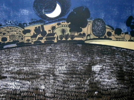
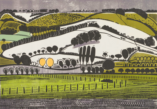
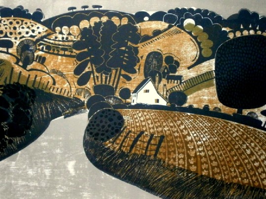
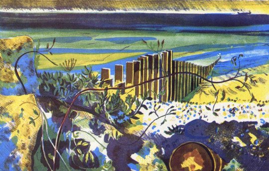
I never really cared for the over complicated etchings of Graham Clarke but I discovered his linocuts on a Shell Poster and was amazed. They are full of the countryside and vivid colours, a wonderful construction and to me, totally pleasing.
Graham Clarke – Harvest Moon
Born in 1941, Clarke’s upbringing in the austerity of war-time and post-war Britain, made him reliant on his own imaginative resources.
He was educated at Beckenham Art School, where he fell under the spell of Samuel Palmer’s romantic and visionary view of the Shoreham countryside. At the Royal College of Art he specialised in illustration and printmaking, and pursued his interest in calligraphy. With encouragement from Edward Bawden, Clarke began refining an individual aesthetic, printing traditional landscapes marked by a sense of locality and genre. Graduating in 1964, most of these prints are from the 60s.
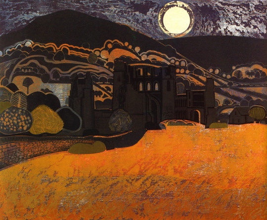
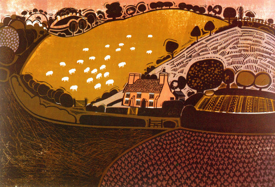
Graham Clarke – Llanthony Priory, Autumn (Commissioned by Shell)
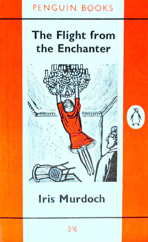
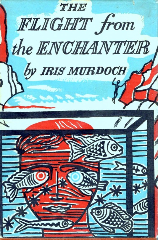
It is always interesting to look at how an artist illustrates a book, what scenes are chosen for the dust jacket. Normally when a book goes into paperback form the publisher either uses the same image from the hardback copy or gets another illustrator in, but with this Iris Murdoch book Edward Bawden would do two covers. Once for Faber & Faber in 1952 and again for Penguin Books in 1962.
Edward Bawden – The Flight From The Enchanter by Iris Murdoch, 1952
The design of the 1952 dust jacket is a mixture of collage of linocut and ink drawn design of cliffs and lettering. The colour was added by the printer under Bawden’s instruction
‘You get real fish here,’ said Annette. ‘Let’s see the real fish.’ She turned and suddenly made for the fish-bowl. Mischa followed her. Annette looked at him from the other side of the bowl. †
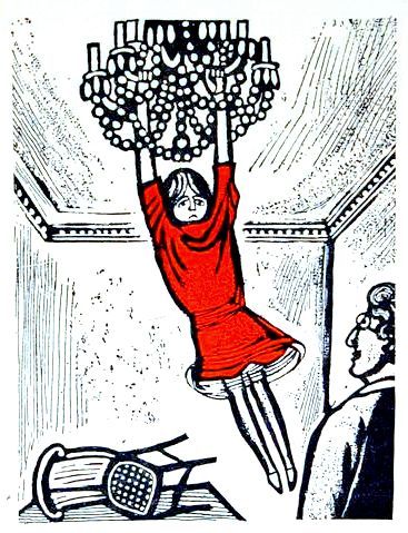
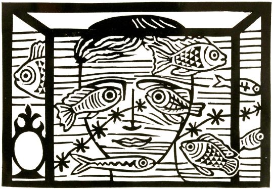
Edward Bawden – The Flight From The Enchanter linocut design,
printed for Edward Bawden’s Book of Cuts 1978.
Edward Bawden – The Flight From The Enchanter by Iris Murdoch, 1962
Then with a quick movement she kicked the chair away and hung stiffly in mid-air. The chandelier felt firm, her grip was strong, there was no terrible rending sound as the chain parted company with the ceiling. After all, thought Annette, I don’t weigh much. †
Iris Murdoch – The Flight From The Enchanter, 1952
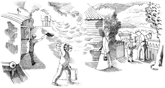
Here is a poem found in Volume 13 of the Saturday Book by Gerald Bullett, from 1953. The illustrations are by John Nash.
Now as my lamp burns low
I remember a green land of long ago,
A plum-coloured train chuffing and puffing about,
And me, lucky, carefully lifted out
And led away into heaven through a White wicket,
Proudly surrendering half a railway ticket.
Between the shafts of a high dogcart stood
A patient pony, warm and brown and good,
Good to touch and fondle, with oily eyes
Incapable of anger or surprise,
Who at a word, a lifting of slack reins,
Carried me and my cousins along the lanes,
Past wooded meadows and the enormous stare
Of cattle, and gray sheep, browsing there.
The sky moment by moment growing dim
While still the sun burned on the western rim,
Rooks home-going, hedges warm with scent,
I rode into my kingdom of content:
So found the farm, Aunt Jinnie, Uncle Ned,
The sleepy supper and the dreamless bed,
To wake next morning in a world new-made.
O Earth and Sky, most tried of comforters:
O morning glory aslant across the years
From far fields, where every blade and weed
Miraculously nourished my heart’s need:
It is here on the map, my joy-bright country
Where grief has brief being, despair no entry,
And in this aged almanack I can trace.
The year, the very hours, of blessedness.
But their unique conjunction, place and time,
Is now no more than a remembered rhyme
Quickening the drowsy blood. Too soon, alas,
The dews dissolve on leaves and shining grass.
Too soon the glossy chestnut, newly come
From silken fold, his paradisial bloom
By malice of corroding time must lose,
The sun droop, the flower of morning close.
80 shall my Eden, as all memories must,
When this my lamp goes out,
Dwindle into a little heap of dust,
Resolving faith and doubt …
In whose hand held, or what abysm lost?
THE POEM BY GERALD BULLETT
THE ILLUSTRATIONS BY JOHN NASH
In the past week while looking at some of my books, I noticed that many of them have Ex Libris plates. I have not really thought of having such a thing myself. I always thought although decorative, in most cases they are dull and damage books – though it is nice to trace the possessions of people. Some of the bookplates you are able to Google the people involved, others it is a mystery.
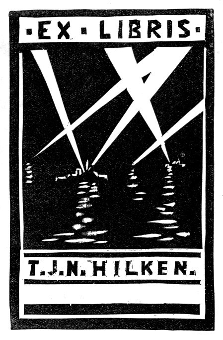
Captain Thomas John Norman Hilken, DSO. (1901-1969)
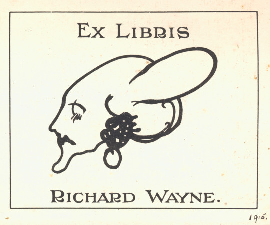
Richard Wayne. The illustration is lovely and I thought slightly Bloomsbury but I couldn’t find any mention of him.
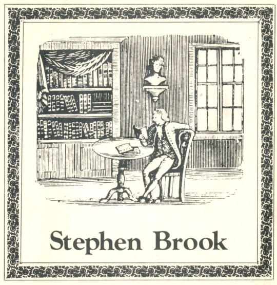
Stephen Brook
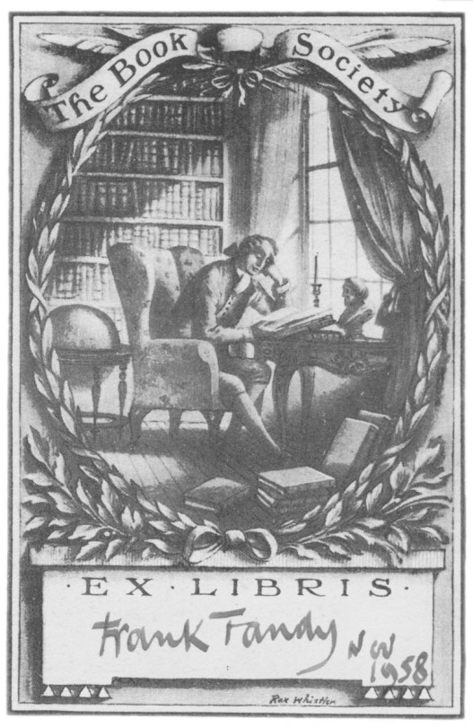
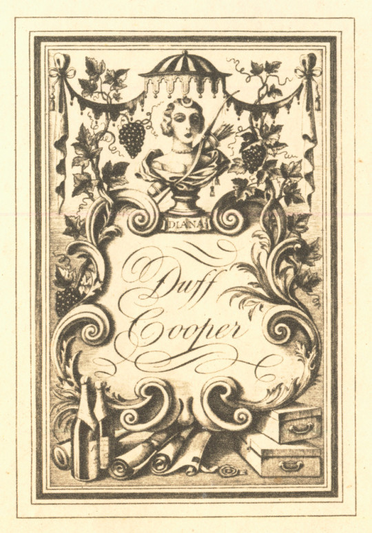
A Book Society bookplate for the public to fill in by Rex Whistler, below another design by Whistler, this time for Duff Cooper.
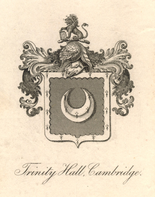
Trinity Hall Library, Cambridge
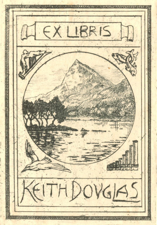
Keith Douglas – Second World War Poet.
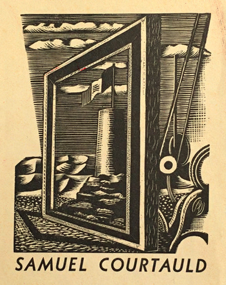
Samuel Courtauld – Art Collector and founder of the Courtauld Institute of Art. Designed by Paul Nash.
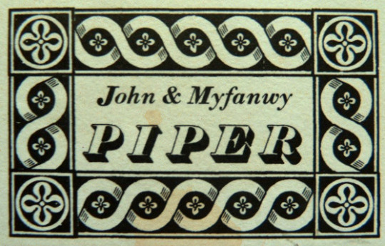
John & Myfanwy Piper – Artists and writer.
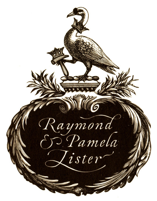
Raymond Lister – Society Ironworker and writer on Romantic Watercolourists, designed by Reynolds Stone.
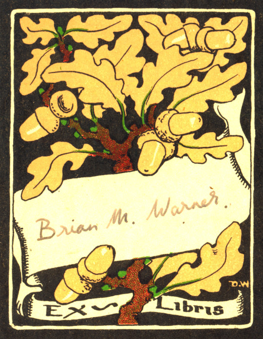
Brian M Warner. A mass produced bookplate by D.W who is unknown to me.
Trevor and Anne Martin
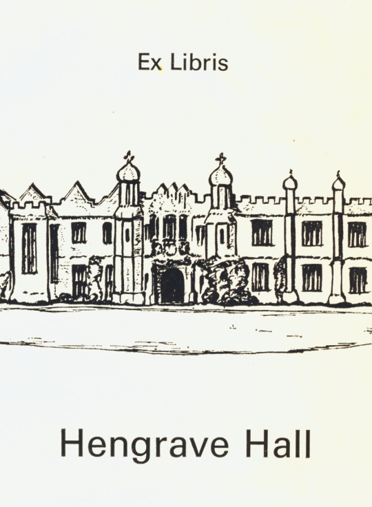
Hengrave Hall library bookplate. Hengrave Hall is a Tudor manor house near Bury St. Edmunds and has been a nunnery. It is now a wedding venue.
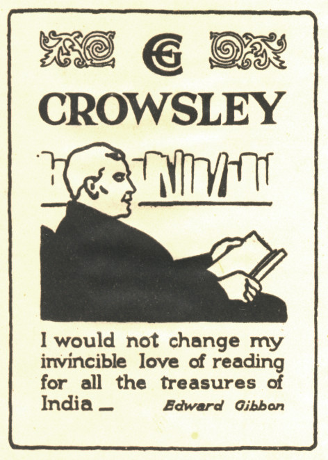
E G Crowsley.
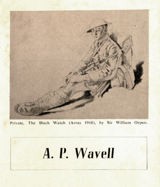
Field Marshal Archibald Percival Wavell, 1st Earl Wavell, GCB, GCSI, GCIE, CMG, MC, KStJ, PC. As noted on the plate, it features a beautiful drawing by William Orpen.
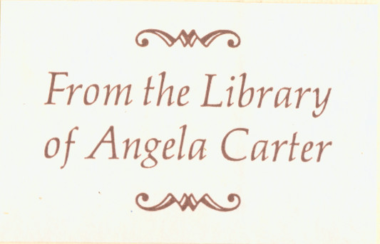
Angela Carter the Novelist.
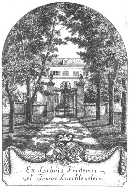
One of the Prince Friedrich’s of Liechtenstein
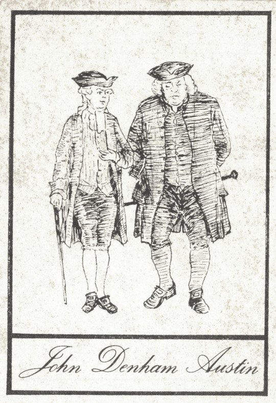
John Denham Austin, writer. Figures depicted are Samuel Johnson and James Boswell.
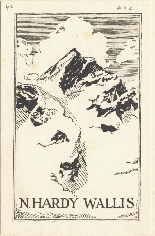
Norbert Hardy Wallis – Translator and writer. 2nd Lieutenant in the South Wales Borderers.
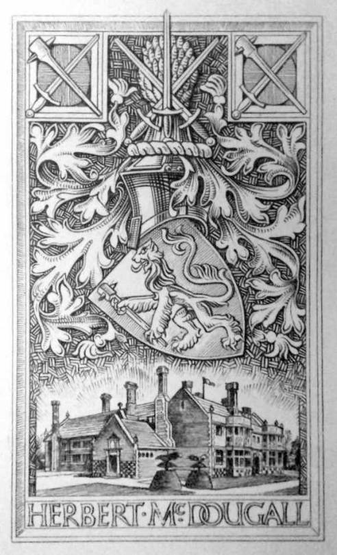
Lieutenant-Colonel Herbert McDougall, of the McDougall’s Flour company. His daughter married Prince Andrew Alexandrovitch of Russia, eldest nephew of Tsar Nicholas II.
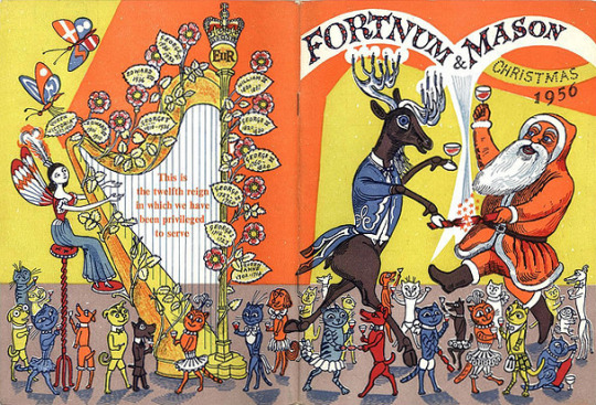
1956 was a busy year for Edward Bawden. In the medium of linocut he completed two prints of Brighton and three large prints based in Great Bardfield. He illustrated the book The Sixpence that Rolled Away and designed the dust jacket for The Flight from the Enchanter by Iris Murdoch in linocut as well.
Further illustration work came with a lino cut of An Old Crab and a Young Crab and an etching of Watermellons for A Handbook of type and Illustration by John Lewis. Fortnum and Mason would commission him to illustrate their Christmas catalogue, something he used to do in the 1930s. In magazines and newspapers he designed a series of adverts for Chubb Locks.
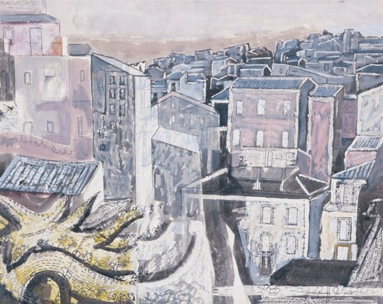
Other than making prints close to home in Great Bardfield, Bawden travelled to Ironbridge. In the Royal Academy Summer Exhibition he displayed his watercolours of Canada painted in 1951 and Enna in Sicily, painted in 1953.
Edward Bawden – Enna, Sicily, 1953. From the RA Summer Exhibition 1956.
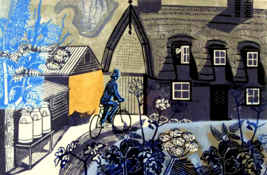
We start at home in Great Bardfield where Bawden was printing the linocuts of Ives Farmhouse and the farmyard behind the cottage.
Edward Bawden – Ives Farmhouse, Great Bardfield, 1956
Ives Farmhouse is listed as the name of the print in the editioned version but there are a handful of ‘artist proof’ copies of this print titled The Road to Thaxted, like the copy the Fry Gallery own.
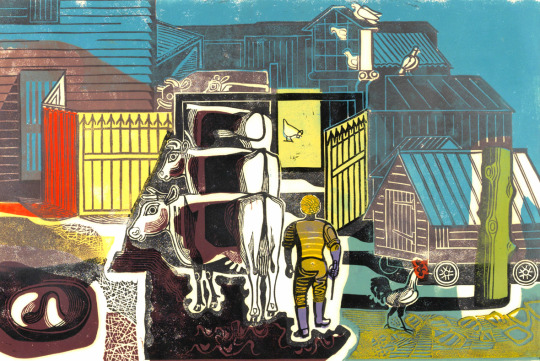
Edward Bawden – Ives Farm, Great Bardfield, 1956
One of the Ives Farmyard proofs has ‘poor print done by EB because no printing press.’ I would assume they mean the patchy printing of the colours.
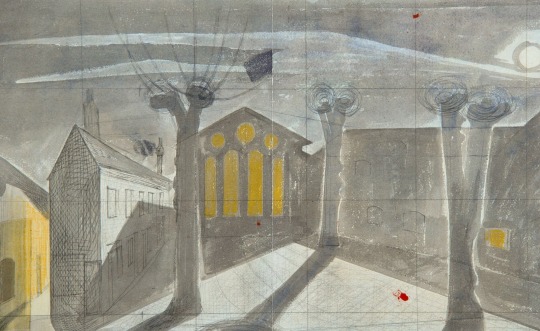
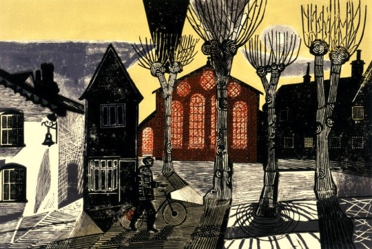
Edward Bawden – Study for: Town Hall Yard, Great Bardfield, 1956
Edward Bawden – Town Hall Yard, Great Bardfield, 1956
Bawden makes good use of an ornamental pattern found in the buildings and finds decorative possibilities in the pollarded and leafless trees. †
The Town Hall Yard linocut would be sold at the Zwemmer Gallery in their first (of many) ‘New Editions’ shows – a selection of prints by various printmakers. It is also believed the Ives Farm prints were also available here. The Town Hall Yard was one of the prints that ended up in the Manchester Pictures for Schools collection, it is assumed that as theirs is an Artist Proof, Bawden donated it to the Pictures for Schools scheme.
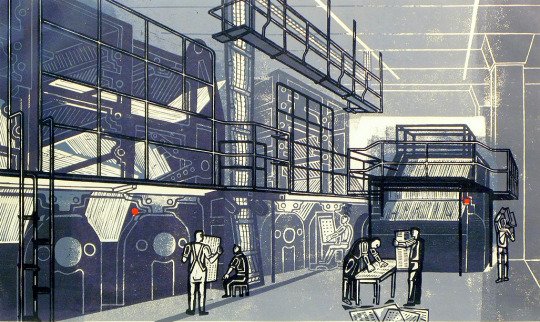
Edward Bawden – Printing the Sunday Times, 1956
The history of Printing the Sunday Times isn’t recorded, in the book The Edward Bawden Editioned Prints book by Jeremy Greenwood it is noted.
It has not been possible to discover the origin of this print, but it was perhaps commissioned by The Sunday Times whose permission at least would have been necessary to allow Bawden access to the plant.
There are a few different ideas to why this print has come about, but my theory is that is was likely commissioned by Bawden’s friend Robert Harling.
In the 1930s Harling worked for the advertising firms, Stuarts as a Designer and Everett Jones and Delamere as the Creative Director where he hired Bawden to illustrate the Fortnum and Mason catalogues. Harling was the designer who hired Eric Ravilious to design the cover to Wisden’s Cricketers’ Almanack in 1938. In 1945 Everett Jones and Delamere was liquidated and Harling moved to the staff of the Sunday Times along side Ian Fleming who was just about to write his first James Bond novel. Harling was the consultant designer to the paper from 1945 to the 80s, he would also guest at an architecture critic. In 1953 Bawden would do some illustration work for the Sunday Times for the article ‘Another Brighton’ by Clifford Musgrave (September 6th 1953).
Given that Harling was a designer for the paper and Bawden was such a close friend it could be guessed he:
Got Bawden onto the premises to make a print of the topic
Bawden saw the printing plant during the 1953 commission
Harling commissioned the print for members of the staff as an internal gift.
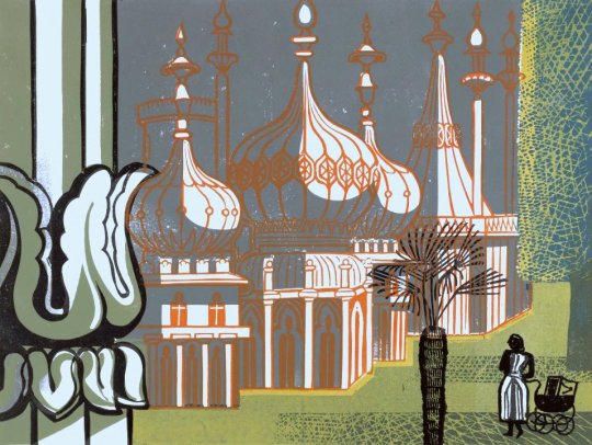
Edward Bawden – The Royal Pavilion, Brighton, 1956
The two prints of Brighton show a summers day and the south coast in winter. It would be the first of a series of prints and drawings Bawden made of Brighton.
Edward Bawden – Snowstorm at Brighton, 1956
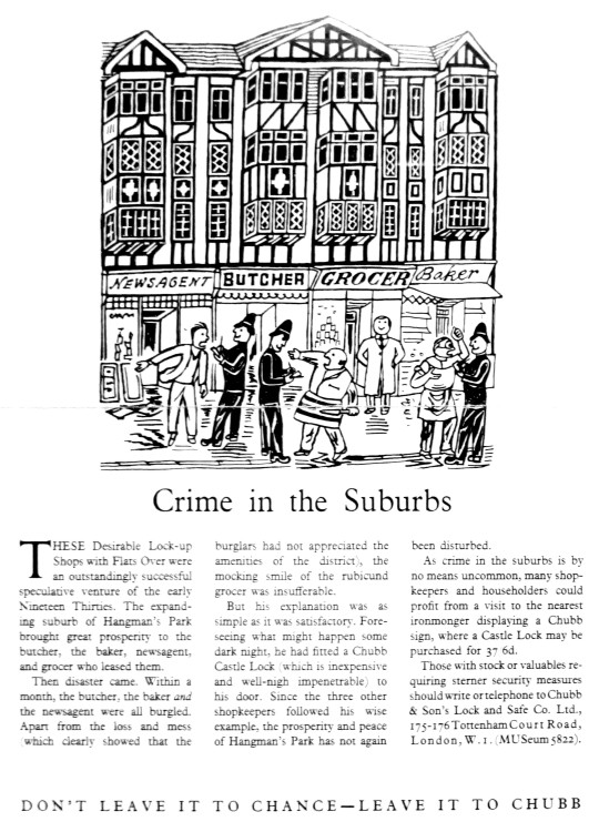
Below are two illustrations for Chubb Locks, one with the full text under and a tale on how Chubb Locks can improve security, all of the adverts follow this style. Under is another line drawing.
Edward Bawden – Chubb Lock Advert, Drawn, 1956 (Published 1957)
Edward Bawden – Chubb Lock Advert, Drawn, 1956 (Published 1957)
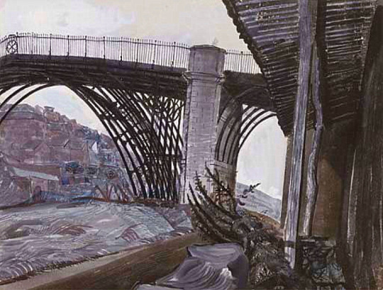
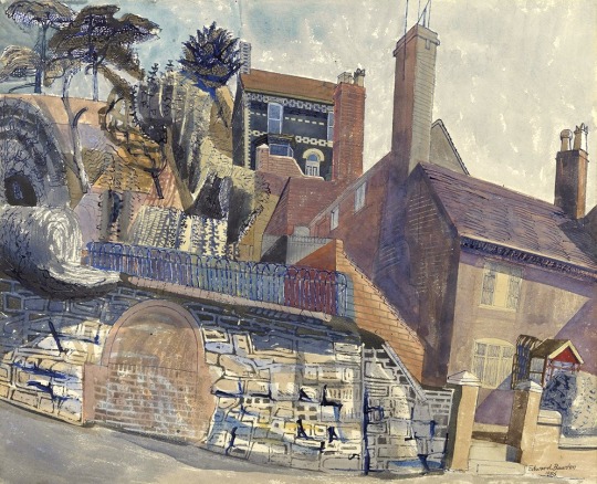
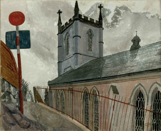
Edward Bawden went on a working holiday to Iron Bridge with the War Artists John Nash and Carel Weight.
I was at Ironbridge for about six weeks in September and October 1956 and was joined by John Aldridge, John Nash and Carel Weight. Each of us in turn painted the famous bridge’. ‘Houses at Ironbridge was almost the last painting I was able to do during my stay. ‡
Edward Bawden. Houses at Ironbridge
Edward Bawden – Iron Bridge, 1956
Edward Bawden – The House at Ironbridge, 1956
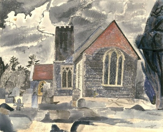
Edward Bawden – Ironbridge Church, 1956
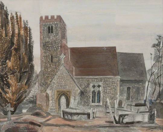
Back at home in Essex Bawden painted Lindsell Church twice and then would go back in 1958 to paint it again before starting a massive linocut of the church in the early 60s.
Edward Bawden – Lindsell Church, 1956
Edward Bawden – Lindsell Church #1, 1956
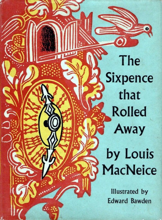
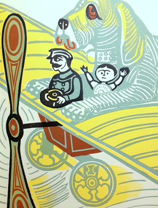
One of the books Bawden Illustrated as mentioned above is the Sixpence that rolled away. A curious tale by poet Louis MacNeice.
Edward Bawden’s Dust Jacket for The Sixpence that rolled away.
Edward Bawden’s illustration inside The Sixpence that rolled away
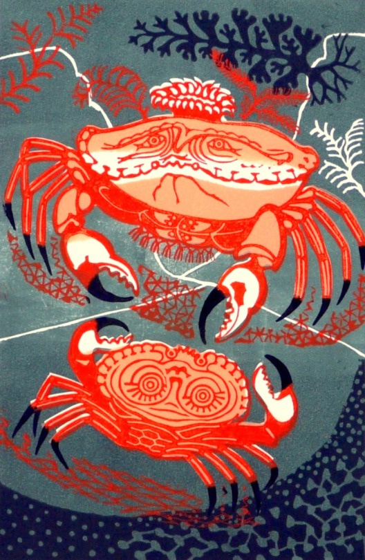
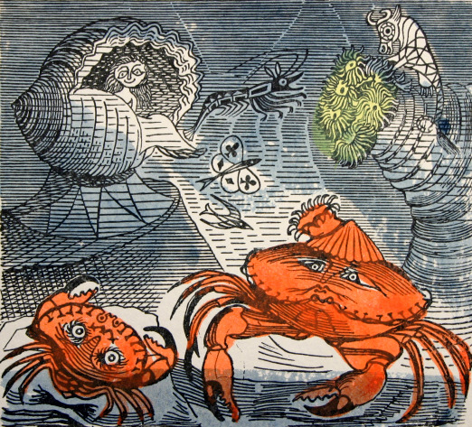
Below this are the two illustrations Bawden would make for the John Lewis book ‘A Handbook of Type & Illustration’ with an early Aesop’s print, An Old Crab & A Young Crab. Bawden would print a series of Aesop’s fable prints in the 70s.
Edward Bawden – An Old Crab & A Young Crab, 1956
The etching below was likely made for the John Lewis book as well, rather than taken from his archive. But Bawden’s style of etching remained very similar throughout his life, from the works as a student to the works he made for the Orient Line. The perspectives looked like they were forced than natural.
Edward Bawden – Watermelons, 1956
The Bawden designed chair and table in green, 1956
The strangest of the commissions to come in 1956 was again from Robert Harling and his client, Bilston Foundries Ltd. A garden seat, bench and table were designed by Bawden.
Churchill sat on it. The ‘Bilston Garden Seat’ was the brainchild of Robert Harling when he was working for an advertising agency. In a letter to Halina Graham the designer wrote, ‘The firm that produced the seat made baths, it was their main line of business & they had no faith in cast iron seats, but I remember going up to Warrington to get information about preparing the design. A technician on the staff of the Furniture School of the Royal College of Art made a model in wood of the design for casting that in itself must have been very expensive. When the seat was first produced & shown at Harrods I think that it probably failed expectations and only later when it became unobtainable did the demand for it increase’.
Bilston Foundries’ advertising leaflet describes it as ‘an ornamental seat unique in its gracefulness, and as distinguished by its careful finish as by its outstanding appearance’. The advertised price was 18 guineas. A cast iron chair along similar lines is illustrated in House and Gardens “Diction of Design”.
Edward Bawden – Flight from the Enchanter, Dust Jacket illustration, 1956.
The cover to The Flight from the Enchanter by Iris Murdoch is half made in Lino and the type and mountains are blown-up pen drawings. The original linocut is below in black, issued as a limited edition print in 1989.
Edward Bawden – Flight from the Enchanter linoblock design, 1956.
At the end of the year Bawden took part in a shared exhibition of Great Bardfield artists with Michael Rothenstein, Geoffrey Clarke and Clifford Smith from the 25th November to 7th December.
Below is a variation on the print above of An Old Crab & A Young Crab used as Edward and his wife Charlotte’s Christmas card that year.
Edward Bawden – An Old Crab & A Young Crab – Christmas Card, 1956
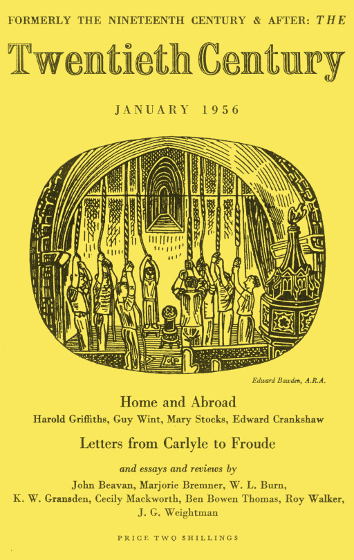
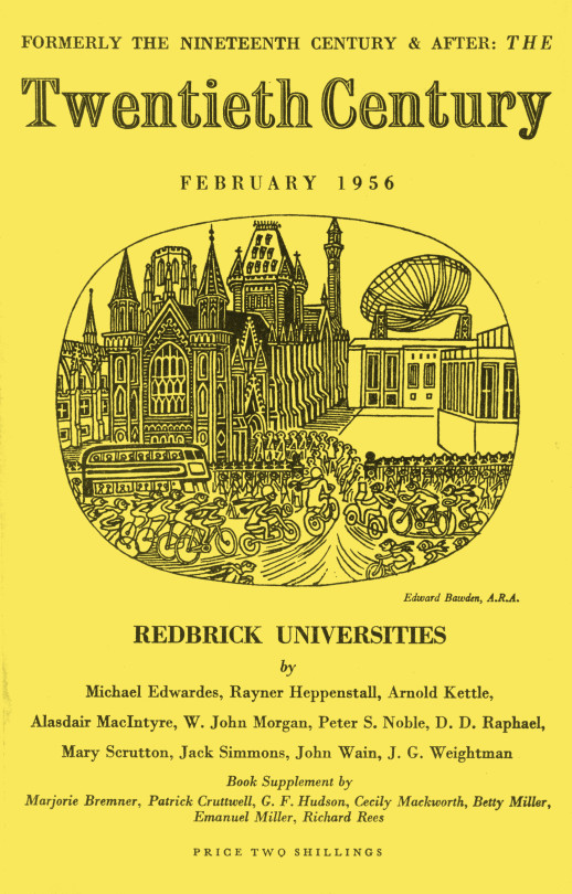
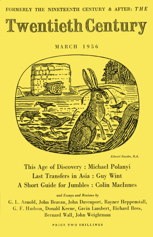
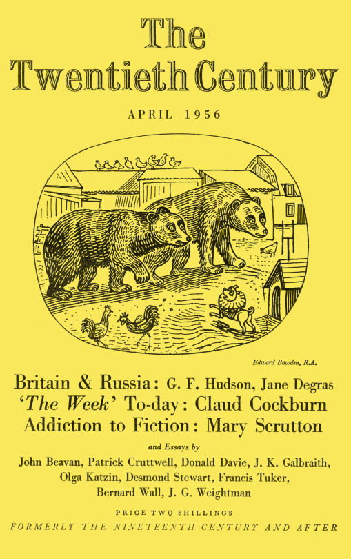
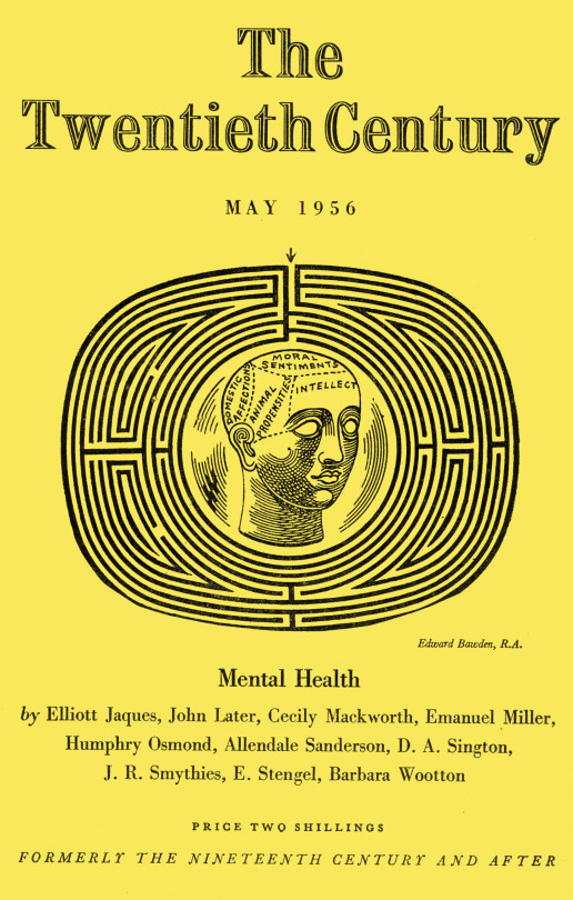
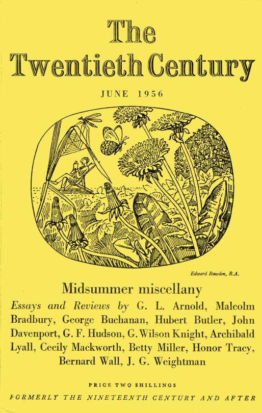
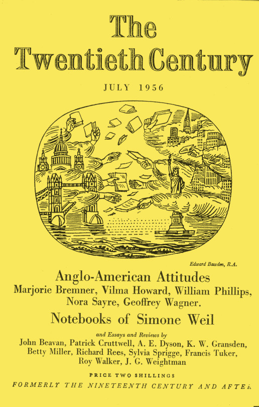
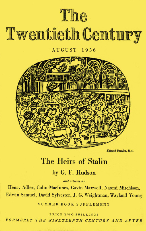
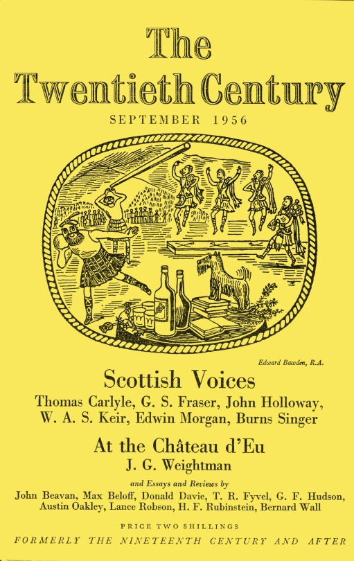
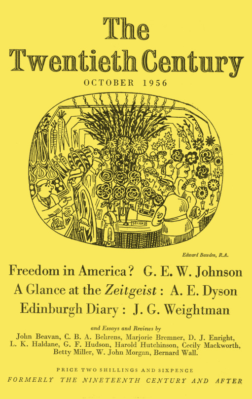
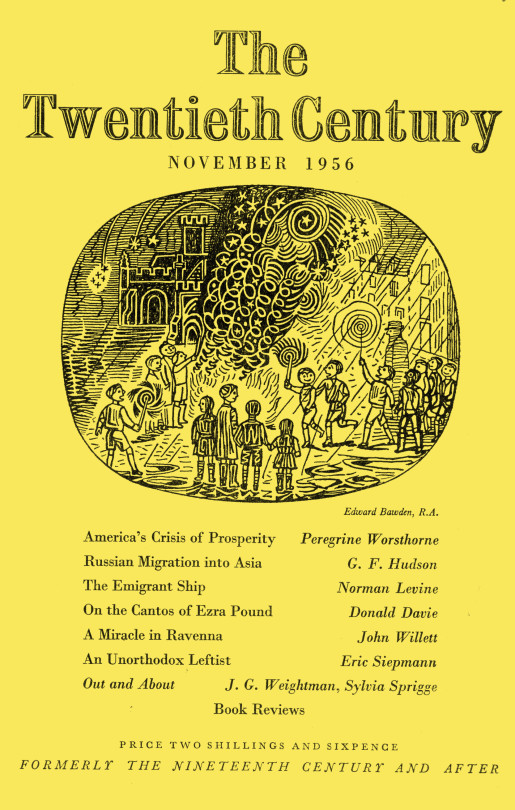
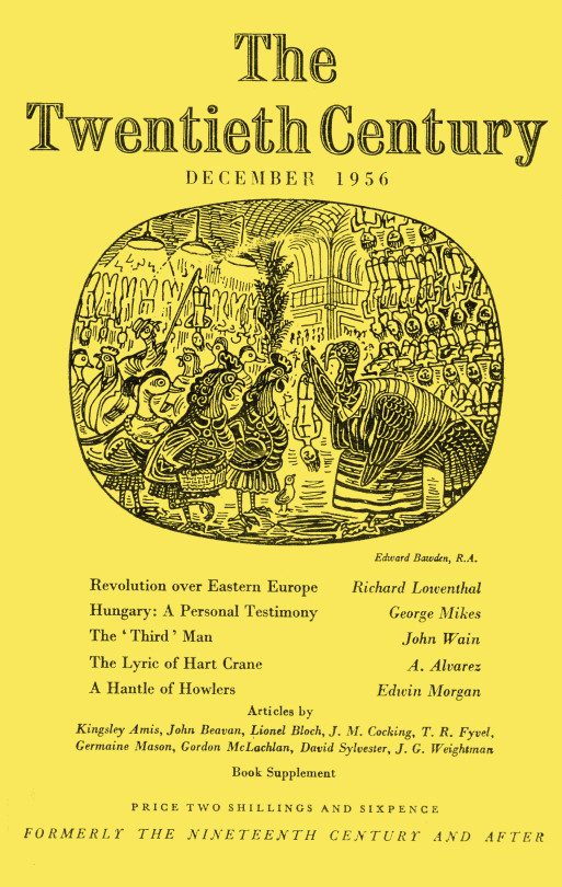
To finish the post off I thought what could be better than a whole run of illustrated magazine covers by Bawden for the Twentieth Century Magazine in 1956. It was in 1956 that Bawden was elected to the Royal Academy of Art. I would guess this happened in February as his credit for February is ARA and his credit for March is RA.
The font in the church shows it being the church in Great Bardfield and also featured in the King Penguin book, Life In An English Village.
The building to the right is the cottage featured in the Ives Farm print above.
Above is an illustration from Liverpool Street Station, London.
As a footnote Robert Harling wrote the book, The Drawings of Edward Bawden in 1950.
† V&A – CIRC.865-1956 Oxford Dictionary of National Biography 2005-2008 ‡ Tate – T00206
In 1949 and 1950 Edward Bawden travelled to Canada to teach at the Banff School of Fine Art during the summer. The town of Banff was first settled in the 1880s, after the transcontinental railway was built through the Bow Valley. In 1883, three Canadian Pacific Railway workers stumbled upon a series of natural hot springs on the side of Sulphur Mountain and since then the area has been a tourist attraction.
The Banff School of Fine Arts was founded in 1933 and in the 1950s they opened up classes for Opera, Photography and had summer schools with international artists visiting as teachers.
From all accounts Bawden enjoyed his time teaching there in 1949 and he returned in 1950 too. His war travels may have inspired him to take on such a commission and it was free travel too. On Bawden’s return from Canada, Walter Hoyle commented that Edward was dressed in blue denim jeans and coat, a modern fashion for such a formal chap.
While in Canada Bawden wrote to John Nash in his typical sarcastic style that he was fed up with mosquitoes and trees:
‘in my opinion nothing will ever open up this country for painting better than some forest fires on a vast scale’.†
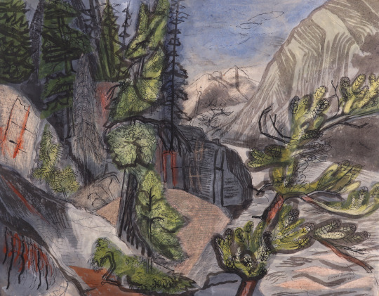
Some of the works were featured in an exhibition in May, 1951 “Water-colour drawings of the Canadian Rockies by Edward Bawden, C.B.E., A.R.A.”
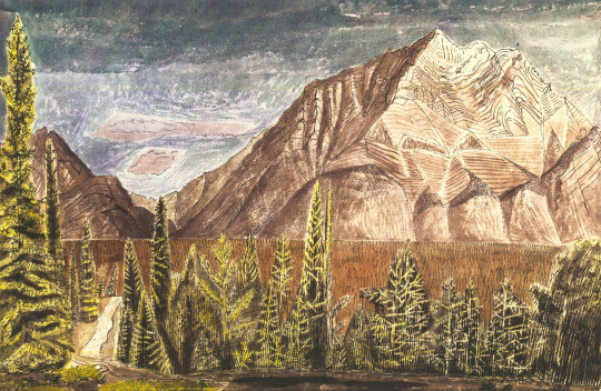
Edward Bawden – Cascade Mountain, Canadian Rockies 1949
Edward Bawden – The Bow River, Banff, Canada, 1949
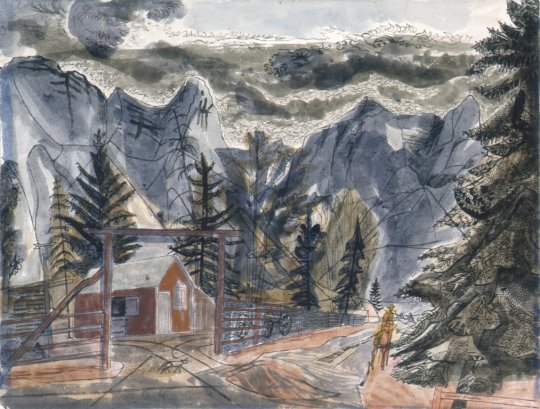
Edward Bawden – A Ranch in the Rockies, 1949
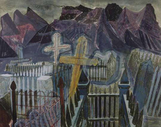
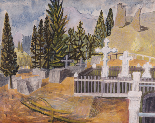
Edward Bawden – The Canmore Mountain Range, 1950
While there he drove to the nearby town of Canmore, Alberta and completed a series of pictures, the watercolour above was painted in the Ukrainain Cemetry of the coal mining town. The mines opened in 1887 but during the 1970s the market price dropped and in 1979 the mines closed.
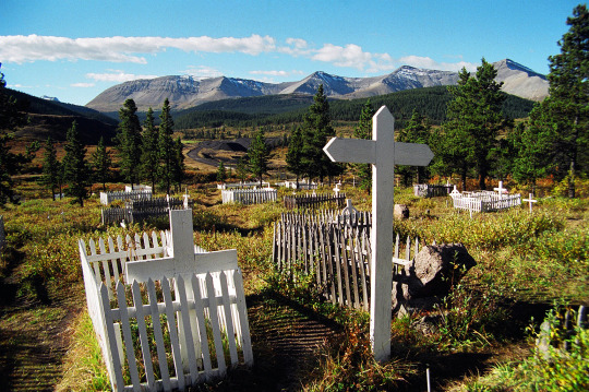
This picture painted in 1950 was done with much thicker paint and less transparent than the others. It was featured in the show at the Leicester Galleries, where the Tate purchased it. Below is the view today.
Edward Bawden – Canmore, Alberta, Canada, 1950
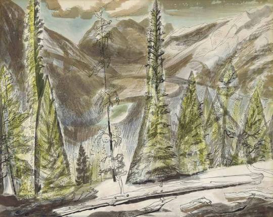
Edward Bawden – In the Canadian Rockies, 1949
Below is a copperplate etching made by Bawden in 1952 of his time in Canada. It would be reprinted with a set of other etchings in March 1988, to celebrate the eighty-fifth birthday of Edward Bawden.
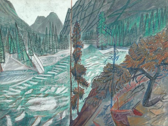
Edward Bawden – Cabin in the Forest – Canada, 1952
† Malcolm Yorke – Edward Bawden & His Circle, 2015
This post is based upon a series of articles in the Spectator during 1986 by author and artist Alan Powers. I thought it interesting and the pictures wonderful to merit a reposting some 31 years later. The lithographs were printed at the Curwen Press.
The series has been commissioned by the Spectator and will be available for sale as a signed, limited edition.
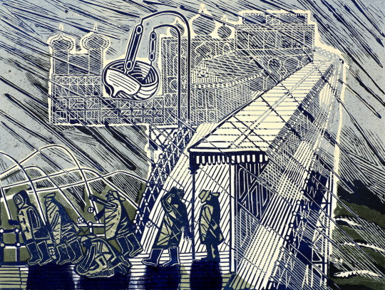
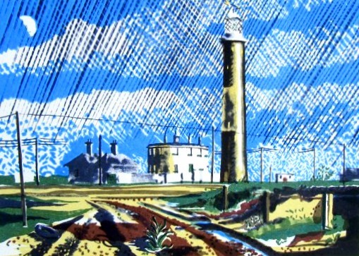
Dungeness
Alan Powers – Dungeness
From Hythe the coast road loses sight of the sea behind the sea walls protecting Romney Marsh. Bungalows and caravans punctuate the progress through Dymchurch and New Romney. From Littlestone to Dungeness is all Shingle, with plenty of fishing boats and tarred huts on the seaward side. The Buildings of England condemns ‘the scruffy shacks that sprawl for miles’, but Dungeness, innocent of architect or planner, has a quality of its own.
It is one of the best Places left for seeing railway carriages Converted into dwellings in the Twenties and Thirties, a rare memorial of the world of Rowland Emmett. He too is the presiding genius of the Romney, Hythe and Dymchurch railway, with miniature steam engines each about the side of an old Bugatti puffing along the shingle to nowhere and back. Lupins and yellow sea poppies grow beside the track. Dungeness Lighthouse, built in 1904, was a favourite subject for painters in the Thirties like John Piper and Eric Ravilious.
Then it was a lone landmark with a prominent midriff of white. The strange circular house on the left is the remains of Samuel Wyatt’s original lighthouse of 1792. Both have been superseded by a concrete lighthouse of 1959 which broadens toward the top for a change. They all share in the salty functionalism which Piper called the Nautical Style. Now the non-nostalgic painter ought really to look just out of the picture to the right, where the twin nuclear power stations are as incongruously gigantic as the railway is miniature. They contribute to the quasi-surrealist genius of Dungeness, and from Winchelsea or Fairlight they wink whitely against distant storm clouds.
The Ness used to be growing rapidly with accretions of shingle. It shelves steeply into the sea, leaving a deep channel for shipping near the coast. The Ministry of Defence has bagged most of the shore from Lydd to Camber, where the sand returns abundantly across the boundary into Sussex.
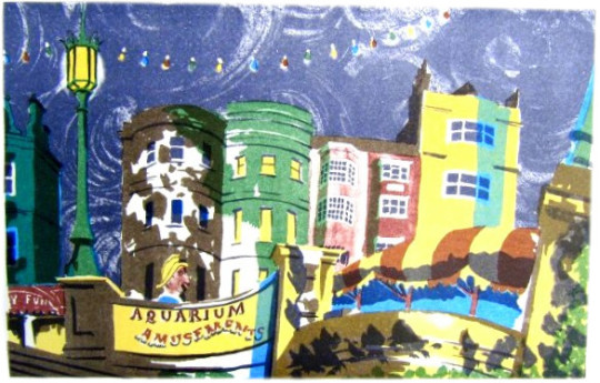
Brighton — Nocturne
Alan Powers – Nocturne
Aquarium Amusements keeps it up till the late hours. By night, the cries of a mechanical parrot carry across the upper air demanding, like an electronic club-bore, ‘Come and talk to me’. Nobody does, for the roundabout of giant ladybirds is stilled and children are pushed home by weary parents, clutching the last ice-cream. The name of the Palace Pier suddenly lights up, like the end of a firework display. From the ballroom the distant music sets the somnolent house-fronts swaying with stucco syncopation. Nobody rides till tomorrow on the pug-dog fireman whose head surfaces above the concrete balustrade. Like Mr Belaker, ‘the allegro, negro, cocktail shaker’, he will wait until the neo-Renaissance lamps are dimmed before he cruises the promenade from Kemp Town to Hove in search of a ghostly lover.
The Aquarium was reconstructed in 1929 and opened by H.R.H. Prince George. The Official Corporation Handbook (1936 edition) notes how `fish of all sorts lead care-free lives in commodious tanks and a kind of Celtic twilight’. There was also ‘a very comprehensive Amusement Arcade, including a Scoota Boat Pool, Dodgem Cars, Ghost Train, Mirror Maze and the latest devices for the amusement of children, such as Jungle Ride, Aerial Ride, etc’. The Spirit of Brighton, so memorably awakened by the Prince Regent in Rex Whistler’s mural, has spread around the middle and needs fairly constant make-up, but she has never yet gone back to her seaweedy bed. Her moralising sister Hove may pull down the blinds, but Brighton carries on anyhow. Like the Pavilion, Brighton turns its back on the sea and the unattractive beach. Yet the sea air brings an architectural intoxication, encouraging strange growths. And would those domes and minarets have sprouted quite the same in Horsham or in Hayward’s Heath?
Climping Beach
Alan Powers – Climping Beach
Climping Beach comes at the end of a country road, where flint-walled thatched barns are the only buildings. A tower block in Littlehampton is distantly apparent, but here there is a rural respite. ‘The only unbuilt piece of coastline between Selsey and Brighton’ (Buildings of England).
The wartime defences, mainly cubes of concrete, are crumbling away slowly and convolvulus twines where barbed wire was before. Soon nothing will be left to show where we nearly fought on the beaches and the landing grounds. The shifting coastline is held in place by majestic groynes, a fitting man-made addition to the elements of sea and shingle.
In the woods behind is a more complicated defence against the tides of time. Bailiffscourt does actually occupy a mediaeval site and has a genuine 13th-century chapel. The rest is a highly convincing spoof-mediaeval house of the 1930s. It was built for Lord Moyne by an antique-dealer, Amyas Phillips, and intended as an instant antiquity from Chaucer’s England, including many fragments from old buildings which were being demolished at the time. The pastiche is brilliant, and still good as a Thirties-style house. The complete story is told in Clive Aslet’s The Last Country Houses. Lady Moyne scattered wild flower seed from the windows of the London train. All the trees at Bailiffscourt were imported fully grown and held upright in the sandy soil with steel hawsers and guy-ropes. It was a frantic search for innocence, yet the Moynes saved Climping from being ‘developed’.
Felpham, the next village along, was not so lucky. It is now part of Bognor, but is remembered as the place where William Blake stayed in 1800-1801 as the guest of William Hayley. The great visionary had never seen the sea be- fore, but he seems to have been more impressed with his cottage. He wrote to Thomas Butts: ‘My Wife and Sister are both very well and are courting Neptune for an Embrace, whose terrors this morning made them afraid, but whose mildness is often Equal to his terrors.’
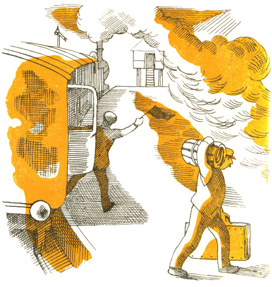
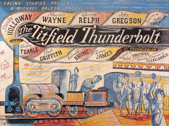
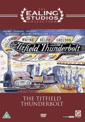
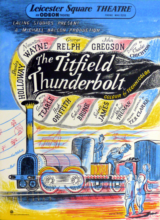
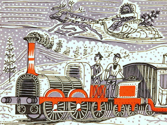
The Titfield Thunderbolt is a 1953 movie by Ealing Studios. The posters were designed by Edward Bawden but so was the promotional ephemera.
The main poster for The Titfield Thunderbolt by Edward Bawden, 1953.
The main poster design might be very colourful and lively as it was the first colour comedy film Ealing Studios had produced.
This poster advertises the film produced in Britain by Ealing Studios in 1952. During the 1940s Ealing Studios commissioned artists like Edward Bawden, Edward Ardizzone and John Piper to design posters. Their illustrative, often humorous, style was quintessentially British and far removed from that of contemporary American film posters, which relied heavily on photographs of the stars as their major selling-point. Bawden ingeniously avoids a hierarchical billing of names by incorporating them equally into the steam of the engine.
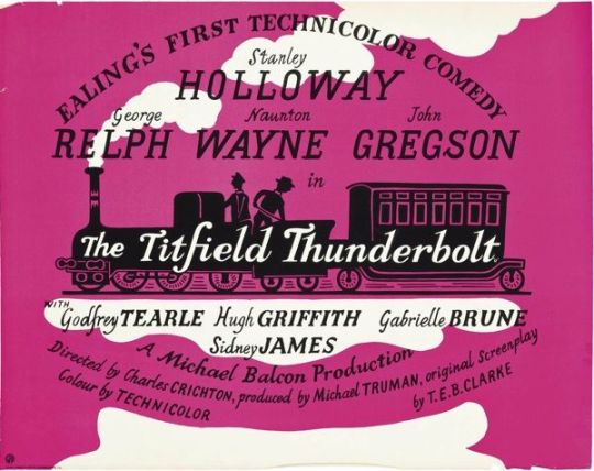
The DVD Reissue for The Titfield Thunderbolt with Edward Bawden’s poster.
The Titfield Thunderbolt is a 1953 British comedy film about a group of villagers trying to keep their branch line operating after British Railways decided to close it. The film was written by T.E.B. Clarke and was inspired by the restoration of the narrow gauge Talyllyn Railway in Wales, the world’s first heritage railway run by volunteers.
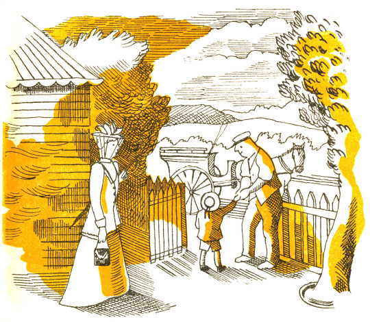
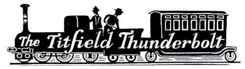
A variation of the Edward Bawden poster, likely for use outside cinemas.
Along with the film poster there are also some items of paraphernalia that Bawden designed; Letterheads and promotional booklets.
An Alternative Poster – A Cheaper to Print Two-Colour Poster for inside Cinemas.
A Letter Head Design.
Above is the press-book for the Titfield Thunderbolt with an alternative drawing by Edward Bawden. I think the gardener is gesticulating a V for Victory.
The Christmas card above from 1952 was designed by Bawden to be sent from Reginald P. Baker and Michael Balcon, the films producers.
To see more Posters by British Artists that Ealing Studios produced see my previous blog on the topic here.
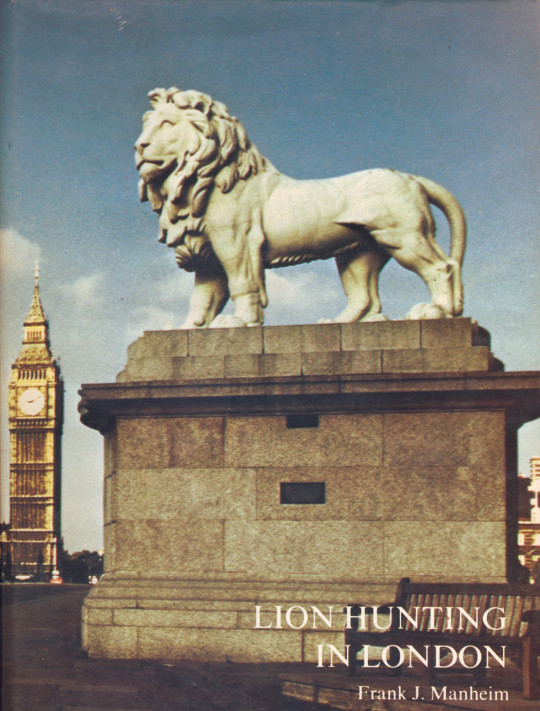
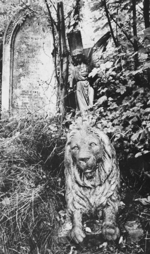
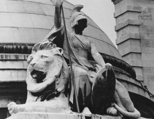
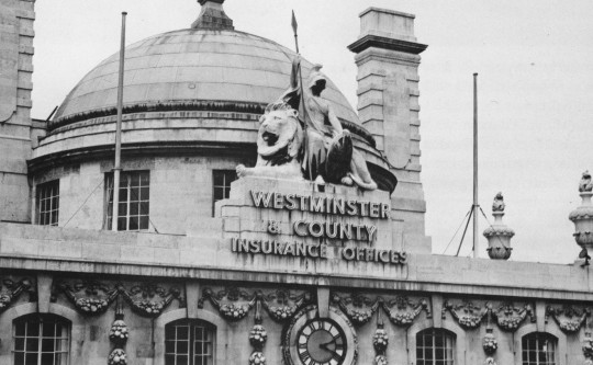
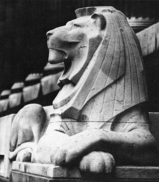
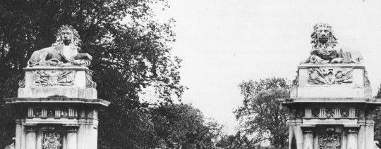
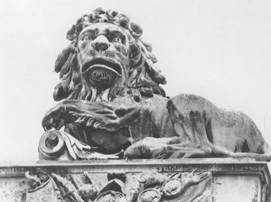
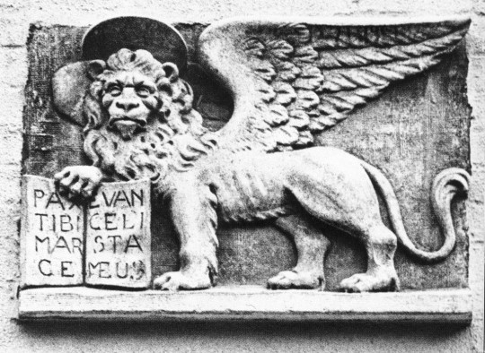
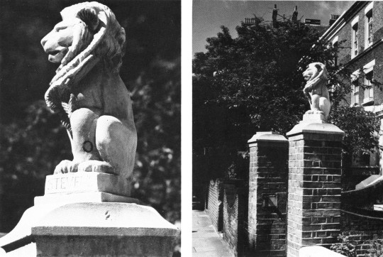
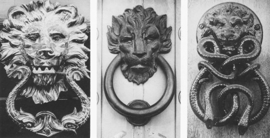
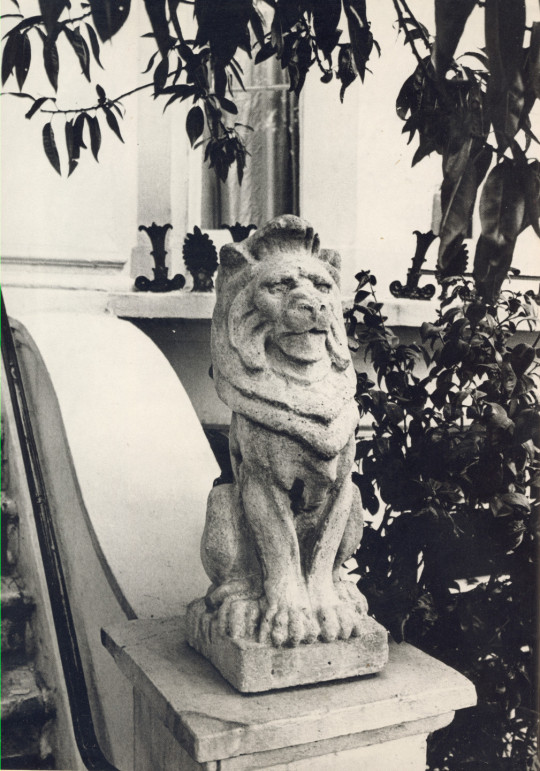
I own the book ‘Lion Hunting in London’ by Frank J. Manheim, 1975. A photographic survey of Lions in London, amazingly it hasn’t been reprinted when you think it would be perfect for tourists.
The Book Cover
Apsley Gate at Hyde Park Corner
King’s College
Guarding a grave in Abney Park cemetery
Detail of Westminster & County Insurance Office, Regent Street
Westminster & County Insurance Office, Regent Street
Christopher Richard Wynne Nevinson started the First World War working for the Red Cross. His work as an ambulance driver took him to the epicentre of the carnage and it’s effects of the war. His time was spent in France working in a disused goods shed converted to a make-shift hospital for up to 3000 men off the railway station in Dunkirk.
Nevinson contracted rheumatic fever in January of 1915 and returned to Britain to recover. During his recovery he started to paint from his sketches and studies made in France on the front lines and trenches for an exhibitions at the Grafton Galleries in March 1916 and then at the Leicester Galleries in September.
By 1915 the theory that art and war could thrive together seemed to convert convincingly into practice as C. R. W. Nevinson, England’s only Futurist disciple and coauthor (with Marinetti) of Viral English Art, advocated upon his return from the front (from a ghastly experience as a medical orderly in Belgium).
“All artists should go to the front to strengthen their art by a worship of physical and moral courage and a fearless desire of adventure, risk and daring and free themselves from the canker of professors, archaeologists, cicerones, antiquaries and beauty worshippers”.
War and art, Nevinson felt. were going to thrive together. Marinettian philosophy had proved an admirable apprenticeship, and here was the perfect subject. Writing in the 1970s, William Wees saw that progression as entirely logical, noting. “The metaphorical implications of avant garde turned art movements into battles. advances and retreats, victories and defeats,” to the point that, years later, Nevinson would look back and declare,
“The war did not take the modern artist by surprise. I think it can be said that modern artists have been at war since 1912…. They were in love with the glory of violence. Some say that artists have lagged behind the war, I should say not! They were miles ahead of it.” †
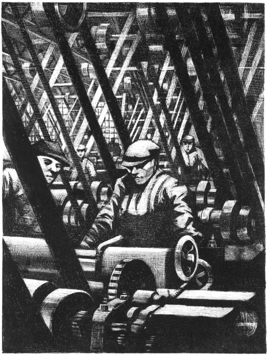
By 1917, Nevinson was made an official war artist. The Black and White etchings from this period are from the ‘Britain’s Efforts and Ideals’ series published in 1917 in an edition of 200 by the Ministry of Information. Other artists involved where Frank Brangwyn, Muirhead Bone and William Rothenstein.
The contributing artists were paid well, each receiving £210 (about £10,000 today) with the possibility of further royalties from sales. The prints were a limited edition of two hundred. The ‘Efforts’ were sold for £2 2s 0d (£100) each and the ‘Ideals’ for £10 10s 0d (£500). ‡
C.R.W Nevinson – Making the Engine, 1917
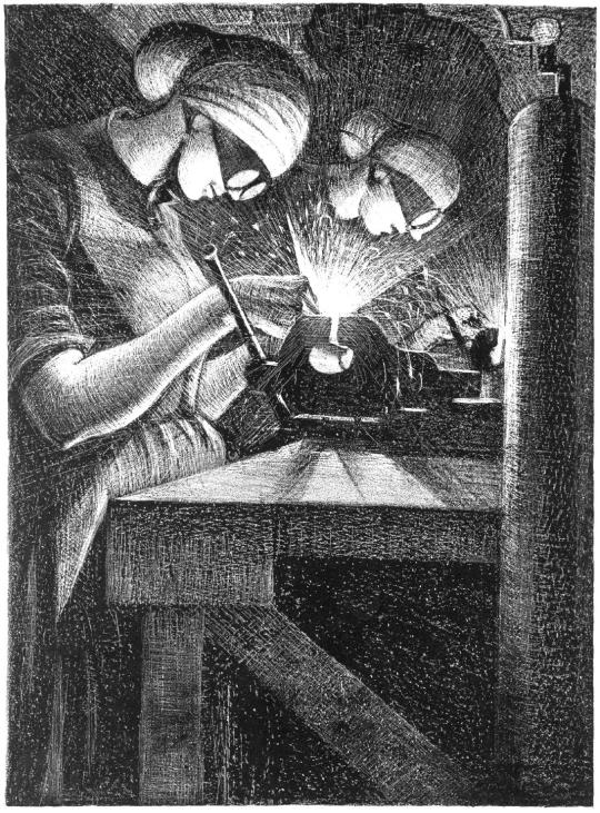
C.R.W Nevinson – Acetylene Welding, 1917
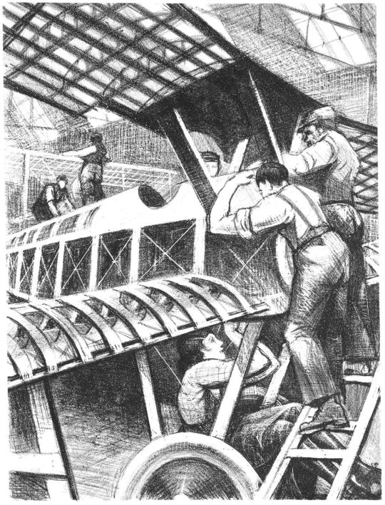
C.R.W Nevinson – Assembling Parts, 1917
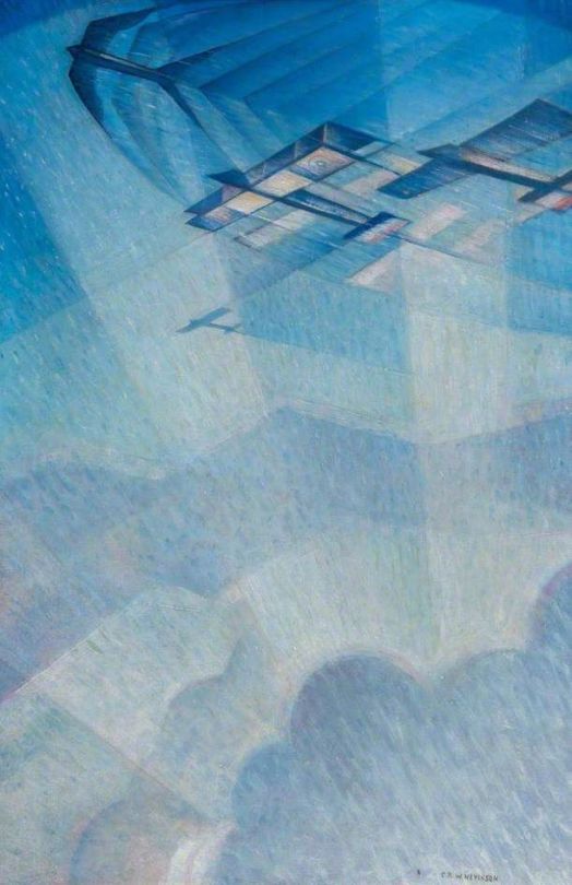
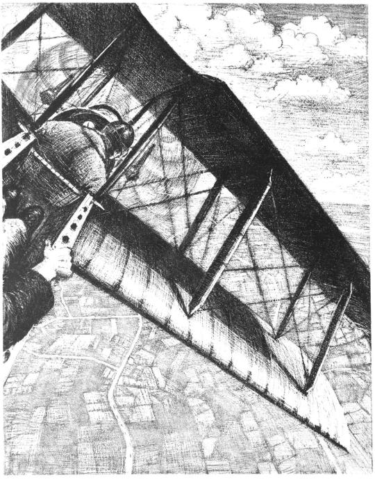
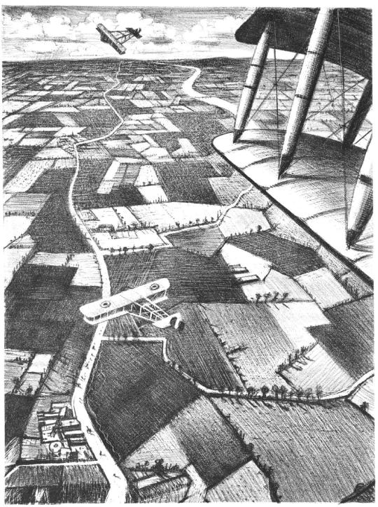
C.R.W Nevinson – Banking at 4000 Feet, 1917
C.R.W Nevinson – Sweeping Down on a Taube, 1917
C.R.W Nevinson – In the Air, 1917
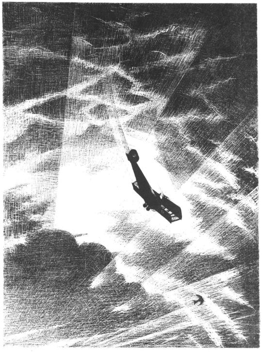
C.R.W Nevinson – Swooping Down on a Hostile Plane, 1917
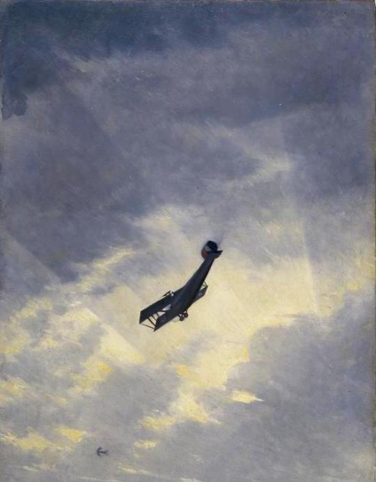
C.R.W Nevinson – War in the Air, 1918
‘War in the Air’ was produced as a very rare lithograph by the Ministry of Information for the Canadian War Memorial Fund in 1919.
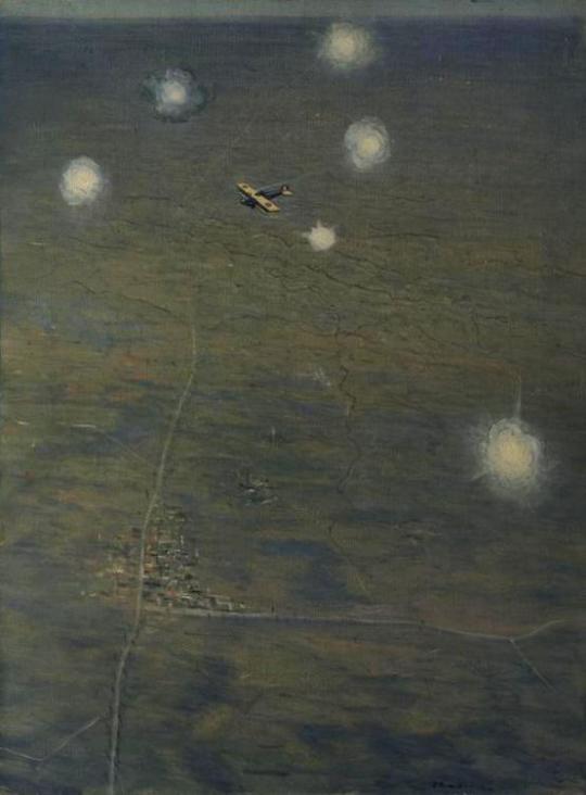
C.R.W Nevinson – War in the Air, 1917
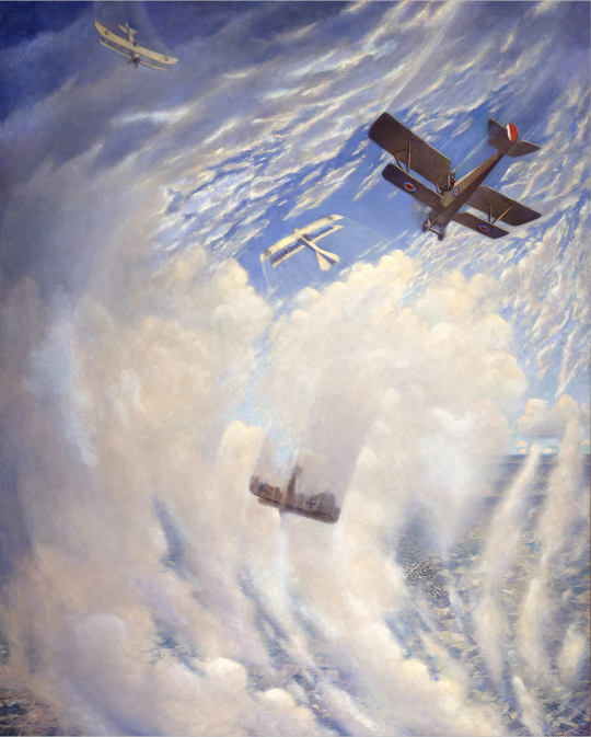
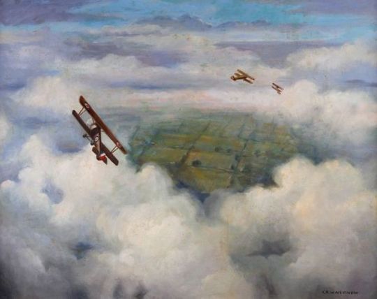
C.R.W Nevinson – Three British WWI Bi-Planes, 1917
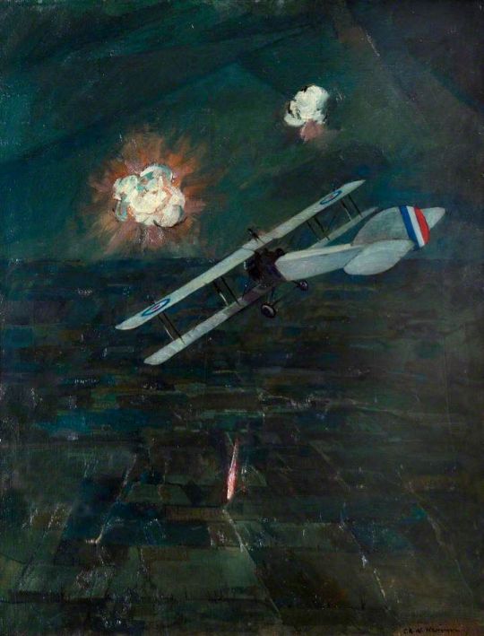
C.R.W Nevinson – Over the Lines, 1917
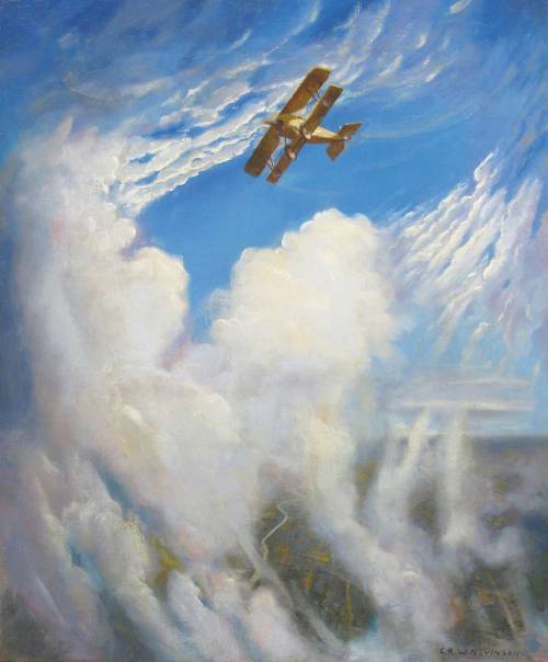
C.R.W Nevinson – Night Raid, 1917
† Nanette Norris – Great War Modernism: Artistic Response in the Context of War, 1914-1918, p27-28, 2015.
‡ The Great War: Britain’s Efforts and Ideals, Online
C.R.W. Nevinson 1889 – 1946 Retrospective Exhibition Of Paintings, Drawings And Prints: Kettle’s Yard Gallery 1988