Tag: Henry Moore
After a previous post of Henry Moore’s shelter drawings I wanted to move on to his series of the Family Unit. The shelter drawings were met with a wave of public success as they captured the public’s imagination of hardship without conflict. The drawings were on show at the National Gallery while the gallery’s permanent works were relocated into air-conditioned huts in caves.
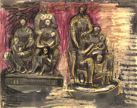
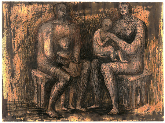
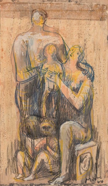
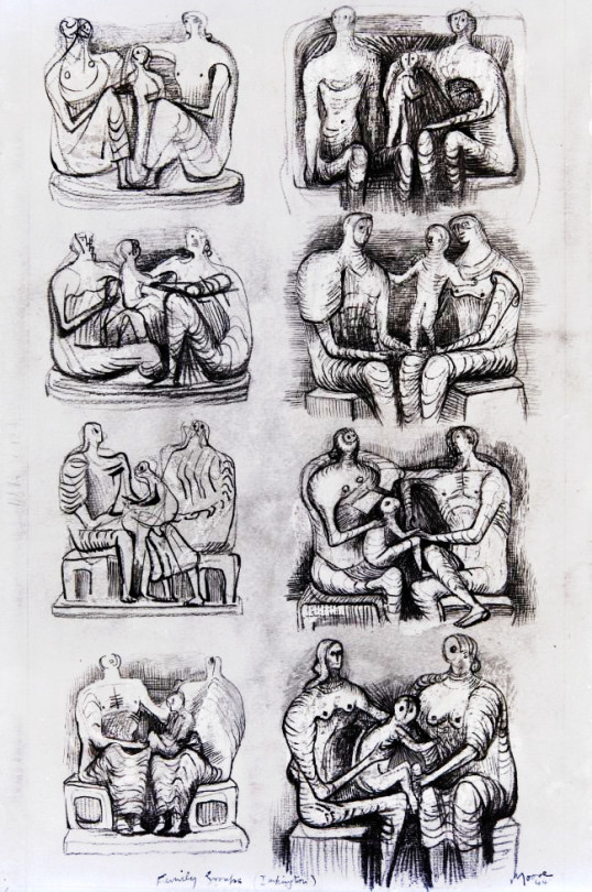
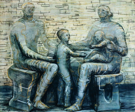
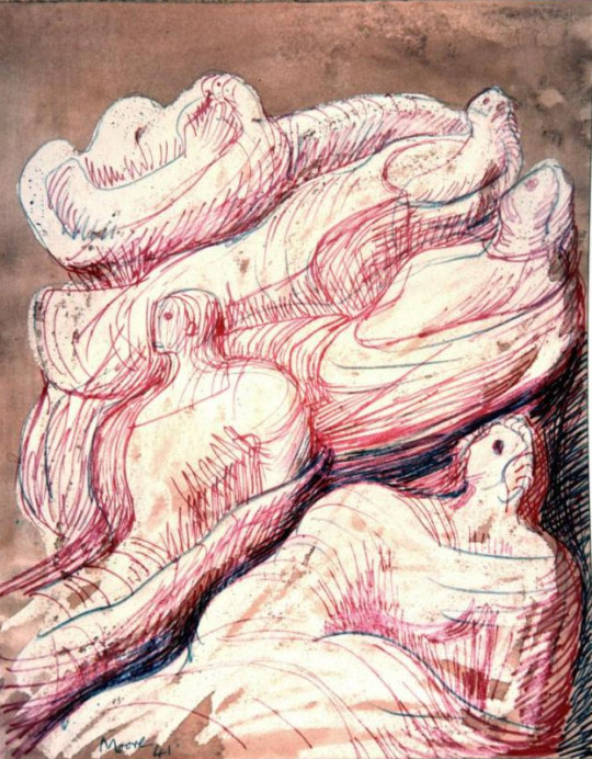
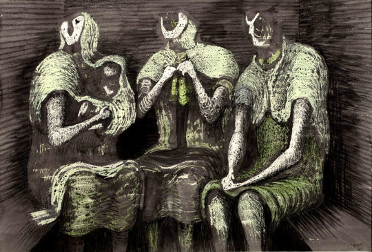
Henry Moore – Family Groups, 1944
The Government used the now empty National Gallery for lunchtime concerts of music and displaying the work of War Artists. So the public where being introduced to modern art by Government patronage.
The Family unit works feel like perhaps a natural progression of the shelter themes, the drawing is in that new style of wax and watercolour. Moore abstracted forms down to crash-test-dummy basics. Draped in fabric it was this period of his work that defined the styles he would continue for the rest of his life. Before the war his work being more abstract and less figurative.
Henry Moore – Family Group, 1944
The works date from 1948-1950 though due to chaotic recording of dates and sketches on Moore’s behalf (pages cut out for sale, for exhibitions, etc) some of the works may have started in 1943. The bulk of the work came from a commission from Henry Morris for a sculpture, this acted as a catalyst for the theme and the work in the sketchbooks.
Henry Moore – Family Group, 1944
The educationalist Henry Morris asked Moore for a sculpture to be placed in the grounds of a proposed village college in Impington, Cambridgeshire. It was to be the first Village College in the Britain. Moore later wrote:
’The Family Group in all its differing forms sprang from my absorbing [Morris’s] idea of the village college – that it should be an institution which could provide for the family unit at all its stages.‘ †
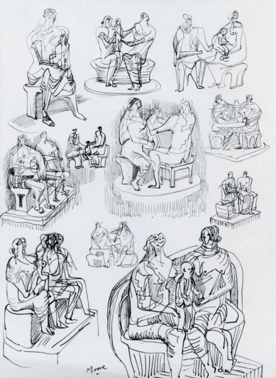
Henry Moore – Studies for Family Groups, 1944
Henry Moore – Studies for Family Groups, 1944
The picture above has a notation ‘Family Group (Impington)’. Below are a series of maquette studies for the sculpture.
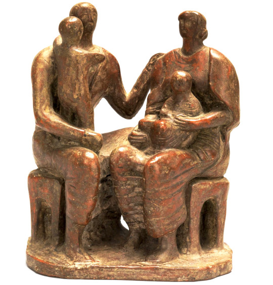
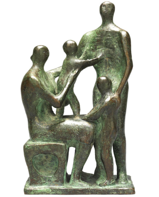
Henry Moore – Maquette for Family Group, 1944
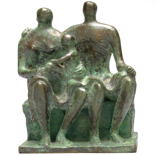
Henry Moore – Maquette for Family Group, 1944
Henry Moore, Family Group, ca. 1943-1944
Between the commission of the sculpture and the reality of it, Cambridge Council got colder feet about the projected costs. They had started a program of building more Village College Schools all over the county and filling them with art from the Pictures for Schools series too. Cambridge was a county with money but they were spending it quickly. In the end Henry Moore sold the sculpture to Hertfordshire Council Council, who like Cambridge sold off their pictures for Schools. Cambridge didn’t have any sculptures to retain but Hertfordshire kept their sculpture and only sold off the framed works.
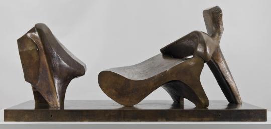
The commission was delayed and finally refused due to lack of funds, but a cast of the resulting Family Group 1948-49 was installed at Barclay School, Stevenage, in 1950. †
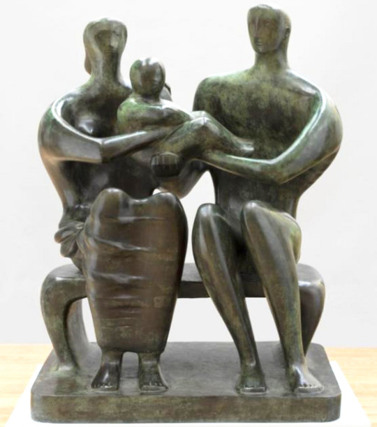
Henry Moore – Family Group, 1949 cast 1950-1
One great regret for Morris was his failure to acquire a sculpture by Henry Moore for Impington. Moore at that time was not a fashionable artist; the general public found his work shocking. Morris went to see him; they discussed the idea of the village college and Moore agreed to attempt a major sculpture which would stand in front of Gropius’s Impington. †
First a maquette was sent to Morris, who was eager to have it executed; but for the Cambridge county councillors of the time, Moore, and the price asked, were too much. They refused to order it. Two years later, Henry’s adoptive county of Herefordshire commissioned the piece. ‡
John Newsom, Hertfordshire’s imaginative county education officer, was an admirer of Henry Morris and knew that Moore still had the models for the Impington project up his sleeve. †
The Family Group above was Moore’s first larger scale bronze sculpture. Now based in Stevenage, the piece has been seen as symbolising aspects of the values of the post-war era of austerity and reconstruction.
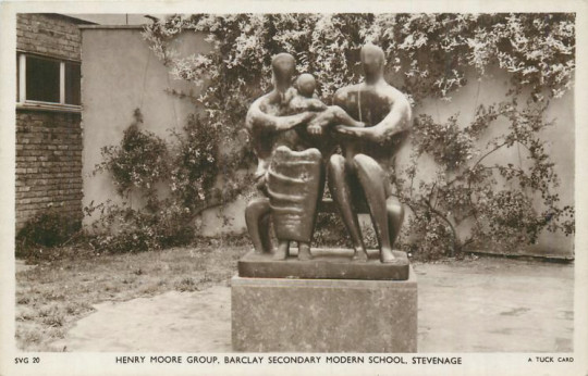
Postcard of the statue in situ.
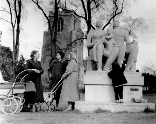
Grouping outside Harlow Church
When the work was produced Henry Moore made a few more drawings of the Family Group, I would guess to sell on the back of the publicity. There was also a Penguin Print of the sculpture too at the same time in 1948.
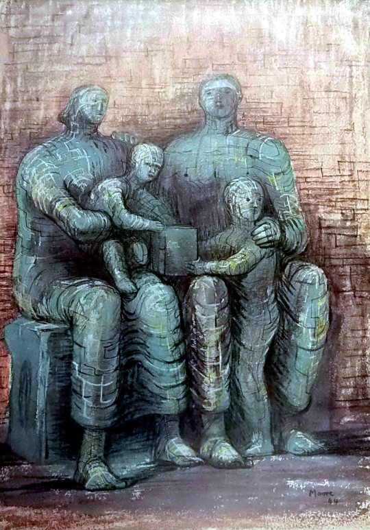
Henry Moore – Family Group, 1948. A Penguin Print.
Henry Moore “Family Group” 1948
† Harry Ree – Educator Extraordinary, 1973, p72
‡ Roger Berthoud – The Life of Henry Moore, 1987 p223
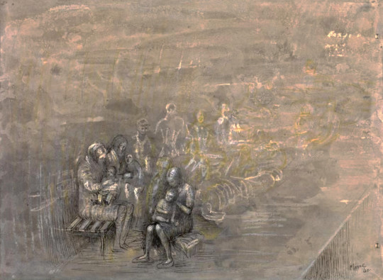
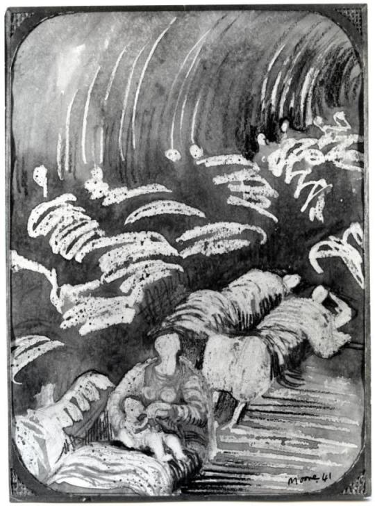
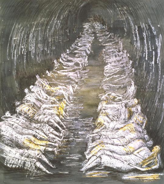
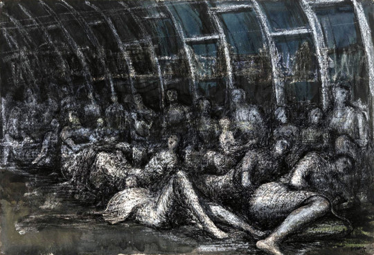
Henry Moore – Women and Children in the Tube, 1940
The London Underground stations and tubeways, being so deep underground for some of the network became the obvious places for Londoners to shelter from air raids by German bombers.
It was during this time that Henry Moore came across the people sleeping in the underground. Moore had been out to dinner in London in the autumn of 1940 and that evening took the underground home. When the train got to Belsize Park, Moore and his wife Irina had to work over the sea of people using the network as a shelter. The view is somewhat squalid. They were documented by the photographer Bill Brandt in Lilliput magazine.
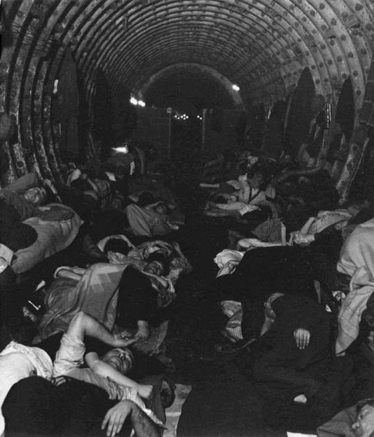
Bill Brandt – Liverpool Street Underground Station Shelter, 1940
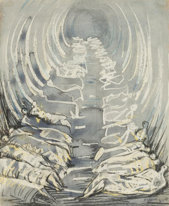
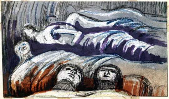
Henry Moore – Sleeping Figures, 1941
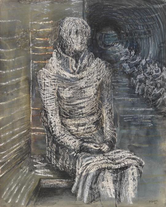
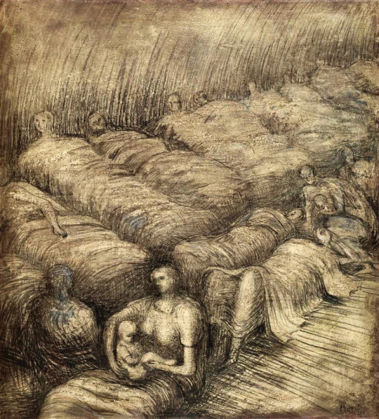
The most curious feature of the shelter drawings is Moore claimed never to draw subjects. He was living at 11a Parkhill Road, Belsize Park at the time but used to watch people and then sketch the scene afterwards at home. I would suggest he did some on location very quickly, like the image above and the one below, then worked them up at his home or in the studio he had in Hampstead. The shapes would have been recorded but not the people or their expressions.
Henry Moore – Shelter Study, 1941
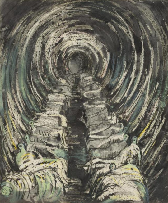
Henry Moore – Large Shelter Sketchbook, 1941 (From the Sketchbooks)
Henry Moore – Tube Shelter Perspective, 1941 (From the Sketchbooks)
Henry Moore – Tube Shelter Perspective, 1941 (From the Sketchbooks)
Above are drawings from the Sketchbooks. The bodies are simple penmarks and the reversed wax wish washes over. The drawing could be made in the Underground and then waxed, washed and painted over after. Below is a version of the Tube from the studio, more detail worked in.
Henry Moore – Tube Shelter Perspective, 1941
Curiously Moore decided to cut the sketchbook pages out and exhibit them in 1970. The Pictures below are three examples from the Sketchbooks that shows Moore adding a felt tipped marker pen for colour in the 1970s long after the originals were created.
Henry Moore – Sleeping Figures, 1941 (Reworked in 1970)
Henry Moore – Reclining Figures, 1941 (Reworked in 1970)
Henry Moore – Shelter Drawing with Sleeping Figures, 1941 (Reworked in 1970)
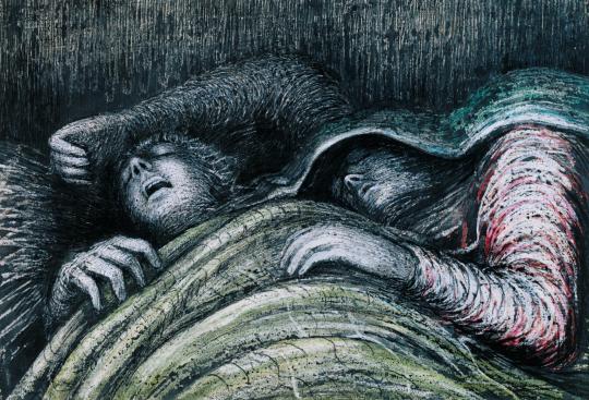
The rest of the images were made at the dates stated and are final finished versions, much more pronounced and refined.
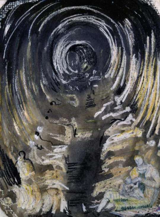
I was fascinated by the sight of the people camping out deep under the ground. I had never seen so many rows of reclining figures and even the holes out of which the trains were coming seemed to me to be like the holes in my sculpture. And there were intimate little touches. Children fast asleep, with trains roaring past only a couple of yards away. People who were obviously strangers to one another forming tight little intimate groups. They were cut off from what was above, but they were aware of it. There was tension in the air. They were a bit like the chorus in a Greek drama telling us about the violence we don’t actually witness †
Henry Moore – Shelterers in the Tube, 1941
Henry Moore – Woman Seated in the Underground, 1941
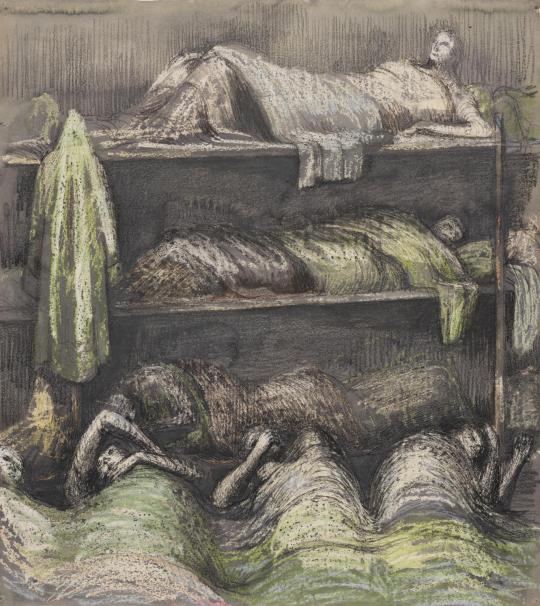
Henry Moore – Shelter Scene: Bunks and Sleepers, 1941
Henry Moore – Pink and Green Sleepers’, 1941
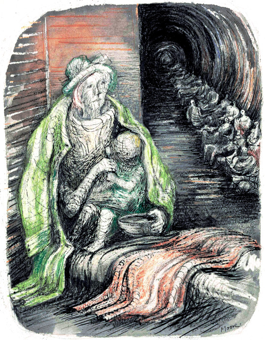
Henry Moore – Woman in an Underground Shelter Feeding a Child, 1941
Henry Moore – Mother and Child among Underground Sleepers, 1941
Moore moved from London in 1941 as his studio was bombed. It lead him to finding a shelter of his own and moving to Much Hadham, the home that is now a museum of his life’s work.
We came here in 1941, when my studio in London was made unusable by a bomb falling nearby and it happened that we were not in London that weekend. We were staying in Much Hadham with friends only two or three hundred yards across from here in a little park called South End. We could see that there was a raid going on because it is near enough to London as the crow flies – only about twenty miles. The friends we had been staying with tried to persuade us to stay a little longer, but I said I was doing the Shelter Drawings and had to get back. We left them on the Monday morning in the little Standard Coupé that we had in those days, and for which I had a small petrol ration, being a war artist. When we got to Hampstead, the road to our studio was cordoned off by the police because of an unexploded bomb. A policeman said, You can’t go this way. Where do you live?’ I said, ‘7 Mall Studios,’ and he said, ‘Oh, they’re flat to the ground,’ with almost a kind of enjoyment in the devastation. So we had to go all the way round, taking about five minutes and imagining all the time that our studio was flat to the ground. However, he had mistaken it and it was Park Hill Studios that had the direct hit, but it was near enough our studio for it to be made unusable, with the windows and doors blown in. ‡
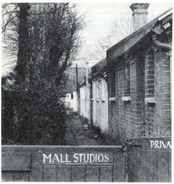
Photograph of Mall Studios in the late 1930s
In those days you couldn’t possibly get a house repaired within six or seven months but we had to have somewhere to live. I rang our Much Hadham weekend friend and said, ‘We would like to come back as you suggested’. Within a week we had found that half this house, Hoglands was available to rent. It was near enough to London for me to travel backwards and forwards, spending the night in the shelters and coming back here the next day to do the drawings. You couldn’t sit in the shelters and draw people undressing their children – it was too private.
In 1941, the house was in a very bad state, tumble-down and so on. Later we got the whole house. The owner wanted to sell, we bought it, and we have been here ever since, gradually making repairs. Ten or fifteen years ago, we built an extra room because there was no room facing the south that got the sunshine, and we acquired several acres, of garden so I could continue working out-of-doors. ‡
† Henry Moore – Writings and Conversations, 2002 p320
‡ With Henry Moore, 1978 p24

The boom in interwar printmaking in Britain was immense, it followed the same popularity of books; naturally the process of colour printing and printmaking where not so dissimilar. People were owning their own homes and they wanted affordable art to put inside.
In the 1920s and 1930s you could either source prints from the Studio Magazine or companies like the Medici print company but then came a series of print publishers who were issuing prints by contemporary artists, not from the past. The first major series of lithographs of modern artists for the public to buy would have been the Contemporary Lithograph series of prints. It was them who started the ball rolling in 1937 and proving that large colour reproduction prints could be made and sold cheaply. Sadly it, like all of the others I will list, were not a financial success. The early print schemes had aspirations of making art more affordable for people. The AIA series was a source of fund-raising for the group and showed off art from their members. The Schools Print series would have likely worked out if it wasn’t for the difficult third series from European artists. But with Lyons Lithographs the public may have felt a little saturated.
Lyons and Guinness both used the idea to their advantage when they needed to brighten up their shabby looking teahouses and pubs in an era of post war austerity.
- Contemporary Lithographs Ltd – 1937-38
- AIA Everyman Prints – 1939 – 1942
- Schools Prints – 1945 – 1949
- Festival of Britain Print Series – 1951
- Coronation Print Series – 1953
- Lyons Lithographs – 1947 and 1955
- Guinness Lithographs – 1956 – 1957
The Penguin series was unusual in that all the prints where old and not designed to be prints for the scheme. It is why they are auto lithographs. The choice of the works were down to Kenneth Clark and it is a curious selection of traditional art and abstract works. The only work I really question is Pieter de Hooch – Courtyard in Delft at Evening- a Woman Spinning, 1656. It is not a picture I can think would hang easily anywhere.
The prints were presented in folders with a size of 13¼” x 17″. Each folder also contained information on the artist and the painting/work of art.
Only 11 prints were produced before Penguin ended the scheme. The first Print was by Turner and appeared in December 1948. The last print was published in April 1952. Below are the works from this long forgotten scheme.
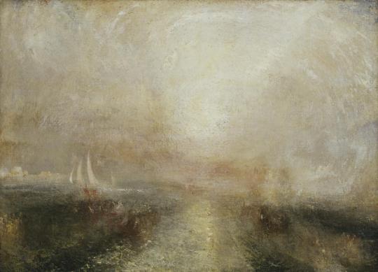
J. M. W. Turner – Yacht Approaching Coast, 1840
Turner painted this view c1840-5 and it was published by Penguin in December 1948. PR1.
In this painting the light in the sky and on the sea dazzles the viewer, obscuring the scene. This visual effect echoes the progress of Turner’s own work on the painting as he returned to areas of the canvas over a period of several years, covering the original subject. Dark shapes that appear through the layers suggest boats, while the buildings on the left have not been definitively identified but may represent Venice. By reworking the canvas, Turner has created less tangible subjects – those of light and colour themselves.
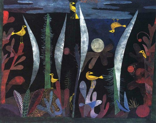
Paul Klee – Landscape with Yellow Birds, 1923
It was published by Penguin in December 1948 PR2
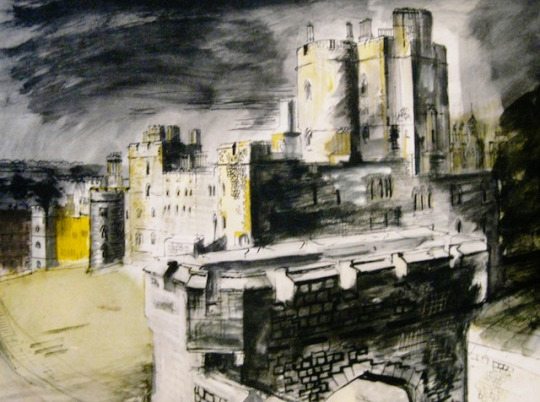
John Piper – View of Windsor Castle, 1940
The John Piper painting was originally made in 1940-41. It was published in 1948. PR3. A blog post about his work at Windsor can be found here.
Pablo Picasso – Le Chardonneret, 1936
This print is from Picasso’s series of illustrations for Buffon’s Natural History. The drawings were made in 1936, and that book was published in 1942. The Penguin print is from December 1948. PR4
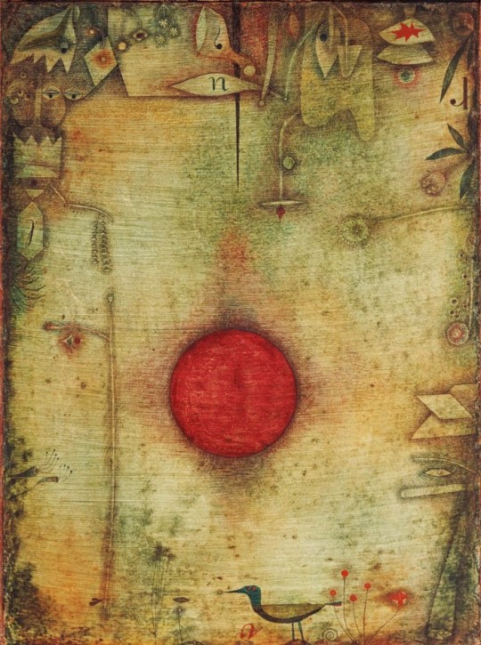
Paul Klee – Ad Marginem, 1930
Ad Marginem was painted in 1930. It was published by Penguin in May 1951.
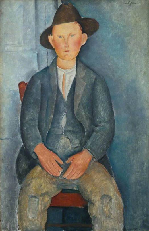
Amedeo Modigliani – Le Petit Paysan, 1918
Amedeo Modigliani – Le Petit Paysan was published as a Penguin Print in 1950.

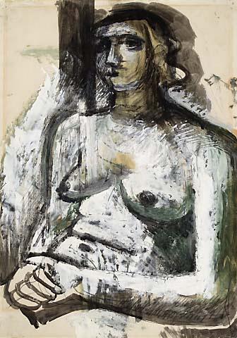
Henry Moore – Family Group, 1944
This work from 1944 looks at Henry Moore’s work earlier in the Second World War of Shelter Drawings, it is visually similar to those drawings and a sculpture he made on the theme. Towards the end of the war Moore made many drawings and sculptures of the family group.
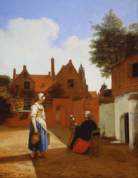
Pieter de Hooch – Courtyard in Delft at Evening- a Woman Spinning, 1656
A curiously odd picture to choose I think as it has nothing that is truly compelling to me about it. The scene is dull, the woman a little surreal but the maid with water jug looks repressed. It’s a sad image.
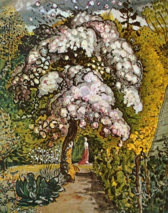
Samuel Palmer – Garden in Shoreham, c1830
An older picture here with Garden in Shoreham but it was part of the revival of interest in Samuel Palmer and his work. Both William Blake and Samuel Palmer were enjoying retrospectives at this point in time.
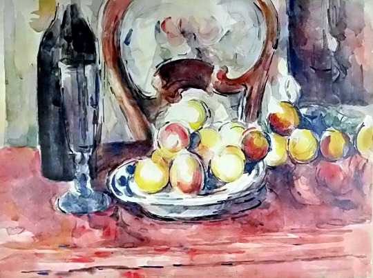
Paul Cézanne – Still Life: Apples, Bottle and Chairback. 1902-1906
One of the looser Cezanne pictures and not an oil like many of his Apple paintings. It is a lovely vibrant still life.
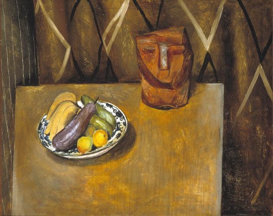
Matthew Smith – Still Life with Clay Figure, I, 1939
The Still Life with Clay figure was part of a series of works Smith made in the same studio space, all rather different to each other. This was the final Penguin print before they abandoned the scheme in 1952.
John Armstrong – Coggeshall Church, Essex, 1940 – Tate – Not on Display
When most people think of artists and where they paint – they think of St
Ives, Cornwall. The new Tate gallery there and its controversial Stirling Prize nominated extension have been both a help and hindrance to locals, but maybe not the 24% of those in St Ives who are Second Home owners †. The same could be said for Margate and the Bilbao effect from the Turner Contemporary Tate Gallery there. The Tate has pushed tourist through Margate’s streets like air into lungs. In the East of England is where many of the country’s best loved artists lived, but sadly the East of England is rather poor when it comes to showing off their artists – so why not a branch of the Tate in Aldeburgh or Southwold or Colchester?
John Constable – Stoke-by-Nayland, 1811 – Tate – Not on Display
The famous East Anglian artists of old are John Crome, Thomas Gainsborough and John Constable. Crome was the most famous of the Norwich School of painters who were inspired by painters like Jacob van Ruisdael and the Dutch style. They painted the vast waterways, windmills and dykes of the fenland and Norfolk Broads. Crome also had many talented pupils. John Sell Cotman, one of the country’s best watercolour artists, was also part of this brew.
Alfred Munnings – From My Bedroom Window, 1930 – Tate, Not on Display
John Constable painted the Dedham Vale in Suffolk and, most famously, Flatford Mill. A brisk walk away is the Museum and former home of Alfred Munnings. Also in Dedham was the original home of Cedric Morris’s East Anglian School of Painting and Drawing, but when it burnt down (John Nash told Ronald Blythe ‡) Munnings drove around the village like Mr Toad shouting ‘Down with modern art’. Cedric Morris then bought Benton End from Alfred Sainsbury in 1939 and continued his art school with his life partner, Arthur Lett-Haines. Lucien Freud, Maggi Hambling, Lucy Harwood, Valerie Thornton and Olive Cook all studied there.
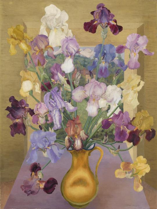
Cedric Morris – Iris Seedlings, 1943 – Tate – Not on Display
In 1940 after his London home suffered bomb damage, the sculptor Henry Moore made his home in Perry Green, just south of Much Hadham. It is now a museum with a collection of his works in the grounds. Moore walked around the local fields picking up pieces of flint thrown aside from ploughing and in his studio he would draw them as pre-made organic sculpture. Moore called them his ‘library of natural forms’ and they would inspire his larger works.
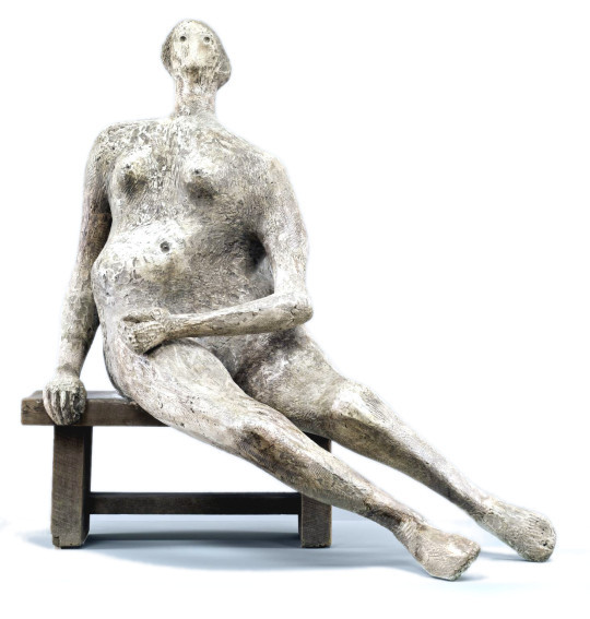
Henry Moore – Seated Woman, 1957 – Tate – Not On Display
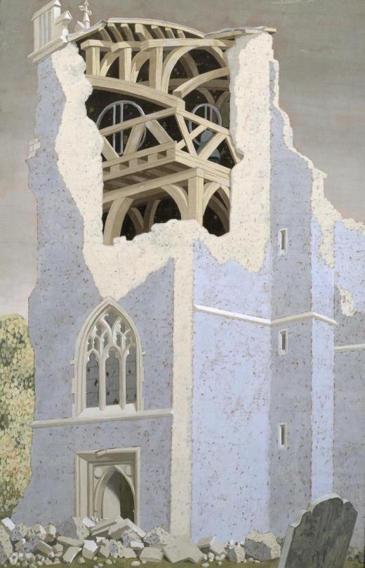
John Piper in the 80s made a beautiful series of ruined churches of East Anglia. In 1934, at Ivon Hitchens cottage in Sizewell, Suffolk, Piper met his wife Myfanwy Evens. They married in 1937. Myfanwy worked with Benjamin Britten writing lyrics to his operas including Death in Venice. Britten lived in Aldeburgh with his partner Peter Pears. Piper would design many of the stage sets.
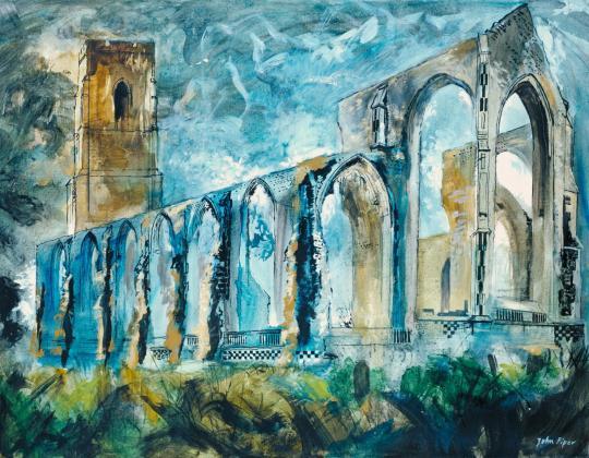
John Piper – Covehithe Church, 1983 – Tate – Not On Display
On the other side of Colchester in 1944, war artist John Nash was restoring the Elizabethan Bottengoms Farm, moving in with his wife Christine Kühlenthal. Christine had studied at the Slade school of art alongside Dora Carrington, Mark Gertler and she worked at the Omega Workshops while John had become famous for his monumental paintings of the First World War alongside his brother Paul. At Bottengoms, John became famous for his landscape paintings and botanical studies. He taught at Colchester School of Art with Richard ‘Dickie’ Chopping, an artist known for his dust jackets for Ian Fleming’s James Bond series. Dickie lived with his lover, another landscape painter, Denis Wirth-Miller. Their life with Francis Bacon has been expertly documented in Jon Lys Turner’s ‘The Visitors’ Book’. Bacon owned a home in Wivenhoe as did Dickie and Denis.
John Nash – Mill Building, Boxted, 1962 – Tate – Not On Display
Also on the staff at Colchester was John o’Connor, a wood-engraver and landscape painter. He was once the pupil of both Edward Bawden and Eric Ravilious at the Royal College of Art. Bawden and Ravilious where renting part of Brick House in Great Bardfield, Essex, when Ravilious moved a few miles away to Castle Hedingham with his painter wife Tirzah. Bawden and his Leach Pottery student wife Charlotte bought Brick House. Both men became war artists and only Bawden returned from the conflict after painting the early war, including Dunkirk. He was also shipwrecked off the coast of Africa, rescued and imprisoned by Vichy French forces, liberated by the Americans and then off again to paint the campaigns in Africa and Iraq. Eric died in 1942 when the aircraft he was in was lost off Iceland. Ravilious used the Essex area profusely in his short life there in
wood-engravings and watercolours.
Eric Ravilious – Tiger Moth, 1942 – Tate – Not on Display
Around the village of Great Bardfield, Bawden was joined by John Aldridge (a landscape painter), Walter Hoyle (one of Bawden’s students who helped Bawden on work at the Festival of Britain) and Michael Rothenstein (the pioneer printmaker and brother to the Director of the Tate Gallery). Other artists in the village were George Chapman, Bernard Cheese, Stanley Clifford-Smith, Audrey Cruddas, Sheila Robinson and Kenneth Rowntree.
John Aldridge – Head and Fruit, 1930 – Tate – Not on Display
In the small hamlet of Landermere – on the coastland of Essex – lived Adrian and Karin Stephen with their daughter Judith. Adrian was the younger brother of Virginia Wolfe and Vanessa Bell. After her parents death Judith lived on in their house with her husband and Independent Group member, Nigel Henderson. Also in Landermere they were joined by Eduardo Paolozzi who owned one of the cottages and set up Hammer Prints Limited, a company for printing limited edition works and designing abstract home wares such as wallpapers and tiles. Neighbours in the hamlet were architect Basil Spence and Festival of Britain artist and Coventry Cathedral glass engraver, John Hutton, as well as his son, children’s book illustrator Warwick.
Eduardo Paolozzi – Cyclops, 1957 – Tate – Not on Display
The Stephens were not the only Bloomsbury members to be in the East. David Garnett, his lover Duncan Grant, and Grants wife Vanessa Bell were all staying at Wissett Lodge, Suffolk in the summer of 1916 as conscientious objectors, working on a farm, though Vanessa is the one who got the most painting done.
With the boom in British publishing many of these artists enjoyed illustration commissions, from the cookery books of Ravilious and Bawden to poetry books decorated by John Piper and gardening books illustrated by John Nash.
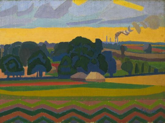
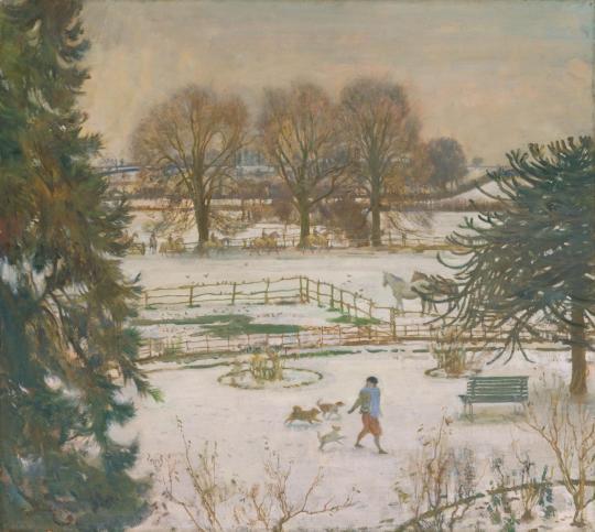
Spencer Gore – The Beanfield, Letchworth, 1912 – Tate – Not On Display
Naturally there are names left out but there are too many artists to list. But why are they so poorly represented in the region? In the East there is the Sainsbury Centre for Visual Arts and Kettles Yard but neither of these galleries aim to promote the work of East Anglian artists, but rather the international collections of the Sainsbury family and Jim Ede. They both do a lot of good for the local economy but it’s not the same as championing the area’s artists.
The nearest to it is the Fry Art Gallery in Saffron Walden, but their manifesto only lets them collect work from artists who have lived in North West part of Essex. But for all of Bedfordshire, Cambridgeshire, Essex, Hertfordshire, Norfolk and Suffolk there should be a body to represent them.
There are so many other artists that could be liberated from the Tate and their archives and put on show to support and promote the region where they were created. At the time of publishing, all the artworks in this blog owned by the Tate were not on display.
† https://www.cornwalllive.com/news/cornwall-news/cornwall-second-homes-plague-revealed-1398388
‡ A Broad Canvas – Ian Collins 1999 – From the Foward by Ronald
Blythe, p6.
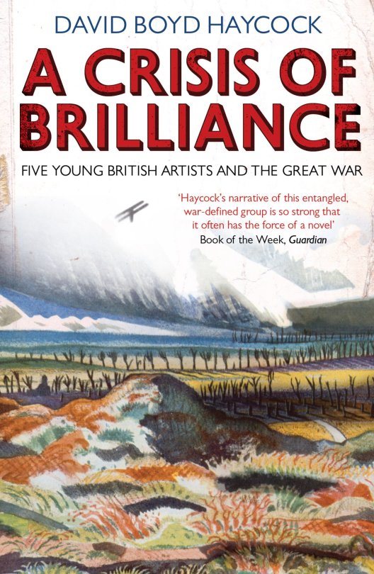
Last summer I was reading ‘A Crisis of Brilliance’ by David Boyd Haycock, it is a wonderful layer-cake of young artists lives as they study at the Slade School of Art on the eve of the First World War and a book I recommend to all to read.
Many of the artists featured are supported by a patron, Eddie Marsh, who not only bought their work but he entertained them and introduced them to people in society who would advance their careers.
Marsh was a strange and unique person. In his career as a civil servant he worked as Private Secretary to a succession of Great Britain’s most powerful ministers, particularly Winston Churchill.
He was the sponsor of the Georgian school of poets and a friend to many poets, including Rupert Brooke and Siegfried Sassoon. He was a discreet but influential figure within Britain’s homosexual community.
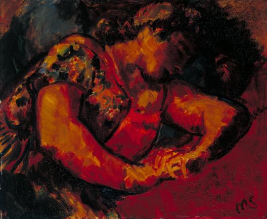
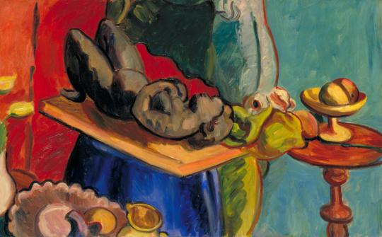
Matthew Smith – Woman Reclining, c.1925–6
Some of the money Marsh had to spend on art was the remainder of a family legacy from the death of his great-grandfather, Spencer Perceval in 1812, the only British prime minister to have been assassinated. Parliament voted to settle £50,000 on Perceval’s children (today it would be around 8 million), with additional annuities for his widow and eldest son. 100 years later and Marsh was using the money to buy art.
Although Spencer Perceval possessed six sons and six daughters, some portion of this grant drifted down to Eddie Marsh through his mother. He refused to use any of what he called ‘the murder money’ for his personal requirements; it was from this fund that he bought, with taste and knowledge, the collections with which he has now enriched the public. †
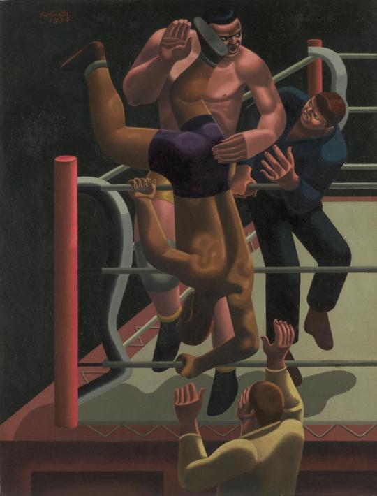
William Roberts – Sam Rabin vs Black Eagle, 1934
After Marsh’s death in 1953 his friends collected accounts of him and published a booklet, edited by Christopher Hassall and Denis Mathews. As it is long out of publication, I have typed up John Rothenstein’s piece on Marsh’s art collecting below. All the pictures in this post were owned by Marsh.
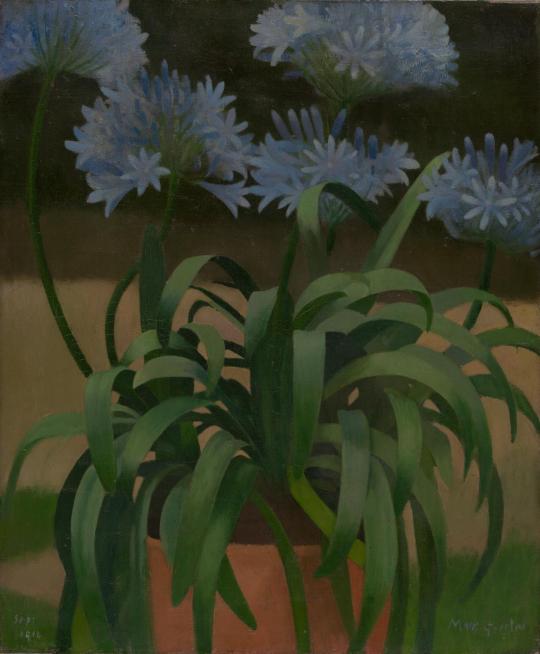
Mark Gertler – Agapanthus, 1914
John Rothenstein on Eddie Marsh
There is a serious disadvantage to an upbringing in an artist’s household. Paintings, drawings, sculpture are apt to be so ubiquitous that they may fail to excite. My father being a painter and also a collector, it seemed to me in my early years that works of art were for the most part little more than part of the furnishing of our house. It is true, however, that when I visited other houses and found dull pictures on the walls or none at all, I was aware of an almost piercing sense of bleakness. But when I first visited Eddie Marsh’s chambers at Gray’s Inn, it was with no sense of bleakness but with the consciousness of something amounting almost to a new experience that I looked at his pictures.
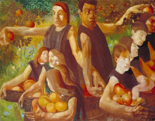
Stanley Spencer – Apple Gatherers, 1912-13
I had not come to look at his pictures; I don’t suppose I was aware that he possessed any. Like many other young men I had come, either shortly before or after leaving Oxford, to consult this benevolent oracle about the perplexing problem of how best to spend my life. I can’t recall any word of advice he gave; but I do recall, almost as clearly as though it were yesterday, the immediate fascination exercised by the pictures which hung, frame to frame, from floor to ceiling, covering every vertical space, not only of wall but of door, and, no less clearly, the kindness with which Eddie responded to the interest his pictures stirred in me. We looked at everything there was to see. And what things there were! Wilson’s Summit of Cader Idris (his bequest of which to the National Gallery, he said, lent an added pleasure to his visits there, that of choosing the place where his ghost would see it on the walls) and Blake’s Har and Heva batbing.
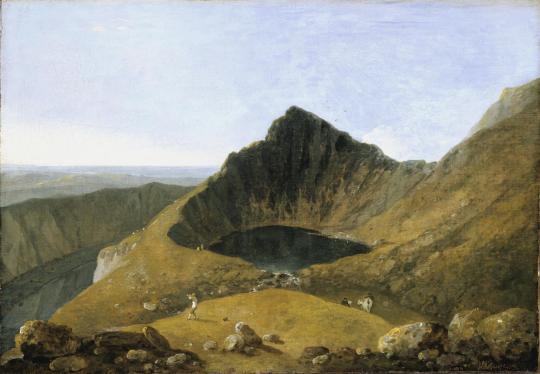
Richard Wilson – Cader Idris, 1774 (Exhibited)
But it was the contemporaries that gave me the sharpest and most pleasurable shock: the works of painters with whom I already had some acquaintance. There were the splendid Self Portrait and the The Apple-gathers by Stanley Spencer (an artist who had not yet held an exhibition), The Dancer: and Parrot Tulip’s by Duncan Grant, The Cornfeild by John Nash, a water-colour of tall trees by his brother Paul, and a lamp-lit bedroom by Gertler.
John Nash – The Cornfield, 1918
The spectacle of so many line examples of the work of an emerging generation of painters, displayed with such affectionate, admiring confidence strengthened the impression I had that there was a school of painting in England deserving of much more respect than most of my contemporaries were inclined to accord to it.
Henry Moore – Woman Seated with Hands Clasped, 1929
My visit was followed by several others, but it was not until many years later that I came to know him well, when I had the good fortune to be associated with him in the running of two institutions particularly dear to him: the Tate Gallery, of which he was a Trustee from 1937 until 1944 and Acting Chairman during 1940 and 1941, and the Contemporary Art Society, of which he was Chairman from 1937 until 1952.
Duncan Grant – Parrot Tulips, 1911
What made this association particularly delightful for those who had a part in it was Eddie’s attitude towards these two institutions. For him the Tate and the Contemporary Art Society were never primarily institutions at all; they were friends to be fought for, to be enriched by his generosity and, from time to.time, to be gently chided. And as such they responded to his friendship with gratitude and affection.
Duncan Grant – The Dancers, 1911
Eddie was not only loved at both the Tate and the Contemporary Art Society, but he reposed in them a special degree and quality of trust. He was capable of a catholicity of taste that at moments provoked his friends to wonder whether there was any work of art which he didn’t like. In his heart, however, he remained faithful to the artists the Spencer and the Nash brothers, Grant, Gertler, and their contemporaries who had first aroused in him the lust of possession.
Paul Nash – Elms, 1914
The works of later painters he often, as he confessed, ‘took great though often in efficacious pains to understand and enjoy’; yet he never expected art to be changeless, and he desired the Tate and the Contemporary Art Society to collect in accordance with their most imperative convictions, whether or not these happened to conform to his own.
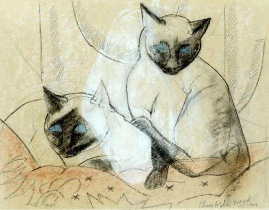
Christopher Wood – Siamese Cats, 1927
The last time I saw him, on is December 1952 at the last meeting of the Society’s Executive which he attended, it had been resolved, as a tribute to his unique services, to commission a portrait of him by Graham Sutherland.
A message from the artist was read out willingly accepting the commission but regretting that he could not undertake it until the autumn of 1953. In a voice that arrested by its intense melancholy Eddie exclaimed, ‘The sands are running out’. In the silence that followed could be read his friends’ mournful recognition that he had spoken the truth. Four weeks later he was dead.
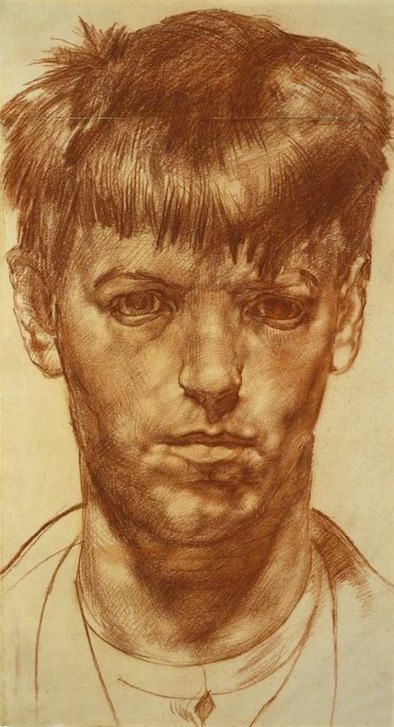
Stanley Spencer – Self Portrait, 1912
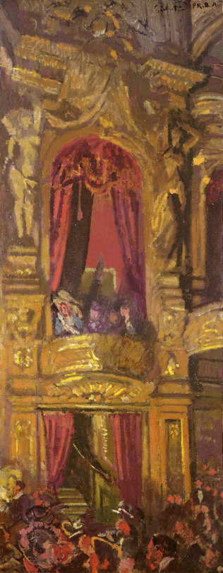
Walter Sickert – The New Bedford, 1915.
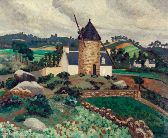
Cedric Morris – Breton Landscape,1927
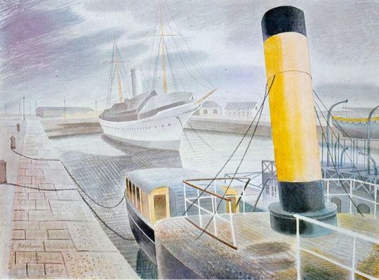
Eric Ravilious – The Yellow Funnel, 1938
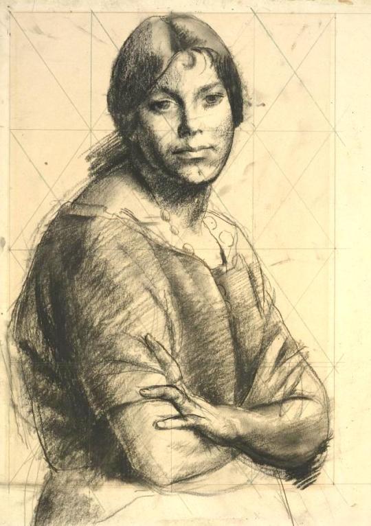
Walter Monnington – Study of a Woman, 1934
Eddie Marsh – Sketches for a composite literary portrait of Sir Edward Marsh, Lund Humphries, 1953
† Paintings and Drawings from the Sir Edward Marsh Collection, The Contemporary Art Society 1953
Even before the end of World War II, it was recognised that post-war economic reconstruction, manufacturing and international trade would require the acceptance of Britain as an industrial design and manufacturing source around the world. The pre-war Empire days of British dominance where nearing their end. In 1946, the British Council of Industrial Design held an exhibition called ‘Britain Can Make It.’
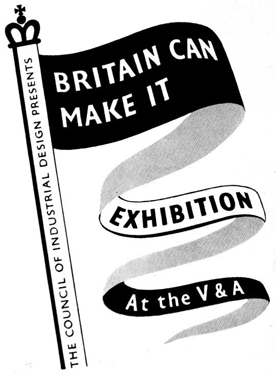
The exhibition was held from September to November at the Victoria and Albert Museum, London. Part of the reason for choosing this venue was that many of the museum’s main exhibits were still in their wartime evacuation storage, outside London. The venue was undamaged by bombing, empty and available, and itself in need of an attraction to restore its pre-war visitors.
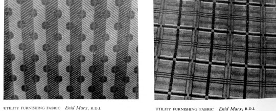
Despite severe cutbacks in production during World War II, the concept of ‘good’ design continued to be of importance and was supported by the Utility Scheme introduced in 1941. Enid Marx was a fabric designer for the scheme, as well as for companies like London Transport.
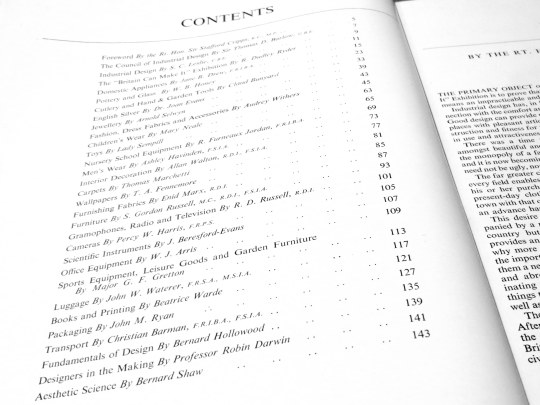
In the catalogue for the exhibition are essays on design by people like Robin Darwin, Gordon Russell and even George Bernard Shaw. I have copied the piece below from the exhibition catalogue as it is an incredibly rare item and the works and opinions of Enid Marx are also hard to find.
Furnishing Fabrics by Enid Marx
Well over a century has passed since the introduction of machinery revolutionised English textile manufacture and made mass production possible. Since then, technical processes have steadily improved; but it is only quite recently that we have begun to absorb machine-made goods into our aesthetic traditions. Up to now, manufacturers and salesmen have been so concerned with mechanical invention and the chemical problems of synthetic dyes, that all their energies and resources were devoted to these ends. Pattern and design were subordinated to pre-conceived notions of how best to display the elaborate possibilities of the latest mechanical device. Consequently, aesthetic development in English furnishing fabrics stood still for close on a hundred years.
At first sight, this statement may seem a gross exaggeration; but we have only to look at pattern books of early chintzes to realise how little has been done in textile printing in England since, say, 1860, which can compare aesthetically with these designs of the 18th and early 19th centuries. In weaving, too, the brocades and tapestries of this early period have never been surpassed for beauty of design, texture and colour. Imitations and adaptations of these early designs are still best sellers to-day-or, rather, were so before rationing made them unobtainable.
No one would deny that it is easier to achieve high aesthetic standards in hand-woven or printed textiles. All the slight irregularities inevitable in hand-made things enhance their interest and give them vitality. There are not nearly so many steps between the designer and the craftsman and each step is likely to add to, rather than detract from, the beauty of the final result. The converse is true of the mass-produced machine made woven or printed textile. Here each step needs to be carefully thought out at all stages of production if the designers true intentions are to be brought out.
Enid Marx – Spot and Stripe – Morton Sundour Fabrics Limited, for Utility Furnishings.
In England before, and in the early days of the industrial revolution, we had a fine tradition of textile design; the drawing was sensitive, the colours subtle and well used, the textures of the fabrics interesting and of excellent quality. About the time of the Great Exhibition of 1851 we notice a rapid decline in aesthetic standards, and not until the present day has this downward trend begun to reverse itself. Space forbids any attempt to analyse the reasons for this long spell of ugliness, which was by no means confined to England; there are many contributory factors. But one point needs stressing. The decline was not, as is so often stated, due to the use of machinery in itself, but rather to the way in which the machine was used.
William Morris, horrified at the prevailing ugliness, revolted against the machine. How much better if, instead, he had revolted against its misuse and directed his delight in good craftsmanship towards improving machine-made mass production. In looking at his designs for hand block printed textiles we are struck by the way he himself succumbed to the very environment against which he was revolting; they have just that mechanical and wooden quality for which he blamed the machine. It is indeed strange that Morris, with his abounding vitality, should have produced textile designs so lacking in it, in spite of his fine sense of spacing, tone values and the beautiful colours he got through reverting to the old vegetable dyes. Nevertheless that Morris should have had so great an influence on design abroad as well as at home shows how great was the popular demand for an aesthetic revival of the influence of the artist-craftsman.
The vegetable dyes, reintroduced by Morris, have a quality and depth of tone which gives them a richness rarely obtainable with synthetic dyes; though vegetable dyes are incomparably less fast to light. Even today, synthetic dyes tend to be harsh and brittle in colour. Though they can give great brilliance, especially on rayon, this does not make up for their lack of depth. Probably this is because their development has mostly lain in the hands of the chemists who have been fully occupied with the problems of providing colour fastness for the different dying and printing groups, as also for the new yarns and combinations of yarns that are constantly being introduced. We may notice that in France, where standards of fastness are perhaps less high than here, the range of colours used is much more subtle. Our problem is to make our colours as beautiful as they are durable.
After the first world war, new materials of all kinds came on to the market, as they are about to do again. This had a stimulating effect on textile design. To take one example, the development of laminated woods, with their grained surfaces, for furniture helped to revive interest in the textures of furnishing fabrics. Spinning is the clue to woven stuffs; indeed the spinning jenny was one of the first steps on the road to mass production in the late 18th century. With the new interest in textures in the early nineteen twenties, the more enterprising manufacturers began to study the effects obtained by the hand loom weavers using hand-spun yarns. The new interest in, and experiments with, textures started on the Continent, in Germany, Austria and Sweden especially. Our English manufacturers were slower off the mark, a contributory reason being, no doubt, that we had to make a more radical change in outlook; the English textile industry had been built up during the previous century on the basis of supplying world-wide markets, but now, faced with the growth of native textile industries supported by tariffs in foreign countries, and the competition of cheap labour, we had to think increasingly in terms of quality. The so-called ”folk weaves”, though at first a poor imitation of the hand-woven prototype, and, in the early stages, of poor quality, at least introduced the idea of textural variety for furnishing fabrics. Later there followed cotton and linen tweeds, and other rough surface effects, of a more successful nature.
England has, of course, a very long tradition of craftsmanship in weaving. The design of printed textiles responded more slowly to new ideas, than woven ones. The world slump accentuated the problem of printed textiles, namely that the cost of setting up and running an elaborate roller printing machine, with say sixteen colours, requires a very large output for one design, which in turn makes experiments in design costly. But already in the early twenties a number of artists in England had become interested in designing and printing textiles, at first by the hand block method. They achieved considerable success with the decorators and the public. The very simplicity of the means by which they obtained their effects, and the freshness and vitality of their well-drawn designs appealed to the public. Some artists also combined together to design and market screen-printed textiles. Screen printing, being quicker than hand-block printing, was a step towards mass production. It was also adopted by our more enterprising manufacturers as a means of mass production without the heavy initial outlay of roller printing, which therefore made it possible for them to be more venturesome with new designs.
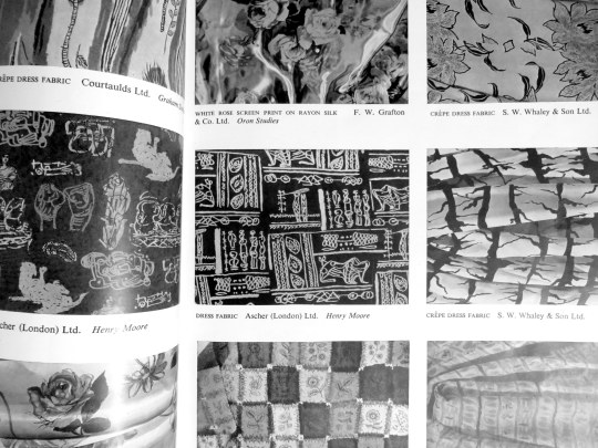
Page from the ‘Britain Can Make It’ exhibition catalogue with designs by Henry Moore and Graham Sutherland.
Hitherto artists had been shy of designing for manufacturers, as they found their designs tended to be changed beyond recognition in the process of manufacture, losing all their individuality. But manufacturers began increasingly to realise the value of artists in bringing in fresh ideas. At last they were prepared to co-operate with the artist in endeavouring to make the final product approximate as closely as possible to the artists original conception, rather than, as hitherto, disregarding the finer points of the design for convenience in production. Such co-operation involves encouraging the artist to work closely with the technical staff. This co-operation has given a much wider range and variety to mass production and appears to be the great hope for the future. Indeed there are many signs that we are standing on the threshold of a great renaissance in English textile design, once the present shortages have been relieved.
This post is about the 1967 gift of Henry Moore’s works to the Tate and how it never came to be. But more so, it’s about a public statement against that donation by 41 of his peers; people like Elisabeth Frink, Patrick Caulfield, Derek Boshier, Eduardo Paolozzi and Joe Tilson to name a few.
Henry Moore – Three Fates, 1941
Having been a student at the Royal College of Art from 1921 to 1924, his first major breakthrough was as part of the Seven and Five Society. The society was set up in the 1920s, mostly for painters, but in the 30s they expanded and the new members bought a more abstract stance with them. The newer members where John Piper, Barbara Hepworth, Henry Moore and John Skeaping.
In the 40s Moore’s London Underground ‘shelter scenes’ presented his work with a human and sensitive side. From then on, a massive bulk of sculpture, drawings, paintings and books forged Moore as a great British artist.
Moore was looking how to cement his legacy as an artist. He was on, what anyone would have assumed was the peak of his forty year career.
Henry Moore – Three Piece Reclining Figure No.2: Bridge Prop
On 27th February 1967, The Times’s front page hailed news that Henry Moore intended to donate many of his works to the Tate Gallery, London.
He had enjoyed a long association with the Tate, not least as trustee, and the idea of a gift was first mooted in 1964. In 1967 he made it conditional on an extension of the Tate’s galleries. †
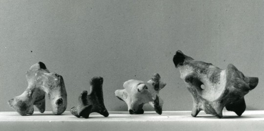
Flint stones in Henry Moore’s studio
The gift would have required the Tate to build a new wing to house the works. The cost to house the collection was rumoured to have been half a million British Pounds in 1967. In the weeks and months after the announcement, negotiations where held about how to raise the money, meanwhile, 41 artists wrote a letter to The Times to protest the new works, two of them, Moore’s own students.
The letter featured the phrase they all feared would happen if the works were housed: ‘publicly financed form of permanent enshrinement’ ‡.
‘Contemporary artists close to the Tape expressed their concern over so much space and funding going toward the celebration of one artist alone’ ♠.
Times 26 May 1967
HENRY MOORE’S GIFT
From Mr. Craigie Aitchison and othersSir. – References have been made in the press and in public during the last few weeks concerning the offer made by Henry Moore to the Tate of between 20 and 30 major works. We understand that the Government will be giving £200,000, and that the Tate will be raising an equivalent sum specifically towards housing these works.
We must not lose sight of the fact that this £400,000, probably only a starting figure, is public money: and considering how public this whole matter should be there has been little precise information available. What can be deduced should be viewed with concern.
We may assume that at least half the gift will be large works. These alone properly displayed would require a space twice the size of the present sculpture hall. Even if the permanent display of these pieces is not envisaged the question of storage is equally crucial.
There are great priorities confronting public patronage of the arts. The Tate has only limited space into which to expand and in which to fulfil its role as the only permanent manifestation of a living culture. London has failed so far to provide itself with museum facilities commensurate with its importance as an art centre and it will not achieve its proper place as an organic part of our world by devoting itself so massively to the work of a single artist.
Whoever is picked out for this exceptional place will necessarily seem to represent the triumph of modern art in our society. The radical nature of art in the twentieth century is inconsistent with the notion of an heroic and monumental role for the artist and any attempt to predetermine greatness for an individual in a publicly financed form of permanent enshrinement is a move we as artists repudiate.
Yours faithfully,
CRAIGIE AITCHISON, DAVID ANNESLEY, GILLIAN AYRES, ANTHONY BENJAMIN, DEREK BOSHIER, ANTHONY CARO, PATRICK CAULFIELD, BERNARD COHEN, HAROLD COHEN, GARTH EVANS, SHEILA FELL, ELISABETH FRINK, PATRICK GEORGE, ANTHONY HILL, HOWARD HODGKIN, MALCOLM HUGHES, GWYTHER IRWIN, TESS JARAY, ALLAN JONES, MICHAEL KIDNER, PHILLIP KING, JOHN LATHAM, FRANCIS MORLAND, HENRY MUNDY, MYLES MURPHY, EDUARDO PAOLOZZI, JOHN PLUMB, TIM SCOTT, PETER SEDGLEY, PETER SNOW, PETER STARTUP, JOE TILSON, WILLIAM TUCKER, EUAN UGLOW, MARC VAUX, BRIAN WALL, GILLIAN WISE, ANTHONY WISHAW, BRIAN YOUNG. ‡
The works would end up going to Toronto with the art gallery there proposing to build a wing for the works and reassuring Moore with architect letters and funding plans on how they would present the collection. The galleries campaign to get the works was lead by Allan Ross, the former president of WM.Wrigley chewing gum. He stated he would donate $500,000 towards a gallery for Henry Moore in Toronto.
Ross wrote: ‘It occurred to me that we of Toronto, and Ontario, and Canada, should build a splendid classical structure to adequately house the collection you have in mind for Tate Gallery and which they for some years apparently cannot accommodate’. ♠
The Henry Moore Gallery in Toronto.
† Henry Moore by Chris Stephens, 2010. p14 9781854378767
‡ ‘Henry Moore’s Gift’, in Times 26 May 1967, in Henry Moore: Sculptural Process and Public Identity, Tate Research Publication, 2015.
♠ Sculpture and the Museum by Christopher R. Marshall, 2011. p79-80 9781409409106
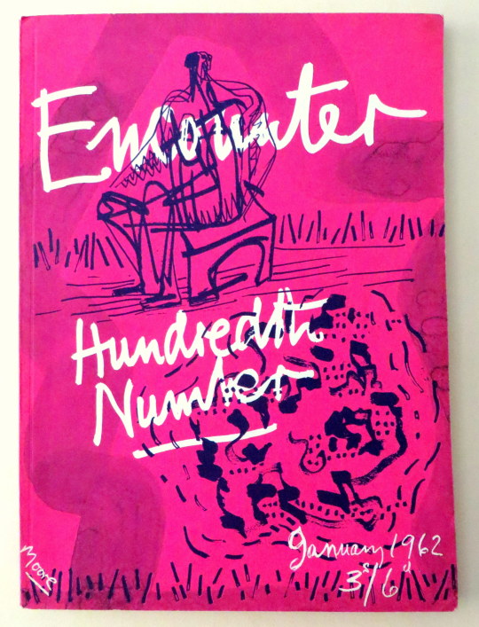
Following my post on Henry Moore’s cover for Poetry London, here is another cover Moore did, this time for Stephen Spender’s Encounter Magazine – The 100th Edition. As a magazine cover I think this rather futuristic for 1962. Pink with blue ink over and a wax resist for the text. Sadly this isn’t worth as much as Poetry London – it’s not lithographically printed for one, also Encounter had a larger audience and thus a bigger print run.
The magazine is full of illustrations and poetry, in this post I have picked out Auden and Spender’s poems below with some of the illustrations.
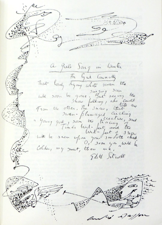
A drawing by Andre Masson
A Change of Air by W.H.Auden
Corns, heartburn, sinus headaches, such minor ailments
Tell of estrangement between your name and you,
Advise a change of air: heed them, but let
The modesty of their discomfort warn you
Against the flashy errands of your dreams.
To grow a sailor’s beard, don monkish garb,
Or trade in an agglutinative tongue
With a stone-age culture would be mollycoddling:
To go elsewhere is to withdraw from movement;
A side-step, a short one, will convey you thither.
Although its chaffinches, maybe, have learned
The dialect of another river-basin,
A fault transformed the local building stone,
It has a priest, a post-mistress, an usher,
Its children know they are not to beg from strangers.
Within its average elsewherishness
Your name is as a mirror answers, yourself
How you behave in shops, the tips you give :
It sides with neither, being outside both,
But welcomes both with healing disregard.
Nor, when you both return (you will, of course)
Where luck and instinct originally brought you,
Will it salute your reconciliation
With farewell rites or populate your absence
With reverent and irreverent anecdote.
No study of your public re-appearance
Will show, as judgement on a cure demands,
A sudden change in love, ideas or diet :
Your sojourn elsewhere will remain wordless
Hiatus in your voluble biography.
Fanatic scholarship at most may prove
That you resigned from a Committee, unearth
A letter from the Grand Duke to his cousin,
Remarking, among more important gossip,
That you seem less amusing than you were.
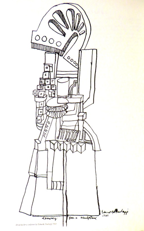
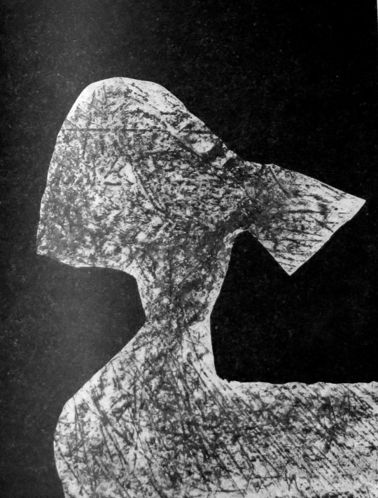
A drawing by Eduardo Paolozzi
The Generous Days by Stephen Spender.
His are the generous days that balance
Soul and body. Should he hear the trumpet
Behind the sun that sends its thinning ray
Penetrating to the marrow –
At once one with that cause, he’d throw
Himself across some high far parapet,
Body die to soul down the sheer way
Of consummation in the summons.
His also are the days when should he greet
Her who goes walking, looking for a brooch
Under broad leaves at dusk beside the path
– And sidelong looks at him as though she thought
His smile might hide the gleam she sought –
He would run up to her and each
Find the lost clasp hid in them both,
Soul live to body where they meet.
Body soul, soul body, seem one breath,
Or the twined shadows of the sun, his will,
In these his generous days, to prove
His own true nature only is to give.
Wholly to die, or wholly else to live!
Body to soul, and let the bright cause kill,
Or soul to body, let the blood make love.
Giving is death in life and life in death.
After, of course, will come a time not this
When he’ll be taken, stripped, strapped to a wheel
That is a world, and has the power to change
The brooch’s gold, the trumpet scarlet blaze
– The lightning in the bones those generous days –
Into what drives a system, like a fuel.
Then to himself he will seem loathed and strange
Have thoughts yet colder than the thing he is.
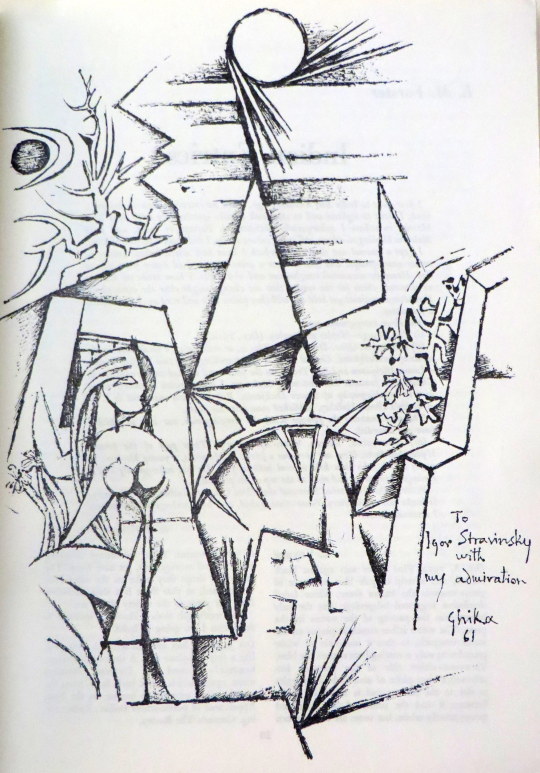
A drawing by Ghika
A drawing by Sidney Nolan
An advert for Guinness by Edward Bawden to the left
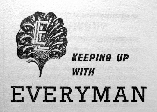
An advert for the Everyman series with the logo, designed by Eric Ravilious
After buying the etching below and looking up the artist and location, it struck me how the uncovering and preservation of British ancient monuments in the twentieth century, together with the age of motoring bought artists to translate these places into art.
Chalk Men:
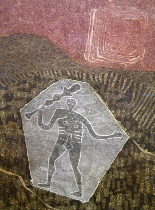
John Grigsby – Cerne Giant
Cerne Abbas is a parish just about eight miles north from Dorchester, in Dorset, England, where, as in the etching above, a human figure has been cut into the chalk hillside. The figure, generally referred to as a giant, is the outline of an ithyphallic man carrying a club in his right hand. At about 55 metres high and 51 metres wide it dominates the valley below. Above the Giant is another landmark, the Iron Age earthwork known as the “Trendle” or “Frying Pan”. The carvings are formed by outlines cut into the turf about 2ft deep, and filled with crushed chalk. The construction of the Wilmington Giant is much the same.
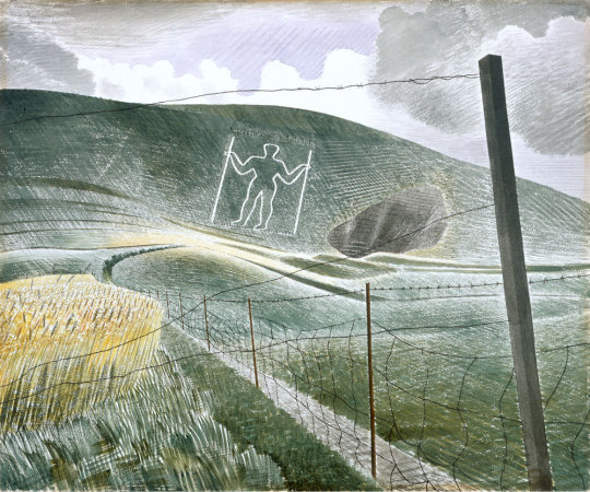
Eric Ravilious – Wilmington Giant, 1939.
“The Long Man of Wilmington and the very phallic Cerne Abbas Giant are of unknown age and controversy still rages over the date of the latter in particular”. †
The Ravilious painting is a watercolour using white resist makes the Giant Glow out from the paper’s natural colour, as do his cross-hatched, almost engraver brush-strokes of differing tones of colour.
Stonehenge:
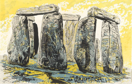
Gertrude Hermes – Stonehenge, 1959.
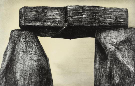
Henry Moore – Stonehenge, 1973
Above two sculptors draw and engrave their perception of Stonehenge. Archaeologists believe Stonehenge was constructed from 3000 BC to 2000 BC. The surrounding circular earth bank and ditch, which constitute the earliest phase of the monument, have been dated to about 3100 BC. Unlike the chalk men, there have been writings of Stonehenge from most of recorded time. The earliest record of the chalk giants is from the 17th century.
Moore on Stonehenge: I began the Stonehenge series with etching in mind, but as I looked at, and drew, and thought about Stonehenge, I found that what interested me most was not its history, nor its original purpose – whether chronological or religious – or even its architectural arrangement, but its present-day appearance. I was above all excited by the monumental power and stoniness of the massive man-worked blocks and by the effect of time on them. Some 4000 years of weathering has produced an extraordinary variety of interesting textures. ‡
Avebury:
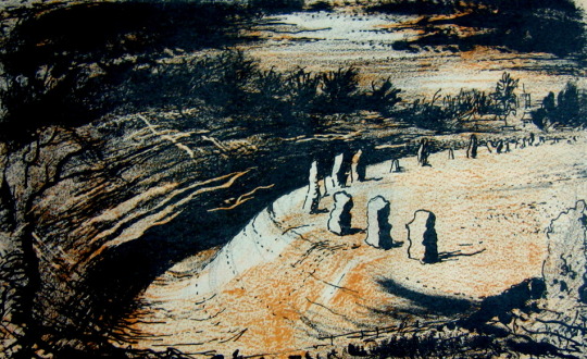
John Piper – Avebury, 1944
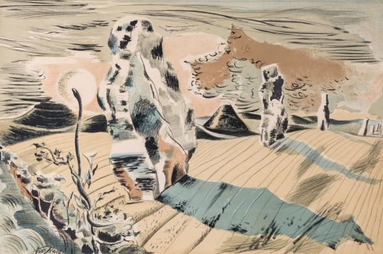
Paul Nash – Landscape of the Megaliths, 1937
Above are both the avenue and the stone circle of Avebury painted in different styles by both Nash and Piper. John Piper’s image was for a book on Romantic British Poetry and he is making use of limited use of colours in the printing process of the book to make the dark-to-light drama washed with umbers. Nash’s lithograph is one of his less surreal of this working time period, unlike the image below where Nash project’s his own vision for modern monoliths. They maybe hay-bails or car grills but these are, to Nash, the monoliths of today.
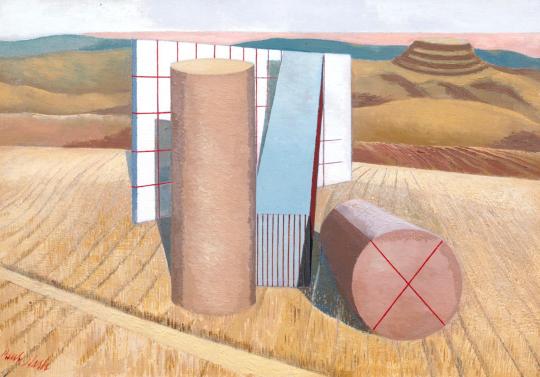
Paul Nash – Equivalents for the Megaliths, 1935.
With Nash it’s best to use his own words about why he came to paint ‘Equivalents for the Megaliths’
These groups (at Avebury) are impressive as forms opposed to their
surroundings both by virtue of their actual composition of lines and masses and planes, directions and volumes; and in the irrational sense, their suggestion of a super-reality. They are dramatic also, however, as symbols of their antiquity, as hallowed remnants of an almost unknown civilisation.In designing the picture, I wished to avoid the very powerful influence of the antiquarian suggestion, and to insist only upon the dramatic qualities of a composition of shapes equivalent to the prone or upright stones simply as upright or prone, or leaning masses, grouped together in a scene of open fields and hills. – Paul Nash – Letter to Lance Sieveking. May 1937.
† The Cambridge Illustrated History of Prehistoric Art. p116 9780521454735
Paul Nash Places. 9781853320460
‡ Henry Moore. Writings and Conversations. p299 978-0520231610