Furnishing Fabrics by Enid Marx

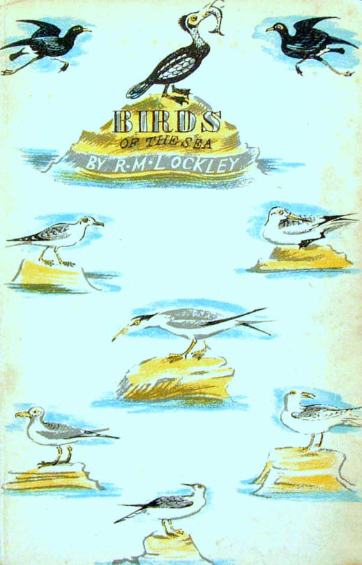
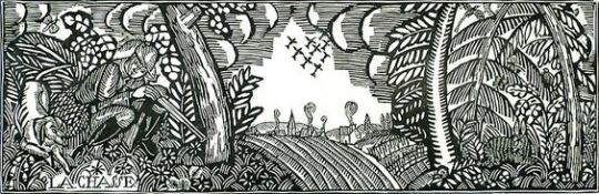
Even before the end of World War II, it was recognised that post-war economic reconstruction, manufacturing and international trade would require the acceptance of Britain as an industrial design and manufacturing source around the world. The pre-war Empire days of British dominance where nearing their end. In 1946, the British Council of Industrial Design held an exhibition called ‘Britain Can Make It.’

image

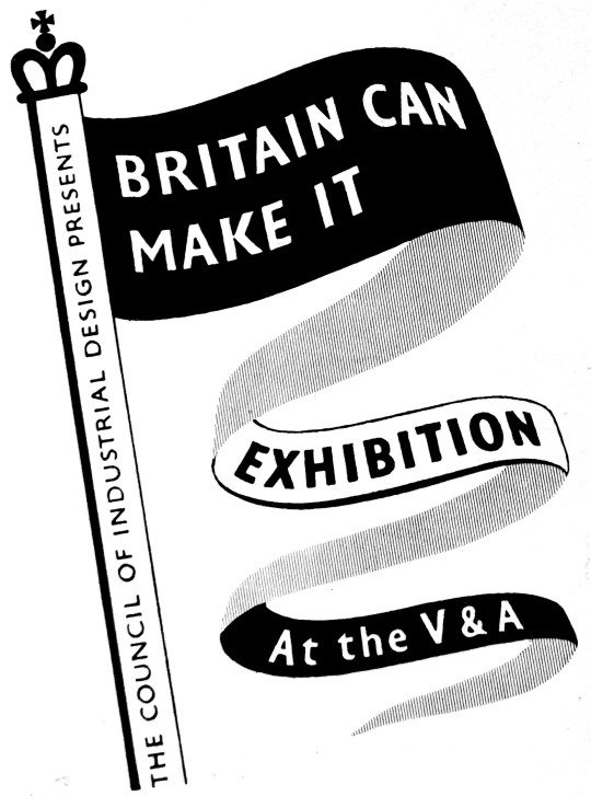
The exhibition was held from September to November at the Victoria and Albert Museum, London. Part of the reason for choosing this venue was that many of the museum’s main exhibits were still in their wartime evacuation storage, outside London. The venue was undamaged by bombing, empty and available, and itself in need of an attraction to restore its pre-war visitors.

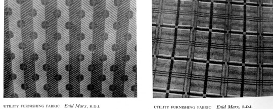
Despite severe cutbacks in production during World War II, the concept of ‘good’ design continued to be of importance and was supported by the Utility Scheme introduced in 1941. Enid Marx was a fabric designer for the scheme, as well as for companies like London Transport.

In the catalogue for the exhibition are essays on design by people like Robin Darwin, Gordon Russell and even George Bernard Shaw. I have copied the piece below from the exhibition catalogue as it is an incredibly rare item and the works and opinions of Enid Marx are also hard to find.

image

Furnishing Fabrics by Enid Marx

Well over a century has passed since the introduction of machinery revolutionised English textile manufacture and made mass production possible. Since then, technical processes have steadily improved; but it is only quite recently that we have begun to absorb machine-made goods into our aesthetic traditions. Up to now, manufacturers and salesmen have been so concerned with mechanical invention and the chemical problems of synthetic dyes, that all their energies and resources were devoted to these ends. Pattern and design were subordinated to pre-conceived notions of how best to display the elaborate possibilities of the latest mechanical device. Consequently, aesthetic development in English furnishing fabrics stood still for close on a hundred years.

At first sight, this statement may seem a gross exaggeration; but we have only to look at pattern books of early chintzes to realise how little has been done in textile printing in England since, say, 1860, which can compare aesthetically with these designs of the 18th and early 19th centuries. In weaving, too, the brocades and tapestries of this early period have never been surpassed for beauty of design, texture and colour. Imitations and adaptations of these early designs are still best sellers to-day-or, rather, were so before rationing made them unobtainable.

image

No one would deny that it is easier to achieve high aesthetic standards in hand-woven or printed textiles. All the slight irregularities inevitable in hand-made things enhance their interest and give them vitality. There are not nearly so many steps between the designer and the craftsman and each step is likely to add to, rather than detract from, the beauty of the final result. The converse is true of the mass-produced machine made woven or printed textile. Here each step needs to be carefully thought out at all stages of production if the designers true intentions are to be brought out.

image

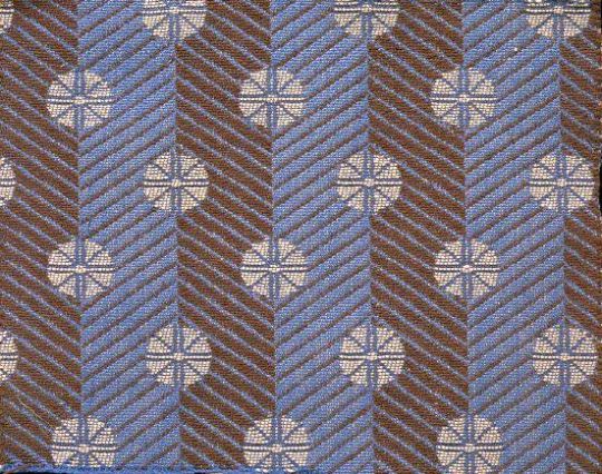
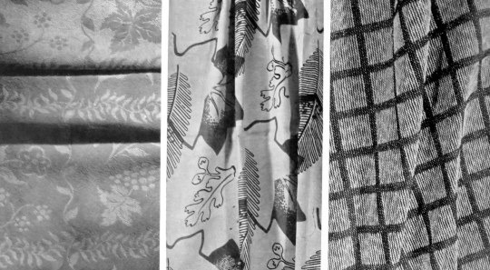
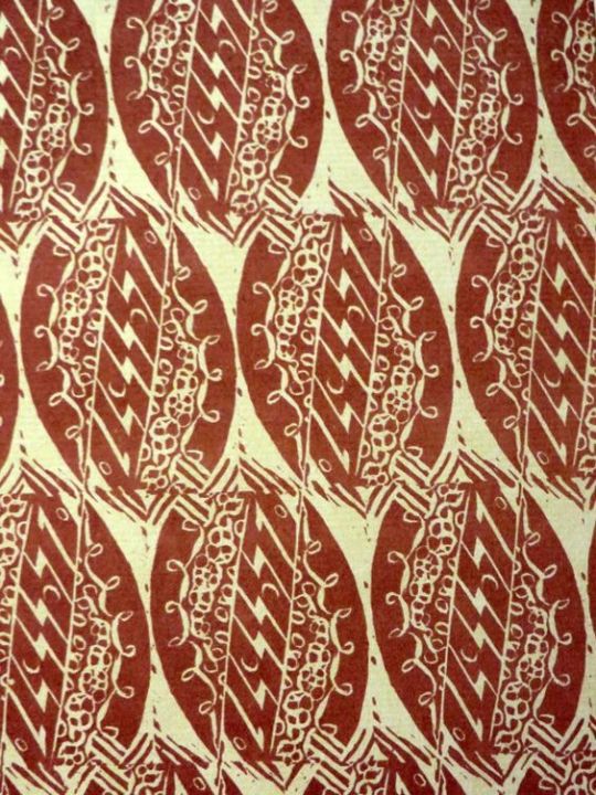
 Enid Marx – Spot and Stripe – Morton Sundour Fabrics Limited, for Utility Furnishings.

In England before, and in the early days of the industrial revolution, we had a fine tradition of textile design; the drawing was sensitive, the colours subtle and well used, the textures of the fabrics interesting and of excellent quality. About the time of the Great Exhibition of 1851 we notice a rapid decline in aesthetic standards, and not until the present day has this downward trend begun to reverse itself. Space forbids any attempt to analyse the reasons for this long spell of ugliness, which was by no means confined to England; there are many contributory factors. But one point needs stressing. The decline was not, as is so often stated, due to the use of machinery in itself, but rather to the way in which the machine was used.

William Morris, horrified at the prevailing ugliness, revolted against the machine. How much better if, instead, he had revolted against its misuse and directed his delight in good craftsmanship towards improving machine-made mass production. In looking at his designs for hand block printed textiles we are struck by the way he himself succumbed to the very environment against which he was revolting; they have just that mechanical and wooden quality for which he blamed the machine. It is indeed strange that Morris, with his abounding vitality, should have produced textile designs so lacking in it, in spite of his fine sense of spacing, tone values and the beautiful colours he got through reverting to the old vegetable dyes. Nevertheless that Morris should have had so great an influence on design abroad as well as at home shows how great was the popular demand for an aesthetic revival of the influence of the artist-craftsman.

The vegetable dyes, reintroduced by Morris, have a quality and depth of tone which gives them a richness rarely obtainable with synthetic dyes; though vegetable dyes are incomparably less fast to light. Even today, synthetic dyes tend to be harsh and brittle in colour. Though they can give great brilliance, especially on rayon, this does not make up for their lack of depth. Probably this is because their development has mostly lain in the hands of the chemists who have been fully occupied with the problems of providing colour fastness for the different dying and printing groups, as also for the new yarns and combinations of yarns that are constantly being introduced. We may notice that in France, where standards of fastness are perhaps less high than here, the range of colours used is much more subtle. Our problem is to make our colours as beautiful as they are durable.

After the first world war, new materials of all kinds came on to the market, as they are about to do again. This had a stimulating effect on textile design. To take one example, the development of laminated woods, with their grained surfaces, for furniture helped to revive interest in the textures of furnishing fabrics. Spinning is the clue to woven stuffs; indeed the spinning jenny was one of the first steps on the road to mass production in the late 18th century. With the new interest in textures in the early nineteen twenties, the more enterprising manufacturers began to study the effects obtained by the hand loom weavers using hand-spun yarns. The new interest in, and experiments with, textures started on the Continent, in Germany, Austria and Sweden especially. Our English manufacturers were slower off the mark, a contributory reason being, no doubt, that we had to make a more radical change in outlook; the English textile industry had been built up during the previous century on the basis of supplying world-wide markets, but now, faced with the growth of native textile industries supported by tariffs in foreign countries, and the competition of cheap labour, we had to think increasingly in terms of quality. The so-called ”folk weaves”, though at first a poor imitation of the hand-woven prototype, and, in the early stages, of poor quality, at least introduced the idea of textural variety for furnishing fabrics. Later there followed cotton and linen tweeds, and other rough surface effects, of a more successful nature.

England has, of course, a very long tradition of craftsmanship in weaving. The design of printed textiles responded more slowly to new ideas, than woven ones. The world slump accentuated the problem of printed textiles, namely that the cost of setting up and running an elaborate roller printing machine, with say sixteen colours, requires a very large output for one design, which in turn makes experiments in design costly. But already in the early twenties a number of artists in England had become interested in designing and printing textiles, at first by the hand block method. They achieved considerable success with the decorators and the public. The very simplicity of the means by which they obtained their effects, and the freshness and vitality of their well-drawn designs appealed to the public. Some artists also combined together to design and market screen-printed textiles. Screen printing, being quicker than hand-block printing, was a step towards mass production. It was also adopted by our more enterprising manufacturers as a means of mass production without the heavy initial outlay of roller printing, which therefore made it possible for them to be more venturesome with new designs.

image

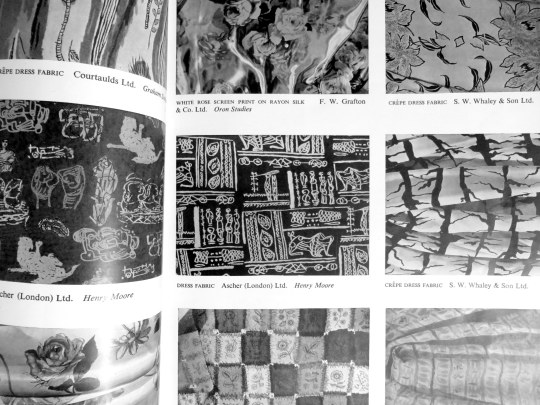
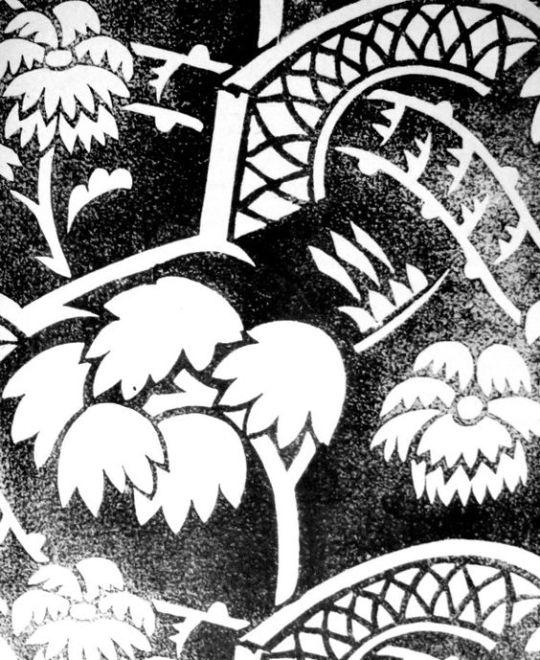
 Page from the ‘Britain Can Make It’ exhibition catalogue with designs by Henry Moore and Graham Sutherland.

Hitherto artists had been shy of designing for manufacturers, as they found their designs tended to be changed beyond recognition in the process of manufacture, losing all their individuality. But manufacturers began increasingly to realise the value of artists in bringing in fresh ideas. At last they were prepared to co-operate with the artist in endeavouring to make the final product approximate as closely as possible to the artists original conception, rather than, as hitherto, disregarding the finer points of the design for convenience in production. Such co-operation involves encouraging the artist to work closely with the technical staff. This co-operation has given a much wider range and variety to mass production and appears to be the great hope for the future. Indeed there are many signs that we are standing on the threshold of a great renaissance in English textile design, once the present shortages have been relieved.

image

King Penguin Books

The King Penguin book series were beautifully printed books. To me, they were like the Ladybird Books for adults, covering a wide range of unconnected topics and monographs.

image

 A Prospect of Wales, illustrated by Kenneth Rowntree, 1948.

The motive for Penguin Books was to broaden its appeal to the public. While still a young company, Penguin shocked the Publishing world with paperback books for sale by known and respected authors. Before that the idea of paperback fiction was to expect an unknown author and a throw-away after use book.

The original run of penguin books were black and white inside and mostly text, with the iconic two stripe colour banding. The colour schemes included: orange and white for general fiction, green and white for crime fiction, cerise and white for travel and adventure, dark blue and white for biographies, yellow and white for miscellaneous, red and white for drama; and the rarer purple and white for essays and belles lettres and grey and white for world affairs.

image

 D.H.Lawrence – Sons and Lovers, 1948. Original Penguin Book cover.

They were an British knock off of the Insel-Bücherei (Island Library) series published in Germany by Insel Verlag from 1912 onwards. The size of the German books with their repeated pattern book coverings was an inspiration. The head of Penguin books is quoted:

Why, we felt, should there not be a similar series of books in this country? The experiment, started a few weeks after war broke out, turned out to be successful. One of the most distinctive features of this series is their decorative covers.” †

image

  Friedrich Nietzsche – Poems. Insel Bucherei 

The aim of the King Penguin is different. These have not been planned to coincide with the public’s growing appreciation of art, but rather to appeal to the general liking for illustrated keepsakes of special projects.” 

The King Penguin series were also hardback books with colour lithographic illustrations, a move away from paperback and monochrome books.

image

 British Butterflies, cover by Paxton Chadwick, 1951.

The books originally combined a classic series of colour plates with an authoritative text. The first two volumes featured sixteen plates from John Gould’s ‘The Birds of Great Britain’ (1873) with historical introduction and commentary on each plate by Phyllis Barclay-Smith, and sixteen plates from Redouté’s Roses (1817–24) with historical introduction and commentary by John Ramsbottom. The third volume began the alternative practice of colour plates from a variety of sources. There were 76 volumes of King Penguin books in total.

Where as the educated scholars writing the books were the famous people at the time, today most people hunt for the illustrators, like John Piper, Edward Bawden, Hutton Clarke, Barbara Jones and Enid Marx.

image

 Birds of the Sea, cover designed by Enid Marx, 1945.

image

 Popular English Art, illustrated by Clarke Hutton, 1945.

image

 Life in an English Village, illustrated by Edward Bawden, 1949.

image

 Flowers of the Meadow, Illustrated by Robin Tanner, 1950.

† The Private Library p143, 1977

The Lion and the Unicorn

 Enid Marx

The Lion and the Unicorn are heraldic symbols of the full Royal coat of arms of the United Kingdom. The lion stands for England and the unicorn for Scotland. The combination dates to 1603, the accession of James I of England who was already James VI of Scotland. The union of the two countries required a new royal coat of arms combining those of England which featured two lions, and Scotland whose coat of arms featured two Unicorns. A compromise was made thus the British coat of arms has one Lion and one Unicorn,

hence “The lion and the unicorn”. 

By extension, they have also been used in the Coat of Arms of Canada since 1921.

 Eric Ravilious

In the art of Heraldry the Lion and the Unicorn are called ‘supporters’ to the clans device, the Arms. The centre of the Arms depicts the Leopards of England in the first and fourth quarters, the lion of Scotland in the second and the Harp of Ireland in the third quarter. The motto around the centre means: “Evil to him who evil thinks” which relates to the Order of the Garter. The motto at the bottom means: “God and my Right”.

 Paul Bommer

In satire the Lion and the unicorn have become many people over time in issues of Punch and other publications they are posed as rivals fighting for the common good of the country. Most famously perhaps in Lewis Carroll’s Through the Looking-Glass when the illustrator John Tenniel made them into caricatures of Benjamin Disraeli and William Gladstone.

image

 Edward Bawden

The traditional legend of enmity between the two heraldic animals and countries is recorded in a nursery rhyme. It is usually given with the lyrics:

The lion and the unicorn
Were fighting for the crown

The lion beat the unicorn
All around the town.

Some gave them white bread,
And some gave them brown;

Some gave them plum cake
and drummed them out of town.

The legend of the two animals may have been intensified by the Acts of Union 1707 and it was one year later that William King (1663–1712) recorded a verse very similar to the first stanza of the modern rhyme. This seems to have grown to include several other verses. Apart from those above only one survives:

And when he had beat him out,
He beat him in again;

He beat him three times over,
His power to maintain.

Woodcut Patterns by Paul Nash

An essay from The Woodcut No.1 An Annual.
In its beginning engraving had certain practical uses. One of these was the cutting of hieroglyphics on wooden stamps for the purpose of producing impressions on clay. The cuts were made both in intaglio and in relief. Blocks of this kind, for stamping bricks, where employed by the Egyptians and in Babylon. The accompanying illustration represents a wooden block found in a tomb at Thebes.

image

Considering these examples of an early method of printing, it is obvious that it was used in other directions, and the inference is that blocks were cut not only with a directly useful intention, as for impressing clay and similar substances, but with a decorative purpose in marking cloth. From the moment the simple craft flowed over from its utilitarian groove it assumed the nature of an art.

That is not to deny that the craft of cutting hieroglyphics may produce consummate art, but a skilled craftsman is not of necessity an artist. Therefore, I date the birth of the art of engraving on wood from the time the craft developed a consciously decorative purpose, and the first-fruits of this were probably in the nature of patterns marked by dyes upon cloth.

It was not until centuries later that the art took on a pictorial significance: even then, for many years after its application to books as an accompaniment to text, its decorative or pattern value was still its true importance. With the increase of skill, however, this quality began to diminish.

The discovery of chiaroscuro only hastened its disappearance, and once the conception of wood engraving as a means for reproducing drawings rather than creating prints was firmly rooted, the decorative value of woodcuts became a matter of accident, dependent, indeed, upon the nature of the drawing translated. Thus, although the art of engraving was already doomed, its spirit has perished long before its ultimate decay into a job for skilled mechanical hacks.

With the revival of wood engraving in recent times, artists have instinctively explored the decorative possibilities of the art. This is only natural in an age interested in the rediscovery of the fundamentals of aesthetics. The woodcut re-seen as an end in itself, and not a means to some other end, discovers itself as a very pure form of art, with its sculptural character, its simple expression in black and white, its direct technique and straightforward application. Of all the arts which are crafts it is the most autobiographical. Indeed, if one may account for the abuse of wood engraving for commercial reasons, it is still difficult to understand the neglect it has received as a means of self-expression. But there is always the dangerous seduction of skillfulness to be taken into account. Hitherto this has been a temptation mainly for the craftsman. To-day it is likely to prove the artist’s snare.

image

Block Print engraved by Doris Scull

Because, as an engraver, I fear such a danger invading the art I practise I have become lately more interested in woodcut patterns than in woodcut pictures. It is always a relief to be rid responsibility of representation. To concern oneself solely with the problem of formal relationships is to escape into a new world. Here one is in touch with pure reality, and the business of make-believe gives place to other considerations in many ways infinitely more satisfying. I would maintain this about all forms of plastic art, but I feel it to be acutely applicable to engraving on wood. Wood seams to yield to the evolution of an abstract design or a decorative arabesque as stone excites the sculptor to the creation of pure form. For it is the glyptic character of engraving on wood which is its peculiar charm, so that the more the engraver cuts into his block — I do not mean literally in point of depth, in the fractions of an inch — the greater his sense of contact with the reality of his expression.

Unfortunately, the scope of this article may not be extended to a consideration of abstract design as expressed in wood engraving, rather it mush be confined to a cursory examination of a few instances of pattern making by means of wood blocks as practised to-day in England.

image

Design and cut on wood by Enid Marx for The Curwen Press

The artist who has worked most consistently and successfully in this direction is Miss Phyllis Barron, who for many years now has produced block-printed materials for dresses and furnishing, using a narrow range of carefully chosen and tested dyes of rather sober but subtle colours on linen, cotton, silk and velvet. Miss Barron, being a true artist as well as a crafts-woman, has created something very definite: in my opinion, as valuable as any contribution to contemporary art in this country. With her are working Miss Dorothy Larcher and Miss Enid Marx. The former is a design of equal ability with Miss Barron, with a personal invention distinguishing all her output. Miss Marx, in one sense, is hardly more than a recruit, but judging by her first efforts one may predict a most interesting future for her art. In the first place she is attempting in her patterns a three-dimensional design.

This is a expedient often resorted by the French with amusing results, but our own textile designers seem generally content with the flat arabesque. Miss Marx’s designs have the character of a fugue in music. Another quality which distinguishes them from the majority of textile designs is the peculiarly rigid movement of the units, which are not conceived in fluid waves or undulations, or as an efflorescence, but are more like the delicate architecture of birds, building with rather awkward shaped sticks.

image

Design and cut on wood by Eric Ravilious for The Curwen Press

It is difficult to proceed farther in discussing the making of patterns without confessing that they are not all cut on wood. Wood is rapidly becoming supplanted by linoleum, and there is no doubt the latter substance has many advantages for the hand block printer. It is quicker and easier to cut, easily replaced, and there is not the danger of warping, which the wood block so constantly presents. Its disadvantages is its unpleasant pulpy texture, which does not allow of fine engraving, and at the same time is a little too easy to cut. There is however, so much excellent work being done in this medium that is must be recognised here.

The most recent group of designers and engravers on linoleum for producing textile patterns is that established by the energy and resource of Mrs. Eric Kennington (nee Edith Celandine Cecil), in a workshop by the river at Hammersmith. The chief craftswoman here is Mrs. Gwen Pike, a most experienced and able engraver and printer. The works, known as Footprints, reproduce patterns by their own staff, and also designs contributed by independent artists.

Finally, there remain to be considered two new fields of activity for the woodcutter. These are the making of wallpapers and papers for book covers by means of printed blocks, These has been recently a revival of interest in wallpapers, especially in Paris, Such distinguished artists as Madame Marie Laurencin and Monsieur Dufy have been in demand, and produced some charming designs. No doubt there are other artists who should be mentioned, but their omission is due to my ignorance, not my neglect.

image

Raoul Dufy — La Chasse (The Hunt) c1910

In England I am aware of only one designer who has turned his attention seriously to engraving wallpaper patterns. This is Edward Bawden, whose invention in this direction has produced papers of real distinction and originality. I need scarcely add that they have either been ignored or rejected by every manufacturer who has seen them.

image

Node: Linocut. One of the four ‘Plaistow Wallpapers’ designs commissioned by Curwen Press in 1932

In the narrower field of book cover patterns designers are more fortunate, since there is not only greater demand for ‘original’ papers, but the cost of production is small. Also we have at least one or who enlightened Presses in this country, although our manufacturers remain benighted. Even so, the industry is minute.

Compared with the production of patterned papers on the Continent, more especially in Germany and Austria, the English output is confined to the work produced by the enterprise of the Curwen Press, which continues doggedly to give encouragement to the two or three artists interested in this branch of design. Alas” that is our trouble in England — the general lack of intelligent encouragement given to her artists for any form of activity, small or great, outside of picture-making.

In England we are still prone to cling rather sentimentally to the idea of the Fine Arts, and think it is a little undignified, or at least unusual, for artists to concern themselves with anything but painting and sculpture, with the result that, for the most part, such arts as interior decoration, stained-glass work, theatre décor and textile designing are left in the hands of the competent but uninspired. The British contribution to the Paris Decorative Arts Exhibition was a shocking enough reminder of this fact, and may serve, perhaps, for as good a reason as any why we should begin to consider patterns as important as pictures.

Paul Nash. 1927

image

Paul Nash: Woodcut — ‘Bouquet’, 1927

It is important to mention that the bold praise of the Curwen press was due to Paul Nash being the head printer there for some years, and this essay being printed by the Curwen Press in 1927. This is not to say there were not ahead of the other printers and designers, but it is always important to review essays with any bias that seeps in the ink.