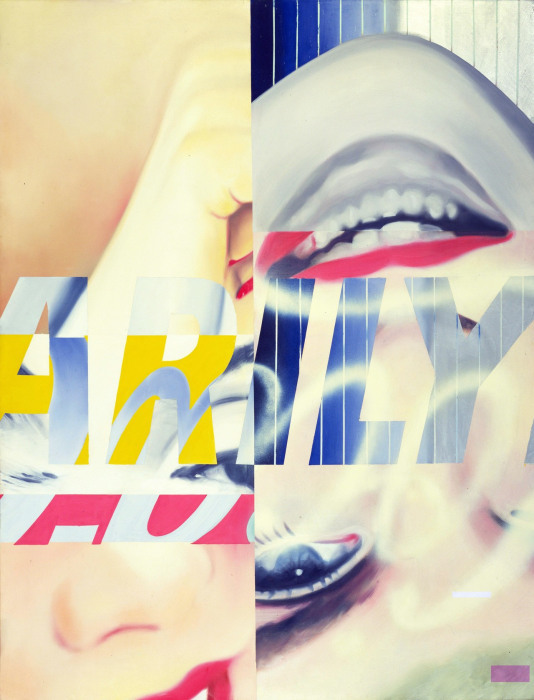
The death of Marilyn Monroe in 1962 aged 36 was a shock to the world. It affected artists who would end up giving her life after she was dead through her image. Fun fact, my sister married into the Mortenson family.
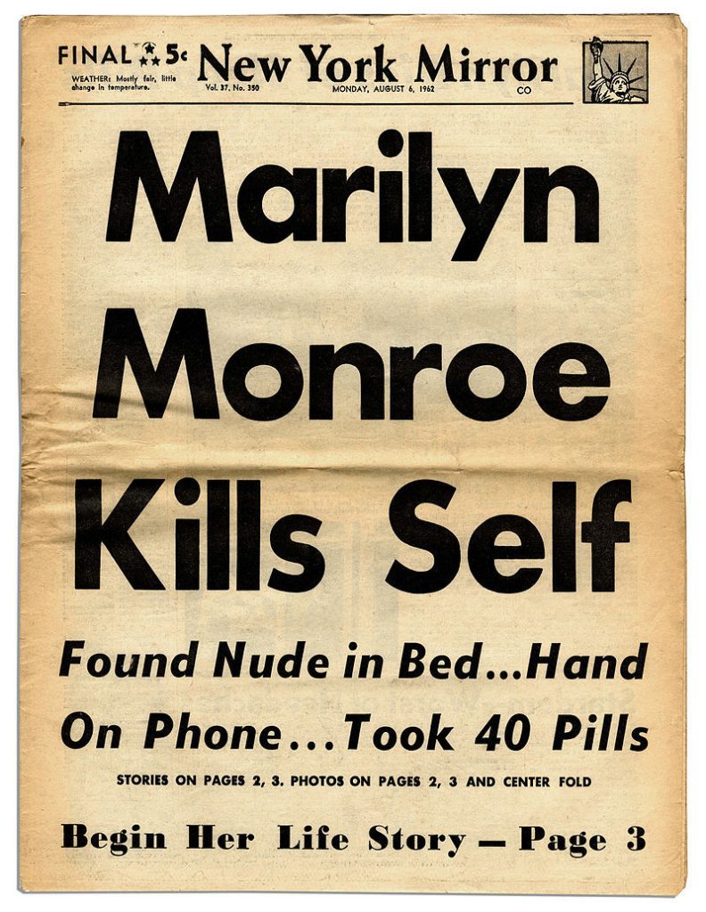
The front page of the New York Daily Mirror published on August 6, 1962
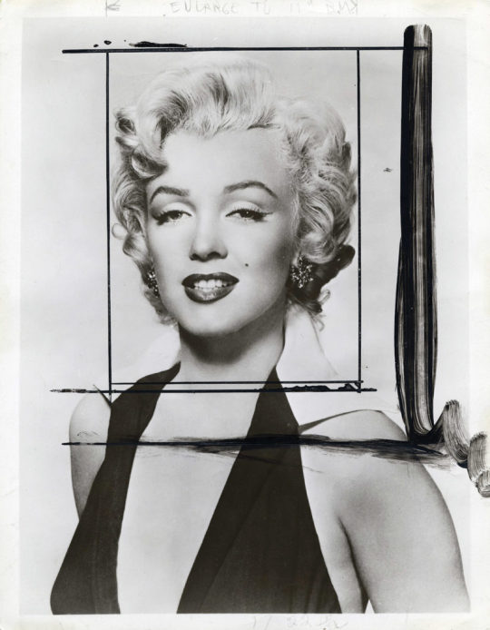
Warhol was the first to make a print in tribute of her, below is the original publicity photograph for Niagara by Frank Powolny. It has the black pen lines where Warhol cropped the photograph and his in studio photographers ‘blew it up’.
Frank Powolny – Publicity still for the 1953 film Niagara, cropped by Warhol.
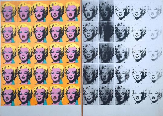
The rubber-stamp method I’d been using to repeat images suddenly seemed too homemade; I wanted something stronger that gave more of an assembly-line effect. With silkscreening you pick a photograph, blow it up, transfer it in glue onto silk, and then roll ink across it so the ink goes through the silk but not through the glue. That way you get the same image, slightly different each time. It all sounds so simple—quick and chancy. I was thrilled with it. My first experiments with screens were heads of Troy Donahue and Warren Beatty, and then when Marilyn Monroe happened to die that month, I got the idea to make screens of her beautiful face. †
Andy Warhol – Marilyn Diptych, 1962
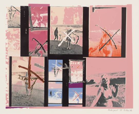
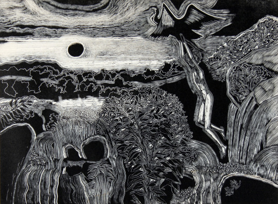
Richard Hamilton made a print a few years later using a mocked up contact sheet with images crossed out from a series of photographs taken by George Barris in the Summer of 1962.
Richard Hamilton – My Marilyn, 1965
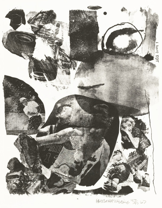
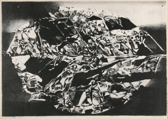
Robert Rauschenberg – Test Stone #1 (Marilyn Monroe), 1967
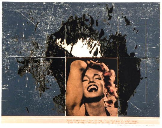
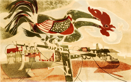
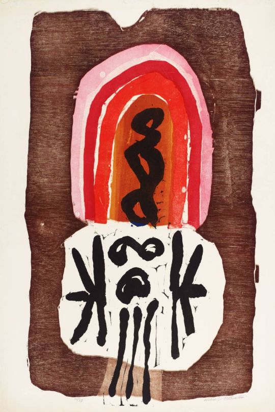
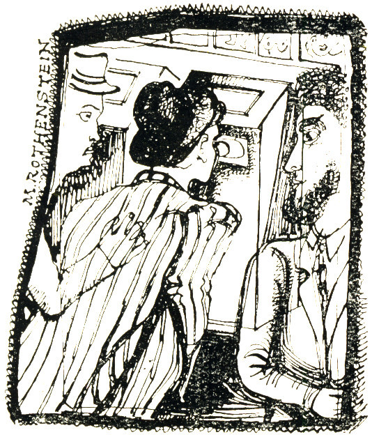
Michael Rothenstein – She’s American – Cartier Bresson on Marilyn Monroe, 1977
Rothenstein would use Monroe’s image for his prints as well, it was a time when he was using famous starlets like Julie Christie. He juxtaposes them with planks of burnished wood and raw textures. The photographs are screen printed over the woodcut.
In Hertfordshire the County Council’s collection of pictures for schools was started in 1949 as part of the School Loan Collection, a post-war initiative by Sir John Newsom, the Hertfordshire Chief Education Officer at the time. The aims of Pictures for Schools were to provide education for children, show children contemporary art rather than reproductions of masters and to liven up classrooms that in post-war Britain would have needed modernisation.
Many of the pieces were purchased from reputable dealers, artists and the ‘Pictures for Schools’ exhibitions which took place from the 1950s and 1960s. I thought I would show some of the pictures I now own and put the biographies of the artists.
Vera Cunningham – ‘Stooks’
Born in Hertfordshire of Scottish parentage, Vera studied painting at the Central School of Arts and Crafts. She began exhibiting with the London Group in 1922. With Matthew Smith, she exhibited in Paris at the Amis de Montparnasse and the Salon des Indépendants in 1922. Her first one-man show was held at the Bloomsbury Gallery in 1929. She produced a number of theatre designs at the end of the 1930s, but returned to easel painting. During WWII she was involved in the Civil Defence Artists’ shows at the Cooling Galleries. After the war her Paris dealer, Raymond Creuze, mounted three exhibitions in 1948, 1951 and 1954. She lived in London. The Barbican Art Gallery held a retrospective exhibition in 1985. Her work is held in the Manchester City Art Gallery; the Guildhall Gallery, London and at Palant House, Chichester.
Cuningham modeled for and had relationships with fellow artists Bernard Meninsky and Matthew Smith.
Vera Cunningham – ‘Garden Scene’
Thomas William Ward – ‘Charmouth Manor’
Thomas William Ward, was born at Sheffield. Studied part-time with Eric Jones (Harold Jones’s twin brother) at Sheffield 1937-1939. After service during the Second World War, Bill continued his studies at the Royal College of Art 1946-1950, winning a silver medal in 1949. He married at Kensington, London in 1949, sculptor Joan Palmer Ward. He taught at Harrow College of High Education 1950-1980, finally as principal lecturer, retiring to Suffolk in 1980. Elected a member of the Royal Society of Painter Etchers in 1953 and the Royal Society of Painters in Watercolour in 1957. This painting was bought from Whitworth Art Gallery, Manchester in 1957.
Alistair Grant – ‘The Weight-lifter’
Although best known as a printmaker, Alistair Grant also painted throughout his career and in the 1980s he adopted an expressionist style using vibrant colours. He was born in London and studied at Birmingham College of Art (1941-43). After serving during the war, Grant returned to art school and the Royal College of Art, where he was taught by Carel Weight and Ruskin Spear. Grant was to work in the printmaking department of the Royal College for 35 years (1955-90), ending his career as Emeritus Professor of Printmaking at the RA.
The Weight-lifter was bought from the Whitechapel Art Gallery at their Pictures for Schools exhibition: 8 October – 29 October 1949. It is likely ‘Eva’s House’ came from a similar exhibition.
Alistair Grant – ‘Eva’s House’, 1955
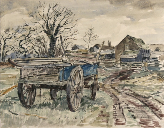
Vincent Lines – ‘Old Hereford Wagon’
Vincent Lines was awarded a scholarship to the Royal College of Art in 1928. The principal, William Rothenstein described him as ‘one of the best students of the painting school’. While only in his twenties, he was appointed principal of Horsham School of Art and later became principal of Hasting School of Art. Lines was a prolific and talented topographical watercolourist, with an intimate knowledge of the countryside, which he recorded on the spot, in the open air.
He was chosen as an artist for the Recording Britain project, to which he contributed twenty watercolours. He was a close friend of Thomas Hennell and the pair often painted together in the countryside around Hennell’s home at Ridley, near Meopham in Kent.
Lines survived the war and went on to become Vice-president of the Royal Watercolour Society. He wrote the biography of Mark Fisher and Margaret Fisher Prout, illustrated Rex Waites ‘The English Windmill’
The war years brought deepened friendships in particular with Mildred Eldidge and Thomas Hennell, both fellow watercolourists of the R .W .S . Through contact with Hennell he became fascinated by country crafts and together they hunted out the potter and the cooper, wheelwright and blacksmith, hurdlemaker and charcoal burner.
During 1943-4 he painted a series of eight watercolours recording the avenues of elms in Windsor Park, before the trees were felled. The pictures are now in the Royal collection. A further commission for Vincent during these years was the contribution to Arnold Palmer’s four-volumed Recording Britain, published in association with the Pilgrim Trust.
Due to Thomas Hennell’s death in 1945 the illustration of Rex Wailes’s book The English Windmill, which would certainly have been done by him, passed instead to Vincent Lines. Wailes’s definitive survey presents English windmills in their history, construction and mode of working. †
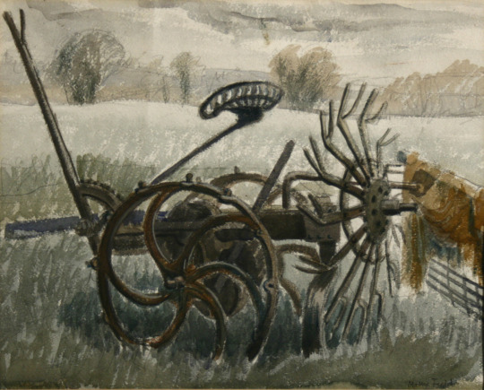
Molly Field – ‘Farm Implements’
Molly Field was born in Keighley, Yorkshire. She originally worked under the name Molly Clapham but then married the artist Dick Field. Attended Leeds College of Art (1932-33) then the Royal College of Art (1934-38), with Ernest Tristram. Showed at the Royal Academy, Women’s International Art Club and the Wakefield. She was married to Dick Field ARCA and they had one daughter.
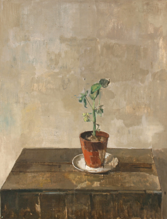
Carolyn Sergeant – ‘Geranium’
This is a mystery as it is one of the best paintings in the collection but there is no detail in the archives about who it is by.
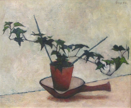
Bernard Gay – ‘Ivy Plant’
Bernard left school at the age of 14 and after various jobs, just before the Second World War joined the merchant navy. In 1947 that he returned to education, studying textile part-time at the Willesden School of Art (1947-52) and changed course to fine-art under Maurice de Sausmarez and Eric Taylor. He began drawing classes at St Martins School of Art and quickly established himself as a painter. It may have been in the Pictures for Schools exhibition 23 January – 14 February 1954.
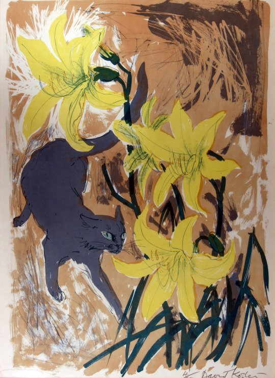
David Koster – ‘Cat and Lilies’
Koster studied at the Slade School of Art (1944-47). Taught drawing and print-making at Medway College of Design. One-man shows at Everyman Foyer Gallery (1958, 60, 62, 64, 66, 68, 70); Glasgow Citizen’s Theatre (1965); Stable Theatre Gallery, Hastings (1967). Taken several illustration commissions including work for the RSPB and a front cover for their ‘Birds’ Magazine.
David Koster was born in London and attended the Slade School of Fine Art from 1944 to 1947. He was a founder Member of the Society of Wildlife Artists in 1964.
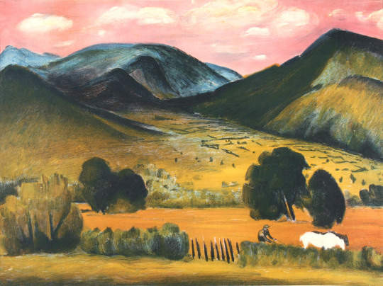
Raymond Croxon – ‘View in the Lake District’
Raymond Coxon enrolled at the Leeds School of Art, and the Royal College of Art. While he was there, between 1919 and 1921, he not only met his future wife but also became friends with a fellow student, Henry Moore. In 1922 Moore and Coxon visited France and met a number of artists there, including Pierre Bonnard and Aristide Maillol. Coxon continued his studies in London at the Royal College of Art between 1921 and 1925 under Sir William Rothenstein. Coxon took a teaching post at the Richmond School of Art in 1925 and in 1926 he married Edna Ginesi, with Moore acting as his best-man. Coxon would later perform the same service for Moore when he married Irina Radetsky in July 1929. He became a member of the London Group in 1931 and of the Chiswick Group in 1938.
During the WW2 he became a war artist and was commissioned to produce some paintings of Army subjects in Britain. Then working for the Royal Navy as a war artist. The painting of this print is in the collection of Palant House. The lithograph made for the Contemporary Lithographs Ltd. Other artists in the series were Eric Ravilious, John Piper, Vanessa Bell, Barnett Freedman and so on.
Julia Ball – ‘East Coast Storm’
Julia Ball is a Cambridge artist and this woodcut came up for sale with the Cambridge collection of Pictures for Schools but due to a cataloguing error on the auctioneers I didn’t win it as they had labeled it as a different lot. For years I smoldered about that. But when the Hertfordshire sale came up, I had to have it. Made in the 1960s this woodcut is of a storm over the east coast. Her painting are mostly abstract and works can be found in Kettles Yard and in the New Hall art collection. This picture was bought from the Royal Academy Diploma Galleries, 1967.
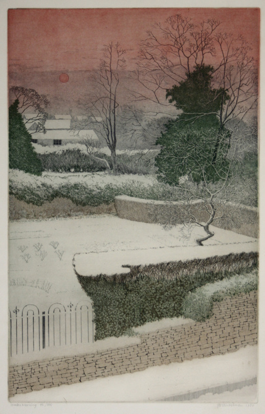
Joseph Winkelman – ‘Winter Morning’
Joseph Winkelman has specialised in intaglio printmaking since 1975 after completing the Oxford University Certificate course in Fine Art at the Ruskin School of Drawing. As an active member of the Royal Society of Painter-Printmakers (RE), he served as President from 1989 to 1995 and was recently artist in residence at St John’s College, Oxford.
John Sturgess – ‘Black and White Leaf’
A student at the Royal College of Art in the 1950s. He would have been taught by Julian Trevelyan, Edwin La Dell, Edward Ardizzone and Edward Bawden. He worked with John Brunsdon as a printer, printing other artists work, rather than going into teaching. They set up a press in Digswell Art Centre and that is likely how his work ended up in the Hertfordshire Collection. This work of a leaf looks more like foil, it is rather beautiful and a lithograph on stone. Though I haven’t photographed it the frame is a John Jones frame made of aluminium and is as beautiful as the print.
John O’Conner – ‘Boy and the Heron’
John O’Connor A.R.C.A. R.W.S, is today best known for his woodcuts, but during his lifetime he was also celebrated as a watercolourist. In 1930 he enrolled at Leicester College of Art before moving on to the Royal College of Art in 1933. His teachers at this time were Eric Ravilious, John Nash and Robert Austin. He graduated in 1937.
On a visit to Eric Ravilious’s home at Bank House, Castle Hedingham in Essex, O’Connor was captivated both by the directness of the wood-engraving technique, and by the simple domestic scene in which Ravilious engraved by a lamp in one corner of the room while his wife Tirzah played with their small son by the fire in another. It was due to Ravilious that O’Connor got his first commission of work aged 23, illustrating Here’s Flowers by Joan Rutter for the Golden Cockerel Press in 1937.
He taught at Birmingham and Bristol before serving in the Royal Air Force form 41-45. On being demobbed he illustrated two books for the Golden Cockerel Press and taught in Hastings for two years before moving to Colchester to become the head of the School of Art in 1948. He was affectionately known as ‘Joc’ to his students, using his initials. His colleagues included Richard Chopping, who designed dust jackets for the James Bond novels, his own former teacher John Nash, and Edward Bawden, one of the finest British printmakers.
He saw his favourite painting places in Suffolk – the ponds, willows, briars and honeysuckle – disappear beneath the bulldozer and combine harvester. In 1964 O’Connor retired from teaching full time at Colchester, to concentrate on painting and engraving. He wrote various ‘How to’ books and taught part time at St Martin’s School of Art. In 1975 he and his wife, Jeannie, went to live by Loch Ken in Kirkcudbrightshire, where his love of light and water inspired his many watercolours and oil paintings. He took up a post teaching at Glasgow School of Art from 1977 to 1984.
In the 1950s and 60s, O’Connor exhibited at the Zwemmer Gallery, in London, and had many exhibitions throughout Britain. His work was purchased by the Arts Council, the Tate Gallery, the British Museum and the Contemporary Art Society, as well as by several local education authorities; it can also be found in the Oslo Museum, the Zurich Museum and at New York central library. He was elected to the Royal Society of Painter-Etchers and Engravers in 1947, and, in 1974, to the Royal Watercolour Society. He was an honorary member of the Society of Wood Engravers.
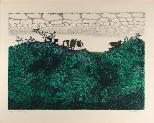
June Berry – ‘High Meadow’
June Berry studied painting at the Slade School of Fine Art, London. She has had nineteen solo exhibitions including a retrospective at the Bankside Gallery, London in 2002. Her paintings have been exhibited frequently at the Royal Academy Summer Exhibition, London since 1952. Berry was Vice-President of the Royal Watercolour Society from 2001 to 2004.
Her work is included in the collections of HM the Queen, the British Government Art Collection, the Victoria & Albert Museum, London, the National Museum of Wales, the Royal West of England Permanent Collection, the Graphothek, Berlin, Germany and the All Union Society of Bibliophiles, Moscow, Russia. Her work has also been purchased by many private collectors in the UK, USA, Germany and Russia. She is a Member of the Royal Watercolour Society, the Royal Society of Painter-Printmakers, the New English Art Club and is a Royal West of England Academician.
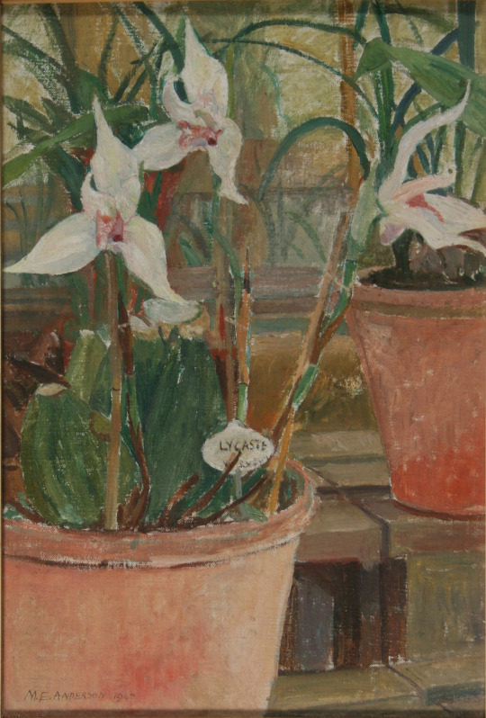
Madeleine Holtom – ‘Orchids’
Madeleine Elizabeth Anderson was born in Belvedere, Kent. She studied art at the Kingston School of Art where Reginald Brill was principal with other teaching from Anthony Betts, William Ware and John Platt. In 1932 she was awarded a scholarship to study at the Royal College of Art, there she won the painting prize in 1934. She painted in oils and watercolours under William Rothenstein and Gilbert Spencer.
Leaving the RCA she became a professional artist and also worked making advertisements. She married and divorced G. H. Holtom and they had two sons and two daughters, they moved to Northwood near Watford, North-West London. She also exhibited with the New English Art Club.
Her work is represented in the collections of: Friendship House, Moscow. Queen’s College, Oxford. The Cuming Museum. Cheltenham’s Art Gallery. The Government Art Collection, British High Commission, Accra, Ghana.
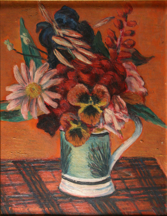
Frank Freeman – ‘Flower Piece’,
Frank Freeman is a bit of a mystery to me at the moment. I can find mention of him in a few places but sadly due to the blitz and poor archiving many are the lost. What is known is he was supported for a while by Lucy Carrington Wertheim and he was based in the Manchester area. One flower painting is mentioned in her book Adventure in Art.
Visitors who came to see me about this time. Among these were Frances Hodgkins, who stayed for months at a time at my flat, Henry Moore and his lovely Russian wife, John Skeaping, Barbara Hepworth, Cedric Morris, Lett Haines, John Alford, William Plomer, Leon Underwood, John Gould Fletcher, Pavel Tchelitchew, Komisarieysy, David Fincham and his wife Sybil, Jim Ede and Frank Freeman. ‡
John Wynne-Morgan – ‘Christmas Roses’
John Wynne-Morgan was born in Harrogate, Yorkshire and enrolled at the Heatherley School of Fine Art in London in 1945.
In a 1962 London catalogue foreword, Wynne-Morgan is described as ‘primarily a portrait painter’ (though the show contained scenes of Paris, Ibiza, Venice and London, and he also painted many Bonnard-ish nudes). His studio was in Hampstead and he was the author of three books for aspiring artists. In Oil Painting as a Pastime: A Complete Course for Beginners (Souvenir Press, London, 1959), he evokes how hard it is to embark on a portrait:
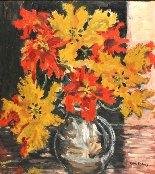
Edna Rodney – ‘Parrot Tulips’
Of all the artists I bought Edna Rodney eludes me, I can not find her anywhere and it might be she was an art student who gave up art for a family or she might have been one of Hertfordshire’s pupils that ended up in the collection as sometimes happened. It is rare to find nothing however.
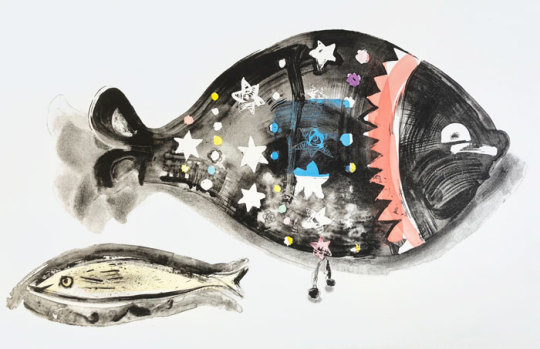
Chloë Cheese – ‘Lucky Fish’,
Chloëʼs childhood was spent in the Essex village of Great Bardfield observing the printmaking of her mother Sheila Robinson and she remembers in particular often visiting the studios of fellow printmakers Edward Bawden and Michael Rothenstein.
She has contributed to a recent book Bawden, Ravilious and the Artists of Great Bardfield published by the V&A. Chloë studied at Cambridge Art School from 1969 and the RCA from 1973 to 1976.
She has lived in South London since the 70s, investigating her home and surroundings first through drawing which is then used as a basis for the creation of monoprints, lithographs and etchings. Her engagement with still life subjects has widened to include figures against the palimpsest of an urban life.
Chloë has exhibited widely and her work is held in various public collections including The V and A Museum London and The Arts Council of Great Britain. Bio via St Judes.
Chloë Cheese – ‘Pink Carnations’
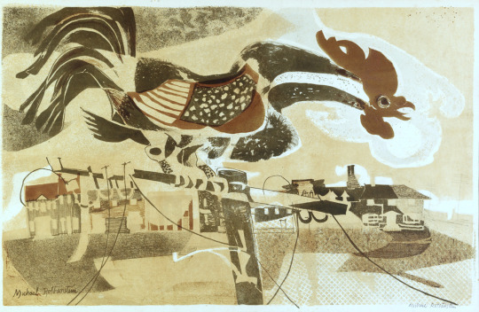
Michael Rothenstein – ‘Coronation Cockerel’
Born in Hampstead, London, on 19 March 1908, he was the youngest of four children born to the celebrated artist, Sir William Rothenstein and his wife Alice Knewstub. He studied at Chelsea Polytechnic and later at the Central School of Arts and Crafts. Affected by lingering depression, Rothenstein did little art making during the late 1920s and early 1930s. Despite this, he had his first one-man show at the Warren Gallery, London in 1931.
During the late 1930s the artist’s output was mainly Neo-Romantic landscapes and in 1940, like Vincent Lines, he was commissioned to paint topographical watercolours of endangered sites for the Recording Britain project organised by the Pilgrim Trust. In the early 1940s he moved to Ethel House, in the north Essex village of Great Bardfield.
At Great Bardfield there was a small resident art community that included John Aldridge, Edward Bawden and Kenneth Rowntree. In the early 1950s several more artists (including George Chapman, Stanley Clifford-Smith, Audrey Cruddas and Marianne Straub) moved to the village making it one of the most artistically creative spots in Britain. Rothenstein took an important role in organising the Great Bardfield Artists exhibitions during the 1950s. Thanks to his contacts in the art world (his older brother, Sir John Rothenstein, was the current head of the Tate Gallery) these exhibitions became nationally known and attracted thousands of visitors.
From the mid-1950s Rothenstein almost abandoned painting in preference to printmaking which included linocut as well as etchings. Like his fellow Bardfield artists his work was figurative but became near abstract in the 1960s. Although little known as a painter, Rothenstein became one of the most experimental printmakers in Britain during the 1950s and ’60s.
Rothenstein was elected an Associate of the Royal Academy (ARA) in 1977 and a Royal Academician (RA) in 1984. Near the end of his life there was a retrospective of his work at the Stoke-on-Trent City Museum and Art Gallery (1989) and important shows followed at the Fry Art Gallery, Essex.
The print I have (The Cockerel) was made for the Festival of Britain series of prints in 1951 and is signed under the mount. Likely bought from Redfern Galleries.
In various books throughout time, you can read about the vulgar arts; it is mostly a term for any mass production and in art that means printmaking. From an art history perspective, the patron and the artist was a system that was more or less redundant in the 20th century. It was at this time that printmaking came into fashion because if an artist didn’t have one major sponsor, they would need many smaller incomes from the public.
The history of printmaking and the taboo also follows publishing technology. After 1800 the wood-engraving was considered to be un-artisan and best left to newspaper printing and advertising. When wood-engraving was embraced by artists as a reaction to various exhibitions of Japanese woodcuts, the artists who used colour printing aped the Japanese styles of carving with British scenery. Sylvan Boxsius is a good example printing in a traditionally Japanese way.
Sylvan G. Boxsius – A Devon Village, 1930s. From My Collection
With more traditional styles of English wood-engraving colour wasn’t welcome. Linocut had a vogue with Cyril Powers works but for printmaking it would be the 50s when colour came in for most artists; much like how colour photography wasn’t considered artisan until the 1980s.
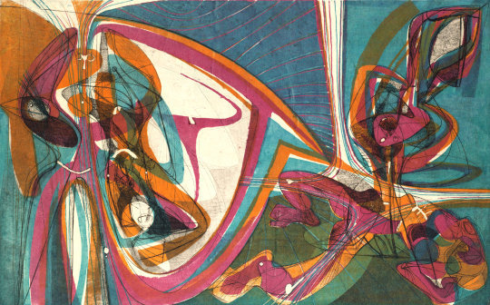
It is important to add this is only in Britain. In France artists had worked in colour. Many of the big artists even worked in advertising making large lithographic posters. Pissarro made colour woodcuts in a medieval style. The French also had the fantastic Atelier 17 – a studio founded in 1927 by Stanley William Hayter. He was a British artist and working mostly in intaglio prints, but he developed new printing methods for colour etchings. Towards the end of the 40s the studio had encouraged mixed media printing methods that crossed over the sea to Britain.
Stanley William Hayter – Cinq Personnages, 1946
But the biggest taboo to some would be to mix medias, pen and ink with wood-engraving or an etching with a lino-cut. It was the 20th century when nothing was classed as holy. For me I should also add there is a thrill when you see something new. When was the last time you saw something new?
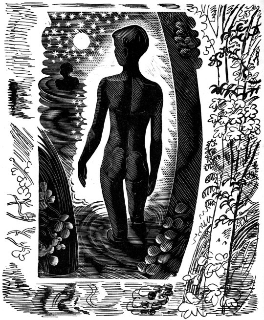
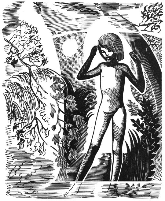
The images below are a series of John O’Connor wood-engravings with pen and ink continuations of the illustrations surrounding it. It might look to be obvious, but it is something new to me and I can’t recall seeing it before or after. The book is E. L. Grant Watson’s Departures from 1948.
John O’Connor – Illustration from Departures, 1948
On the face of it John O’Connor doesn’t look to be a rebel. A student of Eric Ravilious and Edward Bawden at the Royal College of Art his wood engravings always have an old-world charm to them. But I think adding the ink drawings really worked with these illustrations. Below, I love the way the woodcut ends at the child ankles and the ink drawing takes over to show the feet submerged in water.
John O’Connor – Illustration from Departures, 1948
John O’Connor would go on to surprise me with printmaking by making colour wood-engravings. After spending a great deal of time carving the main black inked block, rather than waste time with wood to make the colour layers he would instead use Lino to make his abstract shapes that are loosely thrown over the engraving. Below I have over-saturated the colour layer to make the point, and it might look lazy but I think it’s fantastic and gives a lovely quality to the prints. So many artists fail in printmaking by trying to be too technically accurate, I think of
Stephen Whittle for example.
John O’Connor – Illustration from A Pattern of People, 1959
Michael Rothenstein – Horse and Sunrise, From my collection, 1974.
The other artist that thrills me somewhat is Michael Rothenstein. He is an artist that doesn’t get the credit he deserves and different people who represent his collection push the agenda that suit them.
Having a diverse career in art he started making accurate and twee illustrations of the countryside. As part of the Record Britain project he was sent out to document areas of Britain as artworks before the start of the Second World War. But after the war is where his life and work is far more interesting. He became one of the real innovators of printing and an early British Pop Artist, before the term was coined.
His first print was made in 1947 and after that he went to study at Atelier 17 with Hayter. There he developed skills with lithography and etching but abandoned them for their time consuming preparation processes and influenced by Edward Bawden he moved into Linocut.
Michael Rothenstein, for instance, has applied boundless energy to extending the range of the relief process of wood and lino, sometimes combining them with screenprint and photo-screen. ‡
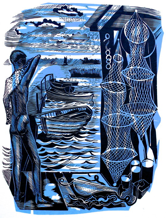
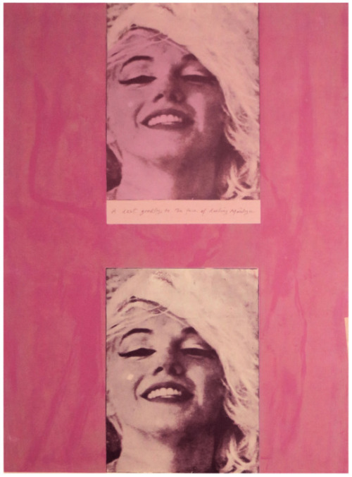
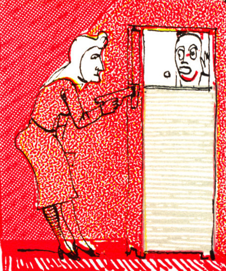
Michael Rothenstein – Marilyn I, From my collection, 1978
This Rothenstein print is made up of two screen prints of a photograph of Marilyn Monroe with a pink frame over printed impressions of a burnished planks of wood in green. I think it may need repeating; printed planks of wood.
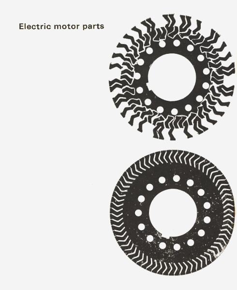
When I was at art school at the end of the previous century I thought my printing of pavements and blocks of wood were new ideas, however Rothenstein had already penned a book on the topic called Frontiers of Printmaking – New Aspects of Relief Printing in 1966. In the book he shows printed Tree-trunks, metal cans, chicken fencing, the board at the back of an old Pye radio, electronic motors… anything flat you could get an impression off of.
Any materials that were fairly thin were printed on the platen press. In proofing surfaces of rough texture, however, a soft, flexible packing was placed above the paper as already described … Before use, metal from the scrap-head needs cleaning. It is clamped to the bench and brushed down with a wire brush or wire circumference brush used in a power-tool. An industrial mask should be worn for this process. Very dirty metal taken from the scrapheap or city dump should be first put in the sink and scrubbed down with disinfectant. †
Example page from Frontiers of Printmaking, 1966
Rothenstein later claimed that Hayter had prompted him to take pictorial risks and avoid predictable effects.
What Hayter did in France to stimulate etching and engraving’. wrote James Burn lately, ‘Michael Rothenstein has done in England for relief printing’. ♠
Rothenstein found and collected things to make really wonderful works and I think he should be celebrated more than he is.
Michael Rothenstein – Red Gothic, 1962
† Michael Rothenstein – Frontiers of Printmaking, 1966 ‡ Richard T. Godfrey – Printmaking in Britain, 1978 ♠ The Penrose Annual: Review of the Graphic, 1964
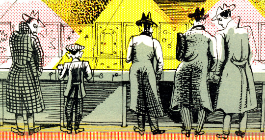
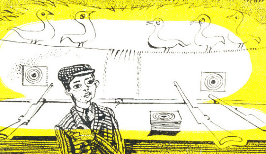
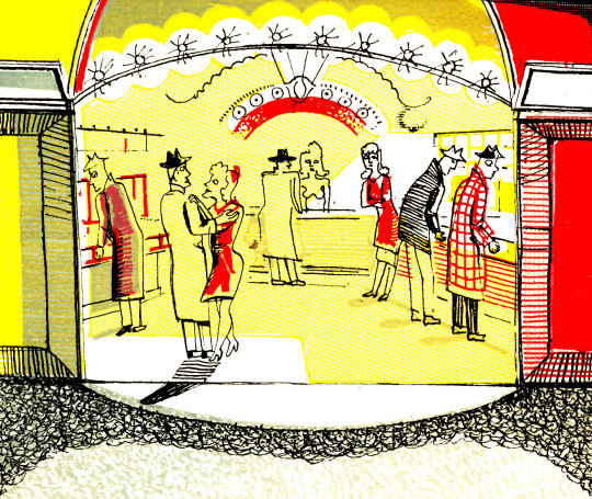
I thought it would be good to digitise an essay Michael Rothenstein wrote and illustrated in 1948 about ‘Sports Gardens’ or what we would now call an Arcade. It shows he was looking at his contemporary items as artworks, pre Pop-art.
Sports Gardens have a tough, adolescent, slightly underhand air; a compound of chain-store and small town fairground. They are of course an urban version of the country fair an indoor version compressed into restricted floor space completely mechanised and with some of the high spirits ironed out.
Further, Sports Gardens are static non-itinerant in contrast to the transience of the village fair, with its attendant sense of a momentary flowering for a single night. The knowledge that the show will be moving off somewhere tomorrow, that it will always be moving off somewhere gives the fair a quality of poignancy, of romance, which the Sports Garden entirely lacks.
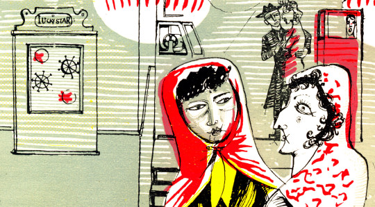
So Gardens are harsh without being romantic; harsh, noisy and garish. Swing is laid on from 11am when they open to 12pm when they close. The typical pattern has a frontage of perhaps twenty feet, and runs straight back from the street. Pin-tables, wall-machines and cranes are ranged at either side: peep-shows are placed at the far end to give greater privacy. But in all Sports Gardens pin-tables and cranes are the largest profit makers, the serious business end of the industry. Hence these two types of machine are placed nearest the entrance in the largest numbers possible.
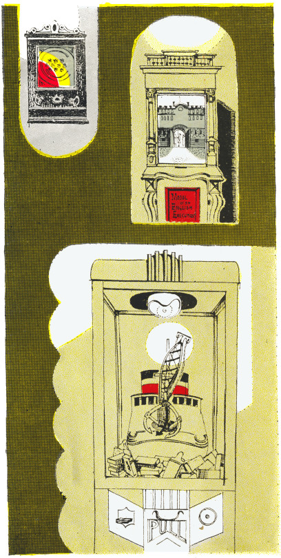
At the entrance to the Coventry Street saloon in London, for example, stands a large grab. A grab consists of a revolving table spread with the cheaper forms of ‘swag’: cigarettes, trinkets, powder-compacts, lighters-above which four shining chromium hands are poised. Aggressive in shape and predatory in gesture, these clutching silver fists are oddly symbolic of this tough, profitable branch of the entertainment catering business. Though in fairness to the management it should be noticed that earnings come chiefly from regular customers, fully aware of the small return received on outlay and not from the larger, more gullible crowd of casual visitors. Three or four shillings spent on the pintables may bring a few cigarettes: six or seven shillings on the cranes – a packet of Players. At the tables a maximum score earns a prize of two cigarettes.
Now the original cost of these machines was about £25, so it looks as if the profits must be very large indeed. The pin-tables themselves, all of American origin, are marked Daval Manufacturing Coy. Chicago. Importations stopped in 1939. Since no other country is able to produce machines of competitive quality, Sports Gardens carry equipment at least nine years old. But the machines are Cheap and easy to maintain: the brightly figured surfaces are all washable and the well-made ingenious machinery inside runs without undue need of repair.
There are, perhaps, twenty-five standard types of table. The numerals on the distinctive backplates are interspersed with pictures of cigar-shaped racing cars zooming along concrete autobahns, pink and blue skyscrapers, giant vermillion aeroplanes with all the faked-up, streamlined paraphernalia of the Futurist city associated with American boys’ magazines.
As one releases the piston, the chromium ball kicks up the shoot, ricocheting from point to point touching off electric buzzers, lighting groups of coloured bulbs, while automatic calculators flash out rapidly mounting scores.
To register winning scores, it is necessary to know how hard to pull back the spring piston, when to jog the table. In a limited sense, then an element of skill does exist, though the scales are heavily weighted in favour of the machine. Rarely does a customer succeed in beating the hazards. When he does however the management count it good advertisement the ‘punter’ pulling in packet after packet of cigarettes, incites the crowd to spend sums far in excess of any temporary loss.
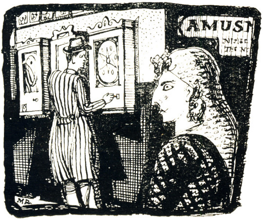
Regular customers are of many types but of only one sex-male. A mixed age-group, very young to middle-aged they return day after day to play a particular table. Many are prosperous; ten shillings is a not unusual sum to spend on each visit. Business men wearing soft hats of emphatic curve, carrying bulky pigskin briefcases, often play the tables in pairs during the lunch hour.
The peep-show, a non-scoring game of mechanism Peeping Tom has also an exclusively masculine following. A penny is placed in the aperture of the ‘Muto-scope’ or ‘Butiviewer’ and one peers down a black eyepiece at a miniature motion picture of a girl caught, as a rule, in protracted dalliance, wearing only her wrap or underclothes; a clothed male may also appear, the sleek young-middle aged shop walker type, sometimes dressed in Turkish costume.
The sequence of pictures shown within is advertised by a ‘still’ bearing the expected caption: ‘Paris Nights’, ‘Sunbathing’, ‘Parasol Polly’, ‘A Pair of Queens’. Some are old fashioned machines worked by hand. In this case stills of half-dressed chorus girls, of the 1920 type flick over as one turns the handle. The pictures are illuminated in flashes, so the viewer’s eye holes shine yellow at one moment and are deeply shadowed the next.
The attendants are an essentially urban type, matey, good-humoured and nervy having a predilection for flashy up-to-dateness. This makes them touchingly proud of the little modern equipment they possess. Many of the older types of installation have great visual charm with their fussy grandfather clock appearance and elaborately erratic machinery ticking over within.
For these or other attractions single customers are apt to have a furtive look. They twist their mouths at you a bit sheepishly as they crane their necks to the peepshow eyepiece. But practised in groups, these penny pastimes take a more wholehearted and genial turn; and there is much geniality in the hours of peak attendance – rainy Sunday afternoons or evenings towards the week-end.
There is a sense of motion, vitality, quick-fire humour and attractively sharp colour, which contrasts not unfavourably with the stretched-out monotony of the scene outside. The Sports Garden entrance cuts a yellow hole in the black forbidding frontage of the night streets; beyond it we catch sight of the mysteriously welcome dazzle of coloured lights and animated crowds; while relayed Swing music, throbbing rather pleasantly down the empty street, thumps quietly at our ears.
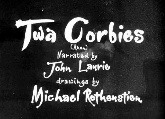
Here are two poems read and drawn as an interesting collaboration of artists as part of the Festival of Britain in 1951. The drawings were used to make a series of scenes for a short film, the spoken or sung content added over this.
In this clip there are two poems. Twa Corbies narrated by John Laurie and illustrated by Michael Rothenstein and Spring and Winter (Shakespeare) sung by Peter Pears to music by Thomas Arne and illustrated by Mervyn Peake.
Both of these poems are available to be seen on the BFI for free. Here is the link.
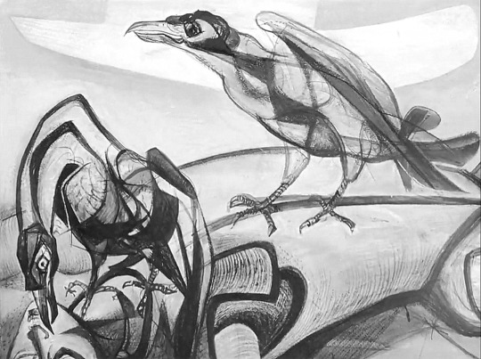
Michael Rothenstein – A Still from Twa Corbies, 1951
Michael Rothenstein – A Still from Twa Corbies, 1951
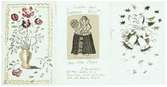
Here are some of the Christmas cards from various Great Bardfield artists. I have always thought it important to send out something decorative and interesting at Christmas and the Bardfield artists were the same.
Eric Ravilious – Christmas Card
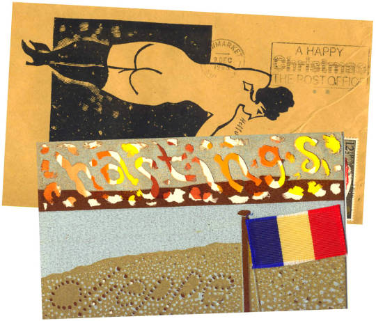
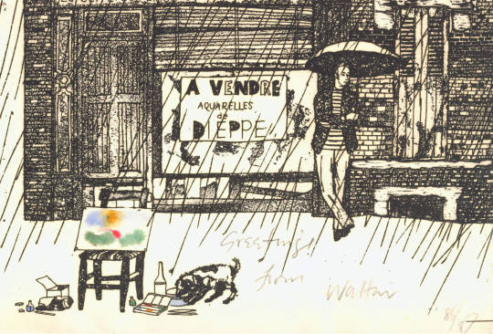
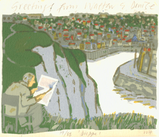
With some of the artists like Walter Hoyle the envelopes were just as important as the cards for decoration. Many of them were numbered as editioned prints. Signed from Walter and his wife Denise.
Walter Hoyle – Christmas Card Envelope, 1986
Walter Hoyle – Christmas Card, 1986
Walter Hoyle – Christmas Card and Envelope, 1983
Walter Hoyle – Christmas Card
Walter Hoyle – Christmas Card
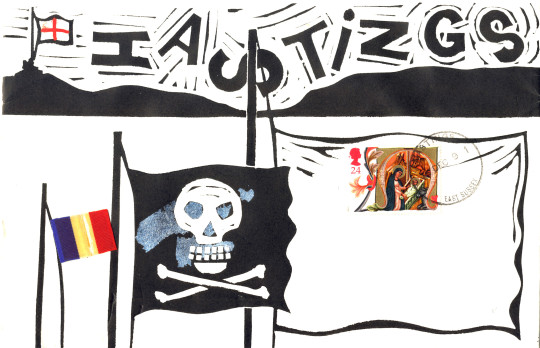
Walter Hoyle – Christmas Envelope
Walter Hoyle – Christmas Card
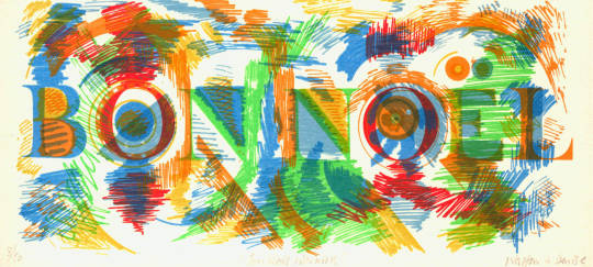
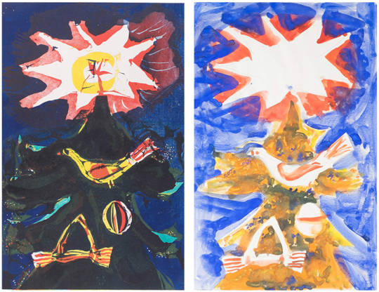
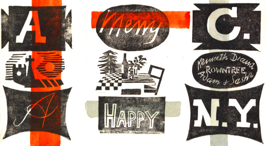
Michael Rothenstein – Christmas Card & Design for Faber and Faber, 1962
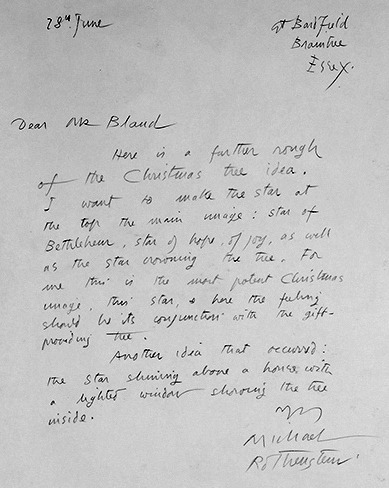
The note below is from Michael Rothenstein to David Bland of Faber and Faber. Faber were planning the Christmas card in June as the letter is dated 28th of that month. The picture above shows the finished design to the left and the prototype to the right.
Here is a further rough of the Christmas tree idea. I want to make the star at the top of the main image: star of Bethlehem, star of hope, of joy, as well as the star of morning, the tree, for me this is the most potent Christmas image….
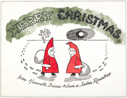
Below are two Christmas cards from Kenneth Rowntree his wife Diana and family.
Kenneth Rowntree – Christmas Card
Kenneth Rowntree – Christmas Card
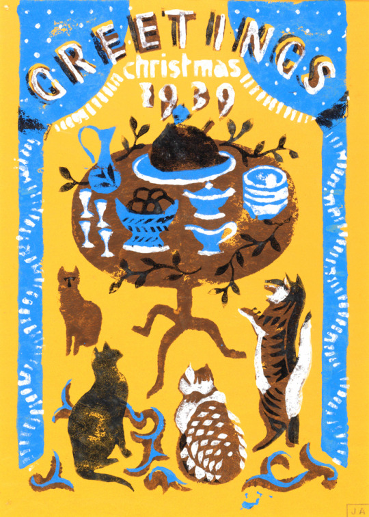
Below are some more images from other Great Bardfield artists.
Great Bardfield being a small community of artists, it is only natural that they would borrow ideas, items and homes from each other to work in. Here are a few examples of connections in illustrated books by the people in the community that all were published within a few years of each other.
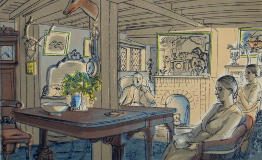
Edward Bawden – Sunday Evening, 1949 (Life in an English Village)
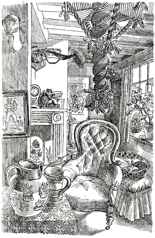
The picture above shows the sitting room at Ives Farm, Great Bardfield. Tom Ives is pictured in the corner with his pipe. It’s depicted in a lithograph by Edward Bawden from the King Penguin book ‘Life in an English Village’ (1949), around the same time Aldridge himself used this house in a book illustration for ‘Adam Was A Ploughman’ (1947) by Clarence Henry Warren.
John Aldridge – Living Room, 1947 (Adam Was A Ploughman)
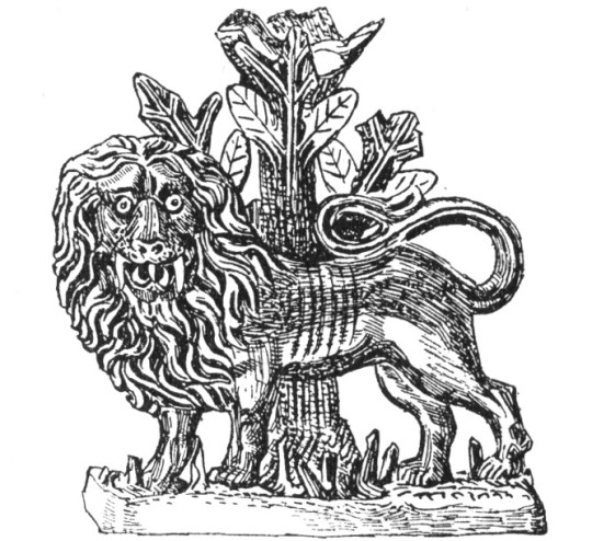
On the fireplace you can see a Staffordshire figure of a lion by a tree, it was illustrated again on another page in ‘Adam Was A Ploughman’, pictured below.
John Aldridge – Lion, 1947 (Adam Was A Ploughman)
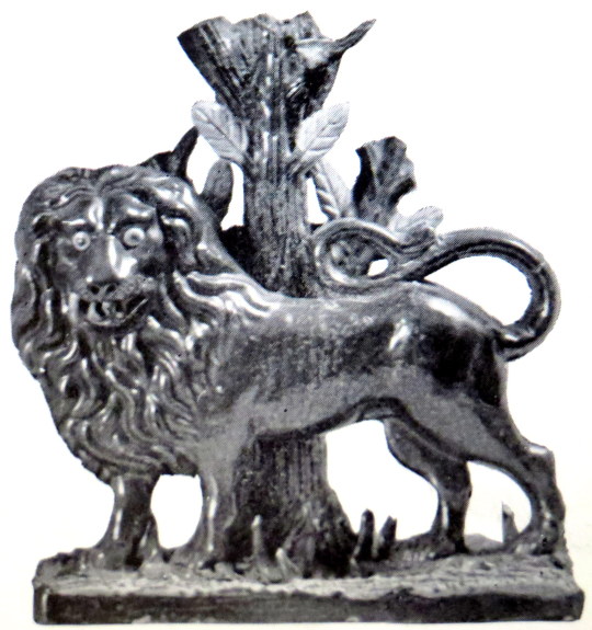
The photograph below is from Volume Five of The Saturday Book (1945), in a chapter by Edwin Smith on ‘Household Gods’ and is the same Staffordshire Lion.
Edwin Smith – Lion, 1945 (The Saturday Book)
Back to the drawing of Ives farm living room is a corn-dolly hanging up, below in the King Penguin book ‘Life in an English Village’ I have picked it out in yellow.
John Aldridge – Living Room, 1947 (Adam Was A Ploughman)
Edward Bawden – Corn-dollies, 1949 (Life in an English Village)
To the bottom right of the image above is also the bell used in the Pub lithograph below. Below the bell, the one-eyed man is Fred Mizen, a gardener and thatcher who also had a talent for making corn-dollie, it is likely all of them are by him.
Edward Bawden – The Bell (detail), 1949 (Life in an English Village)
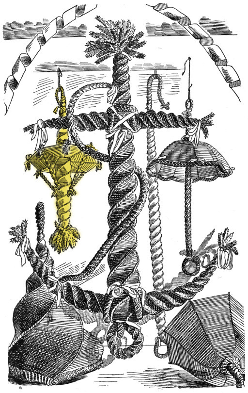
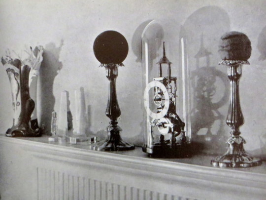
Michael Rothenstein – Clock and Candlestick, 1942
The painting by Rothenstein above is a curious still life of a table and village scene. Curiously enough these items appear again in fifth Volume of The Saturday Book, along with the Aldridge Lion photograph. The article mentioned the clock ‘flanked by exotic shapes contrived from coloured balls on candlesticks’ it is wisely assumed that the picture is from Rothenstein’s house.
Edwin Smith – Clock and Candlestick, 1945 (The Saturday Book)
Clarence Henry Warren – Adam Was A Ploughman, 1947
Leonard Russell (Editor) – The Saturday Book, 1945
Noel Carrington – Life in an English Village, 1949
Michael Rothenstein was born in 1908 in Hampstead, London and the youngest of four children of Sir William Rothenstein and Alice Knewstub. His brother John became a director for the Tate Gallery and had connections with the Bloomsbury Set.
Howard Coster’s photo of John Rothenstein; Sir William Rothenstein; Michael Rothenstein (standing), National Portrait Gallery, 1939.
Michael was homeschooled and studied art at Chelsea Polytechnic
and later at the Central School of Arts and Crafts (1924-27). His mother was American and his father British, the family home was also a social and happy one.
If we accept the frequent probability of children’s rebelling against the lives and pursuits of their parents – or at least their parental environment – Michael Rothenstein’s early years might well have destroyed any burgeoning of a creative disposition. But as a child and as a young man, he actively enjoyed the not affluent but very comfortable style of an artist’s household in which Augustus John, Wyndham Lewis, Edward Burra, Stanley Spencer, David Jones, Edwin Lutyens or the young Henry Moore were received and he often rubbed shoulders at supper or tea parties with Walter de la Mare, Barnett Freedman or Robert Graves.†
Affected by lingering depression due to myxoedema, he did little art making during the late 1920s and early 1930s. Despite this, he had
his first one-man show at the Warren Gallery, London in 1931.
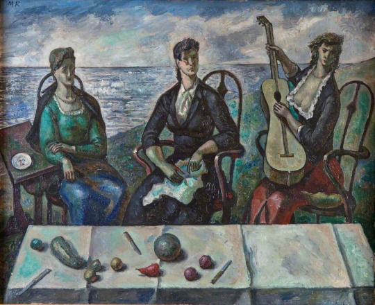
Michael Rothenstein – Three Women by the Sea, Jerwood Gallery, 1938.
His work and style of the late 30s and early 40s was part of the neo-romantic water-colourist set that artists like Thomas Hennell, Claude Muncaster, Eric Ravilious and Paul Nash had been championing for a decade. These watercolours are best showcased by the work he created for the Recording Britain project.
Michael Rothenstein – Kilburn Church from the South, V&A, 1940. (Recording Britain)
In 1941 Rothenstein moved to Great Bardfield, staying first at ‘Place House’, where John Aldridge also lived, before moving to ‘Ethel House’. As his style progressed away from the Recording Britain project he could be more abstract and free with his artworks, moving to Great Bardfield gave him a community of artists and a resource of subjects to work with. He started a long association with the Redfern Gallery, with his first show in 1942.
Michael Rothenstein – Autumn, 1947.
The community of Great Bardfield in the 1940s had Rothenstein in contact with artists like John Aldridge, Edward Bawden and Kenneth Rowntree. Bawden moved to the village in 1925 and Rowntree in 1939. Following Rothenstein over the next decade would be George Chapman, Stanley Clifford-Smith, Audrey Cruddas and textile artist Marianne Straub. The village would go on to hold events and make it one of the artistic centres for East Anglia alongside Colchester and its School of Art.
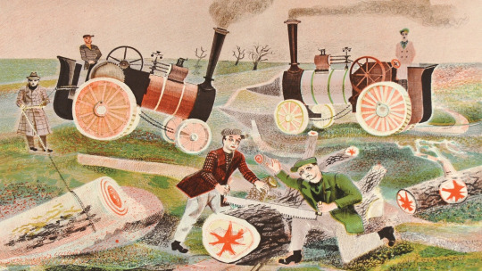
During 1945 he submitted a lithograph for the Schools Prints series, ‘Timber Felling’, it was the fifth print of the first series and is one of his most recognisable works. He also illustrated the Sussex volume of Visions of England in 1947.
Michael Rothenstein – Timber Felling, 1945. (Schools Prints SP5)
In 1948 Rothenstein would learn about lithographic printing with the two sisters, Frances Byng-Stamper and Caroline Byng-Lucas whom had set up Millers Press in Lewes, East Sussex. Their express purpose was to revitalise the art of lithography in the French style, art-lithography having become unfashionable in early twentieth century Britain and seen as the tool of a ‘commercial artist’.
Together with new lithographs, over the next few years Rothenstein would print many monotype experiments at his home in Great Bardfield.
Michael Rothenstein – The Cockerel, From my collection, 1950.
In the 1950s he embraced printmaking over painting working in every area of the medium. In 1952 he travelled to Paris to the ‘Atelier 17′ studio to work with Stanley William Hayter – the surrealist print-maker; under his influence it is credited that Rothenstein started his bold experiments in printmaking. The prints he produced were modern and colourful and very chunky mixing woodcuts with screen-prints or etchings. In this form of work he had discovered his true style making the farmyards and fields of Great Bardfield into lively prints.
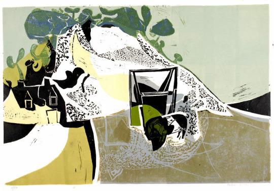
Michael Rothenstein – Quarry (White Cliff), V&A, 1955.
The first stages of the printmaking revival started with the boom in book sales and publishing from 1900. As publishers looked for more artistic illustrators the medium jumped into the art world with limited edition framed prints becoming more popular into the 1930s. Lithography, lino and the woodcut were the springboard in the 40s and 50s for large scale limited edition images that could be presented as art in multiable copies; with a painting you only have one sale, with a print you have many. Rothenstein, with his ongoing experiments into printmaking, found himself with a younger set of artists pushing the boundaries of printmaking and riding the British wave of Pop Art.
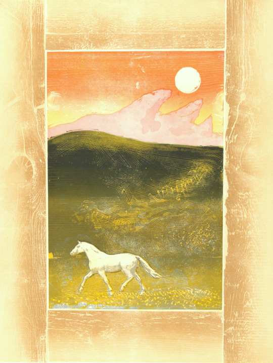
Michael Rothenstein – Horse and Sunrise, From my collection, 1974.
Horse and Sunrise is made with wood timbers bolted together in a frame like metal type is in a letterpress. The centre is made of two more woodblocks of (1) the sky and land, and (2) the green hill top shading. The horse is a screen-print layer
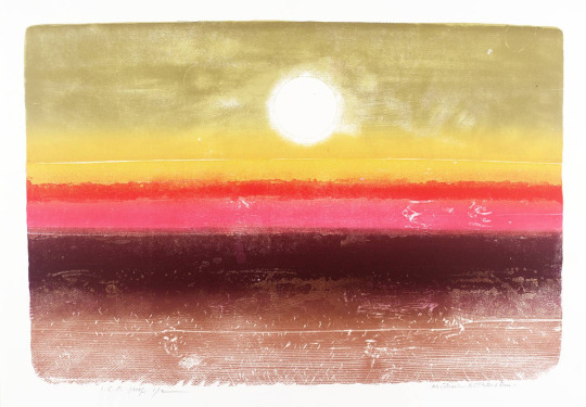
Michael Rothenstein – Sunrise at 36,000 ft, From my collection, 1973
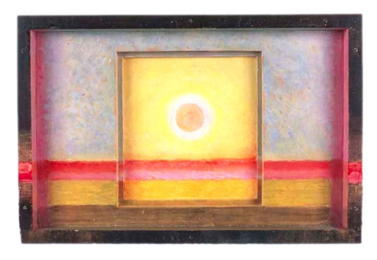
Sunrise at 36,000 ft is a woodcut with multiable pieces of wood bolted together and a colour intaglio print with multi-colour shading, blending and intaglio details. In the 60s Rothenstein started to construct box pieces made from found items. Painted or covered with his prints they blurred the perceptions of painting, sculpture and printmaking.
Michael Rothenstein – Sun Box II, 1975.
The works that set Rothenstein into becoming a Pop Artist are mostly the ones with screen-print overlays, like in the Marilyn Monroe print.
Michael Rothenstein – Marilyn I, From my collection, 1978
The fundamentals of Pop Art are using ‘found objects’ to make major commercial artworks. Like Warhol and Lichtenstein, he blew-up the size of pictures from newspapers and bolted them with real items in his boxes.
Michael Rothenstein, for instance, has applied boundless energy to extending the range of the relief process of wood and lino, sometimes combining them with screenprint and photo-screen. ‡
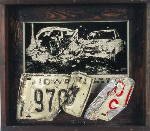
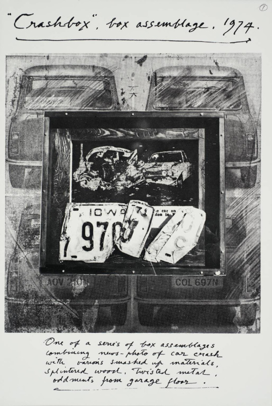
Michael Rothenstein – Crash Box I, 1973
Michael Rothenstein, Crash Box Assemblage, Tate, London, 1974
In 1936 he married his first wife, the artist, Betty Fitzgerald, who was later known as Duffy Ayers, and the couple had two children. In 1956 he divorced Duffy and in 1958 married Diana Arnold-Forster. Not long after the 1958 Great Bardfield summer exhibition the couple moved to the nearby village of Stisted, Essex.
Rothenstein was elected an Associate of the Royal Academy (ARA) in 1977 and a Royal Academician (RA) in 1984. His works are held in international collections.
Michael Rothenstein – Black Mast, Dalmatian Sea, From my collection, 1958.
† Obituary: Michael Rothenstein by Bryan Robertson, The Independent, 1993
‡ Printmaking in Britain by Richard T. Godfrey, 0714818380, 1978.
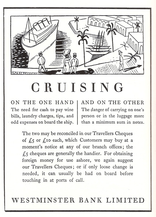
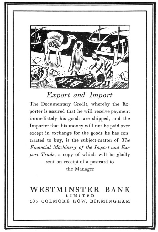
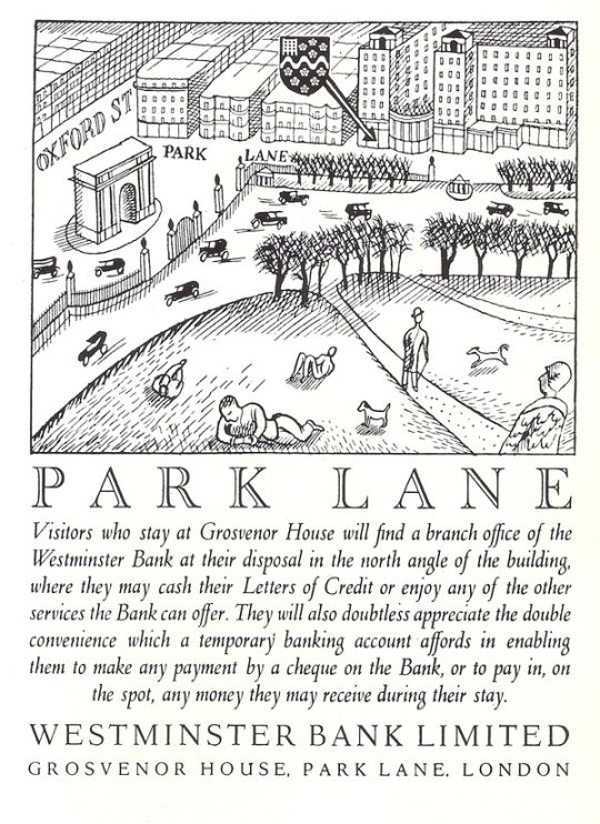
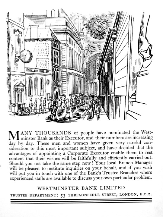
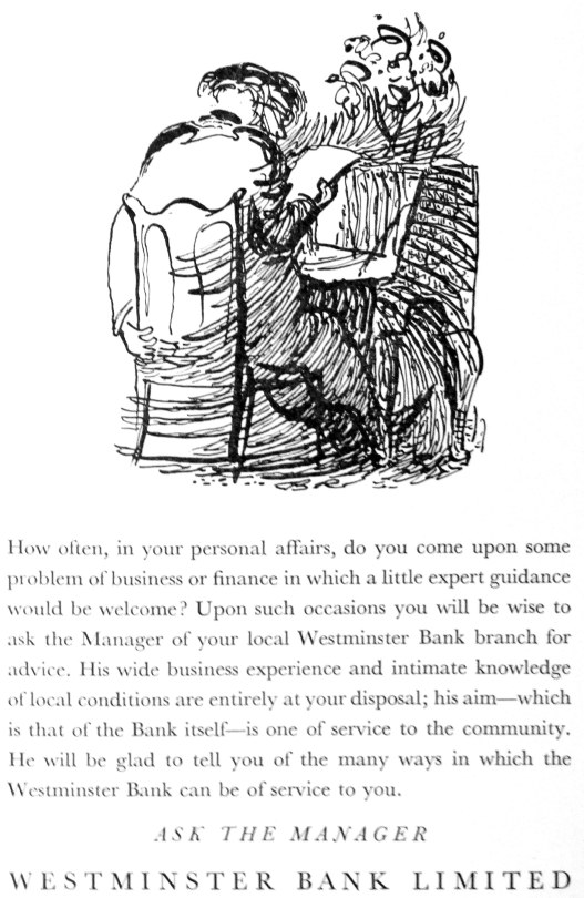
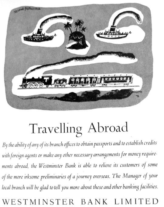
Here are a set of adverts out of various magazines from 1932-34 for the Westminster Bank. They are very similar in style to the adverts running at the same time by Guinness and Twinings. The first four illustrations are by Edward Bawden, then Ardizzone and Rothenstein.
There are many more illustrations with all the artists work on the internet but these were the ones I had found in my magazines so far, the text and pictures show the spirit of the age with travel and empire; to the technology of cars and steam liners, simple but beautiful I think.
The Documentary Credit, whereby the Exporter is assured that he will receive payment immediately his goods are shipped, and the Importer that his money will not be paid over except in exchange for the good he has contracted to buy, is the subject-matter of The Financial Machinery of the Import and Export Trade, a copy of which will be gladly sent on receipt of a postcard to the Manager.
Visitors who stay at Grosvenor House will find a branch office of the Westminster Bank at their disposal in the north angle of the building, where they may cash their Letters of Credit or enjoy any of the other services the Bank can offer. They will also doubtless appreciate the double convenience which a temporary banking account affords in enabling them to make any payment by cheque or the Bank, or to pay in, on the spot, any money they may receive during their stay.
Many thousands of people have nominated the Westminster Bank as their Executor, and their numbers are increasing day by day. These men and women have given very careful consideration to this most important subject, and have decided that the advantages of appointing a Corporate Executor enable them to rest content that their wishes will be faithfully and efficiently carried out. Should you not take the same step now? Your local Branch Manager will be please to institute inquiries on your behalf, and if you wish will put you in touch with one of the Bank’s Trustee Branches were experienced staffs are available to discuss your own particular problem.
Edward Ardizzone
How often, in your personal affairs, do you come upon some problem of business or finance in which a little expert guidance would be welcome? Upon such occasions you will be wise to ask the Manager of your local Westminster Bank branch for advice, His wide business experience and intimate knowledge of local conditions are entirely at your disposal; his aim – which is that of the Bank it’self – is on of service to the community. He will be glad to tell you of the many ways in which the Westminster Bank can be of service to you.
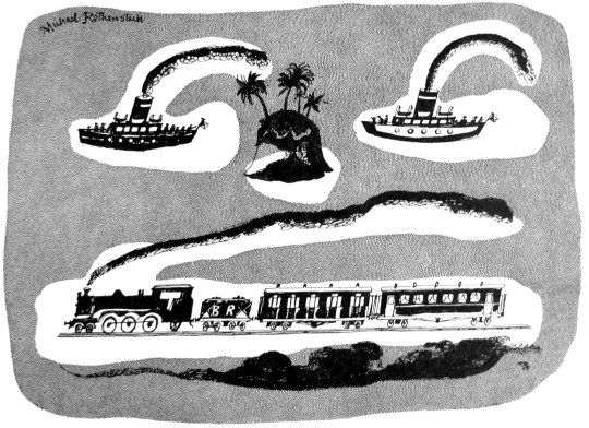
Michael Rothenstein
By the ability of any of its branch offices to obtain passports and to establish credits with foreign agents or make any other necessary arrangements for money requirements abroad, the Westminster Bank is able to relive its customers of some of the more irksome preliminaries of a journey overseas. The Manager of your local branch will be glad to tell you more about these and other banking facilities.