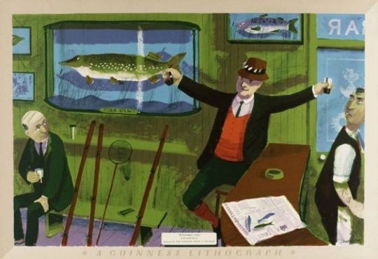
In various books throughout time, you can read about the vulgar arts; it is mostly a term for any mass production and in art that means printmaking. From an art history perspective, the patron and the artist was a system that was more or less redundant in the 20th century. It was at this time that printmaking came into fashion because if an artist didn’t have one major sponsor, they would need many smaller incomes from the public.
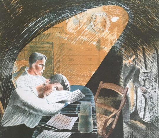
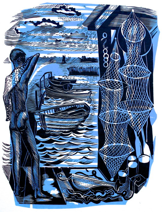
The history of printmaking and the taboo also follows publishing technology. After 1800 the wood-engraving was considered to be un-artisan and best left to newspaper printing and advertising. When wood-engraving was embraced by artists as a reaction to various exhibitions of Japanese woodcuts, the artists who used colour printing aped the Japanese styles of carving with British scenery. Sylvan Boxsius is a good example printing in a traditionally Japanese way.
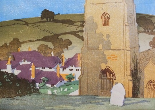
Sylvan G. Boxsius – A Devon Village, 1930s. From My Collection
With more traditional styles of English wood-engraving colour wasn’t welcome. Linocut had a vogue with Cyril Powers works but for printmaking it would be the 50s when colour came in for most artists; much like how colour photography wasn’t considered artisan until the 1980s.
It is important to add this is only in Britain. In France artists had worked in colour. Many of the big artists even worked in advertising making large lithographic posters. Pissarro made colour woodcuts in a medieval style. The French also had the fantastic Atelier 17 – a studio founded in 1927 by Stanley William Hayter. He was a British artist and working mostly in intaglio prints, but he developed new printing methods for colour etchings. Towards the end of the 40s the studio had encouraged mixed media printing methods that crossed over the sea to Britain.
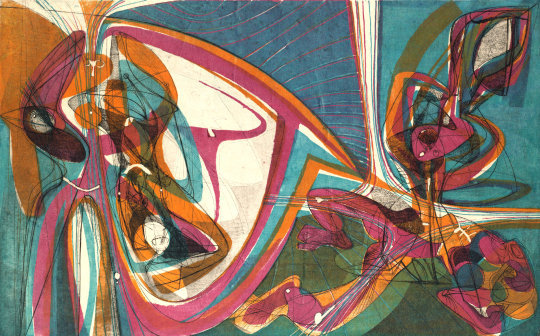
Stanley William Hayter – Cinq Personnages, 1946
But the biggest taboo to some would be to mix medias, pen and ink with wood-engraving or an etching with a lino-cut. It was the 20th century when nothing was classed as holy. For me I should also add there is a thrill when you see something new. When was the last time you saw something new?
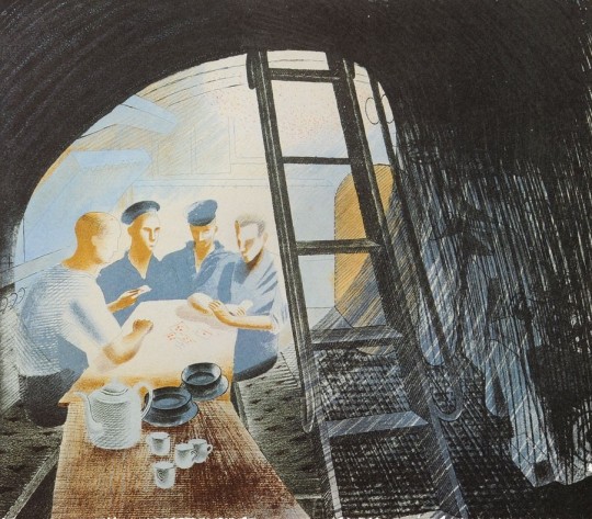
The images below are a series of John O’Connor wood-engravings with pen and ink continuations of the illustrations surrounding it. It might look to be obvious, but it is something new to me and I can’t recall seeing it before or after. The book is E. L. Grant Watson’s Departures from 1948.
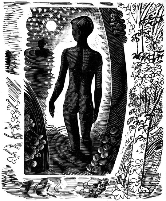
John O’Connor – Illustration from Departures, 1948
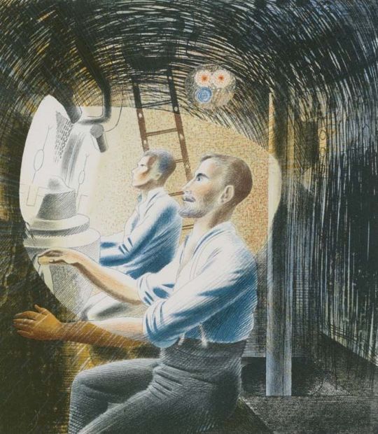
On the face of it John O’Connor doesn’t look to be a rebel. A student of Eric Ravilious and Edward Bawden at the Royal College of Art his wood engravings always have an old-world charm to them. But I think adding the ink drawings really worked with these illustrations. Below, I love the way the woodcut ends at the child ankles and the ink drawing takes over to show the feet submerged in water.
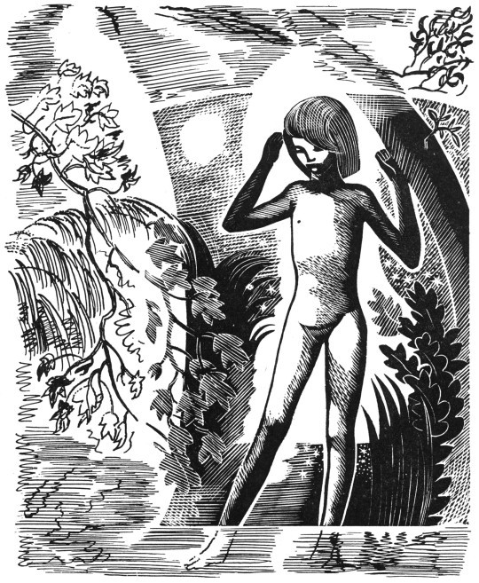
John O’Connor – Illustration from Departures, 1948
John O’Connor would go on to surprise me with printmaking by making colour wood-engravings. After spending a great deal of time carving the main black inked block, rather than waste time with wood to make the colour layers he would instead use Lino to make his abstract shapes that are loosely thrown over the engraving. Below I have over-saturated the colour layer to make the point, and it might look lazy but I think it’s fantastic and gives a lovely quality to the prints. So many artists fail in printmaking by trying to be too technically accurate, I think of
Stephen Whittle for example.
John O’Connor – Illustration from A Pattern of People, 1959
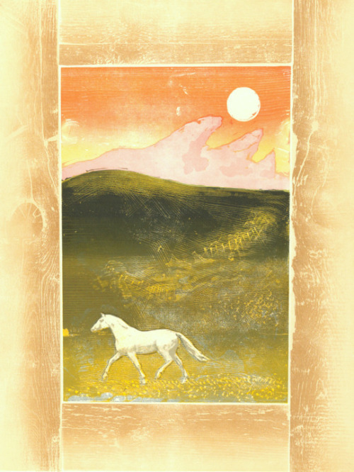
Michael Rothenstein – Horse and Sunrise, From my collection, 1974.
The other artist that thrills me somewhat is Michael Rothenstein. He is an artist that doesn’t get the credit he deserves and different people who represent his collection push the agenda that suit them.
Having a diverse career in art he started making accurate and twee illustrations of the countryside. As part of the Record Britain project he was sent out to document areas of Britain as artworks before the start of the Second World War. But after the war is where his life and work is far more interesting. He became one of the real innovators of printing and an early British Pop Artist, before the term was coined.
His first print was made in 1947 and after that he went to study at Atelier 17 with Hayter. There he developed skills with lithography and etching but abandoned them for their time consuming preparation processes and influenced by Edward Bawden he moved into Linocut.
Michael Rothenstein, for instance, has applied boundless energy to extending the range of the relief process of wood and lino, sometimes combining them with screenprint and photo-screen. ‡
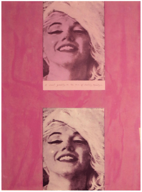
Michael Rothenstein – Marilyn I, From my collection, 1978
This Rothenstein print is made up of two screen prints of a photograph of Marilyn Monroe with a pink frame over printed impressions of a burnished planks of wood in green. I think it may need repeating; printed planks of wood.
When I was at art school at the end of the previous century I thought my printing of pavements and blocks of wood were new ideas, however Rothenstein had already penned a book on the topic called Frontiers of Printmaking – New Aspects of Relief Printing in 1966. In the book he shows printed Tree-trunks, metal cans, chicken fencing, the board at the back of an old Pye radio, electronic motors… anything flat you could get an impression off of.
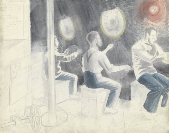
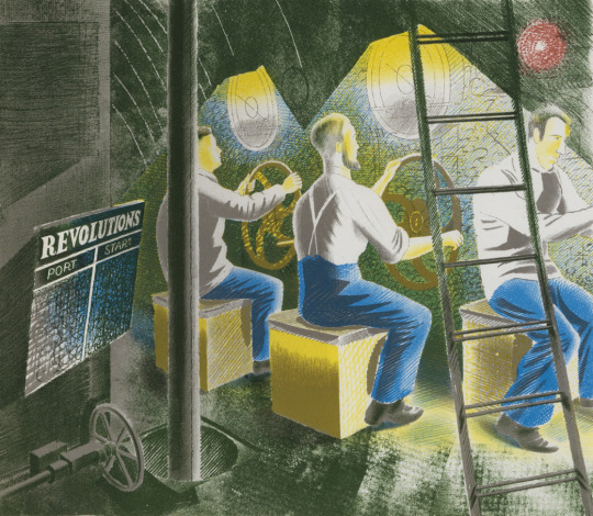
Any materials that were fairly thin were printed on the platen press. In proofing surfaces of rough texture, however, a soft, flexible packing was placed above the paper as already described … Before use, metal from the scrap-head needs cleaning. It is clamped to the bench and brushed down with a wire brush or wire circumference brush used in a power-tool. An industrial mask should be worn for this process. Very dirty metal taken from the scrapheap or city dump should be first put in the sink and scrubbed down with disinfectant. †
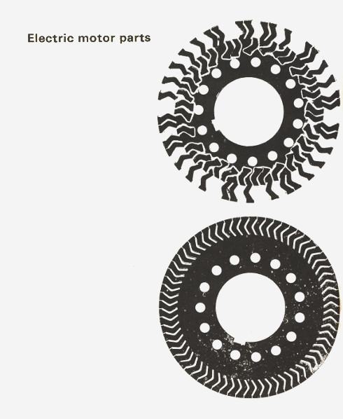
Example page from Frontiers of Printmaking, 1966
Rothenstein later claimed that Hayter had prompted him to take pictorial risks and avoid predictable effects.
What Hayter did in France to stimulate etching and engraving’. wrote James Burn lately, ‘Michael Rothenstein has done in England for relief printing’. ♠
Rothenstein found and collected things to make really wonderful works and I think he should be celebrated more than he is.
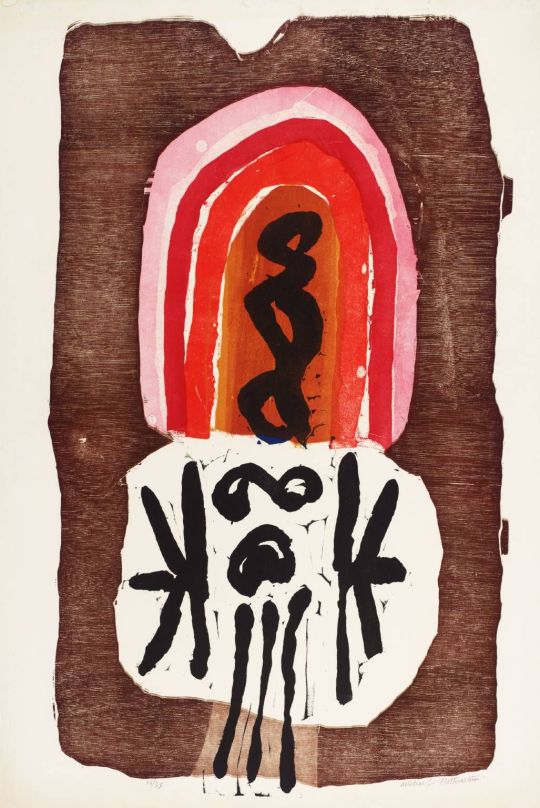
Michael Rothenstein – Red Gothic, 1962
† Michael Rothenstein – Frontiers of Printmaking, 1966
‡ Richard T. Godfrey – Printmaking in Britain, 1978
♠ The Penrose Annual: Review of the Graphic, 1964