Here is a series of images from La Fontaine’s fable The Cat Transformed into a Woman by different artists with the poem translated.
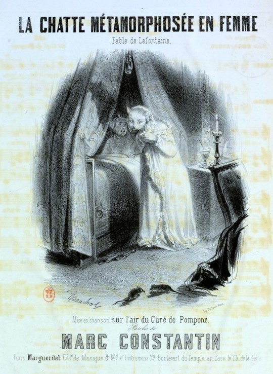
Marc Constantin’s song sheet – The Cat transformed into a woman from the La Fontaine’s fable, 1846.
A bachelor caressed his cat,
A darling, fair, and delicate;
So deep in love, he thought her mew
The sweetest voice he ever knew.
By prayers, and tears, and magic art,
The man got Fate to take his part;
And, lo! one morning at his side
His cat, transformed, became his bride.
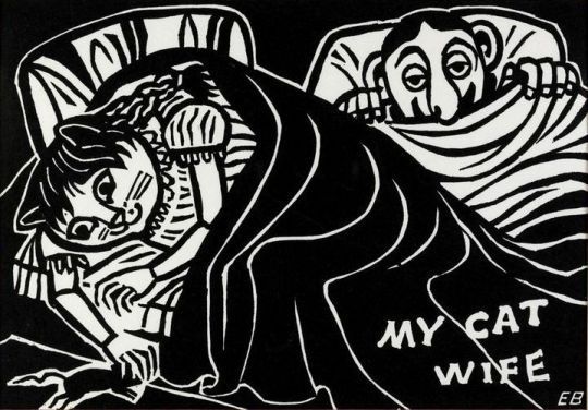
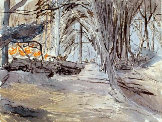
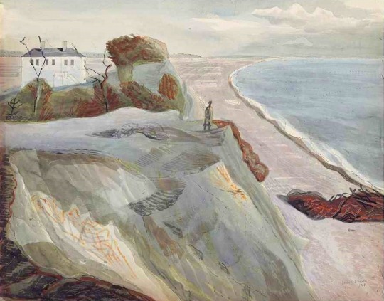
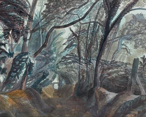
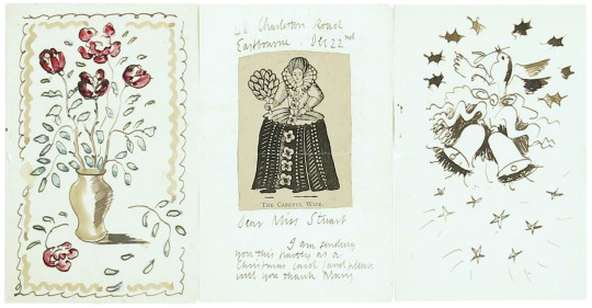
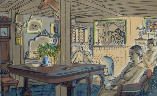
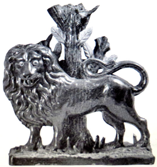
Edward Bawden – My Cat Wife, 1986
In wedded state our man was seen
The fool in courtship he had been.
No lover ever was so bewitched
By any maiden’s charms
As was this husband, so enriched
By hers within his arms.
He praised her beauties, this and that,
And saw there nothing of the cat.
In short, by passion’s aid, he
Thought her a perfect lady.
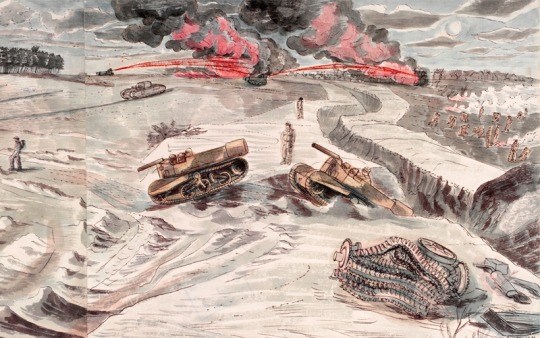
It was night: some carpet gnawing mice
Disturbed the nuptial joys.
Excited by the noise,
The bride sprang at them in a trice;
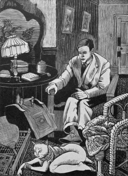
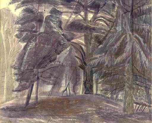
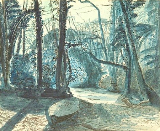
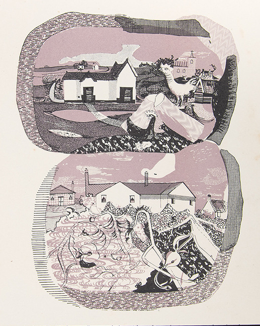
Tirzah Garwood – The Cat Wife, 1928
The mice were scared and fled.
The bride, scarce in her bed,
The gnawing heard, and sprang again,
And this time not in vain,
For, in this novel form arrayed,
Of her the mice were less afraid.
Through life she loved this mousing course,
So great is stubborn nature’s force.
In mockery of change, the old
Will keep their youthful bent.
When once the cloth has got its fold,
The smelling-pot its scent,
In vain your efforts and your care
To make them other than they are.
To work reform, do what you will,
Old habit will be habit still.
Nor fork nor strap can mend its manners,
Nor cudgel-blows beat down its banners.
Secure the doors against the renter,
And through the windows it will enter.
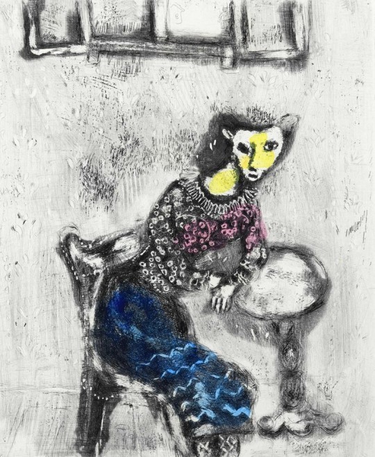
Marc Chagall – The Cat Transformed into a Woman, 1926
In 1926 Ambroise Vollard commissioned Chagall to illustrate La Fontaine’s ‘Fables’. ‘The Cat Transformed into a Woman’ illustrates the story of a man who so adored his cat that he was able to turn her into a woman and marry her. He thought she would be the perfect wife. However, he soon realised he could not change her in every respect, as she still chased mice. †
† Tate – N05759