The Countryman magazine was founded in 1927 by J. W. Robertson Scott, who edited it from his office in Idbury in rural Oxfordshire for the first 21 years, since then it has had many editors but is still going today. In the Spring issue of 1958 it described itself as “A quarterly non-party review and miscellany of rural life and work for the English-speaking world”. Its editor at that time was Johnathan Cripps.
The magazines are amazing things to look in as you never know what you will read, from blacksmiths who make Dragon shaped door locks to the development of archaeology and farming. The size is also charming, being A5 it slips in a bag better than most modern magazines.
In 1959 the magazine was published quarterly, all four of the covers were designed by John Nash. Nash at this time lived in Bottengoms, a house in Wormingford, Essex, near Colchester. He taught botanical illustration at the Colchester School of Art in the 60s and 70s. He is most famous for his country paintings and was at the forefront of the revival of British landscape painting.
These copies with the John Nash covers are not that rare but many booksellers online have not noticed the illustrator.
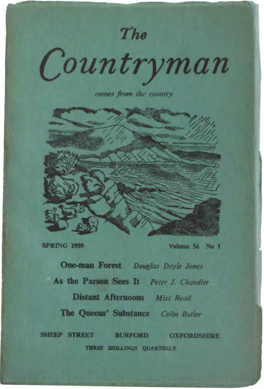
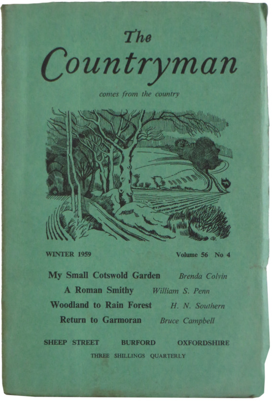
Nash’s most important association with The Countryman was over the four cover designs he did for their 1959 issues. Prior to 1959 the covers had always tabled the list of contents, but Cripps wrote to Nash in May 1958 explaining that for some time he had been investigating the possibility of introducing an illustration onto the cover, and he invited Nash’s comments on the matter. Obviously this was an important step for such a well established periodical and one that could win or lose a lot of readers. John Lewis was also asked to come in on the project to advise on the design and layout of the new covers. It was decided that Nash would design the first four covers and Cripps wrote to him accordingly:
… to confirm that you will prepare four roughs with some relation to the seasons, to occupy approximately the top half of the space on our cover now filled with the titles of articles and their authors. For these I would pay a total sum of thirty guineas.
By September 1958 Nash had done four designs which he sent to John Lewis for his comments. Nash apologised that they were carried out in biro, he also pointed out that his final drawings would be twice the size in order to simplify any cross-hatching work he had to do. The drawings were sent on to Cripps who then wrote back to Nash with various suggestions.
He liked Nash’s drawing of Skye best and he asked him if he could perhaps include some lambs in the illustration so they could use it for the first cover for Spring. Nash checked to see whether there would in fact be lambs on Skye in spring and as there were be revised his drawing accordingly.
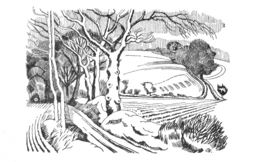
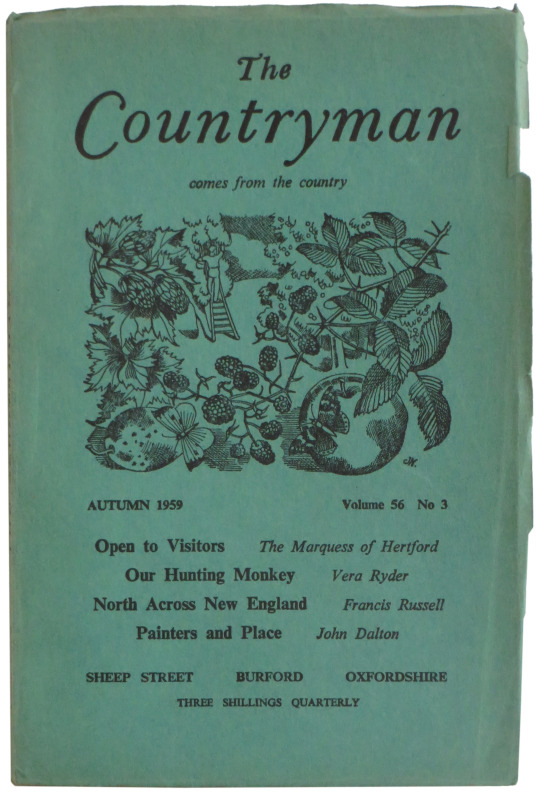
The drawing for Winter of a lane at Stoke-by-Nayland was also approved of, but Cripps pointed out that as this design had trees in it, it would be inappropriate to precede it with Nash’s drawing for Autumn of a wood. Nash therefore produced
another drawing for Autumn, a more seasonal one of apple-picking with a sprig of a blackberry bush across the foreground.
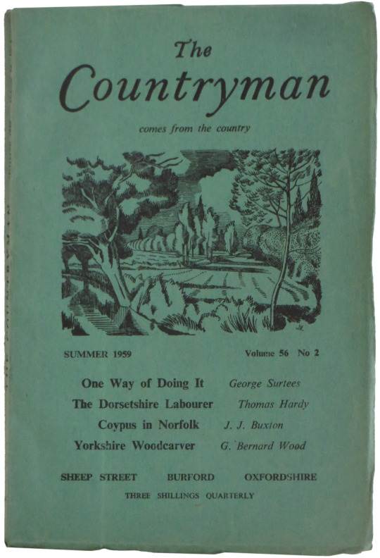
Nash’s fourth drawing of a lake in Cornwall also had to be re-done because the paper for the cover was too absorbent and would not pick up the detail in his design. This he substituted with the drawing of ‘A Suffolk Stream’.
Apart from a somewhat lengthy discussion about whether there should be a line round Nash’s illustrations or not, and a few minor revisions to the positioning of the blackberry sprig for the Autumn cover, the printing went ahead according to plan. Nash’s designs were obviously a success because from now on all The Counterman covers were illustrated. The next six were on the same deep green paper, but in the autumn of 1961 this was replaced with a bright green and the design was inset on a white background. Nash was not asked to contribute further cover designs. †
† Clare Colvin – John Nash – Book Designs, p74, 1986