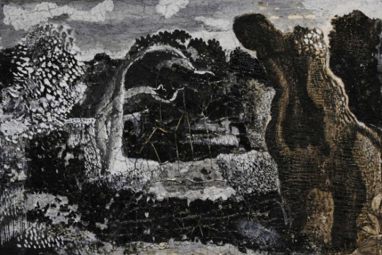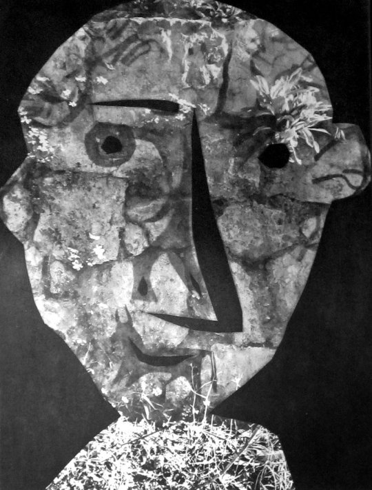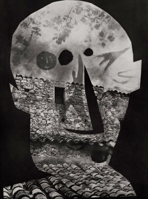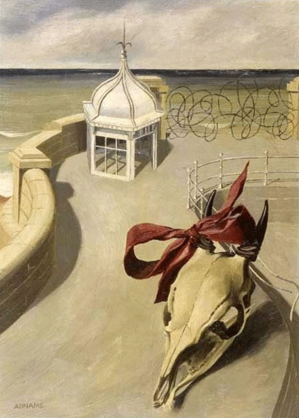
Marion Adnams – Aftermath, 1946
Marion Elizabeth Adnams was an English painter, printmaker, draughtswoman and one of Britain’s unknown Surrealist painters, there are many artists who don’t get the recognition they deserve.
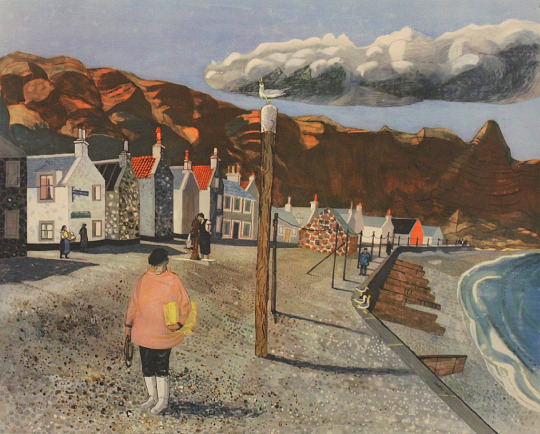
Her family were from the Isle of Wight but moved and settled in Derbyshire, where she was born and educated. After reading Modern Languages at Nottingham University and teaching French and English in the day, it was then that she started to paint and took evening classes at Derby School of Art under Alfred Bladen. In some of her paintings she used locations in Derbyshire as the subjects in oil.
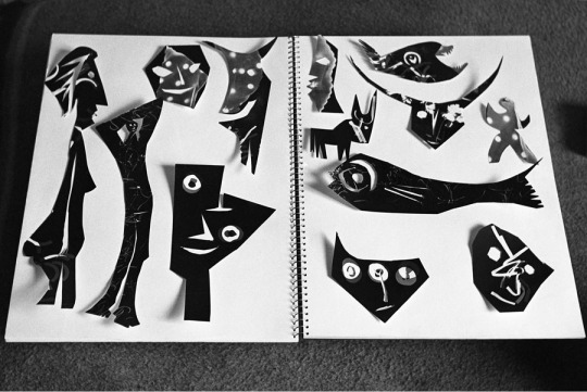
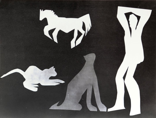
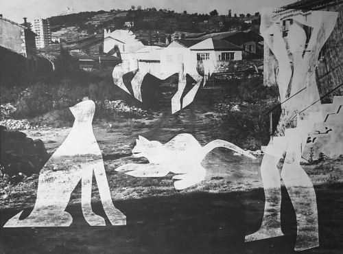
In 1938 Adnams became an art teacher and around this time she started painting in a surrealist style; putting apparently unrelated objects together in mysterious scenes, and rarely if ever including figures. †
She became head of the art department at Derby Training College in 1946, the year Aftermath was painted. The skull and barbed wire may allude to the war, but they were also standard Surrealist motifs, seen also, for example, in the work of John Banting. ‡
Adnams made many friends in the artistic world, she is listed in the credits of many books on surrealist and abstract art in the 1930s and credited as a adviser on churches in Derbyshire in John Betjeman’s English Parish Churches. She is also thanked in the book, Vom Bauhaus nach Terezín – Children’s Drawings from the Concentration Camp Theresienstadt.
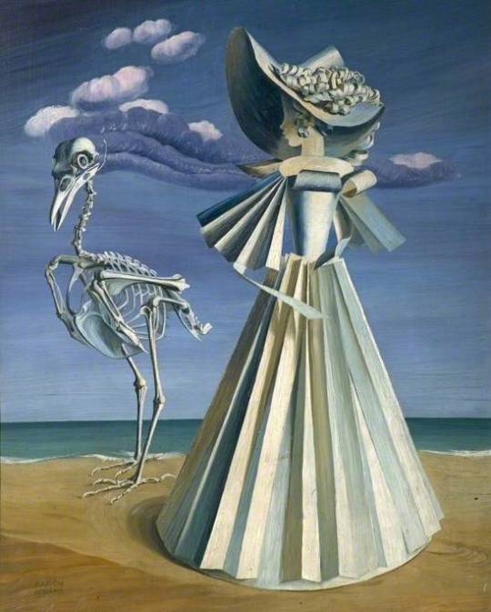
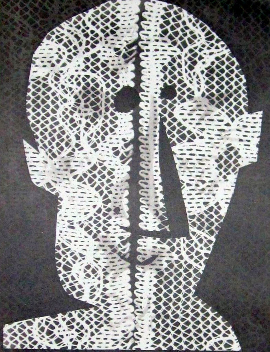
Marion Adnams – Alter Ego, 1940
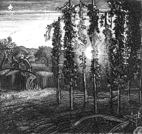
Marion Adnams – For Lo, Winter Is Past, 1963
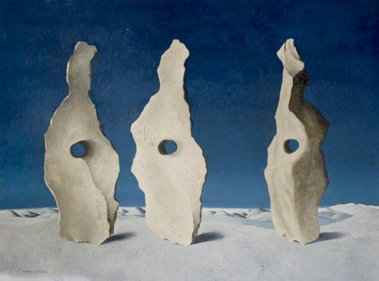
Marion Adnams – Three Stones, 1968
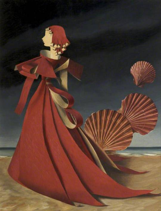
Marion Adnams – Variation On Red, 1949
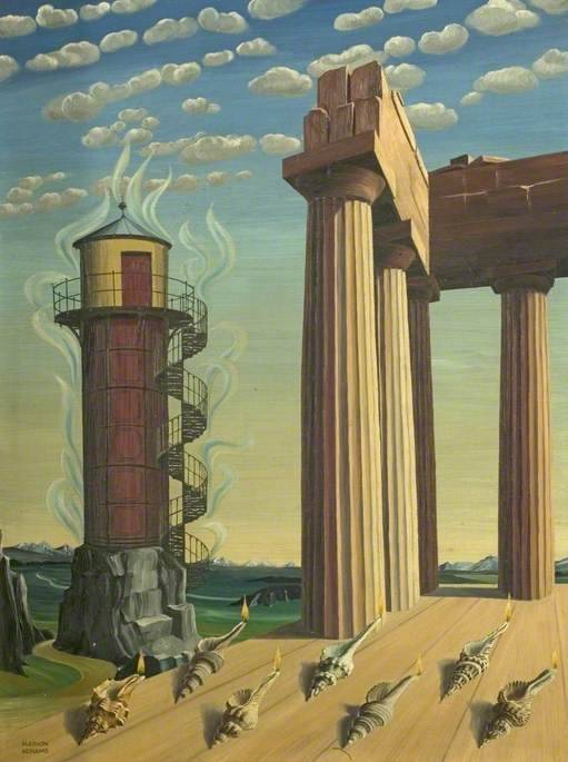
Marion Adnams – The Seven Lamps, 1956
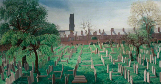
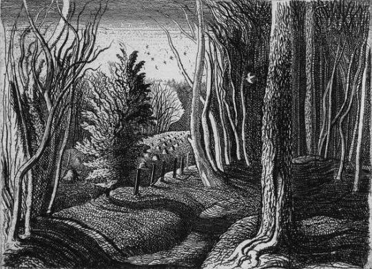
Marion Adnams – Spring In The Cemetery, 1956
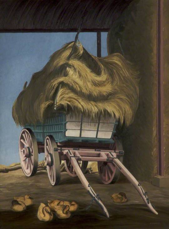
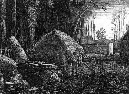
Marion Adnams – Hay Harvest, 1947
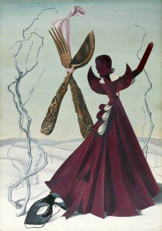
Marion Adnams – Coloured Ending, 1962
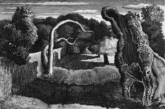
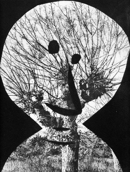
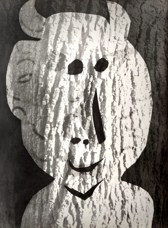
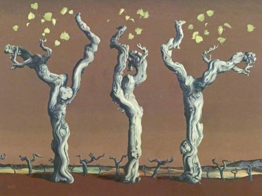
Marion Adnams – The Living Tree, 1939
The Living Tree: On a visit to Sark in the summer of 1939 she was thrilled with the sea and its accompaniment of seaweed, sand and shells. Skies fascinated her, too, and of these she made endless colour notes. The twisted trunks and branches of trees. ♠
† Marion Adnams – National Galleries of Scotland
‡ Another World – Dalí, Magritte, Miró and the Surrealists, 2010, p162
♠ The Studio Magazine – Volumes 127-128, 1944, p120
Alan Windsor – Handbook of Modern British Painting and Printmaking 1900-1990, 1998, p3
Sara Gray – The Dictionary of British Women Artists, 2009 p11