Roland Vivian Pitchforth was 44 when war was declared. He was one of the few artists to get the job done. He painted every type of scene you could think of and accurately.
The spotlight after the war fell on more abstract artists. I blame gallery curators who want to make an easy (lazy?) link between the wars; the abstract paintings of Paul Nash of the First World War next to the paintings of Graham Sutherland and Henry Moore’s Second. In this funk I think Roland Vivian Pitchforth lost out, as did Eric Ravilious until his work was reviewed again in the 1970s. I think it is time these works are championed.
After almost a year of bureaucratic wrangling with the start up of the War Artists’ Advisory Committee, Pitchforth was made an official war artist.
Kenneth Clark was chairman of the War Artists’ Advisory Committee. That committee was part of the Ministry of Information. Clark would describe the ministry and its role succinctly, if rather negatively, in his autobiography:
It was said to contain 999 employees… [Its] large staff had been recruited to deal with three or four different objects. The first, and most defensible, was censorship; the second the provision of news; the third a feeble attempt at propaganda through various media; and the fourth to provide a kind of wastepaper-basket into which everyone could throw their grievances and their war-winning proposals.
The official role of war art had been, after much difficulty, established during the First World War. (In part, the idea had succeeded because the Germans had already developed such a scheme of their own, and the English felt a need to rival their enemy.) The essential purpose was that artists should provide a record of the war; and in some instances, (though it was not required, or expected) they might create something beyond reportage or official portraits – works of art in their own right. †
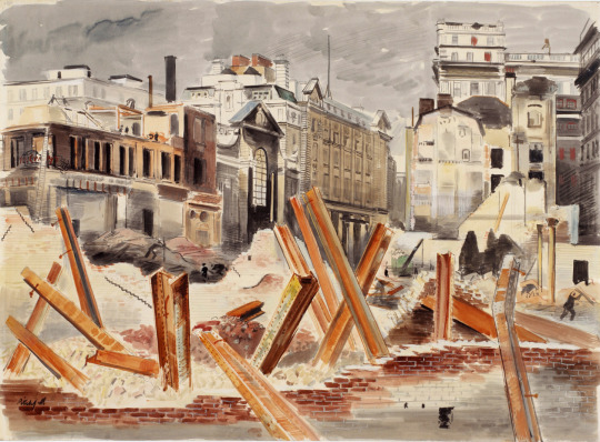
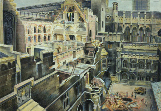
Roland Vivian Pitchforth – Post Office Buildings, 1941
From 1940 to 1945, Pitchforth served as an official war artist for the Ministries of Information, Home Security, Supply and for the Admiralty. In March 1940, he was given a brief to depict the work of the Air Raid
Precaution (ARP) organisation and in December secured a six month
appointment with the Ministries of Home Security and Supply.
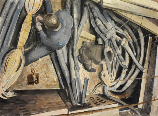
Roland Vivian Pitchforth – Repairing Telephone Cables, 1941
In a series of pencil, watercolour, oil and lithograph pieces, he depicted ARP training, war damage, military production and naval scenes. Many of these were singled out for praise by the War Artists’ Advisory Committee (WAAC) and exhibited at the Royal Academy from 1941. He also painted a series of London war damage scenes including a number of paintings of the House of Commons in 1941
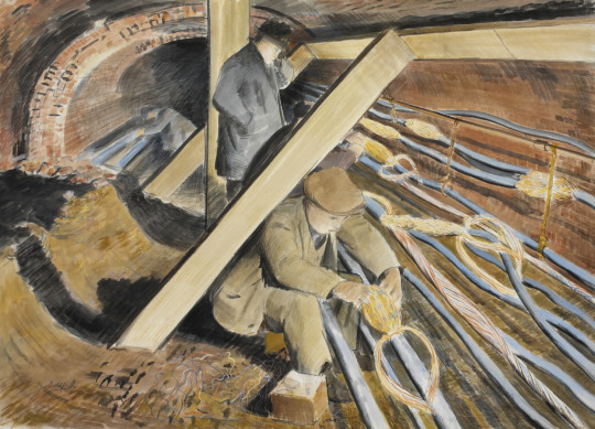
Roland Vivian Pitchforth – Repairing Telephone Cables, 1941
His artist’s eye picked out the many bleak and surreal sights on London’s bomb sites. In March 1941, he described sketching damaged lift shafts open to the elements: “They look like dead prehistoric animals lying
over the jagged walls.”
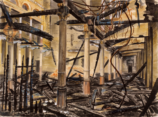
Roland Vivian Pitchforth – The City Temple Church, London, EC4, 1941
Pitchforth subsequently specialised in coastal scenes, joined several naval convoys to Gibraltar and the Azores and produced paintings on RAF test flights and maintenance subjects.
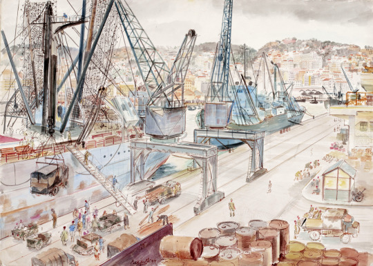
Roland Vivian Pitchforth – Loading Stores for Italy at Algiers, 1944
Commissioned in October 1943 as a temporary captain in the Royal Marines, Pitchforth was attached to the Royal Navy and in 1945 was sent by South Eastern Command to record the naval campaigns to retake Burma and Ceylon. During the British assault on Rangoon, he assisted in the camouflaging of his group’s amphibious craft. He captured the events in a series of paintings of Colombo Harbour and in The First British troops in Rangoon (1945). At war’s end, Pitchforth acquired a lung infection and spent 1945-1946 convalescing in South Africa (he still managed to exhibit at Wildenstein’s Gallery) before returning to London in 1948.
It is not surprising that you can still find the locations of Pitchforth’s paintings in London, but due to bombing and redevelopment some of the shops have changed shape.
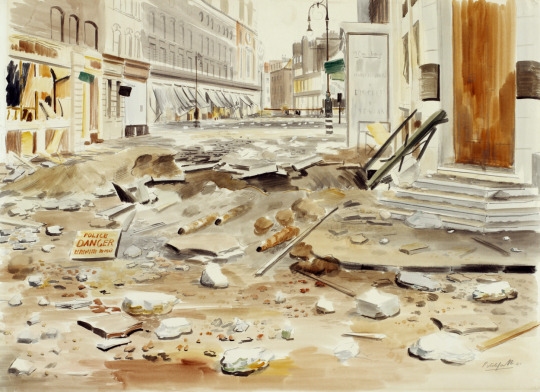
Roland Vivian Pitchforth – Sunday Morning, Great Titchfield Street, London, 1941
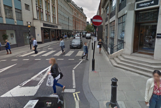
The Street Today, Google Maps.
Roland Vivian Pitchforth – Chamber of the House of Commons, Bomb Damage, 1940–1945
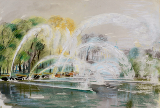
Roland Vivian Pitchforth – AFS Practice with a Trailer-pump : On the banks of the Serpentine, London, 1941
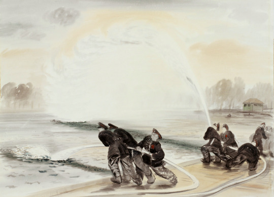
Roland Vivian Pitchforth – Fire-hose Practice in St James’s Park, London, 1941
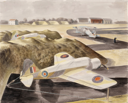
Roland Vivian Pitchforth – Protection Pits for Dispersed Aircraft, Lee-on-Solent, 1941
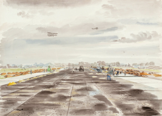
Roland Vivian Pitchforth – A New Runway, Lee-on-Solent, 1941
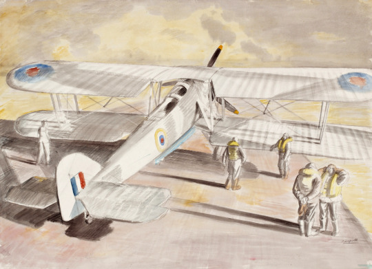
Roland Vivian Pitchforth – A Swordfish Aircraft Getting Ready to Take Off, 1941
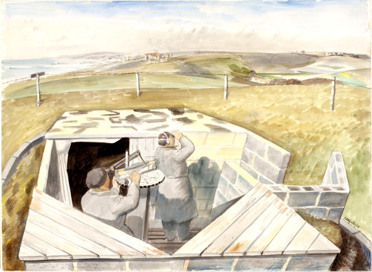
Roland Vivian Pitchforth – A Royal Observer Corps Post, Rottingdean, 1944
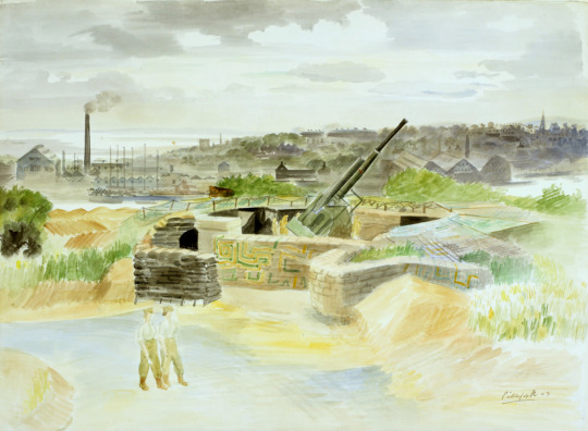
Roland Vivian Pitchforth – An AA Battery, 1943
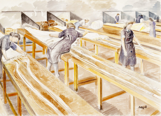
Roland Vivian Pitchforth – WAAFs Packing Parachutes, 1940
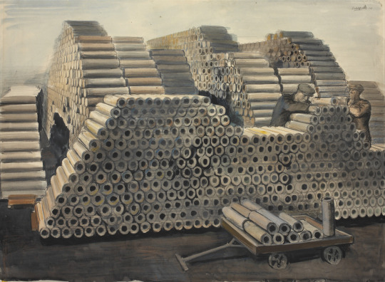
Roland Vivian Pitchforth – Raw Materials for 4.5 Anti-aircraft Shells, 1941
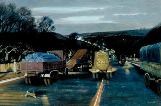
Roland Vivian Pitchforth – Night Transport, 1940
† Peter Stansky & William Abrahams – London’s Burning – Life, Death & Art in the Second World War. 1994. p16