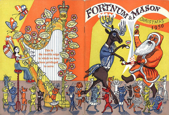
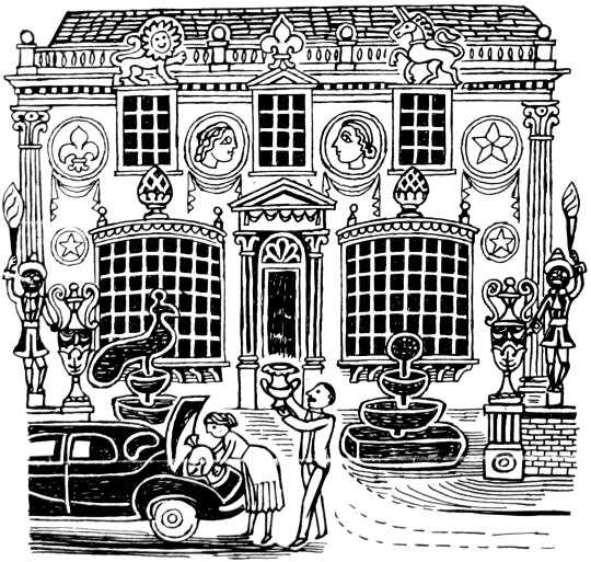
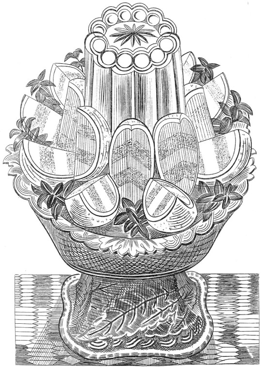
Edward Bawden – Fortnum & Mason Catalogue, 1956
1956 was a busy year for Edward Bawden. In the medium of linocut he completed two prints of Brighton and three large prints based in Great Bardfield. He illustrated the book The Sixpence that Rolled Away and designed the dust jacket for The Flight from the Enchanter by Iris Murdoch in linocut as well.
Further illustration work came with a lino cut of An Old Crab and a Young Crab and an etching of Watermellons for A Handbook of type and Illustration by John Lewis. Fortnum and Mason would commission him to illustrate their Christmas catalogue, something he used to do in the 1930s. In magazines and newspapers he designed a series of adverts for Chubb Locks.
Other than making prints close to home in Great Bardfield, Bawden travelled to Ironbridge. In the Royal Academy Summer Exhibition he displayed his watercolours of Canada painted in 1951 and Enna in Sicily, painted in 1953.
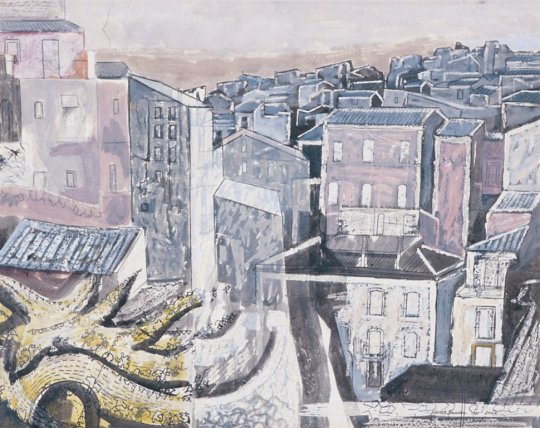
Edward Bawden – Enna, Sicily, 1953. From the RA Summer Exhibition 1956.
We start at home in Great Bardfield where Bawden was printing the linocuts of Ives Farmhouse and the farmyard behind the cottage.
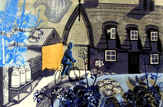
Edward Bawden – Ives Farmhouse, Great Bardfield, 1956
Ives Farmhouse is listed as the name of the print in the editioned version but there are a handful of ‘artist proof’ copies of this print titled The Road to Thaxted, like the copy the Fry Gallery own.
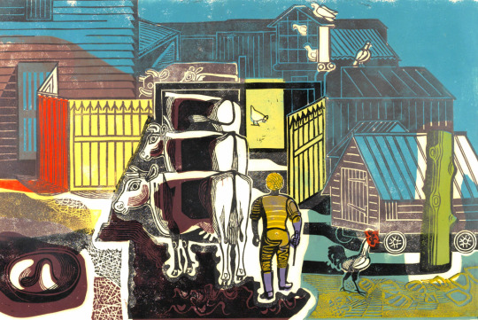
Edward Bawden – Ives Farm, Great Bardfield, 1956
One of the Ives Farmyard proofs has ‘poor print done by EB because no printing press.’ I would assume they mean the patchy printing of the colours.
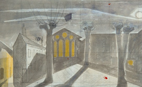
Edward Bawden – Study for: Town Hall Yard, Great Bardfield, 1956
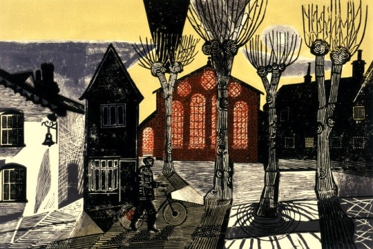
Edward Bawden – Town Hall Yard, Great Bardfield, 1956
Bawden makes good use of an ornamental pattern found in the buildings and finds decorative possibilities in the pollarded and leafless trees. †
The Town Hall Yard linocut would be sold at the Zwemmer Gallery in their first (of many) ‘New Editions’ shows – a selection of prints by various printmakers. It is also believed the Ives Farm prints were also available here. The Town Hall Yard was one of the prints that ended up in the Manchester Pictures for Schools collection, it is assumed that as theirs is an Artist Proof, Bawden donated it to the Pictures for Schools scheme.
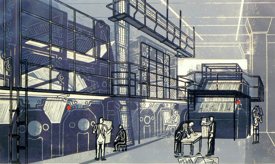
Edward Bawden – Printing the Sunday Times, 1956
The history of Printing the Sunday Times isn’t recorded, in the book The Edward Bawden Editioned Prints book by Jeremy Greenwood it is noted.
It has not been possible to discover the origin of this print, but it was perhaps commissioned by The Sunday Times whose permission at least would have been necessary to allow Bawden access to the plant.
There are a few different ideas to why this print has come about, but my theory is that is was likely commissioned by Bawden’s friend Robert Harling.
In the 1930s Harling worked for the advertising firms, Stuarts as a Designer and Everett Jones and Delamere as the Creative Director where he hired Bawden to illustrate the Fortnum and Mason catalogues. Harling was the designer who hired Eric Ravilious to design the cover to Wisden’s Cricketers’ Almanack in 1938. In 1945 Everett Jones and Delamere was liquidated and Harling moved to the staff of the Sunday Times along side Ian Fleming who was just about to write his first James Bond novel. Harling was the consultant designer to the paper from 1945 to the 80s, he would also guest at an architecture critic. In 1953 Bawden would do some illustration work for the Sunday Times for the article ‘Another Brighton’ by Clifford Musgrave (September 6th 1953).
Given that Harling was a designer for the paper and Bawden was such a close friend it could be guessed he:
- Got Bawden onto the premises to make a print of the topic
- Bawden saw the printing plant during the 1953 commission
- Harling commissioned the print for members of the staff as an internal gift.
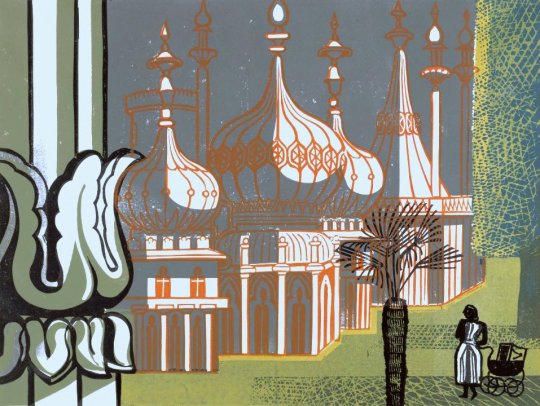
Edward Bawden – The Royal Pavilion, Brighton, 1956
The two prints of Brighton show a summers day and the south coast in winter. It would be the first of a series of prints and drawings Bawden made of Brighton.
Edward Bawden – Snowstorm at Brighton, 1956
Below are two illustrations for Chubb Locks, one with the full text under and a tale on how Chubb Locks can improve security, all of the adverts follow this style. Under is another line drawing.
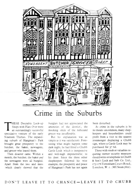
Edward Bawden – Chubb Lock Advert, Drawn, 1956 (Published 1957)
Edward Bawden – Chubb Lock Advert, Drawn, 1956 (Published 1957)
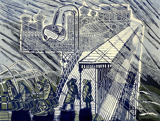
Edward Bawden went on a working holiday to Iron Bridge with the War Artists John Nash and Carel Weight.
I was at Ironbridge for about six weeks in September and October 1956 and was joined by John Aldridge, John Nash and Carel Weight. Each of us in turn painted the famous bridge’. ‘Houses at Ironbridge was almost the last painting I was able to do during my stay. ‡
Edward Bawden. Houses at Ironbridge
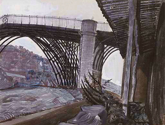
Edward Bawden – Iron Bridge, 1956
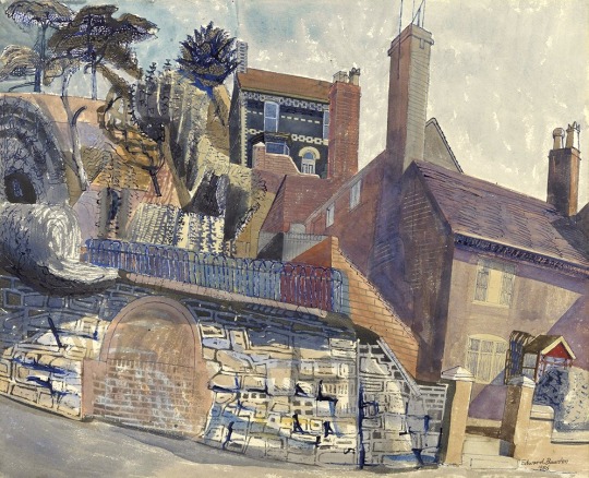
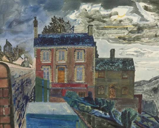
Edward Bawden – The House at Ironbridge, 1956
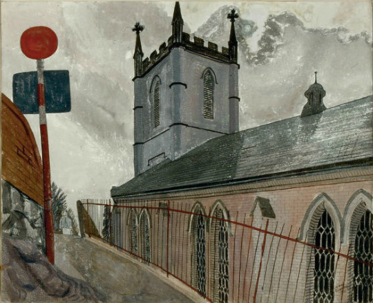
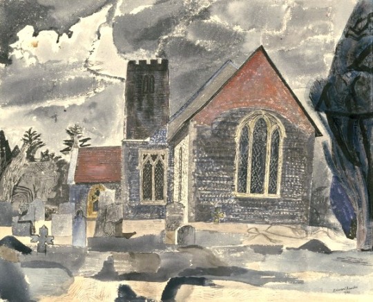
Edward Bawden – Ironbridge Church, 1956
Back at home in Essex Bawden painted Lindsell Church twice and then would go back in 1958 to paint it again before starting a massive linocut of the church in the early 60s.
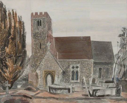
Edward Bawden – Lindsell Church, 1956
Edward Bawden – Lindsell Church #1, 1956
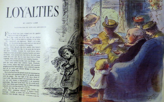
One of the books Bawden Illustrated as mentioned above is the Sixpence that rolled away. A curious tale by poet Louis MacNeice.
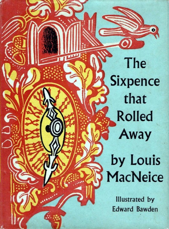
Edward Bawden’s Dust Jacket for The Sixpence that rolled away.
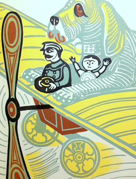
Edward Bawden’s illustration inside The Sixpence that rolled away
Below this are the two illustrations Bawden would make for the John Lewis book ‘A Handbook of Type & Illustration’ with an early Aesop’s print, An Old Crab & A Young Crab. Bawden would print a series of Aesop’s fable prints in the 70s.
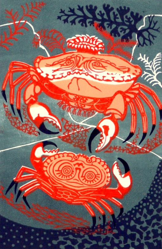
Edward Bawden – An Old Crab & A Young Crab, 1956
The etching below was likely made for the John Lewis book as well, rather than taken from his archive. But Bawden’s style of etching remained very similar throughout his life, from the works as a student to the works he made for the Orient Line. The perspectives looked like they were forced than natural.
Edward Bawden – Watermelons, 1956
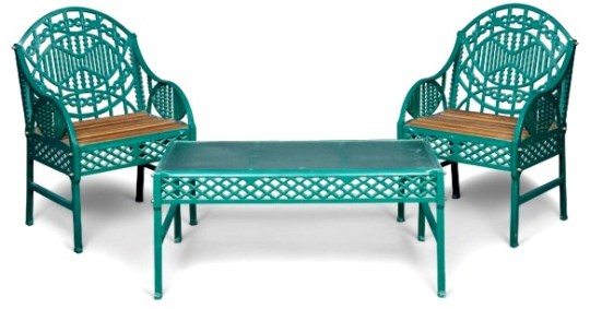
The Bawden designed chair and table in green, 1956
The strangest of the commissions to come in 1956 was again from Robert Harling and his client, Bilston Foundries Ltd. A garden seat, bench and table were designed by Bawden.
Churchill sat on it. The ‘Bilston Garden Seat’ was the brainchild of Robert Harling when he was working for an advertising agency. In a letter to Halina Graham the designer wrote, ‘The firm that produced the seat made baths, it was their main line of business & they had no faith in cast iron seats, but I remember going up to Warrington to get information about preparing the design. A technician on the staff of the Furniture School of the Royal College of Art made a model in wood of the design for casting that in itself must have been very expensive. When the seat was first produced & shown at Harrods I think that it probably failed expectations and only later when it became unobtainable did the demand for it increase’.
Bilston Foundries’ advertising leaflet describes it as ‘an ornamental seat unique in its gracefulness, and as distinguished by its careful finish as by its outstanding appearance’. The advertised price was 18 guineas. A cast iron chair along similar lines is illustrated in House and Gardens “Diction of Design”.
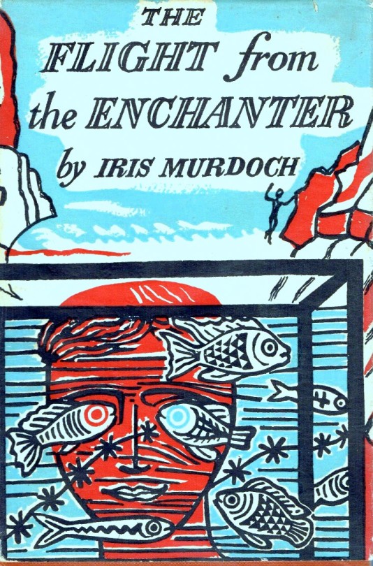
Edward Bawden – Flight from the Enchanter, Dust Jacket illustration, 1956.
The cover to The Flight from the Enchanter by Iris Murdoch is half made in Lino and the type and mountains are blown-up pen drawings. The original linocut is below in black, issued as a limited edition print in 1989.
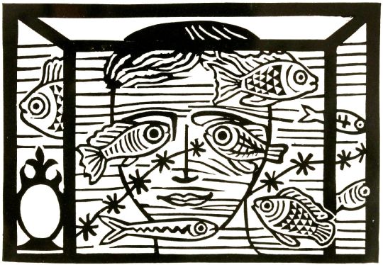
Edward Bawden – Flight from the Enchanter linoblock design, 1956.
At the end of the year Bawden took part in a shared exhibition of Great Bardfield artists with Michael Rothenstein, Geoffrey Clarke and Clifford Smith from the 25th November to 7th December.
Below is a variation on the print above of An Old Crab & A Young Crab used as Edward and his wife Charlotte’s Christmas card that year.
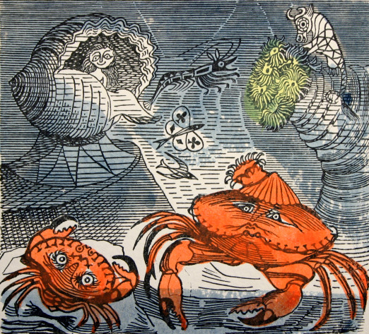
Edward Bawden – An Old Crab & A Young Crab – Christmas Card, 1956
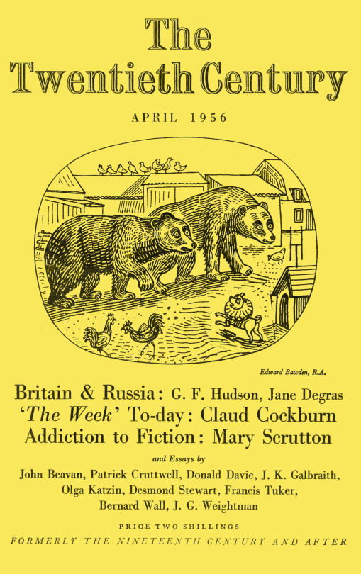
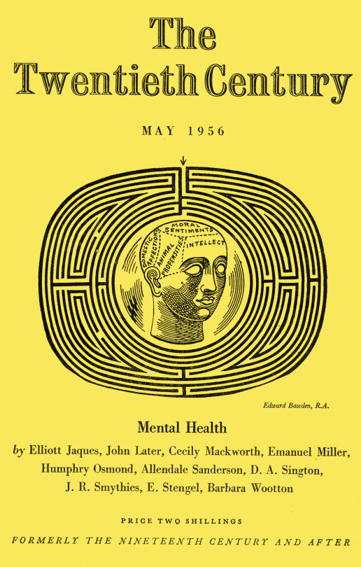
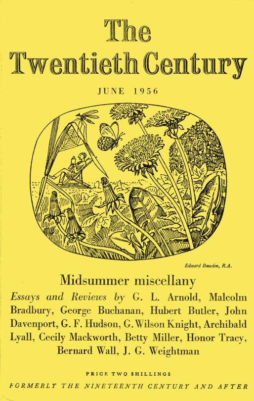
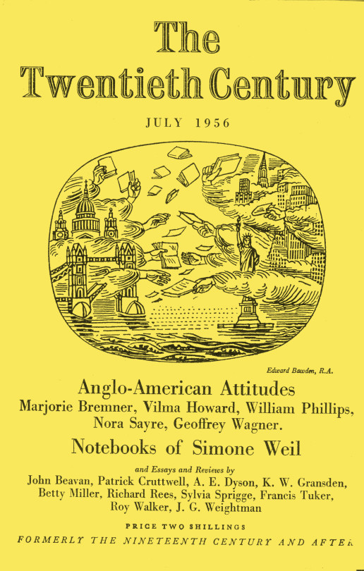
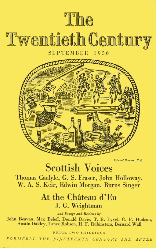
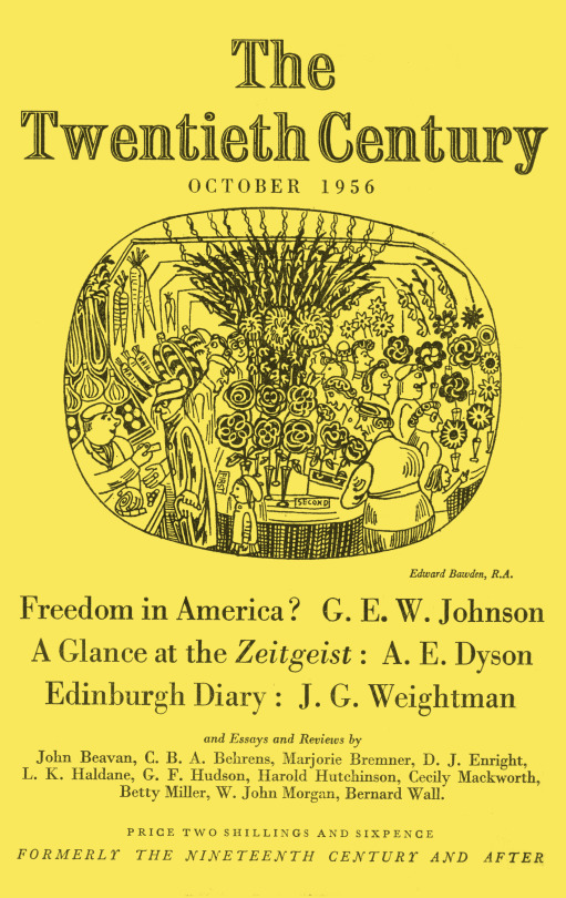
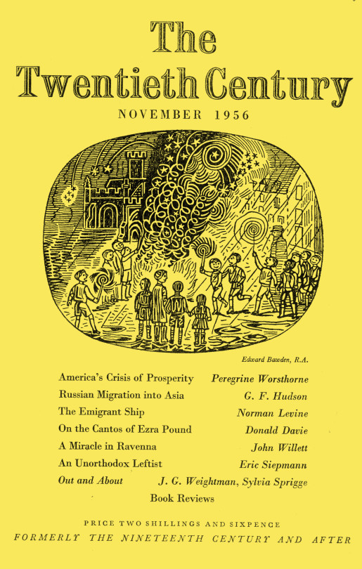
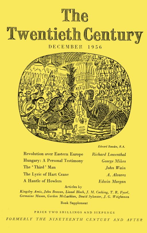
To finish the post off I thought what could be better than a whole run of illustrated magazine covers by Bawden for the Twentieth Century Magazine in 1956. It was in 1956 that Bawden was elected to the Royal Academy of Art. I would guess this happened in February as his credit for February is ARA and his credit for March is RA.
The font in the church shows it being the church in Great Bardfield and also featured in the King Penguin book, Life In An English Village.
The building to the right is the cottage featured in the Ives Farm print above.
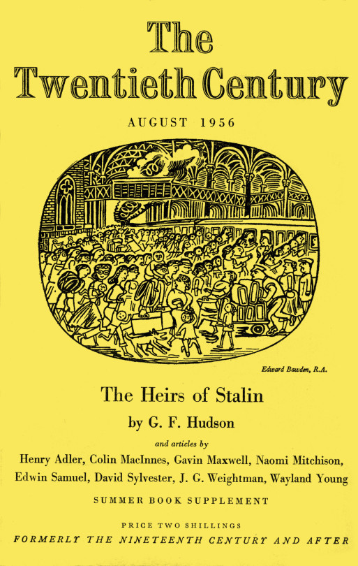
Above is an illustration from Liverpool Street Station, London.
As a footnote Robert Harling wrote the book, The Drawings of Edward Bawden in 1950.
† V&A – CIRC.865-1956
Oxford Dictionary of National Biography 2005-2008
‡ Tate – T00206