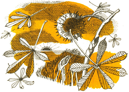
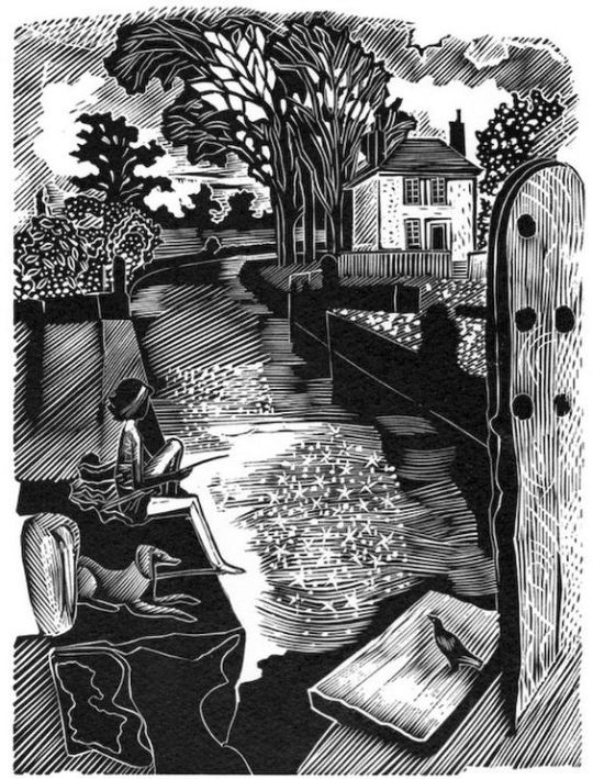
Here is a poem found in Volume 13 of the Saturday Book by Gerald Bullett, from 1953. The illustrations are by John Nash.
Now as my lamp burns low
I remember a green land of long ago,
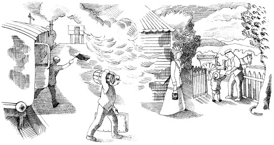
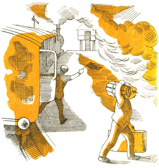
A plum-coloured train chuffing and puffing about,
And me, lucky, carefully lifted out
And led away into heaven through a White wicket,
Proudly surrendering half a railway ticket.
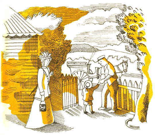
Between the shafts of a high dogcart stood
A patient pony, warm and brown and good,
Good to touch and fondle, with oily eyes
Incapable of anger or surprise,
Who at a word, a lifting of slack reins,
Carried me and my cousins along the lanes,
Past wooded meadows and the enormous stare
Of cattle, and gray sheep, browsing there.
The sky moment by moment growing dim
While still the sun burned on the western rim,
Rooks home-going, hedges warm with scent,
I rode into my kingdom of content:
So found the farm, Aunt Jinnie, Uncle Ned,
The sleepy supper and the dreamless bed,
To wake next morning in a world new-made.
O Earth and Sky, most tried of comforters:
O morning glory aslant across the years
From far fields, where every blade and weed
Miraculously nourished my heart’s need:
It is here on the map, my joy-bright country
Where grief has brief being, despair no entry,
And in this aged almanack I can trace.
The year, the very hours, of blessedness.
But their unique conjunction, place and time,
Is now no more than a remembered rhyme
Quickening the drowsy blood. Too soon, alas,
The dews dissolve on leaves and shining grass.
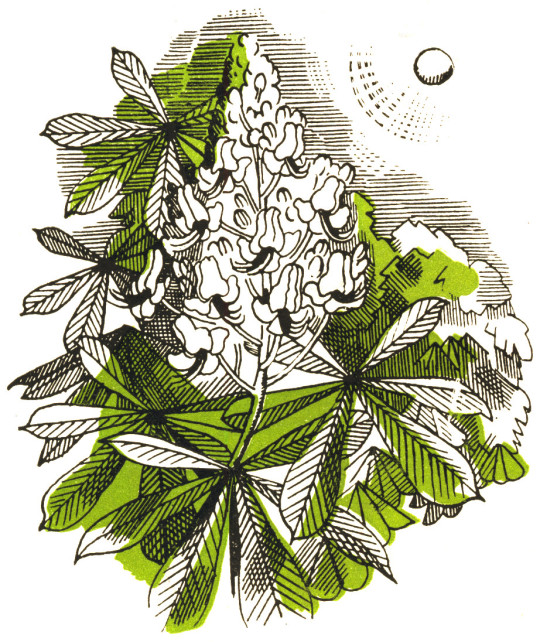
Too soon the glossy chestnut, newly come
From silken fold, his paradisial bloom
By malice of corroding time must lose,
The sun droop, the flower of morning close.
80 shall my Eden, as all memories must,
When this my lamp goes out,
Dwindle into a little heap of dust,
Resolving faith and doubt …
In whose hand held, or what abysm lost?
THE POEM BY GERALD BULLETT
THE ILLUSTRATIONS BY JOHN NASH
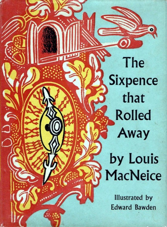
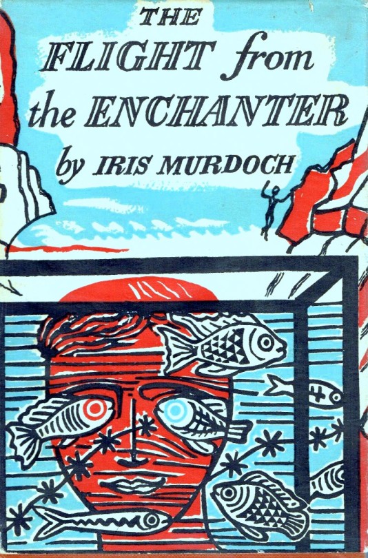
1956 was a busy year for Edward Bawden. In the medium of linocut he completed two prints of Brighton and three large prints based in Great Bardfield. He illustrated the book The Sixpence that Rolled Away and designed the dust jacket for The Flight from the Enchanter by Iris Murdoch in linocut as well.
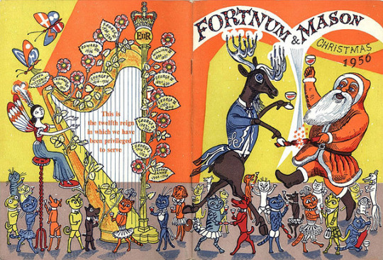
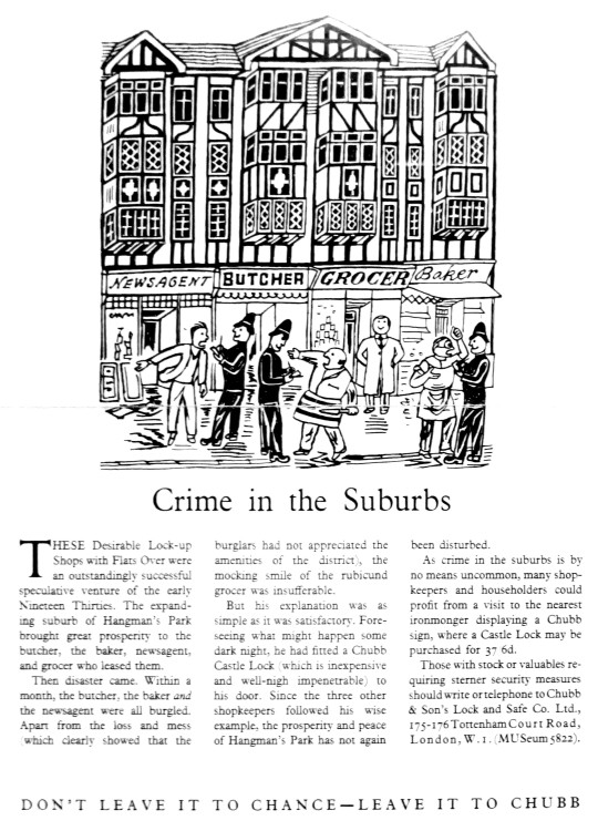
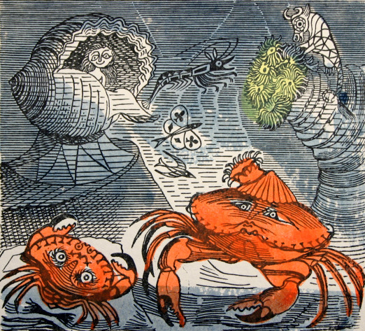
Further illustration work came with a lino cut of An Old Crab and a Young Crab and an etching of Watermellons for A Handbook of type and Illustration by John Lewis. Fortnum and Mason would commission him to illustrate their Christmas catalogue, something he used to do in the 1930s. In magazines and newspapers he designed a series of adverts for Chubb Locks.
Other than making prints close to home in Great Bardfield, Bawden travelled to Ironbridge. In the Royal Academy Summer Exhibition he displayed his watercolours of Canada painted in 1951 and Enna in Sicily, painted in 1953.
Edward Bawden – Enna, Sicily, 1953. From the RA Summer Exhibition 1956.
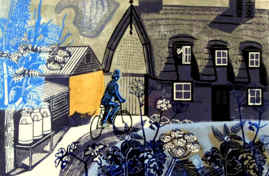
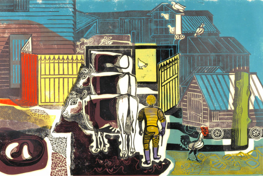
We start at home in Great Bardfield where Bawden was printing the linocuts of Ives Farmhouse and the farmyard behind the cottage.
Edward Bawden – Ives Farmhouse, Great Bardfield, 1956
Ives Farmhouse is listed as the name of the print in the editioned version but there are a handful of ‘artist proof’ copies of this print titled The Road to Thaxted, like the copy the Fry Gallery own.
Edward Bawden – Ives Farm, Great Bardfield, 1956
One of the Ives Farmyard proofs has ‘poor print done by EB because no printing press.’ I would assume they mean the patchy printing of the colours.
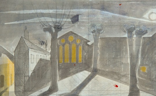
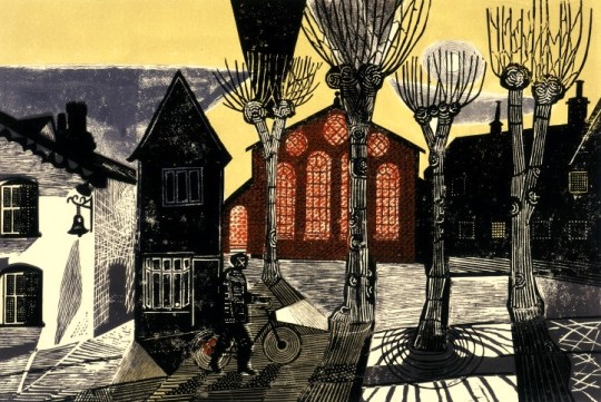
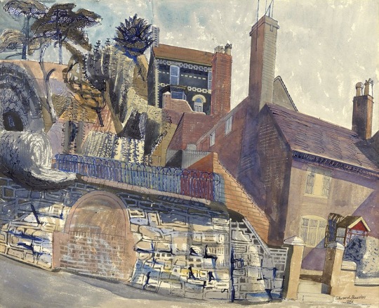
Edward Bawden – Study for: Town Hall Yard, Great Bardfield, 1956
Edward Bawden – Town Hall Yard, Great Bardfield, 1956
Bawden makes good use of an ornamental pattern found in the buildings and finds decorative possibilities in the pollarded and leafless trees. †
The Town Hall Yard linocut would be sold at the Zwemmer Gallery in their first (of many) ‘New Editions’ shows – a selection of prints by various printmakers. It is also believed the Ives Farm prints were also available here. The Town Hall Yard was one of the prints that ended up in the Manchester Pictures for Schools collection, it is assumed that as theirs is an Artist Proof, Bawden donated it to the Pictures for Schools scheme.
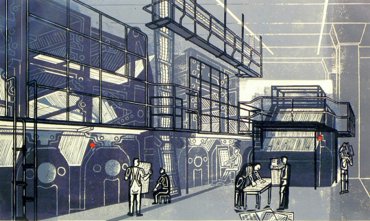
Edward Bawden – Printing the Sunday Times, 1956
The history of Printing the Sunday Times isn’t recorded, in the book The Edward Bawden Editioned Prints book by Jeremy Greenwood it is noted.
It has not been possible to discover the origin of this print, but it was perhaps commissioned by The Sunday Times whose permission at least would have been necessary to allow Bawden access to the plant.
There are a few different ideas to why this print has come about, but my theory is that is was likely commissioned by Bawden’s friend Robert Harling.
In the 1930s Harling worked for the advertising firms, Stuarts as a Designer and Everett Jones and Delamere as the Creative Director where he hired Bawden to illustrate the Fortnum and Mason catalogues. Harling was the designer who hired Eric Ravilious to design the cover to Wisden’s Cricketers’ Almanack in 1938. In 1945 Everett Jones and Delamere was liquidated and Harling moved to the staff of the Sunday Times along side Ian Fleming who was just about to write his first James Bond novel. Harling was the consultant designer to the paper from 1945 to the 80s, he would also guest at an architecture critic. In 1953 Bawden would do some illustration work for the Sunday Times for the article ‘Another Brighton’ by Clifford Musgrave (September 6th 1953).
Given that Harling was a designer for the paper and Bawden was such a close friend it could be guessed he:
Got Bawden onto the premises to make a print of the topic
Bawden saw the printing plant during the 1953 commission
Harling commissioned the print for members of the staff as an internal gift.
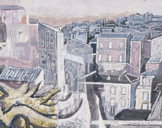
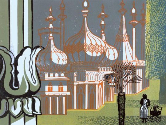
Edward Bawden – The Royal Pavilion, Brighton, 1956
The two prints of Brighton show a summers day and the south coast in winter. It would be the first of a series of prints and drawings Bawden made of Brighton.
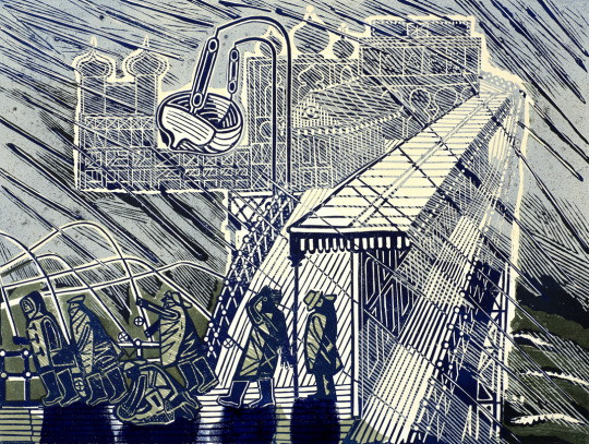
Edward Bawden – Snowstorm at Brighton, 1956
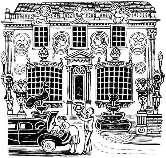
Below are two illustrations for Chubb Locks, one with the full text under and a tale on how Chubb Locks can improve security, all of the adverts follow this style. Under is another line drawing.
Edward Bawden – Chubb Lock Advert, Drawn, 1956 (Published 1957)
Edward Bawden – Chubb Lock Advert, Drawn, 1956 (Published 1957)
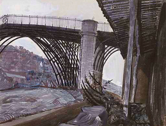
Edward Bawden went on a working holiday to Iron Bridge with the War Artists John Nash and Carel Weight.
I was at Ironbridge for about six weeks in September and October 1956 and was joined by John Aldridge, John Nash and Carel Weight. Each of us in turn painted the famous bridge’. ‘Houses at Ironbridge was almost the last painting I was able to do during my stay. ‡
Edward Bawden. Houses at Ironbridge
Edward Bawden – Iron Bridge, 1956
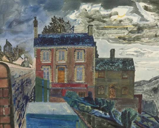
Edward Bawden – The House at Ironbridge, 1956
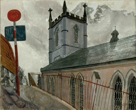
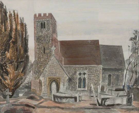
Edward Bawden – Ironbridge Church, 1956
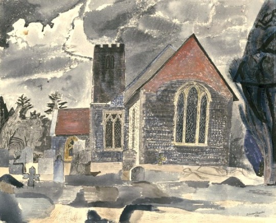
Back at home in Essex Bawden painted Lindsell Church twice and then would go back in 1958 to paint it again before starting a massive linocut of the church in the early 60s.
Edward Bawden – Lindsell Church, 1956
Edward Bawden – Lindsell Church #1, 1956
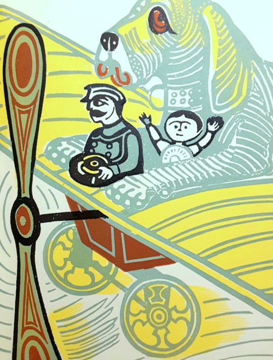
One of the books Bawden Illustrated as mentioned above is the Sixpence that rolled away. A curious tale by poet Louis MacNeice.
Edward Bawden’s Dust Jacket for The Sixpence that rolled away.
Edward Bawden’s illustration inside The Sixpence that rolled away
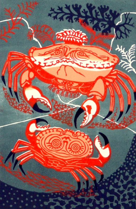
Below this are the two illustrations Bawden would make for the John Lewis book ‘A Handbook of Type & Illustration’ with an early Aesop’s print, An Old Crab & A Young Crab. Bawden would print a series of Aesop’s fable prints in the 70s.
Edward Bawden – An Old Crab & A Young Crab, 1956
The etching below was likely made for the John Lewis book as well, rather than taken from his archive. But Bawden’s style of etching remained very similar throughout his life, from the works as a student to the works he made for the Orient Line. The perspectives looked like they were forced than natural.
Edward Bawden – Watermelons, 1956
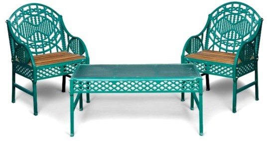
The Bawden designed chair and table in green, 1956
The strangest of the commissions to come in 1956 was again from Robert Harling and his client, Bilston Foundries Ltd. A garden seat, bench and table were designed by Bawden.
Churchill sat on it. The ‘Bilston Garden Seat’ was the brainchild of Robert Harling when he was working for an advertising agency. In a letter to Halina Graham the designer wrote, ‘The firm that produced the seat made baths, it was their main line of business & they had no faith in cast iron seats, but I remember going up to Warrington to get information about preparing the design. A technician on the staff of the Furniture School of the Royal College of Art made a model in wood of the design for casting that in itself must have been very expensive. When the seat was first produced & shown at Harrods I think that it probably failed expectations and only later when it became unobtainable did the demand for it increase’.
Bilston Foundries’ advertising leaflet describes it as ‘an ornamental seat unique in its gracefulness, and as distinguished by its careful finish as by its outstanding appearance’. The advertised price was 18 guineas. A cast iron chair along similar lines is illustrated in House and Gardens “Diction of Design”.
Edward Bawden – Flight from the Enchanter, Dust Jacket illustration, 1956.
The cover to The Flight from the Enchanter by Iris Murdoch is half made in Lino and the type and mountains are blown-up pen drawings. The original linocut is below in black, issued as a limited edition print in 1989.
Edward Bawden – Flight from the Enchanter linoblock design, 1956.
At the end of the year Bawden took part in a shared exhibition of Great Bardfield artists with Michael Rothenstein, Geoffrey Clarke and Clifford Smith from the 25th November to 7th December.
Below is a variation on the print above of An Old Crab & A Young Crab used as Edward and his wife Charlotte’s Christmas card that year.
Edward Bawden – An Old Crab & A Young Crab – Christmas Card, 1956
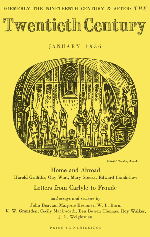
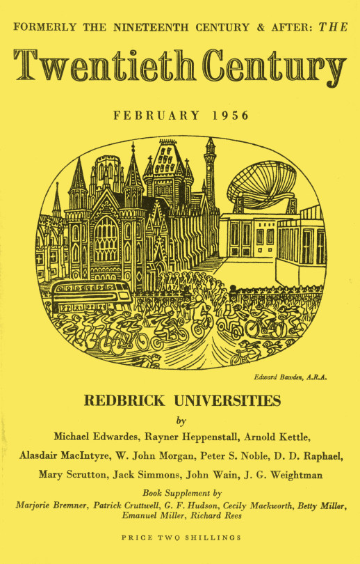
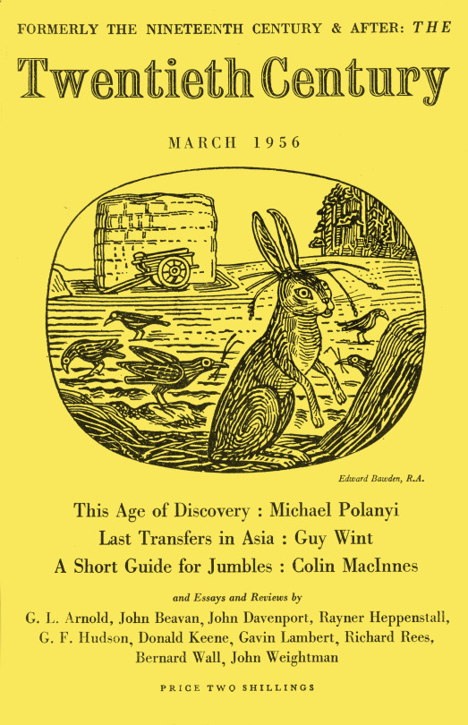
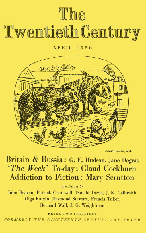
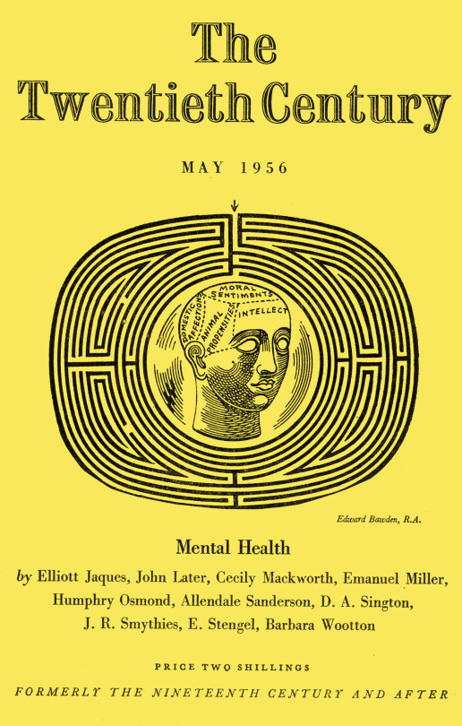
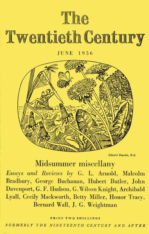
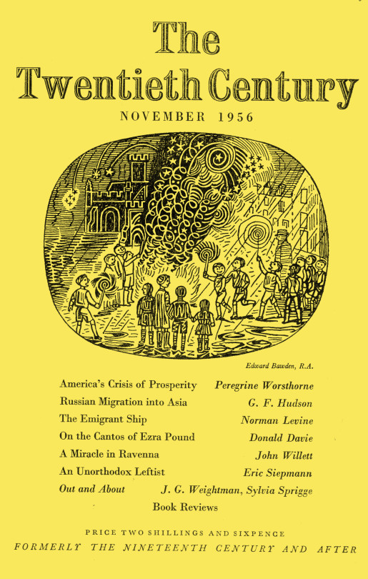
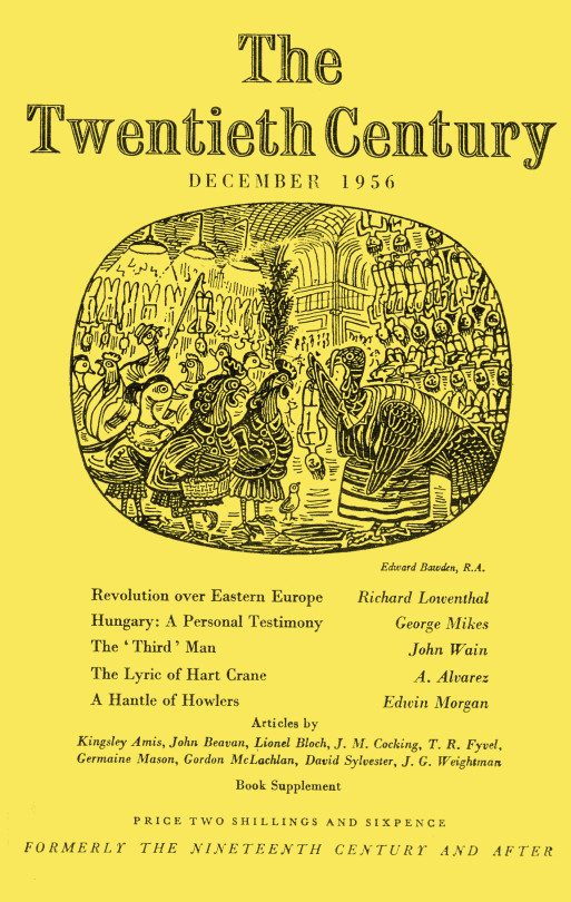
To finish the post off I thought what could be better than a whole run of illustrated magazine covers by Bawden for the Twentieth Century Magazine in 1956. It was in 1956 that Bawden was elected to the Royal Academy of Art. I would guess this happened in February as his credit for February is ARA and his credit for March is RA.
The font in the church shows it being the church in Great Bardfield and also featured in the King Penguin book, Life In An English Village.
The building to the right is the cottage featured in the Ives Farm print above.
Above is an illustration from Liverpool Street Station, London.
As a footnote Robert Harling wrote the book, The Drawings of Edward Bawden in 1950.
† V&A – CIRC.865-1956 Oxford Dictionary of National Biography 2005-2008 ‡ Tate – T00206
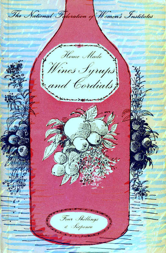
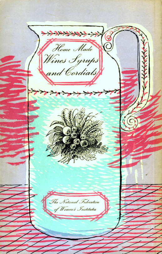
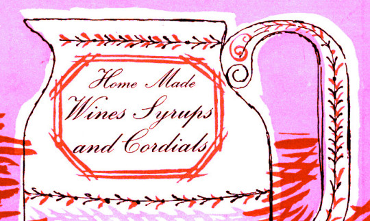
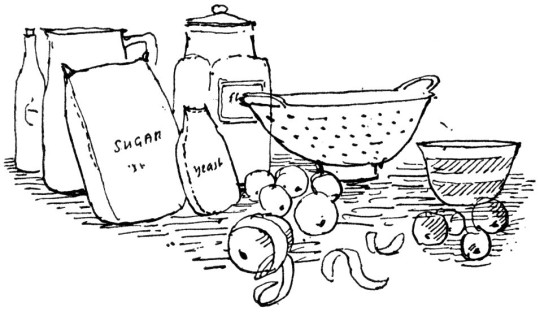
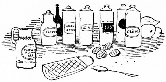
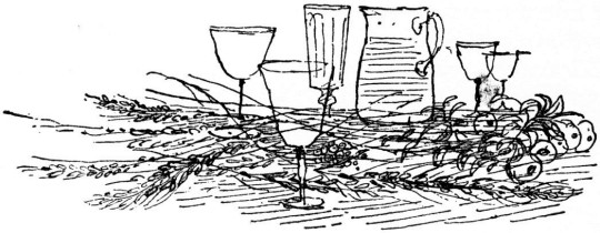
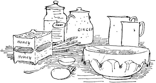
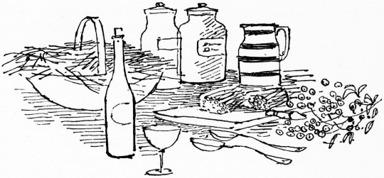
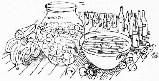
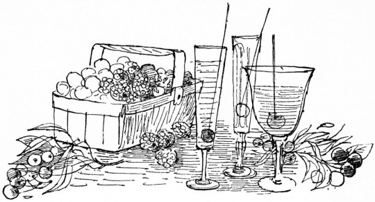
Here is the book ‘Home Made Wines Syrups and Cordials’ by F. W. Beech for the National Federation of Women’s Institutes. The illustrations are by Roger Nicholson. The drawings on the cover are a wonderful example of lithography on zinc. The black line drawings have a Warhol quality to them. The colours are hand drawn, each colour was painted on a different layer so when they are combined they never quite match up, I always thought it a charming effect.
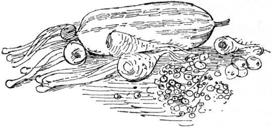
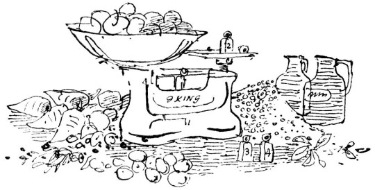
The other illustrations within the book are black and white line drawings of the recipes.
In 1965, the artist and designer Roger Nicholson was working on a commemorative book to mark the 900th anniversary of Westminster Abbey. An enjoyable commission, it gave Roger a taste for designing and publishing books. So, in 1966, he produced Nicholson’s London Reference, the first of the many guidebooks that were to bear his name.
By the early 1970s, the expanding team moved to a loft-style workshop in what is now fashionable Neal’s Yard in Covent Garden. The London Street Finder was to be the most successful title.
Roger was born in Sydney, Australia, into a large family which had emigrated there at the turn of the last century. But times were hard, and in the 1930s his mother returned to England with Roger and some of his siblings and settled in Kent. After school in Rochester, he became a Medway art school student.
Then came service in the Royal Army Medical Corps in Cyprus and Egypt, after which he worked as a laboratory technician. But by 1951, an interest in interior and industrial design led him, and his brother Roger to win commissions for design work on the Festival Of Britain exhibition in Edinburgh.
The brothers’ collaboration continued in London. Their work included designing interiors, carpets and fabrics in the new Shell-Mex building in Waterloo, for the then Carlton Tower Hotel, blanket designs for the British Wool Secretariat, wallpaper designs, and newspaper textile advertisements.
Later, Roger was to become a professor in textile design at the Royal College of Art, but Roger turned to guidebooks. Yet he was no businessman, and financial and personal problems forced the sale of the company. He was retained for several years as a consultant by the new owners.
During that creative but stressful time with the guide books, Roger would take a day off a week for a country walk. He had the ability of relaxing, and making companions do likewise. He made friends easily and was very capable of striking up conversations with strangers, leaving them as if they had been long-standing friends. He was knowledgeable of plant and animal life.
After selling the guides, he explored the less-known parts of Spain, France, Greece and Turkey, where his talent for abstract landscape painting flourished. His other recreations were keeping fit, gardening and swimming.
Roger felt everyone should have equal opportunities, good value and a fair chance. When an accident put his second wife, Susi, in a coma, he would make the long journey to visit her regularly and give her the special physiotherapy himself which no medical staff could provide. Having lived in various Georgian houses in Kent, the couple moved to Brighton and then Winchelsea.
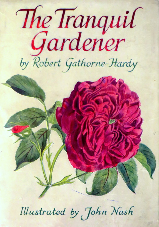
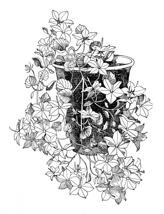
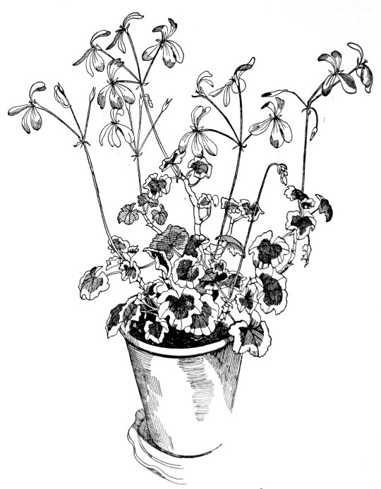
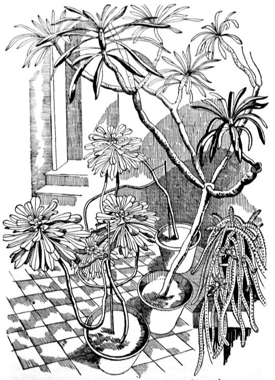
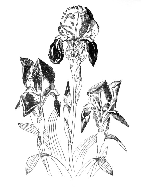
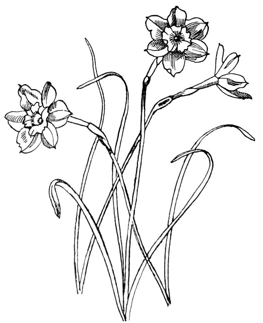
I recently bought a book called The Tranquil Gardener by Robert Gathorne-Hardy, it is illustrated by John Nash. These days Nash is known for his war art and being the brother of Paul Nash, but he is not as known for being a botanical illustrator and teacher.
From the dust jacket blurb: Robert Gathorne-Hardy has been an amateur gardener for as long as he can remember. In this book he describes three gardens with which he has been intimately connected-his own, his mother’s, and that of his illustrator, John Nash-each with its different soil, its different possibilities, its own invitations and its own snubs to give. He is, moreover, a plant collector of very considerable calibre, and there is the true biographical sapor to much of his description of individual plants. The text is superbly complemented by Mr Nash’s exquisite drawings.
During the 1920s John Nash taught at the Ruskin School of Art in Oxford and remained a teacher until the end of his life, inspiring many, including some of the best Kew artists. During most of the interwar years John Nash and his wife lived at Meadle in Buckinghamshire. From there both went on holidays all over England during which they filled numerous sketch books with pen, pencil and wash studies which developed into oil and watercolour compositions in their studio. Like Constable, Nash made annotations in these books about the weather on particular days.
John Nash had a great passion for plants and his technique as a plant illustrator deserves special notice as he excelled in the field. John Nash liked to use live specimen which sometimes was a problem when publishers asked for illustrations of plants which were not in season.
He often used his garden, which was planted with a wide variety of plants such as roses, irises, gentians and hellebores. John Nash had always been interested in botany even as a child he had won a Botany Prize and, like his friend Cedric Morris, he called himself an ‘artist plantsman’.
In 1940 Nash was commissioned as an Official War Artist in the Royal Marines, a role he did not especially enjoy, preferring to paint the English landscape, which he did after the war. From 1922 Nash had made many visits to Essex and rented a summer cottage at Wormingford, near Colchester and in 1945 he and his wife bought Bottengoms Farm where they lived until they died. When in Essex Nash taught at Colchester Art School and conducted yearly plant illustration courses at Flatford Mill. As one of the founders of Colchester Art Society (and later the Society’s President) and through exhibitions of his own work, he became closely connected with the Minories Art Gallery.
On his death he bequeathed his personal library and several of his paintings as well as the engravings recorded in this catalogue to the Gallery. Since then, the library, the paintings and most of the engravings were sold to the Tate.
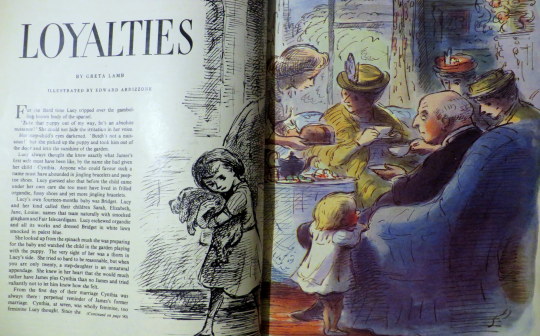
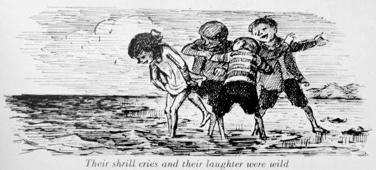
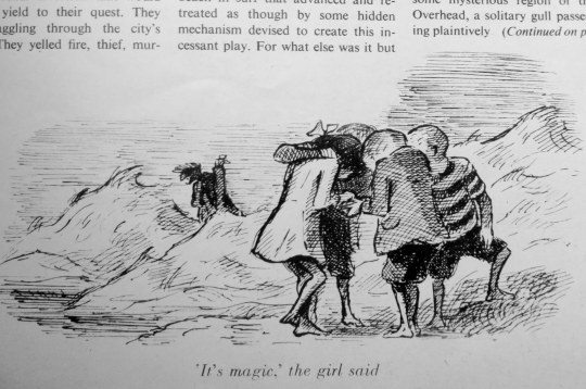
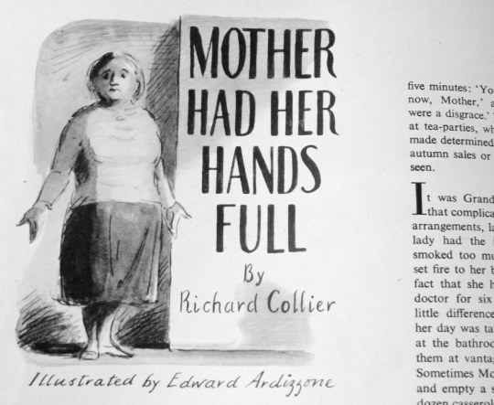
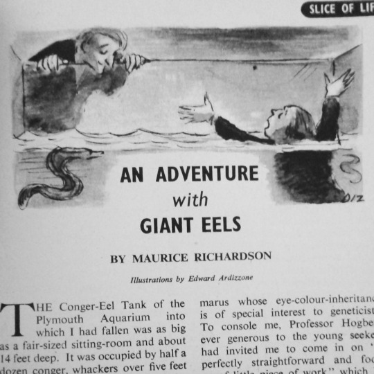
I find I can spot the illustration work of Edward Ardizzone across a room if I am in a bookshop, it is so iconic in style. He is most famous these days for the illustrations to Puffin children’s books like ‘Stig of the Dump’ by Clive King and BB’s ‘The Little Grey Men’ as they have been reprinted now for over forty years with his illustrations; but it’s nice to see his ‘Tim’ series of books have also been reprinted and revived again.
This post is really about his illustrations found inside ‘The Housewife Magazine’. I can find very little information on the history of the magazine itself, but the issues I own run from 1950 to 1970. As you can see from below, some of the illustrations are full colour and one of them is half colour and black and white. Without having looked in every magazine, so far I have found five stories illustrated by Ardizzone, but each edition had a prominent illustrator inside, sometimes Ronald Searle, sometimes Barnett Freedman.
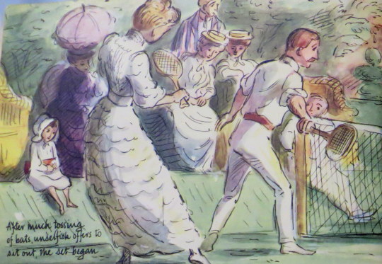
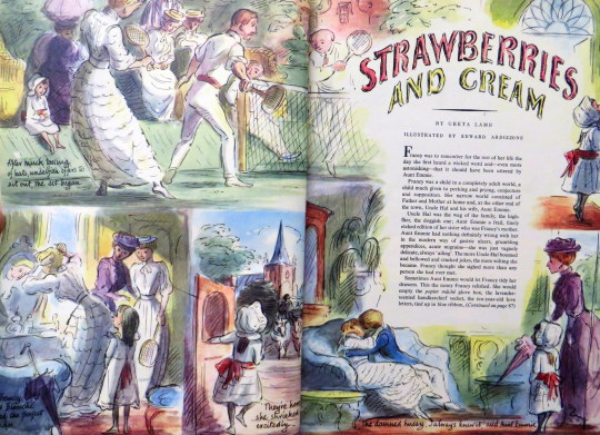
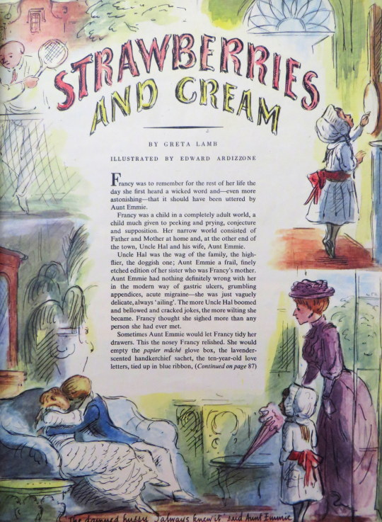
Strawberries and Cream illustrated in full storyboard style by Edward Ardizzone.
Born Edward Jeffrey Irving Ardizzone, he was born in Tonkin on 16 October 1900 and died in Rodmersham Green in Kent, England on 8 November 1979. His father was a naturalised Frenchman of Italian descent, who was born in Algeria. His mother, Margaret, was English.
In 1905, Margaret Ardizzone returned to England with her three eldest children. They were brought up in Ipswich, Suffolk, largely by their maternal grandmother, whilst Margaret returned to join her husband in the Far East.
Ardizzone left school in 1918 and twice tried to enlist in the British Army but was refused. After spending six months at a commerce college in Bath, Ardizzone spent several years working as an office clerk in both Warminster and London, where he began taking evening classes at the Westminster School of Art, which were taught by Bernard Meninsky. In 1922 Ardizzone became a naturalised British citizen.
Ardizzone’s first major commission was to illustrate an edition of ‘In a Glass Darkly’ by Sheridan Le Fanuin 1929. He also produced advertising material for Johnnie Walker whisky and illustrations for both Punch and The Radio Times.
He became a war artist. With an Italian name he was often found drawing British installations and getting arrested as troops struggled to understand his role as a ‘war artist’ and suspected him of being an Italian spy.
Post war his credits of illustrations are so numerous they have become listed as part of a 300 page book of Illustrative works by Brian Alderson ‘A Bibliographic Commentary Hardcover’, a book listing hundreds of books and magazine covers.
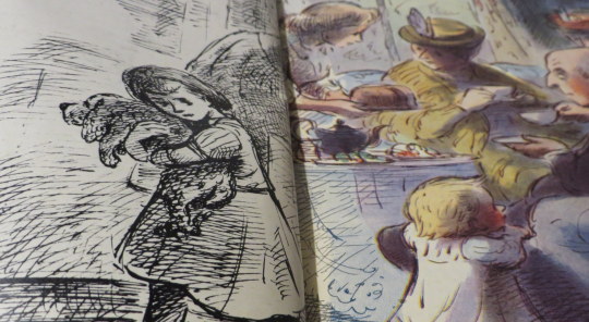
Here is a colour and black and white printing. Magazines where still on a budget after the war and colour printing was reserved as a decorative feature to be dispersed over the magazine. Here is an unusual view of this. In Ardizzone’s ‘Tim’ books it is common for one page to be colour and the other in black and white.
Below are the black and white printed line drawings by Ardizzone. One of the loveliest features is the illustrations incorporate the text and flow around it.
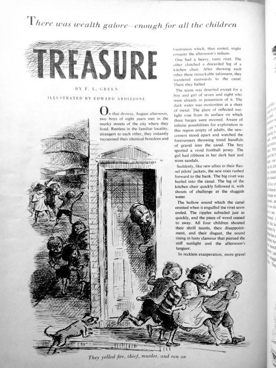
The last image below I love best of all. It shows he could illustrate anything.
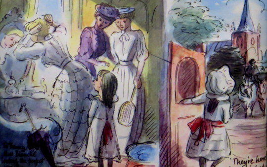
Strawberries and cream – Greta Lamb – Housewife September 1951 Treasure – F. L. Green – Housewife September 1952
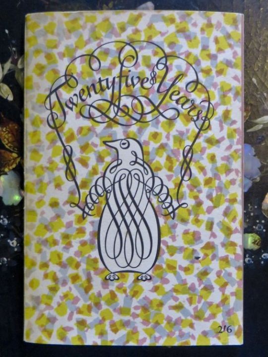
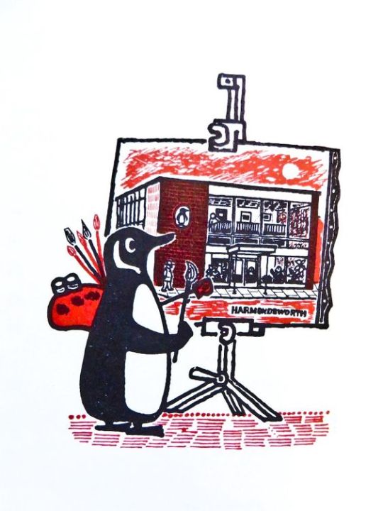
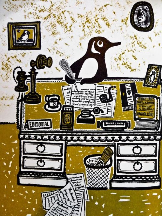
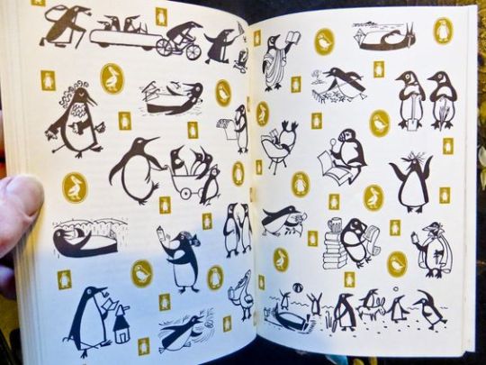
Penguins Progress; Twenty Five Years, 1935 -1960. A beautifully illustrated book full of different variations of the Penguin Logo. If you are a fan of the books then this is a really lovely treat. Full of the history of Penguin Books and biographies of some of the key people in Penguin.
Illustrations by David Gentleman, John Griffiths, Feliks Topolski and Theodore Ramos. Photographs by Sam Lambert, Lotte Meitner-Graf and Athol Shmith. Cover designed by Elizabeth Friedlander.
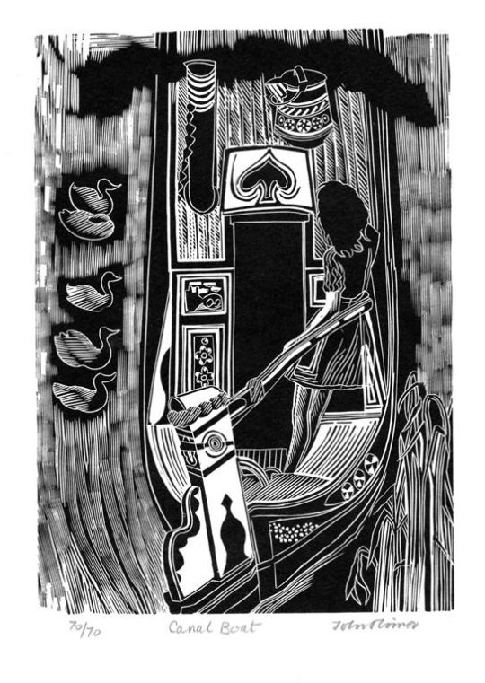
Woodcuts by John o’Connor Canal boat decoration is more sever and generally smaller in scale and form than that of the gypsy caravan. The shape of the boat itself, build for narrow bridges, tunnels, and wharves, denies excesses and frills.
Canal boats in the 1960s still used a formal pattern of décor, in the style of road transport vehicles, and the rose and castle of the water bucket now have a strangely insecure position on the shelves of some departmental stores, although a few are still to be seen on the canals. In brilliant green, scarlet, yellow, and pale blue, the landscape and flower pictures are painted in a tradition as rigid as a Gothic screen.
Black is used as a foil to white cord in ship-shape order. These decorations are as incongruous in the setting of an English landscape, hedgerow, weed, and dark water, as a flowered teapot at a picnic.
Cheap fairing pieces of china in the 1880s may be the direct source of inspiration for these designs. Recalling as they do the corded mantelpieces of a Victorian midland cottage.
From ‘The Saturday Book #22’ (1962) Edited by John Hadfield & The best of the Saturday book 1941–1975 (1981) Edited by John Hadfield