Bardfield and the Beeb

image

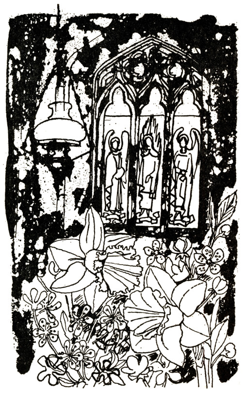
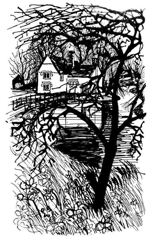
 Walter Hoyle – May, 1963

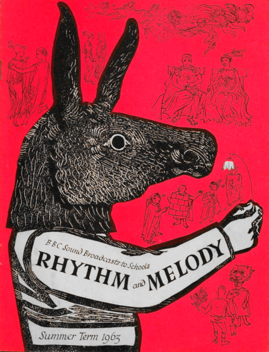
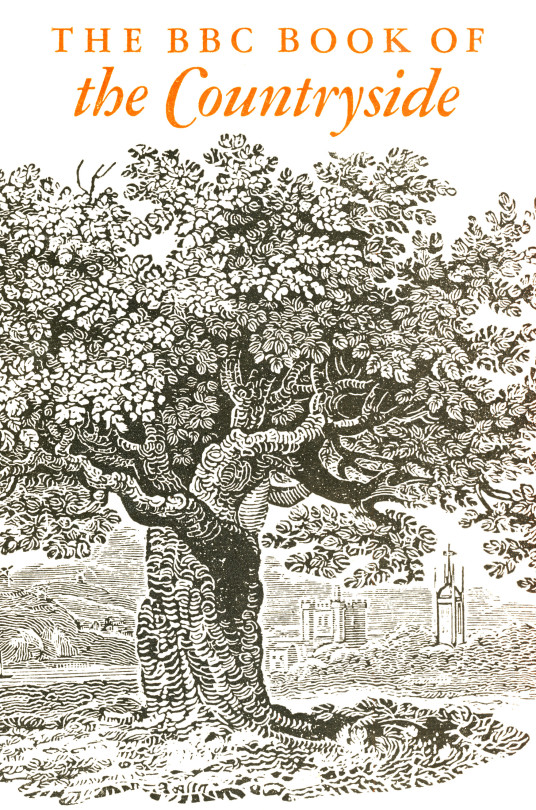
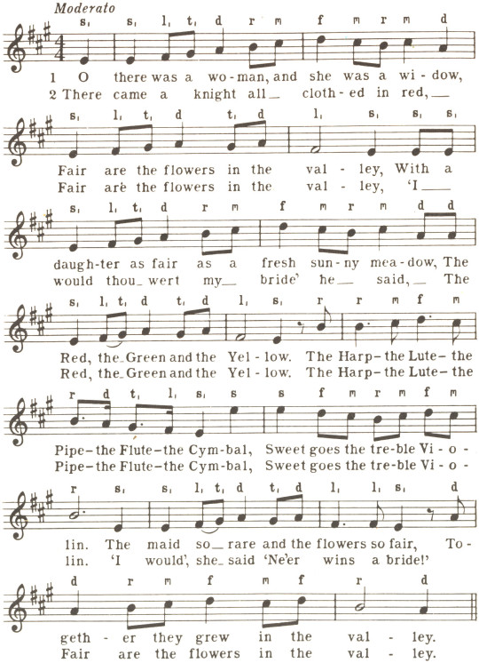
The BBC Book of the Countryside came out in 1963 and was edited by Arthur Phillips. It featured illustrations from the Great Bardfield artists Walter Hoyle and Sheila Robinson. There are also illustrations from John Nash and Ralph Thompson. It is a book packed with beautiful illustrations that is so often overlooked due to the title.  

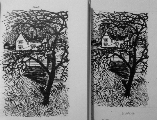
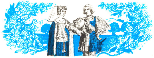
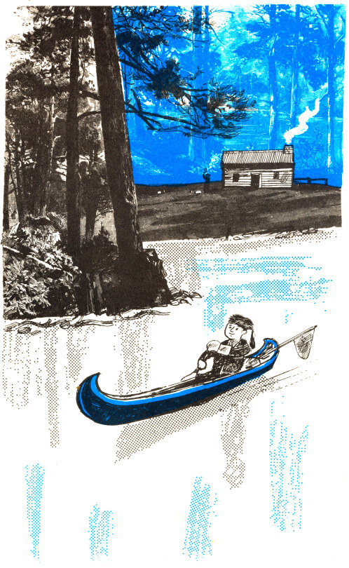
A while ago I bought all six of the Walter Hoyle original ink illustrations from the book. I got them because they have illustrations made while Hoyle was in the Bardfield area and it’s important to see an artist while they are riding a creative peak.

image

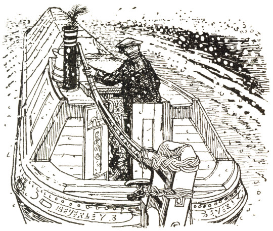
 Walter Hoyle – January, 1963

Walter Hoyle is in danger of being one of the forgotten Great Bardfield artists due to the lack of information on him. He was born in Rishton, Lancashire in July 1922. Hoyle’s artistic education started at the Beckenham School of Art in 1938,

I persuaded my local art school to accept me, and presented as evidence of my serious intent, a series of drawings much influenced by Walt Disney.

From Beckenham, Hoyle gained a place as a student at the Royal College of Art from 1940-42 and again from 1947-48 after serving in the Second World War. During Hoyle’s time at the RCA one of his tutors was Edward Bawden, who encouraged him to develop watercolours and printmaking.

It was 1940, the phoney war was about to end and the college was evacuated from London to Ambleside in the Lake District, famous for poets rather than artists. It was here that I was first introduced to printmaking – lithography – by a friend called Thistlethwaite, a fellow student from Oswaldtwistle (although these names are true, I mention them only because I like the sound they make). He prepared a litho stone for me with a beautiful finely ground surface and instructed me how to draw in line and wash. †

In 1948, During the RCA Diploma show a visitor was so impressed by Hoyle’s work that he was offered seven months’ work in the Byzantine Institute in Istanbul. Hoyle accepted, the work he saw there made a strong impression. Italian art and architecture also influenced him at that time.

Early in 1951 when Bawden was commissioned by the Festival of Britain to produce a mural for the Lion and Unicorn Pavilion on the South Bank, it was Hoyle that he chose to assist him on account of his great talent. During that summer Bawden invited Hoyle on a holiday to Sicily.

Edward asked to see my watercolours. He looked very carefully and quizzed me about them, and in general was complimentary and encouraging. I felt I had passed some kind of examination.

It was this holiday together that Hoyle would scribe into a limited edition booklet of 10 in 1990 and into a book in 1998 – “To Sicily with Edward Bawden” a limited edition of 350 copies with a forward by Olive Cook.

image

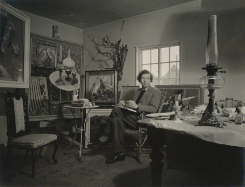
 Geoffrey Ireland – Walter Hoyle at home in Great Bardfield c1955

image

 Walter Hoyle – March, 1963

March I think is Hill Farm in Great Sampford, Essex.

The BBC Book of the Countryside features articles by different nature writers and journalists from the BBC from farming to wildlife. It comes from The Countryside radio show.

Selected from over five hundred scripts and sixty-seven hours of broadcasting, this anthology depicts life and activity in the British countryside as seen through the eyes of some of the contributors to the BBC’s monthly Countryside programme during the past eleven years. 

C. Gordon Glover, whose narrative sets the scene for each chapter, lives in an Essex village and the changing face of the countryside from month to month is portrayed as he sees it, from his kitchen window — from the bridge over the village

Claude Gordon Glover was a BBC Radio Broadcaster (you can hear him present an edition of The Countryside here) and he lived in Arkesden, a few miles West of Saffron Walden. He was also for a time, the lover of Barbara Pym. His broadcasts consist of a Betjeman like prose over classical music and the song of birdsong likely to be heard that month. Below is a selection of October.

October: Lovely October of the half-way days, the wayward pause between the certainties of summer and winter – the one is well over, the other not yet begun. For the countryman everywhere this is the month of the great tidying up – the sweeping, the burning, the cleaning, the digging, the transference upon dry days of apples from tree to store. The suns of summer have done their work, the land has given forth and the harvest is home. 

image

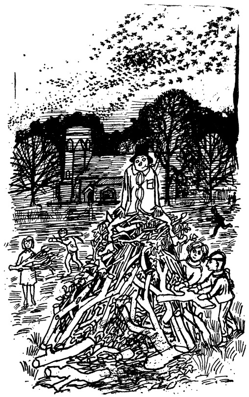
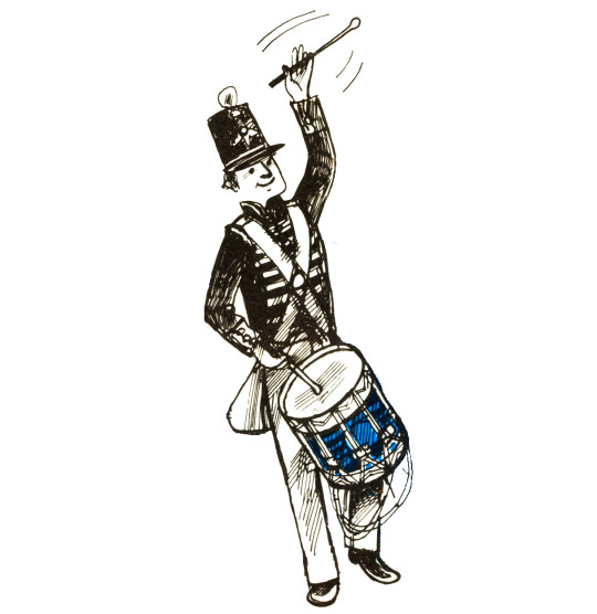
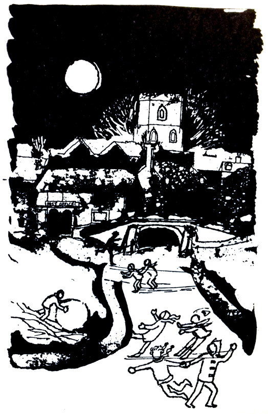
 Walter Hoyle – November, 1963

Above is a picture for November by Hoyle and in the background is Bardfield Saling church. It is always good to prove that pictures are relevant to artists lives and the history of Great Bardfield. Curiously enough, the artist Celia Hart suggested that the guy might be a self portrait of Walter himself. 

The photograph below was taken by John Piper in the late 40s or early 50s when he was working on the Shell Guides and just finished three of the Murray’s Guidebooks with John Betjeman. 

image

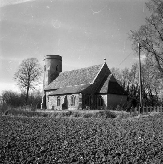
John Piper – Photograph of St. Peter & St. Paul’s church, Bardfield Saling, c1950

A poem for May:
A branch of May I have bought you
And at your door we shall stand
It is but a spout but it’s well spread about
By the words of our Lord’s hand. 

Fair Maids look out of your window so high
To view the May-Bush fair,
it was cut down so late last night
To take the fresh morning air.
 

image

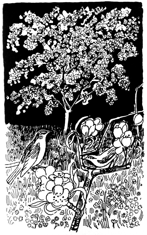
 Walter Hoyle – September, 1963

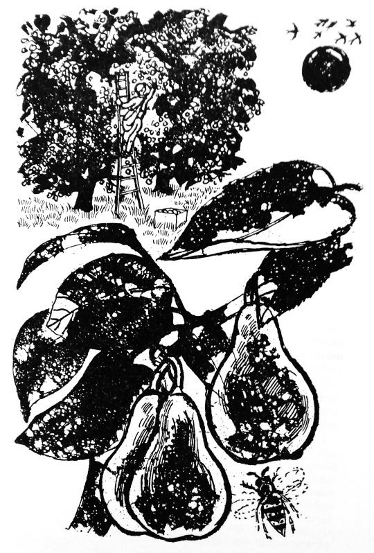
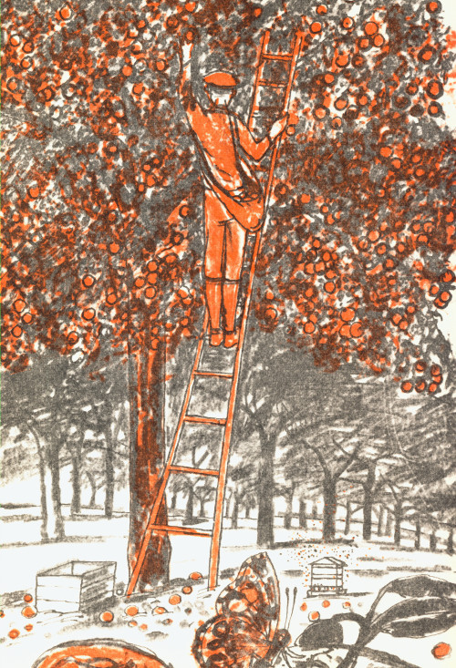
In 1969 Walter Hoyle illustrated the ‘Women’s Institute book of Party Recipes’. This series of little illustrations are some of his best in my opinion.

They form a curious set of mixed media works that I believe to have been printed by Hoyle in lithograph then sent off to the book printers to be mass-printed, with the look of being a lithograph, but without it being so. Clearly the book was designed to be cheaply printed, for one it is spiral bound – but this is rather helpful in a cookery book. The other indicator of cheapness is that it has a very limited colour palette of orange, red and black. It was printed by Novello & Co Ltd, who mostly make sheet-music scores.

Below is an illustration from the cookery book of a man picking apples in an orchard and, above is almost the same drawing made four years later for the BBC Book of the Countryside by Walter Hoyle in 1963. As the WI book illustration have been drawn on to printing plate the image would have been reversed – so the ladder, man and fruit crate are a mirror image to the figures below. I know the picture from the Countryside book isn’t mirrored as it came from an ink drawing and I own those drawings.

image

† Printmaking Today, Volume 7, 1998. page 9-10.
https://en.wikipedia.org/wiki/St_Mary_Abchurch
♠ To Sicily with Edward Bawden, Previous Parrot Press, 1998.
The Great Bardfield Exhibition by Gerald Marks, Realism, August – September, 1955
http://www.fryartgallery.org/the-collection/search-viewer/691/artist/15/Walter-Hoyle–/22

BBC & Parr

Only by chance did I discover that these BBC One idents are photographed by Martin Parr. Not quite like his normal portrait work, as you can see from the Making Of photos below. They are as forced as most portraits are but I find it a curious collaboration compared with his point-shoot-and leave photographs.

image
image

I have to say I find the idents a bit disturbing myself, the bird-watchers one the most, the way the people look directly at the camera isn’t something you get from TV other than the news and weather. They are a bit too quaint for me, too much of Ohh the British are an odd lot, it becomes too obvious for Parr’s work, its almost a parody of himself. 

image
image
image
image
image
image
image
image

Notes on the Building of Broadcasting House by Val Myer

image

 A newly finished Broadcasting House, London, 1933

It is imagined, in many quarters, that “modern” architecture has revolutionised the whole of present-day practice, whereas the truth is that good architecture has always been a matter of common-sense, plus a leavening of aesthetic instinct. In reality, its vital principles are no different today from those which guided the old Egyptians, Greeks, and Romans.

In planning a building, the first essential, of course, is to make it suitable for the purpose for which it is intended. That it should be pleasing to the eye is, obviously, a further necessity, but, if it looks suitable, its designer is already halfway towards achieving his object.

image

 Broadcasting House – Under Construction and surrounded by Poster Billboards

In the case of Broadcasting House, we had first to consider its functions. These are twofold; the actual broadcasting, and the administration of broadcasting. Obviously, the studios, Control Room, and the accommodation of technical equipment come first, with the actual studios as the most important factor of all.

Accordingly, it was the planning of the studios which had to be the key to the whole scheme. At the outset, it was thought that the ideal arrangement would be to place all the studios on one floor and, as protection against inter – studio interference, to surround each by a complete circuit of brick -built corridor. As protection against extraneous noises, the studios would be placed at the top of the building.

The site of Broadcasting House, however, though picturesque in form, is irregular, which fact would have caused studios so grouped to be of awkward shape. Besides this, although the B.B.C., at that early stage, contemplated fewer studios than have now been built, the system of individual insulation by corridors and walls would have been so extravagant that the areas left for studios would have been quite inadequate. Moreover, owing to the high value of a site in the heart of London, the space available for the studios is necessarily limited. Hence the open -area system of insulation, adopted elsewhere, was out of the question.

After exploring scores of different systems of planning, the problem of accommodating a large number of studios and their suites within the space available was quite suddenly solved. Instead of the studios being all on one floor, or on two floors, they would be all in one tower, so that, given a good service of lifts, circulation would be actually easier than if they had been all on the same level, and, of course, larger and more shapely studios could be provided. Once this key idea had been found, the plan was rapidly developed and, one after the other, its benefits appeared. The evolution of the plan proceeded on simple lines which can best be expressed as follows :

  • Studios must be insulated from sound Put a thick brick wall round them, omitting the usual steel framework.
  • Studios must be artificially ventilated, so need have no windows
  • Put them in the centre of the building, where there is least daylight to waste.
  • Offices must have daylight
  • Put them all round the outside of the building, where plenty of daylight is available.
  • Studios need to be sound insulated from one another
  • Put between them horizontal layers of rooms such as Music Libraries, Book Stores, etc, which neither create noise nor are disturbed by it.

In this way, item by item, the plans were wrestled with and were slowly developed to their present form. Sometimes, as a result of much thought, whole features had to be discarded. Such was the fate of a huge parking garage, at one time accommodated in the basement. I could fill many pages with the history of planning this building, with all its exacting requirements, but, interesting as this would be to myself, this is, perhaps, hardly the place for such a story.

image

 The Entrance Hall 

Before speaking of the exterior, I will just say a word about the internal decoration of the principal apartments. The Entrance Hall, semi -circular in plan, is simplicity itself, devoid of ornament, and depends for its effect upon the grace of the natural curves which arise from its circular form and the rhythm of its vertical lines. The beauty of the English marble (Hopton -Wood stone), which lines the walls, is an added charm.

The central feature of the Hall is to be a lovely figure of “The Sower,” for which Eric Gill has already made his model.

image

 The Entrance Hall with The Sower by Eric Gill.

image

 The Council Chamber

The Council Chamber, sixty feet across, is of semi- circular shape, like the Entrance Hall. This room, whose acoustic qualities are strangely happy to the naked ear, is lined with Tasmanian oak and, at night, is entirely illuminated by reflected light from lamps concealed in wrought – oak urns. The pedestals of these urns serve as relieving accents of interest to the simple panelled walls.

image

 The Concert Hall 

The Concert Hall , in the heart of the building, is wedge – shaped in plan. The splay is not sufficient for one to realise, at first sight, its existence, but it has the strange perspective effect of making the Hall appear very much longer from the back than from the stage. The treatment of the ceiling is entirely novel; it is hoped that, with the semi – indirect lighting indicated, the ceiling will provide a very distinctive feature.

Now, a word as to the exterior. First, let me explain the reason for the eastern side being cut away as with a draw knife. This part of Langham Street is narrow and, not only have the opposite owners rights of light which had to be respected, but there are three -sided mutual covenants with other neighbours which could not be broken. Hence, the whole of the building above the fourth floor had to be  sloped back and restrained within a limiting angle. In Portland Place, the only limit of height was that imposed by the London Building Act..

image

 The East Side of Broadcasting House

The south end of the building, facing down Regent Street, suffered under the same difficulties as the Langham Street front, but at this vital point, realising my troubles, the parties concerned made certain concessions of real value. In the circumstances, the obvious course seemed to be to design a symmetrical façade to Portland Place which would dominate the whole building, to emphasise the main doorway facing south by placing a Clock Tower above it, and to be satisfied with a modest elevation to Langham Street which, without being striking, would be suitable.

The marrying together of these three components was a particularly interesting problem, which was helped by the I provision of a third aerial mast over the Clock Tower.

image

 All Souls Church and Broadcasting House

At an early date I realised that the site possessed a rare virtue in the long curve of the western side, and so, in organising the proportion of my masses and the play of light and shade, I tried to make full use of the gracious horizontal lines which this curve suggested. Broadcasting House is said to look bigger than its actual dimensions. This is due to the scale and number of the windows, necessitated by the provision of an immense number of small offices. Endless flexibility of subdivision of offices was required by the Corporation, which fact, naturally, weighed with me in preparing my design for the façade. Although economy was essential to the whole scheme, and the sculpture at my disposal limited, I insisted that it be as good as possible, and then placed it, with other architectural features, at the most effective points, hoping to set it off to advantage by the contrast of plain walling and the considered rhythm of the windows referred to above.

image

 Eric Gill – Prospero and Ariel, 1933

As a footnote it is worth looking at the Eric Gill’s views on the building and his work for it.

His (Gill’s) frustration with the BBC work must have been compounded by the trouble over the size of Ariel’s penis already recounted, and with ‘Bad weather, bad stone and bad health’ – though it was on his own choice to work on inadequate and exposed scaffolding. From this perch he was heard to shout to a passing friend, ‘You know, this is all balls’. ‘The Sower’ was also done with some cynicism as he wrote to his brother Cecil; ‘I am about to begin the statue, representing a man ‘Broadcasting’, to stand in the entrance hall. Comic thought, whe you consider the quality of BBC semination, to compre it with the effords of a simply countryman sowing corn! However, it’s their idea, not mine. Mine not to reason why… mine simple, to carve a good image of a broadcaster”. 

Malcolm Yorke – Eric Gill: Man of Flesh and Spirit

Great Bardfield and the Beeb

image

Before television, the radio was the main media for the nation. The British Broadcasting Corporation was free from advertising and their early aims were to ‘educate, inform and entertain’. It was the education element that lead to leaflets being produced as a visual aid to the radio. The public could send a stamped-addressed envelope off and receive guide to the content in the radio show, from photographs of master paintings as part of a series of lectures on art to song sheets.

All of the artists from the Great Bardfield group would at one time or another work as commercial artists, many illustrating books. Here is a selection of works made for the BBC.

image

 Eric Ravilious – BBC Talks Pamphlet, 1934

Published in 1934 this booklet was to follow six lectures on art, there are seven pages of text and 30 pages of black and white illustrations. The cover design is a wood engraving by Eric Ravilious showing a Bewick style wood-engraving, an artists pallet and oil paints and some beautiful graphic devices hand carved around the vignette. This booklet could be bought as a softback at seven pence or a hardback at one shilling.

image

 Edward Bawden – Dust Jacket for the BBC Year Book 1947

This cover by Edward Bawden shows Broadcasting House and All Souls Church with musical faeries flying around. The BBC Year book started as an annual review beginning 1928. In the mid 50′s it became the BBC Handbook and in the 80s merged into an Annual Report. The focus of the publication would range from statistics of people with Radio Licences, to essays on Opera, Art and even Foley House, the building that Broadcasting House replaced. But this gives me a wonderful excuse to share a picture of this magnificent building so you can compare it to Bawden’s drawing.

image

 BBC Broadcasting House, London, 1932.

Many of the other works in the rest of this article are simple two colour illustrations made for various children’s educational radio programs. The way each of the artists went about solving this problem is interesting but mostly it is based on technique and time. Inside the covers is usually sheet music, lyrics and an illustration for most of the songs.

Many of Shelia Robinson’s illustrations are black and white pen drawings or her cardboard-prints, but rarely is there much colour and when there is it looks to be the printer flooding the image around her illustration with it. It’s a shame because her art prints are extraordinarily competent.

Bernard Cheese’s works have a more interesting use of colour and layering for those interested in printmaking and use of one colour with black, as is the work of Walter Hoyle.

image

 Sheila Robinson – Sing Together – Rhythm & Melody, 1955

image

  Walter Hoyle – Rhythm and Melody, 1961

image

  Walter Hoyle – Illustration from Rhythm and Melody, 1961

image

 Sheila Robinson – Singing Together, 1961

image

 Sheila Robinson – Rhythm and Melody – Summer, 1963

image

 Bernard Cheese – Time and Tune, 1963

In a break from BBC radio pamphlets comes the BBC Book of the Countryside. A hardback book with a compilation of the BBC Countryside programs set out in a month by month calendar. For fans of Great Bardfield and East Anglian art,  one gets work by both Walter Hoyle and Sheila Robinson, but also six illustrations by John Nash. The drawings from the book by Walter Hoyle I am delighted to own as part of my collection.

image

 Cover to the BBC Book of the Countryside, 1963

image

 Walter Hoyle – Page from the Book of the Countryside to the left and the drawing to the right, 1963.

image

 Sheila Robinson – January, 1963, illustration from BBC Book of the Countryside

image

 Walter Hoyle – April, 1963, illustration from BBC Book of the Countryside

image

 Bernard Cheese – Singing Together, 1964

image

 Bernard Cheese – Singing Together, 1968

image

 Bernard Cheese – Illustration from Singing Together, 1968

To see more illustrations from the Bernard Cheese Singing Together 1968 book, click here as I dedicated a full post to them

Bernard Cheese for BBC (I)

image

The BBC Radio for Schools books were a wonder for illustrators and young artists, a chance to showcase a style but also work with a brief given by the BBC based on whatever the topic was about. In the days when Radio was a more dominant media than television the BBC had opportunities for the public and schools to buy printed booklets on the shows with more information and sometimes pictures too.

A music series offering children opportunities to listen to music and sing along, with creative suggestions and games to develop music appreciation and skills.

image

 Bernard Cheese – Cover to Singing Songs, 

Below are the drawings made by Bernard Cheese in 1968. As the BBC wanted to save money the booklets were normally one colour and black on white paper. Here Cheese is working with pure Cyan. Some of them use dotted plastic film that was used in the printing process then, normally to save money on ink and to add shading. But in the cover picture above there are various features going on that make it a remarkable print technically. The band in black but with the drum and flag decoration shaded in blue, the crowd to the right are in black at the front and behind in blue – a cunning use of limited colours. The shading too is in blue and black dots. This is a process that the other images have been separated up using. 

image
image
image

image
image
image
image
image

The following illustrations are curious as they incorporate parts of 19th century illustrations, likely from religious books like the Quiver, the sea and the trees are clearly from steel engravings, the King and Queen I also suspect are not from Cheese’s own hand. It is a jolly way to use and recycle such illustrations. 

image
image
image