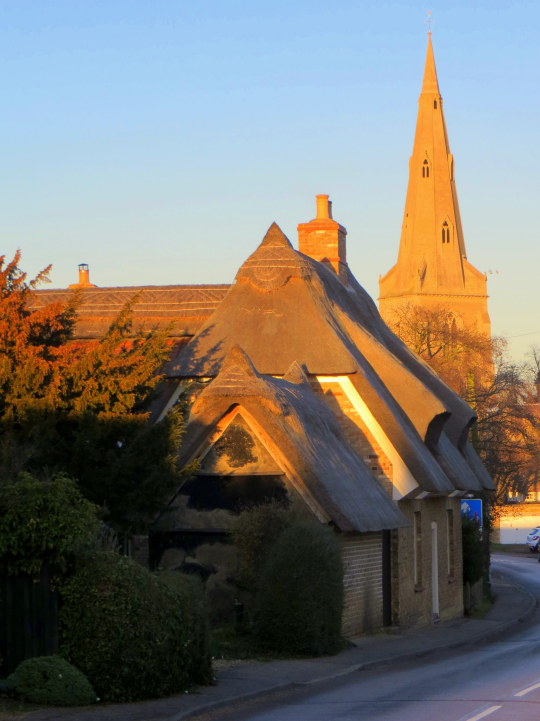
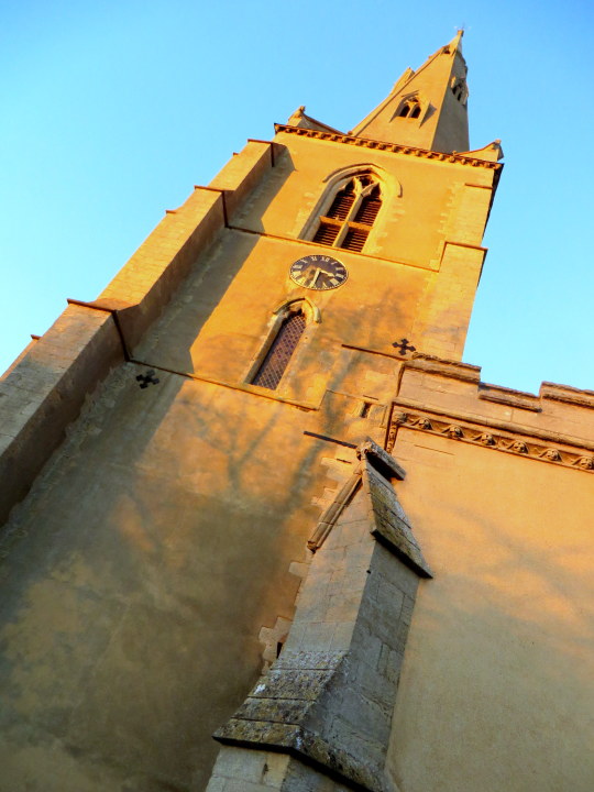
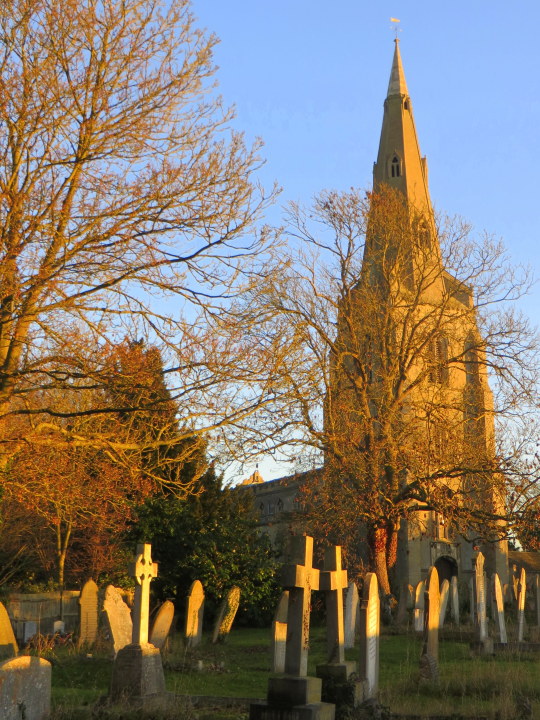
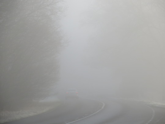
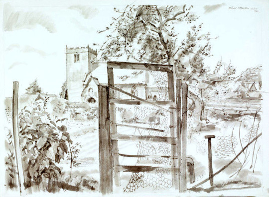
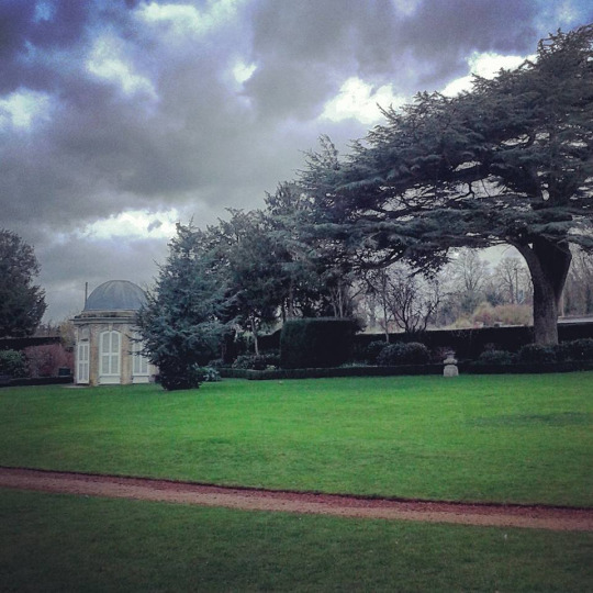
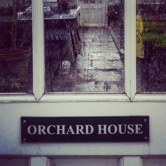
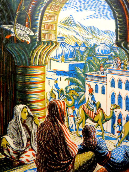
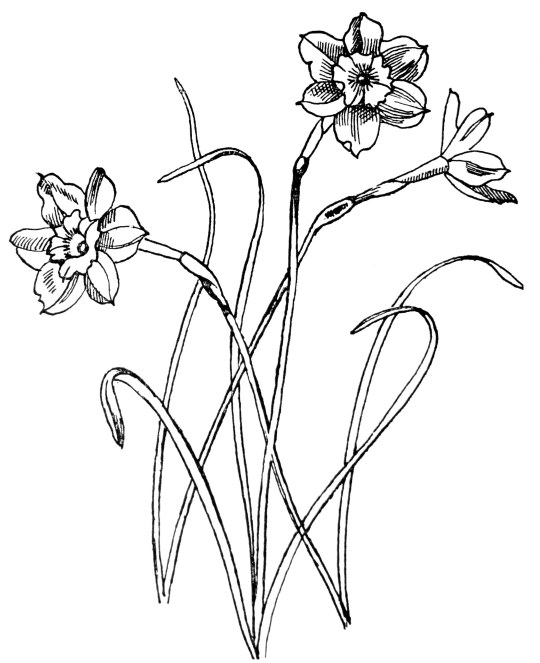
Over, It lies among the orchards, but the fishermen know it well, for the wayward Ouse broadens out where the ferry takes us over the border to a delightful little inn (In Holywell). But Over will not let us hurry away, for it has a handsome church which the centuries have ’ tilled with interest without and within. Its sanctus bell has hung in the bellcot for 600 years, and all that time the spire has been pointing the village folk the way to Heaven. The tower is older still, a landmark in this valley since the 13th century. †
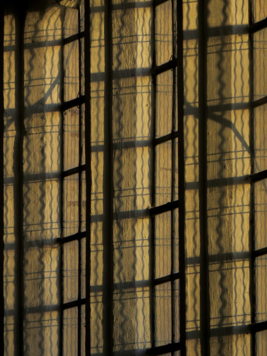
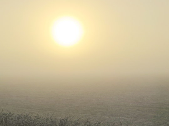
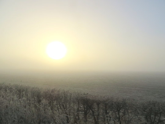
It was as the sun was going down that I got to the St Mary’s Church in Over, it had been a lovely day and the setting sun lit up the pale brick and plaster work.
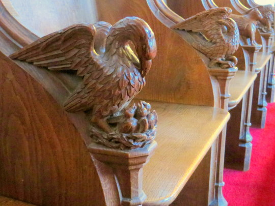
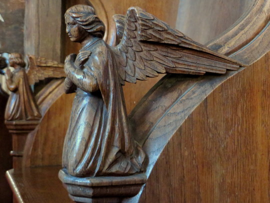
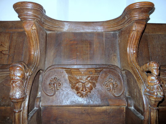
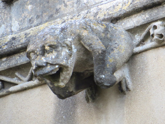
Like with Swavesey church there are some carvings, the choir seats on one side are carved with mythical beasts and birds.
Here are some angles and below a cow like beast with wings. Edit: The cow with wings is the symbol of St Luke the Evangelist, patron saint of painters – Paul Bommer.
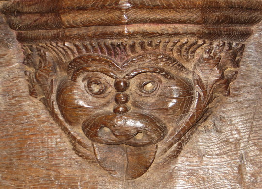
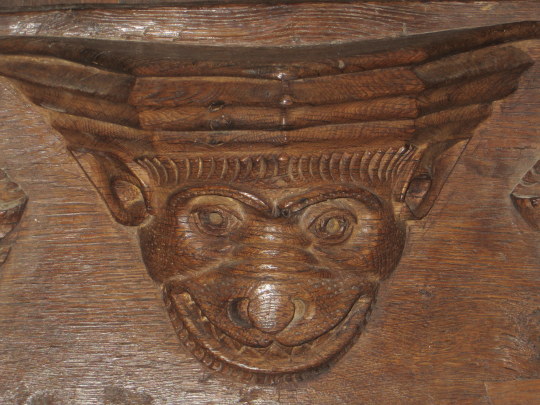
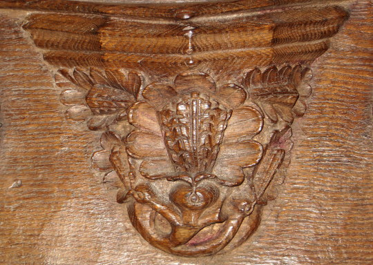
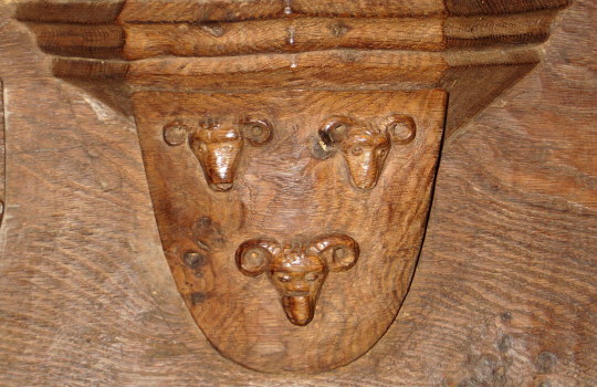
On the other side of the chapel the choir seating is older, the tip-up seating hid the medieval misericords.
Misericords were set on the underside of the hinged seats in the choirs of churches. They had no religious function but gave some support to the monks and clergy in the long parts of the services when standing was required. This explains the name ‘misericord’, which comes from the Latin for mercy. The decoration was often amusing and sometimes moral. ‡
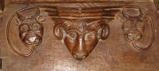
Here is a Rams head and Devils or Cows to the sides. Below the full image of the chairs show how the seats flap down and the decorations on the corners.
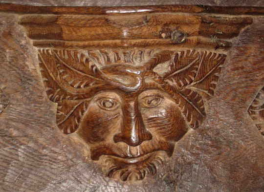
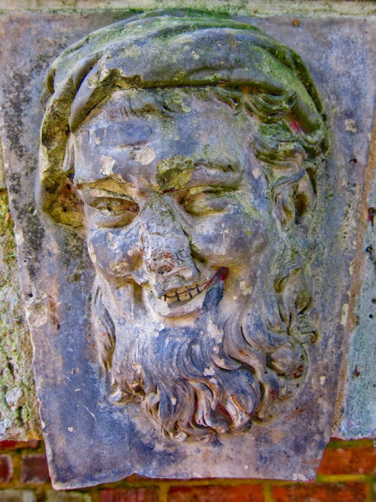
Above a traditional Green-man image carved with beard. Below a more devious looking Green-man or woodland spirit with leaves brushing beside the head, another beast and then leaves and coats of arms for the Abbot of Ramsey who would have given the parish money to decorate and repair the church along with the Abbot of Ely.
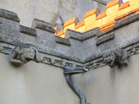
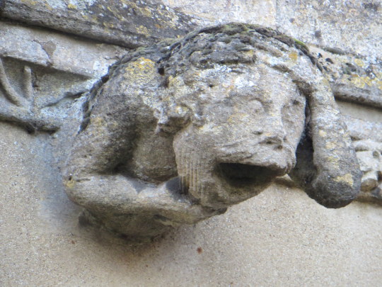
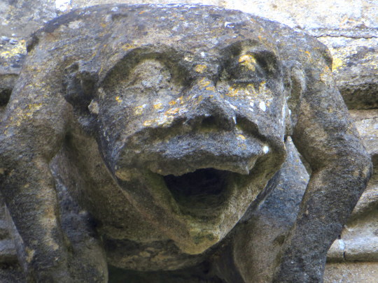
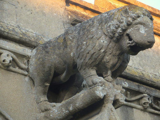
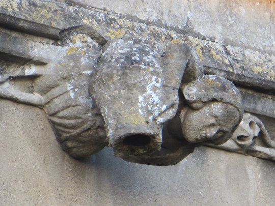
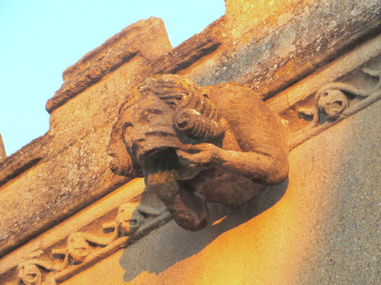
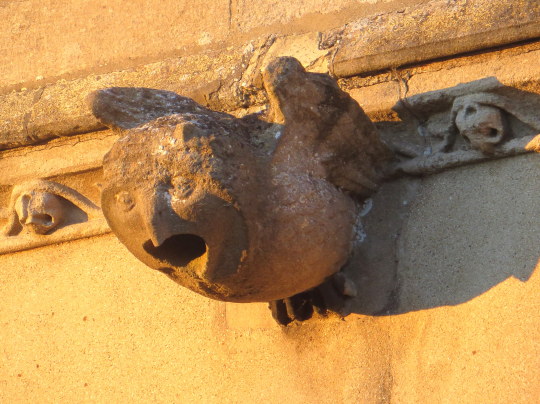
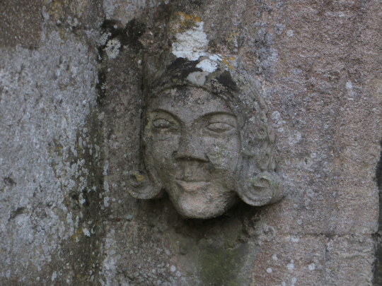
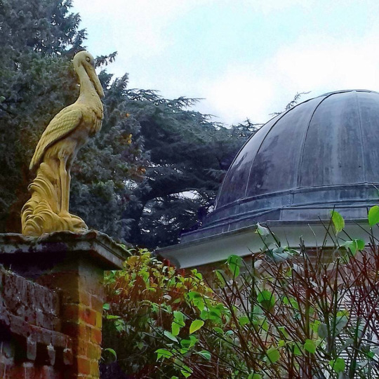
Outside the church is no less decorative than the interior as the image below shows, the gargoyles were the original way of spouting water from the roof while looking decorative. It has now been replaced with the modern piping and emergency spout for heavy rainfall or if the pipe is blocked with leaves.
The carving of them is not only wonderful but so inventive. A sheep, a maiden with a potty or jug. I am unsure of their age but I love the folk nature of the design and that everything should be functional and decorative.
The owl caught the sunlight as the full force of the sunset glowed across the building.
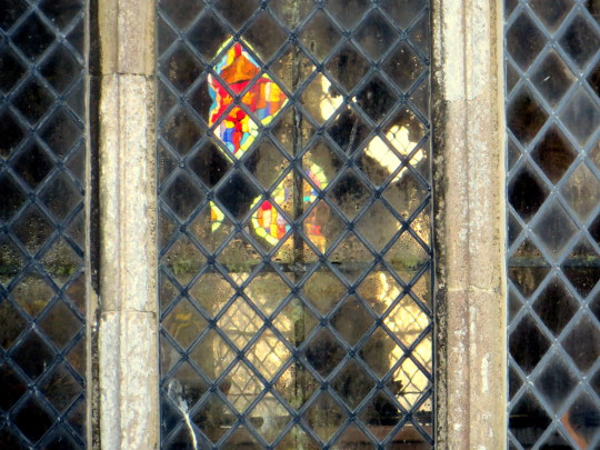
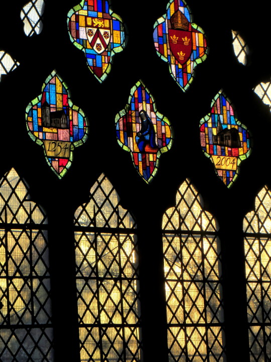
From outside the date celebration window is reflected in part thought the leaded squares. Below the image is the window in full with coats of arms and the dates 1254 when the building was much simpler, to how it is today.
To the other side of the church and the light was catching the trees and headstones.
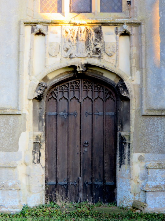
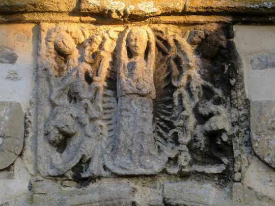
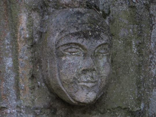
Above the door on the back of the tower is a wonderful carving, what might be Mary is in the centre of a
Botticelli like shell and the faces of men around the sides, the top left in a wig reminding me of Samuel Pepys, who’s family origin from the near-by Cottenham.
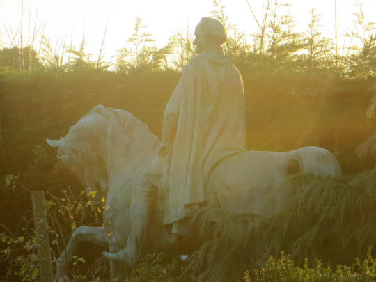
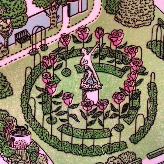
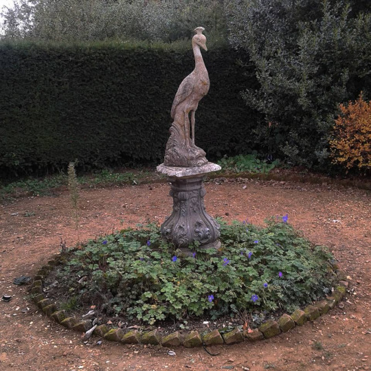
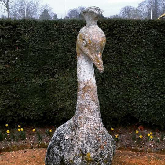
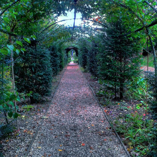
At the end of the Graveyard you can see into the next garden and there is a huge statue of a Roman on a Horse, looking over a 8ft high hedge.
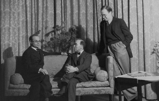
Michael Rothenstein was born in 1908 in Hampstead, London and the youngest of four children of Sir William Rothenstein and Alice Knewstub. His brother John became a director for the Tate Gallery and had connections with the Bloomsbury Set.
Howard Coster’s photo of John Rothenstein; Sir William Rothenstein; Michael Rothenstein (standing), National Portrait Gallery, 1939.
Michael was homeschooled and studied art at Chelsea Polytechnic
and later at the Central School of Arts and Crafts (1924-27). His mother was American and his father British, the family home was also a social and happy one.
If we accept the frequent probability of children’s rebelling against the lives and pursuits of their parents – or at least their parental environment – Michael Rothenstein’s early years might well have destroyed any burgeoning of a creative disposition. But as a child and as a young man, he actively enjoyed the not affluent but very comfortable style of an artist’s household in which Augustus John, Wyndham Lewis, Edward Burra, Stanley Spencer, David Jones, Edwin Lutyens or the young Henry Moore were received and he often rubbed shoulders at supper or tea parties with Walter de la Mare, Barnett Freedman or Robert Graves.†
Affected by lingering depression due to myxoedema, he did little art making during the late 1920s and early 1930s. Despite this, he had
his first one-man show at the Warren Gallery, London in 1931.
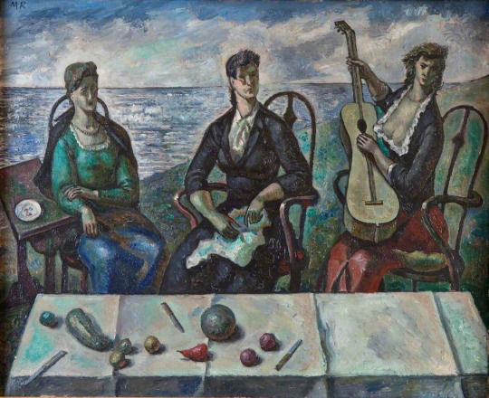
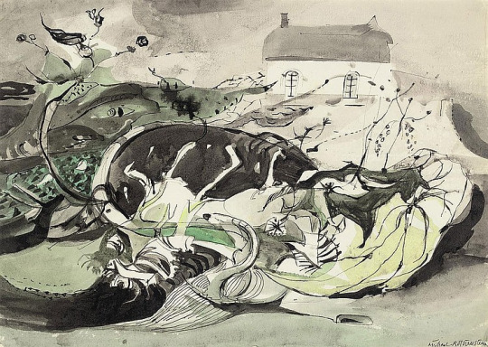
Michael Rothenstein – Three Women by the Sea, Jerwood Gallery, 1938.
His work and style of the late 30s and early 40s was part of the neo-romantic water-colourist set that artists like Thomas Hennell, Claude Muncaster, Eric Ravilious and Paul Nash had been championing for a decade. These watercolours are best showcased by the work he created for the Recording Britain project.
Michael Rothenstein – Kilburn Church from the South, V&A, 1940. (Recording Britain)
In 1941 Rothenstein moved to Great Bardfield, staying first at ‘Place House’, where John Aldridge also lived, before moving to ‘Ethel House’. As his style progressed away from the Recording Britain project he could be more abstract and free with his artworks, moving to Great Bardfield gave him a community of artists and a resource of subjects to work with. He started a long association with the Redfern Gallery, with his first show in 1942.
Michael Rothenstein – Autumn, 1947.
The community of Great Bardfield in the 1940s had Rothenstein in contact with artists like John Aldridge, Edward Bawden and Kenneth Rowntree. Bawden moved to the village in 1925 and Rowntree in 1939. Following Rothenstein over the next decade would be George Chapman, Stanley Clifford-Smith, Audrey Cruddas and textile artist Marianne Straub. The village would go on to hold events and make it one of the artistic centres for East Anglia alongside Colchester and its School of Art.
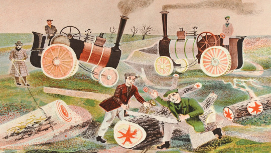
During 1945 he submitted a lithograph for the Schools Prints series, ‘Timber Felling’, it was the fifth print of the first series and is one of his most recognisable works. He also illustrated the Sussex volume of Visions of England in 1947.
Michael Rothenstein – Timber Felling, 1945. (Schools Prints SP5)
In 1948 Rothenstein would learn about lithographic printing with the two sisters, Frances Byng-Stamper and Caroline Byng-Lucas whom had set up Millers Press in Lewes, East Sussex. Their express purpose was to revitalise the art of lithography in the French style, art-lithography having become unfashionable in early twentieth century Britain and seen as the tool of a ‘commercial artist’.
Together with new lithographs, over the next few years Rothenstein would print many monotype experiments at his home in Great Bardfield.
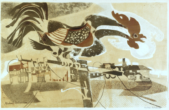
Michael Rothenstein – The Cockerel, From my collection, 1950.
In the 1950s he embraced printmaking over painting working in every area of the medium. In 1952 he travelled to Paris to the ‘Atelier 17′ studio to work with Stanley William Hayter – the surrealist print-maker; under his influence it is credited that Rothenstein started his bold experiments in printmaking. The prints he produced were modern and colourful and very chunky mixing woodcuts with screen-prints or etchings. In this form of work he had discovered his true style making the farmyards and fields of Great Bardfield into lively prints.
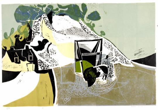
Michael Rothenstein – Quarry (White Cliff), V&A, 1955.
The first stages of the printmaking revival started with the boom in book sales and publishing from 1900. As publishers looked for more artistic illustrators the medium jumped into the art world with limited edition framed prints becoming more popular into the 1930s. Lithography, lino and the woodcut were the springboard in the 40s and 50s for large scale limited edition images that could be presented as art in multiable copies; with a painting you only have one sale, with a print you have many. Rothenstein, with his ongoing experiments into printmaking, found himself with a younger set of artists pushing the boundaries of printmaking and riding the British wave of Pop Art.
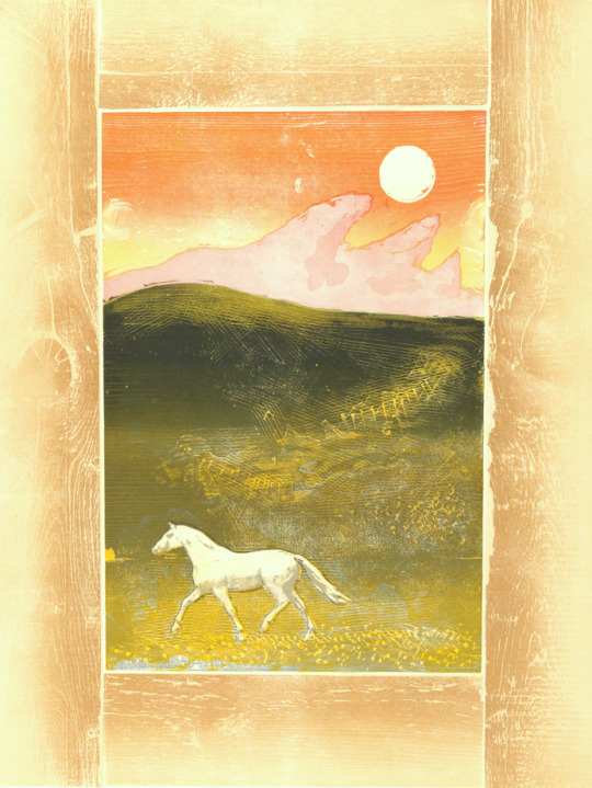
Michael Rothenstein – Horse and Sunrise, From my collection, 1974.
Horse and Sunrise is made with wood timbers bolted together in a frame like metal type is in a letterpress. The centre is made of two more woodblocks of (1) the sky and land, and (2) the green hill top shading. The horse is a screen-print layer
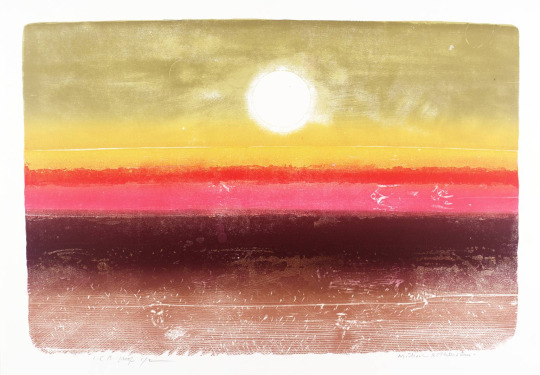
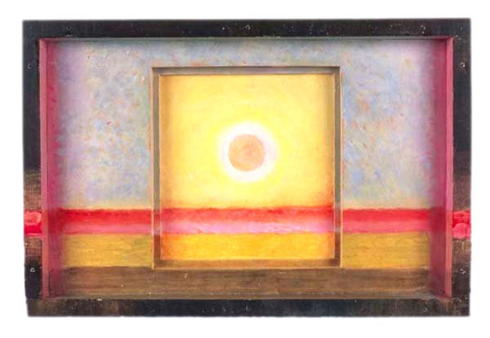
Michael Rothenstein – Sunrise at 36,000 ft, From my collection, 1973
Sunrise at 36,000 ft is a woodcut with multiable pieces of wood bolted together and a colour intaglio print with multi-colour shading, blending and intaglio details. In the 60s Rothenstein started to construct box pieces made from found items. Painted or covered with his prints they blurred the perceptions of painting, sculpture and printmaking.
Michael Rothenstein – Sun Box II, 1975.
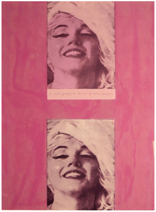
The works that set Rothenstein into becoming a Pop Artist are mostly the ones with screen-print overlays, like in the Marilyn Monroe print.
Michael Rothenstein – Marilyn I, From my collection, 1978
The fundamentals of Pop Art are using ‘found objects’ to make major commercial artworks. Like Warhol and Lichtenstein, he blew-up the size of pictures from newspapers and bolted them with real items in his boxes.
Michael Rothenstein, for instance, has applied boundless energy to extending the range of the relief process of wood and lino, sometimes combining them with screenprint and photo-screen. ‡
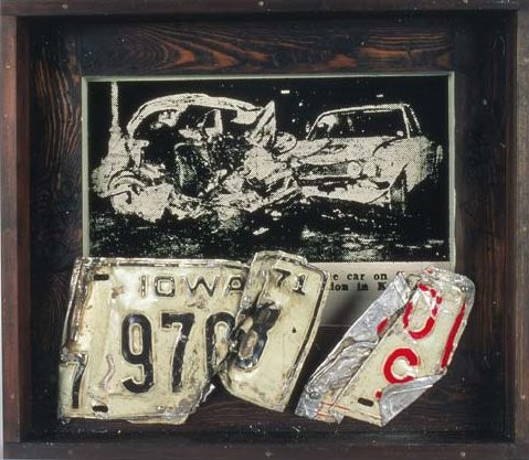
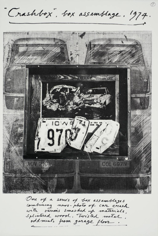
Michael Rothenstein – Crash Box I, 1973
Michael Rothenstein, Crash Box Assemblage, Tate, London, 1974
In 1936 he married his first wife, the artist, Betty Fitzgerald, who was later known as Duffy Ayers, and the couple had two children. In 1956 he divorced Duffy and in 1958 married Diana Arnold-Forster. Not long after the 1958 Great Bardfield summer exhibition the couple moved to the nearby village of Stisted, Essex.
Rothenstein was elected an Associate of the Royal Academy (ARA) in 1977 and a Royal Academician (RA) in 1984. His works are held in international collections.
Michael Rothenstein – Black Mast, Dalmatian Sea, From my collection, 1958.
† Obituary: Michael Rothenstein by Bryan Robertson, The Independent, 1993
‡ Printmaking in Britain by Richard T. Godfrey, 0714818380, 1978.
Olive Muriel Cook was born in Cambridge on 20 February 1912, the daughter of Arthur Cook, a librarian at the University Library for 56 years, and his wife, a dressmaker for Robert Sayle (John Lewis Partnership). She was educated at the Perse School before gaining a scholarship to Newnham College in 1931, where she read Modern Languages. She obtained her MA in 1942.
Olive Cook – I Am the Ancient Apple Queen, The Fry Gallery
Her first job was that of art editor for Chatto and Windus, followed by supervisor of publications at the National Gallery (1936-1945), where she worked with Kenneth Clark and Arnold Palmer. She met and became friends with official war artists including Eric Ravilious, Thomas Hennell and Stanley Spencer, and it was during this time that she met Edwin Smith, whom she married in 1954. In 1945 she left the National Gallery to devote herself to her own writing and painting and she and Smith started to write and illustrate articles for The Saturday Book edited by Leonard Russell, to which they both contributed annually until Edwin’s death.
She took a two week painting course at Sir Cedric Morris’s Benton End school in Hadleigh Much. She is now one of his forgotten pupils of the East Anglian School of Painting and Drawing. The other prominent artists of the school are Lucy Harwood, Lucian Freud, Maggi Hambling, David Kentish, Bettina Shaw-Lawrence, Lucy Harwood, Joan Warburton, Glyn Morgan, Valerie Thornton and top legal scholar Bernard Brown.
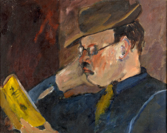
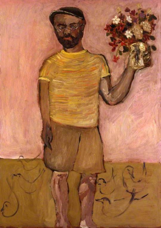
Olive Cook – Portrait of Michael Rothenstein Reading – The Fry Gallery, 1947.
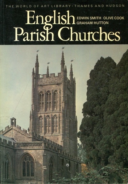
She wrote ‘Suffolk’ in 1948, ‘Cambridgeshire: Aspects of a County, 1953’, and children’s books illustrated by George Adams in 1954. That same year saw the publication of ‘English Cottages and Farmhouses’ with text by Cook and photographs by Smith, their first major work for Thames and Hudson. After their marriage they lived in Hampstead where they had a large circle of artist and writer friends. More joint books followed including ‘English Abbeys and Priories’, ‘British Churches’, ‘The Wonders of Italy’, ‘The English House Through Seven Centuries’.
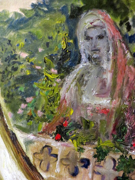
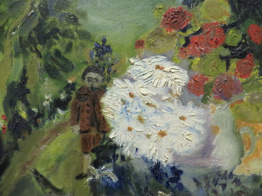
Olive Cook – In The Garden
They moved to Saffron Walden in 1962, where Olive Cook pursued her passion for the preservation of the countryside, her book ‘The Stansted Affair’ presenting the case against the development of the airport (1967). They purchased the Coach House in 1967, remodelled and decorated it in their own inimitable way (see photos in Series 9). Sadly, Smith died of cancer at the early age of 59, leaving Cook devastated. However, a woman of great spirit, she rallied and continued to further the reputation of her beloved husband, producing ‘Edwin Smith: Photographs 1935-1971’ in 1984, and continually promoting his work through exhibitions and in books of others, such as Lucy Archer’s ‘Architecture in Britain and Ireland 600-1500’.
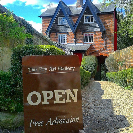
Her own writing also continued: she wrote the libretto for ‘The Slit Goose Feather’ composed by Christopher Brown, ‘Tryphema Pruss’, illustrated by Walter Hoyle, as well as the introduction for his ‘To Sicily with Edward Bawden’. And, in the 1980s she along with Iris Weaver was instrumental in establishing the Fry Art Gallery in Saffron Walden, writing biographical sketches of the artists of the North West Essex Collection deposited there.
Olive Cook had an enormous capacity for friendship, as the hundreds of cards in her papers attest, and although she had no children herself, she was clearly a great favourite with those of her many friends. Right up to the end of her long life, messages came pouring in. She died on 2 May 2002, aged 90.
Olive Cook – Edwin Smith with Flowers and Ducks, National Portrait Gallery, 1954.
Edwin George Herbert Smith was born on 15 May 1912 in Canonbury, London, the only child of Edwin Stanley Smith a clerk and his wife Lily Beatrice. After leaving elementary school he was educated at the Northern Polytechnic, transferring to the architectural school at the age of sixteen. He then won a scholarship to the Architectural Association, but for financial reasons gave up his course and worked as an architectural draughtsman for several years, most notably for Raymond Myerscough-Walker. >From 1935 he became a free lance photographer, though painting remained his first love, working briefly for Vogue as a fashion photographer, but mostly concentrating on the mining community of Ashington in Northumberland, the docks of Newcastle, and circuses and fair grounds around London.
In 1935 Smith married Rosemary Ansell, daughter of Henry Ansell, a confectioner. Their son Martin was born in 1941, but the marriage ended in divorce two years later. By this time Smith was living with Olive Cook, whom he married in 1954. Smith was also a writer, producing photographic handbooks, including ‘All the Photo Tricks’ (1940), for Focal Press. But he is best known for his photographs of architecture and landscapes, both of Britain and Europe. His books include: ‘English Parish Churches’ (1952), ‘English Cottages and Farmhouses’ (1954), ‘The English House Through Seven Centuries’ (1968), ‘England’ (1971) ‘Pompeii and Herculanaeum’ (1960) ‘Rome: From its Foundation to the Present’ (1971). Many were collaborations between him and Cook: his photographs, her text.
In addition to his photographic output (60,00 negatives are now at RIBA), Smith was also a prolific artist. When at home, not a day went by without him drawing or painting. Throughout his life Smith produced water and oil paintings, drawings, linocuts and woodcuts. And in later years at Saffron Walden, he drew up architectural plans for local properties. It was only after his death that exhibitions of Smith’s work appeared.
He became ill in the spring of 1971, but his cancer was not diagnosed until a few weeks before his death on 29 December. There is a poignant account in one of his notebooks written by Olive and addressed to him three months after he died, recounting in detail his last day.
Cook inherited Smith’s estate on his death, 29 December 1971, and towards the end of her life deposited his huge photograph collection of some 60,000 negatives at the Royal Institute of British Architects (RIBA) along with their letters to each other. The remainder of his papers became part of her archive at Newnham.
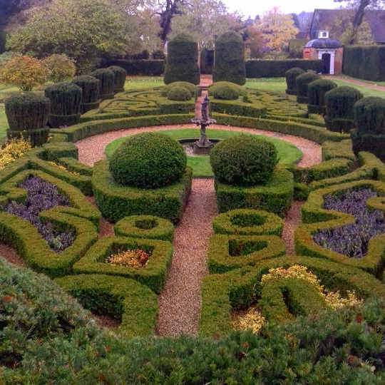
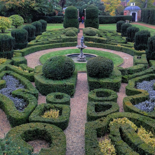
Every time I go to Saffron Walden I walk past the Fry Gallery and into Bridge End Gardens.
My Father was born around the corner and I remember being taken to the gardens as a child. My father’s memories of the gardens were quite different from today. During WW2 they had been dug up and used to grow vegetables in the Dig For Victory campaign. They were somewhat restored but it wasn’t until the 1980s that the work was put into making them into somewhere you would want to go.
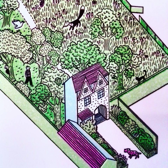
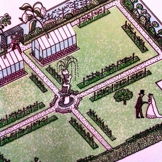
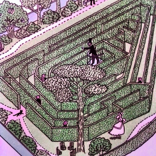
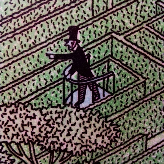
Lately they have added a visitors centre and in that is a large plaque with illustrations by Christopher Brown, below are some details of his illustrations of the garden sections and photos of mine.
The drawn plan is by Christopher Brown who studied at the Royal College of Art where he first met, then later assisted, Edward Bawden. Christopher made his first trip to Saffron Walden to visit Bawden in 1979. Over the course of subsequent visits they sometimes walked through the Garden, which was in a sorry state at the time. Returning to the town for this commission, Christopher believes Bawden would appreciate the restoration work.
Bridge End Gardens were built on fields on the edge of Saffron Walden and covers an area of 2.7 hectares (7 acres). The area was set out as gardens from around 1828 by Atkinson Francis Gibson and his wife Elizabeth.
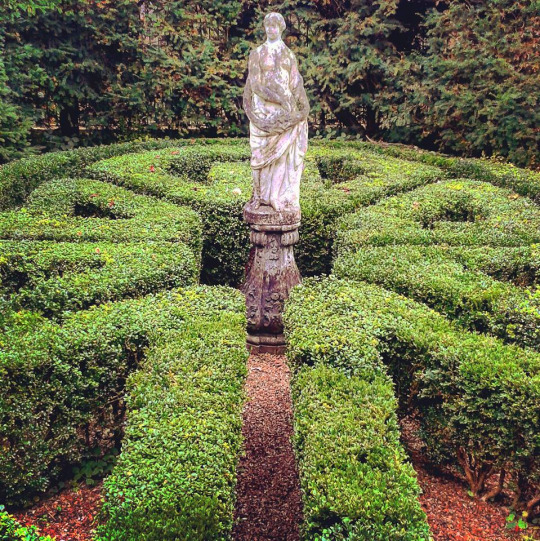
From 1838, his son Francis Gibson – who was interested in horticulture and had also completed a garden design for his sister – began creating a new garden with the help of a local nurseryman William Chater. The hedge maze was planted around 1870, by which stage the garden was under the management of a local agent and was used as a venue for shows by the Saffron Walden horticultural society.
The site opened to the public in 1902 and the borough council took over responsibility for its management from 1918, designating it as a ‘public pleasure ground’.
In 1987, the garden was listed with English Heritage. In the same year, the maze was replanted and the kitchen garden cleared. Between 2002–2006 the garden was restored back to the 1870 plan. The kitchen garden reopened between 2009 and 2011. †
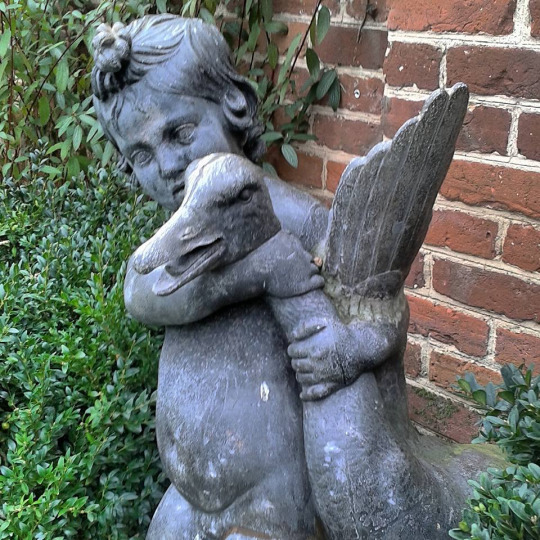
This statue I find covered with feathers or flowers, some local person is always decorating him in various organic items.
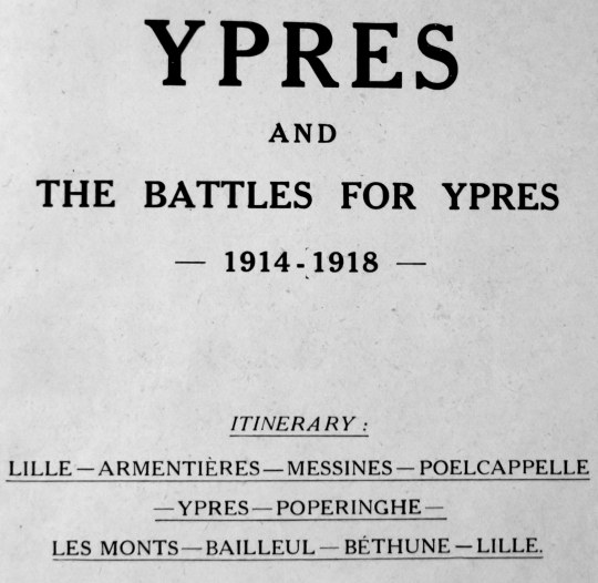
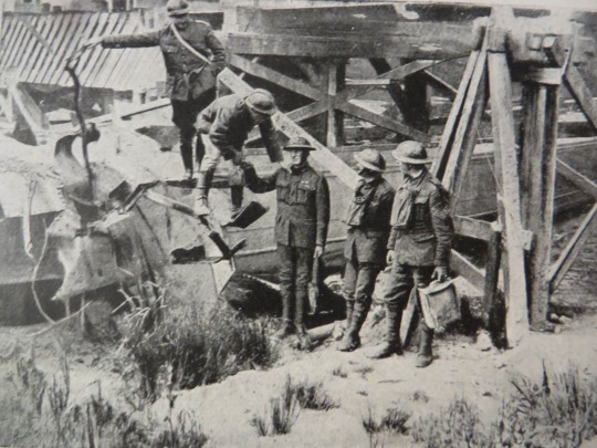
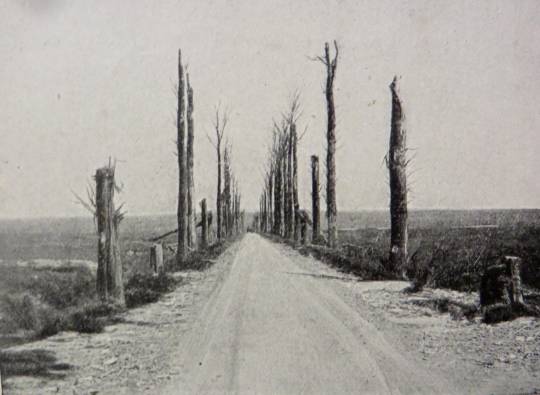
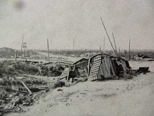
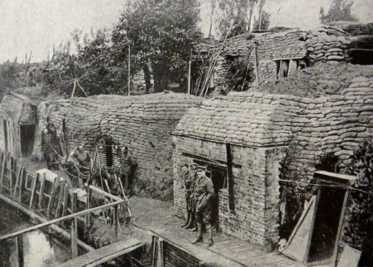
These pictures are from the ‘Michelin Guides to the Battle-Fields: Ypres and The Battles for Ypres’. It was a book giving the history of the first world war with maps and how each area was affected over time. I think most importantly they have pictures of the Ypres area during and directly after the war showing the carnage and the ruins, both with ruined machinery and buildings.
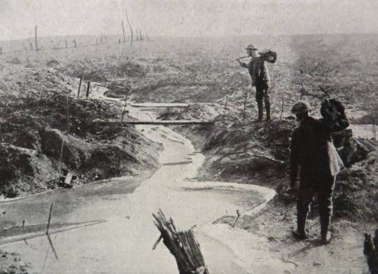
A difficult crossing. British and Belgian soldiers.
Today I think it might be easy to think a guide like this is distasteful, but there was a real demand of people who wanted to see where they lost family members and after the carnage the booklet is to the point with it’s histories.
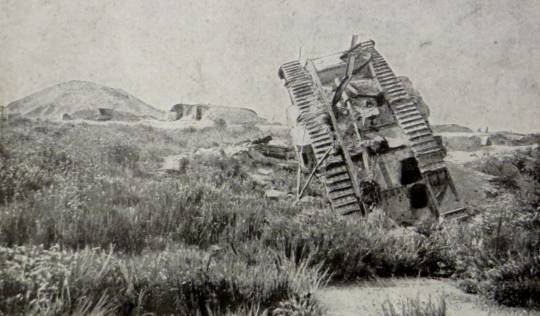
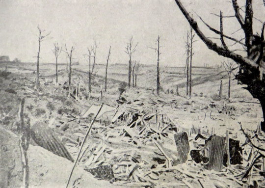
Langemarck, with destroyed tank. The mound in the middle distance is all that remains of the church.
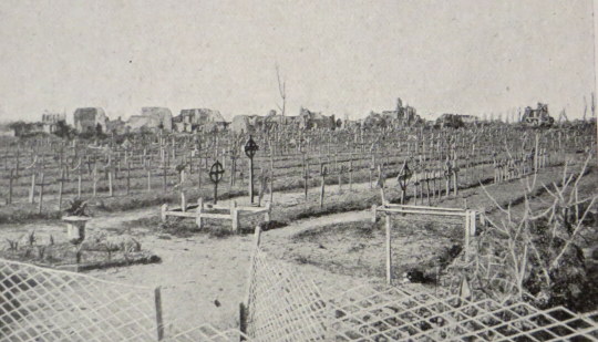
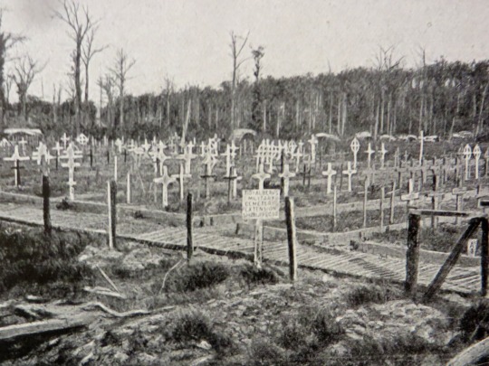
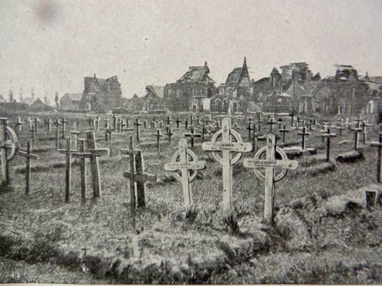
The British Cemetery Just outside of Ypres, on the road to Menin.
British Cemetery on the Polegsteert Road at Messines.
British Cemetery at the Hospice Notre-Dame.
The graveyards of the dead were rows of graves with wooden crosses staked in the ground while designs and ideas for war monuments were being designed. After the monuments had been designed and the graves laid out with stone uniformed crosses the families were asked if they would like to purchase the original wooden crosses and have it shipped back, those that where not bought by families were burnt.
The Flanders Battlefield in Winter.
The slopes of Scherpenberg Hill.
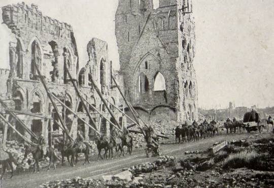
French troops passing in front of the ruins of Ypres Cloth Hall.
Messines Road.
Destroyed British Tank sunk in the mud at the entrance to Poelcappelle.
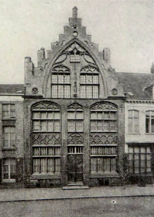
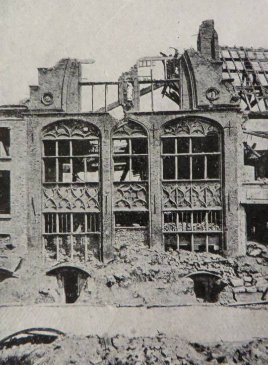
Before: Biebuyge House and below after the war.
After.
British Defence-works in front of Ypres.
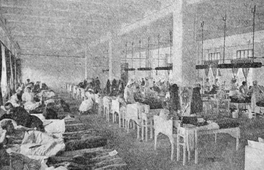
On the back pages of the book is a page outlining what Michelin did in the War by converting their warehouses (four storey) into hospitals with Operating Theatres, X-Ray wards and Laboratory’s in seven weeks and opening on September 22nd 1914. All the expenses were paid by the Michelin company.
A view of one of the Michelin Wards.
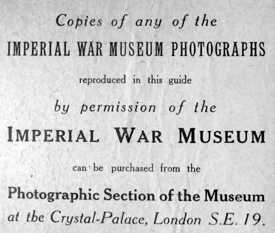
An advert for photographic reproductions of the images in the book, most of them were provided by the Imperial War Museum, London.
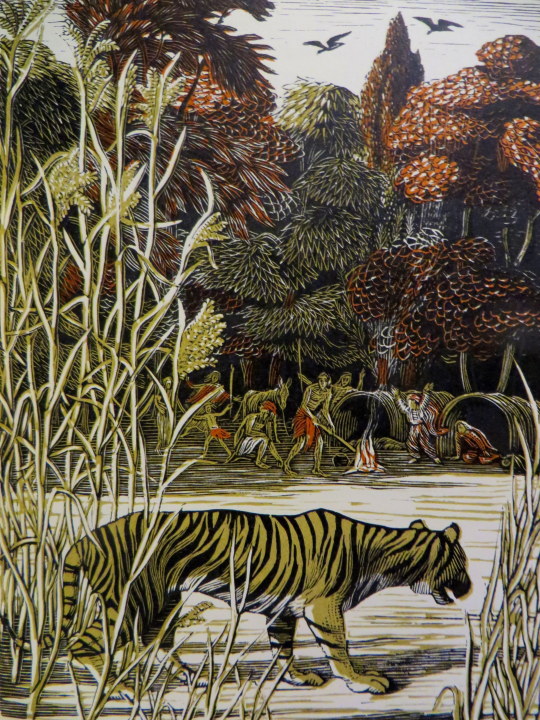
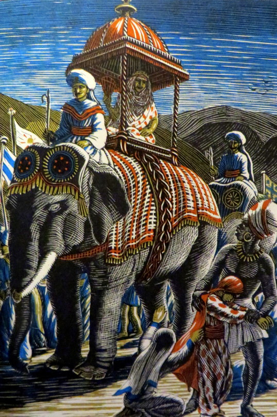
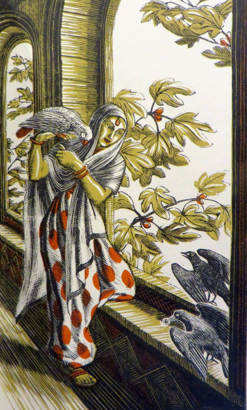
In a past post I wrote about the Cambridge Book of Poetry for Children, edited by Kenneth Grahame with 54 wood-engravings by Raverat. All of them black and white. This is a post about her colour wood engravings from The Bird Talisman.
Gwen Raverat, the granddaughter of Charles Darwin, was an English wood engraver and author. Born and raised in Cambridge, England, she studied art at the Slade School of Fine Art in 1908 and studied under Frederick Brown and Henry Tonks. She was inspired by Thomas Bewick’s wood engravings but the Slade at that time gave no opportunities to study wood engraving. When she left the Slade she went to Paris to the Sorbonne where she met and married Jacques Pierre Raverat, a fellow student and draughtsman.
These images come from The Bird Talisman is a story written by Raverat’s great uncle, Henry Allen Wedgwood, a London barrister. He originally published it with illustrations by the himself in The Family Tutor in 1852 and then later in book form in 1887.
Gwen took it upon herself to re-illustrate the book with her wood engravings.
She overcame her feeling of “sacrilege in tampering with a sacred work” and tried to illustrate it herself for Faber and Faber. It did not worry her that she had never visited India, where the story is set, for neither had her great uncle; and neither of them made any effort to be accurately Indian.
Her interest in colour printing, which had first appeared in the frontispiece to Four Tales from Hans Andersen, is here developed with rich effect in eight full-page colour plates. †
She held off agreeing to a contract until she had experimented one of these and settled how to do the various cuts. She decided in each to undertake the main block herself, but to hand over to a blockmaker those that would carry the colour. When de la Mare arranged for these to be done in Vienna, Gwen objected, owing to the German occupation of Austria, and asked to estimate the cost of Austrian blocks, postage and insurance against the of using either English or French blockmakers as she was willing to pay the difference. †
In the end she used an English blockmaker she knew and trusted outlining for him the colour on the second block. She herself cut the plentiful smaller black-and-white engravings, in a variety of shapes and sizes, which help make this the most sumptuously decorated of all her books.It was contracted in February 1939 and due to be delivered in May of that year, but took longer, owing to the painstaking work involved. †
At one point the imminence of war cast doubt over the book’s production. “It’s now so nearly finished that I do hope it will get actually printed and bound, war or no war,” she wrote to Richard de la Mare in late August 1939, “that is I should hope this, if I could think about anything but war.” More positively, she wrote: “I hope you will like the colour plates; they are, at any rate, just what I intended them to be.” She threw further encouragement his way, reminding him that in the last war people had bought a lot of books, “especially if they were absolutely non-topical – quite away from war subjects, which this is. And there’s always Christmas for children even in war. However,” she ended, unable to stem her own despair, “nothing really matters much does it?” †
The book did, however, get published, though work on it was slow for by the time they started printing half the men at the Press had been called up. (This may have limited the number produced in 1939 and helps explain why a second edition was produced in 1945, soon after the return to peace.) †
† Gwen Raverat: Friends, Family and Affections by Frances Spalding, p357, 2001.
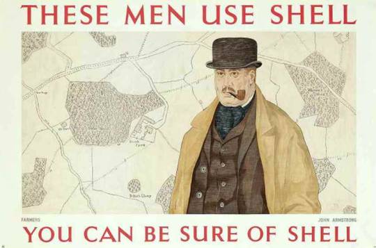
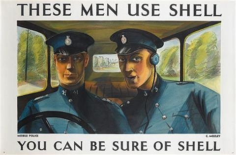
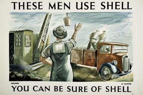
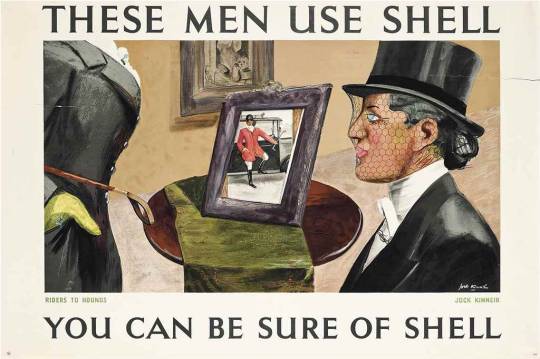
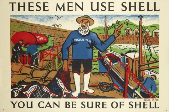
In the 1930s, Shell’s advertising department under Jack Beddington were running various poster series. This post shows the ‘These Men Use Shell’ series.
Shell employed artists such as Tom Eckersley and Paul Nash to produce a range of posters which transformed Shell’s visual identity. As these posters were displayed in petrol stations and on boards where Shell was purchased. The pictures by the artists were framed in the boxes
In being on open display it’s fair to say they were some of the first pieces of modern art the public would have seen.
In 1939, Armstrong designed his fourth poster for Shell, called ‘Farmers Use Shell’, which features an affectionate caricature portrait of Jack Beddington as Farmer George. †
There’s no doubt that Armstrong’s Shell postered helped dissminate his work to a wider audience, and together with the GPO posters, made him a more popular and better-known figure in the art world. The Shell posters were for lorry boards and travelled the length and breadth of the country on the sides of Shell’s tanker-trucks. These lorry bills were known as ‘the common man’s art gallery’ †
Farmers – John Armstrong. The farmer depicted is a portrait of Jack Beddington.
Mobile Police – Charles Mozley
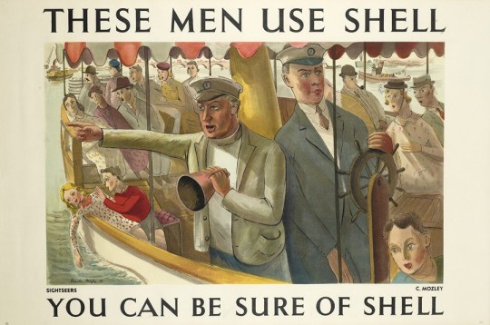
Sightseers – Charles Mozley
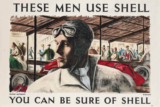
Racing Motorists – Richard Guyatt
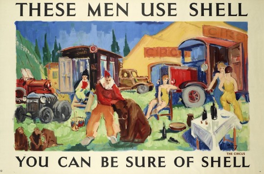
The Circus – Kavari Schwitzer
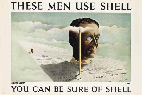
Journalists – Zero is the pseudonym for Hans Schlager.
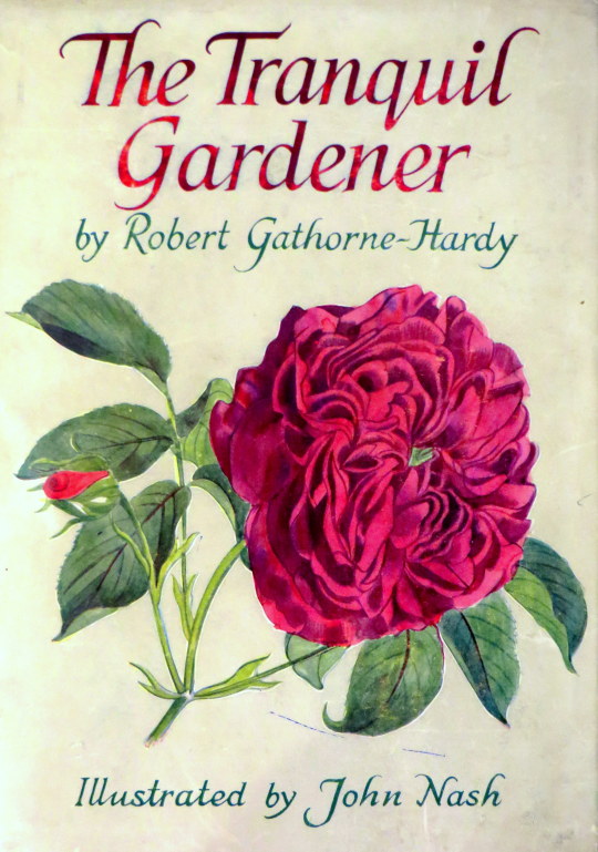
I recently bought a book called The Tranquil Gardener by Robert Gathorne-Hardy, it is illustrated by John Nash. These days Nash is known for his war art and being the brother of Paul Nash, but he is not as known for being a botanical illustrator and teacher.
From the dust jacket blurb: Robert Gathorne-Hardy has been an amateur gardener for as long as he can remember. In this book he describes three gardens with which he has been intimately connected-his own, his mother’s, and that of his illustrator, John Nash-each with its different soil, its different possibilities, its own invitations and its own snubs to give. He is, moreover, a plant collector of very considerable calibre, and there is the true biographical sapor to much of his description of individual plants. The text is superbly complemented by Mr Nash’s exquisite drawings.
During the 1920s John Nash taught at the Ruskin School of Art in Oxford and remained a teacher until the end of his life, inspiring many, including some of the best Kew artists. During most of the interwar years John Nash and his wife lived at Meadle in Buckinghamshire. From there both went on holidays all over England during which they filled numerous sketch books with pen, pencil and wash studies which developed into oil and watercolour compositions in their studio. Like Constable, Nash made annotations in these books about the weather on particular days.
John Nash had a great passion for plants and his technique as a plant illustrator deserves special notice as he excelled in the field. John Nash liked to use live specimen which sometimes was a problem when publishers asked for illustrations of plants which were not in season.
He often used his garden, which was planted with a wide variety of plants such as roses, irises, gentians and hellebores. John Nash had always been interested in botany even as a child he had won a Botany Prize and, like his friend Cedric Morris, he called himself an ‘artist plantsman’.
In 1940 Nash was commissioned as an Official War Artist in the Royal Marines, a role he did not especially enjoy, preferring to paint the English landscape, which he did after the war. From 1922 Nash had made many visits to Essex and rented a summer cottage at Wormingford, near Colchester and in 1945 he and his wife bought Bottengoms Farm where they lived until they died. When in Essex Nash taught at Colchester Art School and conducted yearly plant illustration courses at Flatford Mill. As one of the founders of Colchester Art Society (and later the Society’s President) and through exhibitions of his own work, he became closely connected with the Minories Art Gallery.
On his death he bequeathed his personal library and several of his paintings as well as the engravings recorded in this catalogue to the Gallery. Since then, the library, the paintings and most of the engravings were sold to the Tate.
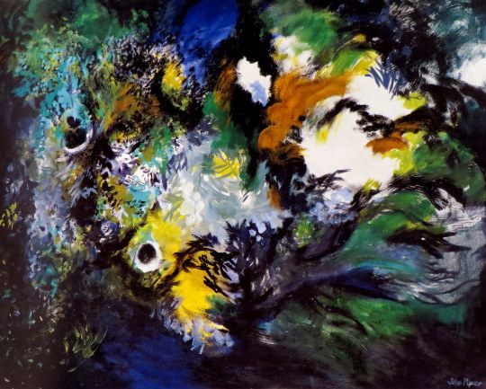
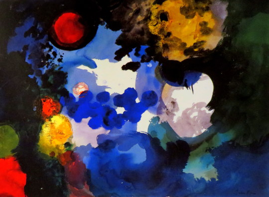
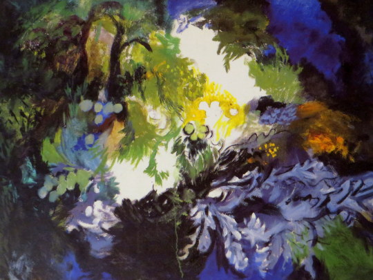
There is no rule to be observed that an artist’s work has to become looser as he gets older. It is easy to think of some remarkable cases where this happened, but this is because the late works of more usual careers with comparatively little change are less prominent. John Piper’s latest exhibition shows paintings of a startling freedom, but in his whole long career he has always swung between detailed and exuberant manners, whether the detail is the precise outline of an abstract painting or of a window at Windsor Castle, or whether the exuberance is of a collage of marbled papers that became one of his pre-war landscapes or of the whirls and blotches that decorate his pottery of the last twenty years. He has not been able recently to travel to his subject, and has fallen back onto something that he has saved for years, the garden of his own house.
John Piper – Fawley VII, 1989.
Piper is one of the few modern figurative artists who has never painted, or even photographed, a view of his own studio, since he has not wanted to tell people about himself, or idolise his own art. He may in effect reveal much, but only by inference. Until recently he has rarely painted even the valley and farmhouse where he lives. During the 19805 more paintings of his house and garden were exhibited, and for the summer of last year he made a whole exhibition of paintings of blossoms and of the garden. ‘Pear Tree and X/all’ from that exhibition almost overlaps with the new paintings, as the twisted tree seemed to cavort unrealistically in some black space of its own, almost dancing with liveliness.
The paintings now shown by Piper are amongst the best of his whole career, for his painterly skills are more evident as the given structures of the subject dissolve, and rarely has his work seemed so very personal and without outside occasion.
In the last few years there have been in London several gardening exhibitions, mostly historical, presumably in sympathy with the more conservative taste that has become noticeable. Gardens however are not only for retreat or withdrawal. They are also the battlefield of nature against cultivation, and the life and death not only of all plants with the seasons but between competing growths, some of which can survive by fertilisation and seeding.
John Piper – Fawley X, 1989.
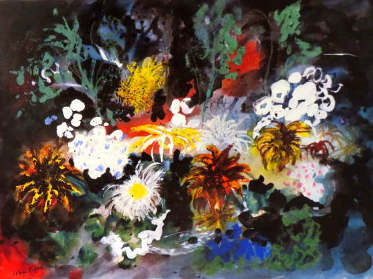
Piper has always avoided inventing figures in his work. The splendid Kings of Oundle College windows are translations of romanesque carvings and not his own figure studies. The figures in his photographs are obscured, either by fragmentation or by covering with foliage like a ’Wild Man’. He has admired the ’foliate heads’ of English gothic sculpture, and has two such heads in his studio, where he often places alongside them the gigantic drooping heads of‘sunflowers.
A favourite of his photographs is the ’lived Figure’ of Wotton, his title turning the name of the plant into a verb. It is only an extension of this where these new paintings are themselves ivied, or convolvolussed, herbascioussed and chrysanthemums. If the garden could be pruned, the statues, walls and paths would appear; but Piper has always fought against tidying up. This is an attitude of mind that opposed the clearing of buddleia from abbey walls by the Ministry of Works, and is also part of the sheer generosity of character that made those copious screenprints of well known and out of the way buildings, in extremes of light.
It is difficult to be certain in these new paintings whether the plants have covered the foreground or have somehow taken over the whole vision of the artist, leaving only a few spots of clear light. The overhanging eyebrows which looked so spooky in Phil Starling’s photograph of Piper on the cover of The Independent Magazine (10 December 1988) might have forced the vision back into the mind. These paintings were all begun with a wide brushed coating of white, mixed with sand to give a rough surface.
John Piper – Fawley VIII, 1989.
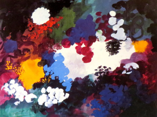
The prominent blacks almost obscure the light, left shining through in places like the opening of a cave. The flowers and leaves are in front of this blackness, things not quite known that are alive in this darkest part of the garden. Piper’s ordering of the colours still follows the discipline of his abstract paintings, which were themselves partly the result of his study of medieval stained glass painting.
The intense reds and blues of such windows, used sparingly but decisively within the design of heavy black outlines and borders, were models for his abstraction and have remained so most clearly whenever his painting has become less realistic. This harmony of colour is noticeable now more than ever, a harmony like Venetian and French painting that is a kind of eloquence based on patterns of contrast, and which gives the paintings a feeling of large scale.
John Piper – Fawley III, 1989.
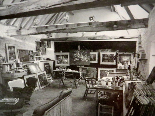
John Piper’s studio with flower paintings on the easel.