Rosemary Ellis

Rosemary Ellis née Collinson was born in Totteridge, North London in 1910. Her grandfather was the leading designer of furniture company Collinson & Lock and her father trained as a cabinet maker and started the firm Frank Collinson & Co.

image

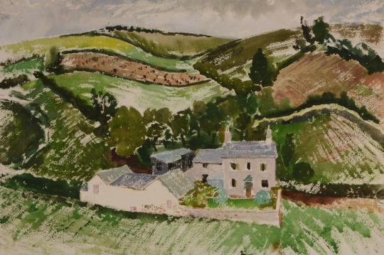
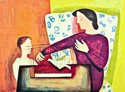
 Clifford Ellis – The Farm, 1945, from my collection.

Rosemary’s father served in WW1 in France and Italy. Having survived this conflict he died of Spanish Flu in 1919 and so Rosemary and her siblings moved in with her mother’s parents in their large house at Netley Marsh in the New Forest. In this environment she developed a love of the forest and its animals. Some time later, the family moved to London.

Rosemary went to study art at the Regent Street Polytechnic in 1928. It was here that she met her future husband Clifford Ellis who was her tutor at the Polytechnic.

image

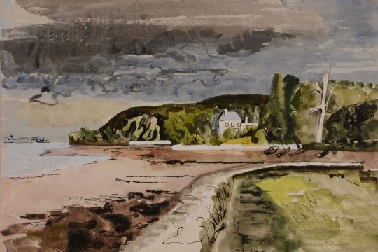
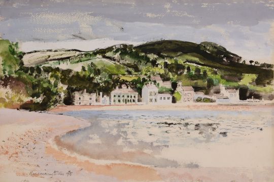
 Rosemary Ellis – View of Holcombe from Dawlish, 1945, from my collection.

Clifford and Rosemary Ellis were at once husband and wife and an artistic partnership. Their collaboration began in 1931, the year of their marriage, and subsequently almost all their published freelance work is signed jointly. By the time the New Naturalist jackets were designed they had taken to using the cipher C&RE to express their joint authorship. Such consistent use of a joint cipher is unusual, and needs a little explanation. The initials were put in alphabetical order, not out of any sense of seniority.

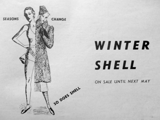
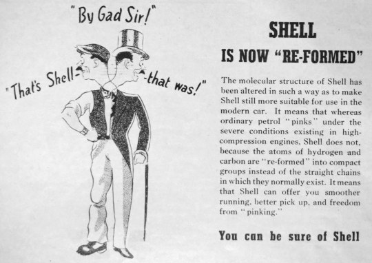
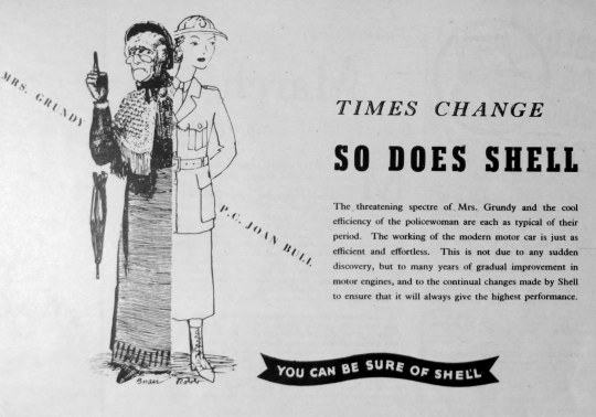
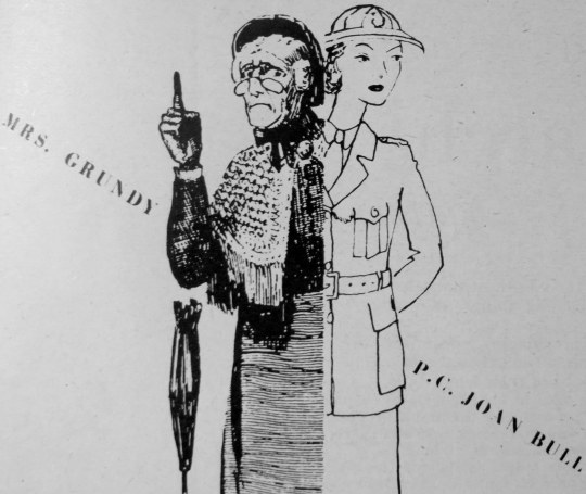
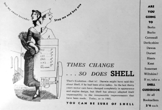
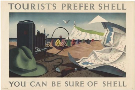
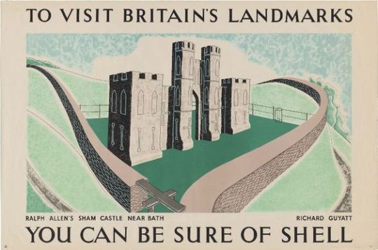
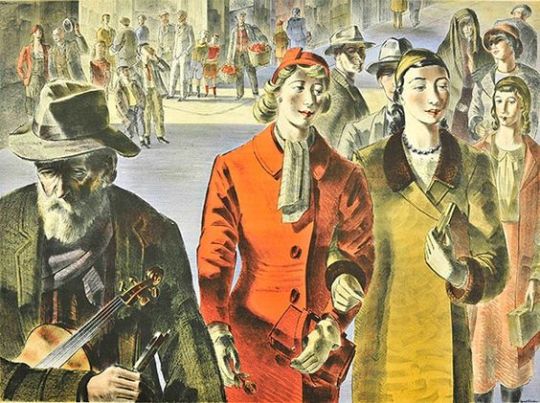
The couple as artists and designers joined the ranks of Ben Nicholson, Eric Ravilious, Barnett Freedman and Edward Bawden as artists who could create both posters for advertising and book dust jackets. They would join many of these artists in working for Shell Mex and for London Transport on posters.

image

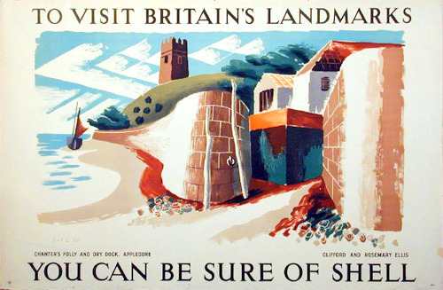
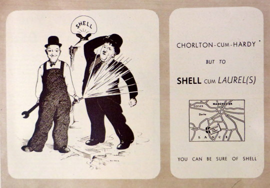
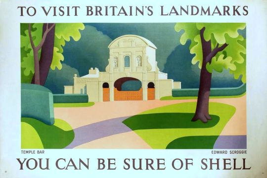
 Clifford and Rosemary Ellise – Appledore – ‘Shell Landmark’ Series No. 491

Work that would welcome further investigation includes posters by Barnett Freeman, Edward Bawden, Richard Guyatt and Clifford and Rosemary Ellis. Another area that was constrained from further investigation by lack of space was the way in which Beddington provided opportunities for women to produce art for commercial use. Women artists were given very little press attention in the 1930s and, although artists such as Barbara Hepworth were active exhibitors, critics rarely reviewed their shows. Apart from Vanessa Bell, six other women artists produced posters for Shell, including Pamela Drew, Eve Kirk, Cathleen Mann and Margaret Brynhild Parker. The reason for the prominence of women in poster design is a potentially interesting area of research that could illuminate issues of female participation in the arts, gender prejudice, and education in the 1930s.

By the time of WW2 Clifford Ellis was the headmaster of the Bath School of Art. He then served as a camouflage artist and official war artist with Grenadier Guards during Second World War.

image

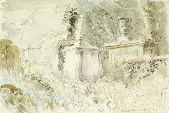
 Rosemary Ellis – Tombstones, Bathampton Cemetery, Bath for Recording Britain, 1943, V&A.

Rosemary too was a official war artist working on the Recording Britain project with Clifford. Above is a beautiful view of a graveyard in Bath. It is one of the most gothic and romantic works she produced and looks more like a John Piper study. The painting above ‘View of Holcombe from Dawlish’ also has elements of John Piper in it: the loosely constructed house, the abstract boat off the shore and the dark sky.

image

 Rosemary Ellis – Teignmouth Bay, 1945, from my collection.

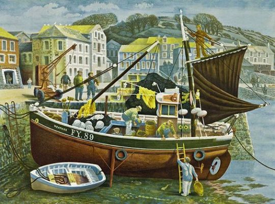
The couple would also be selected as artists for the Lyon’s Lithograph series in 1947. The aim was to produce large lithographs that could cheaply be bought by members of the public but also be displayed to brighten up the tearooms Lyons owned. The Ellis’s submission of Teignmouth was described as almost being a painting rather than a lithograph.

Between 1946 and 1955 the company commissioned three series of prints, some 40 in all, from most of the leading British artists of the day. The lithographs were not advertising per se (the Lyons name only appeared in small type at the bottom of each), but they were branding by association. 

To help, he brought in the artist Barnett Freedman as the technical director. He had long experience as a lithographer and had been both an official war artist and a teacher at the Royal College of Art. ♠

image

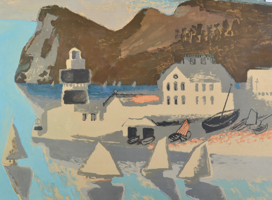
 R&CE – Teignmouth From the Lyons Lithographs First Series 1947.

The painting of Teignmouth Bay from 1945 would have been a study around the time of the Lyons lithograph above but looking back and forth onto each other.

Teignmouth Painted by Clifford and Rosemary Ellis: For the lithographs worked up at Chromoworks from originals, (Barnett) Freedman’s input at the proofing stage was crucial. In response to his comments about the proof of Teignmouth, for example, (Frank) Oppenheimer noted at the printers that they would ‘try a light grey printing over the sails etc … alter the colour of the light brown high light in the hills in printing [and] … make the colour of the sky and sea slightly warmer. ♣

Rosemary Ellis worked with her husband Clifford to design over 60 of the dust jackets for the New Naturalist book series, after volume 71 the artist Robert Gillmor took over.

image

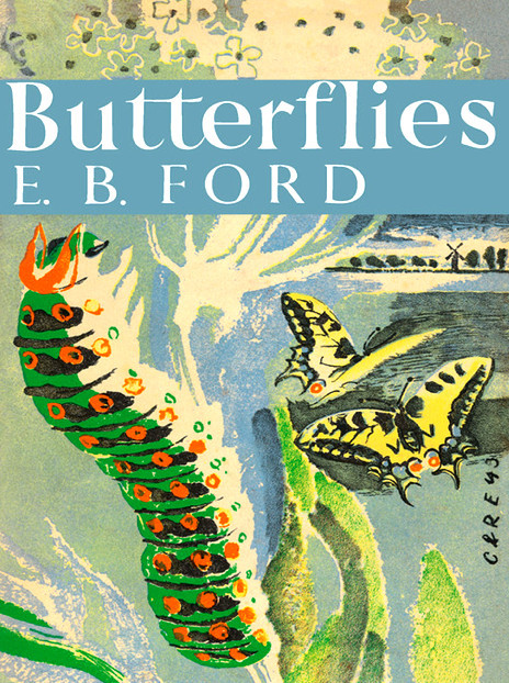
 R&CE – Butterflies by E. B. Ford, Collins, 1945

Today these jackets are their best-known work, though book lovers may know some of their other jackets before and after the war, for the Collins Countryside series in the 1970s, or their design for John Betjeman’s Collins Guide to English Parish Churches. Within the art worked they are remembered more as innovative teachers, Clifford Ellis having run the Academy of Art at Corsham Court for a quarter of a century with his wife Rosemary as a leading member of the staff. 

The pair also designed two of the covers to the King Penguin Series.

image

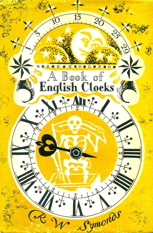
 R&CE – A Book of English Clocks by R.W.Symonds, 1946, King Penguin Books.

The original idea for King Penguins came from the small Insel-Verlag books which were published in Germany before the war. Why, we felt, should there not be a similar series of books in this country? The experiment, started a few weeks after war broke out, turned out to be successful. One of the most distinctive features of this series is their decorative covers. ♦

The King Penguin series itself struggled to make money, because of the costs of colour printing, and it was cancelled in 1957. ♥

image

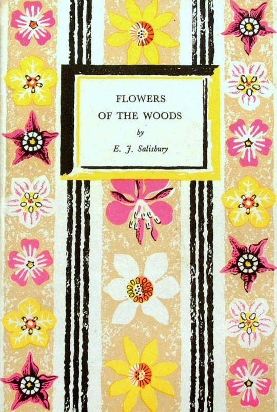
 R&CE – Flowers of the Woods by E.J.Salisbury, 1947, King Penguin Books.

† Collecting the New Naturalists by Tim Bernhard and Timothy Loe, 2015.
Shell’s England by Malcolm V. Speakman, 2014.
♠ Bawden and battenberg by Michael Prodger, The Guardian 12 July 2013.
Tea and a Slice of Art: The Lyons Lithographs 1946-1955 by Charlie Batchelor.
Reading Penguin: A Critical Anthology by William Wootten and George Donaldson, 2014.
♦ Pevsner: The BBC Years: Listening to the Visual Arts – Page 75
Recording Britain. Volume 4, Edited by Arnold Palmer, 1949.

A Double Take – Shell Adverts

image

In the 1930’s the adverts of Twinings, Guinness and Shell all followed a similar trend of comic verse and modern illustration.

Advertising needed to work differently in print, especially with the rise of weekly magazines, adverts were serialised, so every week they would have a different poem, illustration or tag line for the same product.

image

 John Patrick – Laurel & Hardy Chorlton-cum-Hardy Shell Petrol, 1937.

The adverts became less about the ‘quality and price’ of the products; but more abstract, advertising what the products do. With Shell it was to make you ‘go faster’, or give the perception of that.

image

The changes happened under Jack Beddington, who it could be argued changed the face of British Advertising by thinking of where his adverts would be seen. In magazines there would be more time to read the adverts, so there were poems or jokes. In petrol stations it was a bright poster with a line of text, something clean, quick to read and inspiring – for early petrol stations, that were mostly grubby sheds or small brick huts.

It was a trick Guinness would use to brighten up gloomy pubs. A decade later Lyons Corner-houses consulted Beddington on artists and lithography choices when doing prints to liven up their tea-rooms.

His adverts used modern art to make the company look modern by association. At this time museums charged admission, so the public didn’t visit them as much, so in these posters, it would have been the first time the public were exposed to modern art. The posters ’You can be sure of shell’ showcased beautiful British Locations by modern artists.

image

 Edward Scroggie – Temple Bar – ‘To Visit Britain’s Landmarks, You can be Sure of Shell’, 1937.

The magazine adverts were, on the whole, black and white with line drawings. The most famous are the series designed by Edward Bawden, but as I couldn’t find the illustrations below online, and the designers are less known, I thought it would be more interesting to showcase those rather than the adverts everyone knows already.

image

I photographed these adverts from old copies of Zoo Magazine: the National Nature Magazine – The Official Organ of the Zoological Society of London from 1937, ’38 and ’39.

image

 John Reynolds – ‘By Gad Sir!’ Reynolds was a book illustrator and cartoonist, best known for his illustrations of 1066 And All That (1930).

image

 Brian Robb – ‘Times Change.’ Robb worked for Punch in the 30′s, made posters for Shell and London Transport and became Head of Illustration at the Royal College, London. He was also a Camouflage Officer in the Western Desert in the Second World War. The advert above reads:

Times Change – So Does Shell
The threatening spectre of Mrs. Grundy and the cool efficiency of the policewoman are each as typical of their period. The working of the modern motor car is just as efficient and effortless. This is not due to any sudden discovery, but to many years of gradual improvement in motor engines, and to the continual change made by Shell to ensure that it will always give the highest performance. 

image
image

 Brian Robb – ‘Times Change’.

Times Change … So Does Shell
That’s Evolution – that is! Darwin might have said this about Shell, if he had been alive today. In the last thirty years motorcars have changed completely in appearance and engine design, but Shell has always adapted itself imperceptibly to the innumerate improvements that have been made. Today, as in 1907.

image
image

 Brian Robb – ‘Times Change’.

Times Change – so does Shell.
Shell has always been a contemporary spirit. It belongs to 1937 as much as it belonged to 1907. Between the years lies a big different made up of countless small improvements, each of which was made immediately it became desirable and possible. If, in the Autumn, you buy a 1938 car, you will find that Shell suits it perfectly; for Shell keeps in step with motor-car design.

image

She’s a hiker…
This girl would be a good walker, if only her clothes would let her. Some petrols suffer from the same handicap; they’ve got the essential power but not in a form in which it is most effective in the high-compression engine.
Shell, on the other hand, is really good petrol made still more suitable for the modern car by the new “re-forming” process.

image

Lyons Teashop Lithographs

image

 Lyons Print: William Scott — The Bird Cage.

The war had not only hit at Britain’s cities with bombs, but also at the people with rationing. Food and fabric, paper and paint, tea and sugar were all rationed.

It was in the war years that the Lyons teashops became shabby and as fashions started to change in the post war era they looked dated. Materials like wood and paint where mostly reserved and rationed for government use in the post war construction, so another idea had to be devised to make the Lyons tearooms look more respectable.

image

  Lyons Teahouse. 1951 The 2nd series of lithographs on the walls.

The directors, Felix and Julian Salmon had the idea of refreshing the tearooms with lithographic pictures to make them more appealing. In 1947 they sort advice from Jack Beddington who was the Artistic Director of Shell-Mex.

image

 Shell Advert by Tristram Hillier — White Cliffs of Dover

The advertising in the 1930’s for Shell-Mex featured British artists modern work with simple text. It had been a public success and an exhibition of the Shell-Mex lithographs in 1939 was well attended.

The art of advertising in London from the mid 1920’s onward had seen modern art projected onto the public with company’s like Shell-Mex & London Transport using artists like Paul Nash, Edward McKnight Kauffer, Horace Taylor and Graham Sutherland to illustrate bold and simple posters.

It was an age when galleries charged admission and in the war years galleries where disbanding and hiding their art collections safe from German bombing raids. This would mean that the colour advertising posters where some of the few artworks to be left open to the public in wartime and where displayed all over the country. It would be the first time the public would encounter these artists.

image

 Shell Advert by Richard Guyatt — Ralph Allen’s Sham Caster nr Bath.

By appointing Beddinton they relied on his contacts with artists to product the lithographs. Samples and designs where commissioned and the first series of these sixteen prints featured Edward Ardizzone, Edward Bawden, Clifford & Rosemary Ellis, Barnett Freedman (who assisted with artistic advice on lithography) Duncan Grant, Edwin La Dell, John Nash to name half. Artists also claimed royalties on copies sold in the tearooms, an unusual practice in it’s day. One thousand five hundred prints where made of each poster in the first series.

image

 Lyons Print: David Gentleman — Cornish Pilchard Boat

Some of the troubles in printing came from printing trade unions and of artists unfamiliar with the lithography process. Some of these posters had to be hand drawn onto the lithographic plate to be printed, pre-made works where translated from paintings by Chromoworks Ltd, London.

The artworks for Lyons had a press release in 1947 at the Trocadero Restaurant, London, where Lyons often had their board meetings.
A special preview was arranged for Queen Mary.

Many prints where glued to wood or mirrors for hanging in the tearooms, the public could then buy the posters un-mounted and unframed, it’s the prints unglued to canvas and board that are worth more money today.

image

 Edward Bawden — The Dolls at Home.

Thirty of the Lyon’s Tea Rooms in London exhibited the prints at first. Due to the press and public interest the prints were soon found in all Lyons’ teashops. The success of the first series of prints meant that a second and third series of prints came in 1951 and 1955.

It is worth noting that companies like Guinness started to produce lithographic prints (The World Record Series) to brighten up their pubs soon after. So the series and it’s publicity had an ongoing effect.

image

 Michael Ayrton — The Spectators

image

 Barnett Freedman — People