Rothenstein into Pop Art.

Michael Rothenstein was born in 1908 in Hampstead, London and the youngest of four children of Sir William Rothenstein and Alice Knewstub. His brother John became a director for the Tate Gallery and had connections with the Bloomsbury Set.

image

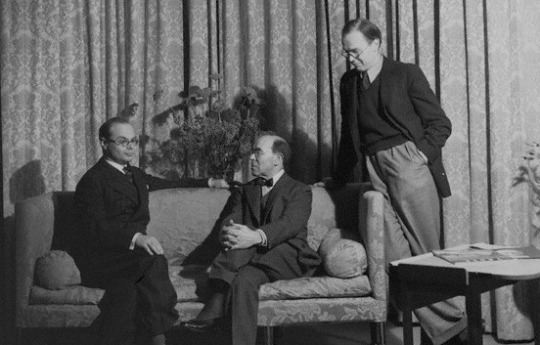
 Howard Coster’s photo of John Rothenstein; Sir William Rothenstein; Michael Rothenstein (standing), National Portrait Gallery, 1939. 

Michael was homeschooled and studied art at Chelsea Polytechnic

and later at the Central School of Arts and Crafts (1924-27). His mother was American and his father British, the family home was also a social and happy one.

If we accept the frequent probability of children’s rebelling against the lives and pursuits of their parents – or at least their parental environment – Michael Rothenstein’s early years might well have destroyed any burgeoning of a creative disposition. But as a child and as a young man, he actively enjoyed the not affluent but very comfortable style of an artist’s household in which Augustus John, Wyndham Lewis, Edward Burra, Stanley Spencer, David Jones, Edwin Lutyens or the young Henry Moore were received and he often rubbed shoulders at supper or tea parties with Walter de la Mare, Barnett Freedman or Robert Graves.

Affected by lingering depression due to myxoedema, he did little art making during the late 1920s and early 1930s. Despite this, he had

his first one-man show at the Warren Gallery, London in 1931.

image

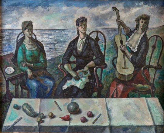
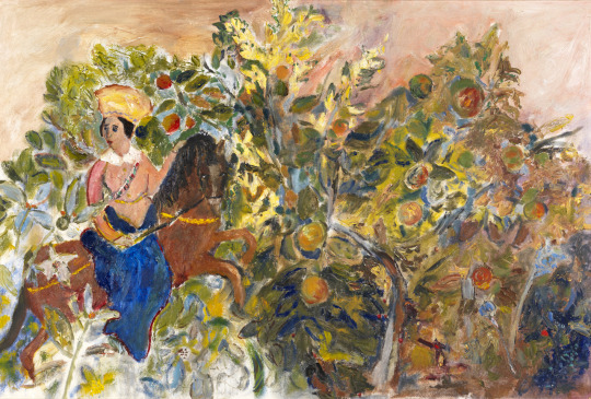
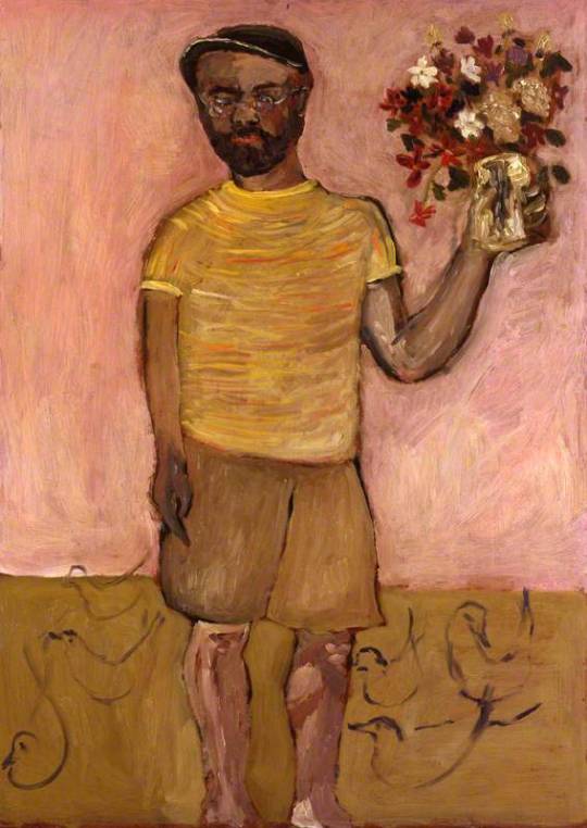
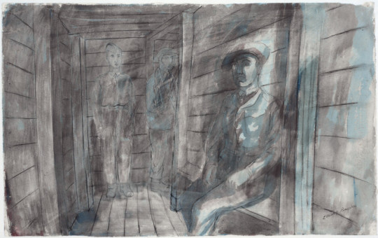
 Michael Rothenstein – Three Women by the Sea, Jerwood Gallery, 1938.

His work and style of the late 30s and early 40s was part of the neo-romantic water-colourist set that artists like Thomas Hennell, Claude Muncaster, Eric Ravilious and Paul Nash had been championing for a decade. These watercolours are best showcased by the work he created for the Recording Britain project.

image

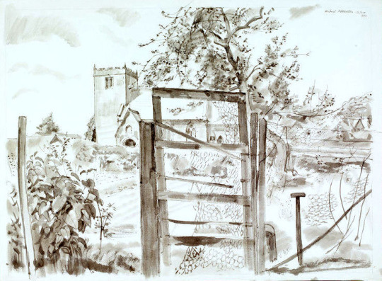
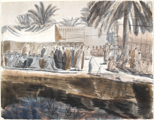
 Michael Rothenstein – Kilburn Church from the South, V&A, 1940. (Recording Britain) 

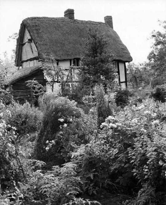
In 1941 Rothenstein moved to Great Bardfield, staying first at ‘Place House’, where John Aldridge also lived, before moving to ‘Ethel House’. As his style progressed away from the Recording Britain project he could be more abstract and free with his artworks, moving to Great Bardfield gave him a community of artists and a resource of subjects to work with. He started a long association with the Redfern Gallery, with his first show in 1942.

image

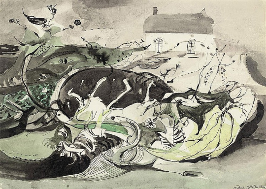
 Michael Rothenstein – Autumn, 1947.

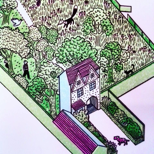
The community of Great Bardfield in the 1940s had Rothenstein in contact with artists like John Aldridge, Edward Bawden and Kenneth Rowntree. Bawden moved to the village in 1925 and Rowntree in 1939. Following Rothenstein over the next decade would be George Chapman, Stanley Clifford-Smith, Audrey Cruddas and textile artist Marianne Straub. The village would go on to hold events and make it one of the artistic centres for East Anglia alongside Colchester and its School of Art.

image

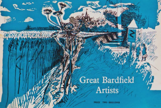
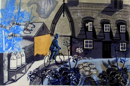
 Cover of the Great Bardfield Artists 1957-58 Exhibition Catalogue (Design by Walter Hoyle)

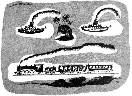
During 1945 he submitted a lithograph for the Schools Prints series, ‘Timber Felling’, it was the fifth print of the first series and is one of his most recognisable works. He also illustrated the Sussex volume of Visions of England in 1947.

image

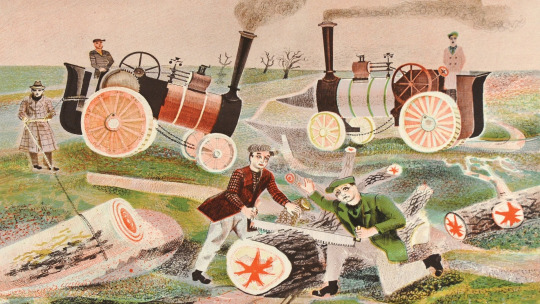
 Michael Rothenstein – Timber Felling, 1945. (Schools Prints SP5)

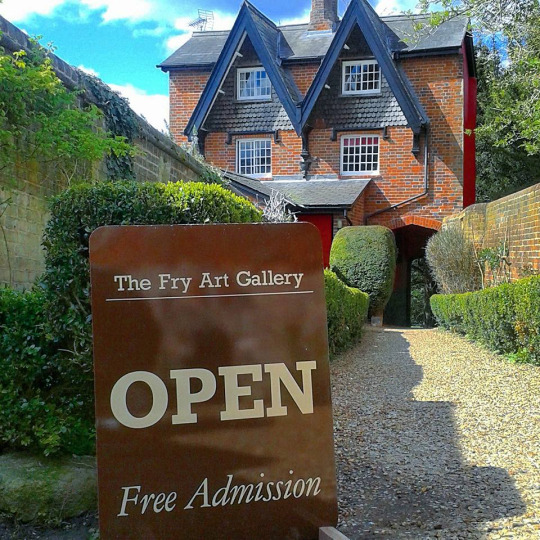
In 1948 Rothenstein would learn about lithographic printing with the two sisters, Frances Byng-Stamper and Caroline Byng-Lucas whom had set up Millers Press in Lewes, East Sussex. Their express purpose was to revitalise the art of lithography in the French style, art-lithography having become unfashionable in early twentieth century Britain and seen as the tool of a ‘commercial artist’.

Together with new lithographs, over the next few years Rothenstein would print many monotype experiments at his home in Great Bardfield.

image

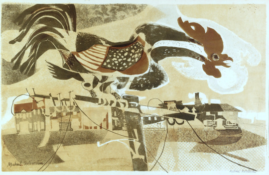
 Michael Rothenstein – The Cockerel, From my collection, 1950.

In the 1950s he embraced printmaking over painting working in every area of the medium. In 1952 he travelled to Paris to the ‘Atelier 17′ studio to work with Stanley William Hayter – the surrealist print-maker; under his influence it is credited that Rothenstein started his bold experiments in printmaking. The prints he produced were modern and colourful and very chunky mixing woodcuts with screen-prints or etchings. In this form of work he had discovered his true style making the farmyards and fields of Great Bardfield into lively prints.

image

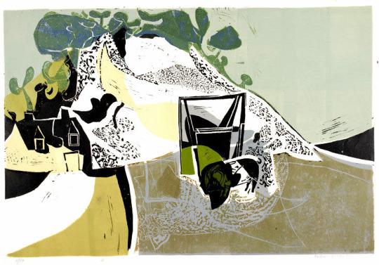
 Michael Rothenstein – Quarry (White Cliff), V&A, 1955.

The first stages of the printmaking revival started with the boom in book sales and publishing from 1900. As publishers looked for more artistic illustrators the medium jumped into the art world with limited edition framed prints becoming more popular into the 1930s. Lithography, lino and the woodcut were the springboard in the 40s and 50s for large scale limited edition images that could be presented as art in multiable copies; with a painting you only have one sale, with a print you have many. Rothenstein, with his ongoing experiments into printmaking, found himself with a younger set of artists pushing the boundaries of printmaking and riding the British wave of Pop Art.

image

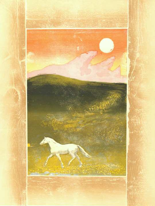
 Michael Rothenstein – Horse and Sunrise, From my collection, 1974.

Horse and Sunrise is made with wood timbers bolted together in a frame like metal type is in a letterpress. The centre is made of two more woodblocks of (1) the sky and land, and (2) the green hill top shading. The horse is a screen-print layer

image

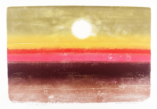
 Michael Rothenstein – Sunrise at 36,000 ft, From my collection, 1973

Sunrise at 36,000 ft is a woodcut with multiable pieces of wood bolted together and a colour intaglio print with multi-colour shading, blending and intaglio details. In the 60s Rothenstein started to construct box pieces made from found items. Painted or covered with his prints they blurred the perceptions of painting, sculpture and printmaking.

image

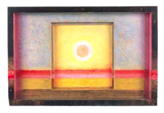
 Michael Rothenstein – Sun Box II, 1975.

The works that set Rothenstein into becoming a Pop Artist are mostly the ones with screen-print overlays, like in the Marilyn Monroe print.

image

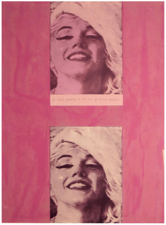
 Michael Rothenstein – Marilyn I, From my collection, 1978

The fundamentals of Pop Art are using ‘found objects’ to make major commercial artworks. Like Warhol and Lichtenstein, he blew-up the size of pictures from newspapers and bolted them with real items in his boxes.

Michael Rothenstein, for instance, has applied boundless energy to extending the range of the relief process of wood and lino, sometimes combining them with screenprint and photo-screen.  

image

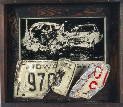
 Michael Rothenstein – Crash Box I, 1973

image

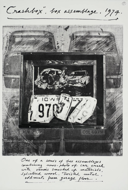
 Michael Rothenstein, Crash Box Assemblage, Tate, London, 1974

In 1936 he married his first wife, the artist, Betty Fitzgerald, who was later known as Duffy Ayers, and the couple had two children. In 1956 he divorced Duffy and in 1958 married Diana Arnold-Forster. Not long after the 1958 Great Bardfield summer exhibition the couple moved to the nearby village of Stisted, Essex.

Rothenstein was elected an Associate of the Royal Academy (ARA) in 1977 and a Royal Academician (RA) in 1984. His works are held in international collections.

image

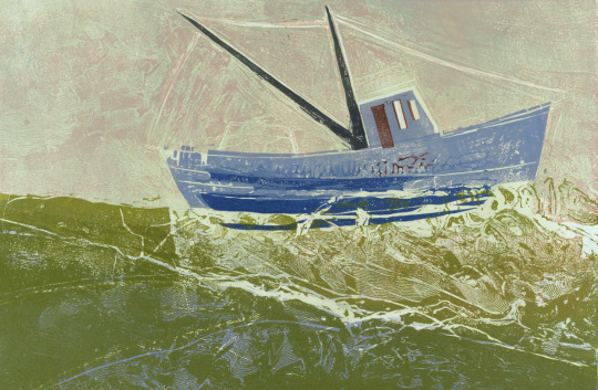
 Michael Rothenstein – Black Mast, Dalmatian Sea, From my collection, 1958.

Obituary: Michael Rothenstein by Bryan Robertson, The Independent, 1993
Printmaking in Britain by Richard T. Godfrey, 0714818380, 1978.

Olive Cook and Edwin Smith

Olive Muriel Cook was born in Cambridge on 20 February 1912, the daughter of Arthur Cook, a librarian at the University Library for 56 years, and his wife, a dressmaker for Robert Sayle (John Lewis Partnership). She was educated at the Perse School before gaining a scholarship to Newnham College in 1931, where she read Modern Languages. She obtained her MA in 1942.

image

 Olive Cook – I Am the Ancient Apple Queen, The Fry Gallery

Her first job was that of art editor for Chatto and Windus, followed by supervisor of publications at the National Gallery (1936-1945), where she worked with Kenneth Clark and Arnold Palmer. She met and became friends with official war artists including Eric Ravilious, Thomas Hennell and Stanley Spencer, and it was during this time that she met Edwin Smith, whom she married in 1954. In 1945 she left the National Gallery to devote herself to her own writing and painting and she and Smith started to write and illustrate articles for The Saturday Book edited by Leonard Russell, to which they both contributed annually until Edwin’s death.

She took a two week painting course at Sir Cedric Morris’s Benton End school in Hadleigh Much. She is now one of his forgotten pupils of the East Anglian School of Painting and Drawing. The other prominent artists of the school are Lucy Harwood, Lucian Freud, Maggi Hambling, David Kentish, Bettina Shaw-Lawrence, Lucy Harwood, Joan Warburton, Glyn Morgan, Valerie Thornton and top legal scholar Bernard Brown.

image

 Olive Cook – Portrait of Michael Rothenstein Reading – The Fry Gallery, 1947.

She wrote ‘Suffolk’ in 1948, ‘Cambridgeshire: Aspects of a County, 1953’, and children’s books illustrated by George Adams in 1954. That same year saw the publication of ‘English Cottages and Farmhouses’ with text by Cook and photographs by Smith, their first major work for Thames and Hudson. After their marriage they lived in Hampstead where they had a large circle of artist and writer friends. More joint books followed including ‘English Abbeys and Priories’, ‘British Churches’, ‘The Wonders of Italy’, ‘The English House Through Seven Centuries’.

image

 Olive Cook – In The Garden

They moved to Saffron Walden in 1962, where Olive Cook pursued her passion for the preservation of the countryside, her book ‘The Stansted Affair’ presenting the case against the development of the airport (1967). They purchased the Coach House in 1967, remodelled and decorated it in their own inimitable way (see photos in Series 9). Sadly, Smith died of cancer at the early age of 59, leaving Cook devastated. However, a woman of great spirit, she rallied and continued to further the reputation of her beloved husband, producing ‘Edwin Smith: Photographs 1935-1971’ in 1984, and continually promoting his work through exhibitions and in books of others, such as Lucy Archer’s ‘Architecture in Britain and Ireland 600-1500’.

image

Her own writing also continued: she wrote the libretto for ‘The Slit Goose Feather’ composed by Christopher Brown, ‘Tryphema Pruss’, illustrated by Walter Hoyle, as well as the introduction for his ‘To Sicily with Edward Bawden’. And, in the 1980s she along with Iris Weaver was instrumental in establishing the Fry Art Gallery in Saffron Walden, writing biographical sketches of the artists of the North West Essex Collection deposited there.

Olive Cook had an enormous capacity for friendship, as the hundreds of cards in her papers attest, and although she had no children herself, she was clearly a great favourite with those of her many friends. Right up to the end of her long life, messages came pouring in. She died on 2 May 2002, aged 90.

image

  Olive Cook – Edwin Smith with Flowers and Ducks, National Portrait Gallery, 1954.

Edwin George Herbert Smith was born on 15 May 1912 in Canonbury, London, the only child of Edwin Stanley Smith a clerk and his wife Lily Beatrice. After leaving elementary school he was educated at the Northern Polytechnic, transferring to the architectural school at the age of sixteen. He then won a scholarship to the Architectural Association, but for financial reasons gave up his course and worked as an architectural draughtsman for several years, most notably for Raymond Myerscough-Walker. >From 1935 he became a free lance photographer, though painting remained his first love, working briefly for Vogue as a fashion photographer, but mostly concentrating on the mining community of Ashington in Northumberland, the docks of Newcastle, and circuses and fair grounds around London.

In 1935 Smith married Rosemary Ansell, daughter of Henry Ansell, a confectioner. Their son Martin was born in 1941, but the marriage ended in divorce two years later. By this time Smith was living with Olive Cook, whom he married in 1954. Smith was also a writer, producing photographic handbooks, including ‘All the Photo Tricks’ (1940), for Focal Press. But he is best known for his photographs of architecture and landscapes, both of Britain and Europe. His books include: ‘English Parish Churches’ (1952), ‘English Cottages and Farmhouses’ (1954), ‘The English House Through Seven Centuries’ (1968), ‘England’ (1971) ‘Pompeii and Herculanaeum’ (1960) ‘Rome: From its Foundation to the Present’ (1971). Many were collaborations between him and Cook: his photographs, her text.

image

In addition to his photographic output (60,00 negatives are now at RIBA), Smith was also a prolific artist. When at home, not a day went by without him drawing or painting. Throughout his life Smith produced water and oil paintings, drawings, linocuts and woodcuts. And in later years at Saffron Walden, he drew up architectural plans for local properties. It was only after his death that exhibitions of Smith’s work appeared.

He became ill in the spring of 1971, but his cancer was not diagnosed until a few weeks before his death on 29 December. There is a poignant account in one of his notebooks written by Olive and addressed to him three months after he died, recounting in detail his last day.

Cook inherited Smith’s estate on his death, 29 December 1971, and towards the end of her life deposited his huge photograph collection of some 60,000 negatives at the Royal Institute of British Architects (RIBA) along with their letters to each other. The remainder of his papers became part of her archive at Newnham.

image


Text sourced from Janus Cambridge Archives. https://janus.lib.cam.ac.uk/db/node.xsp?id=EAD%2FGBR%2F2911%2FPP%20Cook

Bridge End Gardens

Every time I go to Saffron Walden I walk past the Fry Gallery and into Bridge End Gardens. 

image

My Father was born around the corner and I remember being taken to the gardens as a child. My father’s memories of the gardens were quite different from today. During WW2 they had been dug up and used to grow vegetables in the Dig For Victory campaign. They were somewhat restored but it wasn’t until the 1980s that the work was put into making them into somewhere you would want to go.

Lately they have added a visitors centre and in that is a large plaque with illustrations by Christopher Brown, below are some details of his illustrations of the garden sections and photos of mine. 

The drawn plan is by Christopher Brown who studied at the Royal College of Art where he first met, then later assisted, Edward Bawden. Christopher made his first trip to Saffron Walden to visit Bawden in 1979. Over the course of subsequent visits they sometimes walked through the Garden, which was in a sorry state at the time. Returning to the town for this commission, Christopher believes Bawden would appreciate the restoration work.

image
image
image

Bridge End Gardens were built on fields on the edge of Saffron Walden and covers an area of 2.7 hectares (7 acres). The area was set out as gardens from around 1828 by Atkinson Francis Gibson and his wife Elizabeth.

From 1838, his son Francis Gibson – who was interested in horticulture and had also completed a garden design for his sister – began creating a new garden with the help of a local nurseryman William Chater. The hedge maze was planted around 1870, by which stage the garden was under the management of a local agent and was used as a venue for shows by the Saffron Walden horticultural society.

The site opened to the public in 1902 and the borough council took over responsibility for its management from 1918, designating it as a ‘public pleasure ground’.


In 1987, the garden was listed with English Heritage. In the same year, the maze was replanted and the kitchen garden cleared. Between 2002–2006 the garden was restored back to the 1870 plan. The kitchen garden reopened between 2009 and 2011. 

image
image

This statue I find covered with feathers or flowers, some local person is always decorating him in various organic items.

image
image
image
image
image
image
image
image
image
image
image
image
image
image
image
image
image
image
image
image
image

Wikipedia – Bridge End Gardens.

Everyman’s Vanguard

There are many examples where book design is uniform, most famously Penguin Book’s ‘Stripe’ design by Edward Young and perfected by Jan Tschichold in 1935. Bold and colourful they were enormously successful and cheap to make being paperback. The colours they used to coordinate the books also made selecting a book a quicker process due to your preference, Crime-Green. Fiction-Orange. Cerise-Travel. Blue-Biographies. Red-Drama.

image

There where many other sets imitating Penguin’s success, most of them short lived. Below is a range of book jackets that Edward Bawden and Eric Ravilious had been commissioned to do, but this time in hardback.


Edward Bawden & The Vanguard Library


image

The Vanguard Library (not to be confused with Vanguard Books, a US series from the 1930s) was a joint venture published by Chatto & Windus in association with William Heinemann Ltd. The joint venture was probably to combine the backlist of titles under copyright to both of these smaller publishers. The series was in print for only a few years in the early 1950s. The series consisted of back catalog titles, mostly modern fiction, a smattering of more and less serious fiction. 

image

The dust jacket of the Vanguard Library books originally featured a standard design by Edward Bawden of a Trojan warrior on a geometric background. 

 A page from Bawden’s Sketchbooks showing the designs being worked upon.

Although the series would go on with various designs and dust jackets, it is estimated that only twelve books with Bawden’s covers where issued, all in 1952 with his Trojan design but with colour variations.

image

The inspiration for the Trojan design is likely to have come from another book illustration commission Bawden had completed the year before, illustrating Rex Warner’s ‘Greeks & Trojans’. 


Ravilious & Everyman’s Library 
The series Eric Ravilious was commissioned to re-design was to run far longer than Bawden’s. J. M. Dent and Company began to publish the ‘Everyman’s Library’ series in 1906. It was conceived in 1905 by London publisher Joseph Malaby Dent, whose goal was to create a 1,000 volume library of world literature that was affordable for, and that appealed to, every kind of person, from students to the working classes to the cultural elite.

image

 An Everyman’s Library book with Ravilious’s designs to the cover 1935-45

After running for thirty years and likely with the new release of Penguin paperback books, the series went under a redesign in 1935. Eric Ravilious was asked to redesign the covers, end-papers and make graphic devices for each subject that would also be colour coordinated with the dust jackets, like penguin books were. Both publishers where aiming for the same thing, cheap books for the people. 

image

Above is the decorative knot used on the front covers of the books from 1935-1945. Signed ER in the corner. The carving on the top and bottom spikes seemed to lack some detail that would be expected from his normal standard. In two letters to his lover Helen Binyon, Ravilious writes about how the work is rushed and from all accounts takes three months from January to March:

3rd February 1935
…Dents have sent along a proof of the new book which is bad but not very bad, and I am hoping at the eleventh hour to do part of the job again. Unfortunately there is a hurry for it. 

21st March 1935

…Everyman is out at last, and seeing six new volumes this morning they looked alright – the one blue Chesterton even rather good. 

Below are a selection of some of the dust-jacket colours and devices used for the different subjects and featured on the title page of the book. Perplexingly the designs are not featured on the book spines: 

image

 Left to right is Oratory (Red), Reference (Pink), Romance (Orange), Poetry & Drama (Green).

image

 Left to right: Science (Grey Blue), Young People (Bright Blue) Travel and Topography (Green), Essays & Bells-Lettres

Looking at the devices under magnification, there is every evidence that the engravings were made in a considerable hurry with engraved lines carrying on where they should have stopped and inadequate clearing of background details, none the less they represent a considerable imaginative achievement and are most effective. 

From 1945, the abstract knot was replaced on some volumes with a clam-shell like design overlaid with an ‘EL’, and from 1951 it was used on most jackets until the design was replaced in 1953.

image
image

 A section of the end paper, with a star like repeat design by Ravilious for the series, it was used from 1935-1953.

image

 An alternative end-paper that was briefly used in 1935 but suspended for the star patterned paper above.

Vanguard Library http://seriesofseries.owu.edu/vanguard-library/
Ravilious – Engravings – Jeremy Greenwood
Everyman’s Library: The Ravilious Era http://www.everymanslibrarycollecting.com/ravilious.html

Bank Adverts

Here are a set of adverts out of various magazines from 1932-34 for the Westminster Bank. They are very similar in style to the adverts running at the same time by Guinness and Twinings. The first four illustrations are by Edward Bawden, then Ardizzone and Rothenstein.

There are many more illustrations with all the artists work on the internet but these were the ones I had found in my magazines so far, the text and pictures show the spirit of the age with travel and empire; to the technology of cars and steam liners, simple but beautiful I think.

image
image

The Documentary Credit, whereby the Exporter is assured that he will receive payment immediately his goods are shipped, and the Importer that his money will not be paid over except in exchange for the good he has contracted to buy, is the subject-matter of The Financial Machinery of the Import and Export Trade, a copy of which will be gladly sent on receipt of a postcard to the Manager. 

image

Visitors who stay at Grosvenor House will find a branch office of the Westminster Bank at their disposal in the north angle of the building, where they may cash their Letters of Credit or enjoy any of the other services the Bank can offer. They will also doubtless appreciate the double convenience which a temporary banking account affords in enabling them to make any payment by cheque or the Bank, or to pay in, on the spot, any money they may receive during their stay.

image

Many thousands of people have nominated the Westminster Bank as their Executor, and their numbers are increasing day by day. These men and women have given very careful consideration to this most important subject, and have decided that the advantages of appointing a Corporate Executor enable them to rest content that their wishes will be faithfully and efficiently carried out. Should you not take the same step now? Your local Branch Manager will be please to institute inquiries on your behalf, and if you wish will put you in touch with one of the Bank’s Trustee Branches were experienced staffs are available to discuss your own particular problem.

image

 Edward Ardizzone

How often, in your personal affairs, do you come upon some problem of business or finance in which a little expert guidance would be welcome? Upon such occasions you will be wise to ask the Manager of your local Westminster Bank branch for advice, His wide business experience and intimate knowledge of local conditions are entirely at your disposal; his aim – which is that of the Bank it’self – is on of service to the community. He will be glad to tell you of the many ways in which the Westminster Bank can be of service to you. 

image

 Michael Rothenstein

By the ability of any of its branch offices to obtain passports and to establish credits with foreign agents or make any other necessary arrangements for money requirements abroad, the Westminster Bank is able to relive its customers of some of the more irksome preliminaries of a journey overseas. The Manager of your local branch will be glad to tell you more about these and other banking facilities.

image

 Detail of the Michael Rothenstein illustration.

Bommer and Bawden

 A detail of East Coasting by Edward Bawden

Below is a beautiful limited edition print by Paul Bommer that I own called ‘South Coasting’. It’s inspired by, and expanding upon, Edward Bawden’s illustrations for Dell Leigh’s book ‘East Coasting’.

 South Coasting by Paul Bommer.

The Bommer ‘South Coasting’ print is an affectionate homage to Bawden’s work as well as an irreverent and joyous celebration of the seaside along Britain’s south coast. Printed in 2013 it’s large at 50cm x 70cm, where as the 1931 Bawden work was just a book illustration.

Written by E.P. Leigh-Bennett under the moniker ‘Dell Leigh’, ‘East Coasting’ was published by London and North Eastern Railways and printed by The Curwen Press.

 East Coasting by Edward Bawden.

It was a book not to promote the railways, but to promote where they take you. It was an age when the public were using trains for tourism and workers could day trip. Travel companies and unions would offer workers in the city a chance to escape to the countryside.

 A chapter heading by Edward Bawden.

The railways … helped to boost growth from the 1840s onwards, giving easier, cheaper, faster access to the coast for middling-class families and working-class trippers, and making it possible for Blackpool to become the world’s first working-class seaside resort in the late nineteenth century. By the early twentieth century every English and Welsh coastline was studded with resorts of different sizes, and every possible market could find a congenial holiday home in one or other of well over 100 substantial coastal resorts. †

Paul Bommer’s prints are available here.

† The Seaside Resort: A British cultural export by John K. Walton

Edward Bawden – Early War Paintings.

This post is a light introduction into Edward Bawden’s early war work and paintings, before he was stationed to the Middle-East.

image

 Edward Bawden – In an Air Raid Shelter, Dunkirk – Bombs are dropping, 1940.

On Thursday, 7th March, 1940, three days before his 37th birthday, it was announced in the British papers that Edward Bawden and Barnett Freeman were to become Official War Artists on behalf of the British War Office.

image

 Newspaper with the small announcement under ‘War Artists’.

In the first days of April, Ardizzone (Edward) and Bawden took rooms for a while in the hotel Commerce in Arras, fussed over by a shared batman. They enjoyed the local wine and hospitality, before being billeted separately. Arras was dour, small and grey, It was also the GHQ for the British Army in France. 

image

 Edward Bawden – Boys Serving Coffee, Dunkirk, 1940.

From the outset Edward Bawden had wanted to be close to the action: ‘Mr Bawden … would like to get to the front and live in close touch with the RAF.’ In the event he began his time in France with the 2nd Northampton Regiment, rather than the air force.The Northamptons, he found, were ‘nice, simple fellows … who tear about wagging their tails, fetching sticks and retrieving balls.’ 

The war artists found themselves being toured around by a Conducting Officer, who would choose the suitable sites and subjects. Once, Bawden was placed under arrest as he was painstakingly drawing a gun. On another occasion he was able to sit in on a court martial and sketch. 

image

 Edward Bawden – A Court-Martial, Halluin, 1940.

On his way to Dunkirk, Bawden has rolled up his paintings in a cylindrical tin which he clutched under his arm. †

image

 Edward Bawden – Embarkation of Wounded, May, 1940.

Approaching the port, he ditched all his equipment except his art materials (what would the Germans have done with them?) Marching into the town, they ran the gauntlet of ragged French soldiers jeering them. It discomforted him, as did the looters sweeping like locusts through abandoned houses. †

image

 Edward Bawden – The Quay at Dunkirk, 1940.

He reached the quayside in the company of a Canadian major, and they watched with dismay the frantic self-preservation of a group of British generals on the Dunkirk quayside, the swagger sticks pointing at likely boats bound for England. He turned to the major, with a wry smile. ‘Rats always go first’ he said. †

image

Edward Bawden – Embarkation of Wounded, Dunkirk, May, 1940 

After Dunkirk, Bawden found himself off to Iran and Iraq in 1943. The War Artists Advisory Committee (WAAC) found itself in review mid-war, with the pay and styles of the war artists coming into dispute. It was taken over by F.H.Dowden.

image

 Edward Bawden – The Entrance to an Air Raid Shelter, Dunkirk, 1940

Dowden has previously been an art inspector with the Board of Education (war art otherwise had almost nothing to do with the Home Division), but those credentials did little to facilitate a happy fit between the WAAC and its new minder. Among other things, he vetoed the allocation of funds to pay for the depiction of themes that seemed to him superfluous. ‘There is too much repetition of subjects which are historically unimportant,’ he objected, ‘and it may quite well be that the Committee are more concerned with finding work for artists in whom they are interested, than they are about making a record of the progress of the war.’ As a result of Dowden’s interference the WAAC’s decision to send Edward Bawden to Ian and/or Iraq in 1943 earned Home Office agreement only with difficulty, while a plan to give Stephen Bone an open contract to record subjects of his own choosing was rejected as an irresponsible use of public funds. ‡

Below is one of the paintings from Bawden’s time in Iraq. It was editioned as a print by the Curwen Press in 2008 in a limited number of 145.

image

 Edward Bawden – Preparing to Entertain, 1944

The Sketchbook War by Richard Knott, 2013
978-0752489230
‡ War Paint: Art, War, State and Identity in Britain by Brian Foss, 2007. 978-0300108903 p168.
◦ Images c/o the Imperial War Museum, London.

Edwin and Edward

In writing the previous post I thought how Edwin Smith’s photos looked like some of Edward Bawden’s Linocuts. This isn’t to strike a claim of copycat, it’s just by chance. A nice chance and so here are three instances. 

image

 Edwin Smith – West Smithfield, 1953

image

 Edward Bawden – Smithfield Market, 1967

image

 Edwin Smith – Limetree Cottage, 1953

image

 Edward Bawden – The Road to Thaxted, 1956

image

 Edwin Smith – Post Office Underground Railway, 1957

image

 Edward Bawden – Post Office Tube Railway, 1935

Edwin Smith in Pompeii

image

It seams more and more in ‘second hand books’ that the photographic content and illustrations are boosting prices more than the topic of books themselves – easy examples are High Street by J. M. Richards, or anything with an Edward Bawden or John Minton dust jacket, it’s a mad rush for any artistic ephemera. But it extends to what were cheap magazines with articles by John Nash or Graham Sutherland, once they were disposed in the bin, now they are rare and so are getting expensive. Times past, there were high class standards like Verve or Derrière le miroir but a copy of The Country Life Cookery Book from 1937 can now equal those prices.

image

This week I bought a book of ‘Pompeii and Herculaneum’ by Marcel Brion. Noting what I wrote above, I am more interested in the artistic content of the book rather than the subject matter, but happily I am interested in history and archaeology too. This book is full of the photography of Edwin Smith.

image

As it happens, books with the photos of Edwin Smith seam to be very cheap, due to how popular he was in the 1950s and 60s. There were many reprints and print runs so you can find good copies on Amazon for 1p, or £2.81 with postage – but still a pittance. There are a Thames & Hudson series of books co-written with Edwin Smith’s wife Olive Cook too; English Parish Churches (1952) and English Cottages Farmhouses (1954) being the most popular and thus, cheap to buy. I bought ‘Pompeii and Herculaneum’ for £2.99 in a charity shop.

image

In the introduction Brion writes ‘I am indebted to Mr. Edwin Smith for his photography which I trust the reader will find as brilliantly evocative as I myself do’.

image

Edwin George Herbert Smith (15 May 1912 – 29 December 1971) was an English photographer. He was born in Canonbury, Islington, London, the only child of Edwin Stanley Smith, a clerk, and his wife Lily Beatrice. After leaving school he was educated at the Northern Polytechnic, transferring to the architectural school at the age of sixteen. He then won a scholarship to the Architectural Association, but gave up his course and worked as a draughtsman for several years.

He became a freelance photographer in 1935, working briefly for Vogue as a fashion photographer. However he concentrated his artistic efforts on subjects such as the mining community of Ashington in Northumberland, the docks of Newcastle, and circuses and fairgrounds around London.

image

Smith was also a prolific artist. He produced water and oil paintings, drawings, linocuts and woodcuts throughout his life, and in later years at Saffron Walden, he drew up architectural plans for local properties.

He became ill in the spring of 1971, but cancer was not diagnosed until a few weeks before his death on 29 December. It was only after his death that exhibitions of Smith’s work appeared, with a monograph finally being published in 1984.

image

After Cook’s own death in 2002, her papers and some of those of her husband were placed in Newnham College Archives, Cambridge.

A collection of over 60,000 negatives and 20,000 prints were given by Olive Cook, Smith’s widow and collaborator, to the Royal Institute of British Architects Library. From urban scenes documenting British social history to evocative landscape images and atmospheric interiors, the images displayed reveal the genius and breadth of his work.

Edwin Smith was also an avid collector and creator of Toy Theatre. On his wife’s death, the collection passed to the Pollock’s Toy Museum Trust. A collection of his paintings, woodcuts and photographs is held by The Fry Gallery.

image
image

Plainly Pastoral – James Ravilious

Below is a piece on James Ravilious, written 20 years ago in ‘World of Interiors’, March 1996 by Ronald Blythe. The pictures are the same as in the magazine. 

I was inspired to type it up after having gone to see a show of James Ravilious’s works at the Fry Gallery, running from 18th June – 24th July (2016). The exhibition’s booklet has a quote by Olive Cook from Matrix Magazine #18: "I know of no other presentation of a particular place and people which is as broad and as captivating as James Ravilious’s photographs of North Devon. They are the fruit of a quite exceptional acuity and patience of witness and of a quite unusual humility and warmth of spirit. This great body of work establishes its author as a master of the art of photography whilst at the same time it makes an unparalleled pictorial contribution to social history.

image

 James Ravilious – Young Bulls eating Thistles

Plainly Pastoral – James Ravilious. World of Interiors. March 1996.

For over 20 years photographer James Ravilious has captured on camera powerfully candid images of rural North Devon life for the Beaford Archive. A Corner of England, a new book of his pictures, is full of ‘private moments’ photographed without pathos. 

This second collection of James Ravilious’s work has to be studied for three distinct reasons. Because it is in the great tradition of Henri Cartier-Bresson, because it corrects our distorted vision the English countryside, and because it reveals the poetry of the commonplace. In 1973 Ravilious was invited to restore and add to the Beaford Archive, a remarkable library of photographs of village life in North Devon. This wonderful book shows him way ahead of his commission. His Leica records his own intimacy with the region, its landscape, its people, its creatures. No ordinary journalist or social historian could have gained

Ravilious’s entree to these extraordinarily private rooms and fields, or be taught to see what he so naturally sees. 

image

 James Ravilious – ‘Dr Paul Bangay visiting a patient, Langtree, Devon 1981

The book’s pictures have been drawn from his own contribution to the Beaford Archive and he describes them as ‘rather like scenes from a tapestry I have been stitching over the years’. His wife Robin, a local girl, contributes a few hard facts. ‘The small mixed farm is the commonest unit still. Short of labour, short of capital, bothered by paperwork and recession, farmers struggle stoically in a cold soil, high rainfall and awkward upland terrain…

image

 James Ravilious – Pigs and woodpile, Parsonage Farm

Ravilious’s camera scrupulously avoids wringing the usual bitter-sweet agricultural drama out of this situation and his work is masterly in its absence of comment.He has a way of capturing a private moment without making it public, so to speak. So the reader/looker has to share his intimate views if they are to see anything at all. As one stares into these twisting lanes, farmyards, churchyards, bedrooms, kitchens, animals’ faces, sheds, shops, schools, one often feels apologetic at invading something so personal, then grateful for having been shown what is actual, true and good. 

image

 James Ravilious – Red Devon cow, Narracott, Hollocombe, Devon, England, 1981

This is a rural world without ‘characters’, only people. Not even the old tramp sunning himself amidst the rubbish tip of his belongings is a character – just a naked man on the earth. Nor do the farm animals set out to beguile but are captured without sentiment. A snowdrift of geese on a darkening hilltop and a dog on a blackening road are waiting for the first thunderclap. A sick ram rides home in a tin bath. Here is the ordinariness of the harsh and lovely pastoral. The Ravilious ‘interior’, whether of houses or hills, can shock or inspire- usually both. A rare country book. – Ronald Blythe.

image

 James Ravilious – 

Storm Clouds with Geese

– ‘A Corner of England: North Devon Landscapes and People’ by James Ravilious. Lutterworth Press.