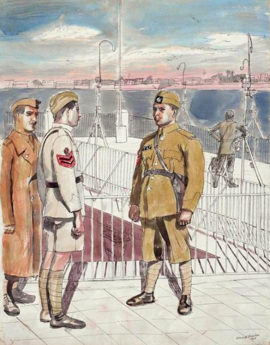
Here is a documentary on Edward Bawden, Broadcast on Anglia TV in November 1983. It shows Bawden in his studio and house, talking of his war work and life in art and design.
Tag: great bardfield
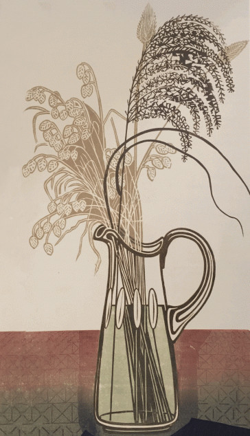
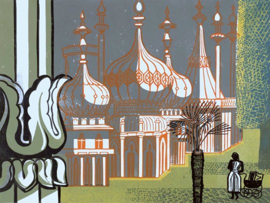
Edward Bawden – Lithograph for Travellers’ Verse, 1946.
This post is the story of Edward Bawden’s war work in the War Artists Advisory Committee (WAAC) as an artist and how he used the wartime drawings and paintings in illustration work, like the The Puffin Picture Book ‘The Arabs’ but other post-war commissions.
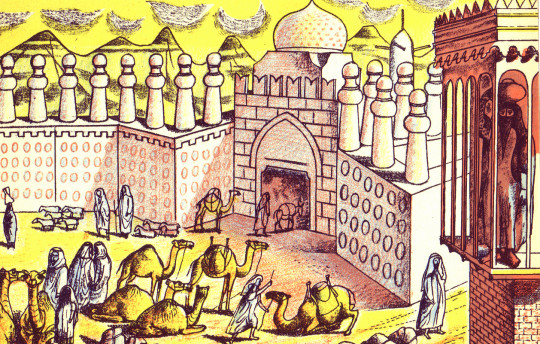
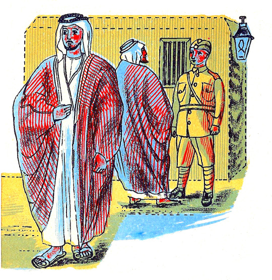
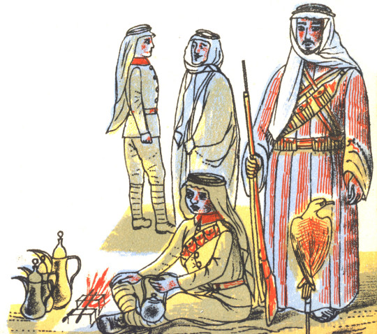
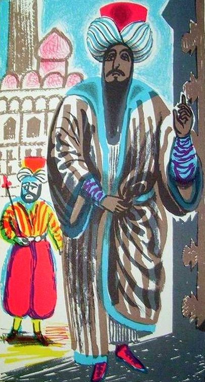
Edward Bawden – Shaikh Sharif al-Hafi, 1944.
When the Second World War broke out in 1939, Edward Bawden had already established a reputation as an illustrator, a comic draughtsman, a designer of typographical ornaments and patterns, a print-maker and a painter of landscapes in water-colour.
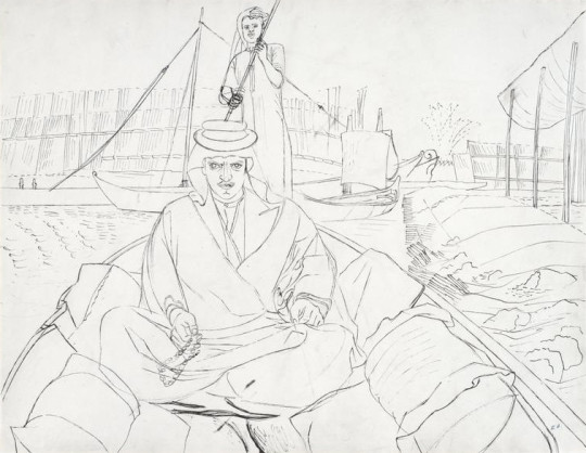
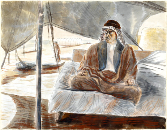
Bawden was appointed one of the first Official War Artists and was sent to join the British Army in France with Barnett Freedman and Edward Ardizzone. After being evacuated via Dunkirk, he was sent to the Middle East where he spent two years painting and drawing in Egypt, Libya, Sudan, Ethiopia, Eritrea, Syria, Iraq and Saudi Arabia. During his return journey to England, his ship was torpedoed; he then spent two months in a French internment camp before being released, and arrived in England safely, only to return to the Middle East, journeying around Cairo, Baghdad, Jeddah, Teheran, Ur of the Chaldees; he was drawing all the time, finally ending his travels in Rome. †
Edward Bawden – Shaikh Raisan al-Gassid, 1944.
The WAAC recommended in December 1939 that Bawden should be appointed as an official Air Ministry artist. In May 1940, after his return from France with the withdrawal from Dunkirk. Bawden expressed his regret at having had to leave, and Dickey reported him to be “extremely anxious to be sent out again to another scene of activity”. He departed for the Middle East in July. ♦
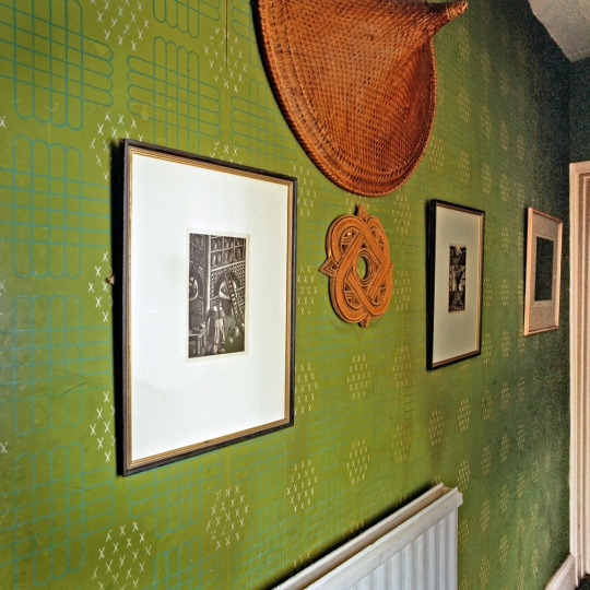
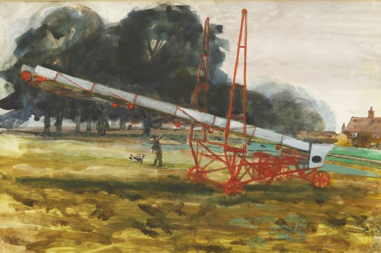
After the war Bawden stayed in Cheltenham while repairs and work were made to his home, Brick House; It was the only building in Great Bardfield to suffer from bomb damage, but Bawden also used the opportunity to make alterations and build a studio to the back of the house. The house was used and abused by the Home Guard during the war.
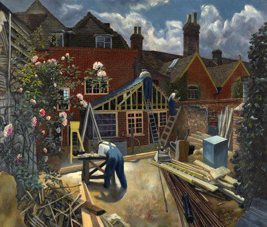
John Aldridge – Builders at Work, Brick House, Great Bardfield, 1946.
Bawden’s time as a war artist had given him the advantage of travel but also an abundance of sketch books and work that were still fresh in his mind in 1945. So it was in November of that year that Noel Carrington, the head of Puffin Books at Penguin was writing to his Allen Lane, his boss about Bawden and the planned book ‘The Arabs’:
12th November 1945
I have arranged for Bawden to meet you here on Wednesday afternoon at three o’clock, so you can discuss the alternative approaches to The Arabs book with him. As an illustrator, one method will suit him as well as another. ♥
From this meeting payments were settled and Bawden took on the job of illustrating the book. The text for the book was by Robert Bertram Serjeant, Nicknamed ‘Bob’. Serjeant was a Scottish scholar, traveller, and one of the leading Arabists of his generation.
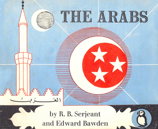
Edward Bawden – Front cover design for The Arabs, 1947.
Bawden to Carrington, 24 July 1946:
“The book is getting on slowly – I work upon the lithographs for a few hours every day, but because of the fine detail I find the work rather a strain on the eyes. In all I have finished one-fifth of the drawings but these include some of the most elaborate ones such as the two double spreads.’ ♥
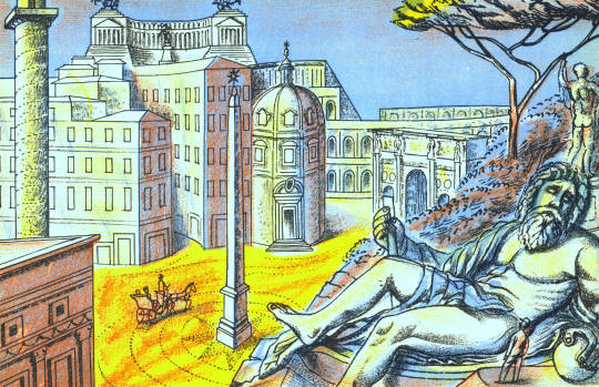
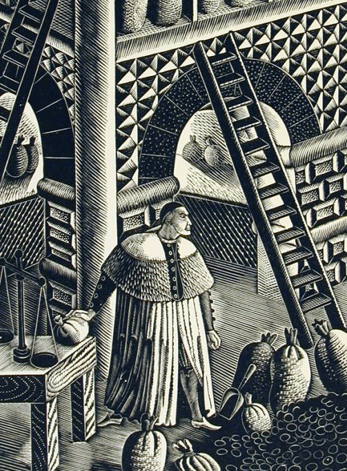
As you can see in the image below, Bawden recycled some of his paintings from the war and used them in the making of the book. The man to the right – on the boat is ‘Shaikh Sharif al-Hafi’, pictured at the top of this post.
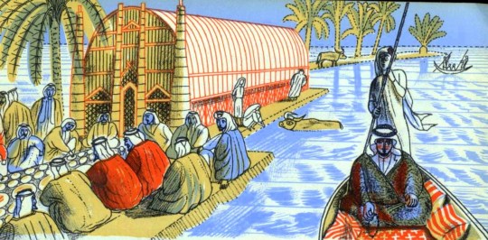
Edward Bawden – Detail from ‘The Arabs’, p18, 1947.
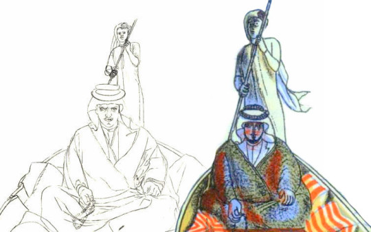
Below I have edited both images side-by-side and you can see how the line drawing has been simplified for the lithographic process.
Although ‘The Arabs’ became a factual book rather than the ‘story’ title Carrington intended, it is one of the highlights of the series. Bawden’s lithographs are as good as any he completed and the two full double page spreads are superb examples of his mastery of line; Curwen made a good job of the printing. ♥
Edward Bawden – Detail from The Arabs, p30, 1947
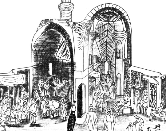
The text of ‘The Arabs’ doesn’t shy away from the Crusades and they are also illustrated as in the image above and below. The historical detail also takes in the history of the Arabic nations, how important they were during the silk road trade routes and how they declined after the European travellers sailed by boat beyond the Cape of Good Hope to China and India.
Edward Bawden – Double page spread from The Arabs, p30-31, 1947
Again, below and side by side are both the lithographed policeman from ‘The Arabs’ and the portrait Bawden painted during his war service. It really demonstrates the cheerful nature of his line drawings. It also shows how he used paintings and sketches to make the book as accurate as it could be.
Edward Bawden – Baghdad: An Illustration of Iraqi Policemen’s Uniforms, 1943
Edward Bawden – Detail from ‘The Arabs’, p6, 1947
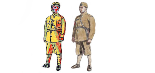
A Digital Edit of the book ‘The Arabs’ & Bawden’s War Portrait of the Policeman
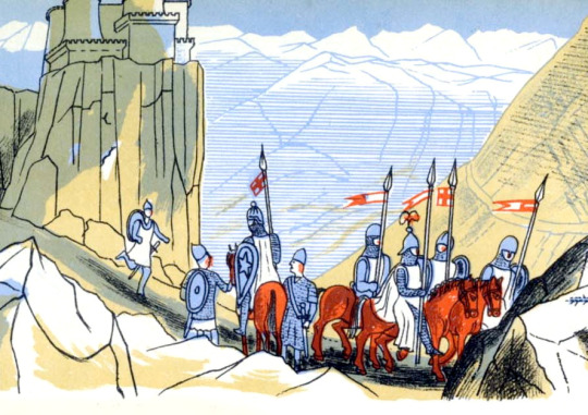
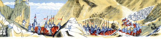
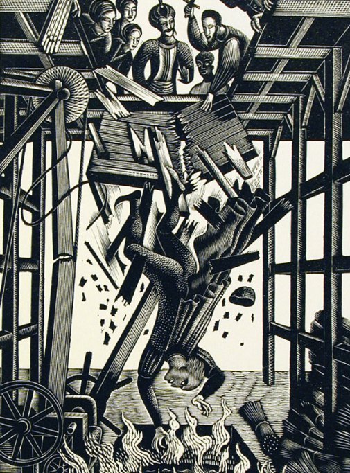
The most beautiful of the two double-page illustrations is the Battle of al-Qādisiyyah, 636AD, when the Rashidun Caliphate overthrew the Sasanian Empire.
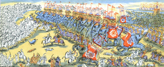
Edward Bawden – Double Page Spread from ‘The Arabs’ p26-27, 1947
The Sassanid Persian army, about 60,000 strong, fell into three main categories, infantry, heavy cavalry, and the Elephant corps. The Elephant corps was also known as the Indian corps, for the elephants were trained and brought from Persian provinces in India. The Arabic side is said to have been 36,000 strong, just over half, and yet they won.
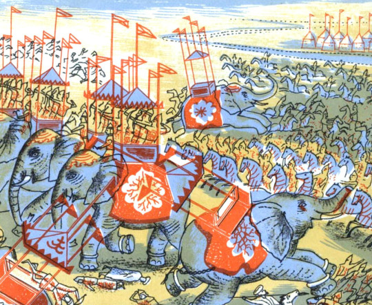
Edward Bawden – Double Page Spread from ‘The Arabs’ p27, 1947
Interestingly the book was never reprinted, and indeed could have been withdrawn and pulped! On the last pages of The Arabs, Bawden had illustrated ‘Muhammad mounted on Buraq’ ascending to the Seventh Heaven’. Obviously no one Bawden, Carrington or Lane had realised the grave offence that the depiction of the Prophet would cause.
The Cairo branch of W.H. Smith, which had ordered 5,000 copies, wrote requesting: ‘would there be any way of painting out the rider’.
Complaints flooded in and the Commonwealth Relations Office wrote to Penguin: The Puffin Picture Book No 61, entitled The Arabs, has on the last page a pictorial representation of the Prophet Mohammed and there have been in the Pakistan Press various letters protesting against this illustration.
As you no doubt know, any representation of the Prophet gives grave offence to Muslim sentiment. Although from a non-Muslim point of view such representations may appear harmless, it is none the less true that Muslim objections to representation of the Prophet in any form are based on sincere conviction.
You will, I am sure, appreciate that in inviting your attention to this matter we do not wish in any way to appear to be interfering with editorial responsibility. But we felt it right to draw your attention to the ill effects which an otherwise excellent little book may have in the Muslim world. Perhaps you would be good enough to bear this in mind should a reprint be under consideration?
One can only imagine the colour of the air when Allen Lane realised that his flagship Puffin was fatally flawed. Understandably The Arabs was never reprinted. ♥
I must add that after mentioning I was writing this post to a friend, they convinced me not to include the image of Mohammed in the blog too. If you wish to see the image you will just have to order a copy of the book to find out at your own offence.
Edward Bawden – Detail from ‘The Arabs’, p15, 1947
The painting below is of Mohammed Bin Abdullah El Atshan, King Ibn Saud’s representative at Rumaliya. This painting is a copy made in 1966 of a painting from 1943 made at the request of a British Petroleum executive when Bawden was painting a mural at the British Petroleum restaurant. The wall of petrol cans were given the BP logo at the executive’s suggestion.
Edward Bawden – Mohammed Bin Abdullah El Atshan, 1966
What is more curious to me about the above retrospective painting is that parts of it turn up twice in the Puffin ‘Arabs’ book. The image below in colour has the hawk, coffee pots, the boy with water-pot and two men standing behind the wall. The black and white illustration below has the drawing of the sitter.
Edward Bawden – Detail from ‘The Arabs’, p7, 1947
Edward Bawden – Detail from ‘The Arabs’, p25, 1947
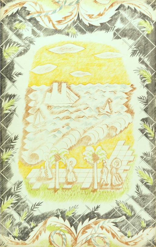
Throughout 1946 Bawden was working on the illustrations for ‘The Arabs’ book, but it wasn’t published until 1947. Also in 1946 Bawden would illustrate a collection of poetry chosen by Mary Gwyneth Lloyd Thomas in a book called ‘Travellers’ Verse’ and he would be able to re-encounter his work of the middle east with his illustrations. These projects started to merge as parts of illustrations from his War Time Sketchbooks would end up in both.
Edward Bawden – Detail from ‘The Arabs’, p12-13, 1947
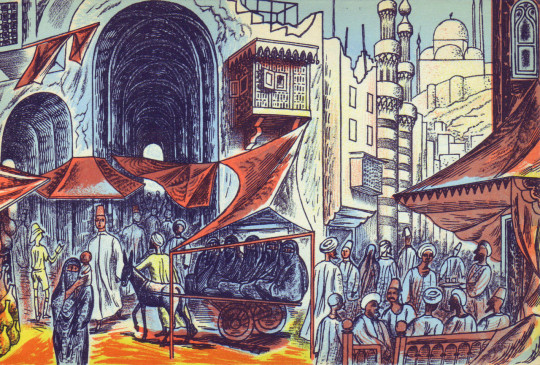
Above is an illustration of a Market in Cairo from ‘The Arabs’ and below is an illustration of a market from ‘Travellers’ Verse’, albeit a more fantastical version. Because ‘The Arabs’ was to be accurate the illustrations are more or less from his war paintings, but the ‘Travellers’ Verse’ book he was able to have more fun with the illustrations and be more fanciful.
Edward Bawden – Detail from ‘Travellers’ Verse’, 1946
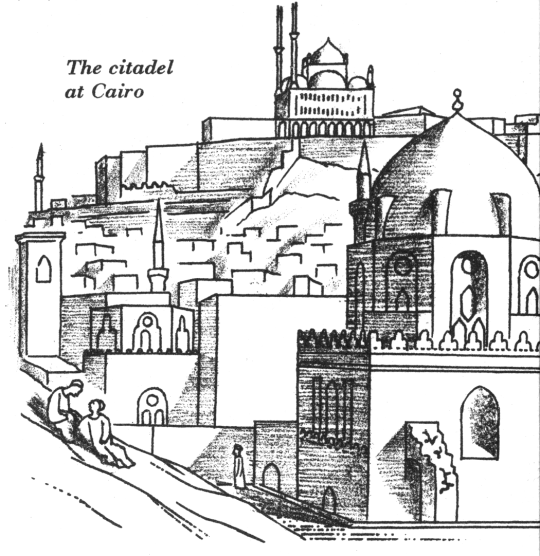
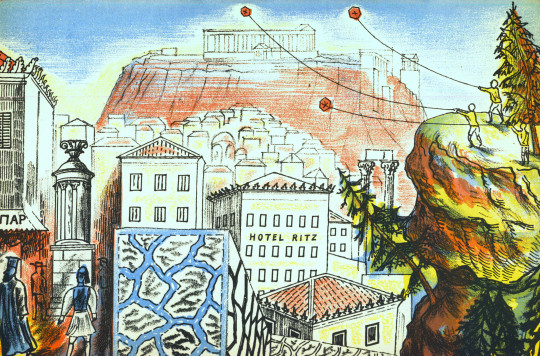
In the top right corner of the image above is the Mohammed Ali Mosque in Cairo in a simple line drawing from 1946. Below you can see it from one of Bawden’s paintings in 1941.
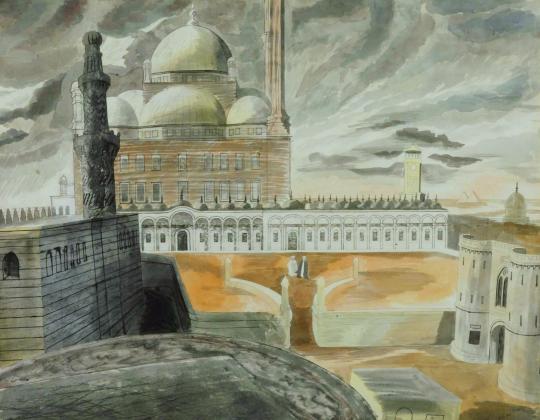
Edward Bawden – Cairo, the Citadel: Mohammed Ali Mosque, 1941
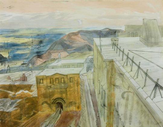
Bawden also illustrated the mosque, as below from the other side of the city
Edward Bawden – Detail from ‘The Arabs’, p23, 1947.
During his travels Bawden was able to stay in the centre of Cairo in the Citadel on his stay as he mentions:
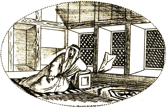
Public relations could deal with journalists but they didn’t know how to deal with artists. They were puzzled and Major Asterly said ‘Why not go and stay in the citadel’, which I did and I found delightful. I made one or two drawings of the Mosque of Mohammed Ali. ♠
Edward Bawden – Cairo, the Citadel: On the Roof of the Officers’ Mess, 1941
In the ‘Travellers’ Verse’ illustrations we see the city life and a fantasy of life in the countryside, with Mosque towers and street cafes to the desert landscape and camp fires.
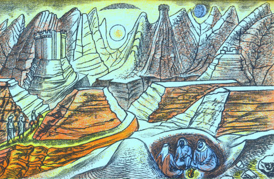
Edward Bawden – Detail from ‘Travellers’ Verse’, 1946
Edward Bawden – Detail from ‘Travellers’ Verse’, 1946
In fact Bawden would be able to use the war drawings of Greece and Rome for the other plates in the book. It seems that after Rome, Athens was a disappointment as Bawden mentions:
When I returned from Florence to Rome it was suggested that I go to Greece, so I went by air, it was the first time I had seen Greece I had been to Rome several times but I was very disappointing on the sight of Athens, it didn’t have the grandeur I was expecting. ♠
Edward Bawden – Detail from ‘Travellers’ Verse’, 1946
In ‘Travellers’ Verse’ the illustration of a huddled mass of bodies in a boat on a Paul Nash sea has none of the cheer the other images have. The poem being illustrated is ‘Don Juan and his tutor Pedrillo are shipwrecked.’ Bawden himself was shipwrecked during the war off the coast of West Africa on a ship from Cape Town to London. It is another translation of his wartime experiences.
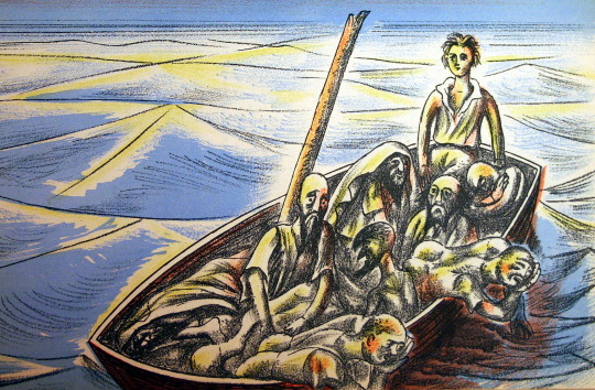
Edward Bawden – Detail from ‘Travellers’ Verse’, 1946
The Laconia was nearing the Equator in temperatures of 110 degrees Fahrenheit when, at 8pm on the evening of 12th September, 1942, it was hit twice below water level by torpedoes from the German U-boat U156 under the command of Werner Hartenstein.
Bawden with typical sangfroid resigned himself to death by drowning: ‘so I thought I’d wander round a bit and have a look. I went down to my cabin – I’d bought my wife a watch and thought I might as well go down with the watch as not.’ Then, ‘on returning from my cabin I saw ropes hanging down on the side where life-boats had been lowered and standing by one of these I was joined by a major. ‘After you, Sir’ I said. As he descended there was a splash. Sliding down the next ropes I found myself being gripped and guided into a boat. A few minutes later all the boats pulled away to a safe distance and there we sat waiting, still and silent and tense for the sound of the ship’s final end. ‡
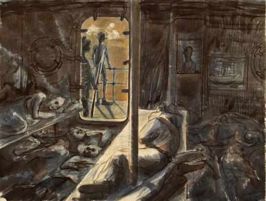
Edward Bawden – Rescued at sea by the French warship Gloire, 1943.
The survivors were rescued by a French ship who were unkind to them and then taken to an internment camp in Casablanca where they stayed for two and a half months until rescued, this time by the Americans, who were kind. As a British citizen he was shipped to Norfolk, Virginia, USA before being shipped back to London.
Edward Bawden – Illustration from Vathek, 1958.
Many years after the war Bawden illustrated Beckford’s ‘Vathek, an Arabian Tale’ for the Folio Society in 1958, I find these illustrations rather weak personally, I can’t work out if he wanted to change to a looser style of lithographic illustration or if they were dashed out for the money, while technically good with colour layering, the end result in my view is poor. I rather suspect the commission came in conjunction with a larger one – ‘The Histories of Herodotus of Halicarnassus’ for the Limited Editions Club, a company like the Folio Society, but American; For them Bawden provided over 100 illustrations in a two volume book set.
He would illustrate Johnson’s ‘Rasselas’ in 1975 for the Folio Society with happier outcomes compared to ‘Vathek’, though not totally Arabian, it is a fantasy of travel.
To conclude the various Arabic styles of Bawden we should end with the giant mural for BP’s restaurant at Britannic House. The best of Bawden’s murals, using Islamic designs and architectural drawings to bold outcomes, it uses blocks of colour and pattern design much like one of his linocuts.
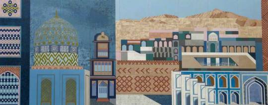
Edward Bawden – Fantasy on Islamic Architecture (Left Panel), 1966
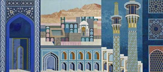
Edward Bawden – Fantasy on Islamic Architecture (Right Panel), 1966
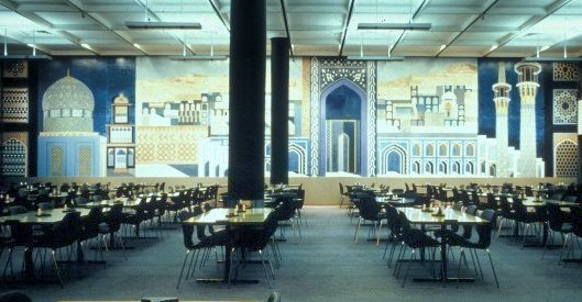
A view of the Dining Room in Britannic House.
† Ruari McLean , Edward Bawden War Artist & His Letters, 1989
‡ Malcolm Yorke – Edward Bawden and His Circle, 2015.
♠ 4622 Edward Bawden Audio Tape, IWM, 1980.
♣ R.B. Serjeant and Bawden Edward – The Arabs, 1947.
♥ Joe Pearson – Drawn Direct to the Plate, 2010
♦ Edward Bawden 1939-1944, ART/WA2/03/044/1
In the past two weeks I have posted about Edward Bawden and his home in the twilight of his life. This is the third and last of these posts.
The artists of Great Bardfield all reacted to their surroundings by making paintings or prints of the area that they lived, so when Edward Bawden moved to Saffron Walden in 1970, he naturally used local places in his artworks, from Bridge End Garden’s to the church.
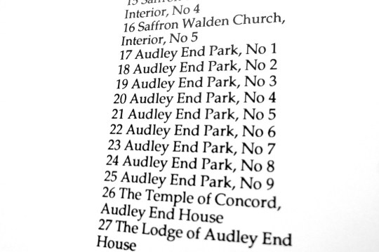
Exhibition list from The Fine Art Society Ltd show 20/ii/1978 – 10/iii/1978.
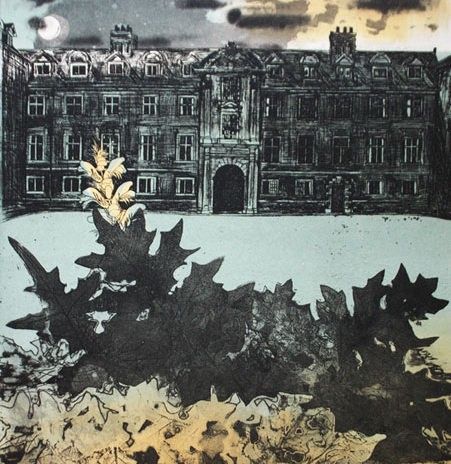
One of the biggest tourist attractions to Saffron Walden and one of the most prominent buildings in East Anglia is Audley End house and its gardens. It also was very convenient being twenty minuets walk from Bawden’s house, even for an older man.
In 1973 Bawden made a large lino cut of Audley End, a complex task to complete, with the regimented architecture of the building it is one of the more technical linocuts Bawden completed.
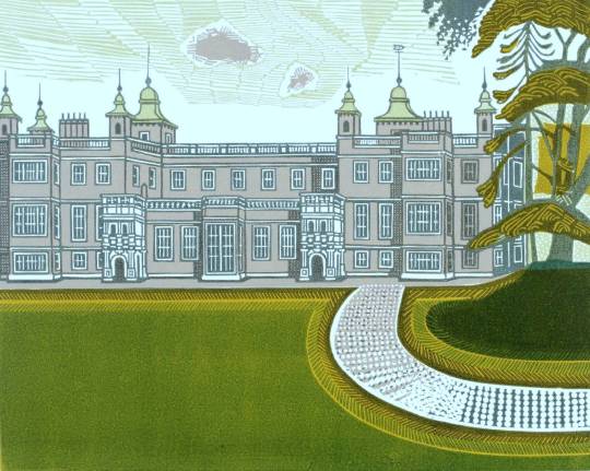
Edward Bawden – Audley End House, 1973
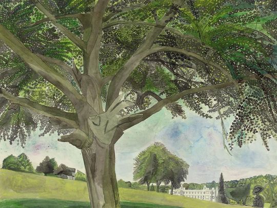
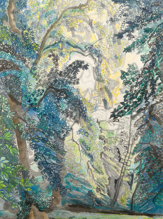
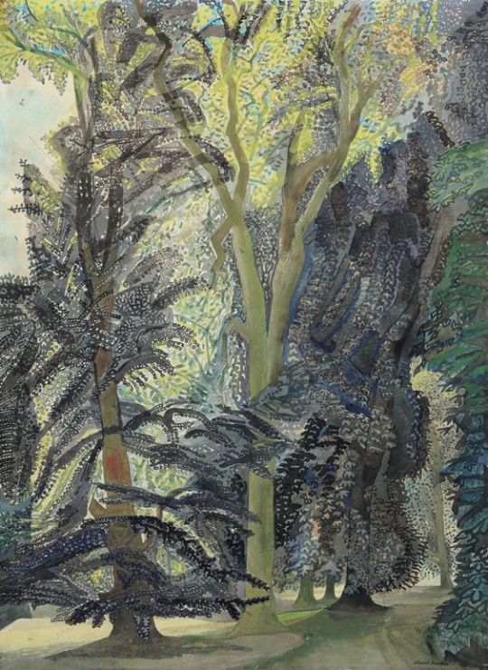
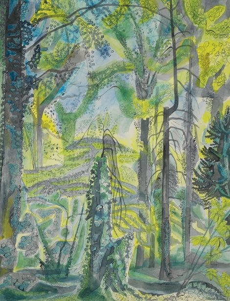
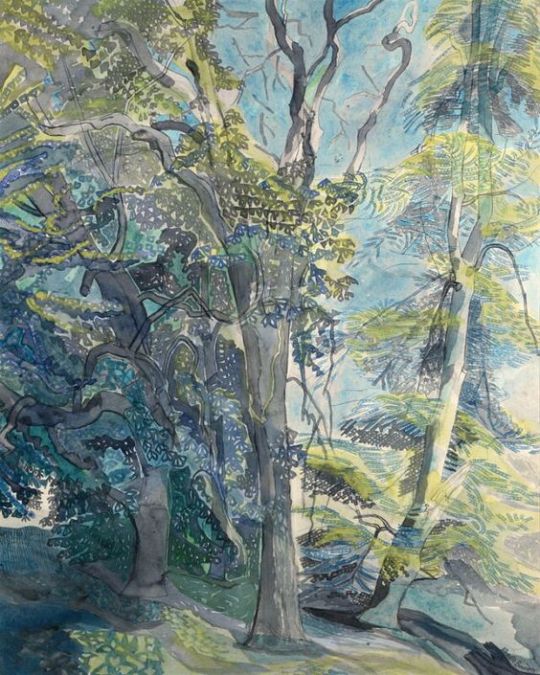
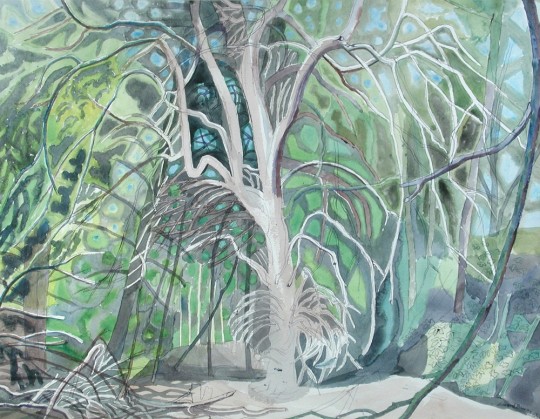
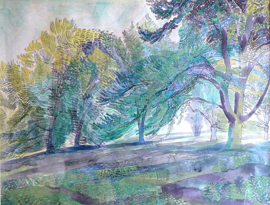
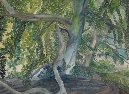
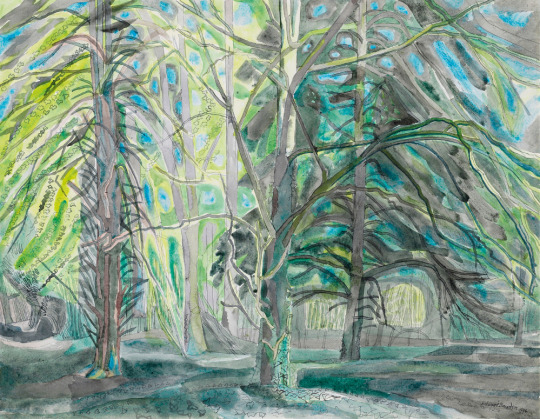
The watercolours Bawden completed where many but show off the wonderful and complex landscape of the Audley End Park, it’s follies and the trees.
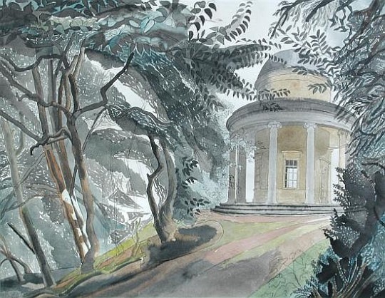
Edward Bawden – The Temple of Concord, Audley End, 1975
Edward Bawden – Audley End Park III, 1975.
Edward Bawden – The Adam Temple, Audley End, 1978
Edward Bawden – Ringwood, Audley End, 1975
Edward Bawden – Ringwood, Audley End, 1975
Edward Bawden – Ringwood, Audley End, 1975
Edward Bawden – Ringwood, Audley End, 1975
Edward Bawden – In Audley End Park, 1978
Edward Bawden – Audley End, 1978
Edward Bawden – Ringwood V, Audley End, 1975


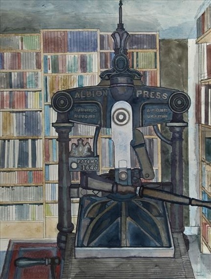
Edward Bawden – Press and Books, 1979
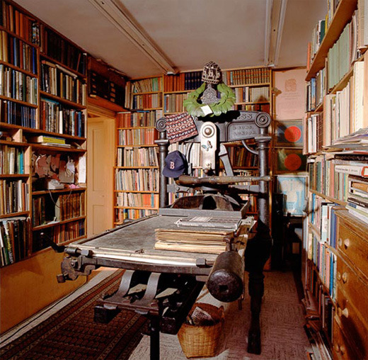
The Print Room – 2 Park Lane, Saffron Walden, 1989
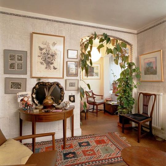
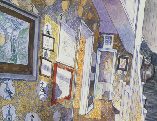
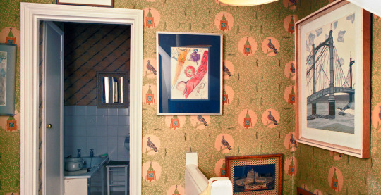
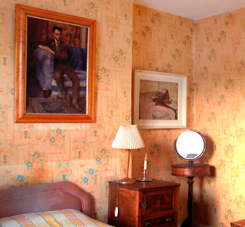
Edward Bawden is best known as one of the Great Bardfield artists in the 1950s, but as the artists either divorced or moved away to other villages and towns, Edward and his wife Charlotte were the only important artists left in the village in the late 1960s, (other than John Aldridge). With health problems and old age, Bawden and his wife decided to move to Saffron Walden. Charlotte sadly died just before moving into 2 Park Lane, Saffron Walden, but Edward honoured the sale and moved alone in 1970.
With the blank canvas of a new house, Bawden set to work decorating the rooms with his own wallpapers and setting up the possessions brought from Brick House into this new home. A studio was built on the back of the property with large windows and a trap door for large works to enter the studio without going through the house. After ten years living at the property Bawden’s health became worse with old age.
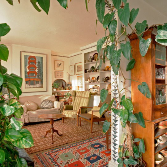
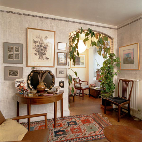
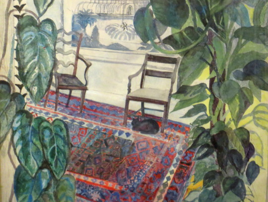
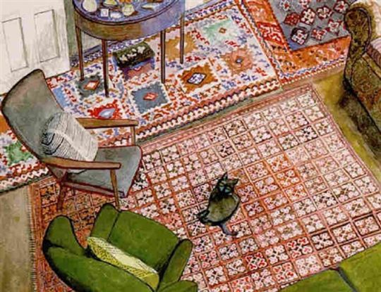
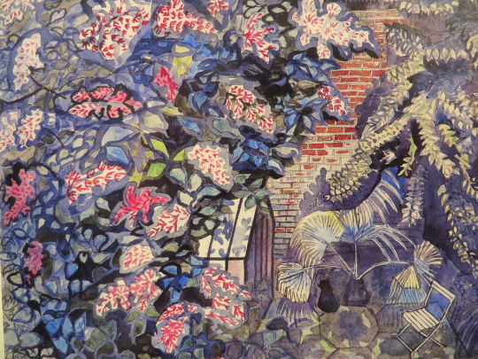
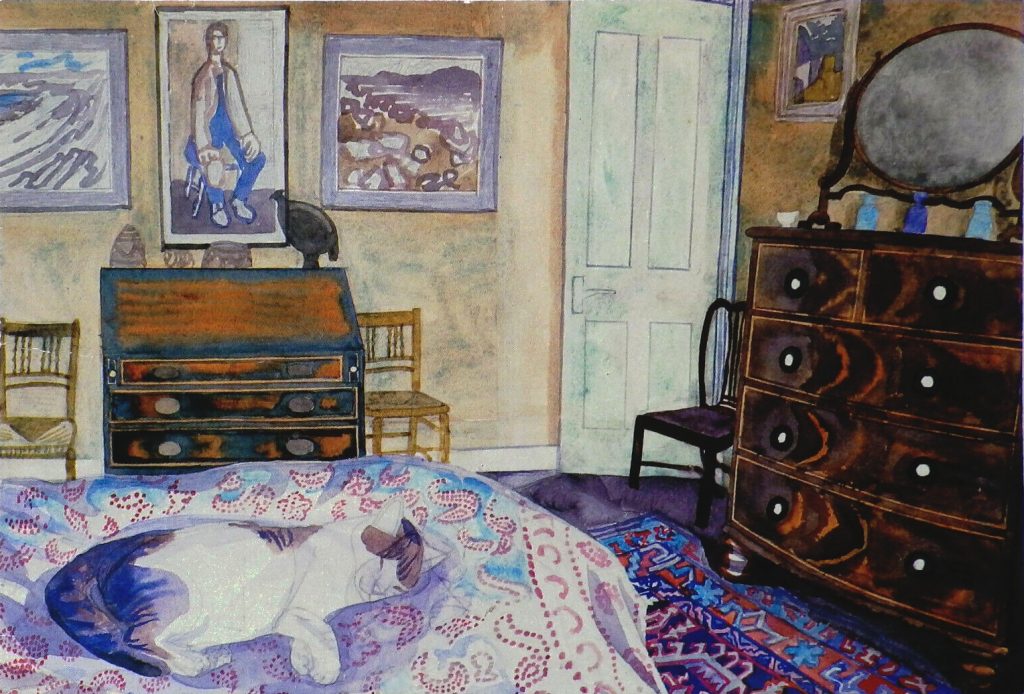
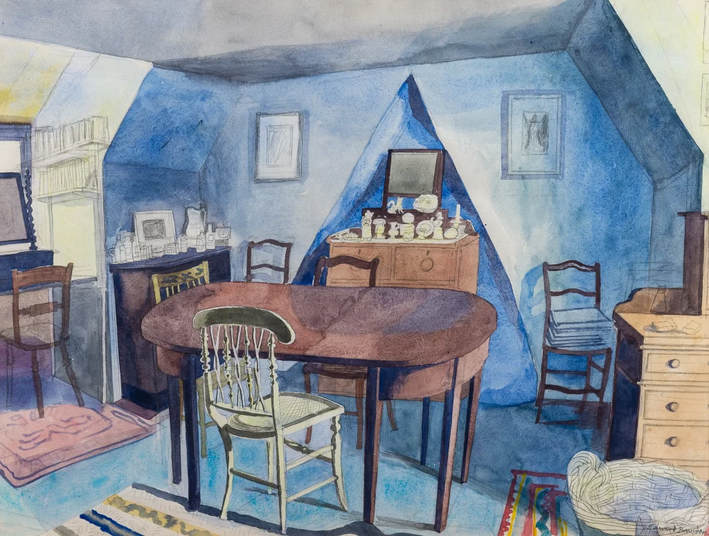
For most of the year he was more house-bound than he had ever been and this forced him into new subject areas. In 1986 he began a series of watercolours which depicted his own rooms, his studio, his plants, his glowing oriental carpets, his gas fire, his cat Emma Nelson, and, eventually, this most private of men made his own face the subject of his art.
This focus on home and the cat was becoming obvious when one looks at the exhibition picture list for ‘The Private World of Edward Bawden’ by the Fine Art Society in 1987.
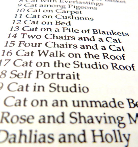
Works list at ‘The Private World of Edward Bawden’ Exhibition, 1987. †
The Tate now possess two of the pictures from this show, “Emma Nelson by the Fire” and “Roses and Rue”, both pictures with the cat in. In the magazine ‘House and Garden’ (December 1987) Edward Bawden gave an interview about his cat:
No cat will suffer from being lifted up and dropped into an empty space intended for her to occupy; that procedure led inevitably to Emma, tail up, walking away at once, so I had to wait patiently until Emma had enjoyed a good meal of Coley and was ready to choose her daily sleeping place, wherever it might be. I would then spring into action with a colour and colour. ‡
Edward Bawden – Emma Nelson by the Fire, 1987
When the Tate wrote to Richard Bawden for more information on the painting they had acquired (Emma Nelson by the Fire) in 1991 he responded with this letter:
Although the house is covered with his early wallpapers, yellowed by nineteen years of nicotine, his studio being an extension was painted brick and not alas the wallpaper known as Rustication [1938–9] … The nasty tartan fur lined cat ‘basket’ came from the local charity shop … The rug on the floor used to be in the bathroom at Brick House, Gt. Bardfield, bought by my mother on a trip to Portugal or elsewhere. The curtain draped over the armchair hung in the spare room at Gt. Bardfield, and I am fairly sure must have been designed by Marianne Straub who lived in the cottage directly across the road and who at the time, I mean the late fifties, was chief designer at Warners. The cushion, at a guess because there is not much showing, was probably covered by a piece of hand blocked cotton by Barron & Larcher who had a studio in Painswick until the outbreak of war. The gas fire I cannot help you with, only I think Edward has improved its design. ♠
The letter illustrates a lifetime of collecting and friendships in the possessions Bawden owned. In next week’s post I will elaborate more on this theme but I will leave you with some of the many images Bawden painted of his home and of his cat.
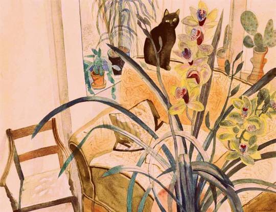
Edward Bawden: Cat and an Orchid, 1987
The Living Print Room – 2 Park Lane, Saffron Walden, 1989

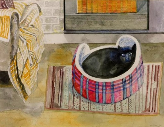
Edward Bawden – Cat on Cushions. 1985
Edward Bawden – The Living Room, 1985 (Featured in the R.A. ‘85 Summer Exhibition)
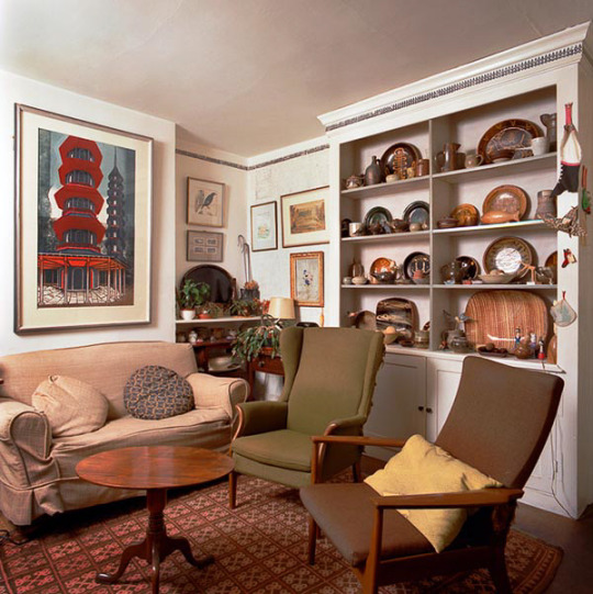
The Living Room – 2 Park Lane, Saffron Walden, 1989
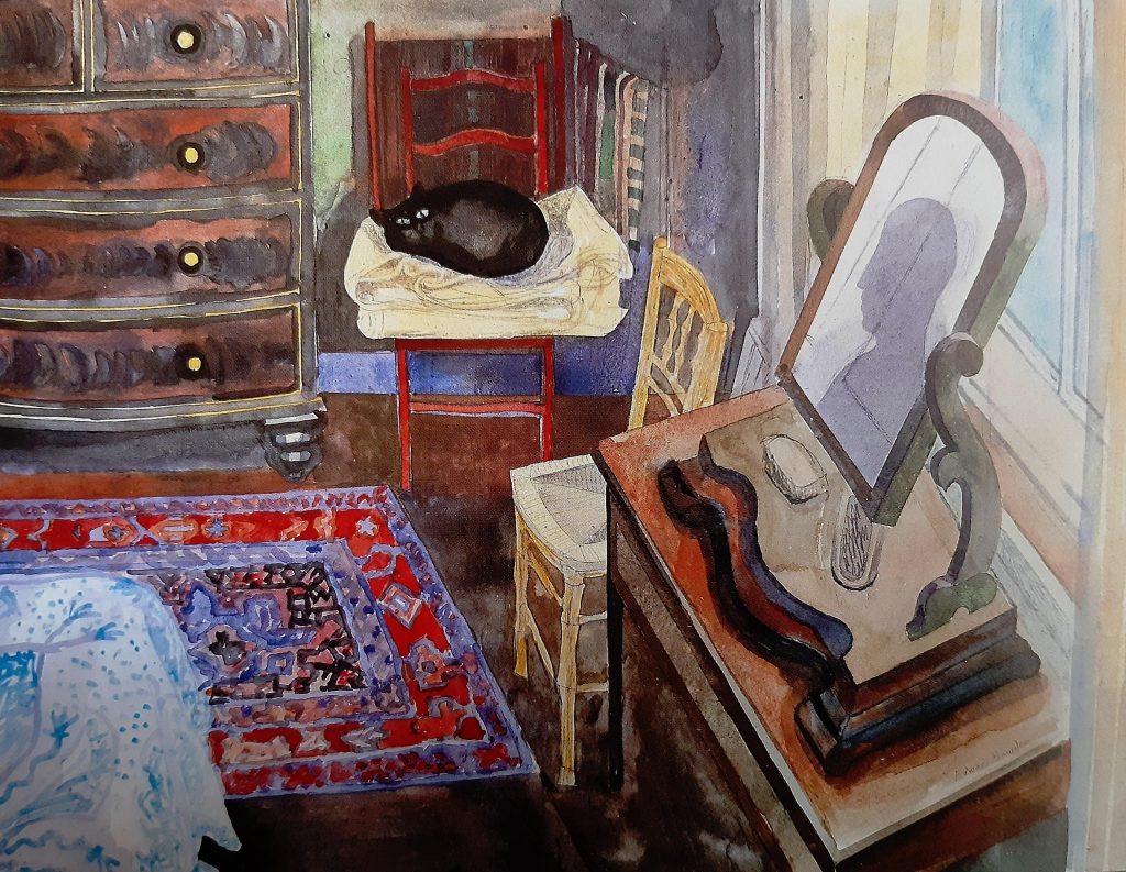
Edward Bawden – Cat on the Carpet, 1987
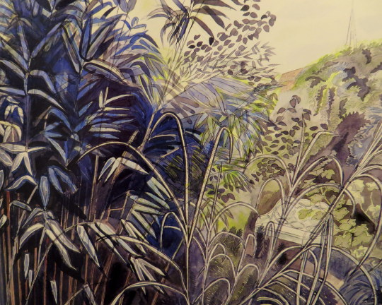
Edward Bawden – Bamboos and Garden Seat, 1979
Edward Bawden – Cat and Greenhouse, 1986

Edward Bawden – Cat Among Pigeons, 1986.
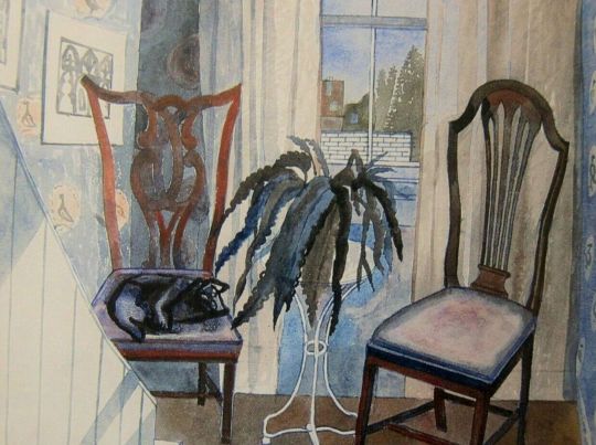
Edward Bawden – Two Chairs and a Cat, 1986
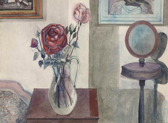
Edward Bawden – Rose and Shaving Mirror, 1987
Edward Bawden – Cat on A Pile of Blankets, 1985
d
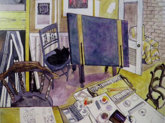
Edward Bawden – Four Chairs and a Cat, 1987
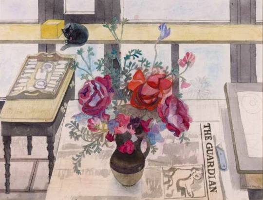
Edward Bawden – Roses and Rue, 1987
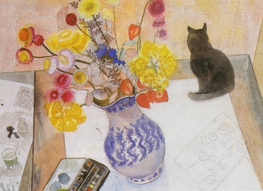
Edward Bawden – Cat with Everlastings, 1987
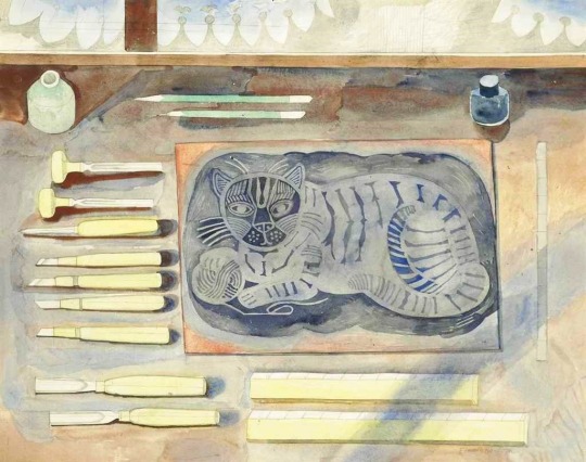
Edward Bawden – Play With Me, 1983
The linocut on the table when finished and editioned was also called Play with Me, now famous for being a Cushion from the Fry Gallery.
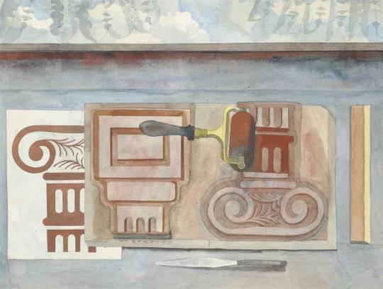
Edward Bawden – Cap and Base, 1983
Bawden printed these designs onto ceramic tiles, presumably for himself.
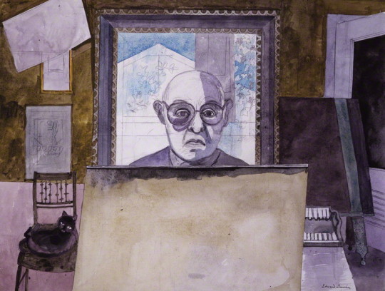
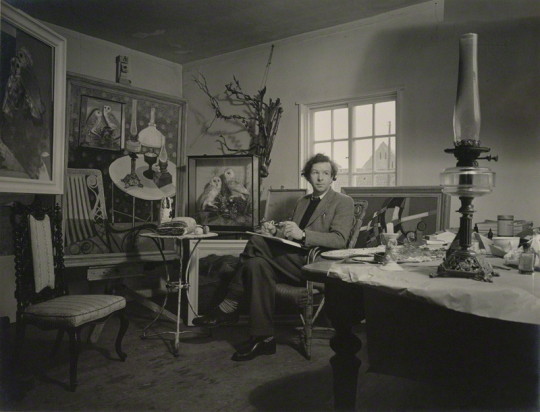
Edward Bawden – Self-Portrait, 1986
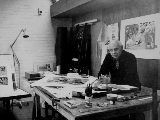
Jorge Lewinski – Edward Bawden in his Studio, 1978.
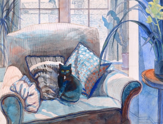
Edward Bawden – Cat on a settee, 1987
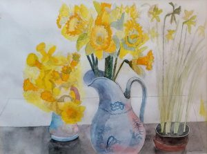
Edward Bawden – Daffodils, 1988
Below is one of the last watercolours Bawden painted and left unfinished and the linocut also unfinished.
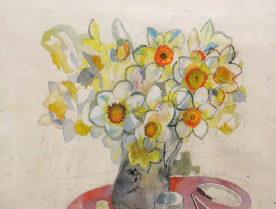
Edward Bawden – Daffodils, Unfinished, 1989
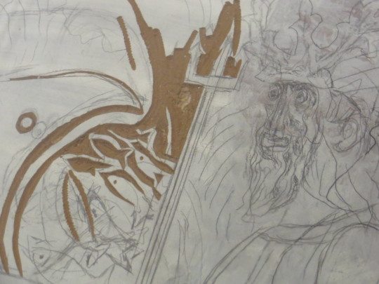
Edward Bawden – Poseidon Linocut, Unfinished 1989
Bawden was working on this linocut on November 21st 1989 before attending for lunch, where he died at table. ♥
† Fine Art Society, The Private World of Edward Bawden’ Exhibition Booklet, 6-30 April, 1987
‡ House and Garden’ (December 1987) Edward Bawden
♠ Tate Gallery: Illustrated Catalogue of Acquisitions 1986-88, London 1996.
♣ Malcolm Yorke – Edward Bawden and his Circle.
♥ Fry Gallery Label 2018
Edward Bawden – His Master’s Room, 1984
Edward Bawden – The Grandchild’s Room, 1984
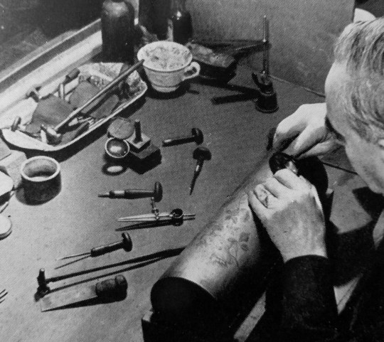
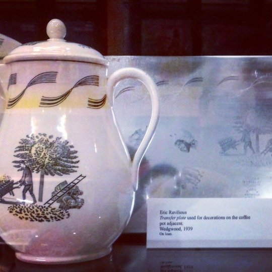
One of the items I own is an original engraving plate for Wedgwood by Eric Ravilious. I bought it as I like the social history of printed china, not only of Wedgwood, but when artists would design domestic tableware. Being a printing plate it is as close to the original drawings by the artist, but very few have survived (maybe ten) and most of them were melted down after the production ended.
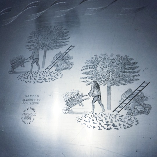
Metal engraved plate with the Ravilous design for ‘Garden’. From my collection.
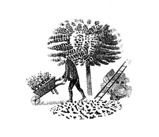
Below is a printing taken from the plate, printed in black on to white paper.
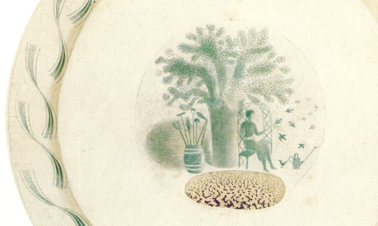
‘Garden’, the most elaborate of the designs (comprising a border, then vignettes and many smaller details from these), appears in the Wedgwood estimate books between November 1938 and May 1939. ‘Speaking for myself,’ Tom Wedgwood wrote acknowledging the receipt of some drawings, ‘I am delighted with them, particularly the Garden pattern; you must have put in a tremendous lot of work on these patterns since you were down here, and I do think you are to be congratulated on the result. †
Detail: A collage of pieces making the finished plate by Ravilious.
The garden series had various vignette designs for the china pieces. Ravilious would paint them in with watercolour, pen and pencil.
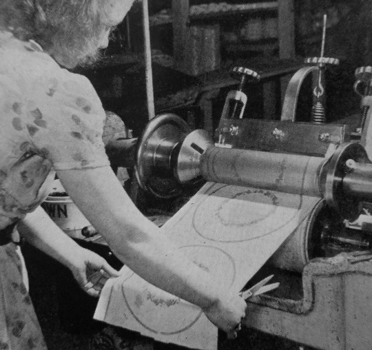
Below I have put more information from the Wedgwood guide to how the factory produced, printed and made the ceramics with the metal plates. ‡
The Engraver:
A pattern which is designed for reproduction by printing is first drawn to fit the curves of the various pieces of ware (china) to the width it will be applied. It is then engraved either on a flat copper plate or on a copper cylinder. This is done with a sharp pointed tool called a “graver”. Light and shade effects are obtained by minutely graduated punched dots. This craftsmanship calls for the highest degree of skill which can only be acquired after many years of experience.
The Printer:
Prints can be taken of flat copper plates by hand. The heat softened colour is rubbed into the engraved lines and the print is taken off on to specially prepared tissue paper by dressing the copper plate with the tissue paper between two flannel covered rollers. Nowadays, power operated printing machines are employed. The engraved copper cylinder prints the pattern on a continuous roll of paper. The colour mixed with oil is fed to the cylinder which is heated by an electric element in its centre.
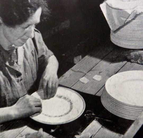
The Transferrer:
All superfluous tissue paper having been cut away the transferrer applies the paper print. It is vigorously rubbed on to the ware first with a flannel and then with a hard brush to ensure that it adheres firmly and evenly. Afterwards the paper is washed off leaving the pattern transferred to the ware. This is then passed through an electric kiln to harden on the colour of patterns printed on biscuit or to fuse the colour to the glaze in the case of those printed on the glaze.
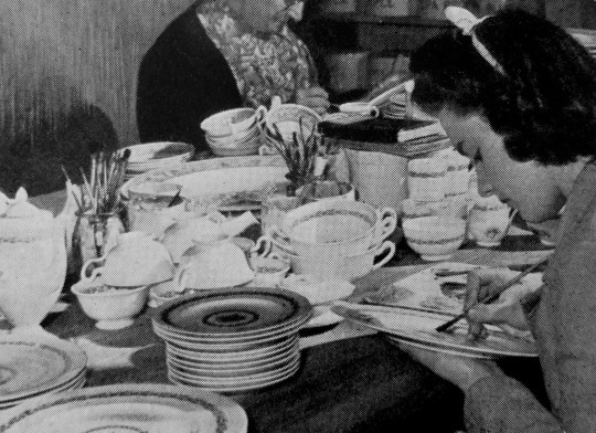
The Enameller:
Printed patterns can be enriched by the addition of ceramic colours, the painting of which calls for great skill.
† Ravilious & Wedgwood: The Complete Wedgwood Designs of Eric Ravilious by Eric Ravilious and Robert Harling, 1995.
‡ The Making of Wedgwood at Barlaston, Stoke on Trent.
In 1940 Eric Ravilious became one of the first official war artists. During the summer he was posted to HMS ‘Dolphin’ in Gosport, drawing the interiors of submarines and sometimes sent out to sea. He had already conceived the idea of a set of submarine lithographs intended as a children’s painting book, and in November he set to work.
The drawings inevitably lack the distinctive texture and colour of the lithographs. In this post they are set next to the finished lithographs with the colours and textures produced at W. S. Cowell Ltd over the original drawn and watercoloured pictures by Ravilious. But we must start first with his appointment as a war artist:
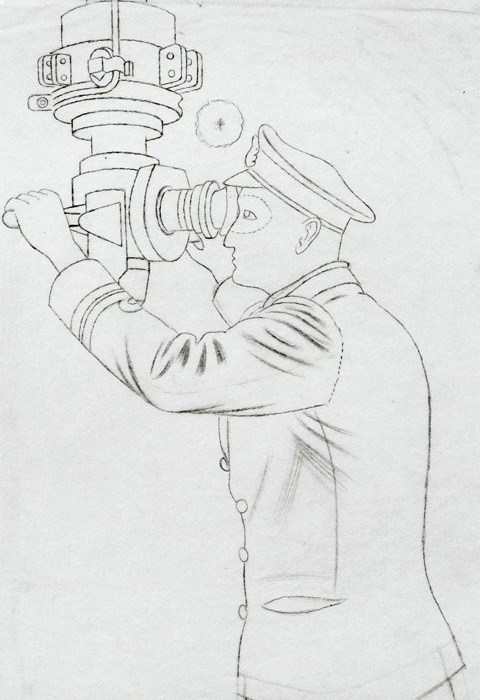
Eric Ravilious – Drawing for Commander and Periscope, 1941
Dear Ravilious, 23rd December, 1939
You may have heard rumours of a scheme which is now being launched for having various phases of the war recorded by selected artists working for the Government. The Admiralty has already appointed one official whole-time artist, and you and John Nash have been selected to work for the Admiralty on a part-time basis, if you should be willing. We very much hope that the idea will appeal to you; indeed it would be a great disappointment to the Admiralty, the Ministry of Information, and, I may add, myself, if you should feel unable or unwilling to undertake work of this kind.If you should be willing, please let me know here as soon as you can and tell me when you could come and see me to discuss details. From our point of view, the sooner you get to work the better. Perhaps I should say that the Treasury have already approved the necessary expenditure.
Yours sincerely
R. Gleadowe †
During World War II Reginald Gleadowe was an Admiralty representative on the War Artists’ Advisory Committee.
Below is a letter from fellow artist (and Ravilious’s tutor) John Nash. Nash had been a war artist in the First World War found himself being asked to become a war artist again.
My dear Eric,
I was at the M.of l. (Ministry of Information) on Friday playing truant part of the time from College and heard from Dickey that you had been there. I don’t suppose I have anything more to report than you have they talk of sending us a ‘contract letter’ but that only deals with the finance and I have heard nothing from the Admiralty since I went there. When I was there I broached the subject of commissioned rank to Gleadowe and there seemed no difficulties. Captainships seemed as cheap as farthing buns and it seemed as if one only missed being made a Major because one had to recognize Muirhead Bone’s seniority! But I begin to doubt now if Gleadowe really has the authority to promise these insignia – we must continue to wait and see I suppose… .
I went to College yesterday and saw most of ‘the boys’. Form was good or even above average and Percy [Horton] made a fine story of a week spent teaching the Punch artist H. M. Bateman to paint. Dickey tells me that the Army War Artists are to be dressed in War Correspondents’ uniform with W.C. on the hat band rather shaming so I’m glad you and l are in the Senior Service!Let me know if you hear anything fresh.
Yours ever,
John †
It is fitting that they both should be chosen so early for this as a lot of the work for both of them was to be painting docks and the boats. Below are paintings each by Ravilious and Nash. They had got to know each other at the Royal College of Art, where Ravilious was a pupil and now they were both on the staff. A year before Gleadowe’s invitation, and on Nash’s recommendation they both went to sketch at Bristol Docks. They painted the same location at night, when the docks were quiet and the boats tied up.
John Nash had been much inspired by painting in Bristol, and he told Eric it was the best port in England, so they planned together a painting visit there. †
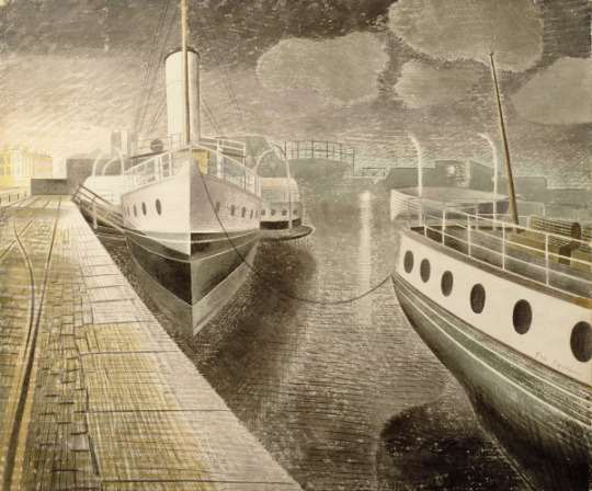
Eric Ravilious – Bristol Docks, 1938
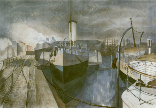
John Nash – Nocturne: Bristol Docks’, November 1938
The Second World War, unlike the First, was not much recorded by printmakers and the Ravilious Submarine series, perhaps the most important such work, was eventually turned down for publication by the Artists Advisory Committee. ‡
The difference of print-making in WW1 and painting in WW2 was that in WW2 the Blitz brought the war to the artists, they could see defences, barrage balloons and blitz bomb damage while still in Britain and record it with most of their materials at hand. The paintings and drawings were recorded quickly as a reaction. In contrast to the prints made in WW1 mostly depicted life in France and Belgium on the front-lines. Works would have to be sketched out and when back in Britain, the prints made from memory and worked up from sketchbook studies for a wider publication. The bridge of a month would mean that the art of WW1 was already retrospective of conditions. People living in the south of England would have been aware of defences, blacked out road signs, and the blitz.
Much of what we know from the process of the lithographic Submarine series comes from letters sent to Dickey (Edward Montgomery O’Rorke Dickey.) At the beginning of the Second World War ‘Dickey’ was seconded from the Ministry of Information and, from 1939 to 1942, was secretary of the War Artists’ Advisory Committee. He was a full member of the committee from 1942 to 1945. During this period he established his close relationship with Eric Ravilious.
Bank House, Castle Hedingham, Essex 24th January 1940.
Dear Dickey,
The Curwen Press have sent me an estimate for the lithographs I spoke to you about – to do six, in five workings each about 15″ x 22″ will cost £36. This seems reasonable to me, if your committee think the idea a good one. Paints and materials will bring the total expenses to, say, £40; so that the choice is actually between £4 or £40, whatever they feel inclined to do. I very much want to do some lithography if that is possible, also it will make a change of medium. Will they call on us to begin work soon, do you think? It is now I see just a month today since the Admiralty wrote about this appointment, and nothing more seems to have happened since then. ♠
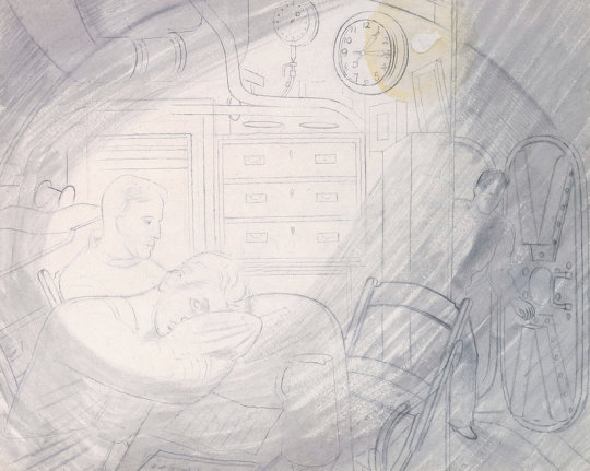
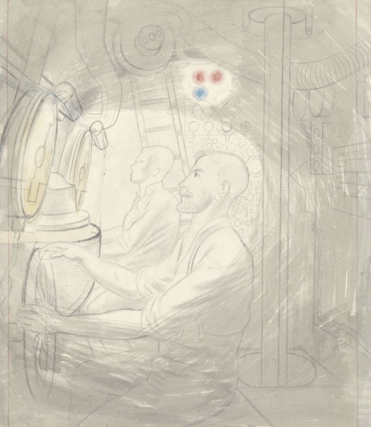
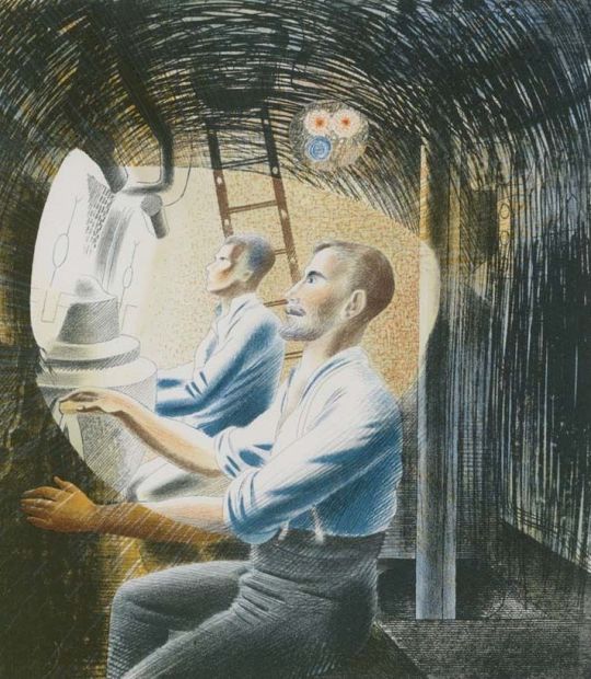
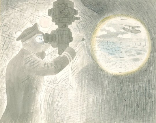
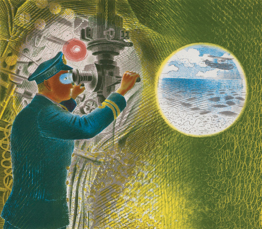
Eric Ravilious – Study for Ward Room #1, Pencil and Watercolour, 1941
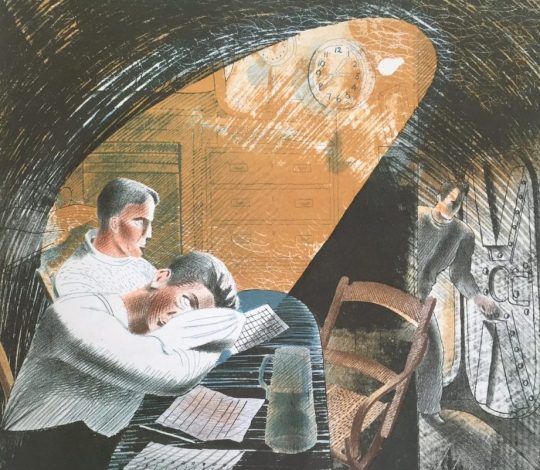
Eric Ravilious – Ward Room #1, Lithograph, 1941
HMS Dolphin, Gosport, Hans. 2nd August 1940.
…At the moment I am living here having been to sea at different times for the last two weeks in the submarine, trying to draw interiors. Some of them may be successful I hope, but conditions are difficult for work. It is awfully hot below when they dive and every compartment small and full of people at work. However this is a change from destroyers and I enjoy the state of complete calm after the North Sea – there is no roll or movement at all in submarines, which is one condition in their favour, apart from the smell, the heat and noise. The scene is extraordinarily good in a gloomy way. There are small coloured lights about the place and the complexity of a Swiss clock…♠
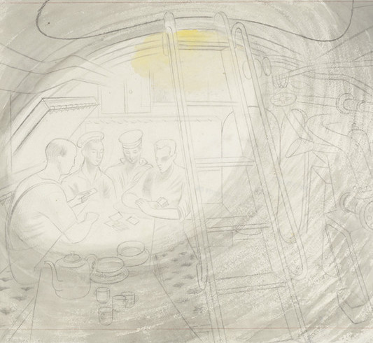
Eric Ravilious – Study for Ward Room #2, Pencil and Watercolour, 1941
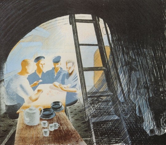
Eric Ravilious – Ward Room #2, Lithograph, 1941
Dear Dickey
…Neither Curwen, Ripley, Murray or Lane can produce these submarine pictures, for all sorts of reasons, so I’ve not abandoned the idea of a book and yesterday went to see the lithographic printers at Ipswich. They will produce the things simply as pictures in a small edition for £100; and if I can manage it this shall be done…
The Leicester Gallery say that they are willing to sell the lithographs if I produce them, so that with luck (if they are not bombed meanwhile) it may pay the expenses. ♣
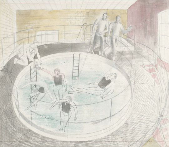
Eric Ravilious – Testing Davis Equipment, Pencil and Watercolour, 1941
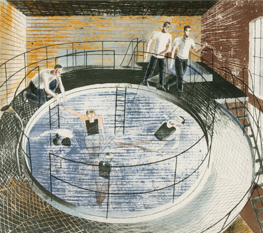
Eric Ravilious – Testing Davis Equipment, Lithograph, 1941
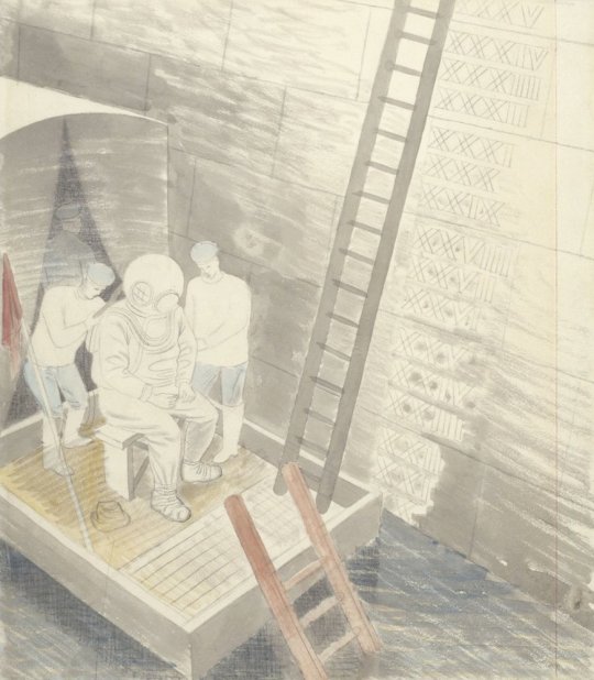
Eric Ravilious – The Diver, Pencil and Watercolour, 1941
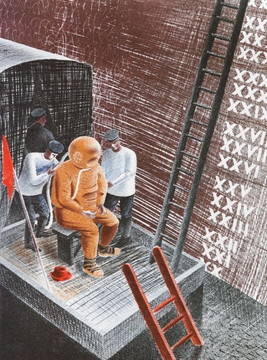
Eric Ravilious – The Diver, Lithograph, 1941
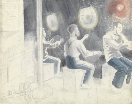
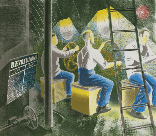
Eric Ravilious – Working Controls While Submerged, Pencil and Watercolour, 1941
Eric Ravilious – Working Controls While Submerged, Lithograph, 1941
Eric Ravilious – Diving Controls #2, Pencil and Watercolour, 1941
Eric Ravilious – Diving Controls #2, Lithograph, 1941
The final lithographs were printed in a small run in 1941. In 1996 a limited edition reprinting of 375 was made. Ravilious died in 1942, he was reported missing, presumed dead while on flight over Iceland. He was 39 years of age.
Eric Ravilious – Commander and Periscope, Pencil and Watercolour, 1941
Eric Ravilious – Commander and Periscope, Lithograph, 1941
Had Ravilious’s idea of a children’s book proceeded it is hard to tell if it would have been just outlines of the men and nautical instruments or with the base watercolour and pencil drawings that he used for the lithographs. Either-way a child could paint over with their own colours. That is really what the printers at
W. S. Cowell Ltd did with the lithographs anyway.
† Eric Ravilious: Memoir of an Artist – By Helen Binyon
‡ The Modern Spirit in British Printmaking, 1910-1950. Garton & Cooke, 1987
♠ Submarine Dream – Lithographs and Letters – The Camberwell Press, 1996
♣ Avant-garde British printmaking, 1914-1960
The journey of any work of art can be interesting in how it is used, forgotten and then reused. As I write this I think it’s endemic of Ravilious’s life that there can be no area or topic on him that hasn’t been probed or turned into a book, but onward I go with my quest for originality.
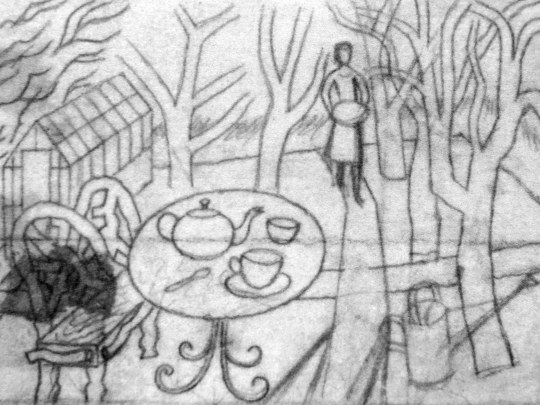
Eric Ravilious – Sketch for Tea in the Garden, 1936
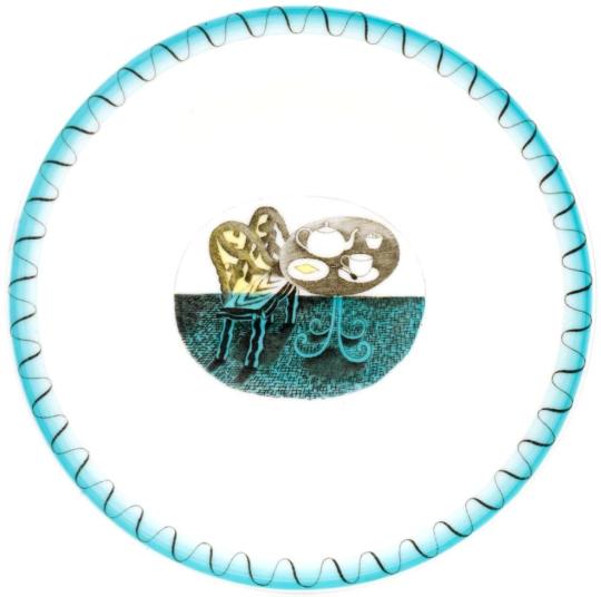
In 1936 Eric Ravilious made a wood engraving for London Transport. Tea in the Garden was made to be used in newspaper advertisements for the Green Line bus service, a decorative vignette to go with commuter information. It is a rather abstract design but it was the start of the commuter lifestyle as London was building a new wave of suburbia and you can imagine the print being used with slogans like “home in time for tea” or “enjoy the garden, 20 mins from the city by bus”
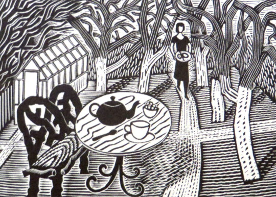
Eric Ravilious – Finished print of Tea in the Garden, 1936
Soon after Ravilious reused the design for a commission with Wedgwood, he was so busy during this point that many designs where recycled from wood engravings to watercolours or china. Below you can see a sketch drawing for a teapot design using the woodblock above. Carving out the legs of the bench and inverting the colours of the table so when printed the transfer will be black and an enamel colour wash painted over.
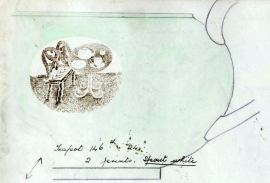
Eric Ravilious – Sketched idea for Teapot design, 1938
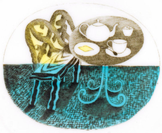
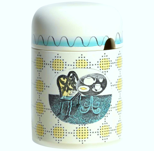
The finished design below, with the colouring in yellow, blue and green. The design has been made simpler and the shading is able to be more subtle as it will be printed on a metal plate, so there is more detail in the halftone lines. It was first used on a preserve jar for Wedgwood.
The preserve jar was introduced six months in advance of the rest of the pattern. The design was advertised in 1939 as being available also in breakfast and coffee sets; the war prevented production of these. At first unnamed, later called ‘Teaset’, the design was finally named ‘Afternoon Tea’.
Here the tea-set is advertised in ‘The Studio Year Book of Decorative Art 1943-1948′ (the gap in printing is noted in the introduction due to WW2, lack of paper and designers being commissioned to do essential war work, this year book covers a wide range of time).
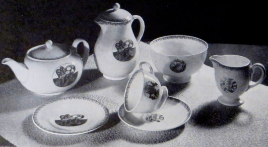
The Bone china tea ware decorated with motifs illustrating Afternoon Tea, printed in sepia and hand-coloured green. Designed by Eric Ravilious A.R.C.A. for Josiah Wedgwood and Sons. †
Here is a tea-plate from the set with the simple wave decoration on the perimeter of the plate and washed in blue enamel paint.
In this prototype photograph from 1938 the design is painted around with a pink glaze to the edge of the design and the Ravilious vignette and border uncoloured but printed in a brown sepia with the pink flooding over the whole plate. These are the rarest of all the designs as they were not put into production and the designs were modified to use less colour glaze after the war.
Twenty five years later the original woodblock design would be resurrected and used in a reduced size for advertising and on the covers of Country Walks booklets.
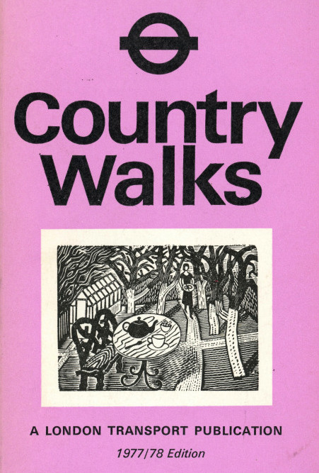
Country Walks with the Ravilious Engraving on the cover, 1978
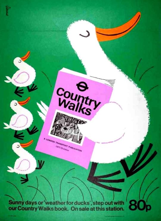
A rather fun and unusual poster for the Country Walks books by Harry Stevens, 1978.
Ravilious Engravings by Ravilious Jeremy Greenwood, Wood Lea Press, 2008.
Country Walks, London Transport, 1978.
Ravilious and Wedgwood: The Complete Wedgwood Designs of Eric Ravilious, 1995.
† The Studio Year Book of Decorative Art 1943-1948

Walter Hoyle is in danger of being one of the forgotten Great Bardfield artists due to the lack of information on him.
Hoyle was born in Rishton, Lancashire in July 1922. Hoyle’s artistic
education started at the Beckenham School of Art in 1938,
I persuaded my local art school to accept me, and presented as evidence of my serious intent, a series of drawings much influenced by Walt Disney. †
From Beckenham, Hoyle gained a place at as a student at the Royal College
of Art from 1940-42 and again from 1947-48 after serving in the
Second World War. During Hoyle’s time at the RCA one of his tutors was
Edward Bawden, who encouraged him to develop watercolours and
printmaking.
Walter Hoyle at home in Great Bardfield, NPG, taken by Geoffrey Ireland.
It was 1940, the phoney war was to about to end and the college was evacuated from London to Ambleside in the Lake District, famous for poets rather than artists. It was here that I was first introduced to printmaking – lithography – by a friend called Thistlethwaite, a fellow student from Oswaldtwistle (although these names are true, I mention them only because I like the sound they make). He prepared a litho stone for me with a beautiful finely ground surface and instructed me how to draw in line and wash. †
In 1948, During the RCA Diploma show, a visitor was so impressed by Hoyle’s work that he was offered seven months’ work in the Byzantine Institute in Istanbul, Hoyle accepted, the work he saw there made a strong impression. Italian art and architecture also influenced him at that time.
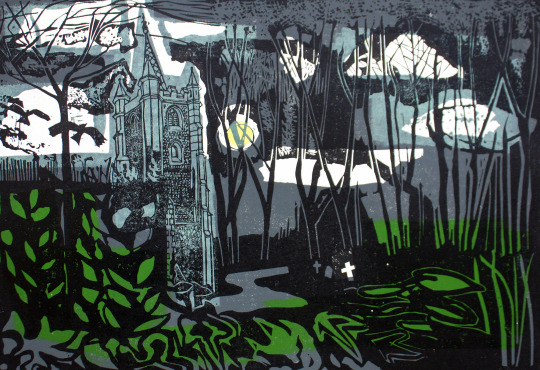
Walter Hoyle – Church Moon, Little Samford (In My Collection) ,1957.
Early in 1951 when Bawden was commissioned by the Festival of Britain to produce a mural for the Lion and Unicorn Pavilion on the South Bank,
it was Hoyle that he chose to assist him on account of his great talent. During that summer Bawden invited Hoyle on a holiday to Sicily.
Edward asked to see my watercolours. He looked very carefully and quizzed me about them, and in general was complimentary and encouraging. I felt I had passed some kind of ‘examination. ♠
It was this holiday together that Hoyle would scribe into a limited edition booklet of 10 in 1990 and into a book in 1998 – “To Sicily with Edward Bawden” a limited edition of 350 copies with a forward by Olive Cook.
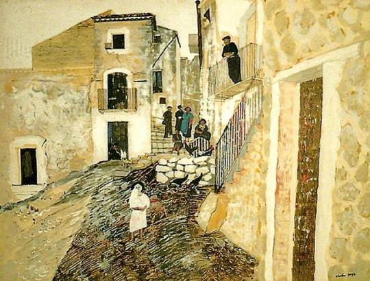
Walter Hoyle – Hill town in Sicily, ex Cambridge City Council, 1951.
In 1952 Hoyle took over the painting of another mural, the dome of St Mary Abchurch, London. The church had been blitzed in September 1940,
and the original mural was being restored by E. W. Tristan, but when Tristan died, Hoyle completed the work. ‡
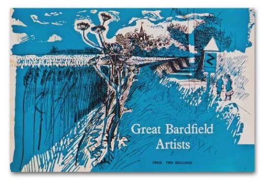
Walter Hoyle – The cover for the Great Bardfield Exhibition booklet.
The move to Great Bardfield:
Hoyle moved first to Great Bardfield in 1952, living for a time in a farm cottage on the outskirts of Bardfield near Great Lodge Farm. He lived and worked in the Great Bardfield area for twenty-two years and exhibited with the Bardfield artists in 1954, 1955 and 1956 when they would open their houses to the public for one weekend a year, rather than relying on London galleries. Hoyle met his wife, the ceramists and poster designer
Denise Hoyle at at one of the Great Bardfield “open house” exhibitions in 1956, when his work was on show at George Chapman’s house.
It may have been Edward Bawden’s painting classes and lectures at Brick House, or being in the hilly Essex countryside but it around this time that Hoyle became interested in English romantic painting: the work of Turner, Blake and Palmer and also in French art. Like other members of Great Bardfield, Hoyle designed for interiors with wallpapers and fabrics for Coles, Sandersons and the Wallpaper Manufacturers Limited.
One of Hoyle’s most popular works for book illustration came with a commission for the Folio Society in 1968 with Shirley by Charlotte Bronte.
Walter Hoyle Design for Sandersons
Teaching:
Walter Hoyle has taught at various art schools: St. Martin’s, London, 1951-60; the Central School of Art, London, 1960-64; and the Cambridge School of Art, 1964-85.
Walter Hoyle left Great Bardfield and moved to Bottisham, Cambridgeshire, to teach at the Cambridge School of Art in their printmaking department. While at Cambridge, he launched the Cambridge Print Editions, publishers of the magazine of the Cambridge School of Art, “Private View” co-edited by Warwick Hutton, which he started and which included interesting extracts from the work of famous artists and writers such as Patrick Heron and Edward Ardizzone, as well as articles by
students and graduates of the school.
Hoyle took over the collection of ‘Original Works for Children in Cambridgeshire’, an art project for City of Cambridge Committee for Education. Hoyle donated a picture and convinced other artists to give works to the project too. He retired from teaching in 1985 to move to Hastings and Dieppe. Hoyle died in 2000.
Walter Hoyle – Great Lodge Farm, 1952 (In My Collection)
Exhibitions and Collections:
Hoyle exhibited internationally working outside of the Bardfield set. Exhibitions were not only at the Byzantine Institute Gallery in Paris in 1950, but in 1952 he showed at the Leicester Galleries, London. He was featured in many mixed exhibitions in London and the provinces, including the Royal Academy summer exhibitions and Kettles Yard, Cambridge (1972). Walter Hoyle is represented in many public and private collections, among them the Bibliothéque Nationale, Paris, the Victoria and Albert and the British Museums, the Tate Gallery, the Walker Art Gallery, the Whitworth Art Gallery, the Fitzwilliam Museum, the Sheffield Art Gallery, the Manchester City Art Gallery, Editions Alecto Gallery, London, and the Palace of Westminster and the Fry Art Gallery in Saffron Walden.
He painted murals for the Natural History Museum, for the Jamestown Festival, USA, and for the Sealink ship “St. David”.
Editions of his prints have been commissioned by Editions Alecto, Christie’s Contemporary Art, Neve International, the British Oxygen Company, the Folio Society and St. Catharine’s College, Cambridge.
Walter Hoyle – St Catherine’s with Acanthus, (In My Collection), 1966
† Printmaking Today, Volume 7, 1998. page 9-10.
‡ https://en.wikipedia.org/wiki/St_Mary_Abchurch
♠ To Sicily with Edward Bawden, Previous Parrot Press, 1998.
The Great Bardfield Exhibition by Gerald Marks, Realism, August —
September 1955
♣ http://www.fryartgallery.org/the-collection/search-viewer/691/artist/15/Walter-Hoyle–/22
In the short time that Eric Ravilious was of working age he produced a massive amount of work for such a young man. He died while serving as an official British War Artist when the aircraft he was aboard crashed off Iceland. He was 39 years old.
At the time of Ravilious’s death there were various projects underway that the war disrupted. As manufacturing was halted, these commissions were put on hold while the country had to economise.
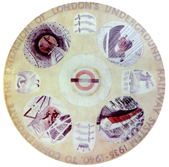
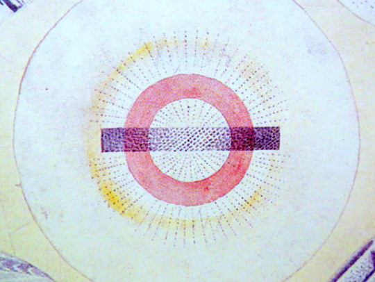
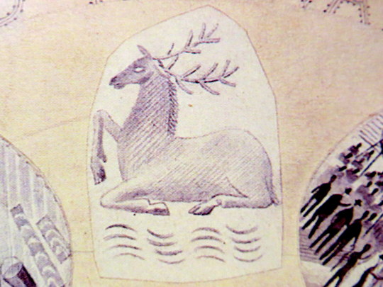
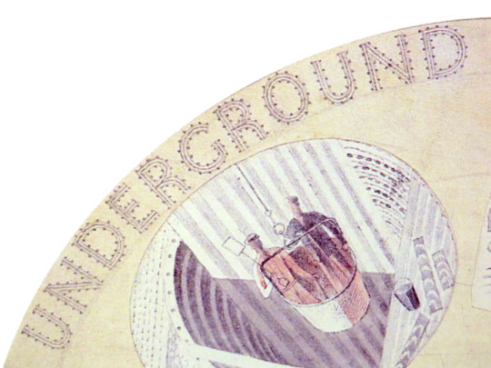
Eric Ravilious – Design for London Underground Plate, 1939.
One of the projects Ravilious had started was for a commemorative plate for the ‘New Works Programme’ of 1935-40 that London Transport had begun.
It was an ambitious extension of the Northern and Bakerloo lines northwards, and the Central line both east and westwards. Although the engineering work was well advanced by the outbreak of war, the project had to be abandoned and was only partly realised in the post-war years. Thus the commemorative plate designed by Ravilious was never produced.
The early Underground train lines, originally owned by several private companies, were brought together under the ‘Underground’ brand in the early 20th century and eventually merged along with the sub-surface lines and bus services in 1933 to form London Transport under the control of the London Passenger Transport Board (L.P.T.B.).
The ‘New Works Programme’ was to develop many aspects of the public transport services run by the L.P.T.B. and the suburban rail services of the Great Western Railway and London and North Eastern Railway.
The investment was largely backed by government assistance as well as by the issuing of financial bonds and was estimated to cost £42,286,000 in 1936 (approximately £2.59 billion today).
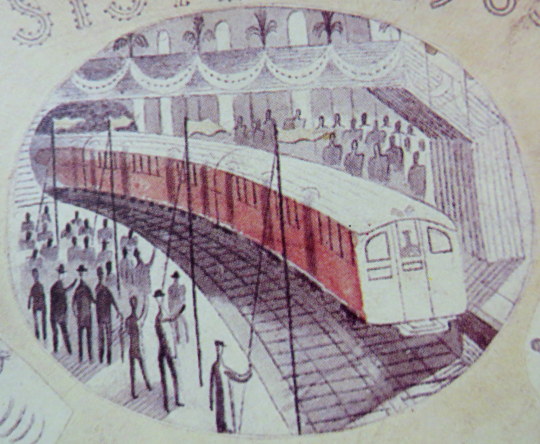
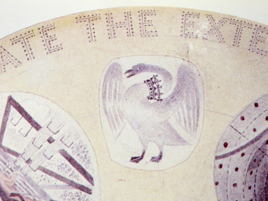
Of the four vignettes Ravilious chose, three were of construction and one was of the predicted Grand Opening, with a tube train and swash bunting along the platform.
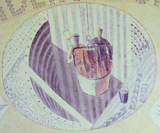
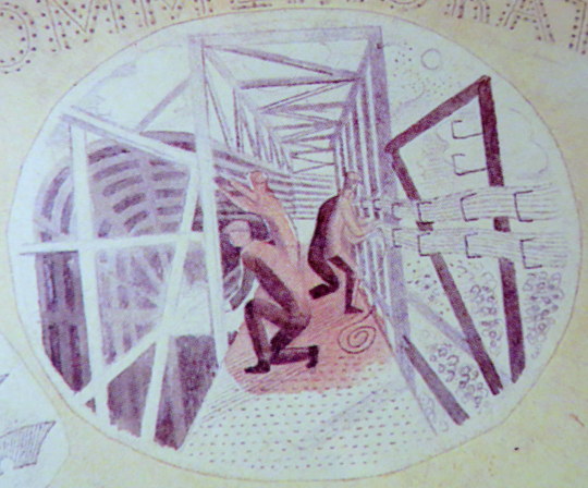
One of the vignettes of construction show men being lowered in buckets into the tube shaft. These were likely non-station locations where the soil was excavated out and the steel and concrete lowered in, like the workers. It was a typical practice in mining.
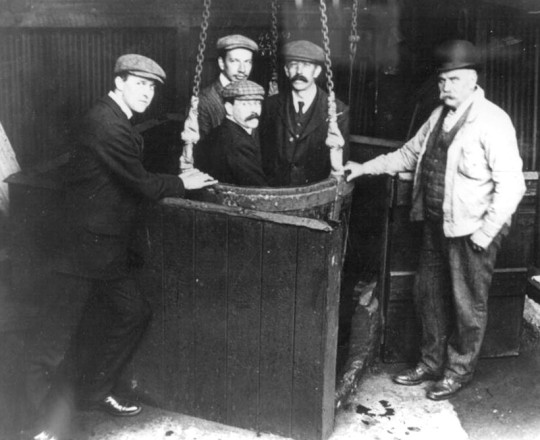
Men in a small-scale drop lift.
Another of the pictures shows workers putting up the frames for the tube tunnels and station platforms. The wiring being bunched on the sides of the tunnel.
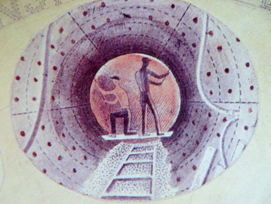
The two workers pictured here are bolting the rivets of the metal into place. The image when manufactured, would have been a black and white transfer and the colour would have been a translucent enamel paint.
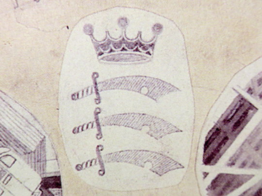
The three heraldic devices show the county badges of Essex, Hertfordshire and Middlesex.
Middlesex Heraldry
Buckinghamshire Heraldry
Hertfordshire Heraldry
The plate would have been one of the last commissions of Frank Pick, chief executive of the London Passenger Transport Board. Pick, who retired in 1940 and died the next year, had worked for the Underground since 1906.
Pick had become publicity officer responsible for marketing and it was at this time that, working with the company’s general manager Albert Stanley, he began developing the strong corporate identity and visual style for which the London Underground later became famous, including the introduction of the ‘Underground’ brand.
One of Pick’s responsibilities was to increase passenger numbers, and he believed that the best way to do so was by encouraging increased patronage of the company’s services outside peak hours. He commissioned posters which promoted the Underground’s trains and London Transport buses as a means of reaching the countryside around London and attractions within the city. Throughout Pick’s career his over-riding passion was for architecture and design, and his adventurous approach and choice of collaborators is famous.
Ravilious had other work planned for London Transport, some posters and wood engravings. During his lifetime he did see some of his work used, a set of his wood-engravings were used for the covers of the Country Walks books in 1936.
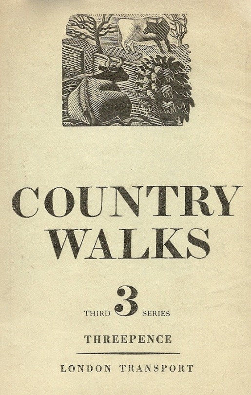
1936 cover to Country Walks, 3rd Series with a Ravilious Design of Two Cows.
The Country Walk books were by Charles White and printed for London Transport to show people the possibilities of using the Underground and Bus network. Inside they had maps and planned walks showing how to get to the locations using London Transport.
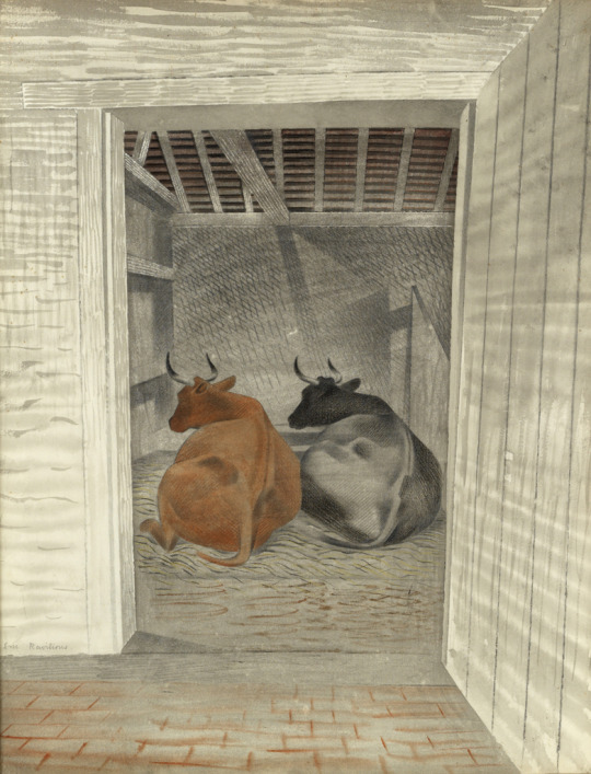
Each of the three volumes had a wood engraving by Ravilious on the cover. The second volume had a Mill, the third featured the Two Cows wood-engraving.
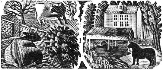
A print from the original woodblock with Two Cows to the left, and Hull’s Mill, Castle Hedingham to the right. 1935.
The two images were engraved on the same block of wood and printed together as one proof. On the left a cow and a bull in a field, separated by a stone wall; on the right a horse standing next to a mill stream, with watermill (based on Hull’s Mill, Castle Hedingham, near Great Bardfeild) in the background.
Below is the original drawing for Two Cows, reversed in design as a woodblock always prints backwards.
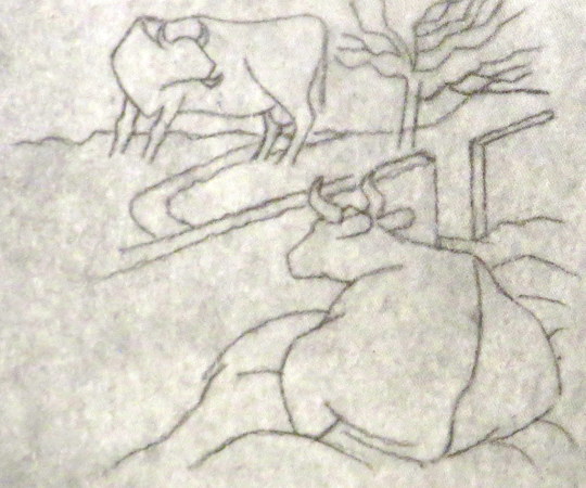
Eric Ravilious – Two Cows, preliminary study for a woodcut, 1935.
The pencil design is remarkable for another reason: part of the design was turned into a watercolour featuring two Cows in the same pose.
Eric Ravilious – Two Cows, The Fry Gallery, 1935.
The book Away We Go by Oliver Green and Alan Powers, documents more of the other work that both Eric Ravilious and Edward Bawden did for London Transport, mostly their designs for press adverts.
Ravilious Engravings by Jeremy Greenwood, The Wood Lea Press, 2008.
Moving Metropolis by Sheila Taylor and Oliver Green, Laurence King, 2001.
Ravilious and Wedgwood by Robert Harling, Dalrymple Press, 1986