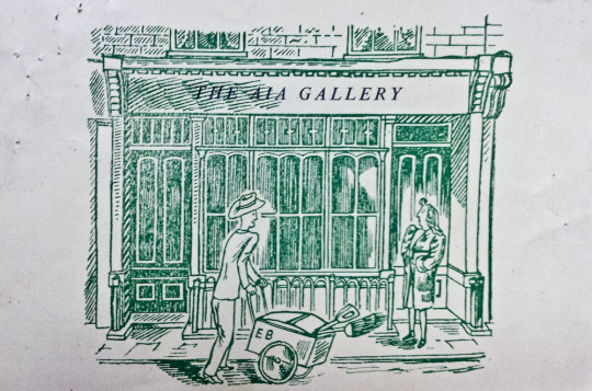
This is a small post, based on a little business card for the A.I.A. Gallery just because I liked it. It is designed by Edward Bawden. I have posted some text from the book on the A.I.A Gallery below. It sums up the organisation far better than I could.
The A.I.A was also known as the Artists’ International Association
An exhibiting society formed in 1932 by a number of left-wings artists and writers who wanted to publicise, through their art, their commitment and resistance to the ‘Imperialist war on the Soviet Union, Fascism and colonial oppression’. Its aim was the ‘Unity of Artists for Peace, Democracy and Cultural Development’. The Association originally termed ‘Artists International’ provided a forum for regular discussions on communism, and its membership included Clifford Rowe, brothers Ronald and Percy Horton, Peggy Angus, Pearl Binder, James Boswell, Edward Ardizzone, Hans Feibusch and Misha Black the first Chairman. Most of the group’s early exhibitions were held at galleries in the Soho area of London, such as Charlotte Street, Frith Street and Soho Square. Its inaugural exhibition was entitled ‘The Social Scene’. In 1935 ‘Association’ was added to its title. A subsequent exhibition in that year called ‘Artists Against Fascism and War’ included works by Robert Medley, Paul Nash and Henry Moore.
The AIA supported the left-wing Republican side in the Spanish Civil War (1936-39) through exhibitions and other fund-raising activities. It attempted to promote wider access to art through travelling exhibitions and publicly available mural paintings. In 1940 it published a series of lithographs known as Everyman Prints in large and consequently low-priced editions. By the end of World War II, membership numbered over a thousand and in 1947 a gallery, founded by Claude Rogers was established at 15 Lisle Street, Soho, London which flourished until the lease expired in 1971. Initially it pursued an obvious Marxist programme, with its affiliates producing satirical illustrations for the magazine Left Review but by 1951 the Association was showing non-figurative work and in 1953 a new constitution abandoned its left-wing commitment and it continued solely as an exhibiting society. Distinguished foreign artists occasionally exhibited work at the later exhibitions: these included Fernand Léger and Picasso.
The Artists’ International Association should not be confused with the International Artists’ Association which was established in 1952 and was an affiliated organization of Unesco.
It tried to promote wider access to art through travelling exhibitions and public mural paintings. In 1940 it published a series of art lithographs titled Everyman Prints in large, and therefore cheap, editions.
A.I.A.: Story of the Artists’ International Association, 1933-53 by Lynda Morris and Robert Radford, 1983
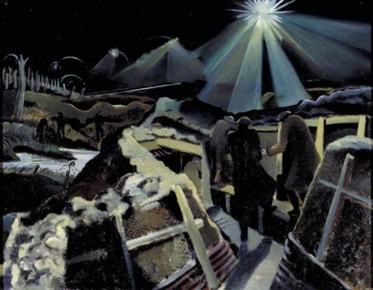
Edward Bawden – Lithograph for Travellers’ Verse, 1946.
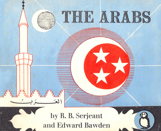
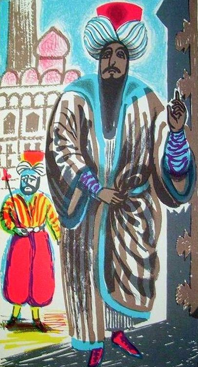
This post is the story of Edward Bawden’s war work in the War Artists Advisory Committee (WAAC) as an artist and how he used the wartime drawings and paintings in illustration work, like the The Puffin Picture Book ‘The Arabs’ but other post-war commissions.
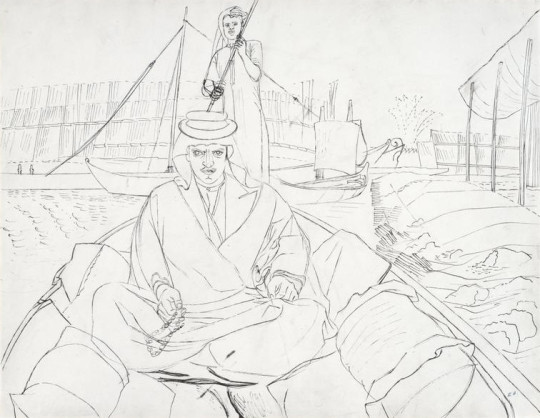
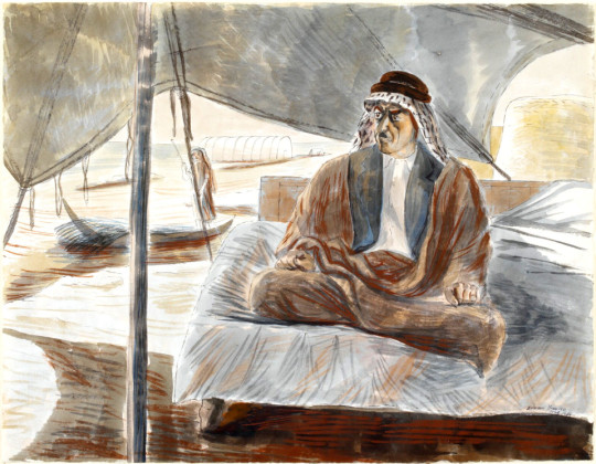
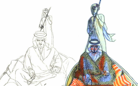
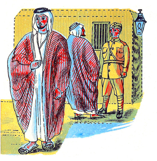
Edward Bawden – Shaikh Sharif al-Hafi, 1944.
When the Second World War broke out in 1939, Edward Bawden had already established a reputation as an illustrator, a comic draughtsman, a designer of typographical ornaments and patterns, a print-maker and a painter of landscapes in water-colour.
Bawden was appointed one of the first Official War Artists and was sent to join the British Army in France with Barnett Freedman and Edward Ardizzone. After being evacuated via Dunkirk, he was sent to the Middle East where he spent two years painting and drawing in Egypt, Libya, Sudan, Ethiopia, Eritrea, Syria, Iraq and Saudi Arabia. During his return journey to England, his ship was torpedoed; he then spent two months in a French internment camp before being released, and arrived in England safely, only to return to the Middle East, journeying around Cairo, Baghdad, Jeddah, Teheran, Ur of the Chaldees; he was drawing all the time, finally ending his travels in Rome. †
Edward Bawden – Shaikh Raisan al-Gassid, 1944.
The WAAC recommended in December 1939 that Bawden should be appointed as an official Air Ministry artist. In May 1940, after his return from France with the withdrawal from Dunkirk. Bawden expressed his regret at having had to leave, and Dickey reported him to be “extremely anxious to be sent out again to another scene of activity”. He departed for the Middle East in July. ♦
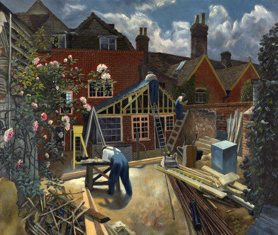
After the war Bawden stayed in Cheltenham while repairs and work were made to his home, Brick House; It was the only building in Great Bardfield to suffer from bomb damage, but Bawden also used the opportunity to make alterations and build a studio to the back of the house. The house was used and abused by the Home Guard during the war.
John Aldridge – Builders at Work, Brick House, Great Bardfield, 1946.
Bawden’s time as a war artist had given him the advantage of travel but also an abundance of sketch books and work that were still fresh in his mind in 1945. So it was in November of that year that Noel Carrington, the head of Puffin Books at Penguin was writing to his Allen Lane, his boss about Bawden and the planned book ‘The Arabs’:
12th November 1945 I have arranged for Bawden to meet you here on Wednesday afternoon at three o’clock, so you can discuss the alternative approaches to The Arabs book with him. As an illustrator, one method will suit him as well as another. ♥
From this meeting payments were settled and Bawden took on the job of illustrating the book. The text for the book was by Robert Bertram Serjeant, Nicknamed ‘Bob’. Serjeant was a Scottish scholar, traveller, and one of the leading Arabists of his generation.
Edward Bawden – Front cover design for The Arabs, 1947.
Bawden to Carrington, 24 July 1946: “The book is getting on slowly – I work upon the lithographs for a few hours every day, but because of the fine detail I find the work rather a strain on the eyes. In all I have finished one-fifth of the drawings but these include some of the most elaborate ones such as the two double spreads.’ ♥
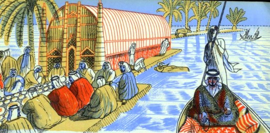
As you can see in the image below, Bawden recycled some of his paintings from the war and used them in the making of the book. The man to the right – on the boat is ‘Shaikh Sharif al-Hafi’, pictured at the top of this post.
Edward Bawden – Detail from ‘The Arabs’, p18, 1947.
Below I have edited both images side-by-side and you can see how the line drawing has been simplified for the lithographic process.
Although ‘The Arabs’ became a factual book rather than the ‘story’ title Carrington intended, it is one of the highlights of the series. Bawden’s lithographs are as good as any he completed and the two full double page spreads are superb examples of his mastery of line; Curwen made a good job of the printing. ♥
Edward Bawden – Detail from The Arabs, p30, 1947
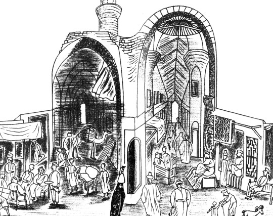
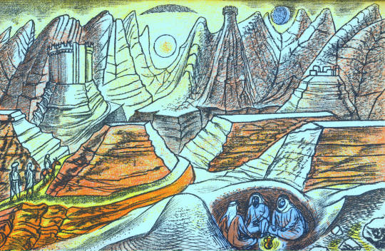
The text of ‘The Arabs’ doesn’t shy away from the Crusades and they are also illustrated as in the image above and below. The historical detail also takes in the history of the Arabic nations, how important they were during the silk road trade routes and how they declined after the European travellers sailed by boat beyond the Cape of Good Hope to China and India.
Edward Bawden – Double page spread from The Arabs, p30-31, 1947
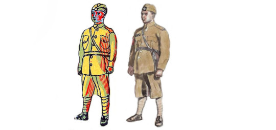
Again, below and side by side are both the lithographed policeman from ‘The Arabs’ and the portrait Bawden painted during his war service. It really demonstrates the cheerful nature of his line drawings. It also shows how he used paintings and sketches to make the book as accurate as it could be.
Edward Bawden – Baghdad: An Illustration of Iraqi Policemen’s Uniforms, 1943
Edward Bawden – Detail from ‘The Arabs’, p6, 1947
A Digital Edit of the book ‘The Arabs’ & Bawden’s War Portrait of the Policeman
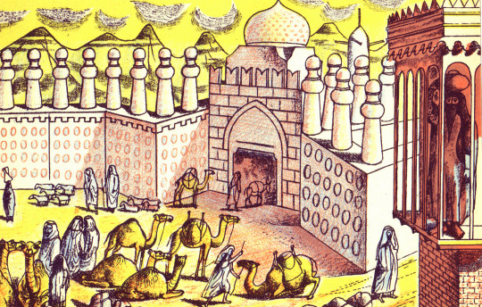
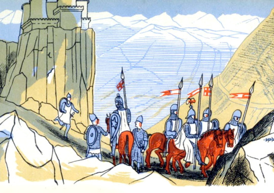
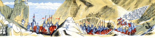
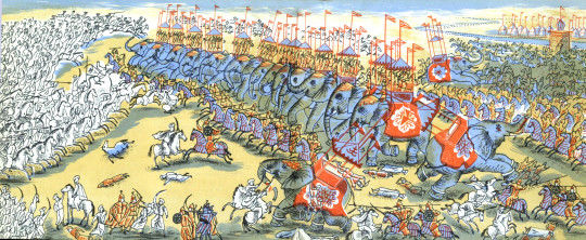
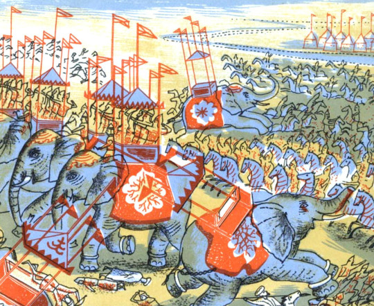
The most beautiful of the two double-page illustrations is the Battle of al-Qādisiyyah, 636AD, when the Rashidun Caliphate overthrew the Sasanian Empire.
Edward Bawden – Double Page Spread from ‘The Arabs’ p26-27, 1947
The Sassanid Persian army, about 60,000 strong, fell into three main categories, infantry, heavy cavalry, and the Elephant corps. The Elephant corps was also known as the Indian corps, for the elephants were trained and brought from Persian provinces in India. The Arabic side is said to have been 36,000 strong, just over half, and yet they won.
Edward Bawden – Double Page Spread from ‘The Arabs’ p27, 1947
Interestingly the book was never reprinted, and indeed could have been withdrawn and pulped! On the last pages of The Arabs, Bawden had illustrated ‘Muhammad mounted on Buraq’ ascending to the Seventh Heaven’. Obviously no one Bawden, Carrington or Lane had realised the grave offence that the depiction of the Prophet would cause.
The Cairo branch of W.H. Smith, which had ordered 5,000 copies, wrote requesting: ‘would there be any way of painting out the rider’.
Complaints flooded in and the Commonwealth Relations Office wrote to Penguin: The Puffin Picture Book No 61, entitled The Arabs, has on the last page a pictorial representation of the Prophet Mohammed and there have been in the Pakistan Press various letters protesting against this illustration.
As you no doubt know, any representation of the Prophet gives grave offence to Muslim sentiment. Although from a non-Muslim point of view such representations may appear harmless, it is none the less true that Muslim objections to representation of the Prophet in any form are based on sincere conviction.
You will, I am sure, appreciate that in inviting your attention to this matter we do not wish in any way to appear to be interfering with editorial responsibility. But we felt it right to draw your attention to the ill effects which an otherwise excellent little book may have in the Muslim world. Perhaps you would be good enough to bear this in mind should a reprint be under consideration?
One can only imagine the colour of the air when Allen Lane realised that his flagship Puffin was fatally flawed. Understandably The Arabs was never reprinted. ♥
I must add that after mentioning I was writing this post to a friend, they convinced me not to include the image of Mohammed in the blog too. If you wish to see the image you will just have to order a copy of the book to find out at your own offence.
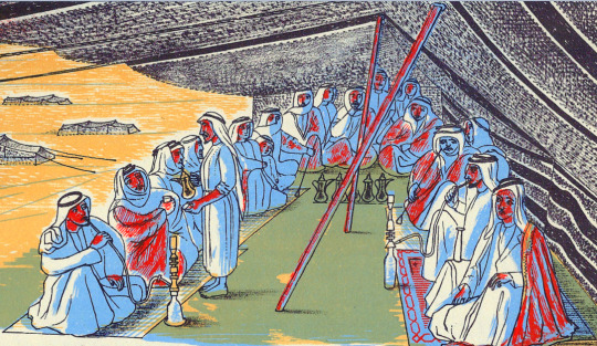
Edward Bawden – Detail from ‘The Arabs’, p15, 1947
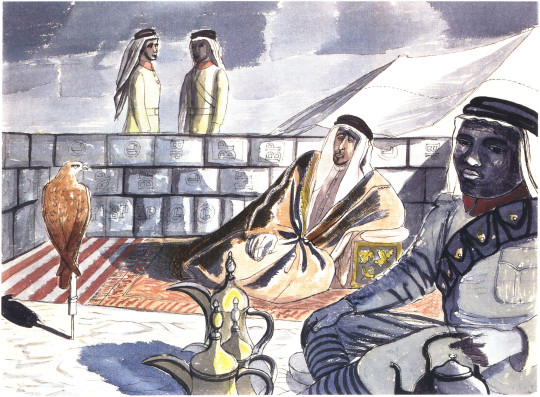
The painting below is of Mohammed Bin Abdullah El Atshan, King Ibn Saud’s representative at Rumaliya. This painting is a copy made in 1966 of a painting from 1943 made at the request of a British Petroleum executive when Bawden was painting a mural at the British Petroleum restaurant. The wall of petrol cans were given the BP logo at the executive’s suggestion.
Edward Bawden – Mohammed Bin Abdullah El Atshan, 1966
What is more curious to me about the above retrospective painting is that parts of it turn up twice in the Puffin ‘Arabs’ book. The image below in colour has the hawk, coffee pots, the boy with water-pot and two men standing behind the wall. The black and white illustration below has the drawing of the sitter.
Edward Bawden – Detail from ‘The Arabs’, p7, 1947
Edward Bawden – Detail from ‘The Arabs’, p25, 1947
Throughout 1946 Bawden was working on the illustrations for ‘The Arabs’ book, but it wasn’t published until 1947. Also in 1946 Bawden would illustrate a collection of poetry chosen by Mary Gwyneth Lloyd Thomas in a book called ‘Travellers’ Verse’ and he would be able to re-encounter his work of the middle east with his illustrations. These projects started to merge as parts of illustrations from his War Time Sketchbooks would end up in both.
Edward Bawden – Detail from ‘The Arabs’, p12-13, 1947
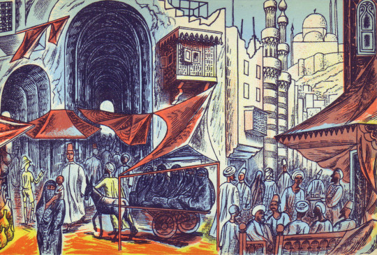
Above is an illustration of a Market in Cairo from ‘The Arabs’ and below is an illustration of a market from ‘Travellers’ Verse’, albeit a more fantastical version. Because ‘The Arabs’ was to be accurate the illustrations are more or less from his war paintings, but the ‘Travellers’ Verse’ book he was able to have more fun with the illustrations and be more fanciful.
Edward Bawden – Detail from ‘Travellers’ Verse’, 1946
In the top right corner of the image above is the Mohammed Ali Mosque in Cairo in a simple line drawing from 1946. Below you can see it from one of Bawden’s paintings in 1941.
Edward Bawden – Cairo, the Citadel: Mohammed Ali Mosque, 1941
Bawden also illustrated the mosque, as below from the other side of the city
Edward Bawden – Detail from ‘The Arabs’, p23, 1947.
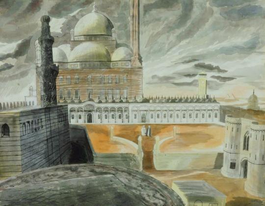
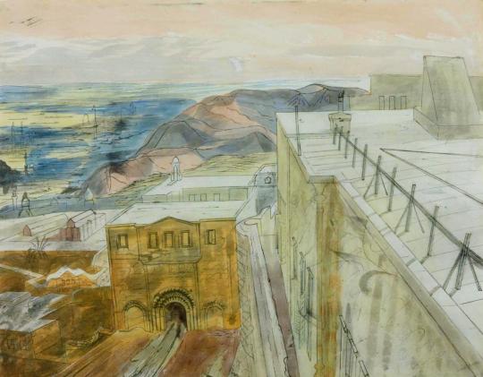
During his travels Bawden was able to stay in the centre of Cairo in the Citadel on his stay as he mentions:
Public relations could deal with journalists but they didn’t know how to deal with artists. They were puzzled and Major Asterly said ‘Why not go and stay in the citadel’, which I did and I found delightful. I made one or two drawings of the Mosque of Mohammed Ali. ♠
Edward Bawden – Cairo, the Citadel: On the Roof of the Officers’ Mess, 1941
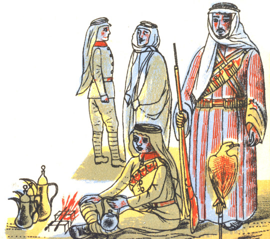
In the ‘Travellers’ Verse’ illustrations we see the city life and a fantasy of life in the countryside, with Mosque towers and street cafes to the desert landscape and camp fires.
Edward Bawden – Detail from ‘Travellers’ Verse’, 1946
Edward Bawden – Detail from ‘Travellers’ Verse’, 1946
In fact Bawden would be able to use the war drawings of Greece and Rome for the other plates in the book. It seems that after Rome, Athens was a disappointment as Bawden mentions:
When I returned from Florence to Rome it was suggested that I go to Greece, so I went by air, it was the first time I had seen Greece I had been to Rome several times but I was very disappointing on the sight of Athens, it didn’t have the grandeur I was expecting. ♠
Edward Bawden – Detail from ‘Travellers’ Verse’, 1946
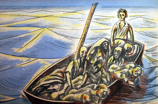
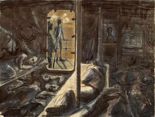
In ‘Travellers’ Verse’ the illustration of a huddled mass of bodies in a boat on a Paul Nash sea has none of the cheer the other images have. The poem being illustrated is ‘Don Juan and his tutor Pedrillo are shipwrecked.’ Bawden himself was shipwrecked during the war off the coast of West Africa on a ship from Cape Town to London. It is another translation of his wartime experiences.
Edward Bawden – Detail from ‘Travellers’ Verse’, 1946
The Laconia was nearing the Equator in temperatures of 110 degrees Fahrenheit when, at 8pm on the evening of 12th September, 1942, it was hit twice below water level by torpedoes from the German U-boat U156 under the command of Werner Hartenstein.
Bawden with typical sangfroid resigned himself to death by drowning: ‘so I thought I’d wander round a bit and have a look. I went down to my cabin – I’d bought my wife a watch and thought I might as well go down with the watch as not.’ Then, ‘on returning from my cabin I saw ropes hanging down on the side where life-boats had been lowered and standing by one of these I was joined by a major. ‘After you, Sir’ I said. As he descended there was a splash. Sliding down the next ropes I found myself being gripped and guided into a boat. A few minutes later all the boats pulled away to a safe distance and there we sat waiting, still and silent and tense for the sound of the ship’s final end. ‡
Edward Bawden – Rescued at sea by the French warship Gloire, 1943.
The survivors were rescued by a French ship who were unkind to them and then taken to an internment camp in Casablanca where they stayed for two and a half months until rescued, this time by the Americans, who were kind. As a British citizen he was shipped to Norfolk, Virginia, USA before being shipped back to London.
Edward Bawden – Illustration from Vathek, 1958.
Many years after the war Bawden illustrated Beckford’s ‘Vathek, an Arabian Tale’ for the Folio Society in 1958, I find these illustrations rather weak personally, I can’t work out if he wanted to change to a looser style of lithographic illustration or if they were dashed out for the money, while technically good with colour layering, the end result in my view is poor. I rather suspect the commission came in conjunction with a larger one – ‘The Histories of Herodotus of Halicarnassus’ for the Limited Editions Club, a company like the Folio Society, but American; For them Bawden provided over 100 illustrations in a two volume book set.
He would illustrate Johnson’s ‘Rasselas’ in 1975 for the Folio Society with happier outcomes compared to ‘Vathek’, though not totally Arabian, it is a fantasy of travel.
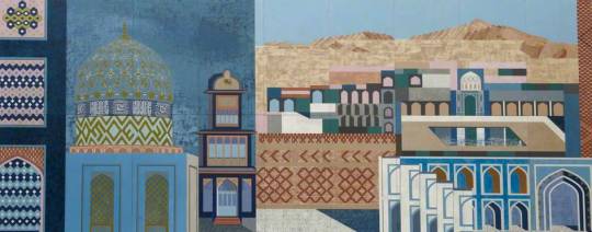
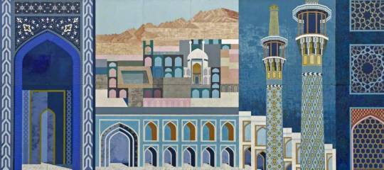
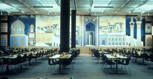
To conclude the various Arabic styles of Bawden we should end with the giant mural for BP’s restaurant at Britannic House. The best of Bawden’s murals, using Islamic designs and architectural drawings to bold outcomes, it uses blocks of colour and pattern design much like one of his linocuts.
Edward Bawden – Fantasy on Islamic Architecture (Left Panel), 1966
Edward Bawden – Fantasy on Islamic Architecture (Right Panel), 1966
A view of the Dining Room in Britannic House.
† Ruari McLean , Edward Bawden War Artist & His Letters, 1989 ‡ Malcolm Yorke – Edward Bawden and His Circle, 2015. ♠ 4622 Edward Bawden Audio Tape, IWM, 1980. ♣ R.B. Serjeant and Bawden Edward – The Arabs, 1947. ♥ Joe Pearson – Drawn Direct to the Plate, 2010 ♦ Edward Bawden 1939-1944, ART/WA2/03/044/1
In the copy of The Listener from March 1941, there is a piece by the artist Keith Henderson on his first year as a War Artist with the Air Ministry.
Before any artists had been appointed by the Air Ministry, William Rothenstein had requested permission to make portraits of airmen at bases in Scotland. Rothenstein pre-empted Keith Henderson, the official artist, in working at Leuchars base, which meant there was nothing for Henderson to do; Rothenstein was often referred to in print as an “official artist”, although at this time, it was not the case.
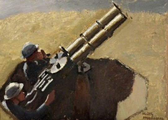
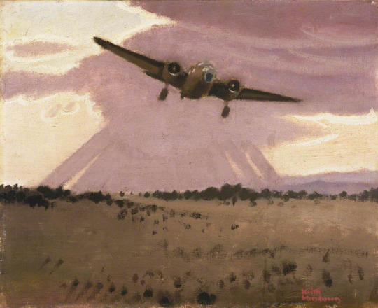
Henderson was one of the first two artists, alongside Paul Nash, appointed as a full-time salaried artist to the Air Ministry by the War Artists’ Advisory Committee, WAAC. Rothenstein’s work ended up with Henderson having to concentrate on ground crew, aircraft hangars, repair shops and runways for subjects. Although the painting ‘An Improvised Test of an Under-carriage’ provoked fury in the Air Ministry and contributed to Henderson’s six-month contract not being extended, it was among the artworks shown at the first WAAC ‘Britain at War’ exhibition at the Museum of Modern Art in New York in May 1941. The painting shows a man jumping up and down on the wing of a Lockheed-Hudson to test the undercarriage.
Keith Henderson was a Scottish painter who worked in both oils and watercolours, and who is known for his book illustrations and his poster work. He had a long professional career that included periods as a war artist in both the First World War, in which he served in the trenches, and in the Second World War. The muted colours and tones of his work remind me of Eric Ravilious, it is that style too, but Henderson’s work was between Ravilious and Christopher R. W. Nevinson.
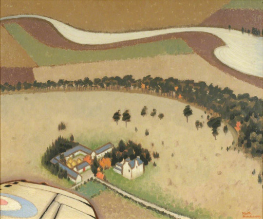
Keith Henderson – An Air View of Montrose, Angus, 1940.
War-time notes of a Peaceful Artist.
Turning over the pages of a diary that I began last April on being appointed one of the two official artists to the Air Ministry, I now read over passages here and there with reminiscent amusement and, yes, a certain genuine pleasure too. During the last war I kept a diary, not only while with my regiment but after being seconded to Intelligence with the XV Corps Squadron, and then Fifth Army Headquarters. The new diary, the one for this war, begins:
Keith Henderson – A North-East Coast Aerodrome, 1940.
April 19, 1940. Started with Helen from home yesterday evening towards the east coast, leaving snow on our Lochaber mountains and daffodils under the wintry trees. Curlews calling from every direction. Tomorrow…
April 20. This my first day of official duty has been a hideous failure. A guard at the aerodrome entrance, I drive in superior and nonchalant, returning the sentry’s salute. On to the Orderly Room. Adjutant, Commanding Officer, Intelligence Officers. Nervous as a cat, I hope they will not see through my calm affability. Cigarettes and a stroll towards the Mess. The ante-room is enormous: African buck, markhor, and other trophies of the chase branch out one above the other towards a lofty ceiling. The leather armchairs are so ample that officers reclining in them appear to be asleep. Crowds of others standing about, all very much alike. They observe that the Commanding Officer has a guest. Introductions, a glass of sherry. Presently through swing doors into the Mess Room, which is enormous. Lunch with one of the Wing Commanders, very friendly. But the afternoon, oh, the afternoon was hell. During a conducted tour round the hangars l saw nothing whatever that I particularly wanted to paint. The wind was hideously cold, the light bleak, and I had an exhausting stomach-ache. Violent and continuous noises of engines being tested. No ideas.
Keith Henderson – Night: An Air Gunner in Auction Turret, 1940.
April 22. Serene spring weather. All has gone well, so well that I’have had to steady myself with thoughts of the horror of the conquered in Poland, Norway, and elsewhere. A man’s philosophy is usually in accord’ with his circumstances, both interior and exterior. Optimists do not have stomach-aches. Mine had vanished. From the high control tower at least three marvellous possibilities appeared. Two sinister and monstrous bombers were awkwardly entering their hangar. They have the eyes, the mouths, legs, bodies, wings of elephantine obscene. insects, but stupid insects. Prod them and they will not move away or retaliate. There is no mind within. They are utterly vacant. I must paint them like that. How lucky am I to have been appointed to this delightful work.
April 24. Three pictures have now been begun. I am using a monochrome mixture of white, yellow-ochre, and a little raw umber. This will make any alterations to the composition easier before a more or less rapid final painting begins.
Keith Henderson – Study of Royal Air Force Machine Gunmen, 1939.
May 5. From the ground this strangely retarded spring is at last clearly visible. Trees are in bud and millions of small dowers give an impression of Chaucerian gaiety. Up in the air scarcely any of this tiny brilliance shows yet. There are just stretches of moorland and of ploughland in various shades of pale buff and maroon, with here a diaper dressing of lime, there a flutter of gulls, a few sombre forestry plantations and many lesser woods wherein only’an occasional pale willow is conspicuous, old stone farmhouses with their haystacks in rows, a ruin near a newer castellated mansion, small lochs all silvery grey, an appearance of desertion far and wide. From the air the earth has no flowers. Eastward is the wonderful coast-line, red sandstone mostly, fretted away into natural arches and pinnacles. The jade green sea is as lovely from above as I remember it in the last war. Those white festooned breakers along the Beaches seem without sound.
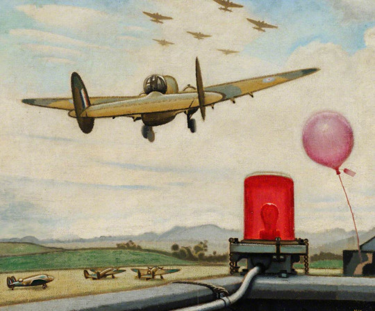
Keith Henderson – An Improvised Test of an Undercarriage, 1940.
May 6. Today I tried the experiment of taking up more than mere notebooks. I took a canvas, a dozen brushes and a full set palette. The Palette was disastrous. Within a few moments of taking off, I noticed Indian red on my sleeve. The observer crept forward to the navigator’s seat where I was, and shouted into my ear, ‘Have you got everything you want?’ ‘Yes, thank you’ I shouted back, ‘but you have got some ultramarine on your cheek. I remembered noticing an air gunner holding the palette at a dangerously acute angle as he handed it to someone. And worse. Nearly all the so carefully arranged large clumps of paint round the palette’s edge were, I saw now with dismay, gone. They had evidently slipped off or been smeared off. But I could not be Without them. They must be found, scraped up penuriously from the floor or anywhere. Then I saw the legs of the air gunner. My precious cadmium red! The observer, the pilot even, all were strangely daubed handed round proved in that cramped space more distributive than cleansing. Their hands, their faces, their flying kit were crimson, blue, white, black, yellow, or tartan. It was a great success.
Keith Henderson – Camouflage Hangars and Gas Gong, 1940.
May 7. My bedroom at the aerodrome is quite comfortable. I shall never forget my astonishment when an efficient batman offered me early tea. I was then getting up at 4 am. for a dawn picture. This morning it had to be 3.30. As we rose into the upper air through ground mist three swans also rose through the ground mist. They Hew north. I found myself thinking: ‘Where exactly is the centre of the Universe?’ And I answered myself: ‘ Wherever you happen to be at the moment’. In mid air ’the centre of the Universe is definitely not on the earth’s surface. All who fly will agree about that. Suppose yourself flying west. You wish to turn south. The great rigid wings slant over. But for all the planetary pull of gravitation, it is not the aircraft which appears to be askew. Not at all. The earth on the other hand has gone mad. It has heaved itself up, sea and all, steeply into space, a huge menacing wave that will not subside until the dial shows the wings horizontal. They will be in a moment. Now they are. Now the earth is itself again, flat, detached inhuman, without laughter or any birds singing.
May 8. A letter from the Air Ministry. I wrote some time ago ‘asking for permission to go to Narvik or Stavanger on a bombing raid’. The Air Commodore at Whitehall answers, ‘Under present conditions it is quite out of the question that you should visit Norway‘. Right. Well, that exonerates me. I am certainly not going to do fancy war pictures from photographs and descriptions.
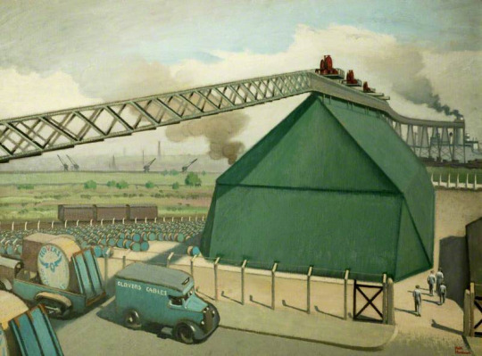
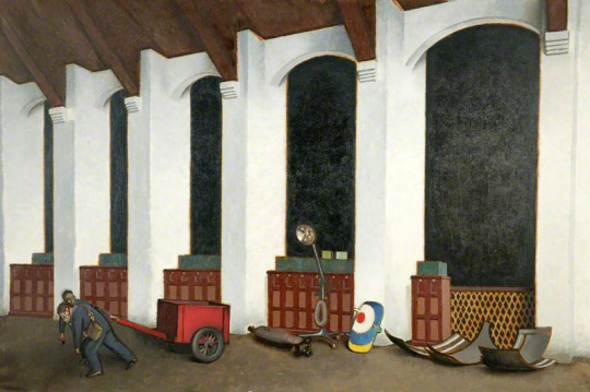
Keith Henderson – Loading Gantry for Pluto, 1940.
May 9. Home for another short rest, tired. No, not depressed. There must be no regretting all that I have not accomplished, but simply a ‘proud delight in all that I have accomplished. Let me be luxuriously lazy. For several days on end I need not do anything. I loll in this white window Seat looking down the length of the room towards Aunt Nell‘s two rococo mirrors on either side of the Chinese lacquer cabinet. One of the dogs in the farmyard barks. I love the faint pink, wallpaper with its bunches of blue-grey and white flowers. I am happy. I think I have been asleep. I must go and see how things are coming on in the walled garden.
May 11. Back at the aerodrome. The usual crowds assemble as soon as I set up my easel for a large picture to be called ‘Repairs to a Bomber’. Since last night when I came round to see that all was in order, the men have produced, in the most frightful raw flat yellow, on the side of the particular aircraft that I am painting, a huge figure of Donald Duck. They want me to put this into the picture, but I really cannot. It would spoil the whole thing. The effort to find words that might show them why it would spoil the whole thing is almost too much during working hours.
Keith Henderson – Dawn: Leaving for North Sea Patrol, 1940.
May 12. On other machines they have now painted other grotesques, including the wholly inexcusable Popeye. A sergeant pilot says that these effigies will ‘cheer up the Jerries’. And this while the news becomes more serious than any news ever announced in the world before.
Keith Henderson – Wings over Scotland, 1940.
May 16. While I was touching in the ‘horns’ of the bomber a young pilot who had been standing beside me asked: ‘How do you begin a picture?’ My answer, which was regrettably long, failed to give satisfaction. I could feel that. There was silence; and then – would I come for a flit with him? When? This afternoon? Well, I did rather want to get on with that thing of the coastline…. He went off at once and came back to say that all had been fixed. We were to go in the Jewel. On my way to the Mess I reflected that a machine called the Jewel sounded pleasantly airworthy. Later I discovered my mistake. Not Jewel, but Dual, a machine with dual control. ‘You must take a turn’, he offered. I made no answer, doubtful as to what this implied. When the parachutes and Mae Wests and other paraphernalia for all concerned are collected we drive across to the Dual. The engines have of course been sending out dust gales to the rear for a good while. We heave ourselves in. Before taking off, the pilot looks round and holds up his right thumb. The rest of the crew hold up theirs. All is well. The noise increases, is doubled, trebled, deafening in spite of ear plugs. We are moving forward, moving more swiftly. We have left the ground. As soon as we are at the right height I begin sketching. The time goes by. I muse vaguely about art meanwhile. Art is more than national, more than international; it is supernatural-magic-always* has been since cave days, always will be. There. The drawings are finished. We may return. Presently the pilot nudges my elbow. I am sitting on the learner’s seat close beside him. What is it now? What? He points to the controls and points at me. Does he mean that I am to ‘take a turn’? I hesitate. His reply to my very sensible hesitation is to cross his arms and lean heavily with his head on one side as if sound asleep. Something must be done. I seize the crescent. He is awake again, ready. We have lost height. I pull back. We rise, rise higher. The North Sea is empty of shipping. No, there’s a distant convoy. So it is. This is rather delightful. At a pinch, if the pilot were to become a casualty, could I carry on ? I might, I really might. But I certainly could not land. I should just have to go on and on, flying round the world indefinitely.
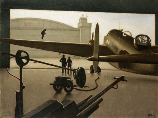
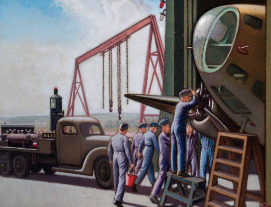
Keith Henderson – Repairs to a Bomber, 1941.
May 23. Abbeville fallen. Boulogne fallen. Well, as to our next move, that rests with the Higher Command, not with me. Defeat ? That is an idea that I’ve never even glanced at. Have any of us ? Probably not. Better not. In the evening I have just finished a life of Wallenstein, and am beginning Lady Mary Wortley Montague’s Letters.
June 13. At home fér another rest. More carrots sown and the artichokes, thinned out to three feet apart, should do well. The Germans are only sixteen miles from Paris.
Keith Henderson – Gas Practice in a Hangar, 1940.
June 14. The first flowers of Campanula Carpatica have appeared, and Helen this afternoon made a delicious cinnamon cake. All down the steep brae towards the river there are foxgloves in full bloom. While raking beechmast into heaps on either side of the drive, I have been watching the cows. They are let out from the byre. They walk very slowly for about five yards, looking straight ahead. Then one of them stops. Gradually they all stop. Why? Two of them move slowly forward a few steps. A long pause. A few others follow and stop again. Another long pause. Do they want to go anywhere in particular? Why need they? A strawberry Ayrshire slowly turns her head. She looks at me for a long while without interest. Then she turns away, having learned nothing. They have nothing to do all day long. A black Galloway, with bracken in her tail, sits down, slowly and heavily. Five minutes later a polled Angus sits down, slowly and heavily. At the end of half-an-hour they have all sat down. Absolute peace here, and news has just come that the Germans have entered Paris.
Keith Henderson – Ascent of the Met Balloon, 1940.
So the diary goes on – a continual contrast between busy warlike aerodromes and exquisite days on leave. That was almost a year ago. How angry we felt then and how obstinate. Today, even more angry and more obstinate, we are surely, I think, feeling much more hopeful. –
The painting ‘An Improvised Test of an Under-carriage’ provoked fury in the Air Ministry and his six month contract as a war artist had come to an end. His work was exhibited at the time but unlike Eric Ravilious his work has more or less been ignored.
Today it is hard to ignore the artist effect of Eric Ravilious, the tide of books on him alone prove his popularity. This is an article from ‘The Artist’ magazine, March, 1943. It ends with a short record of his death, some weeks before. I thought it was interesting that its intention was a review of his life and works but became an obituary.
Eric Ravilious by Richard Seddon Artists of note: Number 97. The Artist Magazine. March 1943
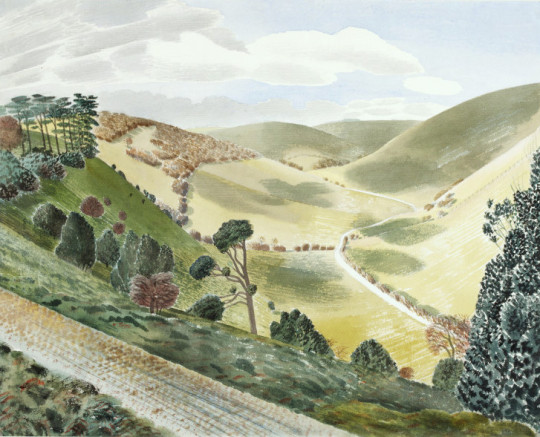
Eric Ravilious – The Causeway, Wiltshire Downs, 1937
Paul Nash was the first to notice the work of Eric Ravilious. This happened when Ravilious was a student of the Royal College of art under the instruction of Nash in the school of design. His wood engraving impressed Paul Nash as being worthy of special attention, and it was on the latter’s introduction that Ravilious became a member of the Society of Wood Engravers. In the society’s exhibitions Ravilious’s engravings immediately drew attention from publishers and their agents. Ravilious illustrated several books and was soon established as a book illustrator of exceptional status.
Between that time and the present he has consolidated a reputation as a leader of contemporary art; not as a leader in figurative or influential, but rather in the most academic sense, of the advancement of research and knowledge. He does not supinely follow the present tendencies and work in a certain manner merely because that manner can be accepted as the logical outcome of the particular form of art and aesthetics accepted at the moment in the country. He does not look for what is being done nowadays, in order to do likewise.
Leadership in art, as in anything else, calls for the usual hackneyed attributes: courage, self-confidence, faith in purpose, and so on. But in art, somehow, as in anything abstract, it needs enthusiasm enough to keep it up in the face of that inexplicable hostility that people show in face of anything that is ‘new.’
In feeling and temperament the work of Ravilious is very English. Ravilious, unlike so many Englishmen, does not try to paint as though he were a Frenchman. His work has its roots deeply sunk into the life and the countryside and the culture of England. His water colours are the lineal descendants of the English eighteenth century school of water colour than in its time gave England a brief reign as a country important in the world’s art, a reign that lasted until the French impressionists wrested the sceptre for France, a reign into which, it is felt, England was re-entering at the beginning of this war, through the excellence of the contemporary school of English landscape, of which Ravilious is one of the most important members.
That, because of his very full knowledge of the history and methods of English art and design, he carries on the English tradition, is apparent in his work in any of the media he employs. His wood engravings revive and extend the essential tradition of Thomas Bewick and the English eighteenth century wood engravers. In his water colours he takes up the story where Peter de Wint, Paul Sandy, John White Abbott and their contemporaries left off, and carries it a stage farther, in the life of modern knowledge. Examples of his pottery design that he carried out for Wedgwood can take their place in the Victoria & Albert Museum, among the original products of Josiah as if by hereditary right.
It is not possible to select one or two influences that can be credited with the moulding of Ravilious’s vision. After leaving school in Eastbourne, he attended Eastbourne School of Art, from where he went up to the Royal College of Art, in London. There, under principal-ship of Sir William Rothenstein, he was tutored by some of the most important contemporary artists in the country. Naturally, the powerful influences of such men must have affected his outlook; indeed, they did. In addition he received, asI have said, an exhaustively comprehensive education in art and design, from which soure he derived the solution of those problems of expression that he always seems to face with courage and solve with ingenuity.
He might easily have been tossed for ears upon a sea of conflicting influences; if so, it happened when he was at the R.C.A., and the process was completed by the time he began his career as a practising artist. At least, no indecision has ever shown itself in the work of his maturity. that he owes something, as all artists, to skilful pilotage, can be safely assumed, but that he emerged with an original style is patently a logical result of his own personal outlook.
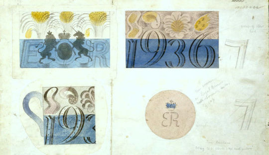
Eric Ravilious – Design for Coronation mug for Edward VIII, 1936.
He is thirty eight, and therefore can be said to have not yet reached the peak of his artistic maturity. As regards his work, whatever the medium he invariable approaches a subject with an open mind and embodies in the work, whether it is a wood engraving, a water colour, ceramics, or fabric design, at least one idea that arises from the needs of that particular job and no other. Of course he refers in his mind as he is thinking it out not only to history but to past works of his own to help in solving the problem of the moment, but he avoids any tendency to repeat successes of the past ad nauseam, giving the same colours, the same subtleties, the same textures and so on, whether or not they are the right ones for the present job. I stress the fact that he does not walk in such a manner because very many artists, both distinguished and otherwise, do so.
Ravilious never rests on his laurels. It cannot be said about a sequence of his work as it can of the work of other artists that, having seen one, you have seen them all. Though they are all built around the personality of the artist, each of his productions is sufficient unto itself.
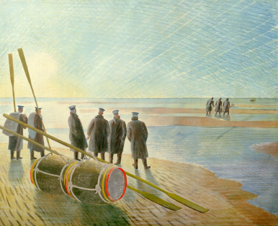
Eric Ravilious – Rendering Mines Safe, 1940. (Now called Dangerous Work at Low Tide)
In a Ravilious exhibition, the paintings are, in the truest sense, variations on a theme and not repetitions. It is said that there are four different ways of looking at a picture, Firstly the observer might stand away and savour the emotional content and the subject matter.Secondly, he might appreciate the purely academic appeal, such as the colour harmony and the broad lines of the composition. Thirdly he might go near the picture and closely examine the technical minutiae: the brushwork, the qualities of the surface, the interplay of ‘fat’ and ‘lean’ painting, and so on. Fourthly, he might scrutinise, analytically, the patterns achieved by the painter, by the use of his range of different ways of coving a surface and of filling in a space.
The Victorian painters appealed to the first two methods, and many contemporary schools solely to the last two. A few contemporary painters, including Eric Ravilious, appeal to all four. Ravilious particularly appeals to the last. His textures and patterns, whatever the medium, are an important feature of his work. He composes as a rule within a tight linear framework, making spaces of carefully contrasted size and shape which he fills with textures that derive partly from the intrinsic textures of the original of the subject and largely from his own fertile imagination. The settings for his landscape painting have been the Downs and coast of Sussex, and localities in Essex, Wiltshire and Wales.
Apart from his war painting he confesses to a tendency to paint in sequences: groups of broken-down tractors and old cars and buses in fields, the discarded machinery of Essex. He has painted a series of Sussex hills, a set of chalk figures (such as the Aylesbury White Horse), a set of lighthouses, rowing boats, beds, beaches and greenhouses. Ravilious was educated at Eastbourne Grammar School. He left the Royal College of Art only to return in 1929 as instructor in design, which position he filled until 1938. Whilst a student at the college he and Edward Bawden completed a well known mural decoration in the refreshment room of Morley College, which was destroyed by a bomb.
Other important mural decorations by Ravilious are those in the circular room at the L.M.S. Hotel at Morecambe and the ceiling decorations in the dining hall of the new Merchant Taylors’ School. Since 1926 he has illustrated books for the Kynoch Press, mainly by wood engravings. His engravings have also illustrated Volume I of ‘Signature’ and Gilbert White’s ‘Selborne.’ From 1937 to 1939 he designed pottery for Wedgwood. One of the best known of these designs was the Coronation Mug. His designing for glass he dismisses as a mere gesture; as a gesture it was brief, but effective.
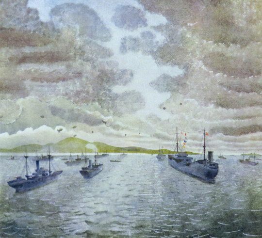
Exhibitions of the work of Ravilious were held at the Zwemmer Gallery in 1934 and 1937, and one at Tooth’s in 1939. Three of his water colour drawings are in the Victoria & Albert Museum, and there are others in the public galleries. At the beginning of the present war he was offered and he accepted an appointment as official war artist to the Admiralty. He holds with the rank of hon. captain in the Royal Marines.
Eric Ravilious – Lewis Gunner
Since this article was written, Eric Ravilious has been posted as ‘missing’. After spending a period in Iceland, in his capacity as official war artist, he life that island by plane and has not been heard of since. Thus ends the career of a very fine artist, whose last efforts were devoted to recording events connected with the war – records which will go down to posterity, and which will keep his memory green, especially in the art world which respected him for his achievements. He was a sane progressive, sound in judgement and method.
Eric Ravilious – Convoy From Merchant Ship At Anchor, 1943
’I am no longer an artist interested and curious, I am a messenger who will bring back word from men who are fighting to those who want the war to go forever. Feeble, inarticulate, will be my message, but it will have a bitter truth, and may it burn their lousy souls.’ – Paul Nash
This is a post about four artists and their reactions to war through their art.
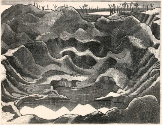
Paul Nash – Mine Crater. Hill 60. December 1917- Stone Lithograph.
The Art of Paul Nash for the war was a remarkable thing. Graphic in detail of metaphor and gloom they showed the public, at home in Britain, the front line. Nash was supported by a host of art critics and writers that wrote to the nervous Admiralty reaffirming that these works must be seen by the public and not censored and locked away. The Sunday Times critic Frank Rutter wrote in August 1917:
“I have seen and studied carefully a number of Mr Paul Nash’s drawings and watercolours made in the Ypres salient and consider them to be among the best and most moving works of art dealing with the present war. Facilities enabling Mr Nash to produce further drawings and pictures of the Front could in my judgement only result in enriching contemporary British art.”
In the next year the War Office would control and present what the public saw of this art with the 1918 series of four magazines called ‘British Artists at the Front’. Volume one: CRW Nevinson, Volume two: Sir John Lavery, Volume three: Paul Nash and Volume four: Eric Kennington.
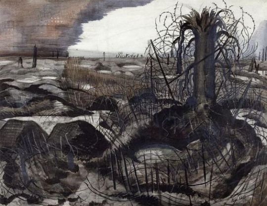
Paul Nash – Wire – Watercolour.
Francisco Goya (1746 – 1828) was a Spanish painter and printmaker. His early artistic works were oil paintings of romance and the Spanish court under Charles III. He’s also credited for painting one of the first totally nude, life-sized paintings in western art without mythological subtext.
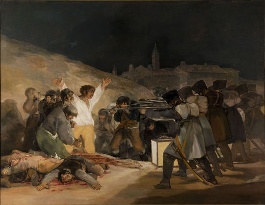
Francisco Goya – The Third of May, 1808.
Towards the end of Goya’s life he produced a remarkable series of 80 etchings called ‘The Disasters of War’.The etchings and aquatints depict a set of scenes from the Spanish struggle against the French army under Napolean Bonaparte, who invaded Spain in 1808. When Napolean tried to install his brother Joseph Bonaparte, as King of Spain, the Spanish fought back, eventually aided by the British and the Portugese.
Above is the painting ‘The Third of May’, painted in 1814. Goya sought to commemorate Spanish resistance to Napoleon’s armies during the occupation. During this time Goya was still a court painter, now under the French and may have been seen as a collaborator by some. Painted while the print series was in progress it marked a change in style, with a darker and more sinister attack on the French and a show of patriotism for the sacrificed Spanish.
Francisco Goya – Esto es peor (This is worse)
The prints show the French as a merciless army and the people in the crossfire, confused or abused victims. Some of the prints are supernatural. They are mostly divided into three styled themes:
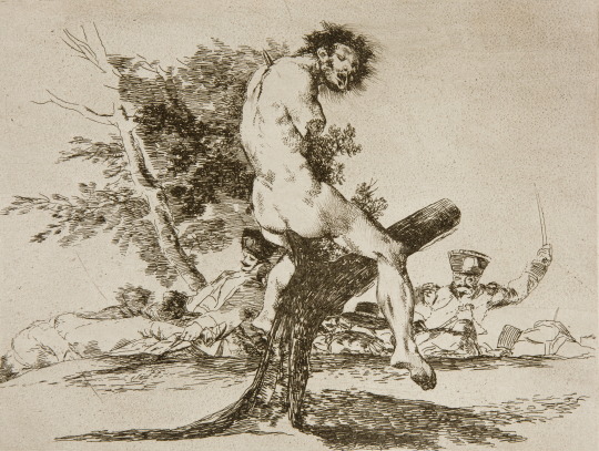
war, famine, and political and cultural allegories. Goya travelled the battle fields and towns in the conflict to sketch out plans for the works. Above in ‘Esto es peor’, the image shows the aftermath of a battle with the mutilated torsos and limbs of civilian victims, mounted on trees, like fragments of marble sculpture.
Francisco Goya – Por una navaja (For a clasp knife).
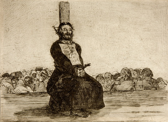
Above from ‘Por una navaja’, a garrotted priest grasps a crucifix in his hands. Pinned to his chest is a description of the crime for which he was killed – possession of a knife, that hangs from a cord around his neck. His body tied to an execution post while the bystanders look away in horror. This again is an image of horror after the event, with the consequences being witnessed by the civilians.
As graphic as the images were and even with ten years spent on their execution, it wasn’t until after Goya’s death that the prints where published. While it is unclear how much of the conflict Goya witnessed, it is generally accepted that he observed first-hand many of the events recorded.
The distance from the publication of Goya’s prints from the events helped them not be censored and with the war won, they reaffirmed Spain’s national pride.
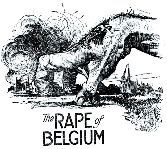
USA propaganda to build popular support for American intervention in the European war, WW1. Note the Germanic tattoo on the hand.
Censorship of art is always something of contemporary issue. A few years before Nash’s works of the battle fields in the early months of World War One was the ‘The Rape of Belgium’.
Belgium at the start of the war was in a state of neutrality from the 1839 ‘Treaty of London’. Under the treaty, the European powers recognised and guaranteed the independence and neutrality of Belgium. Article VII required Belgium to remain perpetually neutral, and by implication committed the signatory powers to guard that neutrality in the event of invasion.
The German army desired to invade Belgium to face the French forces and in doing so the German army engaged in numerous atrocities against the civilian population of Belgium, defying the Treaty.
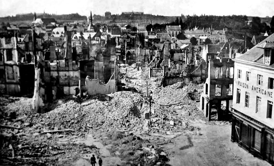
A destroyed Leuven. The Germans burned the city from August 25 to 2 September 1914.
The outcome was the ransacking and burning of civilian, church and government property; 6,000 Belgians were killed, 25,000 homes and other buildings in 837 communities destroyed in 1914 alone. One and a half million Belgians (20% of the entire population) fled from the invading German army. The Germans killed 27,300 Belgian civilians directly, and an additional 62,000 via the deprivation of food and shelter.
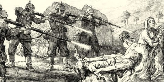
Pierre-Georges Jeanniot – IV – The Massacre at Surice
In reaction to the 1914 carnage and maybe after Goya, Pierre-Georges Jeanniot produced a series of ten etchings in 1915 called ‘The Horrors of War’.
Jeannoit’s first exhibited the works in Paris for less than a day before the French police banned it on fear it would cause panic amongst the Parisian population. The etching plates where locked in a box and lost, only to be rediscovered nearly 100 years later.
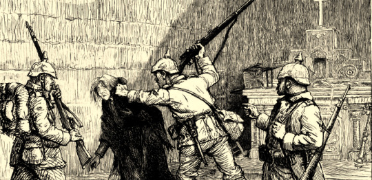
Pierre-Georges Jeanniot – X – In The Church
These etchings, show a detailed situation of an atrocity, where as Goya’s works are almost surreal illustrations of war-craft. They were found and restored by Mark Hill who has had a limited edition printed of them. This posthumous edition was officially published on 4th August 2014, the centenary of the invasion of Belgium and the start of World War One.
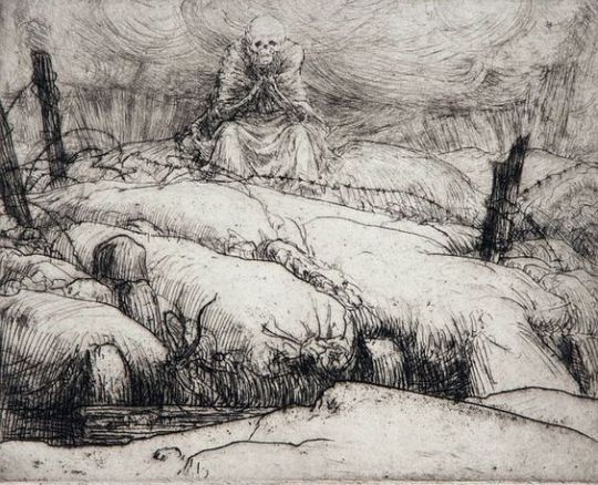
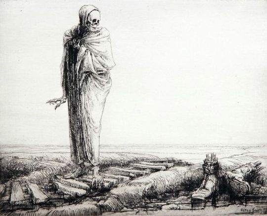
Percy Smith – Death Waits
The last printmaker I want to look at is Percy Delf Smith. Smith made two series of war prints. ‘Drypoints of the War’ and ‘Dance of Death’ – both series of prints documenting life on the Western Front of the First World War.
In 1916 he joined the Royal Marine Artillery and arrived at the Somme in October. He served as a gunner until 1919 in France and Belgium. Rather like Jeanniot, Smith witnessed the Germans destruction of Belgium.
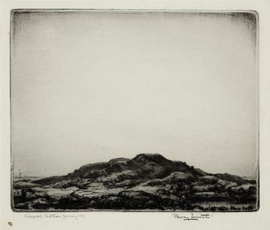
At the start of 1917 Percy Smith was located in Thiepval, Belgium where Lutyens’ Memorial to the Missing of the Somme now stands. When the Germans entered Thiepval on 26 September 1914, the village and its château were utterly destroyed. Smith’s diary entries describe the desolate landscape:
Thurs. 4th (January 1917) ‘Trenching’ as usual. No shelling. Went over Thiepval hill. Thiepval simply a heap of rubbish decorated by gaunt tree trunks. Must sketch it. Finished reading Doyle’s ‘The White Company’ war as it was and read about while the guns cracked’.
Percy Smith – Thiepval Chateau, 1917 – from Sixteen Drypoints of War
Smith was covert about his drawings of time at the front line and was arrested twice of being a spy. He smuggled etching plates in books and magazines both too the front line and home. He printed ‘Drypoints of the War’ while on leave in 1917.
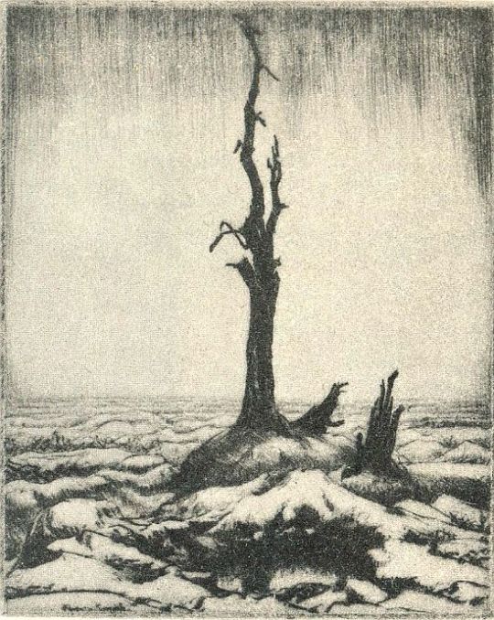
Percy Smith – Thiepval, from Sixteen Drypoints of War, 1917
The ‘Drypoints of War’ are very matter of fact, they are images of the landscape and its desolation that was all around, similar in subject matter to the works of Paul Nash. Destruction with abstraction.
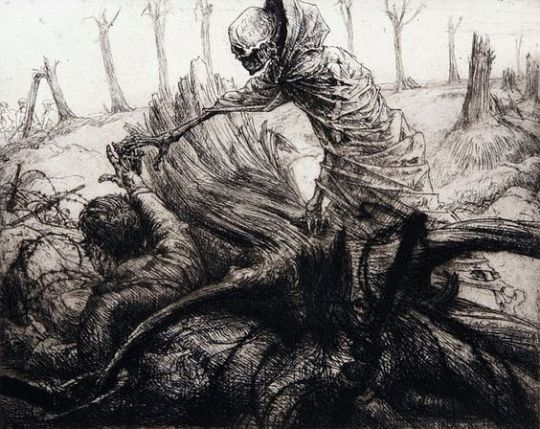
The second series of prints ‘Dance of Death’ was less of a witnessing of war and more of an attack of it. With death always watching, waiting or lingering with the solders, they were produced after the war in 1919.
Percy Smith – The Dance of Death No. 1: Death forbids
In ‘Death forbids’, a hand of the solder that is pinned down by a fallen tree and in the barbed wire reaches up, trying to get the attention of the medics and stretcher bearers to the top left of the picture. I am sure the skeletal death is meant to look harrowing and like he is suppressing the man, but to me it looks affectionate and like death is helping the man surrender to the fate.
Percy Smith – The Dance of Death No. 3: Death awed.
In ‘Death awed’ we are presented with a death, shocked and impressed by the might of war, the carnage and ballistics of force that don’t even leave a body but two boots with broken bones in the wet earth.