Everyman’s Vanguard

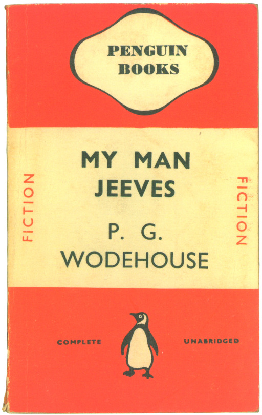
There are many examples where book design is uniform, most famously Penguin Book’s ‘Stripe’ design by Edward Young and perfected by Jan Tschichold in 1935. Bold and colourful they were enormously successful and cheap to make being paperback. The colours they used to coordinate the books also made selecting a book a quicker process due to your preference, Crime-Green. Fiction-Orange. Cerise-Travel. Blue-Biographies. Red-Drama.

image

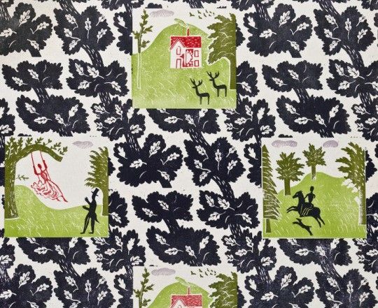
There where many other sets imitating Penguin’s success, most of them short lived. Below is a range of book jackets that Edward Bawden and Eric Ravilious had been commissioned to do, but this time in hardback.


Edward Bawden & The Vanguard Library


image

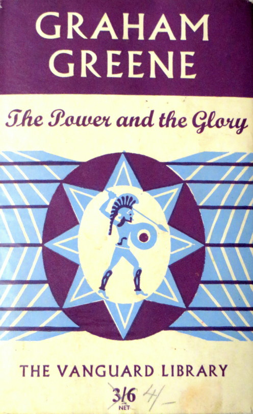
The Vanguard Library (not to be confused with Vanguard Books, a US series from the 1930s) was a joint venture published by Chatto & Windus in association with William Heinemann Ltd. The joint venture was probably to combine the backlist of titles under copyright to both of these smaller publishers. The series was in print for only a few years in the early 1950s. The series consisted of back catalog titles, mostly modern fiction, a smattering of more and less serious fiction. 

image

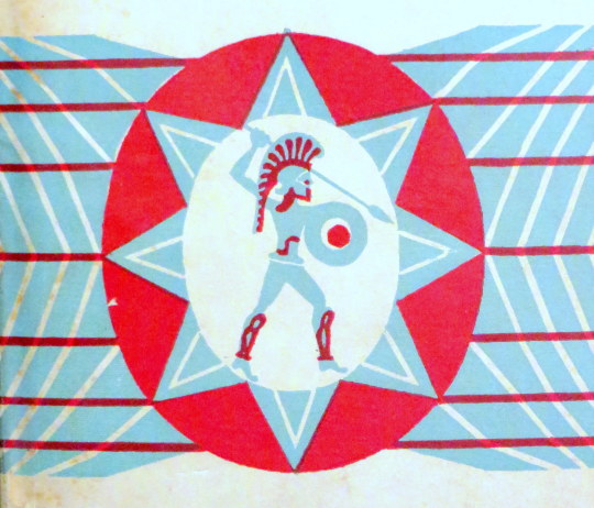
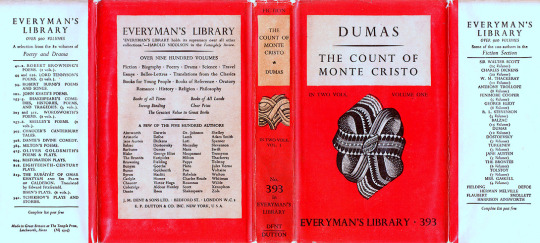
The dust jacket of the Vanguard Library books originally featured a standard design by Edward Bawden of a Trojan warrior on a geometric background. 

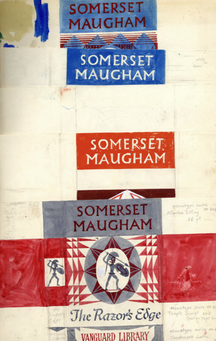
 A page from Bawden’s Sketchbooks showing the designs being worked upon.

Although the series would go on with various designs and dust jackets, it is estimated that only twelve books with Bawden’s covers where issued, all in 1952 with his Trojan design but with colour variations.

image

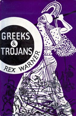
The inspiration for the Trojan design is likely to have come from another book illustration commission Bawden had completed the year before, illustrating Rex Warner’s ‘Greeks & Trojans’. 


Ravilious & Everyman’s Library 
The series Eric Ravilious was commissioned to re-design was to run far longer than Bawden’s. J. M. Dent and Company began to publish the ‘Everyman’s Library’ series in 1906. It was conceived in 1905 by London publisher Joseph Malaby Dent, whose goal was to create a 1,000 volume library of world literature that was affordable for, and that appealed to, every kind of person, from students to the working classes to the cultural elite.

image

 An Everyman’s Library book with Ravilious’s designs to the cover 1935-45

After running for thirty years and likely with the new release of Penguin paperback books, the series went under a redesign in 1935. Eric Ravilious was asked to redesign the covers, end-papers and make graphic devices for each subject that would also be colour coordinated with the dust jackets, like penguin books were. Both publishers where aiming for the same thing, cheap books for the people. 

image

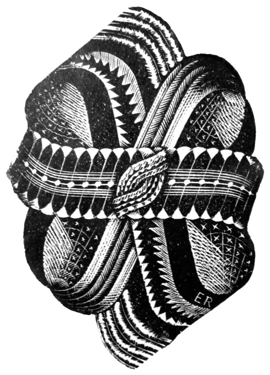
Above is the decorative knot used on the front covers of the books from 1935-1945. Signed ER in the corner. The carving on the top and bottom spikes seemed to lack some detail that would be expected from his normal standard. In two letters to his lover Helen Binyon, Ravilious writes about how the work is rushed and from all accounts takes three months from January to March:

3rd February 1935
…Dents have sent along a proof of the new book which is bad but not very bad, and I am hoping at the eleventh hour to do part of the job again. Unfortunately there is a hurry for it. 

21st March 1935

…Everyman is out at last, and seeing six new volumes this morning they looked alright – the one blue Chesterton even rather good. 

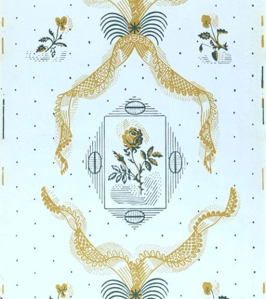
Below are a selection of some of the dust-jacket colours and devices used for the different subjects and featured on the title page of the book. Perplexingly the designs are not featured on the book spines: 

image

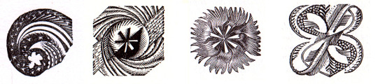
 Left to right is Oratory (Red), Reference (Pink), Romance (Orange), Poetry & Drama (Green).

image

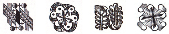
 Left to right: Science (Grey Blue), Young People (Bright Blue) Travel and Topography (Green), Essays & Bells-Lettres

Looking at the devices under magnification, there is every evidence that the engravings were made in a considerable hurry with engraved lines carrying on where they should have stopped and inadequate clearing of background details, none the less they represent a considerable imaginative achievement and are most effective. 

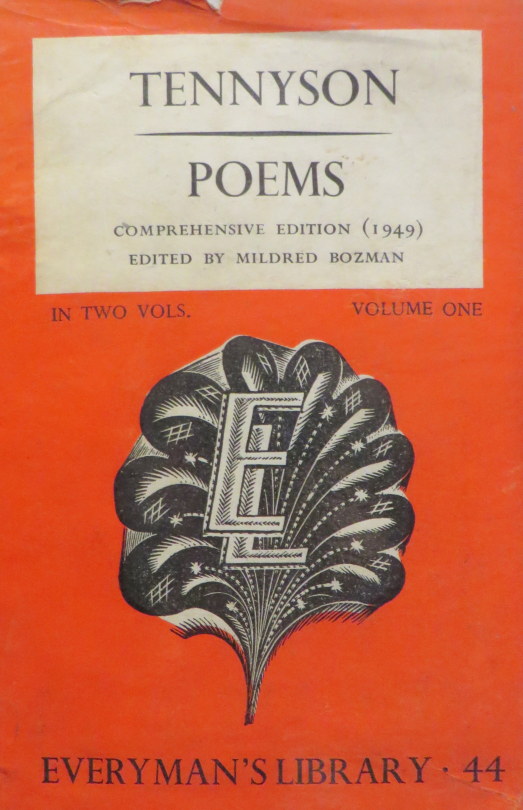
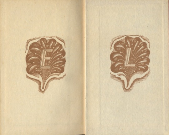
From 1945, the abstract knot was replaced on some volumes with a clam-shell like design overlaid with an ‘EL’, and from 1951 it was used on most jackets until the design was replaced in 1953.

image
image

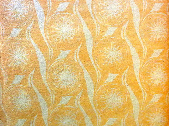
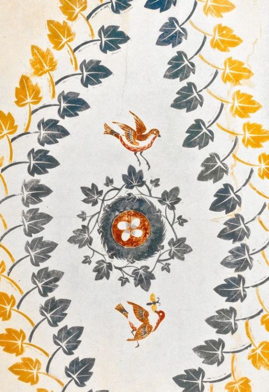
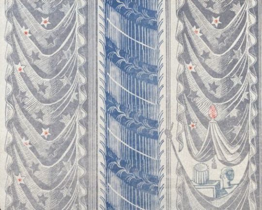
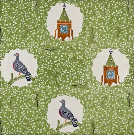
 A section of the end paper, with a star like repeat design by Ravilious for the series, it was used from 1935-1953.

image

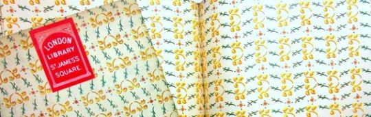
 An alternative end-paper that was briefly used in 1935 but suspended for the star patterned paper above.

Vanguard Library http://seriesofseries.owu.edu/vanguard-library/
Ravilious – Engravings – Jeremy Greenwood
Everyman’s Library: The Ravilious Era http://www.everymanslibrarycollecting.com/ravilious.html

The wallpaper designs of Edward Bawden.

Mainstream British wallpaper design regressed dramatically between the wars, bogged down in a sea of ‘porridge’. But the artist Edward Bawden made a valiant attempt to redeem the medium. ‡

image

 Roy Hammans photo of Edward Bawden’s Saffron Walden House for the Fry Gallery.

Bawden, studied at the Cambridge School of Art (1919–1921), then moved on to the Royal College of Art. It was here where he studied alongside Eric Ravilious and both were tutored by Paul Nash.

Nash’s connections to Harold Curwen meant that in 1928 when the Curwen Press published ‘A Specimen Book of Curwen Pattern Papers’ — (It was a book of patterned papers for bookbinding and shop wrap and boxes)… Bawden’s work was included alongside Ravilious, Enid Marx, Paul Nash and Althea Willoughby.

image

 A Sample book covered in the Pattern Papers with ‘A Specimen Book of Curwen Pattern Papers’ behind, 1928

After his time at the RCA Bawden started to experiment with wallpaper designs. In his book ‘Edward Bawden and His Circle’ Malcolm Yorke describes the lino process:

After drawing the design in a soft pencil on thin paper it could be laid face down on a whitened sheet of lino and the design transferred by rubbing with a spoon. Cutting with a Japanese knife then began from the middle towards the edges, the knife becoming a drawing instrument as the hand became more skilled. Compared to cutting end-grain boxwood for wood-engraving, warmed lino sliced like butter.

image

 Edward Bawden – Bird Nest and Ivy Leaves, 1924

The first known work was never produced industrially, and exists only as a trial print called ‘Bird Nest and Ivy Leaves’ from 1924. Other designs by Bawden followed:

His approach to wallpaper was very much that of a graphic artist. Initially he used lino-printing to produce his own designs, but from 1926 the Curwen Press produced his patterns in the form of colour lithographs.

 Edward Bawden – Ashlar, 1930

It was these designs from 1926 – 1933 that were produced in lithograph by the Curwen Press. Unlike most modern wallpapers, printed on long rolls of paper, the Curwen Press printed these wallpapers as sheets, in sizes up to about 34 x 22 ins. Very few of these sheets survive unused. The reason for printing in sheet form was that the lithographic machines could not support the long rolls of paper. The traditional way of printing wallpapers being to screen print the design or print direct onto the blank role from the woodblock.

image

 Edward Bawden – Sahara, 1928

The wallpapers printed by the Curwen Press were known as the Plaistow Wallpapers, as the press was based in Plaistow Place, London. With them being printed, “Paul Nash introduced Bawden to Elspeth Little and her ‘Modern Textiles’ shop in Beauchamp Place for a sales outlet, but his royalties over six years and sales of 507 sheets came to a miserly £2. 0s. Lod.” Soon after other shops started to sell them, including: Heals, Fortnum & Mason and Gordon Russell’s furniture shop.

image

 Plaistow Wallpaper Advert.

Façade sold a total of 3,899 sheets. While ‘Façade’ might be thought just a neutral title, is it possible that it could have been in the artist’s mind because of the popularity around that time of William Walton’s musical suites of that name, based on Edith Sitwell’s poems. Frederick Ashton’s ballet of Faade was premiered in 1931.

image

 Edward Bawden – Façade, 1933

Bawden’s approach of comic and country images was a shift in British wallpaper design. Some of them form geometric beautiful patterns and others make your walls into giant linocut pictures as you can see from Bawden’s own home.

image

 Edward Bawden – Rose & Lace, 1938

In the 1930’s Bawden was given the chance to print wallpapers by the Roll and not sheets! This range was called the ‘Bardfield Wallpapers’, after the Great Bardfield artist community, these wallpapers where a range by Cole and Son, with designs by Bawden and John Aldridge. The designs were originally developed in 1939, but commercial production was interrupted by the war. The early versions were printed direct from the wood and lino blocks. Some of the designs were exhibited that year at The Little Gallery off Sloane Square in London, but they were not produced commercially until 1946, after the War.

image

 Edward Bawden – Knole Park, 1929

Although the designs were popular, and some were featured in the Festival of Britain in 1951, they were produced in limited quantities to order, and were relatively expensive.

Bawden’s best-known design, Woodpigeon (1927), featured vignettes of birds and church spires emerging through windows in a “wallpaper” of leafy trees. Similarly, in Knole Park (1929) with primitive rural vignettes. These were initially lino-printed [sic] but the blocks were acquired by Cole & Sons in 1946. † 

image

 Edward Bawden – Wood Pigeon, 1927

List of Edward Bawden Wallpapers by Year:

1924 — Bird Nest and Ivy Leaves – Curwen Press
1926 –  Fruit and Napkin – Curwen Press
1927  – Deer and Leaf – Curwen Press
1927  – Pigeon and Clock Tower – Curwen Press
1927  – Tree and Cow – Curwen Press
1928  – Sahara  – Curwen Press
1928  – Mermaid (and Whale) – Curwen Press
1928 – Waves – Curwen Press
1929  – Knole Park Design – Curwen Press
1929  – Lagoon – Curwen Press
1929  – Riviera – Curwen Press
1929 – Conservatory  – Curwen Press
1930 – Waves and Fish – Curwen Press
1930 – Leaf or Seaweed – Curwen Press
1933 – Ashlar- Plaistow Wallpapers
1933 – Node – Plaistow Wallpapers
1933 Façade – Plaistow Wallpapers
1933 – Salver – Plaistow Wallpapers
1938  – Flute – Bardfield Wallpapers
1938  – Waffle / Grid / Cross – Bardfield Wallpapers
1938  – Grid & Cross  – Bardfield Wallpapers
1938 – Stone Ivy – Bardfield Wallpapers
1938  – Grass & Swan – Bardfield Wallpapers
1938  – Rose & Lace – Bardfield Wallpapers
1938  –  Ogee (Gothic)  – Bardfield Wallpapers
1938 Trellis (Periwinkle) – Bardfield Wallpapers
1946  – Quatrefoil  – Cole and Son
1950’s  – Swan & Grass
1956 – Abstract Linear Design – for Sandersons

Malcolm Yorke – Edward Bawden and his Circle  p.54
Lesley Jackson – Twentieth Century Pattern Design  p.74