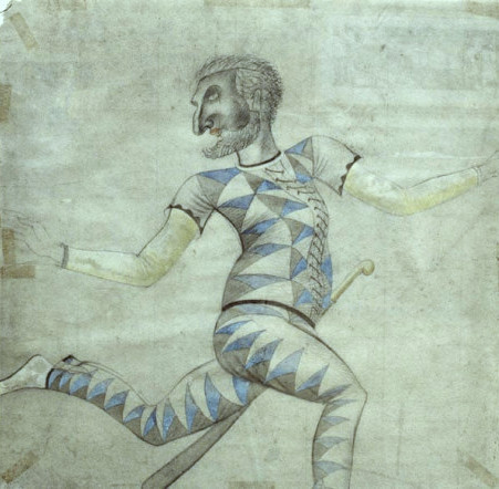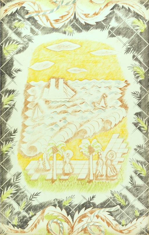
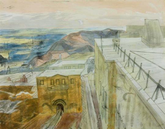
Edward Bawden – Lithograph for Travellers’ Verse, 1946.
This post is the story of Edward Bawden’s war work in the War Artists Advisory Committee (WAAC) as an artist and how he used the wartime drawings and paintings in illustration work, like the The Puffin Picture Book ‘The Arabs’ but other post-war commissions.
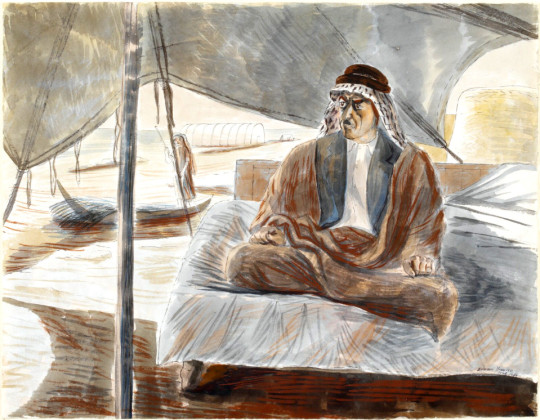
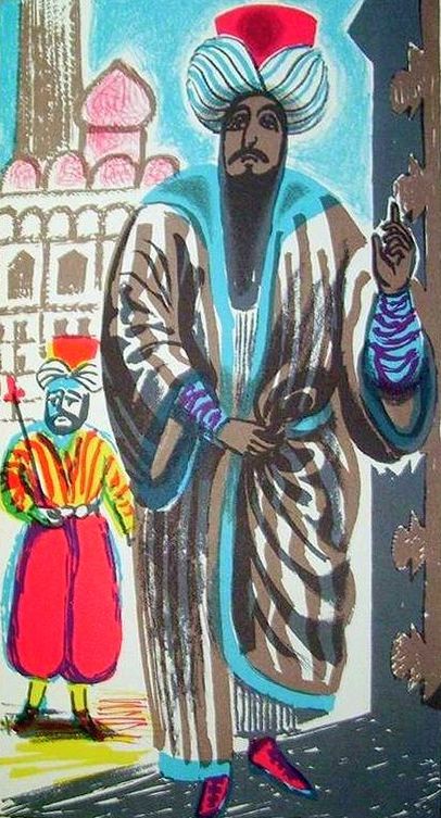
Edward Bawden – Shaikh Sharif al-Hafi, 1944.
When the Second World War broke out in 1939, Edward Bawden had already established a reputation as an illustrator, a comic draughtsman, a designer of typographical ornaments and patterns, a print-maker and a painter of landscapes in water-colour.
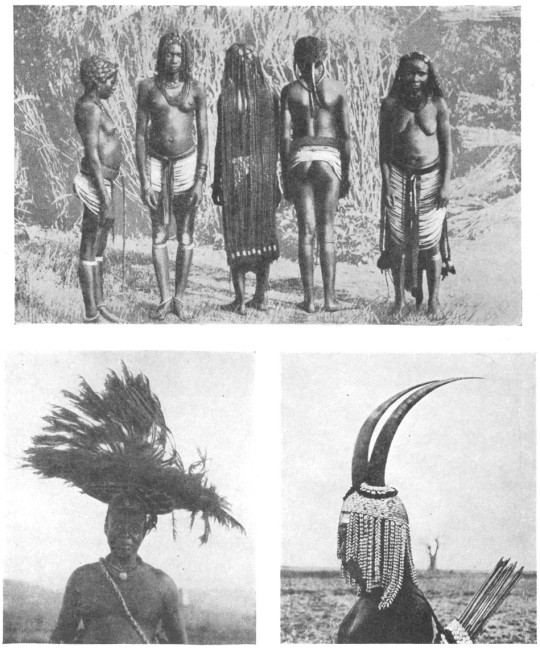
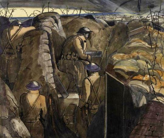
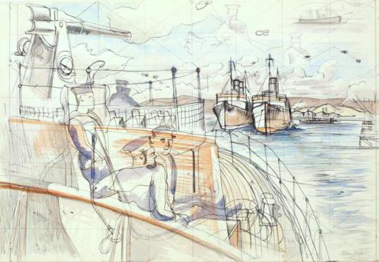
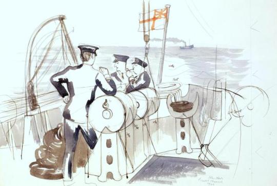
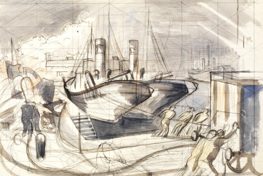
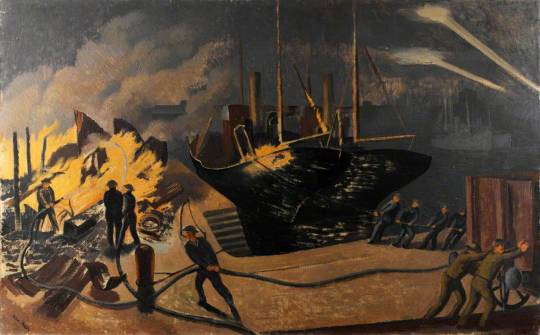
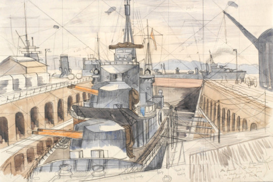
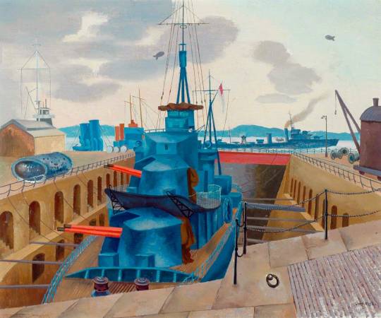
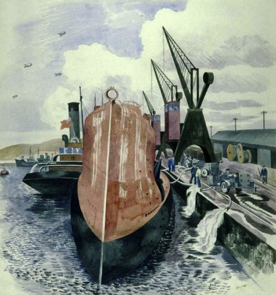
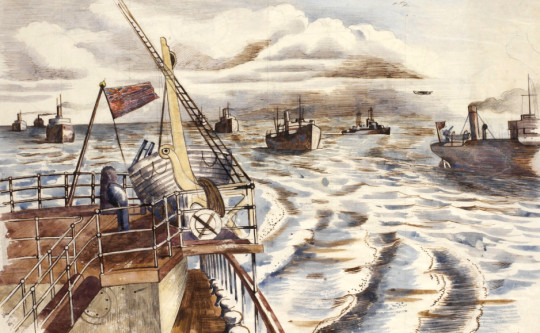
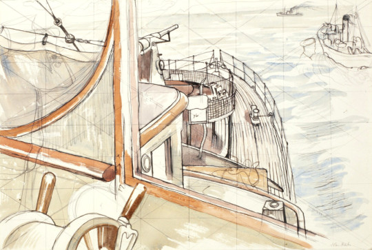
Bawden was appointed one of the first Official War Artists and was sent to join the British Army in France with Barnett Freedman and Edward Ardizzone. After being evacuated via Dunkirk, he was sent to the Middle East where he spent two years painting and drawing in Egypt, Libya, Sudan, Ethiopia, Eritrea, Syria, Iraq and Saudi Arabia. During his return journey to England, his ship was torpedoed; he then spent two months in a French internment camp before being released, and arrived in England safely, only to return to the Middle East, journeying around Cairo, Baghdad, Jeddah, Teheran, Ur of the Chaldees; he was drawing all the time, finally ending his travels in Rome. †
Edward Bawden – Shaikh Raisan al-Gassid, 1944.
The WAAC recommended in December 1939 that Bawden should be appointed as an official Air Ministry artist. In May 1940, after his return from France with the withdrawal from Dunkirk. Bawden expressed his regret at having had to leave, and Dickey reported him to be “extremely anxious to be sent out again to another scene of activity”. He departed for the Middle East in July. ♦
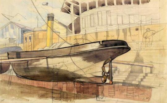
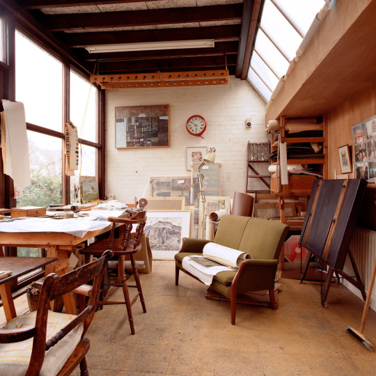
After the war Bawden stayed in Cheltenham while repairs and work were made to his home, Brick House; It was the only building in Great Bardfield to suffer from bomb damage, but Bawden also used the opportunity to make alterations and build a studio to the back of the house. The house was used and abused by the Home Guard during the war.
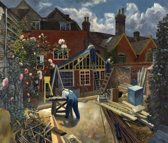
John Aldridge – Builders at Work, Brick House, Great Bardfield, 1946.
Bawden’s time as a war artist had given him the advantage of travel but also an abundance of sketch books and work that were still fresh in his mind in 1945. So it was in November of that year that Noel Carrington, the head of Puffin Books at Penguin was writing to his Allen Lane, his boss about Bawden and the planned book ‘The Arabs’:
12th November 1945
I have arranged for Bawden to meet you here on Wednesday afternoon at three o’clock, so you can discuss the alternative approaches to The Arabs book with him. As an illustrator, one method will suit him as well as another. ♥
From this meeting payments were settled and Bawden took on the job of illustrating the book. The text for the book was by Robert Bertram Serjeant, Nicknamed ‘Bob’. Serjeant was a Scottish scholar, traveller, and one of the leading Arabists of his generation.
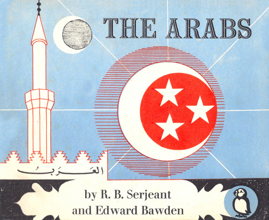
Edward Bawden – Front cover design for The Arabs, 1947.
Bawden to Carrington, 24 July 1946:
“The book is getting on slowly – I work upon the lithographs for a few hours every day, but because of the fine detail I find the work rather a strain on the eyes. In all I have finished one-fifth of the drawings but these include some of the most elaborate ones such as the two double spreads.’ ♥
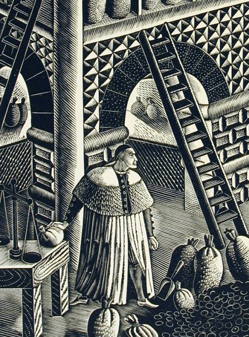
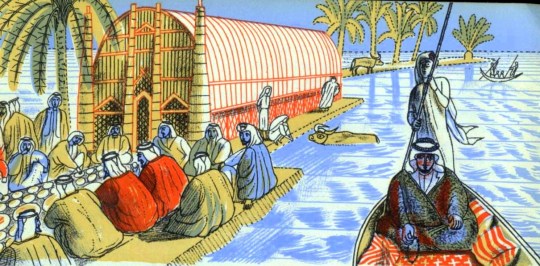
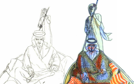
As you can see in the image below, Bawden recycled some of his paintings from the war and used them in the making of the book. The man to the right – on the boat is ‘Shaikh Sharif al-Hafi’, pictured at the top of this post.
Edward Bawden – Detail from ‘The Arabs’, p18, 1947.
Below I have edited both images side-by-side and you can see how the line drawing has been simplified for the lithographic process.
Although ‘The Arabs’ became a factual book rather than the ‘story’ title Carrington intended, it is one of the highlights of the series. Bawden’s lithographs are as good as any he completed and the two full double page spreads are superb examples of his mastery of line; Curwen made a good job of the printing. ♥
Edward Bawden – Detail from The Arabs, p30, 1947
The text of ‘The Arabs’ doesn’t shy away from the Crusades and they are also illustrated as in the image above and below. The historical detail also takes in the history of the Arabic nations, how important they were during the silk road trade routes and how they declined after the European travellers sailed by boat beyond the Cape of Good Hope to China and India.
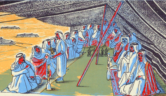
Edward Bawden – Double page spread from The Arabs, p30-31, 1947
Again, below and side by side are both the lithographed policeman from ‘The Arabs’ and the portrait Bawden painted during his war service. It really demonstrates the cheerful nature of his line drawings. It also shows how he used paintings and sketches to make the book as accurate as it could be.
Edward Bawden – Baghdad: An Illustration of Iraqi Policemen’s Uniforms, 1943
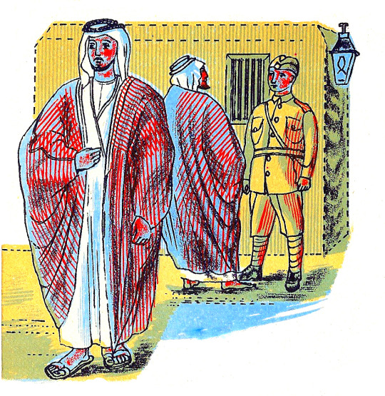
Edward Bawden – Detail from ‘The Arabs’, p6, 1947
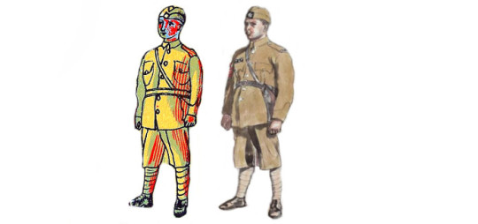
A Digital Edit of the book ‘The Arabs’ & Bawden’s War Portrait of the Policeman
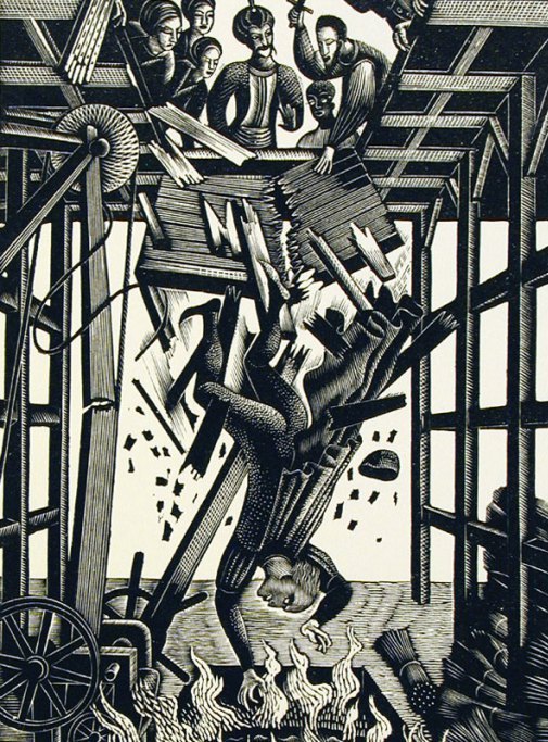
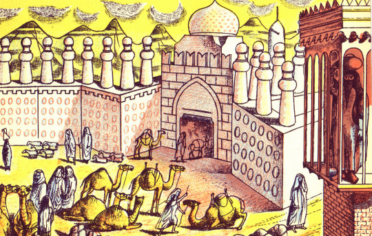
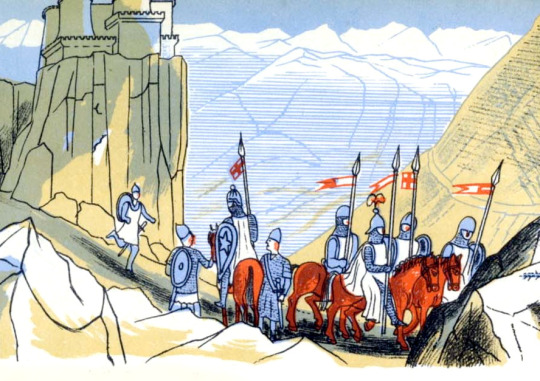
The most beautiful of the two double-page illustrations is the Battle of al-Qādisiyyah, 636AD, when the Rashidun Caliphate overthrew the Sasanian Empire.
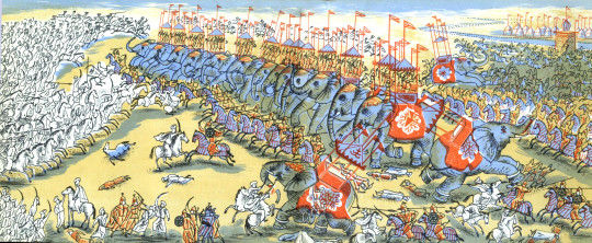
Edward Bawden – Double Page Spread from ‘The Arabs’ p26-27, 1947
The Sassanid Persian army, about 60,000 strong, fell into three main categories, infantry, heavy cavalry, and the Elephant corps. The Elephant corps was also known as the Indian corps, for the elephants were trained and brought from Persian provinces in India. The Arabic side is said to have been 36,000 strong, just over half, and yet they won.
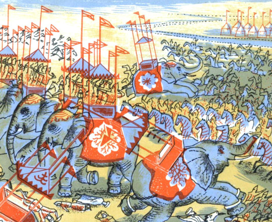
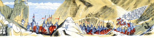
Edward Bawden – Double Page Spread from ‘The Arabs’ p27, 1947
Interestingly the book was never reprinted, and indeed could have been withdrawn and pulped! On the last pages of The Arabs, Bawden had illustrated ‘Muhammad mounted on Buraq’ ascending to the Seventh Heaven’. Obviously no one Bawden, Carrington or Lane had realised the grave offence that the depiction of the Prophet would cause.
The Cairo branch of W.H. Smith, which had ordered 5,000 copies, wrote requesting: ‘would there be any way of painting out the rider’.
Complaints flooded in and the Commonwealth Relations Office wrote to Penguin: The Puffin Picture Book No 61, entitled The Arabs, has on the last page a pictorial representation of the Prophet Mohammed and there have been in the Pakistan Press various letters protesting against this illustration.
As you no doubt know, any representation of the Prophet gives grave offence to Muslim sentiment. Although from a non-Muslim point of view such representations may appear harmless, it is none the less true that Muslim objections to representation of the Prophet in any form are based on sincere conviction.
You will, I am sure, appreciate that in inviting your attention to this matter we do not wish in any way to appear to be interfering with editorial responsibility. But we felt it right to draw your attention to the ill effects which an otherwise excellent little book may have in the Muslim world. Perhaps you would be good enough to bear this in mind should a reprint be under consideration?
One can only imagine the colour of the air when Allen Lane realised that his flagship Puffin was fatally flawed. Understandably The Arabs was never reprinted. ♥
I must add that after mentioning I was writing this post to a friend, they convinced me not to include the image of Mohammed in the blog too. If you wish to see the image you will just have to order a copy of the book to find out at your own offence.
Edward Bawden – Detail from ‘The Arabs’, p15, 1947
The painting below is of Mohammed Bin Abdullah El Atshan, King Ibn Saud’s representative at Rumaliya. This painting is a copy made in 1966 of a painting from 1943 made at the request of a British Petroleum executive when Bawden was painting a mural at the British Petroleum restaurant. The wall of petrol cans were given the BP logo at the executive’s suggestion.
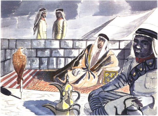
Edward Bawden – Mohammed Bin Abdullah El Atshan, 1966
What is more curious to me about the above retrospective painting is that parts of it turn up twice in the Puffin ‘Arabs’ book. The image below in colour has the hawk, coffee pots, the boy with water-pot and two men standing behind the wall. The black and white illustration below has the drawing of the sitter.
Edward Bawden – Detail from ‘The Arabs’, p7, 1947
Edward Bawden – Detail from ‘The Arabs’, p25, 1947
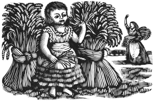
Throughout 1946 Bawden was working on the illustrations for ‘The Arabs’ book, but it wasn’t published until 1947. Also in 1946 Bawden would illustrate a collection of poetry chosen by Mary Gwyneth Lloyd Thomas in a book called ‘Travellers’ Verse’ and he would be able to re-encounter his work of the middle east with his illustrations. These projects started to merge as parts of illustrations from his War Time Sketchbooks would end up in both.
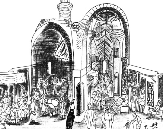
Edward Bawden – Detail from ‘The Arabs’, p12-13, 1947
Above is an illustration of a Market in Cairo from ‘The Arabs’ and below is an illustration of a market from ‘Travellers’ Verse’, albeit a more fantastical version. Because ‘The Arabs’ was to be accurate the illustrations are more or less from his war paintings, but the ‘Travellers’ Verse’ book he was able to have more fun with the illustrations and be more fanciful.
Edward Bawden – Detail from ‘Travellers’ Verse’, 1946
In the top right corner of the image above is the Mohammed Ali Mosque in Cairo in a simple line drawing from 1946. Below you can see it from one of Bawden’s paintings in 1941.
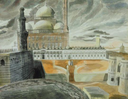
Edward Bawden – Cairo, the Citadel: Mohammed Ali Mosque, 1941
Bawden also illustrated the mosque, as below from the other side of the city
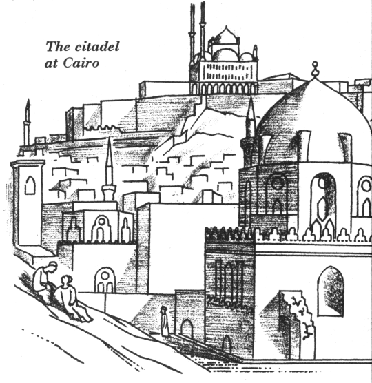
Edward Bawden – Detail from ‘The Arabs’, p23, 1947.
During his travels Bawden was able to stay in the centre of Cairo in the Citadel on his stay as he mentions:
Public relations could deal with journalists but they didn’t know how to deal with artists. They were puzzled and Major Asterly said ‘Why not go and stay in the citadel’, which I did and I found delightful. I made one or two drawings of the Mosque of Mohammed Ali. ♠
Edward Bawden – Cairo, the Citadel: On the Roof of the Officers’ Mess, 1941
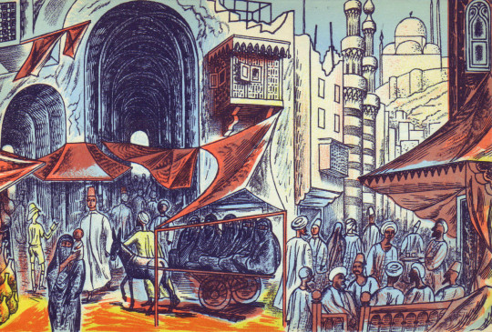
In the ‘Travellers’ Verse’ illustrations we see the city life and a fantasy of life in the countryside, with Mosque towers and street cafes to the desert landscape and camp fires.
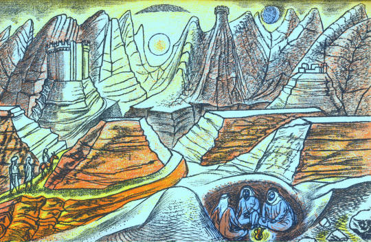
Edward Bawden – Detail from ‘Travellers’ Verse’, 1946
Edward Bawden – Detail from ‘Travellers’ Verse’, 1946
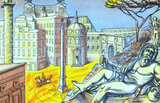
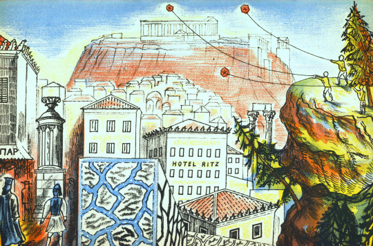
In fact Bawden would be able to use the war drawings of Greece and Rome for the other plates in the book. It seems that after Rome, Athens was a disappointment as Bawden mentions:
When I returned from Florence to Rome it was suggested that I go to Greece, so I went by air, it was the first time I had seen Greece I had been to Rome several times but I was very disappointing on the sight of Athens, it didn’t have the grandeur I was expecting. ♠
Edward Bawden – Detail from ‘Travellers’ Verse’, 1946
In ‘Travellers’ Verse’ the illustration of a huddled mass of bodies in a boat on a Paul Nash sea has none of the cheer the other images have. The poem being illustrated is ‘Don Juan and his tutor Pedrillo are shipwrecked.’ Bawden himself was shipwrecked during the war off the coast of West Africa on a ship from Cape Town to London. It is another translation of his wartime experiences.
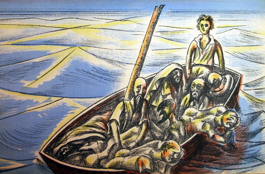
Edward Bawden – Detail from ‘Travellers’ Verse’, 1946
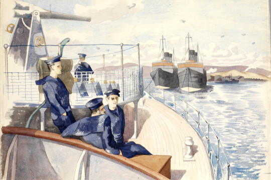
The Laconia was nearing the Equator in temperatures of 110 degrees Fahrenheit when, at 8pm on the evening of 12th September, 1942, it was hit twice below water level by torpedoes from the German U-boat U156 under the command of Werner Hartenstein.
Bawden with typical sangfroid resigned himself to death by drowning: ‘so I thought I’d wander round a bit and have a look. I went down to my cabin – I’d bought my wife a watch and thought I might as well go down with the watch as not.’ Then, ‘on returning from my cabin I saw ropes hanging down on the side where life-boats had been lowered and standing by one of these I was joined by a major. ‘After you, Sir’ I said. As he descended there was a splash. Sliding down the next ropes I found myself being gripped and guided into a boat. A few minutes later all the boats pulled away to a safe distance and there we sat waiting, still and silent and tense for the sound of the ship’s final end. ‡
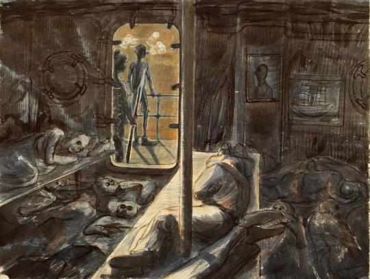
Edward Bawden – Rescued at sea by the French warship Gloire, 1943.
The survivors were rescued by a French ship who were unkind to them and then taken to an internment camp in Casablanca where they stayed for two and a half months until rescued, this time by the Americans, who were kind. As a British citizen he was shipped to Norfolk, Virginia, USA before being shipped back to London.
Edward Bawden – Illustration from Vathek, 1958.
Many years after the war Bawden illustrated Beckford’s ‘Vathek, an Arabian Tale’ for the Folio Society in 1958, I find these illustrations rather weak personally, I can’t work out if he wanted to change to a looser style of lithographic illustration or if they were dashed out for the money, while technically good with colour layering, the end result in my view is poor. I rather suspect the commission came in conjunction with a larger one – ‘The Histories of Herodotus of Halicarnassus’ for the Limited Editions Club, a company like the Folio Society, but American; For them Bawden provided over 100 illustrations in a two volume book set.
He would illustrate Johnson’s ‘Rasselas’ in 1975 for the Folio Society with happier outcomes compared to ‘Vathek’, though not totally Arabian, it is a fantasy of travel.
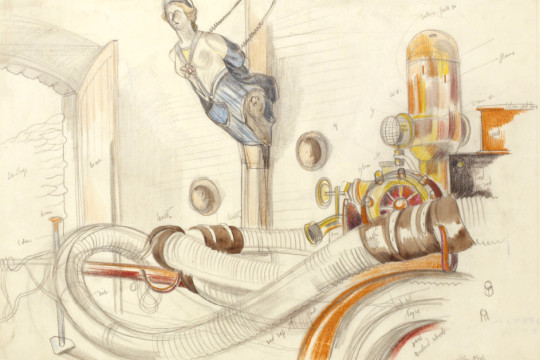
To conclude the various Arabic styles of Bawden we should end with the giant mural for BP’s restaurant at Britannic House. The best of Bawden’s murals, using Islamic designs and architectural drawings to bold outcomes, it uses blocks of colour and pattern design much like one of his linocuts.
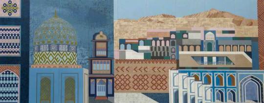
Edward Bawden – Fantasy on Islamic Architecture (Left Panel), 1966
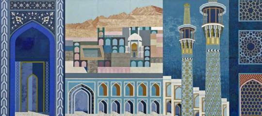
Edward Bawden – Fantasy on Islamic Architecture (Right Panel), 1966
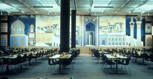
A view of the Dining Room in Britannic House.
† Ruari McLean , Edward Bawden War Artist & His Letters, 1989
‡ Malcolm Yorke – Edward Bawden and His Circle, 2015.
♠ 4622 Edward Bawden Audio Tape, IWM, 1980.
♣ R.B. Serjeant and Bawden Edward – The Arabs, 1947.
♥ Joe Pearson – Drawn Direct to the Plate, 2010
♦ Edward Bawden 1939-1944, ART/WA2/03/044/1