It is always interesting looking back at an artists work in retrospective books, the early works and the friends around them to how they sailed on into life and the work progressed. This post is about the work of John Piper and how I look at his pictures.
Piper’s art education would have been set in a landscape were the tectonic plates of traditional art education of the last 200 years met with post-impressionism and modernism from the exhibitions in 1910 and 1912 by Roger Fry and other movements like Futurism (1912), Vorticism (1914), Cubism (1910-late 20s) and Surrealism (1921-50s).
But these shocks would have been picked up and absorbed by the young artists to come and change British art in the twentieth century, people that John Piper surrounded himself whom were both artists and collectors; Henry Moore, Cedric Morris, Ben Nicholson and Barbara Hepworth where in the Seven and Five Society with Piper (he was the secretary), but also collectors and writers like Jim Ede, John Betjeman, Osbert Lancaster and Benjamin Britten and John Rothenstein.
John Piper – Beach at Donegal, 1937
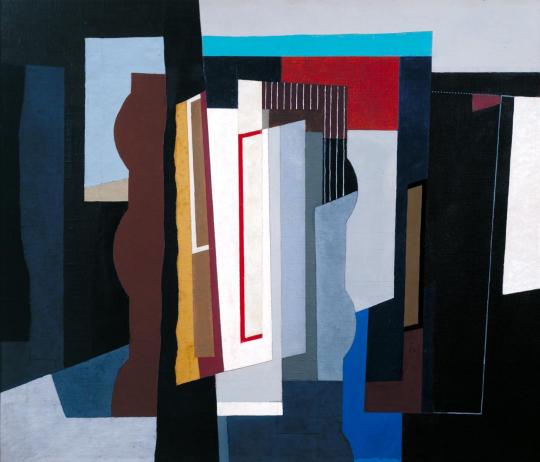
In the 1930s Piper was mostly active in two areas of art, collage and abstraction. The Seven and Five Society would give him a platform to showcase these works alongside other artists investigating both modernism in abstraction but form and function:
The Seven and Five Society was an art group of seven painters and five sculptors created in 1919 and based in London. The group was originally intended to encompass traditional, conservative artistic sensibilities.
However, in 1924 Ben Nicholson, one of the pioneers of abstract art in Britain, joined the Seven and Five. He was followed by other modernists including Barbara Hepworth, Henry Moore and later, John Piper. They effectively hijacked the group, expelling the non-modernists. In 1935 they renamed it the Seven and Five Abstract
Group and held the first all abstract exhibition in Britain at the Zwemmer Gallery in London.
John Piper – Knowlton, Dorset, 1936
In these blocks of colour, objects could be simplified to their basic
form. A really good example of this would be Piper’s collage of
Knowlton, Dorset. With almost no ink lines it is just colour and
form. From these types of collage you get more ink washes and
drawings over the top.
John Piper – Newhaven Harbour and Cliff, Sussex, 1936
Then when it came to returning to painting I always think that this is how Piper approached subjects, first with the base of colours and form, then the black line drawing, as if it were a trade illustration, much in the same way Raoul Dufy paints.
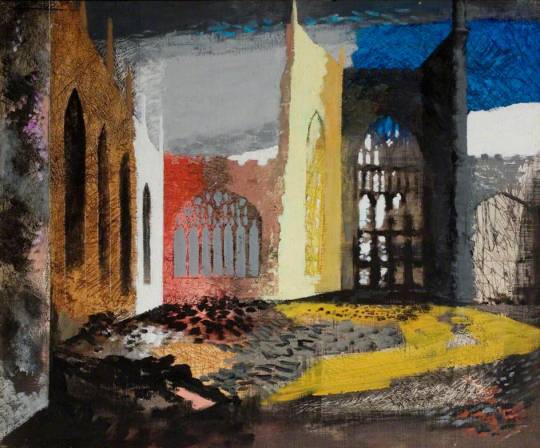
John Piper – Interior of Coventry Cathedral, 15 November 1940
It’s a technique that Piper mastered when painting in the ruins of Coventry Cathedral. – the colour in blocks with black paint for texture. It would also be the way he approached printmaking and lithography.
He also used wax resists in his paintings to keep some of the bold colours and put chalk and pastels over the paintwork too. In time he would work out the form of a painting and the resist rubber gum would leave white lines over his many washes of colour.
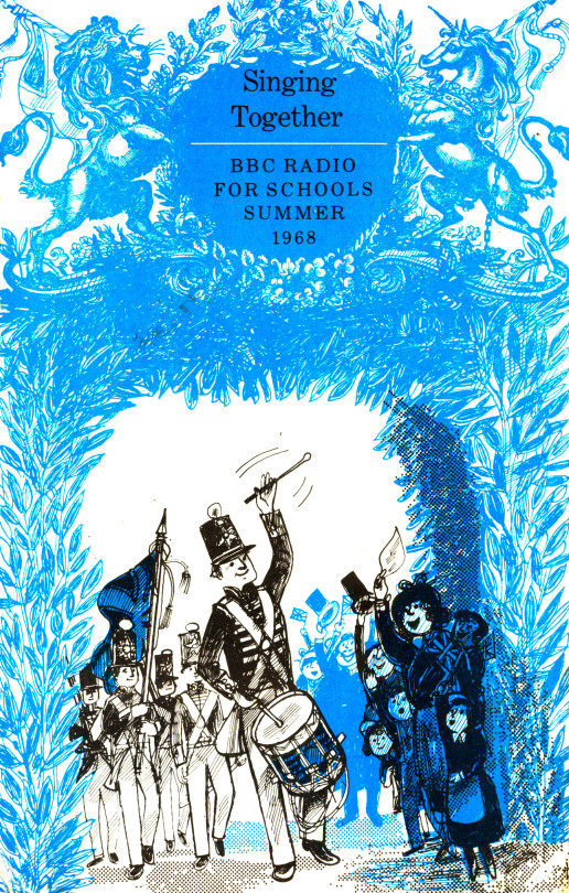
The BBC Radio for Schools books were a wonder for illustrators and young artists, a chance to showcase a style but also work with a brief given by the BBC based on whatever the topic was about. In the days when Radio was a more dominant media than television the BBC had opportunities for the public and schools to buy printed booklets on the shows with more information and sometimes pictures too.
A music series offering children opportunities to listen to music and sing along, with creative suggestions and games to develop music appreciation and skills.
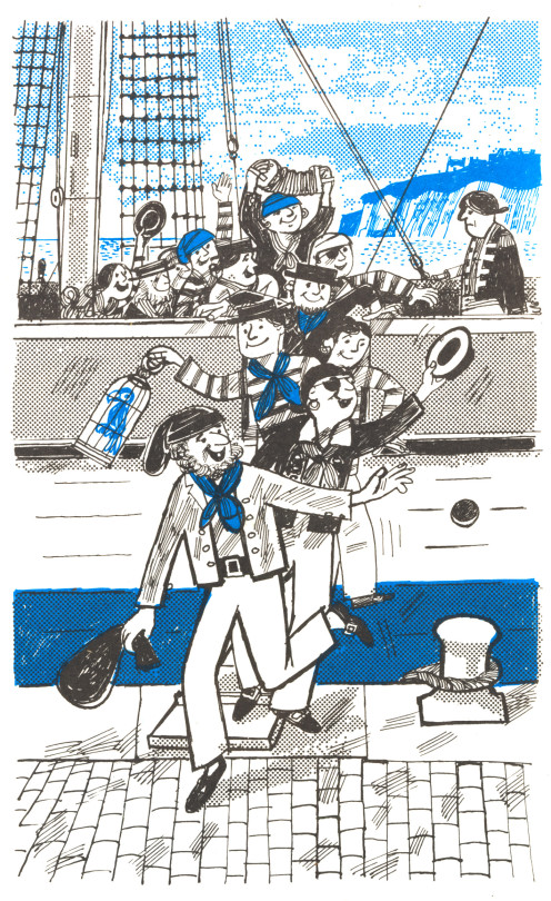
Bernard Cheese – Cover to Singing Songs,
Below are the drawings made by Bernard Cheese in 1968. As the BBC wanted to save money the booklets were normally one colour and black on white paper. Here Cheese is working with pure Cyan. Some of them use dotted plastic film that was used in the printing process then, normally to save money on ink and to add shading. But in the cover picture above there are various features going on that make it a remarkable print technically. The band in black but with the drum and flag decoration shaded in blue, the crowd to the right are in black at the front and behind in blue – a cunning use of limited colours. The shading too is in blue and black dots. This is a process that the other images have been separated up using.
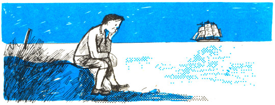
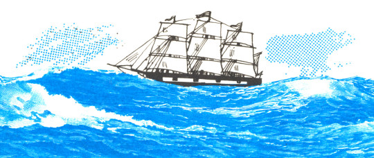
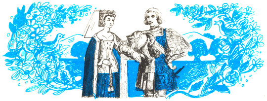
The following illustrations are curious as they incorporate parts of 19th century illustrations, likely from religious books like the Quiver, the sea and the trees are clearly from steel engravings, the King and Queen I also suspect are not from Cheese’s own hand. It is a jolly way to use and recycle such illustrations.
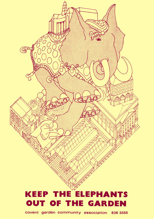
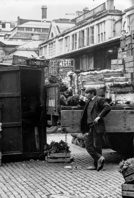
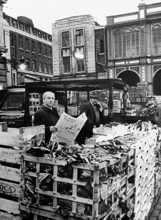
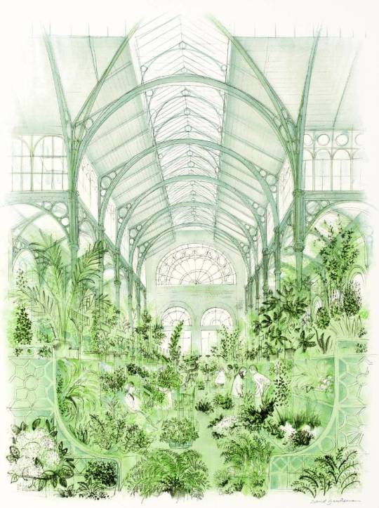
Covent Garden Market in London has a varied history that came to a head in the 1960s. Traffic to and from the market for buyers and traders was bothersome enough with narrow horse carts but with larger cars and lorries it was a nightmare.
In 1961 the Covent Garden Market Bill was passed, there was some deliberation on what would happen to the historic buildings of Covent Garden after that. Redevelopment plans arose, and for ten years these plans were fiercely fought by the Covent Garden community, arguing in favour of preserving the area for its historical value and cultural meaning.
The Elephant being the GLC for Greater London Council, trampling on the area.
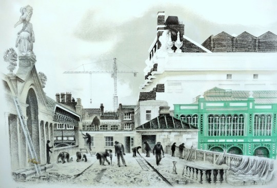
Their victory in this battle preserved Covent Garden’s old market buildings and they were reopened as a major tourist and shopping destination in 1980. The market had to be moved in its entirety across the river to Nine Elms in 1974 but the original buildings were preserved. Below are the responses to the closure and artistic propaganda by David Gentleman to show the beauty of the area.
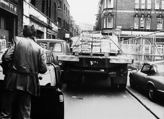
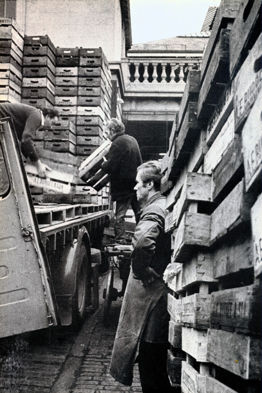
By the end of the 1960s, traffic congestion had reached such a level that the use of the square as a modern wholesale distribution market was becoming untenable, and significant redevelopment was planned. Following a public outcry, buildings around the square were protected in 1973, preventing redevelopment. The following year the market moved to a new site in south-west London. The square languished until its central building re-opened as a shopping centre in 1980.
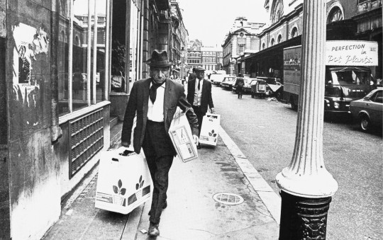
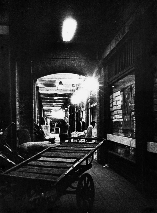
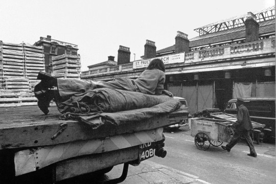
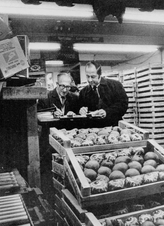
Goodbye Covent Garden was a photobook published in 1975 by Oxford Illustrated Press. It featured photographs of the workers and people around Covent Garden taken by Ena Bodin in the last two years of the market. Other than the cars and beautiful signage in the photographs you can see some of the mens fashions and even in some cases – platform shoes.
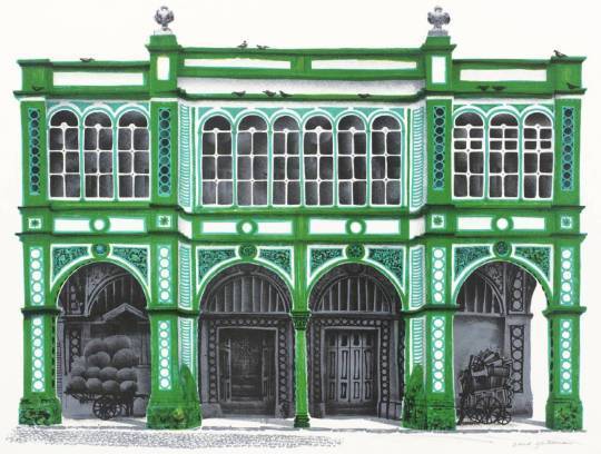
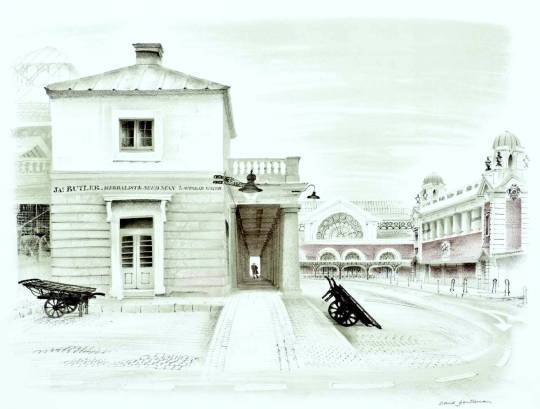
Above the picture shows the original Market building in use and below you can see the beautiful lithographs by David Gentleman.
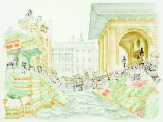
David Gentleman – Foreign Fruit Market, 1972
David Gentleman – Southern Section of Piazza (James Butler), 1972
David Gentleman – East Terrace, 1972
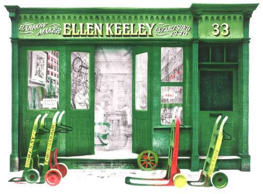
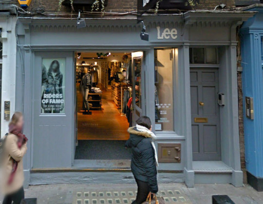
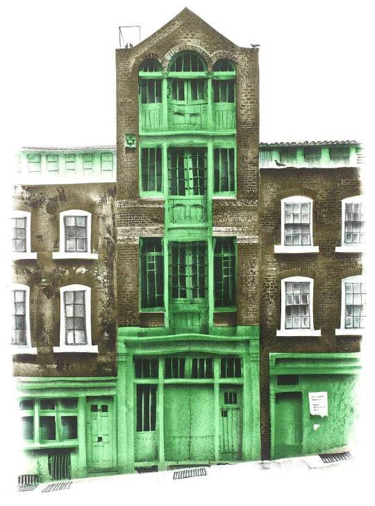
David Gentleman – Ellen Keeley’s Shop, 1972
The main premises of barrow-making firm of Ellen Keeley est. in Ireland in 1830. The Keeley family came to England at the time of the potato famine and lived in Nottingham Court. James Keeley invented and produced the costermonger’s barrow, like a shop on wheels and also developed the donkey barrow, once a familiar sight in London. In 1891 he was living at No.12 Nottingham Court and the elderly costermonger Ellen was living alone at No.8. In the 1960s the firm branched out into hiring their vehicles to the film industry (Keeley Hire in Hoddesdon).
Ellen Keeley’s Shop, 33 Neals Street, 2017.
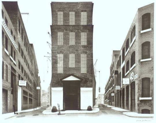
David Gentleman – Warehouses between Shelton St and Earlham St, 1972
David Gentleman – Piazza Looking South Past St Paul’s, 1972
David Gentleman – Warehouse in Mercer St, 1972
David Gentleman – The Flower Market, Covent Garden, 1972
The photography in this post is more of a defeat than a triumph, it is the documenting the end of something. The works of David Gentleman however placed along-side these photos show that Gentleman’s lithographs were able to inspire a vision of the area, making the dishevelled and shabby, romantic. Much like an Eric Ravilious painting. In making the lithographs I believe that Gentleman helped to present a case for the areas protection amongst the artists and lovers of conservation at the time when a spotlight was being put on the East End and Spitalfields.
This post is based upon a series of articles in the Spectator during 1986 by author and artist Alan Powers. I thought it interesting and the pictures wonderful to merit a reposting some 31 years later. The lithographs were printed at the Curwen Press.
The series has been commissioned by the Spectator and will be available for sale as a signed, limited edition.
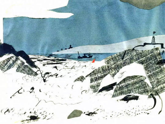
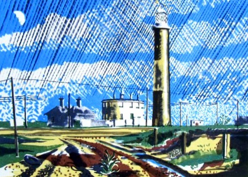
Dungeness
Alan Powers – Dungeness
From Hythe the coast road loses sight of the sea behind the sea walls protecting Romney Marsh. Bungalows and caravans punctuate the progress through Dymchurch and New Romney. From Littlestone to Dungeness is all Shingle, with plenty of fishing boats and tarred huts on the seaward side. The Buildings of England condemns ‘the scruffy shacks that sprawl for miles’, but Dungeness, innocent of architect or planner, has a quality of its own.
It is one of the best Places left for seeing railway carriages Converted into dwellings in the Twenties and Thirties, a rare memorial of the world of Rowland Emmett. He too is the presiding genius of the Romney, Hythe and Dymchurch railway, with miniature steam engines each about the side of an old Bugatti puffing along the shingle to nowhere and back. Lupins and yellow sea poppies grow beside the track. Dungeness Lighthouse, built in 1904, was a favourite subject for painters in the Thirties like John Piper and Eric Ravilious.
Then it was a lone landmark with a prominent midriff of white. The strange circular house on the left is the remains of Samuel Wyatt’s original lighthouse of 1792. Both have been superseded by a concrete lighthouse of 1959 which broadens toward the top for a change. They all share in the salty functionalism which Piper called the Nautical Style. Now the non-nostalgic painter ought really to look just out of the picture to the right, where the twin nuclear power stations are as incongruously gigantic as the railway is miniature. They contribute to the quasi-surrealist genius of Dungeness, and from Winchelsea or Fairlight they wink whitely against distant storm clouds.
The Ness used to be growing rapidly with accretions of shingle. It shelves steeply into the sea, leaving a deep channel for shipping near the coast. The Ministry of Defence has bagged most of the shore from Lydd to Camber, where the sand returns abundantly across the boundary into Sussex.
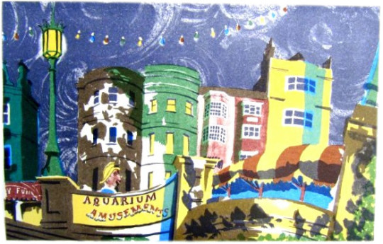
Brighton — Nocturne
Alan Powers – Nocturne
Aquarium Amusements keeps it up till the late hours. By night, the cries of a mechanical parrot carry across the upper air demanding, like an electronic club-bore, ‘Come and talk to me’. Nobody does, for the roundabout of giant ladybirds is stilled and children are pushed home by weary parents, clutching the last ice-cream. The name of the Palace Pier suddenly lights up, like the end of a firework display. From the ballroom the distant music sets the somnolent house-fronts swaying with stucco syncopation. Nobody rides till tomorrow on the pug-dog fireman whose head surfaces above the concrete balustrade. Like Mr Belaker, ‘the allegro, negro, cocktail shaker’, he will wait until the neo-Renaissance lamps are dimmed before he cruises the promenade from Kemp Town to Hove in search of a ghostly lover.
The Aquarium was reconstructed in 1929 and opened by H.R.H. Prince George. The Official Corporation Handbook (1936 edition) notes how `fish of all sorts lead care-free lives in commodious tanks and a kind of Celtic twilight’. There was also ‘a very comprehensive Amusement Arcade, including a Scoota Boat Pool, Dodgem Cars, Ghost Train, Mirror Maze and the latest devices for the amusement of children, such as Jungle Ride, Aerial Ride, etc’. The Spirit of Brighton, so memorably awakened by the Prince Regent in Rex Whistler’s mural, has spread around the middle and needs fairly constant make-up, but she has never yet gone back to her seaweedy bed. Her moralising sister Hove may pull down the blinds, but Brighton carries on anyhow. Like the Pavilion, Brighton turns its back on the sea and the unattractive beach. Yet the sea air brings an architectural intoxication, encouraging strange growths. And would those domes and minarets have sprouted quite the same in Horsham or in Hayward’s Heath?
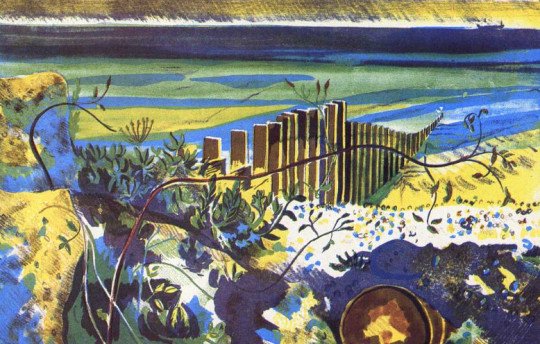
Climping Beach
Alan Powers – Climping Beach
Climping Beach comes at the end of a country road, where flint-walled thatched barns are the only buildings. A tower block in Littlehampton is distantly apparent, but here there is a rural respite. ‘The only unbuilt piece of coastline between Selsey and Brighton’ (Buildings of England).
The wartime defences, mainly cubes of concrete, are crumbling away slowly and convolvulus twines where barbed wire was before. Soon nothing will be left to show where we nearly fought on the beaches and the landing grounds. The shifting coastline is held in place by majestic groynes, a fitting man-made addition to the elements of sea and shingle.
In the woods behind is a more complicated defence against the tides of time. Bailiffscourt does actually occupy a mediaeval site and has a genuine 13th-century chapel. The rest is a highly convincing spoof-mediaeval house of the 1930s. It was built for Lord Moyne by an antique-dealer, Amyas Phillips, and intended as an instant antiquity from Chaucer’s England, including many fragments from old buildings which were being demolished at the time. The pastiche is brilliant, and still good as a Thirties-style house. The complete story is told in Clive Aslet’s The Last Country Houses. Lady Moyne scattered wild flower seed from the windows of the London train. All the trees at Bailiffscourt were imported fully grown and held upright in the sandy soil with steel hawsers and guy-ropes. It was a frantic search for innocence, yet the Moynes saved Climping from being ‘developed’.
Felpham, the next village along, was not so lucky. It is now part of Bognor, but is remembered as the place where William Blake stayed in 1800-1801 as the guest of William Hayley. The great visionary had never seen the sea be- fore, but he seems to have been more impressed with his cottage. He wrote to Thomas Butts: ‘My Wife and Sister are both very well and are courting Neptune for an Embrace, whose terrors this morning made them afraid, but whose mildness is often Equal to his terrors.’
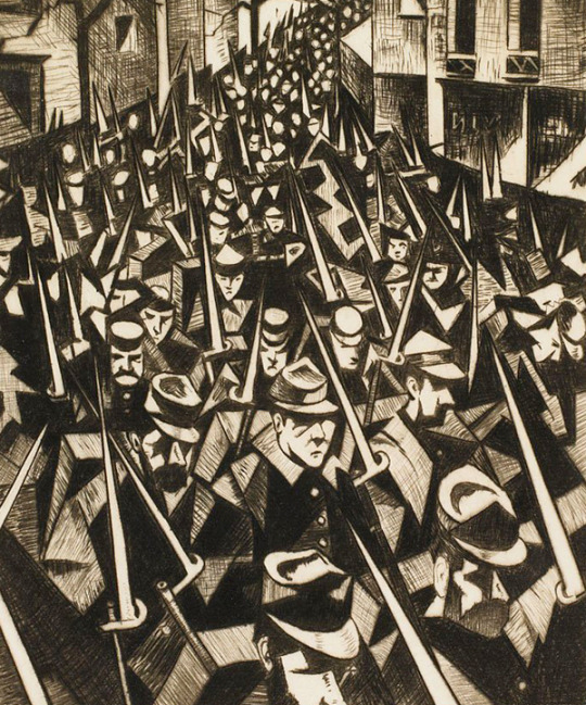
Christopher Richard Wynne Nevinson was a fascinating man who in life and letters seems paranoid and jealous of the success of others, no matter how well he himself was doing. Many of his friends he drove away in one way or the other due to his incredible ability to take offence. In 1920, the critic Charles Lewis Hind wrote that:
‘It is something, at the age of thirty one, to be among the most discussed, most successful, most promising, most admired and most hated British artists.†
He studied at the Slade art school alongside Mark Gertler, Stanley Spencer, Paul Nash, Maxwell Gordon Lightfoot, John Currie, Edward Wadsworth, Rudolph Ihlee, Adrian Allinson and Dora Carrington.
His time at the Slade was unhappy, the tutor Henry Tonks hated his work, he and Gertler fell in love with Dora Carrington (as did most men it seems) and their strong friendship was shattered when Carrington started having intercourse with Gertler.
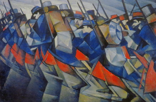
His work however was visual and strong and he was inspired by the Italian Futurists, Cubists and his work follows themes of the Vorticists, even though he was not a member of the group after irking Wyndham Lewis.
After a brief stint as a journalist he went back to art. At the outbreak of World War I, Nevinson joined the Friends’ Ambulance Unit and was deeply disturbed by his work tending wounded French soldiers in Flanders. For a very brief period he served as a volunteer ambulance driver before ill health forced his return to Britain. Subsequently, Nevinson volunteered for home service with the Royal Army Medical Corps. He used these experiences as the subject matter for a series of powerful paintings which used the machine aesthetic of Futurism and the influence of Cubism to great effect. His fellow artist Walter Sickert wrote at the time that Nevinson’s painting:
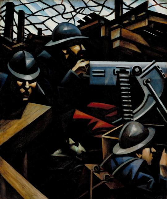
Mr Nevinson’s Mitrailleuse, which will probably remain the most authoritative and concentrated utterance on the war in the history of painting. This must be for the nation. ‡
In 1917, Nevinson was appointed an official war artist, but he was no longer finding Modernist styles adequate for describing the horrors of modern war, and he increasingly painted in a more realistic manner to the point that ’Paths Of Glory, 1917’ was censored from display.
The First World War was one were that artists embraced Printmaking due to the lack of materials at hand, it saw the medium rise up from trade and advertising to one of art. Nevinson’s prints of WW1 were lively, hellish and futuristic.
Nevinson’s printmaking is unique in a number of ways. He was virtually the only artist who was directly concerned with Modernism to use etching and mezzotint. Every other important artist in this regard turned to wood engraving, cutting, or lithography, perhaps to break away from the established traditional etchers with whom they did not wish to be associated. Nevinson actually only attempted two woodcuts.
During the years 1916-19, Nevinson was instrumental in establishing modern ideas in British printmaking, which should be seen in the context of Vorticism, and Nevinson’s own earlier painting. Another antecedent was Edward Wadsworth’s woodcuts. ♠
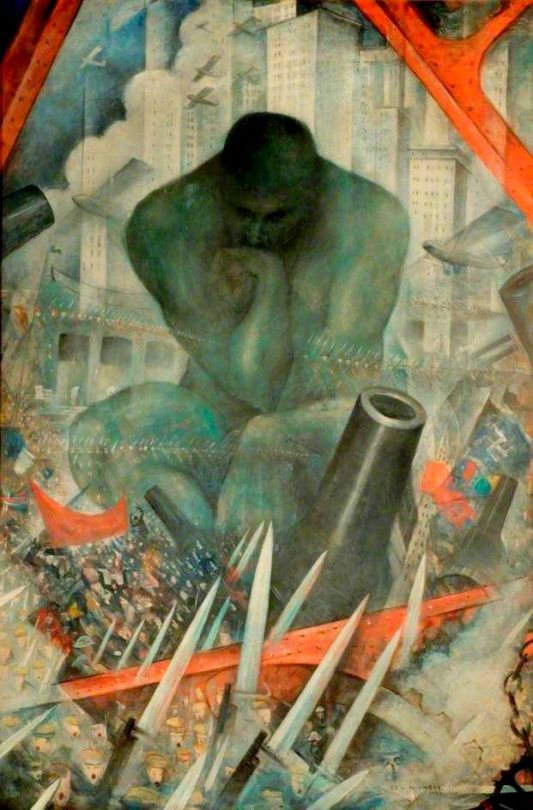
C.R.W Nevinson – The Spirit Of Progress, 1915
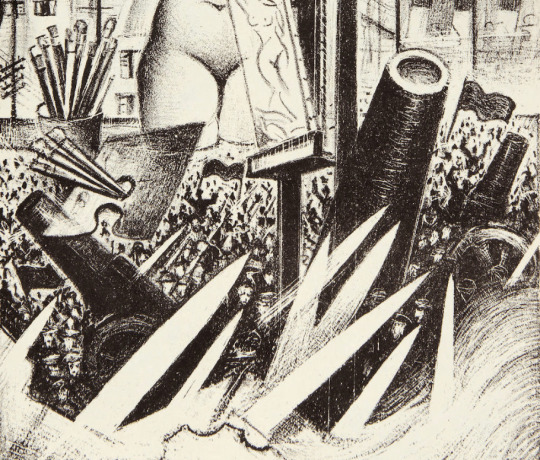
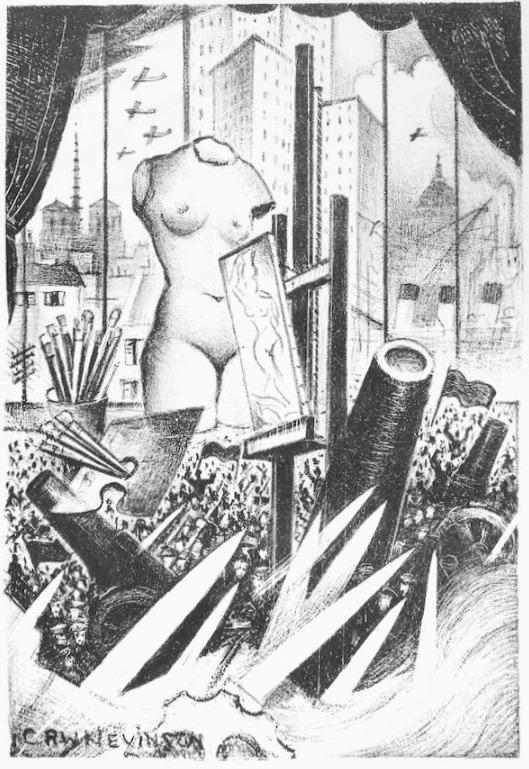
However, this post is about the lithograph by C.R.W.Nevinson made in 1933 called ‘The Spirit Of Progress’. It is an iconic yet strange picture, almost a greatest hits of Nevinson’s artworks of the previous twenty years.
The arrangement of ‘The Spirit Of Progress’ is one Nevinson would visit many times. In ’Twentieth Century’ the Thinker by Auguste Rodin is in the centre of a war and skyscraper combination of airplanes and weaponry.
C.R.W Nevinson – Twentieth Century
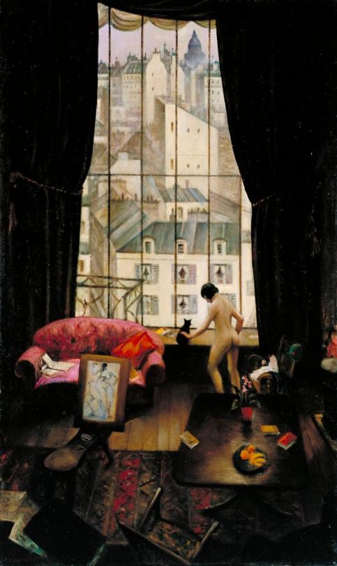
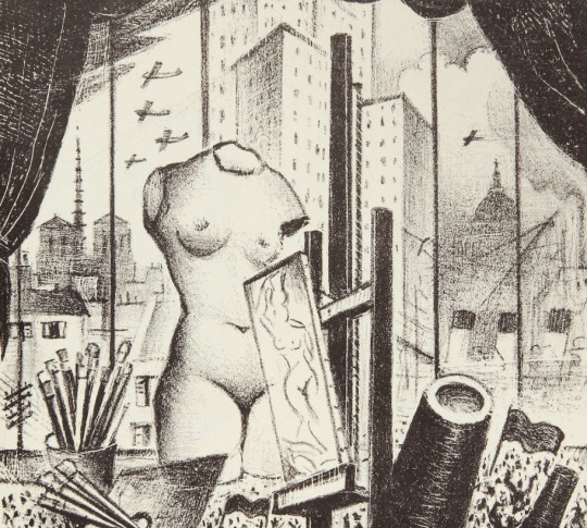
‘The Spirit Of Progress’ takes place on the seventh floor of the Paris studio of the author and journalist Sisley Huddleston, as seen in the painting ‘A Studio in Montparnasse’, with the windows, curtains from this setting.
C.R.W Nevinson – A Studio in Montparnasse, 1925
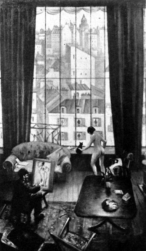
Curiously enough the painting ‘A Studio in Montparnasse’ was exhibited at Leicester Galleries in March 1926 as though it were finished but after the exhibition Nevinson repainted areas of it, adding a swagger to the curtains and removing the artist painting the nude. The original version is pictured below from The Sketch newspaper.
C.R.W Nevinson – A Studio in Montparnasse, from The Sketch, 3 March 1926
When Huddleston saw the painting he was outraged of the addition of the nude model. In ‘The Spirit Of Progress’ the painting of the model is kept but is replaced with a stone Aphrodite of Milos like figure. In the painting ‘Asters’ the model is shown as a small piece of sculpture on the artists desk, though a mirror image, a print is the reverse of how it is drawn. This also happened when Nevinson transcribed ‘Loading Timber, Southampton Docks’ into the print ‘Dock Workers Loading’ it is a mirror image of the painting, being drawing as a print, the same as the painting and reversed in the printing.
C.R.W Nevinson – Asters
As above – outside the window to the right are the funnels of an ocean-liner, the type that Nevinson painted below in 1916 with the cranes for the docks.
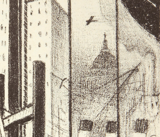
Above the ocean-liner in the mist is St Pauls, Nevinson painted the dome of St Paul’s Cathedral many times from different view points. Planes fly over head, not the Blitz yet, as ‘The Spirit Of Progress’ dates from 1933. It was the early days of aviation and airline travel and aircraft had been used in the World War One as Nevinson was sent up, Biggles style to draw the De Havilland D.H.2 planes in Dog Fights.
C.R.W Nevinson – City of London from Waterloo Bridge, 1934
C.R.W Nevinson – St Paul’s from the South
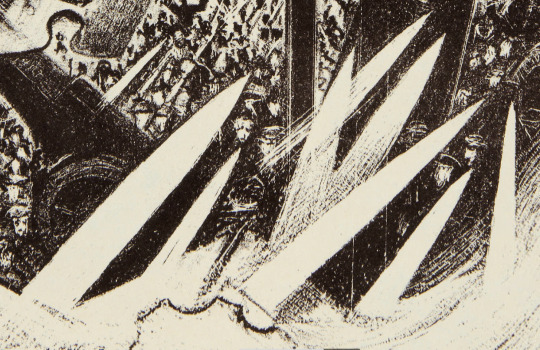
The Bayonets shown are found in many of Nevinson’s First World War pictures, below is an etching of French infantrymen matching though a town. As it is an early picture from the war it is more Futurist in style. The same can be said of ‘Returning to the trenches’, a painting of men marching off into the distance.
C.R.W Nevinson – A Dawn, 1914.
C.R.W Nevinson – Returning to the Trenches, 1914
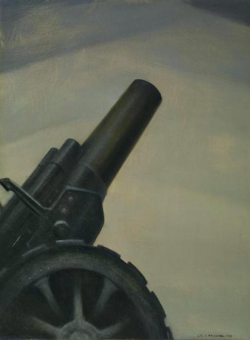
At the base of the the picture is a Howitzer Gun among the bayonet knives. Nevinson painted the gun on its own in a ‘A Howitzer Gun in Elevation’. A mechanical and rather Futuristic painting. The First World War being about the machines and not the humans operating them.
C.R.W Nevinson – A Howitzer Gun in Elevation, 1917
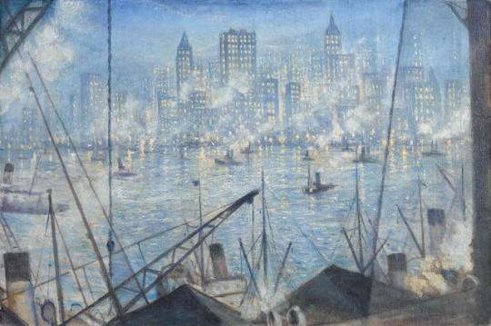
C.R.W Nevinson – New York, Night, 1920.
Nevinson was invited to New York in 1919 by David Keppel of the print publishers Frederick Keppel and Co, to exhibit his War prints. Manhattan’s architecture inspired him, not only by the sheer beauty of its sky-scrapers. ♣
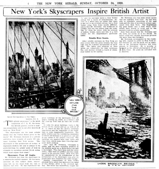
It is interesting to see what then happened between the first and second exhibition in New York. When Nevinson first went to New York, it was as a war hero, a survivor and documenter of war in a bold new ‘futurist’ way. And the first exhibition was a success.
He was clearly captivated by the city, compared to the London of the 1920s it must have been something, the skyscrapers of the day in New York would have been the Woolworth Building (60 stories) and the Metropolitan Life Insurance Company Tower (50 stories), but most of the ‘skyscrapers’ of the early 1920s peaked around 30 stories tall. London didn’t start building above 20 stories until the 1960s. Nevinson is quoted below:
‘New York, being the Venice of this epoch, has triumphed, thanks to its engineers and architects, as successfully as the Venetians did in their time.. Where the Venetian drove stakes into his sandbanks to overcome nature, the American has pegged his city to the sky. No sight can be more exhilarating and beautiful than this triumph of man. ♥
His second exhibition was a series of paintings and etchings of New York that failed to capture the attention of the public. The press were kind but the works did not sell well and there is little reporting of the second exhibition in comparison to the first.
Below is an extract from the New York Herald, 24th October, 1920.
“Art,” says Mr. Nevinson, “triumphs in utility, and the most beautiful products of
the modern world are a Rolls-Royce car and a skyscraper. They have been built for strict utility; their lines are perfect and they must appeal to the genuine artist. New York will be remembered for its introduction of the architecture of the skyscraper long after its people have been forgotten for other things.” ◊
New York should like Mr. Nevinson and his work, for surely he Is her friend. No
native could ever idealize America’s greatest city more than this foreigner. ◊
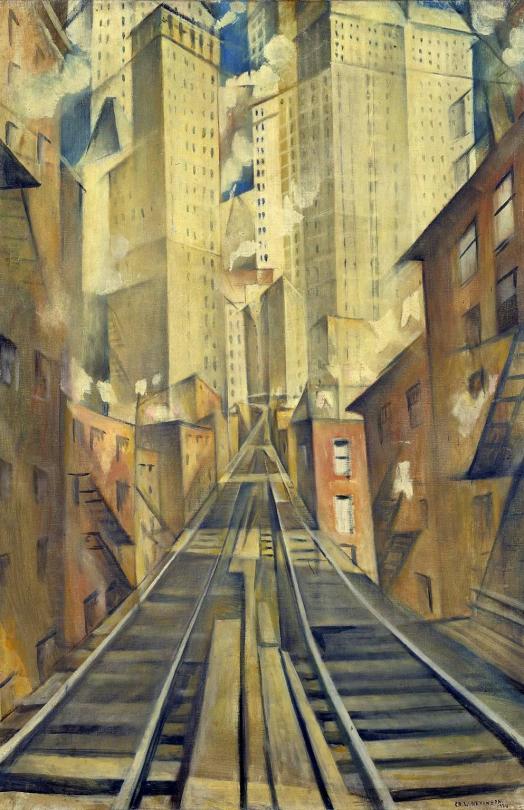
C.R.W Nevinson – The Soul of the Soulless City,Previously known as New York – an Abstraction ,1920.
The poor reception of this exhibition may have accelerated Nevinson’s disaffection with the city. His growing embitterment is perhaps reflected by the change of title. Originally exhibited in 1920 at the Bourgeois Galleries, ‘New York, as New York – an Abstraction’, it was re-titled ‘The Soul of the Soulless City’ in the Faculty of Arts Exhibition, Grosvenor House, London, in 1925 probably at Nevinson’s instigation. ♦
‘The Spirit Of Progress’ has all the motifs mentioned above and of all my Nevinson prints is my favourite.
† M J. K. Walsh – A Dilemma of English Modernism, 2007 ‡ Walter Sickert – Burlington Magazine, The True Futurism – April – 1916 ♠ Robin Garton – British Printmakers 1855 – 1955, 1992 ♣ C.R.W. Nevinson 1889 – 1946 Retrospective Exhibition Of Paintings, Drawings And Prints: Kettle’s Yard Gallery 1988 ♥ David Cohen – C.R.W. Nevinson, The Twentieth Century, p46, 1999. ◊ New York Herald, 24th October, 1920. ♦ Tate, London, T07448.
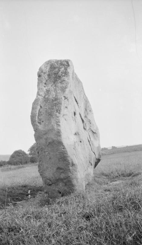
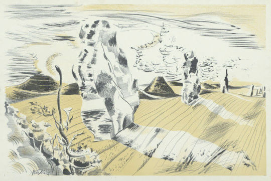
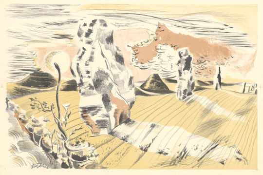
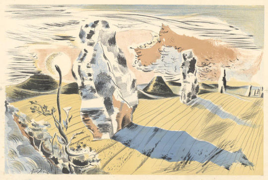
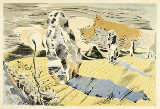
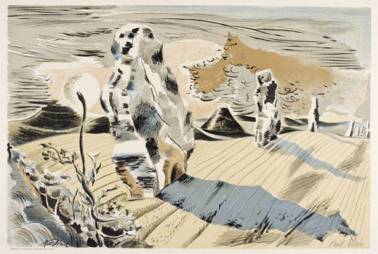
Paul Nash – Black and white negative, stone personage, Avebury, 1933
Paul Nash is one of the most distinctive and important British artists of the 20th century. He is known for his work as an official war artist during both WW1 and WW2. He also was one of the most evocative landscape painters of his generation. Nash was a pioneer of modernism in Britain, promoting the avant-garde European styles of abstraction and surrealism in the 1920s and 1930s.
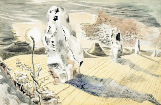
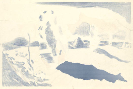
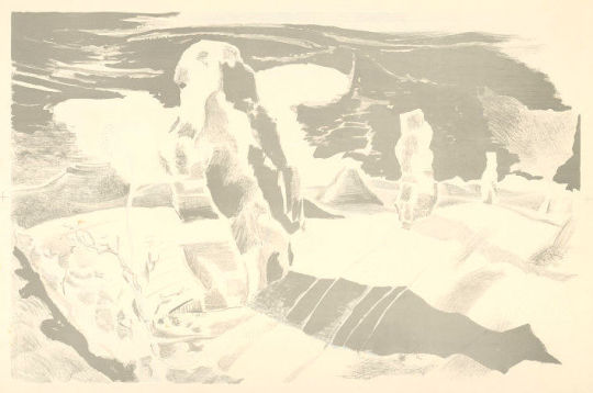
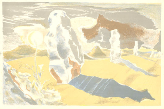
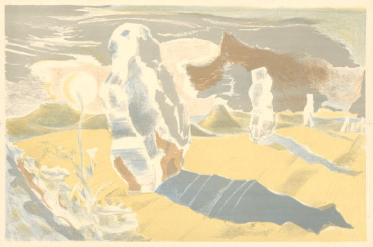
This post is about the printing process and how the Landscape of the Megaliths lithograph was made, showing each of the layers that were printed to make up the final image.
Paul Nash – Landscape of the Megaliths – Watercolour, 1937
Last summer I walked in a field near Avebury where two rough monoliths stand up, sixteen feet high, miraculously patterned with black and orange lichen, remains of an avenue of stones which led to the Great Circle. A mile away, a green pyramid casts a gigantic shadow. In the hedge, at hand, the white trumpet of a convolvulus turns from its spiral stem, following the sun. In my art I would solve such an equation. ‡
This lithograph by Nash is the bridge between romantic and surrealist art of the 1930s. Looking like a desert landscape by Dali the monoliths are both alien and familiar as Nash notes in the quote above. The convolvulus plant is a pernicious weed, I remember it covering a water-pump in the village I grew up in.
It is odd to consider that in my design I, too, have tried to restore the Avenue. The reconstruction is quite unreliable, it is wholly out of scale, the landscape is geographically and agriculturally unsound. The stones seem to be moving rather than to be deep-rooted in the earth. And yet archaeologists have confessed that the picture is a true reconstruction because in it Avebury seems to revive. ♠
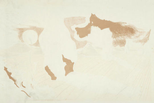
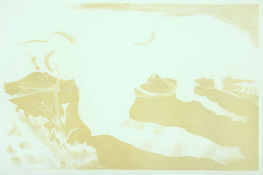
Above is the original watercolour that Nash and the printers would have worked from. The colours have replaced and layered over shadow and texture. Below are many colour layers from the print showing the levels of tone and texture Nash would have used to put into the print. The main tones are printed one-by-one and then variations of tone are printed and layered, and the colours adjusted until the print is final. All the prints came from the V&A archive.
† Paul Nash by Emma Chambers, 2016
‡ The Oxford History of English Art, Volume 11 – Dennis Farr, 1979 ♠ Paul Nash writing in Art and Education – March, 1939
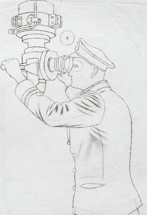
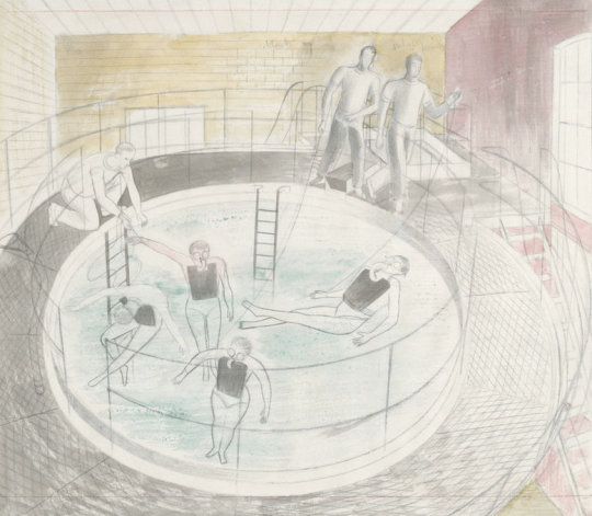
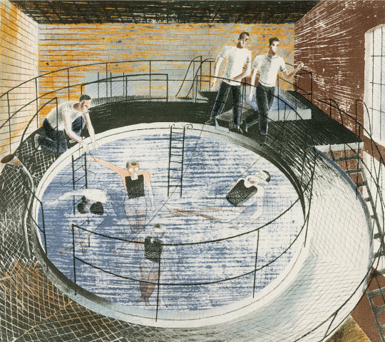
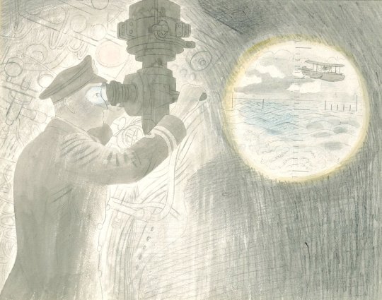
In 1940 Eric Ravilious became one of the first official war artists. During the summer he was posted to HMS ‘Dolphin’ in Gosport, drawing the interiors of submarines and sometimes sent out to sea. He had already conceived the idea of a set of submarine lithographs intended as a children’s painting book, and in November he set to work.
The drawings inevitably lack the distinctive texture and colour of the lithographs. In this post they are set next to the finished lithographs with the colours and textures produced at W. S. Cowell Ltd over the original drawn and watercoloured pictures by Ravilious. But we must start first with his appointment as a war artist:
Eric Ravilious – Drawing for Commander and Periscope, 1941
Dear Ravilious, 23rd December, 1939
You may have heard rumours of a scheme which is now being launched for having various phases of the war recorded by selected artists working for the Government. The Admiralty has already appointed one official whole-time artist, and you and John Nash have been selected to work for the Admiralty on a part-time basis, if you should be willing. We very much hope that the idea will appeal to you; indeed it would be a great disappointment to the Admiralty, the Ministry of Information, and, I may add, myself, if you should feel unable or unwilling to undertake work of this kind.
If you should be willing, please let me know here as soon as you can and tell me when you could come and see me to discuss details. From our point of view, the sooner you get to work the better. Perhaps I should say that the Treasury have already approved the necessary expenditure.
Yours sincerely R. Gleadowe †
During World War II Reginald Gleadowe was an Admiralty representative on the War Artists’ Advisory Committee.
Below is a letter from fellow artist (and Ravilious’s tutor) John Nash. Nash had been a war artist in the First World War found himself being asked to become a war artist again.
My dear Eric, I was at the M.of l. (Ministry of Information) on Friday playing truant part of the time from College and heard from Dickey that you had been there. I don’t suppose I have anything more to report than you have they talk of sending us a ‘contract letter’ but that only deals with the finance and I have heard nothing from the Admiralty since I went there. When I was there I broached the subject of commissioned rank to Gleadowe and there seemed no difficulties. Captainships seemed as cheap as farthing buns and it seemed as if one only missed being made a Major because one had to recognize Muirhead Bone’s seniority! But I begin to doubt now if Gleadowe really has the authority to promise these insignia – we must continue to wait and see I suppose… . I went to College yesterday and saw most of ‘the boys’. Form was good or even above average and Percy [Horton] made a fine story of a week spent teaching the Punch artist H. M. Bateman to paint. Dickey tells me that the Army War Artists are to be dressed in War Correspondents’ uniform with W.C. on the hat band rather shaming so I’m glad you and l are in the Senior Service!
Let me know if you hear anything fresh. Yours ever, John †
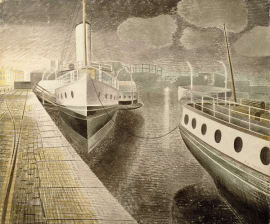
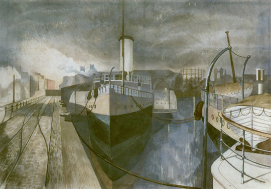
It is fitting that they both should be chosen so early for this as a lot of the work for both of them was to be painting docks and the boats. Below are paintings each by Ravilious and Nash. They had got to know each other at the Royal College of Art, where Ravilious was a pupil and now they were both on the staff. A year before Gleadowe’s invitation, and on Nash’s recommendation they both went to sketch at Bristol Docks. They painted the same location at night, when the docks were quiet and the boats tied up.
John Nash had been much inspired by painting in Bristol, and he told Eric it was the best port in England, so they planned together a painting visit there. †
Eric Ravilious – Bristol Docks, 1938
John Nash – Nocturne: Bristol Docks’, November 1938
The Second World War, unlike the First, was not much recorded by printmakers and the Ravilious Submarine series, perhaps the most important such work, was eventually turned down for publication by the Artists Advisory Committee. ‡
The difference of print-making in WW1 and painting in WW2 was that in WW2 the Blitz brought the war to the artists, they could see defences, barrage balloons and blitz bomb damage while still in Britain and record it with most of their materials at hand. The paintings and drawings were recorded quickly as a reaction. In contrast to the prints made in WW1 mostly depicted life in France and Belgium on the front-lines. Works would have to be sketched out and when back in Britain, the prints made from memory and worked up from sketchbook studies for a wider publication. The bridge of a month would mean that the art of WW1 was already retrospective of conditions. People living in the south of England would have been aware of defences, blacked out road signs, and the blitz.
Much of what we know from the process of the lithographic Submarine series comes from letters sent to Dickey (Edward Montgomery O’Rorke Dickey.) At the beginning of the Second World War ‘Dickey’ was seconded from the Ministry of Information and, from 1939 to 1942, was secretary of the War Artists’ Advisory Committee. He was a full member of the committee from 1942 to 1945. During this period he established his close relationship with Eric Ravilious.
Bank House, Castle Hedingham, Essex 24th January 1940. Dear Dickey,
The Curwen Press have sent me an estimate for the lithographs I spoke to you about – to do six, in five workings each about 15″ x 22″ will cost £36. This seems reasonable to me, if your committee think the idea a good one. Paints and materials will bring the total expenses to, say, £40; so that the choice is actually between £4 or £40, whatever they feel inclined to do. I very much want to do some lithography if that is possible, also it will make a change of medium. Will they call on us to begin work soon, do you think? It is now I see just a month today since the Admiralty wrote about this appointment, and nothing more seems to have happened since then. ♠
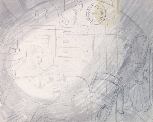
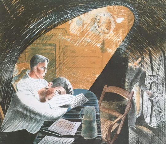
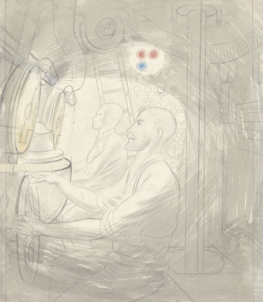
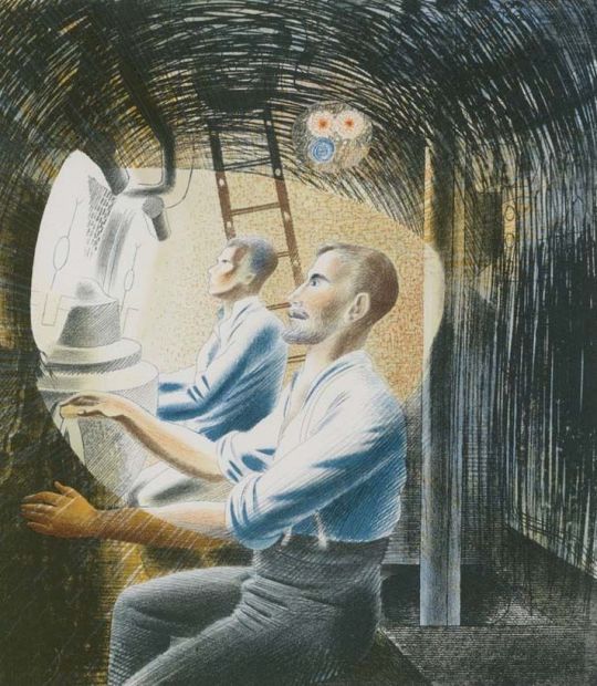
Eric Ravilious – Study for Ward Room #1, Pencil and Watercolour, 1941
Eric Ravilious – Ward Room #1, Lithograph, 1941
HMS Dolphin, Gosport, Hans. 2nd August 1940.
…At the moment I am living here having been to sea at different times for the last two weeks in the submarine, trying to draw interiors. Some of them may be successful I hope, but conditions are difficult for work. It is awfully hot below when they dive and every compartment small and full of people at work. However this is a change from destroyers and I enjoy the state of complete calm after the North Sea – there is no roll or movement at all in submarines, which is one condition in their favour, apart from the smell, the heat and noise. The scene is extraordinarily good in a gloomy way. There are small coloured lights about the place and the complexity of a Swiss clock…♠
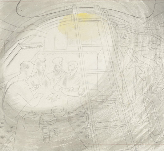
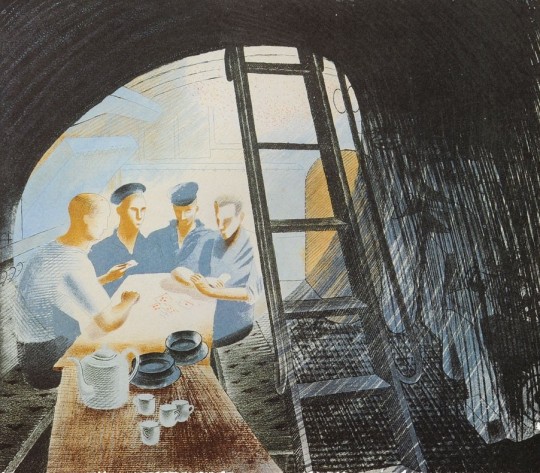
Eric Ravilious – Study for Ward Room #2, Pencil and Watercolour, 1941
Eric Ravilious – Ward Room #2, Lithograph, 1941
Dear Dickey
…Neither Curwen, Ripley, Murray or Lane can produce these submarine pictures, for all sorts of reasons, so I’ve not abandoned the idea of a book and yesterday went to see the lithographic printers at Ipswich. They will produce the things simply as pictures in a small edition for £100; and if I can manage it this shall be done…
The Leicester Gallery say that they are willing to sell the lithographs if I produce them, so that with luck (if they are not bombed meanwhile) it may pay the expenses. ♣
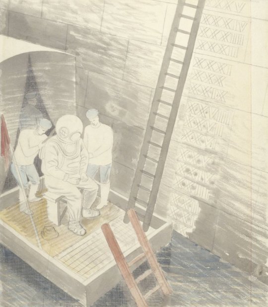
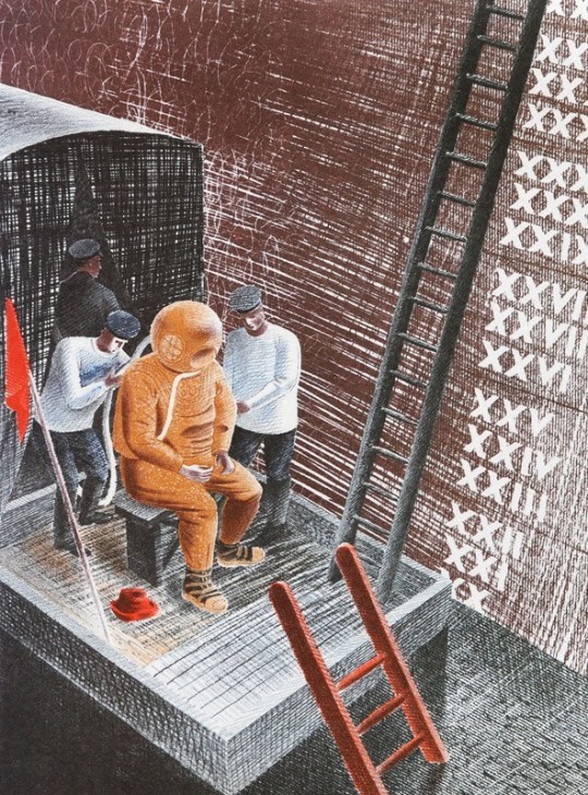
Eric Ravilious – Testing Davis Equipment, Pencil and Watercolour, 1941
Eric Ravilious – Testing Davis Equipment, Lithograph, 1941
Eric Ravilious – The Diver, Pencil and Watercolour, 1941
Eric Ravilious – The Diver, Lithograph, 1941
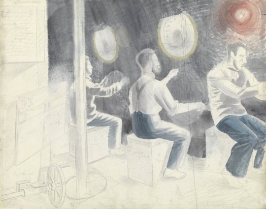
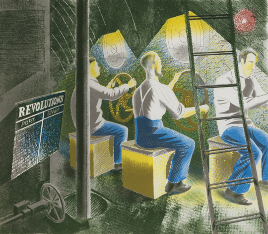
Eric Ravilious – Working Controls While Submerged, Pencil and Watercolour, 1941
Eric Ravilious – Working Controls While Submerged, Lithograph, 1941
Eric Ravilious – Diving Controls #2, Pencil and Watercolour, 1941
Eric Ravilious – Diving Controls #2, Lithograph, 1941
The final lithographs were printed in a small run in 1941. In 1996 a limited edition reprinting of 375 was made. Ravilious died in 1942, he was reported missing, presumed dead while on flight over Iceland. He was 39 years of age.
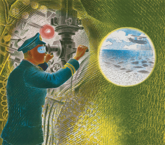
Eric Ravilious – Commander and Periscope, Pencil and Watercolour, 1941
Eric Ravilious – Commander and Periscope, Lithograph, 1941
Had Ravilious’s idea of a children’s book proceeded it is hard to tell if it would have been just outlines of the men and nautical instruments or with the base watercolour and pencil drawings that he used for the lithographs. Either-way a child could paint over with their own colours. That is really what the printers at
W. S. Cowell Ltd did with the lithographs anyway.
† Eric Ravilious: Memoir of an Artist – By Helen Binyon ‡ The Modern Spirit in British Printmaking, 1910-1950. Garton & Cooke, 1987 ♠ Submarine Dream – Lithographs and Letters – The Camberwell Press, 1996 ♣ Avant-garde British printmaking, 1914-1960
Rosemary Ellis née Collinson was born in Totteridge, North London in 1910. Her grandfather was the leading designer of furniture company Collinson & Lock and her father trained as a cabinet maker and started the firm Frank Collinson & Co.
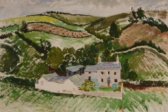
Clifford Ellis – The Farm, 1945, from my collection.
Rosemary’s father served in WW1 in France and Italy. Having survived this conflict he died of Spanish Flu in 1919 and so Rosemary and her siblings moved in with her mother’s parents in their large house at Netley Marsh in the New Forest. In this environment she developed a love of the forest and its animals. Some time later, the family moved to London.
Rosemary went to study art at the Regent Street Polytechnic in 1928. It was here that she met her future husband Clifford Ellis who was her tutor at the Polytechnic.
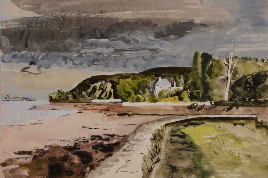
Rosemary Ellis – View of Holcombe from Dawlish, 1945, from my collection.
Clifford and Rosemary Ellis were at once husband and wife and an artistic partnership. Their collaboration began in 1931, the year of their marriage, and subsequently almost all their published freelance work is signed jointly. By the time the New Naturalist jackets were designed they had taken to using the cipher C&RE to express their joint authorship. Such consistent use of a joint cipher is unusual, and needs a little explanation. The initials were put in alphabetical order, not out of any sense of seniority. †
The couple as artists and designers joined the ranks of Ben Nicholson, Eric Ravilious, Barnett Freedman and Edward Bawden as artists who could create both posters for advertising and book dust jackets. They would join many of these artists in working for Shell Mex and for London Transport on posters.
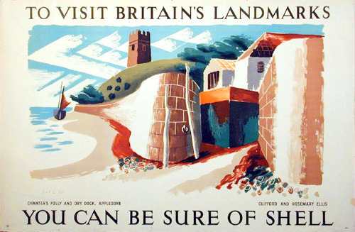
Clifford and Rosemary Ellise – Appledore – ‘Shell Landmark’ Series No. 491
Work that would welcome further investigation includes posters by Barnett Freeman, Edward Bawden, Richard Guyatt and Clifford and Rosemary Ellis. Another area that was constrained from further investigation by lack of space was the way in which Beddington provided opportunities for women to produce art for commercial use. Women artists were given very little press attention in the 1930s and, although artists such as Barbara Hepworth were active exhibitors, critics rarely reviewed their shows. Apart from Vanessa Bell, six other women artists produced posters for Shell, including Pamela Drew, Eve Kirk, Cathleen Mann and Margaret Brynhild Parker. The reason for the prominence of women in poster design is a potentially interesting area of research that could illuminate issues of female participation in the arts, gender prejudice, and education in the 1930s. ‡
By the time of WW2 Clifford Ellis was the headmaster of the Bath School of Art. He then served as a camouflage artist and official war artist with Grenadier Guards during Second World War.
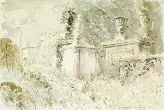
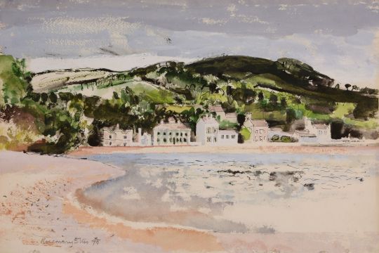
Rosemary too was a official war artist working on the Recording Britain project with Clifford. Above is a beautiful view of a graveyard in Bath. It is one of the most gothic and romantic works she produced and looks more like a John Piper study. The painting above ‘View of Holcombe from Dawlish’ also has elements of John Piper in it: the loosely constructed house, the abstract boat off the shore and the dark sky.
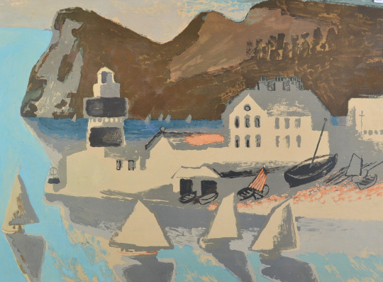
Rosemary Ellis – Teignmouth Bay, 1945, from my collection.
The couple would also be selected as artists for the Lyon’s Lithograph series in 1947. The aim was to produce large lithographs that could cheaply be bought by members of the public but also be displayed to brighten up the tearooms Lyons owned. The Ellis’s submission of Teignmouth was described as almost being a painting rather than a lithograph.
Between 1946 and 1955 the company commissioned three series of prints, some 40 in all, from most of the leading British artists of the day. The lithographs were not advertising per se (the Lyons name only appeared in small type at the bottom of each), but they were branding by association.
To help, he brought in the artist Barnett Freedman as the technical director. He had long experience as a lithographer and had been both an official war artist and a teacher at the Royal College of Art. ♠
R&CE – Teignmouth From the Lyons Lithographs First Series 1947.
The painting of Teignmouth Bay from 1945 would have been a study around the time of the Lyons lithograph above but looking back and forth onto each other.
Teignmouth Painted by Clifford and Rosemary Ellis: For the lithographs worked up at Chromoworks from originals, (Barnett) Freedman’s input at the proofing stage was crucial. In response to his comments about the proof of Teignmouth, for example, (Frank) Oppenheimer noted at the printers that they would ‘try a light grey printing over the sails etc … alter the colour of the light brown high light in the hills in printing [and] … make the colour of the sky and sea slightly warmer. ♣
Rosemary Ellis worked with her husband Clifford to design over 60 of the dust jackets for the New Naturalist book series, after volume 71 the artist Robert Gillmor took over.
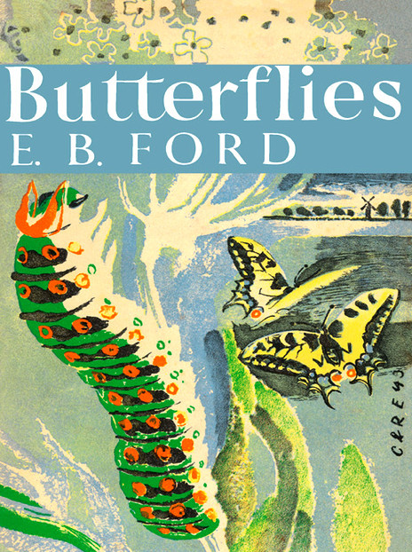
R&CE – Butterflies by E. B. Ford, Collins, 1945
Today these jackets are their best-known work, though book lovers may know some of their other jackets before and after the war, for the Collins Countryside series in the 1970s, or their design for John Betjeman’s Collins Guide to English Parish Churches. Within the art worked they are remembered more as innovative teachers, Clifford Ellis having run the Academy of Art at Corsham Court for a quarter of a century with his wife Rosemary as a leading member of the staff. †
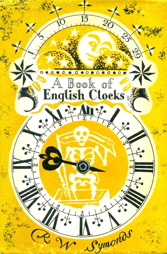
The pair also designed two of the covers to the King Penguin Series.
R&CE – A Book of English Clocks by R.W.Symonds, 1946, King Penguin Books.
The original idea for King Penguins came from the small Insel-Verlag books which were published in Germany before the war. Why, we felt, should there not be a similar series of books in this country? The experiment, started a few weeks after war broke out, turned out to be successful. One of the most distinctive features of this series is their decorative covers. ♦
The King Penguin series itself struggled to make money, because of the costs of colour printing, and it was cancelled in 1957. ♥
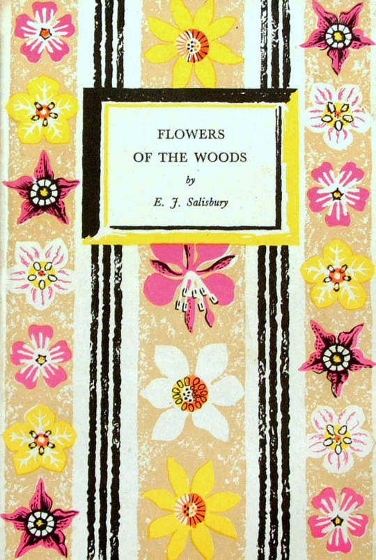
R&CE – Flowers of the Woods by E.J.Salisbury, 1947, King Penguin Books.
† Collecting the New Naturalists by Tim Bernhard and Timothy Loe, 2015.
‡ Shell’s England by Malcolm V. Speakman, 2014.
♠ Bawden and battenberg by Michael Prodger, The Guardian 12 July 2013.
♣ Tea and a Slice of Art: The Lyons Lithographs 1946-1955 by Charlie Batchelor.
♥ Reading Penguin: A Critical Anthology by William Wootten and George Donaldson, 2014.
♦ Pevsner: The BBC Years: Listening to the Visual Arts – Page 75
Recording Britain. Volume 4, Edited by Arnold Palmer, 1949.
Magazines in second hand book and charity shops are treated with various levels of scorn, I am guessing it’s because they don’t stack on a shelf easily and can look untidy. It’s a shame as some are full of adverts and illustrations that are not found anywhere else.
Here is one piece illustrated by Barnett Freedman from the Housewise Magazine in the 1950s. Although there maybe more, I have never seen Freedman illustrate a magazine artical. It’s a simple monochrome print with the focus was on the draftsmanship.
Many of Freedman’s book dust jacket designs are like this too, but with a simple colour wash behind them, he was very economic with colour – in printing terms. With his marvellous free-drawn typefaces and grainy illustration, with closer views you can see the picture is of a theatre and the balcony with the audience looking down on the artical. The heroin is in a locket cameo to the left and the hero to the bottom right. Short simple and I hope an unusual sight for those who know Freedman’s work.
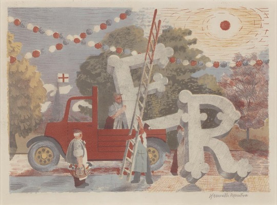
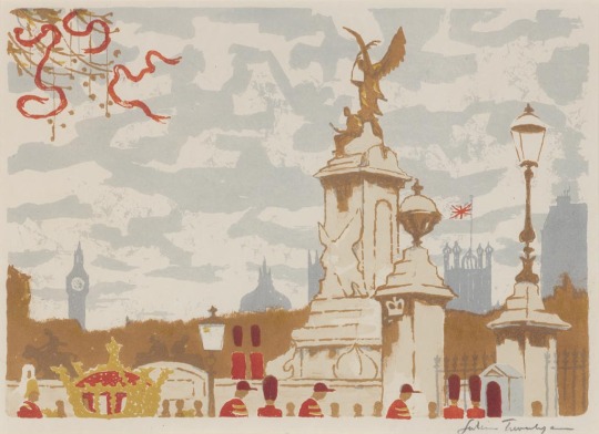
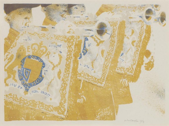
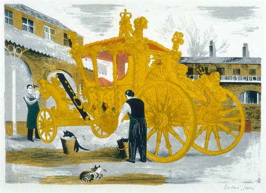
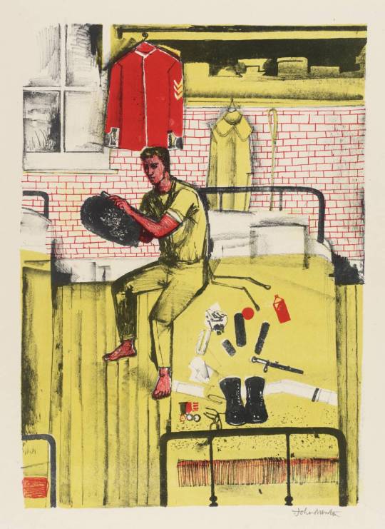
For the Coronation of Elizabeth II, a group of artists were invited to create lithographs for the Royal College of Art. Following the success of the Schools Prints series and Contemporary Lithographs, these prints were sold in limited editions and helped boost the RCA’s skills at reviving lithographic techniques. They were exhibited at the Redfern Gallery from April – May, 1953.
Most of the prints are held in Government collections and gain large prices at auction. It’s one of the least known lithographic collections but showcases some of the best British Artists of the mid twentieth century.
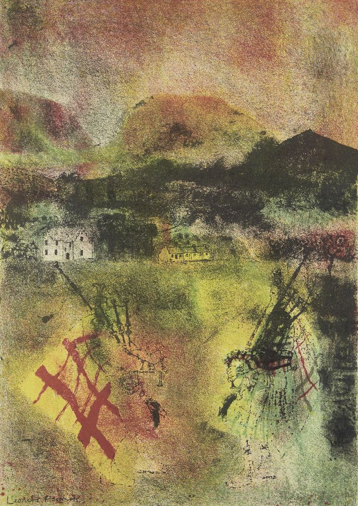
Leonard Rosoman – Two Pipers in the Sunlight, 1953
Michael Ayrton – Kettledrums, 1953
Kenneth Rowntree – Country Celebrations
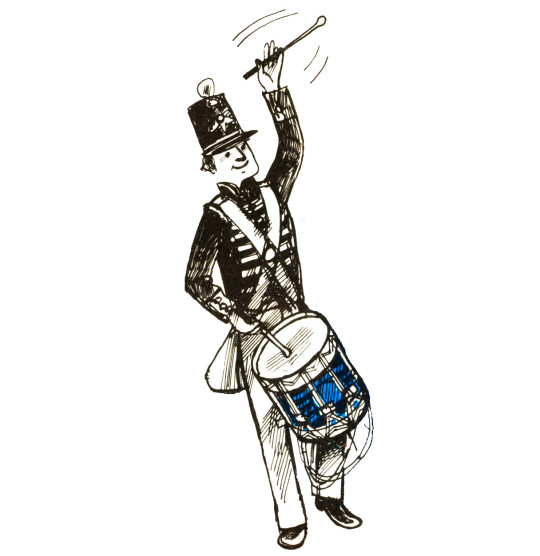
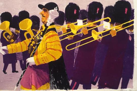
Bernard Cheese – Drum Major
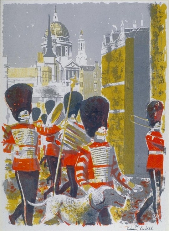
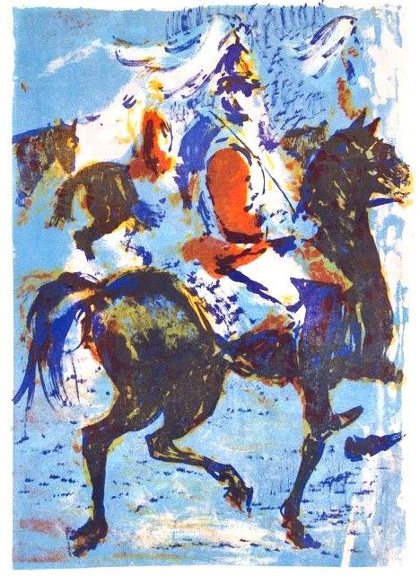
Edwin La Dell – Bandsmen in the City
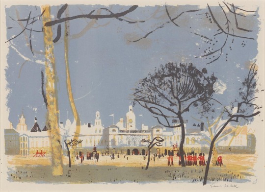
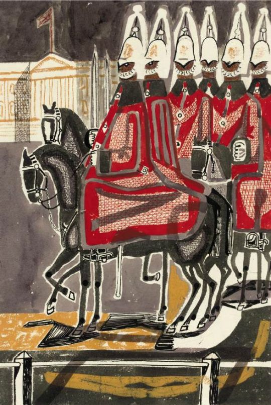
Edwin La Dell – Horse Guards Parade
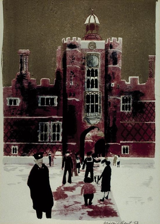
Alistair Grant – Hampton Court
Julian Trevelyan – The Mall
Robert Austin – Heralds
Barbara Jones – Prepairing the Coronation Coach
John Minton – Horseguards in their Dressing Rooms at Whitehall