Following my Post on the John Nash ‘Harvesting’ Schools Print I thought I would present another unravelling of prints from my collection of books.
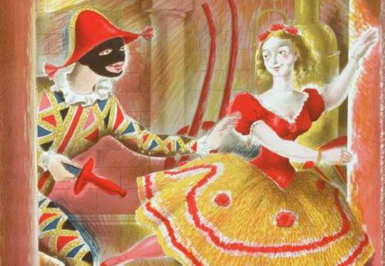
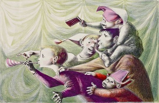
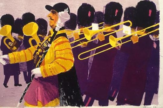
A detail of Harlequinade by Clarke Hutton, 1946.
Stanley Clarke Hutton was born in Stoke Newington, London, on 14 November 1898, son of Harold Clarke Hutton, a solicitor, and his wife Ethel, née Clark. In 1916 he became assistant stage designer at the Empire Theatre. About a decade later he took a trip to Italy, which inspired him to become a fine artist.
In 1927 he joined A.S. Hartrick’s lithography class at the Central School of Arts and Crafts in London, after Hartrick retired he taught the class himself until 1968. He experimented with the technique of auto-lithography with the aim of developing a way of printing affordable full-colour children’s books, and worked with Noel Carrington at Penguin Books to develop the Picture Puffin imprint. With Penguin he also illustrated Popular English Art by Noel Carrington, for King Penguin Books, in 1945.
He used the auto-lithography techniques he developed for the Oxford University Press’ Picture History series. Other notable publications where for The Folio Society. He illustrated about 50 books in all, for publishers in the UK and USA.
His paintings, figures and landscapes, were widely exhibited. His later work took on a surrealist influence. He died in Westminster in the second quarter of 1984.
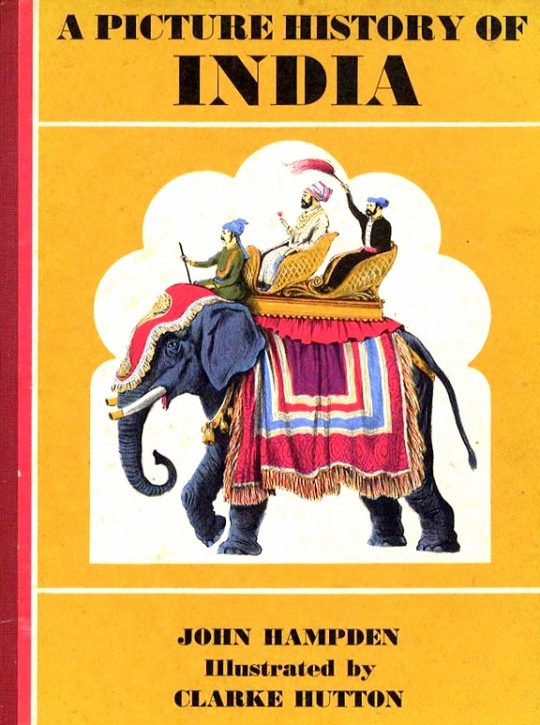
A Picture History of India by John Hampden – Oxford University Press, 1965
Illustrated by Clarke Hutton
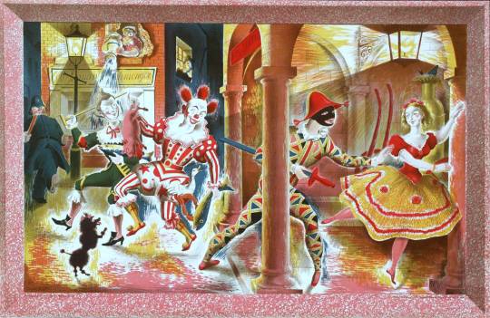
It was his illustrations for Noel Streatfeild’s ‘Harlequinade’ that the link to the Schools Print lays. It’s remarkably similar. Most of the figures are all represented, the harlequin, the ballet dancer and the policeman in the corner. Again under the same street light the clown, dog and jester appear.
The book was published in 1943 and the Schools Print was produced in 1946. So rather like the case of the John Nash ‘Harvesting’ the Schools print is made from recycled earlier sketches and ideas, in my opinion, to great effect – these days it would be considered good marketing for the book.
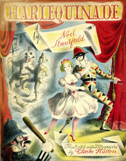
Noel Streatfield – Harlequinade. Chatto and Windus, 1943.
Illustrated by Clarke Hutton
Clarke Hutton – Harlequinade – A Schools Print, 1946.
About The Schools Prints: Set up in 1945 by Brenda Rawnsley, the School Prints scheme commissioned well-known artists to create lithographs, which would then be printed in large numbers and sold cheaply to schools for display in classrooms. The aim was to give ‘school children an understanding of contemporary art’. Each lithograph had a drawn frame so that the print could be pinned to the wall.
In the spirit of post-war optimism, artists responded enthusiastically. The scheme was a unique attempt at giving children access to original works of art in a period of austerity but ended in 1949 because of financial problems.
Some years ago I bought a print called ‘Harvesting’ by John Nash. Years later I would buy a book illustrated by John Nash and start to see the links.
John Nash, The Cornfield, 1918
John Nash was born in London in 1893 and is the younger brother of Paul Nash. He was a very accomplished wood engraver and lithographer and served as an official war artist in both the World Wars. On one occasion in 1917, Nash was one of eighty men ordered to cross No-Mans-Land at Marcoing near Cambrai. Of these, only Nash and eleven men returned.
From 1924 to 1929 he taught at Ruskin School of Art in Oxford, and from 1934 to 1940 taught at the Design school at the Royal College of Art. In 1951 he was elected to the Royal Academy. After the Second World War he moved to Wormingford on the Suffolk and Essex border.
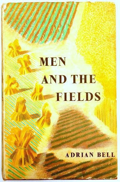
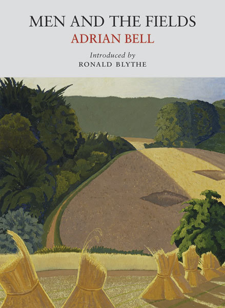
Adrian Bell – Men and the Fields, 1939.
It was in a local bookshop that I found a copy of a John Nash illustrated book called ‘Men and the Fields’ by Adrian Bell. It seemed to me that the lithographic cover of the book looked like his painting ‘The Cornfields’, so simple in yellow patterns. It also has a set of coloured lithographs inside too that people have been cutting out and framing.
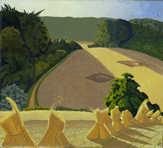
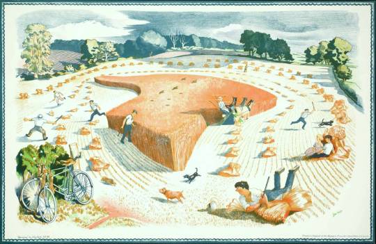
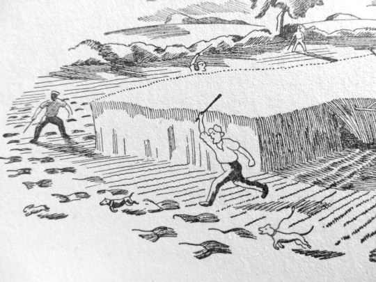
Inside the book there are a lot of line drawings and it’s one of them that is the curiosity. Below is the Schools Print by Nash called ‘Harvesting’. It shows a typically Suffolk scene but with an unusual amount of people in the picture compared to other paintings (normally his pictures are landscape only).
As in ‘The Cornfield’ there are the hay-bails and a beautiful landscape but here the surplus farmhands are poaching for rabbits with the dogs and a couple sit romantically waiting for the threshing machine to finish, so they can bail the corn up onto a cart.
John Nash – Harvesting, 1948
Being a large lithograph it has a beautiful texture to the printing and only a limited number of colours could be used to print it, so it becomes rather harmonic; the men’s trousers and the skyline.
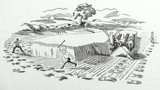
But below are some of the drawings from the 1939 ‘Men and the Fields’ nine years earlier. You likely notice they are almost the studies for the schools print, the men with the dogs, the rabbit. It’s an extrapolated version that makes up the Schools print but the elements are all to be found.
John Nash’s illustration for Adrian Bell’s ‘Men and the Fields’, 1939.
Detail of above
The link is undeniable. But to go full circle, the reissue of ‘Men and the Fields’ in paperback by Little Toller books, has ‘The Cornfields’ as the cover! Ronald Blythe also inherited John Nash’s home, Bottengoms Farm in Wormingford.
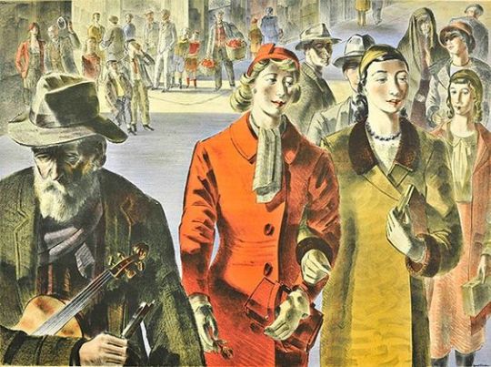
The war had not only hit at Britain’s cities with bombs, but also at the people with rationing. Food and fabric, paper and paint, tea and sugar were all rationed.
It was in the war years that the Lyons teashops became shabby and as fashions started to change in the post war era they looked dated. Materials like wood and paint where mostly reserved and rationed for government use in the post war construction, so another idea had to be devised to make the Lyons tearooms look more respectable.
Lyons Teahouse. 1951 The 2nd series of lithographs on the walls.
The directors, Felix and Julian Salmon had the idea of refreshing the tearooms with lithographic pictures to make them more appealing. In 1947 they sort advice from Jack Beddington who was the Artistic Director of Shell-Mex.
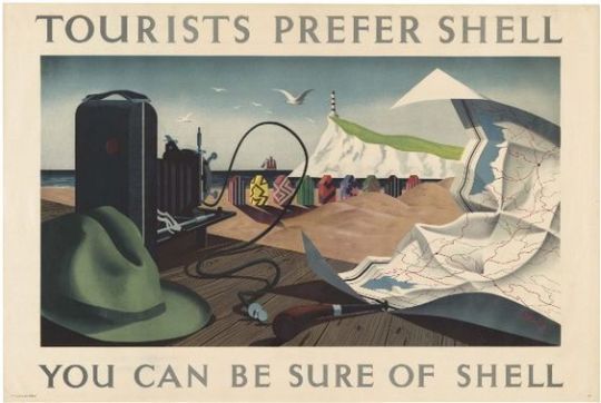
Shell Advert by Tristram Hillier — White Cliffs of Dover
The advertising in the 1930’s for Shell-Mex featured British artists modern work with simple text. It had been a public success and an exhibition of the Shell-Mex lithographs in 1939 was well attended.
The art of advertising in London from the mid 1920’s onward had seen modern art projected onto the public with company’s like Shell-Mex & London Transport using artists like Paul Nash, Edward McKnight Kauffer, Horace Taylor and Graham Sutherland to illustrate bold and simple posters.
It was an age when galleries charged admission and in the war years galleries where disbanding and hiding their art collections safe from German bombing raids. This would mean that the colour advertising posters where some of the few artworks to be left open to the public in wartime and where displayed all over the country. It would be the first time the public would encounter these artists.
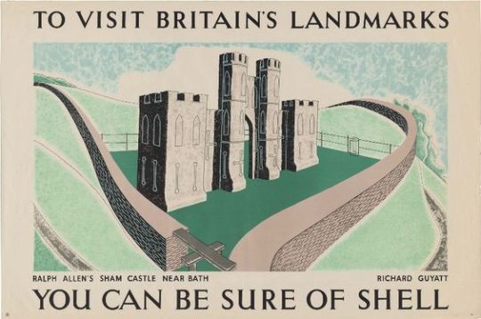
Shell Advert by Richard Guyatt — Ralph Allen’s Sham Caster nr Bath.
By appointing Beddinton they relied on his contacts with artists to product the lithographs. Samples and designs where commissioned and the first series of these sixteen prints featured Edward Ardizzone, Edward Bawden, Clifford & Rosemary Ellis, Barnett Freedman (who assisted with artistic advice on lithography) Duncan Grant, Edwin La Dell, John Nash to name half. Artists also claimed royalties on copies sold in the tearooms, an unusual practice in it’s day. One thousand five hundred prints where made of each poster in the first series.
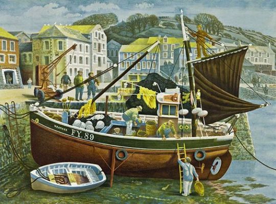
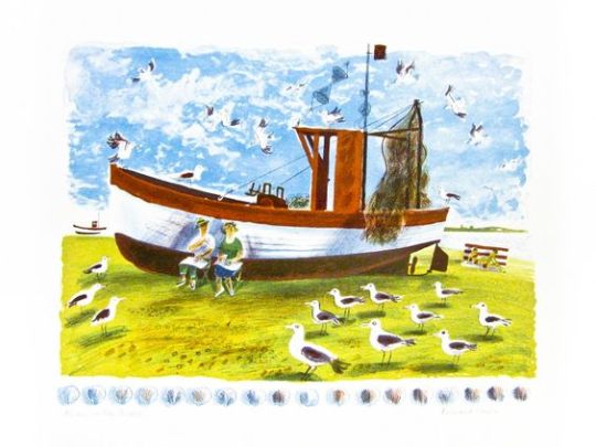
Lyons Print: David Gentleman — Cornish Pilchard Boat
Some of the troubles in printing came from printing trade unions and of artists unfamiliar with the lithography process. Some of these posters had to be hand drawn onto the lithographic plate to be printed, pre-made works where translated from paintings by Chromoworks Ltd, London.
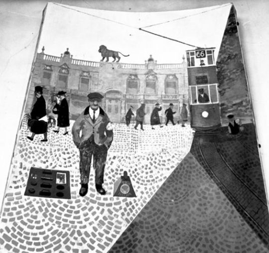
The artworks for Lyons had a press release in 1947 at the Trocadero Restaurant, London, where Lyons often had their board meetings.
A special preview was arranged for Queen Mary.
Many prints where glued to wood or mirrors for hanging in the tearooms, the public could then buy the posters un-mounted and unframed, it’s the prints unglued to canvas and board that are worth more money today.
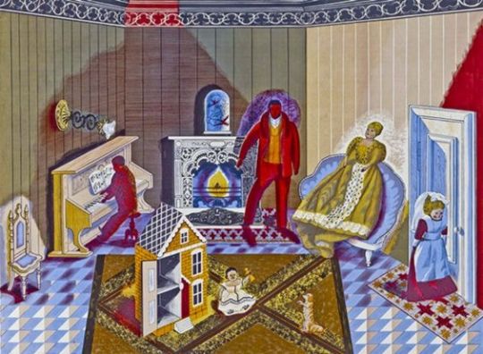
Edward Bawden — The Dolls at Home.
Thirty of the Lyon’s Tea Rooms in London exhibited the prints at first. Due to the press and public interest the prints were soon found in all Lyons’ teashops. The success of the first series of prints meant that a second and third series of prints came in 1951 and 1955.
It is worth noting that companies like Guinness started to produce lithographic prints (The World Record Series) to brighten up their pubs soon after. So the series and it’s publicity had an ongoing effect.
“It is by his coloured lithographs that Bernard Cheese is best known to connoisseurs”
Picnic on the Beach – Bernard Cheese
Bernard Cheese was born in Sydenham, south-east London. His father Gordon William Cheese was a cab driver. He trained at Beckenham School of Art with Walter Hoyle, both studying Graphic Art until they were called up for military service during the Second World War. Joining the Arillery, Cheese served four years in the army until the War ended.
Having being demobbed, in 1947 Cheese resumed his studies and enrolled at the Royal College of Art. Studying under Edward Bawden and Edwin La Dell. It was La Dell who inspired him with printmaking and lithography and encouraged Cheese to improve his draughtsman skills, sending him out with sketchbooks to markets, pubs, parks to record the social life of people around him. Together with artist-printer George Devenish, La Dell and Cheese worked at perfecting traditional lithographic techniques.
While at the Royal College of Art, Bernard met what was to become his first wife, Sheila Robinson. They were married in 1951 and lived together in Beaufort Street, Chelsea. Husband and wife both worked independently on ‘Festival of Britain’ murals, along with other artists like Barbara Jones, John Piper, John Hutton and Edward Bawden.
Bernard’s mural was in the Shot Tower (demolished to make way for the Queen Elizabeth Hall), it was called Kaleidoscope and circled the tower. The boards they were painted on have been lost and are presummed to be destoryed. It was at this time Cheese was getting work as a commersial artist with a set of posters and decorations for London Transport and printed by the Baynard Press.
Section #5 of Kaleidoscope by Bernard Cheese, Festival of Britain. 1951. Fry Gallery.
The marriage was blessed with a child, Chloe Cheese in 1952. Both Bernard and Sheila were weary of London accommodation and with a child they looked at moving out the city. It was under Edward Bawden’s suggestion that they resettled in the artist community of Great Bardfield, Essex, where Bawden also resided. In 1953 they moved to Bardfield End Green, neighbouring Great Bardfield but closer to Thaxted. Bernard set up a studio in an old chip shop in Great Bardfield.
Life in Great Bardfield:
Being in Great Bardfield in the 1950’s forged a legagacy of ‘artists’ that focused the attention on to each other by their location, much like the artists in St Ives in the 1920’s. The artists that lived there were able to share exhibitions that might have been too expensive for solo shows. The set was made up of Edward Bawden (who had Eric Ravilious lodging with him at one point in Brick House), John Aldridge, George Chapman, Stanley Clifford-Smith, Audrey Cruddas, Walter Hoyle, Michael Rothenstein, Marianne Straub and Sheila Robinson with Bernard Cheese. Most of whom are now eulogised by the Fry Gallery, Saffron Walden.
Drum Major — Bernard Cheese
In 1953 Edwin La Dell asked Cheese to contribute to the Coronation Lithograph series: a portfolio of 40 prints by staff and former students of the Royal College of Art, (most notiably featuring Kenneth Rowntree’s ER decorations print) for a celebratory exhibition at the Redfern Gallery in 1953. Bernard’s submission was ‘Drum Major’. In 1954 Cheese and Robinson’s second child Benjamin was born.
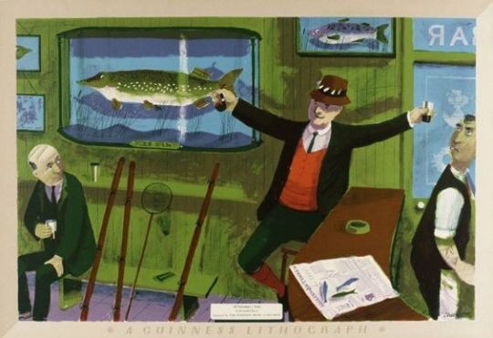
A Fisherman’s Story — Bernard Cheese. Tate
Maybe the most famous image of all for Bernard Cheese was for the Guinness lithograph series. Intended to be hung on the walls of the pubs to brighten them up, the artworks where inspired by the Guinness book of world Records. Cheese’s response to this project was ‘A Fisherman’s Story’, an image of an old man in a pub telling of the largest fish… Other works in the series were Edward Ardizzone’s ‘The Fattest Woman in the World’ and Barnett Freedman’s ‘The Darts Champion’.
Life after Great Bardfield. Sheila Robinson and Cheese separated in 1957 and followed in divorced in 1958. Cheese married his former student Brenda Latham Brown. They moved to Stisted, Essex (closer to Braintree) where their daughters, Joanna and Sarah, were born. For a studio, Bernard rented a Sunday school room.
Bernard Cheese – London Transport Museum Poster
Now working as a teacher and with a good income, Bernard was able to print off lithographs with more ease. Since the rise of the Lyons, Guinness and School Print lithographs… this generation of artists where seeing signed lithographs as a viable commercial option. With people like La Dell and Freedman leading the way in modern lithography for artists, not publishers. With more works came more exhibitions and Cheese’s work would be shown all over the world, both in solo shows and contemporary printmaking exhibitions. Other commercial work would be for the BBC and A&C Black to P&O Cruises.
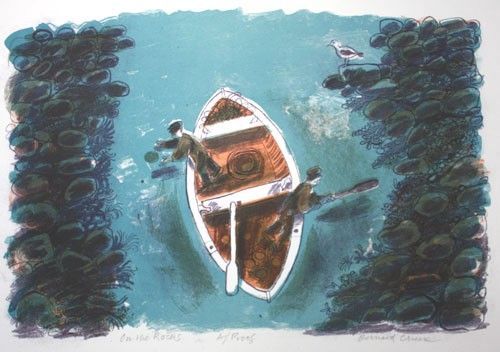
In the 70’s Cheese taught at Goldsmiths College (70–78) and part time in the 80’s at the Central School of Art and Design, London. He and Brenda (nee Latham Brown) separated in 1988 and divorced in 1992. In the 90’s Cheese moved to Nayland, north of Colchester. While he continued to travel in search of new subjects for watercolours that he subsequently reworked as lithographs, he turned increasingly to delightfully idiosyncratic still-life arrangements such as ‘Trout on a Plate’ and ‘On the Rocks’ and ‘Green Apples’many printed by the Curwen Press.
Cheese seams to have picked up Edward Bawden’s sense of humour for his later lithographs, partially Bawden’s talent for comic sketch-work. Many of the later prints contain a humorous twist.
On The Rocks – Bernard Cheese.
Chesse’s works reside in the Victoria and Albert Museum, the Royal Collection to the Museum of Modern Art in New York and New York Public Library. The Tate London and the Fry Gallery in Saffron Walden.With more than 100 lithographs and watercolours, Aberystwyth University holds the largest public collection of his works. In 1988 Cheese was elected a fellow of the Royal Society of Painter-Printmakers.
Cheese was predeceased by Ben. He is survived by Chloe, Joanna and Sarah.
Bernard Cheese, painter and printmaker, born 20 January 1925; died 15 March 2013.