This post covers a range of designs for the General Post Office by the artists of Great Bardfield, I think the post also shows the troubles of being a designer and how often artists were asked to submit designs and have them rejected.
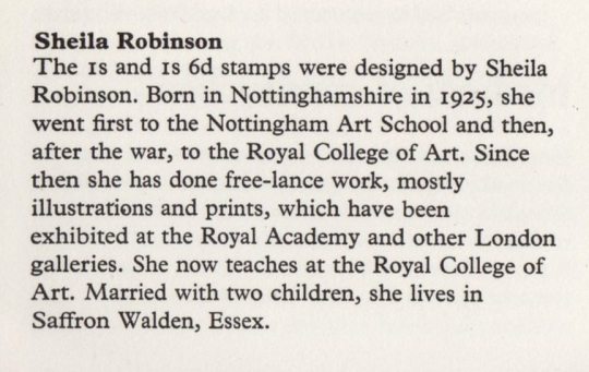
We start with Sheila Robinson, who was the wife of Bernard Cheese and mother of artist Chloe Cheese. Like many of the Great Bardfield artists, Robinson was a print-maker but unlike most print-makers she used cardboard as a medium giving her prints a unique subtle quality. Her first commission for the Post Office would be to design one of two stamps for the 900th Anniversary of Westminster Abbey in 1966.
Miss Sheila Robinson, an art teacher at the Royal College of Art, designed the 3p stamp (No. 452). This was her first attempt at stamp designing and her full name appears as imprint on the stamps. The 3p stamps, printed by Harrison and Sons.
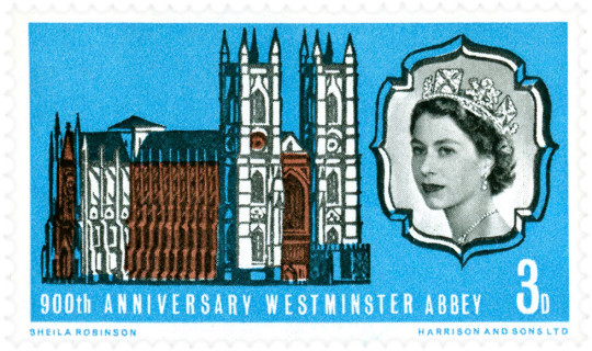
Sheila Robinson – 900th Anniversary of Westminster Abbey Stamp, 1966.
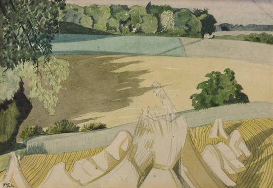
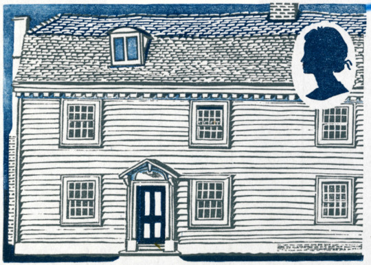
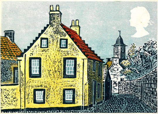
Her next commission would be four years later as part of the British Rural Architecture set of four stamps, Robinson designed two stamps, the other two being designed by David Gentleman. Released on 11th February 1970, they were in circulation for one year. The final designs were Welsh Stucco and Ulster Thatch.
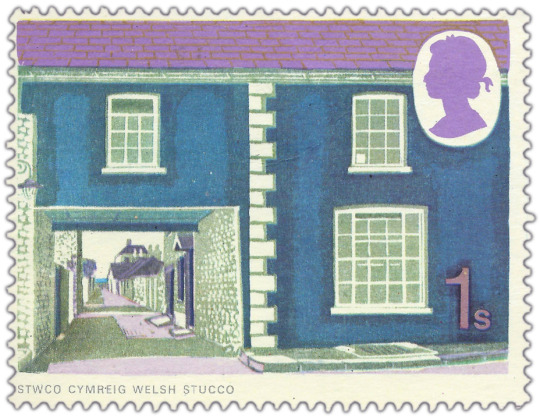
Sheila Robinson – Welsh Stucco Stamp, 1970
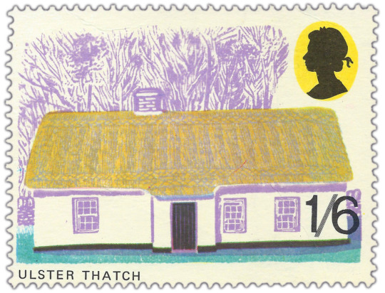
Sheila Robinson – Ulster Thatch, 1970
Above: Part of the information packet to the stamps
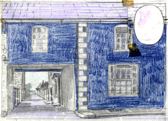
Below: are two other stamp designs and one prototype design.
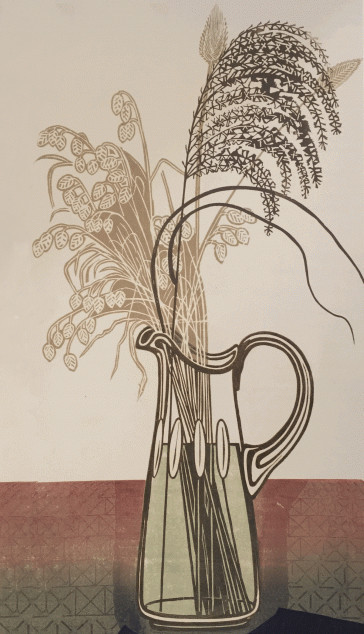
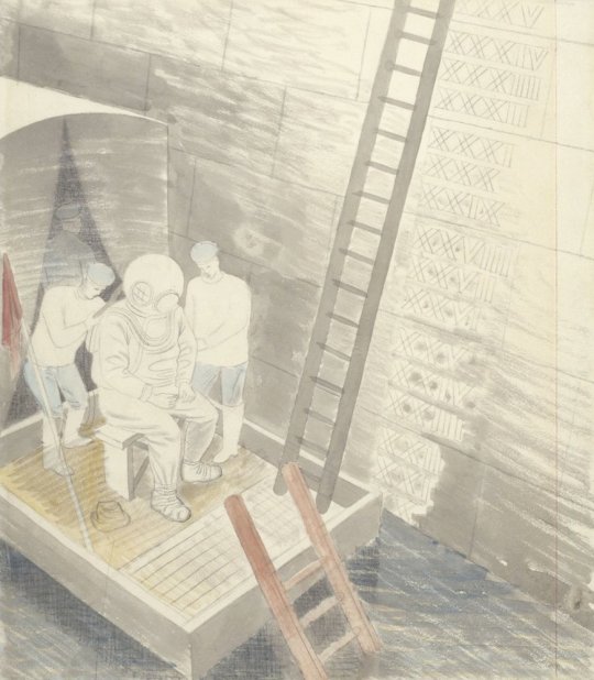
Sheila Robinson – Stamp Design Study – Welsh Stucco Stamp, 1970
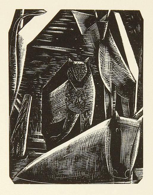
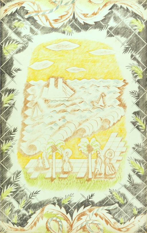
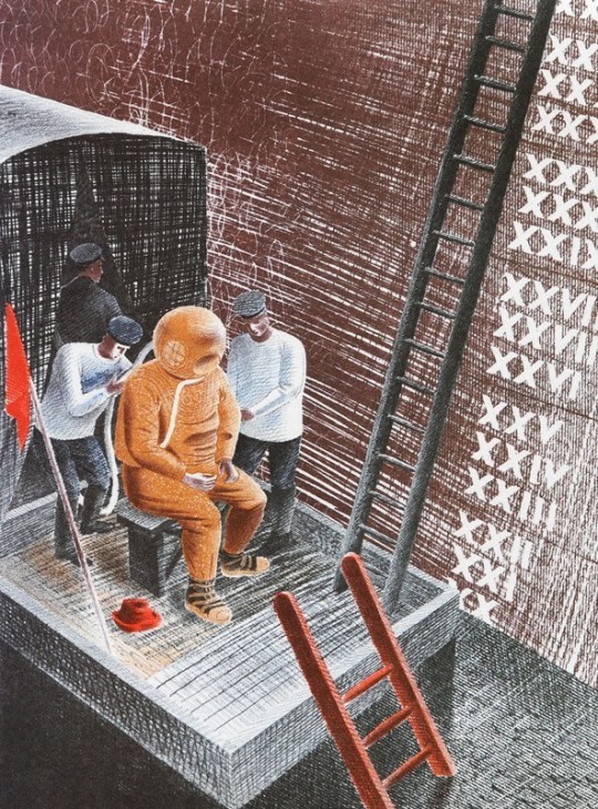
Sheila Robinson – Unused Stamp Design Study, 1970
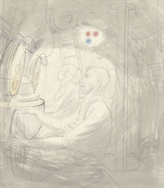
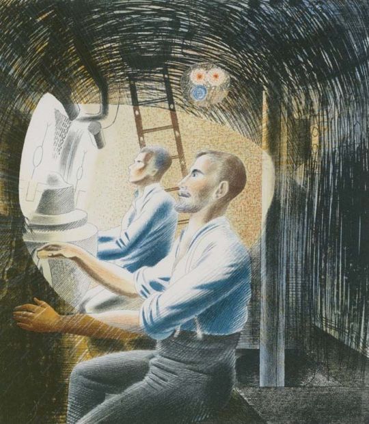
Sheila Robinson – Unused Stamp Design Study, 1970
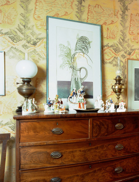
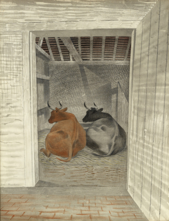
Sheila Robinson – Abingdon (Linocut published by The Post Office), 1965
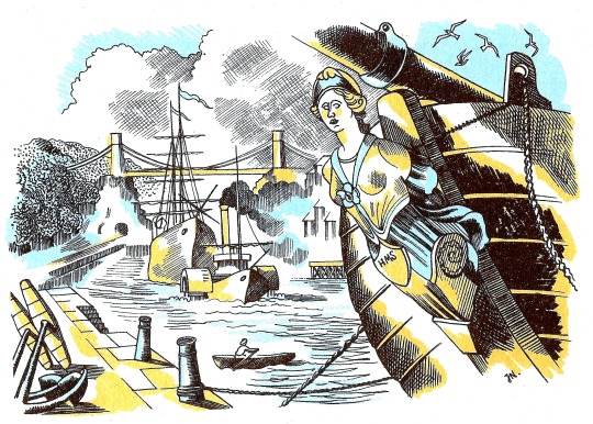
George Chapman had designed posters for Shell and the GPO. After he moved from Great Bardfield he moved to Wales, painting pictures in limited palates of colour, this is a grim looking image with the setting sun.
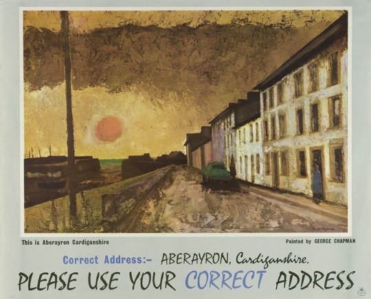
George Chapman – GPO Poster: This is Aberayron Cardiganshire, 1962
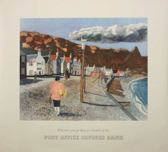
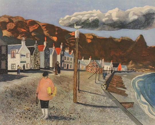
Denise Hoyle is the wife of Walter Hoyle and designed some simple posters for the Post Office savings bank, with the artwork being made from collages.
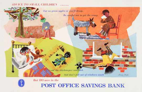
Denise Hoyle – Post Office Savings Bank,
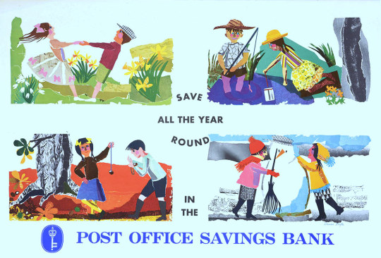
Denise Hoyle – Post Office Savings Bank
Walter Hoyle’s poster designs for the Savings Bank are also curiously off, depicting daily life but in an unfashionable way. Harlow looks wretched with a Golly in the corner and Morris Dancing is hardly popular. The Pennan, Aberdeenshire poster has a beautiful painting with it but feels very lonely.
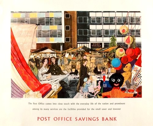
Walter Hoyle – Harlow, New Town, Post Office Savings Bank,
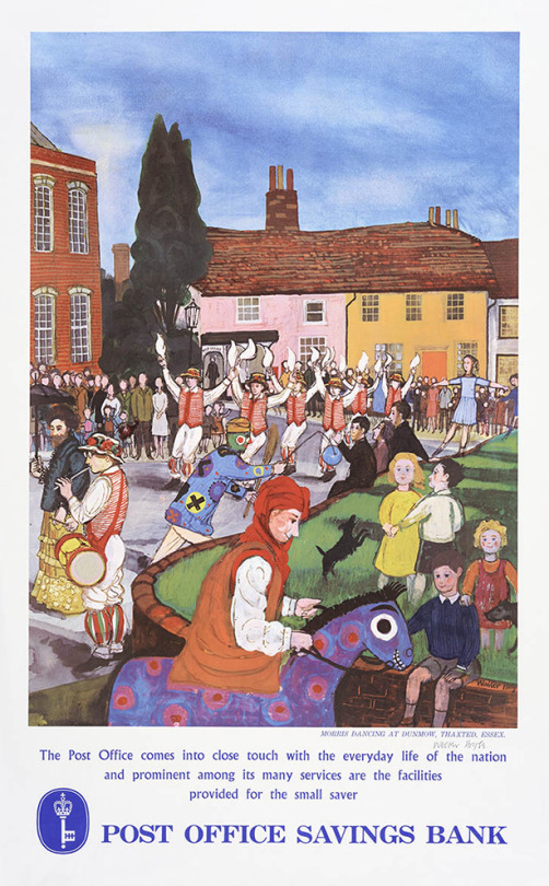
Walter Hoyle – Morris Dancers, Dunmow, Thaxted.
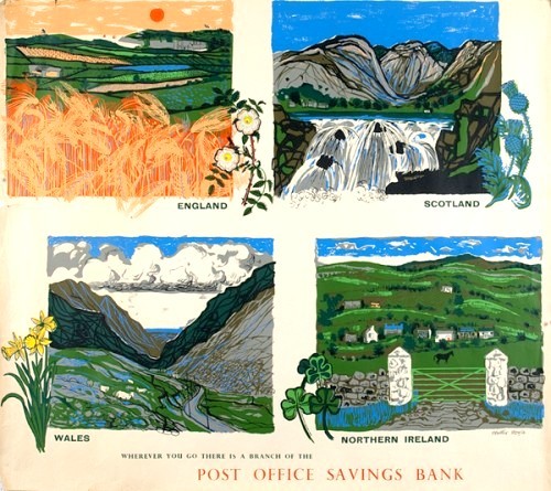
Walter Hoyle – Post Office Savings Bank – Four Nations.
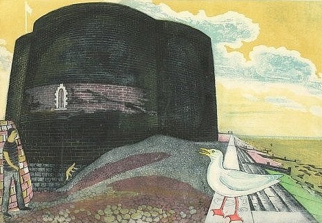
Walter Hoyle – Post Office Pennan, Aberdeenshire, GPO Poster, 1954
Walter Hoyle – Artwork for Post Office Pennan, Aberdeenshire, 1954
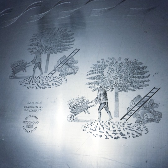
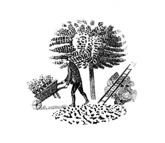
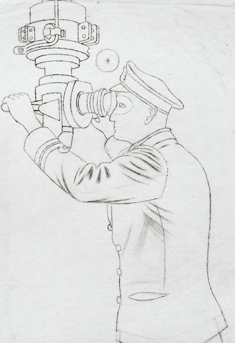
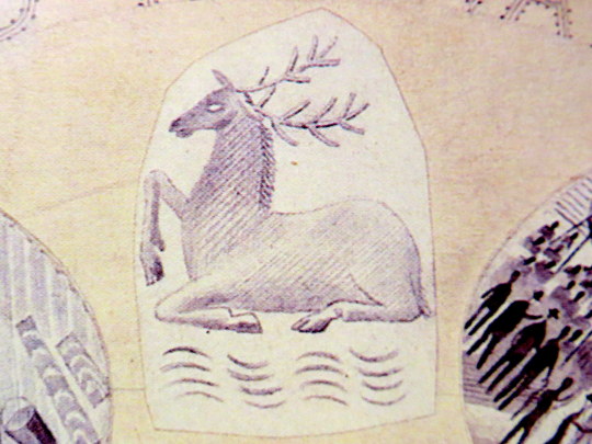
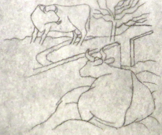
Eric Ravilious only work for the Post Office was a invitation to design a stamp to commemorate 100 years since the introduction of the Penny Black, the first adhesive stamp. Sadly this was not commissioned.
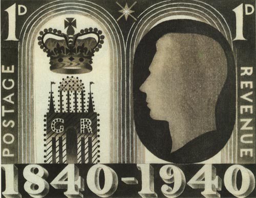
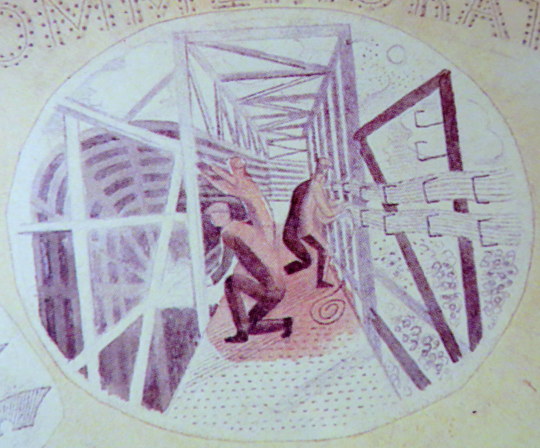
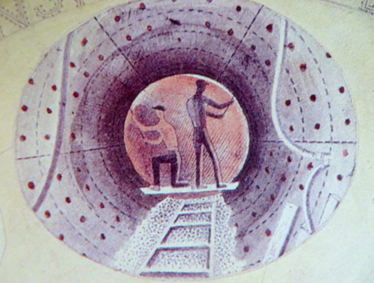
Eric Ravilious – Design for Stamp, 1940
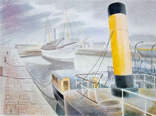
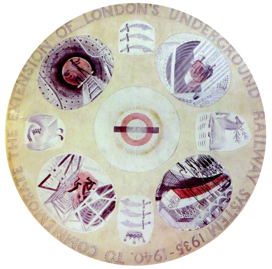
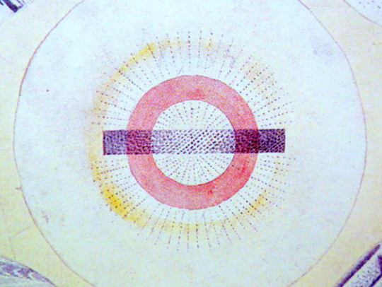
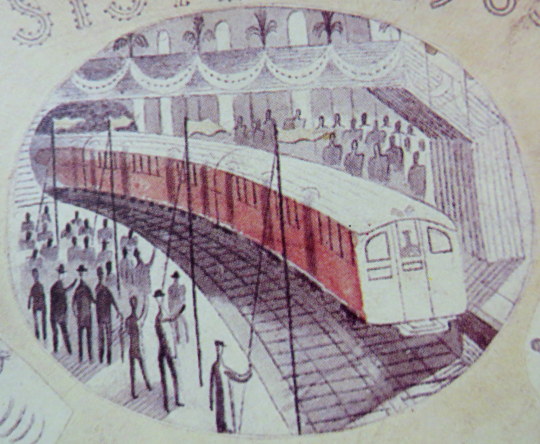
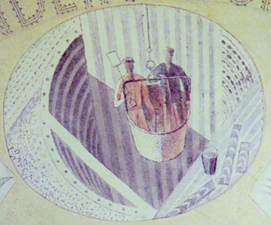
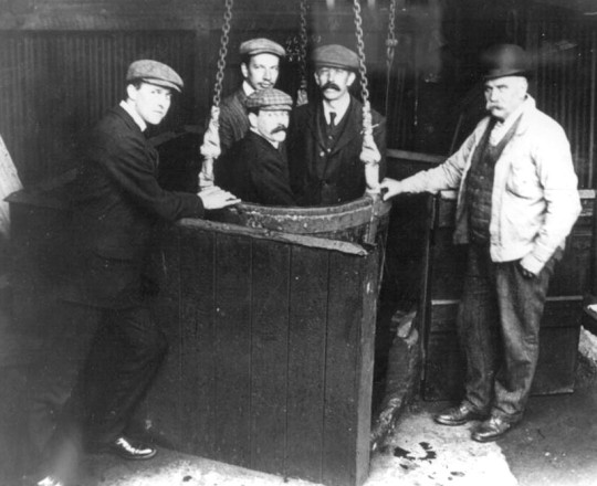
Edward Bawden’s work for the GPO included work that was and wasn’t commissioned. The Post Office Tube Railway was used as a poster with Printed text blow on another sheet.
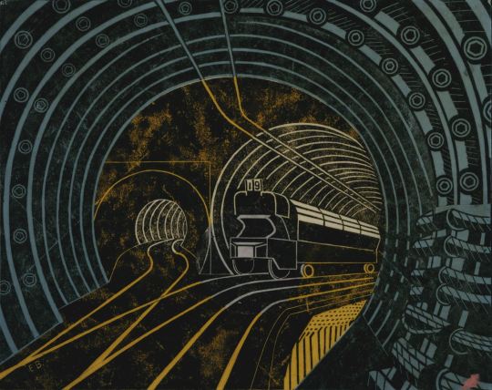
Edward Bawden – Post Office Tube Railway, 1935
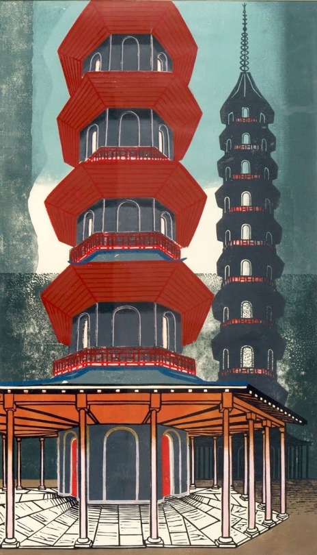
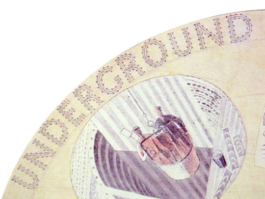
The poster Bawden designed for London Transport to advertise Kew Gardens would be turned into stamps later along with other artists. The full image is on the poster but on the stamp they have cropped it.
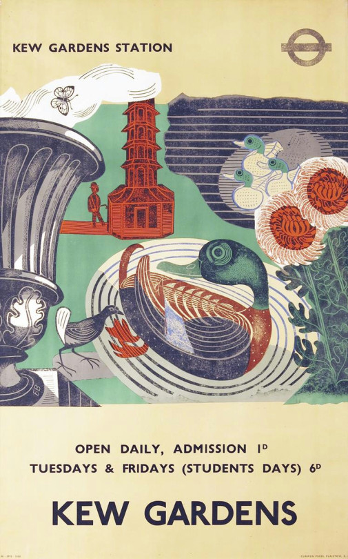
Edward Bawden – Kew Gardens Poster for London Underground, 1936
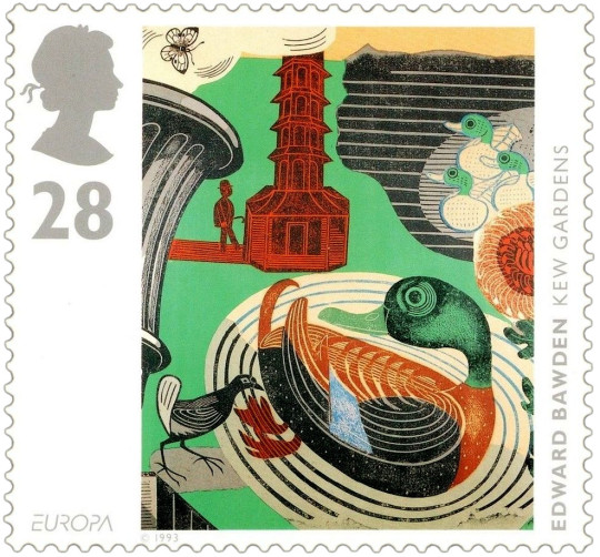
Edward Bawden – Kew Gardens Stamp, 1993
Below is a telegram design by Bawden that was not used by the GPO.
In the archives are lists showing that many well-known artists had not only been considered but had actually been invited to proffer designs. That so many of these invitees did not result in published telegrams may have been a combination of reluctance on the side of the artist and under-confidence or economy on the side of the Post Office.
A list, … included McKnight Kauffer, Graham Sutherland, Edward Bawden, Gwen Raverat and Fougasse. And a further list some two years later, in 1937, apparently emanating from Beddington, included Robin Darwin, Claude Flight, Blair Hughes-Stanton, Cedric Morris, John Nash and Clare Leighton. Many of these were subsequently formally invited to submit roughs. †
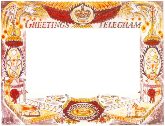
Edward Bawden – Telegram Design, 1935
† Ruth Artmonsky – Bringer of Good Tidings. Greetings Telegrams, 2009 – p22