This is the first part in a series of posts I have been working on about the cookery books made by artists of Great Bardfield. This first volume is on Eric Ravilious.
Eric William Ravilious (22 July 1903 – 2 September 1942) was an English painter, designer, book illustrator and wood-engraver. He grew up in East Sussex, and is particularly known for his watercolours of the South Downs and other English landscapes, which examine English landscape and vernacular art with an off-kilter, modernist sensibility and clarity. He served as a war artist, and died when the aircraft he was in was lost off Iceland. ◊
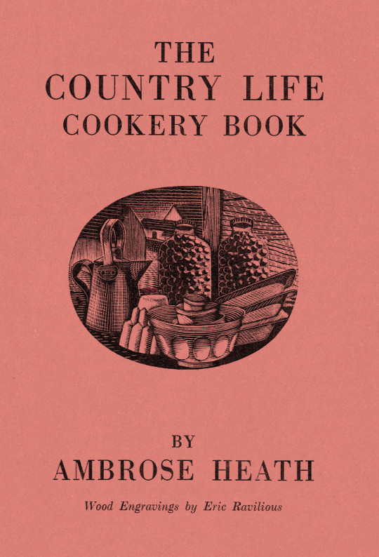
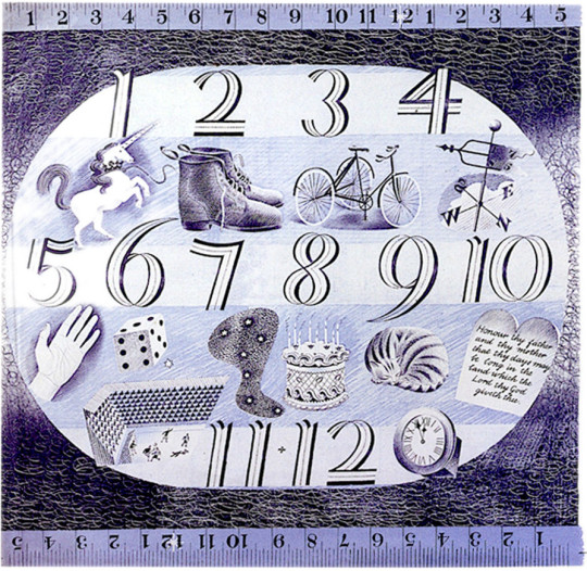
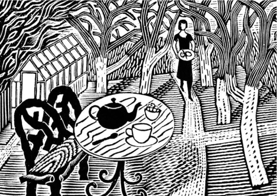
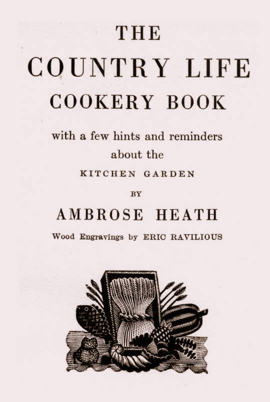
Dust Jacket for The Country Life Cookery Book by Ambrose Heath, 1937
The Country Life Cookery Book was published in 1937 and illustrated by Eric Ravilious. Country Life to some may just be the magazine, but at this point in history they were a major publisher about architecture, craft and a style of country life that would appeal to the new middle and upper classes of Britain. The publications normally contained lots of high quality photography.
In the same year as the Cookery Book was published were many other books, here are a few others for adults: Where To Catch Salmon And Trout, Elements Of Stabling, Morning Flight A Book Of Wildfowl, Gun For Company, Victorian Street Ballads. For children there were: Skilled Horsemanship, The Golden Knight and Other Stories, Peter & Co, Knight in Africa and Rajah the Elephant… as part of the ‘Junior Country Life Library’.
The books are countryside propaganda in the age of travel by train, omnibus, charabanc and car. They were promoting Britain in the way they wanted to see it. It is fair to say when people talk about the ‘Golden Nineteen-Thirties’ that Country Life had a great deal in the legend.
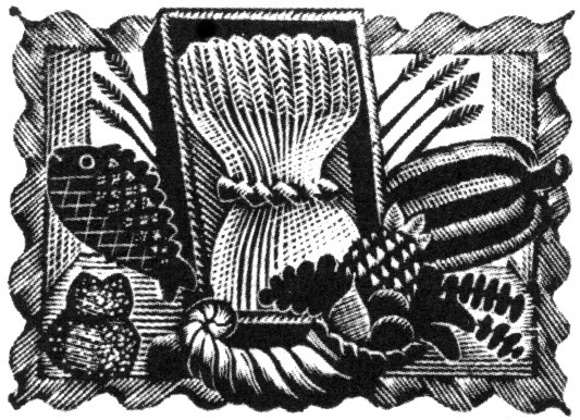
The Title-Page
Eric Ravilious – Title-page of the Country Life Cookery Book, 1937
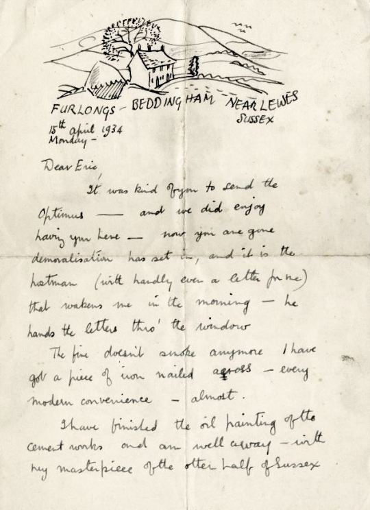
We know Ravilious got the commission for the cookery book in July 1936 as he wrote in this letter to Helen Binyon:
This book is now begun and begins to be promising. †
The wood-engravings follow a seasonal theme, month by month rather than chapters on food or following the text – this calendar style is like the other Ambrose Heath books for Faber & Faber that Edward Bawden had illustrated for the previous five years. Only 12 blocks were cut by Ravilious for the in the book, so with the title page decoration, two of the months (January & December) used the same image. One can only assume this was how many images they thought they needed and so how many images they paid for.
Having the chapters as seasonal months would also hurry the project along from the illustration front – as in April of 1937, nine months later, Ravilious wrote to Binyon:
I don’t believe Heath has written his text yet. ‡
But not having the text as a guide would mean Ravilious could invent the illustrations from his mind and use past works. He worked on the illustrations from July 1936 – February 1937 while taking on other commissioned work and finishing a series of watercolours.
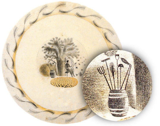
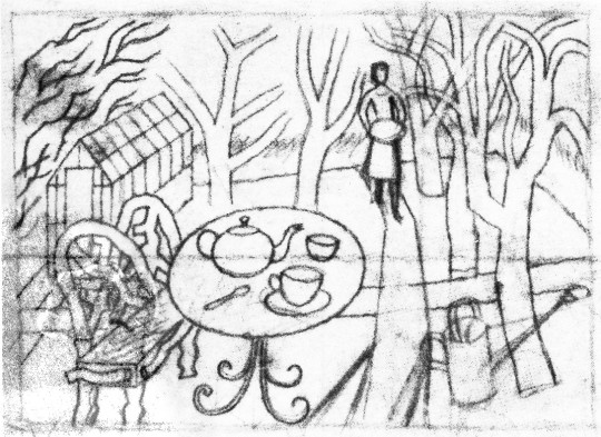
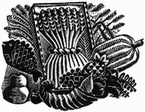
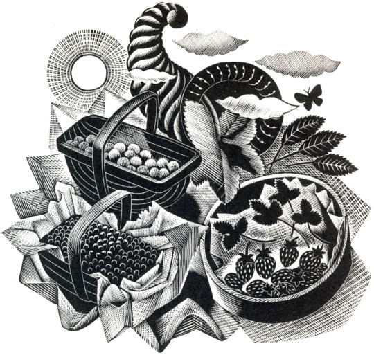
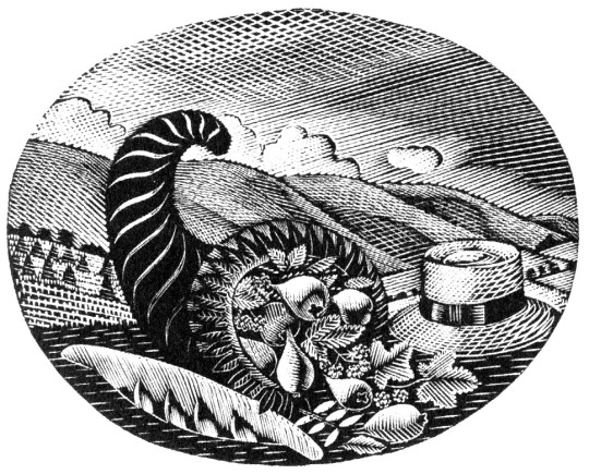
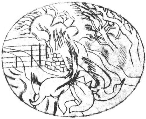
Below is the title page wood-engraving of a framed cornucopia, a wheat-sheaf and food produce. This illustration is a reject from another job.
Eric Ravilious – Title-page (Harvest Festival), Wood-engraving for the Cornhill Magazine, 1936
Ravilious was completing a commission for The Cornhill Magazine in the later part of 1936 and the project overlapped with the Cookery Book. So when one of the wood engravings was rejected by John Murray (editor of The Cornhill) he used it on the cookery book. I thought this engraving was a bit surreal and over the top until I discovered a drawing of it below.
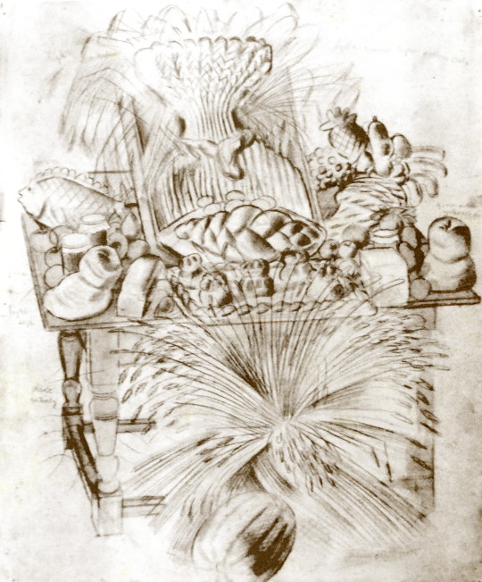
Eric Ravilious – Harvest Festival and Loaves, 1936
I’ve been drawing the bread table in the church – dead and fancy loaves, barley and corn, apples and eggs – and I thought it too beautiful not to place on record. ♠
Having been rejected for one job Ravilious cut away the framed backdrop of the table and submitted the wood-engraving below for the Cookery Book project instead.
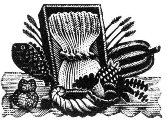
Eric Ravilious – Title-page (Harvest Festival), Wood-engraving for the Country Life Cookery Book, 1937
Below is another woodblock based on the same image made for The Writings of Gilbert White of Selborne in 1938. It’s a new version and not an edited restrike. Likely cut in 1937 as the job was commissioned in May of that year and the book published in 1938.
Eric Ravilious – (Harvest Festival), Wood-engraving for The Writings of Gilbert White of Selborne in 1938
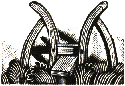
January and December
Eric Ravilious – January & December, Wood-engraving for the Country Life Cookery Book, 1937
January & December is the block that is used twice in the cookery book.
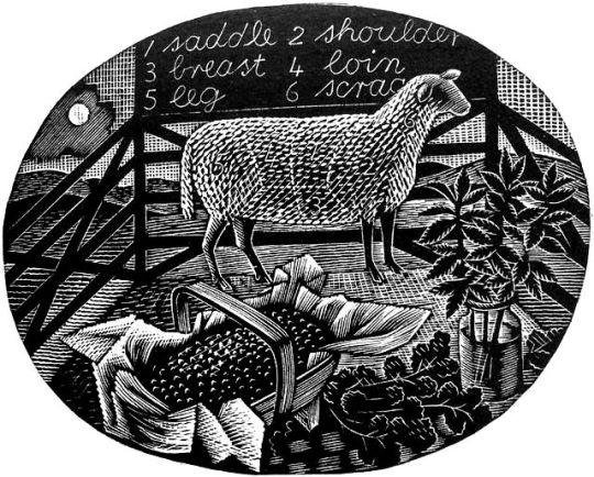
Ravilious would also find inspiration in the past. He owned a copy of The Frugal Housewife published by J Fairburn, 1838 and below is the meat guide on animals. I think this Ravilious woodcut is one of the defining moments in cookery illustration and helped re-popularise this old fashion key to animal flesh. The meat guide is now a typical image to see in cookery books to educate what meats can be gained from an animal. It is used three times in this book. He mentions the idea to use old cookery books below:
I’ve had what you would call a cleaver idea, and Mrs Beeton has been a help. †
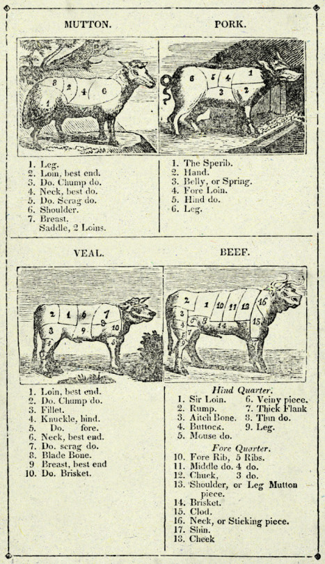
Frontispiece – The Frugal Housewife, J. Fairburn, 1838
February

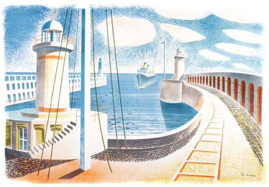
Eric Ravilious – February, Wood-engraving for the Country Life Cookery Book, 1937
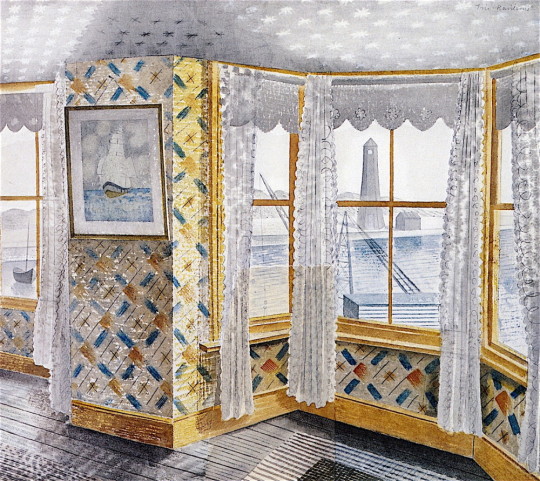
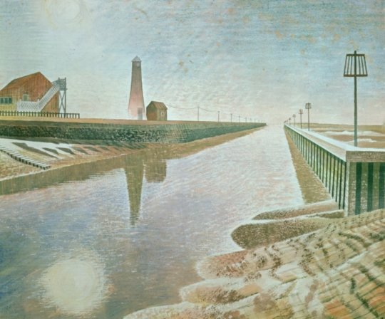
In the August of 1935 Edward Bawden and Ravilious went on a painting trip to Newhaven and in the wood-engraving above, the basket of fish emblazoned with the name of the town.
The idea for the wood engraving would also pop up again in another format, this time a print for Contemporary Lithographs, a company working with artists to make large runs of lithographic prints that would be cheap for the public to buy from the Zwemmer Gallery. Below is one of the watercolours from 1935 that could have been the inspiration for the commission. (The watercolour was also sold via Zwemmer Gallery).
Eric Ravilious – Newhaven Harbour, 1935
The print that Ravilious completed is very similar to the Cookery Book print as the jobs overlapped. The official title of the print is Newhaven Harbour but Eric referred to the print as ‘Homage to Seurat’. Helen Binyon wrote that the print has a:
scene of sensitive clarity and beautiful luminosity ♦
Eric Ravilious – Newhaven Harbour, Contemporary Lithographs Ltd, 1937
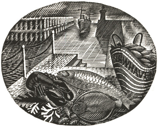
Eric Ravilious – February, Wood-engraving for the Country Life Cookery Book, 1937
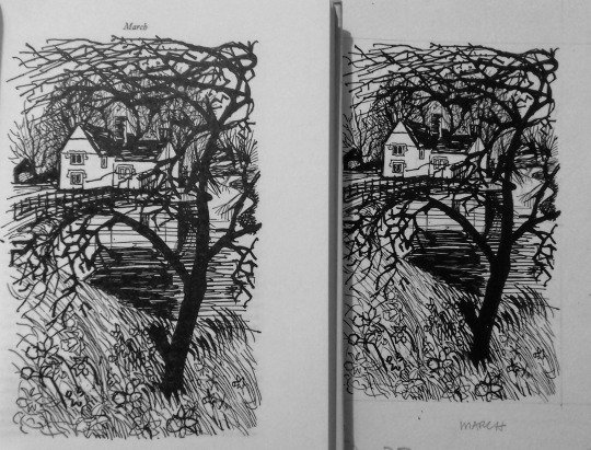
March
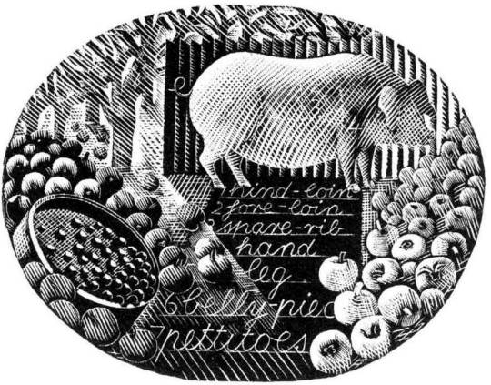
Eric Ravilious – March, Wood-engraving for the Country Life Cookery Book, 1937
A pig surrounded by the fruit of choice, apples, and to the left of the wood-engraving a garden sieve with berries upon it. The watercolour below comes from the same year as the Cookery Book’s commission, but is now one of the lost paintings of Ravilious, it was also damaged when last seen having had the top left corner ripped and creased.
Trugs with Fruit is a lost watercolour by Eric Ravilious, damaged. In the corner it may have been framed and sold or just disregarded and thrown away, but it appears in the wood engraving in this commission for John G Murray, editor of the Cornhill Magazine. It was made for publicity for the Magazine but so far has only ever been seen on the compliment slips they had for a short time.
Eric Ravilious – Trugs with Fruit, 1936
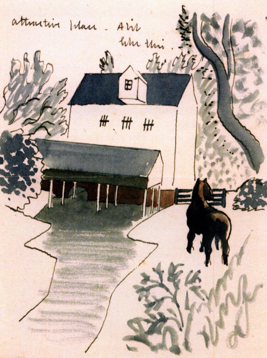
April
Eric Ravilious – April, Wood-engraving for the Country Life Cookery Book, 1937
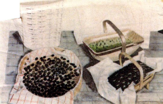
Rather like the Title Page, the wood engraving for April came at the same time as the Cornhill Magazine commission. Below is a watercolour, now presumed lost of trugs of fruit and the same trug appears in the wood engraving next to a glass of mint – these are red currents and mint, said to be the good sauces for Lamb.

Eric Ravilious – Trugs with Fruit, 1936
The wood-engraving below would have been copied from the painting and in the printing process it appears reversed, it comes with the same cornucopia from the title-page engraving.
Eric Ravilious – Autumn Fruits, 1936
And here you can see the wood-engraving in use on the Cornhill Magazine compliment slip.
Eric Ravilious – Cornhill Magazine Complement Slip with Autumn Fruits, 1936
May
The wood-engraving for May looks to be the most original of all of the illustrations, I can’t think of having seen any element in past work.
Eric Ravilious – May, Wood-engraving for the Country Life Cookery Book, 1937
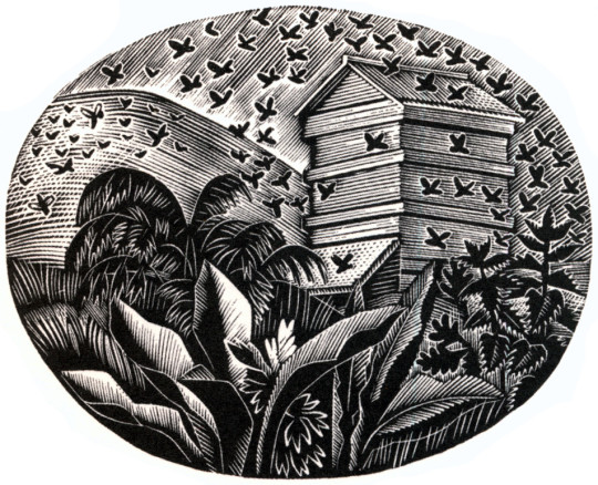
June
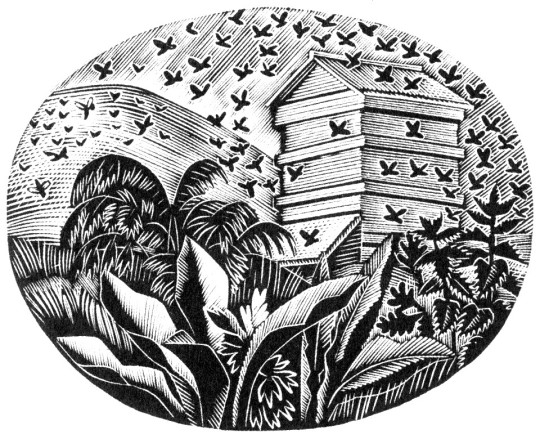
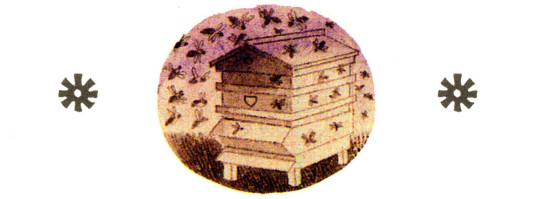
Eric Ravilious – June, Wood-engraving for the Country Life Cookery Book, 1937
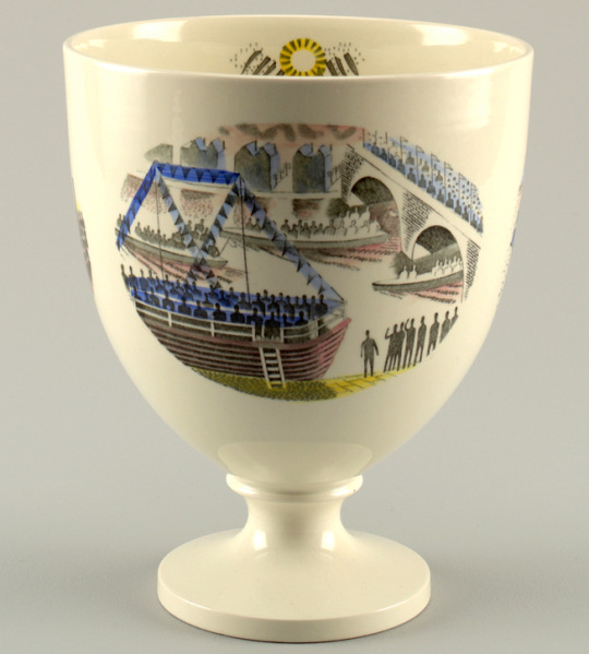
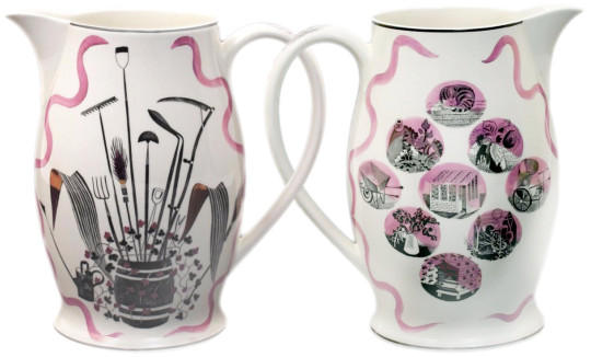
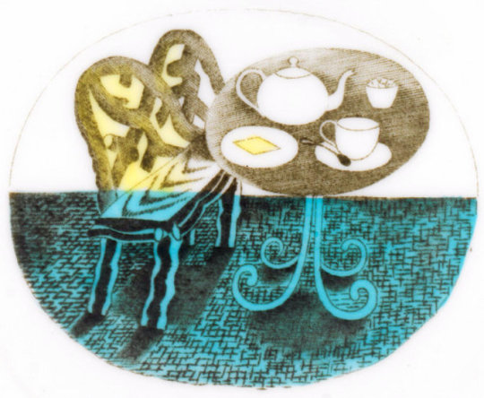
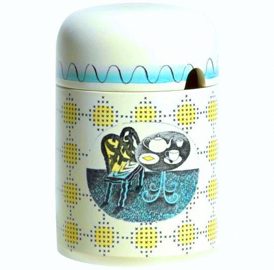
The June illustration features a bee-hive. A variation of the image would be used two years later on The Garden Implements Jug that was also designed by Ravilious for Wedgwood. The bottom most vignette.
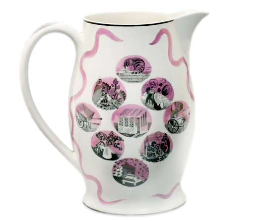
Wedgwood Garden Implements Jug, 1939
July
Eric Ravilious – July, Wood-engraving for the Country Life Cookery Book, 1937
The wood-engraving for July has roots in many places. The finished wood block has a hat, cornucopia of pears, a hat on the backdrop of hills and cornstooks. In an early drawing for the wood-block the hat is in the same place (reversed when printed) but many of the other elements have changed.
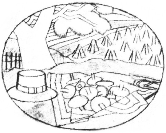
Eric Ravilious – Proposed July Block, Drawing made on tracing paper for woodblock, (reversed for printing), 1936
It is likely that the print Ravilious drew out was inspired by the Harvest theme of the month he was illustrating and he looked back on older work. Below the wood engraving from 1934 is one of many Curwen Press Stock Blocks. They are woodblocks and prints the press has paid artists to make so they can be used without the need to hire an illustrator for a job, so production times can be quicker and still have illustrated items.
The tree and setting of cornstooks reminded me of the drawing he made above and even the way the stooks flow uphill.
Eric Ravilious – July, Wood-engraving for the Country Life Cookery Book, 1937
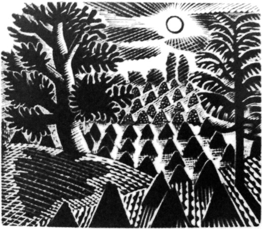
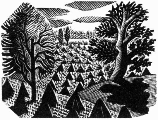
Eric Ravilious – Curwen Press Stock Block 985, 1936
The booklet the block was used upon happened to be called Spectator Harvest, for the Spectator Magazine.
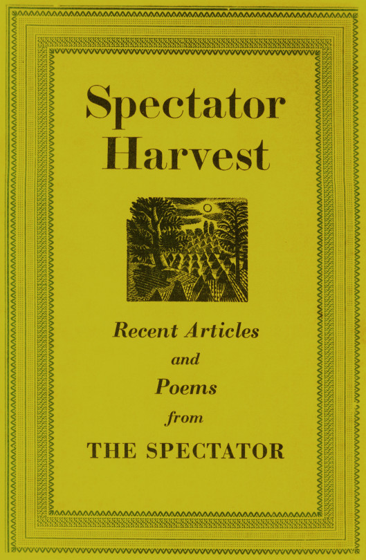
Spectator Harvest, 1952
It was also re-cut in mirror image for The Writings of Gilbert White of Selborne in 1938.
Eric Ravilious – Selborne Tailpiece Volume 2, 1938
But back to the cookery book – the cornucopia below (that appeared next to a hat and a baguette) has been seen before in this post – in the wood-engraving in use on the Cornhill Magazine compliment slip.

Eric Ravilious – July, Wood-engraving for the Country Life Cookery Book, 1937
One above the other, it isn’t hard to see a link.

Eric Ravilious – Autumn Fruits, 1936
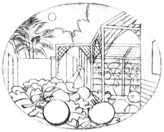
August
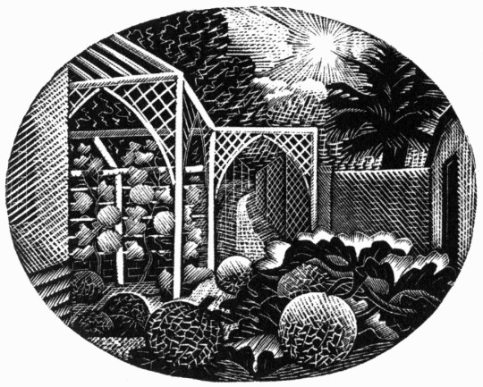
Eric Ravilious – August, Wood-engraving for the Country Life Cookery Book, 1937
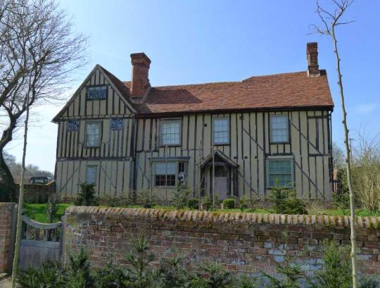
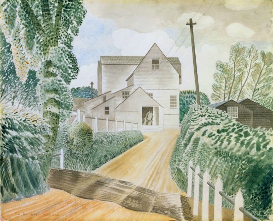
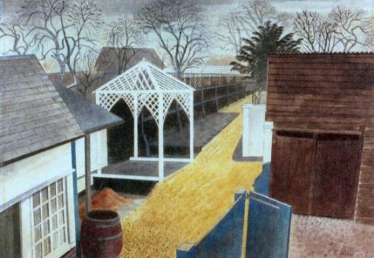
For the August vignette Ravilious chose to illustrate the garden of Brick House in Great Bardfield. Ravilious and his wife Tirzah had shared the house with Edward Bawden and his wife Charlotte from 1932 until 1935 when the Raviliouses moved to near-by Castle Hedingham.
In 1936 Bawden painted the garden in the winter of the Cookery Book commission showing the wood gazebo that was up in 1932 as it was a wedding gift from Eric and Tirzah to Edward and Charlotte. The arches must have been added between then, around 1936.
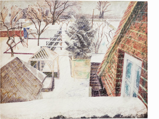
Edward Bawden, February 2pm, 1936
Eric Ravilious – The Garden Path, 1933
Eric Ravilious – August – Drawing made on tracing paper for woodblock, 1936 (reversed for printing)
September
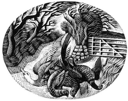
Eric Ravilious – September, Wood-engraving for the Country Life Cookery Book, 1937
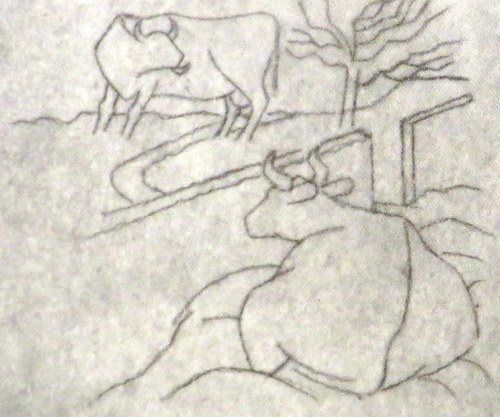
The illustration for September shows the game shooting season and a brace of birds, maybe a goose to the left and pheasants to the right in front of a country lane. Below is the original trace drawing for the block, reversed for printing.
Eric Ravilious – September, Drawing made on tracing paper for woodblock, (reversed for printing), 1936
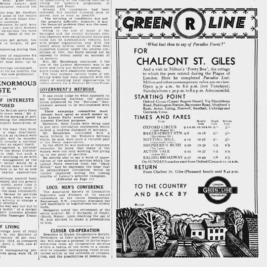
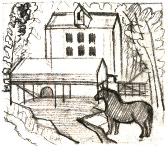
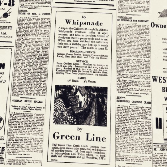
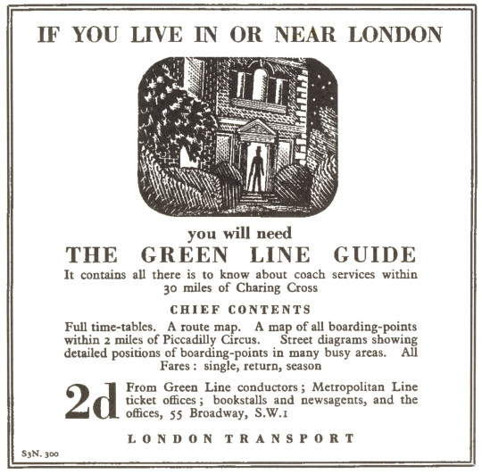
Followers of my blog would not be surprised to see that the illustration bears a similarity to another one, the wood-engraving for London Transport, this is confirmed in a letter to Helen Binyon again:
The jobs, cookery and Green Line advertisements – are all done and sent off and very glad am I that hard work is finished. ♣
Counter to the letter I can’t find another reference to them in print.

Eric Ravilious – The Shepard, 1936
The Shepard is one of the most lively engravings that Ravilious made for London Transport. The Sheep and their ears with the hillside up to the house are pleasing. The technicality of the halftone shading are some of his best. ♥
The Cookery Books version of the engraving is more detailed, I think because the printing was likely to be finer than the press adverts the London Transport one would be reproduced in.

Eric Ravilious – September, Wood-engraving for the Country Life Cookery Book, 1937
October
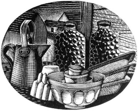
Eric Ravilious – October, Wood-engraving for the Country Life Cookery Book, 1937
October sees kitchen items, a jug, copper jelly mould stacked mixing bowls and baking trays with two jars of preserved items.
November
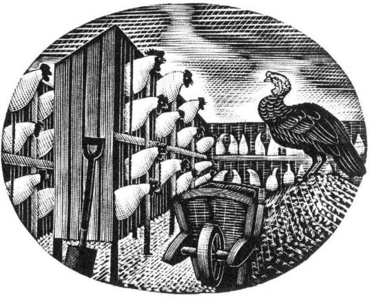
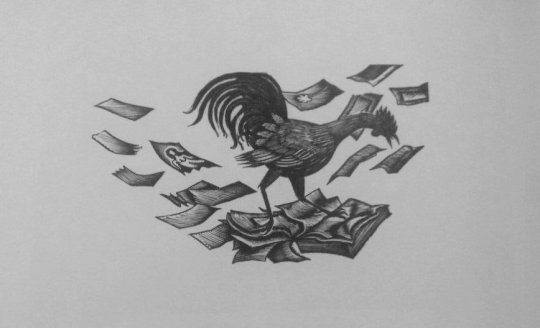
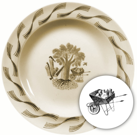
Eric Ravilious – November, Wood-engraving for the Country Life Cookery Book, 1937
The last work of a chicken farm and a turkey with wheelbarrow gives the Christmas feeling and may have been marked to have been the December illustration but January’s wood-engraving was also used as December.
† Eric Ravilious to Helen Binyon – 19th July, 1936
‡ Eric Ravilious to Helen Binyon – 14th April, 1937
♠ Eric Ravilious to Helen Binton – 6th October, 1936
♣ Eric Ravilious to Helen Binyon – 17th August (1936)
♦ Helen Binyon – Eric Ravilious: Memoir of an Artist, 2016
♥ Robjn Cantus – A Journey of London Transport with Eric Ravilious, 2018
◊ Wikipedia – Eric Ravilious