The Betrayal of Henry Moore

This post is about the 1967 gift of Henry Moore’s works to the Tate and how it never came to be. But more so, it’s about a public statement against that donation by 41 of his peers; people like Elisabeth Frink, Patrick Caulfield, Derek Boshier, Eduardo Paolozzi and Joe Tilson to name a few.

image

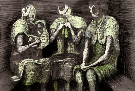
 Henry Moore – Three Fates, 1941

Having been a student at the Royal College of Art from 1921 to 1924, his first major breakthrough was as part of the Seven and Five Society. The society was set up in the 1920s, mostly for painters, but in the 30s they expanded and the new members bought a more abstract stance with them. The newer members where John Piper, Barbara Hepworth, Henry Moore and John Skeaping.

In the 40s Moore’s London Underground ‘shelter scenes’ presented his work with a human and sensitive side. From then on, a massive bulk of sculpture, drawings, paintings and books forged Moore as a great British artist.

Moore was looking how to cement his legacy as an artist. He was on, what anyone would have assumed was the peak of his forty year career.

image

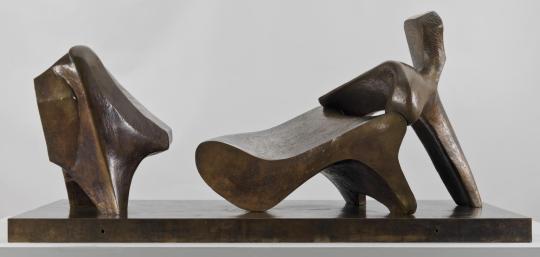
 Henry Moore – Three Piece Reclining Figure No.2: Bridge Prop

On 27th February 1967, The Times’s front page hailed news that Henry Moore intended to donate many of his works to the Tate Gallery, London.

He had enjoyed a long association with the Tate, not least as trustee, and the idea of a gift was first mooted in 1964. In 1967 he made it conditional on an extension of the Tate’s galleries. †

image

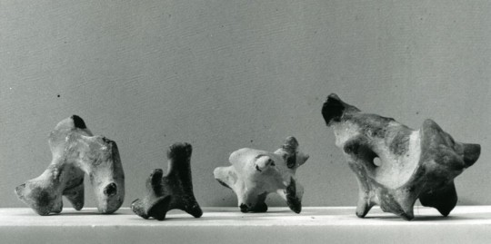
 Flint stones in Henry Moore’s studio

The gift would have required the Tate to build a new wing to house the works. The cost to house the collection was rumoured to have been half a million British Pounds in 1967. In the weeks and months after the announcement, negotiations where held about how to raise the money, meanwhile, 41 artists wrote a letter to The Times to protest the new works, two of them, Moore’s own students.

The letter featured the phrase they all feared would happen if the works were housed: ‘publicly financed form of permanent enshrinement’ ‡.

‘Contemporary artists close to the Tape expressed their concern over so much space and funding going toward the celebration of one artist alone’ ♠.

Times 26 May 1967
HENRY MOORE’S GIFT
From Mr. Craigie Aitchison and others

Sir. – References have been made in the press and in public during the last few weeks concerning the offer made by Henry Moore to the Tate of between 20 and 30 major works. We understand that the Government will be giving £200,000, and that the Tate will be raising an equivalent sum specifically towards housing these works.

We must not lose sight of the fact that this £400,000, probably only a starting figure, is public money: and considering how public this whole matter should be there has been little precise information available. What can be deduced should be viewed with concern.

We may assume that at least half the gift will be large works. These alone properly displayed would require a space twice the size of the present sculpture hall. Even if the permanent display of these pieces is not envisaged the question of storage is equally crucial.

There are great priorities confronting public patronage of the arts. The Tate has only limited space into which to expand and in which to fulfil its role as the only permanent manifestation of a living culture. London has failed so far to provide itself with museum facilities commensurate with its importance as an art centre and it will not achieve its proper place as an organic part of our world by devoting itself so massively to the work of a single artist.

Whoever is picked out for this exceptional place will necessarily seem to represent the triumph of modern art in our society. The radical nature of art in the twentieth century is inconsistent with the notion of an heroic and monumental role for the artist and any attempt to predetermine greatness for an individual in a publicly financed form of permanent enshrinement is a move we as artists repudiate.

Yours faithfully,
CRAIGIE AITCHISON, DAVID ANNESLEY, GILLIAN AYRES, ANTHONY BENJAMIN, DEREK BOSHIER, ANTHONY CARO, PATRICK CAULFIELD, BERNARD COHEN, HAROLD COHEN, GARTH EVANS, SHEILA FELL, ELISABETH FRINK, PATRICK GEORGE, ANTHONY HILL, HOWARD HODGKIN, MALCOLM HUGHES, GWYTHER IRWIN, TESS JARAY, ALLAN JONES, MICHAEL KIDNER, PHILLIP KING, JOHN LATHAM, FRANCIS MORLAND, HENRY MUNDY, MYLES MURPHY, EDUARDO PAOLOZZI, JOHN PLUMB, TIM SCOTT, PETER SEDGLEY, PETER SNOW, PETER STARTUP, JOE TILSON, WILLIAM TUCKER, EUAN UGLOW, MARC VAUX, BRIAN WALL, GILLIAN WISE, ANTHONY WISHAW, BRIAN YOUNG. 

The works would end up going to Toronto with the art gallery there proposing to build a wing for the works and reassuring Moore with architect letters and funding plans on how they would present the collection. The galleries campaign to get the works was lead by Allan Ross, the former president of WM.Wrigley chewing gum. He stated he would donate $500,000 towards a gallery for Henry Moore in Toronto.

Ross wrote: ‘It occurred to me that we of Toronto, and Ontario, and Canada, should build a splendid classical structure to adequately house the collection you have in mind for Tate Gallery and which they for some years apparently cannot accommodate’

 The Henry Moore Gallery in Toronto. 

† Henry Moore by Chris Stephens, 2010. p14 9781854378767
‡ ‘Henry Moore’s Gift’, in Times 26 May 1967, in Henry Moore: Sculptural Process and Public Identity, Tate Research Publication, 2015.
♠ Sculpture and the Museum by Christopher R. Marshall, 2011. p79-80 9781409409106

Gwen Raverat and all that

Gwen Raverat, the granddaughter of Charles Darwin, was an English wood engraver and author. Born and raised in Cambridge, England, she studied art at the Slade School of Fine Art in 1908 and studied under Frederick Brown and Henry Tonks.

She was inspired by Thomas Bewick’s wood engravings but the Slade at that time gave no opportunities to study wood engraving. When she left the Slade she went to Paris to the Sorbonne where she met and married Jacques Pierre Raverat, a fellow student and draughtsman.

She had some luck to obtain some instruction from her cousin Eleanor Monsell – Mrs Bernard Darwin – who had begun to cut and engrave wood blocks as early as 1898 but soon desisted owing to the pressure of other work. By 1914 Gwendolen Raverat had nearly sixty blocks to her credit. 

She was one of the founding members of the Society of Wood Engravers in 1920, alongside: Philip Hagreen, Robert Gibbings, Lucien Pissaro, and Eric Gill. The book below is a nice collection of styles of Raverat’s work, but it’s not her best work. It is a quaint throwback to when children would read a book of poetry.


The Cambridge Book of Poetry for Children, edited by Kenneth Grahame with 54 wood-engravings by Raverat, was published in 1932, printed from the original blocks.

image

 Book cover and Boy Reading wood engraving.

image

 The King of Spain’s Daughter.

image

 The Wagon of Hay.

image

 The Moon.

image

 The Eve of Waterloo.

image

 Winter Has Come.

image

 The Boat.

image

 Daffodils.

image

 The Forsaken Marman.

image

 Columbus.

† English Wood-Engraving 1900-1950 by Thomas Balston, 1951
A History of British Wood Engraving by Albert Garrett, 1978.
The Cambridge Book of Poetry for Children, edited by Kenneth Grahame, 1932

The Vision of Paul Nash

Below is an article by John Russell from The Listener magazine in November 1948. It’s mostly a promotional piece rather than a review, for the book ‘Paul Nash: Paintings, Drawings and Illustrations, 1948′. 

The publication of the book was timed with a retrospective exhibition of Nash’s work at the Tate Gallery two years after his death in 1946 of heart failure, as a result of his long-term asthma.

image

 Paul Nash – Landscape of the Vernal Equinox, 1943.

The Vision of Paul Nash by John Russell
In a moment of confidence (reproduced in June 1938 in that most fastidious of occasional periodicals, Signature) Paul Nash described how, as a very young man, he broke free from the thraldom of Rossetti. No violence was done; for he still trembled in sympathy with the luckless personages of that Italianate imagination, and was anxious to effect an unobtrusive retreat. ’I might have spared my caution’, he noted afterwards. ‘No one and no thing noticed either my presence or its departure. The lovers stayed locked in their anguished embrace, the chained monkey continued to pick the rose to pieces, the boar-hound of unsure anatomy still slept by the side of the lance and shield. On the window-sill the dove lay dead. Outside the door I passed the frenzied eavesdropper among the shadows’.

The man who could regard his own early attachments – and indeed the whole of life – with such ceremonious irony could not but appreciate the predicament of those who, in future years, will attempt to penetrate the imaginative world of Paul Nash himself. We who have grown up in this world, and marked each of its phases in turn, feel no such difficulty. The dis-peopled landscape of this painter’s art has long been accepted by us; and we know that for Paul Nash the conjunction of a toadstool and a tennis-ball  was as significant as the encounter of Lancelot and Guinevere. (He told us so, moreover-remarking that ‘for me at least, the forms of natural objects and the features of landscape were sufficient without the intrusion of human beings, or even animals’.)

image

 Paul Nash – Equivalents for the Megaliths, 1935.

To this conviction we owe the long series of painting in which he underprivileged members of the natural world were given the stature of heroic beings. It is in these works that the conventional order of landscape painting is reversed, and the fungus, the pebble and the diving-board are presented as triumphal features. In the last years of his life, when illness took from him all freedom of movement, he removed, in imagination, still further from the landscapes available to the casual eye. ‘What the body is denied’, he wrote at this time, ‘the mind must achieve’.

Many a friend and acquaintance of Paul Nash must recall how this painter, remarkable as ever for his anachronistic elegance of dress and diction, would expound in the sedate recesses of north Oxford the new visions on which he was working – the cluster of hellebores aslant the night sky, or the underground fortress of the mole. For those who knew, however slightly, this finest of men, it is natural to wish, and in wishing to assume, that the quality and intensity of his imagination have been perfectly reproduced in his work.

image

 Paul Nash – Iron steps, 106 Banbury Road, Oxford (Nash’s Home).

The wish, if not the assumption, has animated, for example, the majestic memorial volume which Messrs. Lund Humphries have rescued from dereliction. Miss Eates, the general editor, has followed in outline the plans laid down by the artist himself; the publishers, less fortunate, have inherited a quantity of plates, and a quality of paper, that one would not normally associate with their imprint. In default of those last personal ornaments which Paul Nash would have known so well how to give, Miss Eates has called upon four distinguished enthusiasts to contribute essays upon various aspects of the artist’s activity. Mr. Read, Mr. Rothenstein, Miss Ramsden and Mr. Philip James discharge their duties in able and affectionate style; there is a good, though not a complete catalogue of known paintings by Paul Nash; and 132 plates, of which twenty are in colour.

Paul Nash’s pictures are peculiarly difficult to reproduce. The unvarnished surface of his oils inclines to look thin and dry when transposed into monochrome; and as for the key-cold delicacy of his watercolours, there can be few signatures which so constantly evade the reproducer’s craft.

Some periods come off well in this memorial volume – the exacerbated realism, for instance, of the paintings brought home from Flanders in 1918; the patient geometry of the late nineteen-twenties; and some of the pictures which it is possible to regard as his finest work- the series done at Dymchurch between 1922 and 1924, in a landscape where, as Nash later remarked, ‘natural and artificial forms have equal pictorial significance, even amounting to architectural beauty’. As against this, there are many reproductions which can only give, to those who do not known the originals, a derisory impression of the science and devotion which made Paul Nash not merely an original fantasticator, but also the best straightforward water-colourist of his generation.

image

 Paul Nash – The Wall, Dymchurch, 1923.

Nash was that rarest of beings – an English water-colourist who got better and better; and he was never so good as when, during the last holiday of his life, he painted at Cleeve Hill, near Cheltenham, the series of sunset studies which, by their mastery of tone and variety of attack, can rank in the company of Girtin and Cotman. Of these paintings, unluckily, a grotesque amount is given, and one can hardly conceive that the artist would have sanctioned their appearance. One can only be grateful for the enthusiasm and the disregard for commercial obstacles which have gone to the making of this book, and its plates include many works which are rare, and some which have been destroyed; but it remains legitimate to hope that before long somebody will publish Paul Nash’s fragmentary memoirs, and a substantial collection of his admirable letters, for in these shines out the preservative irony which will help the best of his work to survive the hazards of reputation.

image

 Paul Nash – The Pyramids in the Sea, 1912.

Here are fragments of text by Andrew Causey about Nash’s preparations on the book, that turned into a his memorial publication.

Paul Nash had been preparing for at least two years before his death in 1946 material for the book which Lund Humphries would publish in due course. He collected black-and-white prints from owners, some of them images he had not seen since before the First World War. And though he did not finish the project, he invested considerable time and energy in it, creating the skeleton of a book of which he may be considered part-author, and in which he could take much pride. 

The book signalled an advance on the conventional art book at that point: apart from the various authors’ texts, it contained supplementary information, including chronologies of Nash exhibitions and a list of Nash’s paintings and drawings in public collections in Britain and around the world. It was produced under difficult postwar conditions, marked especially by the shortage of paper of appropriate quality. ‡

The correspondence during the Second World War years surrounding Nash’s assembly of plates for what was to become the Lund Humphries book, shows how highly he valued his early drawings made around the family’s home at Iver Heath and how much his emotions were stirred by reliving his early life through his drawings. The paradox is that a book so personal to the artist and so full of references to his own life should not have been seen by Nash in its finished form. 

image

 Paul Nash: Paintings, Drawings and Illustrations, 1948.

† The Listener, November 1948. The Vision of Paul Nash by John Russell
‡ Lund Humphries – Celebrating 75 Years of Art Book Publishing. 1939–2014. – Paul Nash by Andrew Causey

A Double Take – Shell Adverts

image

In the 1930’s the adverts of Twinings, Guinness and Shell all followed a similar trend of comic verse and modern illustration.

Advertising needed to work differently in print, especially with the rise of weekly magazines, adverts were serialised, so every week they would have a different poem, illustration or tag line for the same product.

image

 John Patrick – Laurel & Hardy Chorlton-cum-Hardy Shell Petrol, 1937.

The adverts became less about the ‘quality and price’ of the products; but more abstract, advertising what the products do. With Shell it was to make you ‘go faster’, or give the perception of that.

image

The changes happened under Jack Beddington, who it could be argued changed the face of British Advertising by thinking of where his adverts would be seen. In magazines there would be more time to read the adverts, so there were poems or jokes. In petrol stations it was a bright poster with a line of text, something clean, quick to read and inspiring – for early petrol stations, that were mostly grubby sheds or small brick huts.

It was a trick Guinness would use to brighten up gloomy pubs. A decade later Lyons Corner-houses consulted Beddington on artists and lithography choices when doing prints to liven up their tea-rooms.

His adverts used modern art to make the company look modern by association. At this time museums charged admission, so the public didn’t visit them as much, so in these posters, it would have been the first time the public were exposed to modern art. The posters ’You can be sure of shell’ showcased beautiful British Locations by modern artists.

image

 Edward Scroggie – Temple Bar – ‘To Visit Britain’s Landmarks, You can be Sure of Shell’, 1937.

The magazine adverts were, on the whole, black and white with line drawings. The most famous are the series designed by Edward Bawden, but as I couldn’t find the illustrations below online, and the designers are less known, I thought it would be more interesting to showcase those rather than the adverts everyone knows already.

image

I photographed these adverts from old copies of Zoo Magazine: the National Nature Magazine – The Official Organ of the Zoological Society of London from 1937, ’38 and ’39.

image

 John Reynolds – ‘By Gad Sir!’ Reynolds was a book illustrator and cartoonist, best known for his illustrations of 1066 And All That (1930).

image

 Brian Robb – ‘Times Change.’ Robb worked for Punch in the 30′s, made posters for Shell and London Transport and became Head of Illustration at the Royal College, London. He was also a Camouflage Officer in the Western Desert in the Second World War. The advert above reads:

Times Change – So Does Shell
The threatening spectre of Mrs. Grundy and the cool efficiency of the policewoman are each as typical of their period. The working of the modern motor car is just as efficient and effortless. This is not due to any sudden discovery, but to many years of gradual improvement in motor engines, and to the continual change made by Shell to ensure that it will always give the highest performance. 

image
image

 Brian Robb – ‘Times Change’.

Times Change … So Does Shell
That’s Evolution – that is! Darwin might have said this about Shell, if he had been alive today. In the last thirty years motorcars have changed completely in appearance and engine design, but Shell has always adapted itself imperceptibly to the innumerate improvements that have been made. Today, as in 1907.

image
image

 Brian Robb – ‘Times Change’.

Times Change – so does Shell.
Shell has always been a contemporary spirit. It belongs to 1937 as much as it belonged to 1907. Between the years lies a big different made up of countless small improvements, each of which was made immediately it became desirable and possible. If, in the Autumn, you buy a 1938 car, you will find that Shell suits it perfectly; for Shell keeps in step with motor-car design.

image

She’s a hiker…
This girl would be a good walker, if only her clothes would let her. Some petrols suffer from the same handicap; they’ve got the essential power but not in a form in which it is most effective in the high-compression engine.
Shell, on the other hand, is really good petrol made still more suitable for the modern car by the new “re-forming” process.

image

Edward Bawden – Early War Paintings.

This post is a light introduction into Edward Bawden’s early war work and paintings, before he was stationed to the Middle-East.

image

 Edward Bawden – In an Air Raid Shelter, Dunkirk – Bombs are dropping, 1940.

On Thursday, 7th March, 1940, three days before his 37th birthday, it was announced in the British papers that Edward Bawden and Barnett Freeman were to become Official War Artists on behalf of the British War Office.

image

 Newspaper with the small announcement under ‘War Artists’.

In the first days of April, Ardizzone (Edward) and Bawden took rooms for a while in the hotel Commerce in Arras, fussed over by a shared batman. They enjoyed the local wine and hospitality, before being billeted separately. Arras was dour, small and grey, It was also the GHQ for the British Army in France. 

image

 Edward Bawden – Boys Serving Coffee, Dunkirk, 1940.

From the outset Edward Bawden had wanted to be close to the action: ‘Mr Bawden … would like to get to the front and live in close touch with the RAF.’ In the event he began his time in France with the 2nd Northampton Regiment, rather than the air force.The Northamptons, he found, were ‘nice, simple fellows … who tear about wagging their tails, fetching sticks and retrieving balls.’ 

The war artists found themselves being toured around by a Conducting Officer, who would choose the suitable sites and subjects. Once, Bawden was placed under arrest as he was painstakingly drawing a gun. On another occasion he was able to sit in on a court martial and sketch. 

image

 Edward Bawden – A Court-Martial, Halluin, 1940.

On his way to Dunkirk, Bawden has rolled up his paintings in a cylindrical tin which he clutched under his arm. †

image

 Edward Bawden – Embarkation of Wounded, May, 1940.

Approaching the port, he ditched all his equipment except his art materials (what would the Germans have done with them?) Marching into the town, they ran the gauntlet of ragged French soldiers jeering them. It discomforted him, as did the looters sweeping like locusts through abandoned houses. †

image

 Edward Bawden – The Quay at Dunkirk, 1940.

He reached the quayside in the company of a Canadian major, and they watched with dismay the frantic self-preservation of a group of British generals on the Dunkirk quayside, the swagger sticks pointing at likely boats bound for England. He turned to the major, with a wry smile. ‘Rats always go first’ he said. †

image

Edward Bawden – Embarkation of Wounded, Dunkirk, May, 1940 

After Dunkirk, Bawden found himself off to Iran and Iraq in 1943. The War Artists Advisory Committee (WAAC) found itself in review mid-war, with the pay and styles of the war artists coming into dispute. It was taken over by F.H.Dowden.

image

 Edward Bawden – The Entrance to an Air Raid Shelter, Dunkirk, 1940

Dowden has previously been an art inspector with the Board of Education (war art otherwise had almost nothing to do with the Home Division), but those credentials did little to facilitate a happy fit between the WAAC and its new minder. Among other things, he vetoed the allocation of funds to pay for the depiction of themes that seemed to him superfluous. ‘There is too much repetition of subjects which are historically unimportant,’ he objected, ‘and it may quite well be that the Committee are more concerned with finding work for artists in whom they are interested, than they are about making a record of the progress of the war.’ As a result of Dowden’s interference the WAAC’s decision to send Edward Bawden to Ian and/or Iraq in 1943 earned Home Office agreement only with difficulty, while a plan to give Stephen Bone an open contract to record subjects of his own choosing was rejected as an irresponsible use of public funds. ‡

Below is one of the paintings from Bawden’s time in Iraq. It was editioned as a print by the Curwen Press in 2008 in a limited number of 145.

image

 Edward Bawden – Preparing to Entertain, 1944

The Sketchbook War by Richard Knott, 2013
978-0752489230
‡ War Paint: Art, War, State and Identity in Britain by Brian Foss, 2007. 978-0300108903 p168.
◦ Images c/o the Imperial War Museum, London.

Footprints

image

 Joyce Clissold – ‘Footprints’ c.1928 for Footprints Ltd. 

The Footprints workshop started life as a printing press for dress and furnishing fabrics using traditional hand-block printing. It was set up in 1925 by Gwen Pike and Elspeth Little in Durham Wharf, Hammersmith and supported by Celandine Kennington (the wealthy second wife of the artist Eric Kennington). The name, Footprints, was chosen because of the foot pressure used to create most of the block prints.

Originally the Pike and Little partnership was one of artist and business; Elspeth Little owning a shop called ‘Modern Textiles’ and Gwen Pike being the artist / designer of ‘Footprints’.

Modern Textiles was opened in 1926 by Elspeth Anne Little, who had studied painting at the Central and Slade Schools. She had become involved with textiles and block printing by being employed in a theatrical workshop after leaving college.♠ 

Elspeth Little was taken on in 1923 as an apprentice at ‘Fraser, Trelevan and Wilkinson’ – the theatrical workshop run by Grace Lovat Fraser, widow of the designer Claude Lovat Fraser. The pressure of work meant that Elspeth Little soon became an employee, not a trainee, and as such she was involved in printing fabrics for theatre sets and costumes.

Encouraged by Paul Nash, she opened a shop to sell a variety of craft made goods. It was the intention of Modern Textiles to promote superior design and production as an alternative to what were seen as the “hackneyed and exhausted” offerings being mass-produced repetitively by many English manufacturers. This was emphasised in the shop’s publicity which stated that:

The object of “Modern Textiles” is to sell work of good design, principally fabrics of various kinds. A few people already know that well designed materials are being made by one or two artists, but the promoters of “Modern Textiles” believe a very much larger public than is generally supposed would be eager to buy stuffs of individuality and beauty, whether for dresses or furnishing, if there were better opportunity for selection”. ♠

image

Joyce Clissold – fabric print for Footprints Ltd. c1930s

Elspeth Little sold lengths of fabric, scarves, shawls, cloaks, dressing gowns, velvet jackets and other small ready to wear items, plus some ceramics. Block printed linens and velvets by Phyllis Barron and Enid Marx and batiks by Marion Dorn were offered along side painted and printed fabrics by Miss Little, and artists Paul Nash, Eric Kennington and Norman Wilkinson.Miss Little had a workroom behind the shop where she printed her own textile designs from lino blocks. However, the majority of printing for Modern Textiles was carried out by Footprints, a workshop established to supply the shop. ♠

image

 Doris Gregg – ‘Welwyn Garden City’, 1930. Lino block print. Footprints Ltd.

The Footprints workshop became the longest-lasting block printing enterprise of the 1920s and continued (despite the break up of the Pike-Little partnership) until after the war. It was predominantly a female workforce. Workers would enter the studio as an apprentice, working making dyes and assisting with printing before designing their own work, this made sure that all the staff were competent in the main processes of the studio.

image

 Doris Scull – ‘Sheep’ for Footprints Ltd.

The most recent group of designers and engravers on linoleum for producing textile patterns is that established by the energy and resource of Mrs. Eric Kennington (nee Edith Celandine Cecil), in a workshop by the river at Hammersmith. The chief craftswoman here is Mrs. Gwen Pike, a most experienced and able engraver and printer. The works, known as Footprints, reproduce patterns by their own staff, and also designs contributed by independent artists.

image

 Joyce Clissold – Fabric designed for Footprints Ltd with the original lino block below.

image

Joyce Clissold arrived in two years into Footprints life in 1927, and continued Footprints when Pike and Little split in 1929. Clissold studied at the Central School of Arts and Crafts, learning wood engraving and lino cutting in the printing rooms. When she started working at Footprints she was a student and it was a small printing workshop on the Thames outside London, she is mostly to credit for turning it into a viable business. She focused most on the creative input of designing and block cutting but helped Footprints establish their own set of shops independent of ‘Modern Textiles’ after 1929.

image

 Footprints Studio, Brentford, 1934-35

In the mid-1930s she relocated Footprints to enable her to live and work on the same premises. The new situation reflected the tradition of textile production by women at home. Household and workshop activities intermingled. The kitchen became known at the “lab”. But the domestic setting belied the fact of an effective business. In its heyday there were 40-50 employees involved in the production, making up, distribution and sale of printing fabrics. The first Footprints shop opened in New Bond Street, London, in 1933 to sell dress and furnishing fabrics; it moved to a more stylish location in 1936, near, near to furriers, milliners and gown markers. An additional shop was established in 1935 in fashionable Knightsbridge. Footprints’ textiles provided interesting alternatives to predictable modernist trends and appealed to artistic customers such as Gracie Fields and Yvonne Arnaud. 

image

 Paul Nash fabric design. Printined by Footprints Ltd.

The Footprints shops and represented artists like Paul Nash, Eric Kennington and Marion Dorn. Footprints used a much wider colour range than Barron and Larcher. Block printed fabric was very much the desire of the Avant-garde and influential. Without machines the fabrics were hand printed, this was a slow process. These fabrics were exclusive and expensive with the average price of hand printed fabrics, at 12 shillings per yard, while manufacturers such as Warners could produce printed textiles for 6 shillings per yard.

In 1940 Clissold had to close the shops due to the lack of essential supplies and the female employees being required for war work. The workshop managed to re-open after the war, but with fewer printers and a more modest range. 

image

 Paul Nash – Two variations on ‘Big Abstract’ printed by Footprints Ltd. 

Other clients included Deitmar Blow, the architect to the Duke of Westminster, and the stylish and fashionable decorator Syrie Maugham.

† Dictionary of Women Artists by Delia Gaze, 1997. 9781884964213
Modern Block Printed Textiles by Alan Powers, 1992. 9780744518917
‡ The Woodcut No.1 An Annual, 1927.
♠ Printed Textiles: Artist Craftswomen by Hazel Clark, 1989

John O’Connor

John O’Connor A.R.C.A. R.W.S, is today best known for his woodcuts, but during his lifetime he was also celebrated as a watercolourist. He was educated between the wars at the Royal College of Art in London under John Nash and Edward Bawden.

image

 John O’Connor – Self Portrait, The Ruth Borchard Collection

A quote about Ravilious mentions O’Connor: Through his work and his teaching he became a very real influence both in design and wood engraving. One of his
students was John O’Connor. As an engraver O’Connor is an illustrator and very sensitive draughtsman. In style he is influenced by the Ravilious manner, with an emphasis on pattern and book design techniques. He has made a valuable contribution to book design through his technical experiments which include colour. O’Connor has
also brought wood engraving and other media together in the same work. These are essentially book designing experiments rather than experiments in engravings as such.

John O’Connor was was born in Leicester in 1913. In 1930 he enrolled at Leicester College of Art before moving onto the Royal College of Art in 1933. His teachers at this time were Eric Ravilious, John Nash and Robert Austin. He graduated in 1937.

image

On a visit to Eric Ravilious’s home at Bank House, Castle Hedingham in Essex, O’Connor was captivated both by the directness of the wood-engraving technique, and by the simple domestic scene in which Ravilious engraved by a lamp in one corner of the room while his wife Tirzah played with their small son by the fire in another. It was due to Ravilious that O’Connor got his first commission of work aged 23, illustrating Here’s Flowers by Joan Rutter for the Golden Cockerel Press in 1937.

He taught at Birmingham and Bristol before serving in the Royal Air Force form 41-45. He arrived with the allied troops during the fall of Berlin, and sketched the ruined city. Back in England, but still in his flight lieutenant’s uniform, he met his future wife, Jeannie Tennant, who was a teacher, in Filey, North Yorkshire. They married in 1945, and spent their honeymoon cycling around the Yorkshire dales.

image

 John O’Connor – Kersey Church, Suffolk

On being demobbed he illustrated two books for the Golden Cockerel Press and taught in Hastings for two years before moving to Colchester to become the head of the School of Art in 1948. He was affectionately known as ‘Joc’ to his students, using his initials. His colleagues included Richard Chopping, who designed dust jackets for the James Bond novels, his own former teacher John Nash, and Edward Bawden, one of the finest
British printmakers.

image

 John O’Connor – Heron and Ducks

In 1950, O’Connor wrote and illustrated ’Canals, Barges and People’. The book had colour illustrations; wood-engravings by overprinting coloured linocuts. This was something of a revolution, as wood-engraving had till then been largely considered a black-and-white process.

The book also stood out as part of a Folk-art scene looking into the artistic past of Britain. Other writer/artists to be doing this would be Enid Marx, Barbara Jones and Noel Carrington. ’Canals, Barges and People’ was an immediate success, but only 1,000 copies were printed by Shenval Press and the colour made a reprint impractical and too expensive.

image

 John O’Connor – Orange Field. Clare College, University of Cambridge

He saw his favourite painting places in Suffolk – the ponds, willows, briars and honeysuckle – disappear beneath the bulldozer and combine harvester. In 1964 O’Connor retired from teaching full time at Colchester, to concentrate on painting and engraving. He wrote various ‘How to’ books and taught part time at St Martin’s School of Art. In 1975 he and his wife, Jeannie, went to live by Loch Ken in Kirkcudbrightshire, where his love of light and water inspired his many watercolours and oil paintings. He took up a post teaching at Glasgow School of Art from 1977 to 1984.

image

 John O’Connor – Chestwood Meadows, Lewisham Local History & Archives Centre

His engraving continued into yet another decade with the imaginative commission from Richard Ingrams for O’Connor to produce a monthly illustration for The Oldie magazine. These pieces – 36 of which were preserved in hard covers in People and Places – have all the sparkle and wit of the early work, and he only laid down his tools in 2001, a 65-year span which is surely unique.

John O’Connor’s last book of engravings, The Country Scene, a collection for the Whittington Press of his early and largely unknown work, was on the press when he died. As printing was about to begin, the instruction came from his hospital bed that colour was to be introduced wherever possible. Proofs were hurriedly made by his son, Mike, and taken to him, and delightedly approved days before his death.

image

 John O’Connor – Little Garden in the Evening, 1947

In the 1950s and 60s, O’Connor exhibited at the Zwemmer Gallery, in London, and had many exhibitions throughout Britain. His work was purchased by the Arts Council, the Tate Gallery, the British Museum and the Contemporary Art Society, as well as by several local education authorities; it can also be found in the Oslo Museum, the Zurich Museum and at New York central library. He was elected to the Royal Society of Painter-Etchers and Engravers in 1947, and, in 1974, to the Royal Watercolour Society. He was an honorary member of the Society of Wood Engravers. He retired to Stable Cottage, Danevale, Castle Douglas.

He died March 5 2004

Bibliography
1937 –  Here’s Flowers by Joan Rutter. Golden Cockerel Press
1945 – Together and Alone by Christopher Whitfield. Golden Cockerel Press
1946 – We Happy Few by Owen Rutter. Golden Cockerel Press
1950 – Canals, Barges and People by John O’Connor, reprinted 2014
1951 – An Essex Pie by T.M. Hope
1959 – A Pattern of People by John O’Connor
1967 – Landscape painting, reprinted 1977
1973 – Introducing relief printing
1971 – The Technique Of Wood Engraving
1979 – A View of Kilvert by John O’Connor. Foulis Archive Press
1989 – The Wood-engravings of John O’Connor
1990 – The Four Elements by Seamus Heaney. Whittington Press
1991 – Wood Engravings From La Vida Breve
1991 – Twins (Came with Matrix 11) by John O’Connor. Whittington Press.
1999 – People and Places by John O’Connor. Whittington Press.
2004 – The English Scene by John O’Connor. Whittington Press. 

Selected list of Exhibitions
1954 Zwemmer Media Arts, London
1955 Royal Academy of Arts, London
1973 The Minories, Colchester
1976 The Minories, Colchester
1977 Graphic Work Retrospective, Glasgow School of Art
1990 Royal Watercolour Society, Bankside, London

A History of British Wood Engraving by Albert Garrettv, 1978, 9780859360777 – p222
http://www.independent.co.uk/news/obituaries/john-oconnor-38138.html
https://www.theguardian.com/news/2004/mar/20/guardianobituaries.artsobituaries

Young Artists of Promise

I bought a book called ‘Young Artists of Promise’ in a local bookshop, the author was Jack Beddington, the man famous for being Shell’s publicity director. 

Beddington was a curious figure in the history of British Art; with his role at Shell Oil he commissioned a set of poster campaigns that were seen nationally in the 1930s. In doing this he presented the people of Britain with modern art, for what was likely to be the first time, this being the days when museums charged admission. 

image

I found looking through the pages of ‘Young Artists of Promise’ there were not only artists I knew, but many others that where unknown to me. It was these ones that were rather challenging to find details on. The artists that didn’t become famous but where full of promise when at art school to me are the most interesting of all.

image

 One of the known artists. Robert Tavener – Sea Urchins. Lithograph.

Below I have selected parts of Beddington’s introduction from the book with a few of the pictures I liked best. It’s both interesting for his loyalty to the artists he used and discovered from the 1930′s and 40′s and his view on both art and artists in the 1950′s.

“When I was first asked to compile this book, I had to allay certain pangs of conscience. I had quite recently written to the Press a letter which had been published complaining that help was needed far more for middle-aged artists, and for artists with established reputations, than for young artists. I felt that the young ones now were getting a better break than they had had for a very long time. There were a great many teaching jobs going; there were lots of little galleries where they could have shows, and there was patronage on a wider scale. The fashion had been set for helping young artists to make their name rather than for helping those who had had success before the war. So the idea of this book seemed something of a betrayal.”

image

 Stephen Crowther – Sunday Morning, Seaton Carew. Oil.

“Before I could make up my mind what to do, I asked a number of my friends, including principals of art schools and others and, on the whole, they all thought that such a book as this might do more good than harm.

I was assured by the publishers that it would probably have considerable circulation outside this country, and that if the artists’ names and addresses were properly recorded at the end of the book, it might help them”.

image

 A list of names, addresses and there the artists trained.

image

 Alfred Daniels – Painted Stall, Palermo. Oil.

“There were practically no cheerful pictures except landscapes. I chose, as far as I could, pictures which I would like to have myself.”

image

 Arlie Panting – Painted Ladies. Oil.

“This brings me to the subject of teachers in art schools. I think that I have more sympathy with them than with any other small section of the community. Their reward can only lie in the success of their pupils. There are certainly no other strong incentives. In a way, they lead dedicated lives. Thousands of young people come to be taught who have no talent at all. At the end of last year there were over 120,000 whole and part-time art students in the United Kingdom. Their teachers for the most part are teaching in order to earn a living. but the others to whom teaching is a vocation must find it, at times, intensely discouraging”.

image

 Arthur H. Taylor – Sea Wall. Oil.

I have never found that artists are either unpractical or difficult to get on with, or particularly dirty. Some are, but they are very rarely the best ones. If they wear beards, why shouldn’t they? If they like to have strange hats, why shouldn’t they? If you will ignore this and remember that they are probably just as intelligent and just as hard-working and just as anxious to have a happy life as you are, you will probably find them very much easier to get on with. My experience has always been that they are infinitely more adjustable than businessmen”.

War Art – The Horror

I am no longer an artist interested and curious, I am a messenger who will bring back word from men who are fighting to those who want the war to go forever. Feeble, inarticulate, will be my message, but it will have a bitter truth, and may it burn their lousy souls.’ – Paul Nash

This is a post about four artists and their reactions to war through their art.

image

 Paul Nash – Mine Crater. Hill 60. December 1917- Stone Lithograph.

The Art of Paul Nash for the war was a remarkable thing. Graphic in detail of metaphor and gloom they showed the public, at home in Britain, the front line. Nash was supported by a host of art critics and writers that wrote to the nervous Admiralty reaffirming that these works must be seen by the public and not censored and locked away. The Sunday Times critic Frank Rutter wrote in August 1917: 

I have seen and studied carefully a number of Mr Paul Nash’s drawings and watercolours made in the Ypres salient and consider them to be among the best and most moving works of art dealing with the present war. Facilities enabling Mr Nash to produce further drawings and pictures of the Front could in my judgement only result in enriching contemporary British art.

In the next year the War Office would control and present what the public saw of this art with the 1918 series of four magazines called ‘British Artists at the Front’. Volume one: CRW Nevinson, Volume two: Sir John Lavery, Volume three: Paul Nash and Volume four: Eric Kennington. 

image

 Paul Nash – Wire – Watercolour.

Francisco Goya (1746 – 1828) was a Spanish painter and printmaker. His early artistic works were oil paintings of romance and the Spanish court under Charles III. He’s also credited for painting one of the first totally nude, life-sized paintings in western art without mythological subtext. 

image

 Francisco Goya – The Third of May, 1808. 

Towards the end of Goya’s life he produced a remarkable series of 80 etchings called ‘The Disasters of War’. The etchings and aquatints depict a set of scenes from the Spanish struggle against the French army under Napolean Bonaparte, who invaded Spain in 1808. When Napolean tried to install his brother Joseph Bonaparte, as King of Spain, the Spanish fought back, eventually aided by the British and the Portugese. 

Above is the painting ‘The Third of May’, painted in 1814. Goya sought to commemorate Spanish resistance to Napoleon’s armies during the occupation. During this time Goya was still a court painter, now under the French and may have been seen as a collaborator by some. Painted while the print series was in progress it marked a change in style, with a darker and more sinister attack on the French and a show of patriotism for the sacrificed Spanish.

image

 Francisco Goya – Esto es peor (This is worse)

The prints show the French as a merciless army and the people in the crossfire, confused or abused victims. Some of the prints are supernatural. They are mostly divided into three styled themes:

war, famine, and political and cultural allegories. Goya travelled the battle fields and towns in the conflict to sketch out plans for the works. Above in ‘Esto es peor’, the image shows the aftermath of a battle with the mutilated torsos and limbs of civilian victims, mounted on trees, like fragments of marble sculpture.

image

 Francisco Goya – Por una navaja (For a clasp knife). 

Above from ‘Por una navaja’, a garrotted priest grasps a crucifix in his hands. Pinned to his chest is a description of the crime for which he was killed – possession of a knife, that hangs from a cord around his neck. His body tied to an execution post while the bystanders look away in horror. This again is an image of horror after the event, with the consequences being witnessed by the civilians.

As graphic as the images were and even with ten years spent on their execution, it wasn’t until after Goya’s death that the prints where published. While it is unclear how much of the conflict Goya witnessed, it is generally accepted that he observed first-hand many of the events recorded.

The distance from the publication of Goya’s prints from the events helped them not be censored and with the war won, they reaffirmed Spain’s national pride.

image

 USA propaganda to build popular support for American intervention in the European war, WW1. Note the Germanic tattoo on the hand.

Censorship of art is always something of contemporary issue. A few years before Nash’s works of the battle fields in the early months of World War One was the ‘The Rape of Belgium’. 

Belgium at the start of the war was in a state of neutrality from the 1839 ‘Treaty of London’. Under the treaty, the European powers recognised and guaranteed the independence and neutrality of Belgium. Article VII required Belgium to remain perpetually neutral, and by implication committed the signatory powers to guard that neutrality in the event of invasion. 

The German army desired to invade Belgium to face the French forces and in doing so the German army engaged in numerous atrocities against the civilian population of Belgium, defying the Treaty. 

image

 A destroyed Leuven. The Germans burned the city from August 25 to 2 September 1914. 

The outcome was the ransacking and burning of civilian, church and government property; 6,000 Belgians were killed, 25,000 homes and other buildings in 837 communities destroyed in 1914 alone. One and a half million Belgians (20% of the entire population) fled from the invading German army. The Germans killed 27,300 Belgian civilians directly, and an additional 62,000 via the deprivation of food and shelter. 

image

 Pierre-Georges Jeanniot – IV – The Massacre at Surice

In reaction to the 1914 carnage and maybe after Goya, Pierre-Georges Jeanniot produced a series of ten etchings in 1915 called ‘The Horrors of War’.

Jeannoit’s first exhibited the works in Paris for less than a day before the French police banned it on fear it would cause panic amongst the Parisian population. The etching plates where locked in a box and lost, only to be rediscovered nearly 100 years later. 

image

 Pierre-Georges Jeanniot – X – In The Church 

These etchings, show a detailed situation of an atrocity, where as Goya’s works are almost surreal illustrations of war-craft. They were found and restored by Mark Hill who has had a limited edition printed of them. This posthumous edition was officially published on 4th August 2014, the centenary of the invasion of Belgium and the start of World War One.

image

 Percy Smith – Death Waits

The last printmaker I want to look at is Percy Delf Smith. Smith made two series of war prints. ‘Drypoints of the War’ and ‘Dance of Death’ – both series of prints documenting life on the Western Front of the First World War. 

In 1916 he joined the Royal Marine Artillery and arrived at the Somme in October. He served as a gunner until 1919 in France and Belgium. Rather like Jeanniot, Smith witnessed the Germans destruction of Belgium. 

At the start of 1917 Percy Smith was located in Thiepval, Belgium where Lutyens’ Memorial to the Missing of the Somme now stands. When the Germans entered Thiepval on 26 September 1914, the village and its château were utterly destroyed. Smith’s diary entries describe the desolate landscape: 

Thurs. 4th (January 1917) ‘Trenching’ as usual. No shelling. Went over Thiepval hill. Thiepval simply a heap of rubbish decorated by gaunt tree trunks. Must sketch it. Finished reading Doyle’s ‘The White Company’– war as it was and read about while the guns cracked’.

image

 Percy Smith – Thiepval Chateau, 1917 – from Sixteen Drypoints of War

Smith was covert about his drawings of time at the front line and was arrested twice of being a spy. He smuggled etching plates in books and magazines both too the front line and home. He printed ‘Drypoints of the War’ while on leave in 1917. 

image

 Percy Smith – Thiepval, from Sixteen Drypoints of War, 1917

The ‘Drypoints of War’ are very matter of fact, they are images of the landscape and its desolation that was all around, similar in subject matter to the works of Paul Nash. Destruction with abstraction.

The second series of prints ‘Dance of Death’ was less of a witnessing of war and more of an attack of it. With death always watching, waiting or lingering with the solders, they were produced after the war in 1919.

image

 Percy Smith – The Dance of Death No. 1: Death forbids

In ‘Death forbids’, a hand of the solder that is pinned down by a fallen tree and in the barbed wire reaches up, trying to get the attention of the medics and stretcher bearers to the top left of the picture. I am sure the skeletal death is meant to look harrowing and like he is suppressing the man, but to me it looks affectionate and like death is helping the man surrender to the fate. 

image

 Percy Smith – The Dance of Death No. 3: Death awed.

In ‘Death awed’ we are presented with a death, shocked and impressed by the might of war, the carnage and ballistics of force that don’t even leave a body but two boots with broken bones in the wet earth.

image

 Paul Nash – Ypres Salient At Night, 1918.

John Piper Ceramics

image

John Piper, most famous for his stormy skies and paintings of bombed Coventry. Here are some quotes on his designs for pottery:

John Piper — Tate Gallery
Pottery decorated by Piper was first seen publicly in Marlborough Fine Art in 1972, when a considerable number and variety of pieces was included in an exhibition of large paintings and gouaches.

They are a collaboration between decorator and potter, and began when the opportunity arose for Piper to work with Geoffrey Eastop, who made earthenware to his design and taught him the techniques of moulding and glazing.

These decorations were mostly heads or decorative abstract designs, but another large group made in 1982 in association with the Fulham Pottery included landscape variations after old masters, some of them on obelisks and candlesticks, The playful mood of the decorations recalls at times English slipware, Renaissance maiolica Picasso’s painted ceramics.
John Piper — Tate Gallery p137

image

From: John Piper: The Robert and Rena Lewin Gift to the Ashmolean
The opportunity for Piper to decorate ceramics came from his meeting with the potter Geoffrey Eastop, who agreed to set up a pottery next to his house in 1969. Eastop worked independently and with Piper. He had also been a painter, and was interested like Piper in modern French art, though from the point of view of a generation younger, and not for his own ceramics.

Piper designed and decorated plates, jugs, vases and obelisks. The body of the pots was made by assistants, and Eastop always advised and worked with him.

image
image

Piper’s attitude was that of a painter — impulsive, intolerant of technical limitations and extreme in colour. As with the making of stained glass and screenprints, his designs set a challenge to his collaborator, which he was left free to interpret. John Piper: The Robert and Rena Lewin Gift to the Ashmolean — 1992 — David Fraser Jenkins p20

image
image