Gentlemen Underground

image

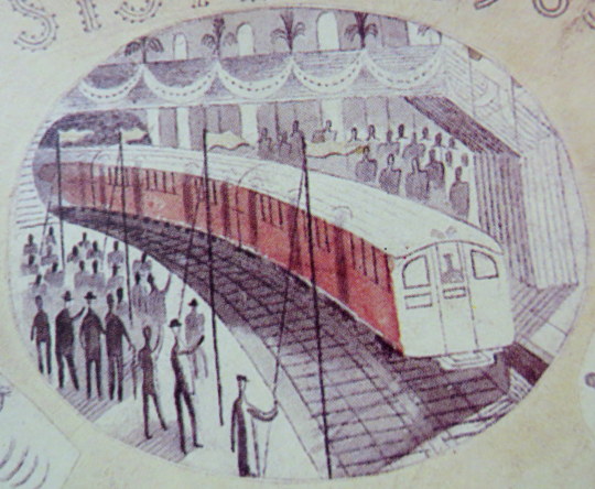
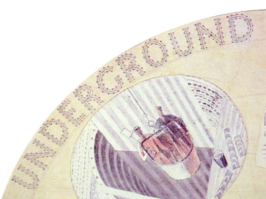
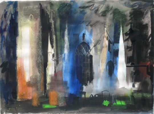
When he was commissioned to design murals for the platforms of Charing Cross underground station, artist David Gentleman (born 1930) chose as his theme the building of the medieval Charing Cross, one of the twelve memorial crosses commemorating Queen Eleanor (who died in 1290). He devised a scheme to take into account the architecture of the station, allowing spaces for entrances and exits and litter bins. He collaged together nearly 50 wood engravings which were then screen-printed onto melamine sheets by Perstorp Waterite Limited. This was the first large-scale application of wood engraving. 

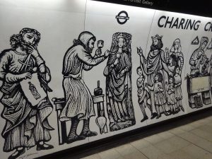
A view of the station platform when decorated in 1979.

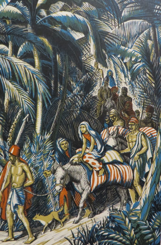
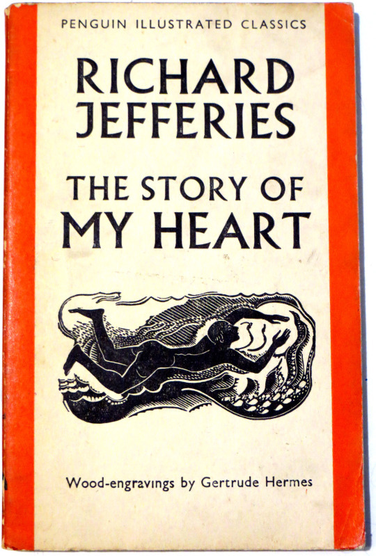
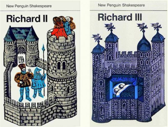
As with many works by any artist, what came before proved to be important. Before the Charing Cross commission Gentleman had been working in wood-engraving commercially for Penguin Books and their Shakespeare reprints. Steeped in a medieval theme and having to produce one image that would summarise a whole play it was useful training.

image

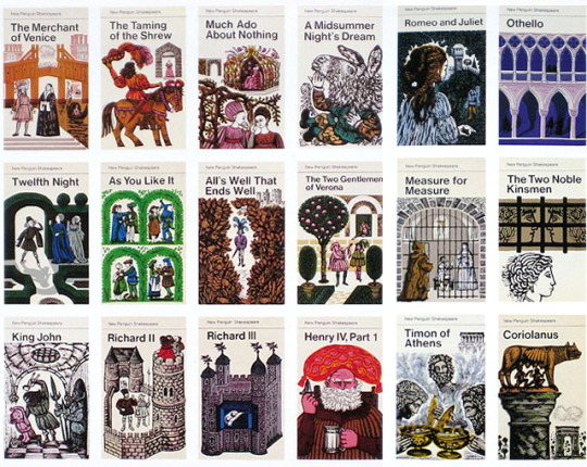
 Penguin Books, Shakespeare collection with covers designed by David Gentleman.

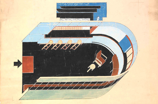
The most interesting and taxing commission to come my way so far did not begin as an engraving job at all. Late in 1977 London Transport asked me to design a mural for Charing Cross Underground station. The practical aspects were clear enough; it was to be fabricated in screen-printed melamine laminate, curved to follow the profile of the tunnel; it would be about two metres high and it would have to find room not only for numerous platform entrances and London Transport roundels but also for various staff letter boxes, telephones, plus litter bins and wooden benches for people to sit on. The subject-matter however was pretty vague. At that time the words Charing Cross suggested little more than a closed-down hospital and a run-down British Rail terminus, and the only brief was that the mural should remind passengers of what the name Charing Cross had once meant. Graphically I was given a free hand, and also the vital assurance of being directly responsible to the two people with real authority: The Chairman, Kenneth Robinson and the Chief Architect, Sidney Hardy. 

image

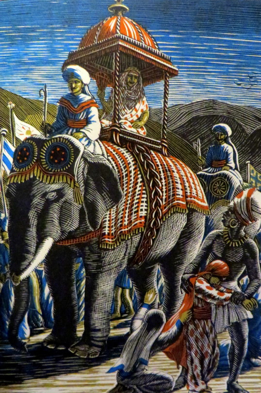
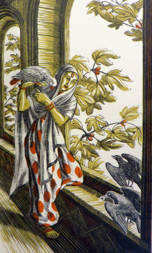
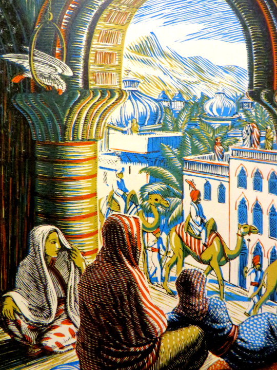
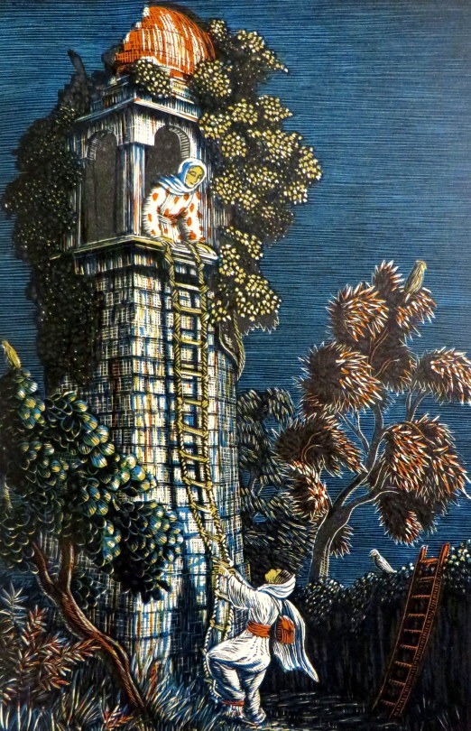
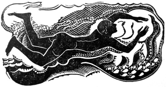
Having recently been working not only on the Shakespeare covers but also on lithographs for an American edition of The Ballards of Robin Hood, medieval imagery in illuminated manuscripts and paintings was still much in my mind, both for its epigrammatic clarity and for the way it often depicts a sequence of related events in one picture. This narrative technique suited the hundred-metre long strip of platform, and the idea of showing how the original Charing Cross had been constructed came to my mind straight away.

image

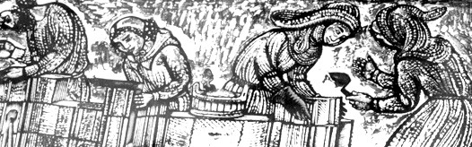
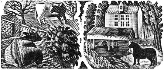
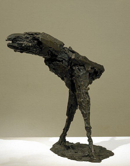
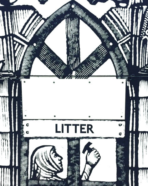
 Original Woodblock by David Gentleman

image

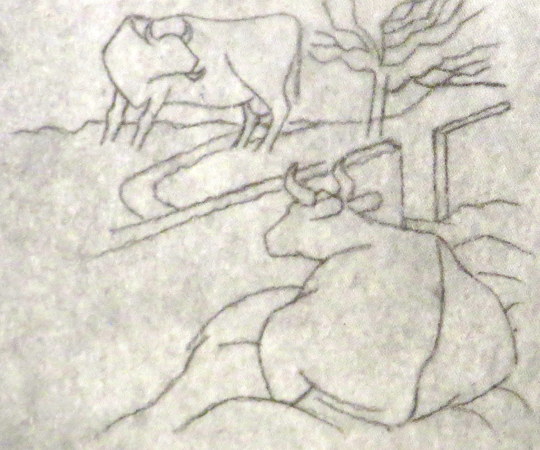
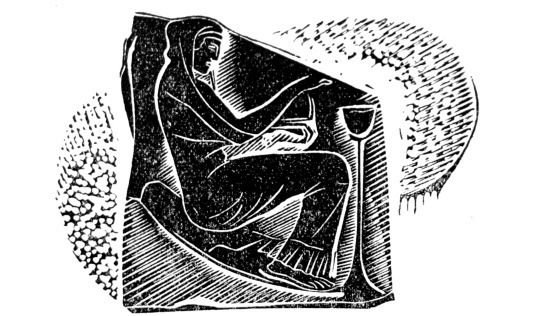
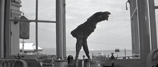
 Here one of the early proofs of the woodcut above for the project before the black background had been carved out.

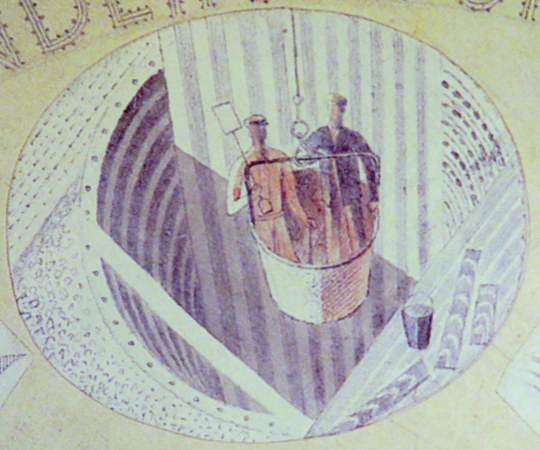
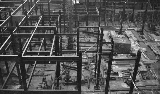
The only proviso they made before they committed themselves absolutely to it was that a strip of it, about twenty yards long, but just as it would be finally, should be built (a mock up) in the disused Aldwych station where there are empty platforms available for such things and I got blown up (photographically) a few engravings and a few roundels… ♠ 

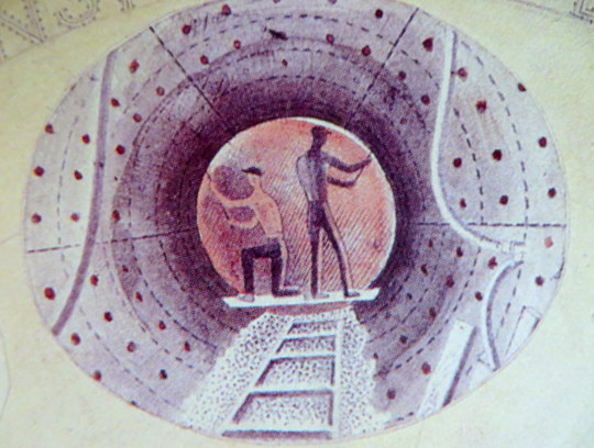
Underneath the roundel bulls-eye with ‘Charing Cross’ there was a bench where people can sit. So there was a bench built into the mock up, and then as the idea developed I got the idea that I could have the figures in my design sitting on the bench or using it as a work table. ♠ 

image

Many stations also feature unique interior designs to help passenger identification. Often these have themes of local significance. Tiling at Baker Street incorporates repetitions of Sherlock Holmes’s silhouette. Tottenham Court Road features semi-abstract mosaics by Eduardo Paolozzi representing the local music industry at Denmark Street. ♥

image

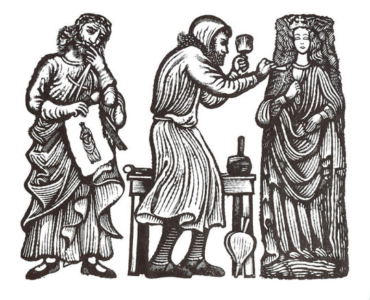
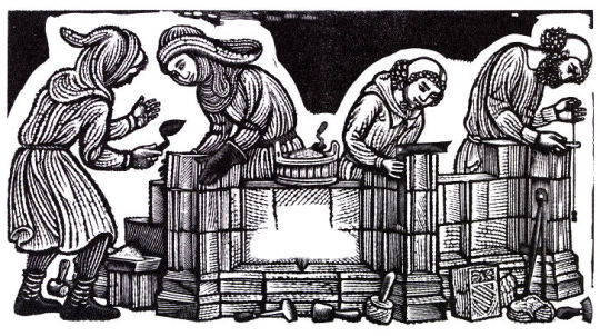
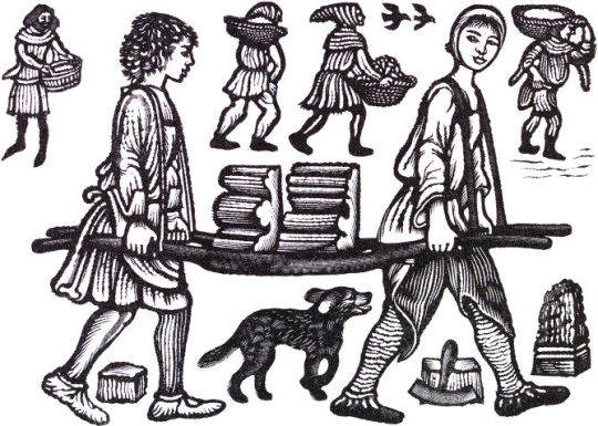
Building the first Charing Cross
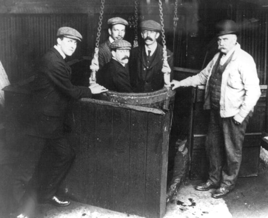
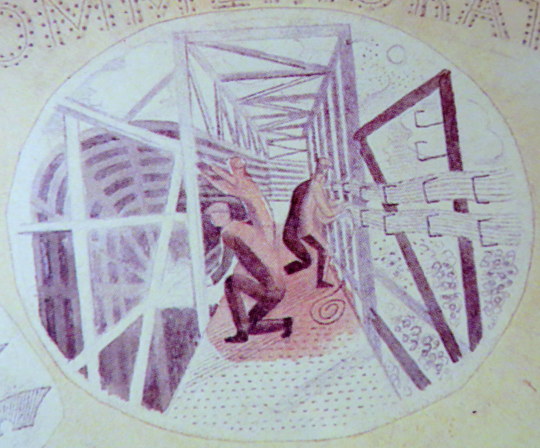
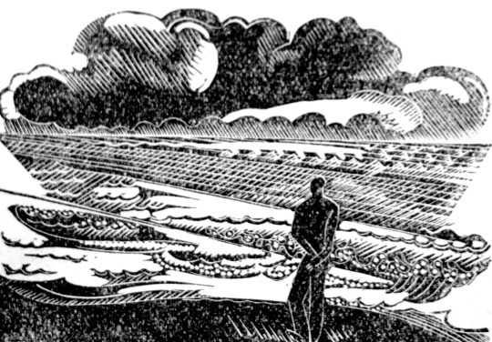
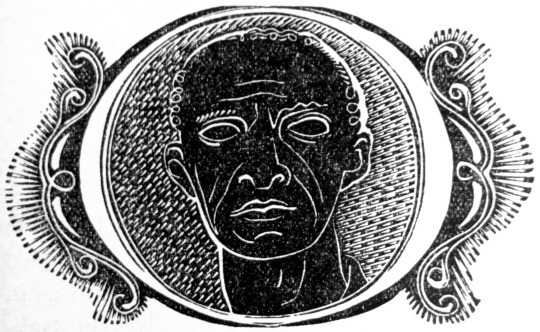
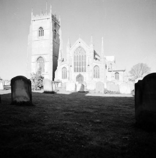
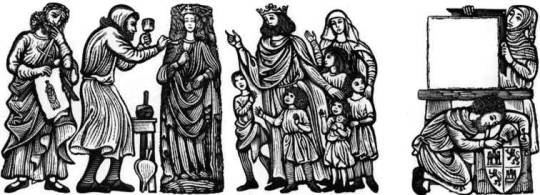
The original Charing Cross was built in 1291-1294 by Edward I in memory of his wife, Queen Eleanor of Castile. It was the most splendid of the twelve Eleanor Crosses erected to mark the successive places where her body rested on its way from Lincoln to Westminster Abbey, and stood near here until it was destroyed in 1647.

Richard of Crundale and Roger of Crundale were the master masons. The stone came from Corfe in Dorset and Caen in Normandy; Richard of Corfe and John of Corfe cut the English stone. Alexander of Abingdon and William of Ireland carved the statues of Queen Eleanor which stood halfway up the Cross, and Ralph of Chichester carved some of the decoration. Many others whose names are forgotten took part in the work: quarry-men, rough-hewers, masons, mortarers, layers, setters, carpenters, thatchers, scaffolders, labourers, falcon or crane-men, apprentices, hodmen, drivers, horsemen and boatmen. These pictures of them are by David Gentleman ♣

image

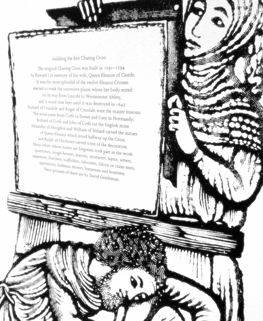
 The historical plaque with the text (above) and the enlarged wood engravings by David Gentleman. 

image

David Gentleman – V&A Website.
The Wood Engravings of David Gentleman, David Esslemont p114, 2000.
Oral History – David Gentleman – Reel 4, Imperial War Museum, 2008-07-03.
♥ London Underground – An overview. Pediapress
Mural text in Charing Cross Station, London.
Guide to the Archive of Art and Design, Victoria & Albert Museum by Elizabeth Lomas, 2001.

Augustus John’s Studio

In the archives of Augustus John at the University of

Liverpool there is an invitation (August 1931) to Charles Reilly to stay with John at his country home of Fryern Court, Fordingbridge for a portrait to be painted. John was looking to build a new studio in the grounds of his home and so having an eminent architect as a sitter, he asked his advice.

image

 Augustus John – Portrait of Charles Reilly, 1931.

While staying with his old friend and colleague Augustus John at Fryern Court, Fordingbridge, during the early autumn of 1931 in order to sit for his portrait, Reilly wrote a series of letters to his wife. In one of these he states ‘I have suggested his (John) building a large new studio, modern, in ferro concrete, and he likes the idea.’

There is no other documentary evidence to suggest that Reilly had any other hand in what eventually was built. John’s chosen architect, Christopher Nicholson – younger son of the painter Sir William Nicholson – produced two designs. The first was a looser interpretation of Modernist principles , and the second and executed design was, as David Dean notes, ‘built to a precise mathematical grid, the reinforced concrete frame has been raised for maximum light on stilts, in the approved Corbusian manner. 

image

 Christopher Nicholson’s second design for John’s Studio.

Augustus John’s studio was Nicholson’s first major commission and an opportunity to put into practice the ideas he had been developing since leaving Cambridge. In 1930 Nicholson visited Paris, where he had the opportunity to see modern studio buildings by Mallet-Stevens, Le Corbusier, Lurcat and Perret. One of the most striking – and an important source for the John studio – was the studio-house built by Le Corbusier for Ozenfant House near the Pare Montsouris. 

Nicholson then had his architectural practice at 12 Old Church Street, a one-roomed office over a chemist’s shop, shared with his partner, Hugh Casson.

image

 The finished studio in 1933.

image

 Christopher Nicholson’s plan for the upstairs of the studio.

image

 In Le Corbusier’s style, Nicholson design the building lifted up from the ground with only a picture store under.

image

 Christopher Nicholson’s plan for the ground floor of the studio.

When the studio was completed John wrote to Reilly in Febuary 1935, about the studio being a success and how John was working with renewed energy.

image

Augustus John lived in Fryern Court from 1927 until his death, at the age of 83, in 1961. At the height of his career, the charismatic Welshman was considered one of Britain’s leading portrait painters. He was a well-known figure in the village of Fordingbridge and one of his favourite town watering holes now bears his name, having formally been known as the Railway Hotel. 

The studio was located in the corner of the garden away from the main house of Fryern Court, so that the views and light of the countryside could flood into the windows.

image

 Interior of Augustus John’s Studio.

image

 Interior of Augustus John’s Studio.

image

 Interior of Augustus John’s Studio with the radiators under the seating.

In 2011 a fire ripped through the main house. More than 60 firefighters were called to Fryern Court near Fordingbridge, the fire crews used water from the swimming pool of the Grade II listed building to douse the flames as they engulfed the roof and first floor. The studio was unaffected.

image

Christopher Nicholson designed many other buildings in his life, but one regarding his death is apt. He designed the building for the London Gliding Club, Tring Road, Dunstable. 

image

 London Gliding Club. Tring Road Dunstable

A gliding enthusiast, Nicholson died at age 44 on 28 July 1948 in a gliding accident during the World Gliding Championships at Samedan in the Graubünden, in Switzerland 

image

 The interior of the bar was designed by Hugh Casson for Christopher Nicholson, about 1935.

image

 A newspaper clipping reporting Nicholson’s death 

The British Art Journal, Volume 2, Issues 1-3, 2000.
Marketing Modernisms: The Architecture and Influence of Charles Reilly, 9780853237563, 2001
Artists and bohemians: 100 years with the Chelsea Arts Club, 9781870948609, 1991.

Eric Ravilious Underground

In the short time that Eric Ravilious was of working age he produced a massive amount of work for such a young man. He died while serving as an official British War Artist when the aircraft he was aboard crashed off Iceland. He was 39 years old.

At the time of Ravilious’s death there were various projects underway that the war disrupted. As manufacturing was halted, these commissions were put on hold while the country had to economise.

image

 Eric Ravilious – Design for London Underground Plate, 1939.

One of the projects Ravilious had started was for a commemorative plate for the ‘New Works Programme’ of 1935-40 that London Transport had begun.

It was an ambitious extension of the Northern and Bakerloo lines northwards, and the Central line both east and westwards. Although the engineering work was well advanced by the outbreak of war, the project had to be abandoned and was only partly realised in the post-war years. Thus the commemorative plate designed by Ravilious was never produced.

image

The early Underground train lines, originally owned by several private companies, were brought together under the ‘Underground’ brand in the early 20th century and eventually merged along with the sub-surface lines and bus services in 1933 to form London Transport under the control of the London Passenger Transport Board (L.P.T.B.).

The ‘New Works Programme’ was to develop many aspects of the public transport services run by the L.P.T.B. and the suburban rail services of the Great Western Railway and London and North Eastern Railway.

The investment was largely backed by government assistance as well as by the issuing of financial bonds and was estimated to cost £42,286,000 in 1936 (approximately £2.59 billion today).

image

Of the four vignettes Ravilious chose, three were of construction and one was of the predicted Grand Opening, with a tube train and swash bunting along the platform.

image

One of the vignettes of construction show men being lowered in buckets into the tube shaft. These were likely non-station locations where the soil was excavated out and the steel and concrete lowered in, like the workers. It was a typical practice in mining.

image

 Men in a small-scale drop lift.

image

Another of the pictures shows workers putting up the frames for the tube tunnels and station platforms. The wiring being bunched on the sides of the tunnel.

image

The two workers pictured here are bolting the rivets of the metal into place. The image when manufactured, would have been a black and white transfer and the colour would have been a translucent enamel paint.

The three heraldic devices show the county badges of Essex, Hertfordshire and Middlesex.

image

 Middlesex Heraldry

image

 Buckinghamshire Heraldry

image

 Hertfordshire Heraldry

The plate would have been one of the last commissions of Frank Pick, chief executive of the London Passenger Transport Board. Pick, who retired in 1940 and died the next year, had worked for the Underground since 1906.

Pick had become publicity officer responsible for marketing and it was at this time that, working with the company’s general manager Albert Stanley, he began developing the strong corporate identity and visual style for which the London Underground later became famous, including the introduction of the ‘Underground’ brand.

image

One of Pick’s responsibilities was to increase passenger numbers, and he believed that the best way to do so was by encouraging increased patronage of the company’s services outside peak hours. He commissioned posters which promoted the Underground’s trains and London Transport buses as a means of reaching the countryside around London and attractions within the city. Throughout Pick’s career his over-riding passion was for architecture and design, and his adventurous approach and choice of collaborators is famous.

Ravilious had other work planned for London Transport, some posters and wood engravings. During his lifetime he did see some of his work used, a set of his wood-engravings were used for the covers of the Country Walks books in 1936.

image

 1936 cover to Country Walks, 3rd Series with a Ravilious Design of Two Cows.

The Country Walk books were by Charles White and printed for London Transport to show people the possibilities of using the Underground and Bus network. Inside they had maps and planned walks showing how to get to the locations using London Transport.

Each of the three volumes had a wood engraving by Ravilious on the cover. The second volume had a Mill, the third featured the Two Cows wood-engraving.

image

 A print from the original woodblock with Two Cows to the left, and Hull’s Mill, Castle Hedingham to the right. 1935.

The two images were engraved on the same block of wood and printed together as one proof. On the left a cow and a bull in a field, separated by a stone wall; on the right a horse standing next to a mill stream, with watermill (based on Hull’s Mill, Castle Hedingham, near Great Bardfeild) in the background.

Below is the original drawing for Two Cows, reversed in design as a woodblock always prints backwards.

image

 Eric Ravilious – Two Cows, preliminary study for a woodcut, 1935.

The pencil design is remarkable for another reason: part of the design was turned into a watercolour featuring two Cows in the same pose.

image

 Eric Ravilious – Two Cows, The Fry Gallery, 1935.

The book Away We Go by Oliver Green and Alan Powers, documents more of the other work that both Eric Ravilious and Edward Bawden did for London Transport, mostly their designs for press adverts.

Ravilious Engravings by Jeremy Greenwood, The Wood Lea Press, 2008.
Moving Metropolis by Sheila Taylor and Oliver Green, Laurence King, 2001.
Ravilious and Wedgwood by Robert Harling, Dalrymple Press, 1986

Olive Cook and Edwin Smith

Olive Muriel Cook was born in Cambridge on 20 February 1912, the daughter of Arthur Cook, a librarian at the University Library for 56 years, and his wife, a dressmaker for Robert Sayle (John Lewis Partnership). She was educated at the Perse School before gaining a scholarship to Newnham College in 1931, where she read Modern Languages. She obtained her MA in 1942.

image

 Olive Cook – I Am the Ancient Apple Queen, The Fry Gallery

Her first job was that of art editor for Chatto and Windus, followed by supervisor of publications at the National Gallery (1936-1945), where she worked with Kenneth Clark and Arnold Palmer. She met and became friends with official war artists including Eric Ravilious, Thomas Hennell and Stanley Spencer, and it was during this time that she met Edwin Smith, whom she married in 1954. In 1945 she left the National Gallery to devote herself to her own writing and painting and she and Smith started to write and illustrate articles for The Saturday Book edited by Leonard Russell, to which they both contributed annually until Edwin’s death.

She took a two week painting course at Sir Cedric Morris’s Benton End school in Hadleigh Much. She is now one of his forgotten pupils of the East Anglian School of Painting and Drawing. The other prominent artists of the school are Lucy Harwood, Lucian Freud, Maggi Hambling, David Kentish, Bettina Shaw-Lawrence, Lucy Harwood, Joan Warburton, Glyn Morgan, Valerie Thornton and top legal scholar Bernard Brown.

image

 Olive Cook – Portrait of Michael Rothenstein Reading – The Fry Gallery, 1947.

She wrote ‘Suffolk’ in 1948, ‘Cambridgeshire: Aspects of a County, 1953’, and children’s books illustrated by George Adams in 1954. That same year saw the publication of ‘English Cottages and Farmhouses’ with text by Cook and photographs by Smith, their first major work for Thames and Hudson. After their marriage they lived in Hampstead where they had a large circle of artist and writer friends. More joint books followed including ‘English Abbeys and Priories’, ‘British Churches’, ‘The Wonders of Italy’, ‘The English House Through Seven Centuries’.

image

 Olive Cook – In The Garden

They moved to Saffron Walden in 1962, where Olive Cook pursued her passion for the preservation of the countryside, her book ‘The Stansted Affair’ presenting the case against the development of the airport (1967). They purchased the Coach House in 1967, remodelled and decorated it in their own inimitable way (see photos in Series 9). Sadly, Smith died of cancer at the early age of 59, leaving Cook devastated. However, a woman of great spirit, she rallied and continued to further the reputation of her beloved husband, producing ‘Edwin Smith: Photographs 1935-1971’ in 1984, and continually promoting his work through exhibitions and in books of others, such as Lucy Archer’s ‘Architecture in Britain and Ireland 600-1500’.

image

Her own writing also continued: she wrote the libretto for ‘The Slit Goose Feather’ composed by Christopher Brown, ‘Tryphema Pruss’, illustrated by Walter Hoyle, as well as the introduction for his ‘To Sicily with Edward Bawden’. And, in the 1980s she along with Iris Weaver was instrumental in establishing the Fry Art Gallery in Saffron Walden, writing biographical sketches of the artists of the North West Essex Collection deposited there.

Olive Cook had an enormous capacity for friendship, as the hundreds of cards in her papers attest, and although she had no children herself, she was clearly a great favourite with those of her many friends. Right up to the end of her long life, messages came pouring in. She died on 2 May 2002, aged 90.

image

  Olive Cook – Edwin Smith with Flowers and Ducks, National Portrait Gallery, 1954.

Edwin George Herbert Smith was born on 15 May 1912 in Canonbury, London, the only child of Edwin Stanley Smith a clerk and his wife Lily Beatrice. After leaving elementary school he was educated at the Northern Polytechnic, transferring to the architectural school at the age of sixteen. He then won a scholarship to the Architectural Association, but for financial reasons gave up his course and worked as an architectural draughtsman for several years, most notably for Raymond Myerscough-Walker. >From 1935 he became a free lance photographer, though painting remained his first love, working briefly for Vogue as a fashion photographer, but mostly concentrating on the mining community of Ashington in Northumberland, the docks of Newcastle, and circuses and fair grounds around London.

In 1935 Smith married Rosemary Ansell, daughter of Henry Ansell, a confectioner. Their son Martin was born in 1941, but the marriage ended in divorce two years later. By this time Smith was living with Olive Cook, whom he married in 1954. Smith was also a writer, producing photographic handbooks, including ‘All the Photo Tricks’ (1940), for Focal Press. But he is best known for his photographs of architecture and landscapes, both of Britain and Europe. His books include: ‘English Parish Churches’ (1952), ‘English Cottages and Farmhouses’ (1954), ‘The English House Through Seven Centuries’ (1968), ‘England’ (1971) ‘Pompeii and Herculanaeum’ (1960) ‘Rome: From its Foundation to the Present’ (1971). Many were collaborations between him and Cook: his photographs, her text.

image

In addition to his photographic output (60,00 negatives are now at RIBA), Smith was also a prolific artist. When at home, not a day went by without him drawing or painting. Throughout his life Smith produced water and oil paintings, drawings, linocuts and woodcuts. And in later years at Saffron Walden, he drew up architectural plans for local properties. It was only after his death that exhibitions of Smith’s work appeared.

He became ill in the spring of 1971, but his cancer was not diagnosed until a few weeks before his death on 29 December. There is a poignant account in one of his notebooks written by Olive and addressed to him three months after he died, recounting in detail his last day.

Cook inherited Smith’s estate on his death, 29 December 1971, and towards the end of her life deposited his huge photograph collection of some 60,000 negatives at the Royal Institute of British Architects (RIBA) along with their letters to each other. The remainder of his papers became part of her archive at Newnham.

image


Text sourced from Janus Cambridge Archives. https://janus.lib.cam.ac.uk/db/node.xsp?id=EAD%2FGBR%2F2911%2FPP%20Cook

Gwen Raverat in Colour

In a past post I wrote about the Cambridge Book of Poetry for Children, edited by Kenneth Grahame with 54 wood-engravings by Raverat. All of them black and white. This is a post about her colour wood engravings from The Bird Talisman.

image

Gwen Raverat, the granddaughter of Charles Darwin, was an English wood engraver and author. Born and raised in Cambridge, England, she studied art at the Slade School of Fine Art in 1908 and studied under Frederick Brown and Henry Tonks. She was inspired by Thomas Bewick’s wood engravings but the Slade at that time gave no opportunities to study wood engraving. When she left the Slade she went to Paris to the Sorbonne where she met and married Jacques Pierre Raverat, a fellow student and draughtsman.

image

These images come from The Bird Talisman is a story written by Raverat’s great uncle, Henry Allen Wedgwood, a London barrister. He originally published it with illustrations by the himself in The Family Tutor in 1852 and then later in book form in 1887.

Gwen took it upon herself to re-illustrate the book with her wood engravings.

She overcame her feeling of “sacrilege in tampering with a sacred work” and tried to illustrate it herself for Faber and Faber. It did not worry her that she had never visited India, where the story is set, for neither had her great uncle; and neither of them made any effort to be accurately Indian.

Her interest in colour printing, which had first appeared in the frontispiece to Four Tales from Hans Andersen, is here developed with rich effect in eight full-page colour plates. 

image

She held off agreeing to a contract until she had experimented one of these and settled how to do the various cuts. She decided in each to undertake the main block herself, but to hand over to a blockmaker those that would carry the colour. When de la Mare arranged for these to be done in Vienna, Gwen objected, owing to the German occupation of Austria, and asked to estimate the cost of Austrian blocks, postage and insurance against the of using either English or French blockmakers as she was willing to pay the difference.

image

In the end she used an English blockmaker she knew and trusted outlining for him the colour on the second block. She herself cut the plentiful smaller black-and-white engravings, in a variety of shapes and sizes, which help make this the most sumptuously decorated of all her books.It was contracted in February 1939 and due to be delivered in May of that year, but took longer, owing to the painstaking work involved.

image

At one point the imminence of war cast doubt over the book’s production. “It’s now so nearly finished that I do hope it will get actually printed and bound, war or no war,” she wrote to Richard de la Mare in late August 1939, “that is I should hope this, if I could think about anything but war.” More positively, she wrote: “I hope you will like the colour plates; they are, at any rate, just what I intended them to be.” She threw further encouragement his way, reminding him that in the last war people had bought a lot of books, “especially if they were absolutely non-topical – quite away from war subjects, which this is. And there’s always Christmas for children even in war. However,” she ended, unable to stem her own despair, “nothing really matters much does it?”

image

The book did, however, get published, though work on it was slow for by the time they started printing half the men at the Press had been called up. (This may have limited the number produced in 1939 and helps explain why a second edition was produced in 1945, soon after the return to peace.) †

image

Gwen Raverat: Friends, Family and Affections by Frances Spalding, p357, 2001.

Turner and Beckford

image

William Beckford’s Fonthill Abbey, now mostly lost, has slipped into legend. Sensational as it was, it was painted and studied by many artists contemporary to the construction, one of these was Joseph Mallord William Turner.

image

Beckford, born in 1760, is mostly remembered for being an author and a showman who inherited a fortune and squandered it on a building that partly collapsed and withered away over the next 50 years. Although he died in 1844, during his life he had a natural talent for self promotion. The building was Fonthill Abbey, a mansion with a tower constructed to make a statement, but it was also built to house his collection of fine works of art and keep the complete library of Edward Gibbon he had bought.

The stained glass windows in the building were painted by Francis Eginton. Other works in Beckford’s collection for the Abbey were Saint Catherine of Alexandria by Raphael, Agony in the Garden and Portrait of Doge Leonardo Loredan by Bellini, Philip IV in Brown and Silver by Velázquez. In time when the estate was sold off the list of possessions would show the near shop-a-holic mania of his collection.

image

It was in the early days of Beckford’s Fonthill Abbey obsession he invited Turner to paint seven large watercolours of the house and it’s grounds. Turner spent three weeks at Fonthill in August, 1799 making drawings for the commission. His sketchbooks from this time show the building under construction and the five watercolours eventually completed, show the abbey from different vantage points and at different times of day.

image

In having Fonthill Abbey documented by a fashionable young artist (Turner was 24 at the time) he would have no doubt hoped that by association, he and his building would too become fashionable. Various scandals in Beckford’s past had lead to him taking a self imposed and strategic exile from Britain, now returning to build the Abbey he was upsetting neighbours and the Royal court by outbidding them for contractors in their building programs.

Beckford had also invited the President of the Royal Academy of Arts, Benjamin West, and Henry Tresham to join Turner on his visit.

When Turner arrived at Fonthill, its building was in full flow. The speed and scale of the work were exceptional. Turner sat and sketched the workmen whom Beckford was employing around the clock in night and day shifts. In another sketch he captured the vast brown scar on the hill on which the building was positioned, created by the small forest of trees that Beckford had felled for the work.
As for Beckford himself, he was rarely seen. The group of artists ate their meals with Williams, Beckford’s steward, rather than being entertained by the patron himself, who spent much of his time engaged in supervising the work on the house as well as riding in his extensive grounds. ♠

At the point when Turner returned to Fonthill its master was losing his battle to regain social acceptability and was already showing the signs of a man who preferred his own company. Beckford was beginning to see his abbey as less a summer pleasure house with which to impress guests, and more a fortress against the wider world. What time Turner did get with Beckford, however, was sufficient to impress on him the profoundly dark tone of his patron’s mind. ♠

In the end Beckford only purchased one of the paintings of Fonthill from Turner. The rest were exhibited by the Artist at the Royal Academy in 1800.

image

In time Turner’s sketchbook became an important document to Fonthill’s structure as by 1825 the majority of the building had fallen down. Beckford however had cunningly sold the estate some years before and moved on to building another tower in Bath.

The picture of the completed building painted by Turner was based on the architectural plans and projections and finished five years before the building was, the final building ended up with no spire. During the building process the tower would get higher and higher, maybe one reason for it’s downfall, the foundations where not strong enough for this babel like building.

image

 J.M.W. Turner, Projected Design for Fonthill Abbey, Wiltshire, 1798

Beckford’s fascination with his pet project meant that he spent no time at all keeping the family business – the foundation of his wealth – active. The family owned a series of sugar plantations in Jamaica but due to the 1807 abolition of the transatlantic slave trade and Beckford’s poor business management meant that by 1822 he is seriously in debt. Selling the estate, he moves to Bath where he builds a neoclassical tower to house his collection. Below is an account of the sale of the Abbey:

Mr. Beckford, on coming possessed of his fortune, made the grand tour, and resided many years in Italy; it was here that he improved that exquisite taste and love of the Fine Arts, for which he is pre-eminent. On his return to England, he resolved on building Fonthill – which he accomplished; and in August, 1822, he as hastily determined to dispose of it – and accordingly gave directions to that eminent auctioneer, Mr. Christie, of Pall-Mall, London, to dispose of it; and so great was the anxiety to view the splendid edifice, that upwards of 9000 catalogues, at one guinea each, were sold before the day of the sale; on the day preceding which, to the surprise and mortification of the public, notice was given that the estate of Fonthill, with all its immense treasures, was sold to Mr. Farquhar for 300,000l. This gentleman has since employed Mr. Phillips to sell the whole of the effects, which will occupy thirty-nine days!

We are told the possessor of this splendid treasure left it almost without a pang. His first resolution was to build a cottage lower down in the demesne, near the fine pond, and let the Abbey go to ruin. ”I can live here,” he said to his woodman, ”in peace and retirement for four thousand a year – why should I tenant that structure with a retinue that costs me near thirty thousand?” Subsequently, however, he resolved to part with the entire, and announced his intention without a sigh. ”It has cost me,” said he (gazing at it), ”with what it contains, near a million. Yet I must leave it, and I can do so at once. Public surprise will be created, but that I am prepared for. Beckford, they will say, has squandered his large fortune: to me it is a matter of perfect indifference.”  It would much exceed our limits to attempt even a description of this justly celebrated Fonthill. 

image

In his later life and typical of the showman act, Beckford would later go on to show off his Turner and describe him thus,

He took me to a small room, where there was a water-colour drawing of Fonthill Abbey. “Ah” “ah there’s the abbey,” he literally exclaimed, pointing to it. I asked him by whom it was painted.
“Turner.”
“Turner?” I asked; “he does not paint like that now.”
“Oh! gracious God! no! He paints now as if his brains and imagination were mixed up on his palette with soapsuds and lather. One must be born again to understand his pictures.”
 ‡

image

It maybe that Turner painted Fonthill Abbey so far away due to the noise and confusion of the building site, or that he preferred to be a landscape artist and thought it more romantic to have it pictures from a-far. Either way Beckford’s quip about ‘soapsud’ watercolours is something that haunted Turner in the later days as his work became more abstracted.

image

Beckford’s Turner was originally listed in the Christies sale as lot 112 on the 8th day of the 9 day sale.

image
image

I have also posted about Fonthill Abbey here: The Father, Son and an Abbey; the story of Fonthill Abbey

† Arliss’s Literary Collections. p105 1830.
‡ The New Monthly Magazine, ‘Conversations with the Late W.Beckford, Esq’. 1844.
♠ Turner: The Extraordinary Life and Momentous Times of J. M. W. Turner by Franny Moyle. 2016. 9780670922697

The Other Photos of Paul Nash

In the Archives of the Tate are over a thousand photographs taken by Paul Nash that were donated by the Paul Nash Trust in 1970. Many of the photographs by Nash where studies for paintings but on their own they are surreal marvels. Mostly taken during the 1930s and 40s, the photos sometimes have no date and a guessed idea of the location.

Below are my favourite out of all of the pictures processed, I chose 17 in all. A good deal of them have not been editioned in books or as prints. I have tried to order them in a way I think looks pleasing.

The text I have taken from the large Fischer Fine Art folio of 25 prints by Paul Nash in 1978, in the 25 photographs John Piper picked out, it’s curious how I have selected none of the same images. I have included it as it’s the best and most brief summery of Nash’s talents, and it’s always nice to hear from John Piper.

Paul Nash took photographs for the last sixteen years of his life; that is to say, from 1930 when he was given an American Kodak. The camera was adequate to his purpose and he never became involved enough in the technique of photography to buy himself a more elaborate one or bother with wide-angle or other lenses or even to use a tripod. But his snapshots were neither indiscriminate nor trigger-happy.

As in everything, he was as professional as he needed to be. If he wanted to take something and the sun was not out, he would wait for it; if he wanted a shadow at a certain angle, he would wait for it. He would stalk the Uffington White Horse or Maiden Castle or the stones at Avebury until the place and the light were right and his friends who drove him would have to wait and stalk too. It was often anxious for them and difficult for him since he was seldom well and that kind of effort and concentration was exhausting.

Paul had an economical and obsessive eye and his new toy at once became a valuable weapon. The very first photographs that he took on the way to the United States related to the preoccupations of his painting; a ship’s mast and rigging was a slender echo and anticipation of the open cage structure he often used, the complicated interplay of hard edges and hollowed shadows within the curve of a life-boat proclaimed his interest in the mystery of ordinary things seen from unordinary angles.

No one could have been a less doctrinaire or literary surrealist but he had a punning vision which, with his aptitude for analogue, made his instinctive reaction to the world very close to the more self-conscious and sophisticated surrealist one. His wit with the camera was a natural extension of the wittiness of his words and of his attitude to life. He loved to see the funny side of things without being destructive so the objects that he photographed at Swanage, for example, for his article “Seaside Surrealism” – absurd concrete seats, huge pretentious lamp standards, three concrete steps isolated in a bed of pebbles – all have a double life of incongruity and of beauty.

While on the one hand he used his photographs as immediate aides-memoire to pin down a fleeting glimpse of the famous “Genus Loci” or to record the particular lie of a dead tree or a shadow on a wall, on the other hand he recorded aspects of the countryside that he was never tempted to paint directly but whichhe translated into the magic of his painting. Stone upon stone in miles of dry stone wall, the endless meeting and parting of furrows in an enormous field, layers of cork drying, stacked and roofed like rows of stone fishing huts, the invisible but eloquent bones of a landscape under stretches of featureless grass, all these ancient repetitions, natural or man-made, extend the more immediate subjects of his work and give them their timeless quality.

Paul Nash always had a feeling for the horizontal, at once boundless and embracing, and this is especially noticeable in his photographs. His Kodak, whether by chance or intention, took an exceptionally wide picture. But he always expected things to work for him and they usually did.

– John Piper. 1977.

image

 White Horse, Uffington

image

 A Woman on a Lawn, Raffia in Her Hair

image

 Nest of the Skeletons, Maiden Castle

image

 Vickers Wellingtons and steam roller

image

 Study of Waterlilies, Hungerford

image

 Demolition Landscape

image

 Oast House Roof

image

 Mrs Bertram and a dog in the garden at the Manor House

image

 The Cowley Dump (WWII Aircraft Recycling Centre)

image

 Study of Wood Fencing

image

 A Woodstack and Barn, Rye

image

 Diving Suit, Drying

image

 Snape Maltings

image

  A Ploughed Field

image

 Building Site, in front of St Pancras Station

image

 The Rock of Gibraltar

image

 The Nest of Wild Stones

Gertrude Hermes for Penguin

The Penguin Illustrated Classics were a series of books published by Penguin to showcase wood-engraving. Only ten were issued, all in May 1938. Robert Gibbings was the Series Editor and he also illustrated a book too.

image

Here is the book illustrated by Gertrude Hermes. Normally her woodcuts are fantastically expensive but as it’s a paperback book, this edition can be found easily and cheaply. A year later Hermes would illustrate another book for Penguin, (the eleventh classic) ‘The Complete Angler’ by Izaak Walton.

image

Gertrude Hermes was born on 18 August 1901 in Bickley, Kent. Her parents, were from Altena, near Dortmund, Germany. In about 1921 she attended the Beckenham School of Art, and in 1922 enrolled at Leon Underwood’s Brook Green School of Painting and Sculpture, where other students included Eileen Agar, Raymond Coxon, Henry Moore and Blair Hughes-Stanton, whom she married in 1926, though they separated in 1931, and were divorced in 1933.

image

Hermes exhibited regularly at the Royal Academy from 1934, and showed at the Venice International Exhibition in 1939. In 1937 Hermes produced a commission for the British Pavilion at the Paris World Fair. She worked in Canada from 1940 to 1945. She taught wood engraving and linocutting at Central School of Art in London from the late forties to early fifties. She also took a drawing class to London Zoo. She taught wood and lino block printing at the Royal Academy Schools, from 1966. She was elected associate to the Royal Academy in 1963, a full member in 1971 and was appointed an OBE in 1981.

image
image
image
image
image
image
image

Piper in Terrington St Clement

Here are two photographs by John Piper and two paintings, both in different styles. They focus on the such of St Clement’s, in Terrington St Clement. A large village in Norfolk, England. It is situated in the drained marshlands to the south of the Wash, 7 miles west of King’s Lynn, Norfolk, and 5 miles east of Sutton Bridge, Lincolnshire, on the old route of the A17 trunk road.

As well as showing the different artistic techniques for one subject, it also shows how Piper used his photographs as a visual reference when back in his studio (as I noted in the post ‘Lens and Pens’).

image

 John Piper – Terrington St Clement Church, 1975.

Five years apart between them both, the 1975 painting is a classic Piper picture and I am amazed it wasn’t editioned into a screen-print as the levels of detail in it are remarkable, the blocked out lighter panels of the windows and reversed light outline of the bell tower against the typical Piper sky.

image

 John Piper – Terrington St Clement Church, Norfolk.

image

 John Piper – Knowlton Church, Dorset, 1938

The picture below from 1980 is far more abstract and wild with colour. It is looking more like a study of a painting. The outlines and abstracted features of the building draughtsmanship are typically Piper. Although the colouring may not look like his works at that time, I would suggest they are a throwback to when Piper used collage in the 1930s. As with the Knowlton Church collage, blocks of colour are used with outlines. It makes an interesting marriage of new and old techniques.

image

 John Piper – Terrington St Clement Church, 1980

image

 John Piper – Terrington St Clement Church, Norfolk.

Below is a video I found on Youtube of a drone flight around the church, I wonder what Piper would have made of such a technology?

The Damned

image

The Damned was Joseph Losey’s 1963 film for Hammer Film Productions. (It is Losey who also directed one of my favourite films ‘The Servant’ the same year).

image

The Damned features teddy boy thugs and nuclear science fiction, it’s really rather odd. The plot revolves around a sculpture called Freya Neilson. The sculptures featured are all by British artist Elisabeth Frink.

image

Frink not only lent these but also was on location for their shooting and coached Lindfors on performing the sculptor’s method of building up plaster, which was then ferociously worked and carved. According to Evan Jones (interview with the author), Frink was around for all the location shooting, seemed to thoroughly enjoy the process, and became quite good friends with Losey and members of the crew. There is no evidence that she was paid. She did receive a prominent screen credit, however, and there is anecdotal evidence that Frink welcomed the exposure, and that it enhanced her career. 

image

 Elisabeth Frink – Bird, 1959

The experience of growing up during the war years strongly affected Frink’s sculpture. This work is one of a number of bronzes, executed in the 1950s, in which animal forms are given a menacing, military appearance. Although only thirty-eight centimetres high, this bird appears simultaneously aggressive, powerful and like a damaged but defiant survivor of a nuclear attack. Typical of the sculptor’s early work, the distressed, textured surface and spindly, striding legs of the bird recall the work of Giacometti, who Frink cited as a great influence. 

image

† Real Objects in Unreal Situations: Modern Art in Fiction Films by Susan Felleman, 2014. p258. 9781783202508
‡ https://www.nationalgalleries.org/collection/artists-a-z/f/artist/elisabeth-frink/object/bird-gma-1108