A short post with some of the photos I took on a trip to North Norfolk.
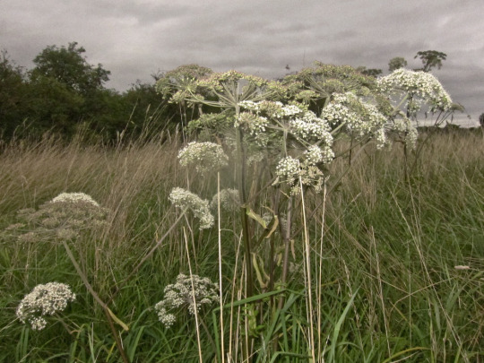
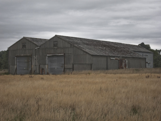
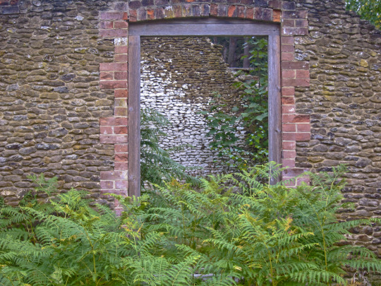
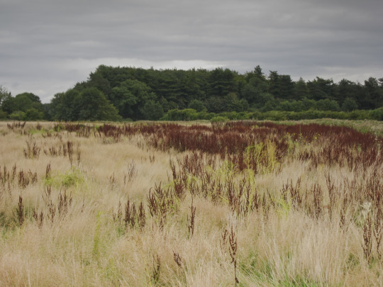
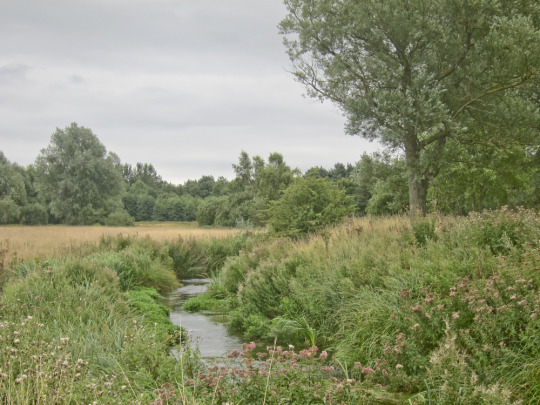
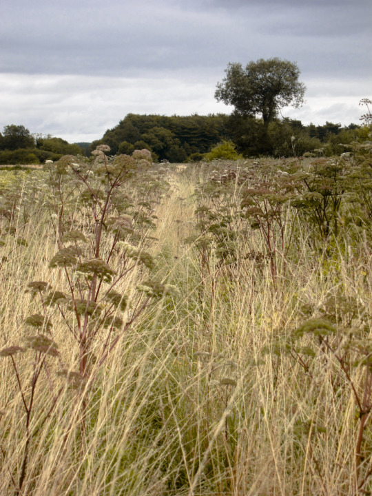
A short post with some of the photos I took on a trip to North Norfolk.


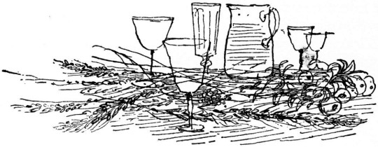
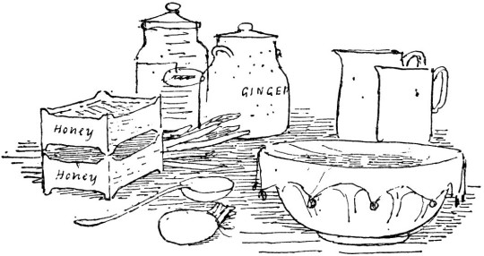
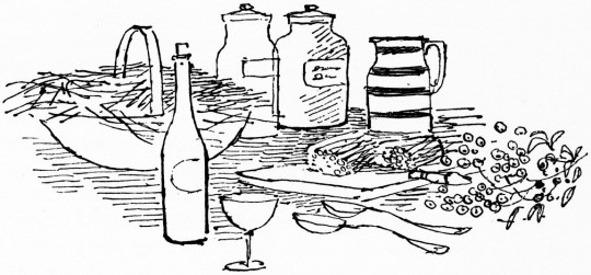
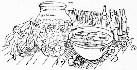
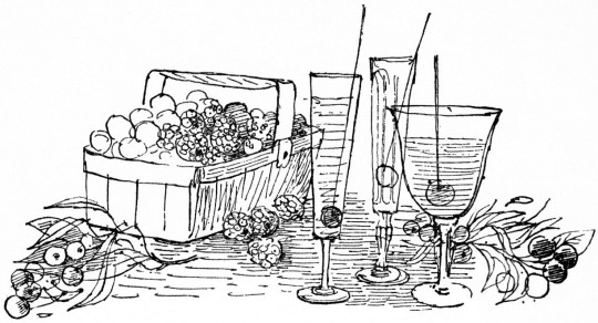
Here is the book ‘Home Made Wines Syrups and Cordials’ by F. W. Beech for the National Federation of Women’s Institutes. The illustrations are by Roger Nicholson. The drawings on the cover are a wonderful example of lithography on zinc. The black line drawings have a Warhol quality to them. The colours are hand drawn, each colour was painted on a different layer so when they are combined they never quite match up, I always thought it a charming effect.
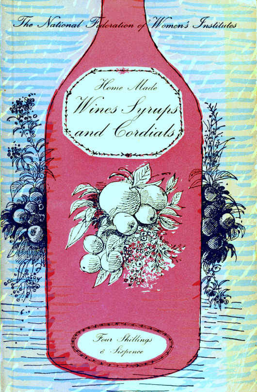
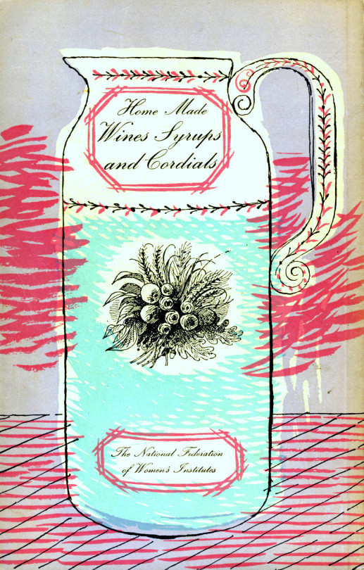
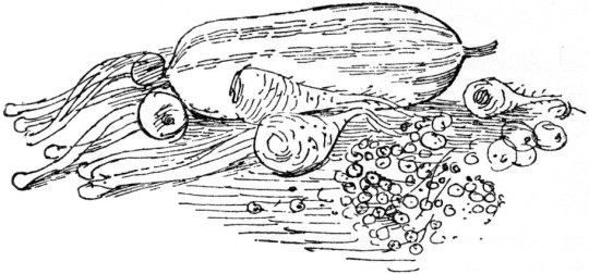
The other illustrations within the book are black and white line drawings of the recipes.
In 1965, the artist and designer Roger Nicholson was working on a commemorative book to mark the 900th anniversary of Westminster Abbey. An enjoyable commission, it gave Roger a taste for designing and publishing books. So, in 1966, he produced Nicholson’s London Reference, the first of the many guidebooks that were to bear his name.
By the early 1970s, the expanding team moved to a loft-style workshop in what is now fashionable Neal’s Yard in Covent Garden. The London Street Finder was to be the most successful title.
Roger was born in Sydney, Australia, into a large family which had emigrated there at the turn of the last century. But times were hard, and in the 1930s his mother returned to England with Roger and some of his siblings and settled in Kent. After school in Rochester, he became a Medway art school student.
Then came service in the Royal Army Medical Corps in Cyprus and Egypt, after which he worked as a laboratory technician. But by 1951, an interest in interior and industrial design led him, and his brother Roger to win commissions for design work on the Festival Of Britain exhibition in Edinburgh.
The brothers’ collaboration continued in London. Their work included designing interiors, carpets and fabrics in the new Shell-Mex building in Waterloo, for the then Carlton Tower Hotel, blanket designs for the British Wool Secretariat, wallpaper designs, and newspaper textile advertisements.
Later, Roger was to become a professor in textile design at the Royal College of Art, but Roger turned to guidebooks. Yet he was no businessman, and financial and personal problems forced the sale of the company. He was retained for several years as a consultant by the new owners.
During that creative but stressful time with the guide books, Roger would take a day off a week for a country walk. He had the ability of relaxing, and making companions do likewise. He made friends easily and was very capable of striking up conversations with strangers, leaving them as if they had been long-standing friends. He was knowledgeable of plant and animal life.
After selling the guides, he explored the less-known parts of Spain, France, Greece and Turkey, where his talent for abstract landscape painting flourished. His other recreations were keeping fit, gardening and swimming.
Roger felt everyone should have equal opportunities, good value and a fair chance. When an accident put his second wife, Susi, in a coma, he would make the long journey to visit her regularly and give her the special physiotherapy himself which no medical staff could provide. Having lived in various Georgian houses in Kent, the couple moved to Brighton and then Winchelsea.
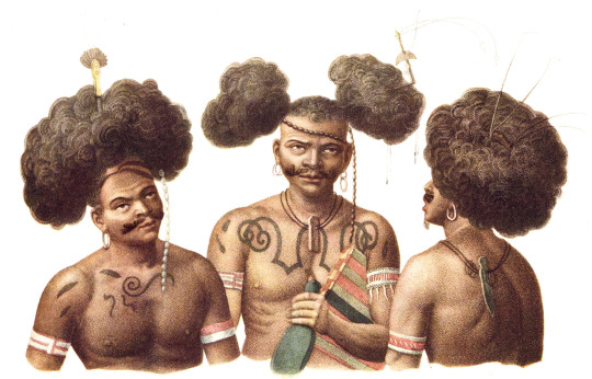
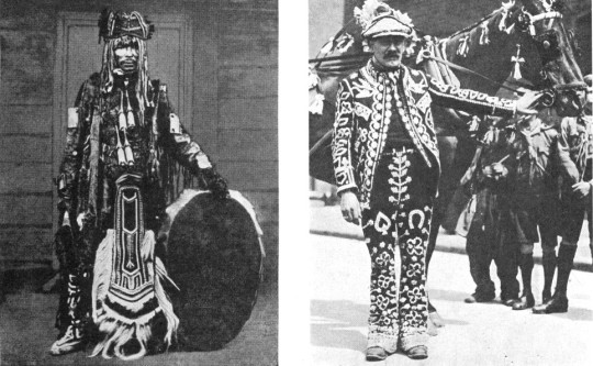
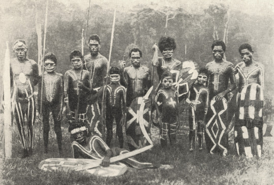
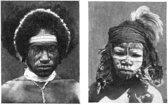
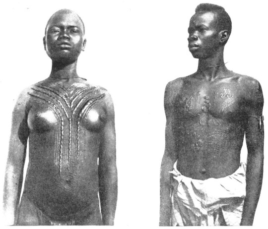
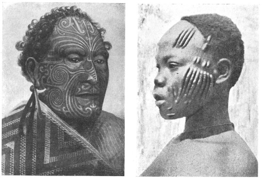
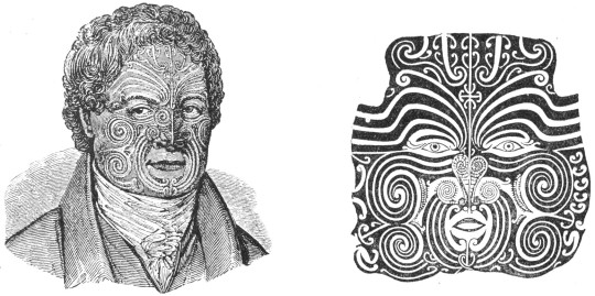
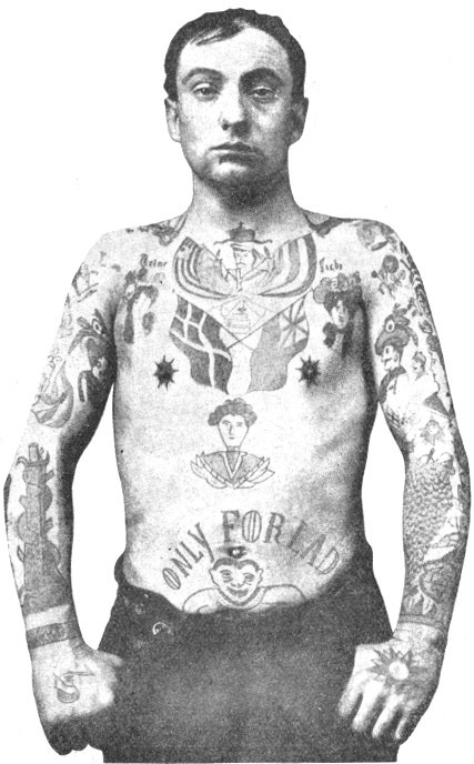
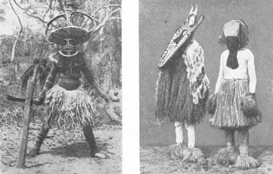
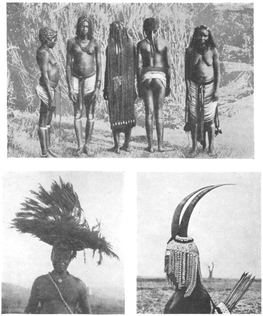
These pictures are all from a book by Hilaire Hiler ‘An Introduction To The Study Of Costume’, 1929.
The book illustrates fashion and costume through history. At just over 300 pages there are many wonderful illustrations, some of them I have pasted below.
Hilaire Harzberg Hiler was an American artist, psychologist, and color theoretician who worked in Europe and United States during the mid-20th century. At home and abroad, Hiler worked as a muralist, jazz musician, costume and set designer, teacher, and author.
At the beginning of the Second World War Nash served in the Observer Corps, moving to the Admiralty in 1940 as an official war artist with the rank of Captain in the Royal Marines. He was promoted acting major in 1943, and relinquished his commission in November 1944.
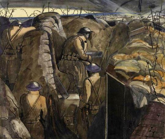
John Nash – An Advanced Post, Night, 1918
There is so much written about the paintings John Nash produced for the First World War but little on the Second. In a previous blog-post I noted that John Nash and Eric Ravilious both painted docks together in 1938 and also their letters to each other on both being invited to be war artists.
In a long interview given to the Imperial War Museum on a reel-to-reel tape machine, Nash explains this time:
The First World War paintings were the result of actual vivid experience, Second World War paintings were really more commissioned and hadn’t a very war like aspect at all.
Questioner: You were sent specifically to do a particular subject in the Second World War?
Yes I was sent to Plymouth to paint objects in the Dock Yard, and of course it’s a very beautiful dockyard and was then full of very handsome figureheads both outside in the grounds and also in some of the buildings. †
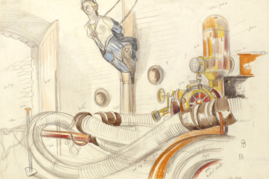
John Nash – Study of ‘Pump Room’, Plymouth Dock Yards.
But the trouble was there was a spy scare at the time, it was the period of the ‘phoney war’ and I was constantly being asked for my papers and in one case positively arrested although I was dressed up as a Royal Marine Captain, and after a time this rather got me down. In one case I actually felt afraid to do any drawing and didn’t do it when the ‘Hood’ battleship came in. I thought I must go and have a look and see if anything can be done about the ‘Hood’, I was really in a state of nerves by then that I didn’t do it – I didn’t do anything at all.
It was largely the fault of spy scares, especially amongst the dockyard ‘maties’ as they called them (men working the dockyard) who report one to the marine police on the slightest provocation. “These’s an officer there making plans” they said, I was drawing in a sketchbook you see. So at Mountbatten – the seaplane base I was arrested and marched around the camp until released by a friendly R.A.F commandant who told the officer who arrested me he got the wrong man.
But I got rather tired of this and I decided to go on elsewhere and leave Plymouth and I went to Cardiff, where they said they had nothing for me to do and from there to Swansea. I put up in a hotel in Swansea and the Staff Officer of operations there knew something of my work and knew something about me and he came out straight away to see me at the hotel and said “we don’t like you to be in this hotel (I won’t mention it) on account of security reasons, we’ll find you somewhere else to go to” and they installed me in a delightful hotel in Mumbles. But I had a very good time at Swansea because they had a awful lot to do at Swansea and were quite prepared to welcome official War Artists as a sort of additional pleasurable occupation. He kept thinking up things for me to draw and sending cars around to take you here and there, it was really very pleasant. †
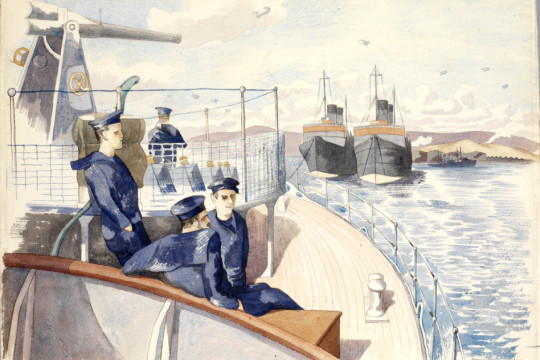
John Nash – HMS Oracle at Anchor
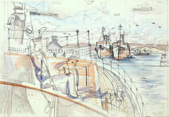
John Nash – Study for HMS Oracle at Anchor
I was taken up to draw a very big merchant ship which have been toed up one of the rivers there and split in half by a bomb I think… I drew this thing high and dry on the mud and then went again with the Naval numbers to see her dragged off the mud by seven tugs and then went in a car with them and drew her as she was being toed Triumphantly down the river by one tug by then. †
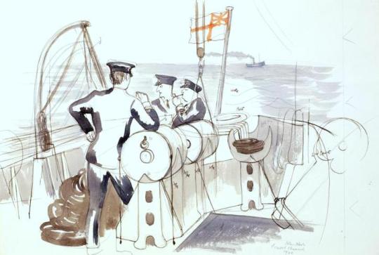
John Nash – Bristol Channel, with Tug Boat in the distance.
When we came back from this trip up and down the Bristol Channel we tied up in the dockyard and everybody got ready to have a (party) changed their clothes and the port was bought out and having a nice sort of evening when there was a ‘Purple Air Alarm’ and we went out on deck to see what was happening and there was a terrific explosion and everybody fell flat on the deck and the bomb landed at the end of the dock.
After that the number one officer said “I must go out and see what the Captain is doing, I think he’s gone out firefighting” ‘cause fires had started in the dock and I said “well I’ll come too.” And we spent the whole night- up to three o’clock in the morning – firefighting, dragging hoses about and what is really illustrated in that painting there. †
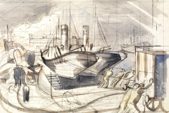
John Nash – Study for A Dockyard Fire
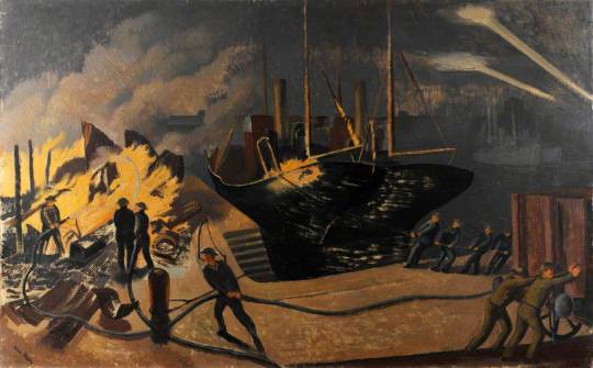
John Nash – A Dockyard Fire.
(I was) drawing in a detached way, but didn’t seem much to be like war, not that I am a fire-eater in any way. It seemed to be rather (like a) peace time occupation in the middle of a war. †
The pictures that come from the Second World War were observational documents much in the style of the Recording Britain project. During WW1 Nash was a young man but by the time of WW2 he was in his late forties and the army were less interested in giving him an active brief and they refused him opportunities to serve with the troops overseas. It maybe that the pictures Nash did for the Second World War became detached and stylishly posed but have little might or drama to interest the museums and thus also the public too.
I gave it up. I got tired of the whole thing and gave it up. I asked the Royal Marines Office to get me a job which was not an artist’s job, and so I was sent to Rosyth. It was an absolute change of life and I didn’t do any painting, really, for four years. ‡
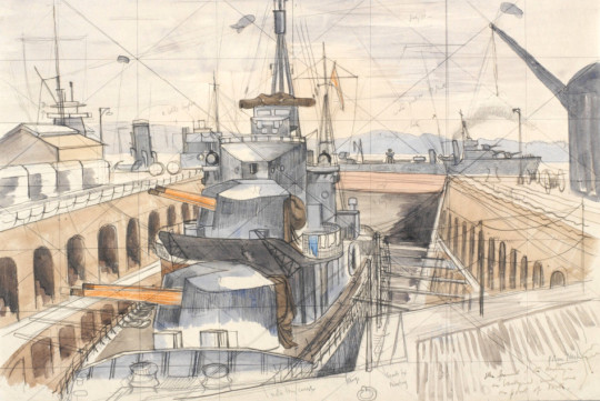
John Nash – Study for ‘Destroyer in Dry Dock’
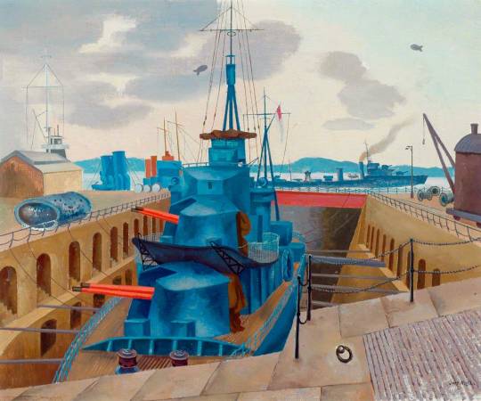
John Nash – Destroyer in Dry Dock’
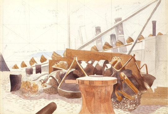
John Nash – Study for ‘Scrap’
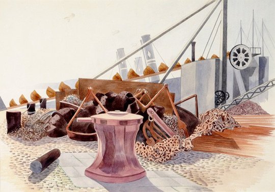
John Nash – Scrap
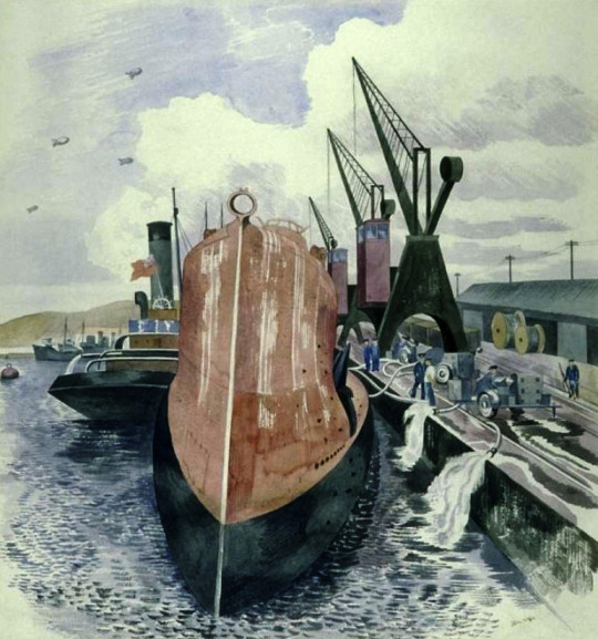
John Nash – French Submarine “La Creole” in Swansea Dock, 1940
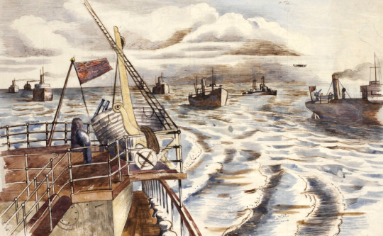
John Nash – Convoy Scene
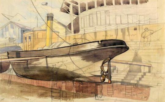
John Nash – Study for ‘Small Vessel in Dry Dock’
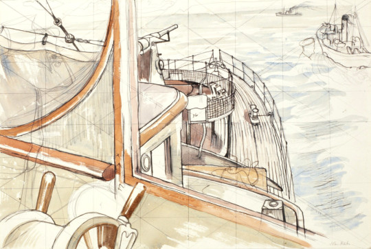
John Nash – Study for ‘From the Wheelhouse’
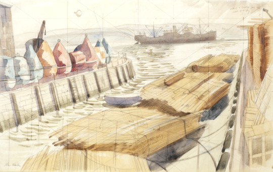
John Nash – Study for ‘Timber’
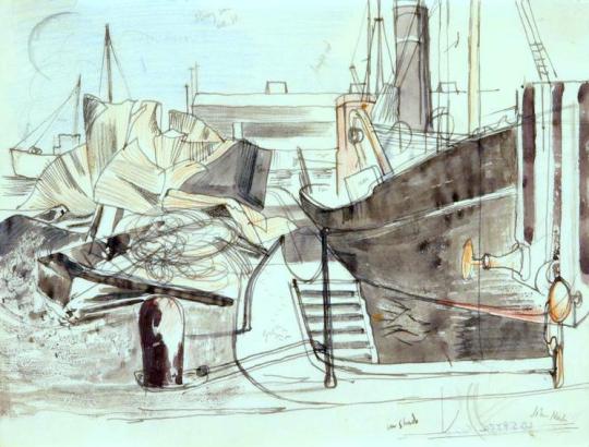
John Nash – Study for Arming a Merchantman
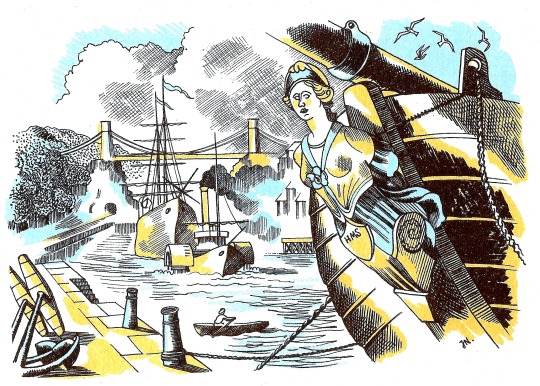
John Nash would be able to return to his war work in 1947 when making an illustration for the Handbook of Printing by W S Cowell. He was illustrating The Harbours of England by John Ruskin. The figure head from the ship is clearly taken from Study of ‘Pump Room’, Plymouth Dock Yards.
† IWM – Nash, John Northcote (Oral history)
‡ Ronald Blythe – John Nash at Wormingford p12
W S Cowell – Handbook of Printing, 1947
In the past two weeks I have posted about Edward Bawden and his home in the twilight of his life. This is the third and last of these posts.
The artists of Great Bardfield all reacted to their surroundings by making paintings or prints of the area that they lived, so when Edward Bawden moved to Saffron Walden in 1970, he naturally used local places in his artworks, from Bridge End Garden’s to the church.
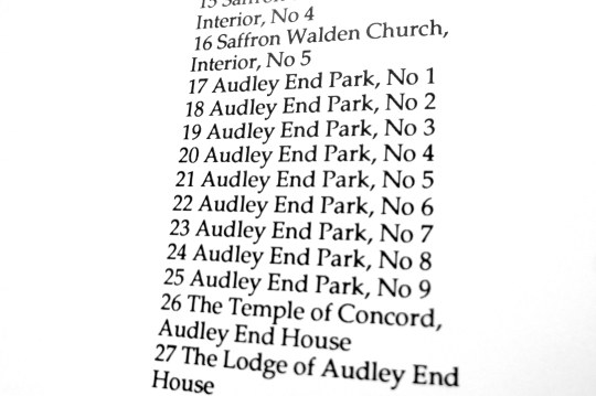
Exhibition list from The Fine Art Society Ltd show 20/ii/1978 – 10/iii/1978.
One of the biggest tourist attractions to Saffron Walden and one of the most prominent buildings in East Anglia is Audley End house and its gardens. It also was very convenient being twenty minuets walk from Bawden’s house, even for an older man.
In 1973 Bawden made a large lino cut of Audley End, a complex task to complete, with the regimented architecture of the building it is one of the more technical linocuts Bawden completed.
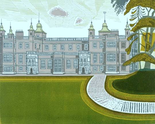
Edward Bawden – Audley End House, 1973
The watercolours Bawden completed where many but show off the wonderful and complex landscape of the Audley End Park, it’s follies and the trees.
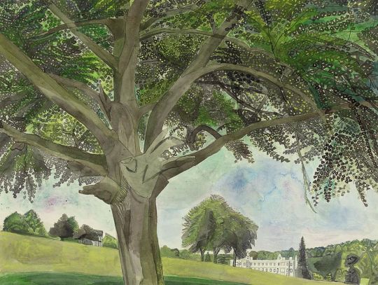
Edward Bawden – The Temple of Concord, Audley End, 1975
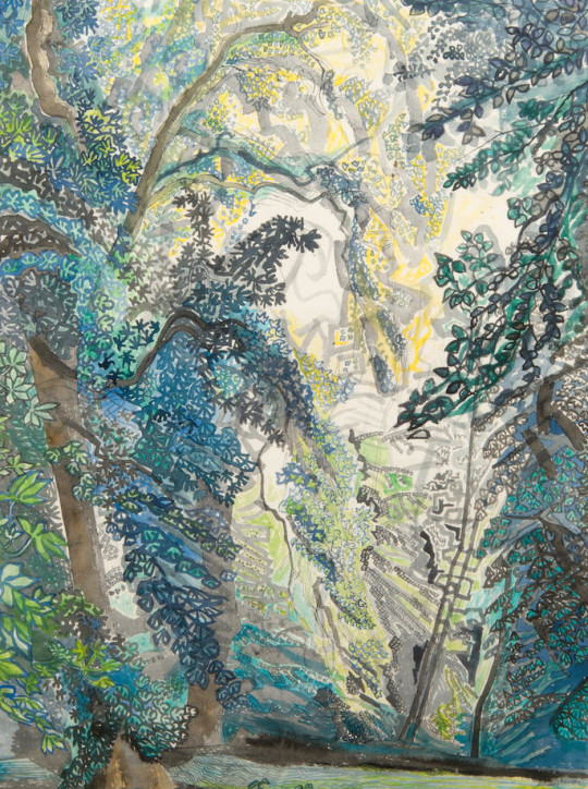
Edward Bawden – Audley End Park III, 1975.
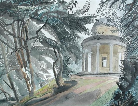
Edward Bawden – The Adam Temple, Audley End, 1978
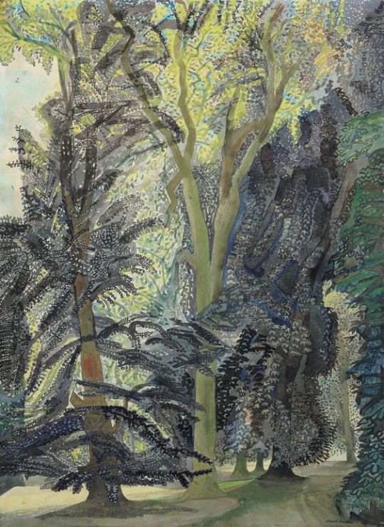
Edward Bawden – Ringwood, Audley End, 1975
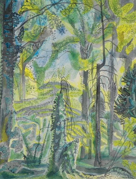
Edward Bawden – Ringwood, Audley End, 1975
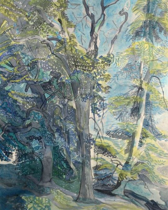
Edward Bawden – Ringwood, Audley End, 1975
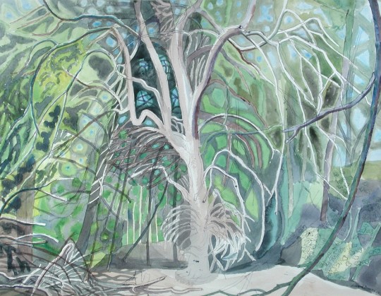
Edward Bawden – Ringwood, Audley End, 1975
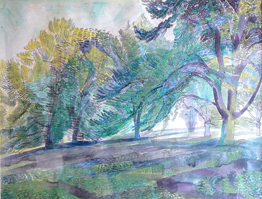
Edward Bawden – In Audley End Park, 1978
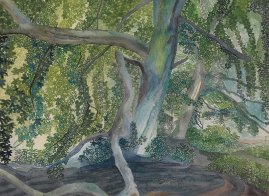
Edward Bawden – Audley End, 1978
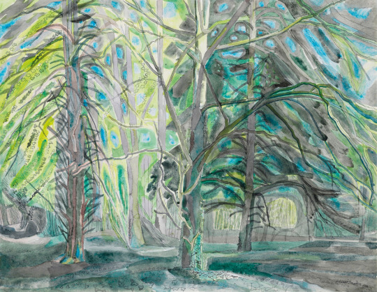
Edward Bawden – Ringwood V, Audley End, 1975
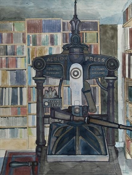
Edward Bawden – Press and Books, 1979
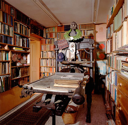
The Print Room – 2 Park Lane, Saffron Walden, 1989
Edward Bawden is best known as one of the Great Bardfield artists in the 1950s, but as the artists either divorced or moved away to other villages and towns, Edward and his wife Charlotte were the only important artists left in the village in the late 1960s, (other than John Aldridge). With health problems and old age, Bawden and his wife decided to move to Saffron Walden. Charlotte sadly died just before moving into 2 Park Lane, Saffron Walden, but Edward honoured the sale and moved alone in 1970.
With the blank canvas of a new house, Bawden set to work decorating the rooms with his own wallpapers and setting up the possessions brought from Brick House into this new home. A studio was built on the back of the property with large windows and a trap door for large works to enter the studio without going through the house. After ten years living at the property Bawden’s health became worse with old age.
For most of the year he was more house-bound than he had ever been and this forced him into new subject areas. In 1986 he began a series of watercolours which depicted his own rooms, his studio, his plants, his glowing oriental carpets, his gas fire, his cat Emma Nelson, and, eventually, this most private of men made his own face the subject of his art.
This focus on home and the cat was becoming obvious when one looks at the exhibition picture list for ‘The Private World of Edward Bawden’ by the Fine Art Society in 1987.
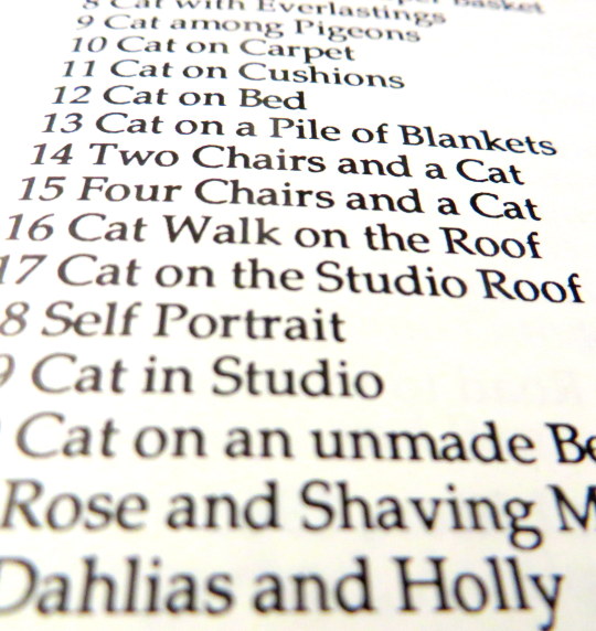
Works list at ‘The Private World of Edward Bawden’ Exhibition, 1987. †
The Tate now possess two of the pictures from this show, “Emma Nelson by the Fire” and “Roses and Rue”, both pictures with the cat in. In the magazine ‘House and Garden’ (December 1987) Edward Bawden gave an interview about his cat:
No cat will suffer from being lifted up and dropped into an empty space intended for her to occupy; that procedure led inevitably to Emma, tail up, walking away at once, so I had to wait patiently until Emma had enjoyed a good meal of Coley and was ready to choose her daily sleeping place, wherever it might be. I would then spring into action with a colour and colour. ‡
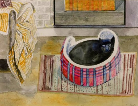
Edward Bawden – Emma Nelson by the Fire, 1987
When the Tate wrote to Richard Bawden for more information on the painting they had acquired (Emma Nelson by the Fire) in 1991 he responded with this letter:
Although the house is covered with his early wallpapers, yellowed by nineteen years of nicotine, his studio being an extension was painted brick and not alas the wallpaper known as Rustication [1938–9] … The nasty tartan fur lined cat ‘basket’ came from the local charity shop … The rug on the floor used to be in the bathroom at Brick House, Gt. Bardfield, bought by my mother on a trip to Portugal or elsewhere. The curtain draped over the armchair hung in the spare room at Gt. Bardfield, and I am fairly sure must have been designed by Marianne Straub who lived in the cottage directly across the road and who at the time, I mean the late fifties, was chief designer at Warners. The cushion, at a guess because there is not much showing, was probably covered by a piece of hand blocked cotton by Barron & Larcher who had a studio in Painswick until the outbreak of war. The gas fire I cannot help you with, only I think Edward has improved its design. ♠
The letter illustrates a lifetime of collecting and friendships in the possessions Bawden owned. In next week’s post I will elaborate more on this theme but I will leave you with some of the many images Bawden painted of his home and of his cat.
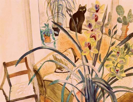
Edward Bawden: Cat and an Orchid, 1987
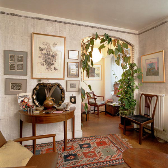
The Living Print Room – 2 Park Lane, Saffron Walden, 1989
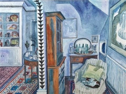
Edward Bawden – Cat on Cushions. 1985
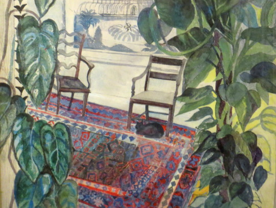
Edward Bawden – The Living Room, 1985 (Featured in the R.A. ‘85 Summer Exhibition)
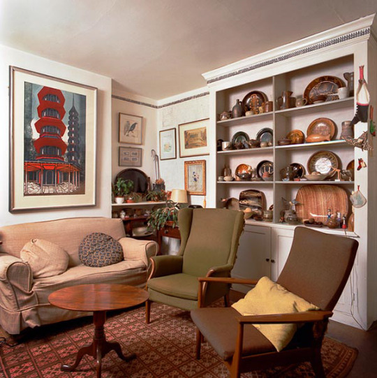
The Living Room – 2 Park Lane, Saffron Walden, 1989
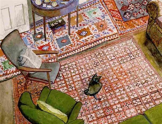
Edward Bawden – Cat on the Carpet, 1987
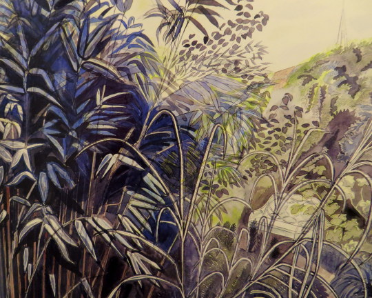
Edward Bawden – Bamboos and Garden Seat, 1979
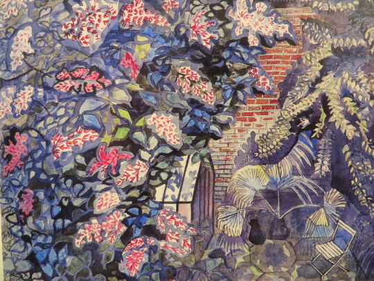
Edward Bawden – Cat and Greenhouse, 1986
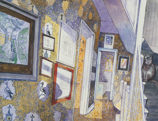
Edward Bawden – Cat Among Pigeons, 1986.
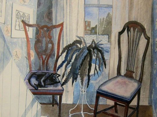
Edward Bawden – Two Chairs and a Cat, 1986
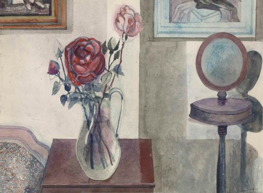
Edward Bawden – Rose and Shaving Mirror, 1987
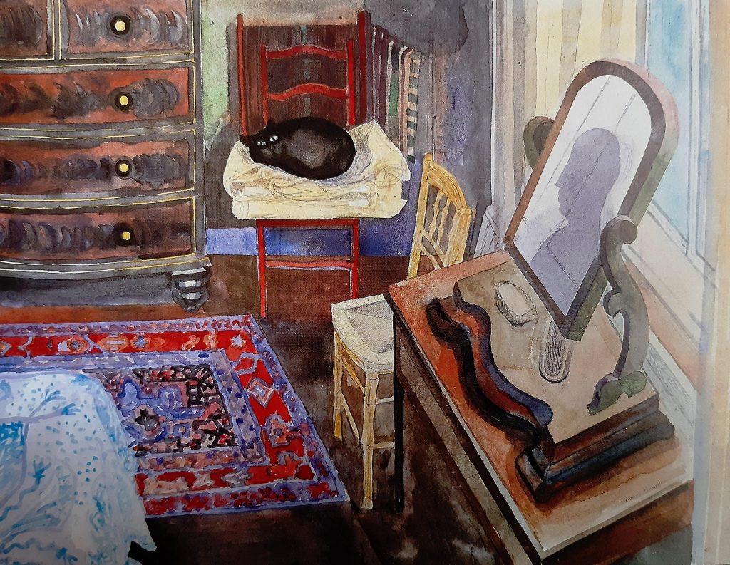
Edward Bawden – Cat on A Pile of Blankets, 1985
d
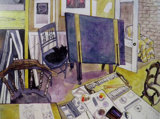
Edward Bawden – Four Chairs and a Cat, 1987
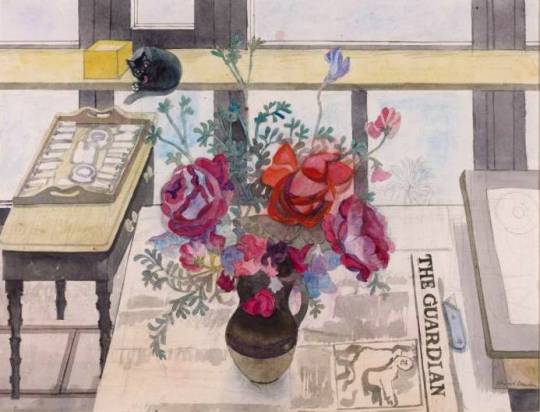
Edward Bawden – Roses and Rue, 1987
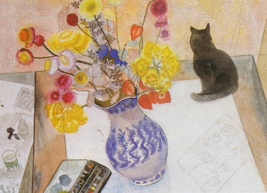
Edward Bawden – Cat with Everlastings, 1987
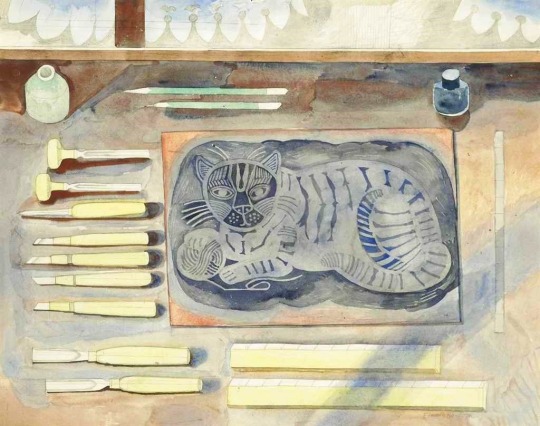
Edward Bawden – Play With Me, 1983
The linocut on the table when finished and editioned was also called Play with Me, now famous for being a Cushion from the Fry Gallery.
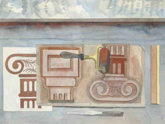
Edward Bawden – Cap and Base, 1983
Bawden printed these designs onto ceramic tiles, presumably for himself.
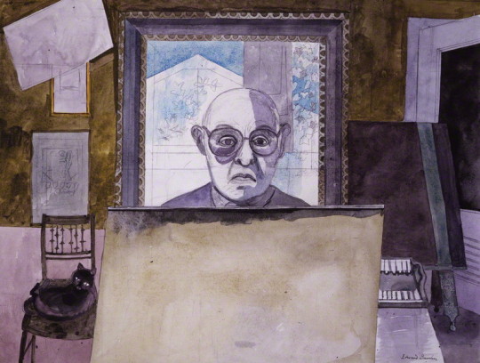
Edward Bawden – Self-Portrait, 1986
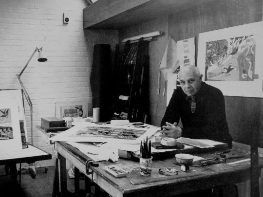
Jorge Lewinski – Edward Bawden in his Studio, 1978.
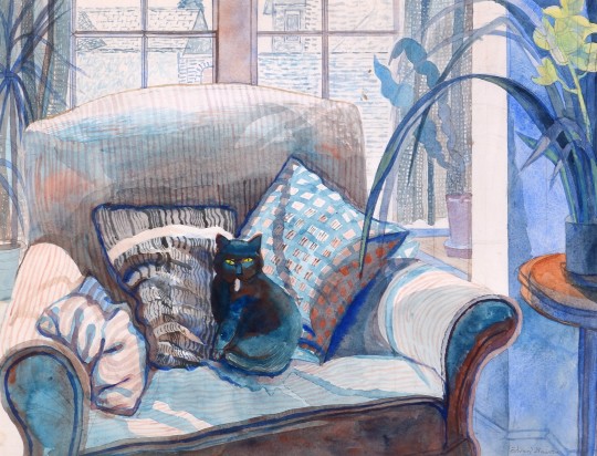
Edward Bawden – Cat on a settee, 1987
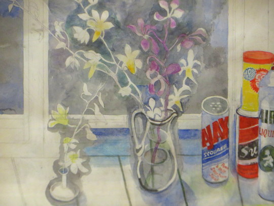
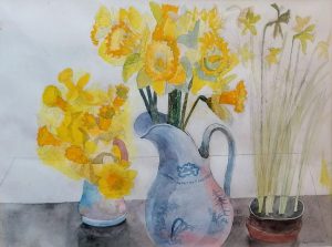
Edward Bawden – Daffodils, 1988
Below is one of the last watercolours Bawden painted and left unfinished and the linocut also unfinished.
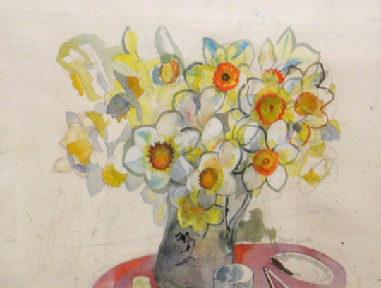
Edward Bawden – Daffodils, Unfinished, 1989
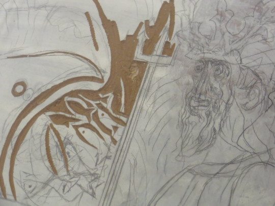
Edward Bawden – Poseidon Linocut, Unfinished 1989
Bawden was working on this linocut on November 21st 1989 before attending for lunch, where he died at table. ♥
† Fine Art Society, The Private World of Edward Bawden’ Exhibition Booklet, 6-30 April, 1987
‡ House and Garden’ (December 1987) Edward Bawden
♠ Tate Gallery: Illustrated Catalogue of Acquisitions 1986-88, London 1996.
♣ Malcolm Yorke – Edward Bawden and his Circle.
♥ Fry Gallery Label 2018
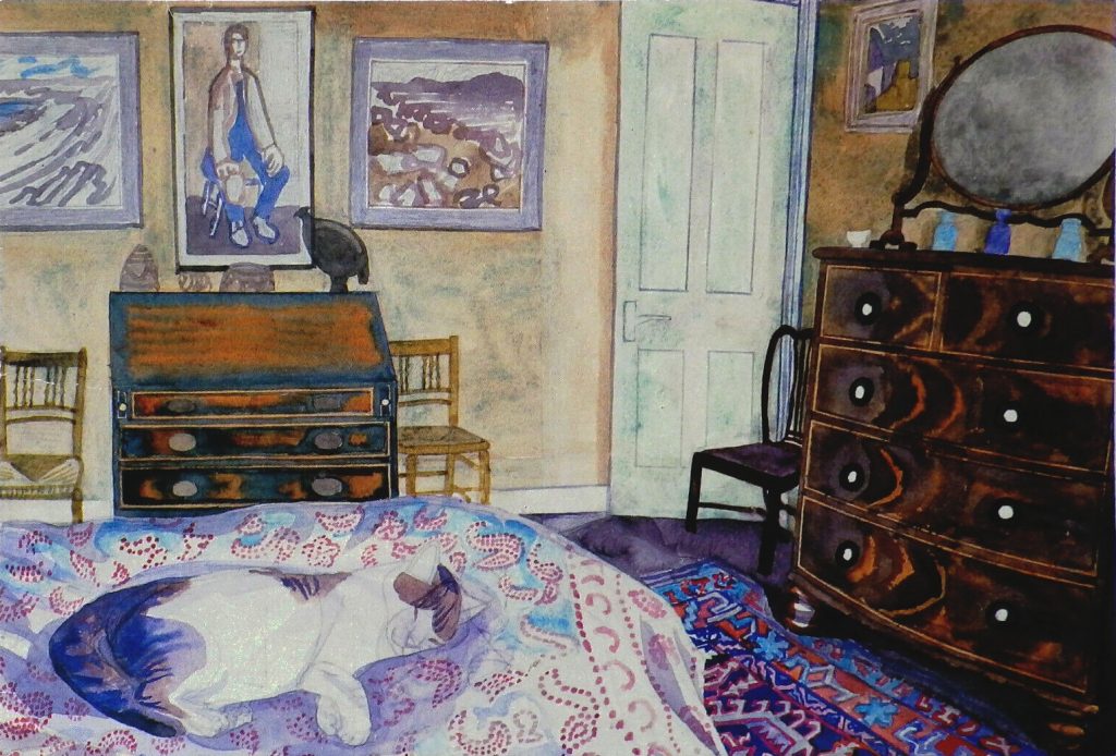
Edward Bawden – His Master’s Room, 1984
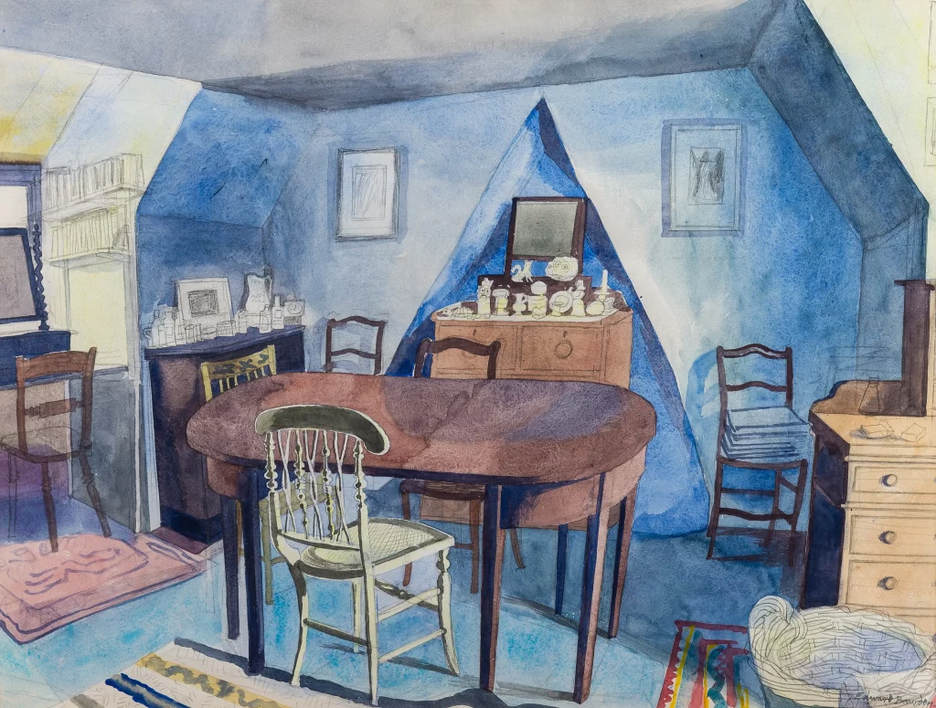
Edward Bawden – The Grandchild’s Room, 1984
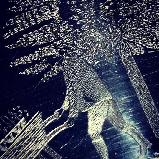
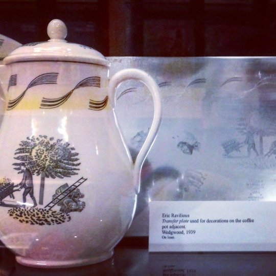
One of the items I own is an original engraving plate for Wedgwood by Eric Ravilious. I bought it as I like the social history of printed china, not only of Wedgwood, but when artists would design domestic tableware. Being a printing plate it is as close to the original drawings by the artist, but very few have survived (maybe ten) and most of them were melted down after the production ended.
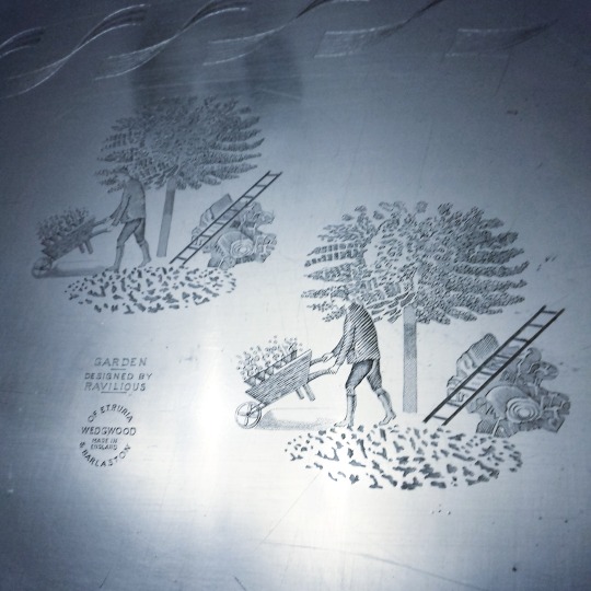
Metal engraved plate with the Ravilous design for ‘Garden’. From my collection.
Below is a printing taken from the plate, printed in black on to white paper.
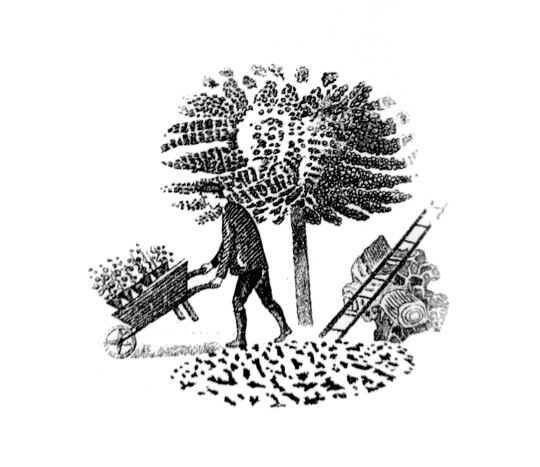
‘Garden’, the most elaborate of the designs (comprising a border, then vignettes and many smaller details from these), appears in the Wedgwood estimate books between November 1938 and May 1939. ‘Speaking for myself,’ Tom Wedgwood wrote acknowledging the receipt of some drawings, ‘I am delighted with them, particularly the Garden pattern; you must have put in a tremendous lot of work on these patterns since you were down here, and I do think you are to be congratulated on the result. †
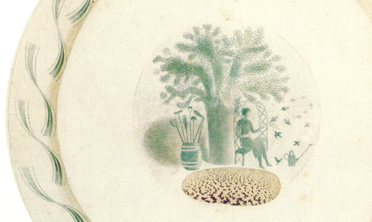
Detail: A collage of pieces making the finished plate by Ravilious.
The garden series had various vignette designs for the china pieces. Ravilious would paint them in with watercolour, pen and pencil.
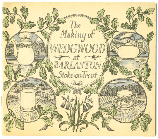
Below I have put more information from the Wedgwood guide to how the factory produced, printed and made the ceramics with the metal plates. ‡
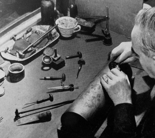
The Engraver:
A pattern which is designed for reproduction by printing is first drawn to fit the curves of the various pieces of ware (china) to the width it will be applied. It is then engraved either on a flat copper plate or on a copper cylinder. This is done with a sharp pointed tool called a “graver”. Light and shade effects are obtained by minutely graduated punched dots. This craftsmanship calls for the highest degree of skill which can only be acquired after many years of experience.
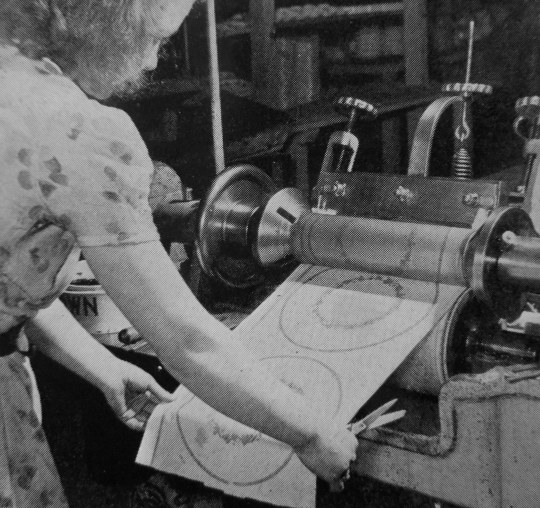
The Printer:
Prints can be taken of flat copper plates by hand. The heat softened colour is rubbed into the engraved lines and the print is taken off on to specially prepared tissue paper by dressing the copper plate with the tissue paper between two flannel covered rollers. Nowadays, power operated printing machines are employed. The engraved copper cylinder prints the pattern on a continuous roll of paper. The colour mixed with oil is fed to the cylinder which is heated by an electric element in its centre.
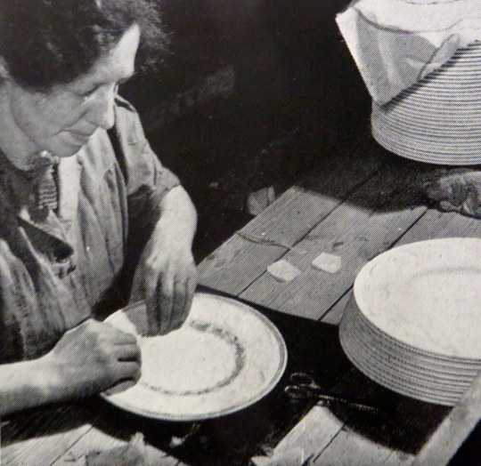
The Transferrer:
All superfluous tissue paper having been cut away the transferrer applies the paper print. It is vigorously rubbed on to the ware first with a flannel and then with a hard brush to ensure that it adheres firmly and evenly. Afterwards the paper is washed off leaving the pattern transferred to the ware. This is then passed through an electric kiln to harden on the colour of patterns printed on biscuit or to fuse the colour to the glaze in the case of those printed on the glaze.
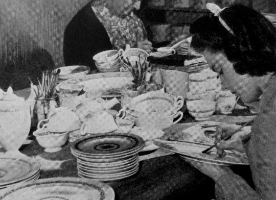
The Enameller:
Printed patterns can be enriched by the addition of ceramic colours, the painting of which calls for great skill.
† Ravilious & Wedgwood: The Complete Wedgwood Designs of Eric Ravilious by Eric Ravilious and Robert Harling, 1995.
‡ The Making of Wedgwood at Barlaston, Stoke on Trent.
Augustus John – Self Portrait, 1920.
After the Second World War had effectively ended with the United States dropping the two nuclear weapons on the Japanese cities of Hiroshima and Nagasaki on August 6th and 9th, 1945, the world was closing one door to war and opening another into the Cold War. This was both an arms-race and a stand-off. Peace movements and rallies had some worth to them then.
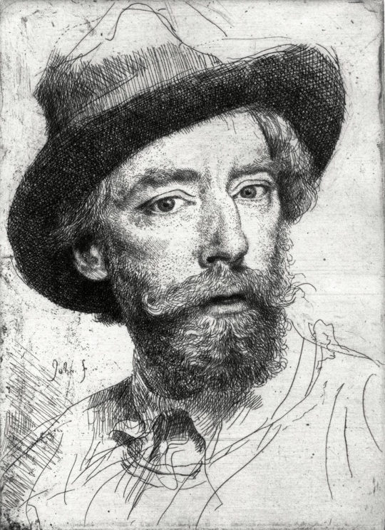
Augustus John joined the Peace Pledge Union as a pacifist in the 1950s, and on the 17th September 1961, just over a month before his death, he joined the Committee of 100’s anti-nuclear weapons demonstration in Trafalgar Square, London. At the time, his son, Admiral Sir Caspar John was First Sea Lord and Chief of Naval Staff. It can only be guessed that Caspar John was not happy about it. Further more he was invited to join an CND demonstration by Bertrand Russell.
From Augustus John
Fryern Court,
Fordingbridge, Hants.
(Postmarked 15 Feb 1961)Dear Lord Russell,
Your message was brought to me while I was working in the studio (not the one you knew, but one further off) by the gardener. I told him how to reply, which he said he understood but I don’t know if he did so correctly. All I wanted to say was that I believed in the object of the demonstration and would like to go to prison if necessary. I didn’t want to parade my physical disabilities though I still have to follow the instructions of my doctor, who I think saved my life when I was in danger of coronary thrombosis. A very distinguished medical authority who was consulted, took a very pessimistic view of my case, but my local doctor, undeterred, continued his treatment and I feel sure, saved my life. All this I meant privately & am sure you understood, even if the gardener garbled it when telephoning.I wish the greatest success for the demonstration on the 18th although I can only be with you in spirit.Your Augustus John,
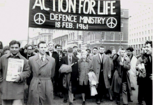
A few days later on the 18th February 1961, Bertrand Russell can be seen sitting under the banner of Action for life, a peace protest against nuclear weapons.
At a peace protest for the commemoration of Hiroshima Day on the 6th August, 1961 Russell was arrested when he took part in a sit down protest.
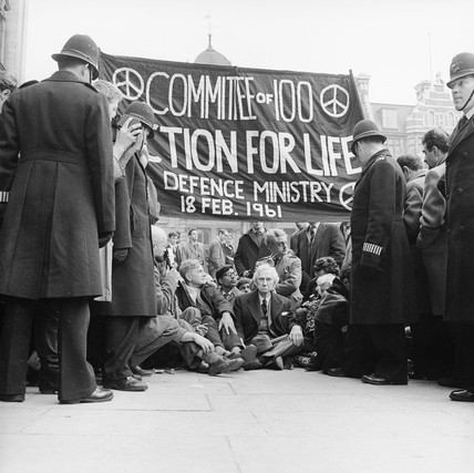
At the age of 89, Russell was jailed for seven days in Brixton Prison for “breach of peace” after taking part in the anti-nuclear demonstration in London. The magistrate offered to exempt him from jail if he pledged himself to “good behaviour”, to which Russell replied: “No, I won’t.”
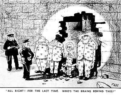
Cartoon from the Evening Standard refers to the week-long prison sentence served by Russell in September 1961.
After he had spent a week in jail he was released. In October he gave a speech in Trafalgar Square.
Extract of Russell’s Speech in Trafalgar Square, October 29, 1961
Friends,
During the last decades there have been many people who have been loud in condemnation of the Germans for having permitted the growth of Nazi evil and atrocities in their country. ‘How’, these people ask, ‘could these Germans allow themselves to remain unaware of the evil? Why did they not risk their comfort, their livelihood, even their lives to combat it?’Now a more all-embracing danger threatens us all-the danger of nuclear war. I am very proud that there is in this country a rapidly growing company of people who refuse to remain unaware of the danger, or ignorant of the facts concerning the policies that enable, and force, us to live in such danger. I am even prouder to be associated with those many among them who, at whatever risk of discomfort and often of very real hardship, are willing to take drastic action to uphold their belief. They had laid themselves open to the charges of being silly, being exhibitionist, being law-breakers, being traitors. They have suffered ostracism and imprisonment, sometimes repeatedly, in order to call attention the facts that they have made the effort to learn.It is a great happiness to me to welcome so many of them here – I wish that I could say all of them, but some are still in prison. We none of us, however can be entirely happy until our immediate aim has been achieved and the threat of nuclear war has become a thing of the past. Then such actions as we have taken and shall take will no longer be necessary.
We all wish that there shall be no nuclear war, but I do not think that the country realizes, or even that many of us here present realize, the very considerable likelihood of a nuclear war within the next few months. We are all aware of Khrushchev’s resumption of tests and of his threat to explode a 50 megaton bomb.
We all deplore these provocative acts. But I think we are less aware of the rapidly growing feeling in America in favour of a nuclear war in the very near future. In America, the actions of Congress are very largely determined by lobbies representing this or that interest. The armament lobby, which represents both the economic interests of armament firms and the warlike ardour of generals and admirals, is exceedingly powerful, and it is very doubtful whether the President will be able to stand out against the pressure which it is exerting. Its aims are set forth in a quite recent policy statement by the Air Force Association, which is the most terrifying document that I have ever read. It begins by stating that preservation of the status quo is not adequate as a national goal. I quote: ‘Freedom must bury Communism or be buried by Communism. Complete eradication of the Soviet system must be our national goal, our obligation to all free people, our promise of hope to all who are not free.’ It is a curious hope that is being promised, since it an only be realised in heaven, for the only ‘promise’ that the West can hope to fulfil is the promise to turn Eastern populations into Corpses.
The noble patriots who make this pronouncement omit to mention that Western populations also will be exterminated. ‘We are determined’, they say, ‘to back our words with action even at the risk of war. We seek not merely to preserve our freedoms, but to extend them.’ The word ‘freedom’, which is a favourite word of Western warmongers, has to be understood in a somewhat peculiar sense. It mains freedom for warmongers and prison for those who oppose them. A freedom scarcely distinguishable from this exists in Soviet Russia. The document that I am discussing says that we should employ bombs against Soviet aggression, even if the aggression is nonnuclear and even if it consists only of infiltration. We must have, it says, ‘ability to fight, win, and purposefully survive a general nuclear war’. This aim is, of course, impossible to realise, but, by using their peculiar brand of ‘freedom’ to cause belief in lies, they hope to persuade a deliberately uninformed public opinion to join in their race towards death. They are careful to promise us that H-bombs will not be the worst things they have to offer. ‘Nuclear weapons’, they say, ‘are not the end of military development. There is no reason to believe that nuclear weapons, no matter how much they may increase in number and ferocity, mark the end of the line in military systems’ development.’ They explain their meaning by saying, ‘ factor in the international power equation’. They lead up to a noble peroration: “Soviet aims are both evil and implacable.
The people (i.e. the American people) are willing to work toward, and fight for if necessary, the elimination of Communism from the world scene. Let the issue be joined.’ This ferocious document, which amounts to a sentence of death on the human race, does not consist of the idle vapourings of acknowledged cranks. On the contrary, it represents the enormous economic power of the armament industry, which is re-enforced in the public mind by the cleverly instilled fear that disarmament would bring a new depression. This fear has been instilled in spite of the fact that Americans have been assured in the Wall Street journal that a new depression would not be brought about, that the conversion from armaments to manufactures for peace could be made with little dislocation. Reputable economists in other countries support this Wall Street view. But the armament firms exploit patriotism and anti-communism as means of transferring the taxpayers’ money into their own pockets. Ruthlessly, and probably consciously, they are leading the world towards disaster. Two days ago The Times published an article by its correspondent in Washington which began: ‘The United States has decided that any attempt by East Germany to close the Friedrichstrasse crossing between West and East Berlin will be met by force.’ These facts about both America and Russia strengthen my belief that the aims that I have been advocating for some years, and upon which some of us are agreed, are right. I believe that Britain should become neutral, leaving NATO to which, in any case, she adds only negligible strength. I believe this partly because I believe that Britain would be safer as a neutral, and without a bomb of her own or the illusory ‘protection’ of the American bomb, and without bases for foreign troops; and, perhaps more important, I believe it because, if Britain were neutral, she could do more to help to achieve peace in the world than she can do now. †
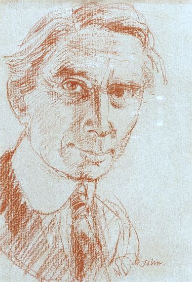
Augustus John’s portrait of Bertrand Russell.
† Bertrand Russell’s America: His Transatlantic Travels and Writings. Volume Two 1945-1970: 2
Both beautiful and inspiring, the artwork that Shell used on their posters was a shift in advertising for two reasons: They were selling the ambitions of the motorist beyond commuting; a generation of day-trippers without trains. Also they were presenting modern art to the public in an era when museums charged admission. The posters were pasted on the sides of petrol stations, lorries and billboards with that simple line “You Can Be Sure of Shell”.
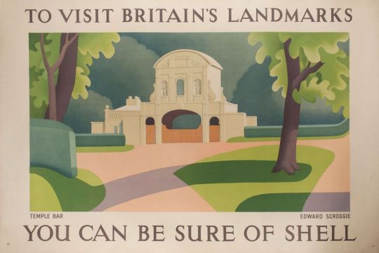
Edward Scroggie – Temple Bar
The respectability of motor touring was reinforced by the list of artists commissioned by Shell. It reads like a Who’s Who of the British art establishment of the period – Paul Nash, Graham Sutherland, Vanessa Bell, Ben Nicholson, Rex Whistler and Edward McKnight Kauffer – who between them produced some of the finest examples of commercial art while promoting a nostalgic view of England at the same time. At this stage of the century the motor car itself was not perceived as a threat to the countryside. Buying a car meant buying into a new world. ‡
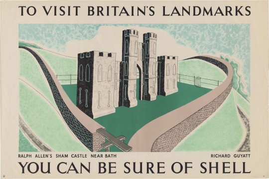
Richard Guyatt – Ralph Allen’s Sham Castle
Ralph Allen’s Sham Castle:
Ralph Allen was an entrepreneur, philanthropist and was notable for his reforms to the British postal system. He his home, Prior Park, a Palladian house, built to demonstrate the properties of Bath stone as a building material, Allen happened to own a few stone mines in Bath. On the crest of Bathwick Hill facing the city of Bath is the colloquially dubbed “Ralph Allen’s Sham Castle”, built in 1755. Guyatts poster is the most modernist in this post, making use of positive and negative line drawing in the shade and light.
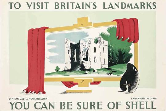
Edward McKnight Kauffer – Dinton Castle, Near Aylesbury
Dinton Castle:
A most charming, innocent folly, standing on a little mound by the Aylesbury-Thame road and circled by pine trees. It was built in 1769 by Sir John Vanhatten to house his collection of fossils, some of which are let into the random rubble walls. The plan is a hexagon with towers at two opposite corners, one for fireplaces and the other for a spiral staircase. ♠
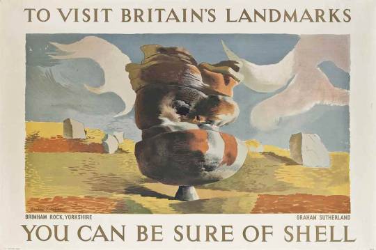
Graham Sutherland – Bringham Rock, Yorkshire
Bringham Rock, Yorkshire.
Sutherland visited this site in the autumn of 1935 at the suggestion of Jack Beddington, who wanted it to figure as one of a series of Shell posters. The result is a dreamlike lithograph, more in the style of Paul Nash. There are other rock structures on the site, all unique. ♣
There are many variations of rock formations, caused by Millstone Grit being eroded by water, glaciation and wind, some of which have formed amazing shapes. ♣
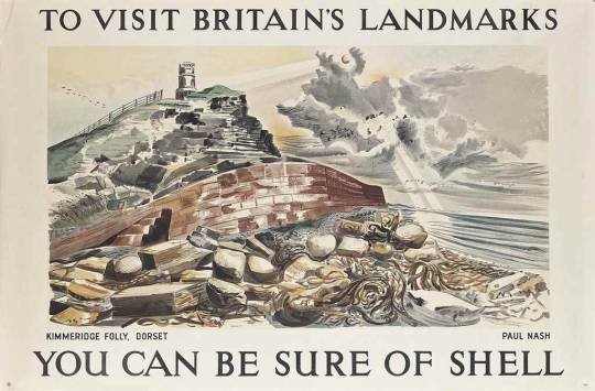
Paul Nash – Kimmeridge Folly, Dorset
Kimmeridge Folly, Dorset
When Paul Nash was working for Shell in 1937 it was to produce the Shell Guide of Dorset. He relocated for the project. His boss for the guide was not just Jack Beddington but also John Betjeman. It was Betjeman who suggested he paint Kemmeridge Folly for the ‘Landmark’s’ campaign. Paul Nash was paid 50 guineas when the picture was accepted as a poster in 1938.
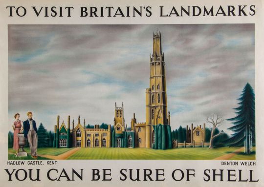
Denton Welch – Hadlow Castle, Kent
Hadlow Castle, Kent
The first few months of 1937 saw Denton working on a large-scale panel of Hadlow Castle, a building some three miles east of Tonbridge. Although the main part of the house dated from the end of the eighteenth century and had been inspired by Strawberry Hill, the 170-foot tower, built between 1938-40, was modelled on William Beckford’s Fonthill. The whole ambience of the place appealed greatly to Denton’s love of the Gothic. His naive painting, which shows the puny tower rising above the other parts like a coffee-iced wedding cake, was designed specifically to be reproduced as a poster. †
Hadlow Castle was built on the site of Hadlow Court Lodge, a country house. The Castle was built over a number of years from the late 1780s, commissioned by Walter May in an ornate Gothic style, it became known as May’s Folly. The architect was J. Dugdale.
His son, Walter Barton May inherited the estate in 1823. It was he, who added a 170 feet (52 m) octagonal tower in 1838, the architect was George Ledwell Taylor. The tower was based in part on James Wyatt’s at Fonthill Abbey. A 40 feet (12 m) octagonal lantern was added two years later in 1840 and another smaller tower was added in 1852. This was dismantled in 1905. Walter Barton May died in 1858 and the estate was sold.
The property passed from many owners in the early twentieth century. During the Second World War it was used as a watchtower by the Home Guard and Royal Observer Corps. The unoccupied castle changed hands several times after the war too, until it was demolished in 1951, except for the servants’ quarters, several stables and the Coach House, which was saved due to campaigning from the society portrait painter and local resident, Bernard Hailstone. The Tower was Listed as a historic structure on 17 April 1951.
† Denton Welch: Writer and Artist by James Methuen-Campbell, 2003
‡ The English Landscape in the Twentieth Century by Trevor Rowley 2006
♠ Follies & Grottoes by Barbara Jones, 1953
♣ Wikipedia: Brimham Rocks