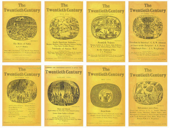
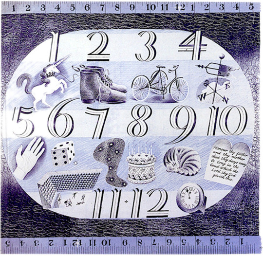
Here are all the covers of The Twentieth Century I own, yet there are many more, but I thought you would enjoy the illustrations, it shows Bawden looking at daily life and would be good for a diary.
It was in 1956 that Bawden was elected to the Royal Academy of Art. It must have happened in February as his credit his credit changed from ARA to RA.
The information that comes into my world and on to this blog comes from either reading it or talking to people. Twice this weekend I have got my notebook out and scribbled down references about people. In the research, links are made and there is a spider’s web of connections until I am surrounded with books like a bird in a nest.
Margaret Bryan’s name appeared on Twitter, who was she and what had she done? Well there isn’t a lot of information out there but what I have amassed so far is this:
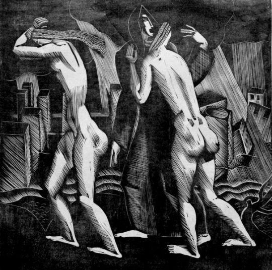
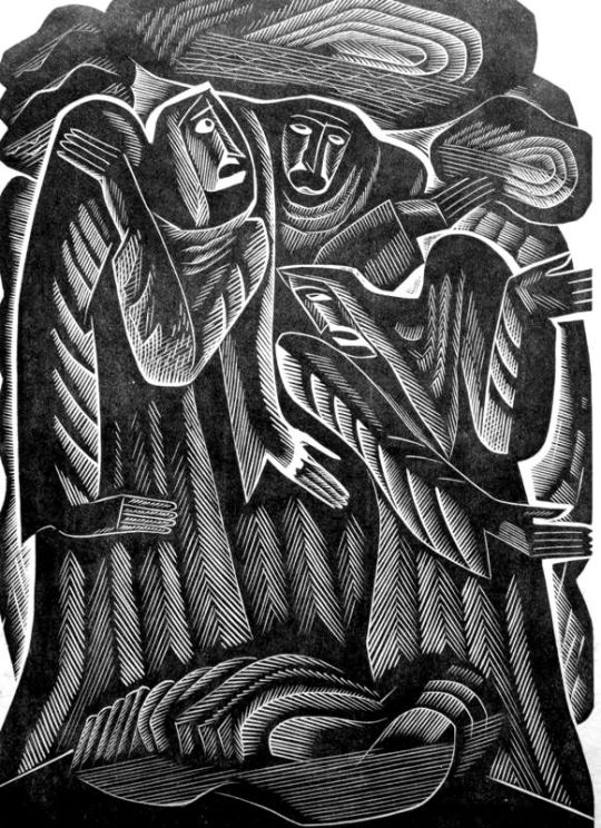
Margaret Bryan – The Deluge
Margaret Bryan was born in 1903. A Nottingham artist, most noted for her wood engravings. She was working from the mid-1920s to the late 1930s. After this point it is harder to find out information. During the 20s she appeared a few times in newspaper and magazine reviews of art shows but then it all stops. One can only guess married life and children slowed the pace of her work. In 1929 Margaret lived in Castle Road and was also traced to Lucknow Avenue, Mapperley Park, Nottingham. In 1947 she illustrated Henry Bell’s Children’s Almanac.
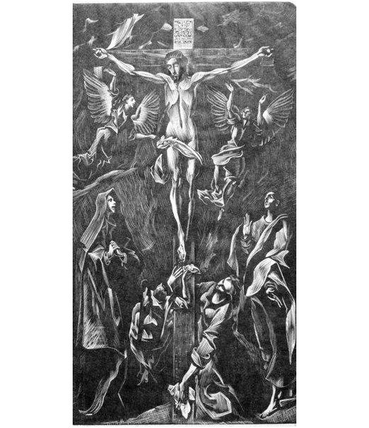
Margaret Bryan – After El Creco, 1931
Miss Margaret Bryan’s interpretations of Michelangelo and El Greco are far from incompetent. The Apollo – October, 1931.
The quote above comes from an exhibition where her work was shown beside Blair Hughes-Stanton and Gertrude Hermes. The show is likely to be from the short lived English Wood Engraving Society, a splinter group from the Society of Wood Engravers.; Their aim was to attract artists who were not solely interested in book illustration, but rather, wanted to make wood engravings that were independent of such an illustrative function.
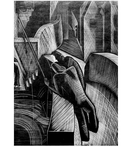
Margaret Bryan – The Fisherman
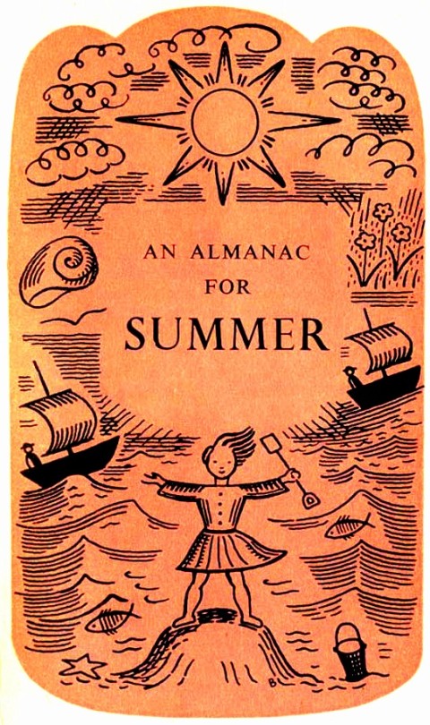
Below are two pages from A Children’s Almanac, 1947. the simple pen drawings are layered with a simple one colour image overlay.
Margaret Bryan – Autumn, 1947
Margaret Bryan – Summer, 1947
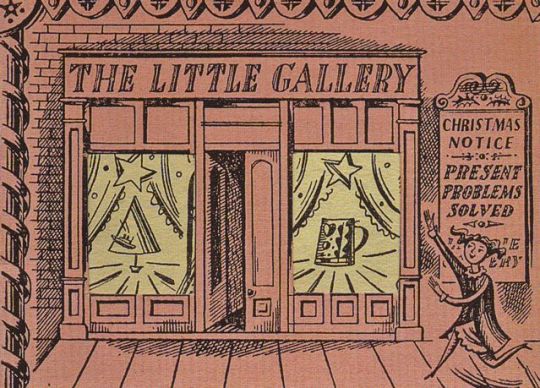
It was another blogger who pointed the link between Bryan and the illustration for The Litter Gallery’s Christmas advert. In my time the illustration below has been attributed to Edward Bawden and Barbara Jones because it is designed with a B but I would say they are correct and it is Margaret Bryan. The Muriel Rose archive also never attribute the artist of the advert so it is in some doubt.
Christmas Advert for The Little Gallery
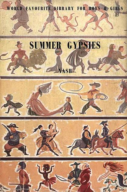
Bryan also designed the illustrations on the World Favourite Library for Boys and Girls books dust jacket. Her designs were used as a uniform dust jacket, the illustration always being the same but the name of the book printed over it changes. The series was published by Peter Lunn who also published A Children’s Almanac, both in 1947.
Nash – Summer Gypsies, with the uniform jacket by Margaret Bryan, 1947
Eric the copycat Ravilious, as I am starting to think of him, may well have taken delight in how surprised I am that so many of his designs are recycled from other works. Over the ages he might be whispering ‘In front of your face are the clues, now go find them’ but as in my previous blogs, I take delight in such matters.
In 1936, Cecilia Dunbar Kilburn
(later Lady Sempill) and (the Royal College of Art registrar) Athole Hay, set up a shop to promote the works of RCA students in modern interiors, the shop was called Dunbar Hay Ltd.
Josiah Wedgwood and Sons began their work with Ravilious following his introduction to Victor Skellern, the head Art Director at Wedgwood.
In 1934 Skellern was new to the job at Wedgwood and looking to shake the company up, he had also studied at the RCA.
The introduction was instigated by Kilburn who encouraged established companies to take on young designers to make more interesting products for her shop to sell. Ravilious would also be recommended to Stuart Crystal and much later, the British Cotton Trade Board to do work.
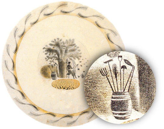
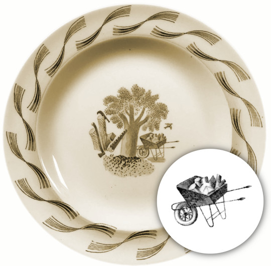
Eric Ravilious – Pen and Wash Design for Garden plate series, 1938
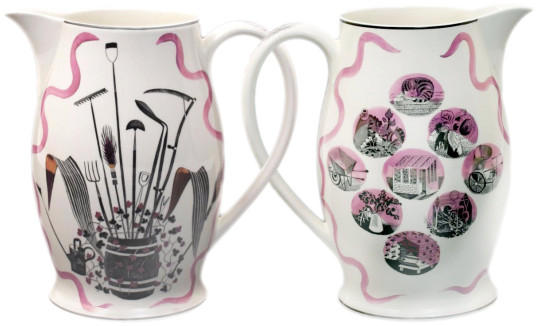
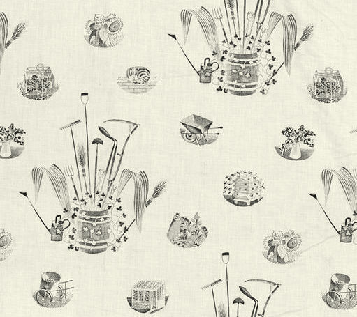
The Garden Implements jug designs by Eric Ravilious for Wedgwood in 1939 saw him once again recycling old works. A year before he was designing a series of tableware called Garden for Wedgwood, in one of the many designs is a small barrel, full of tools, just like from the jug. The plate was issued and the barrel of tools used on the plate as well as on the lid for the teapot.
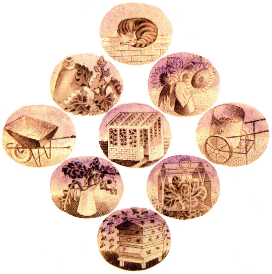
However when the barrel design is alone on the jug it looks like an illustration from a farmers almanac, much more elegant. The other side of the jug has a series of vignette designs. The Garden Implements jug forms part of a lemonade set. The designs and transfers placed on a stock Wedgwood ‘Liverpool Jug’ shape. Production numbers in 1939 are unknown but a limited number of 250 was produced in 1986 to mark the 50th anniversary of his first employment by Wedgwood in 1936. Below I have outlined the memory bubbles Ravilious used in the vignettes of this 1939 design.
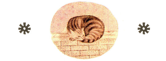
The Cat
This design as far as I know is an original drawing for the jug, although two years later when asked to make some designs for the British Cotton Board he re-used the design again, though those designs were never printed commercially.
Eric Ravilious – Design on Paper for a child’s handkerchief, 1941
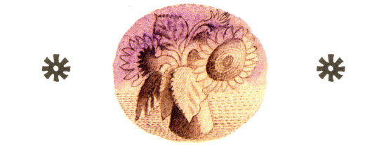
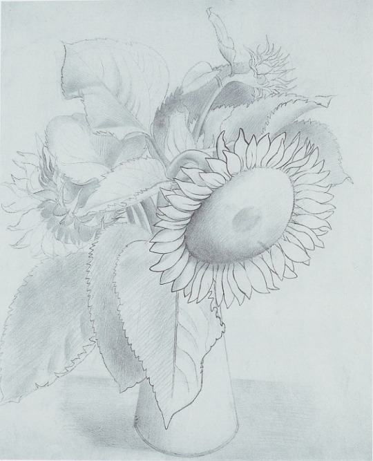
The Sunflowers The drawing of a Sunflower looks like it could have been a watercolour from the re-drawing of the main flower.
Eric Ravilious – Drawing of a Sunflower, c1935
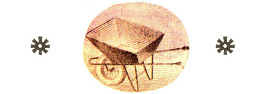
The Wheelbarrow The Wheelbarrow was used in an earlier commission of some months from Wedgwood. The design of the Garden Implement jug, takes the log laden wheelbarrow and empties it for a simpler design.
Eric Ravilious – Design for Garden dinner service, Wedgwood, 1938
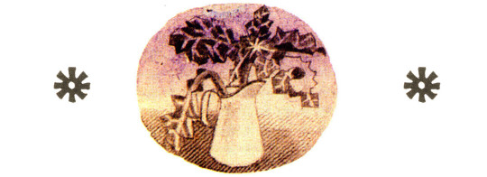
The Jug The Jug of Acanthus leafs, a subject for an earlier painting has been drawn with halftone lines as if it was a wood engraving.
Eric Ravilious – Still Life with Acanthus Leaves, 1938
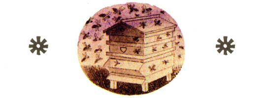
The Beehive The Beehive wood engraving appears in the Country Life Cookery Book in 1937, Ravilious made 12 engravings for the book, one for each month and Ambrose Heath provided the text. Heath also worked with Edward Bawden on cookery books as well.
Eric Ravilious – June, Wood-engraving for the County Life Cookery Book, 1937
The Fabric
A fabric was made of the jug designs, the commission likely came at the same time as the handkerchief design, pictured above. The commissioner was a young graphic designer (the man who invented the peace sign) working for the British Cotton Board, Gerald Holtom. It was 1941 and Ravilious was now in the War Artists Adversy Scheme, so Holtom went to Eric’s boss, Dickey O’Rourke.
I’ve just had a long visit from a Mr Gerald Holtom who seems very much to want designs for textiles for some Cotton Board. It would make a change to do this for a bit, and he assures me the whole thing is urgent and necessary. Do you know anything of this scheme? I said that it was a good idea which I would do if it were possible. The committee agreed that Eric might in Mr Holtom’s phrase ‘postpone battle at sea for battle in export trade’, and do some experiments in designing textiles †‡
It is as yet unknown by me, if Ravilious intended the Garden Implements design to become a fabric also, but in 1956 the Edinburgh Weavers company did produce a short run of this fabric for commercial sale but how it came about I don’t know. Judging from the amount of recycling of work Ravilious did it wouldn’t surprise me.
The handkerchief above however was designed on paper and with documentation it was for the BCB. In 1989 Alan Powers and his Judd Street Gallery printed a limited run of the handkerchief.
Edinburgh Weavers – Garden Implements design after Eric Ravilious, 1957.
† Alan Powers – Eric Ravilious’s Child’s Handkerchief. 1989
‡ Helen Binyon – Eric Ravilious: Memoir of an Artist, 1983 Jeremy Greenwood – Eric Ravilious Wood Engravings, 2008 Robert Harling – Ravilious & Wedgwood, 1986
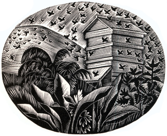
While looking into Eric Ravilious’s work for London Transport I noticed how many times a greenhouse would appear in Ravilious’s work.
Eric Ravilious – Kynoch Press Block 112, 1932
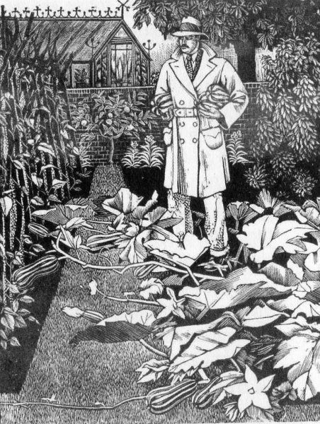
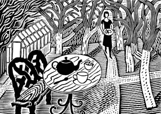
There are two curious observations in this post. One is the wood-engraving above, and the one below are the same location; the walled-off greenhouse with decoration on the end of the roof above the glass panes. It is also like the wood-engraving Tea in the Garden, but not quite.
Tirzah, (Ravilious’s wife), was a wonderful wood-engraver and artist in her own right. Below is a man about town in a driving Macintosh laden with marrows, the perfect suburban man.
Tirzah Garwood – The Husband, 1929
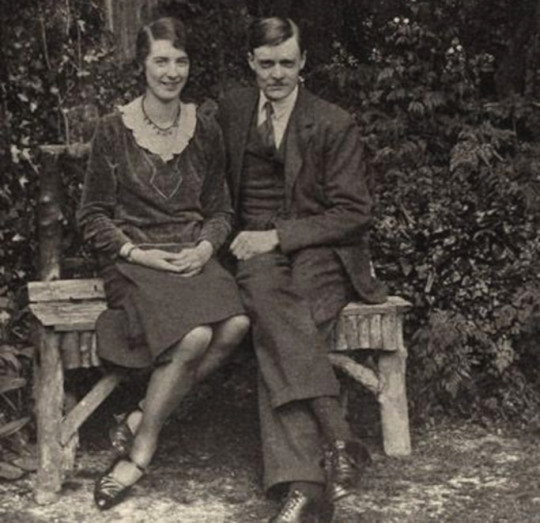
Below are two pictures, one, a wood-engraving featured in last week’s post on London Transport, but also a photograph of Tirzah and Eric together at the time of their engagement.
I include it because it’s the second of my observations in this post – the bench they are sitting on is so remarkably similar to the bench in Tea in the Garden that I would say this is the same bench and the inspiration. The back may have curves on the woodcut but I would suggest this is just to make the design more harmonic.
Eric Ravilious – Tea in the Garden, 1936
Tirzah Garwood and Eric Ravilious at the time of their engagement, 1930
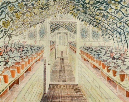
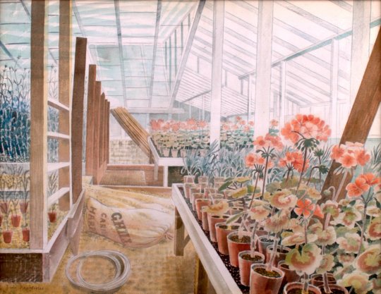
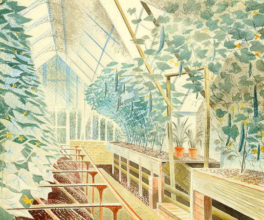
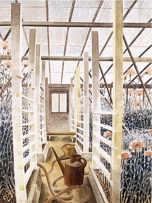
Below are a series of beautiful watercolours of greenhouses by Eric Ravilious included because they are so beautiful. It is very hard to walk into any greenhouse and not think of these paintings. They are the skill of perspective but also that skill found in craftsmen, the ability to paint, carve or make a series of objects, in the case of a carpenter it would be stair rods, in Ravilious’s case it is each plant pot and working with the the backdrop of shadow.
Eric Ravilious – The Greenhouse – Cyclamen and Tomatoes, 1935.
Eric Ravilious – Geraniums And Carnations In Greenhouse, 1935
I thought it would be interesting to list my 50 favourite books. I have no idea what it might say about me other than I read a lot and like escapist literature. It took a week to edit it down and I just picked the ones I could likely quote backwards. They are in no particular order other than most memorable.
1. We – Yevgeny Zamyatin 2. Maidens Trip – Emma Smith 3. A Crisis of Brilliance – David Haycock 4. Evolution in Modern Art – Frank Rutter 5. Alone in Berlin – Hans Fallada 6. Pictures from Persia – Cecil Keeling 7. The Pale Horse – Agatha Christie 8. And Then There Were None – Agatha Christie 9. Our Mutual Friend – Charles Dickens 10. The Riddle of the Sands – Erskine Childers. 11. Full Tilt – Dervla Murphy 12. Bicycle Diaries – David Byrne 13. The Painted Veil – Somerset Maugham 14. Lost Horizon – James Hilton 15. The Horse and His Boy – C S Lewis 16. Few Eggs and No Oranges – Vere Hodgson 17. The Happy Prince – Oscar Wilde 18. Dreaming of Babylon – Richard Brautigan 19. Empty World – John Christopher 20. The Tripods Trilogy – John Christopher 21. The Handmaid’s Tale – Margaret Atwood 22. Witches Abroad – Terry Pratchett 23. Wind in the Willows – Kenneth Grahame 24. His Dark Materials Trilogy – Philip Pullman 25. The Tempest – William Shakespeare 26. Vanity Fair – William Thakery 27. Mr Norris Changes Trains – Christopher Isherwood 28. On The Road – Jack Kerouac 29. The Wasteland – T.S. Eliot 30. Naked Lunch – William Burroughs 31. Fatherland – Robert Harris 32. On The Beach – Nevil Shute 33. The Doomed Oasis – Hammond Innes 34. The Story of the Amulet – E. Nesbit 35. The Day of the Triffids – John Wyndham 36. The Hound of the Baskervilles – A. Conan Doyle 37. The Temple – Stephen Spender 38. The House at Pooh Corner – A.A. Milne 39. The Hours – Michael Cunningham 40. Brideshead Revisited – Evelyn Waugh 41. The Lord of the Rings Trilogy – J.R.R. Tolkein 42. The Grapes of Wrath – John Steinbeck 43. The Wench is Dead – Colin Dexter 44. The Idiot – Fyodor Dostoyevsky 45. Summoned by Bells – John Betjeman 46. A Clergyman’s Daughter – George Orwell 47. The Pursuit of Love – Nancy Mitford 48. Unnatural Death – Dorothy L Sayers 49. Smiley’s People – John le Carre 50. Dead Souls – Nikolay Gogol
Part of the particular charm of Eric Ravilious’s work is that it is everywhere, I don’t mean on t-towels or mugs, (though regrettably we are at that stage now) it is that his pictures cover scenes that can be found all over Britain. There are many examples where his watercolours could fool you to be a country road you know and pass, until you find it was painted in deepest darkest Sussex and not Northern Essex.
It would surprise no-one then that most of the works he illustrated for London Transport didn’t feature London. The woodcuts made for press adverts and later used on booklets were mostly views from Essex and the village he lived in, Castle Hedingham.
Ravilious and his new wife, the artist and diarist, Tirzah (née Garwood) moved to Bank House in the village in September 1934. It was around the same time that he started an affair with Helen Binyon from 1934-37 – there are a mass of letters between the two to help the writing of this post.
Eric Ravilious – Back Gardens, Castle Hedingham
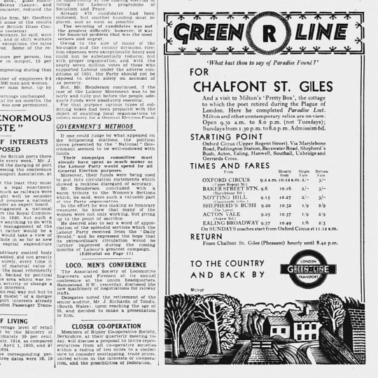
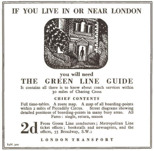
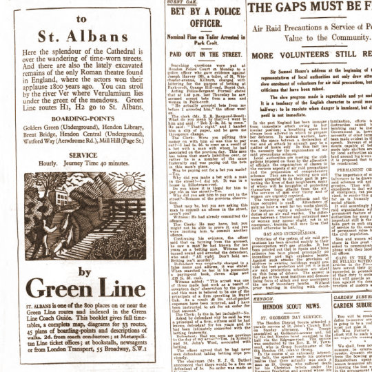
Green Line Coaches Limited was formed on 9th July 1930 by the London General Omnibus Company, to offer coach services from London to towns up to 30 miles away, comprising 60 vehicles on eight routes. London Transport took the company over in 1933 but kept the name the Green Line.
It was via the Curwen Press that Ravilious was asked to make illustrations for London Transport and the Green Line. They wanted a simple, long, thin wood-engraving. This started a series of wood-engravings that Ravilious would produce for other areas of London Transport.
The order was commissioned on the 20th March 1935. In a letter to Helen Binyon ten days later, Ravilious wrote:
30th March 1935 Green Line Buses would like an advertisement for the Essex scenery – some long narrow engravings, so this job will help to pass the time pleasantly next week. I wish commercial work was all so straightforward so much becomes a compromise between the client’s ideas and what the printer thinks about it and always a hurry for results. These engravings will be fun to do I think. †
Eric Ravilious – Green Line Coach Adverts, 1935
Below is the advert from the original newspaper-sheet, with the news of the day surrounding it. Rather like many adverts of the time there is a quote and a hint at tourism; ‘What hast though to say of Paradise Found?’ and then some information on John
Milton’s home where he completed Paradise Lost.
These remind me of the adverts for Shell Edward Bawden was illustrating at the same time, only these Green Line adverts have a lack of humour in favour of fact. The typography is spot on with dishing out the information, very simple and no fuss. Starting point, times and fares and return journeys, I wish more timetables were like this now.
Eric Ravilious – Advert and wood-engraving in a newspaper, 1935.
Ravilious was very busy at this point in his life, so it will surprise no-one that he was a great re-cycler of his own work, woodcuts for paid trade work became watercolours for his own exhibitions.
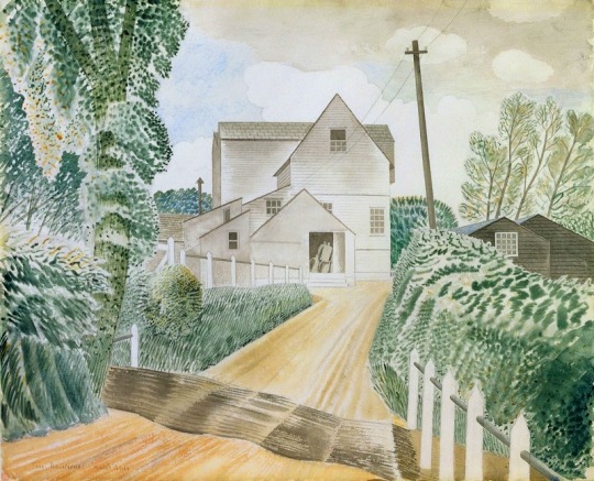
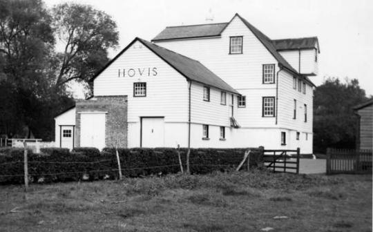
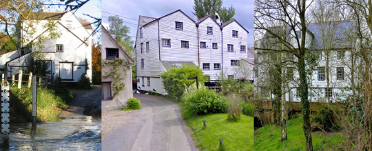
Time would also effect the travelling he could do, so other examples of Ravilious using his local area can be seen by the multi-named Hull’s Mill – Hovis Mill – Maplestead Mill, found in the next village to Castle Hedingham, Sible Hedingham. He would use the building from every angle for a variety of adverts for London Transport from 1935-36.
Eric Ravilious – Hull’s Mill, 1935
In Ravilious’s time the building was known locally as Hull’s Mill but in 1917 it was bought by Hovis who ran it til 1957 and sold it in 1959. Recently, although always considered a part of Sible Hedingham the mill is over the parish line on the Great Maplestead side of the river and is known as Maplestead Mill, located next to Hull’s Farm.
Mechanically it was driven by a water wheel, then after the First World War it was converted to be powered by a turbine and a gas engine and the water mill removed. With the water wheel removed in the painting above you can see the exhaust stack for the turbine and gas apparatus.
Emilie Montgomery Gardner – Hull’s Mill, 1952
Below is the design for the print that Ravilious made of Hull’s Mill, annoying (especially if you are trying to research this) this block is named Hovis Mill, maybe to differentiate it from the watercolour above. It is a larger woodblock for Ravilious and this maybe why he engraved the mill in triptych style. In a letter to Helen Binyon Eric notes:
8 November 1935 …The block is much too big. It is one I happened to have so feel I should use it all. †
Eric Ravilious – Design in Pencil for Hovis Mill, 1935
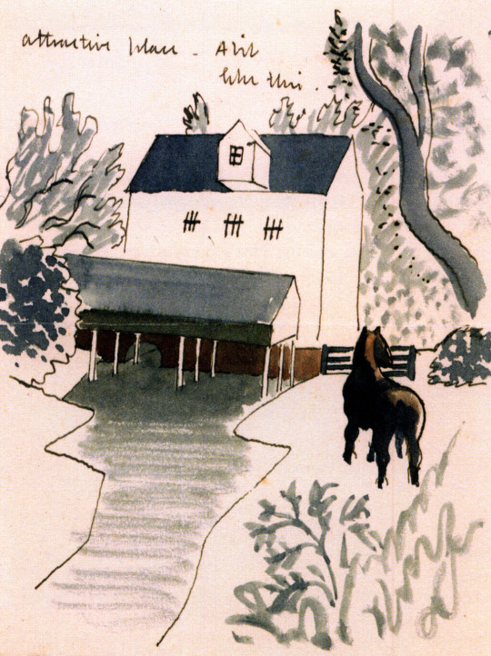
In another letter to Helen Binyon Ravilious writes:
The Mill drawings are going fairly well and may finish themselves one day. It is an extraordinarily attractive place – a bit like this. †
Ravilious illustrated this letter to Binyon and a drawing of the mill and last part of the letter are pictured below.
Eric Ravilious – Design on part of a letter to Helen Binyon, 1935
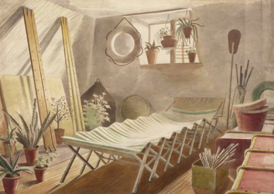
When living at Brick House with Edward and Charlotte Bawden, Tirzah’s uncle made Eric and her a canoe, it maybe why Eric put one in the Hovis woodcut below. The Paddle can be see in the painting The Attic Bedroom, Brick House. The river behind Hull’s Mill is also one of the widest parts of river in the area, being cut wider from when the Mill had a water wheel, and still is free from weeds.
Eric Ravilious – The Attic Bedroom, Brick House, 1934
Eric Ravilious – Hovis Mill, 1935
A set of views of the Mill today, 2018
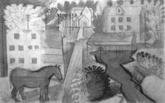
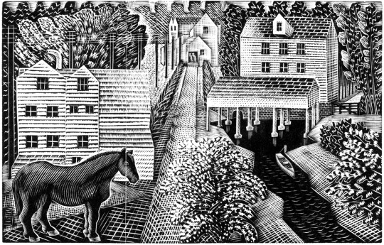
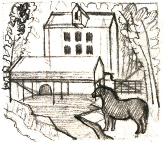
Ravilious would go on to cut the mill in another block using the same design again, this time without the canoe as in the Hovis wood-engraving, but with the horse grazing in the field like the above letter to Binyon. In this wood-engraving this time called Pony by a Mill. Below is the study for his wood-block design, squared off and ready for engraving.
Eric Ravilious – Drawing for Pony by a Mill wood-block, 1936
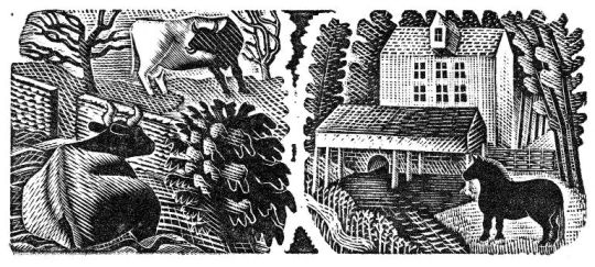
Eric Ravilious – Two Cows / Pony by a Mill, 1936
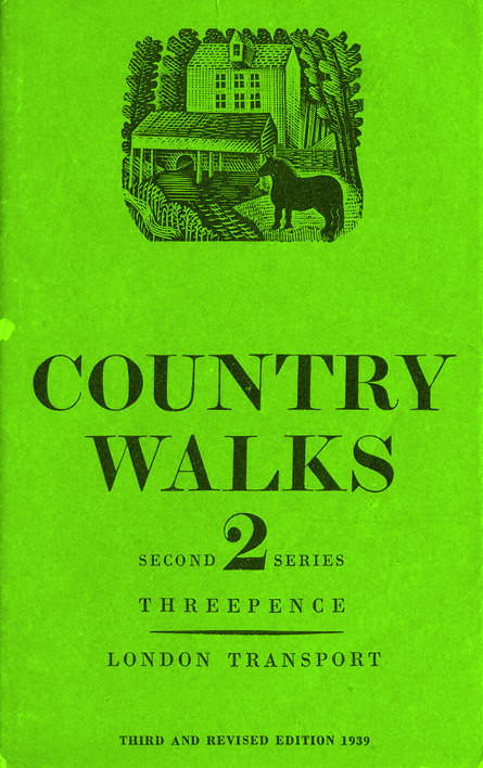
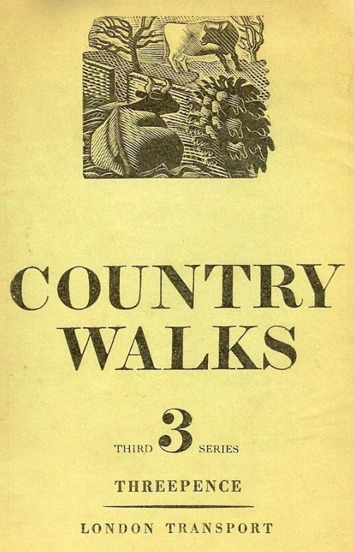
Cover for Country Walks, 2nd Series with a Ravilious Design of Pony by a Mill.
Above is the print Pony by a Mill with the edges chamfered off in use on one of the London Transport booklets, originally printed in 1936. The 3rd series would also feature the Two Cows wood engraving below.
The Country Walk books were by Charles White and printed for London Transport to show people the possibilities of using the train and bus network. Inside they had maps and planned walks showing how to get to the locations and the sights one might see.
Eric Ravilious – Two Cows / Pony by a Mill, 1936
The two images were engraved on the same block of wood and printed together as one proof. On the left a cow and a bull in a field, separated by a stone wall.
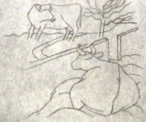
Below is the original drawing on tracing paper for Two Cows, reversed in design as a woodblock always prints backwards.
Eric Ravilious – Two Cows, preliminary study for a woodcut, 1936
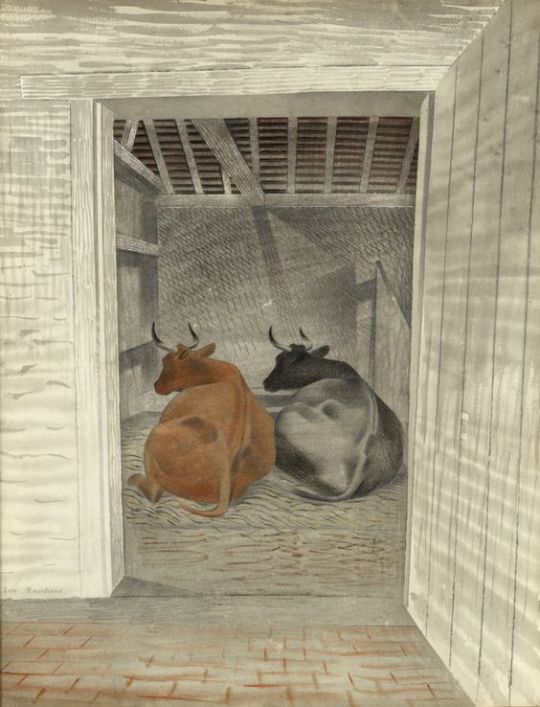
The pencil design and wood-engraving again would be re-cycled into another watercolour, Two Cows. Here keeping the study of a cow in the same pose, now doubled in pose, but this time with the perspective of a barn door to fix the eyes attention.
Eric Ravilious – Two Cows, 1936, The Fry Gallery
1936 cover to Country Walks, 3rd Series with a Ravilious Design of Two Cows.
Eric Ravilious – Vicarage in Winter, 1935
Another work with the creativity sparked in Castle Hedingham is the Vicarage in Winter started in the Winter of 1935. Tirzah writes in her diary that Eric’s paint had frozen on the brush and some days later Eric wrote to Helen Binyon:
The snow picture is finished and not bad – rather pretty but so was the thing, like a Christmas card. ‡
This water colour takes us back to the Green Line illustrations and in 1936 Ravilious used the cottage to the right in Vicarage in Winter for one of his wood-engravings for London Transport. According to Barry Kitts:
Ravilious has transformed the slates on the Essex cottage – into thatch. †
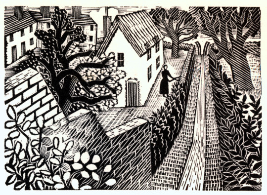
The woman cutting the hedge with the path leading up to a V shaped Sussex style stile are pictured – but it is the wall and hedge in Vicarage in Winter that bind them together as the same location.
Eric Ravilious – Cutting The Hedge, 1936
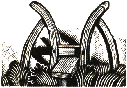
The V Stile also appeared in the Kynoch Press Notebook for 1933. The the stile is on the page for the 8th May but its technical name is Block 121. The Notebook has 42 engraved vignettes of rural life.
Eric Ravilious – Kynoch Press Block 121, 1932
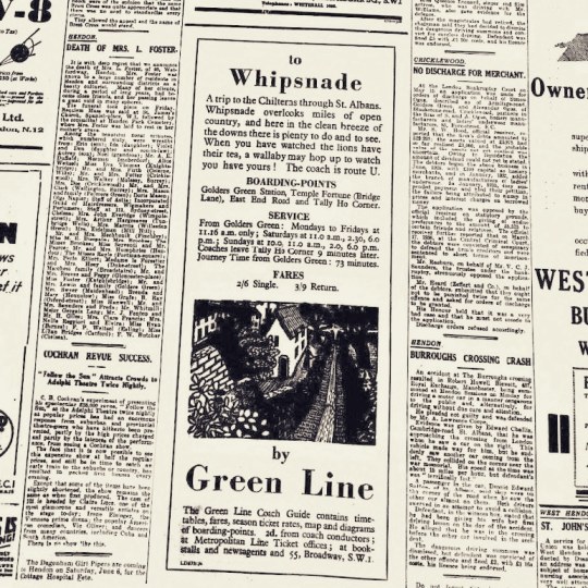
Below is the press advert, the text in the advert talks of the clean breeze of the downs and how you can see Lions at Whipsnade Zoo.
Eric Ravilious – Cutting The Hedge as part of a Green Line Advert, 1936
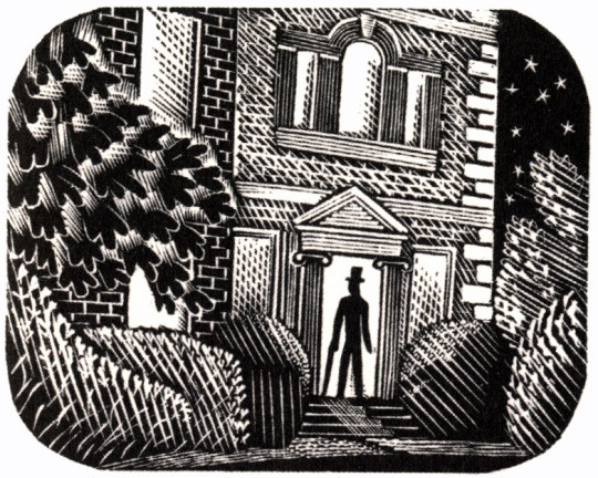
Another design is the Suburban Home with the man in top hat and umbrella standing in the doorway, much like the men are in the watercolour of Hull’s Mill.
Eric Ravilious – Suburban Home, 1936
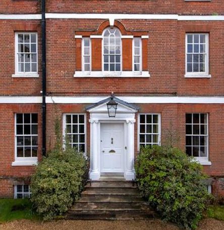
The house turns out to be the Old Vicarage in Castle Hedingham, the same in Vicarage in Winter, 1935. The steps, the ionic colonnaded door and the window above all say so – it isn’t a fact I have seen in print before. Below is the engraving in the advert as it would appear in the press.
The Old Vicarage in Castle Hedingham as it is now.
Eric Ravilious – Suburban Home as part of a Newspaper advert, 1936
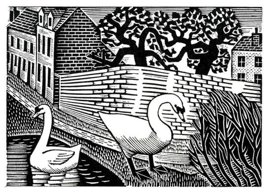
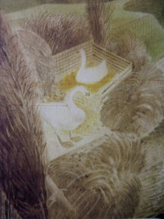
With the Two Swans as others, a watercolour followed like the Two Cows watercolour, though the figures are similar, they have no relation to the backgrounds of each other.
Eric Ravilious – Two Swans, 1936
Eric Ravilious – Two Swans, 1936
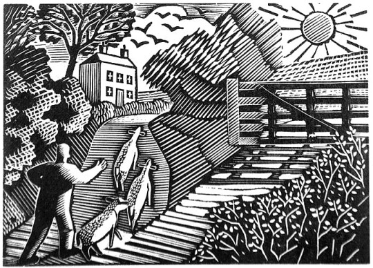
The Shepard is one of the most lively engravings that Ravilious made for London Transport. The Sheep and their ears with the hillside up to the house are pleasing. The technicality of the halftone shading are some of his best.
Eric Ravilious – The Shepherd, 1936
Eric Ravilious – The Shepard as part of a Green Line Advert, 1936
Eric Ravilious – Tea in the Garden, 1936
The last stop on these London Underground travels is of Tea in the Garden. It is a rather abstract design but it was the start of the commuter lifestyle as London was building a new wave of suburbia and you can imagine the print being used with slogans like “home in time for tea” or “enjoy the garden, 20 mins from the city by bus”.
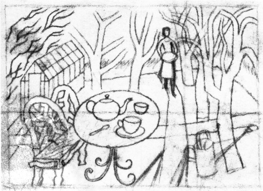
Eric Ravilious – Sketch for Tea in the Garden, 1936
Eric Ravilious – Tea in the Garden as part of a Green Line Advert, 1936
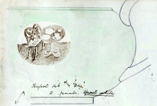
Soon after Ravilious reused the design for a commission with Wedgwood, he was so busy during this point that many designs were recycled from wood engravings to watercolours or china. Below you can see a sketch drawing for a teapot design using the woodblock above. Carving out the legs of the bench and inverting the colours of the table so when printed the transfer will be black and an enamel colour wash painted over.
Eric Ravilious – Sketched idea for Teapot design, 1938
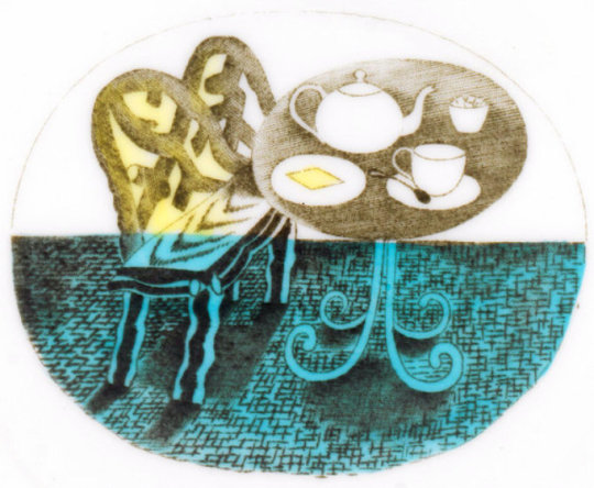
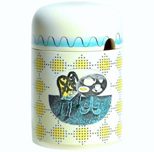
The finished design below, with the colouring in yellow, blue and green. The design has been made simpler and the shading is able to be more subtle as it will be printed on a metal plate, so there is more detail in the halftone lines. It was first used on a preserve jar for Wedgwood.
Eric Ravilious – Printed and Enamelled design from Wedgwood, 1938
The preserve jar was introduced six months in advance of the rest of the pattern. The design was advertised in 1939 as being available also in breakfast and coffee sets; the war prevented production of these. At first unnamed, later called ‘Teaset’, the design was finally named ‘Afternoon Tea’.
Eric Ravilious – The Final Jampot by Wedgwood using Ravilious’s Design, 1938
† Ravilious – Engravings by Jeremy Greenwood, Wood Lea Press, 2008. Ravilious & Wedgwood by Robert Harling, 1995. Away We Go by Oliver Green and Alan Powers, 2006 Eric Ravilious: Memoir of an Artist by Helen Binyon, 1983
‡ Ravilious: The Watercolours by James Russell, 2015
Before television, the radio was the main media for the nation. The British Broadcasting Corporation was free from advertising and their early aims were to ‘educate, inform and entertain’. It was the education element that lead to leaflets being produced as a visual aid to the radio. The public could send a stamped-addressed envelope off and receive guide to the content in the radio show, from photographs of master paintings as part of a series of lectures on art to song sheets.
All of the artists from the Great Bardfield group would at one time or another work as commercial artists, many illustrating books. Here is a selection of works made for the BBC.
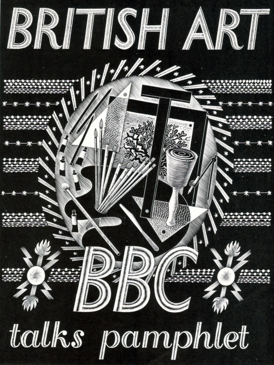
Eric Ravilious – BBC Talks Pamphlet, 1934
Published in 1934 this booklet was to follow six lectures on art, there are seven pages of text and 30 pages of black and white illustrations. The cover design is a wood engraving by Eric Ravilious showing a Bewick style wood-engraving, an artists pallet and oil paints and some beautiful graphic devices hand carved around the vignette. This booklet could be bought as a softback at seven pence or a hardback at one shilling.
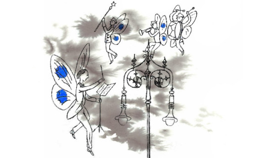
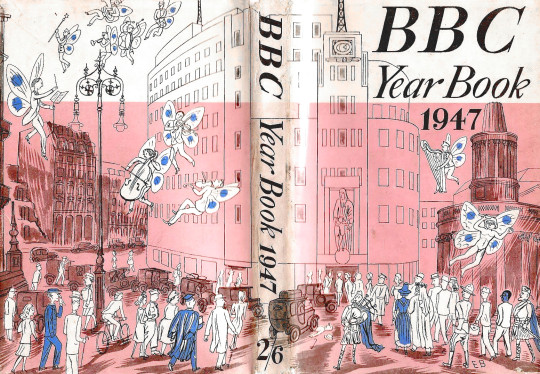
Edward Bawden – Dust Jacket for the BBC Year Book 1947
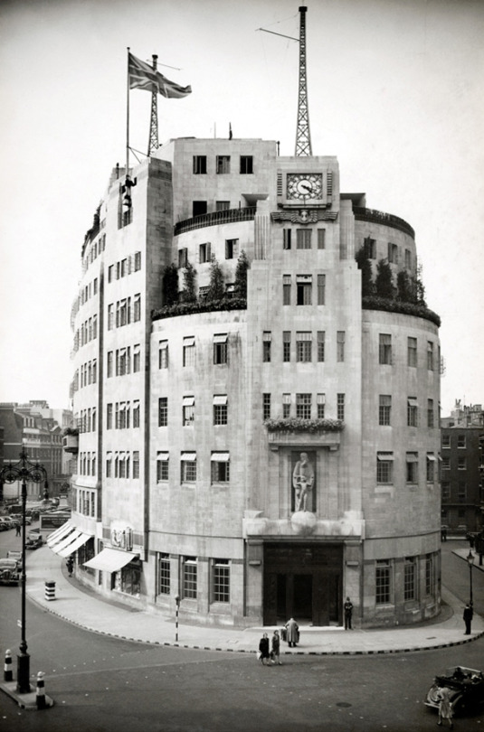
This cover by Edward Bawden shows Broadcasting House and All Souls Church with musical faeries flying around. The BBC Year book started as an annual review beginning 1928. In the mid 50′s it became the BBC Handbook and in the 80s merged into an Annual Report. The focus of the publication would range from statistics of people with Radio Licences, to essays on Opera, Art and even Foley House, the building that Broadcasting House replaced. But this gives me a wonderful excuse to share a picture of this magnificent building so you can compare it to Bawden’s drawing.
BBC Broadcasting House, London, 1932.
Many of the other works in the rest of this article are simple two colour illustrations made for various children’s educational radio programs. The way each of the artists went about solving this problem is interesting but mostly it is based on technique and time. Inside the covers is usually sheet music, lyrics and an illustration for most of the songs.
Many of Sheila Robinson’s illustrations are black and white pen drawings or her cardboard-prints, but rarely is there much colour and when there is it looks to be the printer flooding the image around her illustration with it. It’s a shame because her art prints are extraordinarily competent.
Bernard Cheese’s works have a more interesting use of colour and layering for those interested in printmaking and use of one colour with black, as is the work of Walter Hoyle.
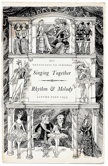
Sheila Robinson – Sing Together – Rhythm & Melody, 1955
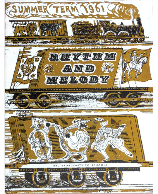
Walter Hoyle – Rhythm and Melody, 1961
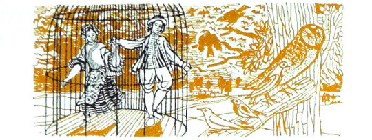
Walter Hoyle – Illustration from Rhythm and Melody, 1961
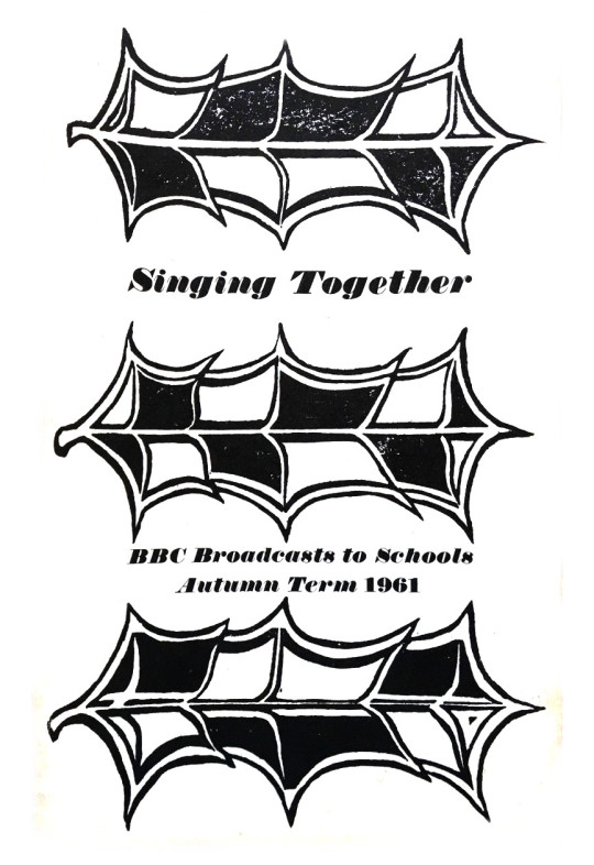
Sheila Robinson – Singing Together, 1961
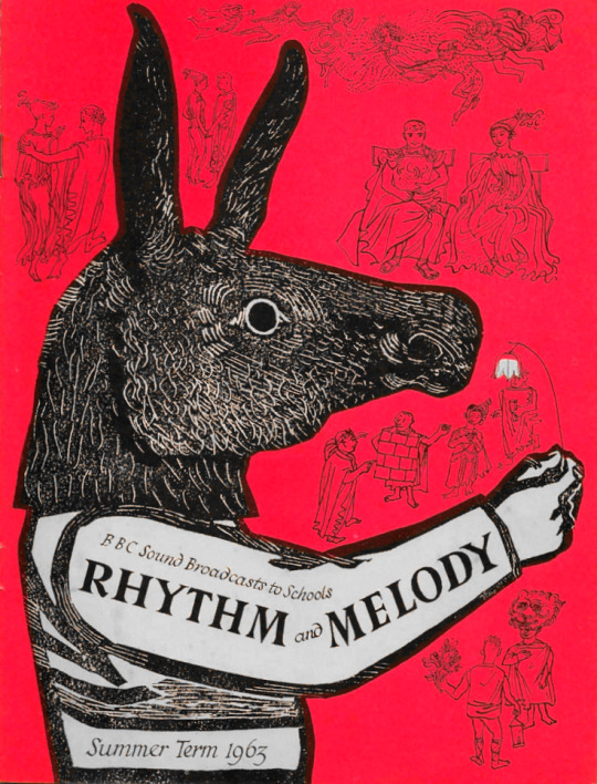
Sheila Robinson – Rhythm and Melody – Summer, 1963
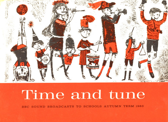
Bernard Cheese – Time and Tune, 1963
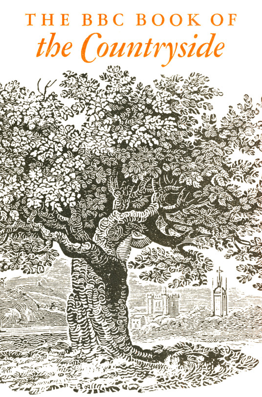
In a break from BBC radio pamphlets comes the BBC Book of the Countryside. A hardback book with a compilation of the BBC Countryside programs set out in a month by month calendar. For fans of Great Bardfield and East Anglian art, one gets work by both Walter Hoyle and Sheila Robinson, but also six illustrations by John Nash. The drawings from the book by Walter Hoyle I am delighted to own as part of my collection.
Cover to the BBC Book of the Countryside, 1963
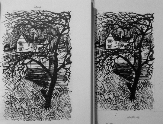
Walter Hoyle – Page from the Book of the Countryside to the left and the drawing to the right, 1963.
Sheila Robinson – January, 1963, illustration from BBC Book of the Countryside
Walter Hoyle – April, 1963, illustration from BBC Book of the Countryside
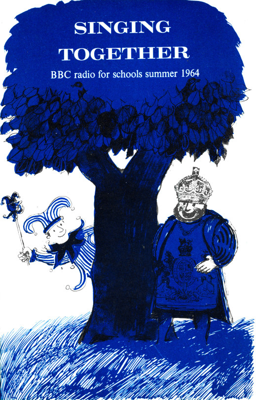
Bernard Cheese – Singing Together, 1964
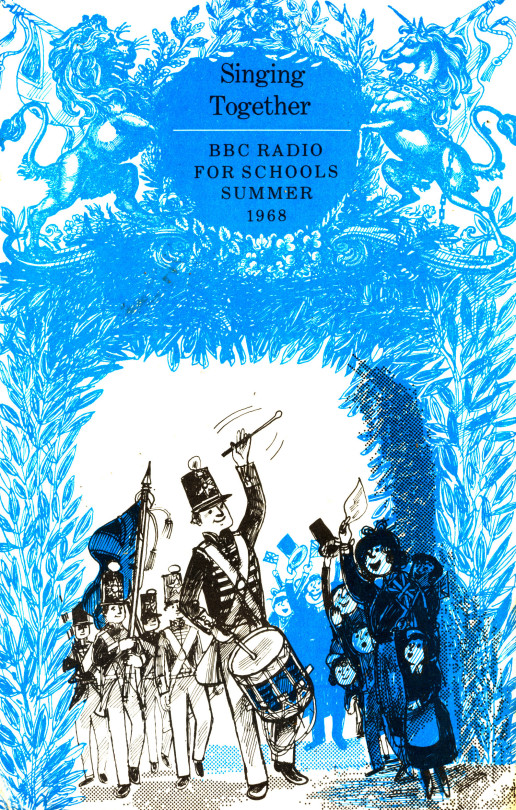
Bernard Cheese – Singing Together, 1968
Bernard Cheese – Illustration from Singing Together, 1968
To see more illustrations from the Bernard Cheese Singing Together 1968 book, click here as I dedicated a full post to them
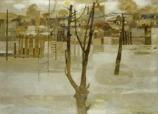
Erik Harrower Forrest – Trees, 1956, In My Collection
In the past few weeks I bought two wonderful paintings by Erik H Forrest but I couldn’t find much information about him. I was buying them at auction and online as I lived too far to view them, so I was worried they may be mid-century inventions (sadly there are many paintings on the market that look old but have no age to them). But when my two paintings were delivered I found they had gallery labels. The paintings were marked as 1956 and 1957. In 1956 Forrest was listed as living in 36 Chapel Lane Leeds, in 1957 he was at 17 Richmond Road Leeds. From that date on I couldn’t find any other details on E H Forrest in the UK.
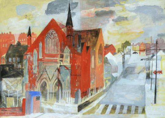
Erik Harrower Forrest – The Red Church, 1957, In my Collection
I then went to Google and found a monograph from 1985 he published ‘Harry Thubron at Leeds, and Views on the Value of his Ideas for Art Education Today’ in the Journal of Art & Design Education – Vol 4 No 2, 1985. This came with a biography that said he moved to America, from then I found a LinkedIn profile and his email.
From our emails I can report Erik Harrower Forrest, born in 1925, trained in Scotland at the Edinburgh College of Art under John Maxwell and Leonard Roseman. He started the Diploma in Art in 1941 but the war paused his studies and he had three years out flying in the Fleet Air Arm Squadron. He continued his work in 1945 with a specialisation in Drawing and Painting. He went on to the University of Edinburgh and at this time he admired the works of John Piper, Eric Ravilious, Paul Nash and John Minton.
Forrest taught painting and lithography at Leeds College of Art in the late 1950s and later became the deputy head of the School of Art Education at Birmingham Polytechnic.
My first job at the Leeds College was in Art and Design because I was in their Design department and I taught Illustration as well as drawing and painting. About half way through my time there I moved to the Art Education department. I had found that I had almost as strong an interest in art education, especially at the Tertiary level, as in painting and drawing. I had also been teaching Lithography, so I was wandering away from the life of a ‘professional’ painter already.
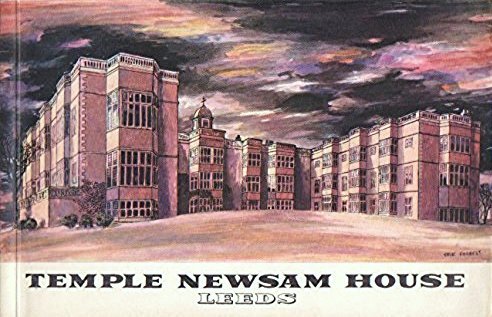
He was commissioned to made a painting of Temple Newsam for the gallery booklet in 1951
Temple Newsam House Gallery Booklet with cover painting by E.H.M, 1951
In the late 1960s he took the first year of a two-year degree in Philosophy at the University of Warwick, and left for the USA before he could complete it.
That was in 1968. The doctorate I did between 1980 and 1983, finishing the dissertation when I was 58 years old.
He has had one man shows of paintings, prints, and drawings in Britain, Canada, and USA, and articles by him have been published in British and American journals. His works are in the collections of Wakefield City Art Gallery, Nottingham City Gallery, the Scottish National Gallery, the National Gallery of Canada and the Beaverbrook Art Gallery. He also exhibited at the Wakefield, Twenty Artists Exhibition.
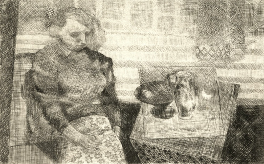
Erik Harrower Forrest – Interior, 1950
In America he was the Associate Professor at the University of Wisconsin-Parkside in 1969 and in 1977 became the Art Professor at Ohio University and is now retired in San Diego.
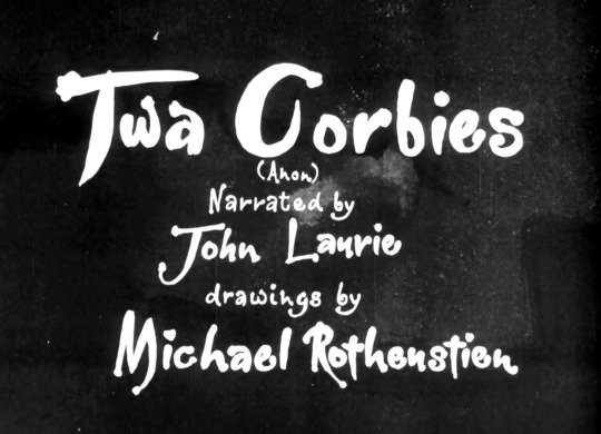
Here are two poems read and drawn as an interesting collaboration of artists as part of the Festival of Britain in 1951. The drawings were used to make a series of scenes for a short film, the spoken or sung content added over this.
In this clip there are two poems. Twa Corbies narrated by John Laurie and illustrated by Michael Rothenstein and Spring and Winter (Shakespeare) sung by Peter Pears to music by Thomas Arne and illustrated by Mervyn Peake.
Both of these poems are available to be seen on the BFI for free. Here is the link.
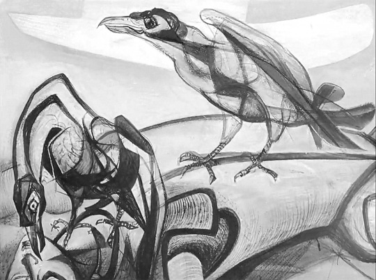
Michael Rothenstein – A Still from Twa Corbies, 1951
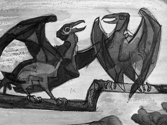
Michael Rothenstein – A Still from Twa Corbies, 1951