Below is an article by John Russell from The Listener magazine in November 1948. It’s mostly a promotional piece rather than a review, for the book ‘Paul Nash: Paintings, Drawings and Illustrations, 1948′.
The publication of the book was timed with a retrospective exhibition of Nash’s work at the Tate Gallery two years after his death in 1946 of heart failure, as a result of his long-term asthma.
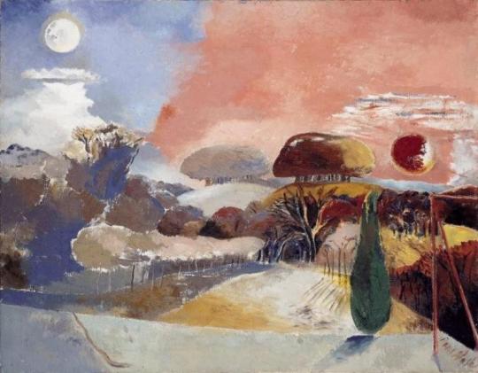
Paul Nash – Landscape of the Vernal Equinox, 1943.
The Vision of Paul Nash by John Russell
In a moment of confidence (reproduced in June 1938 in that most fastidious of occasional periodicals, Signature) Paul Nash described how, as a very young man, he broke free from the thraldom of Rossetti. No violence was done; for he still trembled in sympathy with the luckless personages of that Italianate imagination, and was anxious to effect an unobtrusive retreat. ’I might have spared my caution’, he noted afterwards. ‘No one and no thing noticed either my presence or its departure. The lovers stayed locked in their anguished embrace, the chained monkey continued to pick the rose to pieces, the boar-hound of unsure anatomy still slept by the side of the lance and shield. On the window-sill the dove lay dead. Outside the door I passed the frenzied eavesdropper among the shadows’.
The man who could regard his own early attachments – and indeed the whole of life – with such ceremonious irony could not but appreciate the predicament of those who, in future years, will attempt to penetrate the imaginative world of Paul Nash himself. We who have grown up in this world, and marked each of its phases in turn, feel no such difficulty. The dis-peopled landscape of this painter’s art has long been accepted by us; and we know that for Paul Nash the conjunction of a toadstool and a tennis-ball was as significant as the encounter of Lancelot and Guinevere. (He told us so, moreover-remarking that ‘for me at least, the forms of natural objects and the features of landscape were sufficient without the intrusion of human beings, or even animals’.)
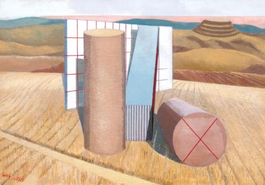
Paul Nash – Equivalents for the Megaliths, 1935.
To this conviction we owe the long series of painting in which he underprivileged members of the natural world were given the stature of heroic beings. It is in these works that the conventional order of landscape painting is reversed, and the fungus, the pebble and the diving-board are presented as triumphal features. In the last years of his life, when illness took from him all freedom of movement, he removed, in imagination, still further from the landscapes available to the casual eye. ‘What the body is denied’, he wrote at this time, ‘the mind must achieve’.
Many a friend and acquaintance of Paul Nash must recall how this painter, remarkable as ever for his anachronistic elegance of dress and diction, would expound in the sedate recesses of north Oxford the new visions on which he was working – the cluster of hellebores aslant the night sky, or the underground fortress of the mole. For those who knew, however slightly, this finest of men, it is natural to wish, and in wishing to assume, that the quality and intensity of his imagination have been perfectly reproduced in his work.
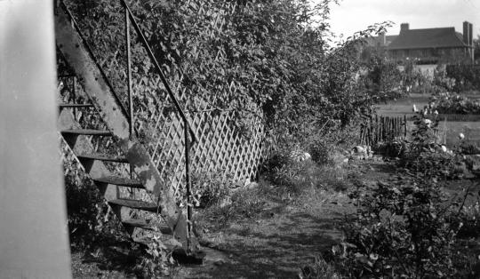
Paul Nash – Iron steps, 106 Banbury Road, Oxford (Nash’s Home).
The wish, if not the assumption, has animated, for example, the majestic memorial volume which Messrs. Lund Humphries have rescued from dereliction. Miss Eates, the general editor, has followed in outline the plans laid down by the artist himself; the publishers, less fortunate, have inherited a quantity of plates, and a quality of paper, that one would not normally associate with their imprint. In default of those last personal ornaments which Paul Nash would have known so well how to give, Miss Eates has called upon four distinguished enthusiasts to contribute essays upon various aspects of the artist’s activity. Mr. Read, Mr. Rothenstein, Miss Ramsden and Mr. Philip James discharge their duties in able and affectionate style; there is a good, though not a complete catalogue of known paintings by Paul Nash; and 132 plates, of which twenty are in colour.
Paul Nash’s pictures are peculiarly difficult to reproduce. The unvarnished surface of his oils inclines to look thin and dry when transposed into monochrome; and as for the key-cold delicacy of his watercolours, there can be few signatures which so constantly evade the reproducer’s craft.
Some periods come off well in this memorial volume – the exacerbated realism, for instance, of the paintings brought home from Flanders in 1918; the patient geometry of the late nineteen-twenties; and some of the pictures which it is possible to regard as his finest work- the series done at Dymchurch between 1922 and 1924, in a landscape where, as Nash later remarked, ‘natural and artificial forms have equal pictorial significance, even amounting to architectural beauty’. As against this, there are many reproductions which can only give, to those who do not known the originals, a derisory impression of the science and devotion which made Paul Nash not merely an original fantasticator, but also the best straightforward water-colourist of his generation.
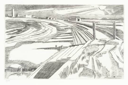
Paul Nash – The Wall, Dymchurch, 1923.
Nash was that rarest of beings – an English water-colourist who got better and better; and he was never so good as when, during the last holiday of his life, he painted at Cleeve Hill, near Cheltenham, the series of sunset studies which, by their mastery of tone and variety of attack, can rank in the company of Girtin and Cotman. Of these paintings, unluckily, a grotesque amount is given, and one can hardly conceive that the artist would have sanctioned their appearance. One can only be grateful for the enthusiasm and the disregard for commercial obstacles which have gone to the making of this book, and its plates include many works which are rare, and some which have been destroyed; but it remains legitimate to hope that before long somebody will publish Paul Nash’s fragmentary memoirs, and a substantial collection of his admirable letters, for in these shines out the preservative irony which will help the best of his work to survive the hazards of reputation.
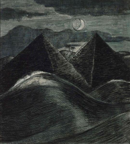
Paul Nash – The Pyramids in the Sea, 1912.
Here are fragments of text by Andrew Causey about Nash’s preparations on the book, that turned into a his memorial publication.
Paul Nash had been preparing for at least two years before his death in 1946 material for the book which Lund Humphries would publish in due course. He collected black-and-white prints from owners, some of them images he had not seen since before the First World War. And though he did not finish the project, he invested considerable time and energy in it, creating the skeleton of a book of which he may be considered part-author, and in which he could take much pride. ‡
The book signalled an advance on the conventional art book at that point: apart from the various authors’ texts, it contained supplementary information, including chronologies of Nash exhibitions and a list of Nash’s paintings and drawings in public collections in Britain and around the world. It was produced under difficult postwar conditions, marked especially by the shortage of paper of appropriate quality. ‡
The correspondence during the Second World War years surrounding Nash’s assembly of plates for what was to become the Lund Humphries book, shows how highly he valued his early drawings made around the family’s home at Iver Heath and how much his emotions were stirred by reliving his early life through his drawings. The paradox is that a book so personal to the artist and so full of references to his own life should not have been seen by Nash in its finished form. ‡
Paul Nash: Paintings, Drawings and Illustrations, 1948.
† The Listener, November 1948. The Vision of Paul Nash by John Russell
‡ Lund Humphries – Celebrating 75 Years of Art Book Publishing. 1939–2014. – Paul Nash by Andrew Causey