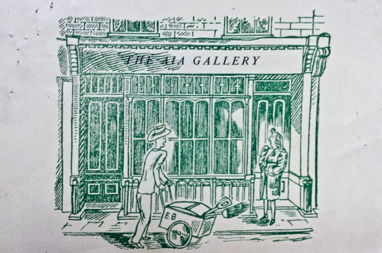
This is a small post, based on a little business card for the A.I.A. Gallery just because I liked it. It is designed by Edward Bawden. I have posted some text from the book on the A.I.A Gallery below. It sums up the organisation far better than I could.
The A.I.A was also known as the Artists’ International Association
An exhibiting society formed in 1932 by a number of left-wings artists and writers who wanted to publicise, through their art, their commitment and resistance to the ‘Imperialist war on the Soviet Union, Fascism and colonial oppression’. Its aim was the ‘Unity of Artists for Peace, Democracy and Cultural Development’. The Association originally termed ‘Artists International’ provided a forum for regular discussions on communism, and its membership included Clifford Rowe, brothers Ronald and Percy Horton, Peggy Angus, Pearl Binder, James Boswell, Edward Ardizzone, Hans Feibusch and Misha Black the first Chairman. Most of the group’s early exhibitions were held at galleries in the Soho area of London, such as Charlotte Street, Frith Street and Soho Square. Its inaugural exhibition was entitled ‘The Social Scene’. In 1935 ‘Association’ was added to its title. A subsequent exhibition in that year called ‘Artists Against Fascism and War’ included works by Robert Medley, Paul Nash and Henry Moore.
The AIA supported the left-wing Republican side in the Spanish Civil War (1936-39) through exhibitions and other fund-raising activities. It attempted to promote wider access to art through travelling exhibitions and publicly available mural paintings. In 1940 it published a series of lithographs known as Everyman Prints in large and consequently low-priced editions. By the end of World War II, membership numbered over a thousand and in 1947 a gallery, founded by Claude Rogers was established at 15 Lisle Street, Soho, London which flourished until the lease expired in 1971. Initially it pursued an obvious Marxist programme, with its affiliates producing satirical illustrations for the magazine Left Review but by 1951 the Association was showing non-figurative work and in 1953 a new constitution abandoned its left-wing commitment and it continued solely as an exhibiting society. Distinguished foreign artists occasionally exhibited work at the later exhibitions: these included Fernand Léger and Picasso.
The Artists’ International Association should not be confused with the International Artists’ Association which was established in 1952 and was an affiliated organization of Unesco.
It tried to promote wider access to art through travelling exhibitions and public mural paintings. In 1940 it published a series of art lithographs titled Everyman Prints in large, and therefore cheap, editions.
A.I.A.: Story of the Artists’ International Association, 1933-53 by Lynda Morris and Robert Radford, 1983
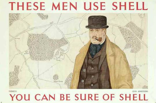
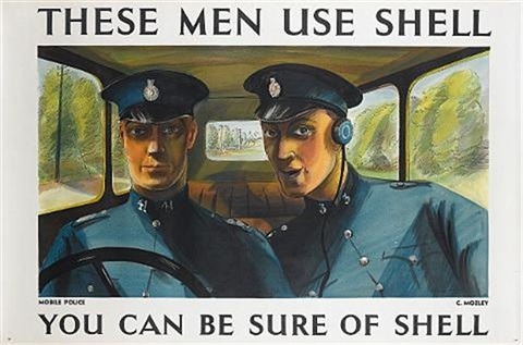
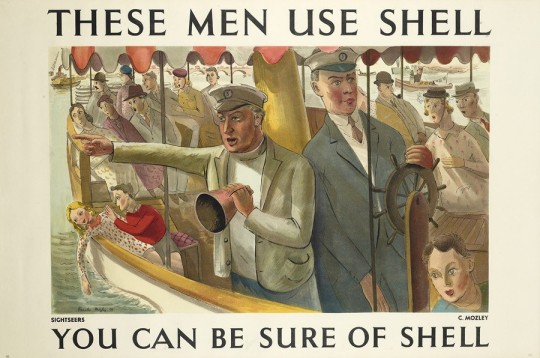
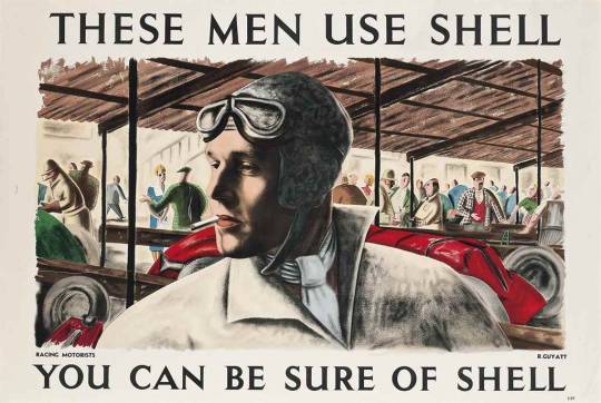
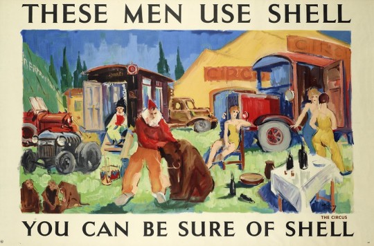
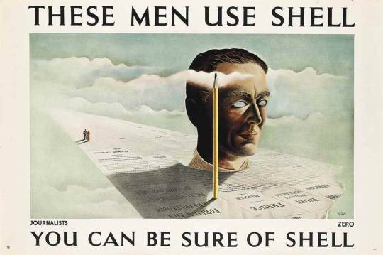
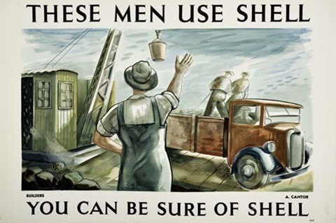
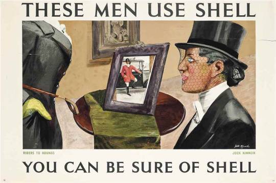
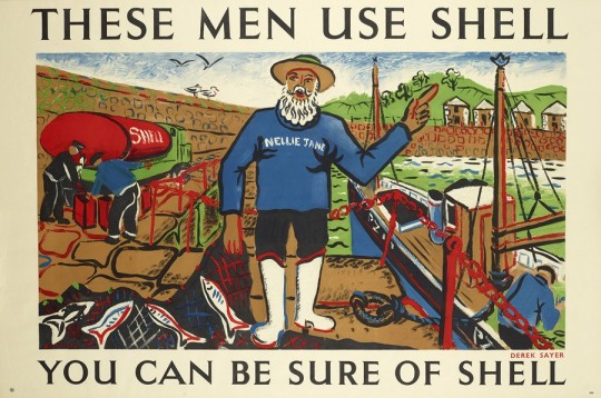
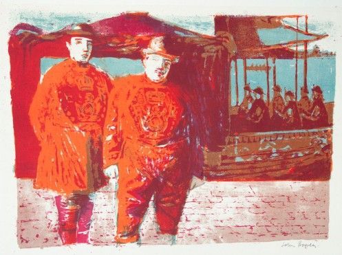
In the 1930s, Shell’s advertising department under Jack Beddington were running various poster series. This post shows the ‘These Men Use Shell’ series.
Shell employed artists such as Tom Eckersley and Paul Nash to produce a range of posters which transformed Shell’s visual identity. As these posters were displayed in petrol stations and on boards where Shell was purchased. The pictures by the artists were framed in the boxes
In being on open display it’s fair to say they were some of the first pieces of modern art the public would have seen.
In 1939, Armstrong designed his fourth poster for Shell, called ‘Farmers Use Shell’, which features an affectionate caricature portrait of Jack Beddington as Farmer George. †
There’s no doubt that Armstrong’s Shell postered helped dissminate his work to a wider audience, and together with the GPO posters, made him a more popular and better-known figure in the art world. The Shell posters were for lorry boards and travelled the length and breadth of the country on the sides of Shell’s tanker-trucks. These lorry bills were known as ‘the common man’s art gallery’ †
Farmers – John Armstrong. The farmer depicted is a portrait of Jack Beddington.
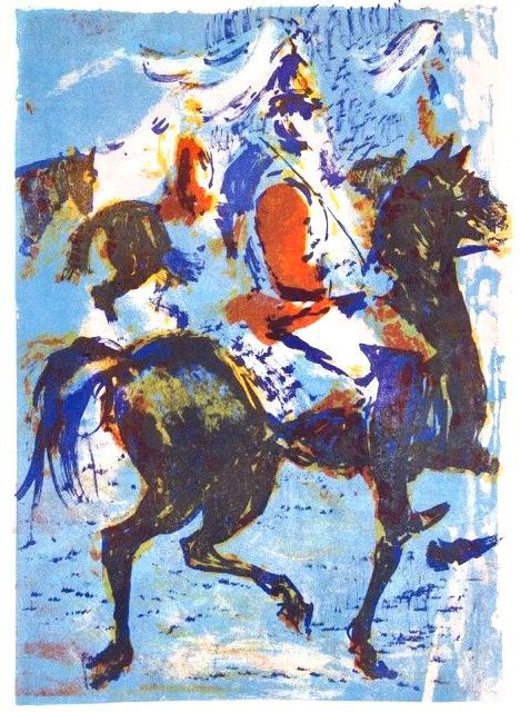
Mobile Police – Charles Mozley
Sightseers – Charles Mozley
Racing Motorists – Richard Guyatt
The Circus – Kavari Schwitzer
Journalists – Zero is the pseudonym for Hans Schlager.
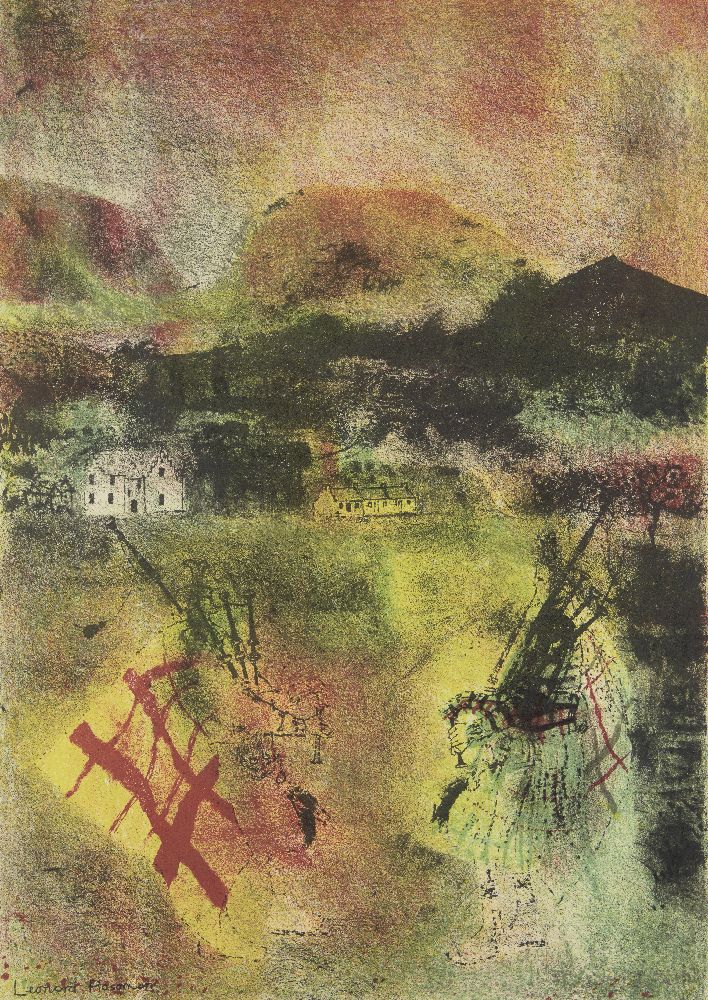
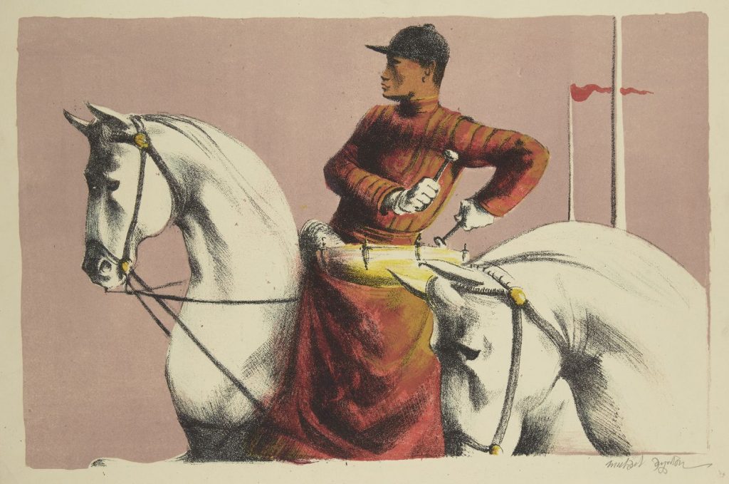
For the Coronation of Elizabeth II, a group of artists were invited to create lithographs for the Royal College of Art. Following the success of the Schools Prints series and Contemporary Lithographs, these prints were sold in limited editions and helped boost the RCA’s skills at reviving lithographic techniques. They were exhibited at the Redfern Gallery from April – May, 1953.
Most of the prints are held in Government collections and gain large prices at auction. It’s one of the least known lithographic collections but showcases some of the best British Artists of the mid twentieth century.
Leonard Rosoman – Two Pipers in the Sunlight, 1953
Michael Ayrton – Kettledrums, 1953
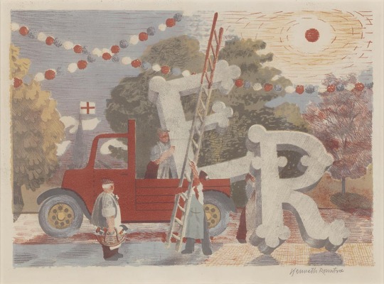
Kenneth Rowntree – Country Celebrations
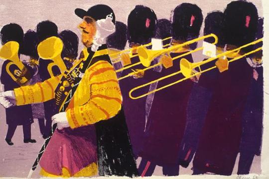
Bernard Cheese – Drum Major
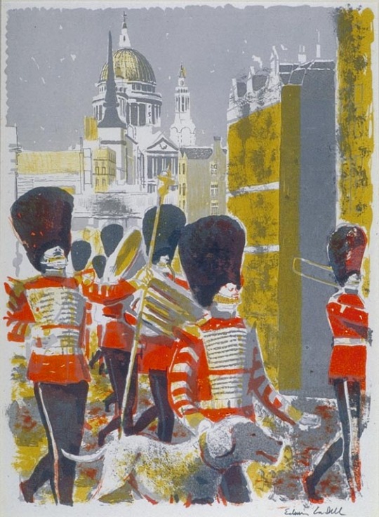
Edwin La Dell – Bandsmen in the City
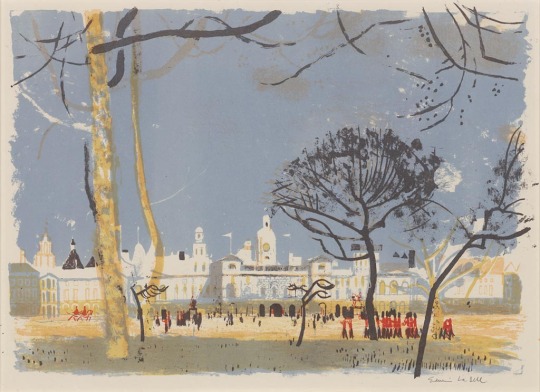
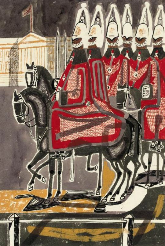
Edwin La Dell – Horse Guards Parade
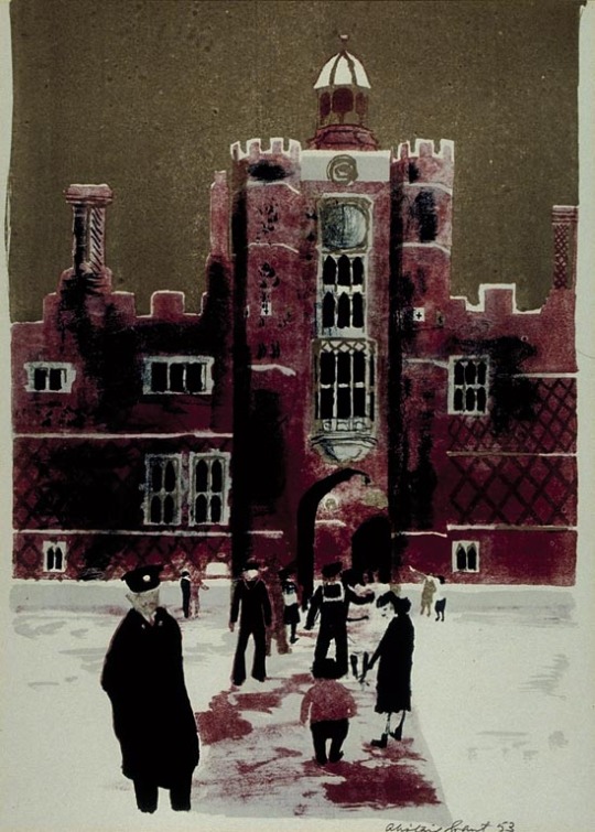
Alistair Grant – Hampton Court
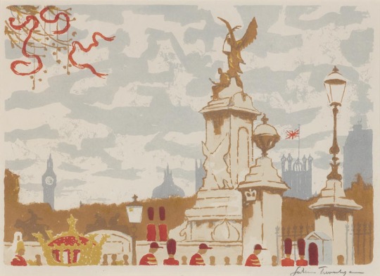
Julian Trevelyan – The Mall
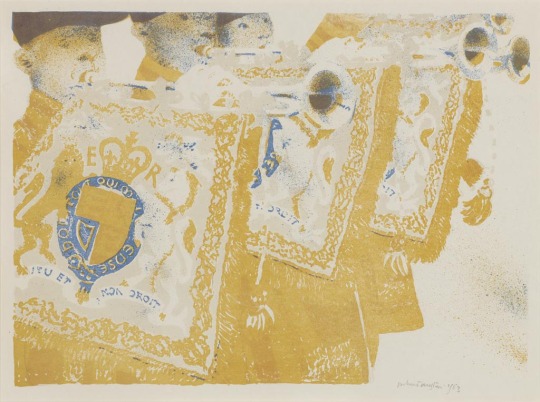
Robert Austin – Heralds
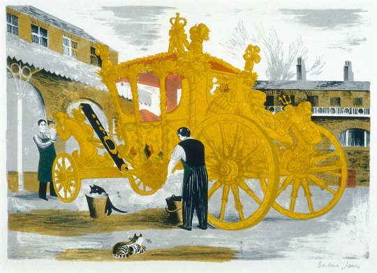
Barbara Jones – Prepairing the Coronation Coach
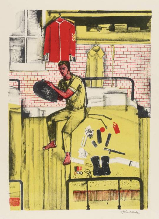
John Minton – Horseguards in their Dressing Rooms at Whitehall
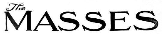
In a garage sale I bought a book of magazines. I love old newspapers and annuals bound into books, it saves them from damage and keeps them in order of date. On that day, I came away with a bound book of The Masses Magazine – A left wing american publication from 1911-1917. It was an interesting period for America, with the Mexican revolution and the start of the First World War happening around them.
“Perhaps the most vibrant and innovative magazine of its day, The Masses was founded in 1911 as an illustrated socialist monthly, and it was soon sponsoring a heady blend of radical politics and modernist aesthetics that earned it the popular sobriquet “the most dangerous magazine in America.”
The magazine had three editors during its first two years—Thomas Seltzer, Horatio Winslow, and Piet Vlag (the magazine’s founder)—but for the remainder of its short life The Masses was brilliantly edited by Max Eastman, who—with Floyd Dell, as managing editor—helped turn it into the flagship journal of Greenwich Village, the burgeoning bohemian art community in New York”. †
After Max Eastman took over editing the magazine, the front covers became more colourful and less conservative looking. Inside the magazine the lithographs and illustrations became more contemporary, looser drawings rather than cartoonish ‘Punch’ like illustrations.
In his first editorial, Eastman argued: “This magazine is owned and published cooperatively by its editors. It has no no dividends to pay, and nobody is trying to make money out of it. A revolutionary and not a reform magazine: a magazine with a sense of humour and no respect for the respectable: frank, arrogant, impertinent, searching for true causes: a magazine directed against rigidity and dogma wherever it is found: printing what is too naked or true for a money-making press: a magazine whose final policy is to do as it pleases and conciliate nobody, not even its readers.”
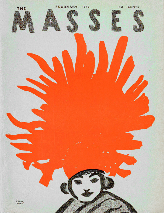
The Masses magazine cover, by Frank Walts, 1916.
Many scholars have noted the high quality of the writing, imagery and design of the Masses. Specifically, they all identify the magazine’s visuals as its hallmark. The complete list of works that mention the magazine would be too extensive to list exhaustively, but in a number of works, the Masses takes centre stage. Discussions on the magazine and imagery can be found within histories of print journalism and the little magazine; works on the intellectual and artistic life of New York City in this period. ‡
Max Eastman was accused later on of going against the collective nature of the magazine when he wrote and published articles and illustrations without consulting the board who hired him. Eastman hired an assistant editor, Floyd Dell, he recalled “some of the artists held a smouldering grudge against the literary editors, and believed that Max Eastman and I were infringing the true freedom of art by putting jokes or titles under their pictures”.
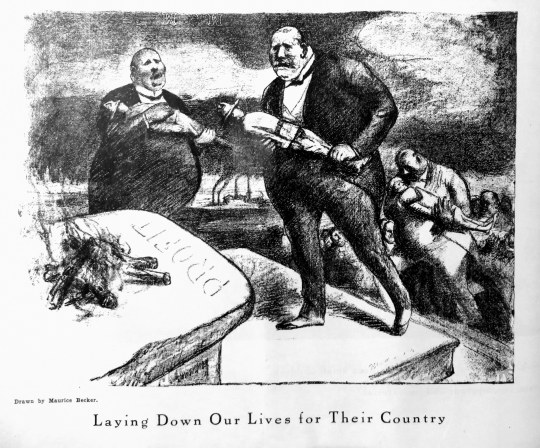
Maurice Becker – Laying Down Our Lives for Their Country
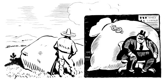
Above is a typical illustration from the magazine; Capitalists laying down the bodies of soldiers at the alter of Profit. The magazines socialist agenda wasn’t masked at all. Below a picture about the Mexican Revolution and how a Mexican is hiding behind a rock from gunfire where as the American Fat Cat is hiding behind the gold of Wall Street.
Maurice Becker again, – This was one of the more interesting illustrations, it was untitled – drawn direct onto newspaper print and then printed up. Maybe unknowingly initiative.
Maurice Becker – Christmas Cheer, 1914.
The picture above is captioned “Cheer up, Bill – time next Christmas comes around, we may be prisoners of war.”
In 1918 Maurice Becker became a conscientious objector to American participation in World War I. He fled to Mexico with his wife to avoid the draft. He was arrested upon his return to the United States in 1919 and was tried, convicted, and sentenced to 25 years of hard labour, of which he served 4 months at Fort Leavenworth prior to commutation of his sentence. After he was released he lived in Mexico for a few years before returning to America.
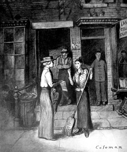
Glenn O. Coleman – Overheard on Hester Street.
(To the Suffrage Canvasser) “You’ll have to ask the head of the house – I only do the work.”
The Masses, as in the picture above, were keen to promote women’s rights.
The magazine vigorously argued for birth control (supporting activists like Margaret Sanger) and women’s suffrage. Several of its Greenwich Village contributors, like Reed and Dell, practised free love in their spare time and promoted it (sometimes in veiled terms) in their pieces. Support for these social reforms was sometimes controversial within Marxist circles at the time; some argued that they were distractions from a more proper political goal, class revolution.
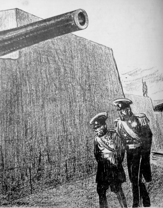
K. R. Cahmberlain – At Petrograd
Russian Officer: ‘Why these fortifications, your Majesty? Surely the Germans will not get this far!” The Czar: “But when our own army returns…?”
It’s hard to say if the Masses did anything at the time to change the political thinking of America. It’s true to say they sponsored and promoted art and writers that would go on to become significant. As a historical document, it’s value has been justified by time.
The Masses found itself constantly entangled in lawsuits claiming libel brought by major corporation and syndicates (most notably the Associated Press), and eventually the government, invoking the Espionage Act of 1917, barred it from the mails in August 1917 for its critique of the U.S.’s involvement in World War One. Without being able to ship the magazine to it’s subscribers the magazine folded.
Following my Post on the John Nash ‘Harvesting’ Schools Print I thought I would present another unravelling of prints from my collection of books.
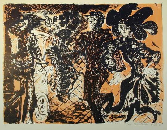
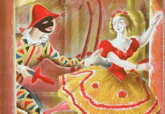
A detail of Harlequinade by Clarke Hutton, 1946.
Stanley Clarke Hutton was born in Stoke Newington, London, on 14 November 1898, son of Harold Clarke Hutton, a solicitor, and his wife Ethel, née Clark. In 1916 he became assistant stage designer at the Empire Theatre. About a decade later he took a trip to Italy, which inspired him to become a fine artist.
In 1927 he joined A.S. Hartrick’s lithography class at the Central School of Arts and Crafts in London, after Hartrick retired he taught the class himself until 1968. He experimented with the technique of auto-lithography with the aim of developing a way of printing affordable full-colour children’s books, and worked with Noel Carrington at Penguin Books to develop the Picture Puffin imprint. With Penguin he also illustrated Popular English Art by Noel Carrington, for King Penguin Books, in 1945.
He used the auto-lithography techniques he developed for the Oxford University Press’ Picture History series. Other notable publications where for The Folio Society. He illustrated about 50 books in all, for publishers in the UK and USA.
His paintings, figures and landscapes, were widely exhibited. His later work took on a surrealist influence. He died in Westminster in the second quarter of 1984.
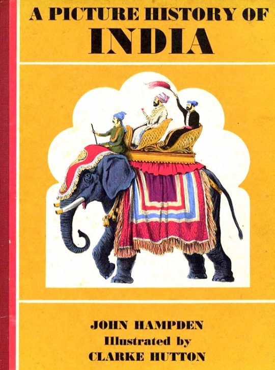
A Picture History of India by John Hampden – Oxford University Press, 1965
Illustrated by Clarke Hutton
It was his illustrations for Noel Streatfeild’s ‘Harlequinade’ that the link to the Schools Print lays. It’s remarkably similar. Most of the figures are all represented, the harlequin, the ballet dancer and the policeman in the corner. Again under the same street light the clown, dog and jester appear.
The book was published in 1943 and the Schools Print was produced in 1946. So rather like the case of the John Nash ‘Harvesting’ the Schools print is made from recycled earlier sketches and ideas, in my opinion, to great effect – these days it would be considered good marketing for the book.
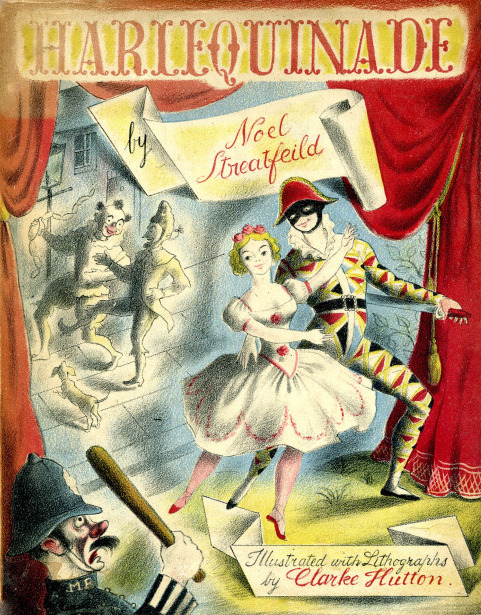
Noel Streatfield – Harlequinade. Chatto and Windus, 1943.
Illustrated by Clarke Hutton
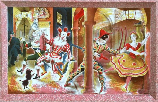
Clarke Hutton – Harlequinade – A Schools Print, 1946.
About The Schools Prints: Set up in 1945 by Brenda Rawnsley, the School Prints scheme commissioned well-known artists to create lithographs, which would then be printed in large numbers and sold cheaply to schools for display in classrooms. The aim was to give ‘school children an understanding of contemporary art’. Each lithograph had a drawn frame so that the print could be pinned to the wall.
In the spirit of post-war optimism, artists responded enthusiastically. The scheme was a unique attempt at giving children access to original works of art in a period of austerity but ended in 1949 because of financial problems.
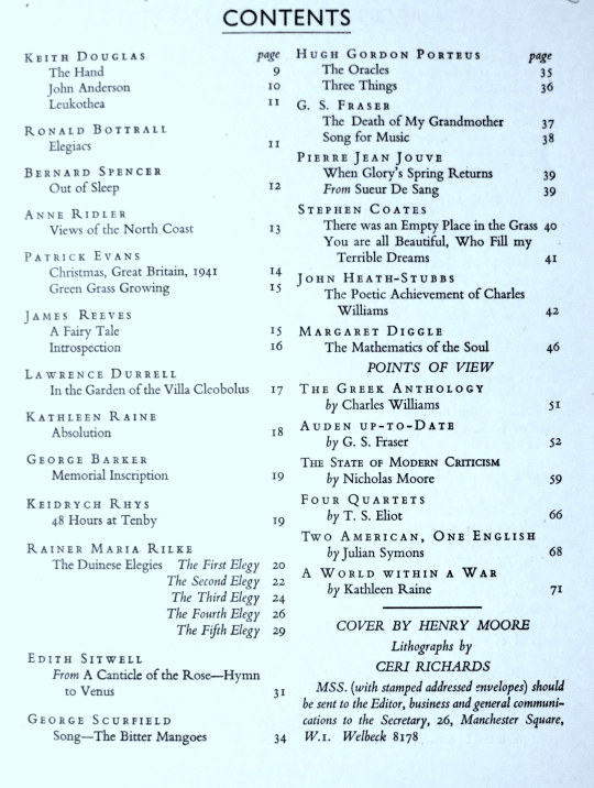
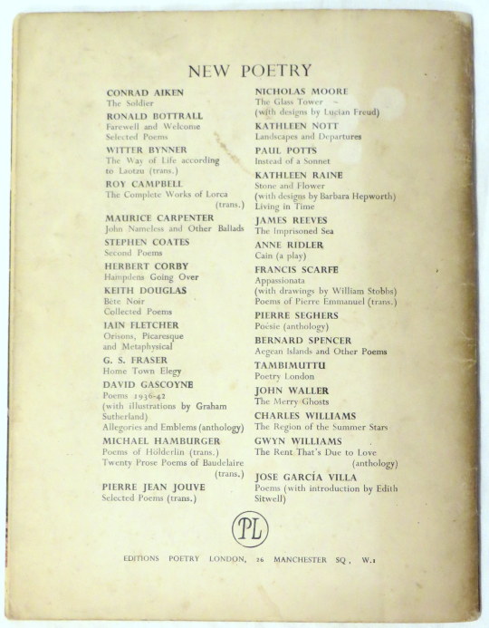
Poetry London: A Bi-Monthly of Modern Verse and Criticism. This publication was founded by Tambimuttu and the first issue was dated January/February 1939. The associated publishing imprint, Editions Poetry London, formed in 1943, produced some 70 books and pamphlets, including by Keith Douglas, G. S. Fraser, Henry Miller, Vladimir Nabokov and Kathleen Raine, before being discontinued in 1951.
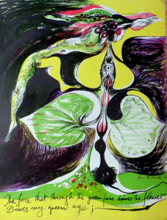
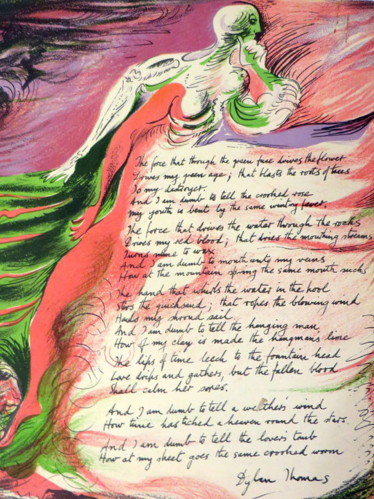
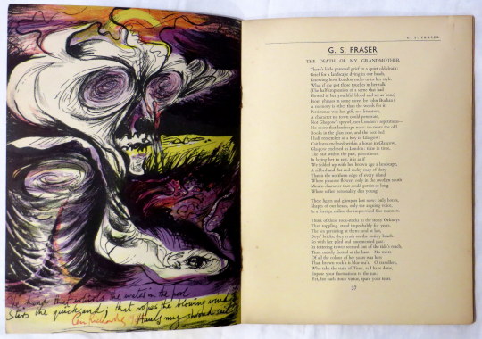
This is one of those publications. I have a few in my collection but this is an excellent example as the cover is a lithograph by Henry Moore and inside there a further four lithographs by Ceri Richards, not to mention the authors inside.
Ceri Richards trained at the Royal College of Art from 1924. In 1929 he married Frances Clayton, a fellow artist.
His work gradually moved towards surrealism after exposure to the work of Picasso and Kandinsky. He was also a talented musician, and music is a theme for much of his artwork. From 1959 onwards, he made prints for theCurwen Press. One of the high points of his career was the Venice Biennale of 1962, where he was a prizewinner.