Last summer I was reading ‘A Crisis of Brilliance’ by David Boyd Haycock, it is a wonderful layer-cake of young artists lives as they study at the Slade School of Art on the eve of the First World War and a book I recommend to all to read.
Many of the artists featured are supported by a patron, Eddie Marsh, who not only bought their work but he entertained them and introduced them to people in society who would advance their careers.
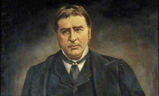
Marsh was a strange and unique person. In his career as a civil servant he worked as Private Secretary to a succession of Great Britain’s most powerful ministers, particularly Winston Churchill.
He was the sponsor of the Georgian school of poets and a friend to many poets, including Rupert Brooke and Siegfried Sassoon. He was a discreet but influential figure within Britain’s homosexual community.
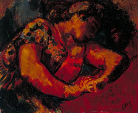
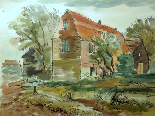
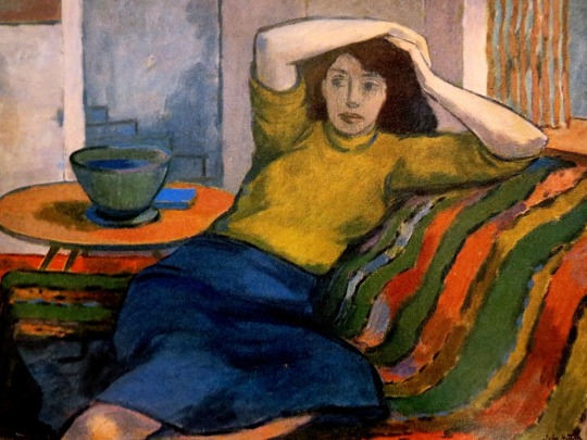
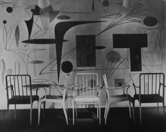
Matthew Smith – Woman Reclining, c.1925–6
Some of the money Marsh had to spend on art was the remainder of a family legacy from the death of his great-grandfather, Spencer Perceval in 1812, the only British prime minister to have been assassinated. Parliament voted to settle £50,000 on Perceval’s children (today it would be around 8 million), with additional annuities for his widow and eldest son. 100 years later and Marsh was using the money to buy art.
Although Spencer Perceval possessed six sons and six daughters, some portion of this grant drifted down to Eddie Marsh through his mother. He refused to use any of what he called ‘the murder money’ for his personal requirements; it was from this fund that he bought, with taste and knowledge, the collections with which he has now enriched the public. †
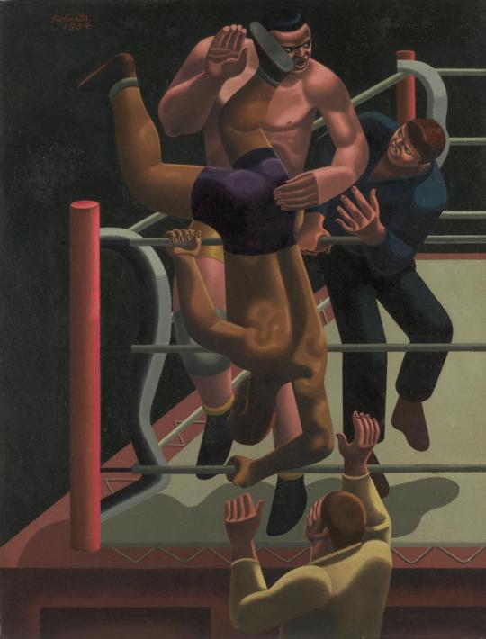
William Roberts – Sam Rabin vs Black Eagle, 1934
After Marsh’s death in 1953 his friends collected accounts of him and published a booklet, edited by Christopher Hassall and Denis Mathews. As it is long out of publication, I have typed up John Rothenstein’s piece on Marsh’s art collecting below. All the pictures in this post were owned by Marsh.
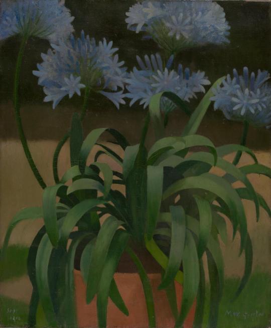
Mark Gertler – Agapanthus, 1914
John Rothenstein on Eddie Marsh
There is a serious disadvantage to an upbringing in an artist’s household. Paintings, drawings, sculpture are apt to be so ubiquitous that they may fail to excite. My father being a painter and also a collector, it seemed to me in my early years that works of art were for the most part little more than part of the furnishing of our house. It is true, however, that when I visited other houses and found dull pictures on the walls or none at all, I was aware of an almost piercing sense of bleakness. But when I first visited Eddie Marsh’s chambers at Gray’s Inn, it was with no sense of bleakness but with the consciousness of something amounting almost to a new experience that I looked at his pictures.
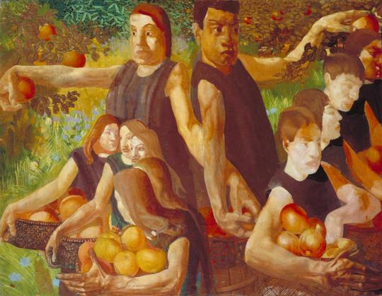
Stanley Spencer – Apple Gatherers, 1912-13
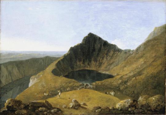
I had not come to look at his pictures; I don’t suppose I was aware that he possessed any. Like many other young men I had come, either shortly before or after leaving Oxford, to consult this benevolent oracle about the perplexing problem of how best to spend my life. I can’t recall any word of advice he gave; but I do recall, almost as clearly as though it were yesterday, the immediate fascination exercised by the pictures which hung, frame to frame, from floor to ceiling, covering every vertical space, not only of wall but of door, and, no less clearly, the kindness with which Eddie responded to the interest his pictures stirred in me. We looked at everything there was to see. And what things there were! Wilson’s Summit of Cader Idris (his bequest of which to the National Gallery, he said, lent an added pleasure to his visits there, that of choosing the place where his ghost would see it on the walls) and Blake’s Har and Heva batbing.
Richard Wilson – Cader Idris, 1774 (Exhibited)
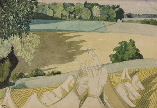
But it was the contemporaries that gave me the sharpest and most pleasurable shock: the works of painters with whom I already had some acquaintance. There were the splendid Self Portrait and the The Apple-gathers by Stanley Spencer (an artist who had not yet held an exhibition), The Dancer: and Parrot Tulip’s by Duncan Grant, The Cornfeild by John Nash, a water-colour of tall trees by his brother Paul, and a lamp-lit bedroom by Gertler.
John Nash – The Cornfield, 1918
The spectacle of so many line examples of the work of an emerging generation of painters, displayed with such affectionate, admiring confidence strengthened the impression I had that there was a school of painting in England deserving of much more respect than most of my contemporaries were inclined to accord to it.
Henry Moore – Woman Seated with Hands Clasped, 1929
My visit was followed by several others, but it was not until many years later that I came to know him well, when I had the good fortune to be associated with him in the running of two institutions particularly dear to him: the Tate Gallery, of which he was a Trustee from 1937 until 1944 and Acting Chairman during 1940 and 1941, and the Contemporary Art Society, of which he was Chairman from 1937 until 1952.
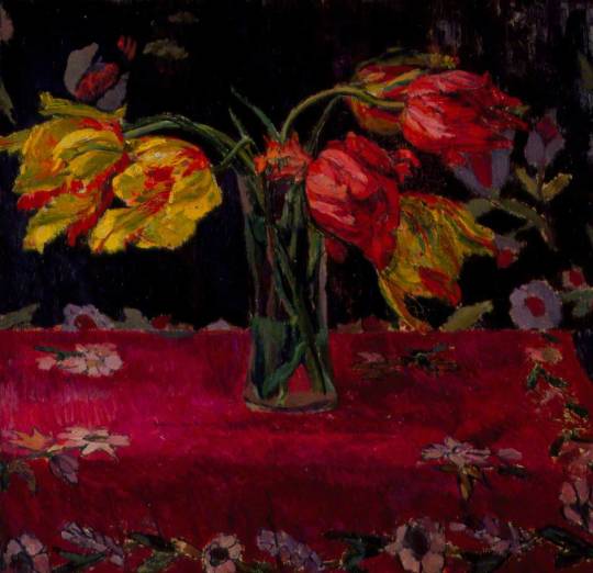
Duncan Grant – Parrot Tulips, 1911
What made this association particularly delightful for those who had a part in it was Eddie’s attitude towards these two institutions. For him the Tate and the Contemporary Art Society were never primarily institutions at all; they were friends to be fought for, to be enriched by his generosity and, from time to.time, to be gently chided. And as such they responded to his friendship with gratitude and affection.
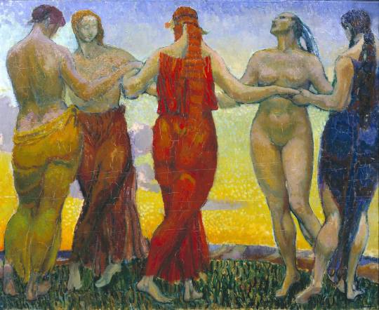
Duncan Grant – The Dancers, 1911
Eddie was not only loved at both the Tate and the Contemporary Art Society, but he reposed in them a special degree and quality of trust. He was capable of a catholicity of taste that at moments provoked his friends to wonder whether there was any work of art which he didn’t like. In his heart, however, he remained faithful to the artists the Spencer and the Nash brothers, Grant, Gertler, and their contemporaries who had first aroused in him the lust of possession.
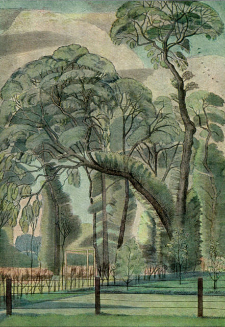
Paul Nash – Elms, 1914
The works of later painters he often, as he confessed, ‘took great though often in efficacious pains to understand and enjoy’; yet he never expected art to be changeless, and he desired the Tate and the Contemporary Art Society to collect in accordance with their most imperative convictions, whether or not these happened to conform to his own.
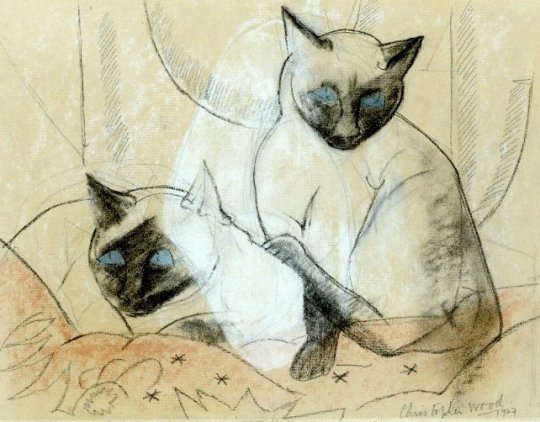
Christopher Wood – Siamese Cats, 1927
The last time I saw him, on is December 1952 at the last meeting of the Society’s Executive which he attended, it had been resolved, as a tribute to his unique services, to commission a portrait of him by Graham Sutherland.
A message from the artist was read out willingly accepting the commission but regretting that he could not undertake it until the autumn of 1953. In a voice that arrested by its intense melancholy Eddie exclaimed, ‘The sands are running out’. In the silence that followed could be read his friends’ mournful recognition that he had spoken the truth. Four weeks later he was dead.
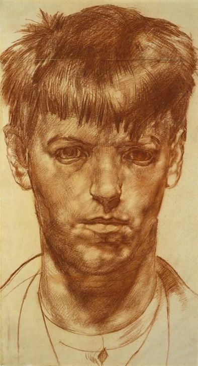
Stanley Spencer – Self Portrait, 1912
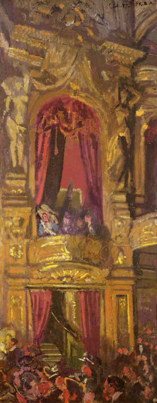
Walter Sickert – The New Bedford, 1915.
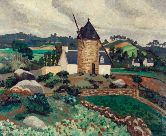
Cedric Morris – Breton Landscape,1927
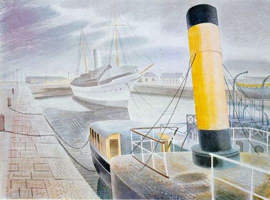
Eric Ravilious – The Yellow Funnel, 1938
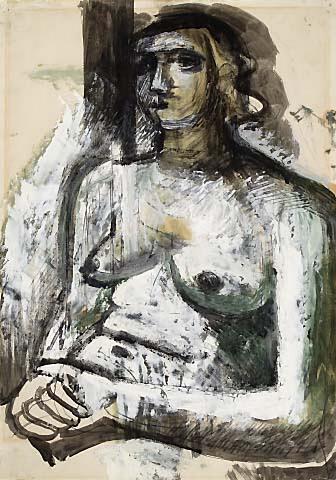
Walter Monnington – Study of a Woman, 1934
Eddie Marsh – Sketches for a composite literary portrait of Sir Edward Marsh, Lund Humphries, 1953 † Paintings and Drawings from the Sir Edward Marsh Collection, The Contemporary Art Society 1953
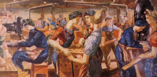
This is a press piece by Valentine Dobree some years after the suicide of Mark Gertler and on the eve of a retrospective at Leicester Galleries. Gertler gassed himself in his London studio in 1939. He was suffering at the time from increasing financial difficulties, his wife had recently left him, he had held a critically derided exhibition at the Lefevre Gallery, he was still depressed over the death of his mother and Carrington’s own suicide (both in 1932), and he was filled with fear over the imminent world war.
Valentine Dobrée was born Gladys May Mabel Brooke-Pechell in India. She studied art under Andre Derain but had no further formal education in art. In 1913 she married Bonamy Dobrée. From April 1914 until the outbreak of the War they lived in Florence. Returning to England she led a Bohemian life – she had an affair with Mark Gertler, who painted her portrait in 1919 and 1920, and became a close friend of Roland Penrose and Dora Carrington. In 1920 she exhibited with the London Group. Between 1921-25 the Dobrées lived in a French village in the Pyrenees. She published many books, the first novel was ‘Your Cuckoo Sings by Kind’. This was followed in 1929 by a second novel ‘The Emperor’s Tigers’. In the same year the Dobrées returned to England, settling at Mendham Priory, Harleston, Norfolk, near Diss. In her literary capacity, Dobrée was admired by T. S. Eliot and Graham Greene, she died in 1974.
The Works of Mark Gertler
The Leicester Galleries are holding a comprehensive exhibition of Mark Gertler’s painting. Even a year or two may help one to get a better perspective often artist’s work, and see him against the background of his time; especially now when the time of entre deux guerres has by the present violence been shunted to a premature past. The people who lived and worked in it, made it, and no longer seem its victims. All have become part of the continuity, and questions of development, experiments, influences seem to vanish as a mirage, for it is a very new past. Some of these questions don’t seem very important in Gerder’s work. He is a lonely figure, and followed his own way and was not often_ tempted to leave it. Because he was so highly individual, one cannot help thinking it will take some time before he is really appreciated. It is the penalty for not being in any particular movement ; the field is wide with no others to plot out or strike their claim in this or that area. But since he was an artist of great integrity, and since he made no easy communications, it might be worth while to examine one aspect of this integrity.
Mark Gertler – Portrait of a Girl, 1912
Christian Zervos reports that Picasso, in conversation, said: ‘It is my misfortune and perhaps my joy that I give things their place according to my love for them. What an unhappy plight for a painter who loves blonde women, but who feels himself forbidden to put them in the picture because they don’t go with the basket of fruit! What misery for a painter who detests apples to feel obliged to use them always because they go with the table-cloth. I put in my pictures all the things that I love. Tant pis pour les chases, they just have to settle it between themselves’.
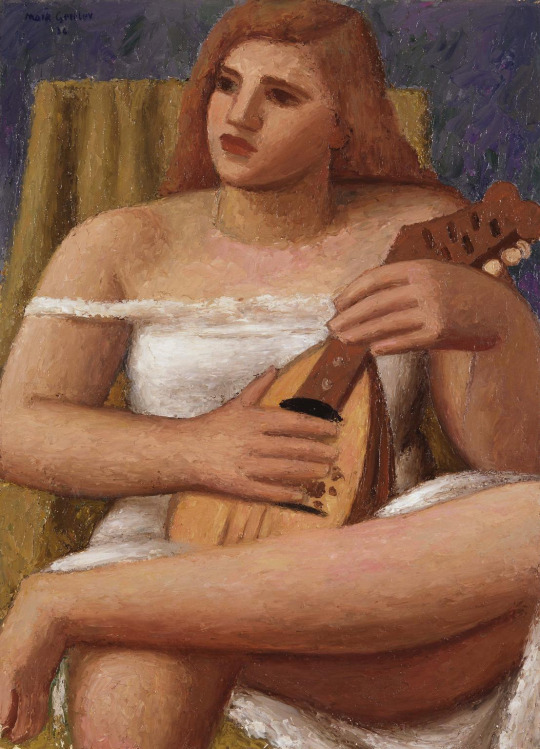
Mark Gertler – Mandolinist, 1934.
There is one of the roots of integrity, and if Gertler could speak now, and look back with us on his life’s work, that might very well be what he would say, ‘I put in my pictures all the things that I love’. And as is so often the way, the things that he loved were the things of his youth: the interior, the lace-veiled front room, with its ornaments, the bright ruched cushions, the slightly dusty artificial flowers, all a little crowded, and presided over by the monumental figure of his mother. The grandeur, the scale, were those a child sees. Anyone, who knew him at the time, will remember his delighted discovery, when he felt that he could discard the unpractical, because fleeting, real flower for the artificial one, which would always be there. Practical? Yes. His technique was evolved from a long and careful study of the object, and he nearly always painted from life.
Mark Gertler – The Artist’s Mother, 1911.
But also something more than practical; he painted those cotton roses and tulips with zest. This zest too is evident in his best portraits: those of simple people, the little servant girl, the Scots nursemaid, and above all his mother. The same bias is shown in some of his’ landscapes; the most successful being when the scene itself collaborated, and was as still as an interior. Looking at the present exhibition, it seems that here is an interesting and powerful link with the Victorian age. Fin de siécle sounds a curious word ‘to use for such a vigorous painter, yet in one sense it fits very aptly: in the sense that the glory had passed, and artificial silk had come on the market. One feels, here is a man who loved permanence; permanence in the way a Victorian would have understood it; the permanence achieved by making as complete a statement as possible. Nearly all his pictures are highly wrought.‘
Genius is an infinite capacity for taking pains, comes. into one’s mind, and with it all the mockery that has been aimed at the first rate swotter. Yet, if the taking pains is fortified by a constant and enduring passion, this is certainly the right description. This constant and enduring passion of Gertler showed itself in his refusal to be lured away by movements or fashions. It shows itself in one of those last magnificent still-lives: the work of a man who is prepared to take every step of the way, and who has held back nothing. Success opened to him the doors of London the metropolis , at heart, though, he remained the provincial Londoner. He accepted what was often intractable material, he had no agility in avoiding problems , but he had wisdom, for he knew that the artist is the most fated of mortals. He must remain faithful to the first imprint, retain his innocence. The pattern may refine, develop, extend, but in an artist of integrity, and there are no others, the pattern is not distorted or blurred; such as it is, it shines out.
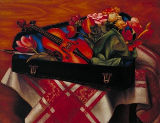
Mark Gertler – Violin Case and Flowers, 1930.
The Listener, 15th May 1941. Wikipedia – Mark Gertler Valentine Dobree – Liss Fine Art
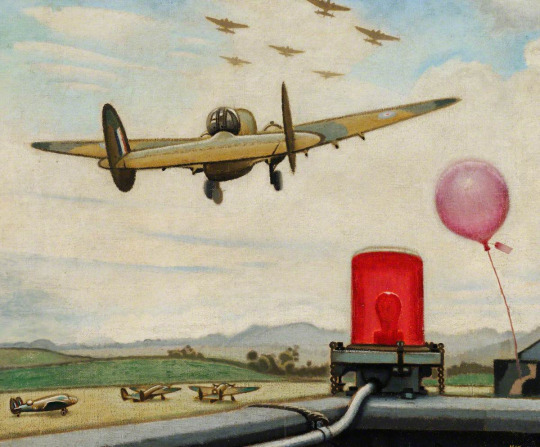
In the copy of The Listener from March 1941, there is a piece by the artist Keith Henderson on his first year as a War Artist with the Air Ministry.
Before any artists had been appointed by the Air Ministry, William Rothenstein had requested permission to make portraits of airmen at bases in Scotland. Rothenstein pre-empted Keith Henderson, the official artist, in working at Leuchars base, which meant there was nothing for Henderson to do; Rothenstein was often referred to in print as an “official artist”, although at this time, it was not the case.
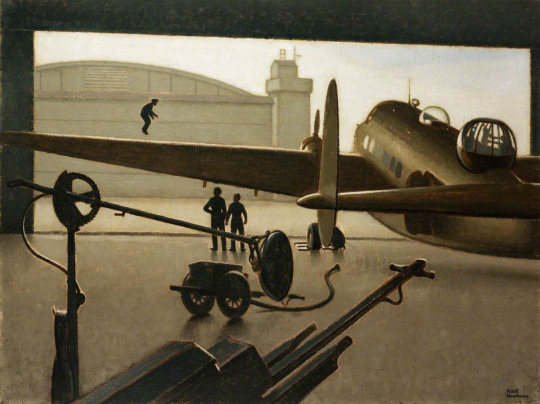
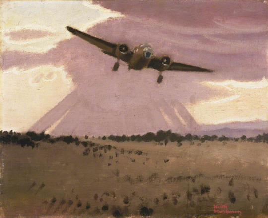
Henderson was one of the first two artists, alongside Paul Nash, appointed as a full-time salaried artist to the Air Ministry by the War Artists’ Advisory Committee, WAAC. Rothenstein’s work ended up with Henderson having to concentrate on ground crew, aircraft hangars, repair shops and runways for subjects. Although the painting ‘An Improvised Test of an Under-carriage’ provoked fury in the Air Ministry and contributed to Henderson’s six-month contract not being extended, it was among the artworks shown at the first WAAC ‘Britain at War’ exhibition at the Museum of Modern Art in New York in May 1941. The painting shows a man jumping up and down on the wing of a Lockheed-Hudson to test the undercarriage.
Keith Henderson was a Scottish painter who worked in both oils and watercolours, and who is known for his book illustrations and his poster work. He had a long professional career that included periods as a war artist in both the First World War, in which he served in the trenches, and in the Second World War. The muted colours and tones of his work remind me of Eric Ravilious, it is that style too, but Henderson’s work was between Ravilious and Christopher R. W. Nevinson.
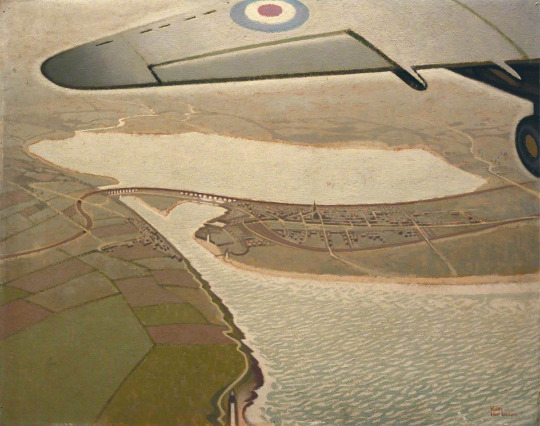
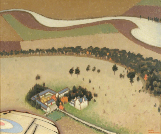
Keith Henderson – An Air View of Montrose, Angus, 1940.
War-time notes of a Peaceful Artist.
Turning over the pages of a diary that I began last April on being appointed one of the two official artists to the Air Ministry, I now read over passages here and there with reminiscent amusement and, yes, a certain genuine pleasure too. During the last war I kept a diary, not only while with my regiment but after being seconded to Intelligence with the XV Corps Squadron, and then Fifth Army Headquarters. The new diary, the one for this war, begins:
Keith Henderson – A North-East Coast Aerodrome, 1940.
April 19, 1940. Started with Helen from home yesterday evening towards the east coast, leaving snow on our Lochaber mountains and daffodils under the wintry trees. Curlews calling from every direction. Tomorrow…
April 20. This my first day of official duty has been a hideous failure. A guard at the aerodrome entrance, I drive in superior and nonchalant, returning the sentry’s salute. On to the Orderly Room. Adjutant, Commanding Officer, Intelligence Officers. Nervous as a cat, I hope they will not see through my calm affability. Cigarettes and a stroll towards the Mess. The ante-room is enormous: African buck, markhor, and other trophies of the chase branch out one above the other towards a lofty ceiling. The leather armchairs are so ample that officers reclining in them appear to be asleep. Crowds of others standing about, all very much alike. They observe that the Commanding Officer has a guest. Introductions, a glass of sherry. Presently through swing doors into the Mess Room, which is enormous. Lunch with one of the Wing Commanders, very friendly. But the afternoon, oh, the afternoon was hell. During a conducted tour round the hangars l saw nothing whatever that I particularly wanted to paint. The wind was hideously cold, the light bleak, and I had an exhausting stomach-ache. Violent and continuous noises of engines being tested. No ideas.
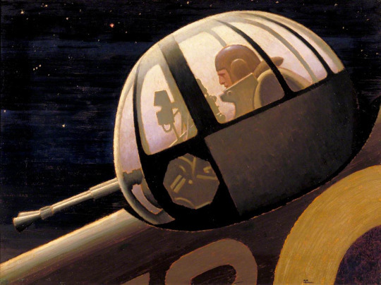
Keith Henderson – Night: An Air Gunner in Auction Turret, 1940.
April 22. Serene spring weather. All has gone well, so well that I’have had to steady myself with thoughts of the horror of the conquered in Poland, Norway, and elsewhere. A man’s philosophy is usually in accord’ with his circumstances, both interior and exterior. Optimists do not have stomach-aches. Mine had vanished. From the high control tower at least three marvellous possibilities appeared. Two sinister and monstrous bombers were awkwardly entering their hangar. They have the eyes, the mouths, legs, bodies, wings of elephantine obscene. insects, but stupid insects. Prod them and they will not move away or retaliate. There is no mind within. They are utterly vacant. I must paint them like that. How lucky am I to have been appointed to this delightful work.
April 24. Three pictures have now been begun. I am using a monochrome mixture of white, yellow-ochre, and a little raw umber. This will make any alterations to the composition easier before a more or less rapid final painting begins.
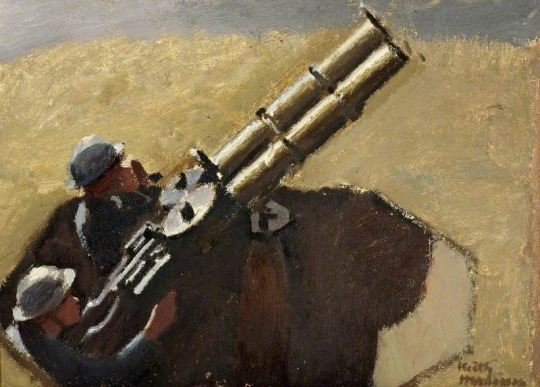
Keith Henderson – Study of Royal Air Force Machine Gunmen, 1939.
May 5. From the ground this strangely retarded spring is at last clearly visible. Trees are in bud and millions of small dowers give an impression of Chaucerian gaiety. Up in the air scarcely any of this tiny brilliance shows yet. There are just stretches of moorland and of ploughland in various shades of pale buff and maroon, with here a diaper dressing of lime, there a flutter of gulls, a few sombre forestry plantations and many lesser woods wherein only’an occasional pale willow is conspicuous, old stone farmhouses with their haystacks in rows, a ruin near a newer castellated mansion, small lochs all silvery grey, an appearance of desertion far and wide. From the air the earth has no flowers. Eastward is the wonderful coast-line, red sandstone mostly, fretted away into natural arches and pinnacles. The jade green sea is as lovely from above as I remember it in the last war. Those white festooned breakers along the Beaches seem without sound.
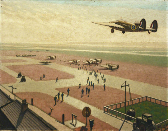
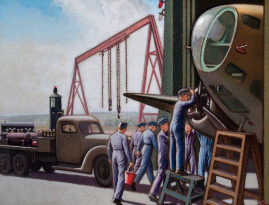
Keith Henderson – An Improvised Test of an Undercarriage, 1940.
May 6. Today I tried the experiment of taking up more than mere notebooks. I took a canvas, a dozen brushes and a full set palette. The Palette was disastrous. Within a few moments of taking off, I noticed Indian red on my sleeve. The observer crept forward to the navigator’s seat where I was, and shouted into my ear, ‘Have you got everything you want?’ ‘Yes, thank you’ I shouted back, ‘but you have got some ultramarine on your cheek. I remembered noticing an air gunner holding the palette at a dangerously acute angle as he handed it to someone. And worse. Nearly all the so carefully arranged large clumps of paint round the palette’s edge were, I saw now with dismay, gone. They had evidently slipped off or been smeared off. But I could not be Without them. They must be found, scraped up penuriously from the floor or anywhere. Then I saw the legs of the air gunner. My precious cadmium red! The observer, the pilot even, all were strangely daubed handed round proved in that cramped space more distributive than cleansing. Their hands, their faces, their flying kit were crimson, blue, white, black, yellow, or tartan. It was a great success.
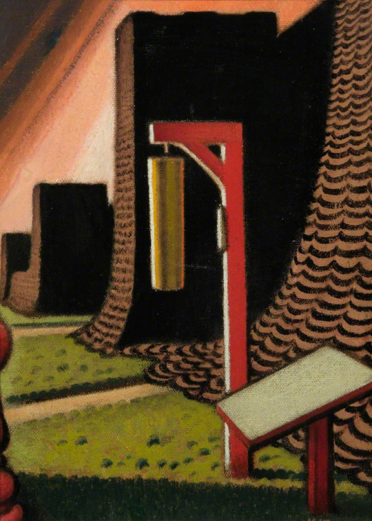
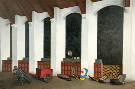
Keith Henderson – Camouflage Hangars and Gas Gong, 1940.
May 7. My bedroom at the aerodrome is quite comfortable. I shall never forget my astonishment when an efficient batman offered me early tea. I was then getting up at 4 am. for a dawn picture. This morning it had to be 3.30. As we rose into the upper air through ground mist three swans also rose through the ground mist. They Hew north. I found myself thinking: ‘Where exactly is the centre of the Universe?’ And I answered myself: ‘ Wherever you happen to be at the moment’. In mid air ’the centre of the Universe is definitely not on the earth’s surface. All who fly will agree about that. Suppose yourself flying west. You wish to turn south. The great rigid wings slant over. But for all the planetary pull of gravitation, it is not the aircraft which appears to be askew. Not at all. The earth on the other hand has gone mad. It has heaved itself up, sea and all, steeply into space, a huge menacing wave that will not subside until the dial shows the wings horizontal. They will be in a moment. Now they are. Now the earth is itself again, flat, detached inhuman, without laughter or any birds singing.
May 8. A letter from the Air Ministry. I wrote some time ago ‘asking for permission to go to Narvik or Stavanger on a bombing raid’. The Air Commodore at Whitehall answers, ‘Under present conditions it is quite out of the question that you should visit Norway‘. Right. Well, that exonerates me. I am certainly not going to do fancy war pictures from photographs and descriptions.
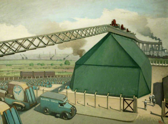
Keith Henderson – Loading Gantry for Pluto, 1940.
May 9. Home for another short rest, tired. No, not depressed. There must be no regretting all that I have not accomplished, but simply a ‘proud delight in all that I have accomplished. Let me be luxuriously lazy. For several days on end I need not do anything. I loll in this white window Seat looking down the length of the room towards Aunt Nell‘s two rococo mirrors on either side of the Chinese lacquer cabinet. One of the dogs in the farmyard barks. I love the faint pink, wallpaper with its bunches of blue-grey and white flowers. I am happy. I think I have been asleep. I must go and see how things are coming on in the walled garden.
May 11. Back at the aerodrome. The usual crowds assemble as soon as I set up my easel for a large picture to be called ‘Repairs to a Bomber’. Since last night when I came round to see that all was in order, the men have produced, in the most frightful raw flat yellow, on the side of the particular aircraft that I am painting, a huge figure of Donald Duck. They want me to put this into the picture, but I really cannot. It would spoil the whole thing. The effort to find words that might show them why it would spoil the whole thing is almost too much during working hours.
Keith Henderson – Dawn: Leaving for North Sea Patrol, 1940.
May 12. On other machines they have now painted other grotesques, including the wholly inexcusable Popeye. A sergeant pilot says that these effigies will ‘cheer up the Jerries’. And this while the news becomes more serious than any news ever announced in the world before.
Keith Henderson – Wings over Scotland, 1940.
May 16. While I was touching in the ‘horns’ of the bomber a young pilot who had been standing beside me asked: ‘How do you begin a picture?’ My answer, which was regrettably long, failed to give satisfaction. I could feel that. There was silence; and then – would I come for a flit with him? When? This afternoon? Well, I did rather want to get on with that thing of the coastline…. He went off at once and came back to say that all had been fixed. We were to go in the Jewel. On my way to the Mess I reflected that a machine called the Jewel sounded pleasantly airworthy. Later I discovered my mistake. Not Jewel, but Dual, a machine with dual control. ‘You must take a turn’, he offered. I made no answer, doubtful as to what this implied. When the parachutes and Mae Wests and other paraphernalia for all concerned are collected we drive across to the Dual. The engines have of course been sending out dust gales to the rear for a good while. We heave ourselves in. Before taking off, the pilot looks round and holds up his right thumb. The rest of the crew hold up theirs. All is well. The noise increases, is doubled, trebled, deafening in spite of ear plugs. We are moving forward, moving more swiftly. We have left the ground. As soon as we are at the right height I begin sketching. The time goes by. I muse vaguely about art meanwhile. Art is more than national, more than international; it is supernatural-magic-always* has been since cave days, always will be. There. The drawings are finished. We may return. Presently the pilot nudges my elbow. I am sitting on the learner’s seat close beside him. What is it now? What? He points to the controls and points at me. Does he mean that I am to ‘take a turn’? I hesitate. His reply to my very sensible hesitation is to cross his arms and lean heavily with his head on one side as if sound asleep. Something must be done. I seize the crescent. He is awake again, ready. We have lost height. I pull back. We rise, rise higher. The North Sea is empty of shipping. No, there’s a distant convoy. So it is. This is rather delightful. At a pinch, if the pilot were to become a casualty, could I carry on ? I might, I really might. But I certainly could not land. I should just have to go on and on, flying round the world indefinitely.
Keith Henderson – Repairs to a Bomber, 1941.
May 23. Abbeville fallen. Boulogne fallen. Well, as to our next move, that rests with the Higher Command, not with me. Defeat ? That is an idea that I’ve never even glanced at. Have any of us ? Probably not. Better not. In the evening I have just finished a life of Wallenstein, and am beginning Lady Mary Wortley Montague’s Letters.
June 13. At home fér another rest. More carrots sown and the artichokes, thinned out to three feet apart, should do well. The Germans are only sixteen miles from Paris.
Keith Henderson – Gas Practice in a Hangar, 1940.
June 14. The first flowers of Campanula Carpatica have appeared, and Helen this afternoon made a delicious cinnamon cake. All down the steep brae towards the river there are foxgloves in full bloom. While raking beechmast into heaps on either side of the drive, I have been watching the cows. They are let out from the byre. They walk very slowly for about five yards, looking straight ahead. Then one of them stops. Gradually they all stop. Why? Two of them move slowly forward a few steps. A long pause. A few others follow and stop again. Another long pause. Do they want to go anywhere in particular? Why need they? A strawberry Ayrshire slowly turns her head. She looks at me for a long while without interest. Then she turns away, having learned nothing. They have nothing to do all day long. A black Galloway, with bracken in her tail, sits down, slowly and heavily. Five minutes later a polled Angus sits down, slowly and heavily. At the end of half-an-hour they have all sat down. Absolute peace here, and news has just come that the Germans have entered Paris.
Keith Henderson – Ascent of the Met Balloon, 1940.
So the diary goes on – a continual contrast between busy warlike aerodromes and exquisite days on leave. That was almost a year ago. How angry we felt then and how obstinate. Today, even more angry and more obstinate, we are surely, I think, feeling much more hopeful. –
The painting ‘An Improvised Test of an Under-carriage’ provoked fury in the Air Ministry and his six month contract as a war artist had come to an end. His work was exhibited at the time but unlike Eric Ravilious his work has more or less been ignored.
In the archives of Augustus John at the University of
Liverpool there is an invitation (August 1931) to Charles Reilly to stay with John at his country home of Fryern Court, Fordingbridge for a portrait to be painted. John was looking to build a new studio in the grounds of his home and so having an eminent architect as a sitter, he asked his advice.
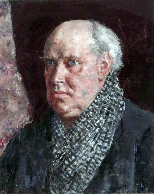
Augustus John – Portrait of Charles Reilly, 1931.
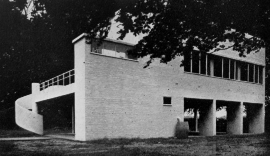
While staying with his old friend and colleague Augustus John at Fryern Court, Fordingbridge, during the early autumn of 1931 in order to sit for his portrait, Reilly wrote a series of letters to his wife. In one of these he states ‘I have suggested his (John) building a large new studio, modern, in ferro concrete, and he likes the idea.’
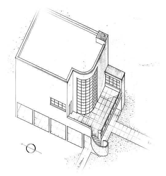
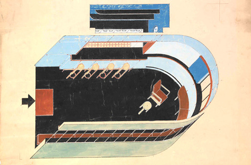
There is no other documentary evidence to suggest that Reilly had any other hand in what eventually was built. John’s chosen architect, Christopher Nicholson – younger son of the painter Sir William Nicholson – produced two designs. The first was a looser interpretation of Modernist principles , and the second and executed design was, as David Dean notes, ‘built to a precise mathematical grid, the reinforced concrete frame has been raised for maximum light on stilts, in the approved Corbusian manner. †
Christopher Nicholson’s second design for John’s Studio.
Augustus John’s studio was Nicholson’s first major commission and an opportunity to put into practice the ideas he had been developing since leaving Cambridge. In 1930 Nicholson visited Paris, where he had the opportunity to see modern studio buildings by Mallet-Stevens, Le Corbusier, Lurcat and Perret. One of the most striking – and an important source for the John studio – was the studio-house built by Le Corbusier for Ozenfant House near the Pare Montsouris. ‡
Nicholson then had his architectural practice at 12 Old Church Street, a one-roomed office over a chemist’s shop, shared with his partner, Hugh Casson. ♠
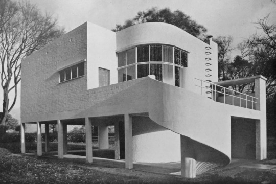
The finished studio in 1933.
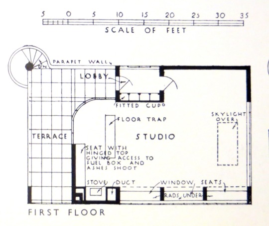
Christopher Nicholson’s plan for the upstairs of the studio.
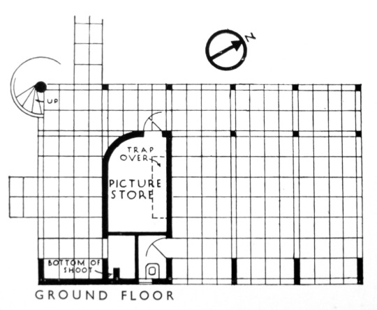
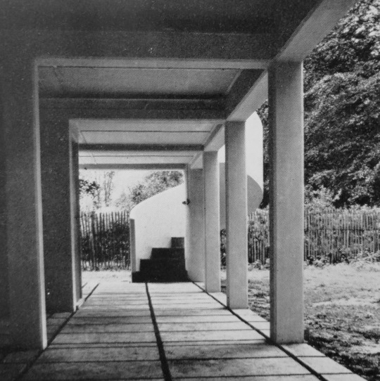
In Le Corbusier’s style, Nicholson design the building lifted up from the ground with only a picture store under.
Christopher Nicholson’s plan for the ground floor of the studio.
When the studio was completed John wrote to Reilly in Febuary 1935, about the studio being a success and how John was working with renewed energy.
Augustus John lived in Fryern Court from 1927 until his death, at the age of 83, in 1961. At the height of his career, the charismatic Welshman was considered one of Britain’s leading portrait painters. He was a well-known figure in the village of Fordingbridge and one of his favourite town watering holes now bears his name, having formally been known as the Railway Hotel.
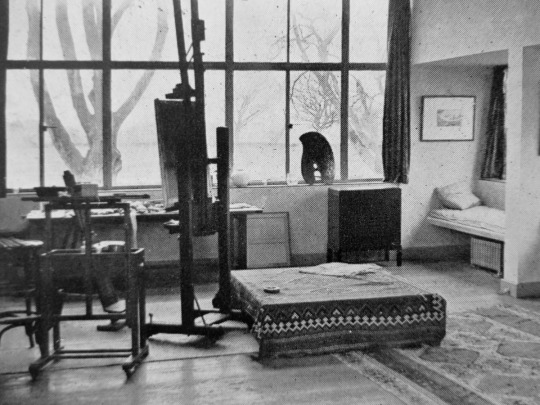
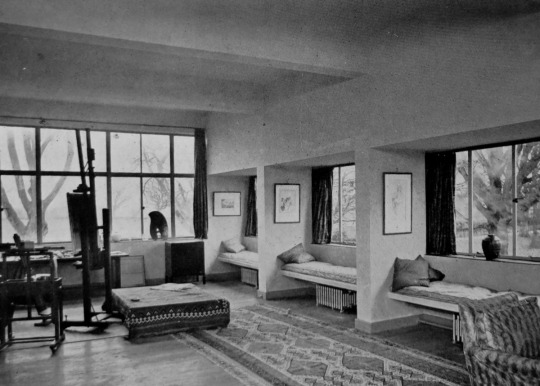
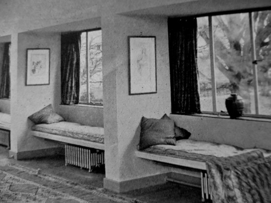
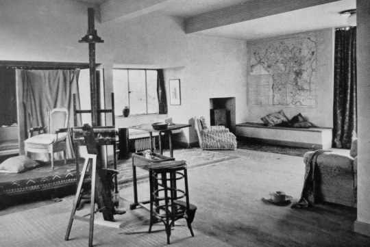
The studio was located in the corner of the garden away from the main house of Fryern Court, so that the views and light of the countryside could flood into the windows.
Interior of Augustus John’s Studio.
Interior of Augustus John’s Studio.
Interior of Augustus John’s Studio with the radiators under the seating.
In 2011 a fire ripped through the main house. More than 60 firefighters were called to Fryern Court near Fordingbridge, the fire crews used water from the swimming pool of the Grade II listed building to douse the flames as they engulfed the roof and first floor. The studio was unaffected.
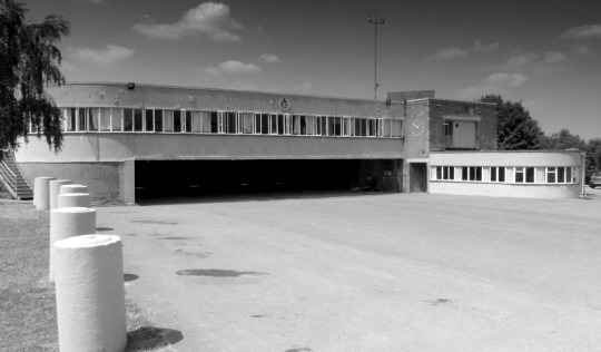
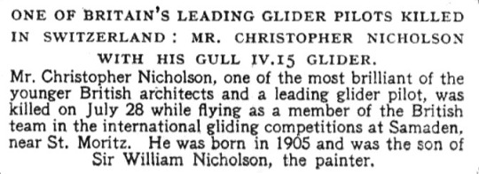
Christopher Nicholson designed many other buildings in his life, but one regarding his death is apt. He designed the building for the London Gliding Club, Tring Road, Dunstable.
London Gliding Club. Tring Road Dunstable
A gliding enthusiast, Nicholson died at age 44 on 28 July 1948 in a gliding accident during the World Gliding Championships at Samedan in the Graubünden, in Switzerland
The interior of the bar was designed by Hugh Casson for Christopher Nicholson, about 1935.
A newspaper clipping reporting Nicholson’s death
‡ The British Art Journal, Volume 2, Issues 1-3, 2000. † Marketing Modernisms: The Architecture and Influence of Charles Reilly, 9780853237563, 2001 ♠ Artists and bohemians: 100 years with the Chelsea Arts Club, 9781870948609, 1991.
In the short time that Eric Ravilious was of working age he produced a massive amount of work for such a young man. He died while serving as an official British War Artist when the aircraft he was aboard crashed off Iceland. He was 39 years old.
At the time of Ravilious’s death there were various projects underway that the war disrupted. As manufacturing was halted, these commissions were put on hold while the country had to economise.
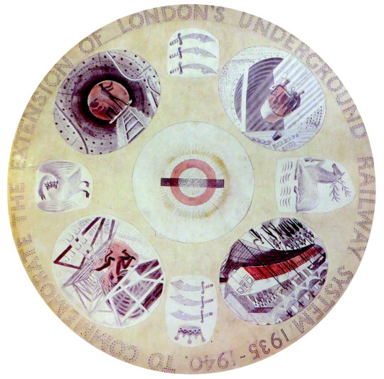
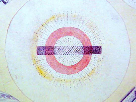
Eric Ravilious – Design for London Underground Plate, 1939.
One of the projects Ravilious had started was for a commemorative plate for the ‘New Works Programme’ of 1935-40 that London Transport had begun.
It was an ambitious extension of the Northern and Bakerloo lines northwards, and the Central line both east and westwards. Although the engineering work was well advanced by the outbreak of war, the project had to be abandoned and was only partly realised in the post-war years. Thus the commemorative plate designed by Ravilious was never produced.
The early Underground train lines, originally owned by several private companies, were brought together under the ‘Underground’ brand in the early 20th century and eventually merged along with the sub-surface lines and bus services in 1933 to form London Transport under the control of the London Passenger Transport Board (L.P.T.B.).
The ‘New Works Programme’ was to develop many aspects of the public transport services run by the L.P.T.B. and the suburban rail services of the Great Western Railway and London and North Eastern Railway.
The investment was largely backed by government assistance as well as by the issuing of financial bonds and was estimated to cost £42,286,000 in 1936 (approximately £2.59 billion today).
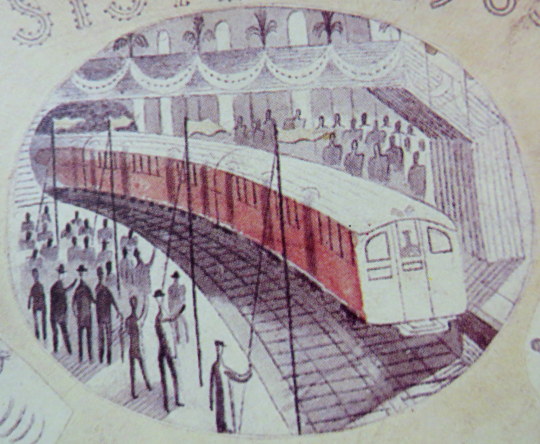
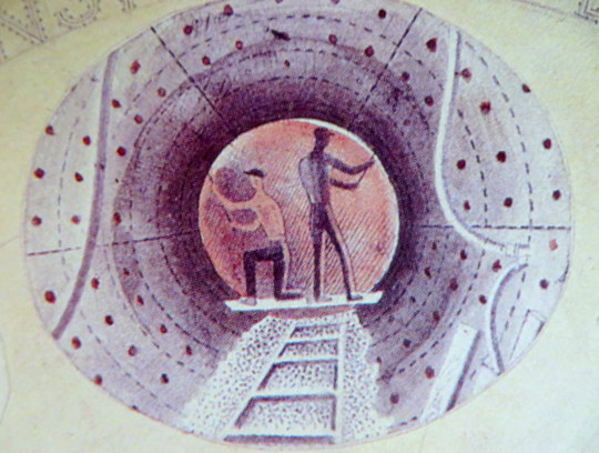
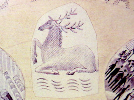
Of the four vignettes Ravilious chose, three were of construction and one was of the predicted Grand Opening, with a tube train and swash bunting along the platform.
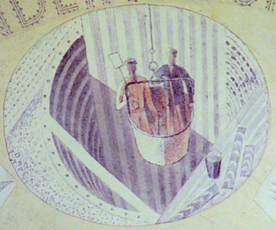
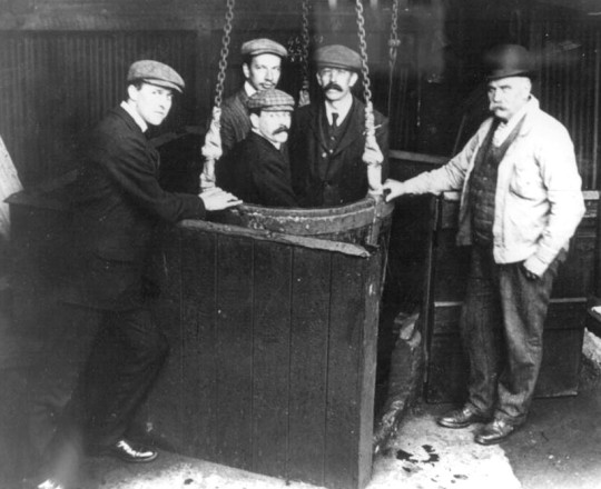
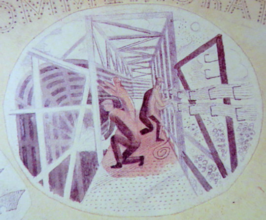
One of the vignettes of construction show men being lowered in buckets into the tube shaft. These were likely non-station locations where the soil was excavated out and the steel and concrete lowered in, like the workers. It was a typical practice in mining.
Men in a small-scale drop lift.
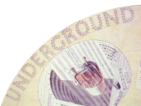
Another of the pictures shows workers putting up the frames for the tube tunnels and station platforms. The wiring being bunched on the sides of the tunnel.
The two workers pictured here are bolting the rivets of the metal into place. The image when manufactured, would have been a black and white transfer and the colour would have been a translucent enamel paint.
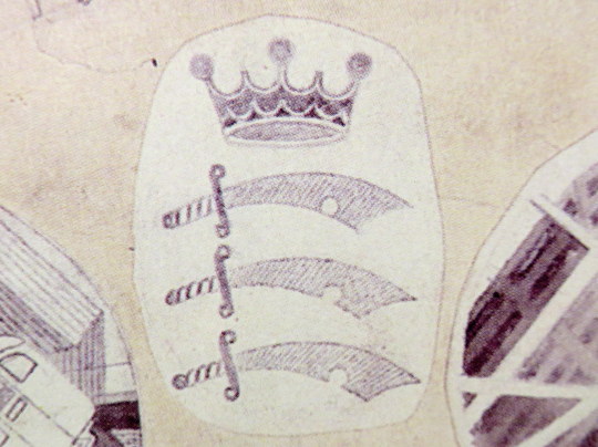
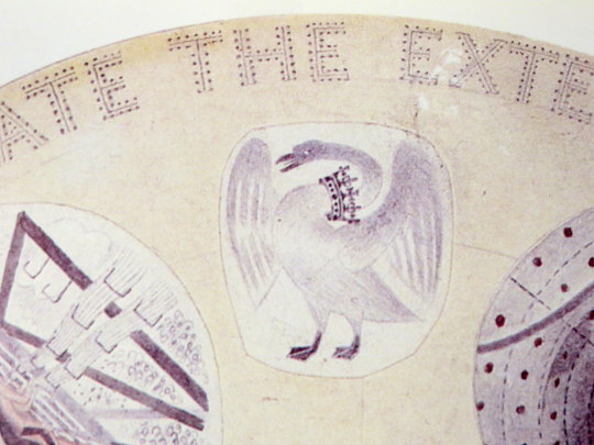
The three heraldic devices show the county badges of Essex, Hertfordshire and Middlesex.
Middlesex Heraldry
Buckinghamshire Heraldry
Hertfordshire Heraldry
The plate would have been one of the last commissions of Frank Pick, chief executive of the London Passenger Transport Board. Pick, who retired in 1940 and died the next year, had worked for the Underground since 1906.
Pick had become publicity officer responsible for marketing and it was at this time that, working with the company’s general manager Albert Stanley, he began developing the strong corporate identity and visual style for which the London Underground later became famous, including the introduction of the ‘Underground’ brand.
One of Pick’s responsibilities was to increase passenger numbers, and he believed that the best way to do so was by encouraging increased patronage of the company’s services outside peak hours. He commissioned posters which promoted the Underground’s trains and London Transport buses as a means of reaching the countryside around London and attractions within the city. Throughout Pick’s career his over-riding passion was for architecture and design, and his adventurous approach and choice of collaborators is famous.
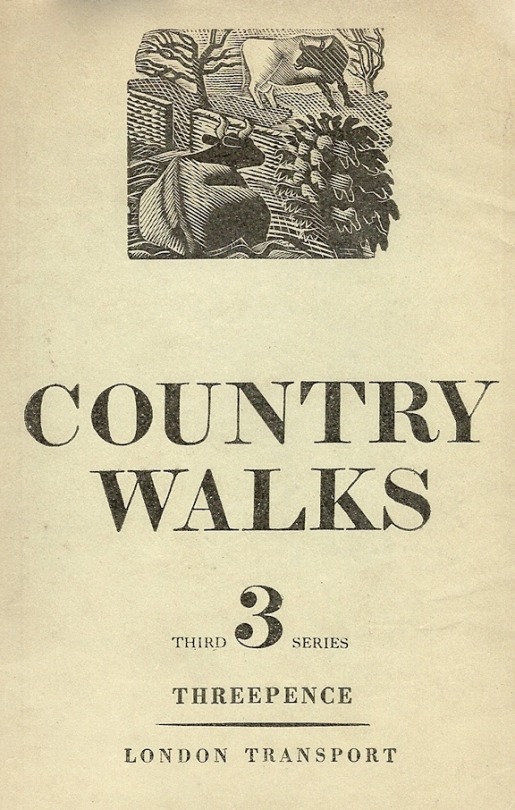
Ravilious had other work planned for London Transport, some posters and wood engravings. During his lifetime he did see some of his work used, a set of his wood-engravings were used for the covers of the Country Walks books in 1936.
1936 cover to Country Walks, 3rd Series with a Ravilious Design of Two Cows.
The Country Walk books were by Charles White and printed for London Transport to show people the possibilities of using the Underground and Bus network. Inside they had maps and planned walks showing how to get to the locations using London Transport.
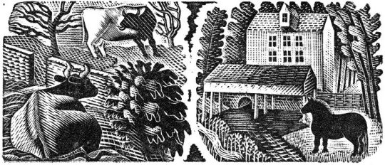
Each of the three volumes had a wood engraving by Ravilious on the cover. The second volume had a Mill, the third featured the Two Cows wood-engraving.
A print from the original woodblock with Two Cows to the left, and Hull’s Mill, Castle Hedingham to the right. 1935.
The two images were engraved on the same block of wood and printed together as one proof. On the left a cow and a bull in a field, separated by a stone wall; on the right a horse standing next to a mill stream, with watermill (based on Hull’s Mill, Castle Hedingham, near Great Bardfeild) in the background.
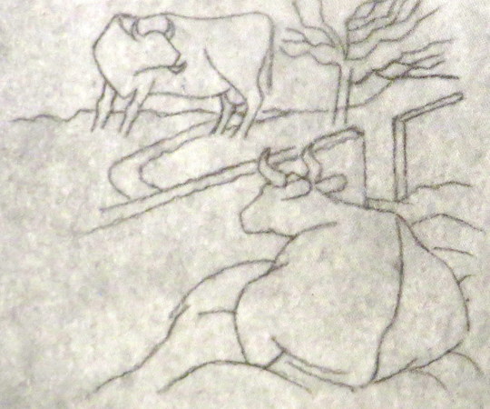
Below is the original drawing for Two Cows, reversed in design as a woodblock always prints backwards.
Eric Ravilious – Two Cows, preliminary study for a woodcut, 1935.
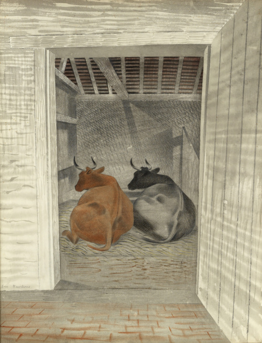
The pencil design is remarkable for another reason: part of the design was turned into a watercolour featuring two Cows in the same pose.
Eric Ravilious – Two Cows, The Fry Gallery, 1935.
The book Away We Go by Oliver Green and Alan Powers, documents more of the other work that both Eric Ravilious and Edward Bawden did for London Transport, mostly their designs for press adverts.
Ravilious Engravings by Jeremy Greenwood, The Wood Lea Press, 2008. Moving Metropolis by Sheila Taylor and Oliver Green, Laurence King, 2001. Ravilious and Wedgwood by Robert Harling, Dalrymple Press, 1986
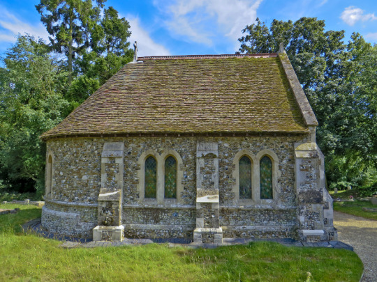
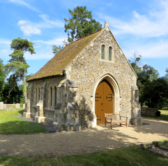
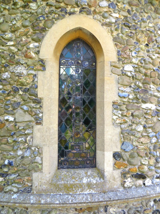
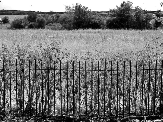
During last summer I visited Ickleton Cemetery Chapel, between Ickleton and Hinxton. The chapel is Victorian and Grade II listed. Built in 1883, in an Early English style, flint with limestone dressings and knapping to the sides and a slated semi-circular roof end.
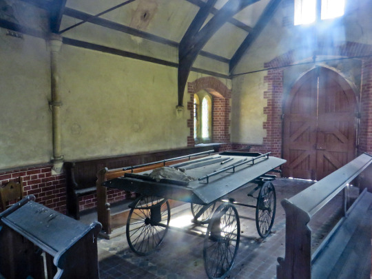
With double doors to the side is a mortuary chapel and a coffin cart rests inside.
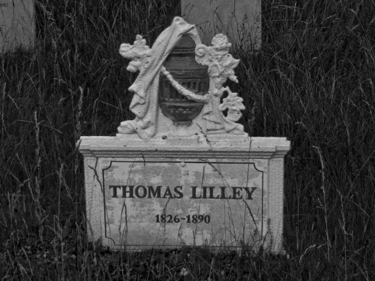
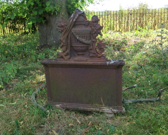
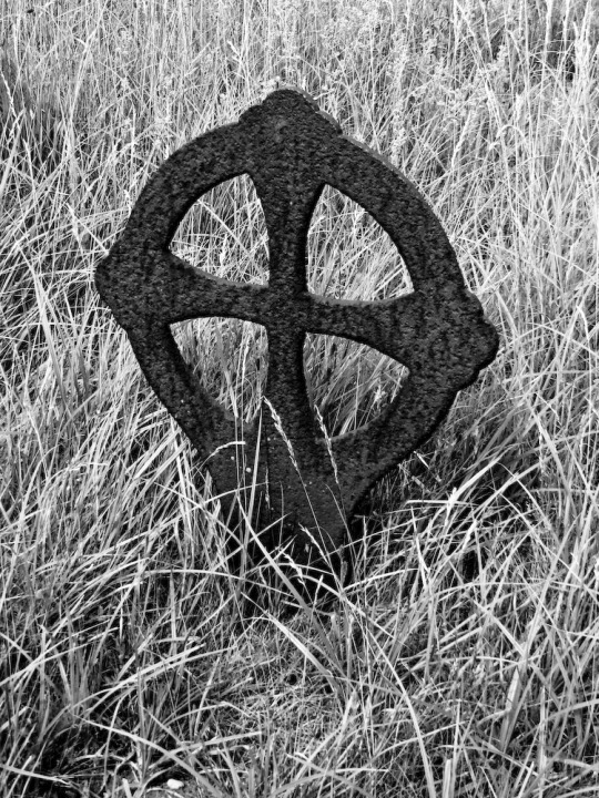
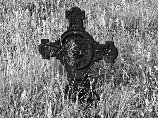
In the graveyard are a set of unusual metal sand cast headstones. Probably made by a company who made fireplaces. An old chap who looks after the graveyard told me that some of them had been stolen, probably for scrap metal as a piece of corrugated iron on top of the compost heap had also been stolen.
The painted grave is one of his relations, and he had repainted them to look as they did when put in. Others have rusted however.
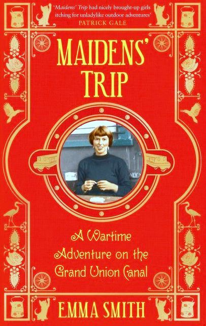
One of the best books I read in 2016 was Emma Smith’s Maidens’ Trip, a story about life on the wartime canals. In 1943 Emma Smith joined the Grand Union Canal Carrying Company under their wartime scheme of employing women to replace the boaters.
The Canal system had been in some decline since the rise of the railways in the 1880s, but wartime efforts to save money on fuel and get maximum efficiency out of the countries infrastructure facilitated a temporary change.
The Re-issued cover of the book.
Smith set out with two friends on a big adventure: three eighteen-year-olds, freed from a middle-class background, precipitated into the boating fraternity. They learn how to handle a pair of seventy-two foot-long canal boats, how to carry a cargo of steel north from London to Birmingham and coal from Coventry; how to splice ropes, bail out bilge water, keep the engine ticking over and steer through tunnels. They live off kedgeree and fried bread and jam, adopt a kitten, lose their bicycles, laugh and quarrel and get progressively dirtier and tougher as the weeks go by. I was rather annoyed to have missed the BBC Radio4 adaptation of it but hope to see it on BBC Radio4Extra in the coming year.
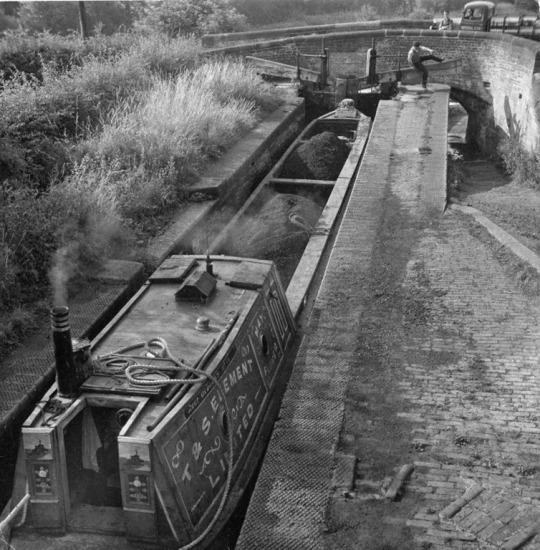
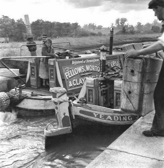
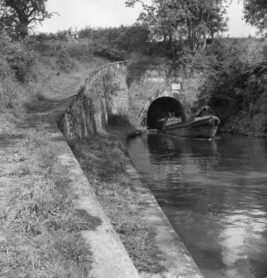
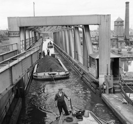
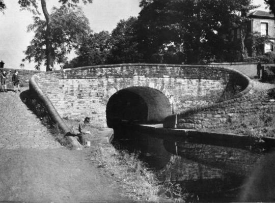
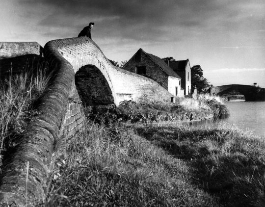
While reading the Smith book, for reference I had the ‘The Canals of England’ by Eric de Maré with his beautiful photos of 1950s Britain. Below are a selection of the pictures.
By the end of the nineteen-sixties a lot of the canals where in poor condition and it was only until the mid nineteen-nineties that they were cleared out and seen as tourist attractions.
Eric de Maré – The Canals of England, The Architectural Press, 1950 Emma Smith – Maidens’ Trip, Putnam & Company, 1948
Between Walton-on-the-Naze and Harwich, is Landermere, a hamlet made up of an old pub and some cottages built next to a quay on the river. In the 16th century it is rumoured to have been a former smugglers’ bay due to its close proximity by boat to the North Sea.
This article is a set of biographies of the extraordinary people who have lived in this place with around 15 houses, mostly in the last 100 years. Some of the shining lights of 1950s British art seemed to end up in this tiny place in Essex, rather like Great Bardfield.
John Hutton – A sketch of Landermere.
Landermere Wharf, a small dock which, as well as being used for hundreds of years to bring in heavy goods, was also once a commercial concern. First used in Elizabethan times, it was sold in 1760 to Richard Rigby who also owned the post at Mistley. The main cargoes were coal, corn and Scandinavian timber.
Remote coastlines have always been a problem for customs men, particularly around inland bays such as Hamford Water where boats carrying contraband could be moored, waiting for a suitable opportunity to approach the wharf and offload. The King’s Head pub used to be situated near Landermere Wharf, and reputedly lost its licence in 1913 after a smuggling incident. ♠
Gull Cottages, Landermere, c1950.
Sir William Withey Gull (Queen Victoria’s Doctor – Ripper Suspect)
Adrian and Karin Stephen (Brother of Virginia Woolfe)
Nigel and Judith Henderson (Daughter of Adrian and Karin)
Eduardo Paolozzi (Artist, Murals in Tottenham Court Road Station)
Basil Spence (Architect, Coventry Cathedral)
John Hutton (Artist, Coventry Cathedral)
Sir William Withey Gull
Gull was born in 1816, on the River Colne, aboard a barge called ‘The Dove’, then moored at St Osyth Mill, Saint Leonards, Colchester.
William’s father John Gull was 38 when he was born, he was a barge owner. William’s mother was 40. William was the youngest of eight children, two of whom died in infancy. When he was 4 the family moved to Landermere.
His father died when he was 10 years old and is buried at Thorpe-le-Soken. After her husband’s death, Elizabeth Gull devoted herself to her children’s upbringing on very slender means. She was a woman of character, instilling in her children the proverb “whatever is worth doing is worth doing well.” William Gull often said that his real education had been given him by his mother.
Gull attended a local school kept by the local clergyman. At fifteen he first began to study Latin. The clergyman’s teaching, however, seems to have been very limited; and at seventeen William announced that he would not go any longer. Gull became a pupil-teacher in a school kept by a Mr. Abbott at Lewes, Sussex. He lived with the schoolmaster and his family, studying, but also paying his keep by also teaching Latin and Greek to the boys. At this time he became acquainted with Joseph Woods, the author, architect and botanist. He formed an interest in looking for unusual plant life that would remain a lifelong pastime and eventually turned his mind to biological and medical research. Gull was introduced to the director of Guy’s Hospital, Benjamin Harrison. Harrison was impressed by Gull’s abilities and Gull was given patronage to study and work as apprentice at Guy’s Hospital in 1837.
Gull, encouraged by Harrison, determined to make the most of his opportunity, and resolved to try for every prize for which he could compete in the hospital in the course of that year. He succeeded in gaining every one.
Guy’s Hospital in Gull’s time.
Aged 26, Gull was appointed to teach Materia Medica at Guy’s Hospital. A Year later in 1843, he was appointed Lecturer on Natural Philosophy. He also held at this time the post of Medical Tutor at Guy’s and was appointed Medical Superintendent of the wards for lunatics. At 30, he earned his M.D. degree at the University of London, and gained the gold medal. At that time this was the highest honour in medicine which the University was able to confer.
In 1847, Gull was elected Fullerian Professor of Physiology at the Royal Institution of Great Britain, a post which he held for two years, during which time he formed a close friendship with Michael Faraday (at that time Fullerian Professor of Chemistry). In 1848, he was elected a Fellow of the Royal College of Physicians.
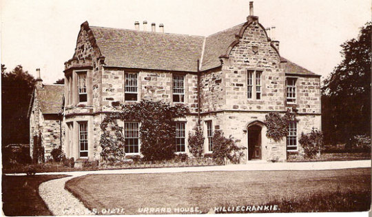
In 1887, Sir William Gull suffered the first of several strokes at his Scottish home at Urrard House, Killiecrankie. The attack of hemiplegia and aphasia was caused by a cerebral haemorrhage, of which the only warning had been unexplained haemoptysis a few days earlier.
Urrard House, Killiecrankie
He recovered after a few weeks and returned to London; but was under no illusions about the danger to his health, remarking “One arrow had missed its mark, but there are more in the quiver”. Over the next two years, Gull lived in London, Reigate and Brighton, suffering several more strokes. The fatal attack came at his home in 74, Brook Street, London on 27 January 1890. He died two days later.
The term anorexia nervosa was first used in 1873 by William Gull to describe this condition.
Postscript:
Dr. Thomas E. A. Stowell suggested in a 1970 article in ‘The Criminologist’ that Sir William Gull, the Royal physician, attempted to certify Prince Albert Victor, Duke of Clarence and Avondale, who was the Ripper.
Stowell claimed that his main source was Gull’s daughter Caroline who was married to Theodore Dyke Acland. Having studied under Acland, Stowell referred to him as “one time my beloved Chief”. Stowell was an executor of Acland’s will.
Stephen Knight, in his 1976 book Jack the Ripper: The Final Solution went even further, claiming that Jack the Ripper was actually a three-man team, with Gull as the actual killer. Knight alleged that Gull was a Freemason and the killings were carried out according to Masonic ritual. Knight claims that Gull afterwards became insane and was certified in an asylum under the name “Thomas Mason” and a sham funeral service carried out in the pretence that he had died. Cited as evidence in support of the theory is the fact that Acland signed his father-in-law’s death certificate. While Acland’s actions were unusual and were not encouraged, they were not illegal.
Following Stowell’s article, Colin Wilson disclosed that ten years before it was published, Stowell invited him to lunch at his club and tried to convince him that they were thinking along the same lines on the Ripper mystery. He told him, “Jack the Ripper was the Duke of Clarence.” Later, Wilson said that he contacted Stowell to ask him if he might mention the theory in some articles that he was about to write and although Stowell refused, saying “Her Majesty might not approve”, Wilson had the distinct impression that Stowell hoped the he would mention it. He said, “He (Stowell) had been sitting on this thing for 30 years and would have welcomed the chance to test public reaction.”
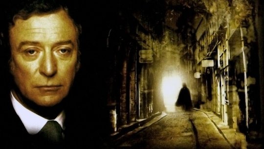
In the 1988 mini-series Jack the Ripper, Acland was played by Richard Morant.
Poster for Jack the Ripper (1988)
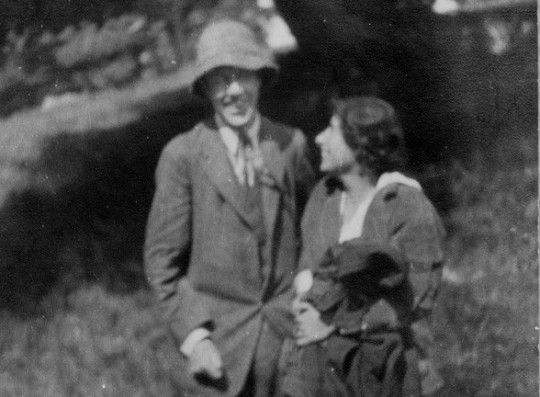
Adrian and Karin Stephen
Photograph of Adrian and Karin together in 1914. NPG, London.
Adrian:
Landermere was the former home of Adrian and Karin Stephen. Adrian Stephen (1883–1948) was the younger brother of Thoby Stephen, Virginia Woolf and Vanessa Bell and the brother-in-law of Clive Bell, Duncan Grant and Leonard Sidney Woolf. This naturally forged him as a member of the Bloomsbury Group. By his mother’s first marriage, he was also a half-brother of George and Gerald Duckworth of Duckworth Publishers.
Virginia Woolf eventually accused Gerald and George, of having sexually abused her and Vanessa when they were children and teenagers.
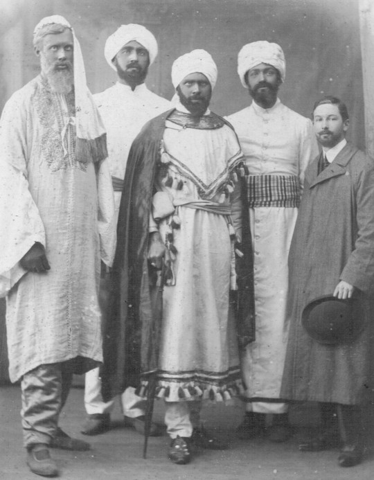
One of main highlights to a biographer for Adrian Stephen’s life would be the precursor to the Dreadnought Hoax, the Zanzibar Hoax at Cambridge in 1905.
“Prince Musaka Ali and his suite” were in fact students (L-R) Adrian Stephen, Robert Bowen Colthurst, Horace Cole, Leland Buxton and ‘Drummer’ Howard. In this guise, they hoaxed the Mayor and citizens of Cambridge, 1905.
Adrian was a student at Cambridge University with Horace de Vere Cole at the time when the Sultan of Zanaibar was know to be visiting England. A telegram was sent to the Mayor, ostensibly from a government official.
Cole, Stephen and three other friends then dressed up in robes and turbans and arrived at the railway station where they were met by the Town Clerk who took them to an official reception by the Mayor at the Guildhall. After the reception, charity bazaar and tour of the sights, they were taken back to the station, where they made their escape. The story was then given to the Daily Mail by Cole and became famous. The Mayor wanted the student sent down but was persuaded by the Vice-Chancellor that this would damage his reputation further.
In 1909 Adrian had an affair with Duncan Grant but in 1914 Adrian married Karin Costello, a philosophy graduate of Newnham College, Cambridge. Virginia Woolf once wrote of Karin “A good cob of a woman, but so hearty and without shade or softness. Age will harden her … and her family will coarsen her.”
During the World War One, Adrian Stephen, like most of the Bloomsbury men, was a conscientious objector. Through the war years Karin and he worked on a dairy farm in Essex until 1918.
Through Duncan Grant he met Lytton Strachey (Duncan’s cousin) and also Lytton’s brother, James Strachey. James Strachey and his wife Alix were the first translators of Freud into the English language, and the first professionally qualified and practising psychoanalysts in Britain. Their enthusiasm rubbed off onto Adrian and Karin, and after the war they both decided to become analysts, an ambition fulfilled for Adrian in 1926 after completing a medical degree. They went on to be keen followers of Freud’s methods.
With the coming to power of Adolf Hitler and the rise of Nazi Germany and antisemitism, Stephen’s pacifist views changed. At the outbreak of the war in 1939, he volunteered to become an army psychiatrist and in 1942 he become an army doctor at the age of 60. He died in 1948.
Karin Stephen:
Karin had a remarkable life at Cambridge University as a student. After a pause in her studies from ear trouble she came back and was awarded a double first in Mental and Moral Science. She was elected a member of the Aristotelian Society. Her tutor was Bertrand Russell and he would later become her uncle by marriage. She wrote ‘The Misuse of Mind: A Study of Bergson’s Attack on Intellectualism’ published in 1922.
After Adrian’s death, Karin’s health deteriorated. After a life of deafness and manic depression in 1953 Karin committed suicide leaving her daughter Judith the house in Landermere.
Judith Stephen and Nigel Henderson.
Nigel, Judith and Drusilla ‘Jo’ Henderson in the garden of 46 Chisenhale Road, Bethnal Green, 1952
Nigel Henderson (1917-1985)
Judith Stephen (1918-1972)
Nigel Henderson’s parents divorced when he was young. His mother, Wyn Henderson, creatively inspired him to pursue a career in art though her friends and connections. At the beginning of her career Wyn managed ‘The Hours Press’ for Nancy Cunard (the first person to publish Samuel Beckett) in Paris and found herself mixing with Surrealist artist and poets. After a quarrel with Cunard, Wyn returned to London to live in Gordon Square, the heart of the Bloomsbury Set. The young Nigel saw an early performance of Virginia Woolf’s Freshwater in Vanessa Bell’s studio and stayed with Bell and Duncan Grant at Charleston.
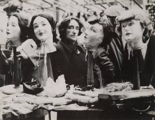
Nigel Henderson – Wig Stall, Petticoat Lane, 1952
Nigel was able to meet Max Ernst on a trip to the south of France in 1932, Ernst inspired him to become a full time artist. At this time in 1938, Wyn was managing Peggy Guggenheim’s gallery ‘Guggenheim Jeune’ at 30 Cork Street, London. Peggy Guggenheim was an airess of the mining
Guggenheim family and her father had died on the RMS Titanic. The
gallery links helped Nigel meet Marcel Duchamp as well as Jean Cocteau
and Wassily Kandinsky.
Nigel studied biology at Chelsea Polytechnic in London from 1935–1936. He then worked as an assistant to Helmut Ruhemann from 1936–1939 restoring old master paintings. In the late 1930s Henderson developed paintings inspired by Yves Tanguy, another of Guggenheim’s artists. Nigel displayed two of his collages at the gallery. Peggy Guggenheim closed Guggenheim Jeune with a farewell party on 22 June 1939 having made a loss of £600 in the first year.
Henderson put his passion for art aside to join the war effort as a pilot in Coastal Command. In 1943, he married Judith Stephen, daughter of Adrian and Karin Stephen. The niece of Virginia Woolf and Vanessa Bell, Judith had graduated from Cambridge when she met Nigel. She was stationed in Bethnal Green as part of a social anthropology project. Judith’s access to the working class and poorer parts of London inspired Nigel to go out and photograph the nearby people and shops. He also continued to experiment with collages and the physicality of photography, he achieved abnormal effects by using various techniques such as altering negatives and placing images on light-sensitive paper to create Photograms.
As a biologist, Henderson was fascinated by the universe revealed by the microscope. As a pilot, he was familiar with landscape perceived from the air. His experiments with cameras, enlargers and developing combine the
two perspectives. What looks like a study of cellular structures turns out to be a photograph composed of bomb debris.
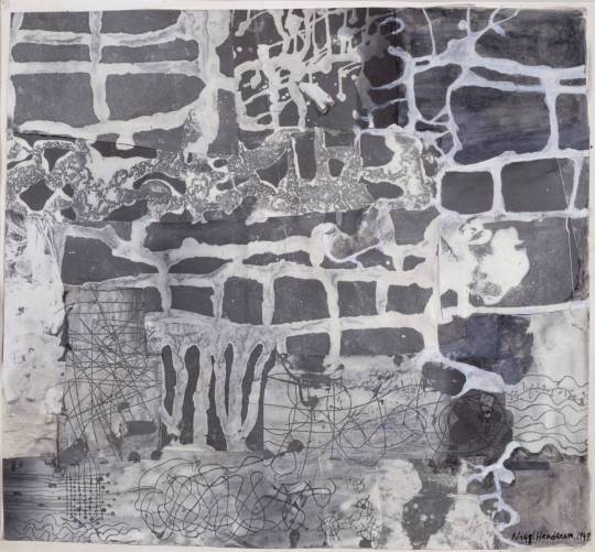
Nigel Henderson – Collage, 1949.
He enrolled at the Slade School of Fine Art in London. At Slade he befriended Eduardo Paolozzi and William Turnbull. With Paolozzi, he formed The Independent Group in 1952. The Independent Group’s other main members were Lawrence Alloway, Richard Hamilton, John McHale and Alison & Peter Smithson. They had their meetings at the Institute of
Contemporary Arts in London.
Following the suicide of Judith’s mother Karin Stephen in 1953, the couple moved into Judith’s Landermere family home in 1954 and bounced between there and London for the rest of their lives. Paolozzi moved across to the road at Gull Cottage in 1955.
From 1965–1968 and from 1972–1982 he headed the photography department at Norwich School of Art while working on independent projects.
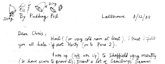
A Christmas letter from Nigel Henderson in Landermere to artist Chris Mullen.
His obituary quotes: “I want to release an energy from trivial data. I feel happiest among discarded things, vituperative fragments cast casually from life, with the fizz of vitality still about them.”
Although part of the Independent Group and using ‘found objects’ to make art, Henderson’s photography and design was also more old fashioned and documentary styled than the Pop Art of Paolozzi.
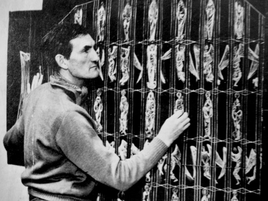
Sir Eduardo Paolozzi
Eduardo Paolozzi taken by Frank Thurston, NPG, 1988
Paolozzi was born in Leith in north Edinburgh and was the eldest son of Italian immigrants. His parents owned an ice-cream cafe in Leith. Paolozzi’s father was an admirer of Mussolini and sent Eduardo to a fascist youth camp in Italy every summer where he acquired a liking for badges, uniforms and aeroplanes.
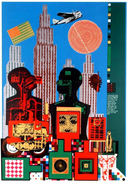
Eduardo Paolozzi – Reality, Tate, 1964
In June 1940, when Italy declared war on Britain, Paolozzi was interned (along with most other Italian men in Britain). His father, uncle and grandfather were among 630 Italian and German internees killed when the ship carrying them to Canada, the SS Arandora Star, was sunk by the German U-Boat, U-47, on 2 July 1940.
Being 16, Eduardo spent three months in Saughton jail, Edinburgh, rather than put on a boat. Upon his release, Paolozzi helped his mother and sister, Yolanda, make and sell ice cream while he attended the Edinburgh College of Art learning calligraphy and lettering.
Moving to London he studied briefly at Saint Martin’s School of Art in 1944, and then at the Slade School of Fine Art at University College London from 1944 to 1947. In the post war years of 1947-1949 Paolozzi moved and worked in Paris. Like Henderson, he became acquainted with Alberto Giacometti, Jean Arp, Constantin Brâncuși, Georges Braque and
Fernand Léger.
On moving back to Britain he moved to 9 Paultons Square, Chelsea in London. His studio was full of hundreds of found objects, from toys and books to tools and models. Part of this studio has been re-created in the Scottish National Gallery of Modern Art.
In 1951 he married Freda Elliot, a textile designer. In the mid 1950s
Eduardo Paolozzi moved to Landermere to work and raise his family. He
had followed his friend Nigel Henderson. Paolozzi moved across to the
road at Gull Cottage in 1955.
Together with Nigel Henderson he established Hammer Prints Limited, a design company producing wallpapers, textiles and ceramics that were initially manufactured at Landermere Wharf.
Eduardo Paolozzi – Newton after Blake, 1993–94.
Paolozzi came to public attention in the 1950s by producing a range of striking screenprints and “Art Brut” sculpture. He was a founder of the
Independent Group in 1952, which is regarded as the precursor to the
mid-1950s British and late 1950s American Pop Art movements. His
seminal 1947 collage “I was a Rich Man’s Plaything” is considered the earliest standard bearer representing Pop Art.
Paolozzi’s graphic work of the 1960s was highly innovative. Using silk screen printing he was able to use and modify the colours of found images in the Pop Art style. The resulting prints are characterised by Pop culture
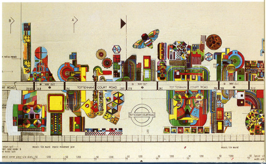
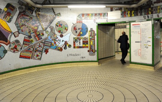
references and technological imagery. In 1979 he was asked to design a large scale mural in Tottenham Court Road Underground station, London. The mosaic’s frenetic design was intended to reflect the station’s position adjacent to Tottenham Court Road’s large concentration of hi-fi and electronics shops.
Paolozzi’s design for Tottenham Court Road on London Underground
Some of this mosaic has now been removed in the expansion of the station
for Crossrail. These parts are due to be reconstructed and installed in the University of Edinburgh.
Paolozzi was appointed CBE in 1968 and in 1979 he was elected to the Royal Academy. Paolozzi was knighted by Queen Elizabeth II in 1989 as a
Knight Bachelor.
Part of the surviving mosaic in Tottenham Court Road Underground station.
He was promoted to the office of Her Majesty’s Sculptor in Ordinary for
Scotland in 1986, which he held until his death. He also received an
Honorary Doctorate from Heriot-Watt University in 1987.
On Desert Island Discs, Paolozzi’s luxury item was a Hurdy gurdy.
Hammer Prints Limited
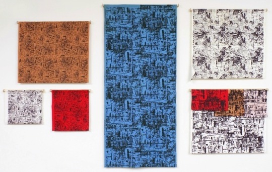
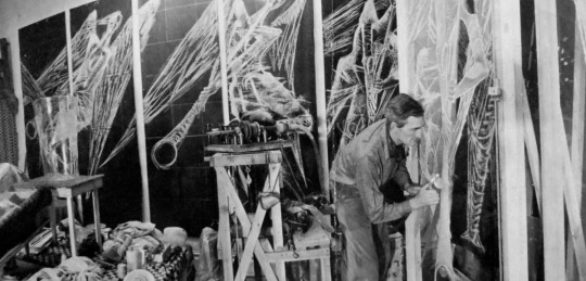
In 1954, with Paolozzi, Henderson established Hammer Prints Limited, a design company producing wallpapers, textiles and ceramics that were initially manufactured at Landermere Wharf.
Interior of the Henderson’s house at 46 Chisenhale Road, Bow, covered with Hammer Print prototypes.
Henderson and Paolozzi were registered as the company directors along with Judith Henderson who acted as secretary. Working from a studio at the Henderson’s home, they developed over eleven designs that were screen printed onto wallpapers, textiles and ready made ceramic products.
It’s aim “To purchase, sell, manufacture, hire or act as agents for the sale of textiles, wallpaper, statuary, ceramics, furniture and photographic equipment and materials”. Paolozzi’s notes stated ‘it is the object of Hammer Prints Ltd that an attack be made on the craft field using the silk-screen as the media to be exploited. ♣”
In 1955 the wallpapers were manufactured by Cole and Son (who also printed Edward Bawden and John Aldridge’s designs) and their textile designs were
produced by the Lancashire firm Hull Traders from 1958.
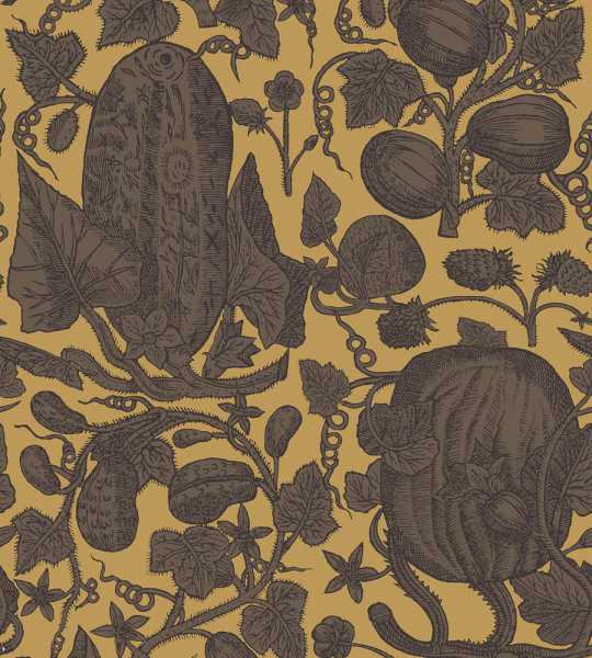
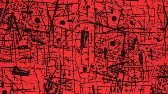
Cowcumber by Hammer Prints, Printed by Cole and Sons, 1955.
Coalface, Cowcumber, Hessian and Sgraffito were the first to become available
from January 1955. Barkcloth, Big Drawings, Newsprint, Portobello and Townscape followed whilst Sea Beasts and Toys were developed for a range of ceramic tiles, lampstands, bowls, trays and furniture.
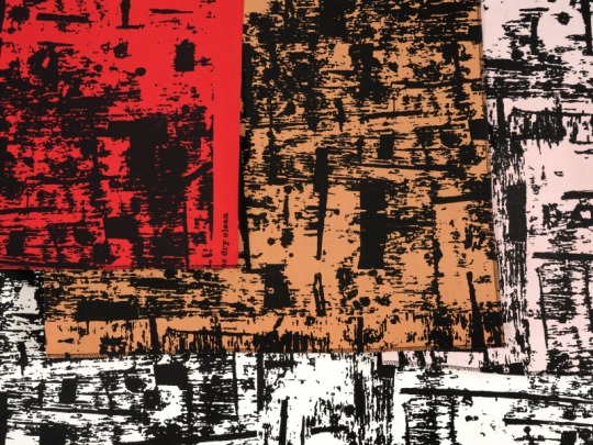
Sgraffito by Hammer Prints, Printed by Cole and Sons, 1955.
Hammer Prints exhibitions were held at the Studio Club on Swallow Street in December 1955 and from 10 December 1956 to 4 January 1957. The Castle Bookshop on Museum Street in Colchester also held an exhibition and sale of bowls, tiles, scarves, textiles and wallpapers from 21 April to 5 May, 1956. The designs were for sale in Liberty and Habitat.
The collaboration between the artists lasted only a few years with Henderson working on designs alone until 1962. The artists continued to receive royalties on their design work from Cole & Son and Hull Traders until the company was dissolved in 1975.
Colour choices for Sgraffito by Hammer Prints, Printed by Cole and Sons, 1955.
Basil Spence
Spence was a Scottish architect, most notably associated with Coventry Cathedral in England and the Beehive in New Zealand, but also responsible for numerous other buildings in the Modernist/Brutalist style.
Basil Spence and his wife Joan took a holiday cottage at the far end of the Gull Cottage row which they used for weekends and holidays.
It was while Basil Spence was laid up with influenza at Landermere that he occupied his time working on designs for the architectural competition for the new Coventry Cathedral – only a part, of course, of months of work on the designs.
But Basil Spence’s decision to enter this competition, and his ultimate success against 218 other entries in August 1951, was later to alter beyond recognition the lives of the Spence and Hutton occupants of the cottages at Landermere. Basil Spence wrote of John Hutton:
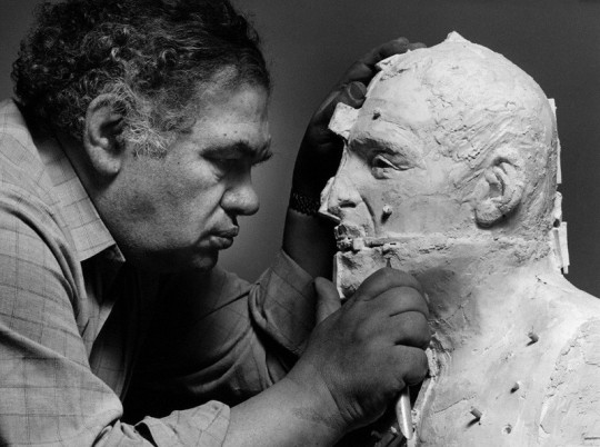
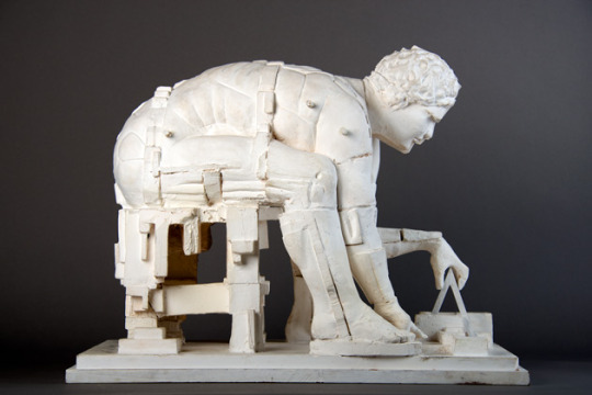
John Hutton in his studio, engraving the Coventry Glass, 1964.
I had no hesitation in recommended John Hutton for the great glass screen as he had worked with me on many exhibitions and I had found him an artist of great quality, a true draughtsman and one who knew the glass engraving technique backwards. Moreover, he was a delight to work with, practical and trustworthy. †
On Desert Island Discs, Spence’s luxury item was Spaghetti.
John Hutton
John Hutton – Painting during a spell of sick leave in Tiberias, 1942.
John Hutton was born on the New Zealand and is most famous for his glass engravings on the Great West Screen of Coventry Cathedral. Known as the ‘Screen of Saints and Angels’ the Coventry work features 66 larger-than-life figures that took ten years of creation, for which he received
instant acclaim in 1962 alongside other artists like John Piper and Graham Sutherland.
He was first married to the artist Helen ‘Nell’ Hutton (née Blair), an
artist from New Zealand in 1934. Two years later the couple set sail
for Britain to help their artist careers. For John the move gave him
commissions for murals on the S.S. Orcades for Orient Line and later, a large mural design for the Festival of Britain.
The war found Hutton working as a camouflage officer in a unit designing
anything from fabrics for uniforms in different terrains, to ways of concealing airfields runways with paints and chalk to look like fields from above.
He had three children with Helen, all boys: Warwick Hutton, who was an artist, Macaillan Hutton, an architect, Peter Hutton, a teacher.
John and Nell had been invited to a party at the home of Karin Stephen (the widow of Virginia Woolf’s brother, Adrian) in order to meet Bertrand Russell. Nell recalls that it was an especially good party – “lots to drink and Bertie Russell very jovial.” But the really good thing that emerged from the party was the discovery that Karin Stephen owned a cottage on an Essex estuary which she was prepared to let. It was Landermere Creek, near Thorpe-le-Soken, and perhaps it was the “lots to drink” atmosphere of that party which fostered a swift decision, for on 7 April 1949 the Huttons left London and moved to Essex. The twins (Warwick and Macaillan) were nine years old, and a completely changed life lay before them. ‡
John Hutton – Nell Hutton at Landermere, Private Collection, 1951
The Gull Cottages were coastguard cottages, used more for the policing of smuggling than the saving of lives. When the tide was in the mash land of birds and reeds became wide rivers that went miles inland.
Hutton moved to Landermere in the King’s Head to start with, before moving into one of the Gull Cottages where he had a glass studio in the garden. Eduardo Paolozzi used it to make his sculptures in, he described it thus: “a glass shed, which was home-made and always leaking, it had been inhabited formerly by a glass artist much used by Basil Spence called John Hutton… But he seemed to have limited means, and there was a lot of DIY there. ♥”
John Hutton – Chalk Plan for the Coventry Window, 1952.
Among Hutton’s other public commissions were six larger-than-life Angels for the South and West doors of Guildford Cathedral.
With the opening of the new Shakespeare Centre at Stratford-upon-Avon,
Hutton was commissioned to make life sized etchings of famous actors,
but altered his brief to ‘Shakespeare’s Characters’ and portraits of Ophelia, Macbeth, Romeo and Juliet. Nineteen characters were engraved into glass. Hutton selected the 19 characters based on two main criteria: 1) The character is instantly recognisable to any viewer. (read:
non-scholars)
2) The character can stand alone without any background detail or
overwrought attention to costume.
John Hutton – Mural for Furniture Exhibition Stand, British Industries Fair, London, 1949
At the Civic Centre of Newcastle upon Tyne, UK, he created a glass
screen representing some of the great inventions of the city with the
help of his son, Warwick Hutton. 1975 he became first Vice President of the newly founded British Guild of Glass Engravers (Laurence Whistler was first President and Queen Elizabeth, The Queen Mother was its first Patron).
His second marriage was to Marigold Dodson, they had one daughter, Katie Hutton. His windows are in buildings all over the world and his glass engravings, paintings and murals in global national collections.
John Hutton – Women At War, Mural for Crosby & Company Ltd, 1946.
References:
† Phoenix at Coventry: the Building of a Cathedral by Basil Spence, 1962 ‡ John Hutton by Margaret Brentnall, 1986 Henderson Letters: Fulltable.com Website ♠ The Essex Coastline, Then and Now by M.P.B. Fautley and J.H. Garon, 2004 ♣ Nigel Henderson & Eduardo Paolozzi: Hammer Prints Ltd. 1954 – 75, 2012 ♥ Frank Whitford Interviewing Eduardo Paolozzi – Sir Eduardo Paolozzi, Tate Archive C466/17/F4988-A Nigel Henderson: Parallel of Life and Art by Victoria Walsh, 2001 Eduardo Paolozzi by Judith Collins, 2014
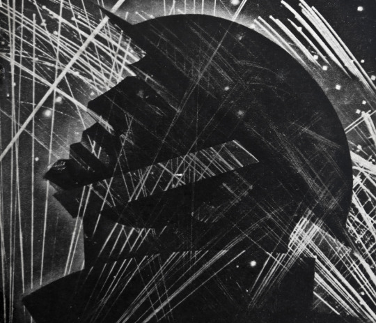
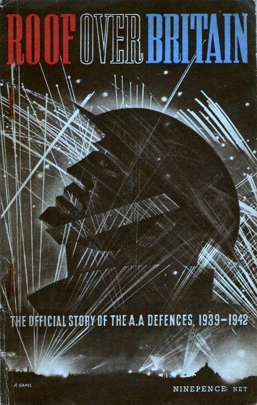
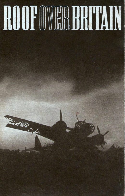
On my bookcases I have a rotation of new and old books that I face out, depending on the designer. Some John Minton or Edward Bawden dust jackets, or pamphlets. But the book I normally put out, for the absolute beauty of the illustration is Roof Over Britain. It is illustrated by Abram Games and for the beauty of it, it is normally to be found for under five pounds. I have contemplated getting another to frame on the wall.
The topic is of the Anti-aircraft defences during the Second World War. It is an odd thing how patriotic the art of WW2 makes one feel. The lines of the soldiers face are almost like a German statue, it is all very modern.
The Front Cover of ‘Roof Over Britain’, 1943.
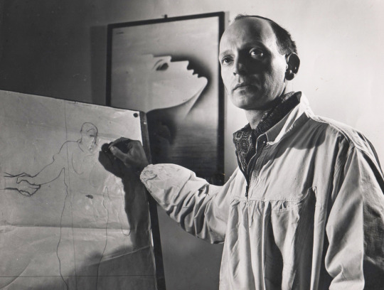
Born in 1914 to Latvian and Russo-Polish parents in Whitechapel, East London, Abram Games joined the Army in 1939 and was quickly designated the role of draughtsman. By 1942 he had been promoted to captain and was the only Official War Poster Artist for the rest of the Second World War.
Abram Games in his studio, 1941
After the war his freelance career went from strength to strength with commissions for the Festival of Britain, the United Nations, Shell, Guinness and the BBC. After a career spanning over 60 years, Games died in 1996 leaving a legacy of daring, distinctive and elegant images.
Justly famous for his innovative and bold poster commissions, Games claimed that the perfect design employed ‘maximum meaning, minimum means’. As a design student they are words I loved, communication first as part of design.
The Back Cover
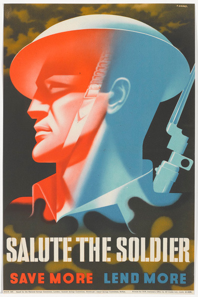
Abram Games – Salute the Soldier – National Army Museum, 1944
The model for the booklet looks to have been one Games used many times judging by the similarity of the ‘Salute the Soldier’ poster.
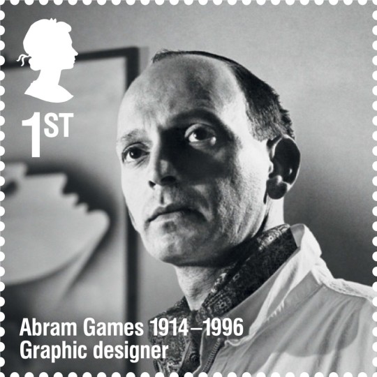
In 2014 Games’s image was used on a stamp for the Remarkable Lives series for Royal Mail.
Abram Games, 1st Class Stamp, Remarkable Lives Set, 2014.
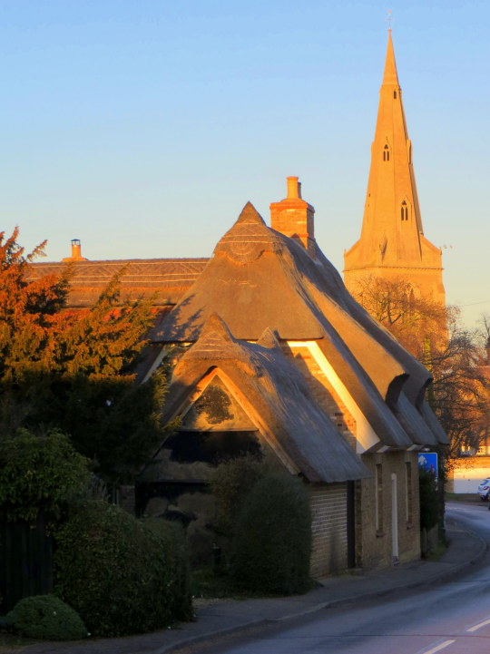
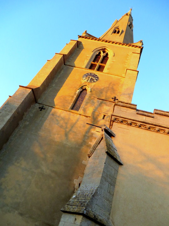
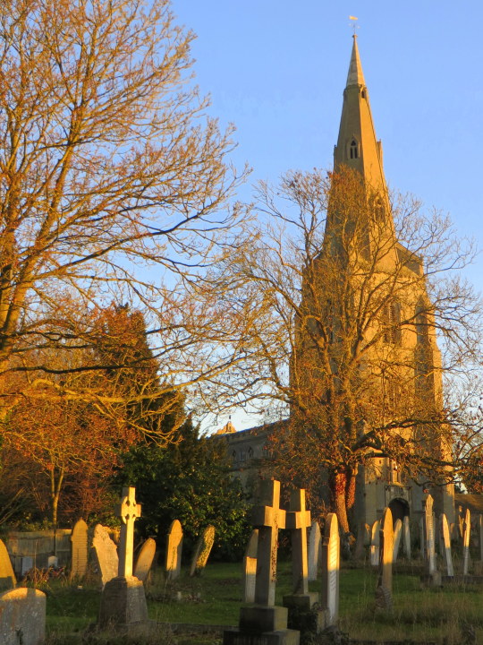
Over, It lies among the orchards, but the fishermen know it well, for the wayward Ouse broadens out where the ferry takes us over the border to a delightful little inn (In Holywell). But Over will not let us hurry away, for it has a handsome church which the centuries have ’ tilled with interest without and within. Its sanctus bell has hung in the bellcot for 600 years, and all that time the spire has been pointing the village folk the way to Heaven. The tower is older still, a landmark in this valley since the 13th century. †
It was as the sun was going down that I got to the St Mary’s Church in Over, it had been a lovely day and the setting sun lit up the pale brick and plaster work.
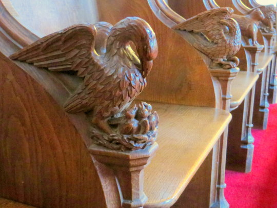
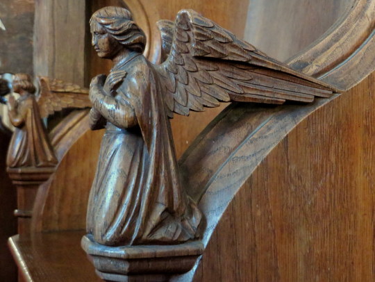
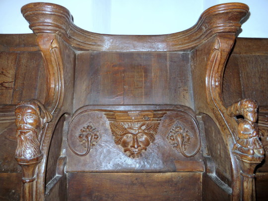
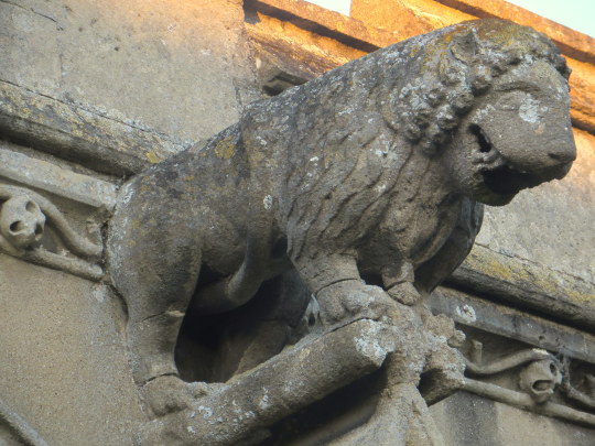
Like with Swavesey church there are some carvings, the choir seats on one side are carved with mythical beasts and birds.
Here are some angles and below a cow like beast with wings. Edit: The cow with wings is the symbol of St Luke the Evangelist, patron saint of painters – Paul Bommer.
On the other side of the chapel the choir seating is older, the tip-up seating hid the medieval misericords.
Misericords were set on the underside of the hinged seats in the choirs of churches. They had no religious function but gave some support to the monks and clergy in the long parts of the services when standing was required. This explains the name ‘misericord’, which comes from the Latin for mercy. The decoration was often amusing and sometimes moral. ‡
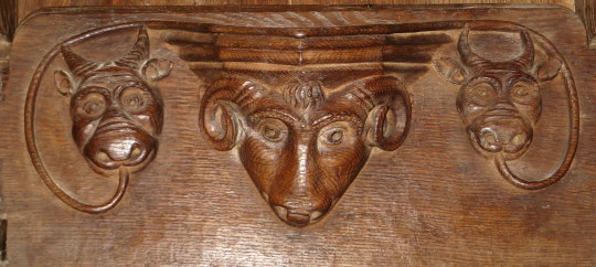
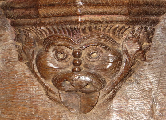
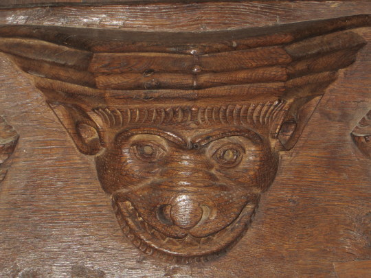
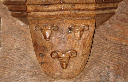
Here is a Rams head and Devils or Cows to the sides. Below the full image of the chairs show how the seats flap down and the decorations on the corners.
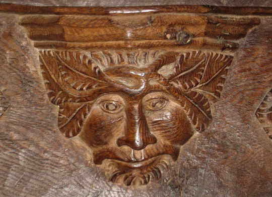
Above a traditional Green-man image carved with beard. Below a more devious looking Green-man or woodland spirit with leaves brushing beside the head, another beast and then leaves and coats of arms for the Abbot of Ramsey who would have given the parish money to decorate and repair the church along with the Abbot of Ely.
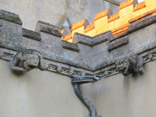
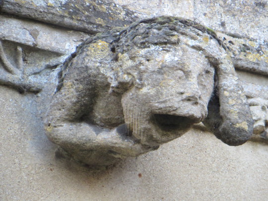
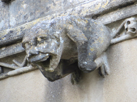
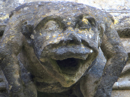
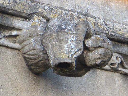
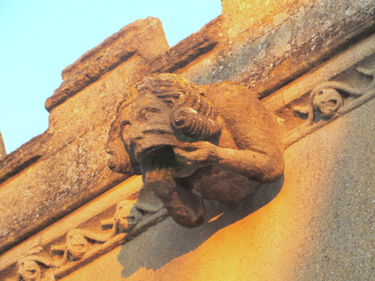
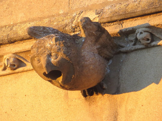
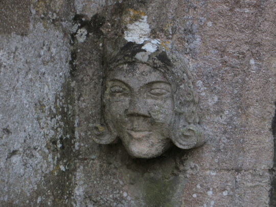
Outside the church is no less decorative than the interior as the image below shows, the gargoyles were the original way of spouting water from the roof while looking decorative. It has now been replaced with the modern piping and emergency spout for heavy rainfall or if the pipe is blocked with leaves.
The carving of them is not only wonderful but so inventive. A sheep, a maiden with a potty or jug. I am unsure of their age but I love the folk nature of the design and that everything should be functional and decorative.
The owl caught the sunlight as the full force of the sunset glowed across the building.
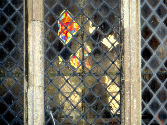
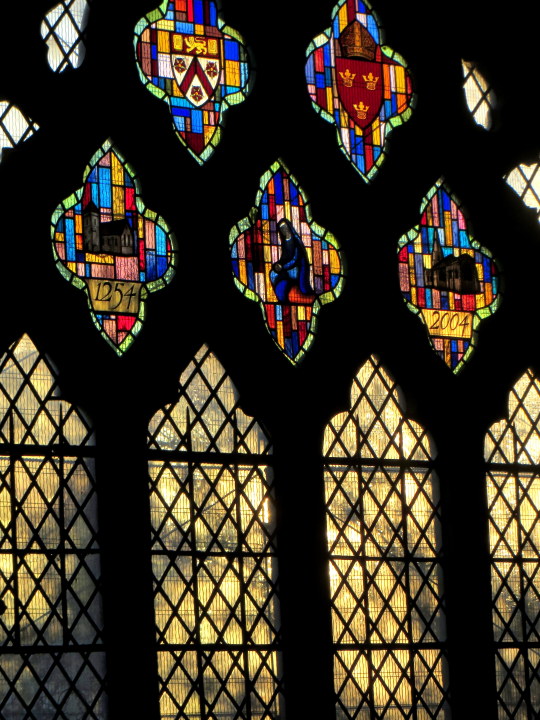
From outside the date celebration window is reflected in part thought the leaded squares. Below the image is the window in full with coats of arms and the dates 1254 when the building was much simpler, to how it is today.
To the other side of the church and the light was catching the trees and headstones.
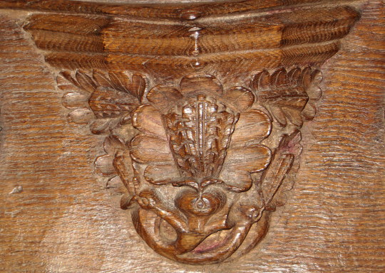
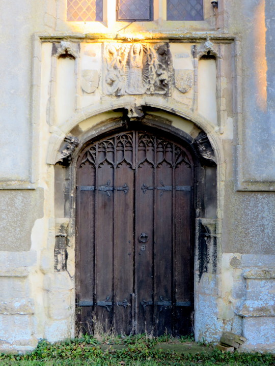
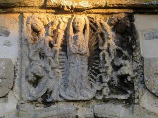
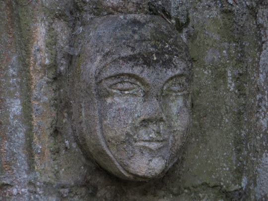
Above the door on the back of the tower is a wonderful carving, what might be Mary is in the centre of a
Botticelli like shell and the faces of men around the sides, the top left in a wig reminding me of Samuel Pepys, who’s family origin from the near-by Cottenham.
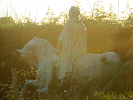
At the end of the Graveyard you can see into the next garden and there is a huge statue of a Roman on a Horse, looking over a 8ft high hedge.