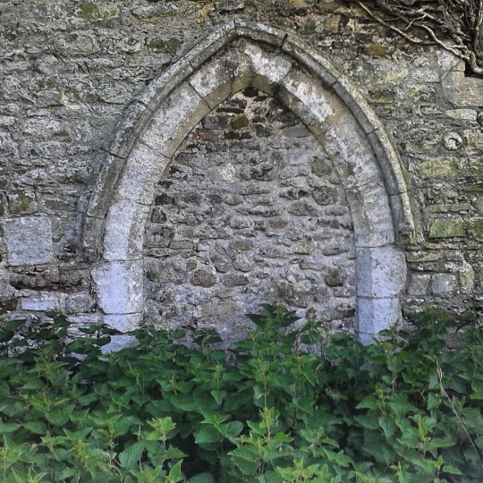
William Beckford’s Fonthill Abbey, now mostly lost, has slipped into legend. Sensational as it was, it was painted and studied by many artists contemporary to the construction, one of these was Joseph Mallord William Turner.
Beckford, born in 1760, is mostly remembered for being an author and a showman who inherited a fortune and squandered it on a building that partly collapsed and withered away over the next 50 years. Although he died in 1844, during his life he had a natural talent for self promotion. The building was Fonthill Abbey, a mansion with a tower constructed to make a statement, but it was also built to house his collection of fine works of art and keep the complete library of Edward Gibbon he had bought.
The stained glass windows in the building were painted by Francis Eginton. Other works in Beckford’s collection for the Abbey were Saint Catherine of Alexandria by Raphael, Agony in the Garden and Portrait of Doge Leonardo Loredan by Bellini, Philip IV in Brown and Silver by Velázquez. In time when the estate was sold off the list of possessions would show the near shop-a-holic mania of his collection.
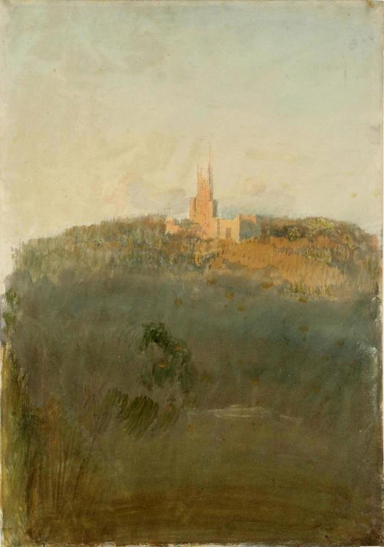
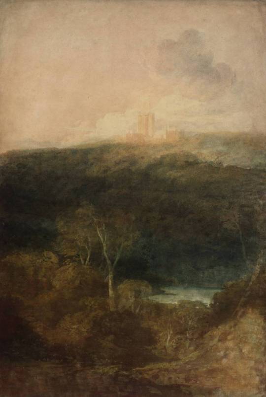
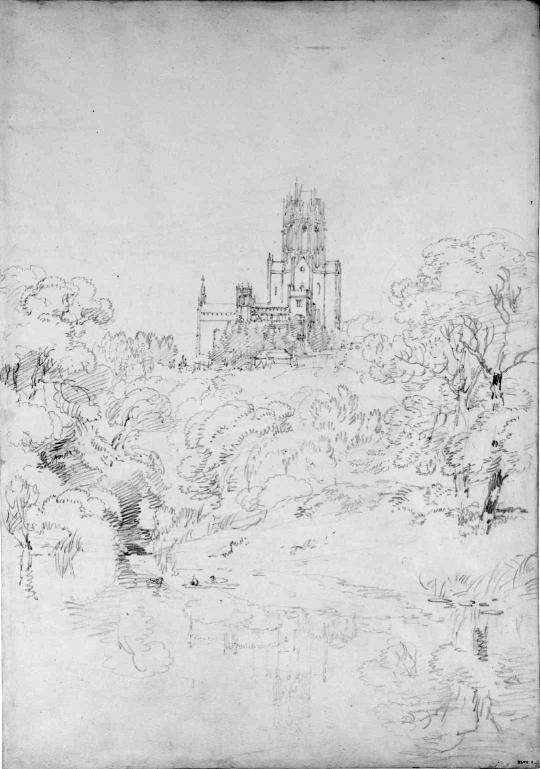
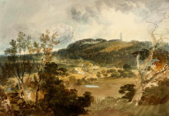
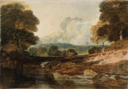
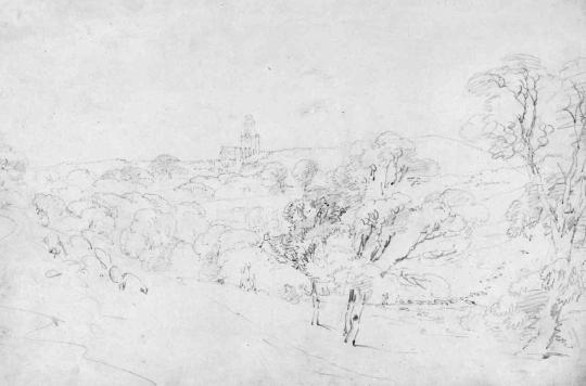
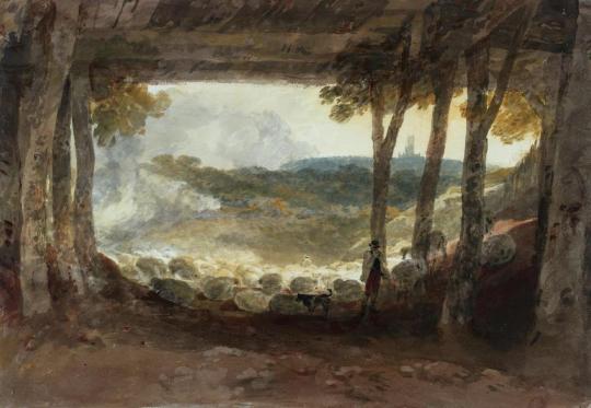
It was in the early days of Beckford’s Fonthill Abbey obsession he invited Turner to paint seven large watercolours of the house and it’s grounds. Turner spent three weeks at Fonthill in August, 1799 making drawings for the commission. His sketchbooks from this time show the building under construction and the five watercolours eventually completed, show the abbey from different vantage points and at different times of day.
In having Fonthill Abbey documented by a fashionable young artist (Turner was 24 at the time) he would have no doubt hoped that by association, he and his building would too become fashionable. Various scandals in Beckford’s past had lead to him taking a self imposed and strategic exile from Britain, now returning to build the Abbey he was upsetting neighbours and the Royal court by outbidding them for contractors in their building programs.
Beckford had also invited the President of the Royal Academy of Arts, Benjamin West, and Henry Tresham to join Turner on his visit.
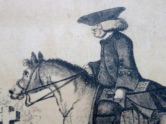
When Turner arrived at Fonthill, its building was in full flow. The speed and scale of the work were exceptional. Turner sat and sketched the workmen whom Beckford was employing around the clock in night and day shifts. In another sketch he captured the vast brown scar on the hill on which the building was positioned, created by the small forest of trees that Beckford had felled for the work.
As for Beckford himself, he was rarely seen. The group of artists ate their meals with Williams, Beckford’s steward, rather than being entertained by the patron himself, who spent much of his time engaged in supervising the work on the house as well as riding in his extensive grounds. ♠
At the point when Turner returned to Fonthill its master was losing his battle to regain social acceptability and was already showing the signs of a man who preferred his own company. Beckford was beginning to see his abbey as less a summer pleasure house with which to impress guests, and more a fortress against the wider world. What time Turner did get with Beckford, however, was sufficient to impress on him the profoundly dark tone of his patron’s mind. ♠
In the end Beckford only purchased one of the paintings of Fonthill from Turner. The rest were exhibited by the Artist at the Royal Academy in 1800.
In time Turner’s sketchbook became an important document to Fonthill’s structure as by 1825 the majority of the building had fallen down. Beckford however had cunningly sold the estate some years before and moved on to building another tower in Bath.
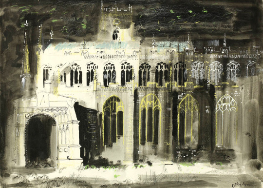
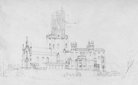
The picture of the completed building painted by Turner was based on the architectural plans and projections and finished five years before the building was, the final building ended up with no spire. During the building process the tower would get higher and higher, maybe one reason for it’s downfall, the foundations where not strong enough for this babel like building.
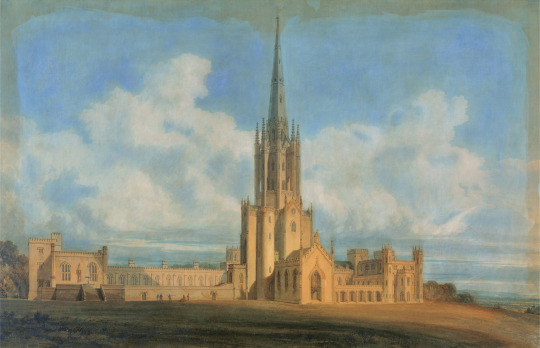
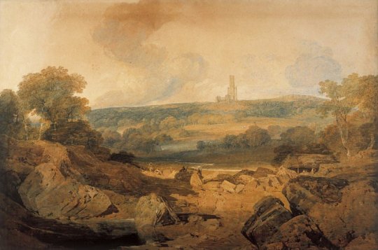
J.M.W. Turner, Projected Design for Fonthill Abbey, Wiltshire, 1798
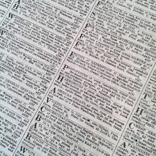
Beckford’s fascination with his pet project meant that he spent no time at all keeping the family business – the foundation of his wealth – active. The family owned a series of sugar plantations in Jamaica but due to the 1807 abolition of the transatlantic slave trade and Beckford’s poor business management meant that by 1822 he is seriously in debt. Selling the estate, he moves to Bath where he builds a neoclassical tower to house his collection. Below is an account of the sale of the Abbey:
Mr. Beckford, on coming possessed of his fortune, made the grand tour, and resided many years in Italy; it was here that he improved that exquisite taste and love of the Fine Arts, for which he is pre-eminent. On his return to England, he resolved on building Fonthill – which he accomplished; and in August, 1822, he as hastily determined to dispose of it – and accordingly gave directions to that eminent auctioneer, Mr. Christie, of Pall-Mall, London, to dispose of it; and so great was the anxiety to view the splendid edifice, that upwards of 9000 catalogues, at one guinea each, were sold before the day of the sale; on the day preceding which, to the surprise and mortification of the public, notice was given that the estate of Fonthill, with all its immense treasures, was sold to Mr. Farquhar for 300,000l. This gentleman has since employed Mr. Phillips to sell the whole of the effects, which will occupy thirty-nine days!
We are told the possessor of this splendid treasure left it almost without a pang. His first resolution was to build a cottage lower down in the demesne, near the fine pond, and let the Abbey go to ruin. ”I can live here,” he said to his woodman, ”in peace and retirement for four thousand a year – why should I tenant that structure with a retinue that costs me near thirty thousand?” Subsequently, however, he resolved to part with the entire, and announced his intention without a sigh. ”It has cost me,” said he (gazing at it), ”with what it contains, near a million. Yet I must leave it, and I can do so at once. Public surprise will be created, but that I am prepared for. Beckford, they will say, has squandered his large fortune: to me it is a matter of perfect indifference.” It would much exceed our limits to attempt even a description of this justly celebrated Fonthill. †
In his later life and typical of the showman act, Beckford would later go on to show off his Turner and describe him thus,
He took me to a small room, where there was a water-colour drawing of Fonthill Abbey. “Ah” “ah there’s the abbey,” he literally exclaimed, pointing to it. I asked him by whom it was painted.
“Turner.”
“Turner?” I asked; “he does not paint like that now.”
“Oh! gracious God! no! He paints now as if his brains and imagination were mixed up on his palette with soapsuds and lather. One must be born again to understand his pictures.” ‡
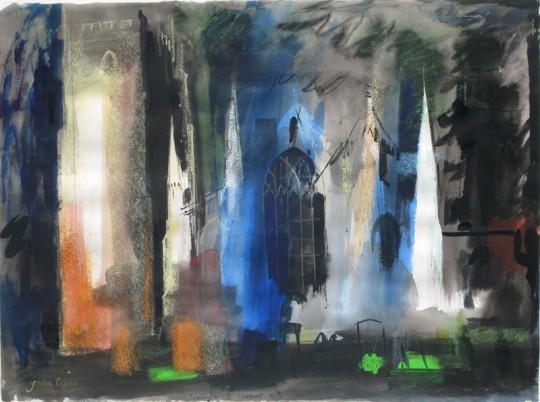
It maybe that Turner painted Fonthill Abbey so far away due to the noise and confusion of the building site, or that he preferred to be a landscape artist and thought it more romantic to have it pictures from a-far. Either way Beckford’s quip about ‘soapsud’ watercolours is something that haunted Turner in the later days as his work became more abstracted.
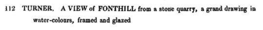
Beckford’s Turner was originally listed in the Christies sale as lot 112 on the 8th day of the 9 day sale.
I have also posted about Fonthill Abbey here: The Father, Son and an Abbey; the story of Fonthill Abbey
† Arliss’s Literary Collections. p105 1830.
‡ The New Monthly Magazine, ‘Conversations with the Late W.Beckford, Esq’. 1844.
♠ Turner: The Extraordinary Life and Momentous Times of J. M. W. Turner by Franny Moyle. 2016. 9780670922697