A video on the making, inspiration and production of the Noel Carrington and Edward Bawden’s book, Life In An English Village.
Edward Bawden – Life In An English Village Discovered
A video on the making, inspiration and production of the Noel Carrington and Edward Bawden’s book, Life In An English Village.
Edward Bawden – Life In An English Village Discovered
Great Bardfield being a small community of artists, it is only natural that they would borrow ideas, items and homes from each other to work in. Here are a few examples of connections in illustrated books by the people in the community that all were published within a few years of each other.
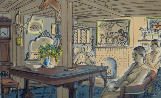
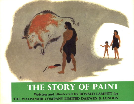
Edward Bawden – Sunday Evening, 1949 (Life in an English Village)
The picture above shows the sitting room at Ives Farm, Great Bardfield. Tom Ives is pictured in the corner with his pipe. It’s depicted in a lithograph by Edward Bawden from the King Penguin book ‘Life in an English Village’ (1949), around the same time Aldridge himself used this house in a book illustration for ‘Adam Was A Ploughman’ (1947) by Clarence Henry Warren.
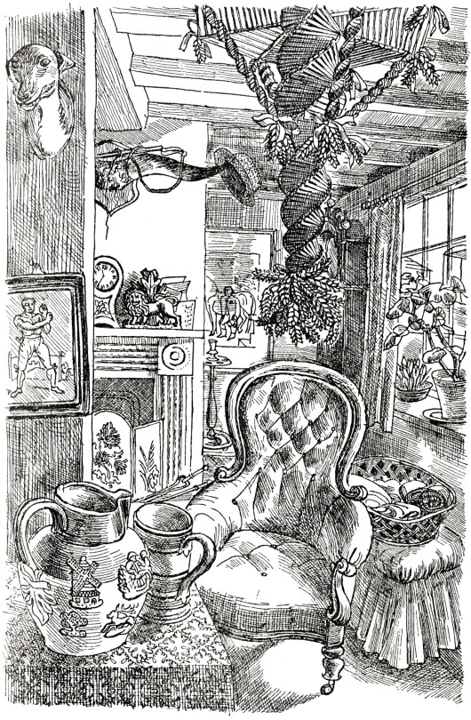
John Aldridge – Living Room, 1947 (Adam Was A Ploughman)
On the fireplace you can see a Staffordshire figure of a lion by a tree, it was illustrated again on another page in ‘Adam Was A Ploughman’, pictured below.
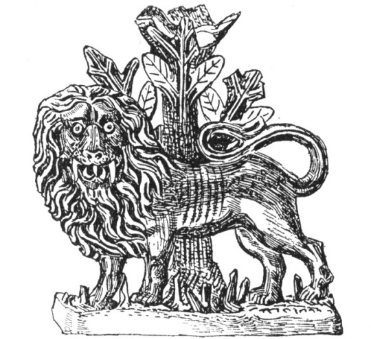
John Aldridge – Lion, 1947 (Adam Was A Ploughman)
The photograph below is from Volume Five of The Saturday Book (1945), in a chapter by Edwin Smith on ‘Household Gods’ and is the same Staffordshire Lion.
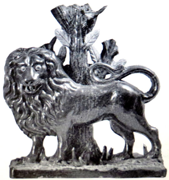
Edwin Smith – Lion, 1945 (The Saturday Book)
Back to the drawing of Ives farm living room is a corn-dolly hanging up, below in the King Penguin book ‘Life in an English Village’ I have picked it out in yellow.

John Aldridge – Living Room, 1947 (Adam Was A Ploughman)
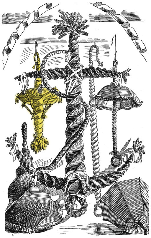
Edward Bawden – Corn-dollies, 1949 (Life in an English Village)
To the bottom right of the image above is also the bell used in the Pub lithograph below. Below the bell, the one-eyed man is Fred Mizen, a gardener and thatcher who also had a talent for making corn-dollie, it is likely all of them are by him.
Edward Bawden – The Bell (detail), 1949 (Life in an English Village)
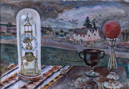
Michael Rothenstein – Clock and Candlestick, 1942
The painting by Rothenstein above is a curious still life of a table and village scene. Curiously enough these items appear again in fifth Volume of The Saturday Book, along with the Aldridge Lion photograph. The article mentioned the clock ‘flanked by exotic shapes contrived from coloured balls on candlesticks’ it is wisely assumed that the picture is from Rothenstein’s house.
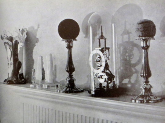
Edwin Smith – Clock and Candlestick, 1945 (The Saturday Book)
Clarence Henry Warren – Adam Was A Ploughman, 1947
Leonard Russell (Editor) – The Saturday Book, 1945
Noel Carrington – Life in an English Village, 1949
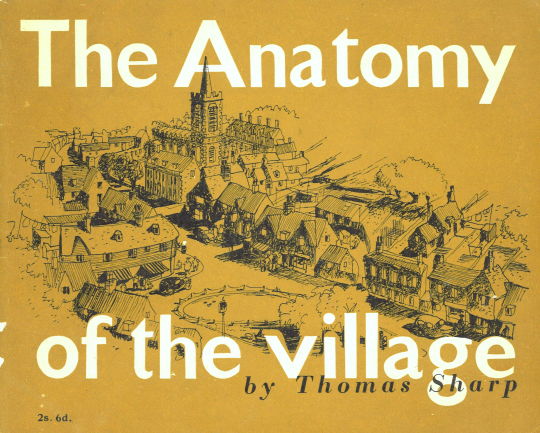
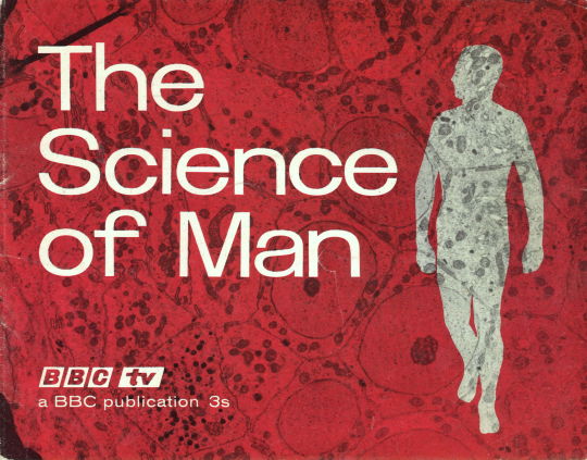
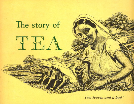
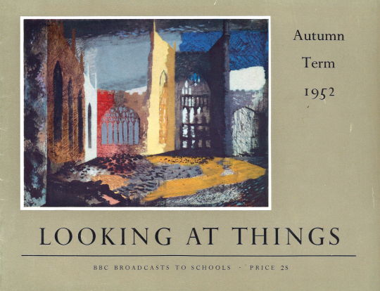
The Puffin picture book series was inspired from various continental and Russian children’s books; as Insel-Bücherei publications inspired the King Penguin series, the Puffin books also inspired others due to the handy size for displaying information. Here are some books that are the same size but are styled in a suspiciously similar way. Some of them are a series of BBC books, others are by tea companies and the V&A.
Rosemary Ellis née Collinson was born in Totteridge, North London in 1910. Her grandfather was the leading designer of furniture company Collinson & Lock and her father trained as a cabinet maker and started the firm Frank Collinson & Co.
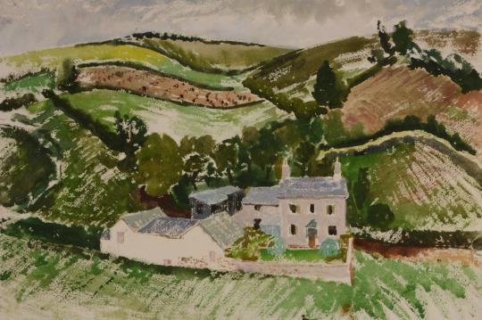
Clifford Ellis – The Farm, 1945, from my collection.
Rosemary’s father served in WW1 in France and Italy. Having survived this conflict he died of Spanish Flu in 1919 and so Rosemary and her siblings moved in with her mother’s parents in their large house at Netley Marsh in the New Forest. In this environment she developed a love of the forest and its animals. Some time later, the family moved to London.
Rosemary went to study art at the Regent Street Polytechnic in 1928. It was here that she met her future husband Clifford Ellis who was her tutor at the Polytechnic.
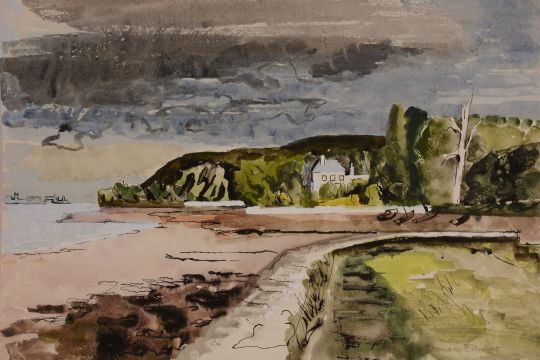
Rosemary Ellis – View of Holcombe from Dawlish, 1945, from my collection.
Clifford and Rosemary Ellis were at once husband and wife and an artistic partnership. Their collaboration began in 1931, the year of their marriage, and subsequently almost all their published freelance work is signed jointly. By the time the New Naturalist jackets were designed they had taken to using the cipher C&RE to express their joint authorship. Such consistent use of a joint cipher is unusual, and needs a little explanation. The initials were put in alphabetical order, not out of any sense of seniority. †
The couple as artists and designers joined the ranks of Ben Nicholson, Eric Ravilious, Barnett Freedman and Edward Bawden as artists who could create both posters for advertising and book dust jackets. They would join many of these artists in working for Shell Mex and for London Transport on posters.
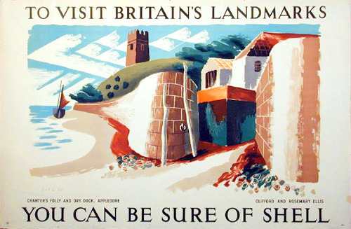
Clifford and Rosemary Ellise – Appledore – ‘Shell Landmark’ Series No. 491
Work that would welcome further investigation includes posters by Barnett Freeman, Edward Bawden, Richard Guyatt and Clifford and Rosemary Ellis. Another area that was constrained from further investigation by lack of space was the way in which Beddington provided opportunities for women to produce art for commercial use. Women artists were given very little press attention in the 1930s and, although artists such as Barbara Hepworth were active exhibitors, critics rarely reviewed their shows. Apart from Vanessa Bell, six other women artists produced posters for Shell, including Pamela Drew, Eve Kirk, Cathleen Mann and Margaret Brynhild Parker. The reason for the prominence of women in poster design is a potentially interesting area of research that could illuminate issues of female participation in the arts, gender prejudice, and education in the 1930s. ‡
By the time of WW2 Clifford Ellis was the headmaster of the Bath School of Art. He then served as a camouflage artist and official war artist with Grenadier Guards during Second World War.
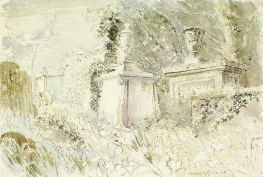
Rosemary Ellis – Tombstones, Bathampton Cemetery, Bath for Recording Britain, 1943, V&A.
Rosemary too was a official war artist working on the Recording Britain project with Clifford. Above is a beautiful view of a graveyard in Bath. It is one of the most gothic and romantic works she produced and looks more like a John Piper study. The painting above ‘View of Holcombe from Dawlish’ also has elements of John Piper in it: the loosely constructed house, the abstract boat off the shore and the dark sky.
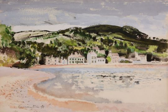
Rosemary Ellis – Teignmouth Bay, 1945, from my collection.
The couple would also be selected as artists for the Lyon’s Lithograph series in 1947. The aim was to produce large lithographs that could cheaply be bought by members of the public but also be displayed to brighten up the tearooms Lyons owned. The Ellis’s submission of Teignmouth was described as almost being a painting rather than a lithograph.
Between 1946 and 1955 the company commissioned three series of prints, some 40 in all, from most of the leading British artists of the day. The lithographs were not advertising per se (the Lyons name only appeared in small type at the bottom of each), but they were branding by association.
To help, he brought in the artist Barnett Freedman as the technical director. He had long experience as a lithographer and had been both an official war artist and a teacher at the Royal College of Art. ♠
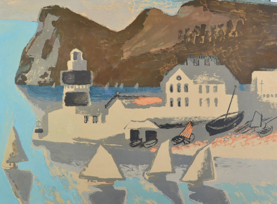
R&CE – Teignmouth From the Lyons Lithographs First Series 1947.
The painting of Teignmouth Bay from 1945 would have been a study around the time of the Lyons lithograph above but looking back and forth onto each other.
Teignmouth Painted by Clifford and Rosemary Ellis: For the lithographs worked up at Chromoworks from originals, (Barnett) Freedman’s input at the proofing stage was crucial. In response to his comments about the proof of Teignmouth, for example, (Frank) Oppenheimer noted at the printers that they would ‘try a light grey printing over the sails etc … alter the colour of the light brown high light in the hills in printing [and] … make the colour of the sky and sea slightly warmer. ♣
Rosemary Ellis worked with her husband Clifford to design over 60 of the dust jackets for the New Naturalist book series, after volume 71 the artist Robert Gillmor took over.
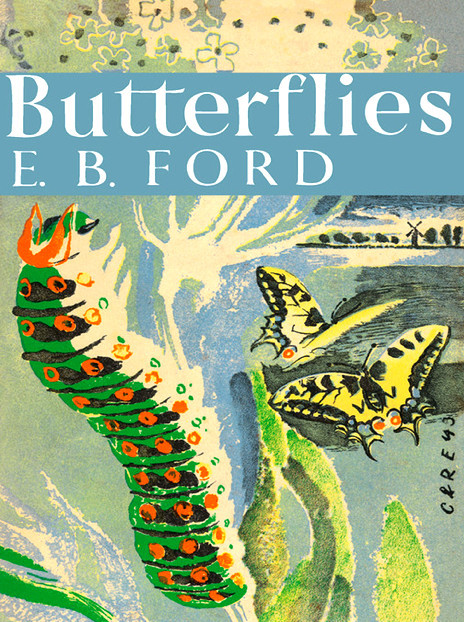
R&CE – Butterflies by E. B. Ford, Collins, 1945
Today these jackets are their best-known work, though book lovers may know some of their other jackets before and after the war, for the Collins Countryside series in the 1970s, or their design for John Betjeman’s Collins Guide to English Parish Churches. Within the art worked they are remembered more as innovative teachers, Clifford Ellis having run the Academy of Art at Corsham Court for a quarter of a century with his wife Rosemary as a leading member of the staff. †
The pair also designed two of the covers to the King Penguin Series.
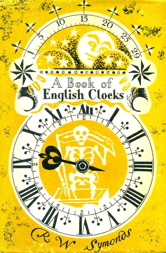
R&CE – A Book of English Clocks by R.W.Symonds, 1946, King Penguin Books.
The original idea for King Penguins came from the small Insel-Verlag books which were published in Germany before the war. Why, we felt, should there not be a similar series of books in this country? The experiment, started a few weeks after war broke out, turned out to be successful. One of the most distinctive features of this series is their decorative covers. ♦
The King Penguin series itself struggled to make money, because of the costs of colour printing, and it was cancelled in 1957. ♥
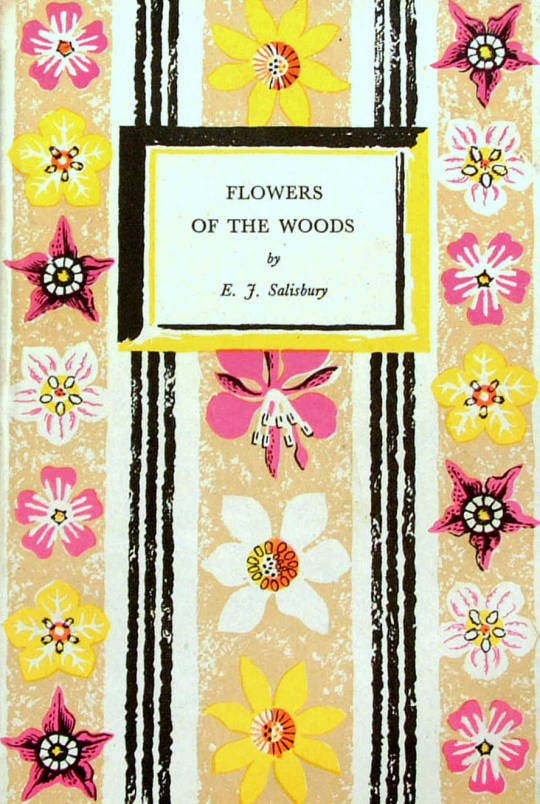
R&CE – Flowers of the Woods by E.J.Salisbury, 1947, King Penguin Books.
† Collecting the New Naturalists by Tim Bernhard and Timothy Loe, 2015.
‡ Shell’s England by Malcolm V. Speakman, 2014.
♠ Bawden and battenberg by Michael Prodger, The Guardian 12 July 2013.
♣ Tea and a Slice of Art: The Lyons Lithographs 1946-1955 by Charlie Batchelor.
♥ Reading Penguin: A Critical Anthology by William Wootten and George Donaldson, 2014.
♦ Pevsner: The BBC Years: Listening to the Visual Arts – Page 75
Recording Britain. Volume 4, Edited by Arnold Palmer, 1949.
Following my Post on the John Nash ‘Harvesting’ Schools Print I thought I would present another unravelling of prints from my collection of books.
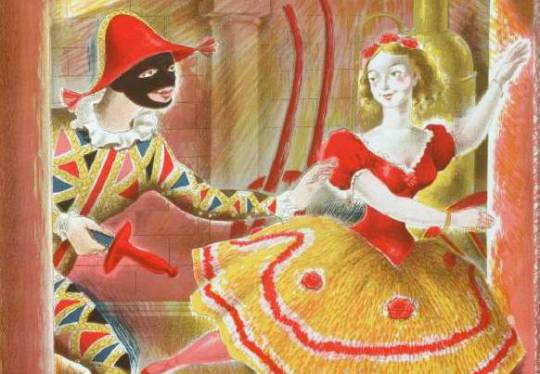
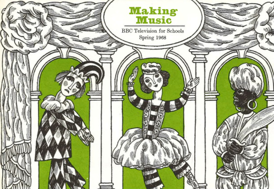
A detail of Harlequinade by Clarke Hutton, 1946.
Stanley Clarke Hutton was born in Stoke Newington, London, on 14 November 1898, son of Harold Clarke Hutton, a solicitor, and his wife Ethel, née Clark. In 1916 he became assistant stage designer at the Empire Theatre. About a decade later he took a trip to Italy, which inspired him to become a fine artist.
In 1927 he joined A.S. Hartrick’s lithography class at the Central School of Arts and Crafts in London, after Hartrick retired he taught the class himself until 1968. He experimented with the technique of auto-lithography with the aim of developing a way of printing affordable full-colour children’s books, and worked with Noel Carrington at Penguin Books to develop the Picture Puffin imprint. With Penguin he also illustrated Popular English Art by Noel Carrington, for King Penguin Books, in 1945.
He used the auto-lithography techniques he developed for the Oxford University Press’ Picture History series. Other notable publications where for The Folio Society. He illustrated about 50 books in all, for publishers in the UK and USA.
His paintings, figures and landscapes, were widely exhibited. His later work took on a surrealist influence. He died in Westminster in the second quarter of 1984.
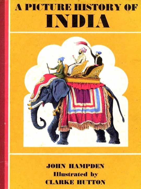
A Picture History of India by John Hampden – Oxford University Press, 1965
Illustrated by Clarke Hutton
It was his illustrations for Noel Streatfeild’s ‘Harlequinade’ that the link to the Schools Print lays. It’s remarkably similar. Most of the figures are all represented, the harlequin, the ballet dancer and the policeman in the corner. Again under the same street light the clown, dog and jester appear.
The book was published in 1943 and the Schools Print was produced in 1946. So rather like the case of the John Nash ‘Harvesting’ the Schools print is made from recycled earlier sketches and ideas, in my opinion, to great effect – these days it would be considered good marketing for the book.
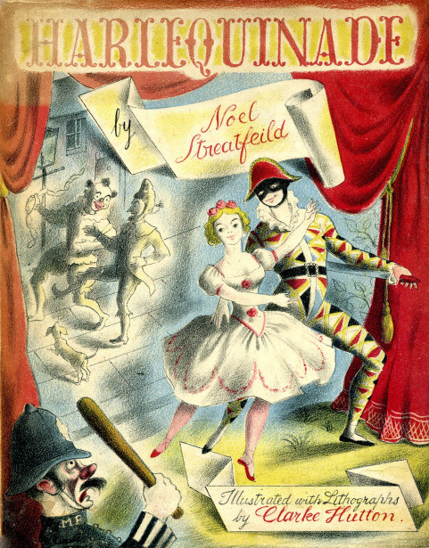
Noel Streatfield – Harlequinade. Chatto and Windus, 1943.
Illustrated by Clarke Hutton
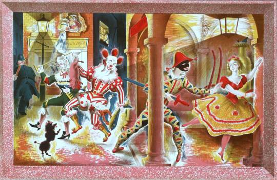
Clarke Hutton – Harlequinade – A Schools Print, 1946.
About The Schools Prints:
Set up in 1945 by Brenda Rawnsley, the School Prints scheme commissioned well-known artists to create lithographs, which would then be printed in large numbers and sold cheaply to schools for display in classrooms. The aim was to give ‘school children an understanding of contemporary art’. Each lithograph had a drawn frame so that the print could be pinned to the wall.
In the spirit of post-war optimism, artists responded enthusiastically. The scheme was a unique attempt at giving children access to original works of art in a period of austerity but ended in 1949 because of financial problems.
The King Penguin book series were beautifully printed books. To me, they were like the Ladybird Books for adults, covering a wide range of unconnected topics and monographs.
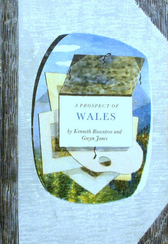
A Prospect of Wales, illustrated by Kenneth Rowntree, 1948.
The motive for Penguin Books was to broaden its appeal to the public. While still a young company, Penguin shocked the Publishing world with paperback books for sale by known and respected authors. Before that the idea of paperback fiction was to expect an unknown author and a throw-away after use book.
The original run of penguin books were black and white inside and mostly text, with the iconic two stripe colour banding. The colour schemes included: orange and white for general fiction, green and white for crime fiction, cerise and white for travel and adventure, dark blue and white for biographies, yellow and white for miscellaneous, red and white for drama; and the rarer purple and white for essays and belles lettres and grey and white for world affairs.
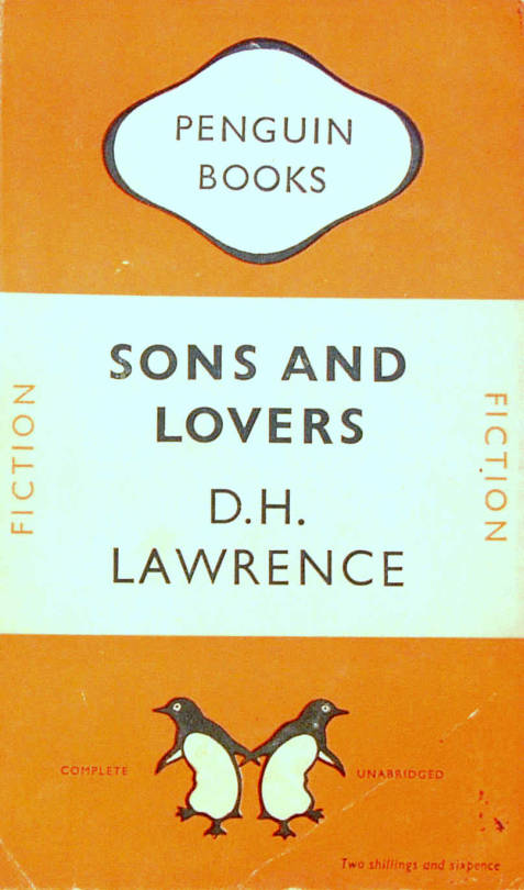
D.H.Lawrence – Sons and Lovers, 1948. Original Penguin Book cover.
They were an British knock off of the Insel-Bücherei (Island Library) series published in Germany by Insel Verlag from 1912 onwards. The size of the German books with their repeated pattern book coverings was an inspiration. The head of Penguin books is quoted:
“Why, we felt, should there not be a similar series of books in this country? The experiment, started a few weeks after war broke out, turned out to be successful. One of the most distinctive features of this series is their decorative covers.” †
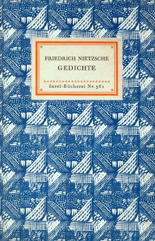
Friedrich Nietzsche – Poems. Insel Bucherei
“The aim of the King Penguin is different. These have not been planned to coincide with the public’s growing appreciation of art, but rather to appeal to the general liking for illustrated keepsakes of special projects.” †
The King Penguin series were also hardback books with colour lithographic illustrations, a move away from paperback and monochrome books.
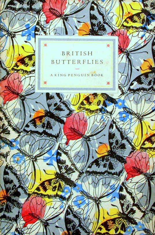
British Butterflies, cover by Paxton Chadwick, 1951.
The books originally combined a classic series of colour plates with an authoritative text. The first two volumes featured sixteen plates from John Gould’s ‘The Birds of Great Britain’ (1873) with historical introduction and commentary on each plate by Phyllis Barclay-Smith, and sixteen plates from Redouté’s Roses (1817–24) with historical introduction and commentary by John Ramsbottom. The third volume began the alternative practice of colour plates from a variety of sources. There were 76 volumes of King Penguin books in total.
Where as the educated scholars writing the books were the famous people at the time, today most people hunt for the illustrators, like John Piper, Edward Bawden, Hutton Clarke, Barbara Jones and Enid Marx.
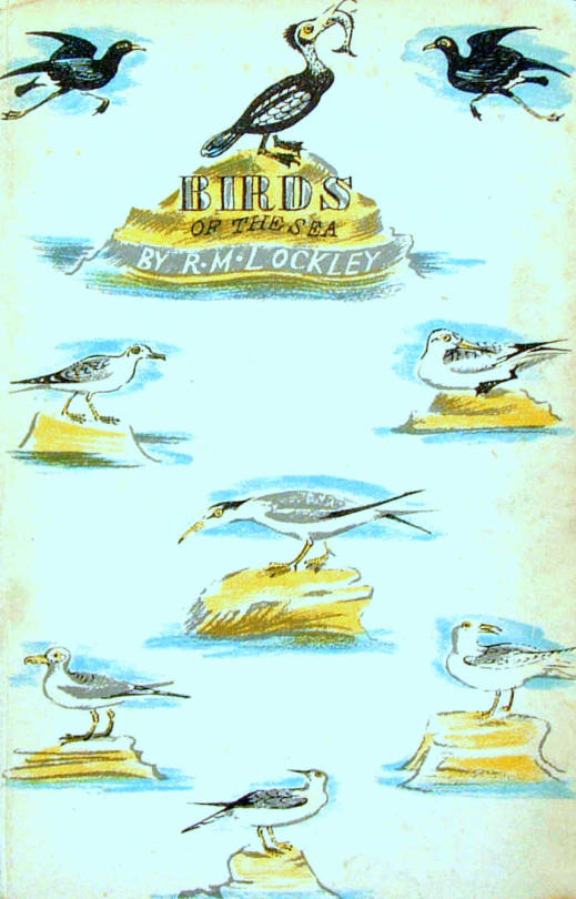
Birds of the Sea, cover designed by Enid Marx, 1945.
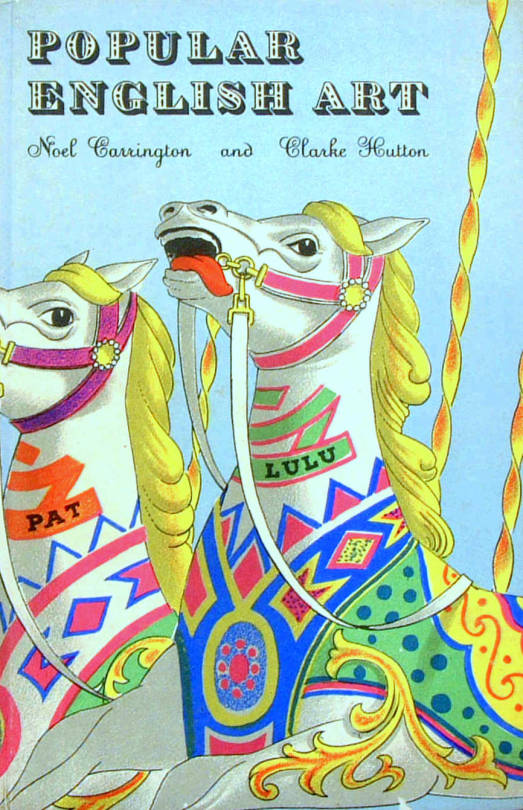
Popular English Art, illustrated by Clarke Hutton, 1945.
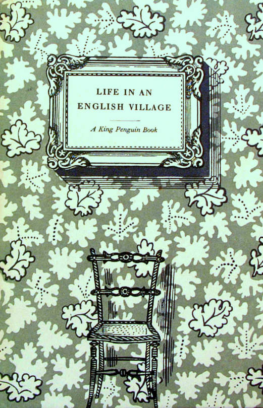
Life in an English Village, illustrated by Edward Bawden, 1949.
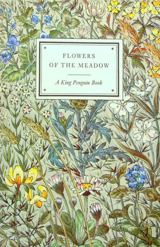
Flowers of the Meadow, Illustrated by Robin Tanner, 1950.
† The Private Library p143, 1977