Gwen Raverat, the granddaughter of Charles Darwin, was an English wood engraver and author. Born and raised in Cambridge, England, she studied art at the Slade School of Fine Art in 1908 and studied under Frederick Brown and Henry Tonks.
She was inspired by Thomas Bewick’s wood engravings but the Slade at that time gave no opportunities to study wood engraving. When she left the Slade she went to Paris to the Sorbonne where she met and married Jacques Pierre Raverat, a fellow student and draughtsman.
She had some luck to obtain some instruction from her cousin Eleanor Monsell – Mrs Bernard Darwin – who had begun to cut and engrave wood blocks as early as 1898 but soon desisted owing to the pressure of other work. By 1914 Gwendolen Raverat had nearly sixty blocks to her credit. †
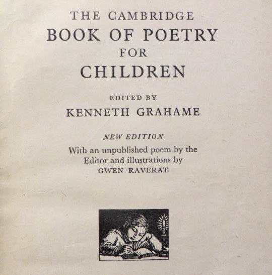
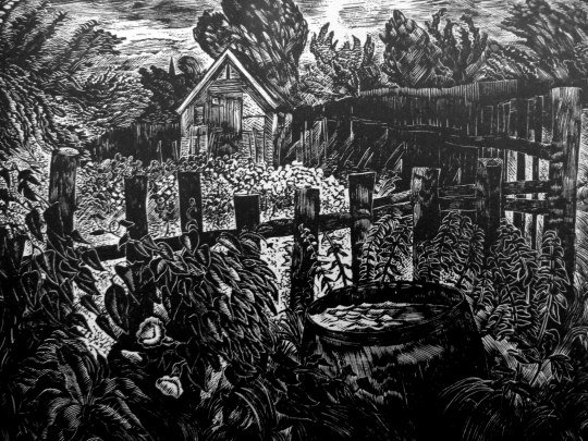
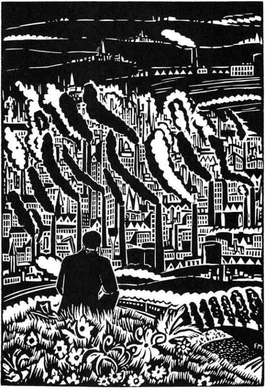
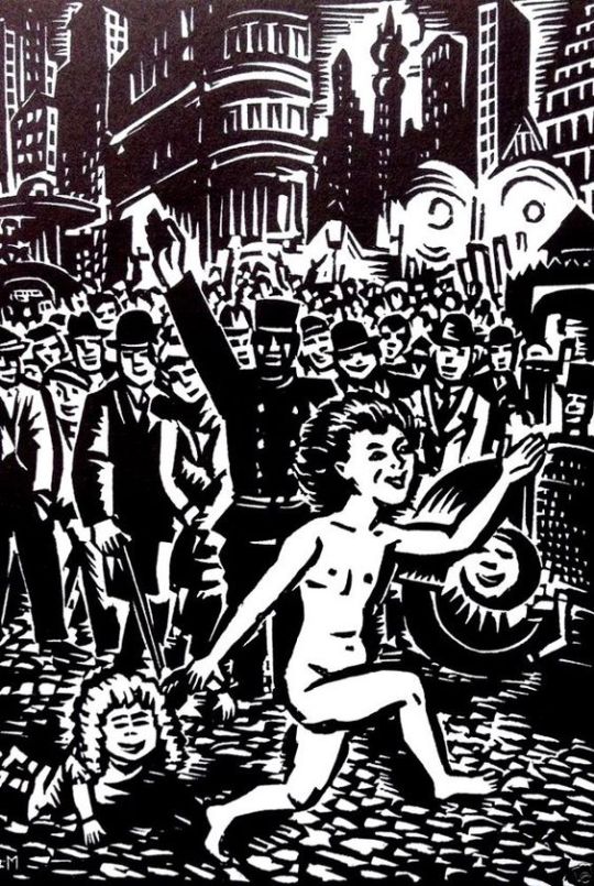
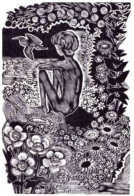
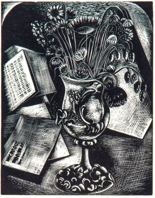
She was one of the founding members of the Society of Wood Engravers in 1920, alongside: Philip Hagreen, Robert Gibbings, Lucien Pissaro, and Eric Gill. The book below is a nice collection of styles of Raverat’s work, but it’s not her best work. It is a quaint throwback to when children would read a book of poetry.
The Cambridge Book of Poetry for Children, edited by Kenneth Grahame with 54 wood-engravings by Raverat, was published in 1932, printed from the original blocks.
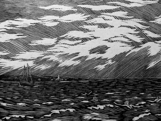
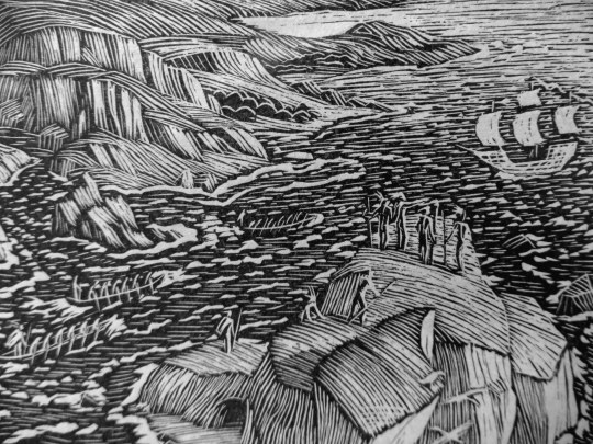
Book cover and Boy Reading wood engraving.
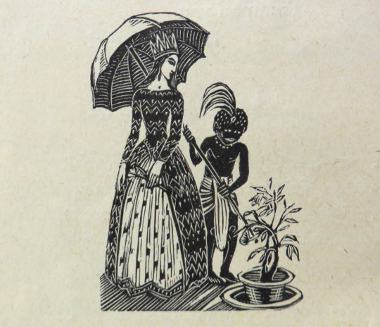
The King of Spain’s Daughter.
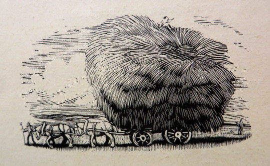
The Wagon of Hay.
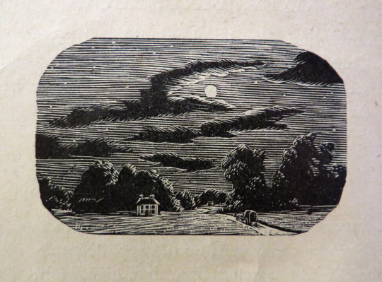
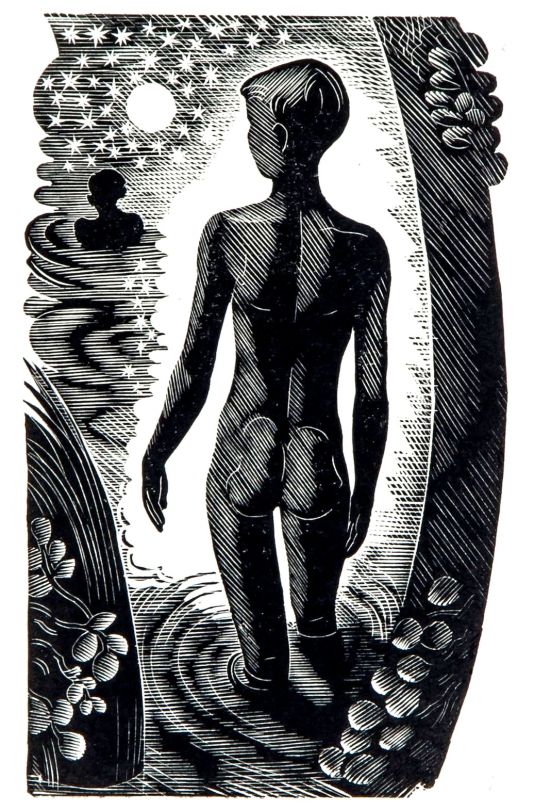
The Moon.
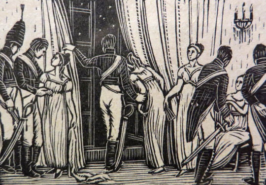
The Eve of Waterloo.
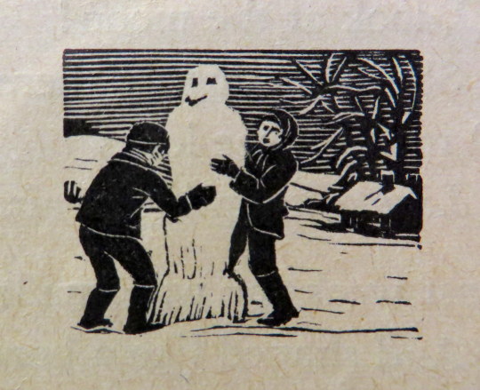
Winter Has Come.
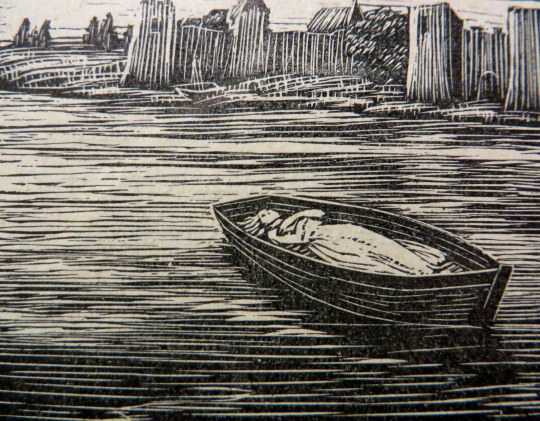
The Boat.
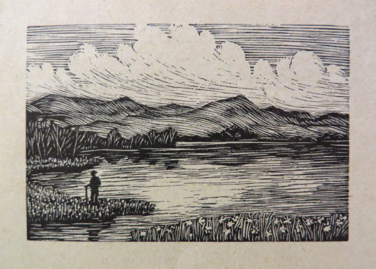
Daffodils.
The Forsaken Marman.
Columbus.
† English Wood-Engraving 1900-1950 by Thomas Balston, 1951
A History of British Wood Engraving by Albert Garrett, 1978.
The Cambridge Book of Poetry for Children, edited by Kenneth Grahame, 1932
John O’Connor A.R.C.A. R.W.S, is today best known for his woodcuts, but during his lifetime he was also celebrated as a watercolourist. He was educated between the wars at the Royal College of Art in London under John Nash and Edward Bawden.
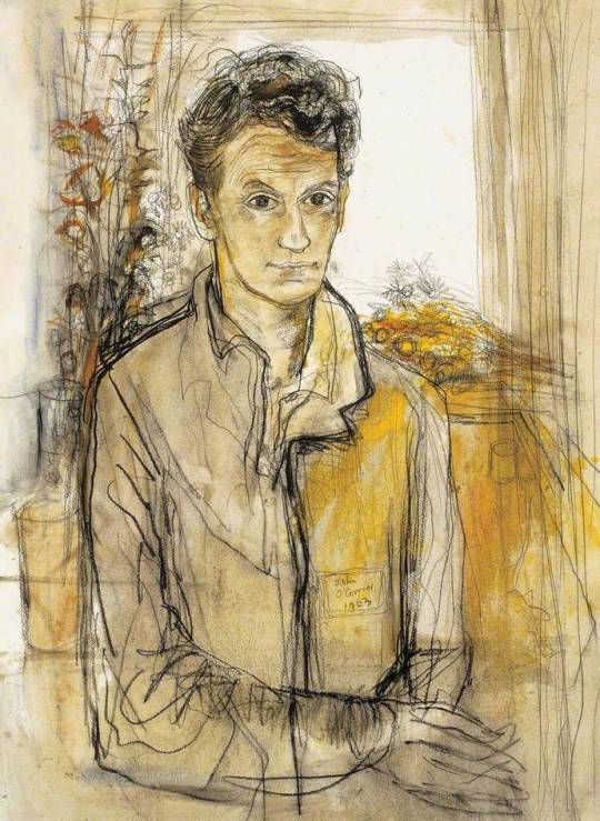
John O’Connor – Self Portrait, The Ruth Borchard Collection
A quote about Ravilious mentions O’Connor: Through his work and his teaching he became a very real influence both in design and wood engraving. One of his
students was John O’Connor. As an engraver O’Connor is an illustrator and very sensitive draughtsman. In style he is influenced by the Ravilious manner, with an emphasis on pattern and book design techniques. He has made a valuable contribution to book design through his technical experiments which include colour. O’Connor has
also brought wood engraving and other media together in the same work. These are essentially book designing experiments rather than experiments in engravings as such. †
John O’Connor was was born in Leicester in 1913. In 1930 he enrolled at Leicester College of Art before moving onto the Royal College of Art in 1933. His teachers at this time were Eric Ravilious, John Nash and Robert Austin. He graduated in 1937.
On a visit to Eric Ravilious’s home at Bank House, Castle Hedingham in Essex, O’Connor was captivated both by the directness of the wood-engraving technique, and by the simple domestic scene in which Ravilious engraved by a lamp in one corner of the room while his wife Tirzah played with their small son by the fire in another. It was due to Ravilious that O’Connor got his first commission of work aged 23, illustrating Here’s Flowers by Joan Rutter for the Golden Cockerel Press in 1937.
He taught at Birmingham and Bristol before serving in the Royal Air Force form 41-45. He arrived with the allied troops during the fall of Berlin, and sketched the ruined city. Back in England, but still in his flight lieutenant’s uniform, he met his future wife, Jeannie Tennant, who was a teacher, in Filey, North Yorkshire. They married in 1945, and spent their honeymoon cycling around the Yorkshire dales.
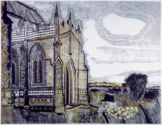
John O’Connor – Kersey Church, Suffolk
On being demobbed he illustrated two books for the Golden Cockerel Press and taught in Hastings for two years before moving to Colchester to become the head of the School of Art in 1948. He was affectionately known as ‘Joc’ to his students, using his initials. His colleagues included Richard Chopping, who designed dust jackets for the James Bond novels, his own former teacher John Nash, and Edward Bawden, one of the finest
British printmakers.
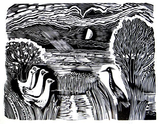
John O’Connor – Heron and Ducks
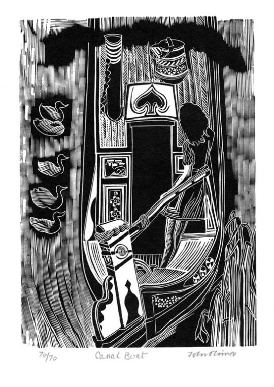
In 1950, O’Connor wrote and illustrated ’Canals, Barges and People’. The book had colour illustrations; wood-engravings by overprinting coloured linocuts. This was something of a revolution, as wood-engraving had till then been largely considered a black-and-white process.
The book also stood out as part of a Folk-art scene looking into the artistic past of Britain. Other writer/artists to be doing this would be Enid Marx, Barbara Jones and Noel Carrington. ’Canals, Barges and People’ was an immediate success, but only 1,000 copies were printed by Shenval Press and the colour made a reprint impractical and too expensive.
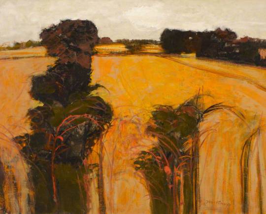
John O’Connor – Orange Field. Clare College, University of Cambridge
He saw his favourite painting places in Suffolk – the ponds, willows, briars and honeysuckle – disappear beneath the bulldozer and combine harvester. In 1964 O’Connor retired from teaching full time at Colchester, to concentrate on painting and engraving. He wrote various ‘How to’ books and taught part time at St Martin’s School of Art. In 1975 he and his wife, Jeannie, went to live by Loch Ken in Kirkcudbrightshire, where his love of light and water inspired his many watercolours and oil paintings. He took up a post teaching at Glasgow School of Art from 1977 to 1984.
John O’Connor – Chestwood Meadows, Lewisham Local History & Archives Centre
His engraving continued into yet another decade with the imaginative commission from Richard Ingrams for O’Connor to produce a monthly illustration for The Oldie magazine. These pieces – 36 of which were preserved in hard covers in People and Places – have all the sparkle and wit of the early work, and he only laid down his tools in 2001, a 65-year span which is surely unique.
John O’Connor’s last book of engravings, The Country Scene, a collection for the Whittington Press of his early and largely unknown work, was on the press when he died. As printing was about to begin, the instruction came from his hospital bed that colour was to be introduced wherever possible. Proofs were hurriedly made by his son, Mike, and taken to him, and delightedly approved days before his death.
John O’Connor – Little Garden in the Evening, 1947
In the 1950s and 60s, O’Connor exhibited at the Zwemmer Gallery, in London, and had many exhibitions throughout Britain. His work was purchased by the Arts Council, the Tate Gallery, the British Museum and the Contemporary Art Society, as well as by several local education authorities; it can also be found in the Oslo Museum, the Zurich Museum and at New York central library. He was elected to the Royal Society of Painter-Etchers and Engravers in 1947, and, in 1974, to the Royal Watercolour Society. He was an honorary member of the Society of Wood Engravers. He retired to Stable Cottage, Danevale, Castle Douglas.
He died March 5 2004
Bibliography 1937 – Here’s Flowers by Joan Rutter. Golden Cockerel Press
1945 – Together and Alone by Christopher Whitfield. Golden Cockerel Press
1946 – We Happy Few by Owen Rutter. Golden Cockerel Press
1950 – Canals, Barges and People by John O’Connor, reprinted 2014
1951 – An Essex Pie by T.M. Hope
1959 – A Pattern of People by John O’Connor
1967 – Landscape painting, reprinted 1977
1973 – Introducing relief printing
1971 – The Technique Of Wood Engraving 1979 – A View of Kilvert by John O’Connor. Foulis Archive Press
1989 – The Wood-engravings of John O’Connor
1990 – The Four Elements by Seamus Heaney. Whittington Press 1991 – Wood Engravings From La Vida Breve
1991 – Twins (Came with Matrix 11) by John O’Connor. Whittington Press.
1999 – People and Places by John O’Connor. Whittington Press.
2004 – The English Scene by John O’Connor. Whittington Press.
Selected list of Exhibitions 1954 Zwemmer Media Arts, London
1955 Royal Academy of Arts, London
1973 The Minories, Colchester
1976 The Minories, Colchester
1977 Graphic Work Retrospective, Glasgow School of Art
1990 Royal Watercolour Society, Bankside, London
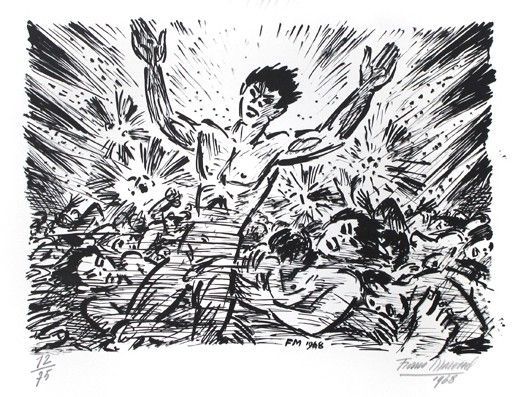
Frans Masereel is above all a thinker. His art expresses ideas. He uses it to render thoughts and emotions which modern humanity has aroused in him. He is thus an enemy of Art for Art’s sake, of pure aesthetics. It is not only Beauty he pursues, but Truth. And he is an individualist: he hates standardization of human beings, of human thought. This attitude towards life he has admirably defended in his series of eighty-three woodcuts called: The Idea, its Birth, its Life, and its Death.
From this standpoint too, from his love of truth and justice, he attacks profiteers, industrial magnates, and warmongers, and on the other hand defends the submerged, the under-dogs, the weak, and the poor. This allies him to a certain extent with such artists as Kaethe Kollwitz and George Grosz, two other champions of the victims of our civilization.
Masereel, however, is more universal than Kaethe Kollwitz, who laments the distress of the labourer, or George Grosz, who castigates the bourgeois and militarists of Germany. Masereel deals with types of all classes and all countries, paints all the sufferings of humanity, not their social distress only. Even technically his work is distinguished from theirs: it looks, strangely enough, much more modern, although he uses quite primitive and well-known means. Kaethe Kollwitz’s art always suggests the technique of the German impressionists, especially that of Slevogt. His conception of the world resembles that of the great Walt Whitman, who, like himself, was a citizen of the world, rather than the child of his nation.
Masereel possesses two other characteristics: an astounding memory for all his experiences and impressions, and indefatigable industry. His whole, rich life is reflected in the works of this Fleming who was born in 1889 in Blankenbergh, where he spent the happy days of his youth — ‘playing much and learning little,’ as he himself says. For a short time he studied at Ghent and subsequently went to Germany, England, Tunis, and Geneva, in which latter town he remained during the war. From Geneva he protested, full of sorrow and indignation, together with his friends Romain Rolland, P. J. Jouve and René Arcos, against that indescribable massacre of mankind, publishing daily in the Genevan paper, La Feuille, satirical and anti-militaristic drawings and woodcuts.
For some years now he has been settled in Paris, high up on Montmartre, whence from his studio table he can overlook the sea of Paris houses. There he works quietly, day by day, and records with unremitting assiduity his experiences. As a result of this industry he has, apart from numerous drawings, oil-paintings and water-colours, already more than 1300 woodcuts to his credit, and he is only in his thirty-ninth year. I know no one who gives such an impression of richness and effortless spontaneity as does Masereel.
This boundless wealth of ideas surprises one, particularly in a series of sixteen cuts which he calls Memories of Home. In this series he often groups seven or eight little scenes round the principal subject, which elaborate it and strengthen the significance of the whole. In each of these pictures there are such a mass of notes, of contrasts which mutually enhance each other, that one never scans the pages of the book without discovering new details, hitherto overlooked.
This simultaneity of presentation has a dynamic force which only the cinematographic film can rival. Many of his woodcut series, especially his picture-novels, have terrific ‘speed’, which makes us turn from page to page almost breathless. This proves the great influence the cinema to which, incidentally, Masereel is passionately devoted — has had on his art. Under its influence were created his picture-novels, such as The Idea, The Passion of a Man, The Sun, My Book of Hours.
These books consist of a series of cuts without any letterpress, and are perhaps the greatest, certainly the most original, of Masereel’s creations. Superficially, these series, which he himself calls ‘Novels in Pictures’, remind us, by reason of their simple technique, of the primitive block-books of the fifteenth century and of the ‘Dance of Death’ series so popular during the sixteenth. Actually, however, they are entirely different. Instead of treating some religious theme, they describe the tearing speed of modern life and the pleasures and sufferings of modern city dwellers.
The Book of Hours is the most beautiful, the most varied, the most richly contrasted of Masereel’s works. This book was inscribed as a motto with Walt Whitman’s words: ‘Behold! I do not give lectures, or a little charity; When I give, I give myself.’ The hero of this novel, who resembles Masereel like a brother, arrives in a big modern city and finds himself thus suddenly surrounded by its roaring traffic. A stranger, he perambulates the streets with an observing eye; amazed, he looks at the motions of the machines; frightened, he sees the gaunt factory buildings and their smoking chimneys. Very touchingly expressed is the pure sensual joy of his first love adventures. His naive love, however, is derided by prostitutes, and he seeks refuge in the silence of a church. Then he leaves the city, laden with sorrow, and travels far and wide. Full of experience, he returns and would help his fellow creatures.
They, however, are too dull to understand him. In a true Flemish manner, Masereel describes the hero’s reaction against this dis- appointment. These cuts are full of life and movement, and powerfully suggest the Film. The hero is now seen making fun of everything, raves about, and does what he can to shock the Philistines. The end of this novel shows us Masereel in a new light; for he often loves to leave brutal reality in order to soften things in the air of poetic imagination. So here: the hero of the Book of Hour: leaves his fellows, seeks the solitude of a wood, and dies alone. Now at last freed from his body he stamps upon his all too human heart that has brought him so much sorrow, and wanders free through the limitless space of the Universe.
The woodcuts of this Book of Hours are, like most of Masereel’s, in black and white, with large spaces. This gives them a kind of monumental power. But as this style is too circumscribed in its possibilities, and inclined to clumsiness, and invites, on account of its apparent easiness, cheap effects, Masereel combines it with a discreet play of white and black lines.
He, however, never makes the mistake of producing tone by complicated cross-hatching, which confuses the lines: with Masereel each line remains clearly visible and retains its own character. The masterly manner in which he is able to render the most varied emotions in spite of his simple and primitive technique can readily be seen in the examples here reproduced.
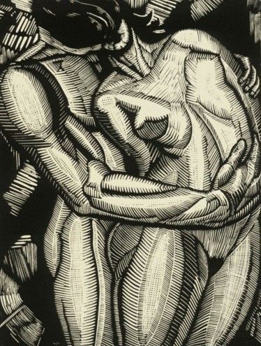
Amongst these ‘The Lovers’ is an excellent illustration of another quality of Masereel’s genius: the originality of his inventions. How many ‘lovers’ have we not seen since the woodcut was invented! No other woodcutter, however, has treated this hackneyed theme in a manner at once so original and so true. And Masereel, too, sees his pictures from ever-varying optical viewpoints.
A few words must here be added concerning Masereel’s book- illustrations. For technical reasons his woodcuts are generally not very suitable for this purpose. It is impossible to produce an absolute harmony between Masereel’s cuts and the letterpress, since even the blackest and heaviest type-face produces a grey surface; Masereel’s woodcuts, however, are never grey in effect: there is always a self-contained harmony of black and white masses.
The best results, typographically speaking, were obtained by Masereel himself, with the illustrations for Les Pâques à New York. In this book, which was set up under the artist’s strict direction, large black type was used — the letterpress widely spaced, and the type-face of the page empanelled with a thick black rule. In this manner a balance was achieved between the letterpress and the illustrations. In his Owlglass (Ulenspiegel, published by Kurt Wolff), too, the result was satisfactory because it was printed in old German Black-letter. None of these illustrations, however, belongs to Masereel’s masterpieces, because his personality is too strong to be forced into the mould of another’s.
It took a long time before the work of this great artist received the attention it deserves. Now, however, his fame is spreading. In Germany and France enormous editions of his picture-novels are sold out; in America the circle of his admirers is steadily growing; in Russia his woodcuts are seen on the Government poster hoardings. And now his name is mentioned in the same breath with Callot’s, Daumier’s, and Van Gogh’s.
By Edmund Bucher – From Volume II — The Woodcut: An Annual by Herbert Furst.
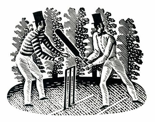
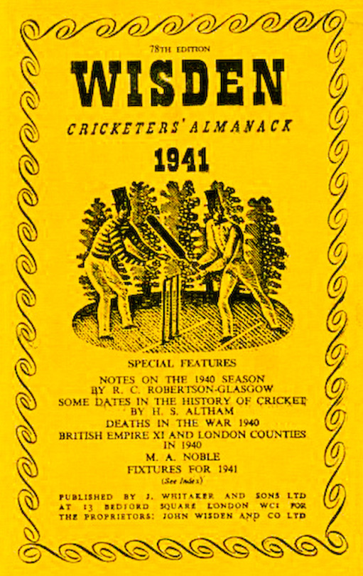
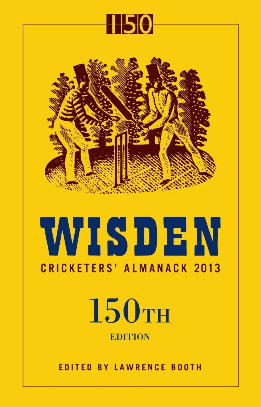
In 1938 typographer and spy, Robert Harling commissioned Eric Ravilious to produce an engraving for the Wisden Cricket Almanac. Harling knew Ravilious had a “special enthusiasm for the game” and wrote: “His engraving of mid-19th century batsman and wicket-keeper remains an ideal graphic introduction to one of England’s most durable publications.”
Over 75 covers have been published since 1938 with the Ravilious batsmen on the cover. The engraving briefly lost its cover-star status in 2003, when a photograph of Michael Vaughan relegated it to the spine of the book’s jacket, incurring the displeasure of traditionalists.
It was immediately restored to the cover in 2004, while staying on the spine as well. And so, for ten editions now, including this one, Ravilious’s creation has been more visible than ever.
Whatever the origin, we do know for certain that Ravilious played cricket, if at a lowly level. In 1935, he wrote of turning out for the Double Crown Club, a dining club for printers and book designers, against the village team at Castle Hedingham in Essex, where he lived for a while. He said the game went on “a bit too long for my liking and I began to get a little absent-minded in the deep field after tea”. He made one not out in defeat, and bowled a few overs. “It all felt like being back at school, especially the trestle tea with slabs of bread and butter, and that wicked-looking cheap cake.” He went on to record the comment of the Double Crown captain Francis Meynell that his bowling was “of erratic length, but promising, and that I should have been put on before. Think of the honour and glory there.”
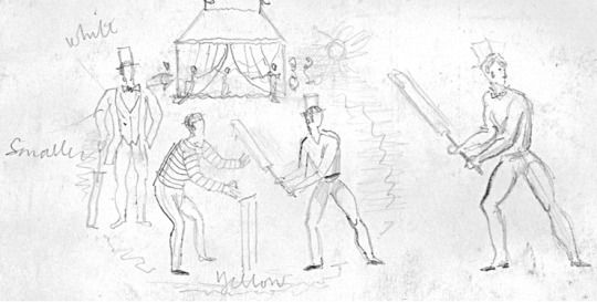
Sketch design by Ravilious for Wisden.
In another game at Castle Hedingham, with his wife Tirzah (a talented artist herself) “in charge of the strawberries and cream”, Ravilious talked of hitting three sixes. “It is, you might say, one of the pleasures of life, hitting a six.”
Ravilious saw only five of the Almanacks to carry his engraving. Yet his work — in many ways a distillation of Englishness — lives on.
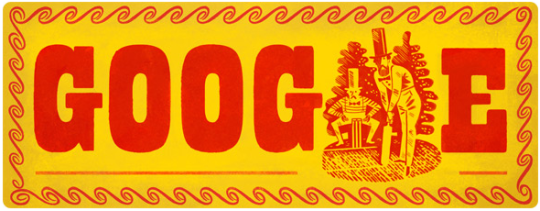
John Wisden’s 187th birthday by Google doodle – 5th September 2013.
PS: Before the second world war, Robert Harling taught at the Reimann School of Design in London, where one of his pupils was the young émigré Alex Kroll, later to join him as art director on House & Garden. A keen weekend sailor, Robert took part in the wartime evacuation of British forces at Dunkirk in May 1940, which he described in his book Amateur Sailor, published in 1944 under the pen name Nicholas Drew. The poet John Masefield praised the book as the best eyewitness account of Dunkirk ever written. Robert then joined the Royal Navy, first serving on mid-Atlantic convoy duty. Again, he gave a marvellous account of this experience in his atmospheric memoir The Steep Atlantick Stream (1946).
His friend Ian Fleming was responsible for Robert’s sudden transfer from anti-submarine warfare to the newly constituted Unit 17Z, given its name by Fleming himself and headed by Donald McLachlan. This small and, to Robert, highly congenial outfit, soon to be known as Fleming’s Secret Navy, was responsible for day-to-day liaison between the naval intelligence division and the British war propaganda teams.
Secret navy assignations, involving solitary missions to the US and the far and Middle East, appealed to the cloak-and-dagger instinct in Robert. The fastidious James Lees-Milne described him as “a rough diamond”. So, to some extent, he was. Wartime experiences cemented Robert and Fleming’s mutual admiration. Robert is depicted fondly in The Spy Who Loved Me as the make-up man on the Chelsea Clarion — “a man called Harling was quite a dab hand at getting the most out of the old-fashioned type faces that were all our steam-age jobbing printers in Pimlico had in stock.”
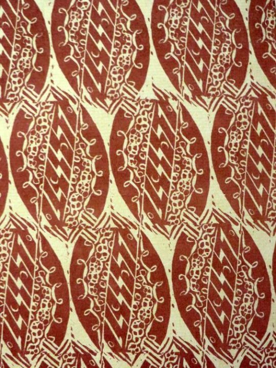
Woodcuts by John o’Connor Canal boat decoration is more sever and generally smaller in scale and form than that of the gypsy caravan. The shape of the boat itself, build for narrow bridges, tunnels, and wharves, denies excesses and frills.
Canal boats in the 1960s still used a formal pattern of décor, in the style of road transport vehicles, and the rose and castle of the water bucket now have a strangely insecure position on the shelves of some departmental stores, although a few are still to be seen on the canals. In brilliant green, scarlet, yellow, and pale blue, the landscape and flower pictures are painted in a tradition as rigid as a Gothic screen.
Black is used as a foil to white cord in ship-shape order. These decorations are as incongruous in the setting of an English landscape, hedgerow, weed, and dark water, as a flowered teapot at a picnic.
Cheap fairing pieces of china in the 1880s may be the direct source of inspiration for these designs. Recalling as they do the corded mantelpieces of a Victorian midland cottage.
From ‘The Saturday Book #22’ (1962) Edited by John Hadfield & The best of the Saturday book 1941–1975 (1981) Edited by John Hadfield
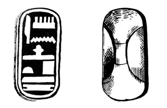
An essay from The Woodcut No.1 An Annual. In its beginning engraving had certain practical uses. One of these was the cutting of hieroglyphics on wooden stamps for the purpose of producing impressions on clay. The cuts were made both in intaglio and in relief. Blocks of this kind, for stamping bricks, where employed by the Egyptians and in Babylon. The accompanying illustration represents a wooden block found in a tomb at Thebes.
Considering these examples of an early method of printing, it is obvious that it was used in other directions, and the inference is that blocks were cut not only with a directly useful intention, as for impressing clay and similar substances, but with a decorative purpose in marking cloth. From the moment the simple craft flowed over from its utilitarian groove it assumed the nature of an art.
That is not to deny that the craft of cutting hieroglyphics may produce consummate art, but a skilled craftsman is not of necessity an artist. Therefore, I date the birth of the art of engraving on wood from the time the craft developed a consciously decorative purpose, and the first-fruits of this were probably in the nature of patterns marked by dyes upon cloth.
It was not until centuries later that the art took on a pictorial significance: even then, for many years after its application to books as an accompaniment to text, its decorative or pattern value was still its true importance. With the increase of skill, however, this quality began to diminish.
The discovery of chiaroscuro only hastened its disappearance, and once the conception of wood engraving as a means for reproducing drawings rather than creating prints was firmly rooted, the decorative value of woodcuts became a matter of accident, dependent, indeed, upon the nature of the drawing translated. Thus, although the art of engraving was already doomed, its spirit has perished long before its ultimate decay into a job for skilled mechanical hacks.
With the revival of wood engraving in recent times, artists have instinctively explored the decorative possibilities of the art. This is only natural in an age interested in the rediscovery of the fundamentals of aesthetics. The woodcut re-seen as an end in itself, and not a means to some other end, discovers itself as a very pure form of art, with its sculptural character, its simple expression in black and white, its direct technique and straightforward application. Of all the arts which are crafts it is the most autobiographical. Indeed, if one may account for the abuse of wood engraving for commercial reasons, it is still difficult to understand the neglect it has received as a means of self-expression. But there is always the dangerous seduction of skillfulness to be taken into account. Hitherto this has been a temptation mainly for the craftsman. To-day it is likely to prove the artist’s snare.
Block Print engraved by Doris Scull
Because, as an engraver, I fear such a danger invading the art I practise I have become lately more interested in woodcut patterns than in woodcut pictures. It is always a relief to be rid responsibility of representation. To concern oneself solely with the problem of formal relationships is to escape into a new world. Here one is in touch with pure reality, and the business of make-believe gives place to other considerations in many ways infinitely more satisfying. I would maintain this about all forms of plastic art, but I feel it to be acutely applicable to engraving on wood. Wood seams to yield to the evolution of an abstract design or a decorative arabesque as stone excites the sculptor to the creation of pure form. For it is the glyptic character of engraving on wood which is its peculiar charm, so that the more the engraver cuts into his block — I do not mean literally in point of depth, in the fractions of an inch — the greater his sense of contact with the reality of his expression.
Unfortunately, the scope of this article may not be extended to a consideration of abstract design as expressed in wood engraving, rather it mush be confined to a cursory examination of a few instances of pattern making by means of wood blocks as practised to-day in England.
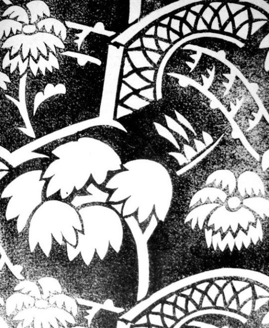
Design and cut on wood by Enid Marx for The Curwen Press
The artist who has worked most consistently and successfully in this direction is Miss Phyllis Barron, who for many years now has produced block-printed materials for dresses and furnishing, using a narrow range of carefully chosen and tested dyes of rather sober but subtle colours on linen, cotton, silk and velvet. Miss Barron, being a true artist as well as a crafts-woman, has created something very definite: in my opinion, as valuable as any contribution to contemporary art in this country. With her are working Miss Dorothy Larcher and Miss Enid Marx. The former is a design of equal ability with Miss Barron, with a personal invention distinguishing all her output. Miss Marx, in one sense, is hardly more than a recruit, but judging by her first efforts one may predict a most interesting future for her art. In the first place she is attempting in her patterns a three-dimensional design.
This is a expedient often resorted by the French with amusing results, but our own textile designers seem generally content with the flat arabesque. Miss Marx’s designs have the character of a fugue in music. Another quality which distinguishes them from the majority of textile designs is the peculiarly rigid movement of the units, which are not conceived in fluid waves or undulations, or as an efflorescence, but are more like the delicate architecture of birds, building with rather awkward shaped sticks.
Design and cut on wood by Eric Ravilious for The Curwen Press
It is difficult to proceed farther in discussing the making of patterns without confessing that they are not all cut on wood. Wood is rapidly becoming supplanted by linoleum, and there is no doubt the latter substance has many advantages for the hand block printer. It is quicker and easier to cut, easily replaced, and there is not the danger of warping, which the wood block so constantly presents. Its disadvantages is its unpleasant pulpy texture, which does not allow of fine engraving, and at the same time is a little too easy to cut. There is however, so much excellent work being done in this medium that is must be recognised here.
The most recent group of designers and engravers on linoleum for producing textile patterns is that established by the energy and resource of Mrs. Eric Kennington (nee Edith Celandine Cecil), in a workshop by the river at Hammersmith. The chief craftswoman here is Mrs. Gwen Pike, a most experienced and able engraver and printer. The works, known as Footprints, reproduce patterns by their own staff, and also designs contributed by independent artists.
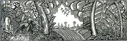
Finally, there remain to be considered two new fields of activity for the woodcutter. These are the making of wallpapers and papers for book covers by means of printed blocks, These has been recently a revival of interest in wallpapers, especially in Paris, Such distinguished artists as Madame Marie Laurencin and Monsieur Dufy have been in demand, and produced some charming designs. No doubt there are other artists who should be mentioned, but their omission is due to my ignorance, not my neglect.
Raoul Dufy — La Chasse (The Hunt) c1910
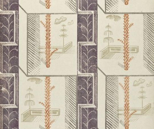
In England I am aware of only one designer who has turned his attention seriously to engraving wallpaper patterns. This is Edward Bawden, whose invention in this direction has produced papers of real distinction and originality. I need scarcely add that they have either been ignored or rejected by every manufacturer who has seen them.
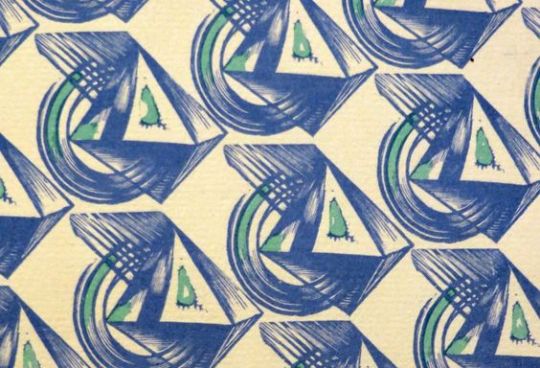
Node: Linocut. One of the four ‘Plaistow Wallpapers’ designs commissioned by Curwen Press in 1932
In the narrower field of book cover patterns designers are more fortunate, since there is not only greater demand for ‘original’ papers, but the cost of production is small. Also we have at least one or who enlightened Presses in this country, although our manufacturers remain benighted. Even so, the industry is minute.
Compared with the production of patterned papers on the Continent, more especially in Germany and Austria, the English output is confined to the work produced by the enterprise of the Curwen Press, which continues doggedly to give encouragement to the two or three artists interested in this branch of design. Alas” that is our trouble in England — the general lack of intelligent encouragement given to her artists for any form of activity, small or great, outside of picture-making.
In England we are still prone to cling rather sentimentally to the idea of the Fine Arts, and think it is a little undignified, or at least unusual, for artists to concern themselves with anything but painting and sculpture, with the result that, for the most part, such arts as interior decoration, stained-glass work, theatre décor and textile designing are left in the hands of the competent but uninspired. The British contribution to the Paris Decorative Arts Exhibition was a shocking enough reminder of this fact, and may serve, perhaps, for as good a reason as any why we should begin to consider patterns as important as pictures.
Paul Nash. 1927
Paul Nash: Woodcut — ‘Bouquet’, 1927
It is important to mention that the bold praise of the Curwen press was due to Paul Nash being the head printer there for some years, and this essay being printed by the Curwen Press in 1927. This is not to say there were not ahead of the other printers and designers, but it is always important to review essays with any bias that seeps in the ink.
Cecil Buller (1886–1973) was a Canadian artist most notable for her wood engravings.
She was born in Montreal and travelled north America, and at 16 years old travelled Europe, mostly England and France. In 1910 She moved to New York where she attended the Art Students League in New York where her wood engravings started to get noticed. Then in 1912 she travels to Paris again where she would have been exposed to Cubists movment that had gained momentum at that time, this inspired the form of her woodcuts in the 1920’s. She moved to London in 1916 to focus on graphic arts where she was educated under Noel Rooke, at the Central School of Art and Design. It was there that she met John Murphy, they married in 1917 and as an American he was able to move his new wife with him to Greenwich Village, New York in 1918.
She gained success in the 20’s and 30’s for her wood engravings and were exhibited. In 1924 her only son was born, in 1930 an essay on her work was published in The Print Collector’s Quarterly. In 1937 she separates from her husband. From then on she travelled widely to Egypt, Iran, Greese, Afghanistan, and back and forth to London and Paris. In 1973 she died of a stroke.
She was awarded the Pennel Prize, Library of Congress, D.C. (1945), the Audubon Society Award (1947 and 1953) and the National Academy of Design Graphic Art Award (1949).
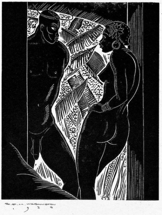
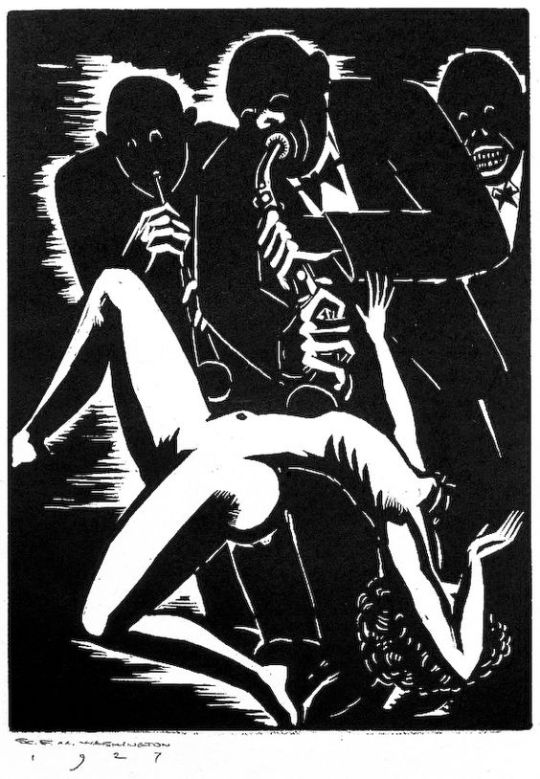
In 1998, woodcuts started to appear on ebay by Earl Mack Washington (1862–1952). For some time there was a lot of mystery about Washington, but the accepted view, now is that he was invented by Earl Marshawn Washington, whom he claimed was his great grandfather. Below is the original faked biography.
Earl M. Washington (1862–1952) was an African-American master wood-engraver and printer who between the early 1900s and the time of his death had amassed and printed from one of the largest collections of artists’ wood blocks in the United States. Washington’s career began at the age of 13, when he was apprenticed at a Southern printing shop. In 1880 Washington moved to New York, but encountered racial and social prejudice which barred him from employment at the larger printing shops in the city. Eventually finding a position in a small shop on the Lower East Side, Washington went on to perfect his skills as a master printer.
Washington’s collection of wood blocks began accidentally, with blocks collected from the fire-ravaged print shop of a fellow-carver and friend. As he continued his printing work, Washington’s circle of acquaintanceship widened, and he began to receive blocks from many different artists and publishers. These included the work of Hale Woodruff, (1900–1980) whom Washington met and befriended; Eric Gill, Lynd Ward, Rockwell Kent, M. C. Escher, Robert Gibbings, and others. Washington printed impressions for each of the wood engraved blocks in his collection, and in some instances, he used the designs of other artists to create new engraved blocks.
The woodblocks produced by Earl Marshawn Washington (born 1962) are now all viewed to be fakes of the masters mentioned above. It was estimated by September 2004 that as many as 60,000 prints had been sold, at prices ranging from $20 to a $350 and Washington himself has since admitted to “creating over 1700 wood engravings” with a team of assistants who he trained to cut woodblocks.
Many of the fakes where printed on old paper that, for a while, abated suspicion. Washington even tried to train his ex-girlfriend (who signed a statement against him) Terra Zavala to cut woodblocks. She also wrote that Earl admitted that he doesn’t even have a great-grandfather named Earl M. Washington.
With so many copies coming onto the market The M.C. Escher Co. found that Washington was forging the work of M. C. Escher and pressed eBay into promising that it would forbid listing of these. They filed a complaint of criminal fraud in California, as prints were being handled there by stripper Stacy Ortiz (who would later become Washington’s wife).
A criminal complaint was filed in Kalamazoo County, Michigan, by the owners of Prairie Home Antiques, who had purchased 82 prints from Washington for $1,640 on 17 June 2004.
Now many of the prints can be bought online for £5-£10. If you buy knowing they are fakes inspired by famous printers you can acquire some beautiful and talented work. But it is unlikely to return any value, other than the novelty of a good tale.