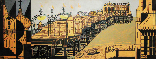
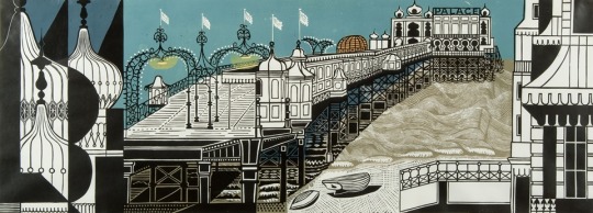
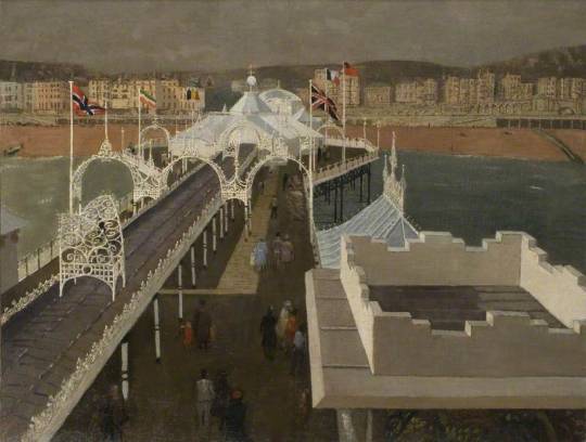
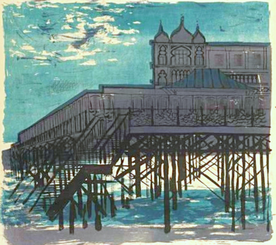
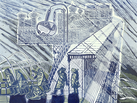
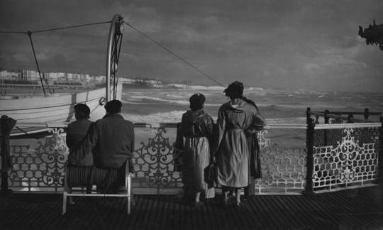
This post is not really connected in the typical way my articles are, but just points to a curious link between the Bardfield Artists being on Brighton Pier. I have also included a photograph by Edwin Smith – All of these artists are represented by the Fry Gallery in Saffron Walden.
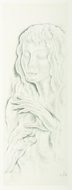
Eric Gill – Study for the ‘Blind Girl’ in silverline, dated 9/10/1938, oddly the night of Kristallnacht.
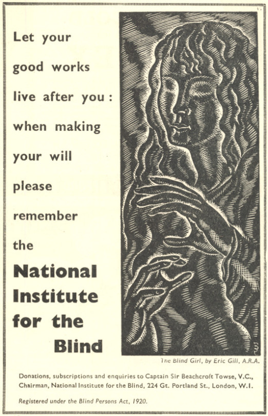
In the 1941 Summer copy of The Countryman I was reading is an advert for the National Institute for the Blind with an Eric Gill engraving. The wood-engraving was made in 1939 for the organisation and is called ‘Blind Girl‘.
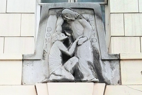
In 1934 Eric Gill carved a relief, in-situ, at Moorefields Eye Hospital, London. It depicts Christ and Bartimaeus, it is a beautiful example of Gill’s Carving on public display.
Mark 10:46-52. From the New Life Version of the Bible. Healing of the Blind Man
Then they came to the city of Jericho. When He was leaving the city with His followers and many people, a blind man was sitting by the road. He was asking people for food or money as they passed by. His name was Bartimaeus, the son of Timaeus. He heard that Jesus of Nazareth was passing by. He began to speak with a loud voice, saying, “Jesus, Son of David, take pity on me!” Many people spoke sharp words to the blind man telling him not to call out like that. But he spoke all the more. He said, “Son of David, take pity on me.” Jesus stopped and told them to call the blind man. They called to him and said, “Take hope! Stand up, He is calling for you!” As he jumped up, he threw off his coat and came to Jesus. Jesus said to him, “What do you want Me to do for you?” The blind man said to Him, “Lord, I want to see!” Jesus said, “Go! Your faith has healed you.” At once he could see and he followed Jesus down the road.
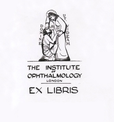
Below is a bookplate from the library of
Moorefields
Eye Hosptal Library using the design of the relief but unlikely to be by Gills hand..
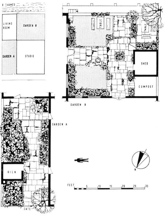
This was a post about the garden of artists Mary Fedden and Julian Trevelyan that is listed in the Architectural Press’s book ‘The New Small Garden’ by Marjory Gill and Susan Jellicoe in 1956. But it has grown into a history of Durham Wharf and the artists that surrounded it. The garden text is at the bottom of the post but I try to explain the history of this remarkable building that is currently being monstered by modern architects.
Durham Wharf
Durham Wharf is a set of sheds on a site overlooking the Thames between Hammersmith and Chiswick. In the 1920s they had been studios for Eric Kennington who used one for painting and sculpture and his wife Celandine Kennington used one as a printing factory for the ‘Footprints’ fabrics company she was sponsoring. Some of the artists for Footprints were Joyce Clissold, Elspeth Little, Gwen Pike, Doris Gregg and Paul Nash. So the Wharf’s history is rather remarkable.
Celandine colonised the buildings with Footprints, a hand-printing operation of fabrics, later run by Joyce Clissold (1905-82), which supplied two London shops, from 1925, with modern textiles and was one of the last design workshops to carry on a direct tradition from the Arts and Crafts revival. ‡
During the early 1930s, Julian Trevelyan moved into the studios with his first wife, the potter Ursula (Mommens) (nee Darwin), she was the sister of Robin Darwin who would employ Julian at the Royal College of Art in the 60s. Below is a description on how they found the wharf:
They came upon two derelict sheds beyond which, they could see, was a cinder yard which appeared to be full of junk. This unprepossessing property, Durham Wharf, casually encountered, became the home and workplace where Julian would live for the rest of his life. The ‘junk’ was lumps of stone, left behind by the artist Eric Kennington who had made sculptures in the main studio.
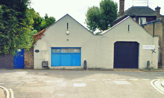
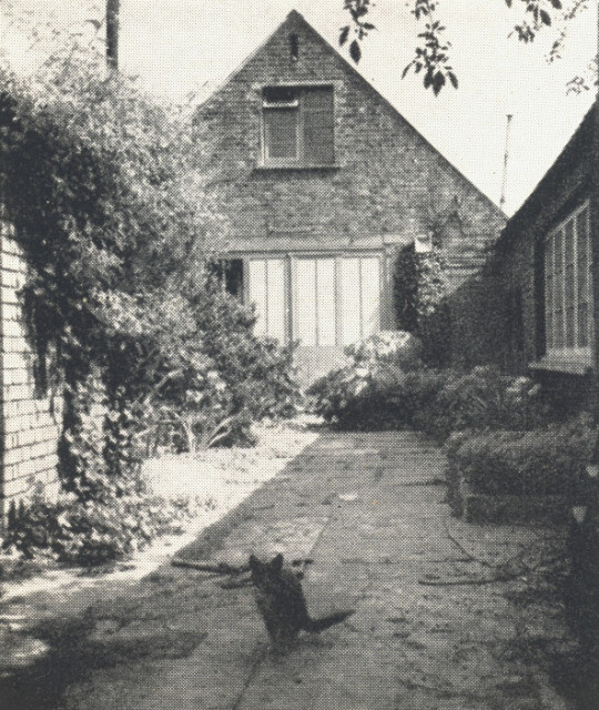
View of Durham Wharf from the Street with the front white facade. (2016)
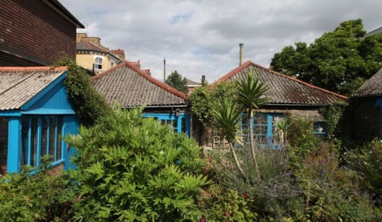
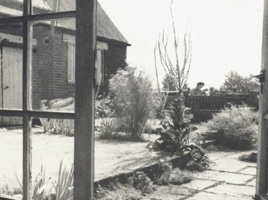
View of Durham Wharf from the garden. (2016)
Durham Wharf had originally been the depot where coal from the northeast was unloaded but after the 1920s when it had ceased being used for the unloading and distribution of coal, in more recent times it had served for as studios for various artists including Eric Kennington, the sculptor, and Len Lye, the experimental film-maker.
After taking out the lease on the Wharf, Julian and Ursula immediately enlisted their friend the architect Christopher Nicholson, the older brother of Ben Nicholson, and an early pioneer of the Modern Movement in architecture, to convert the buildings into living and working studios establishing a kiln for Ursula and studios for Julian to paint and do print making in. Living standards were basic at Durham Wharf but Julian decorated the Wharf with works had bought back from Paris by Picasso and Alexander Calder.
Durham Wharf became a centre of artistic creativity not only for Julian and Ursula but also for other artists who met and socialised there, the list of artists who visited Durham Wharf reads like a who’s who of Modern British Art. The annual boating parties Julian organised at the Wharf became celebrated occasions and it was at one of these parties that he was to meet the artist Mary Fedden who became his second wife. †
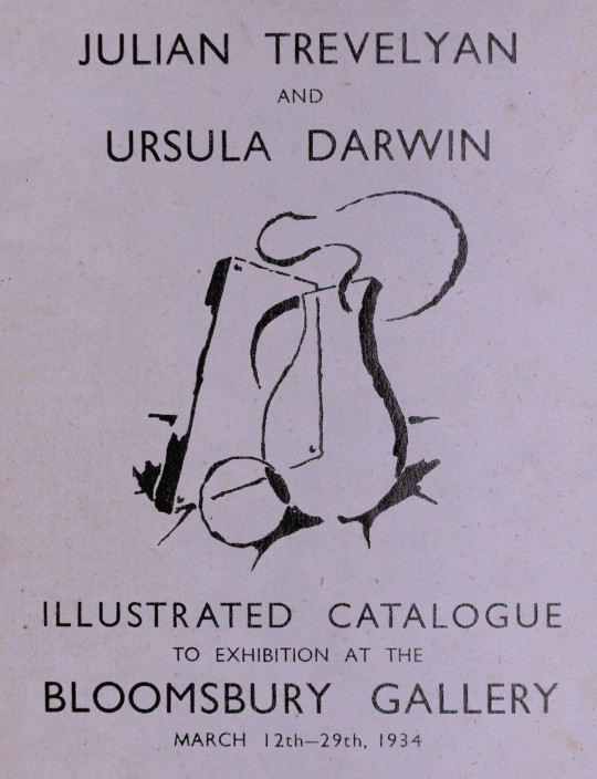
Before Julian and Ursula they were married shared an exhibition of his paintings and her pottery at the Bloomsbury Gallery in March, 1934. They married in the autumn.
The watercolours and gouaches were simple, direct depictions of their subjects. They were immediately successful and sold well in an exhibition at the Bloomsbury Gallery. ◊
Cover to the Exhibition Catalogue for the artists at the Bloomsbury Gallery
In 1935 Trevelyan bought Durham Wharf and Ursula moved in. The Wharf had a shop window facing the roadside but it was only accessible via the wooden gate at the side of the property, the couple set up a gallery in this space for themselves and their friends.
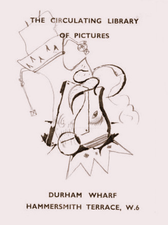
Almost immediately after settling into Durham Wharf, Julian and Ursula used an existing shop window to set up a ‘picture circulating library’. This was a part of the Wharf buildings where new pictures could be displayed and loaned to people who rang the doorbell and took a serious interest in the works. Potential purchasers were offered the chance to hang a picture on their walls, before deciding whether to buy it. This was a simple system based on trust, and many contemporary English artists (and some from Paris) sold pictures in the scheme. It was one of the many ways in which Julian endeavoured to help fellow artists. John Tunnard, Cecil Collins, Ceri Richards, Henry Moore, Victor Pasmore, Graham Sutherland and Ivon Hitchens were all involved at some stage. ○
A leaflet for the Picture Circulating Library at Durham Wharf. Using the design from the Bloomsbury Exhibition Catalogue cover and a doodled king on top.
The area was becoming fashionable for artist to live cheaply outside of central London. In the late 1920′s the area has its own artist community; ‘The Chiswick Group’, a set of artists in the area much at the same time as the Bloomsbury, Camden Town and Chelsea groups. Artists known to be in the group were painters William McCance, Raymond Coxon, William Coldstream, Nicola Counsell, Edna Ginesi, Eric and Celandine Kennington, Elizabeth Violet Polunin, and the list of Footprint artists above due to the studios location. The sculptor Gertrude Hermes was a member, as was the writer A.P. Herbert and his painter wife, Gwen Herbert.
The Chiswick Group was a conspiracy of talents outside the common hierarchy, inclusion was not conferred by privilege alone. ‡
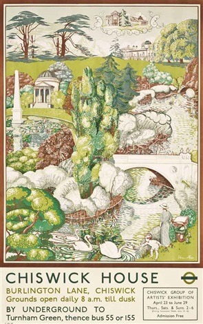
Vera Ross – Chiswick House, 1937 – An advert for the Chiswick Group can be seen in the bottom right corner.
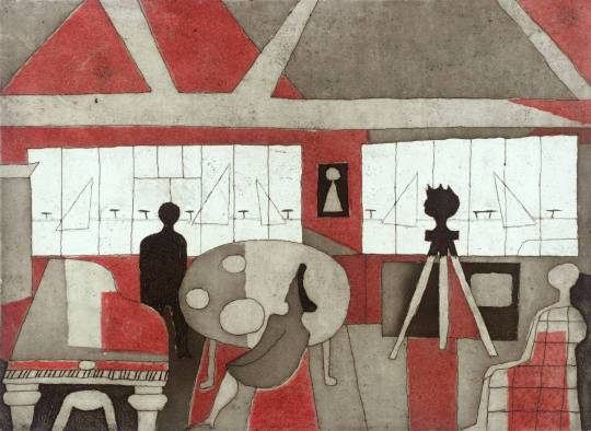
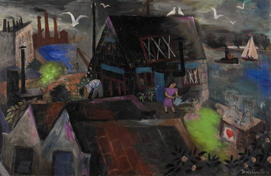
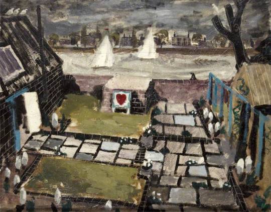
Durham Wharf itself provided a worthy subject for a series of paintings executed in the 1940s of which our Durham Wharf is one of the most striking. First worked on in 1940, Julian returned to complete the painting in 1943. Depicting himself and Ursula in the garden of the Wharf, it’s hard to conceive that it was painted in the middle of the Second World War. †
The painting referred to is below.
Julian Trevelyan – Durham Wharf, 1943
For the Trevelyans it (Durham Wharf) was home and studio, and the centre of a lively social life – the high point of which was their annual Boat Race party. All sorts of friends and acquaintances were invited to this “beer and buns” jamboree over the years. Dylan Thomas, Stanley Spencer, Cyril Connolly and A P Herbert all attended, and on another occasion Auden and Isherwood were given a send-off party on their way to China. ♠
At the Isherwood and Auden party were: E.M. Forster, Benjamin Britten. There was a fight with poet and writer Brian Howard and socialite Eddie Gathorne-Hardy. It must have been quite an evening:
It was estimated that between 200 and 300 people were crushed into Durham Wharf, and the event ended, Trevelyan recalled, ‘in a bit of a rough-house’. According to Britten’s elliptical diary, even before his party arrived at Durham Wharf there had been a ‘colossal row – on phone Christopher & me v. Rupert Doone’. This presumably concerned the forthcoming production of ‘On the Frontier’, which was to have taken place at the Cambridge Arts Theatre during the authors’ absence abroad, supervised by Britten and Spender, who were both now directors of the Group Theatre. Medley recalled that the two playwrights arrived at the Durham Wharf party:
Suitably late for a star entry, accompanied, as if on a state visit, by Prime Minister E. M. Forster; Secretary of State Cyril Connolly; and supported by the drunken halberdiers Brian Howard and Edward Gathome-Hardy. Predictably, these latter soon invaded the out-of-bounds bedroom and were discovered by Julian holding a private party on the bed. After a sharp exchange, during which Howard loudly proclaimed that he would not have his best friend, Eddie, insulted by the worst painter in London, Bob Wellington [the Group Theatre’s business manager] was called in to attempt an eviction, and was immediately challenged to a fight in the small courtyard, in the centre of which was a newly planted magnolia. This ridiculous combat, which I witnessed less as a referee than as a kind of policeman on behalf of the management, lasted but a few moments, as Bob’s Spectacles were knocked off his nose, and Eddie was too drunk to press his advantage.
This version of events (one of many), is disputed by Trevelyan’s second wife, Mary Fedden, who said that the principal fight (perhaps also one of many) was between Trevelyan and Connolly, who disliked each other. Unsatisfied by the drink on offer, Connolly ostentatiously produced a hip flask, which was subsequently handed round. When it reached Trevelyan, Connolly bellowed: ‘I’m not having that man drink my bloody whisky’. Trevelyan promptly knocked Connolly down, whereupon he was floored by one of Connolly’s friends. At the end of this altercation, several distinguished members of what the Sunday Times described as ‘London’s literary and artistic clans’ were to be seen ‘bleeding in the flowerbeds’. ‘Beastly crowed & unpleasant people’ Britten noted in his diary. ‘Christopher leaves in temper’. ♣
After ten years of marriage, Julian and Ursula would be in trouble and Julian would fall in love with Mary Fedden. Julian and Ursula had a son called Peter in this time but Julian divorced Ursula in 1950 and married Mary Fedden in 1951. Mary moved in and lived there long after Julian’s death in 1988. Fedden dying in 2012.
Julian Trevelyan – West Wind, 1983
In the 1960s the Shepherd’s wood-yard that was next door to Durham Wharf burnt down. Durham Wharf was unharmed but Trevelyan purchased the land and with architect Michael Partrick they developed a set of studio houses, finished in 1974. They were designed for artists to use and it is a condition for those who want to live there. The development was named St Peter’s Wharf. Noted occupants have been Hugh Cronyn, Prunella Clough, Bernard Myers and Barbara Brown. Artist Ben Johnson lives here and is chairman of the Trevelyan Arts Trust. ♥
The buildings are still standing today but are sold as artists studios only.
A Riverside Garden in Chiswick From ‘The New Small Garden’.
From a study of the plan alone, this garden would appear to be formal, but in reality, although the ‘bones‘ of the design are regular, the skilled placing of individual plants of character has given the narrow entrance garden and the outdoor-living garden an air of bohemian casualness. The artist owners, Julian Trevelyan and his wife, Mary Fedden, had two thoughts uppermost in their mind; to have a garden that would look after itself when they were away for long periods abroad, and a garden suited to sociable living. They were faced with the need for getting rid of a substantial quantity of surplus rubble and rubbish, and rather than meet the cost of having it carted away (always an expense in towns), they used it to create interesting changes of level. Much of it was used to make the raised platform in the corner, which gives a view down river and serves as a shady terrace for tables and benches. To vary the levels in a small garden is a happier solution for disposing of rocks and bricks than using them to make the all too familiar pseudo-rock garden. A rock garden, by its very nature, should be associated with an open landscape, and perhaps one of the secrets of good taste, as shown in this garden, is that the conception should be appropriate to the circumstances.
The grass plots and flower beds are all raised above the home-made, random rectangular paving, edged with old brick. It is a collector’s garden in the sense that most of the plants have been raised from seeds and cuttings gathered in other countries, from the gardens of friends or from the hedgerows. Full value is given to plants that have beautiful shape and foliage; it could be said, in fact. that the stately giant cow parsnip or the mullein with its towering candelabra of flowers, are treated almost like pieces of sculpture to give a sense of form and emphasis. An interesting comparison can be made between this garden and that of Barbara Jones. Both depend on appreciation of plant form, but whereas Miss Jones chooses to arrange her plants so that the shape and texture of one acts as a fell to others, Mr. Trevelyan is not so much concerned with the juxtaposition of plants as with an appreciation of the value of the form of the individual plant. Being artists with a cosmopolitan background, Mr. and Mrs. Trevelyan naturally enjoy good food and although they have no room for growing vegetables, full use has been made of the soil between the paving stones to grow many herbs.
The bold, branching flower stems and the finely cut foliage of the common fennel are not only a decoration in the garden and in the house, when cut, but are used in sauces or as a garnish. Mint, various thymes, basil, tarragon and chervil, a bush of sage and a clump of marjoram are all herbs that grow well in such a situation.
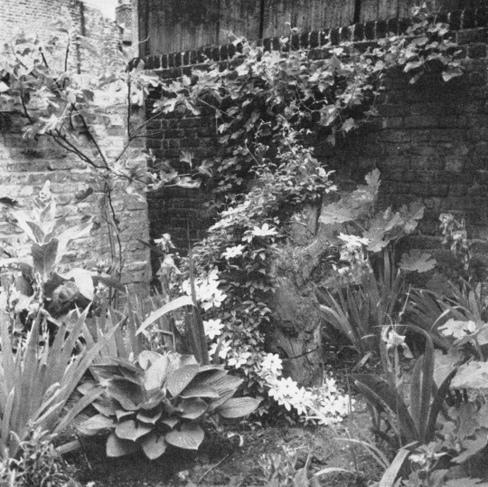
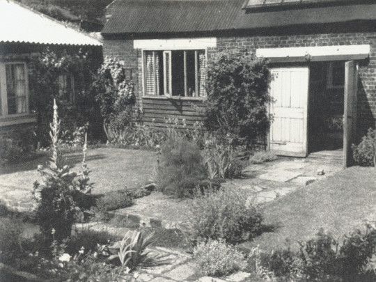
Both the entrance garden and the living garden depend largely on plants with restful grey-green leaves, such as the Cistus purpureus with its familiar Mediterranean scented foliage, plantain lily and the stately plume poppy, which likes to be planted in partial shade so that its leaves have shelter and the strong inflorescences can grow into the brighter light above. The grey-leaved Alyssum saxatile Sedum cauticolum with its blueish-grey waxy leaves, and other small plants billow out. informally over the paving. In the entrance garden a Clematis montana rubens throws its pink flowers over the kiln and can be enjoyed over the top of the six-foot wall by passers-by. On the boundary wall of the entrance garden a sweetwater vine grows freely and once produced thirty eight pounds of white grapes to make sixteen bottles of home made wine. Outdoor vines, if they are to fruit well, need a sunny aspect, adequate drainage and good fibrous loam to start them Oh“. As they are gross feeders it is well to fortify them with well-decayed farm-yard manure and coarse bone meal. A good substitute for farm-yard manure, which is by no means easy to get in towns, is well-rotted compost, and it will be noticed that Mr. Trevelyan has made provision for his compost heap in a corner of the outdoor-living garden.
The entrance garden. leading from the road to the living-room (A on plan) The plants on the right. mostly in shade, are herbs and other grey-green leafed plants, culminating in the dramatic group of grant cow parsnip.
Immediately to the left inside the gate is an essay in colour and texture, With a Clematis Nelly Moser; climbing over an old tree stump as the central feature.
A general View of the Inner garden (B on plan).
Julian Trevelyan – Durham Wharf, 1943
Trevelyan wrote of the wharf: “Here I put down my tap root: my life was measured by its tides and my dreams were peopled by its swans and seagulls.” One painting records the wharf as Trevelyan saw it in the 1940s: a patch of bright green against a still industrial background of smoking chimneys. ♦
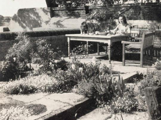
Lunch on the raised terrace overlooking the Thames.
Seen from the studio the mullein has the quality of sculpture. The fennel beside it sends up a fountain of feathery leaves.
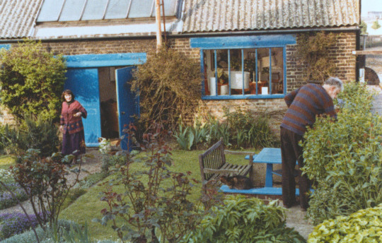
Mary and Julian in the garden.
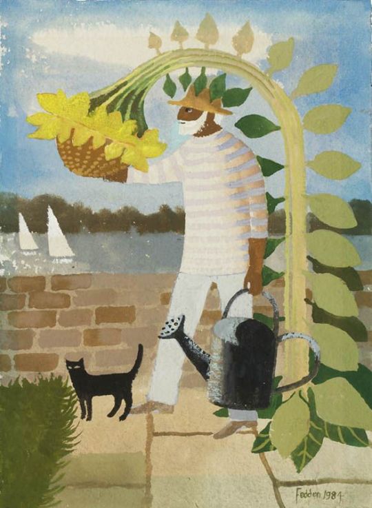
Mary Fedden – Julian and Sunflower, 1984
† Philip Trevelyan – Julian Trevelyan, Lund Humphries, Farnham, p143, 2013. ‡ Jane Hill – The Sculpture of Gertrude Hermes – p13-14, 2011 ♠ Andrew Lambirth – Julian Trevelyan and Mary Fedden, The Telegraph, 18 May 2013 ♣ Peter Parker – Isherwood, p371, 2005
♥ Panorama of the Thames website.
♦ Maev Kennedy – 5 September 2016
◊ Jose Manser – Mary Fedden and Julian Trevelyan, 2012.
○ Philip Trevelyan – Julian Trevelyan: Picture Language, 86-87, 2013
A short and simple post on four drawings by Edward Bawden around King’s Lynn. Originally drawn for the Sundour Diary and Notebook in 1953.
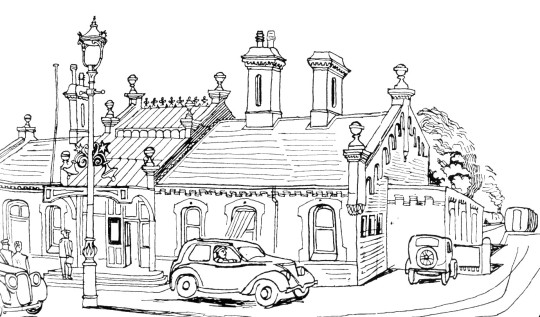
Edward Bawden – Country Railway Station, 1953
At the station. King’s Lynn would have been a change stop for trains heading to Hunstanton, then a vibrant a popular holiday town.
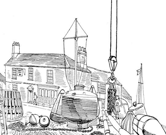
Edward Bawden – Seafarers’ Wharf, 1953
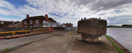
The buoy and pub as they are today. The dockyards now out of use, there are less buoys and anchors than in Bawden’s time.
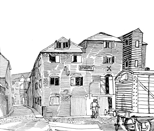
Edward Bawden – Ancient Warehouses, 1953
The old Bowkers warehouses, a late 18th century brick warehouse with 19th century alterations and a 1940s corn drying kiln. The warehouse was originally connected to the 15th, 17th and 18th century merchant’s house at 1 St Margaret’s Place. Most of the warehouse was demolished in 1974 and a magistrates court now stands on the site.
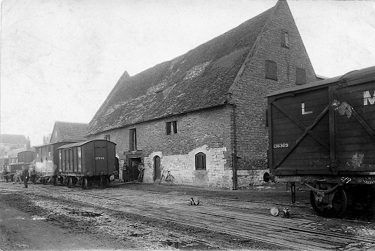
Below is a photograph further down the wharf with the railway carts in front on the quayside.
Marriott’s Warehouse, South Quay, King’s Lynn, c1920
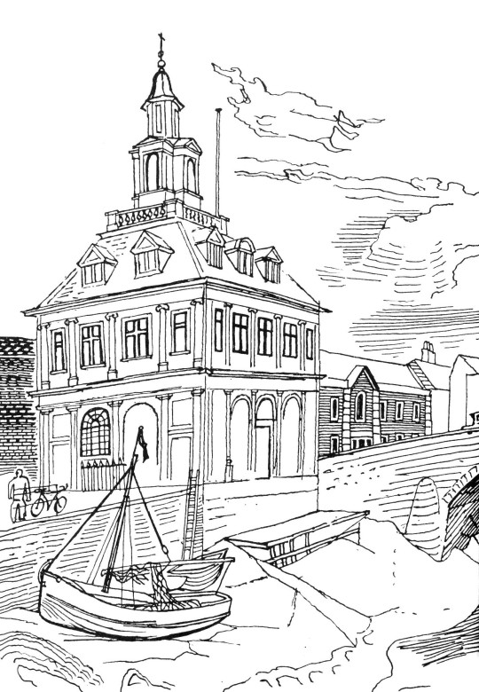
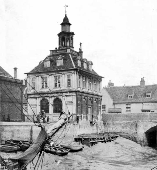
Below is a drawing of the Custom House in Kings Lynn. It was designed by architect Henry Bell and built by Sir John Turner in 1683. It now houses the town’s Tourist Information Office. The building was described by architect Nikolaus Pevsner as ‘one of the most perfect buildings ever built’.
It covers his painting history and also features him painting at Covehithe in Suffolk before his exhibition at the Tate.
John Egerton Christmas Piper CH (13 December 1903 – 28 June 1992) was an English painter, printmaker and designer of stained-glass windows and both opera and theatre sets. His work often focused on the British landscape, especially churches and monuments, and included tapestry designs, book jackets, screen-prints, photography, fabrics and ceramics. He was educated at Epsom College and trained at the Richmond School of Art, followed by the Royal College of Art in London. He turned from abstraction early in his career, concentrating on a more naturalistic but distinctive approach, but often worked in several different styles throughout his career. He was an official war artist in World War II and his war-time depictions of bomb damaged churches and landmarks, most notably those of Coventry Cathedral, made Piper a household name and led to his work being acquired by several public collections. Piper collaborated with many others, including the poets John Betjeman and Geoffrey Grigson on the Shell Guides, and with the potter Geoffrey Eastop and the artist Ben Nicholson.
Christopher Richard Wynne Nevinson was a fascinating man who in life and letters seems paranoid and jealous of the success of others, no matter how well he himself was doing. Many of his friends he drove away in one way or the other due to his incredible ability to take offence. In 1920, the critic Charles Lewis Hind wrote that:
‘It is something, at the age of thirty one, to be among the most discussed, most successful, most promising, most admired and most hated British artists.†
He studied at the Slade art school alongside Mark Gertler, Stanley Spencer, Paul Nash, Maxwell Gordon Lightfoot, John Currie, Edward Wadsworth, Rudolph Ihlee, Adrian Allinson and Dora Carrington.
His time at the Slade was unhappy, the tutor Henry Tonks hated his work, he and Gertler fell in love with Dora Carrington (as did most men it seems) and their strong friendship was shattered when Carrington started having intercourse with Gertler.
His work however was visual and strong and he was inspired by the Italian Futurists, Cubists and his work follows themes of the Vorticists, even though he was not a member of the group after irking Wyndham Lewis.
After a brief stint as a journalist he went back to art. At the outbreak of World War I, Nevinson joined the Friends’ Ambulance Unit and was deeply disturbed by his work tending wounded French soldiers in Flanders. For a very brief period he served as a volunteer ambulance driver before ill health forced his return to Britain. Subsequently, Nevinson volunteered for home service with the Royal Army Medical Corps. He used these experiences as the subject matter for a series of powerful paintings which used the machine aesthetic of Futurism and the influence of Cubism to great effect. His fellow artist Walter Sickert wrote at the time that Nevinson’s painting:
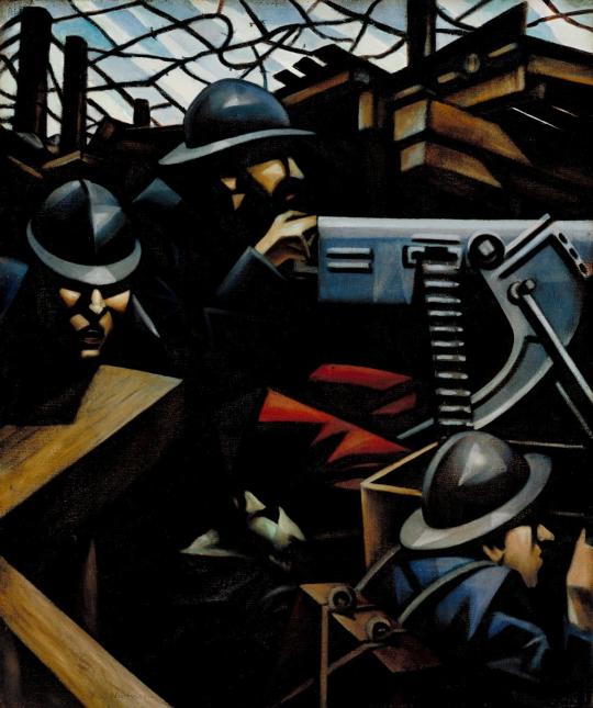
Mr Nevinson’s Mitrailleuse, which will probably remain the most authoritative and concentrated utterance on the war in the history of painting. This must be for the nation. ‡
In 1917, Nevinson was appointed an official war artist, but he was no longer finding Modernist styles adequate for describing the horrors of modern war, and he increasingly painted in a more realistic manner to the point that ’Paths Of Glory, 1917’ was censored from display.
The First World War was one were that artists embraced Printmaking due to the lack of materials at hand, it saw the medium rise up from trade and advertising to one of art. Nevinson’s prints of WW1 were lively, hellish and futuristic.
Nevinson’s printmaking is unique in a number of ways. He was virtually the only artist who was directly concerned with Modernism to use etching and mezzotint. Every other important artist in this regard turned to wood engraving, cutting, or lithography, perhaps to break away from the established traditional etchers with whom they did not wish to be associated. Nevinson actually only attempted two woodcuts.
During the years 1916-19, Nevinson was instrumental in establishing modern ideas in British printmaking, which should be seen in the context of Vorticism, and Nevinson’s own earlier painting. Another antecedent was Edward Wadsworth’s woodcuts. ♠
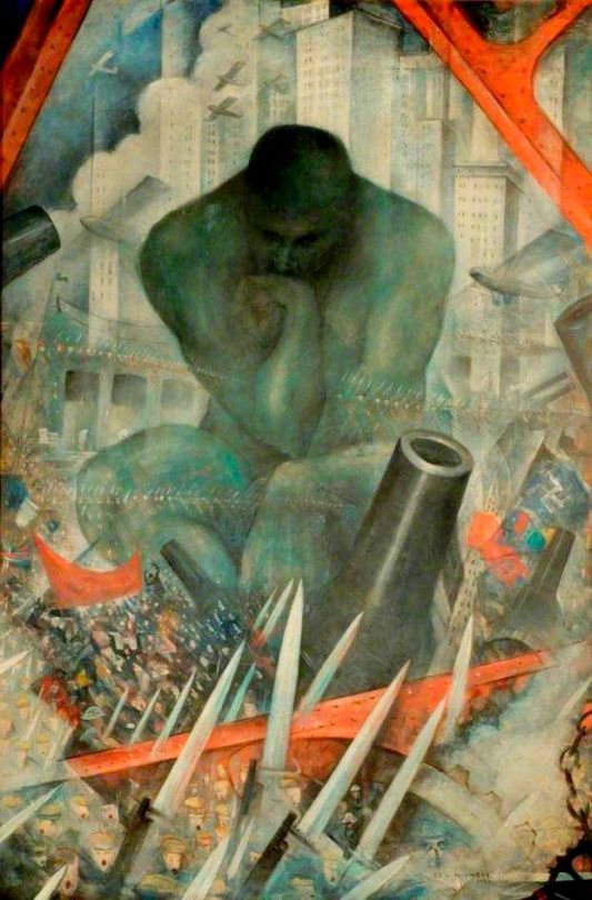
C.R.W Nevinson – The Spirit Of Progress, 1915
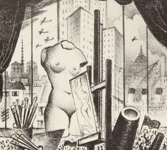
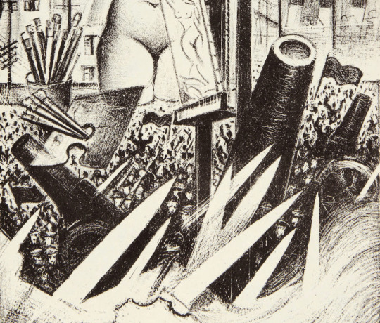
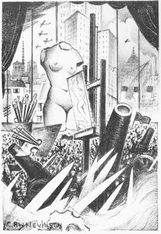
However, this post is about the lithograph by C.R.W.Nevinson made in 1933 called ‘The Spirit Of Progress’. It is an iconic yet strange picture, almost a greatest hits of Nevinson’s artworks of the previous twenty years.
The arrangement of ‘The Spirit Of Progress’ is one Nevinson would visit many times. In ’Twentieth Century’ the Thinker by Auguste Rodin is in the centre of a war and skyscraper combination of airplanes and weaponry.
C.R.W Nevinson – Twentieth Century
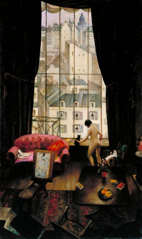
‘The Spirit Of Progress’ takes place on the seventh floor of the Paris studio of the author and journalist Sisley Huddleston, as seen in the painting ‘A Studio in Montparnasse’, with the windows, curtains from this setting.
C.R.W Nevinson – A Studio in Montparnasse, 1925
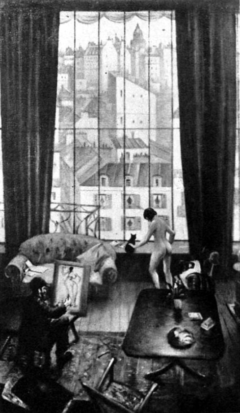
Curiously enough the painting ‘A Studio in Montparnasse’ was exhibited at Leicester Galleries in March 1926 as though it were finished but after the exhibition Nevinson repainted areas of it, adding a swagger to the curtains and removing the artist painting the nude. The original version is pictured below from The Sketch newspaper.
C.R.W Nevinson – A Studio in Montparnasse, from The Sketch, 3 March 1926
When Huddleston saw the painting he was outraged of the addition of the nude model. In ‘The Spirit Of Progress’ the painting of the model is kept but is replaced with a stone Aphrodite of Milos like figure. In the painting ‘Asters’ the model is shown as a small piece of sculpture on the artists desk, though a mirror image, a print is the reverse of how it is drawn. This also happened when Nevinson transcribed ‘Loading Timber, Southampton Docks’ into the print ‘Dock Workers Loading’ it is a mirror image of the painting, being drawing as a print, the same as the painting and reversed in the printing.
C.R.W Nevinson – Asters
As above – outside the window to the right are the funnels of an ocean-liner, the type that Nevinson painted below in 1916 with the cranes for the docks.
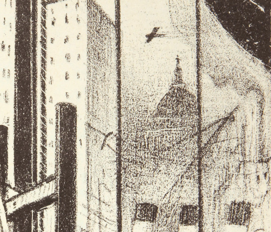
Above the ocean-liner in the mist is St Pauls, Nevinson painted the dome of St Paul’s Cathedral many times from different view points. Planes fly over head, not the Blitz yet, as ‘The Spirit Of Progress’ dates from 1933. It was the early days of aviation and airline travel and aircraft had been used in the World War One as Nevinson was sent up, Biggles style to draw the De Havilland D.H.2 planes in Dog Fights.
C.R.W Nevinson – City of London from Waterloo Bridge, 1934
C.R.W Nevinson – St Paul’s from the South
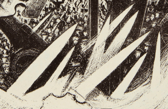
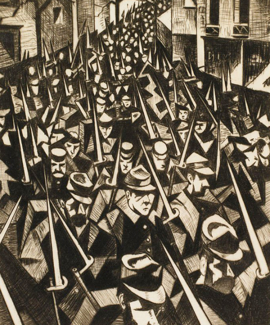
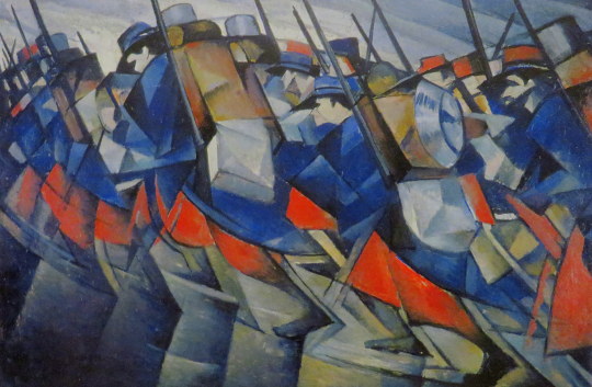
The Bayonets shown are found in many of Nevinson’s First World War pictures, below is an etching of French infantrymen matching though a town. As it is an early picture from the war it is more Futurist in style. The same can be said of ‘Returning to the trenches’, a painting of men marching off into the distance.
C.R.W Nevinson – A Dawn, 1914.
C.R.W Nevinson – Returning to the Trenches, 1914
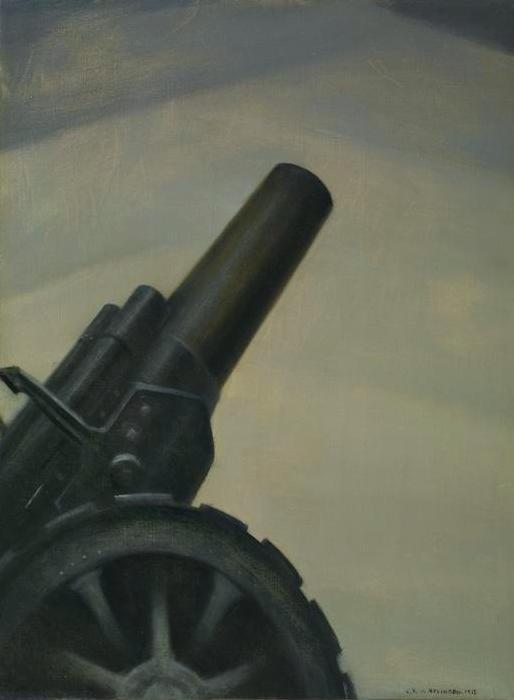
At the base of the the picture is a Howitzer Gun among the bayonet knives. Nevinson painted the gun on its own in a ‘A Howitzer Gun in Elevation’. A mechanical and rather Futuristic painting. The First World War being about the machines and not the humans operating them.
C.R.W Nevinson – A Howitzer Gun in Elevation, 1917
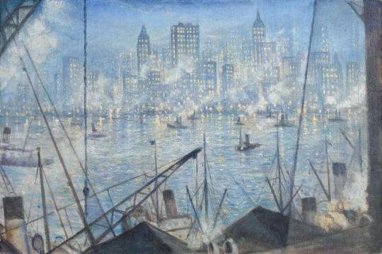
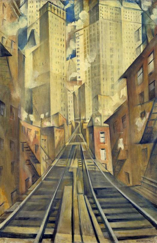
C.R.W Nevinson – New York, Night, 1920.
Nevinson was invited to New York in 1919 by David Keppel of the print publishers Frederick Keppel and Co, to exhibit his War prints. Manhattan’s architecture inspired him, not only by the sheer beauty of its sky-scrapers. ♣
It is interesting to see what then happened between the first and second exhibition in New York. When Nevinson first went to New York, it was as a war hero, a survivor and documenter of war in a bold new ‘futurist’ way. And the first exhibition was a success.
He was clearly captivated by the city, compared to the London of the 1920s it must have been something, the skyscrapers of the day in New York would have been the Woolworth Building (60 stories) and the Metropolitan Life Insurance Company Tower (50 stories), but most of the ‘skyscrapers’ of the early 1920s peaked around 30 stories tall. London didn’t start building above 20 stories until the 1960s. Nevinson is quoted below:
‘New York, being the Venice of this epoch, has triumphed, thanks to its engineers and architects, as successfully as the Venetians did in their time.. Where the Venetian drove stakes into his sandbanks to overcome nature, the American has pegged his city to the sky. No sight can be more exhilarating and beautiful than this triumph of man. ♥
His second exhibition was a series of paintings and etchings of New York that failed to capture the attention of the public. The press were kind but the works did not sell well and there is little reporting of the second exhibition in comparison to the first.
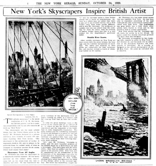
Below is an extract from the New York Herald, 24th October, 1920.
“Art,” says Mr. Nevinson, “triumphs in utility, and the most beautiful products of
the modern world are a Rolls-Royce car and a skyscraper. They have been built for strict utility; their lines are perfect and they must appeal to the genuine artist. New York will be remembered for its introduction of the architecture of the skyscraper long after its people have been forgotten for other things.” ◊
New York should like Mr. Nevinson and his work, for surely he Is her friend. No
native could ever idealize America’s greatest city more than this foreigner. ◊
C.R.W Nevinson – The Soul of the Soulless City,Previously known as New York – an Abstraction ,1920.
The poor reception of this exhibition may have accelerated Nevinson’s disaffection with the city. His growing embitterment is perhaps reflected by the change of title. Originally exhibited in 1920 at the Bourgeois Galleries, ‘New York, as New York – an Abstraction’, it was re-titled ‘The Soul of the Soulless City’ in the Faculty of Arts Exhibition, Grosvenor House, London, in 1925 probably at Nevinson’s instigation. ♦
‘The Spirit Of Progress’ has all the motifs mentioned above and of all my Nevinson prints is my favourite.
† M J. K. Walsh – A Dilemma of English Modernism, 2007 ‡ Walter Sickert – Burlington Magazine, The True Futurism – April – 1916 ♠ Robin Garton – British Printmakers 1855 – 1955, 1992 ♣ C.R.W. Nevinson 1889 – 1946 Retrospective Exhibition Of Paintings, Drawings And Prints: Kettle’s Yard Gallery 1988 ♥ David Cohen – C.R.W. Nevinson, The Twentieth Century, p46, 1999. ◊ New York Herald, 24th October, 1920. ♦ Tate, London, T07448.
John Brunsdon (1933-2014) studied at the Royal College of Art from 1955 to 1958. He was head of the printmaking department at St.Albans College of Art for sixteen years and later lived near Diss on the Suffolk/Norfolk border where he had his own print workshop.
Landscape was always John’s foremost influence, even when images were still abstract and influenced by American abstract expressionists such as Kline and Motherwell. He was fascinated by man’s mark on the landscape – the contrast between buildings and countryside: the one temporary the other timeless and primeval.
All of John’s work is individually hand etched, inked, coloured and printed. He took delight in the texture and decorative qualities of etched marks and the sweeping shapes of broad colour which fuse into timeless images.
He exhibited widely in the United States and Europe, and in New Zealand, Australia, Japan, and Canada, as well as participating in many one-man shows and group exhibitions in the UK. His work is represented in many major public collections, including the Tate Gallery, the British Council, Scottish Museum of Modern Art, the V & A, The Arts Council, the Museum of Modern Art New York. Brunsdon is widely considered one of Britain’s most distinguished printmakers.
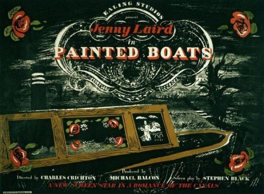
Ealing Studios have many wonderful films, but there was a period of time when they would hire fine-art artists to design promotional ephemera and posters.
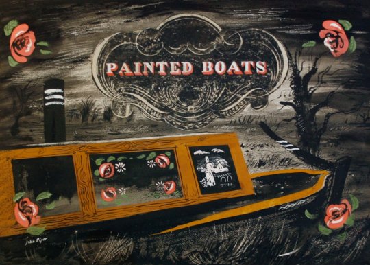
A good example is for the movie ‘Painted Boats’ from 1945. The artwork for the film was designed by John Piper. The painting of the Canal boat has a graphic device painted in by Piper, like the top of a decorative headstone.
The Movie Poster for Painted Boats, 1945.
The original painting for the film poster by John Piper.
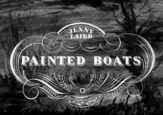
In the credit sequence of the film there is a stylised version of the graphic device used by John Piper – I am unsure if Ealing Studios gave him it to paint first, or if he painted it and they cleaned it up for the film. The backdrop to this maybe a pro-type painting used as the movies title sequence as the trees are not the same in the image above.
The posters for Ealing Studios films feature artwork by many of the era’s greatest artists including John Piper, Edward Bawden, Eric Ravilious, Edward Ardizzone and Mervyn Peake, while the acting talent is a roll-call of many of Britain’s greatest performers. †
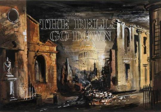
Even when commissioned, the studio didn’t always use the artwork by the artists, ‘The Bells Go Down’, 1942 was John Pipers first work with Ealing and although paid for his efforts, they didn’t use the artwork for the poster.
The Bells Go Down, 1942. Poster prototype design by John Piper.
Ealing’s advertising department was headed up by S. John Woods, who trained as an artist and graphic designer, before working in a variety of advertising roles, including a stint at Twentieth Century Fox in the 1930s. In 1943, he joined Ealing to help realise the vision of the studio’s chief publicist, Monja Danischewsky.
Unusually for a designer working in film advertising, Woods wasn’t afraid to bring politics into the equation. Throughout the 1930s he moved in artistic circles that included Ben Nicholson, Henry Moore and Barbara Hepworth, soaking up the energy and fervour of the interwar generation, cultivating a love of British abstract and surrealist art and actively contributing to exhibitions and articles challenging the established order.
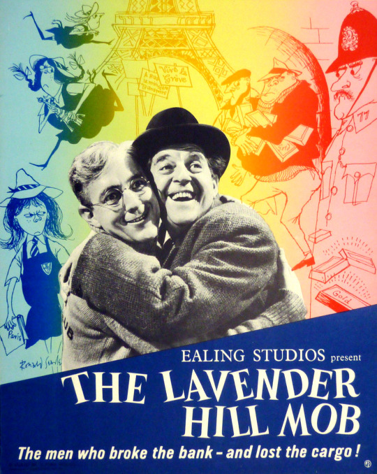
Below is a curious mixture of Ealing Films own graphics department and artists work, in this case using Ronald Searle’s cartoons based on the film and using his St Trinian’s girls series.
The Lavender Hill Mob – Ealing Studios with decorations by Ronald Searle, 1951.
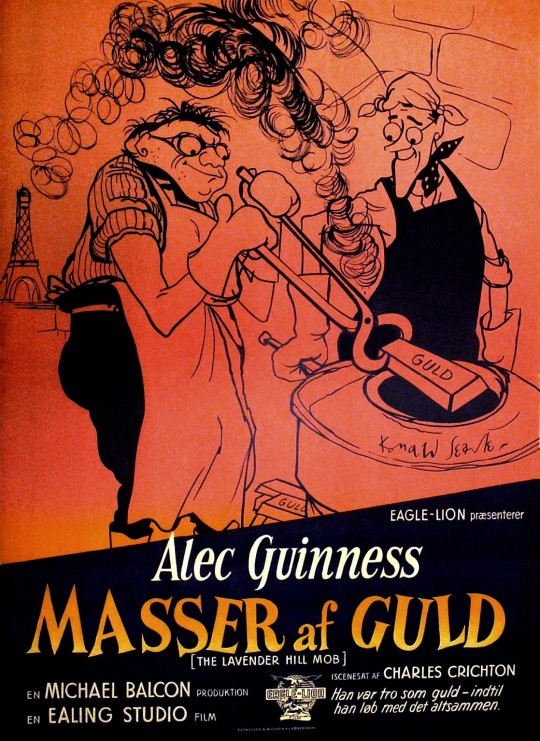
Below is another drawing by Ronald Searle for the Danish version of the poster. The drawing of Alex Guinness is wonderful.
Danish Poster for Masser af Guld – Lots of Gold. The Lavender Hill Mob, 1951.
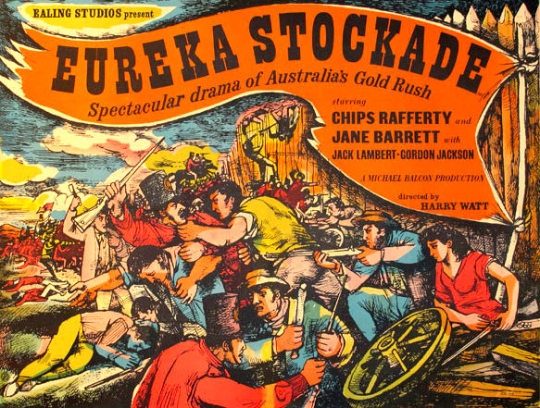
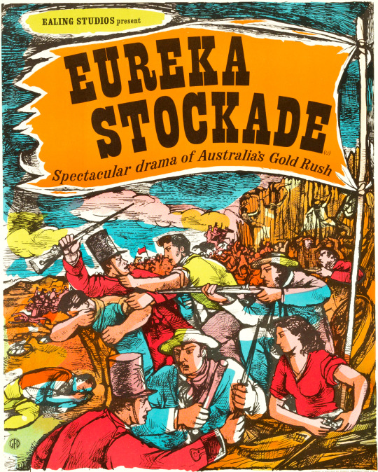
The artist John Minton also made two poster designs for Ealing Studios for the movie ‘Eureka Stockade’, one landscape, one portrait. At first it might look like they are the same image cropped, but the way the man above the cartwheel handles his gun, the riders at the end of the stockade and the man with the razor-blade behind the soldier show they are not the same image, just very similar.
John Minton – Eureka Stockade, 1949
John Minton – Eureka Stockade, 1949
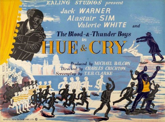
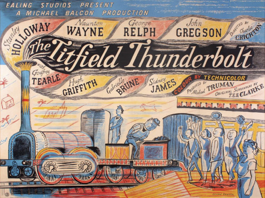
Here are two Posters by Edward Bawden, one for ‘Hue & Cry’ and the other is ‘The Titfield Thunderbolt’. The mixed perspectives of this and the light and dark boys used in both are wonderful. Both posters have hand-drawn typography.
Edward Bawden – Hue & Cry Poster, 1947
Edward Bawden – The Titfield Thunderbolt Poster, 1952
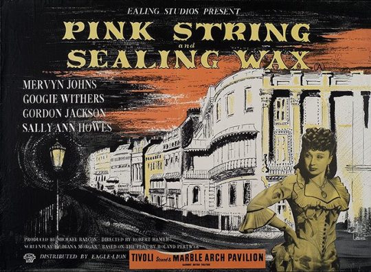
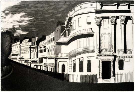
John Piper – Pink String and Sealing Wax Poster, 1945.
Above is the poster designed by John Piper and like in ‘Painted Boats’ the opening credits also used a similar design to the poster. The opening credits image actually comes from his ’Brighton Aquatints’ folio of prints, published in 1939. The poster must be adapted from the drawing.
John Piper – Kemp Town, 1939
† Page 2 – Press Release – Ealing Films – Light and Dark ‡ Ealing and the art of the film poster
Here is a documentary on Edward Bawden, Broadcast on Anglia TV in November 1983. It shows Bawden in his studio and house, talking of his war work and life in art and design.
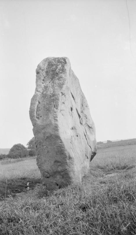
Paul Nash – Black and white negative, stone personage, Avebury, 1933
Paul Nash is one of the most distinctive and important British artists of the 20th century. He is known for his work as an official war artist during both WW1 and WW2. He also was one of the most evocative landscape painters of his generation. Nash was a pioneer of modernism in Britain, promoting the avant-garde European styles of abstraction and surrealism in the 1920s and 1930s.
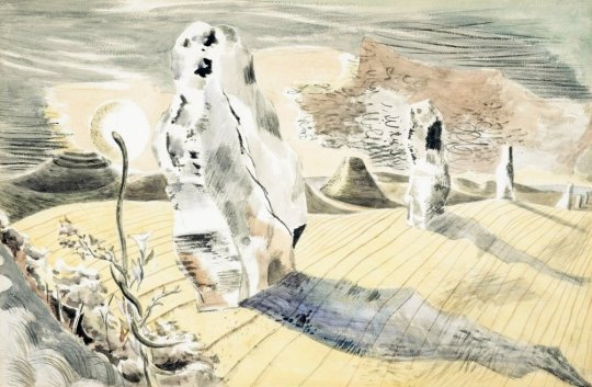
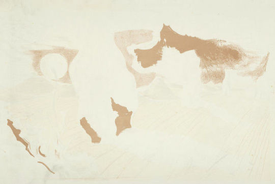
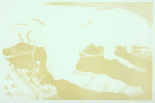
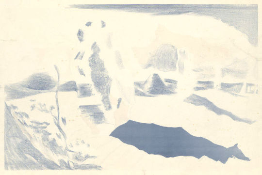
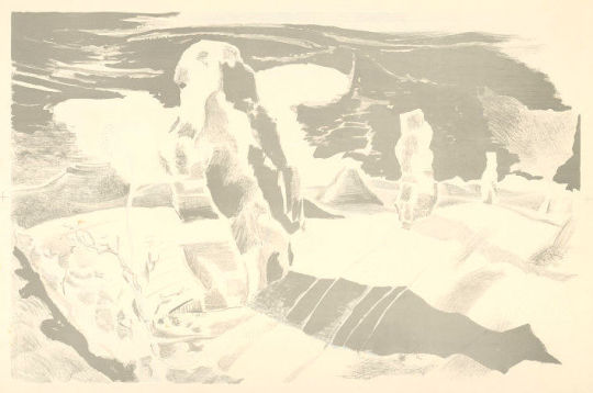
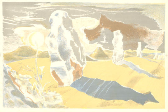
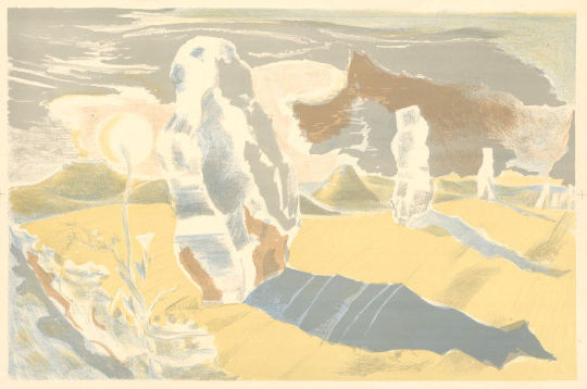
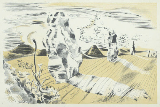
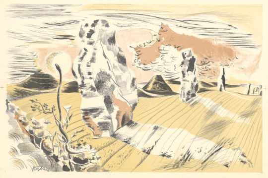
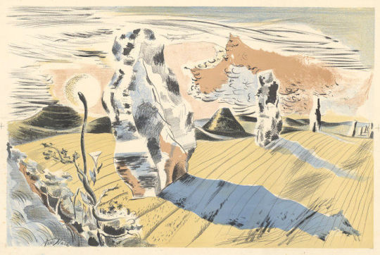
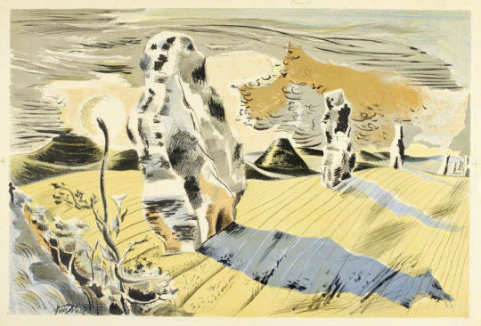
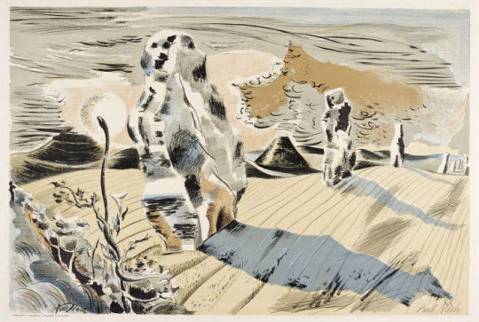
This post is about the printing process and how the Landscape of the Megaliths lithograph was made, showing each of the layers that were printed to make up the final image.
Paul Nash – Landscape of the Megaliths – Watercolour, 1937
Last summer I walked in a field near Avebury where two rough monoliths stand up, sixteen feet high, miraculously patterned with black and orange lichen, remains of an avenue of stones which led to the Great Circle. A mile away, a green pyramid casts a gigantic shadow. In the hedge, at hand, the white trumpet of a convolvulus turns from its spiral stem, following the sun. In my art I would solve such an equation. ‡
This lithograph by Nash is the bridge between romantic and surrealist art of the 1930s. Looking like a desert landscape by Dali the monoliths are both alien and familiar as Nash notes in the quote above. The convolvulus plant is a pernicious weed, I remember it covering a water-pump in the village I grew up in.
It is odd to consider that in my design I, too, have tried to restore the Avenue. The reconstruction is quite unreliable, it is wholly out of scale, the landscape is geographically and agriculturally unsound. The stones seem to be moving rather than to be deep-rooted in the earth. And yet archaeologists have confessed that the picture is a true reconstruction because in it Avebury seems to revive. ♠
Above is the original watercolour that Nash and the printers would have worked from. The colours have replaced and layered over shadow and texture. Below are many colour layers from the print showing the levels of tone and texture Nash would have used to put into the print. The main tones are printed one-by-one and then variations of tone are printed and layered, and the colours adjusted until the print is final. All the prints came from the V&A archive.
† Paul Nash by Emma Chambers, 2016
‡ The Oxford History of English Art, Volume 11 – Dennis Farr, 1979 ♠ Paul Nash writing in Art and Education – March, 1939