The film ‘A Single Man’, directed by Tom Ford is a wonderful piece of cinema. There is behind the story a little set of links between the writer of A Single Man, Christopher Isherwood and the director of the film Tom Ford.
In 1939 Isherwood travelled to America for the first time, leaving Britain on the first steps of war. He moved to Hollywood, California. On Valentine’s Day 1953, at the age of 48, Isherwood met the eighteen-year-old Don Bachardy. The couple started to date. It was at this time Isherwood was teaching a course on modern English literature at Los Angeles State College. He worked there until the 1960s much like George, the leading character in A Single Man. During this time he wrote and published three more books.
After Don Bachardy broke up with him Isherwood started to write, the result of this was the 1964 book, ’A Single Man’.
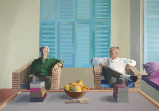
Isherwood and Bachardy reunite and apart from fleeting breakups, they spend the rest of their lives together. They were both painted by David Hockney in 1968.
David Hockney – Don Bachardy and Christopher Isherwood, 1968
Meanwhile in 1979 Tom Ford moves to New York where he meets and dates the artist and illustrator Ian Falconer. Falconer was Ford’s first boyfriend and they dated until Falconer leaves Ford for David Hockney. Depressed and lonely, it was at this point that Ford reads Isherwood’s ‘A Single Man’.
Later Ford would say about the book:
We end up feeling isolated most of the time. That’s what the story is about for me: that isolation we can all feel even though we are surrounded by people. And in my script, George decides to kill himself, so he goes through his day in a completely different way, seeing things in a completely different way, and people respond to him in a different way because he is different. He thinks it’s his last day. For the first time in a long time, he’s actually living in the present.
Tom Ford then got to meet Isherwood in the early 1980’s at David Hockney’s house in L.A. In 1986 Isherwood died. In 2009 Tom Ford directs the Movie ‘A Single Man’.
So Isherwood writes a book. Ford reads it. It’s about Isherwood’s break up and Ford reads it after a break up.
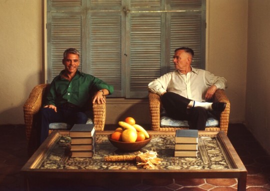
Chris O’Dell – Don Bachardy and Christopher Isherwood, 1976
The effect of the Japanese craft and design on the British at the turn of the 1900s was immense. So was the method of printing. Japanese printing is quite different to European woodblock printing.
The Japanese print with sumi ink – it is more water-based making all tones more translucent and more colour is used. This ink is painted on the block and rubbed in with rice-paste and horse-hair brushes. The Europeans use thick ink and a roller onto the surface. Japanese prints have the paper added and then the impression is made by rubbing the paper with a pad made from bamboo. The European way is to press the paper and woodblock with a roller or pad from a machine.
These are some of the ways that make the woodblocks printed in Japanese style different. But also they have the look of French posters by Toulouse-Lautrec in the design and cut of shapes.
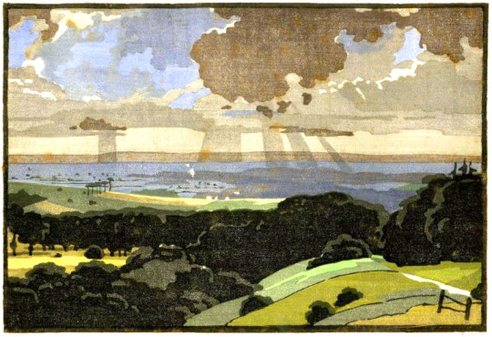
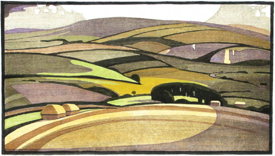
Edward Loxton Knight – The Vale of Pewsey
These fine examples are by Edward Loxton Knight (1905-1993). Born in Long Eaton, Derbyshire, he was encouraged to study art by his headmaster, Samuel Clegg (David Attenborough’s Grandfather), who taught him the art of the colour woodcut at The Long Eaton County School.
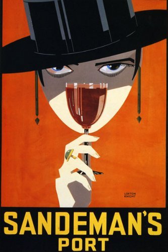
He studied under Joseph Else at Nottingham School of Art from 1924 to 1929. While a student at the Nottingham School of Art he sold designs for posters and press advertising (including the famous Sandeman’s Port). The whole edition of his print Goose Fair was bought by the Colour Woodcut Print Club.
Edward Loxton Knight – Sandeman’s Port Poster
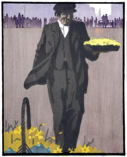
He was an elected member of the Colour Gravure Society, the Royal Society of British Artists, The Pastel Society, the Royal Society of Painters in Watercolour. He exhibited with the New Group extensively throughout this country and abroad. Queen Mary bought the print The Primrose Seller.
Edward Loxton Knight – The Goose Fair, 1928
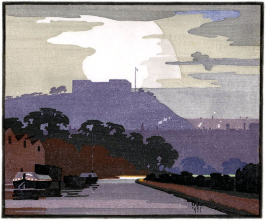
Edward Loxton Knight – Nottingham Castle
Edward Loxton Knight – South Downs
Edward Loxton Knight – The Primrose Seller, 1929
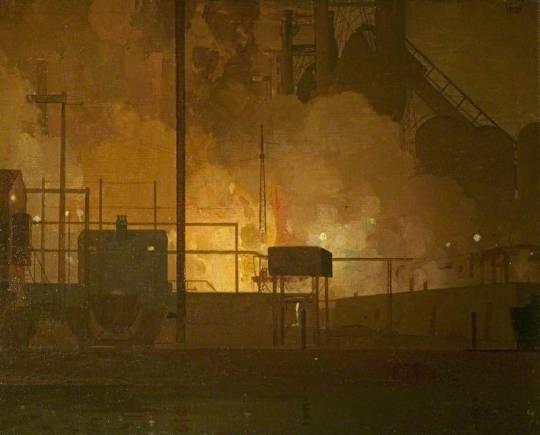
A wonderful example of his painting skills can be found in this painting of the Stanton Ironworks.
Edward Loxton Knight – Stanton Ironworks, Staffordshire, 1932
Erewash Borough Council
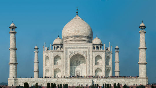
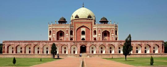
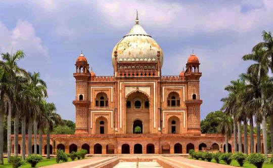
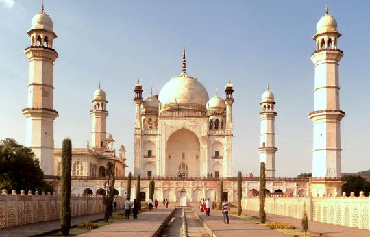
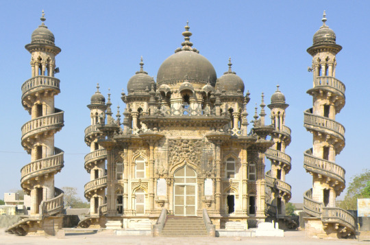
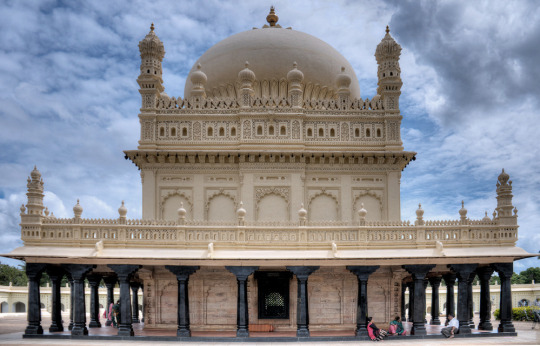
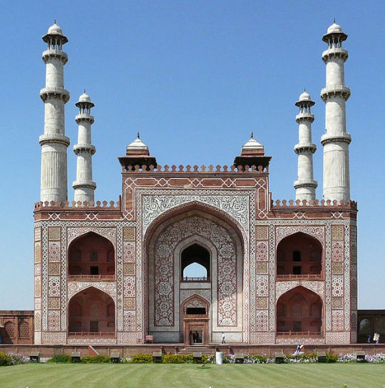
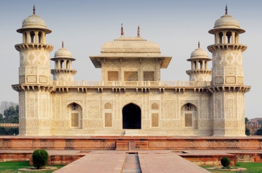
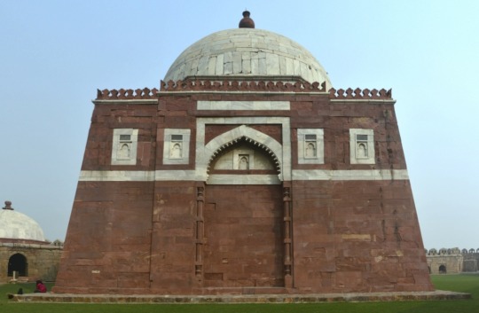
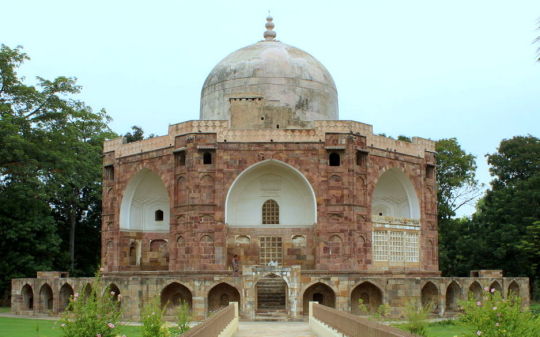
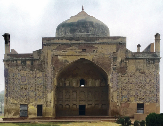
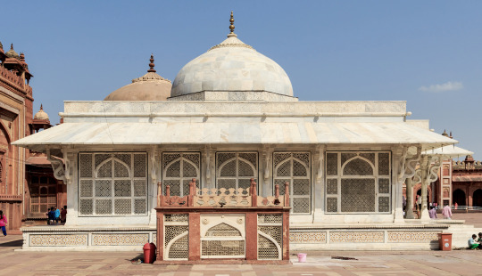
Here are some beautiful mausoleums in India. The extravagance of these buildings blows me away and I hope one day I will be able to see them. But I thought it would be interesting to post them as a series of beautiful objects.
There is a tenderness and repose – a dreamy voluptuousness, melancholy, and splendour peculiar to Eastern Scenery – more particularly when the moonlight is upon it – that, as the eye meets it, flow in upon the mind like successive waves of rich and delicious poetry. The luxuriant vegetation, the umbrageous foliage, and resplendent hues of, to the stranger, unknown and innumerable flowers; – the ghants and gondolas of the rivers; the temples, places, mosques and mausoleums, everywhere peering among the hills, or from the bosom of glens, upon the shore, all combine to give an impress, a character, a spirit to the scene, unseen elsewhere, peculiar to itself, its own. †
Taj Mahal
Humayun’s Tomb
Safdarjung’s Tomb
Bibi Ka Maqbara
Bahauddin Maqbara, Junagadh
Tomb of I’timād-ud-Daulah
Mausoleum of Akbar the Great
Tomb of I’timād-ud-Daulah
Mausoleum of Ghiyas-ud-din Tughlaq
Mausoleum of Qutbuddin Muhammad Khan
Chini ka Rauza
Salim Chishti Shrine
† Alexander’s East India and Colonial Magazine – Oriental Scenes and Scenery, 1836
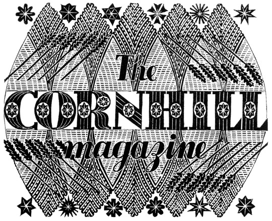
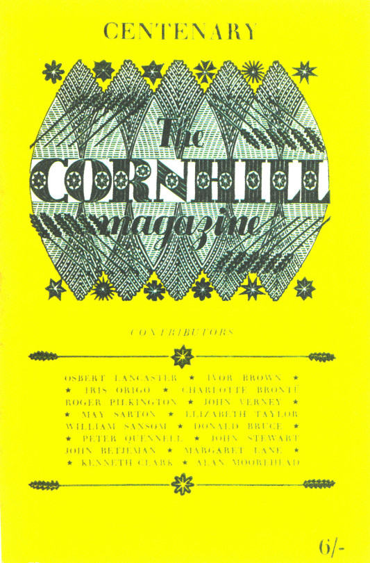
The Cornhill Magazine was founded by George Murray Smith in 1859, the first issue in January 1860. It continued until 1975. It was a literary journal with a selection of articles on diverse subjects and serialisations of new novels. From the days when news was slower to make the press and a book was a luxury commodity, these magazines were more of a social service than a magazine is today. Smith hoped to gain some of the same readership enjoyed by All the Year Round, a similar magazine owned by Charles Dickens, and he employed as editor William Thackeray, Dickens’ great literary rival at the time.
The stories were often illustrated and it contained works from some of the foremost artists of the time including: George du Maurier, Edwin Landseer, Frederic Leighton, and John Everett Millais. Some of its subsequent editors included G. H. Lewes, Leslie Stephen, Ronald Gorell Barnes, James Payn, Peter Quennell and Leonard Huxley.
Eric Ravilious – Cornhill Title Block, 1932
When Ravilious first worked for the Cornhill Magazine it was 1932 with the wood engraving above, but in fact the first appearance of the block was in 1954 for the 1,000th issue of the magazine. Why it was not used isn’t clear but the magazine have used it a few times since for anniversaries and sometimes on the title pages.
Centenary Edition of the Cornhill magazine, 1954
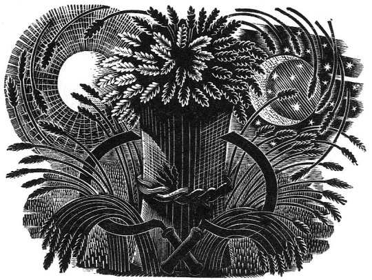
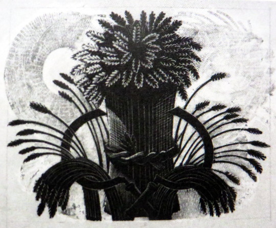
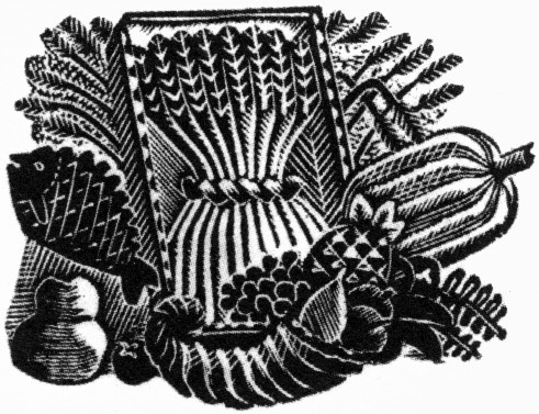
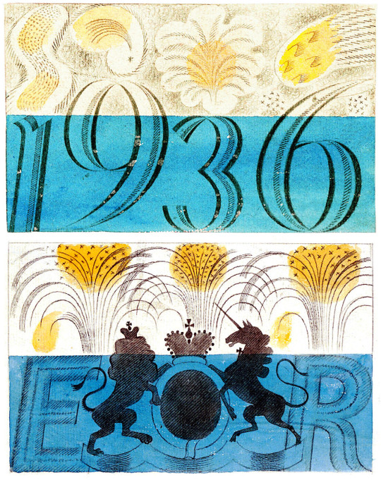
Eric Ravilious – Wheatsheaf for The Cornhill, 1936
The wheat sheaf design was commissioned by a young publisher called John Arnaud Robin Grey (‘Jock’) Murray who was on the staff of the Cornhill Magazine at the time, before going on to publish the likes of John Betjeman, Dervla Murphy and Patrick Leigh Fermor.
The design was to be used as a New Year’s Card, likely for the staff. Details from a letter from Eric to Jock:
I am sending you a print and the block of your wheatsheaf. It is rather more like an Autumn List than a New Year’s card – but perhaps you won’t mind that, and anyway I enjoyed doing the job. I’ll see you tomorrow at the party. †
Eric Ravilious – An Athlete, 1933
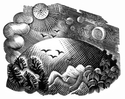
The moon and sun design features in this work from 1933 for Fifty-Four Conceits a book by Martin Armstrong.
Eric Ravilious – Wheatsheaf for The Cornhill, 1936
In 1936 the block appears again but with the background washed out. Ravilious had painted printers white (for correcting errors in artworks) to edit out the background of the block. The printers then made the block into an electrotype metal block to print with for mass production with those areas cut out of the metal.
Eric Ravilious – Wheatsheaf that he sent to Jock Murray, painted out, 1936
Eric Ravilious – Title-page (Harvest Festival), Wood-engraving for the Cornhill Magazine, 1936
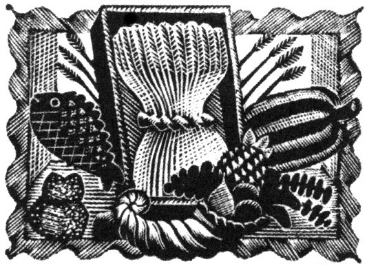
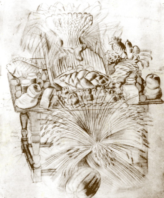
Ravilious was working on the Country Life Cookery Book at the same time as this commission for The Cornhill Magazine in the later part of 1936 and the project overlapped. So when one of the wood engravings was rejected by Jock Murray he used it on the cookery book. I thought this engraving was a bit surreal and over the top until I discovered a drawing of it below.
Eric Ravilious – Harvest Festival and Loaves, 1936
I’ve been drawing the bread table in the church – dead and fancy loaves, barley and corn, apples and eggs – and I thought it too beautiful not to place on record. ♠
Having been rejected for one job Ravilious cut away the framed backdrop of the table and submitted the wood-engraving below for the Cookery Book project instead.
Eric Ravilious – Title-page (Harvest Festival), Wood-engraving for the Country Life Cookery Book, 1937
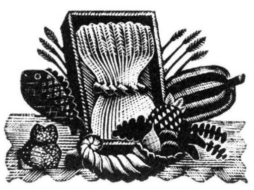
Below is another woodblock based on the same image made for The Writings of Gilbert White of Selborne in 1938. It’s a new version and not an edited restrike. Likely cut in 1937 as the job was commissioned in May of that year and the book published in 1938.
Eric Ravilious – (Harvest Festival), Wood-engraving for The Writings of Gilbert White of Selborne in 1938
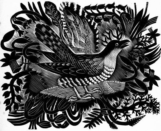
One of the commissions for The Cornhill Ravilious got was a Spring and Autumn woodblocks. Below is the Spring wood-engraving looking like an explosion of nature with a Cuckoo in the centre. It was used on compliment slips.
Eric Ravilious – Cuckoo
The same Cuckoo can be seen in the Gilbert White book again on the woodcut in Volume II on p243. To the bottom left corner.
Eric Ravilious – Requirements of an Ornithologist, 1938
Eric Ravilious – Requirements of an Ornithologist, 1938 (detail)
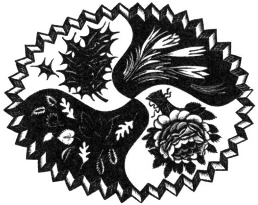
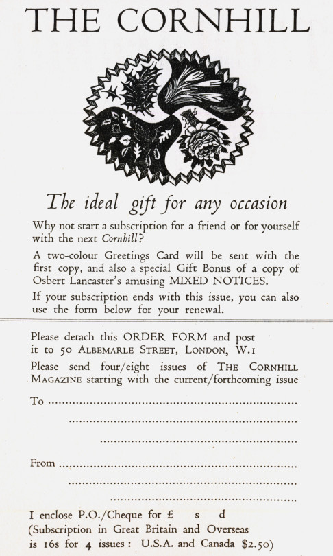
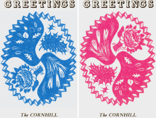
Below is a woodcut for the four seasons. Holly for winter, bulb-flowers for spring, under a rose for summer and a selection of leaves for autumn.
Eric Ravilious – Four Seasons, 1932
In a letter from Ravilious to Jock Murray, 7 January 1932:
I am so glad you like the design for your Quarterly List here is the block with a few amendments. I have made the border lighter as you suggested, and I think that was a good idea. †
The wood engravings were used in black for subscription notices inside the magazine and in colour in Greetings Cards when one subscribed to the magazine as noted in the advert above and pictured below. The rose was presumably uppermost in the summer with warm red and the holly in the winter in a cool blue.
Cornhill Magazine Greetings Cards
Eric Ravilious – Compliment Slip for the Cornhill Magazine using ‘Autumn Fruits’, 1936
Eric Ravilious – Autumn Fruits, 1936
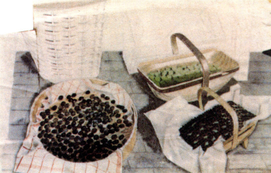
The wood-engraving above, Autumn Fruits, would have been copied from the painting below, and in the printing process it appears reversed. Ravilious as we know was a great recycler of his work.
Eric Ravilious – Trugs with Fruit, 1936
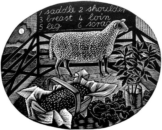
The same trug appears in the wood engraving for the Country Life Cookery Books vignette ‘April’. The job came at the same time as the Cornhill Magazine commission. The watercolour of Trugs of Fruit above has the same trug in the ‘April’ wood engraving. The fruit is presumed to be full of redcurrants as it is also next to mint and a lamb.
Eric Ravilious – April, Wood-engraving for the Country Life Cookery Book, 1937
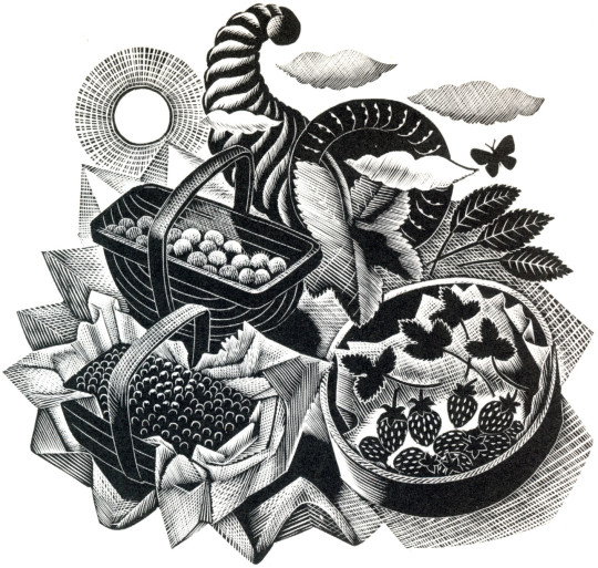
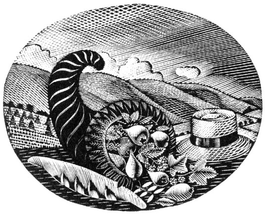
The cornucopia was also a popular device used by Ravilious and appears in the ‘Autumn Fruits’ wood-engraving / compliment slip for Murray. It too was recycled into a wood engraving for the Country Life Cookery Book for ‘July’.
Eric Ravilious – July, Wood-engraving for the Country Life Cookery Book, 1937
♠ Eric Ravilious to Helen Binton – 6th October, 1936 † Jeremy Greenwood – Eric Ravilious Wood Engravings, 2008
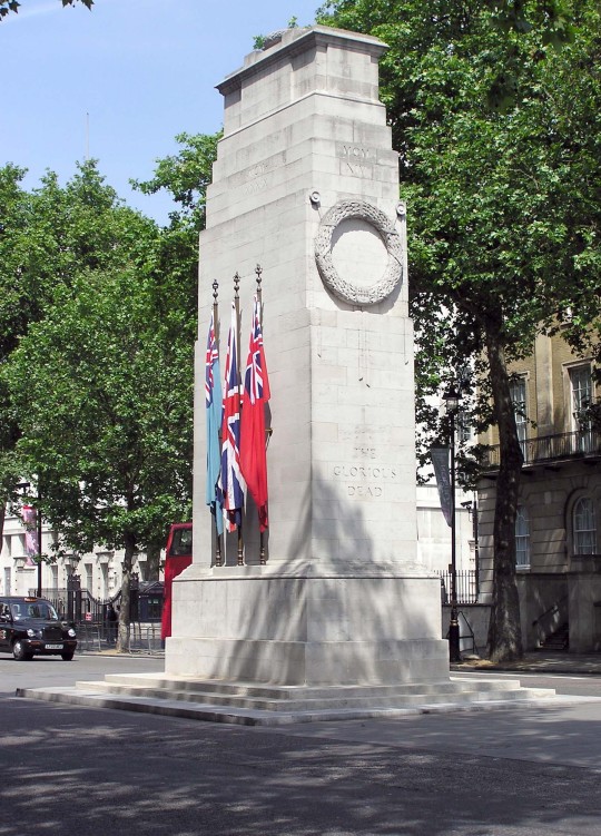
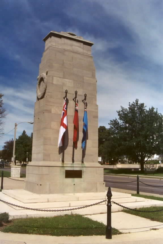
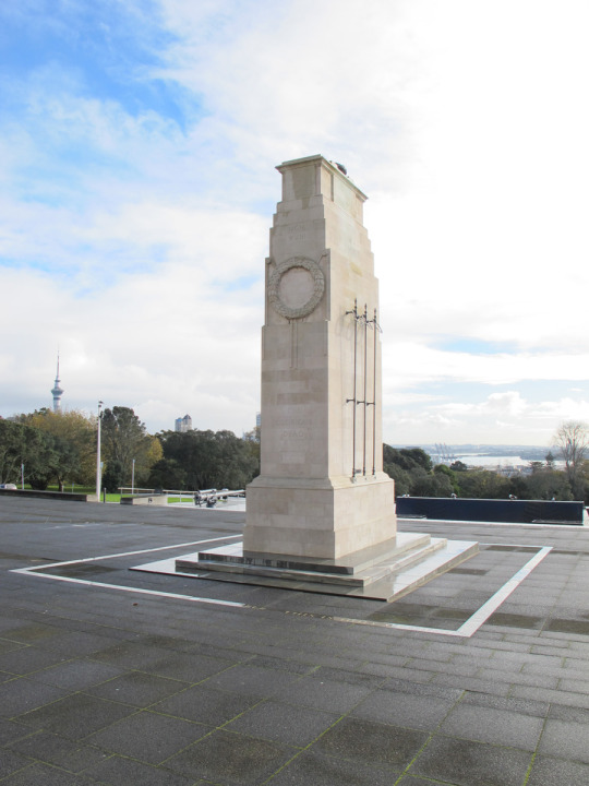
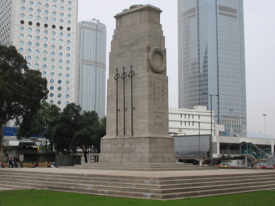
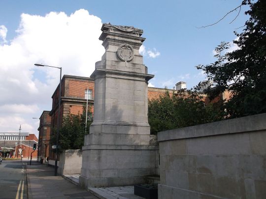
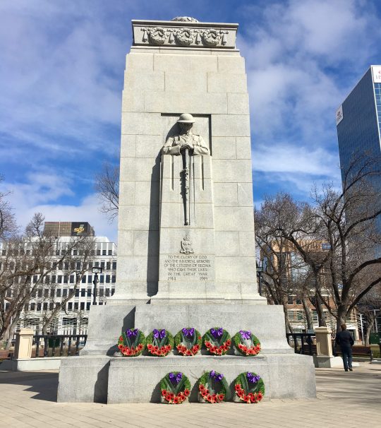
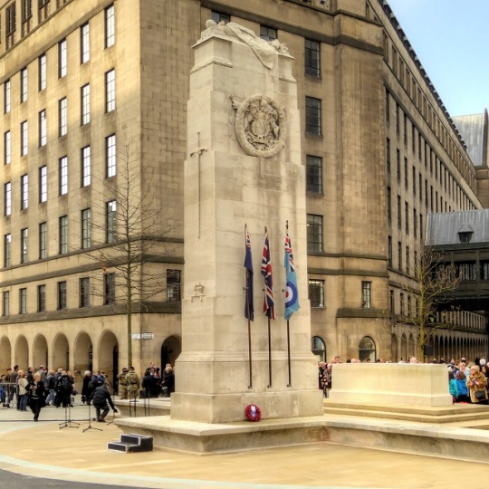
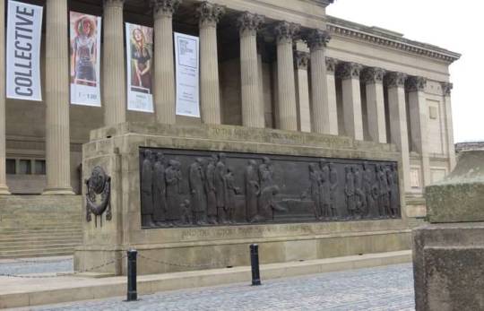
The main Cenotaph memorial is in Whitehall, London. All over the UK and the world there are many more however. The tomb of the unknown soldier is usually thrust into the sky at the top of the memorial. This tomb is empty and thus has contained the perceived graves of all other wars that have come after. The designs are mostly the same but every now and again you get one like in Liverpool, where the tomb is almost sideways.
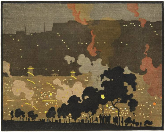
Here is just a brief collection of Ravilious Firework pictures. During the war Eric wrote that the naval ship’s gunfire were like fireworks, I haven’t included those war works, but just the actual depictions of festive images.
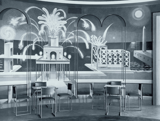
Eric Ravilious – Fireworks – Mural at the Midland Hotel, Morecambe, 1933
The mural above was painted by Eric Ravilious and his wife Tirzah Garwood for the Midland Hotel in Morecambe. The hotel was designed by Oliver Hill. The murals in the dining room were in two parts, Fireworks and Flags, or Night and Day as they are also known.
The race to complete works in time for ‘a grand opening’ of the hotel would mean the newly plastered walls they were painting the mural on had not been left to dry sufficiently.
The diaries of both Eric and Tirzah tell of how leaks from the roof and cracks in the wall had also hindered the painting. The paint bubbled and chipped off within a year and the mural, only two years old was painted over.
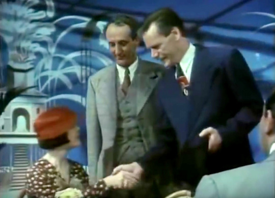
The whole mural was repainted in 1989 for the filming of the Agatha Christie novel – Double Sin. Below you can see Hugh Fraser in front of the repainted mural. It is not precise, but good enough, the original pagoda building’s windows were circles, in the repainting they were rectangles.
Scene from Agatha Christie’s Double Sin, ITV, 1990
The painting below Alan Powers suggested might have been a study for the mural design by Ravilious. I think it shows a young artist in his bedsit flat in London, Bawden made a similar work in his etching, ‘London Back Garden, 1927’. As a friend of mine called it, “a stacked up world with too many people and not enough money”.
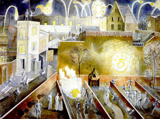
All his life, fireworks were an important and special source of inspiration for Eric’s work, and were made use of in many different ways. By now he and Tirzah had moved from Kensington to Hammersmith, but not before Eric had painted an elaborate watercolour of Bonfire Night, as watched from the roof of their house in Stratford Road. †
Eric Ravilious – November 5th, 1933
Below is another good example of Fireworks featured on the Coronation Mug by Ravilious for Wedgwood. The examples show wild fireworks on one side and on the other side firework fountains above the royal heraldic beasts.
A fun fact is that the shop Dunbar Hey were the first to stock the mug and the first customer was Wallis Simpson.
Eric Ravilious – Design for the Coronation Mug of Edward VIII for Wedgwood, 1936
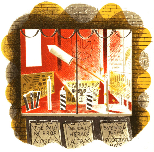
The final of the pictures comes from the book High Street, a series of lithographs by Ravilious with text by J.M.Richards, then husband of Peggy Angus.
Eric Ravilious – Fireworks – from the book High Street, 1938
Given the Second World War was coming I thought the inclusion of Mosley and his Blackshirt’s in the newspaper board highly interesting. If I was penning one of the many books on Ravilious I would say how Mosley and the fireworks were interlinked. That they would predict the horrors of the war to come and the domestic Ajax was a mockery of such views – Thankfully I think posturing after the fact is horse-crap.
† Helen Binyon – Eric Ravilious: Memoir of an Artist, 1983
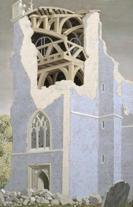
John Armstrong – Coggeshall Church, Essex, 1940 – Tate – Not on Display
When most people think of artists and where they paint – they think of St
Ives, Cornwall. The new Tate gallery there and its controversial Stirling Prize nominated extension have been both a help and hindrance to locals, but maybe not the 24% of those in St Ives who are Second Home owners †. The same could be said for Margate and the Bilbao effect from the Turner Contemporary Tate Gallery there. The Tate has pushed tourist through Margate’s streets like air into lungs. In the East of England is where many of the country’s best loved artists lived, but sadly the East of England is rather poor when it comes to showing off their artists – so why not a branch of the Tate in Aldeburgh or Southwold or Colchester?
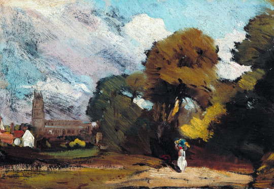
John Constable – Stoke-by-Nayland, 1811 – Tate – Not on Display
The famous East Anglian artists of old are John Crome, Thomas Gainsborough and John Constable. Crome was the most famous of the Norwich School of painters who were inspired by painters like Jacob van Ruisdael and the Dutch style. They painted the vast waterways, windmills and dykes of the fenland and Norfolk Broads. Crome also had many talented pupils. John Sell Cotman, one of the country’s best watercolour artists, was also part of this brew.
Alfred Munnings – From My Bedroom Window, 1930 – Tate, Not on Display
John Constable painted the Dedham Vale in Suffolk and, most famously, Flatford Mill. A brisk walk away is the Museum and former home of Alfred Munnings. Also in Dedham was the original home of Cedric Morris’s East Anglian School of Painting and Drawing, but when it burnt down (John Nash told Ronald Blythe ‡) Munnings drove around the village like Mr Toad shouting ‘Down with modern art’. Cedric Morris then bought Benton End from Alfred Sainsbury in 1939 and continued his art school with his life partner, Arthur Lett-Haines. Lucien Freud, Maggi Hambling, Lucy Harwood, Valerie Thornton and Olive Cook all studied there.
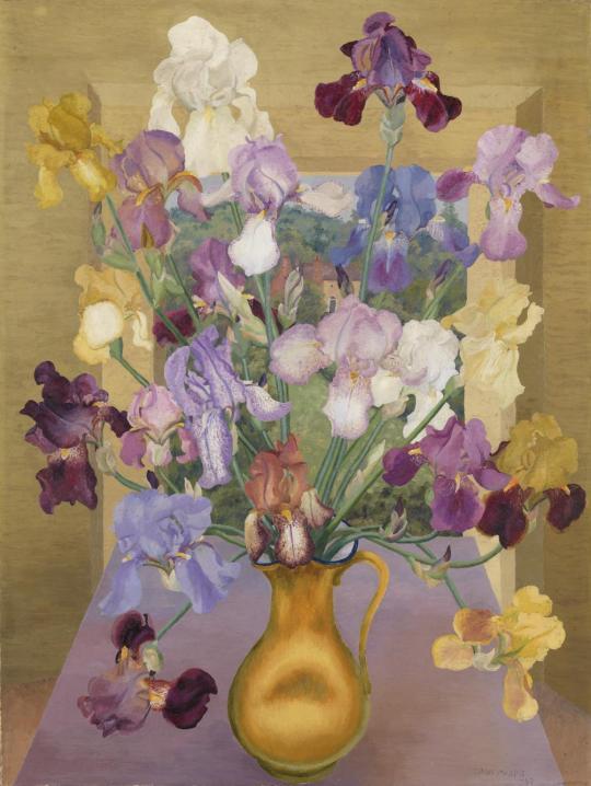
Cedric Morris – Iris Seedlings, 1943 – Tate – Not on Display
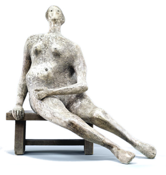
In 1940 after his London home suffered bomb damage, the sculptor Henry Moore made his home in Perry Green, just south of Much Hadham. It is now a museum with a collection of his works in the grounds. Moore walked around the local fields picking up pieces of flint thrown aside from ploughing and in his studio he would draw them as pre-made organic sculpture. Moore called them his ‘library of natural forms’ and they would inspire his larger works.
Henry Moore – Seated Woman, 1957 – Tate – Not On Display
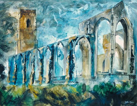
John Piper in the 80s made a beautiful series of ruined churches of East Anglia. In 1934, at Ivon Hitchens cottage in Sizewell, Suffolk, Piper met his wife Myfanwy Evens. They married in 1937. Myfanwy worked with Benjamin Britten writing lyrics to his operas including Death in Venice. Britten lived in Aldeburgh with his partner Peter Pears. Piper would design many of the stage sets.
John Piper – Covehithe Church, 1983 – Tate – Not On Display
On the other side of Colchester in 1944, war artist John Nash was restoring the Elizabethan Bottengoms Farm, moving in with his wife Christine Kühlenthal. Christine had studied at the Slade school of art alongside Dora Carrington, Mark Gertler and she worked at the Omega Workshops while John had become famous for his monumental paintings of the First World War alongside his brother Paul. At Bottengoms, John became famous for his landscape paintings and botanical studies. He taught at Colchester School of Art with Richard ‘Dickie’ Chopping, an artist known for his dust jackets for Ian Fleming’s James Bond series. Dickie lived with his lover, another landscape painter, Denis Wirth-Miller. Their life with Francis Bacon has been expertly documented in Jon Lys Turner’s ‘The Visitors’ Book’. Bacon owned a home in Wivenhoe as did Dickie and Denis.
John Nash – Mill Building, Boxted, 1962 – Tate – Not On Display
Also on the staff at Colchester was John o’Connor, a wood-engraver and landscape painter. He was once the pupil of both Edward Bawden and Eric Ravilious at the Royal College of Art. Bawden and Ravilious where renting part of Brick House in Great Bardfield, Essex, when Ravilious moved a few miles away to Castle Hedingham with his painter wife Tirzah. Bawden and his Leach Pottery student wife Charlotte bought Brick House. Both men became war artists and only Bawden returned from the conflict after painting the early war, including Dunkirk. He was also shipwrecked off the coast of Africa, rescued and imprisoned by Vichy French forces, liberated by the Americans and then off again to paint the campaigns in Africa and Iraq. Eric died in 1942 when the aircraft he was in was lost off Iceland. Ravilious used the Essex area profusely in his short life there in
wood-engravings and watercolours.
Eric Ravilious – Tiger Moth, 1942 – Tate – Not on Display
Around the village of Great Bardfield, Bawden was joined by John Aldridge (a landscape painter), Walter Hoyle (one of Bawden’s students who helped Bawden on work at the Festival of Britain) and Michael Rothenstein (the pioneer printmaker and brother to the Director of the Tate Gallery). Other artists in the village were George Chapman, Bernard Cheese, Stanley Clifford-Smith, Audrey Cruddas, Sheila Robinson and Kenneth Rowntree.
John Aldridge – Head and Fruit, 1930 – Tate – Not on Display
In the small hamlet of Landermere – on the coastland of Essex – lived Adrian and Karin Stephen with their daughter Judith. Adrian was the younger brother of Virginia Wolfe and Vanessa Bell. After her parents death Judith lived on in their house with her husband and Independent Group member, Nigel Henderson. Also in Landermere they were joined by Eduardo Paolozzi who owned one of the cottages and set up Hammer Prints Limited, a company for printing limited edition works and designing abstract home wares such as wallpapers and tiles. Neighbours in the hamlet were architect Basil Spence and Festival of Britain artist and Coventry Cathedral glass engraver, John Hutton, as well as his son, children’s book illustrator Warwick.
Eduardo Paolozzi – Cyclops, 1957 – Tate – Not on Display
The Stephens were not the only Bloomsbury members to be in the East. David Garnett, his lover Duncan Grant, and Grants wife Vanessa Bell were all staying at Wissett Lodge, Suffolk in the summer of 1916 as conscientious objectors, working on a farm, though Vanessa is the one who got the most painting done.
With the boom in British publishing many of these artists enjoyed illustration commissions, from the cookery books of Ravilious and Bawden to poetry books decorated by John Piper and gardening books illustrated by John Nash.
Spencer Gore – The Beanfield, Letchworth, 1912 – Tate – Not On Display
Naturally there are names left out but there are too many artists to list. But why are they so poorly represented in the region? In the East there is the Sainsbury Centre for Visual Arts and Kettles Yard but neither of these galleries aim to promote the work of East Anglian artists, but rather the international collections of the Sainsbury family and Jim Ede. They both do a lot of good for the local economy but it’s not the same as championing the area’s artists.
The nearest to it is the Fry Art Gallery in Saffron Walden, but their manifesto only lets them collect work from artists who have lived in North West part of Essex. But for all of Bedfordshire, Cambridgeshire, Essex, Hertfordshire, Norfolk and Suffolk there should be a body to represent them.
There are so many other artists that could be liberated from the Tate and their archives and put on show to support and promote the region where they were created. At the time of publishing, all the artworks in this blog owned by the Tate were not on display.
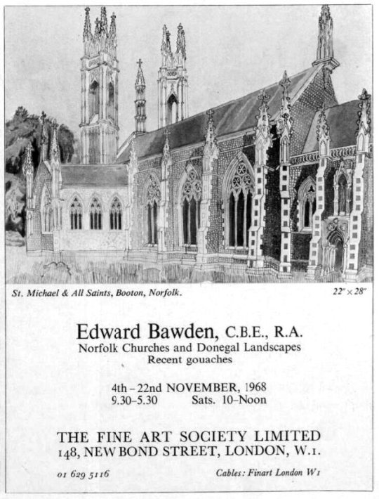
There is nothing I have found that Bawden said in favour of Norfolk that would make this post become more interesting than me presenting some of his works to you. The works I have found showed that when he visited a place he painted it from various angles. I think all of these works were painted in the late 1960s as Bawden had an exhibition at The Fine Art Society in November of 1968 of paintings from Ireland, the Middle East and Norfolk.
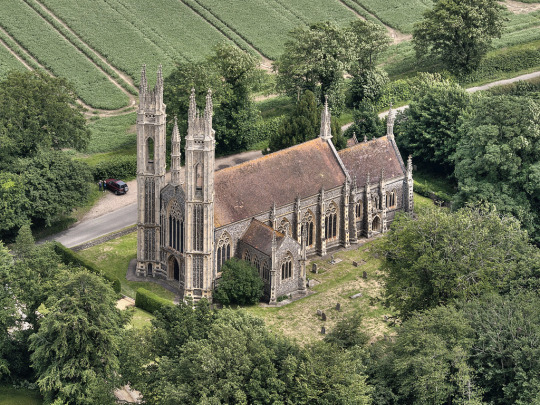
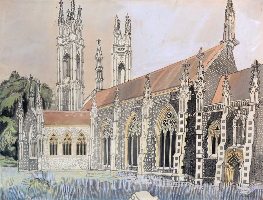
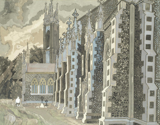
The Church of St Michael The Archangel in Booton, about 10 miles drive from Aylsham is an architectural marvel that you don’t see in Britain. Designed in French Gothic style with pinnacles and two towers it might be a small set from Lord of the Rings.
The Church of St. Michael The Archangel, Booton, Norfolk,
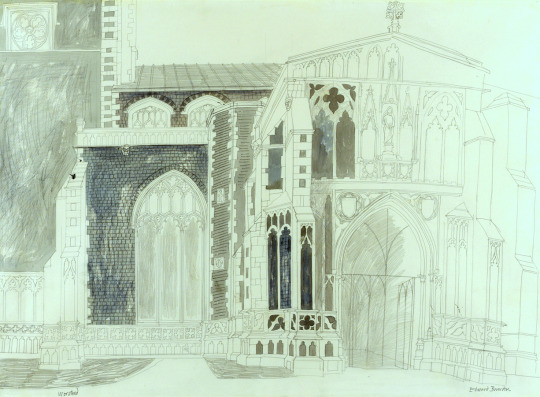
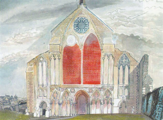
Edward Bawden – Design for The Church of St. Michael The Archangel, Booton, Norfolk, 1966
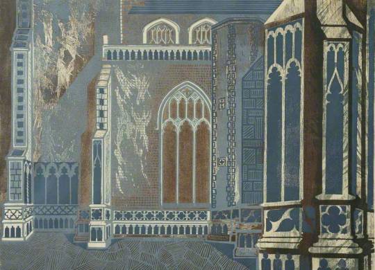
The painting below I rather like for its bold outline painting, but more for the shade of foliage to the left and white church stone in front, the church is painted in a gradient from white on the left, to black flints on the right.
Edward Bawden – The Church of St. Michael The Archangel, Booton, Norfolk, 1966
Edward Bawden – The Church of St. Michael The Archangel, Booton, Norfolk, 1966
Worstead Church is signed but looks more unfinished. It has the hints of a John Piper in the colour blotting and slight unfinished abstraction, though this may be because it mostly was unfinished.
Edward Bawden – Worstead Church, 1966
Edward Bawden – Worstead Church, 1966
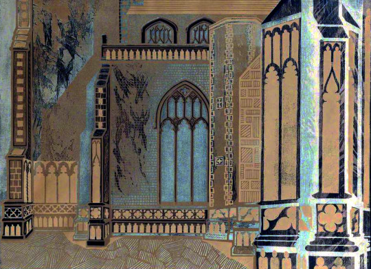
Above a detail section of the Church that makes Bawden’s linocuts so wonderful; He takes a section out of scenes when making them into linocuts (on the Road To Thaxsted is a good example where he has cropped the picture with part of the Cottage roof but did not show the whole scene. If all the cottage was to appear it would look very twee). Bawden has also cut grooved grass, and a wild hacking of the lino made the distress on the building. Its printing in such a dark blue it looks like a negative image from film and to be a little provocative, I have inverted the image as a negative below.. I think it looks more pleasing, more like an Ed Kluz, though Edward wouldn’t thought much to my meddling!
after Edward Bawden – Worstead Church, 1966 (Inverted image)
The following images are Bawden as a good watercolour artist, using a wash on the grass and then a darker series of lines, the sky made up of geometric clouds and the trees inked out in pen and filled in with a broad green wash in a grey of the church and a green.
Edward Bawden – St Mary’s Church, Marlingford, Norfolk.
Edward Bawden – St Mary’s, Marlingford IV, 1968
Edward Bawden – The Churches of All Saints and St Mary’s, Great Melton, Norfolk, 1968
Edward Bawden – Little Melton Church, Norfolk, 1968
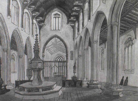
Edward Bawden – North Creake Abbey – Interior, Norfolk, 1967
Edward Bawden – Birnham Priory, Norfolk, 1968
Original Advert for the Fine Art Society Exhibition.
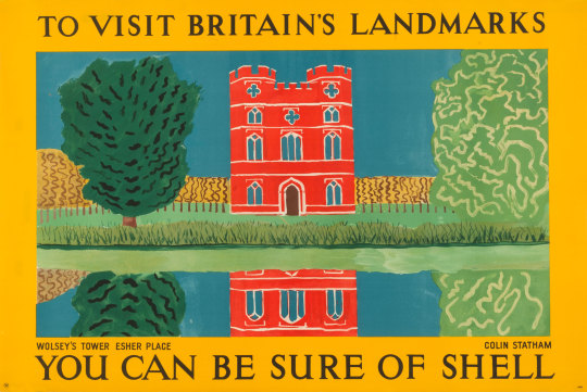
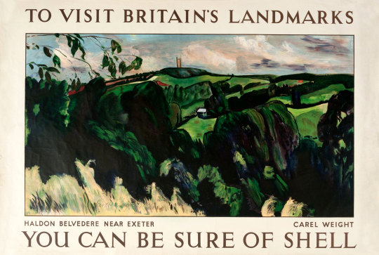
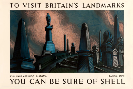
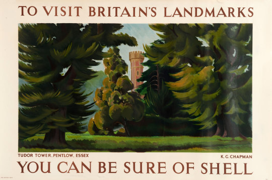
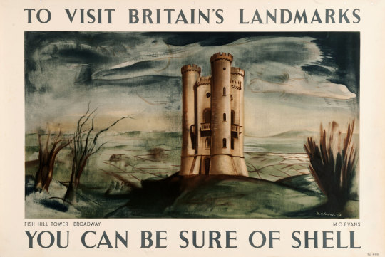
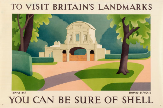
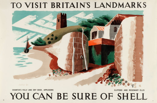
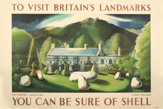
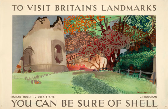
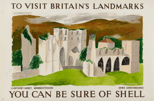
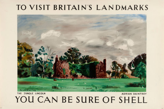
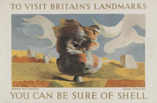
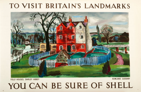
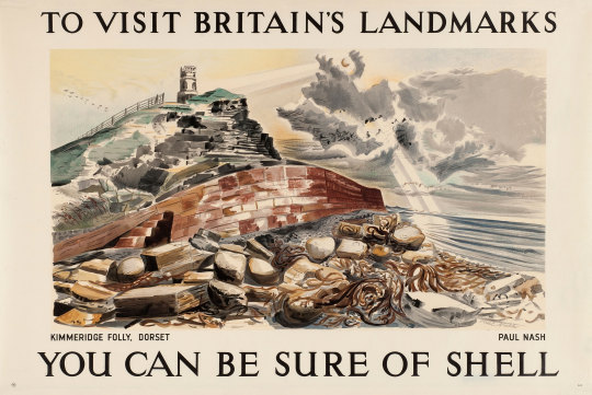
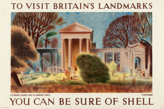
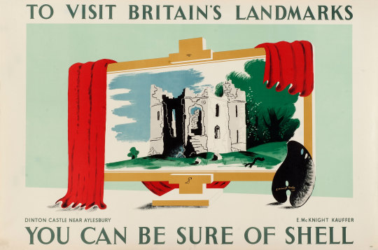
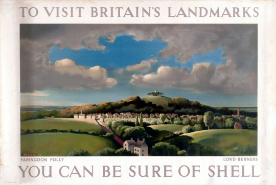
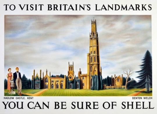
I have featured some of the Shell posters in this series on the blog before but I thought it would be more interesting to post as many of them as I could find. I rather though the range of artists was brilliant.
Shell Mex Limited appointed a new Publicity Director in 1932, Jack Beddington. His insight turned the British Shell advertisements of the 1930s into some of the classic campaigns of the twentieth century. The genius was to let artists depict Britain in their own styles, they would paint an image and whatever their style, and it would be framed by text. There would be no need for product placement, for models holding petrol cans, it was a campaign exposing the beauty and wonder of Britain and modern art. It was to inspire people to use their cars to see the nation and so use more petrol.
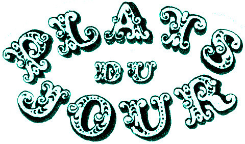
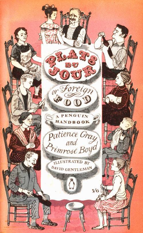
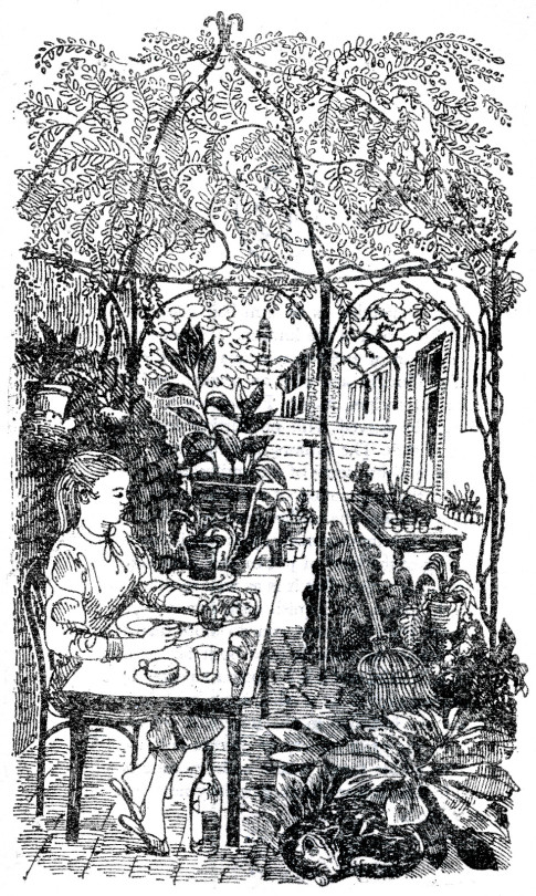
Plats du Jour by Patience Gray and Primrose Boyd is a book illustrated by a 27-year-old David Gentleman in 1957 used to be everywhere, I would see it in most charity shops and on book stalls, however now if you look online and try to find a copy it is about £30 and up. The Persephone Press reissued it it in 2006 with the original illustrations. However the art of the small illustrated cook book has been lost on a tide of celebrity endorsed cookery books, for a nice cookery book we can only look back or to a private press and hope to get books like Lovely Food – A Cookery Notebook by Ruth Lowinsky, Mediterranean Food by Elizabeth David or such like.
However I thought Plats Du Jour was worth looking at in close up for the beautiful covers, letter work and illustration inside. They are so beautiful it is almost aspirational. It sold 50,000 copies in its first year, far outstripping Elizabeth David who was the cookery writer of that age.
Although Gentleman has designed almost everything it could be imagined from Coins and Stamps to Underground Station Artwork and Anti War propaganda he is known most of either his wood-engravings or his lithographs but his drawings and watercolours need a modern retrospective.