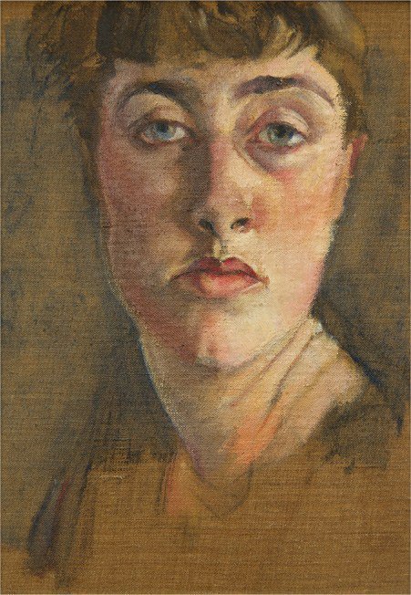
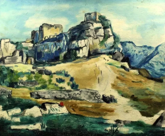
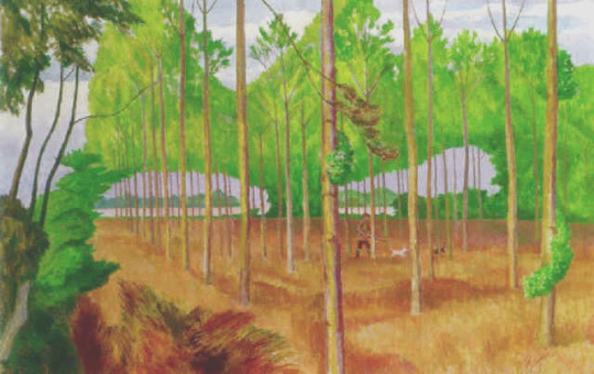
Paul Nash – Landscape of the British Museum, Fitzwilliam Museum
One of the arguments for not leaving a good bit of art to a large museum is that it might never be seen. The idea that your gift may end up in the endless archives of the Tate Gallery or Towner comes with that danger. When Edward Bawden was looking to leave his studio to someone he chose the Higgins Gallery in Bedford because they were much smaller and would be more likely to exhibit his works, though for some time that was not what happened. (It was a decision he apparently regretted when the Fry Gallery was founded in 1985 and opened in 1987.) If work sits in archive storage this might give more weight to my constant quest for Why not a Tate East?
I digress – the other day while looking up engraved windows by John Hutton I discovered the The Fitzwilliam Museum in Cambridge have an online archive of the pieces they own, many of them being in archives not on display and it shocked me to see how many works by Paul Nash they had.
Living in Cambridge one of the things visitors to the city want to see is the Fitzwilliam’s amazing collection of art, but to me a lot of it doesn’t rotate and so I find going rather boring. I wish they could set a rotating room or explore their archives for exhibitions. Below the paintings are mostly from the collection of Paul Nash’s in the Fitzwilliam Museum archives.
Paul Nash – Landscape with Rooks, 1913, Fitzwilliam Museum
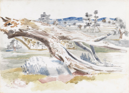
Paul Nash – The cliff to the north, 1912, Fitzwilliam Museum
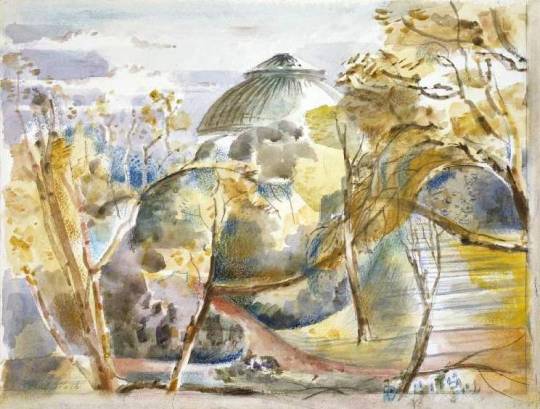
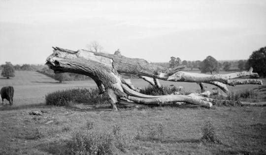
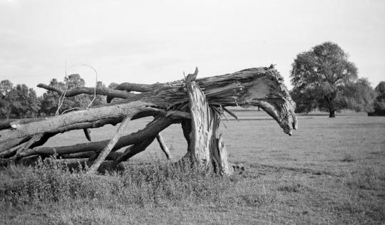
Below are a series of Monster Studies, the photographs and oil are in the Tate but the watercolours are in the Fitz. It is interesting to show how Nash used photography as a memory aid.
Paul Nash – Monster Field, Study I, 1938, Fitzwilliam Museum
Paul Nash – Monster Field, 1938, Tate TGA 7050PH/1111
Paul Nash – Monster Field, Study II, 1938, Fitzwilliam Museum
Paul Nash – Monster Field, 1938, Tate TGA 7050PH/1109
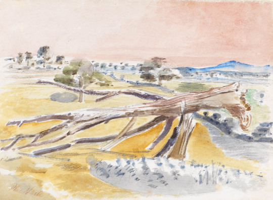
Here in the oil painting by Nash below, he uses both of the ‘Monster’ tree stumps, one in front of the other with his dream like landscape. If it wasn’t for the Oak trees, I would guess at it being Mexico, it’s almost a tacky colour palette.
Paul Nash – Monster Field, 1938
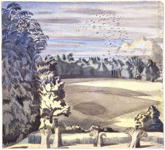
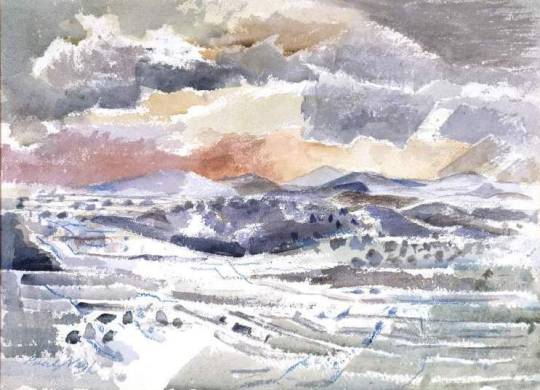
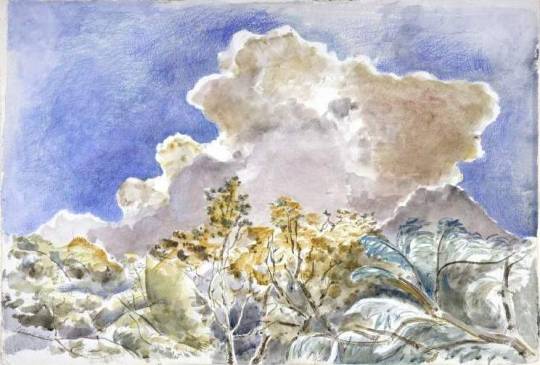
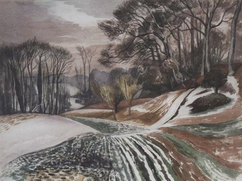
Paul Nash – Clouds, hill and the plain, 1945, Fitzwilliam Museum
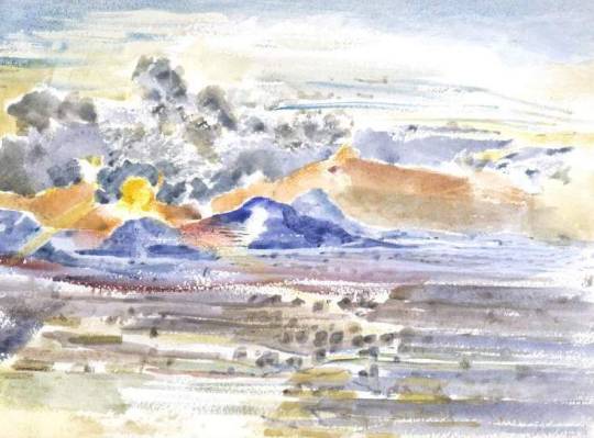
Paul Nash – Sunset eye, Study II, 1945, Fitzwilliam Museum
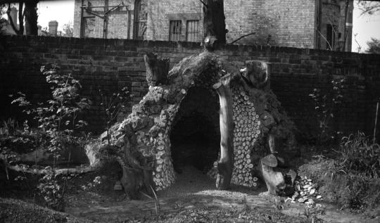
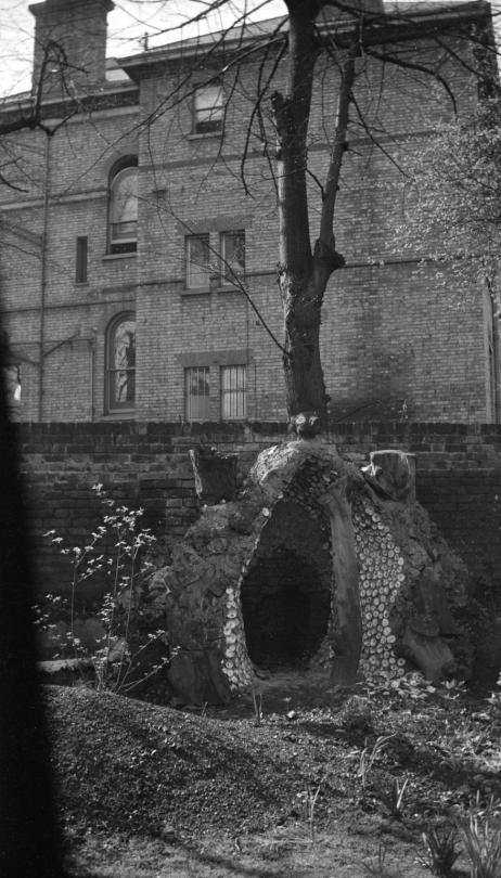
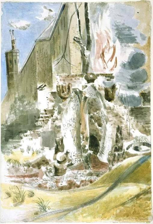
The photography returns with this other ugly Grotto made in the back-garden of Paul Nash’s house in 3 Eldon Grove, Hampstead. Nash lived at this address from 1936 till August 1939. In the photograph a tree stump has been placed in front of the grotto entrance in what might be said to be a phallic way.I don’t think anyone would have guessed this without the photograph as a guide as I thought his painting was of a semi demolished house.
Paul Nash – The grotto, Eldon Grove, 1938, Tate TGA 7050PH/670
Paul Nash – The grotto, Eldon Grove, 1938, Tate TGA 7050PH/673
Paul Nash – The Grotto at Eldon Grove / Study of the Grotto at Eldon Grove, 1938, Fitzwilliam Museum
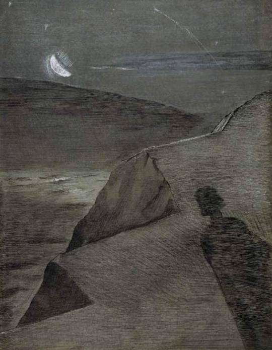
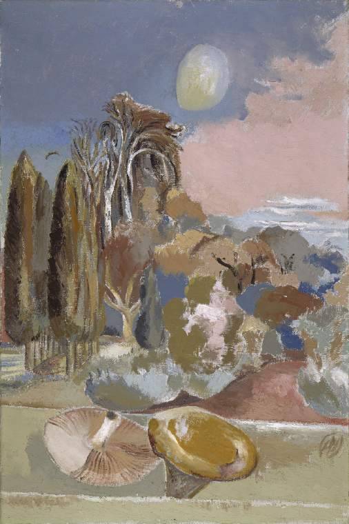
Paul Nash – November Moon, 1942, Fitzwilliam Museum
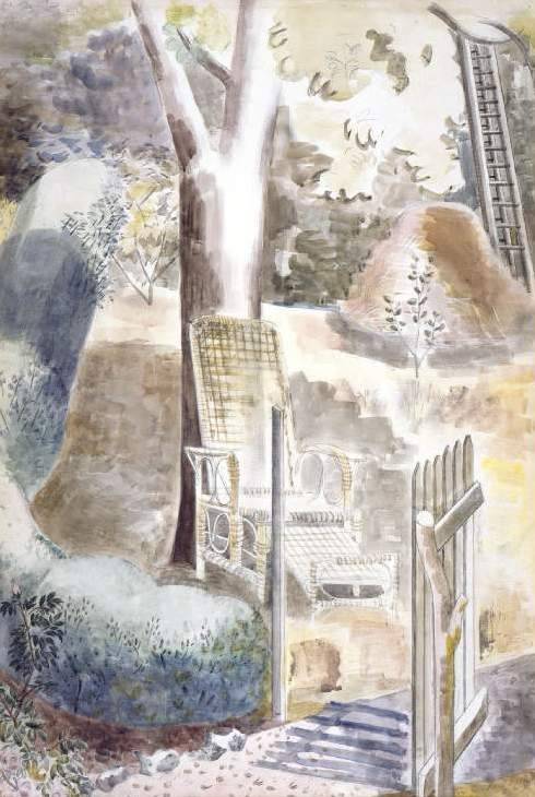
Paul Nash – Garden, 1929, Fitzwilliam Museum
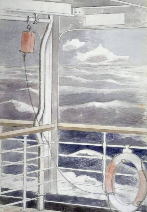
Paul Nash – Atlantic ocean, 1932, Fitzwilliam Museum
Bright Cloud Sketch of a landscape, 1941, Fitzwilliam Museum
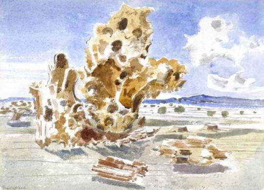
Paul Nash – Landscape of the Death Watch, Fitzwilliam Museum
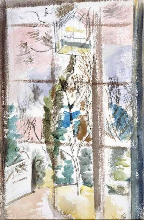
Paul Nash – The Bird-Cage (Canary), 1927, Fitzwilliam Museum
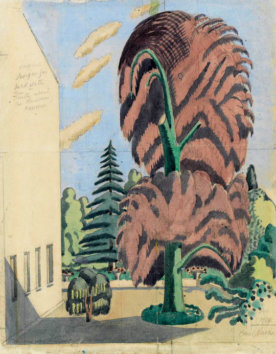
Paul Nash – Design for backcloth, The Truth about the Russian Dancers, 1920, Fitzwilliam Museum
You would think that after the First World War that young people wouldn’t rush to war again, but when in 1936 the Spanish Civil War started a lot of the left wing types you might suspect of being conscientious objectors went off to stand against fascism.
The son of Bloomsbury’s Clive and Vanessa Bell went off to Spain in 1937. Julian Bell wished to fight against Franco in the International Brigade in Spain, but his Aunt Virginia Woolf and his parents both persuaded him he would be safer and more use as an Ambulance Driver with the Spanish Medical Aid. Julian died after being hit by Shrapnel 18 July 1937 months after arriving.
The artists that remained in Britain would hold auctions or art exhibitions of works to raise funds or go on anti-fascist marches. It all reminds me of Marghanita Laski’s ‘Love on the Supertax’. Felicia Brown went off to Spain and died there.
Felicia Browne was born to well-to-do parents in the London suburbs in 1904. She took various courses at the Slade School of Fine Art in London between 1921 and 1928. Then she went to Germany to study sculpture. Historian Tom Buchanan writes* that she witnessed the rise of Nazism in Berlin, and may have taken part in anti-fascist street fighting. She returned to Britain in the early 1930s and in 1933 joined the Communist Party.
She travelled by car to Spain via Paris with her friend, Edith Bone. They arrived in Barcelona just days before Franco’s attempted coup of 18 July 1936. The people rose up to defend the Popular Front government and Felicia Browne was immediately caught up in those heady days.
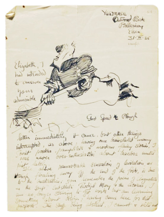
During her brief time in Spain, Felicia Browne sketched other members of the militia, local people and the scenes around her. Following her death, these and other sketches were exhibited in London in October 1936. A selection of them were later published by Lawrence & Wishart, using as a preface Felicia Browne’s letter to Elizabeth Watson. They have frequently been reproduced to illustrate books on the Spanish Civil War.
After trying unsuccessfully to enter the medical services, she volunteered to join the PSUC (Catalan communist) militia, the Karl Marx, heading for Aragon to defend the Republic. They made their headquarters in the small but strategically important town of Tardienta. It was situated near to the railway line from Zaragoza to Huesca, which took vital supplies to the rebel forces. An aqueduct that carried water supplies to the enemy also passed through the town.
When the Karl Marx militia arrived in Tardienta, other militia columns were already billeted there. Several small-scale exchanges of fire took place on 14 and 15 August 1936 between forces of the Columna del Barrio, which included Dutch miliciana and machine-gunner Fanny Schoonheyt, and the rebels.
Felicia Browne’s militia attempted to sabotage the railway line. In a surprise attack by fascist forces that greatly outnumbered them, an Italian miliciano was wounded. Felicia went to his rescue and both were cut down by machine-gun fire and killed, probably on 22 August 1936. †
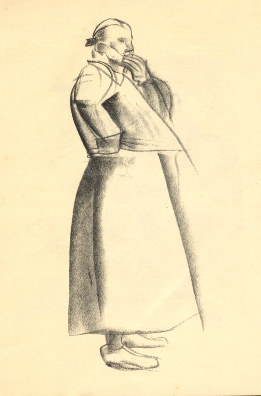
Drawings by Felicia Browne, 1936. † Felicia Browne: The first British casualty in Spain Tom Buchanan – The Impact of the Spanish Civil War on Britain. Eastbourne: Sussex Academic Press
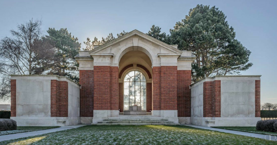
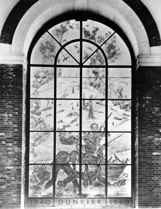
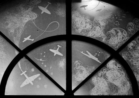
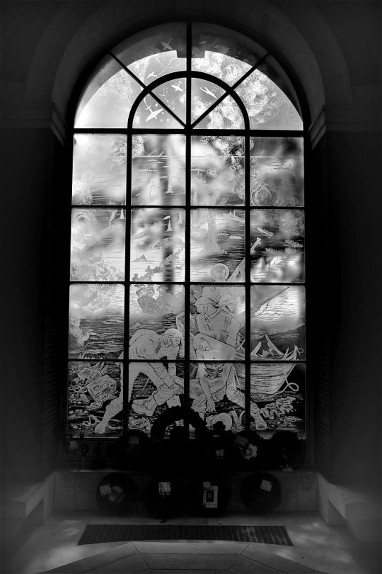
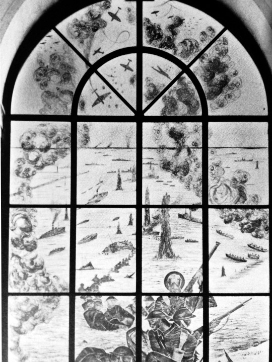
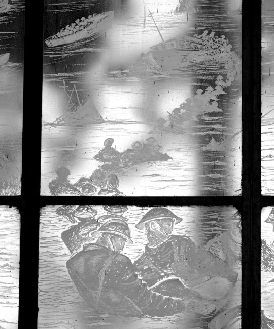
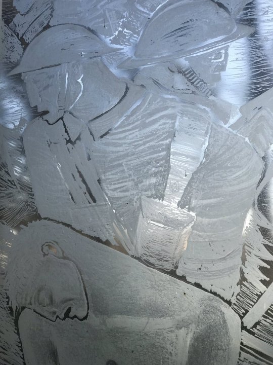
The Dunkirk Memorial stands at the entrance to the British War Graves Section of Dunkirk Town Cemetery. The artistic memorial is a giant etched glass window by John Hutton.
Hutton was asked by Philip Hepworth of the Imperial Graves Commission to design a window. The design shows not only the evacuation from the beaches but also the aerial bombardment and fighting in the sky and at sea. The memorial window was unveiled by Queen Elizabeth II in 1957
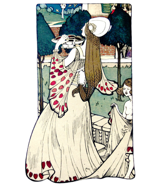
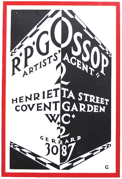
Here is a post on Robert Gossop, an extraordinary designer who really moved with the times. His style went from Art Nouveau to bold bright modernism. He opened up an advertising agency to promote his own and other young talent for advertising.
Reginald Percy Gossop – The Queen of Hearts, 1899
Robert Percy Gossop (1876 – 1951) was apprenticed in 1892 as a wallpaper and fabric designer in London. Whilst undertaking his apprenticeship he attended art classes at colleges including Birkbeck College and Hammersmith School of Art. From 1896 to 1902 he worked as a designer and freelance illustrator. In 1902 he married Jessie Dora Meech, an artist from Camden School of Art.
From 1902 until 1904 he worked as studio manager for the printers Eyre and Spottiswood and from 1904 in the same capacity for W. H. Smith. At W. H. Smith he worked with a number of significant artists, including Henry Ospovat, and designed Smith’s famous lozenge shaped logo. In 1913, following a visit to America, Gossop became the first art editor for British Vogue. In 1914 he became art adviser to Dobson Molle and Co., an Edinburgh firm of printers. From 1916 until the end of the First World War he worked at the Ministry of Information, helping with the distribution of propaganda. At the end of the war he became joint manager at Carlton Studio.
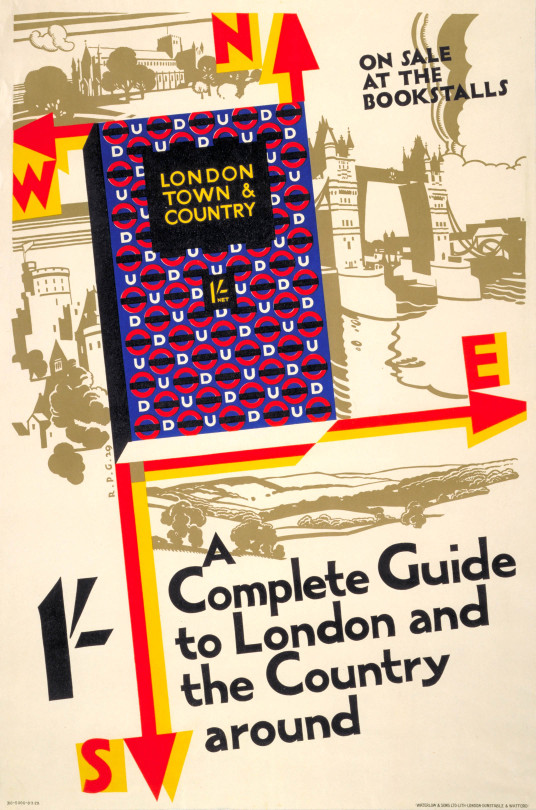
Reginald Percy Gossop – London town and country, 1929
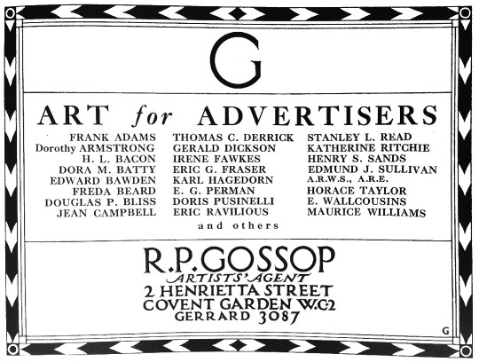
In 1923, partly to help his friend Edmund J. Sullivan, Gossop set up his own firm of artists’ agents, R.P. Gossop Ltd. His clients included Hanslip Fletcher and Eric Fraser. At the same time he continued to work as a freelance designer and illustrator, with commissions including designs for the Empire Marketing Board, Heal & Son Ltd and London Transport. In 1926 he co-founded the Society of Industrial Artists with Milner Gray. He also served on the Council of the Design and Industries Association. In 1937 he delivered the Dent Memorial Lecture, on book illustration, and from 1938 worked as a lecturer at the City of London College. His daughter joined him as office manager for R.P. Gossop Ltd in 1925 and after his death in 1951 she continued to run the business.
An advert for the Reginald Percy Gossop Artists Agency.
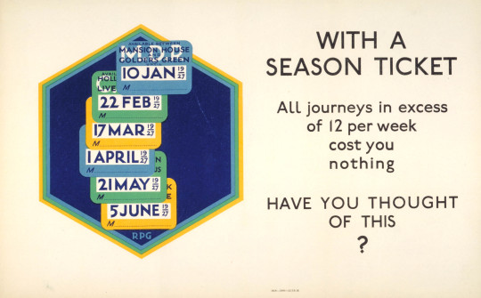
Reginald Percy Gossop – With a season ticket, 1926
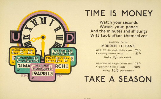
Reginald Percy Gossop – Time is Money, 1926
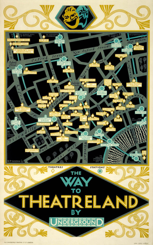
Reginald Percy Gossop – The Way to Theatreland by Underground, 1926
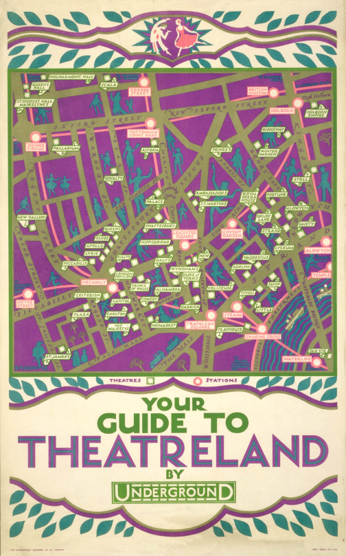
Reginald Percy Gossop – The Way to Theatreland by Underground, 1926
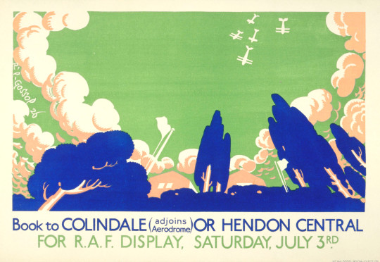
Reginald Percy Gossop – Hendon RAF Display, 1926
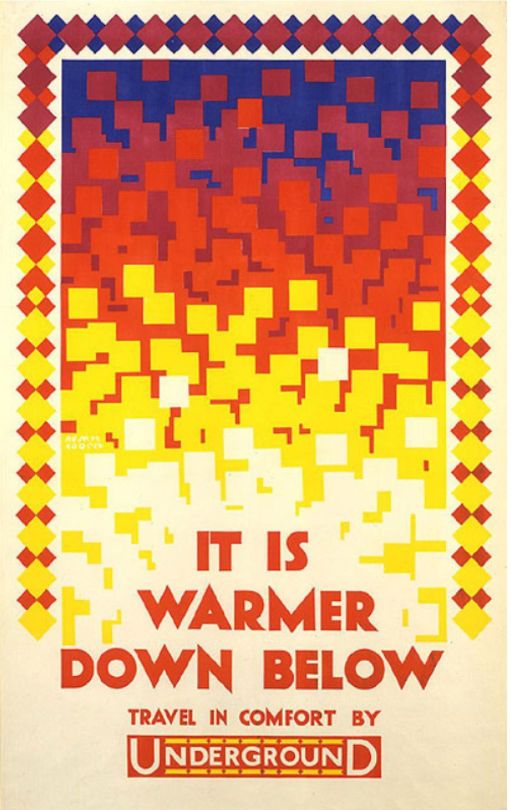
Reginald Percy Gossop – It is warmer down below, 1924
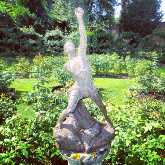
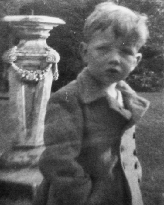
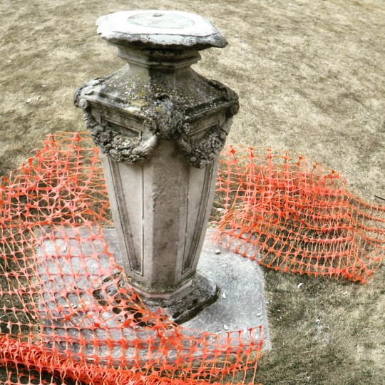
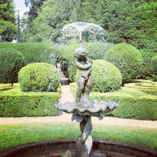
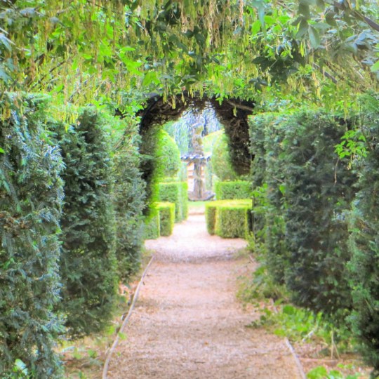
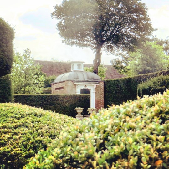
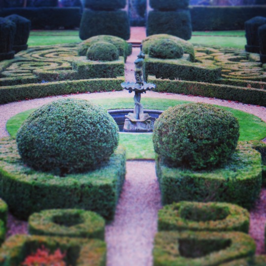
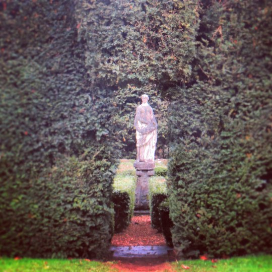
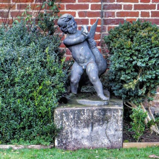
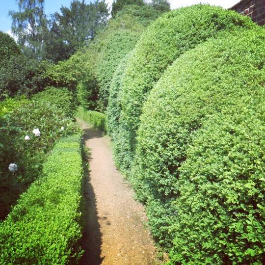
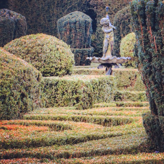
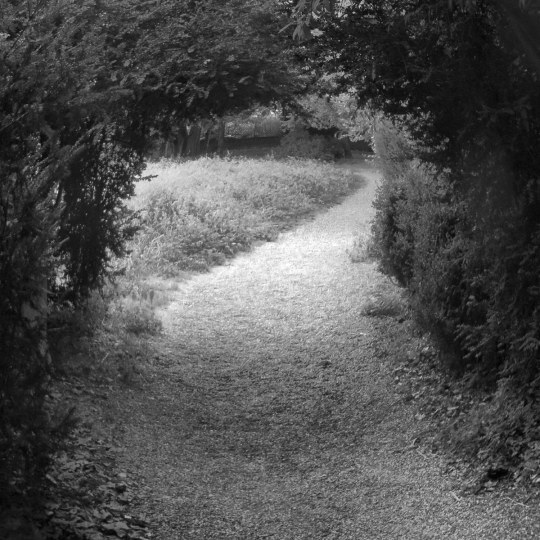
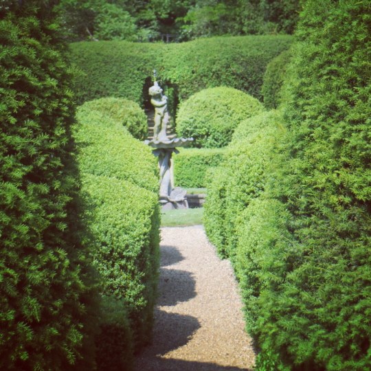
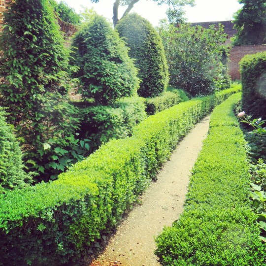
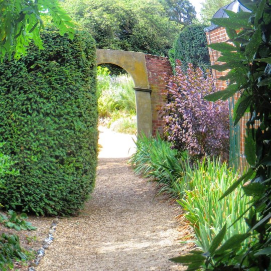
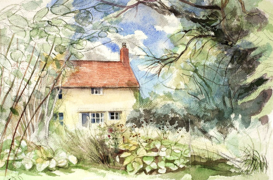
I go to Bridge End Gardens most times when I go to Saffron Walden. Normally to read, but sometimes it is just nice to see what is changing. Here are a series of pictures I have taken. Below is a photograph of the sundial and my father as a child standing beside it.
Jane Vestey was born in 1928, at Virginia Water. The earliest incentive to visual art was given to her as a child by Derek Hill, who showed her how to paint dolls’ furniture. In 1946 she studied life drawing at the Heatherley School of Art, and her apprenticeship continued with landscape and still-life painting at the Camberwell School of Art. It was not, however, until 1949 that the Cezanne’s in the Louvre thrust into this young artist’s hand the instrument with which to start expressing her own vision.
It is evident that Miss Vestey’s pictures of Brazilian and West Indian subjects were painted while the impression made by Cezanne was still beneficently strong. By comparison, her earlier canvases are exercises in elimination that, while showing aesthetic gifts, do not quite succeed in filling out the picture space with interesting paint. Much more lively and appealing-at least to my eye are the southern compositions, which their tented palm fronds, their gaiety of sea and sky: here the painter’s delight in the vivid surprises of the landscape has lent assurance to both hand and eye.
No extravagant claims need to be made for so young a painter at this stage of her career. It is enough to point out that she is the kind of artist who responds to the poetry of nature in a specifically painterly manner: none of her pictures leads me to suspect that she would be better employed in writing novels. Edward Sackville-West
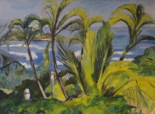
This blog post is about the painting Guaraja Beach by Jane Vestey from 1950. But also it’s about me trying to find more out about her. She is an artist from a rich family. She was good enough to be exhibited at the Redfern Gallery twice, but very little evidence on her art exists online and it was only in an old newspaper that I found a record of her exhibiting.
Jane Vestey – Guaraja Beach, 1950
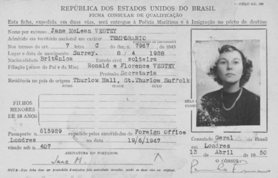
Jane McLean Vestey lived at Thurlow Hall, Great Thurlow, Haverhill, Suffolk. The daughter of Ronald Arthur Vestey and Florence Ellen Vestey (nee McLean Luis). Jane was born on the 8th April 1928 into the famous Vestey family of Blue Star Line Shipping, her father being a Director. At the age of 10 Jane named and launched the Blue Star line ship the ‘Adelaide Star’.
She travelled to Brazil on 13th April 1950 on a temporary visa. In Brazil her family had a fleet of ships. The Painting ‘Guaraja, Brazil’ would have been painted at this time. It is assumed that because her family owned a shipping line, travel for her was less of an issue than it might have been for other people at the time.
Brazilian Copy of Jane’s Visa in 1950.
‘Guaraja Beach’ was exhibited in the Redfern Gallery in 1951, Catalogue Number 124. It was bought by S.J.Dale Esq on 2nd May, 1951. Other artists showing at the exhibition were: Thomas Buford Meteyard, Roy Hobdell and Gordon Crook.
Redfern Gallery, 20 Cork St, W.1. – 2-26 May 1951 – Paintings by the American Impressionist Thomas Buford Mcteyard; Roy Hobdell; Jane Vestey; hand-woven tapestries by Gordon Crook. Exhib. closes May 26. ‡
Vestey exhibited again at the Redfern Gallery as the painting Les Baux was sold at an exhibition in June, 1952. Jane Vestey married John Richard Baddeley (son of a Solicitor) on 23 June 1956. They had three children, Mark, Melissa and Edward.
Mr. R.A. Vestey, on behalf of the Blue Star Line, acknowledged and then proposed the toast of “The Builders.”At the ceremony which followed, Sir Allan Grant, a director of John Brown & Company, presented an antique diamond feather brooch of 1800 to Miss Jane Vestey, who had named and launched the Adelaide Star. †
Jane Vestey – Les Baux
Vestey died on the 22nd June 1999.
† Shipbuilding and Shipping Record – 1950 – Volume 76 – Page 188
‡ New Statesman – 1951 – Volume 41 – Page 548
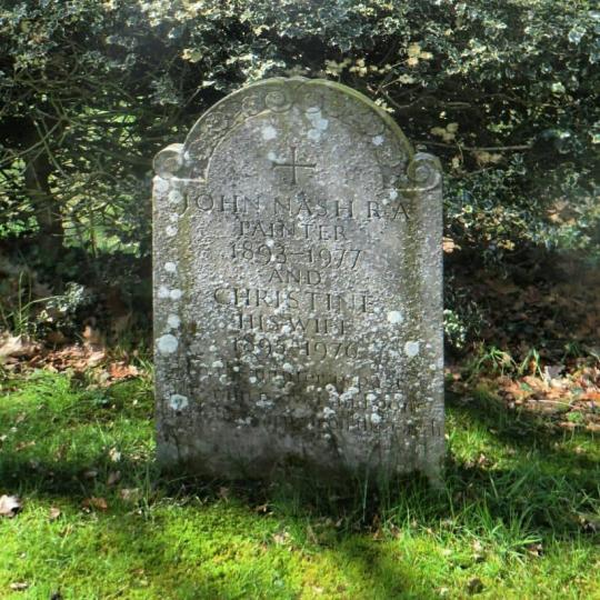
In the past I have posted on John Nash when he was living in Buckinghamshire but here I look at the move John and Christine made to Essex and Wormingford.
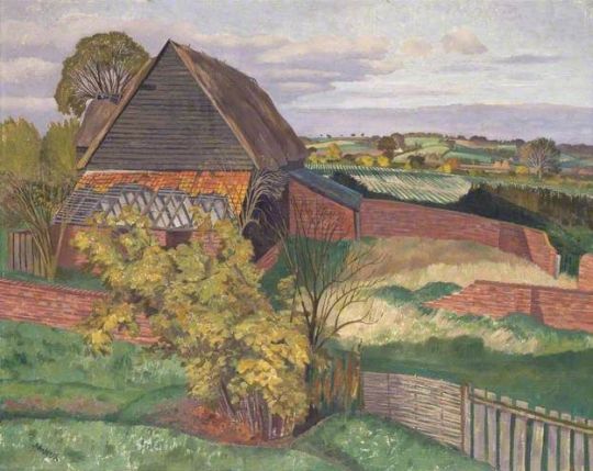
Richard Bawden – Bottengoms Farm
John Nash – The Barn, Wormingford, 1954
When John and his wife Christine came to Wormingford on a holiday, they used to hire a small hut off the side of the local Mill but after it burnt down they returned to find a proper home. This led them to Bottengoms.
After John’s discharge from the forces in 1944, he and Christine sold their cottage at Meadle and moved into Bottengoms Farmhouse near Wormingford, Essex, which, with some two acres of land, they had bought for £750 the previous year. It remained their home for the rest of their lives. The name ‘Bottengoms’ is understood to derive from Bottingham, that of a Saxon farmer. The farmhouse is a small, two-storied sixteennth or seventeenth-century building, of wood and plaster, with one brick gable-end. †
The bulk of Nash’s work from 1944 onward can be found in the areas around Bottengoms, the docklands of Colchester and Ipswich to the landscapes of the Stour Valley and local mill ponds.
When he would venture further afield in France or Cornwall, Christine would scout out painting locations for him and then after he would turn up, walk around for the best view and then paint.
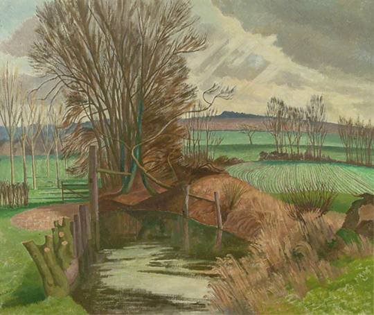
John Nash – Landscape near Polstead
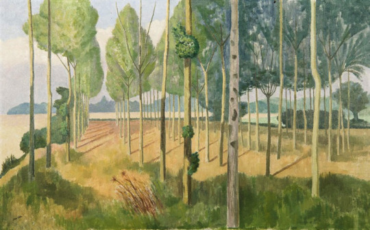
John Nash – Poplar Plantation
Life at Bottengoms was very social. Though he never allowed sociability to disturb his work John formed a circle of close friends, almost all of them neighbours, ‘the dear ones’ as he called them. These included Robert and Natalie Bevan, Colin and Marian Benham, Cedric Morris, Lett Haines, David and Pamela Pearce, John and Griselda Lewis, Lady Fidelity, Lady Cranbrook and Ronald Blythe. †
John Nash – Winter Evening, Wormingford, 1967
John Nash – Disused Canal, Wormingford, Essex, 1958
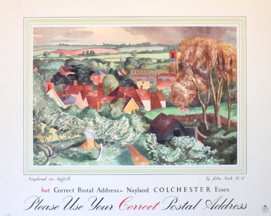
John Nash – GPO Poster – Use Correct Address – Nayland in Suffolk.
John and Christine Nash’s Grave in Wormingford Church.
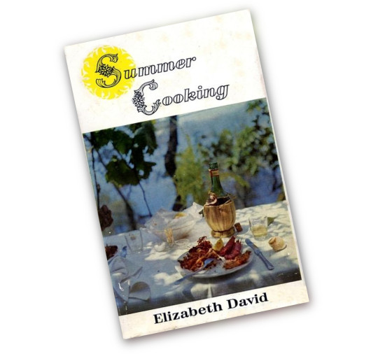
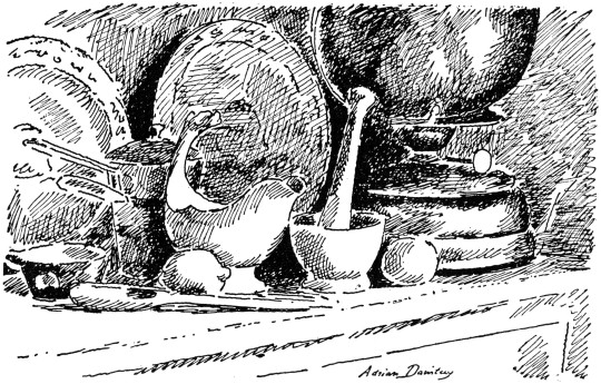
As some of you might have noticed I love illustrated cookery books. Not just Edward Bawden and John Minton’s work but David Gentleman and here, Adrian Daintrey. I think they are an important part of middle class history and one of the first signs of social change and aspiration.
The bottle on the cover, an Italian Chianti with the raffia, flirts with what is now a taboo bit of decor, but at the time would have graced a table with a candle inside and stylistic wax drippings. It was an age where after an extended postwar rationing and the rise of supermarkets, more interesting items were being introduced to a public that didn’t frequent delis.
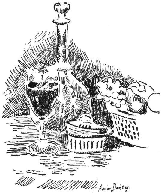
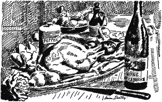
This cookery book by Elizabeth David features illustrations by Adrian Daintrey.
Iced Russian Soup This is a very simplified version of a Russian summer soup called Swekolnik.
1/2lb. of the leaves of young beetroots, 4 small beetroots, half a fresh cucumber, 2 or 3 small pickled cucumbers, a few leaves of tarragon, chives, mint, fennel, ¼ pint of cream, salt, pepper, tarragon vinegar.
Wash the beet leaves, remove the stalks. Cook the leaves in a little salted water for a few minutes. Drain, squeeze perfectly dry, chop finely. Put them in a bowl.
Cut the cooked beetroots into small squares, salt them, add them to the leaves, and pour in a coffee-cupful of tarragon vinegar. Add the diced fresh and pickled cucumber, and a little of the liquid from the pickle. Pour in the cream.
Put the bowl in the refrigerator, and before serving add the chopped herbs, thin with iced water, and serve with little pieces of ice floating in the soup tureen.
This soup comes out a rather violent pink colour, but is very good on a really hot evening.
Laitue a la creme
A salad for people who cannot eat olive oil. Make a cream dressing in the following way: mix together in a cup half a teaspoon of made English mustard, a teaspoon of sugar, 2 teaspoons of tarragon vinegar, half a crushed clove of garlic (this can be left out) and the yolk of a hard-boiled egg. Stir in a teacupful of fresh cream.
Pour the dressing, very cold, over the crisp hearts of cos lettuces, and over the salad sprinkle the chopped white of the egg. Serve very cold. A very beautiful summery looking salad. If you have fresh tarragon or chives add some, chopped, to the dressing.
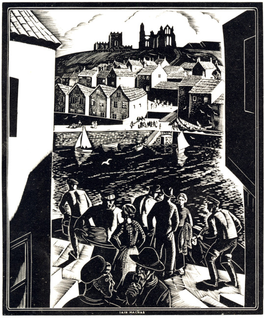
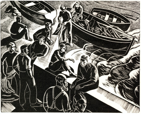
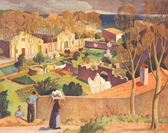
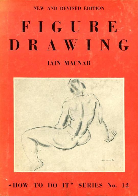
Below is an essay on Iain Macnab. Someone who is talked about for his and Claude Flight’s Grosvenor School. I didn’t really know a lot about Macnab but the text and illustrations are from The Artist, April 1937.
The old adage that “Those that can, do; those that can’t, teach” is one of those half-truths that are dangerous from their very speciousness. It is a good thing to dissect and expose them once in a while. So far as the fine arts are concerned, one need not look far for examples to prove the frequent falsity of this cruel and facile allegation.
Iain Macnab – LNER Poster
Sickert is one conspicuous case; Tonks (whose recent loss we mourn) is another; and among the younger men one could hardly select a better subject than lain Macnab, who can both ‘do’ and ‘teach’ with talent and finish, and who is an artist teacher because he has the two-fold vocation.
The clarity of his exposition, the whole-hearted enthusiasm with which he descants on art, the breadth and catholicity of his views, mark him out a born teacher; while his own production as a painter and engraver is proof of his capacity as a practising artist.
Macnab is of Highland ancestry, and comes of an ancient and celebrated line of Scottish armourers, the Macnabs of Barachastalain. He has always found his hand respond easily to any new technique, and he is inclined to attribute this manual aptitude to the ingrained hereditary habit produced by an age-long tradition of fine engraved work on pistols and other arms. Also, there were artists on both sides of his family. His father was in the Hong Kong & Shanghai Bank, and Macnab was born on 21st October, 1890, at Iloilo, in the Philippine Islands, which were then under Spanish control. He lisped in Spanish as an infant but at the age of four he was brought home to Kilmalcolm, in Renfrewshire.
Iain Macnab – Fisherman at Portofino, 1937
During a holiday in Ireland at the age of seven a gypsy foretold that he would become an artist. He was educated at Merchiston and left school at eighteen. Already as a boy his interests were turned to sculpture, painting and cartooning, with the first perhaps pre-eminent, but the career chosen for him was that of chartered accountant, and he duly served his artiles thereto in Glasgow for five and a half years. He was due to sit for his final examination in October, 1914; with the prospect if he passed, of an excellent post in the Philippines, leading to the early reversion of a complete business.
But the outbreak of the war formed a pretext for abandoning accountancy, and Macnab enlisted at once as a private in the Highland Light Infantry. Being already trained in the school cadet corps, he found himself in France by the end of October, 1914 and is a Mons Star man. In April, 1915 he was granted a regular commission in the 2nd Argyll and Sutherland Highlanders. During the battle of Loos he was blown up by a shell. After some little time symptoms of grave internal injury became evident; and in July, 1916 he was invalided out of the service.
Iain Macnab – Spring Landscape, Tossa, 1936
His cure was by no means complete, however, and it was not until 1918 that he was well enough to take the art course he had promised himself.
In that year he became a student at Heatherley’s. He had already seen and studied many good paintings; he had an uncle who knew several of the Impressionists, and who used to talk art with him; and in general his mind was well stored with paintings lore. He started work with the determination to be a professional artist or nothing; the amateur status had no attraction for him. His rapid progress, his fertility in ideas, and his clear and ready exposition of them, led Henry Massey, the Principal of the School, to see in him a potentially valuable teacher. So strongly did Massey feel this that after only a year he offered Macnab the post of joint Principal of Heatherley’s.
With this offer Macnab closed, and as a teacher worked with enthusiasm at the School till temporarily put out of action again, in 1925, by a too-vigorous pull at the etching press. While convalescent in a nursing home he decided that the time had come when he needed, for the proper expression of his educational theories, a school under his sole personal control; so, once well again he found a big house in Warwick Square, Belgravia, and on 19th October, 1925 opened there the Grosvenor School of Modern Art.
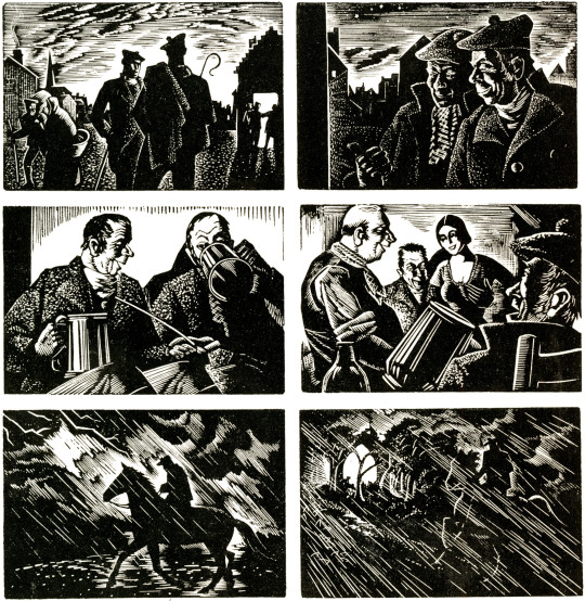
Iain Macnab – Illustrations for Burns’s Tam o’Shanter, 1934
Macnab had thought out the broad principles on which he wished to run his school. His idea was not so much to train students to paint what they saw, in the crude sense, as to teach them to isolate from nature the elements that are truly pictorial, and then to develop their own personalities. His ambition was to make artists.
To be an artist, as distinguished from a mere competent draughtsman, he felt, it is necessary first to have a personality to express. It is indispensable to the production of a work of art that an emotional reaction shall take place. Of that reaction the drawing is only a vehicle. He stresses the cardinal importance of composition; the students are encouraged to approach every problem in terms of design from the beginning, and to build up their drawings gradually on logical principles.
The preliminary visualisation of a subject in planes and its resolution by successive steps into a picture giving the illusion of three-dimensional form are clearly expounded in his recent book on ‘Figure Drawing.’ He is a firm believer in the virtues of wood-engraving as a discipline for all artists, since in this medium every mark must have its significance, and the whole thing must be thought out thoroughly in advance, for there is no scope for fumbling or retouching.
Iain Macnab – Figure Drawing, 1936
Macnab considers himself lucky to have attracted, from the first, a serious-minded type of student, took kindly to his inexorable rule of silence while at work in the studio. This rule shows his common sense, and is by no means the mark of the martinet. No one, indeed, could be less like the more starched kind of pedagogue than Macnab; and when the time comes for exposition and discussion he not only admits but encourages the criticisms of students.
He believes in the thorough ventilation of the subject, and strives to train his pupils to see the inwardness of widely-differing styles. Side by side with his teaching activities Macnab has pursued a versatile course as an artist. He began painting in 1918, and has developed, both in oils and water-colours, a distinctive style that, while it has nothing outré about it, is thoroughly in the modern trend of design.
In October, 1922 he decided that he would like to etch. He was told of five-year courses and suchlike, but this did not suit him, so he bought copper, tools, acid and a book on etching, and within three months had produced six prints which were good enough to secure his election as an Associate of the Royal Society of Painter-Etchers. For some years he exhibited etchings at the Academy, but in 1929 he decided that the copper was altogether too facile and deserted it for wood engraving.
Iain Macnab – Illustration from Burns’s Tam o’Shanter, 1934
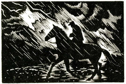
This medium he took up largely because of its recalcitrance, because of the stern discipline it imposes. In it he has done some of his finest work; and one might go a long way before finding wood-engravings to equal the ‘Tam of Shanter’ illustrations here Shown, with their beautiful distribution of blacks and whites and their admirable translation of the famous story into graphic terms.
Macnab is a member of the Royal Institute of Oil Painters, Honorary Treasurer of the National Society, and was made a full R.E. in 1935. He has held only one one-man Show, at the old Albany Gallery, Sackville Street. He exhibits each year at the Royal Scottish Academy, and frequently at the London Group, the Royal Institute of Oil Painters, the New English Art Club and the National Society. He has achieved much, and much more may be expected from him in the future.
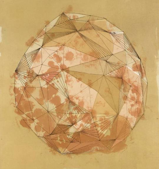
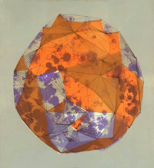
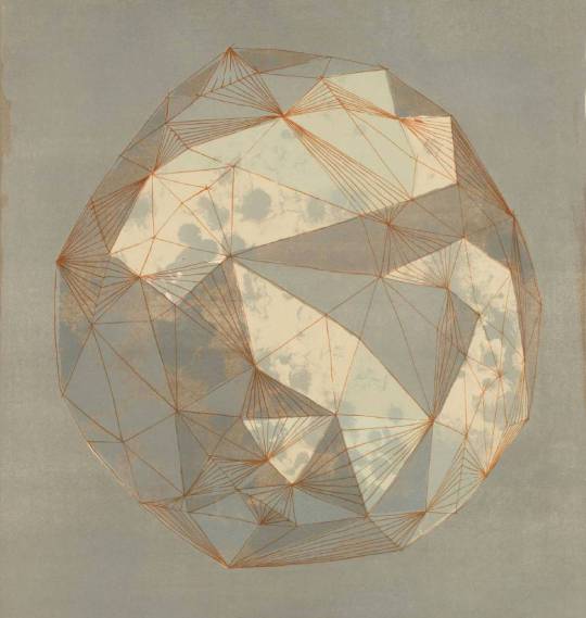
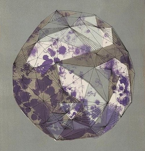
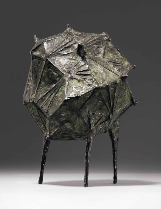
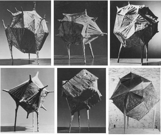
What inspires my collecting is always unknown to me, it is just “If I like it”. But I rather like the simple looking Phases of the Moon by sculpture Lynn Chadwick. So different from the triangle shaped aliens he normally represents.
Lynn Chadwick, Moon in Alabama, 1963
Chadwick’s Moon in Alabama series of 1963, variations on a faceted sphere, is a sculptor’s image, yet developed with a consciousness of the potential of printmaking for changing colour ways. †
Lynn Chadwick – Moon in Alabama (colour variant), 1963
Moon in Alabama reminds one of those evil-looking mines, horned with detonators, that were sown at sea and whose shape Chadwick may subconsciously have recalled from his Fleet Air Arm days as he worked on the maquettes. ‡
Lynn Chadwick – Moon in Alabama (colour variant), 1963
Lynn Chadwick – Moon in Alabama (colour variant), 1963
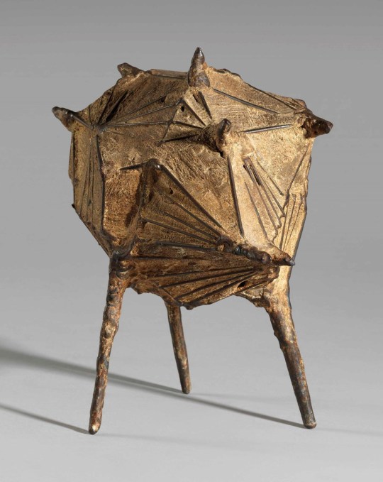
Lynn Chadwick – Maquette II Moon of Alabama
Lynn Chadwick – Maquette III Moon of Alabama
Lynn Chadwick – Full Series of Maquettes and Bottom right the final piece.
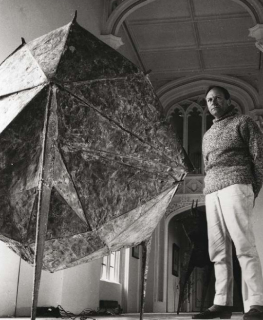
J. S. Lewinski – Lynn Chadwick with Moon of Alabama,
† Alan Powers – Art and Print: The Curwen Story, 2008 – p118 ‡ Dennis Farr – Lynn Chadwick, 2003 – p52