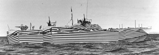
Artists International Association was an exhibiting society founded in London in 1933, which held exhibitions and events to promote and support various left-of centre political causes. Having come out of the First World War and then seeing the global effect of the Great Depression in 1929 many of these artists wanted to promote a better world. Though the Spanish Civil War and the Second World War erupted it was important to have a society where artists could still publicly protest war in a subtle way.
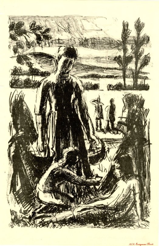
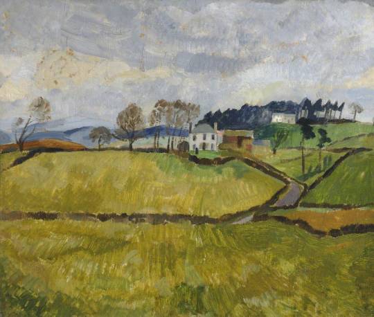
Vanessa Bell – London Children in the Country, 1939
The principal founders of the A.I.A. were Misha Black, James Boswell, Clifford Rowe and Pearl Binder. The guiding ethos was to promote a radical response to political events in the world. A unity against Fascism, both home and abroad.
Its membership quickly grew throughout the 1930s and 1940s (930 members by 1945) so that in 1947 it was able to acquire permanent premises in Lisle Street. In the 50′s the political aims of the group were dropped after they broadcast support for an alliance between Britain and the Soviet Union. In 1953 it became an exhibiting society.
In the Second World War the A.I.A. started a series of prints but due to the economic climate of WW2 it wasn’t a vast success.
In 1942 it was reported to members that the scheme had run into production and retailing difficulties and with ultimately only about 5,000 prints sold, the royalities could not have been very remunerative. †
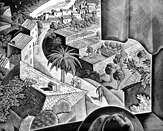
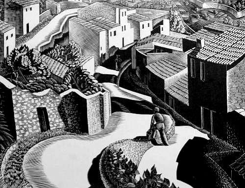
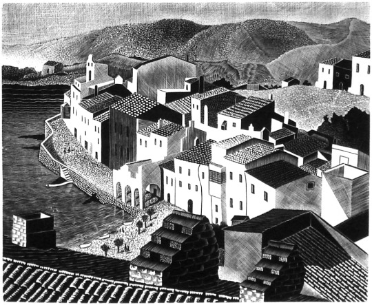
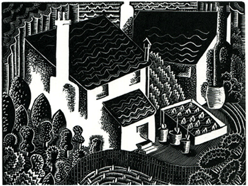
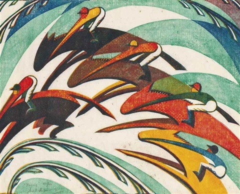
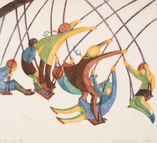
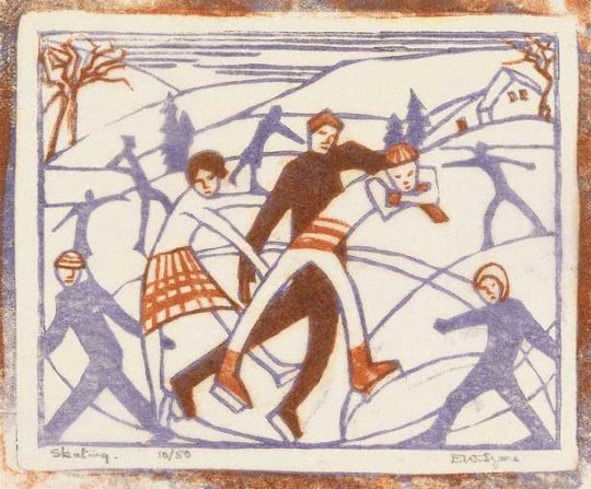
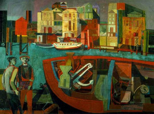
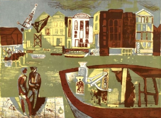
The print series ran from 1939 to 1942 and all the images in this post are taken from the series.
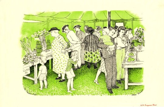
Helen Binyon – The Flower Show, 1939 – Everyman Prints AIA
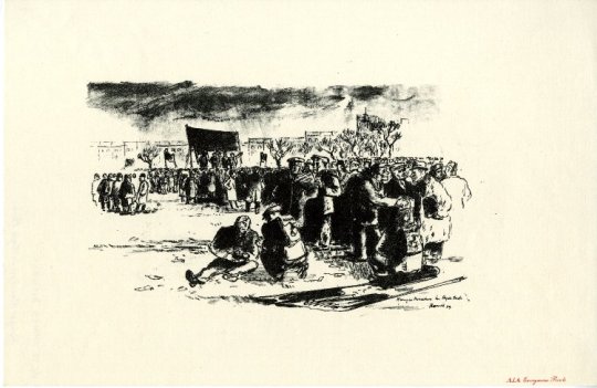
James Boswell – Hunger marchers in Hyde Park, 1939 – Everyman Prints AIA
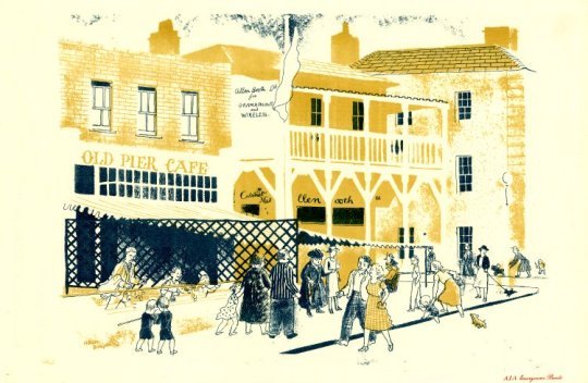
Helen Binyon – Summer Holiday, Walton-on-Naze, 1939 – Everyman Prints AIA
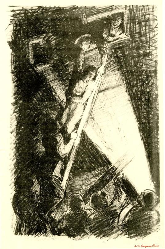
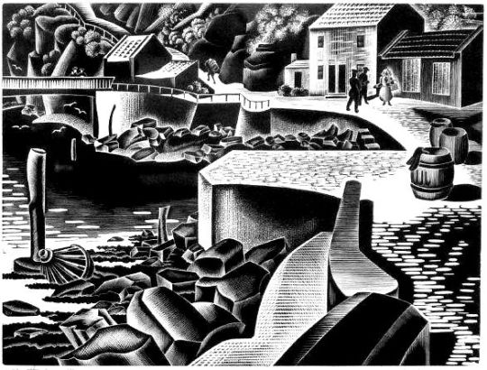
Lowes Dalbiac Luard – The Rescue, 1939 – Everyman Prints AIA
List of Artists International Association print series – 1939 to 1942
- Mary Adshead – Sprint on Woodhouse Moor
- S R Badmin – A British Common & Down for a Refill
- Durac Barnett – Bread and Circuses
- Vanessa Bell – London Children in the Country
- Pearl Binder – Evacuation Scene, 1939
- Helen Binyon – The Flower Show
- Helen Binyon – Summer Holiday, Walton-on-Naze
- Helen Binyon – The Gate
- Stephen Bone – Village on coast
- Arthur Boyce – Upheaval
- James Boswell – Candidate for Glory
- James Boswell – Gitte Business
- James Boswell – Hunger Marchers in Hyde Park
- Herbert Budd – September, 1939
- Robert Butler – The Station
- David Caplan – Liverpool Station
- Raymond Coxon – Evacuated Children at a Yorkshire Village
- Moira Evans – August Bank Holiday
- Moira Evans – November 11th, 193 9
- Chris Fontaine – The Library
- Kathleen Gardiner – Market Day
- Phyllis Ginger – Chimps at the Zoo
- Rowland Hilder – Landscape
- James Holland – ‘Here They Come’
- James Holland – Country Town the Militia
- James Holland – News Reel
- Henry Holzer – Barrage Balloon
- Diana John – On the Beach
- Diana John – Evacuees, Bradford-on-Avon
- Helen Kapp – ‘My Marmaduke’
- Helen Kapp – A Queen’s Hall Prom
- Helen Kapp – English Rose
- Helen Kapp – Black-out; Listening to Beethoven
- L D Luard – The Rescue
- Peter Barker Mill – The Threat
- Mona Moore – Draught Players
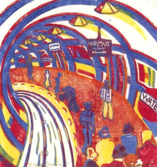
- Theodore Naish – Underground
- Freda Nichols – Fun Fair
- Russel Reeve – Barrage Balloons ascending over Hampstead
- Geoffrey Rhoades – Blackout
- C H Rowe – Unemployment Assessment Board
- Kenneth Rowntree – Wartime Hoardings
- Maurice de Sausmarez – A Garden – God Wot
- Edward Scroggie – Street Market
- Beryl Sinclair – The Row
- Elizabeth Spurr – Washing Day
- Feliks Topolski – Drawing
- William Townsend – W E A Meeting
- Henry Trevick – The Fair
- Kathleen Walker – The Mother’s Union in War Time
- Carel Weight – Blockade
- John Piper – The Font and Tortoise Stove: Britwell Salome
† Lynda Morris and Robert Radford – A.I.A. The Story of the Artists’ International Association, 1999. p58