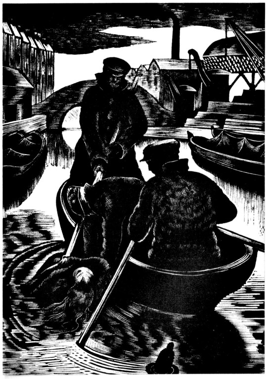
Green Line Bus Advert with Ravilious’s Suburban Home Wood-engraving, 1935
Some time ago I was looking at all the Ravilious wood engravings and their links to each other for a book called Ravilious Recycled. I still haven’t finished the book but in doing it I have made a few discoveries that would add to what is known about the work of Eric Ravilious.
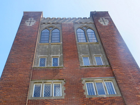
One is a design for the Green Line, the ‘Suburban Home’ with the silhouette of a man in top hat and umbrella standing in the doorway. The house turns out to be the Old Vicarage in Castle Hedingham, the same in the background of Vicarage in Winter, 1935. The steps, the ionic colonnaded door and the window above all say so – it isn’t a fact I have seen in print before and a genuine discovery by myself.
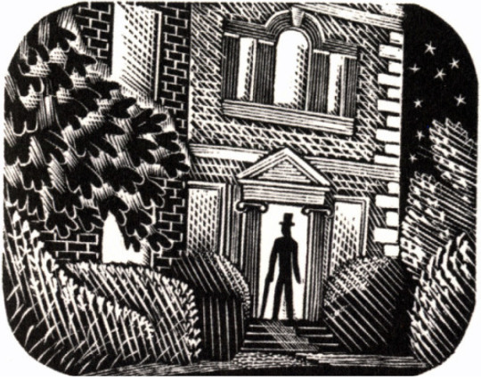
Eric Ravilious – Suburban Home, 1935
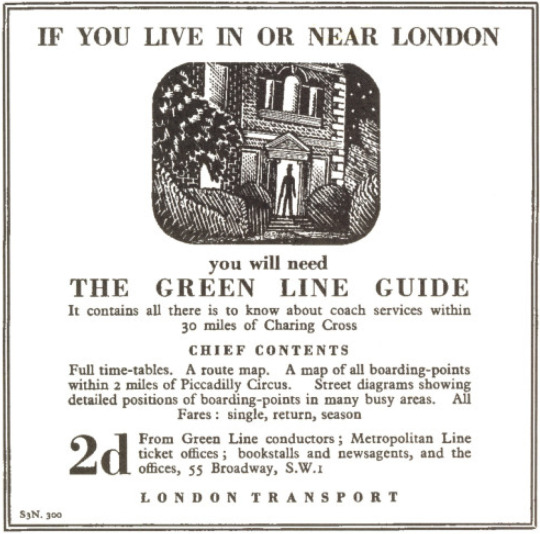
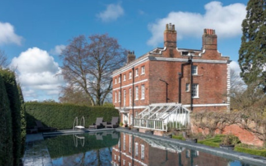
The advert was much smaller in printed size when in the newspapers than the other ‘banner’ like designs London Transport made around Ravilious blocks. It was not used on the Country Walks books. Nearby Greys Hall, in Sible Hedingham also became famous by proxy when used by illustrators Janet and Anne Grahame Johnstone as the inspiration of Hell Hall in The Hundred and One Dalmatians.
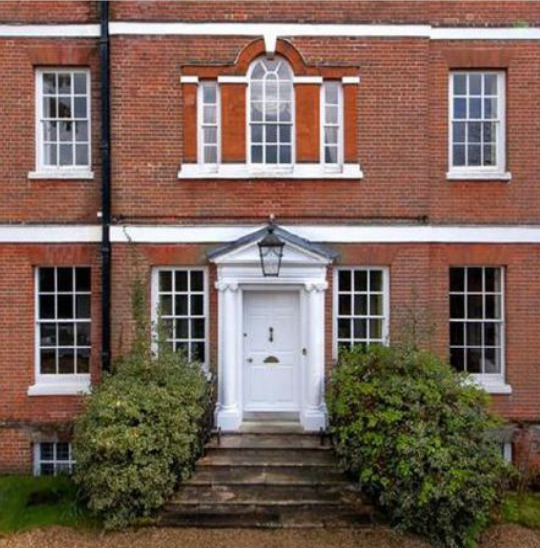
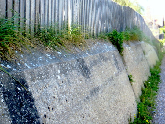
The Old Vicarage, Castle Hedingham today.
In the memoir of Ravilious by Helen Binyon she writes of when Eric and Tirzah came to Castle Hedingham they didn’t know anyone in the village but soon befriended the Vicar and his wife, Rev. Guy and Evelyn Hepher.
The first time that Eric called at their large Georgian vicarage, he found the vicar having a bonfire of the temperance hymn books inherited from his predecessor – an activity that Eric certainly approved of. The vicarage was too large and uncomfortable to be easily run, but it afforded a refuge to the Raviliouses one very cold Christmas when all their pipes had frozen up. ‡
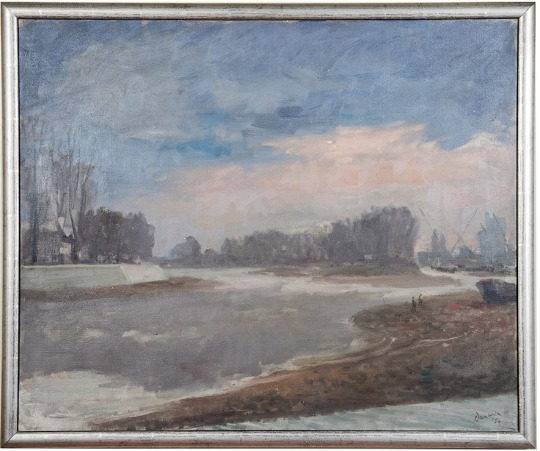
It was the same Christmas period in 1935 that Ravilious painted Vicarage in Winter below.
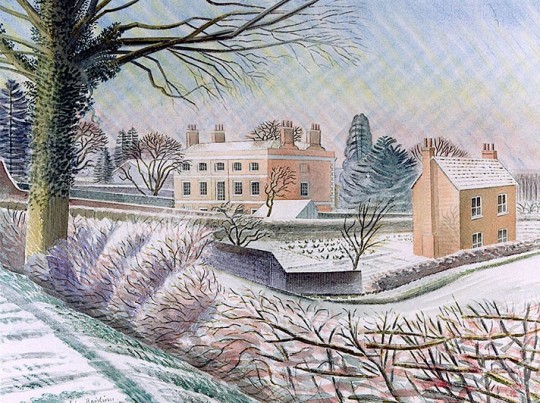
Eric Ravilious – Vicarage in Winter, 1935
Ravilious would go on to use Castle Hedingham for inspiration, as can be found in the Vicarage in Winter watercolour, started in the Winter of 1935. Tirzah writes in her diary that Eric’s paint had frozen on the brush and some days later Eric wrote to Helen Binyon
The snow picture is finished and not bad – rather pretty but so was the thing, like a Christmas card. ‡
The Old Vicarage, Castle Hedingham today.
This watercolour takes us back to the Green Line illustrations and in 1936 Ravilious used the cottage to the right in Vicarage in Winter for one of his wood-engravings for London Transport. According to Barry Kitts
Ravilious has transformed the slates on the Essex cottage – into thatch. †
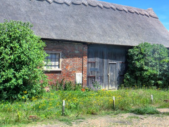
The Vicarage can be seen from behind with the same greenhouse as in the painting still standing today.
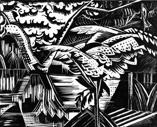
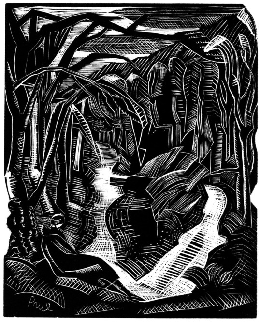
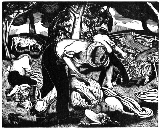
The block shows a woman cutting the hedge by the path leading up to a V shaped Sussex style stile. It is the shape of the wall to the left of the engraving and the hedge in Vicarage in Winter that bind them together as the same location.
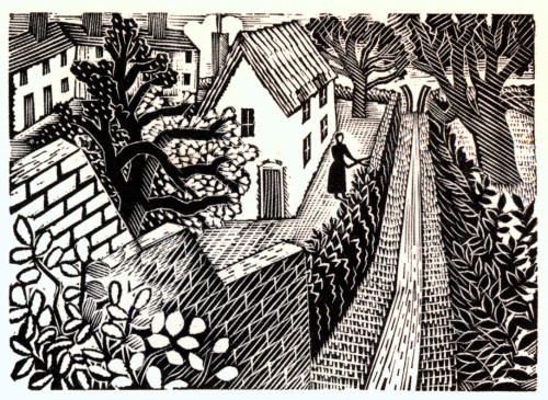
Eric Ravilious – Cutting the Hedge, 1935
In Castle Hedingham I found the lane from Cutting
the Hedge. Looking at the watercolour Vicarage In Winter
I just went to about the same view point and found it on
a village footpath. The photograph (below) shows the same
stepped wall. The house Pottery Cottage has had a lot
of work and is just recognisable. If Vicarage In Winter
were painted today it would be covered in various states
of mid century architecture. It’s a joy to stand on the spot of location and see the work of art before you.
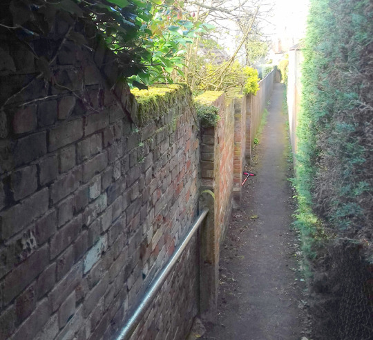
Cutting the Hedge’s view today.
The Lane was named after Castle Hedingham Ware, potted by Edward Bingham between 1864 and 1901.
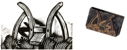
Eric Ravilious – Kynoch Press Block 121, 1932 and the original woodblock.
The V Stile also appeared in the Kynoch Press Notebook for 1933. The stile is on the page for the 8th May but its technical name is Block 121. The Notebook has 42 engraved vignettes of rural life.
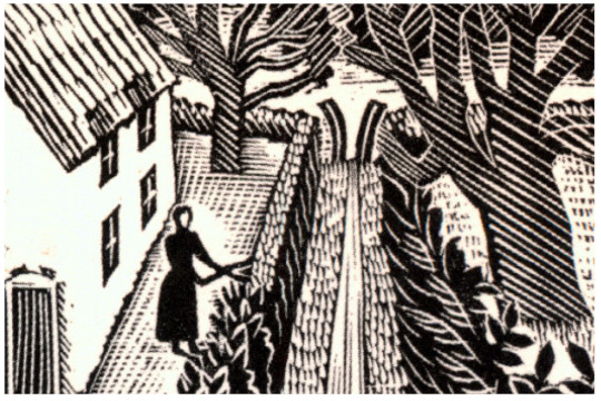
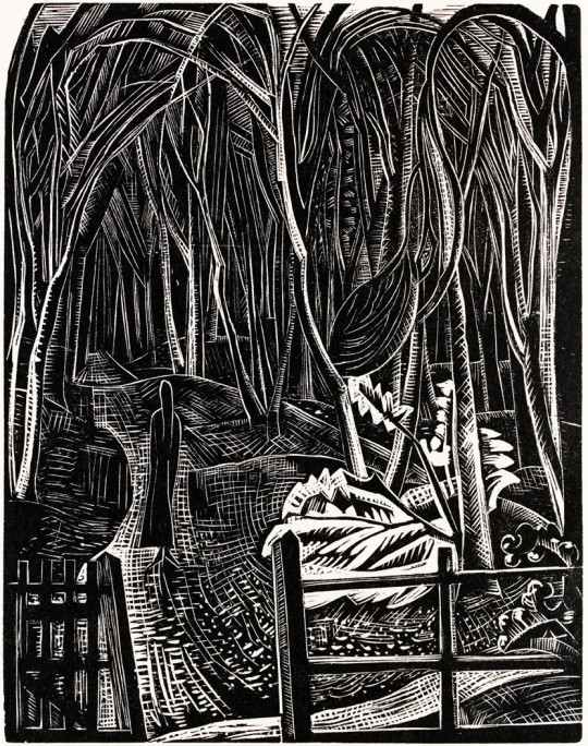
Eric Ravilious – Cutting the Hedge, 1935
Below is the press advert, the text in the advert talks of the clean breeze of the downs.
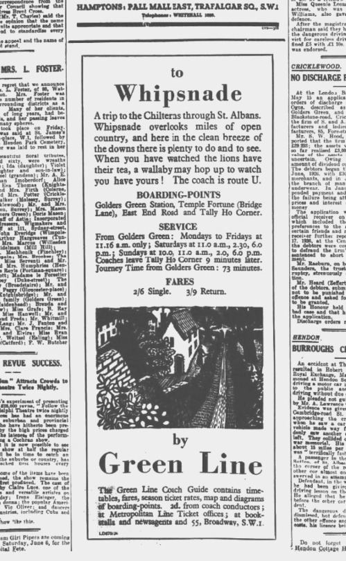
Eric Ravilious – Cutting the Hedge as part of a Green Line Advert, 1936
† Ravilious – Engravings by Jeremy Greenwood, Wood Lea Press, 2008.
‡ Eric Ravilious: Memoir of an Artist by Helen Binyon, Lutterworth Press, 1983