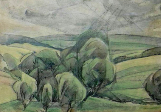
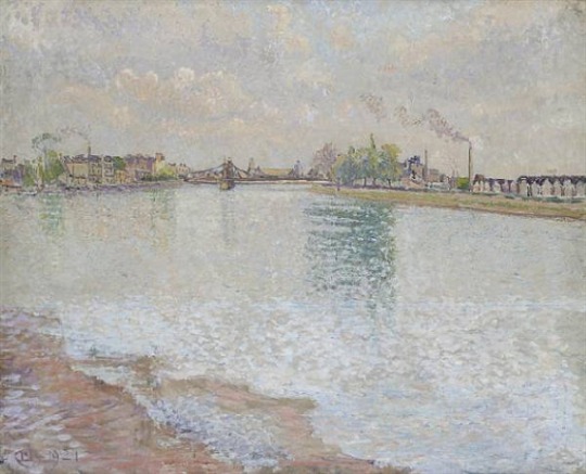
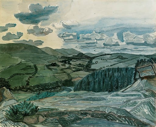
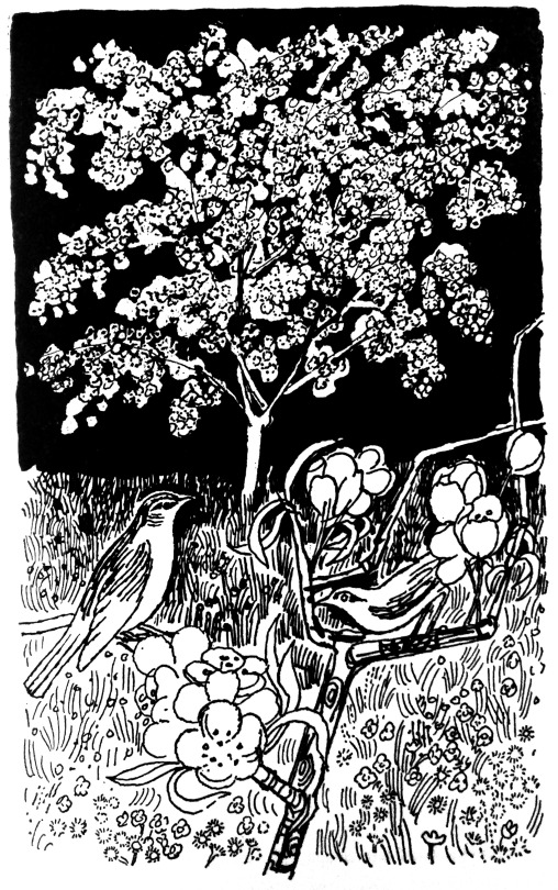
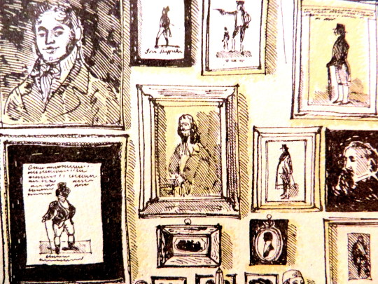
Elsie Marian Henderson – Landscape – Watercolour and Ink
Henderson was one of the great shining students of the early twentieth century. Her works are in the collections of the Tate, British Museum, Victoria and Albert Museum’s in London, the Fitzwilliam Museum in Cambridge, Manchester City Art Gallery, Guernsey Museum & Art Gallery and The Whitworth Manchester.
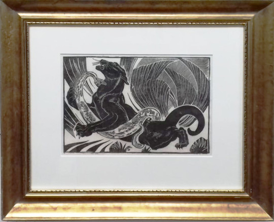
Elsie Marian Henderson – Black Panther & Snake – Linocut
Henderson was born in Eastbourne, Sussex and studied art with the encouragement of her mother. Henderson was a student at the Slade School of Art under the strict Henry Tonks from 1903 to 1905. She continued her art education in the tradition method of the time, by doing a European tour. She moved to Paris and took lessons at various ateliers in the city including the Academie Moderne, Académie Colarossi, Cercle Russe and the Académie de La Palette (studying with cubist painter Amédée Ozenfant and André Dunoyer de Segonzac) under Henri Le Fauconnier. In 1912 Henderson also studied with Othon Friesz before spending 1913 in Italy observing master paintings and works.
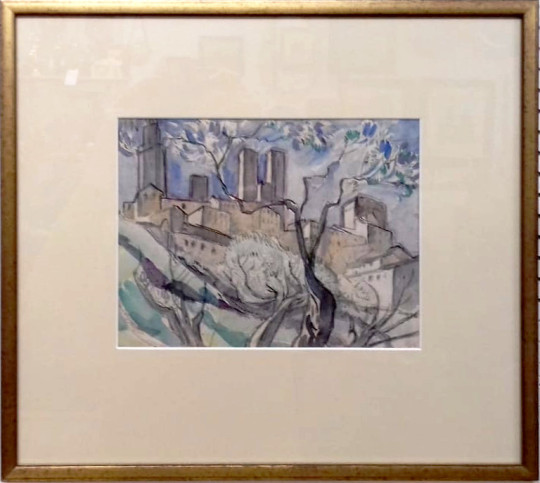
Elsie Marian Henderson – The Towers of San Gimignano, Italy – Watercolour
In 1914 at the start of the First World War Elsie moved to Guernsey, living with her sister but in 1916 she enrolled at the Chelsea Polytechnic, where she was taught lithography by the artist Francis Ernest Jackson, one of the pioneers in British lithography. In London she became a frequent visitor to London Zoo and animal drawings and paintings became a major theme of her early work. While still a student London Transport commissioned a poster from her to promote travel to the Zoo, which was, despite its unusual design for the time of a selection of animal studies, was well received.
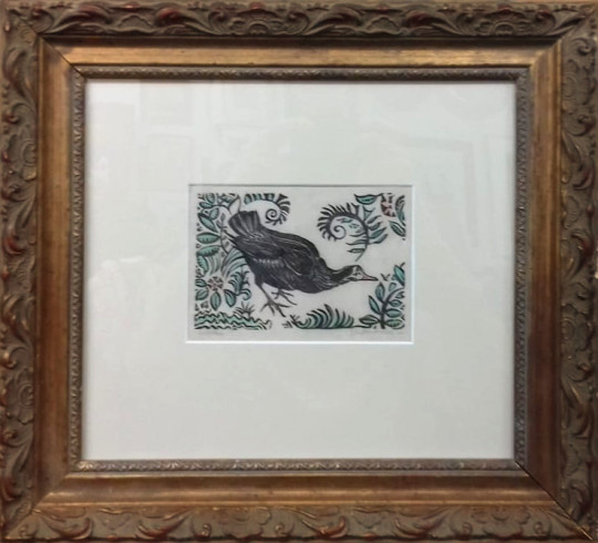
Elsie Marian Henderson – Moorhen – Linocut
Henderson started her own press and became a member of the Senefelder Club for printmakers. Between 1921-1924 she joined Lucien Pissarro’s short lived art society, the Monarro Group, one of only two women members. In 1924 Henderson had her first solo exhibition at the Leicester Galleries in London. The exhibition consisted of drawings, lithographs and bronze sculptures of, often savage, animals such as Jaguar Tearing its Prey and Leopard Killing a Parrot. She had a joint exhibition with Paul Nash. Between 1927 and 1938 she exhibited with the Society of Graver Printers in Colour.
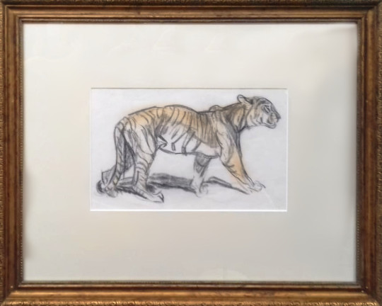
Elsie Marian Henderson – Tiger – Charcoal and pastel
In 1928 Henderson married Emmanuel Edouard Marie Henri de Coudenhove the French consul to Guernsey. The couple lived on the island during World War Two and throughout the German occupation. Baron de Coudenhove died towards the end of the war and in 1946 Henderson moved to Hadlow Down in Sussex.
During her lifetime Henderson exhibited at the Royal Academy, with the Women’s International Art Club and the Society of Women Artists. A joint retrospective exhibition of Henderson’s work, with that of her friend Orovida Pissarro, was held in 1985 at the Michael Parkin Gallery. Sally Hunter Fine Art subsequently held exhibitions of her work.
To Elsie Henderson, stone is a living thing, hence her joy in lithograph. No other process gives such range from velvet-black, profoundly deep to delicate silver. – The Prints of Elsie Henderson – C A Nicholson 1928
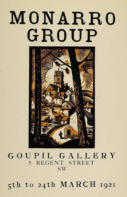
Original Poster for the Monarro show at Goupil Gallery, 1921
Lucien Pissarro was the son of painter Camille Pissarro. In 1911 Lucien Pissarro helped to set up the Camden Town Group, he deplored their decision to exclude women members (it was one of his motivations in leaving and setting up the Monarro). In 1913 he was a founding member of the London Group. These major groups not being enough he founded a third, the more obscure Monarro Group with the intention of carrying on the Impressionist tradition.
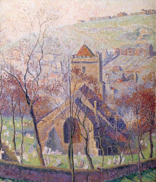
Lucien Pissarro – All Saints’ Church, Hastings: Sun and Mist, 1918
The Monarro Group was named after Claude Mon(et and Lucien Piss)arro. Monet was the honorary president. Pissarro’s brother Ludovic-Rodo Pissarro also helped set up the group. Theo van Rysselberghe acted as the group’s secretary in Paris and in England it was James Bolivar Manson. Manson was also keeper of pictures at the Tate from 1917 – 1930.
The aim of the group was to exhibit those artists who were inspired by the leading Impressionists. The only known women who exhibited with the Group were Hilary Clements Hassell and Elsie Marian Henderson.
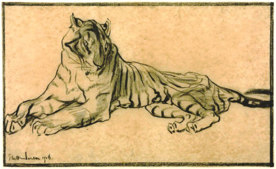
Elsie Marian Henderson – A Tiger, 1916. Tate Britain.
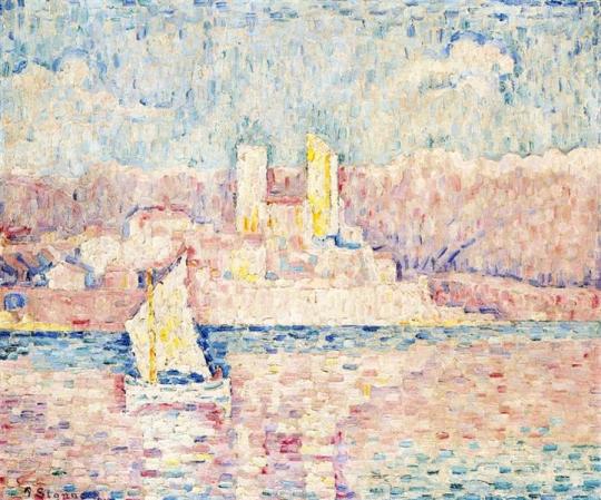
However, it lasted only a brief three years. Other members included New Zealand painter Raymond Francis McIntyre. At least two exhibitions were held at the Goupil Gallery in 1920 and 1921 and included the work of Post-Impressionist Paul Signac.
I do enjoy looking at an artist in a narrow period of time or at one point in an artist’s life. With Bawden his holidays are wonderful examples of a fixed period of time. He normally took them with other artists, John Nash and Carol Weight.
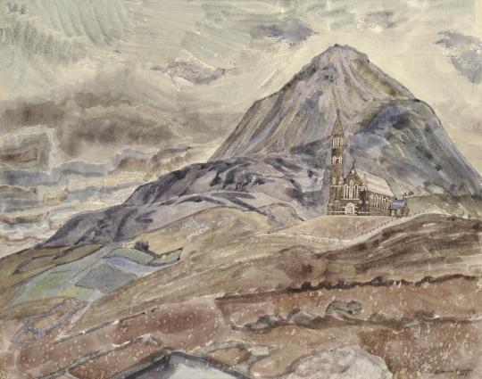
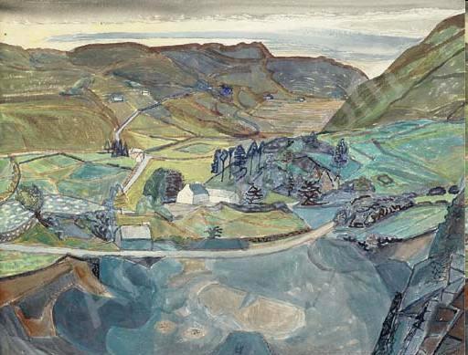
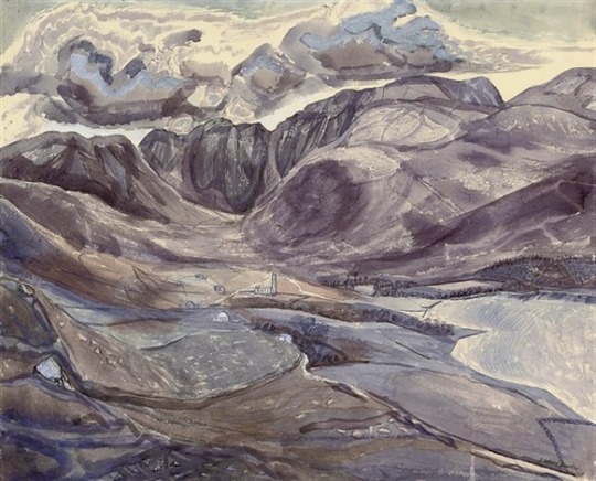
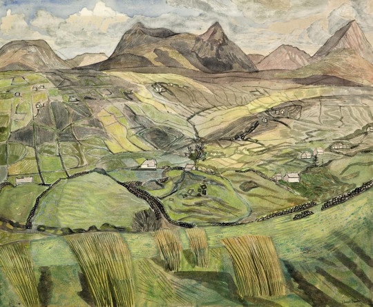
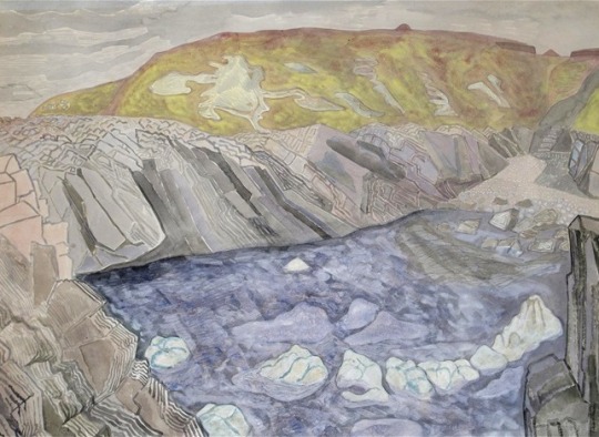
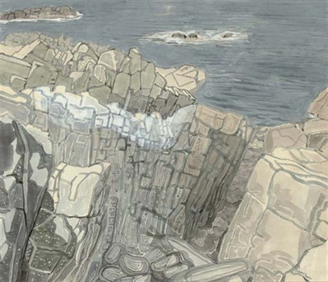
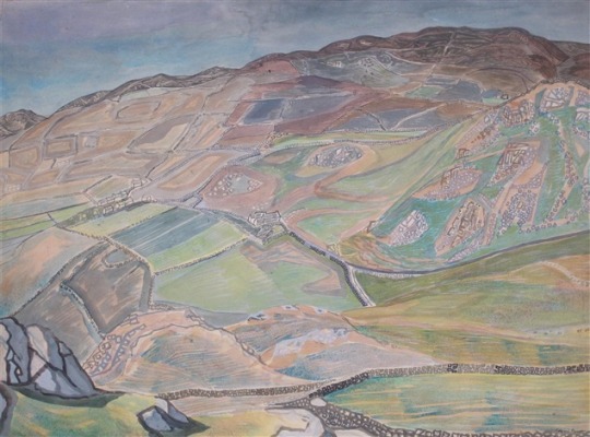
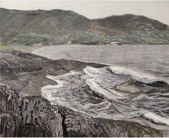
Here we can see many views of Ireland by Bawden, as a contrast to some of the drawings and pictures he made of Portugal and other countries these are some of the most muted, colour wise. I am struggling to resist using the world gloomy. But there is a drama in the landscape that is very much Bawden with his painted lines of geology showing the drama of the hills.
The paintings formed two exhibitions, the first in November 1963 at the Zwemmer Gallery and a later exhibition at the Fine Art Society in November 1968.
Edward Bawden – Errigal, 1962
Edward Bawden – Quarry at Ballybofey Road, 1962
Edward Bawden – The Vault at Glenties, Donegal, 1962
Edward Bawden – The Poisoned Glen, 1962
Edward Bawden – The Muchish Mountain, 1962
Edward Bawden – The Bloody Foreland VI, Co. Donegal, 1965
Edward Bawden – Bloody Foreland VII, Co. Donegal, 1965
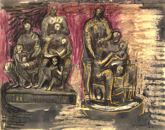
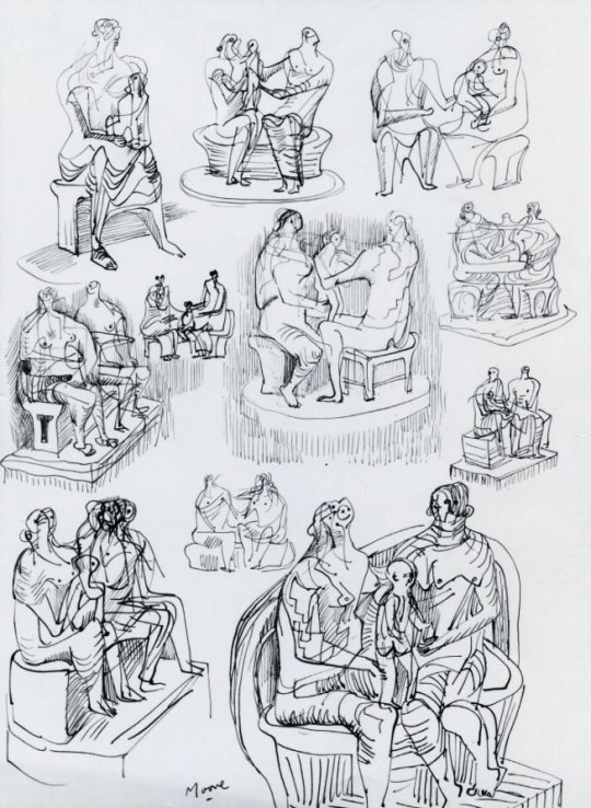
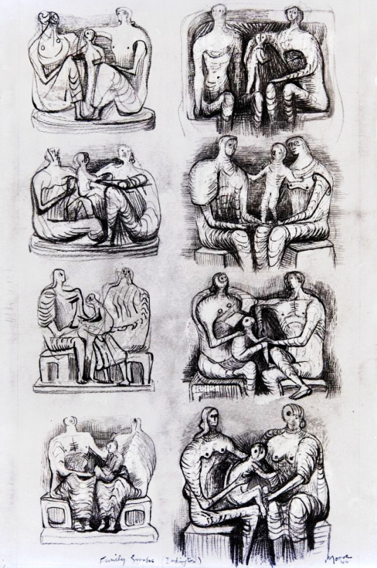
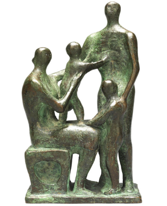
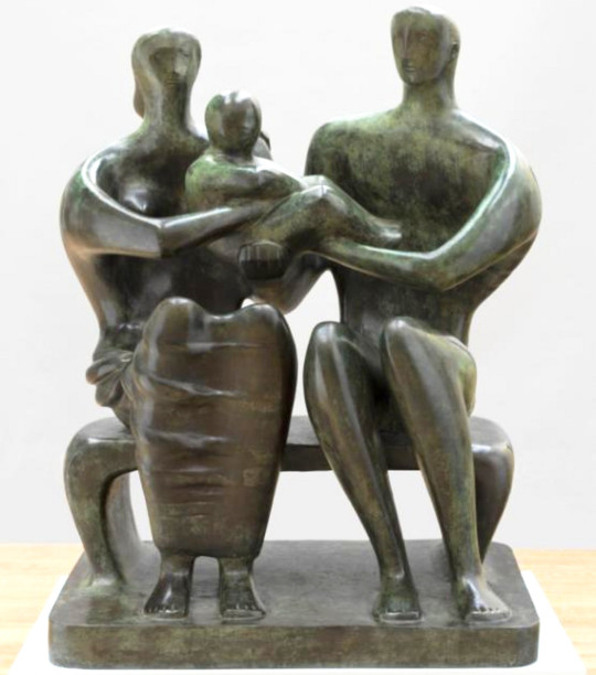
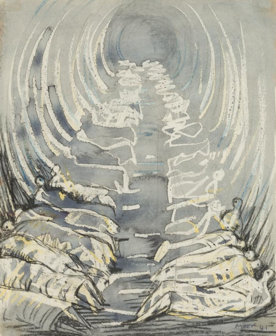
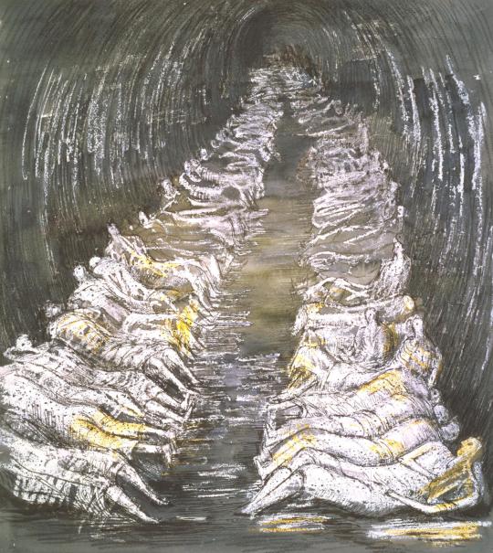
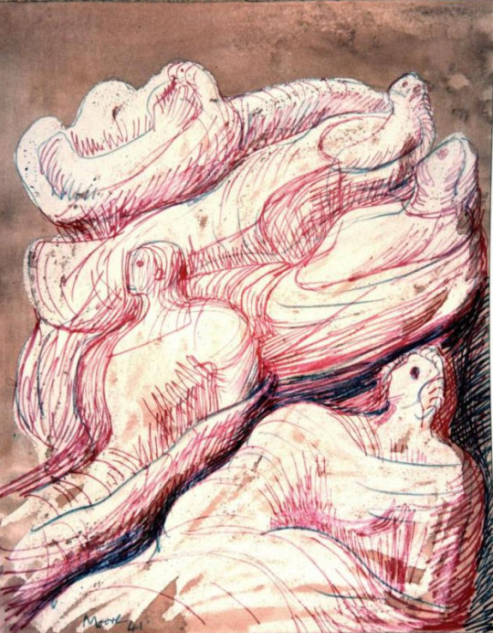
After a previous post of Henry Moore’s shelter drawings I wanted to move on to his series of the Family Unit. The shelter drawings were met with a wave of public success as they captured the public’s imagination of hardship without conflict. The drawings were on show at the National Gallery while the gallery’s permanent works were relocated into air-conditioned huts in caves.
Henry Moore – Family Groups, 1944
The Government used the now empty National Gallery for lunchtime concerts of music and displaying the work of War Artists. So the public where being introduced to modern art by Government patronage.
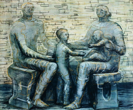
The Family unit works feel like perhaps a natural progression of the shelter themes, the drawing is in that new style of wax and watercolour. Moore abstracted forms down to crash-test-dummy basics. Draped in fabric it was this period of his work that defined the styles he would continue for the rest of his life. Before the war his work being more abstract and less figurative.
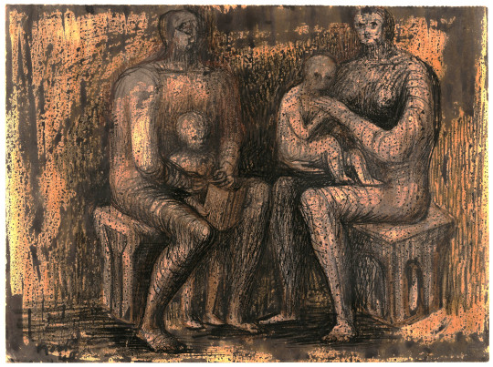
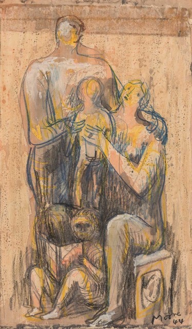
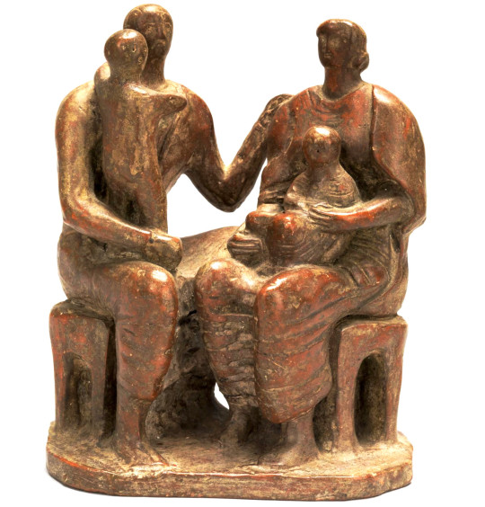
Henry Moore – Family Group, 1944
The works date from 1948-1950 though due to chaotic recording of dates and sketches on Moore’s behalf (pages cut out for sale, for exhibitions, etc) some of the works may have started in 1943. The bulk of the work came from a commission from Henry Morris for a sculpture, this acted as a catalyst for the theme and the work in the sketchbooks.
Henry Moore – Family Group, 1944
The educationalist Henry Morris asked Moore for a sculpture to be placed in the grounds of a proposed village college in Impington, Cambridgeshire. It was to be the first Village College in the Britain. Moore later wrote:
’The Family Group in all its differing forms sprang from my absorbing [Morris’s] idea of the village college – that it should be an institution which could provide for the family unit at all its stages.‘ †
Henry Moore – Studies for Family Groups, 1944
Henry Moore – Studies for Family Groups, 1944
The picture above has a notation ‘Family Group (Impington)’. Below are a series of maquette studies for the sculpture.
Henry Moore – Maquette for Family Group, 1944
Henry Moore – Maquette for Family Group, 1944
Henry Moore, Family Group, ca. 1943-1944
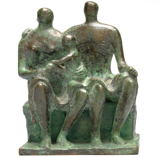
Between the commission of the sculpture and the reality of it, Cambridge Council got colder feet about the projected costs. They had started a program of building more Village College Schools all over the county and filling them with art from the Pictures for Schools series too. Cambridge was a county with money but they were spending it quickly. In the end Henry Moore sold the sculpture to Hertfordshire Council Council, who like Cambridge sold off their pictures for Schools. Cambridge didn’t have any sculptures to retain but Hertfordshire kept their sculpture and only sold off the framed works.
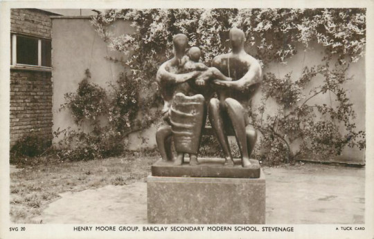
The commission was delayed and finally refused due to lack of funds, but a cast of the resulting Family Group 1948-49 was installed at Barclay School, Stevenage, in 1950. †
Henry Moore – Family Group, 1949 cast 1950-1
One great regret for Morris was his failure to acquire a sculpture by Henry Moore for Impington. Moore at that time was not a fashionable artist; the general public found his work shocking. Morris went to see him; they discussed the idea of the village college and Moore agreed to attempt a major sculpture which would stand in front of Gropius’s Impington. †
First a maquette was sent to Morris, who was eager to have it executed; but for the Cambridge county councillors of the time, Moore, and the price asked, were too much. They refused to order it. Two years later, Henry’s adoptive county of Herefordshire commissioned the piece. ‡
John Newsom, Hertfordshire’s imaginative county education officer, was an admirer of Henry Morris and knew that Moore still had the models for the Impington project up his sleeve. †
The Family Group above was Moore’s first larger scale bronze sculpture. Now based in Stevenage, the piece has been seen as symbolising aspects of the values of the post-war era of austerity and reconstruction.
Postcard of the statue in situ.
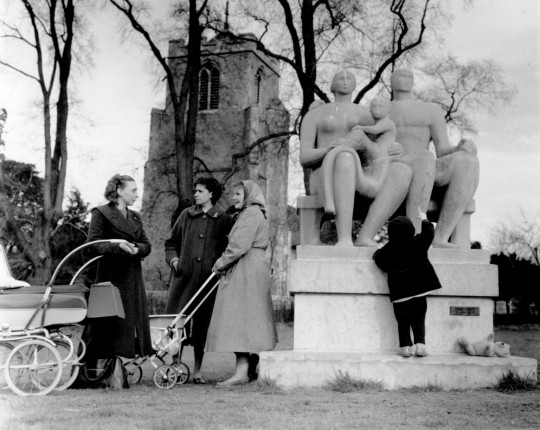
Grouping outside Harlow Church
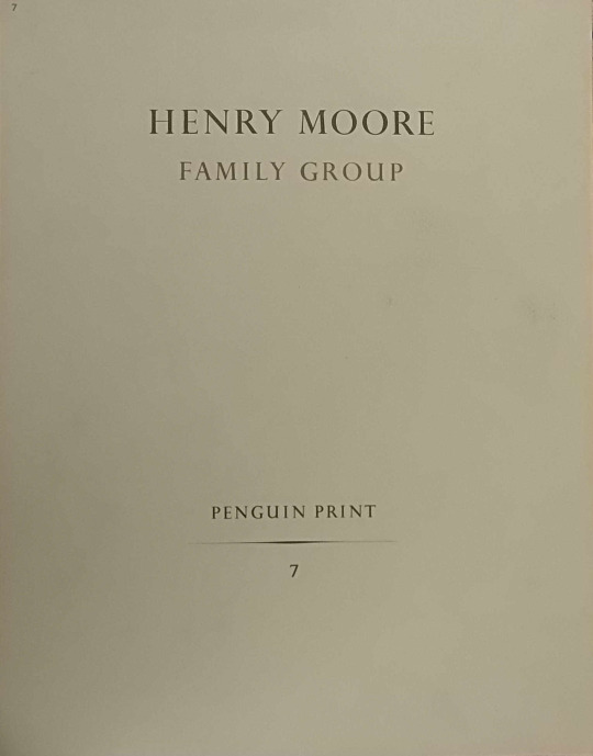
When the work was produced Henry Moore made a few more drawings of the Family Group, I would guess to sell on the back of the publicity. There was also a Penguin Print of the sculpture too at the same time in 1948.
Henry Moore – Family Group, 1948. A Penguin Print.
Henry Moore “Family Group” 1948
† Harry Ree – Educator Extraordinary, 1973, p72 ‡ Roger Berthoud – The Life of Henry Moore, 1987 p223
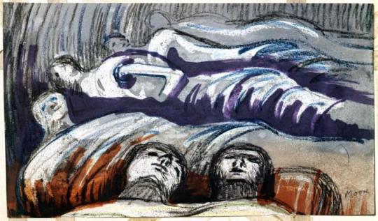
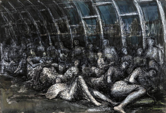
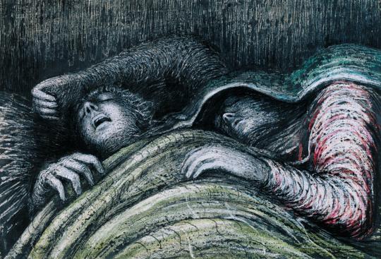
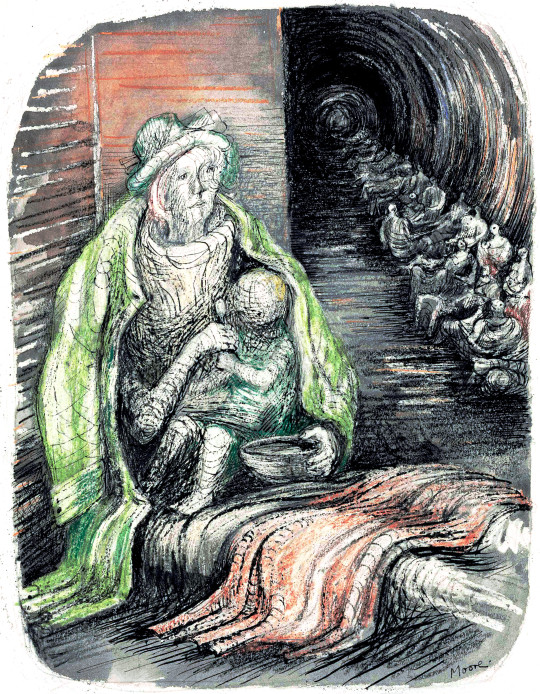
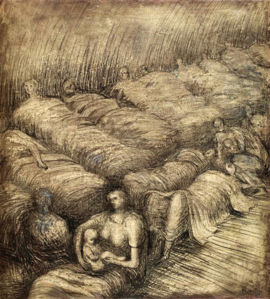
Henry Moore – Women and Children in the Tube, 1940
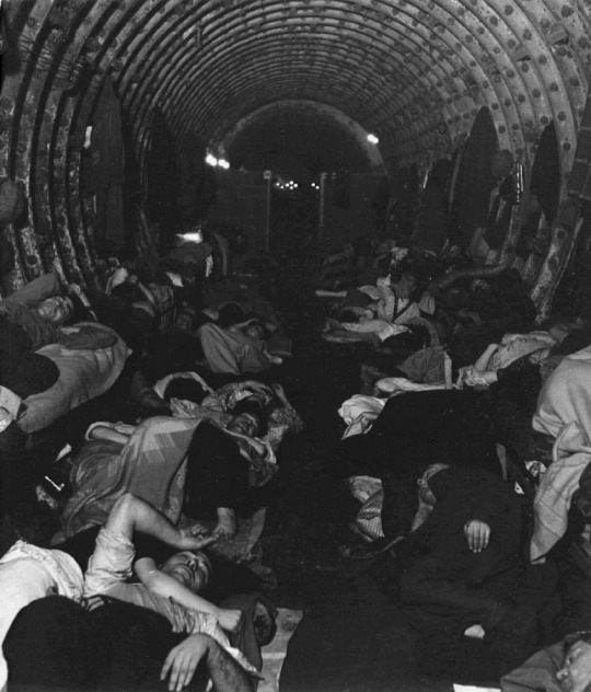
The London Underground stations and tubeways, being so deep underground for some of the network became the obvious places for Londoners to shelter from air raids by German bombers.
It was during this time that Henry Moore came across the people sleeping in the underground. Moore had been out to dinner in London in the autumn of 1940 and that evening took the underground home. When the train got to Belsize Park, Moore and his wife Irina had to work over the sea of people using the network as a shelter. The view is somewhat squalid. They were documented by the photographer Bill Brandt in Lilliput magazine.
Bill Brandt – Liverpool Street Underground Station Shelter, 1940
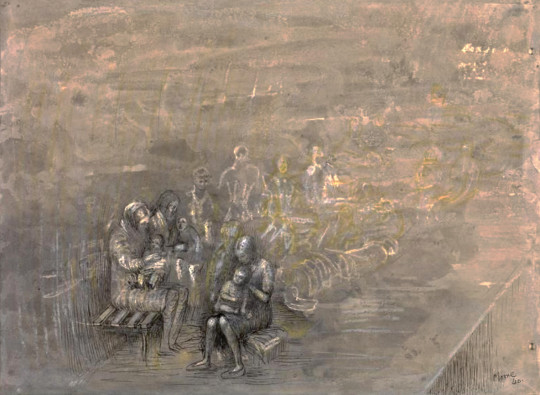
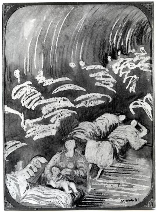
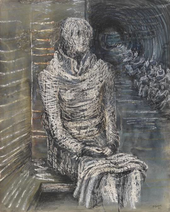
Henry Moore – Sleeping Figures, 1941
The most curious feature of the shelter drawings is Moore claimed never to draw subjects. He was living at 11a Parkhill Road, Belsize Park at the time but used to watch people and then sketch the scene afterwards at home. I would suggest he did some on location very quickly, like the image above and the one below, then worked them up at his home or in the studio he had in Hampstead. The shapes would have been recorded but not the people or their expressions.
Henry Moore – Shelter Study, 1941
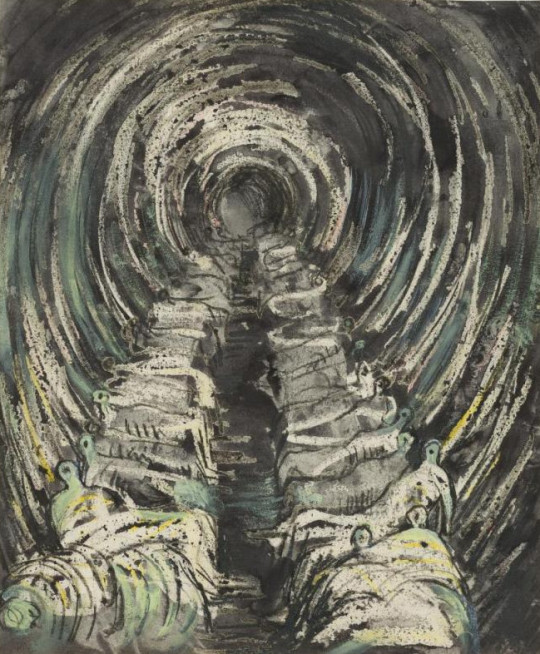
Henry Moore – Large Shelter Sketchbook, 1941 (From the Sketchbooks)
Henry Moore – Tube Shelter Perspective, 1941 (From the Sketchbooks)
Henry Moore – Tube Shelter Perspective, 1941 (From the Sketchbooks)
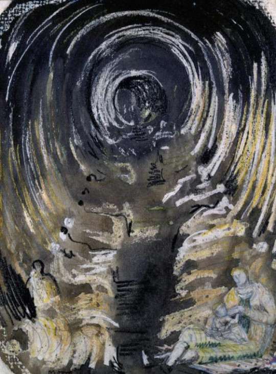
Above are drawings from the Sketchbooks. The bodies are simple penmarks and the reversed wax wish washes over. The drawing could be made in the Underground and then waxed, washed and painted over after. Below is a version of the Tube from the studio, more detail worked in.
Henry Moore – Tube Shelter Perspective, 1941
Curiously Moore decided to cut the sketchbook pages out and exhibit them in 1970. The Pictures below are three examples from the Sketchbooks that shows Moore adding a felt tipped marker pen for colour in the 1970s long after the originals were created.
Henry Moore – Sleeping Figures, 1941 (Reworked in 1970)
Henry Moore – Reclining Figures, 1941 (Reworked in 1970)
Henry Moore – Shelter Drawing with Sleeping Figures, 1941 (Reworked in 1970)
The rest of the images were made at the dates stated and are final finished versions, much more pronounced and refined.
I was fascinated by the sight of the people camping out deep under the ground. I had never seen so many rows of reclining figures and even the holes out of which the trains were coming seemed to me to be like the holes in my sculpture. And there were intimate little touches. Children fast asleep, with trains roaring past only a couple of yards away. People who were obviously strangers to one another forming tight little intimate groups. They were cut off from what was above, but they were aware of it. There was tension in the air. They were a bit like the chorus in a Greek drama telling us about the violence we don’t actually witness †
Henry Moore – Shelterers in the Tube, 1941
Henry Moore – Woman Seated in the Underground, 1941
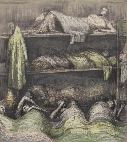
Henry Moore – Shelter Scene: Bunks and Sleepers, 1941
Henry Moore – Pink and Green Sleepers’, 1941
Henry Moore – Woman in an Underground Shelter Feeding a Child, 1941
Henry Moore – Mother and Child among Underground Sleepers, 1941
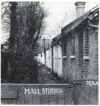
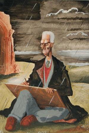
Moore moved from London in 1941 as his studio was bombed. It lead him to finding a shelter of his own and moving to Much Hadham, the home that is now a museum of his life’s work.
We came here in 1941, when my studio in London was made unusable by a bomb falling nearby and it happened that we were not in London that weekend. We were staying in Much Hadham with friends only two or three hundred yards across from here in a little park called South End. We could see that there was a raid going on because it is near enough to London as the crow flies – only about twenty miles. The friends we had been staying with tried to persuade us to stay a little longer, but I said I was doing the Shelter Drawings and had to get back. We left them on the Monday morning in the little Standard Coupé that we had in those days, and for which I had a small petrol ration, being a war artist. When we got to Hampstead, the road to our studio was cordoned off by the police because of an unexploded bomb. A policeman said, You can’t go this way. Where do you live?’ I said, ‘7 Mall Studios,’ and he said, ‘Oh, they’re flat to the ground,’ with almost a kind of enjoyment in the devastation. So we had to go all the way round, taking about five minutes and imagining all the time that our studio was flat to the ground. However, he had mistaken it and it was Park Hill Studios that had the direct hit, but it was near enough our studio for it to be made unusable, with the windows and doors blown in. ‡
Photograph of Mall Studios in the late 1930s
In those days you couldn’t possibly get a house repaired within six or seven months but we had to have somewhere to live. I rang our Much Hadham weekend friend and said, ‘We would like to come back as you suggested’. Within a week we had found that half this house, Hoglands was available to rent. It was near enough to London for me to travel backwards and forwards, spending the night in the shelters and coming back here the next day to do the drawings. You couldn’t sit in the shelters and draw people undressing their children – it was too private.
In 1941, the house was in a very bad state, tumble-down and so on. Later we got the whole house. The owner wanted to sell, we bought it, and we have been here ever since, gradually making repairs. Ten or fifteen years ago, we built an extra room because there was no room facing the south that got the sunshine, and we acquired several acres, of garden so I could continue working out-of-doors. ‡
† Henry Moore – Writings and Conversations, 2002 p320 ‡ With Henry Moore, 1978 p24
The BBC Book of the Countryside came out in 1963 and was edited by Arthur Phillips. It featured illustrations from the Great Bardfield artists Walter Hoyle and Sheila Robinson. There are also illustrations from John Nash and Ralph Thompson. It is a book packed with beautiful illustrations that is so often overlooked due to the title.
A while ago I bought all six of the Walter Hoyle original ink illustrations from the book. I got them because they have illustrations made while Hoyle was in the Bardfield area and it’s important to see an artist while they are riding a creative peak.
Walter Hoyle – January, 1963
Walter Hoyle is in danger of being one of the forgotten Great Bardfield artists due to the lack of information on him. He was born in Rishton, Lancashire in July 1922. Hoyle’s artistic education started at the Beckenham School of Art in 1938,
I persuaded my local art school to accept me, and presented as evidence of my serious intent, a series of drawings much influenced by Walt Disney. †
From Beckenham, Hoyle gained a place as a student at the Royal College of Art from 1940-42 and again from 1947-48 after serving in the Second World War. During Hoyle’s time at the RCA one of his tutors was Edward Bawden, who encouraged him to develop watercolours and printmaking.
It was 1940, the phoney war was about to end and the college was evacuated from London to Ambleside in the Lake District, famous for poets rather than artists. It was here that I was first introduced to printmaking – lithography – by a friend called Thistlethwaite, a fellow student from Oswaldtwistle (although these names are true, I mention them only because I like the sound they make). He prepared a litho stone for me with a beautiful finely ground surface and instructed me how to draw in line and wash. †
In 1948, During the RCA Diploma show a visitor was so impressed by Hoyle’s work that he was offered seven months’ work in the Byzantine Institute in Istanbul. Hoyle accepted, the work he saw there made a strong impression. Italian art and architecture also influenced him at that time.
Early in 1951 when Bawden was commissioned by the Festival of Britain to produce a mural for the Lion and Unicorn Pavilion on the South Bank, it was Hoyle that he chose to assist him on account of his great talent. During that summer Bawden invited Hoyle on a holiday to Sicily.
Edward asked to see my watercolours. He looked very carefully and quizzed me about them, and in general was complimentary and encouraging. I felt I had passed some kind of examination. ♠
It was this holiday together that Hoyle would scribe into a limited edition booklet of 10 in 1990 and into a book in 1998 – “To Sicily with Edward Bawden” a limited edition of 350 copies with a forward by Olive Cook.
Geoffrey Ireland – Walter Hoyle at home in Great Bardfield c1955
Walter Hoyle – March, 1963
March I think is Hill Farm in Great Sampford, Essex.
The BBC Book of the Countryside features articles by different nature writers and journalists from the BBC from farming to wildlife. It comes from The Countryside radio show.
Selected from over five hundred scripts and sixty-seven hours of broadcasting, this anthology depicts life and activity in the British countryside as seen through the eyes of some of the contributors to the BBC’s monthly Countryside programme during the past eleven years.
C. Gordon Glover, whose narrative sets the scene for each chapter, lives in an Essex village and the changing face of the countryside from month to month is portrayed as he sees it, from his kitchen window — from the bridge over the village
Claude Gordon Glover was a BBC Radio Broadcaster (you can hear him present an edition of The Countryside here) and he lived in Arkesden, a few miles West of Saffron Walden. He was also for a time, the lover of Barbara Pym. His broadcasts consist of a Betjeman like prose over classical music and the song of birdsong likely to be heard that month. Below is a selection of October.
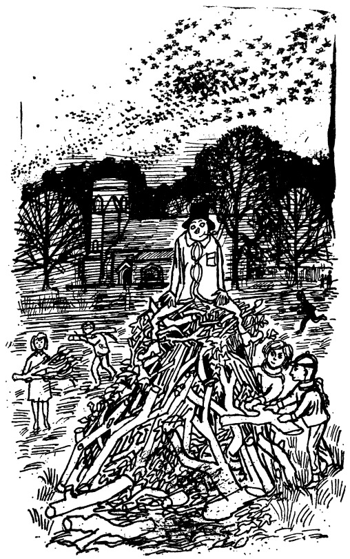
October: Lovely October of the half-way days, the wayward pause between the certainties of summer and winter – the one is well over, the other not yet begun. For the countryman everywhere this is the month of the great tidying up – the sweeping, the burning, the cleaning, the digging, the transference upon dry days of apples from tree to store. The suns of summer have done their work, the land has given forth and the harvest is home.
Walter Hoyle – November, 1963
Above is a picture for November by Hoyle and in the background is Bardfield Saling church. It is always good to prove that pictures are relevant to artists lives and the history of Great Bardfield. Curiously enough, the artist Celia Hart suggested that the guy might be a self portrait of Walter himself.
The photograph below was taken by John Piper in the late 40s or early 50s when he was working on the Shell Guides and just finished three of the Murray’s Guidebooks with John Betjeman.
John Piper – Photograph of St. Peter & St. Paul’s church, Bardfield Saling, c1950
A poem for May: A branch of May I have bought you And at your door we shall stand It is but a spout but it’s well spread about By the words of our Lord’s hand.
Fair Maids look out of your window so high To view the May-Bush fair, it was cut down so late last night To take the fresh morning air.
Walter Hoyle – September, 1963
In 1969 Walter Hoyle illustrated the ‘Women’s Institute book of Party Recipes’. This series of little illustrations are some of his best in my opinion.
They form a curious set of mixed media works that I believe to have been printed by Hoyle in lithograph then sent off to the book printers to be mass-printed, with the look of being a lithograph, but without it being so. Clearly the book was designed to be cheaply printed, for one it is spiral bound – but this is rather helpful in a cookery book. The other indicator of cheapness is that it has a very limited colour palette of orange, red and black. It was printed by Novello & Co Ltd, who mostly make sheet-music scores.
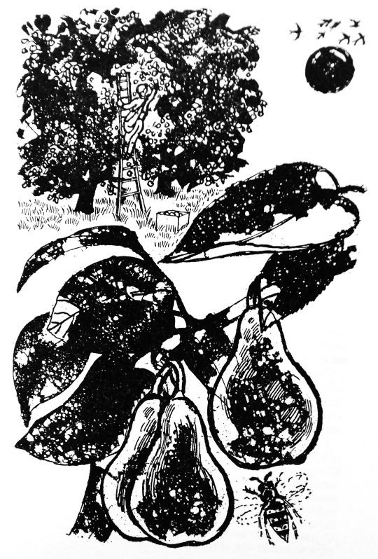
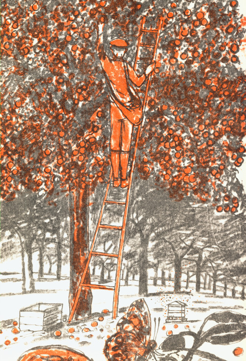
Below is an illustration from the cookery book of a man picking apples in an orchard and, above is almost the same drawing made four years later for the BBC Book of the Countryside by Walter Hoyle in 1963. As the WI book illustration have been drawn on to printing plate the image would have been reversed – so the ladder, man and fruit crate are a mirror image to the figures below. I know the picture from the Countryside book isn’t mirrored as it came from an ink drawing and I own those drawings.
The boom in interwar printmaking in Britain was immense, it followed the same popularity of books; naturally the process of colour printing and printmaking where not so dissimilar. People were owning their own homes and they wanted affordable art to put inside.
In the 1920s and 1930s you could either source prints from the Studio Magazine or companies like the Medici print company but then came a series of print publishers who were issuing prints by contemporary artists, not from the past. The first major series of lithographs of modern artists for the public to buy would have been the Contemporary Lithograph series of prints. It was them who started the ball rolling in 1937 and proving that large colour reproduction prints could be made and sold cheaply. Sadly it, like all of the others I will list, were not a financial success. The early print schemes had aspirations of making art more affordable for people. The AIA series was a source of fund-raising for the group and showed off art from their members. The Schools Print series would have likely worked out if it wasn’t for the difficult third series from European artists. But with Lyons Lithographs the public may have felt a little saturated.
Lyons and Guinness both used the idea to their advantage when they needed to brighten up their shabby looking teahouses and pubs in an era of post war austerity.
Contemporary Lithographs Ltd – 1937-38
AIA Everyman Prints – 1939 – 1942
Schools Prints – 1945 – 1949
Festival of Britain Print Series – 1951
Coronation Print Series – 1953
Lyons Lithographs – 1947 and 1955
Guinness Lithographs – 1956 – 1957
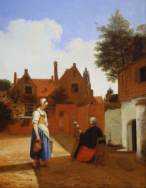
The Penguin series was unusual in that all the prints where old and not designed to be prints for the scheme. It is why they are auto lithographs. The choice of the works were down to Kenneth Clark and it is a curious selection of traditional art and abstract works. The only work I really question is Pieter de Hooch – Courtyard in Delft at Evening- a Woman Spinning, 1656. It is not a picture I can think would hang easily anywhere.
The prints were presented in folders with a size of 13¼” x 17″. Each folder also contained information on the artist and the painting/work of art.
Only 11 prints were produced before Penguin ended the scheme. The first Print was by Turner and appeared in December 1948. The last print was published in April 1952. Below are the works from this long forgotten scheme.
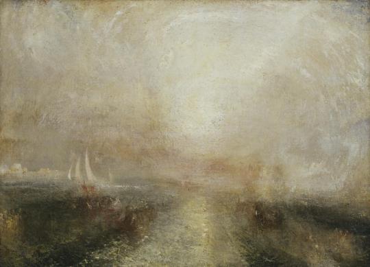
J. M. W. Turner – Yacht Approaching Coast, 1840
Turner painted this view c1840-5 and it was published by Penguin in December 1948. PR1.
In this painting the light in the sky and on the sea dazzles the viewer, obscuring the scene. This visual effect echoes the progress of Turner’s own work on the painting as he returned to areas of the canvas over a period of several years, covering the original subject. Dark shapes that appear through the layers suggest boats, while the buildings on the left have not been definitively identified but may represent Venice. By reworking the canvas, Turner has created less tangible subjects – those of light and colour themselves.
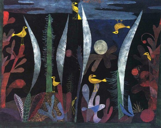
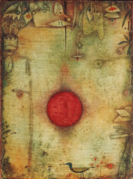
Paul Klee – Landscape with Yellow Birds, 1923
It was published by Penguin in December 1948 PR2
John Piper – View of Windsor Castle, 1940
The John Piper painting was originally made in 1940-41. It was published in 1948. PR3. A blog post about his work at Windsor can be found here.
Pablo Picasso – Le Chardonneret, 1936
This print is from Picasso’s series of illustrations for Buffon’s Natural History. The drawings were made in 1936, and that book was published in 1942. The Penguin print is from December 1948. PR4
Paul Klee – Ad Marginem, 1930
Ad Marginem was painted in 1930. It was published by Penguin in May 1951.
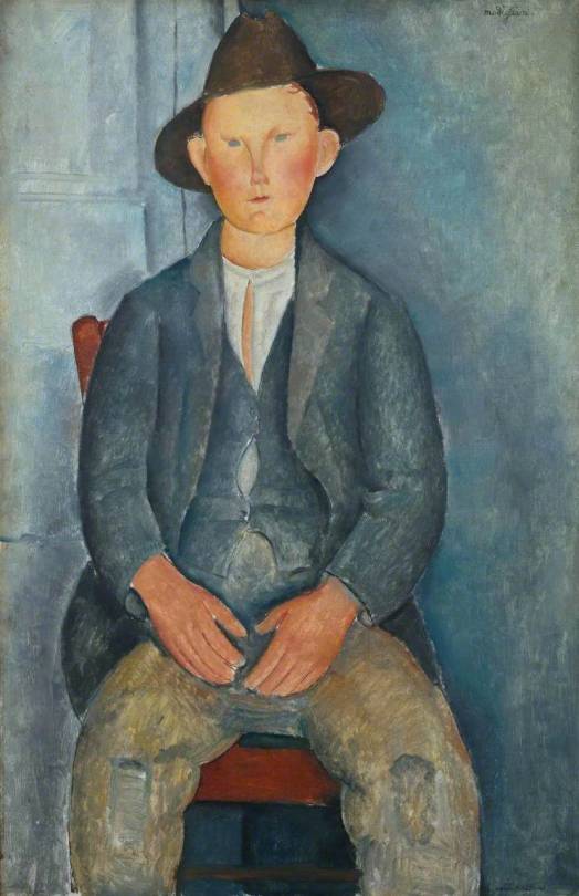
Amedeo Modigliani – Le Petit Paysan, 1918
Amedeo Modigliani – Le Petit Paysan was published as a Penguin Print in 1950.
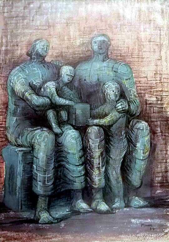
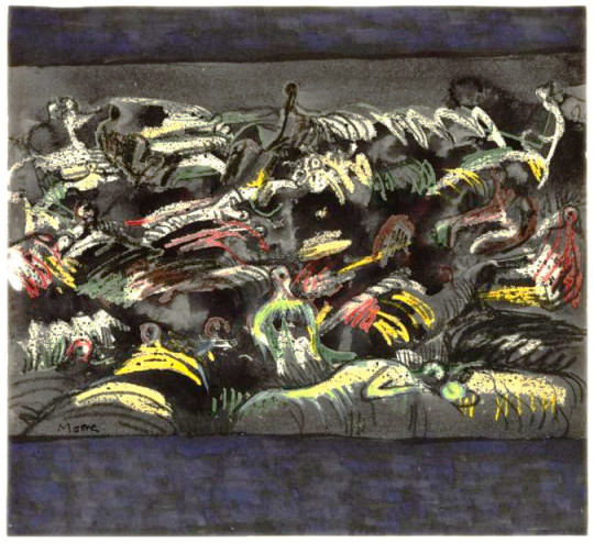
Henry Moore – Family Group, 1944
This work from 1944 looks at Henry Moore’s work earlier in the Second World War of Shelter Drawings, it is visually similar to those drawings and a sculpture he made on the theme. Towards the end of the war Moore made many drawings and sculptures of the family group.
Pieter de Hooch – Courtyard in Delft at Evening- a Woman Spinning, 1656
A curiously odd picture to choose I think as it has nothing that is truly compelling to me about it. The scene is dull, the woman a little surreal but the maid with water jug looks repressed. It’s a sad image.
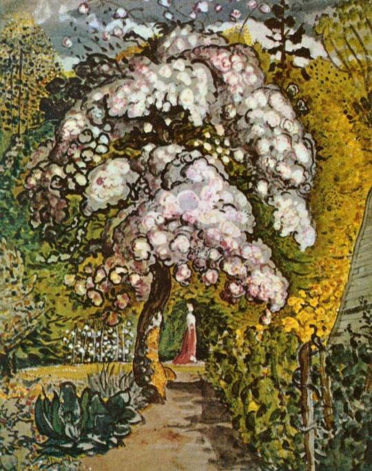
Samuel Palmer – Garden in Shoreham, c1830
An older picture here with Garden in Shoreham but it was part of the revival of interest in Samuel Palmer and his work. Both William Blake and Samuel Palmer were enjoying retrospectives at this point in time.
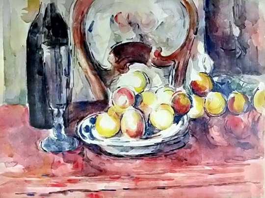
Paul Cézanne – Still Life: Apples, Bottle and Chairback. 1902-1906
One of the looser Cezanne pictures and not an oil like many of his Apple paintings. It is a lovely vibrant still life.
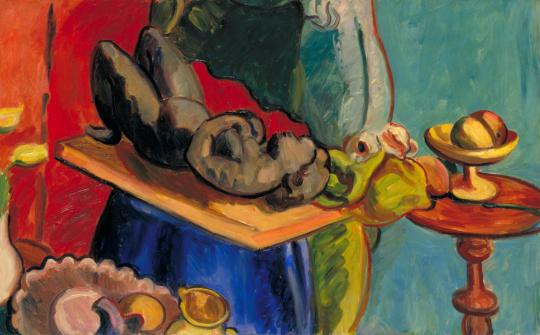
Matthew Smith – Still Life with Clay Figure, I, 1939
The Still Life with Clay figure was part of a series of works Smith made in the same studio space, all rather different to each other. This was the final Penguin print before they abandoned the scheme in 1952.
It would be fair to suggest that the antiques trade has never been more alive and buoyant. With the television full of shows like Antiques Roadshow, Antiques Roadtrip, Flog it and various shows about upcycling antiques and furniture it might be hard to ignore. But at the back of my mind is the dark future for the trade – it comes from housing and education.
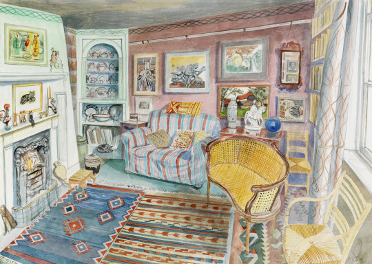
Richard Bawden – Sitting Room of his Home, 1997
The housing problem today for antiques is, large furniture doesn’t sell, because people are living in smaller houses than they were. When it comes to the young people who would be the target demographic for buying antiques, most of them have small flats and houses they rent in the major cities. Cambridge, where I am from has this issue. One of the biggest dooms for renters is that many landlords now charge tenants for the damage to the walls of putting up pictures, so it isn’t uncommon to walk into someone’s flat and see there are no pictures on the walls at all.
David Gentleman – Illustration from Elizabeth Kendall’s Home from Home, 1962
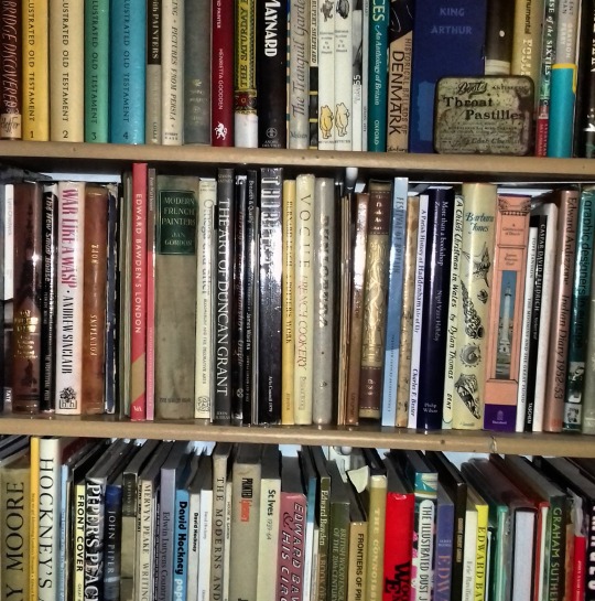
I also find that books are the possessions of people I feel more affiliated with. In the days when I would date, a good test would be to see if they looked upon my book collection with horror or joy. To some people owning books is a waste of space; or they flaunt an education or social aspiration. Maybe it looked obsessive. A lot of the novels I had bought for the dust jackets because I liked the artists at that time.
My Bookcase.
When it comes to education I am less informed to make the argument, I can only go on my own education, artistically. That was when we were only taught about Pop Art and Impressionism. To me then, they were exciting movements but it doesn’t do much to teach people about craft. Our ceramics classes were about making hideous slab work boxes with wonky sides. We were never told about the ideals of pottery or the movement in studio pottery. I would have been more engaged if the ideals of Japanese craftsmanship were told to us, but I feel my education was a matter of ticking boxes in the curriculum with teachers who were not engaged. I am happy to report my latter education was much more interactive.
The Study of Peter Parker – World Book Day, 7 March, 2019
But as a reader of this blog I want to know if you too are worried about what will happen to the world of studio pottery, paintings… Will John Lewis and Ikea furniture rule the homes as much as they currently rule the landfill. These questions are all selfish really. I am asking ‘who will care for the things I care for’.
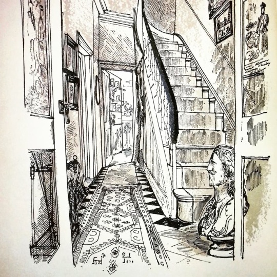
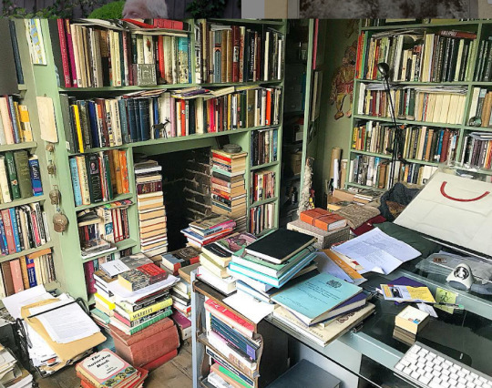
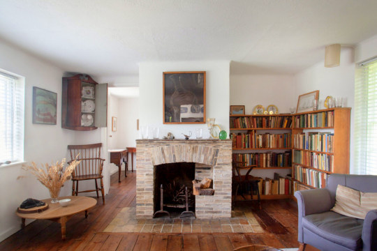
Kettles Yard, the House of Jim Ede.
The only antidote to my moral in Cambridge is to visit the house of Kettles Yard and avoid the gallery area. It’s a beautiful home with function and full of art. My friend’s homes are similar, and the more cluttered it is the more I admire them if it is full of items they have collected or love. As film sets go I always admired the sets of The Servant. A mixture of hip modern items and Georgian charm.
David Gentleman – Illustration from Elizabeth Kendall’s Home from Home, 1962
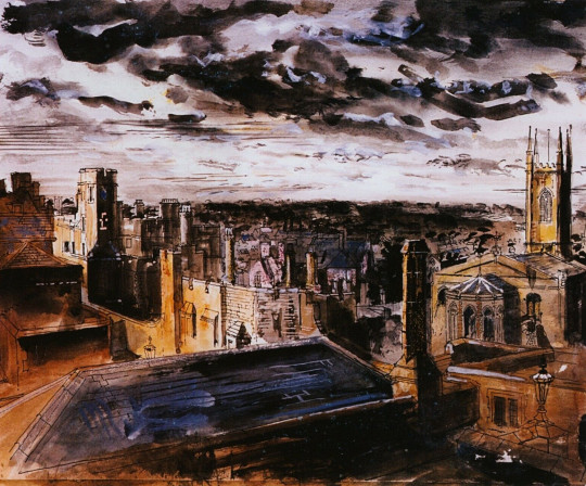
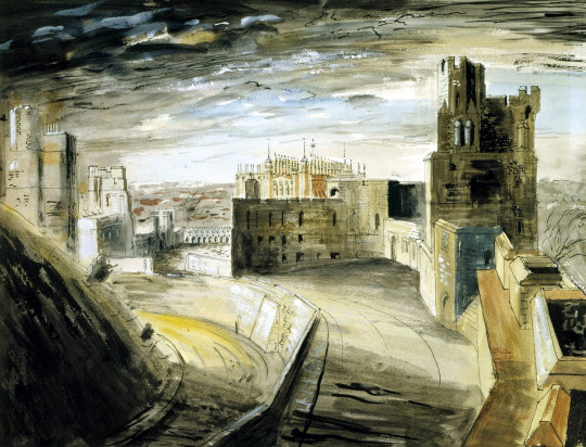
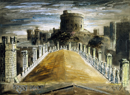
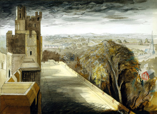
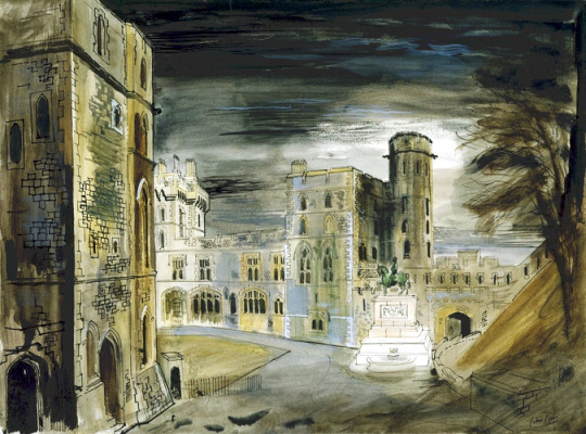
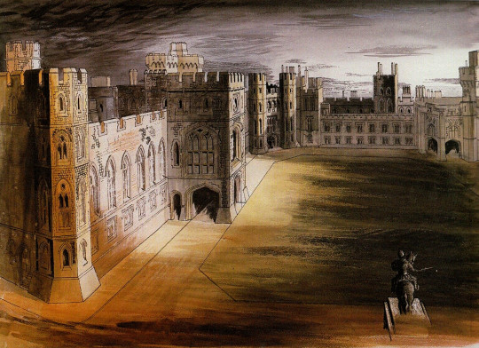
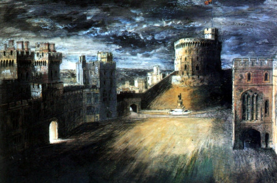
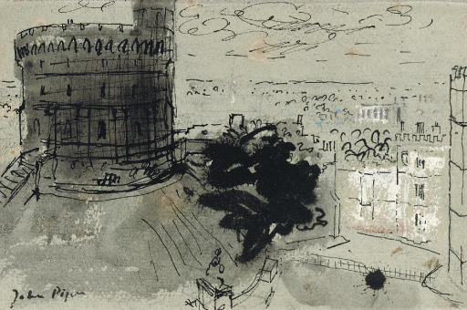
In her single most important act of patronage, Queen Elizabeth commissioned a series of watercolour views of Windsor Castle from John Piper during the Second World War. They were intended to serve as a record of the Castle in case it was damaged by enemy bombs. The result was a virtuoso performance of topographical draughtsmanship. The dark storm clouds in these watercolours are a dramatic backdrop to the pale grey stone of the Castle and they also give a powerful sense of threat from the skies. Piper sought out dramatic vistas in the Castle, such as the view of the Round Tower sketched from the roof of St George’s Chapel, down the sharp perspective of the Albert Memorial Chapel roof. †
Kenneth Clark, then Director of the National Gallery had already started up the Recording Britain scheme in 1939 and it became a reality in 1940. The idea was to both keep artists in work during war-time but use them to record Britain at that moment. Artists would be given funds to go out and paint scenes they thought relevant and under threat. It was the fear that not only German forces and bombs might change the country but also the vast mechanisation of the 1930s would mean that even things like mills and windmills could be seen as endangered. John Piper was also working for Recording Britain when the Windsor commission came in.
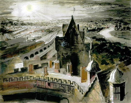
John Piper – Windsor Town from the Castle, 1940-1941
It was due to the bombing and blitz of London that John Piper was invited to paint views of Windsor Castle in late 1940. Queen Elizabeth (the Queen Mother) was worried part of the castle might be destroyed by the German bombing and thought it would be good to have some modern views painted of the grounds. In George III’s reign Paul Sandby painted many views of the Castle that are now in the Royal Collection.
John Piper – Windsor Town, Railway, Curfew Tower and Horseshoe Cloister, 1940-1941
Kenneth Clark’s opinion was sought (he was the surveyor of the King’s pictures) on who might be a good artist to take on the task and John Piper’s name came up. Some of Piper’s work from the Recording Britain was on show at the National Gallery in late 1940 as the moving of the permanent collection of pictures had begun and many of the galleries were empty, so they were filled with the art from war artists and the recording Britain exhibitions.
John Piper – The North Terrace and Brunswick Tower, 1940-1941
Piper spent many months drawing and painting views from sketches he had made and when he presented the works they were not met with favour. The first set of works are detailed and have a marvellous observation to them but the colours chosen are muted under gloomy skies.
The queen extended the commission and asked Piper to paint some springtime views. Clark wrote to the Queen:
“I have told Piper he must try a spring day and conquer his passion for putting grey architecture against black skies” ‡
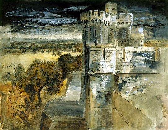
John Piper – The Middle Ward, 1940-1941
But it sounds like John Piper ignored the advice or thought it might ruin the series of works if some suddenly became bright. When the second commission was complete his style had not changed and the sky was still dark. This might have been why the Queen was disappointed with the work and what made the King speak out in such a famous way.
When the Queen saw them she made some appreciative comments, but King George VI looked at them in silence for some time before remarking, ‘You seem to have had very bad luck with your weather, Mr Piper’ †
John Piper – The Round Tower from the roof of St George’s Chapel, 1940-1941
John Piper – The North Terrace and Winchester Tower, 1940-1941
John Piper – The Quadrangle from Engine Court, 1940-1941
John Piper – Windsor Castle Courtyard from the Round Tower, 1940-1941
John Piper – Windsor Castle Courtyard and the Round Tower, 1940-1941
John Piper – Windsor Castle, Study of The Round Tower, 1940-1941
John Piper – Windsor Castle, The Round Tower, 1940-1941
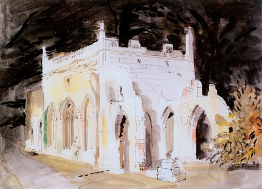
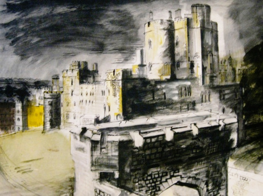
John Piper – Gothic Ruin, 1940-1941
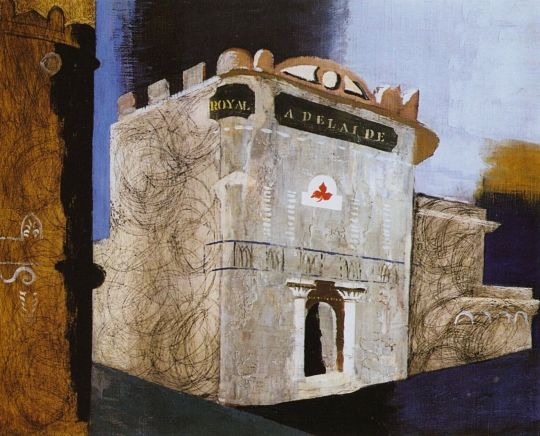
The painting of the Royal Adelaide is not part of the commision but likely where Piper stayed at the time. Being interested in architecture and abstraction it is a perfect subject for him.
John Piper – Royal Adelaide: A Simonds House, Windsor, 1940
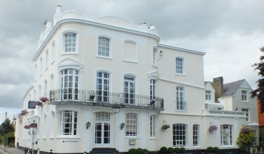
The Royal Adelaide Hotel today
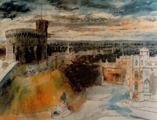
Below is one of the Penguin Prints. It was a scheme that ran from 1948 – 1952 when the lack of demand killed it off. They were rather dubious quality lithographs of famous works selected by Kenneth Clark. Piper’s was the third in the series.
John Piper – Windsor Castle, Penguin Print #3, 1948
Osbert Lancaster – Mr Piper Enjoying his usual luck with the weather
† Richard Harries – The Image of Christ in Modern Art, 2013
‡ William Shawcross – Queen Elizabeth the Queen Mother, 2009
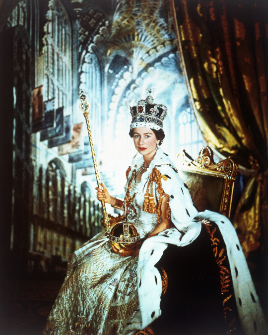
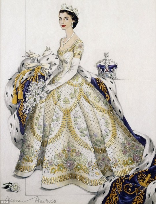
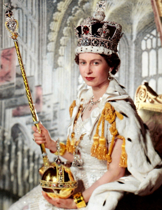
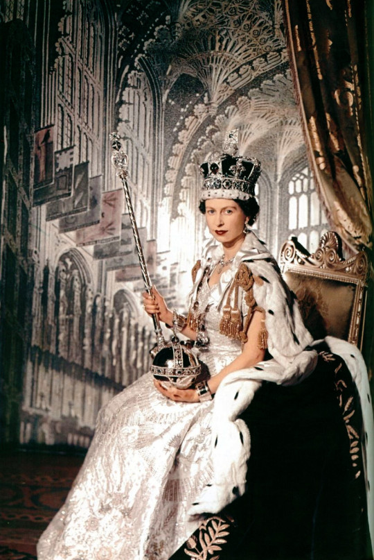
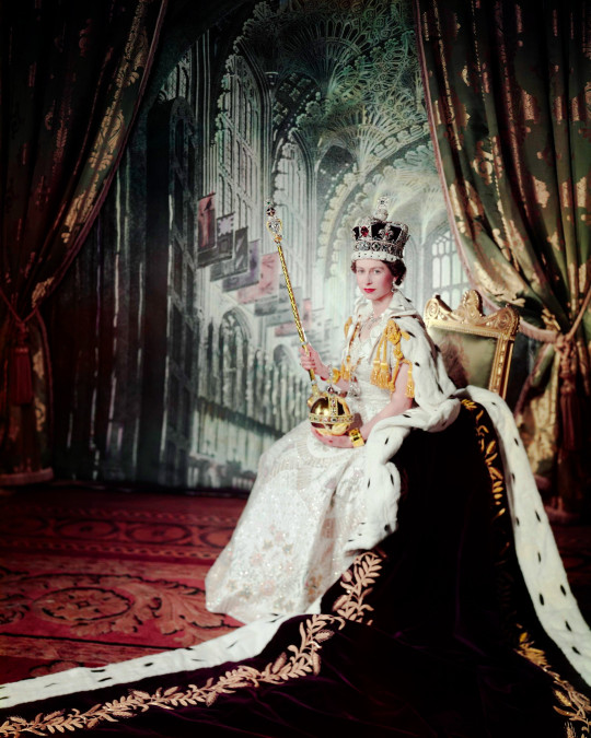
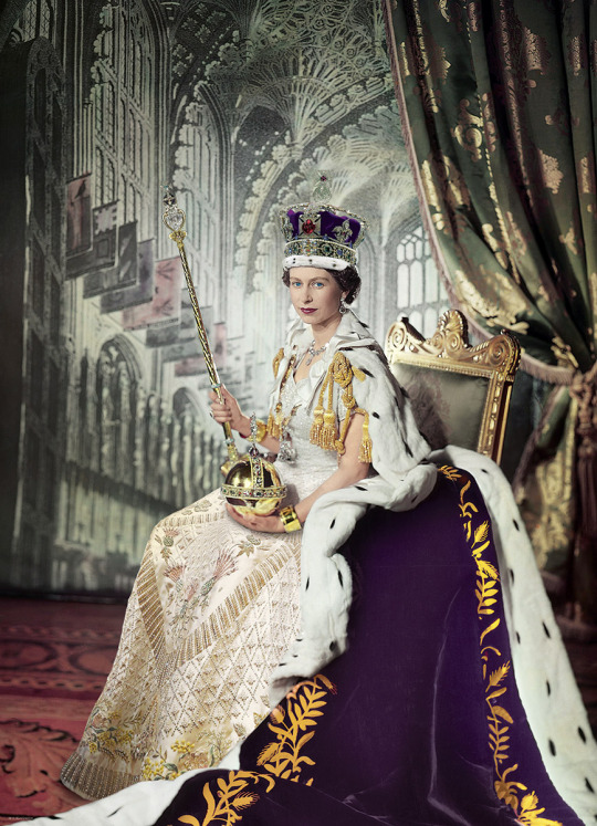
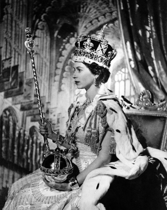
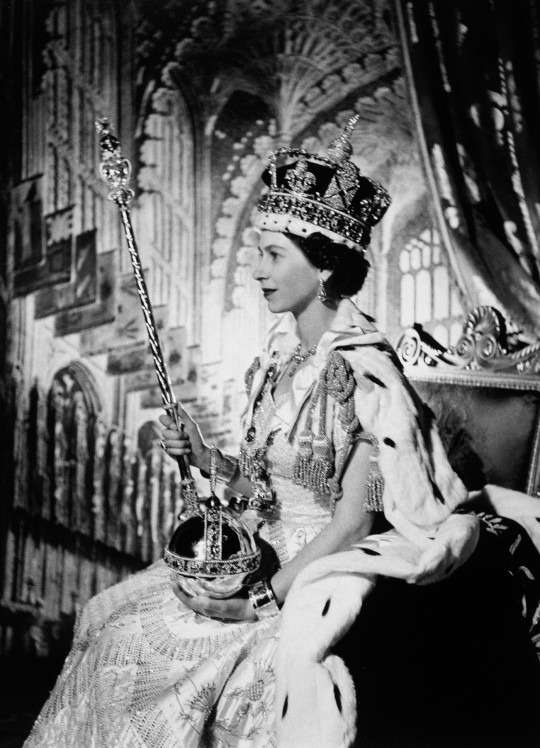
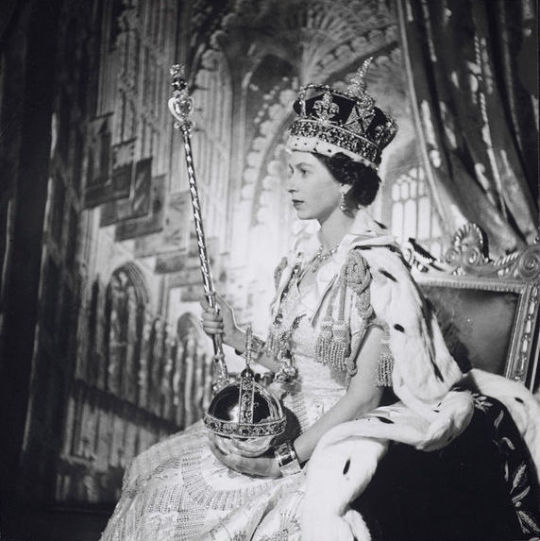
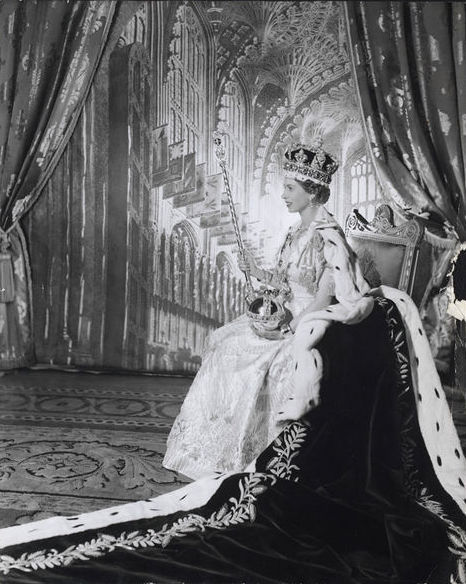
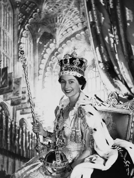
Above is a famous photograph of the Queen on her Coronation day. Though I don’t have a strong affection for the royals I do enjoy propaganda and symbolism and they are all in use in this wonderful photograph.
It is worth looking at one of the components that makes up the photograph and that is the dress. The dress was designed by Norman Hartnell, above is his original design for the dress.
The much celebrated British designer, Norman Hartnell, has been synonymous with elegance and glamour since the 1930s. As the royal dressmaker to the Queen, he was naturally the first choice to design H. M.’s dress for the big day in 1953.
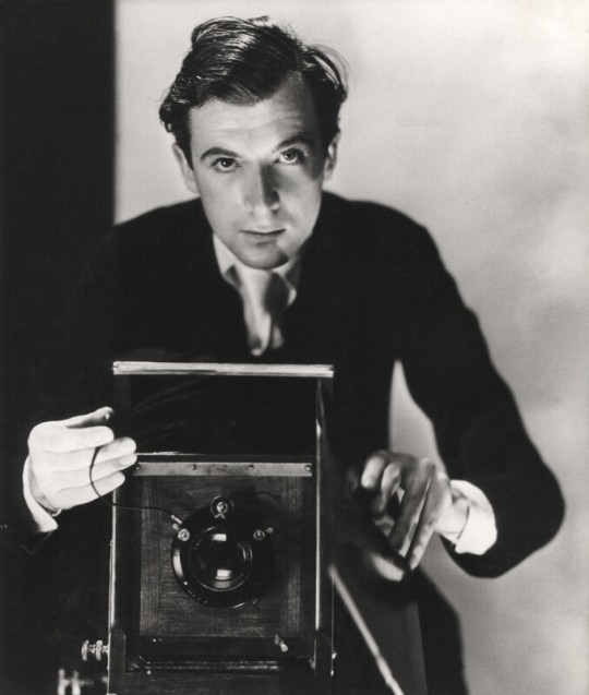
Cecil Beaton was one of the most famous photographers of the day and his contacts with the fashion world and talent for both candid and formal photographs.
Cecil Beaton by Cecil Beaton, c1930
Cecil Beaton attended the ceremony, along with 8,000 other guests. He sat in a balcony close to the pipes of the great organ, recording his impression of the glorious pageant in animated prose and black ink sketches. After the ceremony he returned to the Palace to make final preparations for the official portrait sitting. †
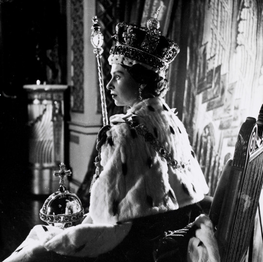
Below are other variations of the same photo session and various tinted photos.
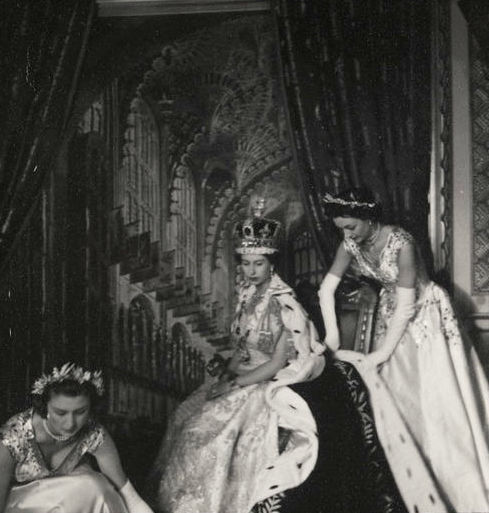
Queen Elizabeth’s Ladies in Waiting preparing her clothing for the photograph.
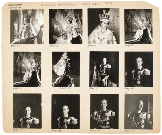
A contact sheet of final and edited proofs of the Coronation Day.