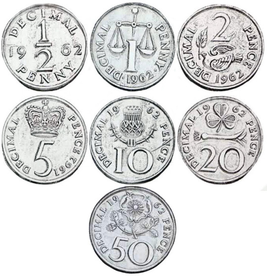
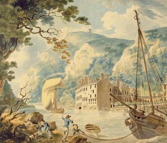
Decimal Day in the United Kingdom was on 15 February 1971, the day on which each country decimalised its respective £sd currency of pounds, shillings, and pence.
The first decimal coins that appeared in the United Kingdom back in 1968 were a well-loved representation of British heritage at that time. 40 years later, in 2008, we wanted to update the coins with a fresh set of designs.
The process began with a competition. The Royal Mint asked people to submit designs for the six coins that could stand alone or work as a set. We were looking for designs that would symbolise Britain, perhaps by using traditional heraldry, though designers were free to explore all options.
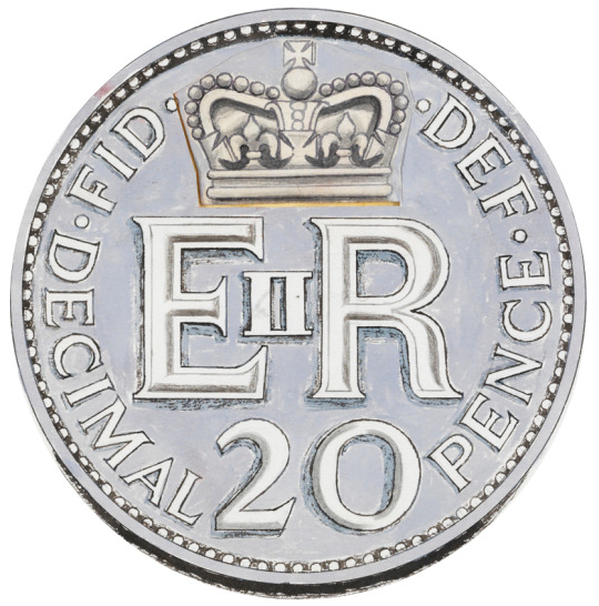
As well as inviting specially chosen artists and coin designers to submit designs, we also opened the competition out to the general public. People were invited to send in their designs for six coins: the 1p, 2p, 5p, 10p, 20p and 50p pieces. The £1 was initially left out of the competition.
When I think of the houses designed by Oliver Hill I imagine either the architectural wedding cake houses of the Essex coastline or Agatha Christie’s Poirot where many of Hill’s houses where used for external shots.
Hill was born in 1887 and would have observed the fashion of Arts and Crafts. The early houses he designed are almost post-arts and crafts, they look like country houses people lived in, not William Morris fantasy castles. They are softer and less regimented. He soon became known as an architect for the rich, designing country houses.
Cour House
Cour House, Carradale, Kintyre, Argyll
Above is Cour House, Kintyre. Built between 1921-2, it is a large house in three wings. The walls are whinstone rubble walls. There is a Library to the East of the Hall and a long rear wing to the West.
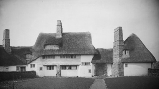
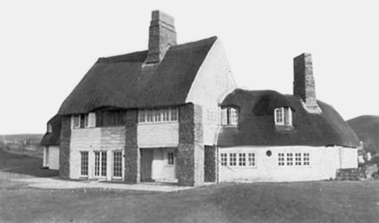
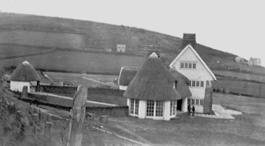
Fox Steep
Fox Steep, Highfield Lane, Holly Cross, nr Wargrave, Reading, 1925
In 1922, the Site was purchased by Mr & Mrs Donald van den Bergh, who were looking for a place to build a weekend retreat. Donald was the son of the Industrialist Henry van den Bergh, born in Oss in the Netherlands, moved to London in 1870 to work in the family margarine business. This merged with Lever Brothers to become Unilever in 1929.
The Fox Streep site was named ‘the Foxes’ at the time of purchase and was apparently being used as a small Inn. The Van den Bergh’s appointed Oliver Hill as architect to create a cottage orné with all the conveniences of a small-scale country house. Gertrude Jekyll was consulted for advice on the layout of the gardens and Albert van de Velde completed the interior decoration.
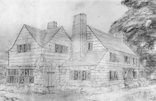
Oliver Hills plans for Fox Streep, c1922
The house was originally supplied with both gas and electric, with the facilities for storing gas and plant for generating electricity situated in the external garage buildings to the north. A chauffeur’s flat was built next to the garage and above the garage there was an indoor playroom, known as the ‘sunshine room’ and quoit court to provide a space for activity for the van den Burgh’s daughter, particularly at times with poor weather.
The van den Burgh’s permitted the house could be used for refugees during the second world war, after which the family sold the property. †
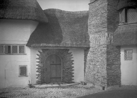
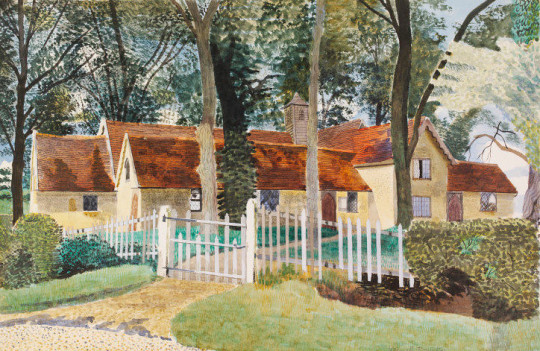
Cock Rock
Cock Rock, Croyde, North Devon, 1925 – Front of the property
Designed by Oliver Hill and built c1925. The house burnt down in 1943, leaving a few remnants around a tall stone chimney and a separate thatched pump house. A new house was built in 1953, also designed by Oliver Hill and slightly SW of the first one. Here the images are of the 1925 property. I love how the house is in three parts with the dramatic chimneys. The house is thatched and with so many chimneys it might have also been the reason of its downfall in 1953.
Part of the charm Hill has with many of these designs is understanding the architectural vernacular of the area. Before house design was more industrialised areas did have a tone and style of housing of their own. The Fox Steep house has cleft wood panelling. Here the Devonshire house has white painted walls and a slightly irregular shape roofline.
Cock Rock, Croyde, North Devon, 1925 – Front door
Cock Rock, Croyde, North Devon, 1925 – rear of the property
Cock Rock, Croyde, North Devon, 1925 – To the side
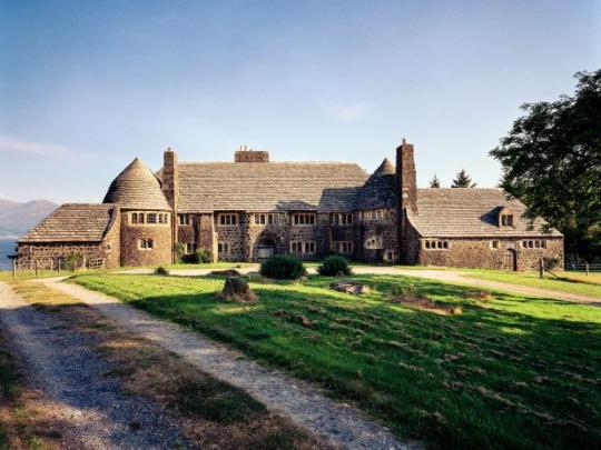
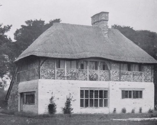
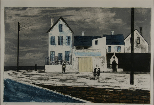
The last house in my list (below) is a good example of how the eye can be fooled. At a first glance this house looks like it has been standing for hundreds of years but in fact it was built from scratch in 1925. It is the most beautiful of all the early designs by Hill I have seen. Traditional but with much more light coming into the building. It reminds me in some ways of the modernism that Frank Lloyd Wright was also trying to subvert from traditional architecture.
Prinsted Farmhouse
Prinsted Farmhouse, Sussex, 1924
This house was recently built for an invalided officer who is working a small farm in West Sussex. The picturesque traditional manner in which it has been built was with oak timbering and brick nogging above. The found floor is laid with white elm boards, and the doors are simply constructed of elm cross boarding. Elm was also used for the staircase. The floor contains the living room, workroom, office, and kitchen.
Dr. Lindley Scott has filled the charming house, designed by Mr. Oliver Hill, with choice furnishings; and the garden is a miracle considering the confined space. This consists in a long strip following the old course of the Westbourne River ‡
† Fox Steep House – Wokingham Borough Council
‡ The Smaller House – Architectural Press, 1924
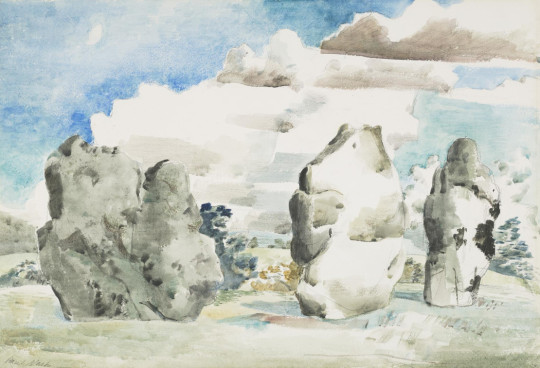
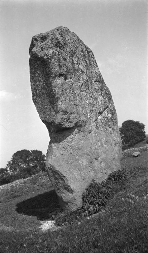
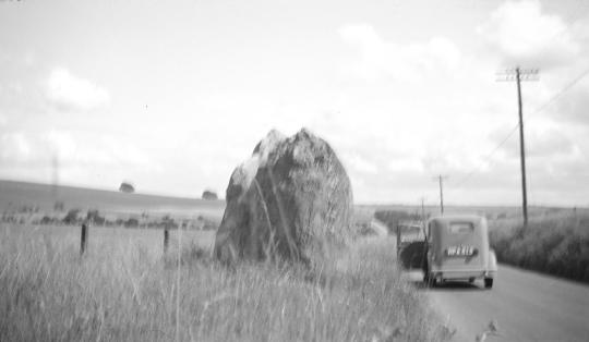
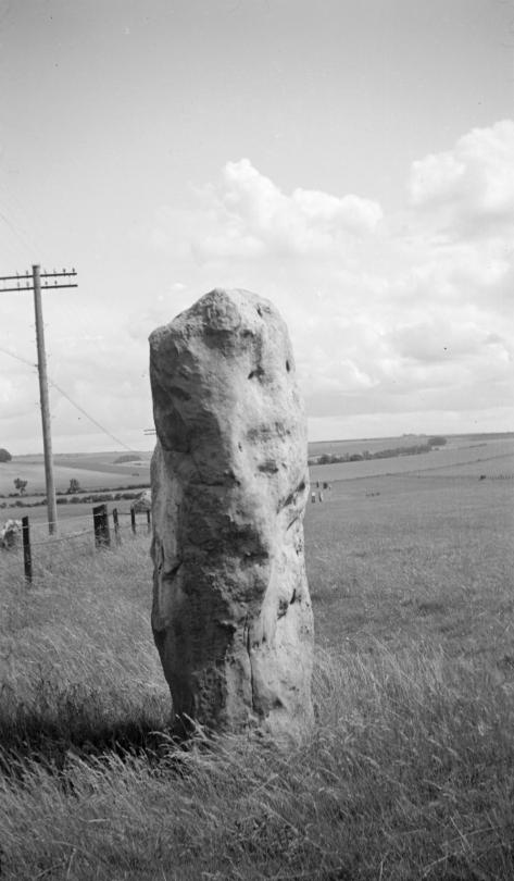
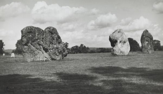
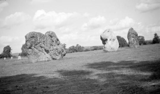
Avebury is a Neolithic henge monument containing three stone circles. The Village of Avebury in Wiltshire was built around them and now bisect the circle with a High Street. Avebury contains the largest megalithic stone circle in the world. Constructed over several hundred years in the Third Millennium BC, during the Neolithic, or New Stone Age, the monument comprises a large henge (a bank and a ditch) with a large outer stone circle and two separate smaller stone circles situated inside the centre of the monument.
Paul Nash – Avebury, 1936
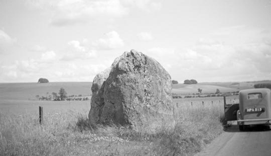
When England was converted to Christianity, Avebury was considered a non-Christian monument. At some point in the early 14th century, villagers began to demolish the monument by pulling down the large standing stones and burying them in ready-dug pits at the side. During the toppling of the stones, one of them (which was 3 metres tall and weighed 13 tons), collapsed on top of one of the men pulling it down, fracturing his pelvis and breaking his neck, crushing him to death. Trapped in the hole that had been dug for the falling stone he was found by archaeologists in 1938. They found that he had been carrying a leather pouch, in which was found three silver coins dated to around 1320–25, as well as a pair of iron scissors and a lancet.
In the latter part of the 17th and then the 18th centuries, destruction at Avebury reached its peak. The majority of the standing stones that had been a part of the monument for thousands of years were smashed up to be used as building material for the local area. This was achieved in a method that involved lighting a fire to heat the sarsen, then pouring cold water on it to create weaknesses in the rock, and finally smashing at these weak points with a sledgehammer.
In the 1920s Marconi wanted to build a radio station on the hills above Avebury and the Air Ministry wanted to close Wayland Smithy area with standing stones as a bombing range in the 1930s . †
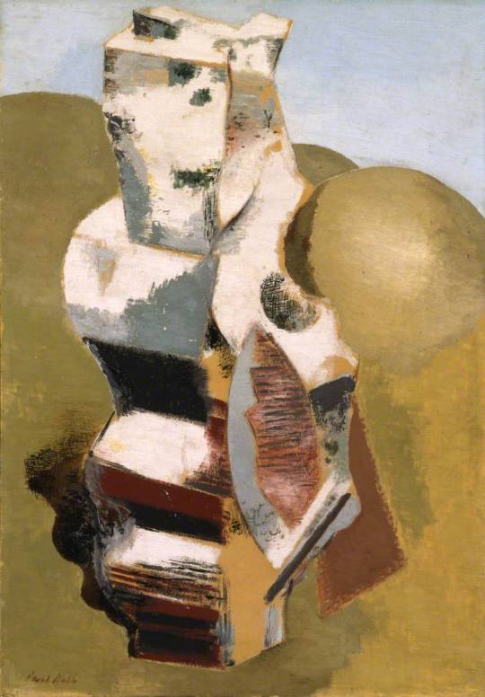
Paul Nash – Avebury, Personage, 1933
In July 1933 the ailing Nash went on holiday to Marlborough with his friend Ruth Clark. From there they made a day trip to nearby Avebury. ‡
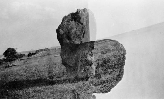
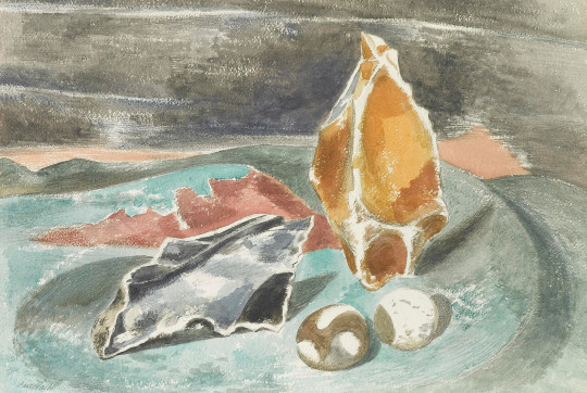
Paul Nash – Avebury Stone (Double Exposure), 1933
The epiphany that Paul Nash had to use he standing stones artistically, seems to have come with an interest in the Neolithic period in publishing with the British Public. It is an era where Paganism has become popular, as many alternative religions did after the First World War. In trying to make sense of the carnage and brutality of the War the public looked for ancient wisdom and this maybe why we have to tolerate people smothering themselves over Stonehenge every solstice.
In these paintings and photographs Nash was also documenting an interest that other artists such as Henry Moore had in the primitive. Moore looked towards early Peruvian pottery and flints for organic shapes and old works made by early man. These monuments are the few examples of art that survive. Even in the medieval period the only arts to survive in Britain of the common man would be the carvings of bench-ends in churches, pottery or other folk art.
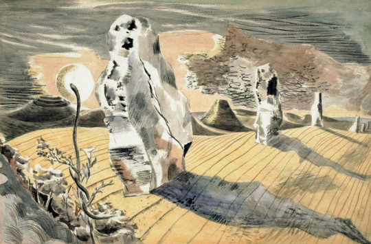
Paul Nash – Landscape of the Megaliths, 1934
Margaret Nash said this was Paul’s first painting of the Avebury stones, which he saw in August 1933. Nash himself gave the following description of Avebury in ‘Picture History’ The preoccupation of the stones has always been a separate pursuit and interest aside from that of object personages. My interest began with the discovery of Avebury megaliths when I was staying at Marlborough in the Summer of 1933. The great stones were then in their wild state, so to speak. Some were half covered by the grass, others stood up in the cornfields were entangled and overgrown in the copses, some were buried under the turf. But they were always wonderful and disquieting, and, as I saw them then, I shall always remember them … Their colouring and pattern, their patina of golden lichen, all enhanced their strange forms and mystical significance. Thereafter, I hunted stones, by the seashore, on the downs, in the furrows. ♣
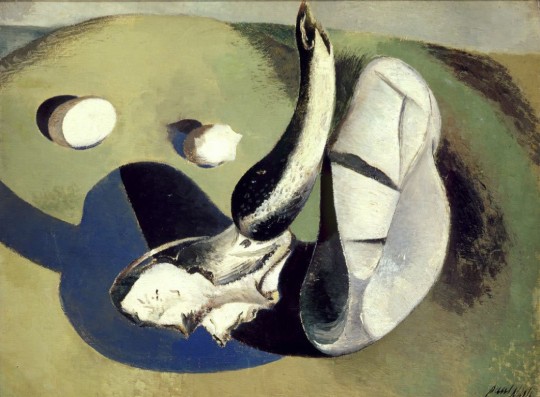
Paul Nash – The Nest of Wild Stones, 1937
I found my first nest of wild stones on looking closely into a drawing I had made of some bleached objects on the Swanage Downs. It lay just below the level of my consciousness, slightly out of focus. But there was no mistaking its lineaments a moment later when I moved the dry thoughts to one side. ♠
Below Paul Nash writes of the effect of Avebury on his work. That he wasn’t only painting the stones themselves but placing ordinary stones he found in a picture as if they were large monuments.
In most instances, the pictures coming out of this preoccupation were concerned with stones seen solely as objects in relation to the landscape. But later certain stone personages evolved, such as the stone birds in the ‘Nest of Wild Stones’ and the more ‘abstract’ forms in ‘Encounter in the Afternoon’. ♣
Many of these works may be down to another external influence, Eileen Agar. Nash had met and fallen in love with Agar, who was a surrealist artist and using stones and found objects in her works around the same time.
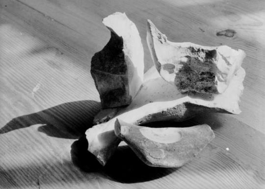
Paul Nash – Photograph of Stones in his Studio, 1936
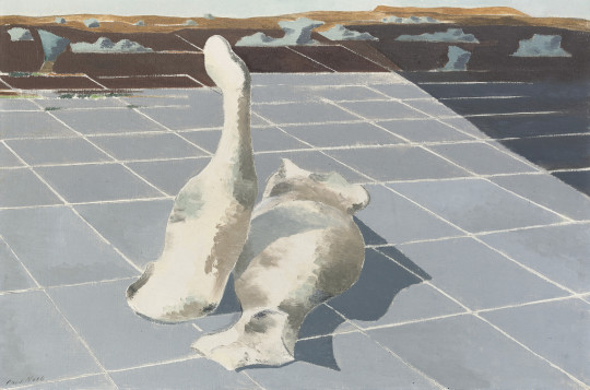
Paul Nash – Encounter in the Afternoon, 1936
Paul Nash – Landscape of Bleached Objects, 1934
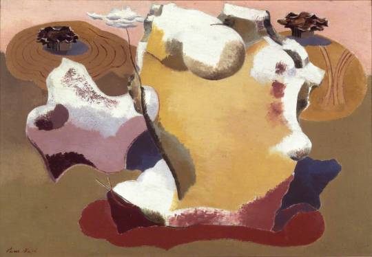
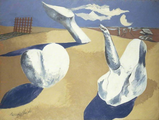
Paul Nash – Circle Of The Monoliths, 1937-8
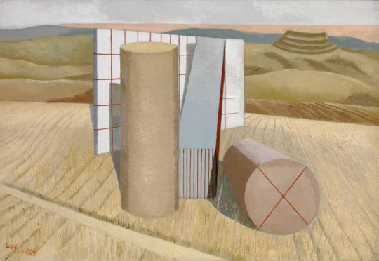
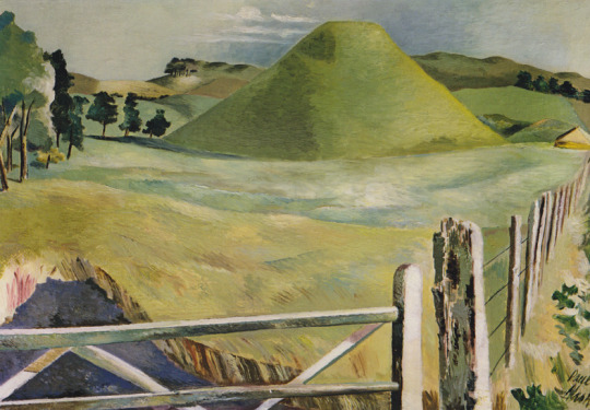
In the painting above (Circle of the Monoliths) is the stepped hill what is likely Silbury Hill. The construction of the hill in the Late Neolithic period was originally stepped, then filled in. Silbury Hill is very close to Avebury.
When the artist Paul Nash first visited Avebury in 1933 he was amazed by the scale of Silbury Hill and by the ancient circle of megaliths, the great glacial boulders that had been dragged from the Downs in prehistoric times. ♥
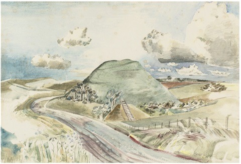
Paul Nash – Silbury Hill, 1938
Paul Nash – Silbury Hill, c1937
All Nash’s other statements about Avebury and stones are much more direct, it is almost as if he contrived to intellectualise his ideas simply to be provocative, but in face the Landscape of the Megaliths Nash does resolve the equation. The picture shows the adventure of stones receding away from the spectator, in the foreground in the convolvulus curls round a snake which rises upwards. ♦
Paul Nash – Avebury Stone, 1933
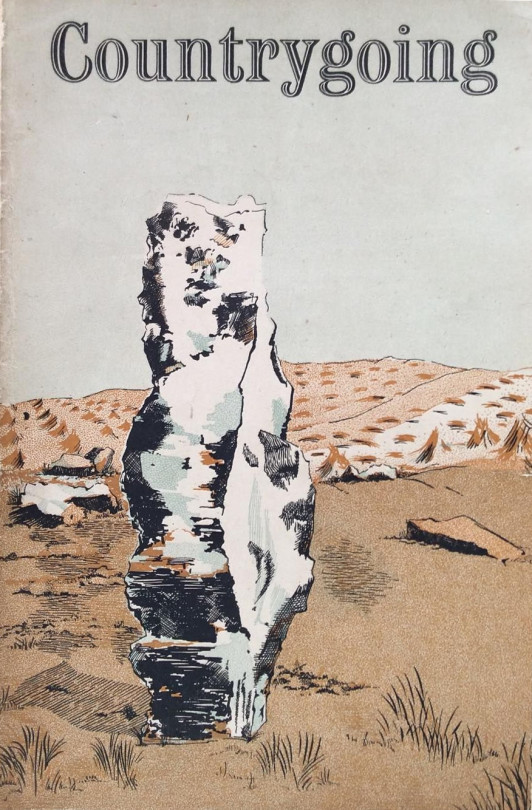
The stones at Avebury come up again when Nash was asked to illustrate a cover to the magazine Countrygoing. Though I think it was commissioned in 1938 it was published in 1945.
A Paul Nash Cover to Countrygoing, 1945
Paul Nash – Circle Of The Monoliths, 1937-8
Above is the finished painting of Circle Of The Monoliths. Below is the study for the work that was found painted on the back of The Two Serpents c 1937.
Paul Nash – Circle of the Monoliths, 1937-1938
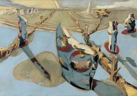
Nash’s abstraction of stones in the 1930s went on with his distortions of landscapes, found stones and the real Neolithic stones. In we see Mên-an-Tol and the stone ring there placed in the top right corner in front of more found stones. To the right is a grid that can only be echoing Encounter in the Afternoon and Circle Of The Monoliths.
Paul Nash – Nocturnal Landscape, 1938
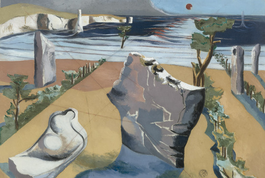
Below we see the same Avebury stone used on the cover to Countrygoing with the wedge shaped cut in the side.
Paul Nash – Druid Landscape, 1938
Initially, using a No.1A pocket Kodak series 2 camera, Nash captured images so that he could refer to them in the creation of his paintings. Increasingly, however, he saw his photographs, not as aids or sketches, but as artworks in their own right.
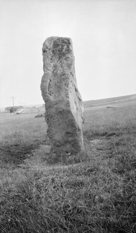
Here Nash depicts one of the Avebury Sentinels, and his choice of subject matter is characteristic. Nash was always interested in landscapes and aspects of the natural world, not for their historical or aesthetic interest per se, but more because he thought that certain places as he called them (see Biography) had about them a mystical importance, a genius loci; which lent the place, the stone, the tree, an importance which transcended its apparent properties. As he wrote there are places whose relationship of parts creates a mystery, an enchantment. It is this mystery, this enchantment, which Nash tries to capture in his photographs. ◊
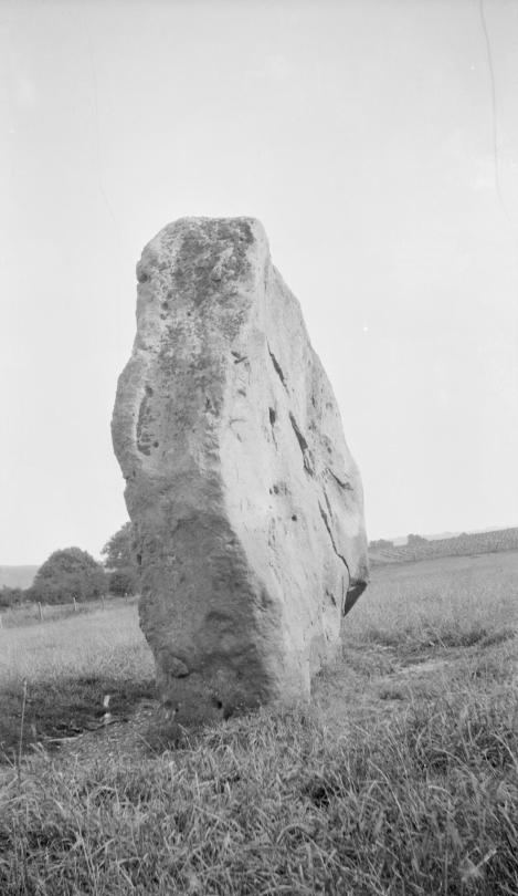
Paul Nash – Avebury, Sentinel, 1933
Some of the quote below may be a repeat of what has been read about Nash, but I featured it for the Convolvulus park that features in Landscape of the Megaliths. In the background of the watercolour and lithograph below are two hills, both likely to be a Neolithic Sidbury Hill and how it looks today.
Last summer I walked in a field near Avebury where two rough monoliths stand up … miraculously patterned with black and orange lichen, remnants of the avenue of stones which led to the Great Circle. In the hedge, at hand, the white trumpet of a convolvulus turns from its spiral stem, following the sun. In my art I would solve such an equation
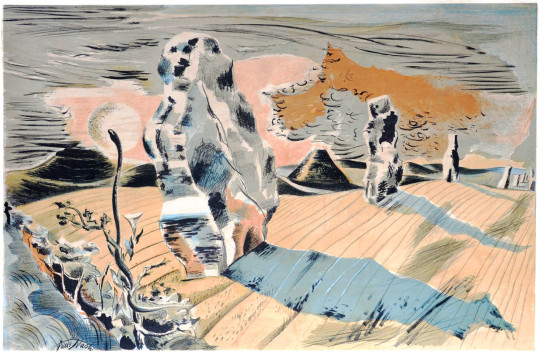
Paul Nash – Landscape of the Megaliths – Watercolour, 1937
Paul Nash – Landscape of the Megaliths – Lithograph, 1937
The photographs below are dated 1942 by the Tate. I don’t know is Nash went back to Avebury or if they are catalogued wrongly. But I thought it was worth including them with the car by the roadside.
Paul Nash – Avebury, 1942
Paul Nash – Avebury, Sentinel, 1942
Paul Nash – Avebury, Sentinel, 1942
Paul Nash – Avebury, Sentinel, 1944
Paul Nash – Avebury, Sentinel, 1944
Paul Nash – Avebury, Sentinel, 1944
Paul Nash – Avebury, 1944
† Joanne Parker – Written on Stone: The Cultural Reception of British Prehistoric, 2009
‡ David Boyd Haycock – Paul Nash, p54, 2002
♠ Andrew Causey – Paul Nash: Writings on Art – Page 142
♣ Paul Nash – Paintings and Watercolours Exhibition Catalogue, Tate, 1975
♥ Julius Bryant – The English Grand Tour, p16, 2005
♦ Paul Nash, Places, South Bank Centre, 1989 ◊ Art Republic
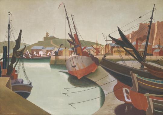
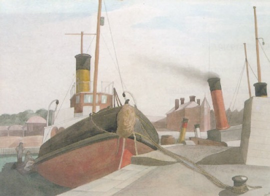
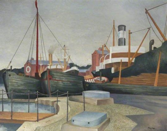
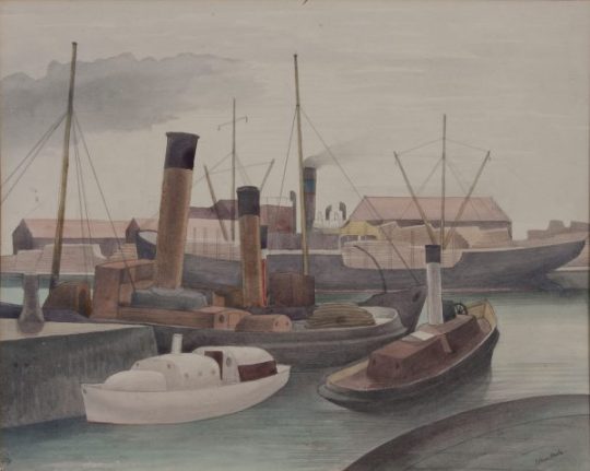
In this blog are a series of paintings by John Nash of Bristol.
In 1925 and 1937, on the latter occasion with Eric Ravilious, he visited Bristol, which he greatly enjoyed, especially the docks and paddle-steamers; these, he wrote, ‘were the inspiration of many works’. At the same time he visited Bath, which he found equally stimulating.
Nash had been advised to work at Bath and Bristol by Edward Wadsworth when they were working together in 1920 on a mural project. Nash went to both cities in the summer of 1924 and again in 1925. Looking at the painting below of Seaport by Wadsworth it is clear his style and suggestion had an effect on Nash.
Edward Wadsworth – Seaport, 1923
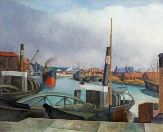
John Nash – The Dredgers, Bristol Docks, 1924
John Nash – Bristol Docks, 1924
John Nash – The Dredgers, Bristol Docks, (likely 1924)
John Nash – Bristol Docks, 1925
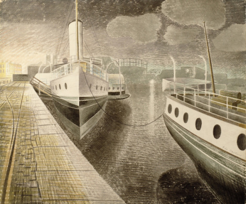
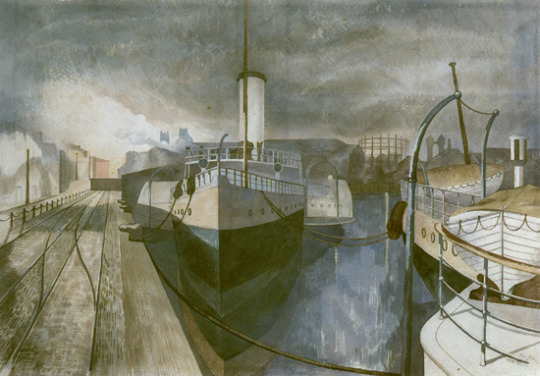
Ravilious and Nash had got to know each other at the Royal College of Art as pupil and teacher, then later as colleagues. It was Nash’s recommendation that they both went to sketch at Bristol Docks. Ravilious wanted to try to subjects They painted the same location at night, when the docks were quiet and the boats tied up. It was about the same time as Ravilious painted Newhaven also.
Eric Ravilious – Bristol Docks, 1938
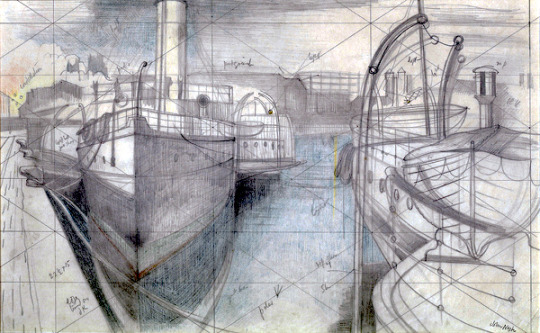
Above is the Eric Ravilious painting he made sitting next to John Nash at night, so they could paint the docks while the boats were tied up. Below is the John Nash painting and a cleaned up version of the drawing.
John Nash – Nocturne: Bristol Docks, 1938
John Nash – Nocturne: Bristol Docks, Gridded Sketch, 1938
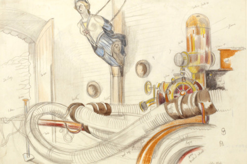
John Nash – Study of ‘Pump Room’, Plymouth Dockyards, WW2
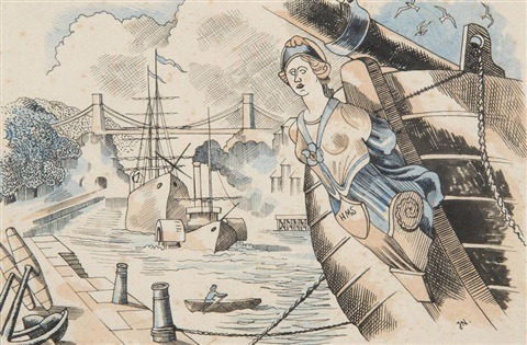
Above is one of John Nash’s war paintings from his brief stint as a War Artist in the Second World War. It was sketched on site and it has notations for colour to be worked up later into an oil painting. I mention it as the figure head was used below.
John Nash – Handbook of Printing by W S Cowell, 1947
In the Handbook of Printing by W.S. Cowell there is an illustration by Nash of Bristol, it’s a modern day version of Turner’s The Avon Gorge and Bristol Hotwell as seen below. I thought it was a nice way to see him looking back twenty years whilst winking at Turner.
J.M.W. Turner – The Avon Gorge and Bristol Hotwell, 1792
The Kennet and Avon Canal in Bath was built between 1796 and 1810. Before the age of steam with the railways, canals were the main super highways of Britain. This Canal enabled goods to be easily transported between London and Bristol.
Many of the pictures in this blog post are dated 1927. There are a few painted and listed as 1926. Dating works by John Nash can be tricky, he often spent the summers making watercolour sketches with colour notes in his sketchbook so the works could be painted in oil over the winter. There is another complication when artists date work and that is usually because they are only dated when exhibited – sometimes the date when sold becomes the date of the picture. Nash just signed his paintings and so dates are guesswork.
Many of these were sold at an exhibition at Goupil Gallery in March 1928 with Gilbert Spencer and Neville Lewis.
Nash had been advised to work at Bath and Bristol by
Edward Wadsworth when they were working together in 1920. Nash went in the summer of 1924 and again in 1925.
John Nash – Canal Bridge, Sydney Gardens, Bath, 1927
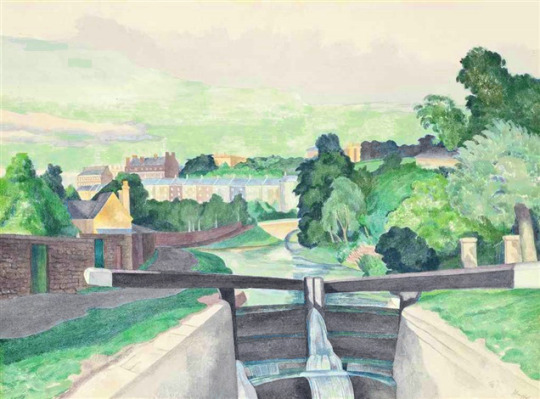
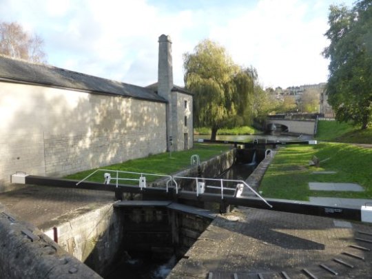
John Nash – Lock Gates at Bath, 1926
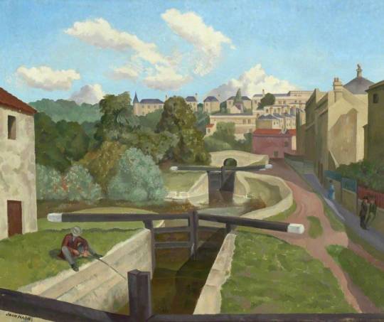
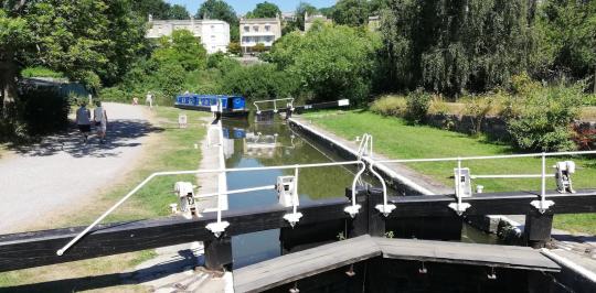
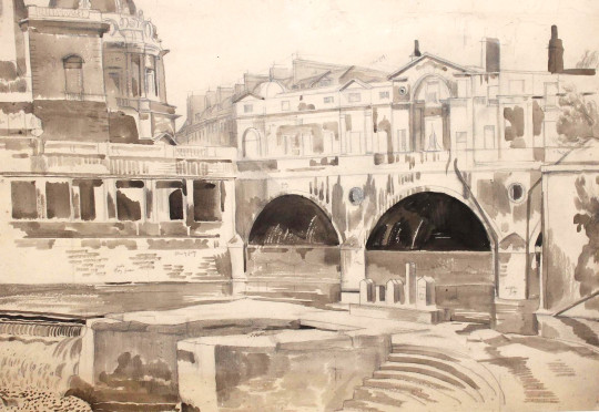
Above is the view today, of the picture below.
Roderick Jones suggested the picture below has a Cezzane feeling to it in the angles and lay out of the buildings but they miss Cezanne’s gradient shading and the colours are very flat. I think what I like about the picture below most is the canals were used and you can see the desire lines in the grass where people walked from lock to lock.
John Nash – The Old Canal, Bath, 1927
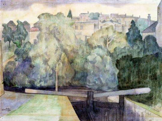
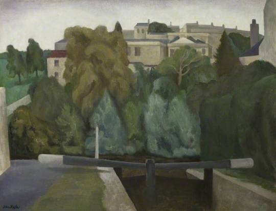
Another photograph above is of the view below. The watercolour below has the oil painting under that too.
John Nash – Canal lock before a town, 1926
John Nash – Lock Gates, Bath, 1926
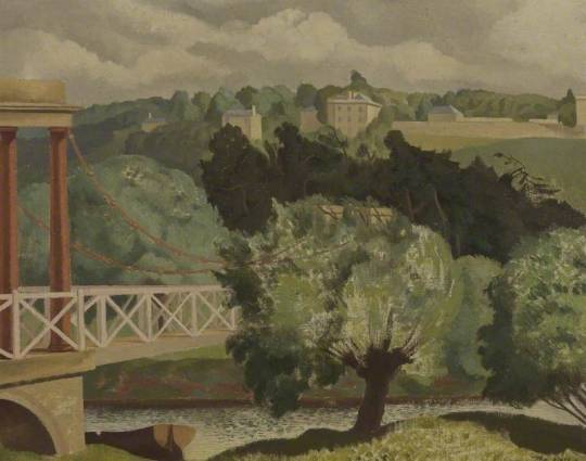
The bridge pictured below is the Grosvenor Suspension Bridge. It was demolished in 1929 and since then the area has been built over.
John Nash – Suspension Bridge, Bath, 1927
John Nash – Pulteney Bridge, Bath, 1926
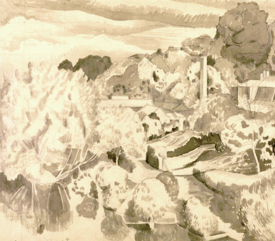
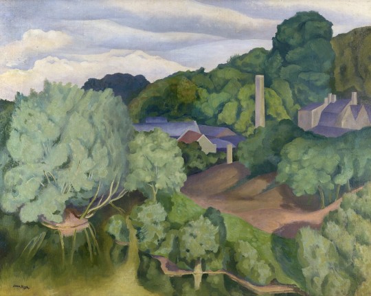
John Nash – Avoncliffe from the Aqueduct, 1926
Above is a wash painting by Nash. It has been gridded to Nash could work it into the oil painting below.
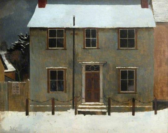
Kenneth Rowntree – Ethel House, Great Bardfield, 1942
In a previous post I featured the work of Walter Hoyle and his drawing of Little Saling Church in Bardfield Saling. In researching that I found the lovely paintings by Kenneth Rowntree below. The image above is Ethel House, Great Bardfield, where his friend Michael Rothenstein lived.
Rowntree trained at the Ruskin School of Drawing in Oxford, and then at the Slade in London. In 1939 he married the architect Diana Buckley. They associated with many of the modernist emigr architects in London at that time, and a strong architectural sense can often be felt in Rowntree’s work. He was a Quaker, and during the war became part of the ‘Recording Britain’ project, in which everyday life in wartime Britain was captured by a range of artists. When Diana became pregnant in 1941 they wished to move out of London, and Eric and Tirzah Ravilious found them a suitable house in Great Bardfield, close to the Bawdens’ home. Local churches provided a strong inspiration for much of his work here, but he also worked in London, Kent and Wales.
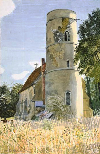
Kenneth Rowntree – SS Peter and Paul, Little Saling, Essex, 1942
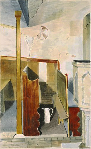
Kenneth Rowntree – Interior of SS Peter and Paul, Little Saling, Essex, 1942
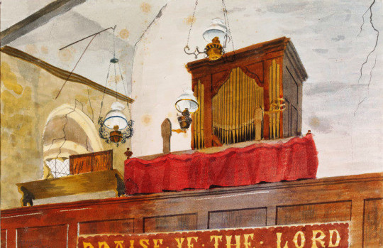
Kenneth Rowntree – The Organ Loft, SS Peter and Paul, Little Saling, 1942
And here are two bonus pictures of nearby church in North End, again, inside and out.
Kenneth Rowntree – Exterior, Black Chapel North End, Nr. Dunmow, 1942
Kenneth Rowntree – Interior, Black Chapel, North End, near Dunmow, Essex, 1942
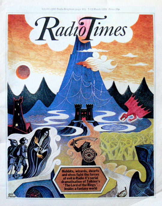
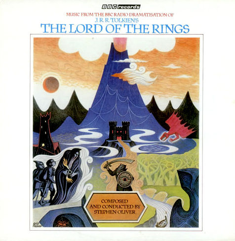
Eric Fraser was born in 1902. Known principally as an illustrator, he became most famous for his work in the Radio Times as well as designing many dust jackets and print advertisements for companies. Today he would be known as a graphic designer, in the 1930s he was known as a commercial artist.
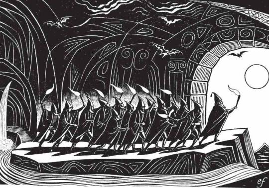
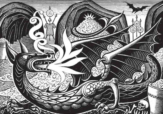
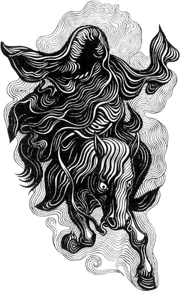
The Radio Times cover above was to celebrate the release of the wonderful BBC Radio Drama of Lord of the Rings in 1981, following the 1968 Hobbit.
This blog is just a look at his work for the Folio Society editions of Lord of the Rings (1977) and The Hobbit (1979). Fraser was a specialist in illustrating classic scenes from mythology.
The Hobbit
Lord of the Rings
The drawings Eric Fraser made for Lord of the Rings were not of his own inspiration but from designs by Margrethe Alexandrine Þórhildur Ingrid, or Margrethe II, Queen of Denmark. She is also an artist whose works have been inspired by J.R.R. Tolkien’s literature from a very young age and she used the pseudonym Ingahild Grathmer.
The same illustration as the BBC Radio Times would be used for the soundtrack to Lord of the Rings by Stephen Oliver in 1981.
Following on from my post on Pictures for Schools last week I thought I would post one on a single painting and the artist. In this case there is very little on her but I enjoyed digging out what I could.
Madeleine Elizabeth Anderson was born in Belvedere, Kent on September 18th, 1910, the daughter of Harry Percival Harvey Anderson. He was an engineer and invented ‘the Anderson condensing system’ for improved thermal efficiency and reduced water consumption in trains. The family must have moved up to Glasgow as her father’s office is in the city and Madeleine attended the Airdrie Academy, Lanarkshire.
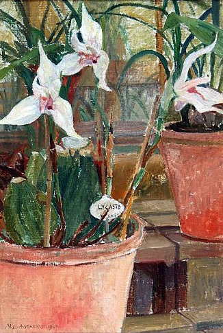
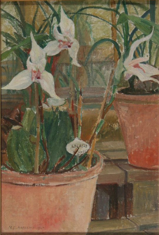
Madeleine E Holtom – Lycaste Orchid, 1947.
(In My Collection / Hertfordshire Pictures for Schools)
In 1931 Madeleine moved to London to study art at the Kingston School of Art where Reginald Brill was principal with other teaching from Anthony Betts, William Ware and John Platt. In 1932 she was awarded a scholarship to study at the Royal College of Art, there she won the painting prize in 1934. She painted in oils and watercolours under William Rothenstein and Gilbert Spencer.
Leaving the RCA she became a professional artist and also worked making advertisements. She married and divorced G. H. Holtom and they had two sons and two daughters, they moved to Northwood near Watford, North-West London. She also exhibited with the New English Art Club.
Her work was bought for the Hertfordshire Collection of Pictures for Schools. The county council’s collection was started in 1949 as part of the School Loan Collection, a post-war project by Sir John Newsom, the Hertfordshire Chief Education Officer at the time. He bought artworks from contemporary British artists so that schools could borrow them for the benefit of pupils’ art education. Painted in 1947 it is likely this is a very early piece bought for the Hertfordshire Collection.
The collection was begun in the late 1940’s by Sir John Newson, the then Chief Education Officer. It complemented Hertfordshire’s radical post-war schools building programme and sat alongside the art works being commissioned for the new schools.
Newson wanted all pupils in Hertfordshire schools, to have the opportunity to see, use and be inspired by original works of art. Early purchases for the collection included work by artists who are now recognised as very important in post-war British art and craft such as Keith Vaughan, Anne Redpath, Michael Ayrton, Edward Bawden, Josef Herman, Walter Keeler and Michael Brennand. The collection also has work by notable Hertfordshire artists such as John Akers and the sculptor John Mills. As well as these famous names the collection holds many fine pieces by newer and less well known artists and makers. †
Her work is represented in the collections of: Friendship House, Moscow. Queen’s College, Oxford. The Cuming Museum. Cheltenham’s Art Gallery. The Government Art Collection, British High Commission, Accra, Ghana.
Madeleine E Holtom – View from Flamsteed House, Greenwich Park, 1959
She exhibited at the Royal Academy 1951, 1958, 1960, 1961, 1964, 1972. Holtom died in 8th November 1976. She was living at St. John’s Coach House, St. John’s Street, Lechlade, Gloucestershire, formerly Grosvenor House, Twickenham, Middlesex.
† Herts Memories – The Hertfordshire County Art Collection –14th May 2009
In Hertfordshire the County Council’s collection of pictures for schools was started in 1949 as part of the School Loan Collection, a post-war initiative by Sir John Newsom, the Hertfordshire Chief Education Officer at the time. The aims of Pictures for Schools were to provide education for children, show children contemporary art rather than reproductions of masters and to liven up classrooms that in post-war Britain would have needed modernisation.
Many of the pieces were purchased from reputable dealers, artists and the ‘Pictures for Schools’ exhibitions which took place from the 1950s and 1960s. I thought I would show some of the pictures I now own and put the biographies of the artists.
Vera Cunningham – ‘Stooks’
Born in Hertfordshire of Scottish parentage, Vera studied painting at the Central School of Arts and Crafts. She began exhibiting with the London Group in 1922. With Matthew Smith, she exhibited in Paris at the Amis de Montparnasse and the Salon des Indépendants in 1922. Her first one-man show was held at the Bloomsbury Gallery in 1929. She produced a number of theatre designs at the end of the 1930s, but returned to easel painting. During WWII she was involved in the Civil Defence Artists’ shows at the Cooling Galleries. After the war her Paris dealer, Raymond Creuze, mounted three exhibitions in 1948, 1951 and 1954. She lived in London. The Barbican Art Gallery held a retrospective exhibition in 1985. Her work is held in the Manchester City Art Gallery; the Guildhall Gallery, London and at Palant House, Chichester.
Cuningham modeled for and had relationships with fellow artists Bernard Meninsky and Matthew Smith.
Vera Cunningham – ‘Garden Scene’
Thomas William Ward – ‘Charmouth Manor’
Thomas William Ward, was born at Sheffield. Studied part-time with Eric Jones (Harold Jones’s twin brother) at Sheffield 1937-1939. After service during the Second World War, Bill continued his studies at the Royal College of Art 1946-1950, winning a silver medal in 1949. He married at Kensington, London in 1949, sculptor Joan Palmer Ward. He taught at Harrow College of High Education 1950-1980, finally as principal lecturer, retiring to Suffolk in 1980. Elected a member of the Royal Society of Painter Etchers in 1953 and the Royal Society of Painters in Watercolour in 1957. This painting was bought from Whitworth Art Gallery, Manchester in 1957.
Alistair Grant – ‘The Weight-lifter’
Although best known as a printmaker, Alistair Grant also painted throughout his career and in the 1980s he adopted an expressionist style using vibrant colours. He was born in London and studied at Birmingham College of Art (1941-43). After serving during the war, Grant returned to art school and the Royal College of Art, where he was taught by Carel Weight and Ruskin Spear. Grant was to work in the printmaking department of the Royal College for 35 years (1955-90), ending his career as Emeritus Professor of Printmaking at the RA.
The Weight-lifter was bought from the Whitechapel Art Gallery at their Pictures for Schools exhibition: 8 October – 29 October 1949. It is likely ‘Eva’s House’ came from a similar exhibition.
Alistair Grant – ‘Eva’s House’, 1955
Vincent Lines – ‘Old Hereford Wagon’
Vincent Lines was awarded a scholarship to the Royal College of Art in 1928. The principal, William Rothenstein described him as ‘one of the best students of the painting school’. While only in his twenties, he was appointed principal of Horsham School of Art and later became principal of Hasting School of Art. Lines was a prolific and talented topographical watercolourist, with an intimate knowledge of the countryside, which he recorded on the spot, in the open air.
He was chosen as an artist for the Recording Britain project, to which he contributed twenty watercolours. He was a close friend of Thomas Hennell and the pair often painted together in the countryside around Hennell’s home at Ridley, near Meopham in Kent.
Lines survived the war and went on to become Vice-president of the Royal Watercolour Society. He wrote the biography of Mark Fisher and Margaret Fisher Prout, illustrated Rex Waites ‘The English Windmill’
The war years brought deepened friendships in particular with Mildred Eldidge and Thomas Hennell, both fellow watercolourists of the R .W .S . Through contact with Hennell he became fascinated by country crafts and together they hunted out the potter and the cooper, wheelwright and blacksmith, hurdlemaker and charcoal burner.
During 1943-4 he painted a series of eight watercolours recording the avenues of elms in Windsor Park, before the trees were felled. The pictures are now in the Royal collection. A further commission for Vincent during these years was the contribution to Arnold Palmer’s four-volumed Recording Britain, published in association with the Pilgrim Trust.
Due to Thomas Hennell’s death in 1945 the illustration of Rex Wailes’s book The English Windmill, which would certainly have been done by him, passed instead to Vincent Lines. Wailes’s definitive survey presents English windmills in their history, construction and mode of working. †
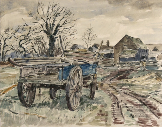
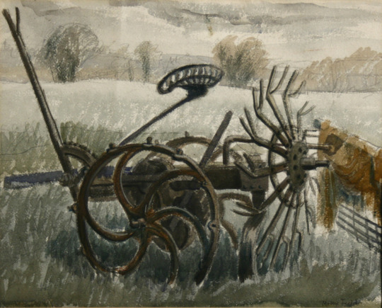
Molly Field – ‘Farm Implements’
Molly Field was born in Keighley, Yorkshire. She originally worked under the name Molly Clapham but then married the artist Dick Field. Attended Leeds College of Art (1932-33) then the Royal College of Art (1934-38), with Ernest Tristram. Showed at the Royal Academy, Women’s International Art Club and the Wakefield. She was married to Dick Field ARCA and they had one daughter.
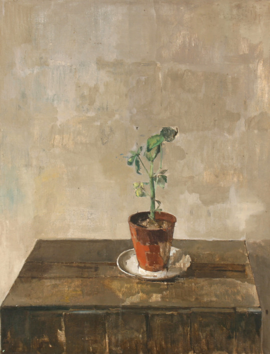
Carolyn Sergeant – ‘Geranium’
This is a mystery as it is one of the best paintings in the collection but there is no detail in the archives about who it is by.
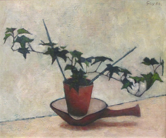
Bernard Gay – ‘Ivy Plant’
Bernard left school at the age of 14 and after various jobs, just before the Second World War joined the merchant navy. In 1947 that he returned to education, studying textile part-time at the Willesden School of Art (1947-52) and changed course to fine-art under Maurice de Sausmarez and Eric Taylor. He began drawing classes at St Martins School of Art and quickly established himself as a painter. It may have been in the Pictures for Schools exhibition 23 January – 14 February 1954.
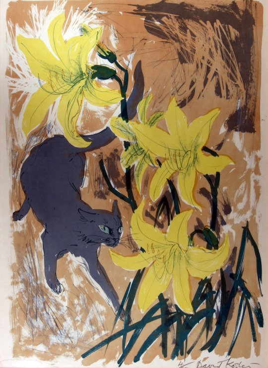
David Koster – ‘Cat and Lilies’
Koster studied at the Slade School of Art (1944-47). Taught drawing and print-making at Medway College of Design. One-man shows at Everyman Foyer Gallery (1958, 60, 62, 64, 66, 68, 70); Glasgow Citizen’s Theatre (1965); Stable Theatre Gallery, Hastings (1967). Taken several illustration commissions including work for the RSPB and a front cover for their ‘Birds’ Magazine.
David Koster was born in London and attended the Slade School of Fine Art from 1944 to 1947. He was a founder Member of the Society of Wildlife Artists in 1964.
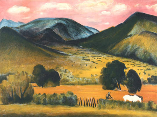
Raymond Croxon – ‘View in the Lake District’
Raymond Coxon enrolled at the Leeds School of Art, and the Royal College of Art. While he was there, between 1919 and 1921, he not only met his future wife but also became friends with a fellow student, Henry Moore. In 1922 Moore and Coxon visited France and met a number of artists there, including Pierre Bonnard and Aristide Maillol. Coxon continued his studies in London at the Royal College of Art between 1921 and 1925 under Sir William Rothenstein. Coxon took a teaching post at the Richmond School of Art in 1925 and in 1926 he married Edna Ginesi, with Moore acting as his best-man. Coxon would later perform the same service for Moore when he married Irina Radetsky in July 1929. He became a member of the London Group in 1931 and of the Chiswick Group in 1938.
During the WW2 he became a war artist and was commissioned to produce some paintings of Army subjects in Britain. Then working for the Royal Navy as a war artist. The painting of this print is in the collection of Palant House. The lithograph made for the Contemporary Lithographs Ltd. Other artists in the series were Eric Ravilious, John Piper, Vanessa Bell, Barnett Freedman and so on.
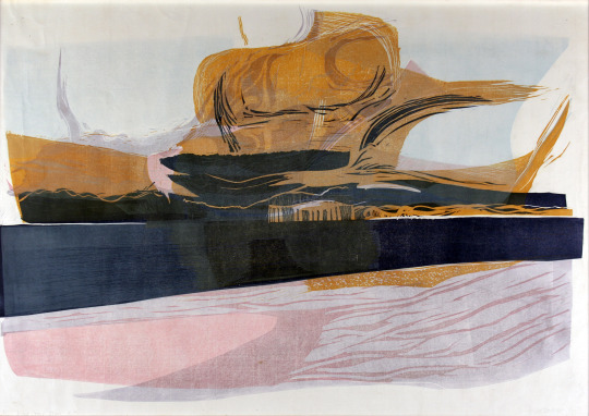
Julia Ball – ‘East Coast Storm’
Julia Ball is a Cambridge artist and this woodcut came up for sale with the Cambridge collection of Pictures for Schools but due to a cataloguing error on the auctioneers I didn’t win it as they had labeled it as a different lot. For years I smoldered about that. But when the Hertfordshire sale came up, I had to have it. Made in the 1960s this woodcut is of a storm over the east coast. Her painting are mostly abstract and works can be found in Kettles Yard and in the New Hall art collection. This picture was bought from the Royal Academy Diploma Galleries, 1967.
Joseph Winkelman – ‘Winter Morning’
Joseph Winkelman has specialised in intaglio printmaking since 1975 after completing the Oxford University Certificate course in Fine Art at the Ruskin School of Drawing. As an active member of the Royal Society of Painter-Printmakers (RE), he served as President from 1989 to 1995 and was recently artist in residence at St John’s College, Oxford.
John Sturgess – ‘Black and White Leaf’
A student at the Royal College of Art in the 1950s. He would have been taught by Julian Trevelyan, Edwin La Dell, Edward Ardizzone and Edward Bawden. He worked with John Brunsdon as a printer, printing other artists work, rather than going into teaching. They set up a press in Digswell Art Centre and that is likely how his work ended up in the Hertfordshire Collection. This work of a leaf looks more like foil, it is rather beautiful and a lithograph on stone. Though I haven’t photographed it the frame is a John Jones frame made of aluminium and is as beautiful as the print.
John O’Conner – ‘Boy and the Heron’
John O’Connor A.R.C.A. R.W.S, is today best known for his woodcuts, but during his lifetime he was also celebrated as a watercolourist. In 1930 he enrolled at Leicester College of Art before moving on to the Royal College of Art in 1933. His teachers at this time were Eric Ravilious, John Nash and Robert Austin. He graduated in 1937.
On a visit to Eric Ravilious’s home at Bank House, Castle Hedingham in Essex, O’Connor was captivated both by the directness of the wood-engraving technique, and by the simple domestic scene in which Ravilious engraved by a lamp in one corner of the room while his wife Tirzah played with their small son by the fire in another. It was due to Ravilious that O’Connor got his first commission of work aged 23, illustrating Here’s Flowers by Joan Rutter for the Golden Cockerel Press in 1937.
He taught at Birmingham and Bristol before serving in the Royal Air Force form 41-45. On being demobbed he illustrated two books for the Golden Cockerel Press and taught in Hastings for two years before moving to Colchester to become the head of the School of Art in 1948. He was affectionately known as ‘Joc’ to his students, using his initials. His colleagues included Richard Chopping, who designed dust jackets for the James Bond novels, his own former teacher John Nash, and Edward Bawden, one of the finest British printmakers.
He saw his favourite painting places in Suffolk – the ponds, willows, briars and honeysuckle – disappear beneath the bulldozer and combine harvester. In 1964 O’Connor retired from teaching full time at Colchester, to concentrate on painting and engraving. He wrote various ‘How to’ books and taught part time at St Martin’s School of Art. In 1975 he and his wife, Jeannie, went to live by Loch Ken in Kirkcudbrightshire, where his love of light and water inspired his many watercolours and oil paintings. He took up a post teaching at Glasgow School of Art from 1977 to 1984.
In the 1950s and 60s, O’Connor exhibited at the Zwemmer Gallery, in London, and had many exhibitions throughout Britain. His work was purchased by the Arts Council, the Tate Gallery, the British Museum and the Contemporary Art Society, as well as by several local education authorities; it can also be found in the Oslo Museum, the Zurich Museum and at New York central library. He was elected to the Royal Society of Painter-Etchers and Engravers in 1947, and, in 1974, to the Royal Watercolour Society. He was an honorary member of the Society of Wood Engravers.
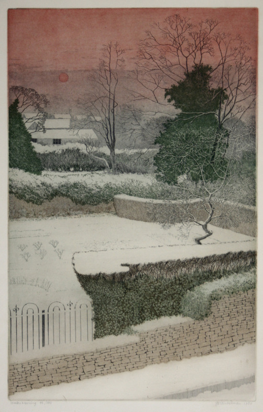
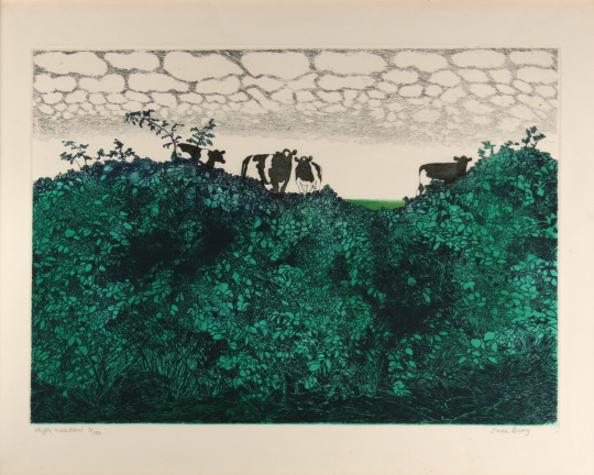
June Berry – ‘High Meadow’
June Berry studied painting at the Slade School of Fine Art, London. She has had nineteen solo exhibitions including a retrospective at the Bankside Gallery, London in 2002. Her paintings have been exhibited frequently at the Royal Academy Summer Exhibition, London since 1952. Berry was Vice-President of the Royal Watercolour Society from 2001 to 2004.
Her work is included in the collections of HM the Queen, the British Government Art Collection, the Victoria & Albert Museum, London, the National Museum of Wales, the Royal West of England Permanent Collection, the Graphothek, Berlin, Germany and the All Union Society of Bibliophiles, Moscow, Russia. Her work has also been purchased by many private collectors in the UK, USA, Germany and Russia. She is a Member of the Royal Watercolour Society, the Royal Society of Painter-Printmakers, the New English Art Club and is a Royal West of England Academician.
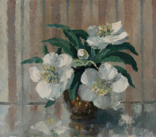
Madeleine Holtom – ‘Orchids’
Madeleine Elizabeth Anderson was born in Belvedere, Kent. She studied art at the Kingston School of Art where Reginald Brill was principal with other teaching from Anthony Betts, William Ware and John Platt. In 1932 she was awarded a scholarship to study at the Royal College of Art, there she won the painting prize in 1934. She painted in oils and watercolours under William Rothenstein and Gilbert Spencer.
Leaving the RCA she became a professional artist and also worked making advertisements. She married and divorced G. H. Holtom and they had two sons and two daughters, they moved to Northwood near Watford, North-West London. She also exhibited with the New English Art Club.
Her work is represented in the collections of: Friendship House, Moscow. Queen’s College, Oxford. The Cuming Museum. Cheltenham’s Art Gallery. The Government Art Collection, British High Commission, Accra, Ghana.
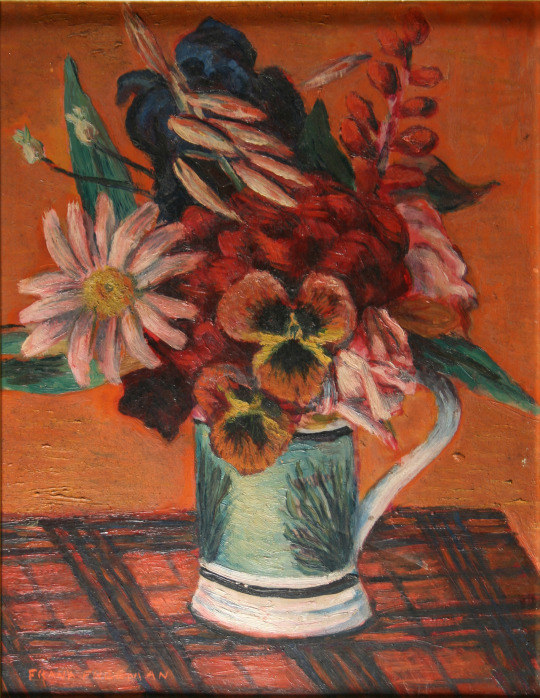
Frank Freeman – ‘Flower Piece’,
Frank Freeman is a bit of a mystery to me at the moment. I can find mention of him in a few places but sadly due to the blitz and poor archiving many are the lost. What is known is he was supported for a while by Lucy Carrington Wertheim and he was based in the Manchester area. One flower painting is mentioned in her book Adventure in Art.
Visitors who came to see me about this time. Among these were Frances Hodgkins, who stayed for months at a time at my flat, Henry Moore and his lovely Russian wife, John Skeaping, Barbara Hepworth, Cedric Morris, Lett Haines, John Alford, William Plomer, Leon Underwood, John Gould Fletcher, Pavel Tchelitchew, Komisarieysy, David Fincham and his wife Sybil, Jim Ede and Frank Freeman. ‡
John Wynne-Morgan – ‘Christmas Roses’
John Wynne-Morgan was born in Harrogate, Yorkshire and enrolled at the Heatherley School of Fine Art in London in 1945.
In a 1962 London catalogue foreword, Wynne-Morgan is described as ‘primarily a portrait painter’ (though the show contained scenes of Paris, Ibiza, Venice and London, and he also painted many Bonnard-ish nudes). His studio was in Hampstead and he was the author of three books for aspiring artists. In Oil Painting as a Pastime: A Complete Course for Beginners (Souvenir Press, London, 1959), he evokes how hard it is to embark on a portrait:
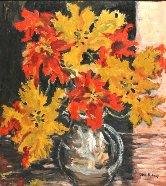
Edna Rodney – ‘Parrot Tulips’
Of all the artists I bought Edna Rodney eludes me, I can not find her anywhere and it might be she was an art student who gave up art for a family or she might have been one of Hertfordshire’s pupils that ended up in the collection as sometimes happened. It is rare to find nothing however.
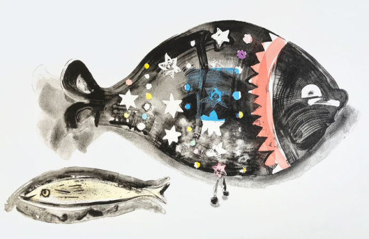
Chloë Cheese – ‘Lucky Fish’,
Chloëʼs childhood was spent in the Essex village of Great Bardfield observing the printmaking of her mother Sheila Robinson and she remembers in particular often visiting the studios of fellow printmakers Edward Bawden and Michael Rothenstein.
She has contributed to a recent book Bawden, Ravilious and the Artists of Great Bardfield published by the V&A. Chloë studied at Cambridge Art School from 1969 and the RCA from 1973 to 1976.
She has lived in South London since the 70s, investigating her home and surroundings first through drawing which is then used as a basis for the creation of monoprints, lithographs and etchings. Her engagement with still life subjects has widened to include figures against the palimpsest of an urban life.
Chloë has exhibited widely and her work is held in various public collections including The V and A Museum London and The Arts Council of Great Britain. Bio via St Judes.
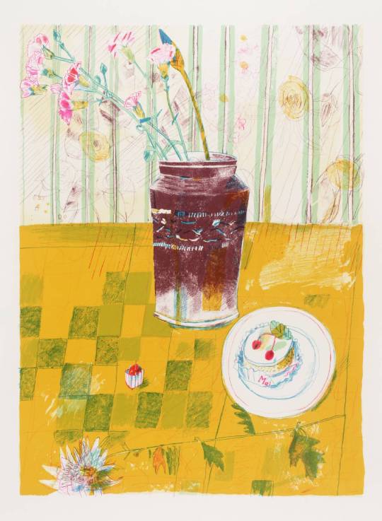
Chloë Cheese – ‘Pink Carnations’
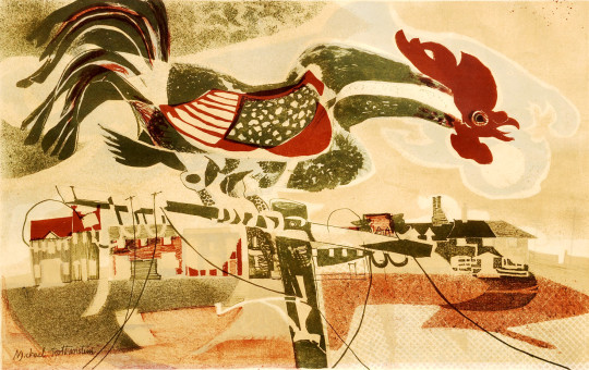
Michael Rothenstein – ‘Coronation Cockerel’
Born in Hampstead, London, on 19 March 1908, he was the youngest of four children born to the celebrated artist, Sir William Rothenstein and his wife Alice Knewstub. He studied at Chelsea Polytechnic and later at the Central School of Arts and Crafts. Affected by lingering depression, Rothenstein did little art making during the late 1920s and early 1930s. Despite this, he had his first one-man show at the Warren Gallery, London in 1931.
During the late 1930s the artist’s output was mainly Neo-Romantic landscapes and in 1940, like Vincent Lines, he was commissioned to paint topographical watercolours of endangered sites for the Recording Britain project organised by the Pilgrim Trust. In the early 1940s he moved to Ethel House, in the north Essex village of Great Bardfield.
At Great Bardfield there was a small resident art community that included John Aldridge, Edward Bawden and Kenneth Rowntree. In the early 1950s several more artists (including George Chapman, Stanley Clifford-Smith, Audrey Cruddas and Marianne Straub) moved to the village making it one of the most artistically creative spots in Britain. Rothenstein took an important role in organising the Great Bardfield Artists exhibitions during the 1950s. Thanks to his contacts in the art world (his older brother, Sir John Rothenstein, was the current head of the Tate Gallery) these exhibitions became nationally known and attracted thousands of visitors.
From the mid-1950s Rothenstein almost abandoned painting in preference to printmaking which included linocut as well as etchings. Like his fellow Bardfield artists his work was figurative but became near abstract in the 1960s. Although little known as a painter, Rothenstein became one of the most experimental printmakers in Britain during the 1950s and ’60s.
Rothenstein was elected an Associate of the Royal Academy (ARA) in 1977 and a Royal Academician (RA) in 1984. Near the end of his life there was a retrospective of his work at the Stoke-on-Trent City Museum and Art Gallery (1989) and important shows followed at the Fry Art Gallery, Essex.
The print I have (The Cockerel) was made for the Festival of Britain series of prints in 1951 and is signed under the mount. Likely bought from Redfern Galleries.
The intention is to lead the spectators eye over the canvas surface by an intentional redistribution of the tones and colours of nature and into the picture by the same means plus a reorganisation of the main planes of nature. But that of course is any serious painters job. ‡
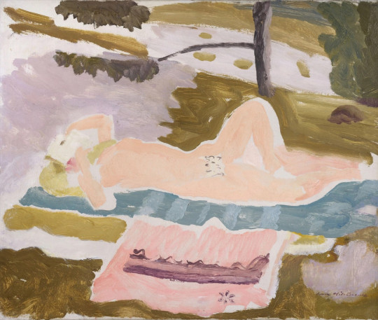
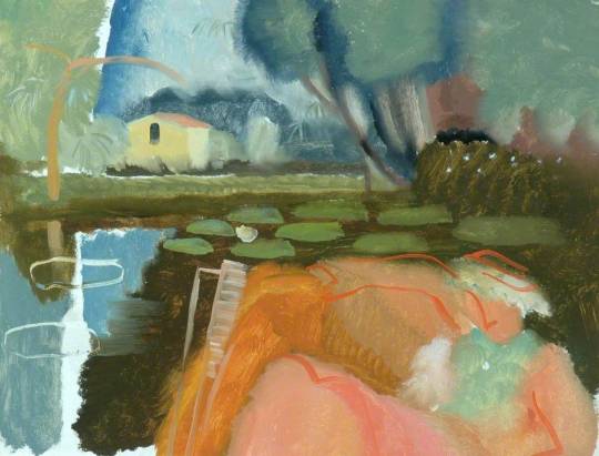
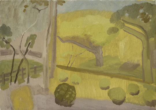
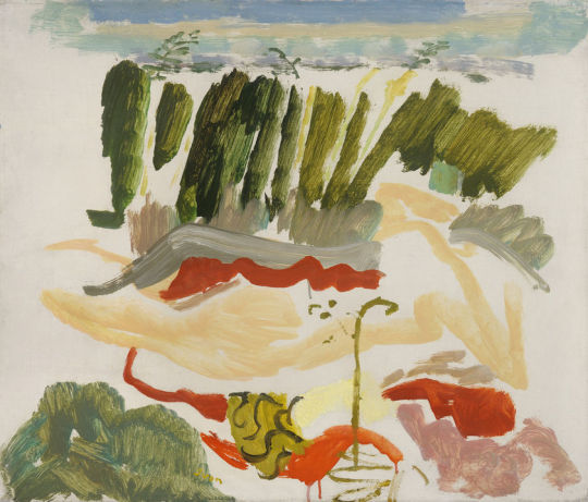
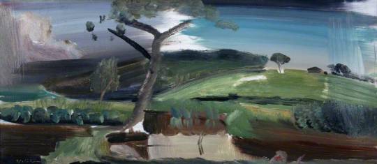
Ivon Hitchens – Sizewell Figure among Bracken, 1935
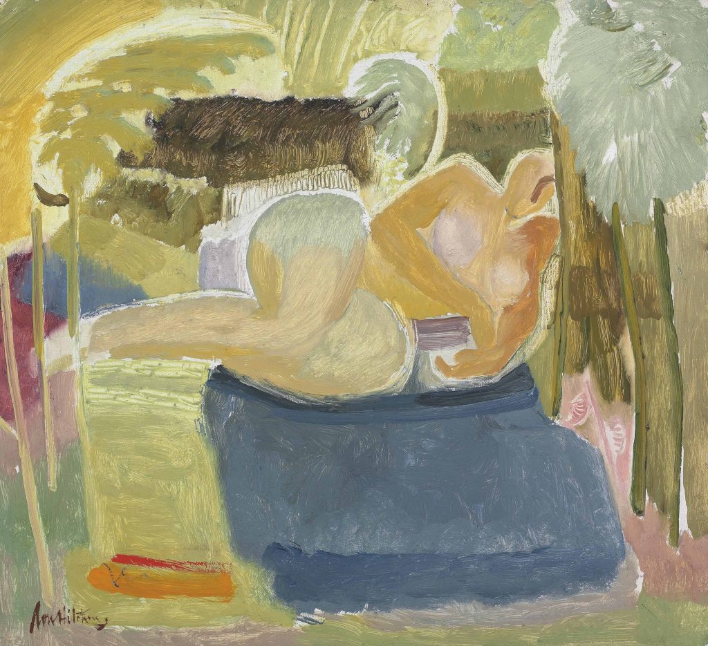
Ivon Hitchens – Sleeping Figure with Book – Sizewell, 1934
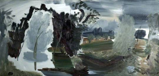
When most people talk to me of Sizewell in Suffolk they either think of the nuclear power plant or of Maggi Hambling. But many artists used this sleepy town as a place to paint from. Walter Batley painted the coast and lanes of Sizewell and Dunwich. John Barlow Wood painted the fields and views of the rivers in watercolour. Then in the 1930s Ivon Hitchens rented himself a cottage as an escape from London.
Hitchens was born in London in 1893. His father was the portrait painter Alfred Hitchens. Ivon studied first at St John’s Wood Art School in 1911 and then the Royal Academy Schools from 1911-12, again from 1914-16 and finally 1918-19. Hitchens was elected a member of the Ben Nicholson vision of the Seven and Five Society in 1920, exhibiting in all its exhibitions until 1935. Hitchens also exhibited with the London Artists’ Association, the London Group, and the Society of Mural Painters. After leaving Suffolk his final move was to West Sussex in 1940 after his Hampstead studio was bombed in the Blitz.
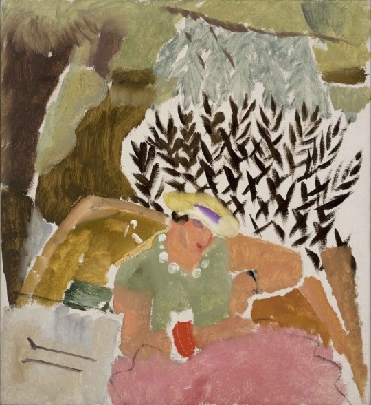
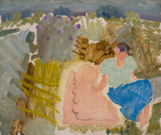
During his time at Sizewell on the Suffolk coast he painted various landscape paintings. Some of these came with paintings of his new wife Mary (Mollie) Cranford Coates.
Ivon Hitchens – River Scene at Holbrook and Molly in a Boat, 1938
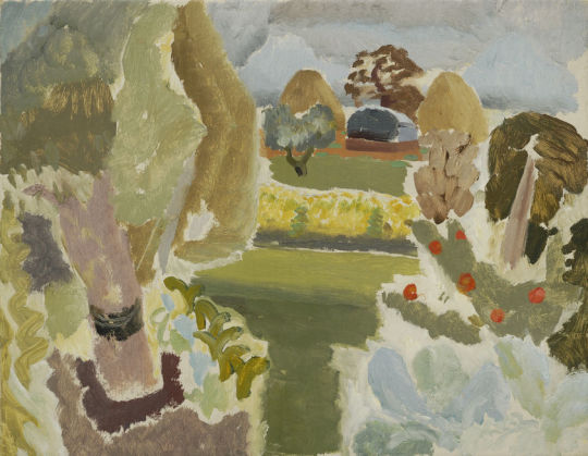
Ivon Hitchens – Haystacks – Suffolk, 1933
He painted views of the Stour Valley whilst staying with artists Ida and Blair Hughes-Stanton at either Higham – Stratford St Mary near Dedham.
He married at Hove, Sussex in 1935, Mary Cranford Coates and honeymooned at Sizewell. Towards the close of the 1930s, when Hitchens had ended a brief flirtation with abstractism, painting ‘Holbrook Pools’ to the south of Ipswich and a ‘Path Through the Wood’ during his stays on the Shotley Peninsula that his Suffolk stays ended.
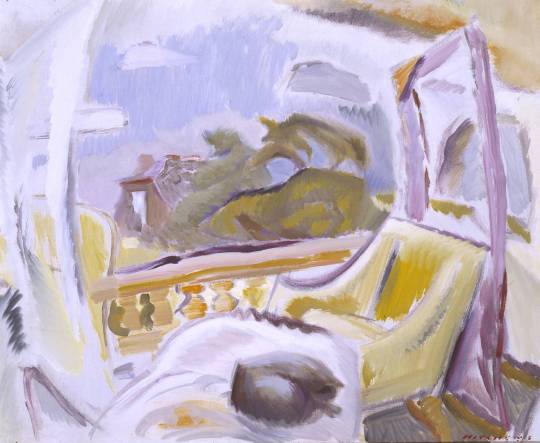
She had been invited down to Suffolk to stay for the weekend with Ivon Hitchens, who had rented a cottage on the beach at Sizewell (before the days of nuclear energy); he wanted to make some drawings of her. John Piper, who was already a friend of Hitchens, although ten years his junior, was already staying there, and he came to meet her off the train at Saxmundham. †
The quote above may be at odds with an account it was Leiston station Piper picked her up from. Pedantic, but I can’t find a definitive source. Below is a painting of a balcony in Cambridge, the house of his friend Jack Murray.
Ivon Hitchens – Balcony at Cambridge, 1929
Ivon’s son is a painter too, John Hitchens. John’s son is also an artist – Simon Hitchens.
† June Osborne – John Piper and Stained Glass, 1997 p36 ‡ Ivon Hitchens to John Maynard Keynes, 27th Nov 1940