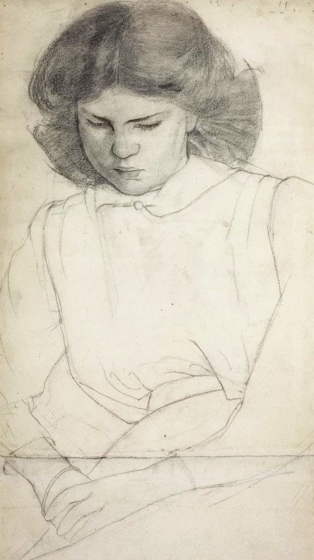
Before and After Great Bardfield: The Autobiography of Lucie Aldridge
Once considered lost, the forthcoming autobiography of Lucie Aldridge is released in the Summer of 2020. It covers her childhood in rural Cambridge at the end of the nineteenth century, her sisters, the Suffragette movement, her first marriage during WWI, and her life in London. That ‘London’ life was a release from the conventions of her childhood. She notes the famous parties of Cedric Morris and the Bright Young Things; meeting John Aldridge and finding herself in Majorca with Robert Graves and Laura Riding. There are too many people to list.
Following the success of Long Live Great Bardfield, The autobiography of Tirzah Garwood, Lucie’s book is a autobiography comes with a postscript by Inexpensive Progress detailing frankly the life and trials Lucie would go on to have in that Essex village.
If anyone has ever met Lucie, has any information on her, or her work (paintings and rugs) do please let me know at frozenocean18@hotmail.com but time is short!
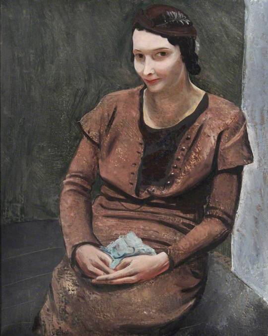
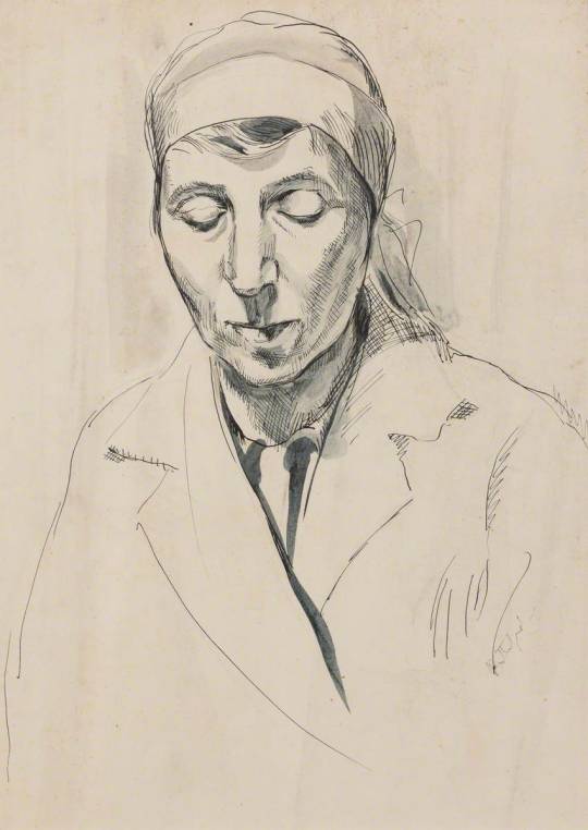
Lucie by John Aldridge, 1930 (Leamington Spa Art Gallery & Museum)
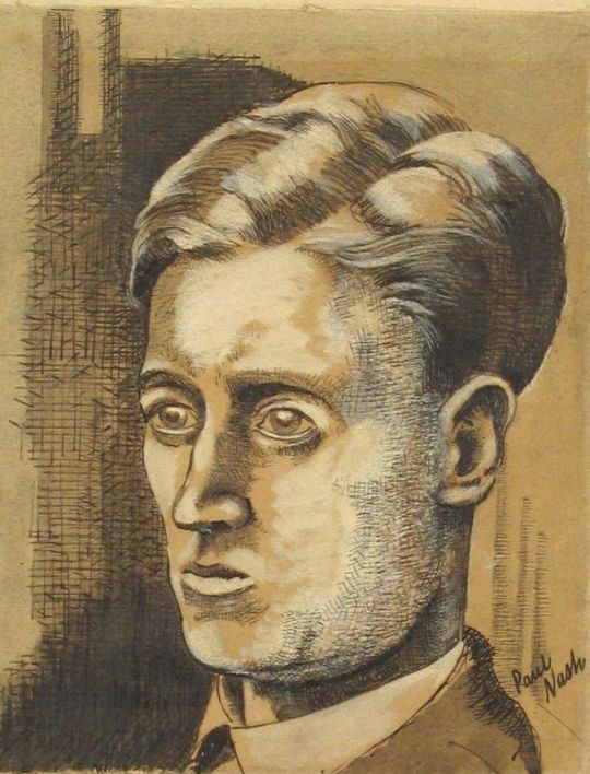
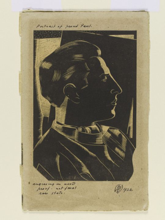
Many people might be unaware that Paul Nash did portraits, few are finished works but some are in illustrated letters. To me they are rather pleasing and the dress and hair of the sitters is also of the era. I picture them being drawn in a 1930s sitting room by a fire.
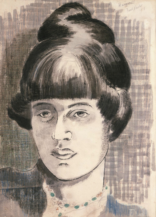
Paul Nash – Margaret Nash, 1919
Margaret Theodosia Odeh was born in Jerusalem, Nash grew up in Cairo. She was the daughter of an Anglican minister. Shortly after moving to London in 1908, she became involved in the suffrage movement and the Tax Resistance League. One of the founding members of the Committee for Social Investigation and Reform, Nash offered rehabilitation and opportunities for women working as prostitutes. With funding from donors including Millicent Fawcett and Elizabeth Anderson, the Women’s Training Colony in Berkshire was established. Women could stay at the retreat and learn arts and crafts, including millinery. The initiative was inspired by the Arts and Crafts objective to improve people’s lives through craft. She also worked on textiles at the Omega Workshops run by the Bloomsbury group. She married Paul Nash in 1913.
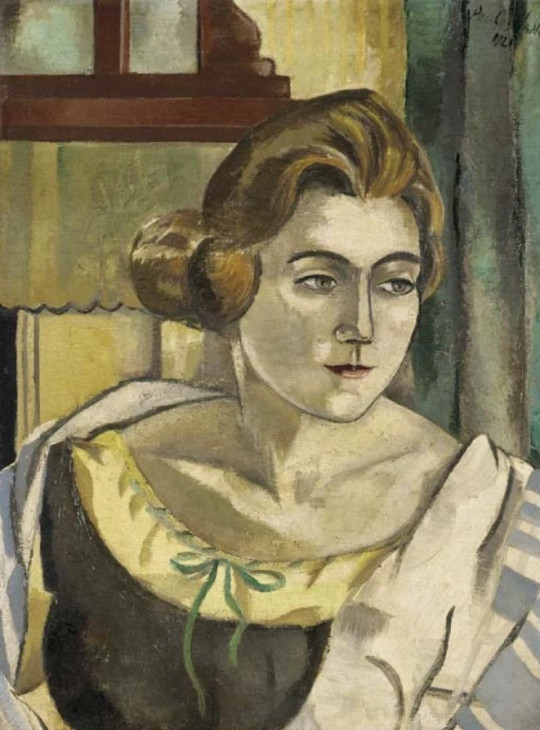
Paul Nash – Portrait of Alice Daglish, 1921
Alice (nee) Archer is known mostly for The Land of Nursery Rhyme, 1932, a book she co-edited with Ernest Rhys. It was illustrated by Charles Folkard. She married Eric Fitch Daglish in 1918 and lived to be 103.
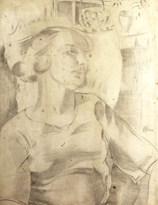
Paul Nash – Yvonne, 1922 (Maybe Yvonne Gregory)
Paul Nash – Douglas Goldring
Douglas Goldring was an English writer and journalist. He became known mostly as a travel writer. In the late 1930s Goldring came to prominence in two ways. He was Secretary of the Georgian Society, which he helped to found after writing in the Daily Telegraph in 1936, with Lord Derwent and Robert Byron. Inspired by the ideas of William Morris, Goldring helped transform it in 1937 into the Georgian Group, a section within the Society for the Protection of Ancient Buildings, on the advice of Lord Esher.
Goldring soon became unhappy with the Georgian Group’s political conservatism and left it. He was also noted, at the same period, as a radical journalist and prolific contributor to left-wing publications. Goldring described his political views as socialist. In his last years, Goldring contributed reviews to the Socialist Labour League magazine Labour Review.
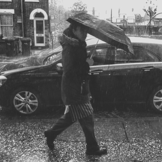
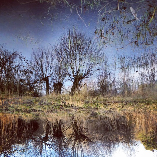
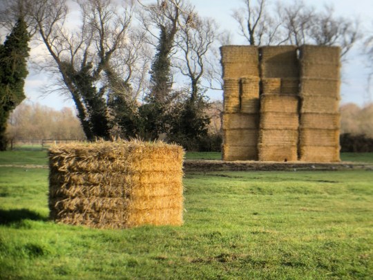
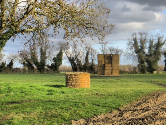
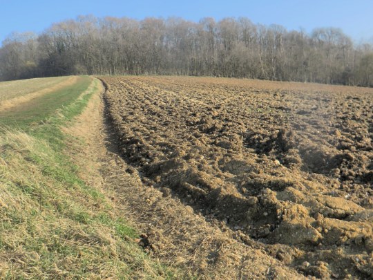
Here are a set of nice but random photographs I have taken over the past few months. Anyone who knows me would know that I take hundreds of photos every week and so it is always hard to edit it down.
Rosemary Ellen Rutherford, was an artist and designer of stained glass windows. She was born in Kings Norton, Worcester in 1912. Her father was Revd John Finlay Rutherford. She studied at the Slade School of Fine Art and in 1939 she became an artist and part-time teacher at St Cedds School, Chelmsford, living at The Vicarage, Broomfield, Chelmsford with her parents.
She also was a student of painting with Cedric Morris at Benton End, Hadleigh, Suffolk. Rutherford was among the earliest students joining the East Anglian School of Painting and Drawing in 1939 at the age of seventeen. Many of her oil paintings have the colour tone and brushwork similar to Cedric Morris.
On the outbreak of the Second World War, Rosemary joined the Red Cross as a volunteer when she performed a variety of jobs, including driving a mobile canteen round gun batteries on the east coast and working as a nurse in hospitals and convalescent homes for servicemen.
She was given permission by the War Artists Advisory Committee (W.A.A.C) to record her work artistically. Many of the works of the time are simple line drawings with watercolour made on the spot, I haven’t seen any other examples of them having been worked into oil paintings after. Despite this she is principally known as a stained glass artist.
Her work is in the Suffolk churches at Boxford, Walsham le Willows and in Hinderclay, where her brother, John Allarton Edge Rutherford (1910-2005), was the incumbent, she also completed stained glass windows in several Essex churches and as distant as West Heslerton All Saints, Yorkshire in 1964. She was of The Priory, Walsham le Willows, when she died at Lambeth, London on 20 June 1972.
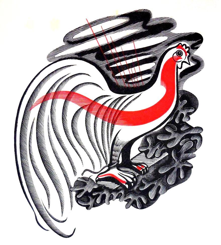
This is a simple post on beautiful illustrations inside The Escaped Cock by D. H. Lawrence, this was Lawrence’s preferred title for this tale but it has also been printed under the title The Man Who Died by some later, more prudish publishers.
In February 1930, the dying Lawrence was negotiating about an unlimited edition with the London publisher, Charles Lahr. Lahr asked for the title to be changed to The Man Who Died and Lawrence eventually agreed, insisting that the original title should be retained as a subtitle. This projected Lahr edition failed to appear, and the first English edition was eventually published by Martin Secker in September 1931 as The Man Who Died, a title never approved by the author. †
The first edition was illustrated with wood-engravings by John Farleigh. Farleigh was born in London. He was apprenticed to the Artists’ Illustrators Agency and later studied at the Central School of Arts and Crafts, London, learning engraving from Noel Rooke. He taught for many years at the Central School of Arts and Crafts. He was also a founder and long time Chairman of the Crafts Centre of Great Britain.
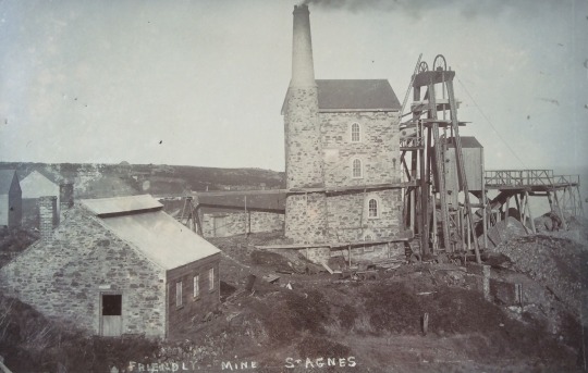
I thought I would feature this Mine as an unlikely source of inspiration. I came across two works on the same day and I thought it was nice to show an alternative to artistic inspiration in Cornwall other than St Ives.
Sammy Solway – Wheal Friendly Mine, 1905
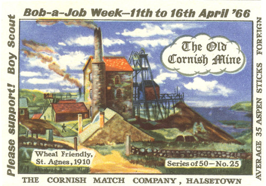
The Wheal Friendly Mine in Cornwall was a small tin mine at St Agnes which formed part of the more famous and rich Wheal Kitty tin mine. It was operating prior to 1863 but was out of use and abandoned by 1930. Below it is imagined when working from a 1966 Match box cover.
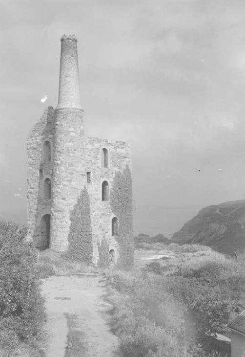
Below is a photograph of the mine by John Piper taken when he was researching the Shell guide for Cornwall. It is a romantic ruin but also looks like an outpost for Mars.
John Piper – Wheal Friendly tin mine engine house, St Agnes, Cornwall, 1933
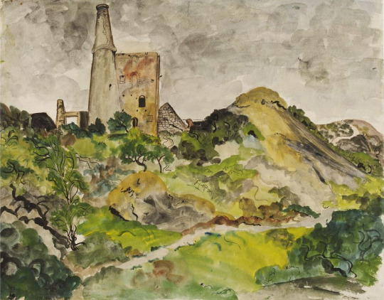
The last picture is a painting by Olive Cook for the Recording Britain project. For Olive Cook it is a rather lovely watercolour.
Olive Cook – Tin Mine, St. Agnes, North Cornwall c1940.
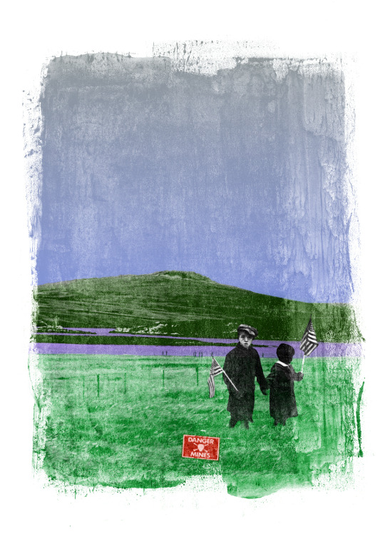
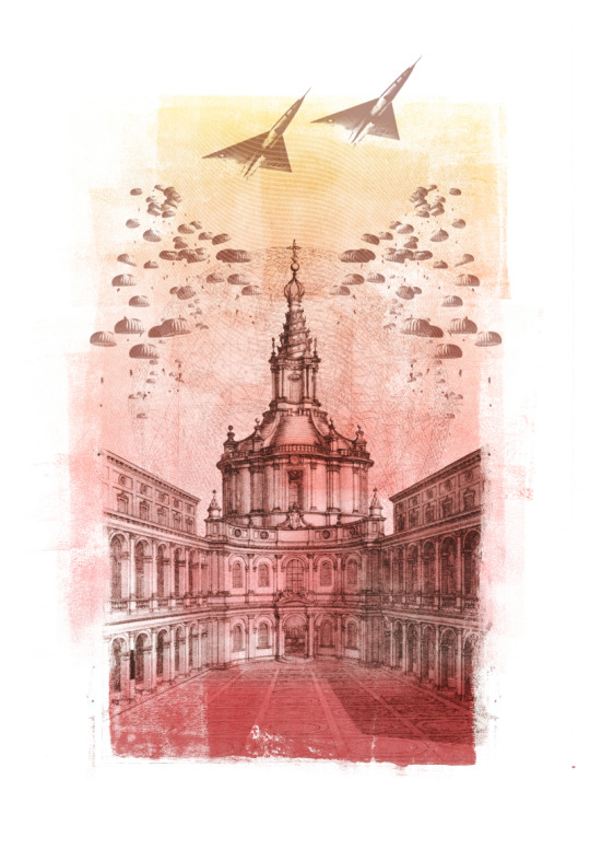
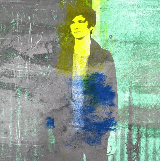
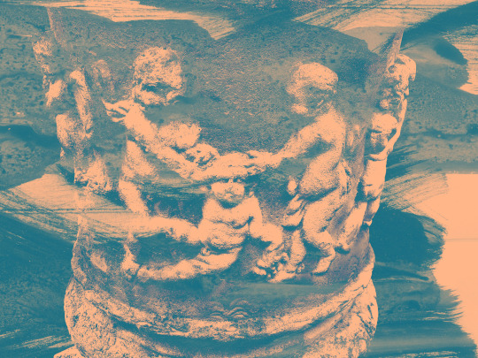
Here is a series of prints I made as a student. Time gives a distance of how you feel about work made but I was clearly angry about the wars happening and going on in these prints. Many of the images were constructed and then printed after.
I liked the mess of printing things wrong, I thought it gave more texture to it all and I enjoyed the abstract nature of making things. At this time I only really knew the works of Michael Rothenstein and had seen a few Robert Rauschenberg prints in books.
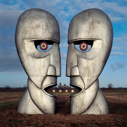
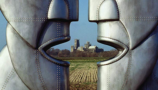
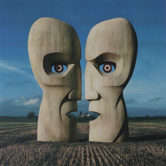
I found myself looking at the vinyl re-release of Pink Floyd’s ‘Division Bell’ in a record shop. Being twelve inches it is much larger than the CD format of five inches, but still people fail to notice what is between the mouths of the sculptures, Ely Cathedral.
The photographs were taken by the difficult to like Storm Thorgerson. In a past life I have many debates over what makes a great album cover, but in the end there is nothing other than public exposure that makes a record cover great in the public’s mind. The Dark Side of the Moon record sleeve with the simple design is beautiful, but the best way to make something iconic is for it to be seen everywhere, like an icon. The photographs of Division bell are beautiful.
Storm Thorgerson’s cover to Pink Floyd’s Division Bell.
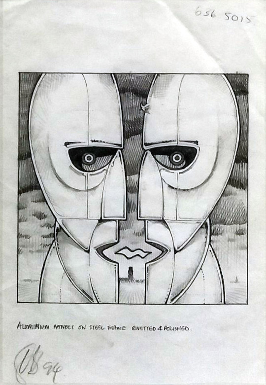
The original sculpture design was by Keith Breeden. They look like African masks and jet engines. They are an intriguing design. The eyes look like RAF logos. Being curved and shaped as they are, the light affects them at different times of the day and locations giving the photographer a lot to work with.
Keith Breeden’s original sketched design for the heads.
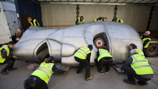
Below the sculptures can be seen being wheeled into the V&A for the Pink Floyd exhibition held in 2017.
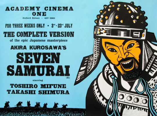
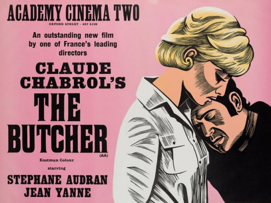
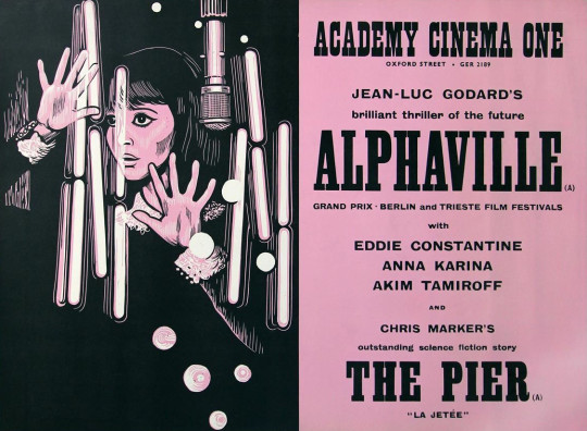
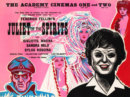
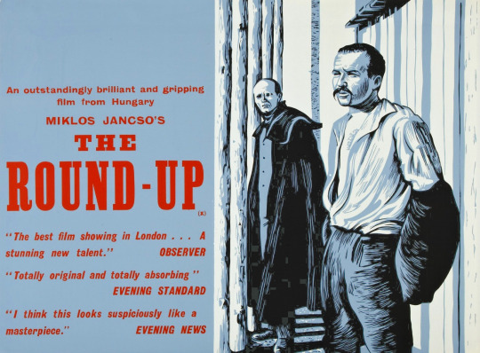
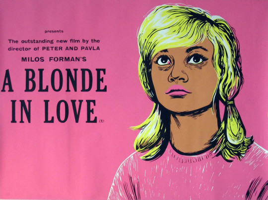
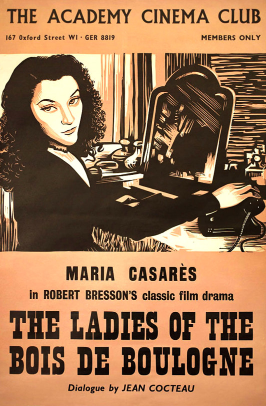
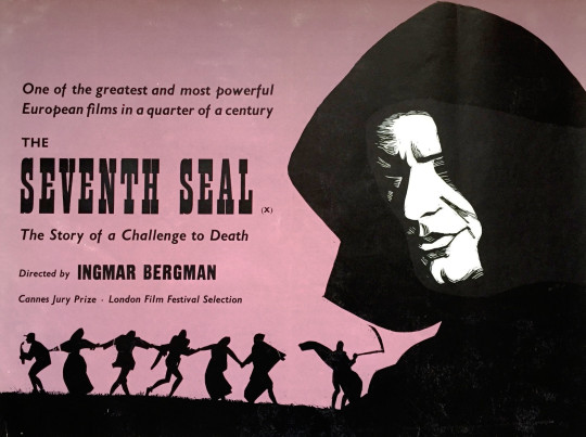
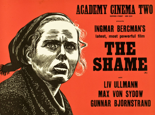
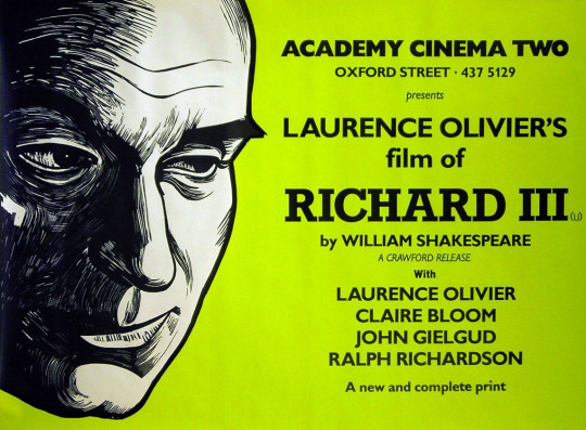
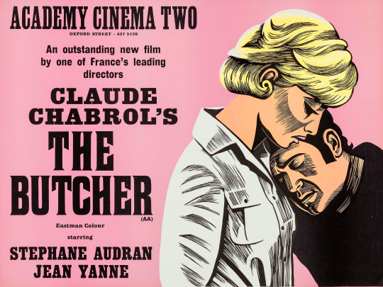
The Academy was a cinema located at 165 Oxford Street, London. Replacing another cinema, in 1931 the Academy opened, becoming London’s pre-eminent art house cinema, and for over 50 years introduced British audiences to major films, beginning with auteurs such as Jean Renoir and Marcel Carné; in later years the Academy largely established the reputations of Ingmar Bergman, Andrzej Wajda, Satyajit Ray, Jean-Luc Godard, Miklós Jancsó and others in Britain.
The Academy’s high standards were maintained by a succession of three managers: Elsie Cohen, George Hoellering and Ivo Jarosy. The cinema was damaged during a bombing raid in 1940 and re-opened in 1944.
In 1948, in order to remedy the lack of initiative shown by the Tate Gallery (and other institutions) in informing the British public about contemporary artistic movements, the ICA (with offices in Charlotte Street) mounted its first exhibition, ‘40 Years of Modern Art: a Selection from British Collections’. The ICA signalled its new approach to the arts by choosing the basement of the Academy rather than an already sanctified ‘art space’. Organised by Roland Penrose, this groundbreaking exhibition opened in February 1948 included works by Pierre Matisse, Pierre Bonnard, Pablo Picasso, Salvadore Dali, René Magritte and Vassily Kandinsky, as well as British contemporaries Francis Bacon, Eduardo Paolozzi, Victor Pasmore and Barbara Hepworth
Academy One opened in May 1964, the small Academy Two in March 1965, and Academy Three in April 1967 after some considerable strengthening and rebuilding in the basement. Hoellering died in 1980; the theatres closed permanently on 2 April 1986 and were demolished in 1989.
These posters are all designed by Peter Strausfeld and I really love the alternative take on poster design with a simple illustration to sum up the film. Poster design is rarely uniform but somehow Strausfeld’s style and punchy bold typefaces make for a beautiful combination.
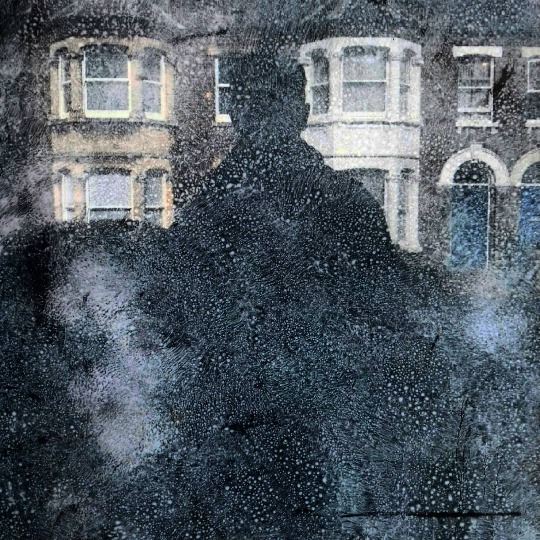
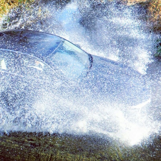
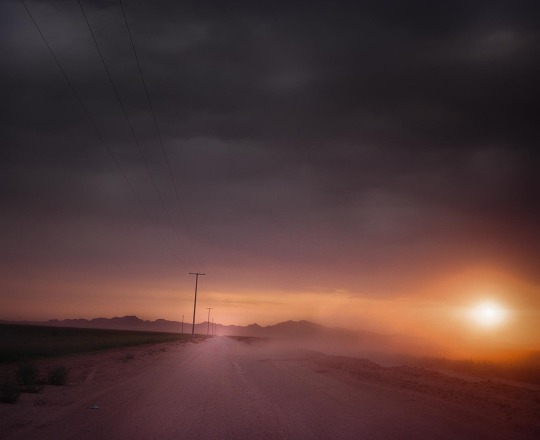
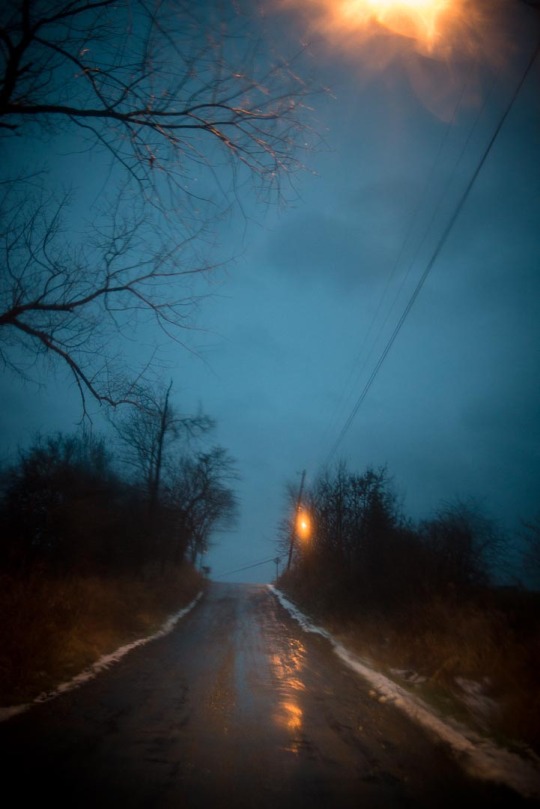
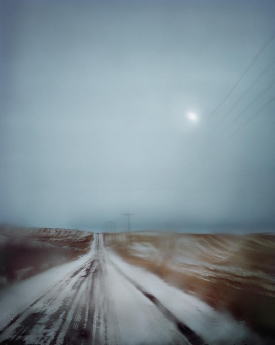
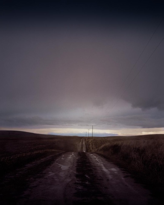
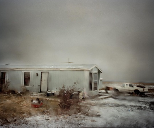
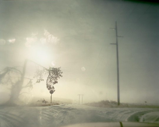
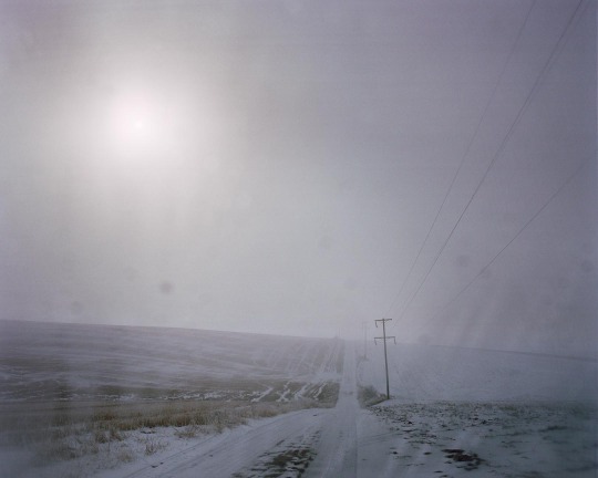
Todd Hido is a photographer based in San Francisco. Many of the photographs here are from the book ‘Roaming’. I originally thought that the pictures were original chance moments taken from inside a car when it was raining, but now I know this is not the case.
Hido keeps at least three water bottles with him in his car. One time, I watch him spray his windshield before taking a landscape photograph. ‘I’ve learned from sheer disappointment that sometimes I need to take pictures, but it isn’t raining outside,’ he says.
Sometimes the artist sprays glycerin on the windshield, for a different kind of effect. It’s a technique he compares to changing paintbrushes. The size, direction and position of drops of water on the car window inform the photograph that results, and within these fictitious raindrops, Hido says he can ‘compose’ the real picture that he wants to see. Ultimately, each photograph is a composition. It is a way of giving shape to a mental state, as opposed to capturing an actual setting.
To me it doesn’t really matter if the subjects of the photos below are staged or not as they are just unusually beautiful to my eyes.
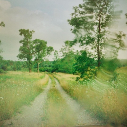
Years ago I was asked not to make a music video, but to find some footage for a song. It happened that very weekend I was in a car in a thunderstorm near Ashley and I shot some footage of a tree being distorted in the window screen with lightning. The song was a statement of forlorn hopelessness and the tree looked sad to me, it was the perfect moment. The result is here.