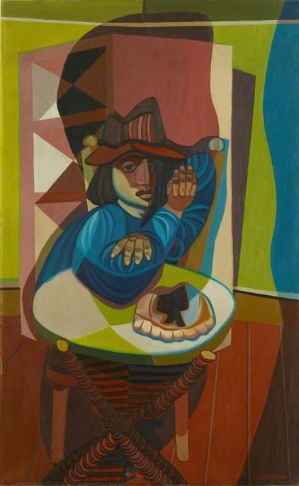
60 Pictures in ‘51 was part of the Festival of Britain celebrations, a touring exhibition of art with 60 paintings by Britain’s leading artists. It came with a booklet but like many books of the time, all the images were in monochrome. I thought it would be entertaining to present the pictures in colour and though I haven’t found all of the paintings, here is what I amassed.
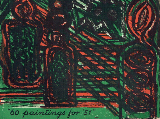
Gerald Wilde cover for the book 60 Paintings for ‘51.
If the Festival of Britain is to achieve its avowed aim of showing the British way of life in all its various facets it is clearly appropriate that a number of our distinguished painters and sculptors should have been given an opportunities to make their contribution.
With this very end in view – and also in the hope of handing down to posterity from our present age something tangible and of permanent value – the Arts Council has commissioned twelve sculptors and invited sixty artists to paint a large work, not less than 45 by 60 inches on a subject of their own choice. †
Keith Vaughan – Interior at Minos, 1950
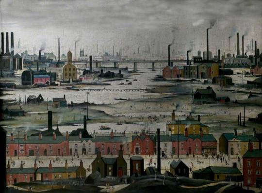
L S Lowry – Industrial Landscape, River Scene, 1950
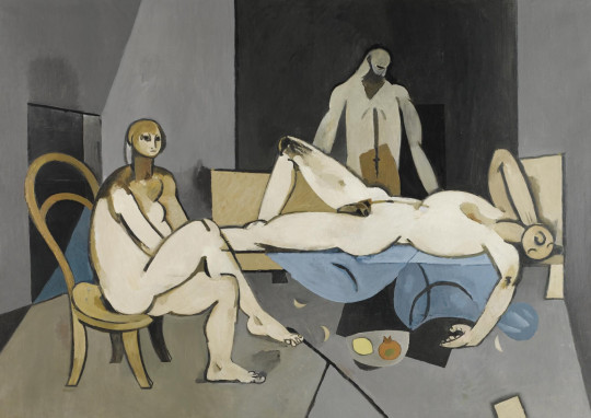
Lucian Freud – Interior Near Paddington, 1951
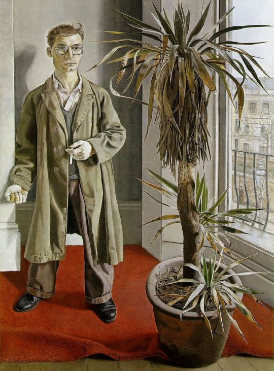
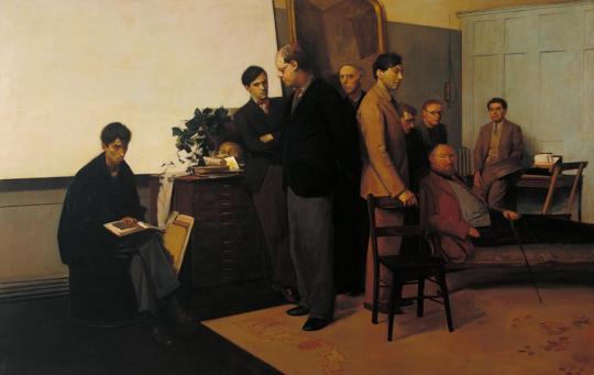
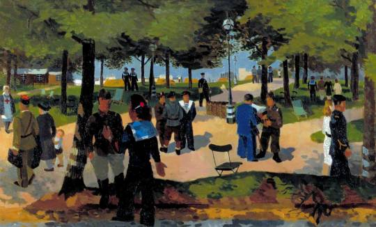
Rodrigo Moynihan – Portrait Group, 1951
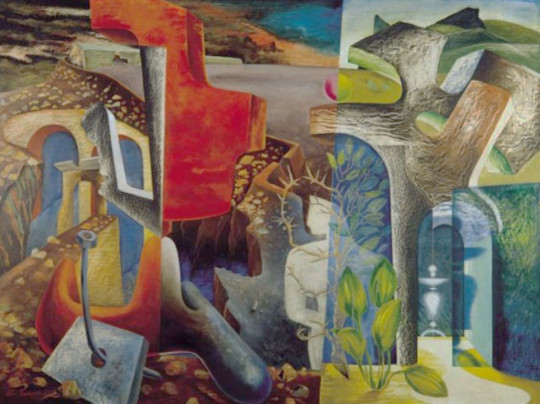
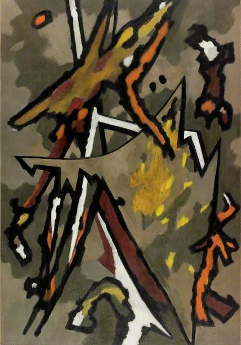
John Tunnard – Return, 1951
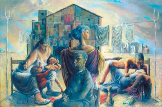
Michael Ayrton – The Captive Seven, 1950
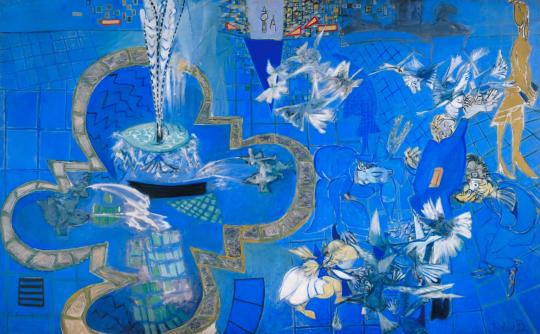
Ceri Richards – Trafalgar Square, London, 1950
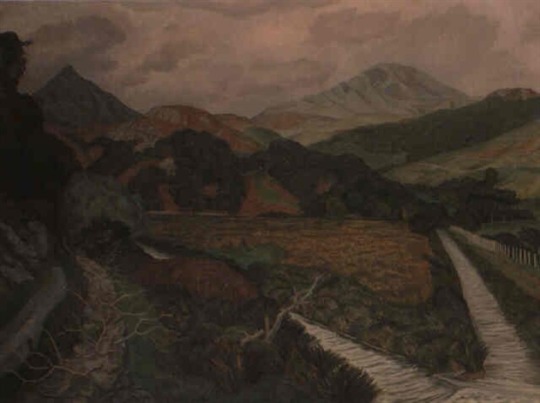
John Nash – Afon Creseor, North Wales , 1951
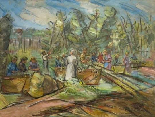
Keith Baynes – Hop-Picking, Rye, 1950
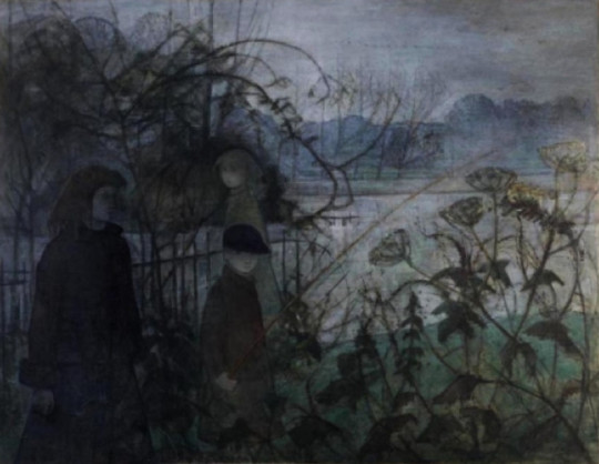
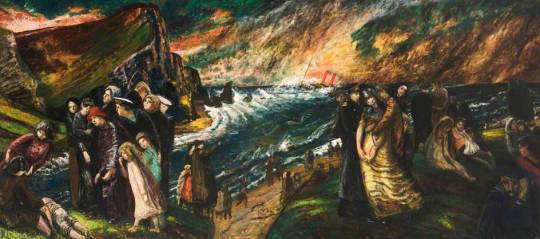
Elinor Bellingham Smith – The Island, 1951
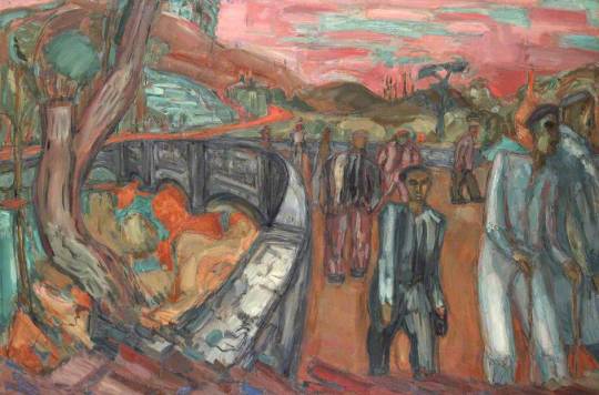
Martin Bloch – Down from Bethesda Quarry, 1951
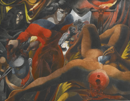
Edward Burra – Judith and the Holofernes, 1951
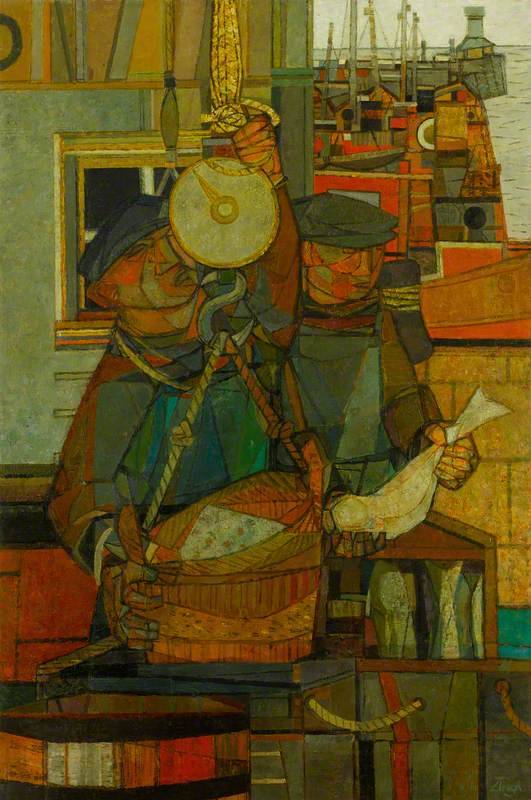
Prunella Clough – Lowestoft Harbour, 1951
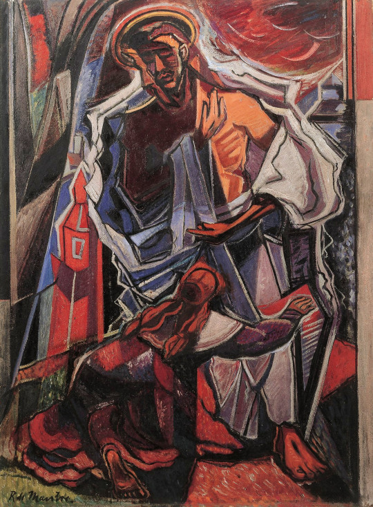
Roy de Maistre, Noli Me Tangere
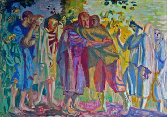
Hans Feibusch, The Prodigal Son
Carel Weight, “As I wend to the Shores…”
Ivon Hitchins, Aquarian Nativity, Child of this Age
Gilbert Spencer, Hebridean Memory
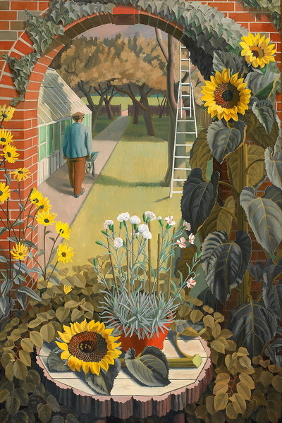
Charles Mahoney – The Garden, 1950
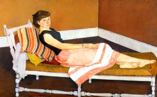
Claude Rogers, Miss Lynne
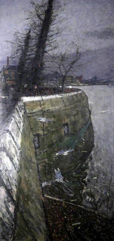
Ruskin Spear – River in Winter, 1951
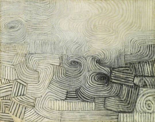
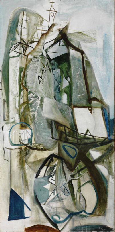
Victor Pasmore – The Snowstorm: Spiral Motif in Black and White, 1951
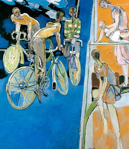
Robert Medley – Cyclists against a Blue Background, 1951
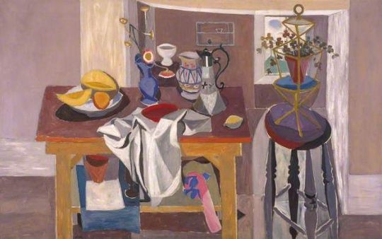
William Gillies – The Studio Table, 1951
Patrick Heron – Christmas Eve, 1951
William Gear – Autumn Landscape, 1950
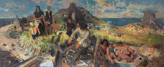
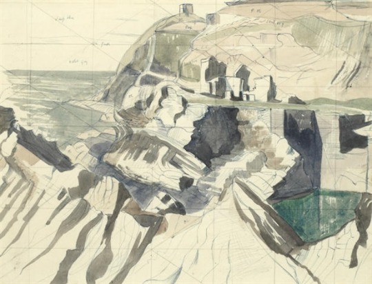
Peter Lanyon – Porthleven, 1951
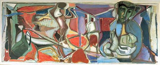
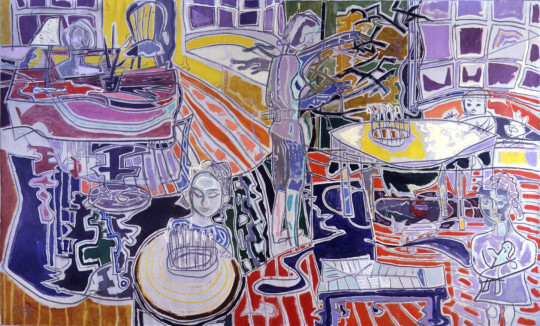
Robert MacBryde – Figure and Still Life, 1951
Below are some of the sculptures mentioned in the forward, but these really had their own booklet and part of the Battersea Park Festival Of Britain Pleasure Garden.
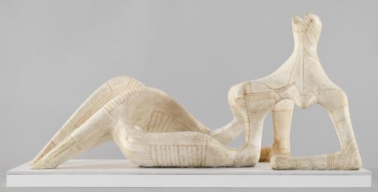
Henry Moore – Reclining Figure, 1951
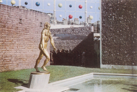
Jacob Epstein – Youth Advances, 1951
Barbara Hepworth
Contrapuntal Forms, 1951
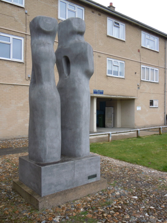
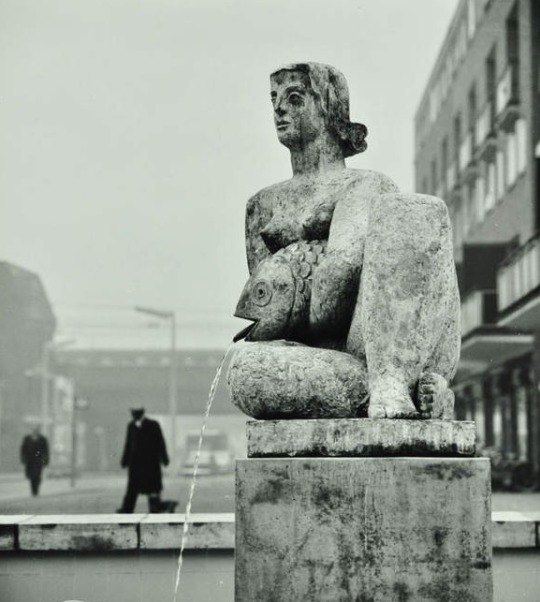
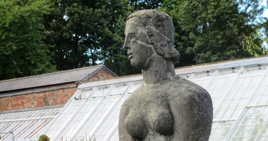
Frank Dobson – Woman and Fish, 1951
The statue above stood in Frank Dobson Square, Tower Hamlets until it was vandalised and she had her head destroyed. Now with scars she sits in Delapre Abbey, Northampton, pictured below.
This week on instagram I will be broadcasting live with Mark Hill, an informal chat from 7pm On Thursday. Join us if you can, gives you time to clap the NHS at 8pm.
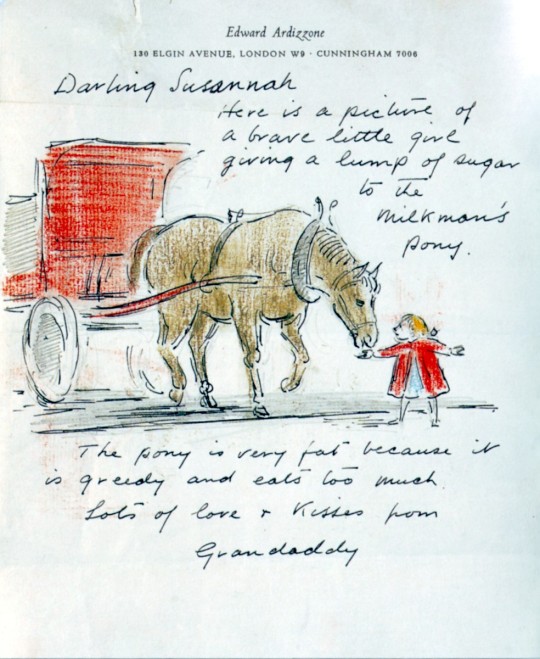
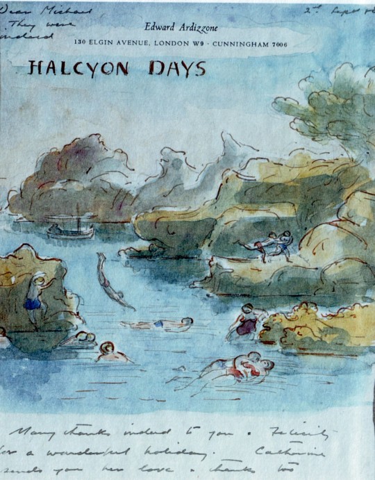
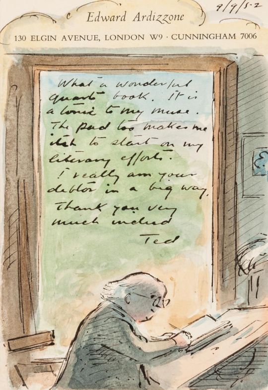
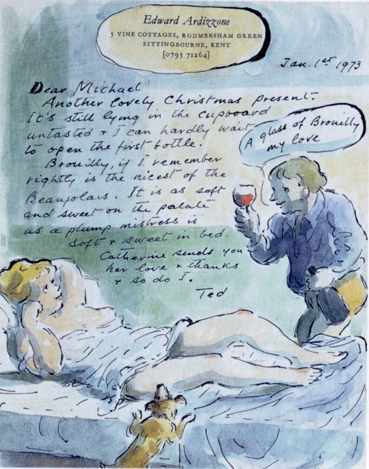
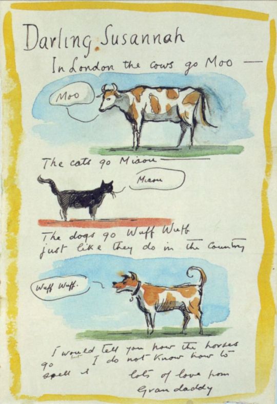
In Judy Taylor’s book Sketches for friends, 2002 are a series of Edward Ardizzone’s illustrated letters. Some I have illustrated below. From reading the Tim series of books, Edward Ardizzone seemed like a kind person and his letters have a joy to them as well with all the comic illustrations.
It was an age when the postal service would run almost continuously and you could send a letter in the morning and know it would get there in the evening. You could keep in contact throughout the day.
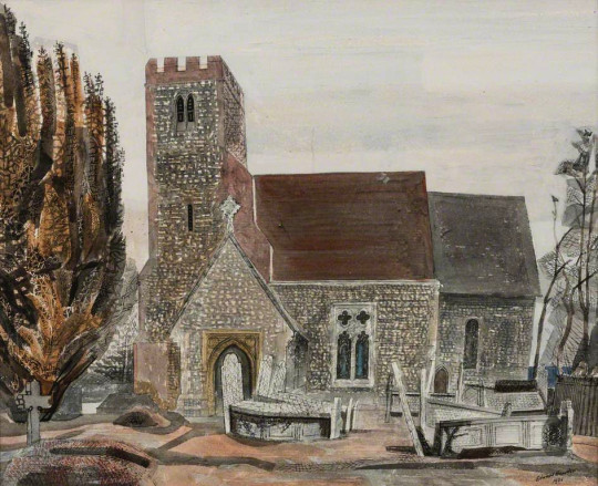
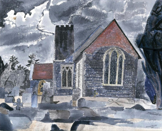
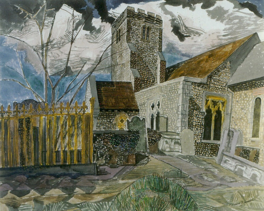
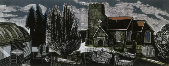
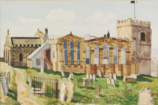
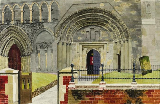
Lindsell is a village neighbouring Great Bardfield, Essex. The church is dedicated to St Mary The Virgin and dates back to Norman period with many alterations since. It was a church that Bawden would paint and print from different angles being in walking distance from his home at Brick House.
Although the styles are much the same the colour pallets are different. The linocut at the bottom of the page is very large and in life, has the texture and detail as this first watercolour.
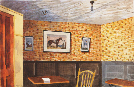
Born in Scarborough, Kenneth Rowntree’s father was the manager of the local department store who displayed his work in the shop, this may have been why Rowntree changed from training to be a cellist to becoming an artist. He studied at the Ruskin Drawing School, Oxford and went to the Slade School in London.
In 1941, Rowntree had moved to Great Bardfield, settling with his wife Diana (née Buckley) into the “a handsome draughty house” Town House. There they would be neighbours to Edward Bawden and Eric Ravilious lived in Castle Hedingham a few miles away.
The paintings Kenneth Rowntree made during war time are rather curious because they are not on the front line. Unlike many of the other official war artists, Rowntree was a Conscientious Objector. He did paint the domestic scenes of life during wartime, but not pictures of the war maneuvers.
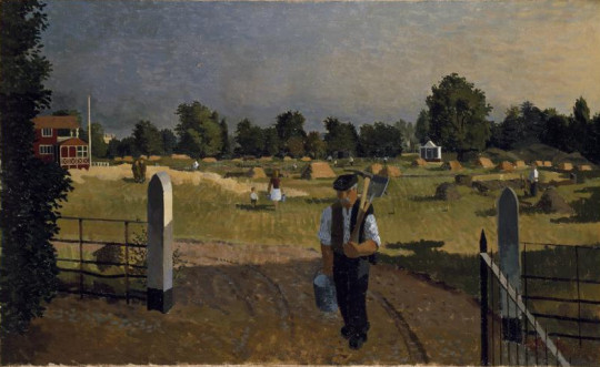
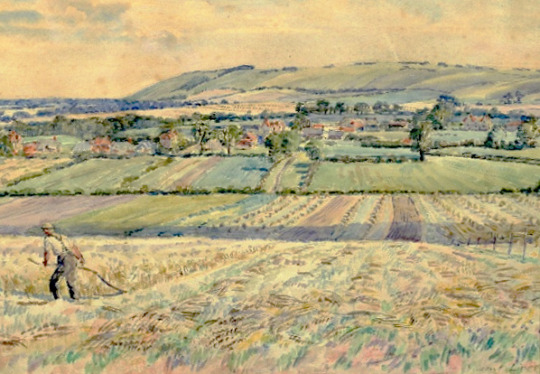
The picture below is of a Polo Ground is a good example of his work. The pitch as been converted into growing produce and the people working for the war effort but making food.
The figure of the man signifying the every man worker to me says ‘we are all in this together’. Below are five of his paintings for the War Artist Scheme.
Kenneth Rowntree – A Polo Ground in War-time, 1940
Kenneth Rowntree – Foreign Servicemen in Hyde Park: Early Summer, 1940
In the picture above, the mixture of uniforms is a good indication of how many parties are mixed up in the conflict. A subtle communication.
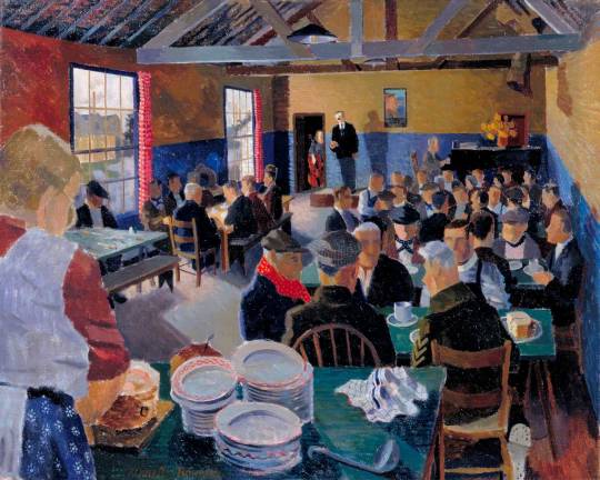
Kenneth Rowntree – The Council for the Encouragement of Music and the Arts Canteen Concert, Isle of Dogs, London, E14, 1940
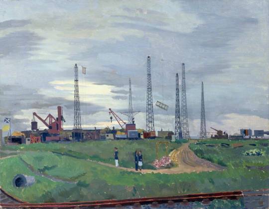
Kenneth Rowntree – The Experimental Establishment, Shoeburyness: Firing through Screens, 1945
All the paintings below are part of the Recording Britain series.
In 1940, when the British landscape was under attack from the threat of German bombers, the Ministry of Labour, in association with the Pilgrim Trust commissioned many of Britain’s artists to go out and paint a record of the changing face of the country before it was too late. †
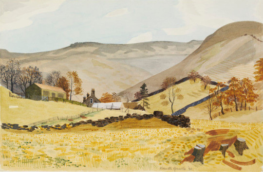
I think part of the romance of the pictures below is the lack of cars in pictures. No High Street in Britain will ever look beautiful again until cars are stored back in their garages and not parked on the street. Other than the Old Toll Bar House all the places are without figures, an empty world of architectural curiosity. I also feel that there is something beautiful about those multi-layered telegraph poles and wires in the same picture.
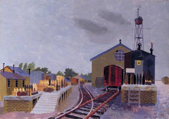
Kenneth Rowntree – Old Toll Bar House, Ashopton, 1940
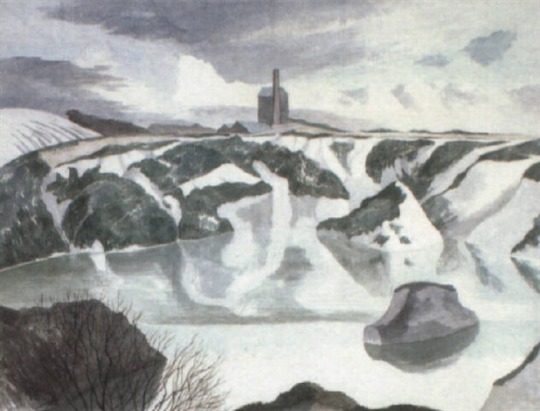
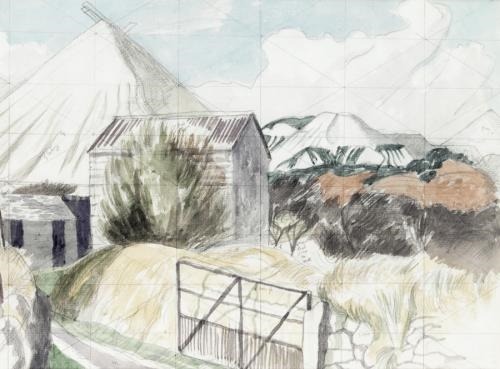
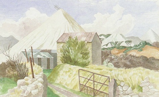
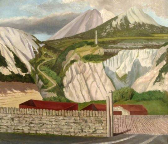
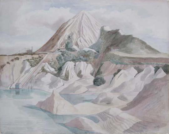
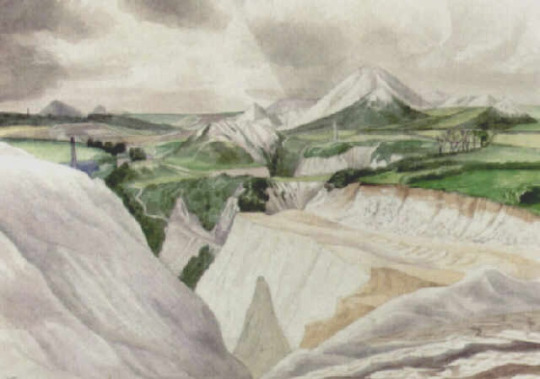
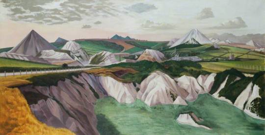
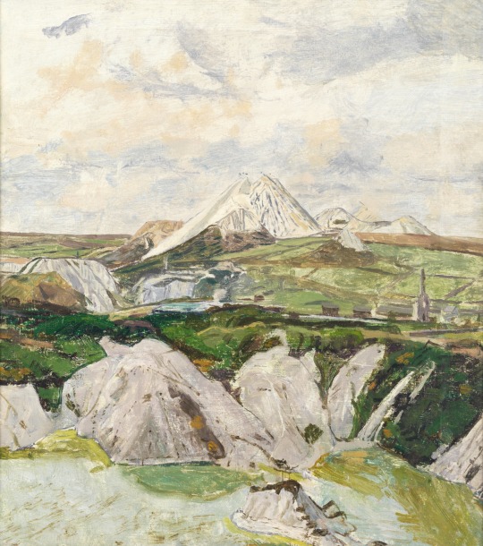
China clay is a material known as kaolin. It was first used in China more than ten thousand years agoto make porcelain. When the Chinese started to export this to Europe it was fashionable but expensive. Noticing a gap in the market, a Plymouth apothecary called William Cookworthy began to research the porcelain-making process and spent several years searching for a material that resembled the kaolin that had been used for so long in China. In 1745 he eventually found it, at Tregonning Hill, near Germoe, in Cornwall, where a rare type of decomposed granite, finer than most talcum powders, arises naturally.
The mining of this over the years scared the landscape with a white mountain of spill and a quarry pit. I have some memory that it was on one of these trips that John Nash painted with Edward Bawden and Carel Weight.
John Nash – Disused China clay pit near Hensborough
John Nash – China clay landscape
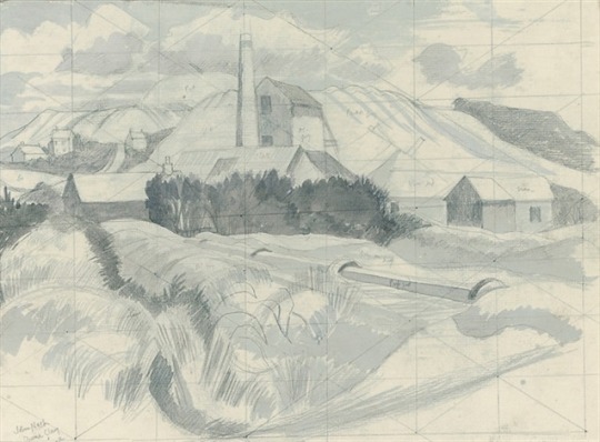
John Nash – A mine, Bugle, Cornwall
John Nash – Mountain Landscape with Distant Lake, 1939
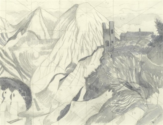
John Nash – China Clay Matterhorn 1952
John Nash – Clay pits , 1954
John Nash – Panorama of Pyramids, 1953
Below is a painting by Carel Weight, it’s the same view of the painting above by John Nash, is it chance or not? Nash used to make pencil drawings of a subject and then come back to it later in the year, maybe with some of his Cornish paintings he came back years later? Or just a fluke, who knows. It doesn’t help that the Weight picture isn’t dated.
I love discovering interesting artists, the research and uncovering details of their life and then buying works to sell, but before the lock down, little did I know that I would buy a painting stolen from the Victoria and Albert Museum. I want to give it back to them but their staff are all furloughed until August.
The painting was a watercolour by Vincent Lines, an artist with an interesting past. Lines education started at the London Central School of Arts and Crafts, then in 1931 he was admitted into the Royal College of Art. He was influenced by A.S.Hartrick and Thomas Hennell. He worked as a watercolour artist and an illustrator. He became Principal of Horsham art school in 1935. He was one of the artists chosen to work on the Recording Britain project, and that is one of the things that attracted me to him.
During the Great Depression in America artists were employed by the state to make works for the public. It was called the Federal Art Project and from 1935 the project was mostly famous for many murals in post offices and public buildings across America, but it also covered sculpture and graphic design work. The project is said to have made 200,000 works from 1935 to 1943.
The director of the National Gallery, Sir Kenneth Clark was inspired by the Federal Art Project in the run-up to the Second World War. In 1940 the Committee for the Employment of Artists in Wartime (part of the British Ministry of Labour and National Service) launched a scheme to employ artists to record the home front, funded by a grant from the Pilgrim Trust. It ran until 1943 and some of the country’s finest watercolour painters, such as John Piper, Rosemary Ellis, Rowland Hilder, and Barbara Jones were commissioned to make paintings and drawings of places which captured a sense of national identity. Their subjects were typically English: market towns, villages, churches, country estates, rural landscapes; industries, rivers, monuments and ruins. They were documenting characteristic scenes in a way never undertaken before.
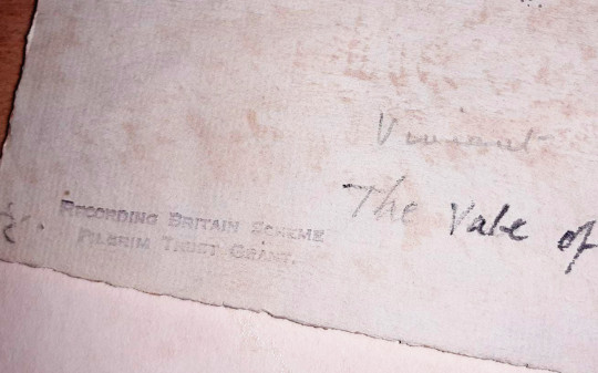
So how did I discover my purchase was stolen? I bought the painting at auction over the internet and had it posted to me, when it arrived the glass was broken, so I took it apart. Unusually it had no tape on the back and it was in a cheap clip frame giving easy access to the back; I thought this was odd as the auction house could see it was titled but they had called it “landscape with farm worker” and I assumed when buying it, that was the title. On the back of the painting it had the full details, Vincent Lines, and the name “Vale of Shalbourne”. Did they Google the real title “Vale of Shalbourne” and found the same listing on the V&A website? Who knows but it feels unusual for an auction house not to research a painting they are consigning.
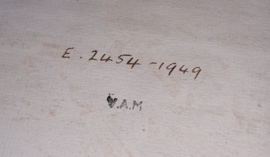
Further-more, I had taken the back off the picture and at first I found a stamp for Recording Britain, then the allocation number. The code when typed into the V&A website comes up with a listing for “The Vale of Shalbourne” by Vincent Lines, is is listed as “In Storage”. Being listed with the code it couldn’t have been a rejected work by Lines for the project. The Recording Britain board chose what they bought, leaving more prolific artists some works to sell, but these were not stamped. Though the Pilgrim Trust funded the scheme they gave all the works, over 1500, to the Victoria and Albert Museum to document and keep. Due to the large number of works created, many works were given to regional collections and it is likely this painting was either stolen or wrongly disposed off by one of these regional collections or a council disposing of work. From the frame the watercolour came in, the style of mount and the amount of dirt on the glass I would guess this was framed in the early 1990s. When it was stolen I couldn’t guess, nor why.
I have emailed the V&A but had nothing back due to Covid Lockdown, but I will wait and see what they say. It would be curious to know if it was loaned out to regional collection or if it was stolen from London. The plot thickens. It is my intention to return it to them. Though technically I lost money from this there is a satisfaction of having done the right thing and returning a work to it’s home. Other collectors of Vincent Line’s work were the King, the Government Art Collection, Hertfordshire Pictures for Schools and the Royal Library. Thankfully I legitimately own the Hertfordshire Pictures for Schools painting as they were all sold off when the council wanted to make some money, but that is another story.
—————————-
I love discovering interesting artists, the research and uncovering details of their life and then buying works to sell, little did I know that I would buy a painting stolen from the Victoria and Albert Museum. I gave it back, losing in money but gaining in spirit.
It was by Vincent Lines, an artist with an interesting past. Lines education started at the London Central School of Arts and Crafts, then in 1931 he was admitted into the Royal College of Art. He was influenced by A.S.Hartrick and Thomas Hennell.He worked as a watercolour artist and an illustrator. He became Principal of Horsham art school in 1935. He was one of the artists chosen to work on the Recording Britain project and that is one of the things that attracted me to him.
During the Great depression in America artists were employed by the state to make works for the public. It was called the Federal Art Project and from 1935 the project was mostly famous for the murals in post offices, but it also covered sculpture and graphic design work. The project is said to have made 200,000 works from 1935 to 1943.
The director of the National Gallery, Sir Kenneth Clark was inspired by the Federal Art Project in the run-up to the Second World War years. In 1940 the Committee for the Employment of Artists in Wartime, part of the British Ministry of Labour and National Service, launched a scheme to employ artists to record the home front, funded by a grant from the Pilgrim Trust. It ran until 1943 and some of the country’s finest watercolour painters, such as John Piper, Sir William Russell Flint, Rowland Hilder, and Barbara Jones were commissioned to make paintings and drawings of places which captured a sense of national identity.
Their subjects were typically English: market towns, villages, churches, country estates, rural landscapes; industries, rivers, monuments and ruins. They were documenting characteristic scenes in a way never undertaken before.
How did I discover it was stolen? I bought the painting at auction and had it posted to me, when it arrived the glass was broken so I took it apart. Unusually it had no tape on the back and it was in a cheap clip frame giving easy access to the back; I thought this was odd as the auction house could see it was titled but they had called it “landscape with farm worker” and I assumed when buying it, that was the title. Did they google the real title “The Vale of Shalbourne” and found the same listing on the V&A website? Who knows but it feels unusual.
So I had taken the back off the picture and at first I found a stamp, then the allocation number. Stamp Above, Number below. The code when typed into the V&A website comes up with a listing for “The Vale of Shalbourne” by Vincent Lines, is is listed as “In Storage”.
Being listed with the code it couldn’t have been a rejected work. The Recording Britain board chose what they bought, leaving more prolific artists some works to sell, but these were not stamped. Though the Pilgrim Trust funded the scheme they gave all the works, over 1500, to the Victoria and Albert Museum to document and keep. Due to the large number of works created, many works were given to regional collections and it is likely this painting was either stolen or wrongly disposed off by one of these regional collections or a council disposing of work.
From the frame the watercolour came in, the style of mount and the amount of dirt on the glass I would guess this was framed in the early 1990s. When it was stolen I couldn’t guess, nor why.
I called the V&A and …
Though technically I lost money from this there is a satisfaction of having done the right thing and returning a work to it’s home. Other collectors of Vincent Line’s work were the King, the Government Art Collection, Hertfordshire Pictures for Schools and the Royal Library.
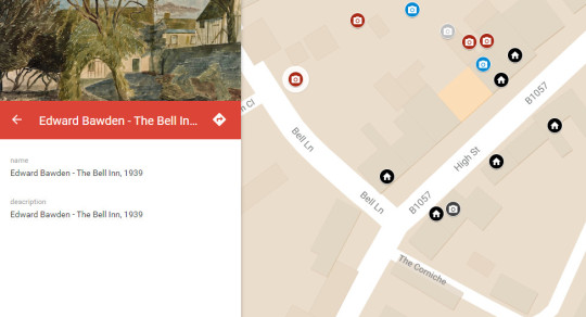
In my isolation I thought it would be fun to make a map of where the Great Bardfield artists painted from. To pinpoint the locations and tag the work. Well that is what I have done, so now you can sit at home and traverse their work using a modified version of Google Maps. I have also added a few more of the Fry Galleries other artists like Paul Beck.
The artists are colour indexed. The House Pin – location of an artists home. Camera Pin – The pins of from where the work was painted (I thought it would be more fun for people to stand in the spot where an artwork was painted)
Here is a essay on Sicilian Carts. It is from a short lived art journal called Arts and Crafts ‘A monthly review’ edited by Herbert Furst, and then Wilfred Lewis Hanchant. It ran from between 1927-1929.
What is interesting is the essay is by Claudia Guercio, who later became Claudia Freedman. Claudia was born in Formby, Liverpool and studied at the local art school before going to the Royal College of Art. There she met and married Barnett Freedman.
It can be a bit rambling but I think it is worth a read and Claudia also mentions her beloved Sicilian Puppets.
Sicilian Carts by Claudia Guercio
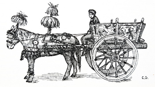
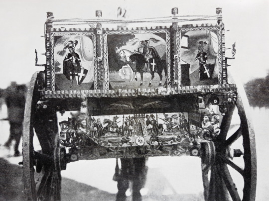
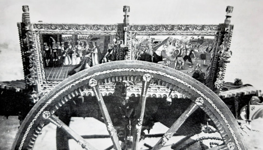
One of the most outstanding features of Sicilian life, in the eyes of any foreigner visiting Sicily for the first time, are the carts used by the peasants of that country. As the carts used in Palermo, the capital of the island, are supposed to be without parallel it is of them we shall speak the writer happens to have lived many years in Palermo and is well acquainted with the carts to be seen there and in the surrounding countryside. They are just the ordinary working carts, used by the proprietors of orange and lemonade orchards in the country to carry their fruit to market in the towns, used by the charcoal sellers and the peddlers of fruit and vegetables, who go their rounds in the morning through alleys and by-streets. These beautifully painted carts are used for even humbler purposes, great loads of seaweed are carried away in them from the sea-shores and loads of stones from the quarries. They are mostly drawn by mules and donkeys, as those are found to be the hardiest animals for that work, though horses of the Sicilian breed are also used.
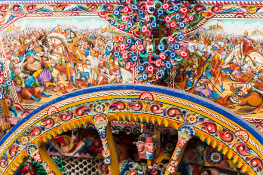
One of those most remarkable things about these carts is that their shape is of the most primitive and utilitarian kind, and yet, they are enriched in all parts with the most exquisite carvings and imaginative paintings. The pattern is always the same though the subjects of the paintings and the details vary.: two panels of painting on each side and the axel is elaborated with wind wood carvings and iron work, all painted in bright colours, and sometimes another strip of similar work hands, like a curtain, from the back of the cart. The four panels of figure painting – two on each side of the art – are illustrations of all kinds of historic and legendary subjects, and they are placed, like pictures in a framework of carved and painted wood, which form the two sides of the cart.
Among the legendary subjects thew favourite ones are: the episode of Rinaldo and Armida, from Tasso’s “Jerusalem Delivered”; Roland at Ronceveaux; Oliver’s Duel; Charlemagne and his Peers, and Angelica at Paris – (an episode from Ariosto’s “Orlando Furioso.”) There are also paintings on the carts whose inspiration comes from such far sources as Greek history and mythology; such as the burning of Troy, the Trojan Horse, and the Rape of Europa! Among the historic subjects the favourites are the Coronation of King Roger – episodes from the Norman Conquest of Sicily, the Retreat from Moscow and pictures of Napoleon III: all derived from more or less authentic sources.
Sometimes the paintings are of a religious kind; and there are also more familiar subjects such as attacks of brigands and family pictures. The subjects of these paintings are usually chosen by the owners of the cart. What must seem most wonderful to the foreigner is the surprising knowledge of such a variety of legends and historical anecdotes on the part of what are often quite illiterate people. But their two great sources of information are the Marionette theatres and the old Sicilian “contastorie”
In the Marionette theatres, for a few soldi, one can see enacted by puppets – on a diminutive stage – the whole epic of Charlemagne, to the accompaniment of a barrel organ – and with loud comments from the spectators, who become as a rule, excited to the point of jumping onto the stage to fight Orlando’s battles for him! This, and the “contastori” who still goes his rounds in the old parts of the town – and relates, in the Sicilian dialect, and after his own fashion the great deeds of Paladins of France – to an audience of men and boys, who belong to the peasant class of Sicily, are their two great sources of information.
The carvings underneath the cart, round the axle, are often a strange medley of religious and profane subjects. Two little fat men with a big barrel of wine are found, for instance, carved underneath the outspread wings of an angel blowing a trumpet; and the Madonna and Child are surrounded by carvings of grotesque figures, and fantastic leaves and flowers. But all these carvings, whatever the subject of them may be, are executed with refinement and beautifully painted, and they are nearly all so miniature as to be visible only on close inspection. One can surely say that the makers of these Sicilian carts are true artists, for they lavish their skill and imaginative genius on even those sections of the cart which are almost completely hidden from view; and one feels they work for the sake of their art rather than for the effect their skill can produce on the outside world.
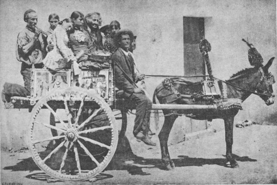
Even the wheels are delicately painted, and the spokes have little carvings on them, though these sections of the artist’s work are always fated to disappear under coatings of dust and mud after the cart has been in use for a short period. The shafts are also carved and painted, and now that I speak of them, I must say something about the trappings and harness on the horse which goes between them. Even on working days the horses, mules, or donkeys of the Sicilian carters, have something gorgeous and fantastic about their harness, even if it is only a bunch of scarlet plumes on their heads and a few circular pieces of mirror, set, like jewels, in the leather of their harness – or a piece of red ribbon tied on to one ear!
These are supposed to be charms – efficient in warding off the “evil eye” from the horses, or any other blight or illness feared by their superstitious owners. On working days the horses also wear large tassels of bright coloured wool, hanging down below their ears, and on their backs, there is a vertical section of their harness, about twelve inches high on the top of which is fixed a bunch of red feathers – their harness is also worked in wool, with brass nails and red ribbon as ornaments, and many bells are attached in various places, which make a continuous sound when the horse is in motion. The same trappings are used on mules and donkeys, and very often one sees a small donkey of mouse grey colour cantering along with his cart rattling behind him – a big tuft of red feathers on his head waving as he moves and all the bells on his harness jingling!
One feels that these are proud moments for the owner of the cart, who looks well satisfied with himself as he cracks his whip merrily in the air, and nods to his acquaintances as he passes. But these wonderful carts are not used only for industrial purposes, and on holiday occasions the Sicilian peasant takes his whole family for an airing in the cart – and even long pilgrimages are attempted in them. A number of rustic chairs are placed on the cart, forming a small square and men, women and children take their places on them, sometimes as many as eight in one small cart.
One a year, in the spring, there is a special festival for the Sicilian carts, and they come into Palermo from all parts of the neighbouring country, and parade about the streets, and prizes are awarded for the finest cart and the best caparisoned horse. It is then you see the houses in their full glory, and the carts, fresh from the hands of their makers, are wonderful to behold! Last spring, when I was in Palermo, I was present at this festival, and I will describe a cart and horse which won some of the biggest prizes.
The horse was of a light bright colour, and a fine example of the Sicilian breed, and his harness was ornate to a fantastic degree; he shone in the sunlight like the steed of some fairy prince! His harness was covered with incrustations of what seemed solid silver and had the appearance of being wrought like filigree ornaments, and it was studded with tiny pieces of mirror. When he moved the music of countless bells was heard, and his whole neck and mane was covered by what seemed armour, of wrought silver, and with a great bunch of nodding plumes on his head, he looked the visionary steed of some mediaeval warrior. Everything about him was one bewildering mass of detail, and in some parts of his harness the silver fretwork stood out several inches from his body like sculptural ornaments. There was hardly a portion of his body visible under these magnificent trappings, and he had even small leggings of silver coloured fretwork. The cart behind him was fresh from the hands of the painter, and adorned with countless enrichments of wood-carving and wrought iron.
Words cannot describe the dazzling colours in which every section of it was painted, or the wealth of incident portrayed in the pictures on it: the hands of the artist had lavished all their skill on it, and there was not the space of one inch on its whole surface that did not have some exquisite carving or painting on it. To complete the picture, I must add that the most beautiful Sicilian girl, among all the peasant women competing for the women’s beauty prize, was sitting in this cart, and great was the applause when the cart, horse and women according to the Sicilian custom – received substantial prizes for their excellence!