In the past week while looking at some of my books, I noticed that many of them have Ex Libris plates. I have not really thought of having such a thing myself. I always thought although decorative, in most cases they are dull and damage books – though it is nice to trace the possessions of people. Some of the bookplates you are able to Google the people involved, others it is a mystery.
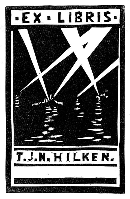
Captain Thomas John Norman Hilken, DSO. (1901-1969)
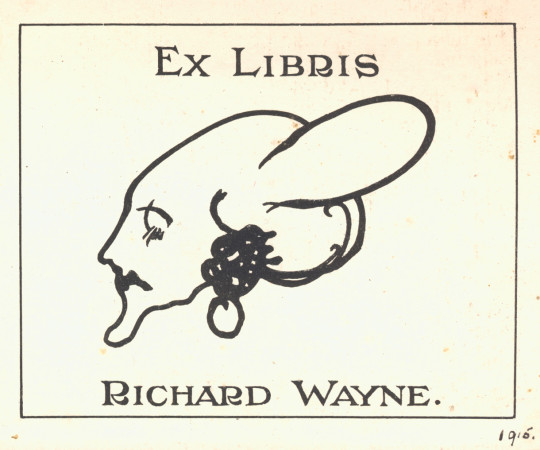
Richard Wayne. The illustration is lovely and I thought slightly Bloomsbury but I couldn’t find any mention of him.
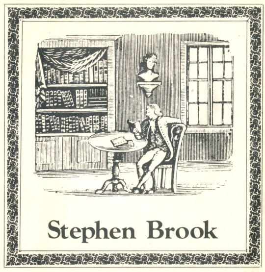
Stephen Brook
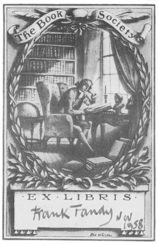
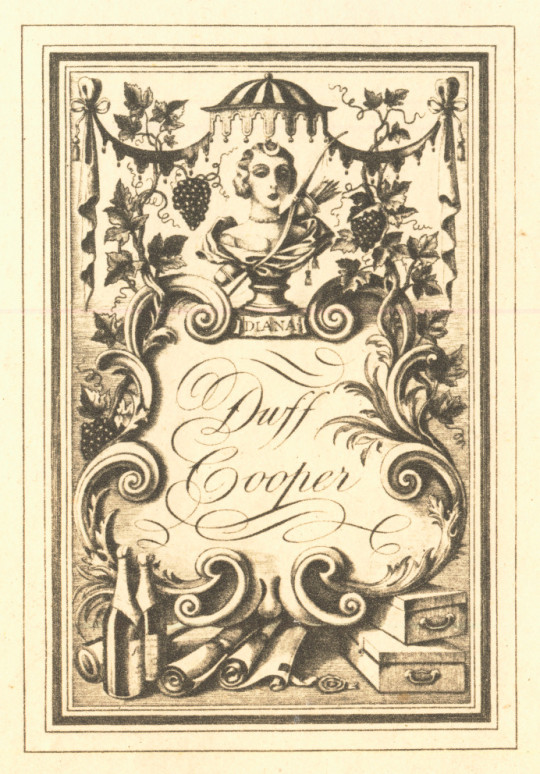
A Book Society bookplate for the public to fill in by Rex Whistler, below another design by Whistler, this time for Duff Cooper.
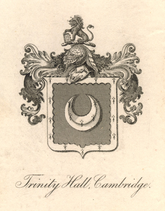
Trinity Hall Library, Cambridge
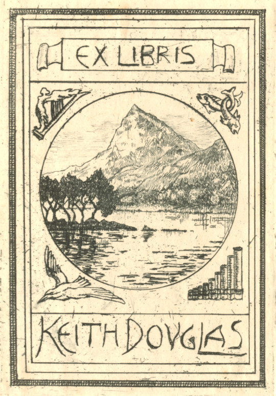
Keith Douglas – Second World War Poet.
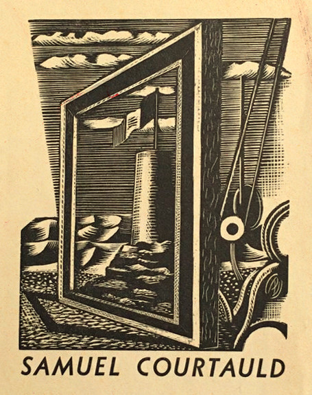
Samuel Courtauld – Art Collector and founder of the Courtauld Institute of Art. Designed by Paul Nash.
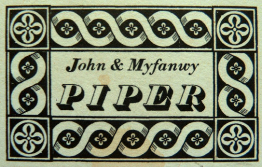
John & Myfanwy Piper – Artists and writer.
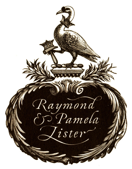
Raymond Lister – Society Ironworker and writer on Romantic Watercolourists, designed by Reynolds Stone.
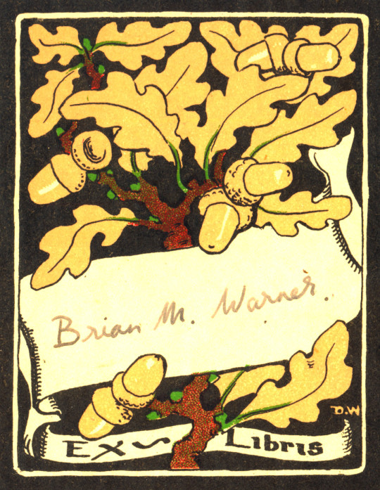
Brian M Warner. A mass produced bookplate by D.W who is unknown to me.
Trevor and Anne Martin
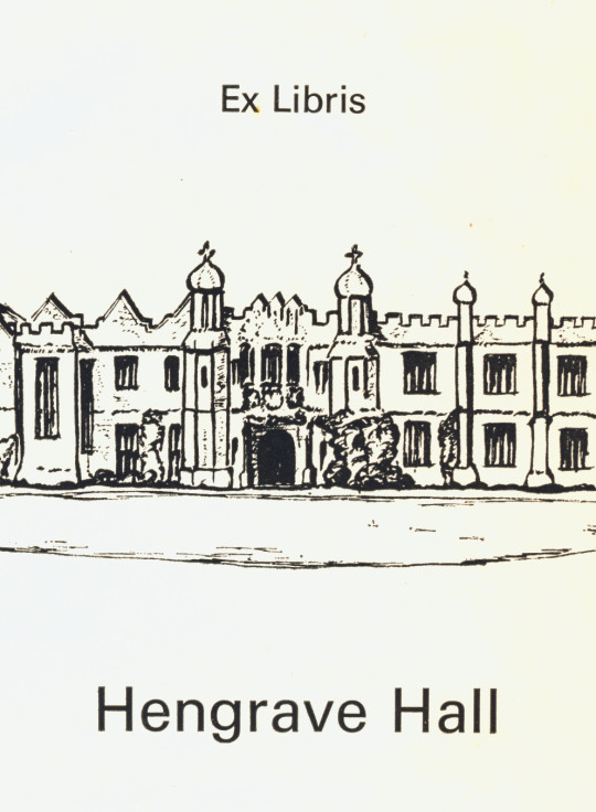
Hengrave Hall library bookplate. Hengrave Hall is a Tudor manor house near Bury St. Edmunds and has been a nunnery. It is now a wedding venue.
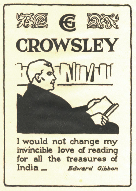
E G Crowsley.
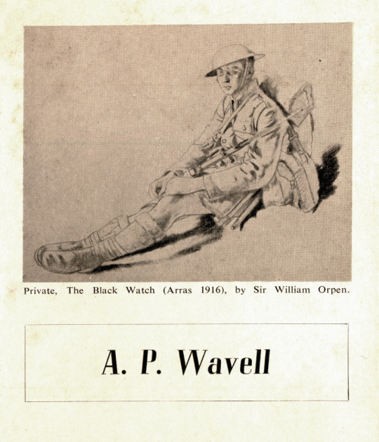
Field Marshal Archibald Percival Wavell, 1st Earl Wavell, GCB, GCSI, GCIE, CMG, MC, KStJ, PC. As noted on the plate, it features a beautiful drawing by William Orpen.
Angela Carter the Novelist.
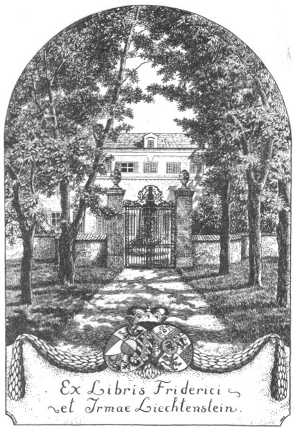
One of the Prince Friedrich’s of Liechtenstein
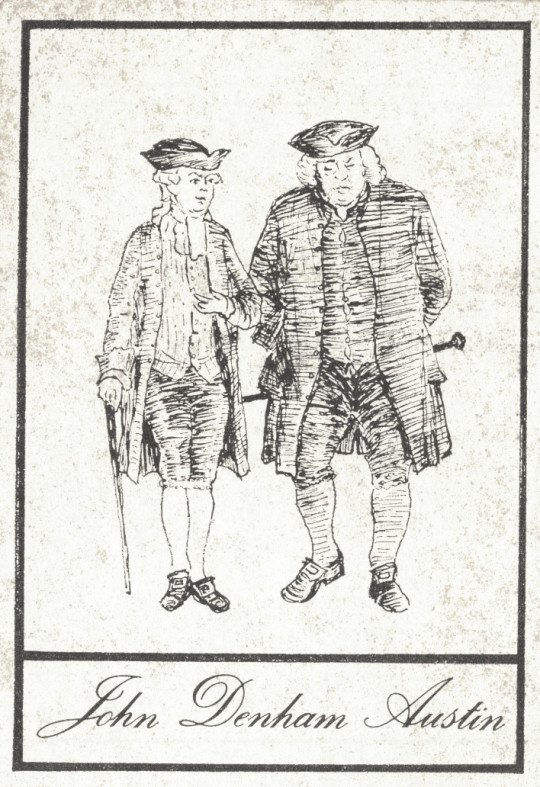
John Denham Austin, writer. Figures depicted are Samuel Johnson and James Boswell.
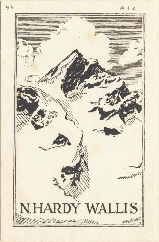
Norbert Hardy Wallis – Translator and writer. 2nd Lieutenant in the South Wales Borderers.
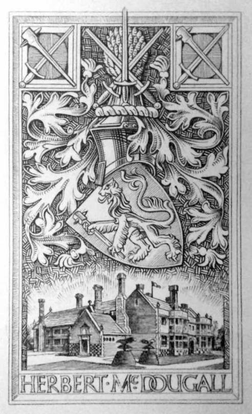
Lieutenant-Colonel Herbert McDougall, of the McDougall’s Flour company. His daughter married Prince Andrew Alexandrovitch of Russia, eldest nephew of Tsar Nicholas II.
It covers his painting history and also features him painting at Covehithe in Suffolk before his exhibition at the Tate.
John Egerton Christmas Piper CH (13 December 1903 – 28 June 1992) was an English painter, printmaker and designer of stained-glass windows and both opera and theatre sets. His work often focused on the British landscape, especially churches and monuments, and included tapestry designs, book jackets, screen-prints, photography, fabrics and ceramics. He was educated at Epsom College and trained at the Richmond School of Art, followed by the Royal College of Art in London. He turned from abstraction early in his career, concentrating on a more naturalistic but distinctive approach, but often worked in several different styles throughout his career. He was an official war artist in World War II and his war-time depictions of bomb damaged churches and landmarks, most notably those of Coventry Cathedral, made Piper a household name and led to his work being acquired by several public collections. Piper collaborated with many others, including the poets John Betjeman and Geoffrey Grigson on the Shell Guides, and with the potter Geoffrey Eastop and the artist Ben Nicholson.
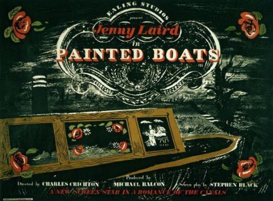
Ealing Studios have many wonderful films, but there was a period of time when they would hire fine-art artists to design promotional ephemera and posters.
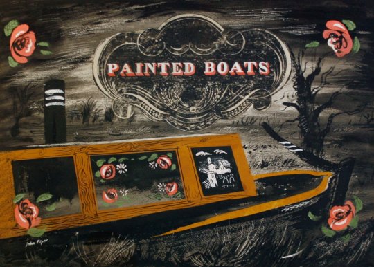
A good example is for the movie ‘Painted Boats’ from 1945. The artwork for the film was designed by John Piper. The painting of the Canal boat has a graphic device painted in by Piper, like the top of a decorative headstone.
The Movie Poster for Painted Boats, 1945.
The original painting for the film poster by John Piper.
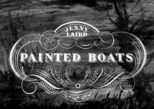
In the credit sequence of the film there is a stylised version of the graphic device used by John Piper – I am unsure if Ealing Studios gave him it to paint first, or if he painted it and they cleaned it up for the film. The backdrop to this maybe a pro-type painting used as the movies title sequence as the trees are not the same in the image above.
The posters for Ealing Studios films feature artwork by many of the era’s greatest artists including John Piper, Edward Bawden, Eric Ravilious, Edward Ardizzone and Mervyn Peake, while the acting talent is a roll-call of many of Britain’s greatest performers. †
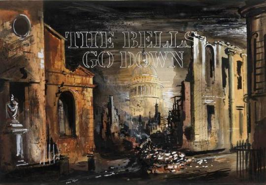
Even when commissioned, the studio didn’t always use the artwork by the artists, ‘The Bells Go Down’, 1942 was John Pipers first work with Ealing and although paid for his efforts, they didn’t use the artwork for the poster.
The Bells Go Down, 1942. Poster prototype design by John Piper.
Ealing’s advertising department was headed up by S. John Woods, who trained as an artist and graphic designer, before working in a variety of advertising roles, including a stint at Twentieth Century Fox in the 1930s. In 1943, he joined Ealing to help realise the vision of the studio’s chief publicist, Monja Danischewsky.
Unusually for a designer working in film advertising, Woods wasn’t afraid to bring politics into the equation. Throughout the 1930s he moved in artistic circles that included Ben Nicholson, Henry Moore and Barbara Hepworth, soaking up the energy and fervour of the interwar generation, cultivating a love of British abstract and surrealist art and actively contributing to exhibitions and articles challenging the established order.
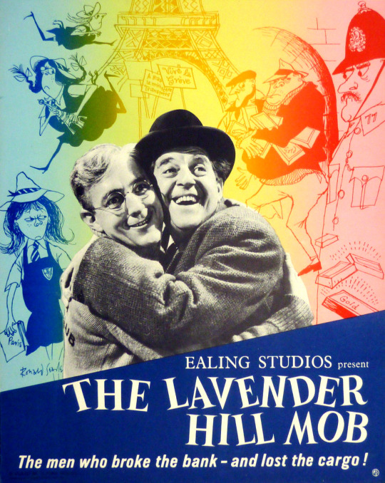
Below is a curious mixture of Ealing Films own graphics department and artists work, in this case using Ronald Searle’s cartoons based on the film and using his St Trinian’s girls series.
The Lavender Hill Mob – Ealing Studios with decorations by Ronald Searle, 1951.
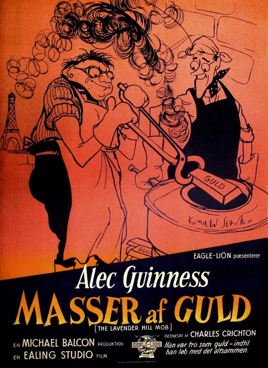
Below is another drawing by Ronald Searle for the Danish version of the poster. The drawing of Alex Guinness is wonderful.
Danish Poster for Masser af Guld – Lots of Gold. The Lavender Hill Mob, 1951.
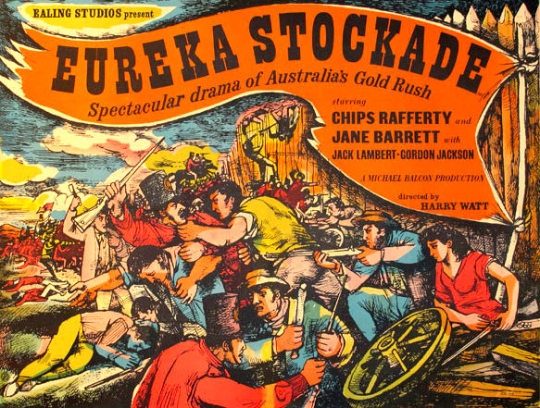
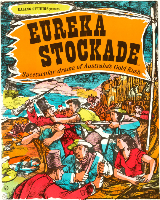
The artist John Minton also made two poster designs for Ealing Studios for the movie ‘Eureka Stockade’, one landscape, one portrait. At first it might look like they are the same image cropped, but the way the man above the cartwheel handles his gun, the riders at the end of the stockade and the man with the razor-blade behind the soldier show they are not the same image, just very similar.
John Minton – Eureka Stockade, 1949
John Minton – Eureka Stockade, 1949
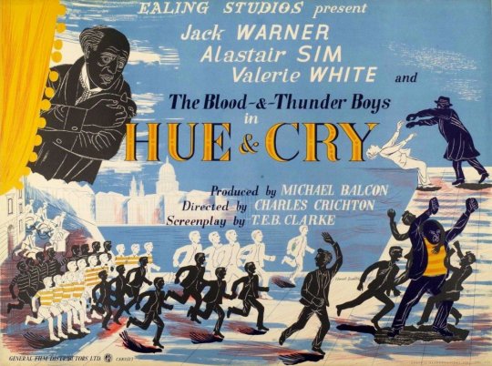
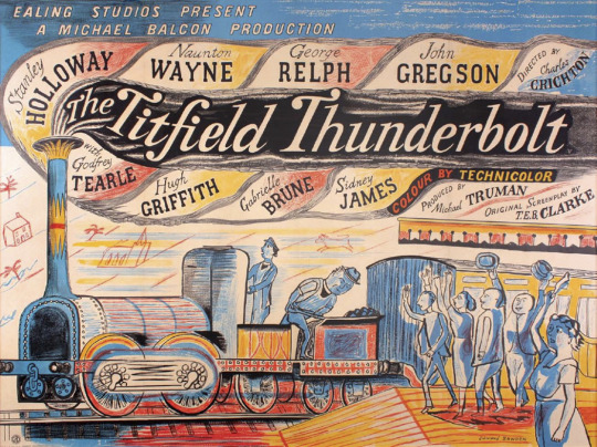
Here are two Posters by Edward Bawden, one for ‘Hue & Cry’ and the other is ‘The Titfield Thunderbolt’. The mixed perspectives of this and the light and dark boys used in both are wonderful. Both posters have hand-drawn typography.
Edward Bawden – Hue & Cry Poster, 1947
Edward Bawden – The Titfield Thunderbolt Poster, 1952
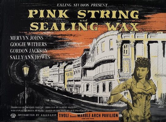
John Piper – Pink String and Sealing Wax Poster, 1945.
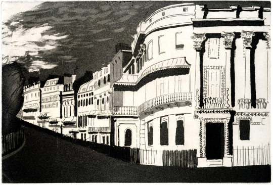
Above is the poster designed by John Piper and like in ‘Painted Boats’ the opening credits also used a similar design to the poster. The opening credits image actually comes from his ’Brighton Aquatints’ folio of prints, published in 1939. The poster must be adapted from the drawing.
John Piper – Kemp Town, 1939
† Page 2 – Press Release – Ealing Films – Light and Dark ‡ Ealing and the art of the film poster
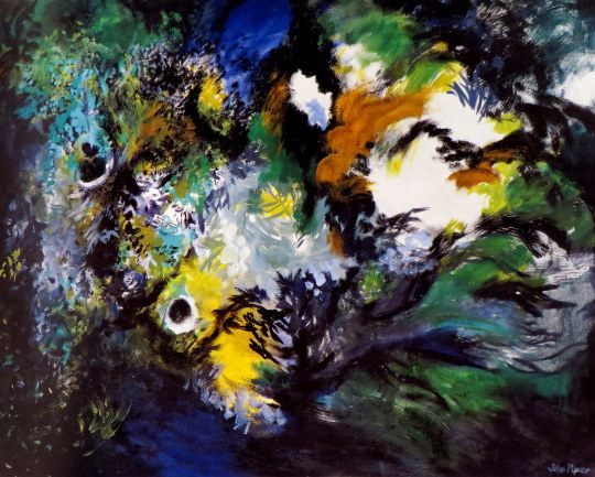
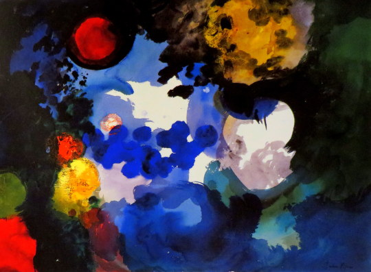
There is no rule to be observed that an artist’s work has to become looser as he gets older. It is easy to think of some remarkable cases where this happened, but this is because the late works of more usual careers with comparatively little change are less prominent. John Piper’s latest exhibition shows paintings of a startling freedom, but in his whole long career he has always swung between detailed and exuberant manners, whether the detail is the precise outline of an abstract painting or of a window at Windsor Castle, or whether the exuberance is of a collage of marbled papers that became one of his pre-war landscapes or of the whirls and blotches that decorate his pottery of the last twenty years. He has not been able recently to travel to his subject, and has fallen back onto something that he has saved for years, the garden of his own house.
John Piper – Fawley VII, 1989.
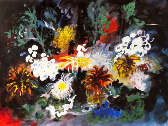
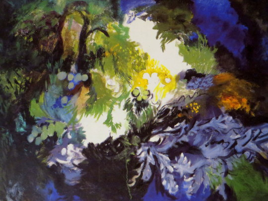
Piper is one of the few modern figurative artists who has never painted, or even photographed, a view of his own studio, since he has not wanted to tell people about himself, or idolise his own art. He may in effect reveal much, but only by inference. Until recently he has rarely painted even the valley and farmhouse where he lives. During the 19805 more paintings of his house and garden were exhibited, and for the summer of last year he made a whole exhibition of paintings of blossoms and of the garden. ‘Pear Tree and X/all’ from that exhibition almost overlaps with the new paintings, as the twisted tree seemed to cavort unrealistically in some black space of its own, almost dancing with liveliness.
The paintings now shown by Piper are amongst the best of his whole career, for his painterly skills are more evident as the given structures of the subject dissolve, and rarely has his work seemed so very personal and without outside occasion.
In the last few years there have been in London several gardening exhibitions, mostly historical, presumably in sympathy with the more conservative taste that has become noticeable. Gardens however are not only for retreat or withdrawal. They are also the battlefield of nature against cultivation, and the life and death not only of all plants with the seasons but between competing growths, some of which can survive by fertilisation and seeding.
John Piper – Fawley X, 1989.
Piper has always avoided inventing figures in his work. The splendid Kings of Oundle College windows are translations of romanesque carvings and not his own figure studies. The figures in his photographs are obscured, either by fragmentation or by covering with foliage like a ’Wild Man’. He has admired the ’foliate heads’ of English gothic sculpture, and has two such heads in his studio, where he often places alongside them the gigantic drooping heads of‘sunflowers.
A favourite of his photographs is the ’lived Figure’ of Wotton, his title turning the name of the plant into a verb. It is only an extension of this where these new paintings are themselves ivied, or convolvolussed, herbascioussed and chrysanthemums. If the garden could be pruned, the statues, walls and paths would appear; but Piper has always fought against tidying up. This is an attitude of mind that opposed the clearing of buddleia from abbey walls by the Ministry of Works, and is also part of the sheer generosity of character that made those copious screenprints of well known and out of the way buildings, in extremes of light.
It is difficult to be certain in these new paintings whether the plants have covered the foreground or have somehow taken over the whole vision of the artist, leaving only a few spots of clear light. The overhanging eyebrows which looked so spooky in Phil Starling’s photograph of Piper on the cover of The Independent Magazine (10 December 1988) might have forced the vision back into the mind. These paintings were all begun with a wide brushed coating of white, mixed with sand to give a rough surface.
John Piper – Fawley VIII, 1989.
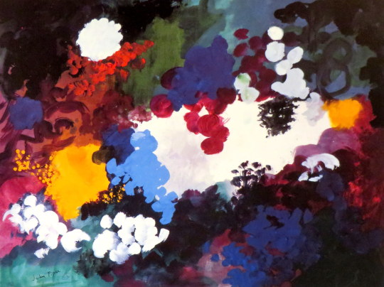
The prominent blacks almost obscure the light, left shining through in places like the opening of a cave. The flowers and leaves are in front of this blackness, things not quite known that are alive in this darkest part of the garden. Piper’s ordering of the colours still follows the discipline of his abstract paintings, which were themselves partly the result of his study of medieval stained glass painting.
The intense reds and blues of such windows, used sparingly but decisively within the design of heavy black outlines and borders, were models for his abstraction and have remained so most clearly whenever his painting has become less realistic. This harmony of colour is noticeable now more than ever, a harmony like Venetian and French painting that is a kind of eloquence based on patterns of contrast, and which gives the paintings a feeling of large scale.
John Piper – Fawley III, 1989.
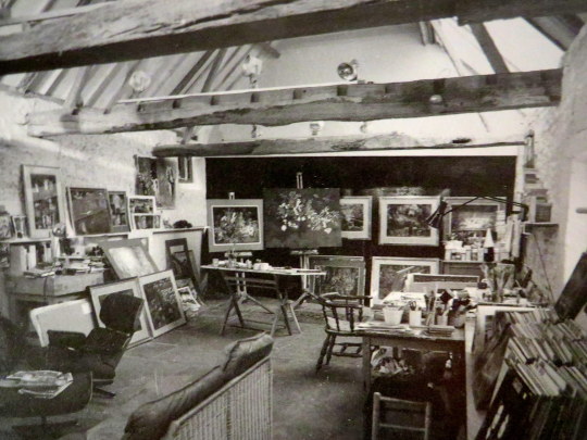
John Piper’s studio with flower paintings on the easel.
In the Archives of the Tate are over a thousand photographs taken by Paul Nash that were donated by the Paul Nash Trust in 1970. Many of the photographs by Nash where studies for paintings but on their own they are surreal marvels. Mostly taken during the 1930s and 40s, the photos sometimes have no date and a guessed idea of the location.
Below are my favourite out of all of the pictures processed, I chose 17 in all. A good deal of them have not been editioned in books or as prints. I have tried to order them in a way I think looks pleasing.
The text I have taken from the large Fischer Fine Art folio of 25 prints by Paul Nash in 1978, in the 25 photographs John Piper picked out, it’s curious how I have selected none of the same images. I have included it as it’s the best and most brief summery of Nash’s talents, and it’s always nice to hear from John Piper.
Paul Nash took photographs for the last sixteen years of his life; that is to say, from 1930 when he was given an American Kodak. The camera was adequate to his purpose and he never became involved enough in the technique of photography to buy himself a more elaborate one or bother with wide-angle or other lenses or even to use a tripod. But his snapshots were neither indiscriminate nor trigger-happy.
As in everything, he was as professional as he needed to be. If he wanted to take something and the sun was not out, he would wait for it; if he wanted a shadow at a certain angle, he would wait for it. He would stalk the Uffington White Horse or Maiden Castle or the stones at Avebury until the place and the light were right and his friends who drove him would have to wait and stalk too. It was often anxious for them and difficult for him since he was seldom well and that kind of effort and concentration was exhausting.
Paul had an economical and obsessive eye and his new toy at once became a valuable weapon. The very first photographs that he took on the way to the United States related to the preoccupations of his painting; a ship’s mast and rigging was a slender echo and anticipation of the open cage structure he often used, the complicated interplay of hard edges and hollowed shadows within the curve of a life-boat proclaimed his interest in the mystery of ordinary things seen from unordinary angles.
No one could have been a less doctrinaire or literary surrealist but he had a punning vision which, with his aptitude for analogue, made his instinctive reaction to the world very close to the more self-conscious and sophisticated surrealist one. His wit with the camera was a natural extension of the wittiness of his words and of his attitude to life. He loved to see the funny side of things without being destructive so the objects that he photographed at Swanage, for example, for his article “Seaside Surrealism” – absurd concrete seats, huge pretentious lamp standards, three concrete steps isolated in a bed of pebbles – all have a double life of incongruity and of beauty.
While on the one hand he used his photographs as immediate aides-memoire to pin down a fleeting glimpse of the famous “Genus Loci” or to record the particular lie of a dead tree or a shadow on a wall, on the other hand he recorded aspects of the countryside that he was never tempted to paint directly but whichhe translated into the magic of his painting. Stone upon stone in miles of dry stone wall, the endless meeting and parting of furrows in an enormous field, layers of cork drying, stacked and roofed like rows of stone fishing huts, the invisible but eloquent bones of a landscape under stretches of featureless grass, all these ancient repetitions, natural or man-made, extend the more immediate subjects of his work and give them their timeless quality.
Paul Nash always had a feeling for the horizontal, at once boundless and embracing, and this is especially noticeable in his photographs. His Kodak, whether by chance or intention, took an exceptionally wide picture. But he always expected things to work for him and they usually did.
– John Piper. 1977.
White Horse, Uffington
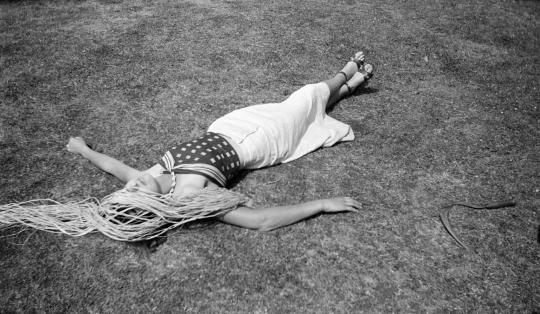
A Woman on a Lawn, Raffia in Her Hair
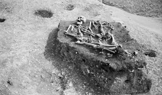
Nest of the Skeletons, Maiden Castle
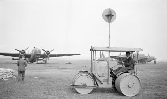
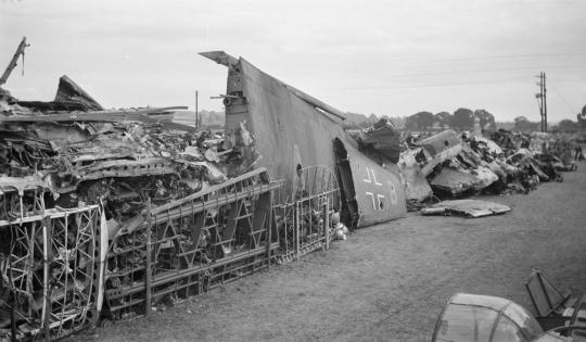
Vickers Wellingtons and steam roller
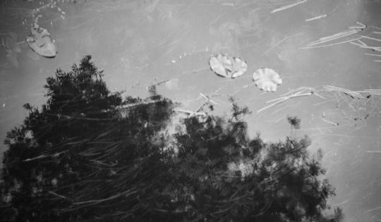
Study of Waterlilies, Hungerford
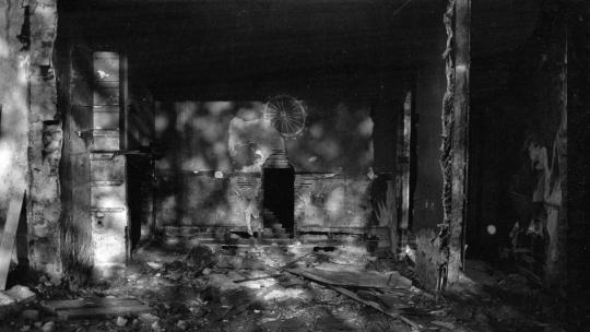
Demolition Landscape
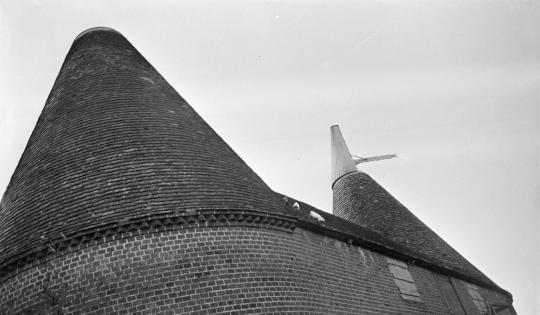
Oast House Roof
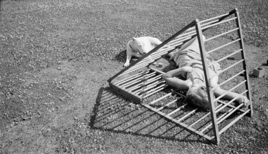
Mrs Bertram and a dog in the garden at the Manor House
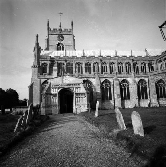
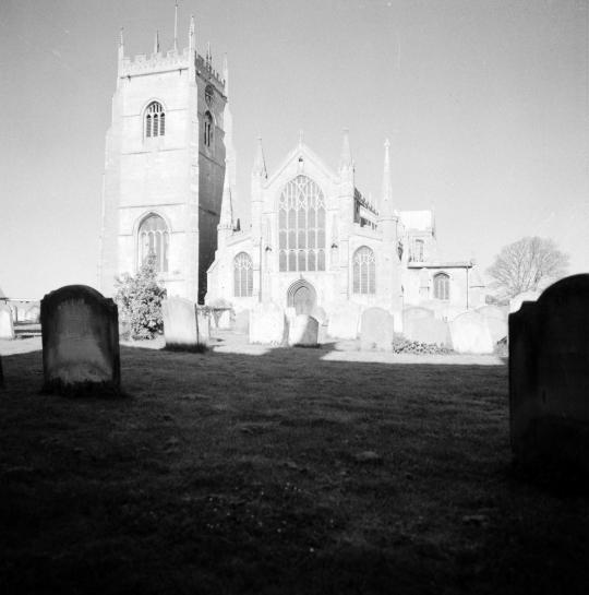
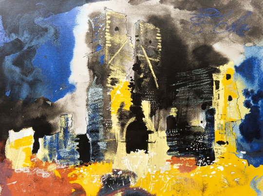
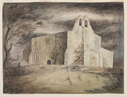
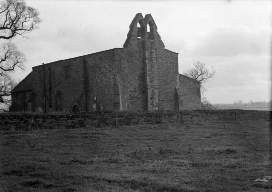
Here are two photographs by John Piper and two paintings, both in different styles. They focus on the such of St Clement’s, in Terrington St Clement. A large village in Norfolk, England. It is situated in the drained marshlands to the south of the Wash, 7 miles west of King’s Lynn, Norfolk, and 5 miles east of Sutton Bridge, Lincolnshire, on the old route of the A17 trunk road.
As well as showing the different artistic techniques for one subject, it also shows how Piper used his photographs as a visual reference when back in his studio (as I noted in the post ‘Lens and Pens’).
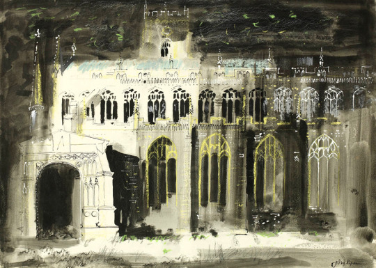
John Piper – Terrington St Clement Church, 1975.
Five years apart between them both, the 1975 painting is a classic Piper picture and I am amazed it wasn’t editioned into a screen-print as the levels of detail in it are remarkable, the blocked out lighter panels of the windows and reversed light outline of the bell tower against the typical Piper sky.
John Piper – Terrington St Clement Church, Norfolk.
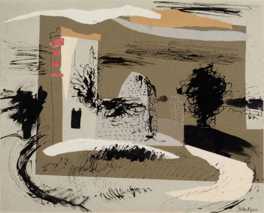
John Piper – Knowlton Church, Dorset, 1938
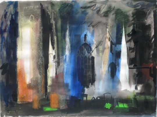
The picture below from 1980 is far more abstract and wild with colour. It is looking more like a study of a painting. The outlines and abstracted features of the building draughtsmanship are typically Piper. Although the colouring may not look like his works at that time, I would suggest they are a throwback to when Piper used collage in the 1930s. As with the Knowlton Church collage, blocks of colour are used with outlines. It makes an interesting marriage of new and old techniques.
John Piper – Terrington St Clement Church, 1980
John Piper – Terrington St Clement Church, Norfolk.
Below is a video I found on Youtube of a drone flight around the church, I wonder what Piper would have made of such a technology?
Rather like many artists, John Piper used his camera to record places and subjects for later work. Piper began taking the photographs when he worked with John Betjeman on the Shell County Guides in the 1930s.
The subjects before the war were often objects – ironwork, lettering, marine apparatus – bus since then have been more usually of buildings in landscape. The primary purpose has always been to record topographical information. ‡
The landscape photographs are very often to hand when Piper draws the same subject in the studio, along with sketches made at the place and any other available information, but they are not copied. Only in very rare cases – some of the mountain sides in North Wales in the later 1940s and of the Château of Chambord – were photographs squared and transferred to drawings. ‡
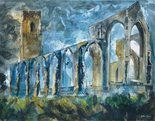
Most of the pictures before are editioned as lithographs or screen prints, some of them are paintings while Piper was working on the Recording Britain project.
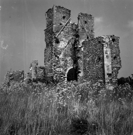
John Piper – ‘Ruined Church’, Bawsey, 1982. (Editioned Print)
John Piper – ‘Ruined Church’, Bawsey, Near Kings Lynn, Norfolk.
The importance of Piper’s photographs lay less in their technique, which was often little more than competent, but in their subject matter. As in his painting, for which his topographical photographs often acted as preliminary studies, Piper had an unerring eye for exciting what the architectural historian John Summerson called “a new curiosity about unnoticed, unlisted things”.
During the war and after, his photographs illustrated articles he wrote for the Architectural Review trumpeting the virtues of subjects as diverse as flint; shops; the Donegal custom of embellishing its stucco houses with painted quoins and stonework details; the ‘gratuitous semi-circle’ in English late classical architecture; and church towers in Eastern England, which was geographically balanced by an article entitled ‘Warmth in the West’ studying the West of England penchant for painting house exteriors.
Some of the most influential of these were a series he wrote seeking to preserve the unique nature of the British pub. More controversial was the 1947 essay ‘Pleasing Decay’, a plea for structurally sound ruins to be retained for the picturesque delights they would afford. †
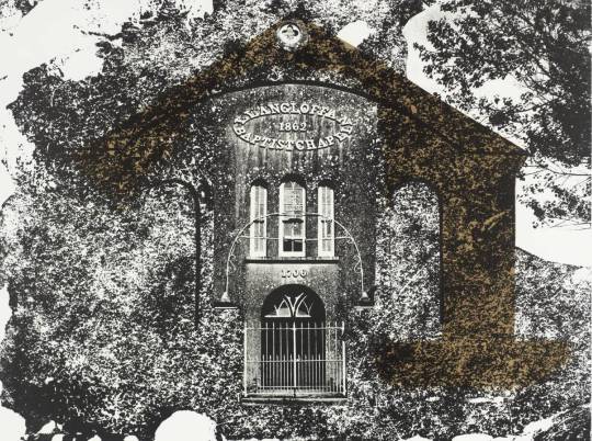
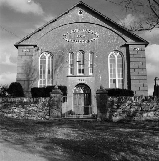
John Piper – Llangloffan Baptist Chapel, 1964. (Editioned Print)
John Piper – The Baptist Chapel, Llangloffan, Pembrokeshire.
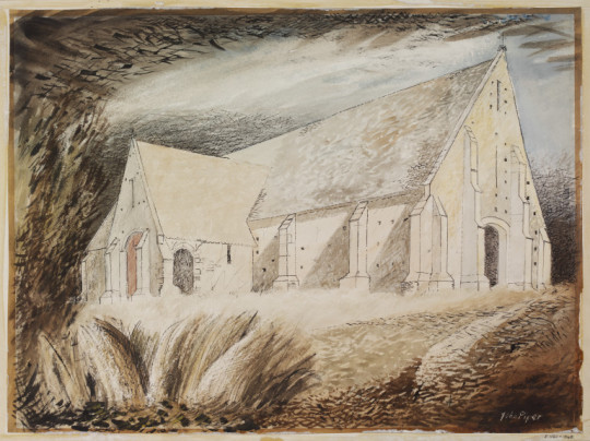
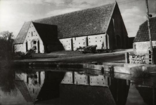
John Piper – Tithe Barn, Great Coxwell, 1940. (Painted for Recording Britain)
John Piper – Tithe Barn, Great Coxwell, Berkshire.
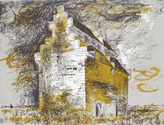
John Piper – Willington Dovecote, Bedfordshire, 1978. (Editioned Print)
John Piper – Willington Dovecote, Bedfordshire.
John Piper – Church of St. Denis, Faxton, 1940. (Painted for Recording Britain)
John Piper – Church of St. Denis, Faxton, Northamptonshire.
John Piper – Covehithe Church, Suffolk, 1983. (Editioned Print)
John Piper – Covehithe Church, Suffolk
John Piper – Crug Glas, Swansea, 1966. (Editioned Print)
John Piper – Crug Glas, Swansea
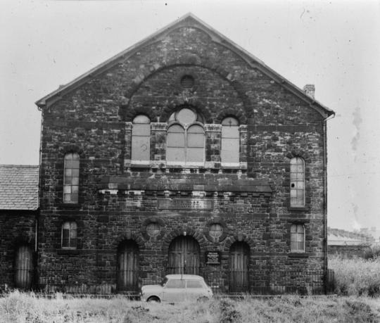
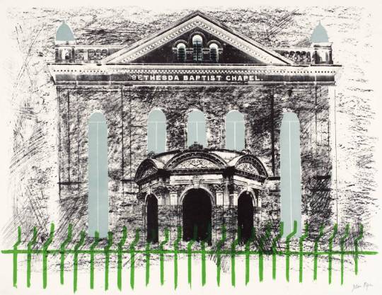
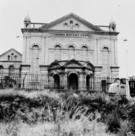
John Piper – Bethesda Chapel, 1966. (Editioned Print)
John Piper – Bethesda Chapel, Swansea.
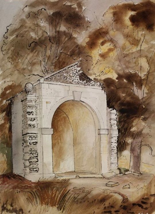
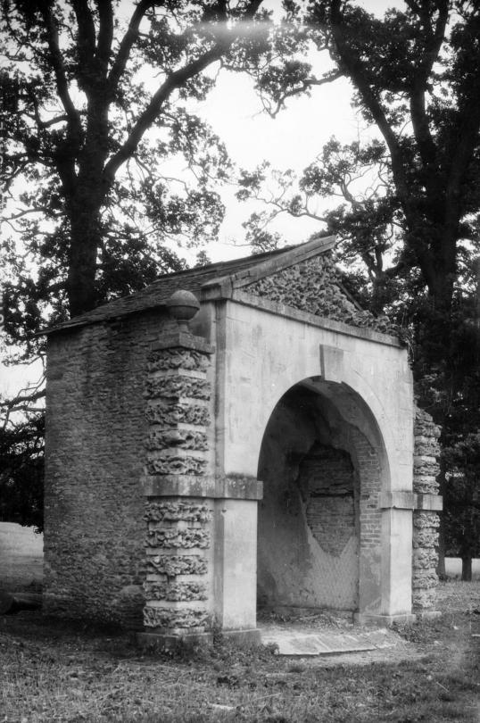
John Piper – The Duck House in the Park of Buckland House, 1940. (Painted for Recording Britain)
John Piper – Folly at Buckland, near Faringdon, formerly in Berkshire.
† John Piper and the RIBA Library Photographs Collection by Robert Elwall, 2009.
‡ John Piper by John Russell, Tate Gallery, 1983. p77
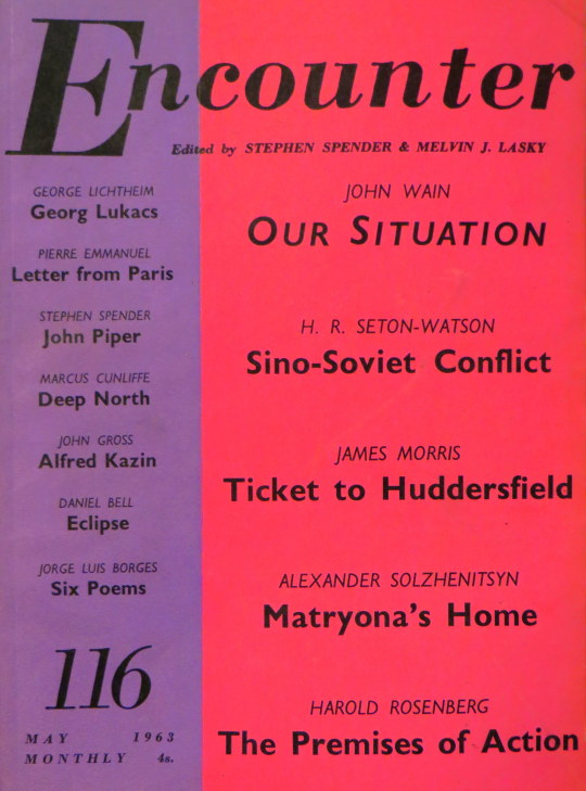
I want to believe the internet is a nice utopia of thought and freedom for people, so this is really why I type up obscure interviews and articles on people for this blog. So far this has been limited to Paul Nash, Frans Masereel and Eric Ravilious but I have many others earmarked from niche publications that I own that seam far too expensive to buy. I hope they are of interest to you all and here is another on John Piper, at this time aged 60. It has a long introduction by Spender but I think it’s nice to read Piper expressing himself about his work, mid career.
A Talk with John Piper by Stephen Spender. From Encounter #116. May 1963.
When I first knew John Piper, in the ‘thirties, he was one of several painters (Ben Nicholson was another) who resisted the turning of Coldstream, Moynihan, Pasmore, and the Euston Road painters towards portraits, landscapes and still lifes. These were artists who, a bit fastidiously, pushed representation towards a frontier where it began to turn into near-abstract drizzly lines (Coldstream), pure colour (Pasmore), rich lumpiness (Moynihan).
John Piper has a lean and hungry look and a lank cheek, like Caesar’s idea of Cassius, and was perhaps also a bit quixotic, as though he might suddenly appear in armour. Although he supported all the virtuous left-wing causes and conscientiously attended every director’s meeting of the Group Theatre, he went on painting abstracts about the size of windmills. During the war he became a War Artist, a position for which his love of architecture, ruins, and an atmosphere of drama admirably qualified him. His paintings of burning churches and barns form, with Moore’s shelter drawings, Sutherland’s iron foundries, the best part of the artistic record of the war.
Before the was, as though to prepare himself for events, Piper has started doing collages of Welsh villages and landscapes. He also did the set for the Group Theatre’s production of ‘Trial of a Judge’. After the war he established a new reputation as a topographical artist, with his series of water colours of Windsor Castle, Renishaw, and other famous houses. He continued with Welsh landscapes – pen-and-ink scratched,with texture like that of cracks in slate, slopes of shale, enclosed in golden washes.
He went on working in the theatre (doing the sets among others for Billy Budd) and painting abstracts. Recently he has done a whole series of oils and water colours of Venice and Rome. Piper is in fact an extremely prolific painter, branching out into many different styles and activities, but at the same time with a very marked consistency which makes a Piper, whether it is a water colour two inches by four, or a stained-glass window the size of a battleship, immediately recognisable. All the same, his work is (it seems to me) very uneven on account of the tension in his nature between the almost oriental richness of some of his water colours, and the extreme dryness which shows in many of his oils, even when they are theatrical and garish. His achievement is absolutely honourable: a fusion of a life-long search for a contemporary idiom with a passion for tradition. He is one of the few English artists whose reputation is more likely to increase than to decline.
To-day tape-recorders have had an effect on interviewing like that of photography on drawing. A printed interview appears a transcript a tape-recording, a bad imitation of one, or a fictitious intervention of the interviewer. Since I hate tapes, and anyway do not know how to use them, I will leave my notes (made in the course of a day spent at the delightful stone farmhouse in a sheltered valley near Henley, where the Pipers live) much as they were written.
Some of them are taken from conversation, some of them were written for me by John Piper before I arrived. It is John Piper speaking:
The Eye. There isn’t a difference between “abstract” and “topographical” in the sense that one might consider “abstract” as purr invention, and “topographical” as imitation. The reason for this is that nothing comes out of a visual consciousness that has not already been received by the eye. All visual invention is the result of visual experience and observation. Everything is drawn out of the stock-pot of visual impressions. Abstraction is a way of inventing variations on the visual experiences one has had, but these may not prove enough to make a decent painter. There have been very few abstract masterpieces apart from those by Mondrian and Rothko. So when one looked into one’s heart and asked “Where do we go from here?” one looked at one’s own nature. I found I was English and Romantic, so I looked at Cotman, Turner, Blake, Palmer and painters in that in that tradition and tried to draw the things I seemed born to love.
Topography. Topography is a branch of Romantic art, and it is also a branch of particularisation. For Romantic art consists in seeing the wing of a bird – a tower – a hop field – and interpreting all nature through the particular. Topography at its best is the interpretation of the world as a vision of the place. The best topographical paintings have spirit of the place in the time, not just the representation of the place, as Cotman expresses the atmosphere of places in Norfolk in the 19th century. Giorgione’s La Tempesta is the epitome of every virtue topographical art should have.
Photography. Photography us useful because it makes one’s vision ridiculous. It proves that what one has seen is in literal fact a cliché. I never take photographs of anything I draw, unless I think the photographs may be useful as something to react against.
Abstraction. Abstraction is much more difficult for English artists than some of them realise. By habit, certainly, and probably by temperament m most English people are literary before they are visual – they have to go through some process, some ritual almost, before they see at naturally and simple. Everything is wrapped in a known idea of itself, a concept. And then, when they do begin to see a thing directly, more or less for what it is, half the time they want to reinterpret the experience in words. Intensity! Intensity is all – but the intensity is made of something, experiences, love, hate, fears: and the natural progress for an Englishman is to explain himself in words before he sings or scribbles.
Crafts. Nobody can possibly have more than two or three original ideas to bring to any craft, without renewing himself by working with his hands all by himself in the studio. The rest is tinkering, improving, tidying, untidying, and doing variations. People think that they can be original stage designers, and can go on being original indefinitely. All they’re doing is turning round on the same spot and facing different ways, using the same two or three little ideas they had when they were twenty: unless, of course, stage designing is simply another form of interior decorating, which it is often thought to be by the public and producers, and especially by music critics, who like everything beige and grey so not to interfere with the music. As for stained glass, there had not been any new ideas in that – not even little ones – for 200 years until Léger and Matisse came along (preceded by a herald or two like Miss Geddes and Miss Hone).
Stained Glass and Real Painting. The bogey of stained glass is its recent history, like the bogey of English painting fifty years ago. You have to steer through all the crafty “traditions.” But in fact the proper rules of the craft (as opposed to the acquired traditions) help a lot by providing an artificial discipline, so that you don’t have to invent one of your own. That’s the horror of crafts. In other words, the limitations of the medium itself, the craft, make half the troublesome decisions for you before you start, and set the pace, and then the craftsman, if he is a good craftsman, takes the strain of a lot more decisions – tensions – all those that have to be made from minute to minute during the work. It is a rest, really, for the designer, except for the enormous area of a window he has to cover. First-class interpretive craftsmen like Patrick Reyntiens or like Charles Bravery, the scenic painters, take nearly all the strain anyway.
No, what is really difficult is to create a masterpiece on paper or canvas all by yourself in the studio with no artificial discipline of the craft that can offer ingenious solutions, no outside help at all. That’s what’s difficult. Loves, hates, fears: those are what painting is about. It is very difficult to paint love and hate without bringing in the things they are about. Abstraction can be achieved, and complete abstraction, without total loss of richness and intensity. I do belie that. Only, as I say, it is much more difficult than most people make out. People pretend that they’re born into it these days. They aren’t, any more than Mondrian was. He achieved it though a long, lonely sweat, like anyone else.
Twenty-five years ago I painted purely abstract paintings for five years, mixed with some collages (which we weren’t allowed to call collages by the galleries, because they said the name suggested that they might come unstuck). – which were done, more or less, from nature. I did actually go out with a big sketch book full of scraps of grey and brown-coloured paper, and a pair of scissors and a bottle of gum or glue. I tried to keep these going side by side with the oils, which were purely abstract-schematic arrangements of shapes and colours I wanted, even then, some of the natural energy and fecundity of nature to get into them, even at second hand. It got into Mondrian through his early works, and through his post-cubist pictures. All this time I had a feeling that-while one was learning a great deal (by putting one colour in a positive shape against others) about the mutual reactions of positive colours and positive shapes, which is the right stuff – at the same time one felt that the things one was producing lacked the richness, the fullness, and the ripeness of life: which, of course, they did, because one wasn’t rich, full or ripe enough; and still one isn’t but you can’t go on waiting till you die.
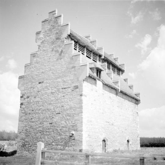
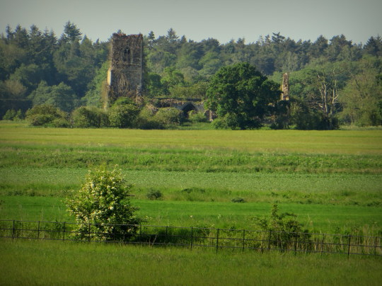
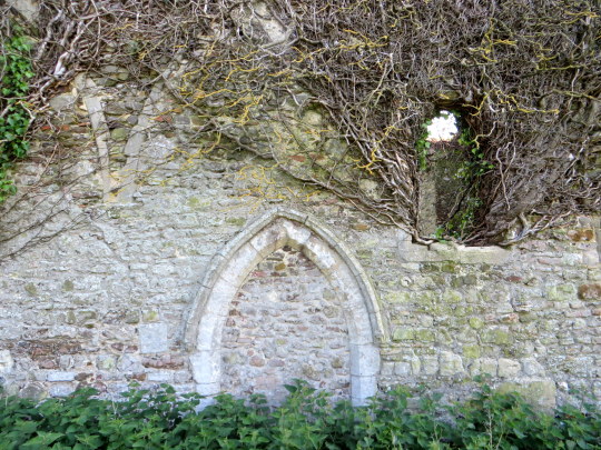
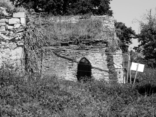
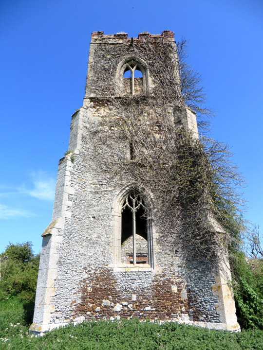
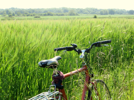
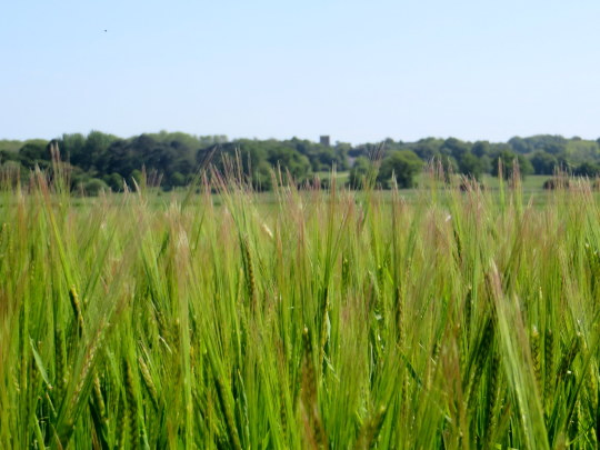
I got the train to King’s Lynn with my bike, (it’s wonderful how some of the railway companies embrace non-rush-hour cycle travel). From London it is just under two hours. The aim was to get to Babingley to see a Norfolk ruined church that John Piper painted. It is located in the middle of a field.
“Said to be the place where St Felix landed about 636 from Burgundy and thus where Christianity entered East Anglia. The present church is not older than the C14. Like so many others in this part of Norfolk, it is ruinous. The walls stand, but the roofs are gone. It was repaired in 1849 but after the mission church was build in 1880 by the main road there was no use for it.” †
Here is a quote from a book on villages about Sandringham that gives light to the problem many of the rural estate churches had in Norfolk and singles out St Felix’s.
“By the time the future Edward VII, as Prince of Wales, acquired the estate in 1862, it had fallen into ruin. Besides, like many Norfolk churches, it stood by itself among fields, the village having migrated to the main road.
‘Up to the last year of his life he was continually improving his domain, repairing churches, spending money on the place in one way or another,’ a friend remembered of Edward VII after his death in 1910.” ‡
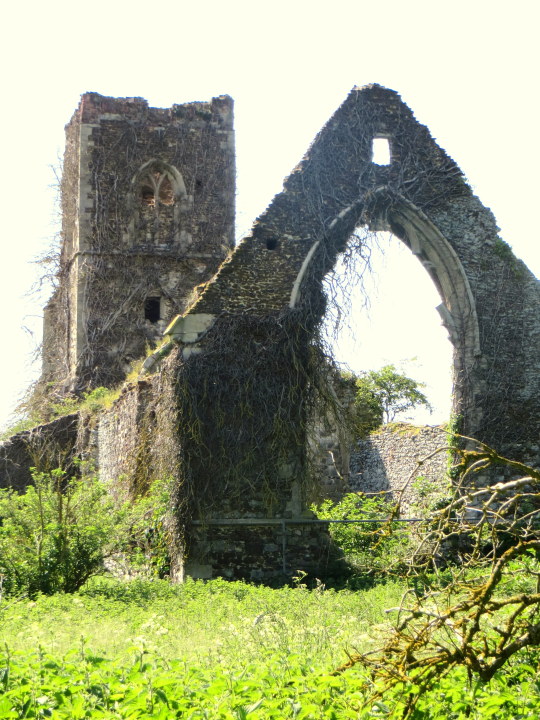
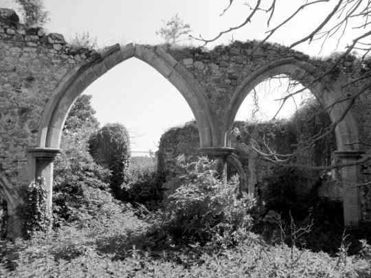
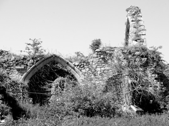
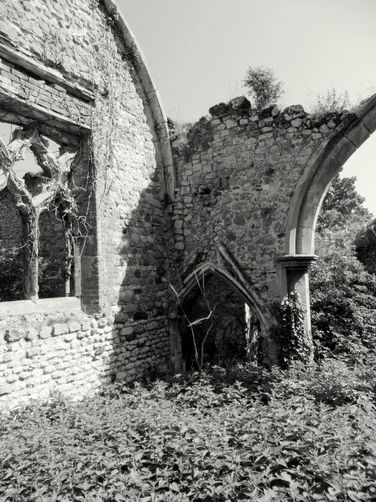
The roof of the church has been removed and few of the other internal details remain that are not part of the structure. The windows are all empty of both glass and the masonry. The church was once one long nave but due to the dwindling congregation the centre of the church was bricked up with a window, to make it two rooms and a bell tower.
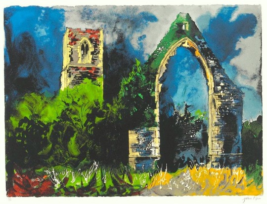
John Piper – Babingley Church, 1983.
The screen-print of the church was produced in 1983. It was printed in both colour (1983) and sepia (1984) editions. Below are more images from walking around the church.
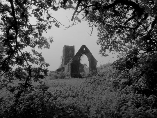
The church today is protected by a sea of stinging nettles (urtica dioica) and many signs telling of ‘Danger’. The heras fencing over the doorways and windows with the health and safety signs make it look depressing, even in a ruin we, the public, must be protected.
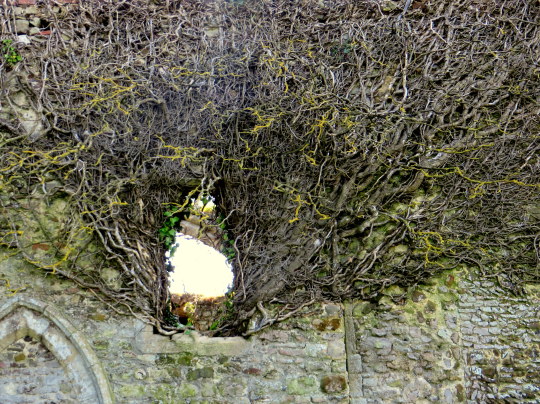
Above, is an image of some of the dead creepers on the wall coming out of the window, it looks haunted, like a Rackham illustration. Below, a picture of my bike and the fields next to the church.
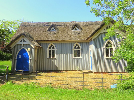
On cycling from St Felix’s Church I passed St Felix’s Chapel. It’s a strange building of corrugated iron and thatched roof with traditional window frames in.
“The church of St Mary and St Felix at Babingley shows that corrugated iron can also have charm. It stands on the Sandringham estate.” ‡
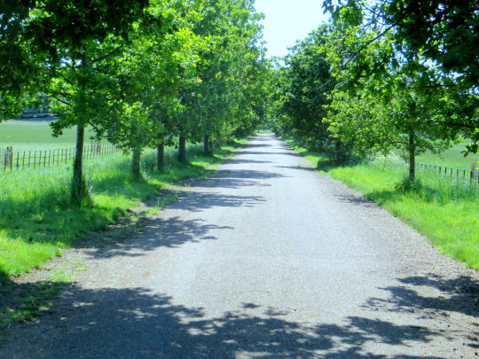
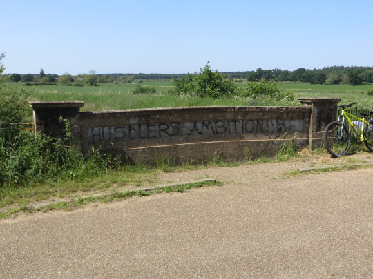
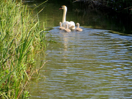
The cycle ride back towards Kings Lynn took me back through Castle Rising. There is a cycle path going on the edge of the village down a tree lined avenue and over a river where I saw a swan and her signets. The bridge over the river had been graffitied with the words ‘Hustlers Ambition’.
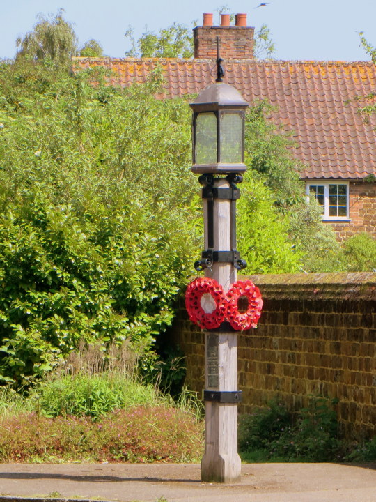
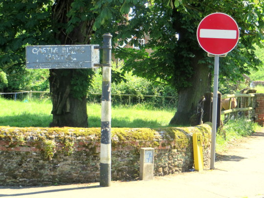
Castle Rising is a small village with the castle still, more-or-less in tact. However I didn’t have much time to see it but the photos from the village were of a rather practical war memorial in the form of a lamp post (maybe an eternal light/flame?) for the First World War. The other was an old sign post for the castle.
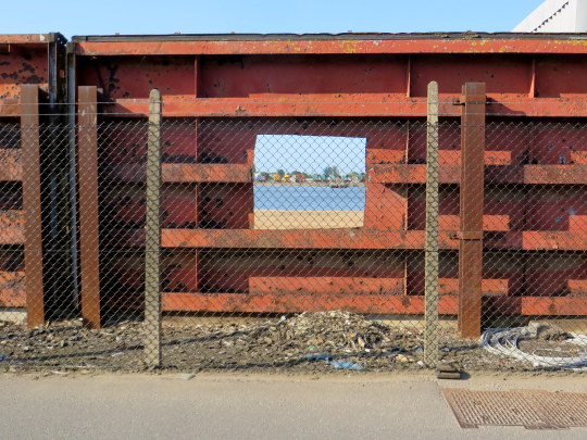
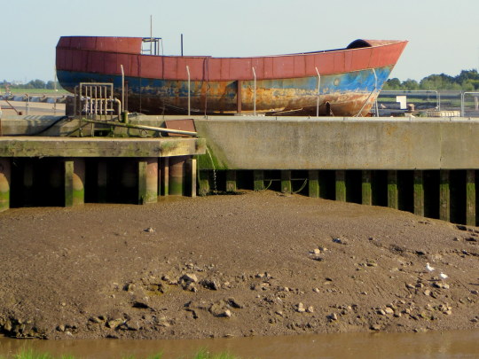
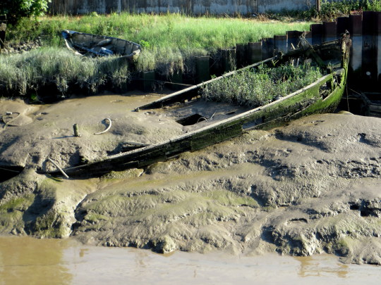
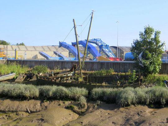
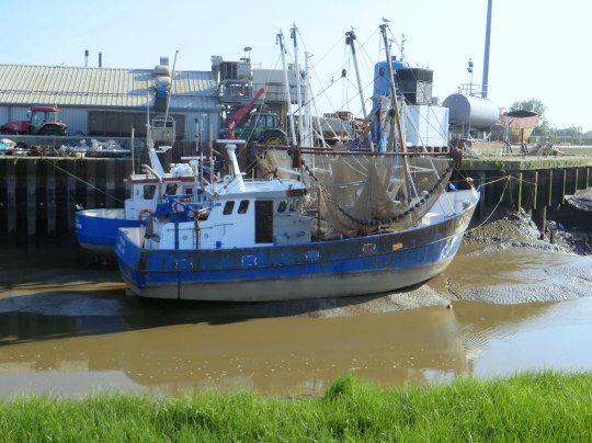
With some time to spare before my train home I cycled around the old docklands of King’s Lynn. It was surprising to see so many scuttled boats at low tide.
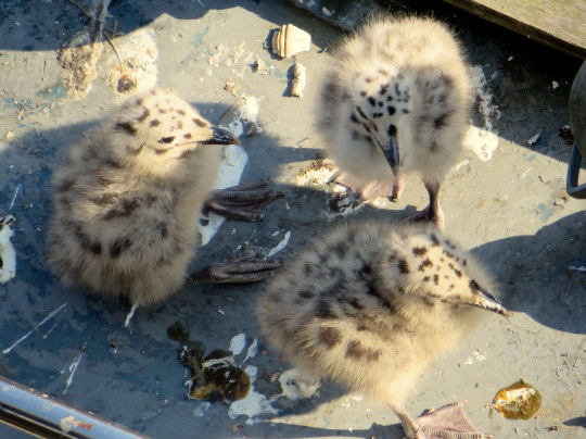
Below are some Seagull chicks with their enormous feet.
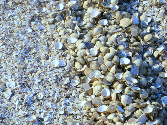
One of the roads by the docks is made up from millions of used shells from the near-by sea food factory. The image below shows how the lorries driving up and down turn the shells into a gravel.
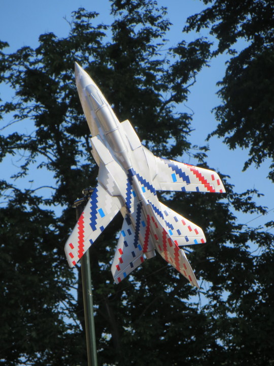
To celebrate the connections with the local R.A.F. Marham over the last 100 years, 15 sponsored and uniquely decorated model Tornados have been positioned around the town. Below is the one outside of the station.
Norfolk by John Betjeman ≠
How did the Devil come? When first attack?
These Norfolk lanes recall lost innocence,
The years fall off and find me walking back
Dragging a stick along the wooden fence
Down this same path, where, forty years ago,
My father strolled behind me, calm and slow.
I used to fill my hands with sorrel seeds
And shower him with them from the tops of the stiles,
I used to butt my head into his tweeds
To make him hurry down those languorous miles
Of ash and alder-shaded lanes, till here
Our moorings and the masthead would appear.
There after supper lit by lantern light
Warm in the cabin I could lie secure
And hear against the polished sides at night
The lap lap lapping of the weedy Bure,
A whispering and watery Norfolk sound
Telling of all the moonlit reeds around.
How did the Devil come? When first attack?
The church is just the same, though now I know
Fowler of Louth restored it. Time, bring back
The rapturous ignorance of long ago,
The peace, before the dreadful daylight starts,
Of unkept promises and broken hearts.
† Norfolk 2: North-West and South, Part 2. p190 9780300096576
‡ Villages of Britain. 9780747588726
≠ John Betjeman’s collected poems – p210 9780719568503
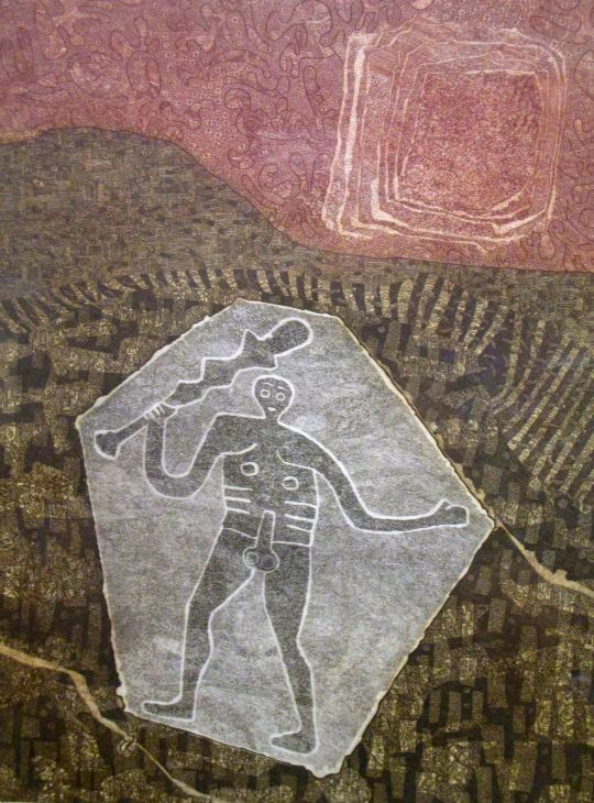
After buying the etching below and looking up the artist and location, it struck me how the uncovering and preservation of British ancient monuments in the twentieth century, together with the age of motoring bought artists to translate these places into art.
Chalk Men:
John Grigsby – Cerne Giant
Cerne Abbas is a parish just about eight miles north from Dorchester, in Dorset, England, where, as in the etching above, a human figure has been cut into the chalk hillside. The figure, generally referred to as a giant, is the outline of an ithyphallic man carrying a club in his right hand. At about 55 metres high and 51 metres wide it dominates the valley below. Above the Giant is another landmark, the Iron Age earthwork known as the “Trendle” or “Frying Pan”. The carvings are formed by outlines cut into the turf about 2ft deep, and filled with crushed chalk. The construction of the Wilmington Giant is much the same.
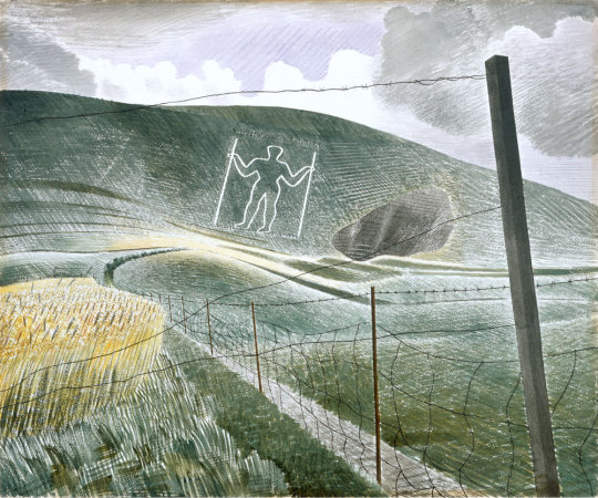
Eric Ravilious – Wilmington Giant, 1939.
“The Long Man of Wilmington and the very phallic Cerne Abbas Giant are of unknown age and controversy still rages over the date of the latter in particular”. †
The Ravilious painting is a watercolour using white resist makes the Giant Glow out from the paper’s natural colour, as do his cross-hatched, almost engraver brush-strokes of differing tones of colour.
Stonehenge:
Gertrude Hermes – Stonehenge, 1959.
Henry Moore – Stonehenge, 1973
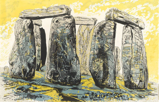
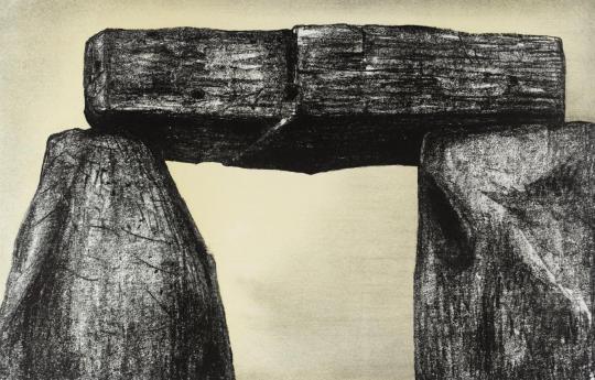
Above two sculptors draw and engrave their perception of Stonehenge. Archaeologists believe Stonehenge was constructed from 3000 BC to 2000 BC. The surrounding circular earth bank and ditch, which constitute the earliest phase of the monument, have been dated to about 3100 BC. Unlike the chalk men, there have been writings of Stonehenge from most of recorded time. The earliest record of the chalk giants is from the 17th century.
Moore on Stonehenge: I began the Stonehenge series with etching in mind, but as I looked at, and drew, and thought about Stonehenge, I found that what interested me most was not its history, nor its original purpose – whether chronological or religious – or even its architectural arrangement, but its present-day appearance. I was above all excited by the monumental power and stoniness of the massive man-worked blocks and by the effect of time on them. Some 4000 years of weathering has produced an extraordinary variety of interesting textures. ‡
Avebury:
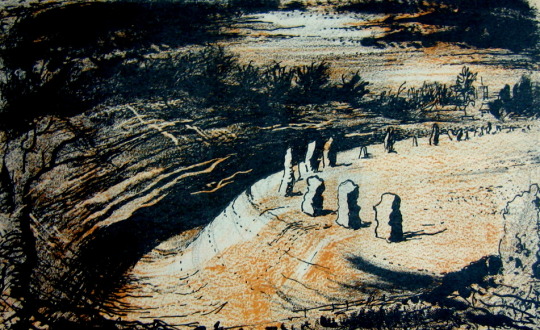
John Piper – Avebury, 1944
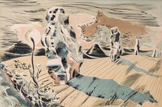
Paul Nash – Landscape of the Megaliths, 1937
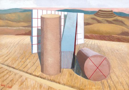
Above are both the avenue and the stone circle of Avebury painted in different styles by both Nash and Piper. John Piper’s image was for a book on Romantic British Poetry and he is making use of limited use of colours in the printing process of the book to make the dark-to-light drama washed with umbers. Nash’s lithograph is one of his less surreal of this working time period, unlike the image below where Nash project’s his own vision for modern monoliths. They maybe hay-bails or car grills but these are, to Nash, the monoliths of today.
Paul Nash – Equivalents for the Megaliths, 1935.
With Nash it’s best to use his own words about why he came to paint ‘Equivalents for the Megaliths’
These groups (at Avebury) are impressive as forms opposed to their
surroundings both by virtue of their actual composition of lines and masses and planes, directions and volumes; and in the irrational sense, their suggestion of a super-reality. They are dramatic also, however, as symbols of their antiquity, as hallowed remnants of an almost unknown civilisation.
In designing the picture, I wished to avoid the very powerful influence of the antiquarian suggestion, and to insist only upon the dramatic qualities of a composition of shapes equivalent to the prone or upright stones simply as upright or prone, or leaning masses, grouped together in a scene of open fields and hills. – Paul Nash – Letter to Lance Sieveking. May 1937.
† The Cambridge Illustrated History of Prehistoric Art. p116 9780521454735 Paul Nash Places. 9781853320460 ‡ Henry Moore. Writings and Conversations. p299 978-0520231610