Sports Gardens by Michael Rothenstein

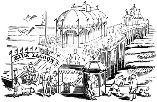
I thought it would be good to digitise an essay Michael Rothenstein wrote and illustrated in 1948 about ‘Sports Gardens’ or what we would now call an Arcade. It shows he was looking at his contemporary items as artworks, pre Pop-art. 
image
image

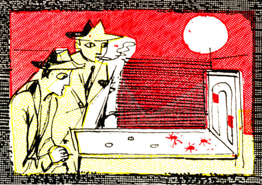
Sports Gardens have a tough, adolescent, slightly underhand air; a compound of chain-store and small town fairground. They are of course an urban version of the country fair an indoor version compressed into restricted floor space completely mechanised and with some of the high spirits ironed out.
image

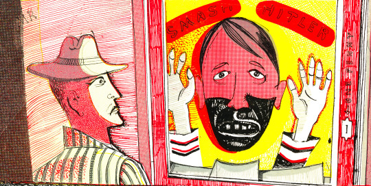
Further, Sports Gardens are static non-itinerant in contrast to the transience of the village fair, with its attendant sense of a momentary flowering for a single night. The knowledge that the show will be moving off somewhere tomorrow, that it will always be moving off somewhere gives the fair a quality of poignancy, of romance, which the Sports Garden entirely lacks.

So Gardens are harsh without being romantic; harsh, noisy and garish. Swing is laid on from 11am when they open to 12pm when they close. The typical pattern has a frontage of perhaps twenty feet, and runs straight back from the street. Pin-tables, wall-machines and cranes are ranged at either side: peep-shows are placed at the far end to give greater privacy. But in all Sports Gardens pin-tables and cranes are the largest profit makers, the serious business end of the industry. Hence these two types of machine are placed nearest the entrance in the largest numbers possible.
image

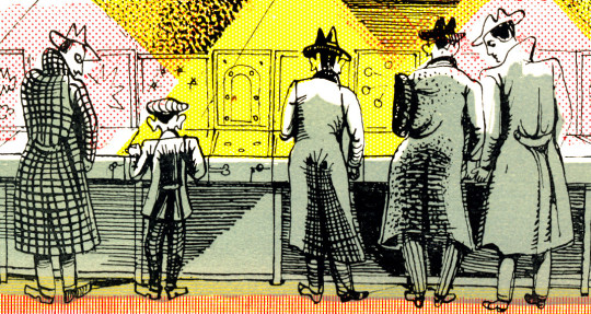
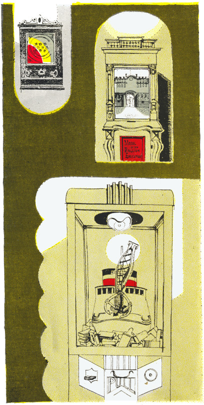
At the entrance to the Coventry Street saloon in London, for example, stands a large grab. A grab consists of a revolving table spread with the cheaper forms of ‘swag’: cigarettes, trinkets, powder-compacts, lighters-above which four shining chromium hands are poised. Aggressive in shape and predatory in gesture, these clutching silver fists are oddly symbolic of this tough, profitable branch of the entertainment catering business. Though in fairness to the management it should be noticed that earnings come chiefly from regular customers, fully aware of the small return received on outlay and not from the larger, more gullible crowd of casual visitors. Three or four shillings spent on the pintables may bring a few cigarettes: six or seven shillings on the cranes – a packet of Players. At the tables a maximum score earns a prize of two cigarettes.
image

Now the original cost of these machines was about £25, so it looks as if the profits must be very large indeed. The pin-tables themselves, all of American origin, are marked Daval Manufacturing Coy. Chicago. Importations stopped in 1939. Since no other country is able to produce machines of competitive quality, Sports Gardens carry equipment at least nine years old. But the machines are Cheap and easy to maintain: the brightly figured surfaces are all washable and the well-made ingenious machinery inside runs without undue need of repair.
image

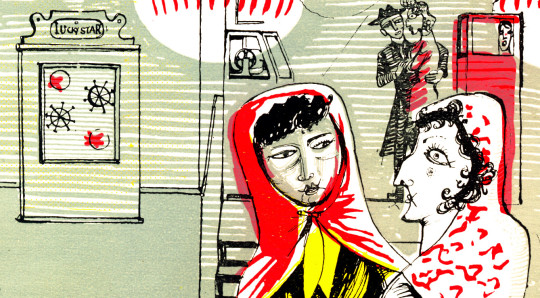
There are, perhaps, twenty-five standard types of table. The numerals on the distinctive backplates are interspersed with pictures of cigar-shaped racing cars zooming along concrete autobahns, pink and blue skyscrapers, giant vermillion aeroplanes with all the faked-up, streamlined paraphernalia of the Futurist city associated with American boys’ magazines.
image

As one releases the piston, the chromium ball kicks up the shoot, ricocheting from point to point touching off electric buzzers, lighting groups of coloured bulbs, while automatic calculators flash out rapidly mounting scores.

To register winning scores, it is necessary to know how hard to pull back the spring piston, when to jog the table. In a limited sense, then an element of skill does exist, though the scales are heavily weighted in favour of the machine. Rarely does a customer succeed in beating the hazards. When he does however the management count it good advertisement the ‘punter’ pulling in packet after packet of cigarettes, incites the crowd to spend sums far in excess of any temporary loss. 

Regular customers are of many types but of only one sex-male. A mixed age-group, very young to middle-aged  they return day after day to play a particular table. Many are prosperous; ten shillings is a not unusual sum to spend on each visit. Business men wearing soft hats of emphatic curve, carrying bulky pigskin briefcases, often play the tables in pairs during the lunch hour.
image

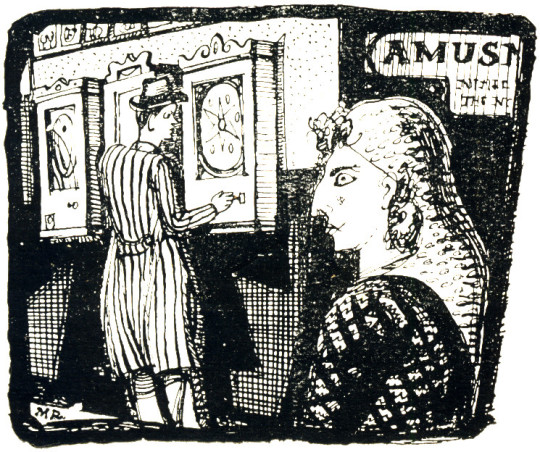
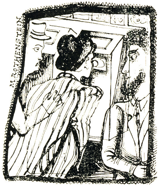
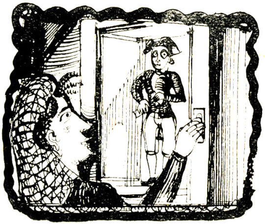
The peep-show, a non-scoring game of mechanism Peeping Tom has also an exclusively masculine following. A penny is placed in the aperture of the ‘Muto-scope’ or ‘Butiviewer’ and one peers down a black eyepiece at a miniature motion picture of a girl caught, as a rule, in protracted dalliance, wearing only her wrap or underclothes; a clothed male may also appear, the sleek young-middle aged shop walker type, sometimes dressed in Turkish costume.
image

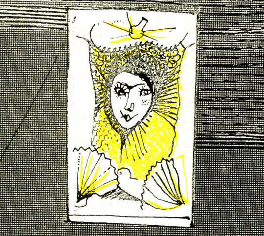
The sequence of pictures shown within is advertised by a ‘still’ bearing the expected caption: ‘Paris Nights’, ‘Sunbathing’, ‘Parasol Polly’, ‘A Pair of Queens’. Some are old fashioned machines worked by hand. In this case stills of half-dressed chorus girls, of the 1920 type flick over as one turns the handle. The pictures are illuminated in flashes, so the viewer’s eye holes shine yellow at one moment and are deeply shadowed the next.
image

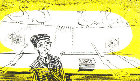
The attendants are an essentially urban type, matey, good-humoured and nervy having a predilection for flashy up-to-dateness. This makes them touchingly proud of the little modern equipment they possess. Many of the older types of installation have great visual charm with their fussy grandfather clock appearance and elaborately erratic machinery ticking over within.
image

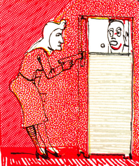
For these or other attractions single customers are apt to have a furtive look. They twist their mouths at you a bit sheepishly as they crane their necks to the peepshow eyepiece. But practised in groups, these penny pastimes take a more wholehearted and genial turn; and there is much geniality in the hours of peak attendance – rainy Sunday afternoons or evenings towards the week-end.
image

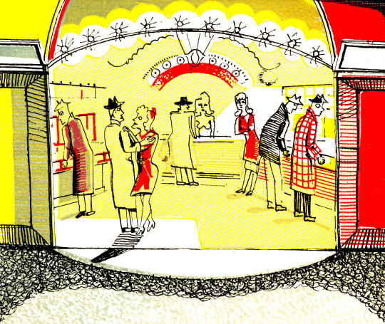
There is a sense of motion, vitality, quick-fire humour and attractively sharp colour, which contrasts not unfavourably with the stretched-out monotony of the scene outside. The Sports Garden entrance cuts a yellow hole in the black forbidding frontage of the night streets; beyond it we catch sight of the mysteriously welcome dazzle of coloured lights and animated crowds; while relayed Swing music, throbbing rather pleasantly down the empty street, thumps quietly at our ears.
image

BBC & Parr

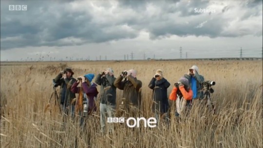
Only by chance did I discover that these BBC One idents are photographed by Martin Parr. Not quite like his normal portrait work, as you can see from the Making Of photos below. They are as forced as most portraits are but I find it a curious collaboration compared with his point-shoot-and leave photographs.

image
image

I have to say I find the idents a bit disturbing myself, the bird-watchers one the most, the way the people look directly at the camera isn’t something you get from TV other than the news and weather. They are a bit too quaint for me, too much of Ohh the British are an odd lot, it becomes too obvious for Parr’s work, its almost a parody of himself. 

image
image
image
image
image
image
image
image

Edward Bawden – War Artist

This post started looking at the difference between the Dunkirk painting and the print, but I thought it was also a good excuse to talk about the Edward Bawden ‘War Artist’ book. One of the cheaper Bawden books to buy it is full of Edward’s letters home with 38 of his war paintings.

image

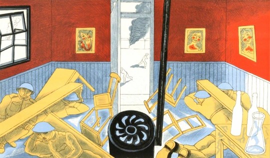
 Edward Bawden – Dunkirk, 1986

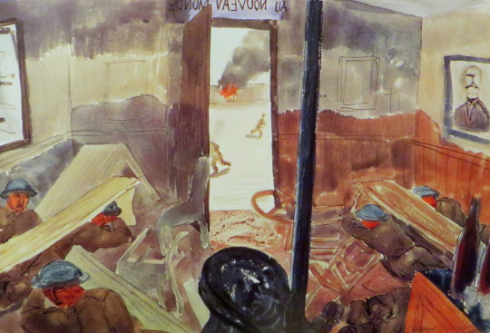
Above is the print of the Dunkirk bombings. Below is the original painting, but there is 40 years difference between the pair.

Painted by Edward Bawden during the shelling of Dunkirk in May 1940, the watercolour shows the interior of a bar and the soldiers hiding from shots under the tables. The bar ironically is called Au Nouveau Monde, ‘In The New World’. Paintings of Dunkirk fascinate me as it was such chaos it would have taken real nerve to paint at all.

image

 Edward Bawden – Dunkirk, 1940

Bawden marched into Dunkirk with the retreating troops through lines of jeering French. The generals had already left by then, as Bawden noted: ‘Well, the rats go first”. Later he said: “By temperament I am a pacifist. War horrifies me, it horrified me then…. I hated the big bangs. No one knew what was happening , and I was just tossed about like a bad penny. Nobody wanted a war artist. Every day I got shoved off to a new unit.”

At Dunkirk he didn’t head for the beach and the rescue boats but to the docks where he holed up for two days making notes of chaotic smoke-filled scenes as thousands of troops tried to get away under constant strafing and shellfire. Eventually a boat came near enough to scramble aboard and he found it full of exhausted men ‘lying in heaps everywhere, some only half dressed.

image

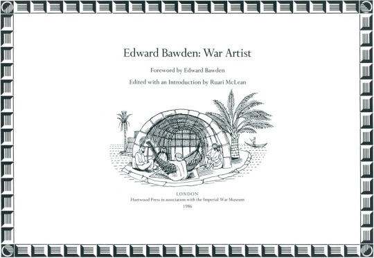
 Edward Bawden – War Artist prospectus, 1986

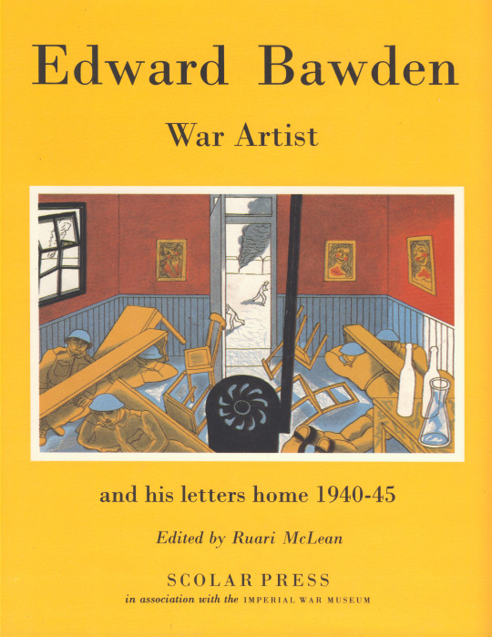
In 1989 Bawden released a series of his war letters, edited by Ruari Mclean. Edward Bawden War Artist and His Letters Home 1940-45. The book was due to come out in 1986 in a different format, a wide landscape book, signed and limited edition published by the Hurtwood Press. But the project stalled and ended up being rekindled and published in a landscape format in 1989.

Above is the original prospectus for the 1986 book that was never produced in this format. It would have looked much like a Fleece Press book.

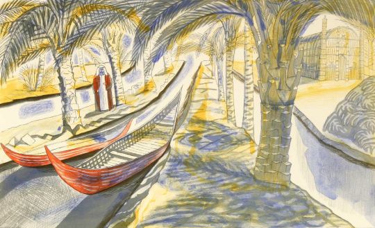
To accompany the 1986 book would have been two new lithographs, but these were released without the book and then used as the front and back covers of the 1989 dust jacket. The Hurtwood Press published Among the Marsh Arabs, and Dunkirk in 1986.

image

 Edward Bawden – Among the Marsh Arabs, 1986

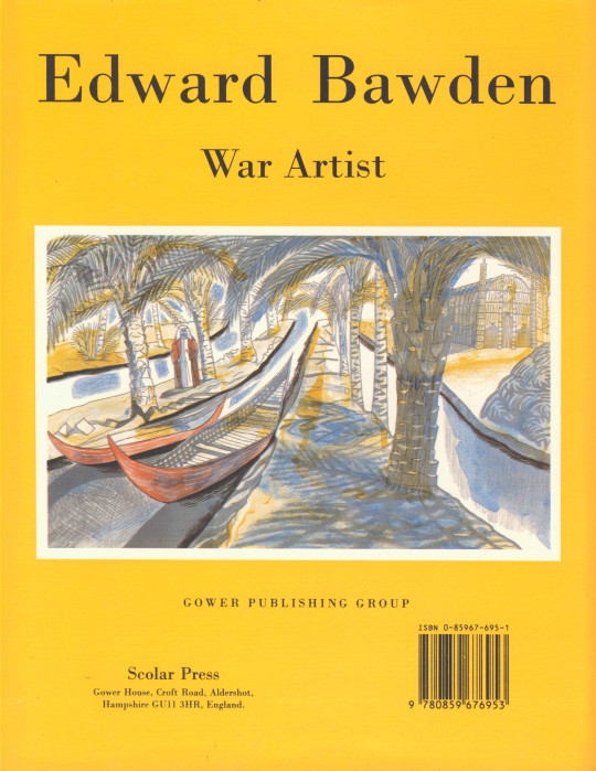
Below are the front and back views of the 1989 book with the lithographs used as artworks.

image

 Edward Bawden – War Artist front cover, 1989

image

 Edward Bawden – War Artist rear cover, 1989

Edward Bawden’s Zinc Zeal

I rather love these adverts by Edward Bawden from the Architects Journal to promote Zinc from 1945-46. From the end of WW2 Britain needed to be rebuilt and Zinc Development Association wanted it to be done with Zinc! In the 1940s it was in direct competition with Aluminium and the asphalt roofing roll.

Bawden completed 12 adverts, one would guess each for a monthly copy of the Architects Journal and Architectural Review (where they were advertised). Bawden got the job from his life-long friend and patron Robert Harling, who was working for Everett’s Advertising Agency at the time. Harling was the fairy godmother to Bawden, providing him with work throughout his life and even penned a book on the artist, he wrote novels and worked as a typographer.

I think the typeface used in this adverts are delightful as well.

image
image
image
image
image
image

The full advert has some text under it, rather bleak and a little bulling I think. Each advert had something related but all about rebuilding Britain, post war.

Until the road system of England is one grand impenetrable traffic-jam, peacetime productions will mean more and more cars. And more and more cars will mean more and more garages. And heaven grant these garages will be neither in the shed-and-shanty nor in the Bypass-Tudor-cum Queen Anne manner, but decent, dignified and honestly contemporary. Their building will demand zinc. For zinc lasts long, resists atmospheric corrosion manfully and does its job economically. It has proved itself the best permanent material for roofs, gutters, weathering and down-pipes. And the wise architect will look into the many new ways and means of unit it. 

image
image
image
image
image
image

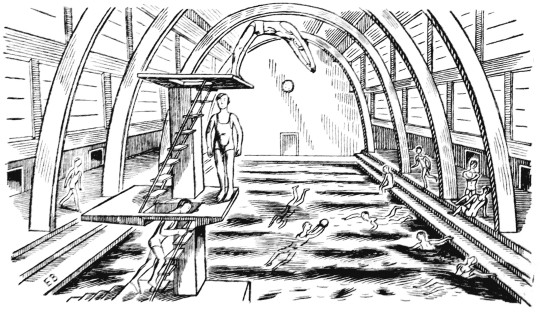
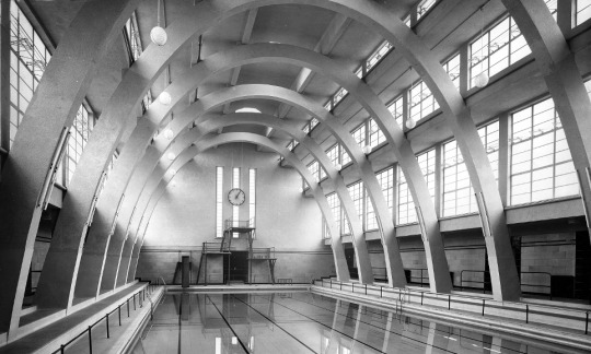
It can only ever be a guess but the swimming pool here is very similar to the Mounts Baths in Northampton, opened in October 1936 pictured below when they opened from Architectural Review.

image

 Mounts Baths, Northampton, 1936

Robert Tavener in Cheltenham

Robert Tavener was a designer and illustrator. He worked for the Central Office of Information, GPO and ICI, as well as publishers Hamish Hamilton, Longmans, and

Oxford University Press. He was a member of the Society of Industrial Artists. In 1957, he was included in the book Young Artists of Promise by Jack Beddington. Tavener taught art at Remple School in Stroud, Medway College of Art and Eastbourne College of Art and Design.

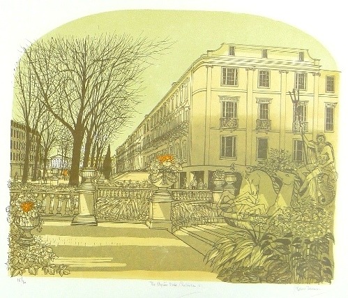
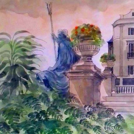
This is just a simple post about a painting I bought on ebay that got lost in the post and was never seen again. It was Robert Tavener’s Neptune Statue, Cheltenham pictured at the base of this post.

image

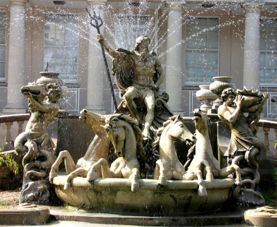
Here is a photograph of the rather elaborate fountains in Cheltenham.

The Neptune Fountain was built in 1893 and designed by Joseph Hall. The fountain is probably fashioned on the Trevi Fountain in Rome. Carved by Boulton & Sons in 1893. Neptune, the Roman god of the sea, is shown with sea horses and tritons. Robert Tavener made a series of lithographs of the town.

image

 Robert Tavener – The Neptune Statue, Cheltenham, Lithograph

image

 Robert Tavener – The Neptune Statue, Cheltenham. Missing in action.

Bawden on Ives Farm

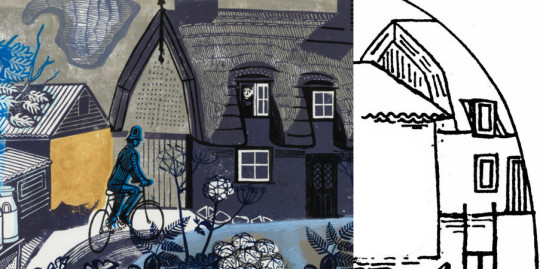
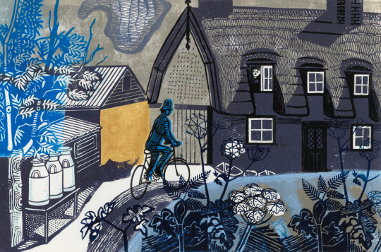
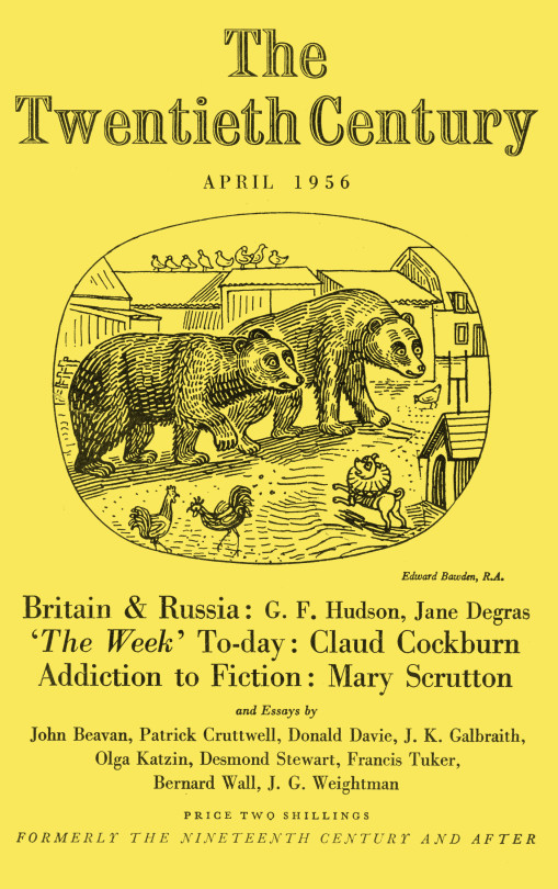
A short post showing the link between two Edward Bawden works. One is the illustration for the cover of The Twentieth Century, April 1956 and the other, a linocut print ‘Ives Farm’ that Bawden also produced in the same year. It isn’t a long post but little by little these observations all shall build up. 

I had posted both works before but I just hadn’t noticed the cottage hiding in the corner.

image

 Edward Bawden – Illustration for the cover of The Twentieth Century, April 1956

image
image

  Edward Bawden – Ives Farm, 1956

 Edward Bawden – Cover of The Twentieth Century, April 1956

My Pictures for Schools

Preview(opens in a new tab)

image

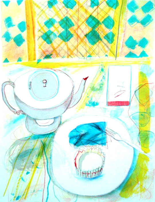
 Chloë Cheese – Tea and Cake (In My Collection)

This is a post about the Cambridgeshire County Council Pictures For Schools Collection. It was a brave project founded in 1947, in part as a reaction to the brutalities of the war, but also to brighten up classrooms and schools with modern works of art and improve the minds of young children. 

I am apt to using the word utopian a lot, but personally I believe projects like these were important in rebuilding Britain after the war. Not just bringing art into the home, but taking it to the public spaces; from the windows in Coventry Cathedral to the Festival of Britain, there was a manufacturing ‘brave new world’ of Britain and they used the artists as part of the team, maybe from champions of design like Robin Darwin at the Royal College of Art and exhibitions like Britain Can Make It in 1946.

The driving force behind the Pictures for Schools project was painter and educator Nan Youngman, art adviser to Cambridgeshire’s Director of Education, Henry Morris. Youngman was a student of painting at the Slade from 1924-1927, winning a prize at the Slade in 1926. She painted still, but focused on education for most of her life. 

The ideas motivating Pictures for Schools were very much of their time. During and after the Second World War, as the rebuilding of Britain was debated in both the public and political spheres, educators called for art education to be given a central position in the new school system. This received support from the Ministry of Education, as part of a project to promote British culture, improve the public’s standards of taste and create a new generation of citizens and educated consumers who were capable of exercising judgement in aesthetic matters and making informed choices and purchases.

The Pictures for Schools project came out of and alongside many other famous ‘utopian’ projects like the Contemporary Lithographs (1937-38), AIA Everyman’s Prints (1940) and the School Prints series of lithographs where major artists would be paid to design a lithograph that would be printed in thousands and then sold to schools cheaply.

Youngman was involved in the Everyman’s Prints series and it may have helped inspire the running of Pictures for Schools.

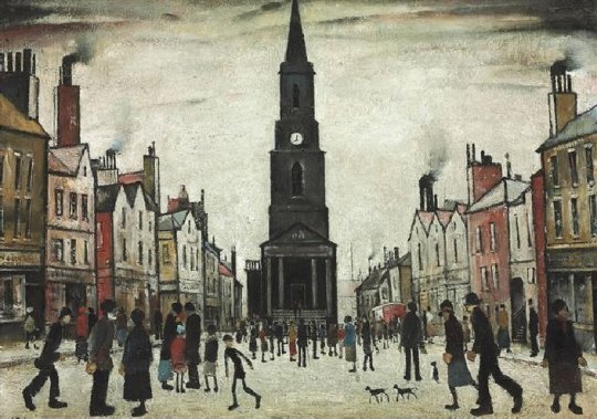
In the founding of the Pictures for Schools project, one of Youngman’s big successes was after she accompanied Morris to London in 1945 to buy a painting by L.S.Lowry from the Lefevre Gallery for 30gns for the Cambridge Schools Art Collection as part of Pictures for Schools. At the start of a recession in 2009 the Cambridge County Council sold it for £541,250 at Christie’s. The commission on that sale would have been around £125k.

image

 L. S. Lowry – A Market Place, Berwick-upon-Tweed, 1935

The rest of the works were due to go up for sale with Christie’s too, some of the works I own still have catalogue assignment stickers from the auction house on the back, but with the economic climate the Cambridge Council pulled the collection from auction and in 2017 they would come up again for sale with another auction house.

Although Nan Youngman was the organiser and originator of Pictures for Schools, she had the support of long-running exhibition secretaries, who themselves had interesting backgrounds and careers.

Slade-trained painter and writer Sylvia Pollak was the first Organising Secretary. She had, like Youngman and many of their circle, links with the Artists’ International Association and the Women’s International Art Club.

She was succeeded by art historian, writer and lecturer Alison Kelly, who had a particular interest in furniture and pottery, from 1950-1957, when she resigned to spend more time lecturing… During the war, Kelly had been flown around the country working on camouflage schemes for possible bombing targets such as factories.

Katharine Baker, who had been treasurer for the Society for Education through Art, took over from 1958-1967. She had previously worked for the British Institute for Adult Education, which during the war organised good design exhibitions, put pictures in air raid shelters, armed services establishments and British Restaurants, and sent exhibitions to outlying districts. She received a New Year’s day MBE in 1948 for her work on the ‘Art for the People’ travelling exhibitions.

Finally, Joan Bartlett was Organising Secretary from 1967 until after the exhibitions’ close in 1969, when the exhibitions were held at the Royal Academy’s Diploma Galleries.

image

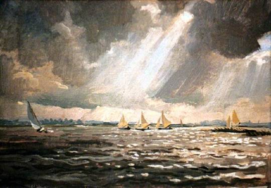
 Stephen Bone – Yachts Racing at Loosdrecht, (In My Collection)

The Stephen Bone painting above was bought direct from the artist himself as on the back are various notes and bills on Bone’s headed paper.

Youngman donated some of her paintings and linocuts to the collection, other artists in the collection are like a who’s who of British Art. Gertrude Hermes, Richard Bawden, John Piper, Anthony Day, Patrick Hughes, Enid Marx, Michael Rothenstein, Malvina Cheek, Robert Tavener, Julia Ball, Peter Nuttall, Richard Beer, George Chapman, Alistair Grant, Edwin La Dell, Rosemary Ellis, Tirzah Garwood and Evelyn Dunbar are but a few.

image

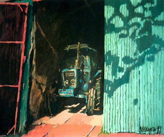
 Nick Lyons – Between You and Me, 1977 (In My Collection)

As the Pictures for Schools scheme ended in the 1960s, in Cambridge the project continued under the name ‘Original Works for Children in Cambridgeshire’.

image

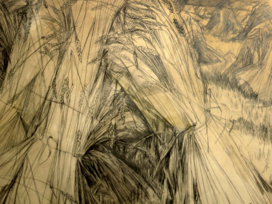
 Malvina Cheek – Cornstooks at Furlongs, 1962 (In My Collection)

The Malvina Cheek drawing above came with some provenance. 

I was staying at Furlongs when I drew the Corn Stooks . It was then a magical place, a shepherds cottage set in the shadow of the Downs. A gap in the wall leads up to the Downs. There was no electricity, no gas, only oil lamps and wood fires; a telephone the only concession to modern life.

In the fields alongside the cottage were pyramids of corn. The exciting shapes of the corn stooks attracted me. There was only time to draw, my daughter was very young, so I made studies hoping to develop them later. I also drew Dick Freeman, the farmer from whom Peggy leased her part of the cottage; he used an adjacent room where he rested after tending his sheep. There was always a pleasant speaking voice, a fine hooked nose and large hands like those in a Permeke drawing. Later I would use both the drawings of corn stooks and of Dick the farmer, I was commissioned to illustrate Gulliver’s Travels

Cheek also worked as part of the Recording Britain project.  

image

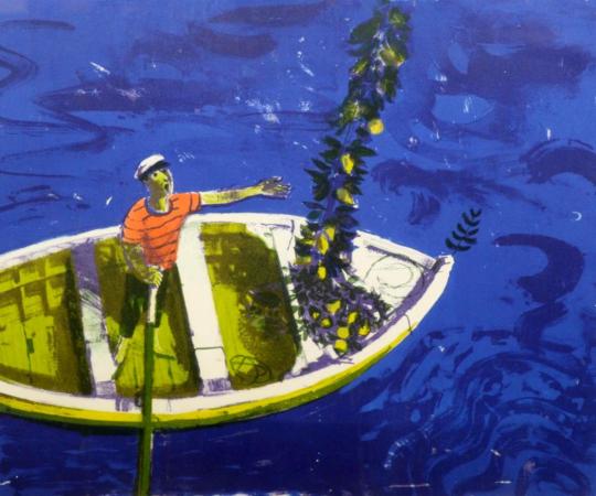
 Bernard Cheese – The Lemon Seller (In My Collection)

Walter Hoyle the Great Bardfield artist took over the scheme in the 1970s. Hoyle donated a few pictures and convinced other artists to donate works to the project too. Hoyle came to be involved as he was working at the Cambridge School of Art, now part of the Anglia Ruskin University. He would teach printmaking in the St Barnabas Press, a premises that the art school rented and he would encourage his pupils to donate a print to the collection. It may also explain how a fellow Bardfield artist, Bernard Cheese gets into the collection. Hoyle retired from teaching in 1985, moving from Cambridge to Hastings and Dieppe. 

image

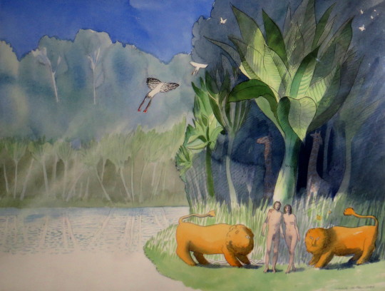
 Warwick Hutton – Adam and Eve, 1986 (In My Collection)

We know the Original Works for Children in Cambridgeshire continued until 1985 when the project was run by the council and in the mid 1990s, the Council wound down the project citing the expenses of transporting the art around, hanging and administration costs and the works were stored in a shed outside Huntington Library and in a community centre in Papworth for the next 15 years.
The works by Walter Hoyle and Warwick Hutton in the collection were given with expenses for framing to the artists. Warwick Hutton’s painting of ‘Adam and Eve’ followed with a book he published in 1987 under the same name by Hutton with Atheneum Books.

image

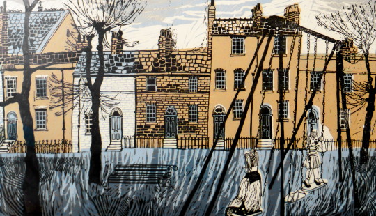
 Poul Webb – Petersfield (In My Collection)

Many of the works that Hoyle encouraged his students to make were prints, Poul Webb remembered making the print above in various colourways to me when I contacted him and he now works mostly as a painter with a totally different style. The picture below by Glyn Thomas is unlike his style now too, he works in drawings and etchings but Hoyle must have been an interesting man to work under as many of the artworks have a bit of Rothenstein or Bawden in them, I guess due to the Bardfield connections.

image

 Glyn Thomas – Corn Exchange, Cambridge, 1965 (In My Collection)

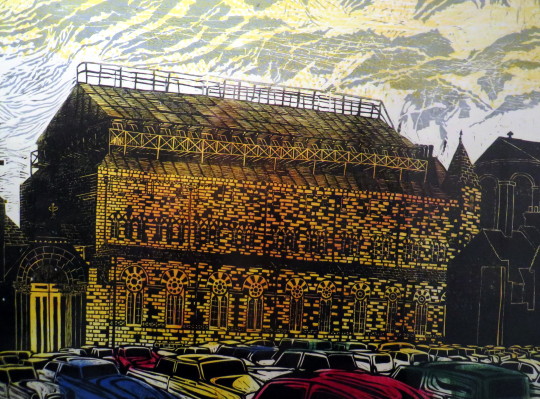
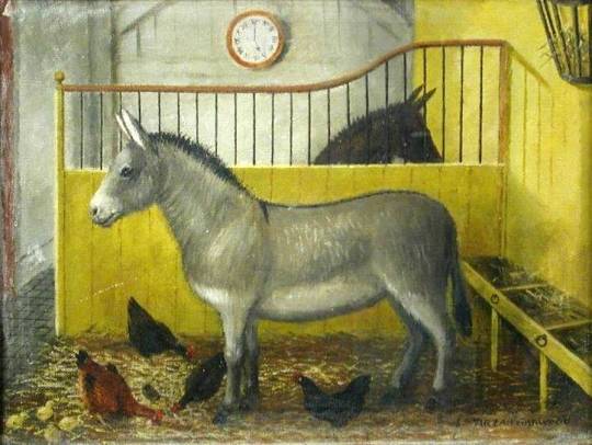
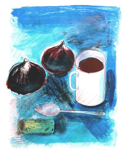
It wasn’t just Bernard Cheese and Walter Hoyle that had works in the collection from Great Bardfield. Tizah Garwood had a painting in the collection of two donkeys. Chloe Cheese also had two prints in the collection.

image

 Tirzah Garwood – Nathaniel and Patsy

image

 Chloë Cheese – Figs and Coffee, 1972 (In My Collection)

image

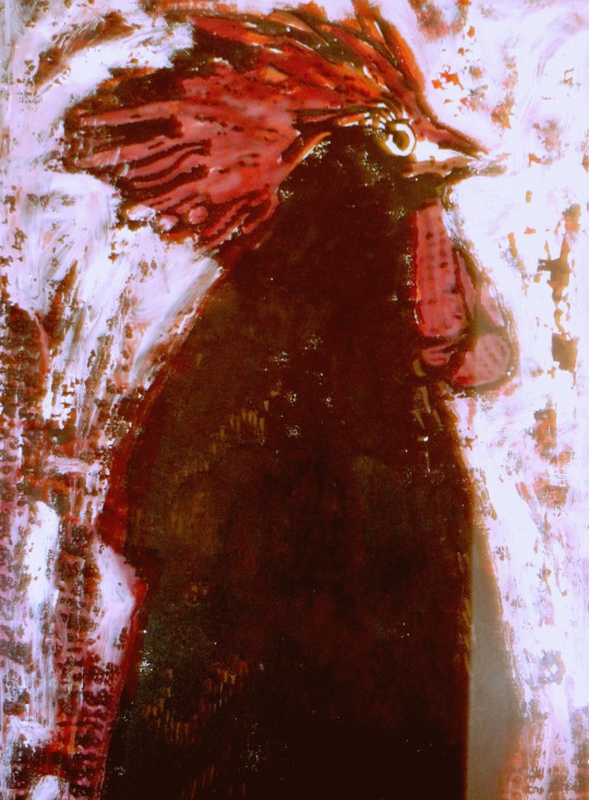
 Norma Jameson – Black Cockerel (In My Collection)

image

 Marion Crawford – Agriculture (In My Collection)

Duncan Grant in Lincoln

I am unsure what the public perception was of Duncan Grant in the 1950s, if people knew he was homosexual or if Vanessa Bell’s infatuation with him masked that. 

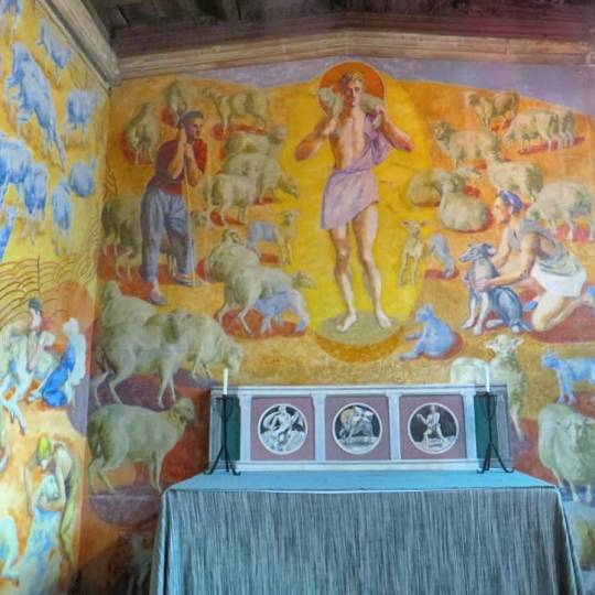
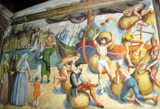
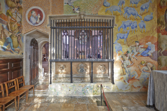
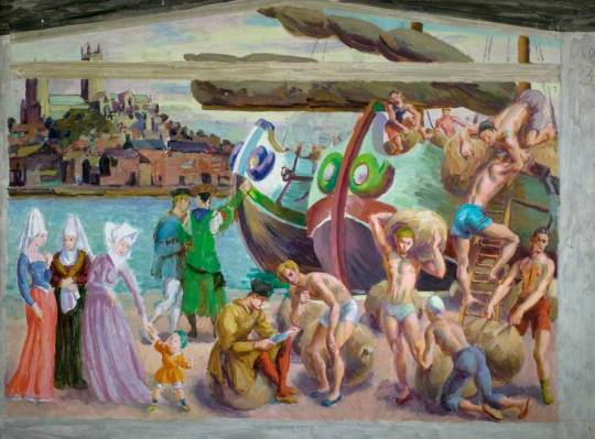
Either way it is surprising to see murals by Grant in a Cathedral given attitudes to such bohemian artists in the church. But in Lincoln Cathedral there is a cell with his homoerotic murals designed on the theme of Lincoln’s history in the wool trade.

image

As with anything Bloomsbury, nothing is simple, so here is a bit of background on Bell and Grant:

Vanessa Bell, married Clive Bell in 1907, and had two sons in quick succession. The couple had an open marriage, both taking lovers throughout their lives. Vanessa had affairs with art critic Roger Fry and with the painter Duncan Grant. Vanessa succeeded in seducing Duncan one evening and she became pregnant in the spring of 1918, having a daughter, Angelica in 1918, whom Vanessa and Clive Bell raised as his own child.

In 1942, aged 24, Angelica married David Garnett. The relationship had begun in the spring of 1938, when Garnett was married to his first wife, Rachel “Ray” Marshall, who was dying of cancer. Angelica had four daughters with Garnett.

Garnett was a member of her parents’ circle, a former lover of Duncan Grant who had also attempted to seduce Vanessa Bell. When Angelica was born, Garnett had written to Lytton Strachey saying of the baby: “Its beauty is the remarkable thing … I think of marrying it; when she is 20 I shall be 46 – will it be scandalous?”

In fact Garnett was nearly 50 at the time of their marriage. Despite their consternation, Angelica’s parents did not inform their daughter of these details of Garnett’s past, although various associates of the family did attempt to warn her against the marriage: John Maynard Keynes had her to tea. Angelica lost her virginity to Garnett in H.G. Wells’s spare bedroom. 

They were a bohemian lot.

image

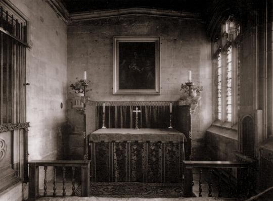
 The Russell Chantry, Lincoln Cathedral, before the Duncan Grant murals. 

The Edwin Austin Abbey Memorial Fund, set up in 1952 by the widow of the illustrator and historical painter to promote murals in public places, had placed a notice in The Times on 2 May 1952 inviting proposals. One of these had come Duncan’s way, helped no doubt by Vanessa’s presence on the Fund’s committee, and he was to decorate the chapel dedicated to St Blaize, patron saint of the wool industry, in the Russell Chantry at Lincoln Cathedral.

St Blaize was a doctor from a rich family who renounced his possessions and lived in caves and hillsides, caring for the animals.

After seven years the murals where finished in 1959, they where effectively hidden from public view. The subjects Grant painted were just too homoerotic for the church at that time. The space was used a broom-cupboard for a while in the 1970s. 

With the mass publications of various Bloomsbury books and the rise of interest in Duncan Grant, the chapel was re-opened for public view after restoration in 1990. However when I went in the summer of 2018 the room was locked and wasn’t mentioned on the handout map given when you enter the building.

image

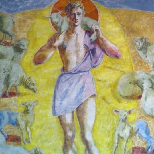
Below is a study for the Christ figure that Grant painted, the study is likely of Paul Roche, Grants lover and painting model.

image

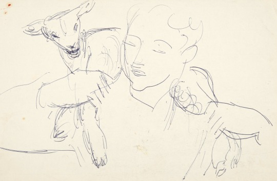
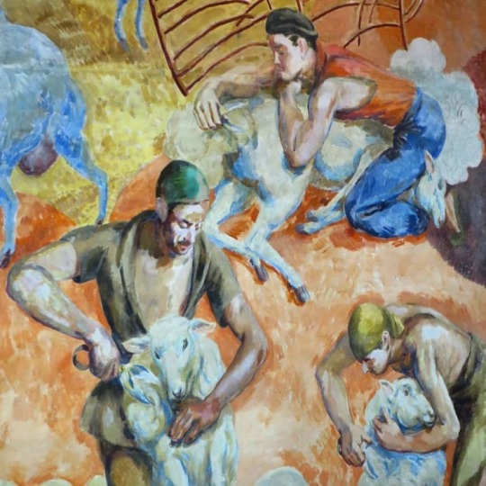
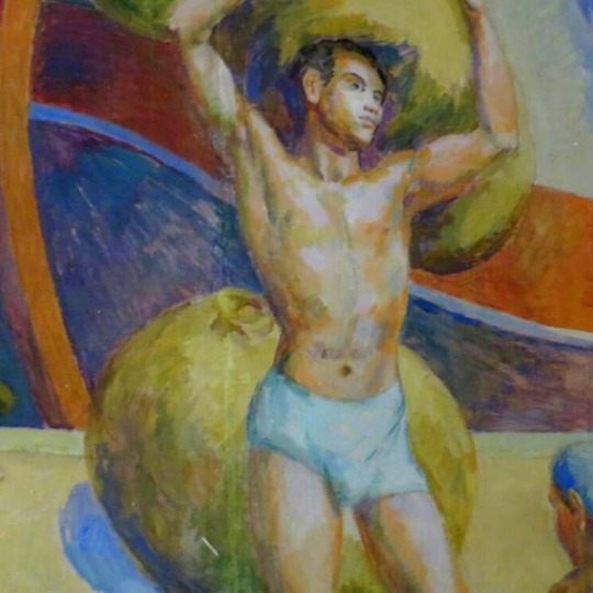
In London, Duncan had begun to draw Paul in some of the poses that he needed: for the men shearing sheep and for the full-length figure that dominates the altar wall, the Good Shepherd, carrying a sheep on his shoulders. 

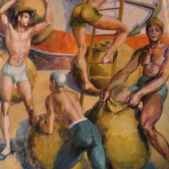
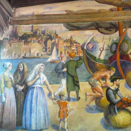
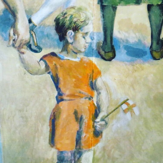
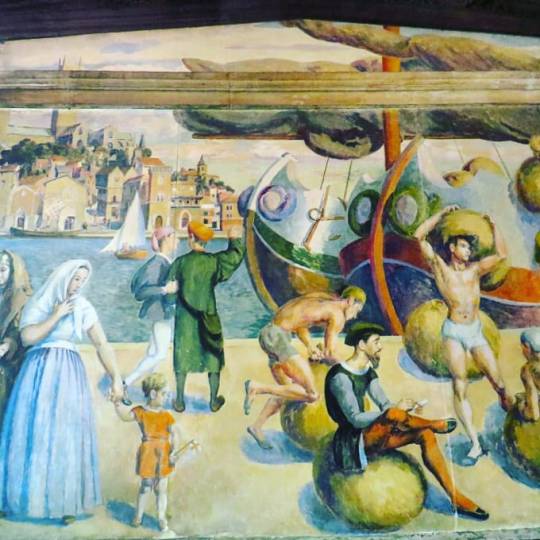
On the wall opposite he was to paint a view of medieval Lincoln, with a busy harbour scene in the foreground. On the right-hand side men heave bales of wool, their balletic poses echoing the curves found in the ships’ prows, while on the left three statuesque figures (Angelica, Vanessa and Olivier) are linked with the men by the small boy pulling at Olivier’s hand.

image
image

The large ships with the homoerotic and suggestive men are likely what caused the greatest offence to Anglican eyes in the 1960s. The men bending over normally in front of other men’s groins and perfectly painted bums. 

As mentioned above the three women below are from Grant’s household. Angelica Bell his biological daughter, Vanessa Bell and Olivier Bell, the wife of Vanessa and Clive’s son Quentin Bell. 

image

Even the little boy looks a little phallic with his flag stuck out at a saucy angle. 

image

In October 1955 Duncan, while painting his Lincoln murals, jumped off a high stand on to a stool that overturned, and cut his head on an electric fire. The accident was minor, but the murals he was painting played a large part in helping him through a low period, for the public at this time showed little interest in his work.

In the image below you can see a round window above the door painted in with St Blaise looking toward the alter. By the time Grant had finished the works he was in his mid-seventies.

image
image

In 1958 Duncan completed the Lincoln murals, which had for so long dominated the studio at Charleston. In order to see them installed, he and Vanessa travelled north and booked in at the White Hart. †

image

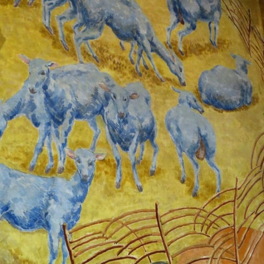
He had put a great deal of thought and labour into this decorative scheme, and at one point had used paper cut-outs to help him decide on the exact positioning of the sheep on either side of the Good Shepherd. Paul had modelled for the young beardless Christ. Consciously or unconsciously, Duncan had drawn on an early Christian tradition which, to ease the transition from paganism to Christianity, depicted Christ in a manner reminiscent of Mercury. Duncan’s Good Shepherd, surrounded by a mandorla of light, fills the centre of the altar wall and faces the view of medieval Lincoln on the wall opposite.

The picture below is a study in the art gallery in Lincoln of the mural back wall with the original headdresses on the three women and the rest of the scene remarkably similar to the final result, other than Lincoln looks more Italian in the final mural. 

image

Study for The Wool Staple in Medieval Lincoln

image
image

The final work was painted in oil on fibrous plaster-boards, which gives to the oils an impression of the chalky surface of fresco. Once the panels arrived in Lincoln in the summer of 1956 they were attached to the walls on battens over the following two years. Duncan Grant and Vanessa Bell attended the unveiling in July 1959, when they stayed as usual in the White Hart Hotel. Vanessa died two years later, while Grant was to live to ripe old age, still travelling and painting and enjoying exhibitions, often with his friend Paul Roche, the model for The Good Shepherd. 
image

Frances Spalding – Duncan Grant, 1997
‡ Angelica Garnett – Wikipedia

The Garden of Barbara Jones

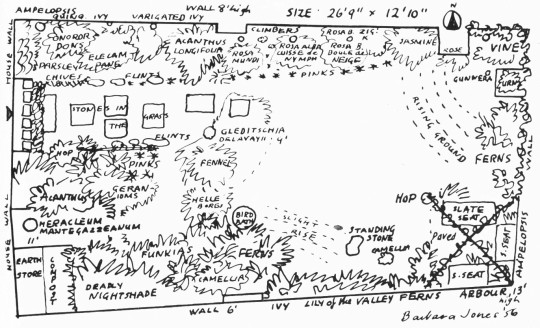
This a post from the The New Small Garden book by Marjory Allen and Susan Jellicoe. The book features Barbara Jones’s garden for her house on Well Walk, and the garden that backed on to Willow Road, her house has been split into two flats and the garden now is even smaller, divided into two. However below is the garden as she would remember it. 

image

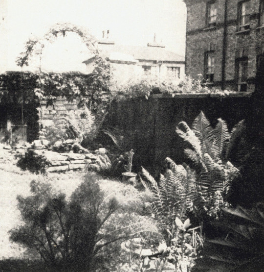
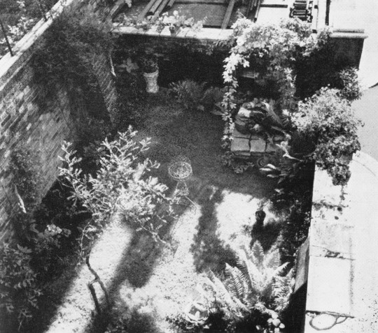
This exquisite little garden has been evolved by Miss Barbara Jones, artist and writer, from as unprepossessing a back yard as can be imagined. It is essentially a collector’s garden, where each plant is valued as an individual. 

image

The tiny scale makes the individual treatment of plants not only appropriate but necessary. It is her delight to arrange her plants so that the shape and texture of each will act as a sympathetic foil to its neighbours. 
image

Notes on the Building of Broadcasting House by Val Myer

image

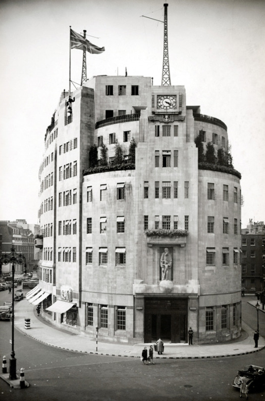
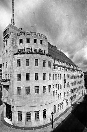
 A newly finished Broadcasting House, London, 1933

It is imagined, in many quarters, that “modern” architecture has revolutionised the whole of present-day practice, whereas the truth is that good architecture has always been a matter of common-sense, plus a leavening of aesthetic instinct. In reality, its vital principles are no different today from those which guided the old Egyptians, Greeks, and Romans.
In planning a building, the first essential, of course, is to make it suitable for the purpose for which it is intended. That it should be pleasing to the eye is, obviously, a further necessity, but, if it looks suitable, its designer is already halfway towards achieving his object.
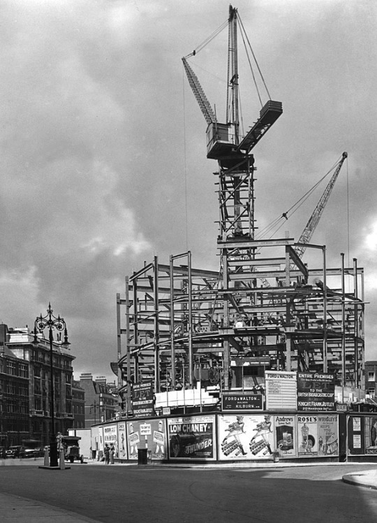
image

 Broadcasting House – Under Construction and surrounded by Poster Billboards

In the case of Broadcasting House, we had first to consider its functions. These are twofold; the actual broadcasting, and the administration of broadcasting. Obviously, the studios, Control Room, and the accommodation of technical equipment come first, with the actual studios as the most important factor of all.

Accordingly, it was the planning of the studios which had to be the key to the whole scheme. At the outset, it was thought that the ideal arrangement would be to place all the studios on one floor and, as protection against inter – studio interference, to surround each by a complete circuit of brick -built corridor. As protection against extraneous noises, the studios would be placed at the top of the building.

The site of Broadcasting House, however, though picturesque in form, is irregular, which fact would have caused studios so grouped to be of awkward shape. Besides this, although the B.B.C., at that early stage, contemplated fewer studios than have now been built, the system of individual insulation by corridors and walls would have been so extravagant that the areas left for studios would have been quite inadequate. Moreover, owing to the high value of a site in the heart of London, the space available for the studios is necessarily limited. Hence the open -area system of insulation, adopted elsewhere, was out of the question.

After exploring scores of different systems of planning, the problem of accommodating a large number of studios and their suites within the space available was quite suddenly solved. Instead of the studios being all on one floor, or on two floors, they would be all in one tower, so that, given a good service of lifts, circulation would be actually easier than if they had been all on the same level, and, of course, larger and more shapely studios could be provided. Once this key idea had been found, the plan was rapidly developed and, one after the other, its benefits appeared. The evolution of the plan proceeded on simple lines which can best be expressed as follows :

  • Studios must be insulated from sound Put a thick brick wall round them, omitting the usual steel framework.
  • Studios must be artificially ventilated, so need have no windows
  • Put them in the centre of the building, where there is least daylight to waste.
  • Offices must have daylight
  • Put them all round the outside of the building, where plenty of daylight is available.
  • Studios need to be sound insulated from one another
  • Put between them horizontal layers of rooms such as Music Libraries, Book Stores, etc, which neither create noise nor are disturbed by it.

In this way, item by item, the plans were wrestled with and were slowly developed to their present form. Sometimes, as a result of much thought, whole features had to be discarded. Such was the fate of a huge parking garage, at one time accommodated in the basement. I could fill many pages with the history of planning this building, with all its exacting requirements, but, interesting as this would be to myself, this is, perhaps, hardly the place for such a story.

image

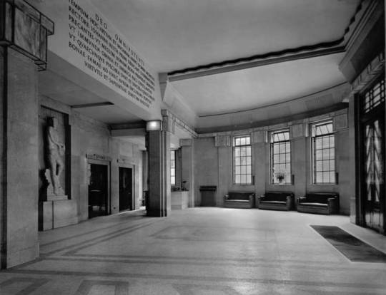
 The Entrance Hall 

Before speaking of the exterior, I will just say a word about the internal decoration of the principal apartments. The Entrance Hall, semi -circular in plan, is simplicity itself, devoid of ornament, and depends for its effect upon the grace of the natural curves which arise from its circular form and the rhythm of its vertical lines. The beauty of the English marble (Hopton -Wood stone), which lines the walls, is an added charm.

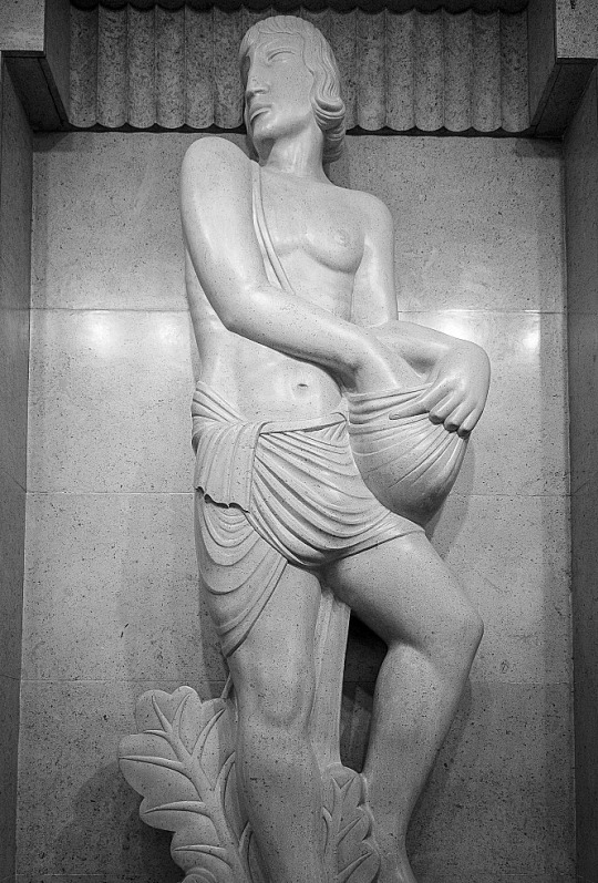
The central feature of the Hall is to be a lovely figure of “The Sower,” for which Eric Gill has already made his model.

image

 The Entrance Hall with The Sower by Eric Gill.

image

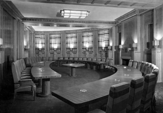
 The Council Chamber

The Council Chamber, sixty feet across, is of semi- circular shape, like the Entrance Hall. This room, whose acoustic qualities are strangely happy to the naked ear, is lined with Tasmanian oak and, at night, is entirely illuminated by reflected light from lamps concealed in wrought – oak urns. The pedestals of these urns serve as relieving accents of interest to the simple panelled walls.

image

 The Concert Hall 

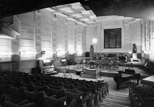
The Concert Hall , in the heart of the building, is wedge – shaped in plan. The splay is not sufficient for one to realise, at first sight, its existence, but it has the strange perspective effect of making the Hall appear very much longer from the back than from the stage. The treatment of the ceiling is entirely novel; it is hoped that, with the semi – indirect lighting indicated, the ceiling will provide a very distinctive feature.

Now, a word as to the exterior. First, let me explain the reason for the eastern side being cut away as with a draw knife. This part of Langham Street is narrow and, not only have the opposite owners rights of light which had to be respected, but there are three -sided mutual covenants with other neighbours which could not be broken. Hence, the whole of the building above the fourth floor had to be  sloped back and restrained within a limiting angle. In Portland Place, the only limit of height was that imposed by the London Building Act..

image

 The East Side of Broadcasting House

The south end of the building, facing down Regent Street, suffered under the same difficulties as the Langham Street front, but at this vital point, realising my troubles, the parties concerned made certain concessions of real value. In the circumstances, the obvious course seemed to be to design a symmetrical façade to Portland Place which would dominate the whole building, to emphasise the main doorway facing south by placing a Clock Tower above it, and to be satisfied with a modest elevation to Langham Street which, without being striking, would be suitable.

The marrying together of these three components was a particularly interesting problem, which was helped by the I provision of a third aerial mast over the Clock Tower.

image

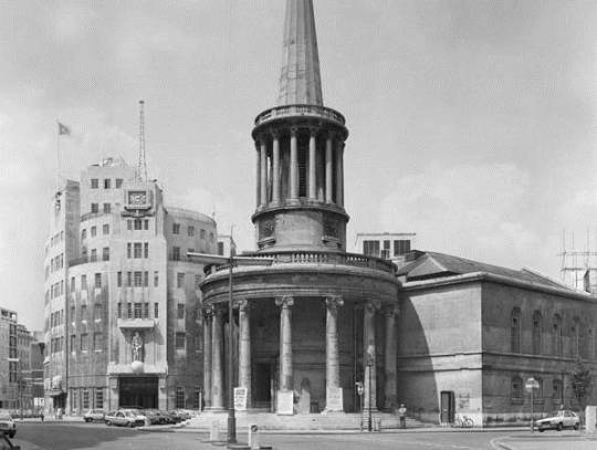
 All Souls Church and Broadcasting House

At an early date I realised that the site possessed a rare virtue in the long curve of the western side, and so, in organising the proportion of my masses and the play of light and shade, I tried to make full use of the gracious horizontal lines which this curve suggested. Broadcasting House is said to look bigger than its actual dimensions. This is due to the scale and number of the windows, necessitated by the provision of an immense number of small offices. Endless flexibility of subdivision of offices was required by the Corporation, which fact, naturally, weighed with me in preparing my design for the façade. Although economy was essential to the whole scheme, and the sculpture at my disposal limited, I insisted that it be as good as possible, and then placed it, with other architectural features, at the most effective points, hoping to set it off to advantage by the contrast of plain walling and the considered rhythm of the windows referred to above.

image

 Eric Gill – Prospero and Ariel, 1933

As a footnote it is worth looking at the Eric Gill’s views on the building and his work for it.

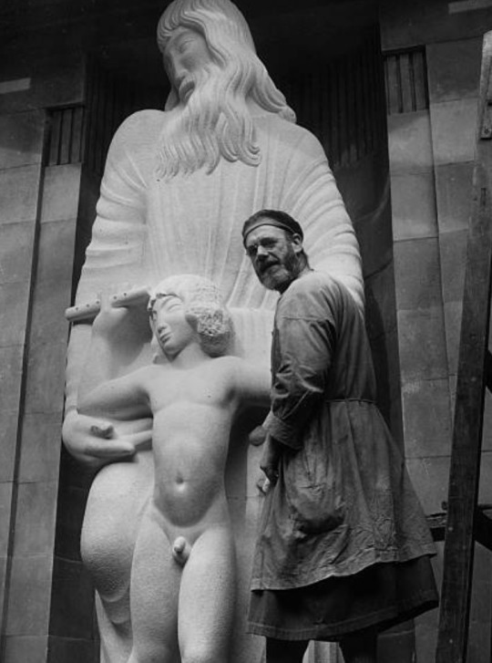
His (Gill’s) frustration with the BBC work must have been compounded by the trouble over the size of Ariel’s penis already recounted, and with ‘Bad weather, bad stone and bad health’ – though it was on his own choice to work on inadequate and exposed scaffolding. From this perch he was heard to shout to a passing friend, ‘You know, this is all balls’. ‘The Sower’ was also done with some cynicism as he wrote to his brother Cecil; ‘I am about to begin the statue, representing a man ‘Broadcasting’, to stand in the entrance hall. Comic thought, whe you consider the quality of BBC semination, to compre it with the effords of a simply countryman sowing corn! However, it’s their idea, not mine. Mine not to reason why… mine simple, to carve a good image of a broadcaster”. 

Malcolm Yorke – Eric Gill: Man of Flesh and Spirit