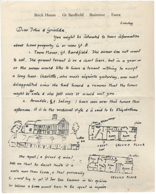
I thought this was an interesting bit of Great Bardfield history, of what could have been. Below is a letter from Edward Bawden to the typographer and book designer John Lewis and what’s interesting is Bawden is suggesting a house for him to live in.
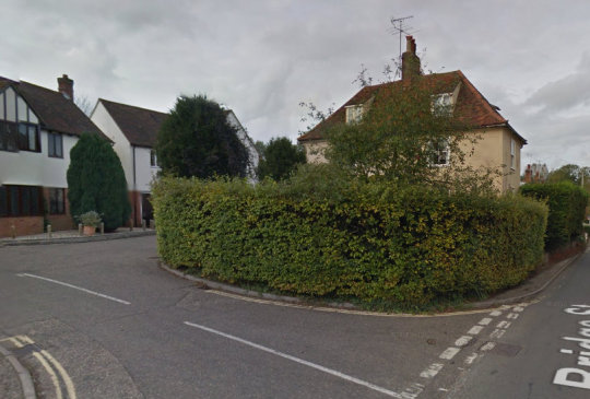
There are two options, one is for them to have a long term rental of Town House in Great Bardfield (around four houses from Brick House) and then a beautiful house called Arundels in Bardfield Saling.
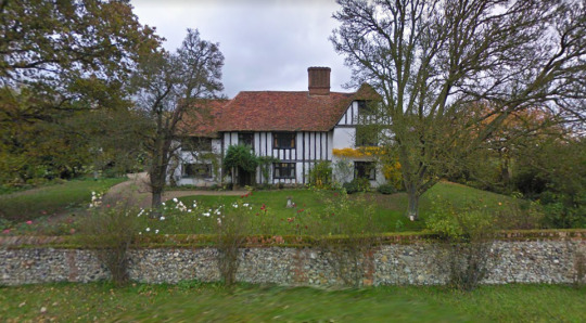
Arundels, Bardfield Saling.
What is rather lovely is Bawden has drawn out a map in the letter and is honest about how much work it will need to repair it.
The curious thing about his letter is that it comes at a time when Edward was encouraging people like Walter Hoyle and other Royal College of Art staff to move to Great Bardfield. It is letters like this that show how Bawden was trying to cement an artistic community in Essex. In the end Lewis moved to Meadow Cottage, Great Bealings, Woodbridge, Suffolk, England, to be near W S Cowell Ltd, Ipswich, where he was a printer.
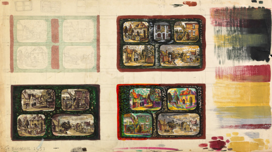
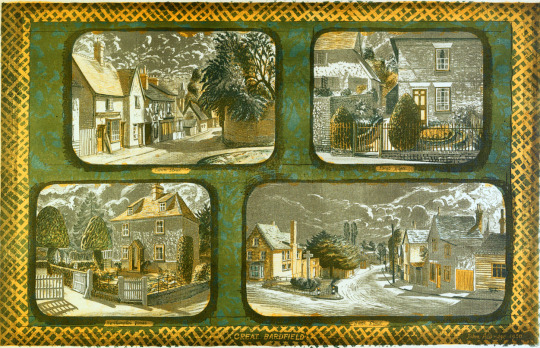
The print and the studies used in this post are by John Aldridge for the Festival of Britain, 1951 lithographs distributed by the Artists’ International Association and Lyons Tea-houses. The series featured prints from Edwin La Dell, Keith Vaughan and Sheila Robinson. The artists all chose different views and ideas but Aldridge used views of Great Bardfield.
John Aldridge – Studies for the Great Bardfield Print, 1950
The process of the print is rather interesting, I like the study doodles for the print made out by Aldridge using different colourways and grids. Below is the final gouache he would have sent off to the prints to transcribe into a lithograph (note it is backwards). It looks like he was using a bit of the wax resist effect that Bawden was so keen on.
John Aldridge – Study for the Great Bardfield Print, 1950
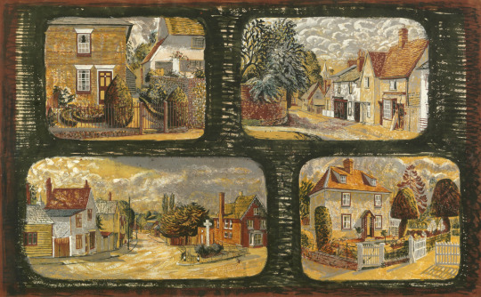
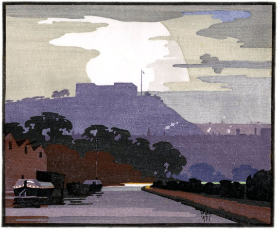
The final print I think is a bit of a disappointment, the texture to the edges of the print have been lost and it’s a very scrappy looking thing with cut and pencil makings that have made it into the lithography. The yellow slashed edging would have been black ink that has been made into a negative with the photo-lithographic technique, it only works for the text areas. The painting above has more vigour – the lack of colour used means the absence of red, the buildings look faded and without blue the sky is apocalyptic like a John Martin painting.
John Aldridge – Great Bardfield, 1951
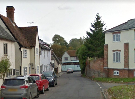
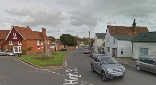
Using the painting as a guide I am showing how the village looks now compared to John Aldridge’s paintings in 1950 using Google street view.
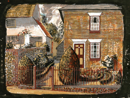
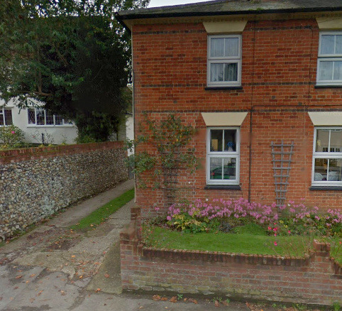
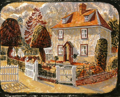
John Aldridge – Pant Place, 1950
Named after the river Pant in Bardfield, the house today has had its door moved and replaced with a rosebush. The railings have also been lost as has the stylised garden for something simpler to deal with. There is a driveway now as the motorcar rules the roads today.
Pant Plant, Great Bardfield today.
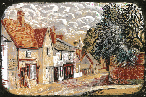
John Aldridge – Crown Street, 1950
Crown Street has only changed with the prevalence of the dreadful curse of the UK, the UPVC Window. The shop has gone and now is a house front.
Crown Street today.
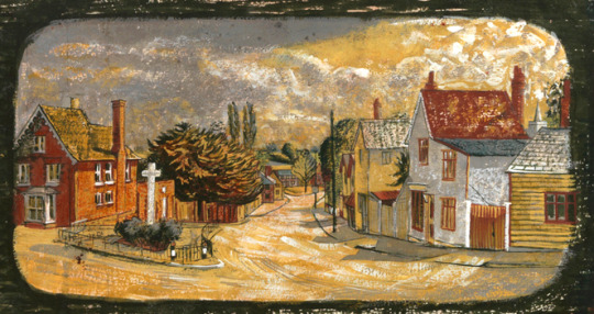
John Aldridge – Brook Street, 1950
Brook Street today too is so similar it might not look to have changed to a time traveller. The railings around the island in the centre of the village and War memorial have gone, maybe they should come back.
The house to the left of the picture is Buck House, home to Stanley Clifford-Smith, one of the most unusual Great Bardfield artists. Thanks to a Fry Art Gallery booklet by Olive Cook he was written out of Great Bardfield history and was considered less important than he was. It was a myth started in 1988 and perpetuated until quite recently with the writing of Under Moon Light by his son Silas Clifford Smith highlighting his role in the Great Bardfield exhibitions in Bardfield’s 1950s.
Brook Street today.
John Aldridge – Northampton House, 1950
The Gardens of Northampton House have been sold off to make an estate called ‘Northampton Meadow’ though it looked to be a rather lovely garden it makes me wonder – in an age without the television and with less transport were gardens the main entertainment and way to show off to your neighbours?
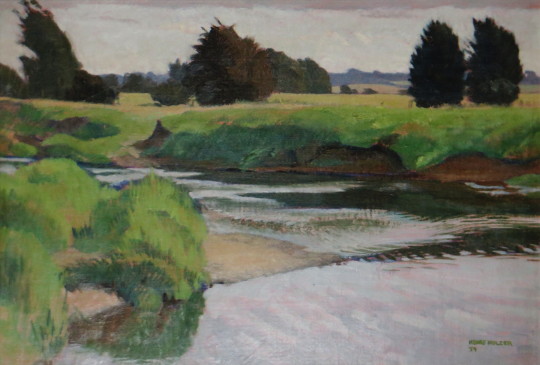
This by Henry Holzer looked familiar. I found that it was the original painting to a print he made. The print is reversed due to the nature of printmaking, so when he was drawing the image to the plate, he was making an abstracted copy of the print.
Henry Holzer – Nr Eisey Bridge, River Thames, Cricklade, Wiltshire, 1954
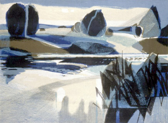
The difference between the two I find is remarkable. Holzer was a war artist and would paint with such detail. The painting I have above has all the hallmarks of quality and the water has a lovely motion to it. The trees are fluffy and fully formed, what I admired is how he translated it into abstract forms for the print, it’s not an easy task to do with so few colours.
Henry Holzer – River at Evening, 1958 (Lithograph)
Born in Tottenham, London. His Viennese born father was a lithographer. Henry studied at the Central School of Arts and Crafts before taking up at teaching post at Hornsey College of Art. During the Second World War he was posted to India and towards the end of the war produced camouflage work. He was Head of Printmaking at Hornsey until he retired in 1968. In later life he moved with his family to Norfolk. He was registered blind in 1993 but continued to paint and draw. †
War service saw a posting to peaceful northern India, where he spent most of his time painting the spectacular scenery. He ended the war as a second lieutenant in the Royal Artillery producing camouflage work and, in the weeks after VE Day, lithographs of anti-doodlebug defences on the Suffolk coast while stationed at Walberswick. ‡
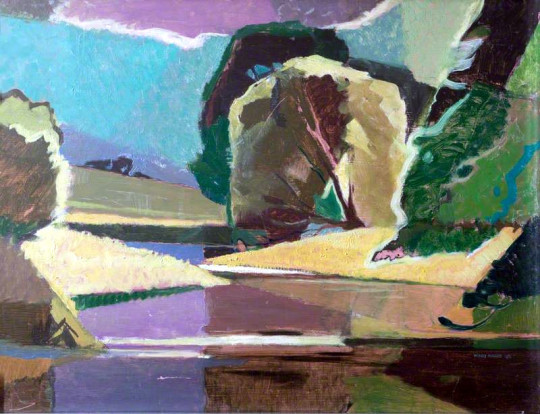
Below is another example of an oil painting and then a lithograph from 1958, but this time the lithograph would have been drawn backwards so it looks like the painting and not a mirror image.
Henry Holzer – Sun over Willows, 1948 (Oil)
Henry Holzer – Sun on the River, 1958 (Lithograph)
† Henry Holzer – Southwark Heritage Guide ‡ Ian Collins – Henry Holzer Obituary
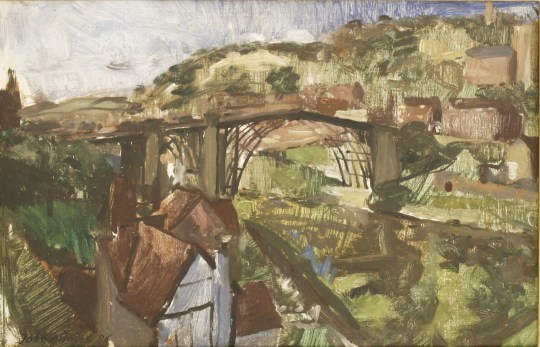
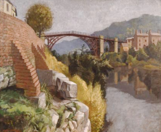
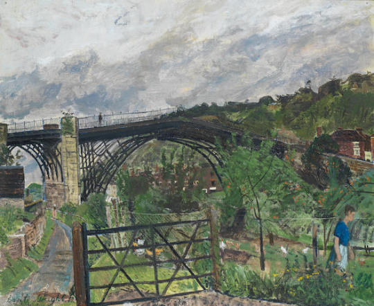
Edward Bawden went on a working holiday to Iron Bridge with the War Artists John Aldridge and Carel Weight. John Nash went with them, but I couldn’t find any records until the artist Celia Hart found some for me! Here I have collected some of the pictures all of them made from that trip and likely finished off in their studios at home. Although the John Nash works don’t have dates I am confident they are from the same trip.
I was at Ironbridge for about six weeks in September and October 1956 and was joined by John Aldridge, John Nash and Carel Weight. Each of us in turn painted the famous bridge’. ‘Houses at Ironbridge was almost the last painting I was able to do during my stay’. ‡
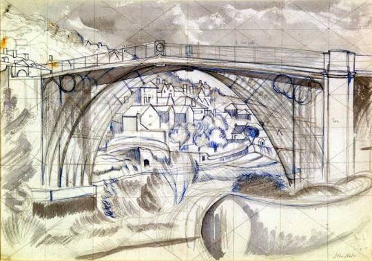
John Nash – Ironbridge through the Bridge, Gridded study.
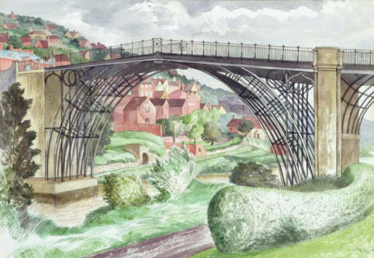
John Nash – Ironbridge, (Exhibited in 1960)
The Iron Bridge is very handsome but a teaser to draw with three upright supports and five curved spans to every three so that a sideways view is very complicated…. We dodge between the showers and somehow I’ve done three drawings and a bit – but Carel has done an oil painting every day it seems while Edward keeps his work secretly in his rooms and does not divulge progress. Carel and I play bar billards every night, but Bawden will not join these simple diversions. ‡
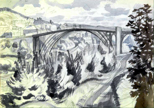
John Nash – Ironbridge, Shropshire.
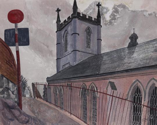
Edward Bawden – Ironbridge Church, 1956
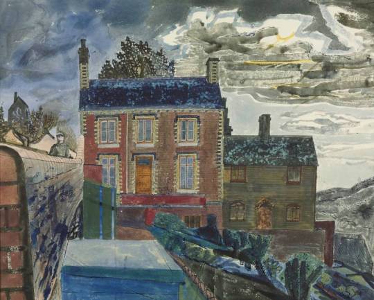
Edward Bawden – The House at Ironbridge, 1956
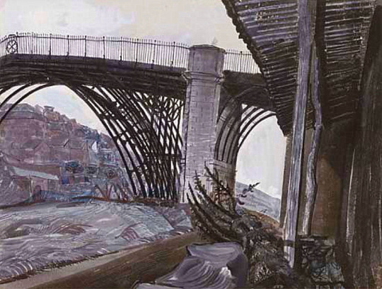
Edward Bawden – Iron Bridge, 1956
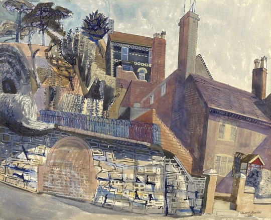
Edward Bawden. Houses at Ironbridge, 1956
The Bawden paintings above all share the same palette leading me to think he painted them on location and touched them up later. The wall of Houses at Ironbridge is a layering of paint and grease to make a watercolour batik over the drawing of the wall.
The paintings of John Aldridge show a quickly sketched oil painting that I would say was done on location and then an Italian looking Ironbridge in a brighter series of colours and much more control that I suspect would have been finished off in Great Bardfield.
John Aldridge – Ironbridge, 1956
John Aldridge – Ironbridge III, 1956
John Aldridge – Garden in Ironbridge, 1956
Carel Weight – Ironbridge, 1957
‡ Tate – T00206 ‡ Letter from John Nash to John Lewis
The problem with book publishing is the rights to images and the expense of paying various people for them, thankfully the internet has a different code of conduct so when I make these posts, I can use pictures that have been lost, even from the world of Pintrest. I try hard to find as many relevant images as I can per topic. I say because someone suggested it was an easy blog to write, but the art of it is the research of quotes and images and though a topic ploughed before this post took a while to compile.
There is a lot on Eric Ravilious in Newhaven in print but very little on Edward Bawden and his feelings of the town other than a few letters back and forth. I start with how both Edward and Eric came to be in Newhaven. But the dates of the Bawden pictures are all over the place as he made visits to Newhaven alone apparently without Eric.
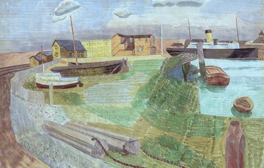
Edward Bawden – Ferryboat Entering Newhaven Harbour, 1935
Ravilious grew up in Sussex, in Eastbourne, where his parents had an antiques shop, studying first at the Eastbourne School of Art (1919-22) and then the Royal College of Art (1922-25), where he met his life-long friend Edward Bawden. ‡
At this time in Edward Bawden and Eric Ravilious lives they were living and painting together with their wives in Brick House, Great Bardfield, they were using the local area of Essex as a source of work but they both wanted some variety. In the summer of 1935 the pair went out to scout painting locations for trips. Harwich was location that didn’t delight.
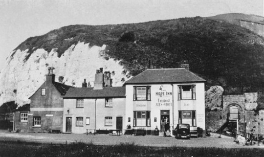
Earlier in the summer Edward had suggested going to draw at Harwich with Eric, but when they went to look round it, they didn’t like it enough, and planned instead to go again to Newhaven, and stay at the Hope Inn. They would go at the beginning of August, after they had put up the end of year students’ exhibition in the design room at the college.†
His (Eric) childhood association with Sussex was reignited by an invitation in 1934 from the artist and polymath Peggy Angus to stay in her shepherd’s hut, Furlongs, on the South Downs. ‡
From Furlongs Ravilious could easily meet up with Bawden for their trip to Newhaven as Ravilious was spending a lot of time at Furlongs painting watercolours for an exhibition later that year.
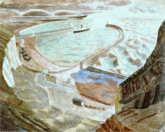
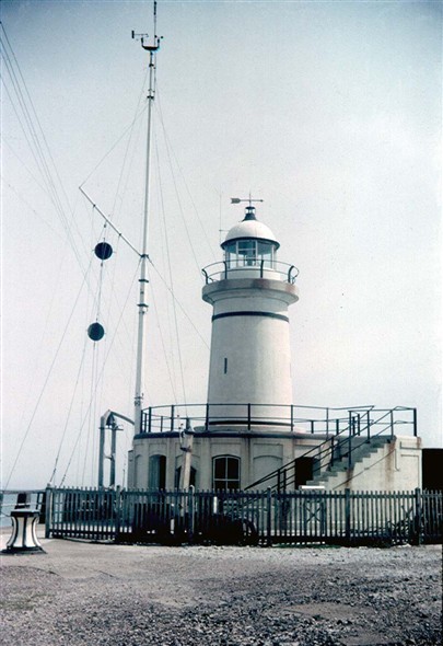
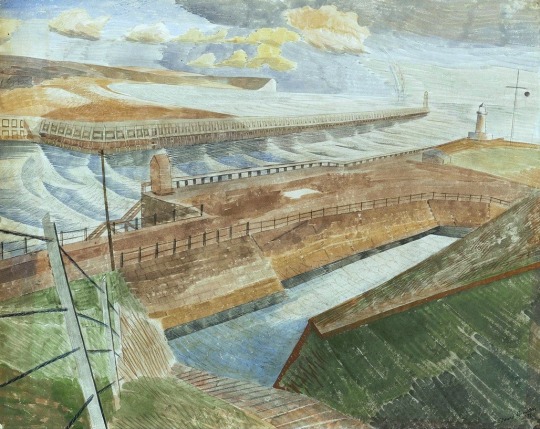
Newhaven was distinguished by a distinctive breakwater and seawall with lighthouses perched at each end. Ravilious’s predilection for the nautical was shared by many of his contemporaries. ‡
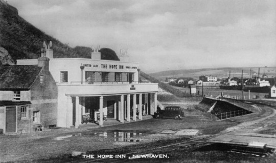
The Hope Inn, Newhaven, 1935
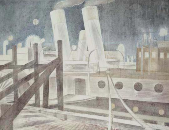
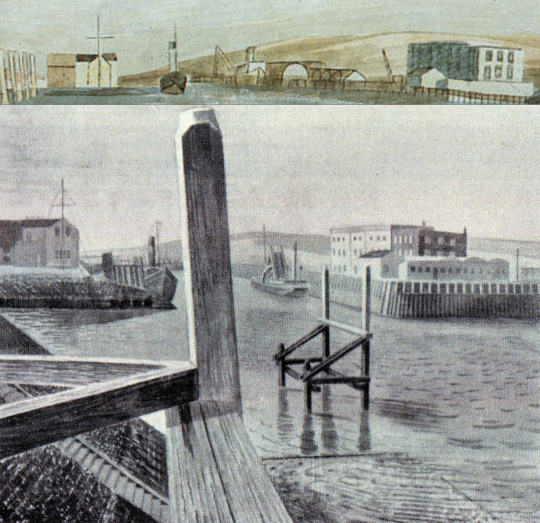
As in a previous post, I mentioned that for Ravilious, Sussex was convenient as a location, as he was lodging in two old caravans at Furlongs. For Bawden it would have been less convenient, it’s likely he came direct from Essex and met Ravilious in Newhaven. They lodged at the Hope Inn, a pub on the side of the cliffs and with a sea view on the edge of the town.
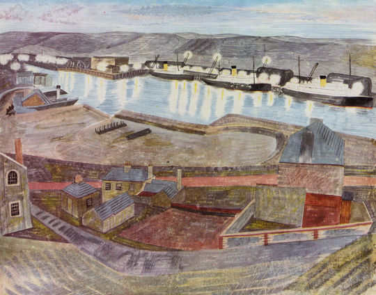
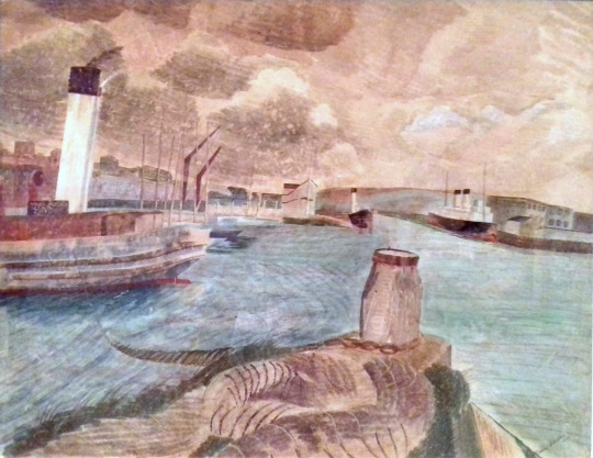
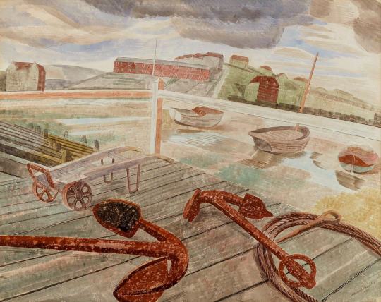
While Eric set to work painting ‘close up shots’ of boats and the edges of piers, Bawden’s work looked more widescreen and panoramic. The works Bawden were painting was rather playful and modern, a range of odd perspectives seamed to challenge him, the boat at a strange angle, looking down a hillside and the litter of boats and yardware made for a really interesting series of works.
Edward Bawden – September Noon Newhaven, 1935
From Furlongs, Ravilious made trips to paint at Newhaven, spending a slightly gruelling August and September at the Hope Inn with Bawden in September 1935. Bawden painted a stormy sea breaking over harbour moles, but Ravilious preferred the Victorian paddle steamers and dredgers with fine names like ‘Brighton Queen’, ‘The James’ and ‘The Foremost Prince’ which worked from Brighton Pier in the summer and were laid up at Newhaven out of season. ♥
A montage of Edward Bawden’s picture and below a ‘lost’ Eric Ravilious painting of Newhaven, Dredgers, 1935.
Edward Bawden – September: 8:30pm (Newhaven), 1935
Directly Eric got to Newhaven, a terrific storm blew up, the worst for years. He walked to the end of the jetty to look at the lighthouse: ‘The spray from the breakers crashing on the weather-side of the breakwater was a quite extraordinary sight – I got very wet and think now it was almost a dangerous walk out there, but worth it. †
Edward Bawden – September: 11am, 1937
Edward Bawden – September: Noon 1937
Edward Bawden – Newhaven No. 2, 1935
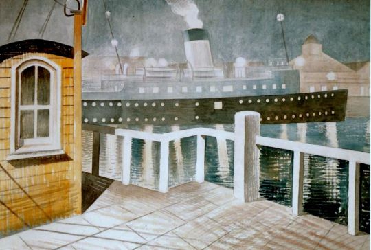
Eric Ravilious – Channel Steamer Leaving, 1935
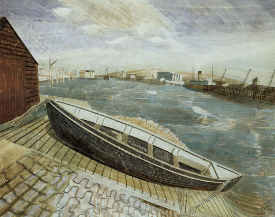
Below are a few views form old photographs and postcards of Newhaven around the same time and showing the things Eric painted below.
Photograph of Newhaven Harbour, c1930.
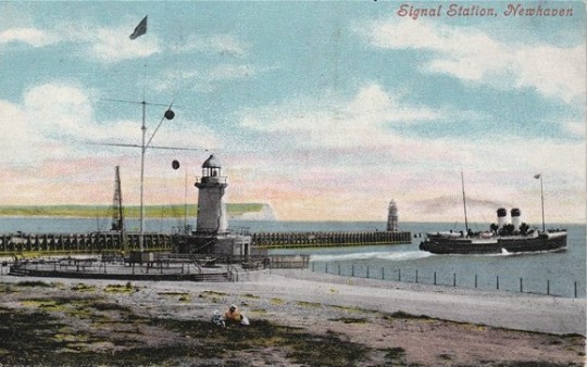
Postcard of Newhaven Harbour, c1900.
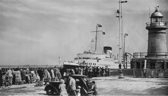
Photograph of the Signal Station and Lighthouse on Newhaven Pier, c1960
These photographs above have various views around the watercolour, lithograph and woodcut below. It would show Ravilious again using and cycling the same subject matter for various commissions.
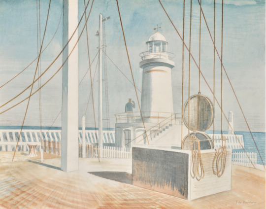
Eric Ravilious – Newhaven Harbour, 1935
The painting above was bought from the Zwemmer Gallery by Beryl Sinclair, nee Bowker. She studied with Edward and Eric at the Royal College of Art. She was known as Bowk. Ravilious painted her twice that we know, once into the Colwyn Bay Pier Murals by Ravilious in the kitchen with a plant and then again in one of the ‘lost’ Ravilious oil painting – ‘Bowk at the sink’, 1929-30.
Newhaven Harbour is everything you would want from a 1930s watercolour. The buildings look like Oliver Hall modernist houses in white with cubes and curves but in fact is Victorian. The lighthouse was built in 1885 and pulled down in 1976. It looks like a stage set design. The rigging and black circles where part of a semaphore signal that shows when the tide is in and out to boats wanting to enter or leave the harbour.
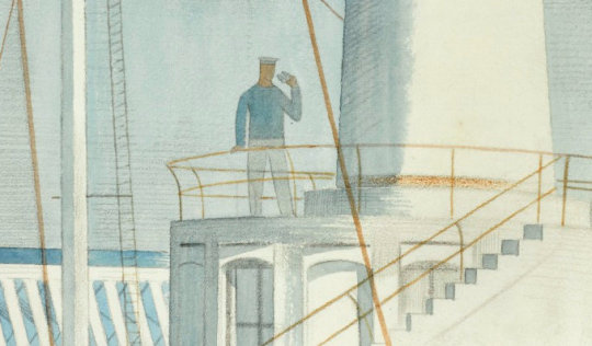
Eric Ravilious – Newhaven Harbour (detail), 1935
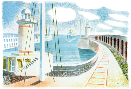
When asked to produce a print for Contemporary Lithographs, Ravilious made what he called a Homage to Seurat, a print made of a spongy sky and the typical halftone lines of colour over layered.
Eric Ravilious – Newhaven Harbour, 1937 – Contemporary Lithographs.
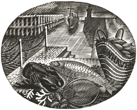
When approached to illustrate the Country Life Cookery Book in the same year of the Lithograph above, Ravilious took the details of his previous works and added seafood and a basket of fish emblazoned with the name of the town.
Eric Ravilious – February, Wood-engraving for the Country Life Cookery Book, 1937
Edward Bawden – September: 7PM, 1937
Staying at The Hope Inn in 1935 must have been a bit dull. But the next year the building would be pulled down and in it’s place a totally modernist building put up.
Eric Neve K.C., on behalf of the Ports-all United Breweries, made an application for the approval plans of proposed alterations to the Hope Inn, Newhaven. He said this was a desire to improve the accommodation of the existing house. ♣
In a letter to Eric, Edward writes:
Meals and service have brightened; gone are those soft, stale oyster-eyed eggs and there is is less water and more gravy with the meat. ♦
Below is a picture of the then, new Hope Inn. White and modernist. At the time Newhaven was a popular way of crossing the channel to France.
The Hope Inn, Newhaven, 1936
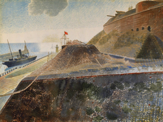
During the Second World War Ravilious became a War Artist and he found himself in Newhaven again to sketch and paint the coastal defences.
Eric Ravilious – Coastal Defences, 1940
Eric Ravilious – Coastal Defences, Harbour Breakwater, 1940
Eric Ravilious – Coastal Defences, Convoy Leaving Harbour, 1940
† Helen Binyon – Eric Ravilious: Memoir of an Artist, 1983
‡ Sothebys – Eric Ravilious
♥ Alan Powers – Eric Ravilious: Imagined Realities, 2012 ♣ Sussex Agricultural Express – Friday 07 February 1936 ♦ Letter from Edward Bawden to Eric Ravilious, 1936
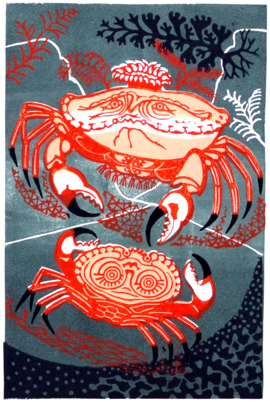
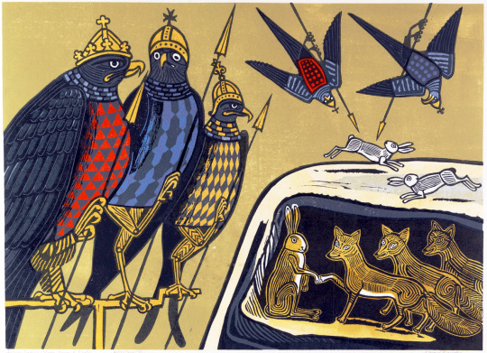
Aesop’s Fables has been a favourite with British illustrators ever since the mass publication of the edition in 1818 with woodcuts by Thomas Bewick. Bewick had first published a Selection of Fables in Three Parts in 1784. But these tales of ancient Greece have such humour and moral tales that they where a kind alternative to the bible for children.
Edward Bawden was a great reader and had an impressive library that he partly sold in grief in 1970 following the double whammy of the death of his wife and down-sizing home from Brick House in Great Bardfield to 2 Park Lane, Saffron Walden. He spent the next 10 years trying to acquire his favourite books back.
Bawden is called a celebrator of English humour and having grown up reading Edward Lear it might be why he thought the fables were a good subject matter, it is hard to say. He made one lino-print for the 1956 book ‘A handbook of type and design’ by John Lewis and maybe it had more mileage.
Edward Bawden – An Old Crab and a Young Crab, 1956
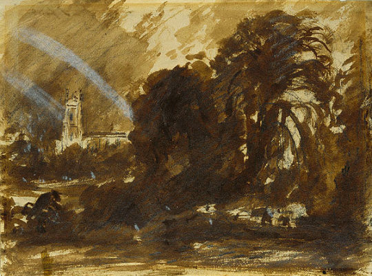
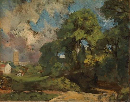
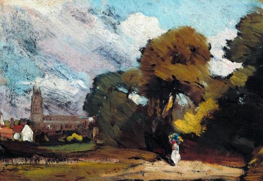
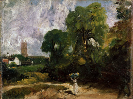
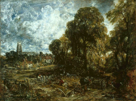
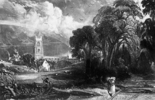
Stoke-by-Nayland lies on the north side of the Stour Valley, a few miles inland from East Bergholt and Dedham. Its church, with an imposing 15th-century tower, appears frequently in Constable’s drawings around 1810-14. The view below must have been a favourite with Constable as it has been studied in so many ways, these drawings have become favourites with me too.
Above is a finished painting by Constable of Stoke-by-Nayland completed in 1836.
Years after the painting was completed the engraving below was made by David Lucas in 1855 for publication in a book. It looks to use not only the painting but most of the sketches as well.
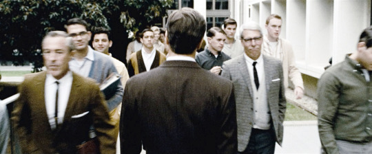
The film ‘A Single Man’, directed by Tom Ford is a wonderful piece of cinema. There is behind the story a little set of links between the writer of A Single Man, Christopher Isherwood and the director of the film Tom Ford.
In 1939 Isherwood travelled to America for the first time, leaving Britain on the first steps of war. He moved to Hollywood, California. On Valentine’s Day 1953, at the age of 48, Isherwood met the eighteen-year-old Don Bachardy. The couple started to date. It was at this time Isherwood was teaching a course on modern English literature at Los Angeles State College. He worked there until the 1960s much like George, the leading character in A Single Man. During this time he wrote and published three more books.
After Don Bachardy broke up with him Isherwood started to write, the result of this was the 1964 book, ’A Single Man’.
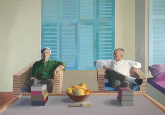
Isherwood and Bachardy reunite and apart from fleeting breakups, they spend the rest of their lives together. They were both painted by David Hockney in 1968.
David Hockney – Don Bachardy and Christopher Isherwood, 1968
Meanwhile in 1979 Tom Ford moves to New York where he meets and dates the artist and illustrator Ian Falconer. Falconer was Ford’s first boyfriend and they dated until Falconer leaves Ford for David Hockney. Depressed and lonely, it was at this point that Ford reads Isherwood’s ‘A Single Man’.
Later Ford would say about the book:
We end up feeling isolated most of the time. That’s what the story is about for me: that isolation we can all feel even though we are surrounded by people. And in my script, George decides to kill himself, so he goes through his day in a completely different way, seeing things in a completely different way, and people respond to him in a different way because he is different. He thinks it’s his last day. For the first time in a long time, he’s actually living in the present.
Tom Ford then got to meet Isherwood in the early 1980’s at David Hockney’s house in L.A. In 1986 Isherwood died. In 2009 Tom Ford directs the Movie ‘A Single Man’.
So Isherwood writes a book. Ford reads it. It’s about Isherwood’s break up and Ford reads it after a break up.
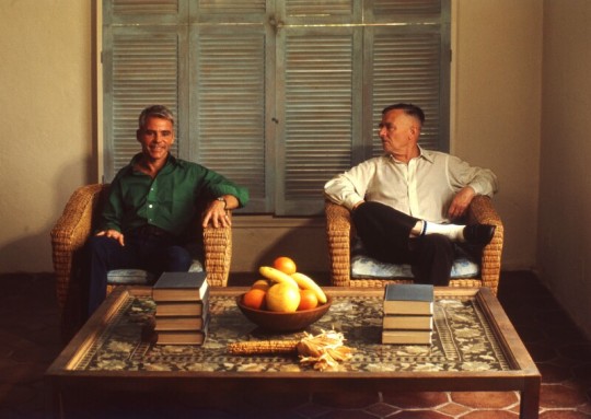
Chris O’Dell – Don Bachardy and Christopher Isherwood, 1976
The effect of the Japanese craft and design on the British at the turn of the 1900s was immense. So was the method of printing. Japanese printing is quite different to European woodblock printing.
The Japanese print with sumi ink – it is more water-based making all tones more translucent and more colour is used. This ink is painted on the block and rubbed in with rice-paste and horse-hair brushes. The Europeans use thick ink and a roller onto the surface. Japanese prints have the paper added and then the impression is made by rubbing the paper with a pad made from bamboo. The European way is to press the paper and woodblock with a roller or pad from a machine.
These are some of the ways that make the woodblocks printed in Japanese style different. But also they have the look of French posters by Toulouse-Lautrec in the design and cut of shapes.
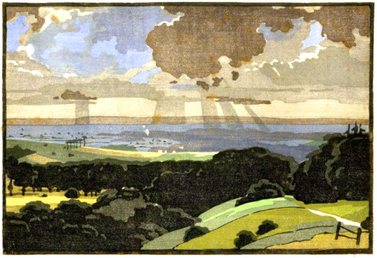
Edward Loxton Knight – The Vale of Pewsey
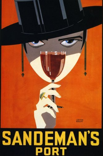
These fine examples are by Edward Loxton Knight (1905-1993). Born in Long Eaton, Derbyshire, he was encouraged to study art by his headmaster, Samuel Clegg (David Attenborough’s Grandfather), who taught him the art of the colour woodcut at The Long Eaton County School.
He studied under Joseph Else at Nottingham School of Art from 1924 to 1929. While a student at the Nottingham School of Art he sold designs for posters and press advertising (including the famous Sandeman’s Port). The whole edition of his print Goose Fair was bought by the Colour Woodcut Print Club.
Edward Loxton Knight – Sandeman’s Port Poster
He was an elected member of the Colour Gravure Society, the Royal Society of British Artists, The Pastel Society, the Royal Society of Painters in Watercolour. He exhibited with the New Group extensively throughout this country and abroad. Queen Mary bought the print The Primrose Seller.
Edward Loxton Knight – The Goose Fair, 1928
Edward Loxton Knight – Nottingham Castle
Edward Loxton Knight – South Downs
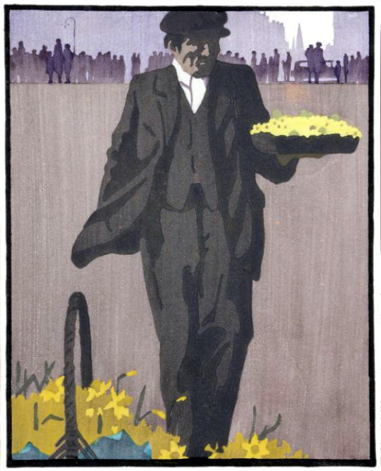
Edward Loxton Knight – The Primrose Seller, 1929
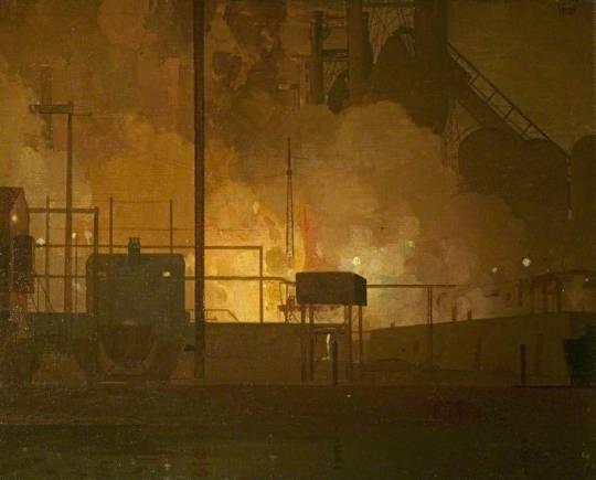
A wonderful example of his painting skills can be found in this painting of the Stanton Ironworks.
Edward Loxton Knight – Stanton Ironworks, Staffordshire, 1932
Erewash Borough Council
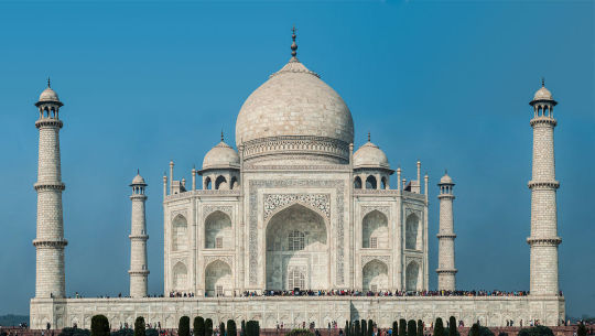
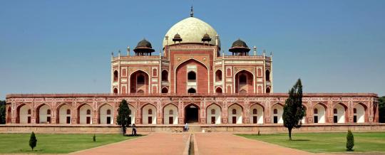
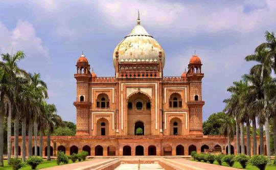
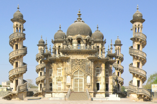
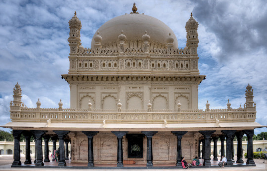
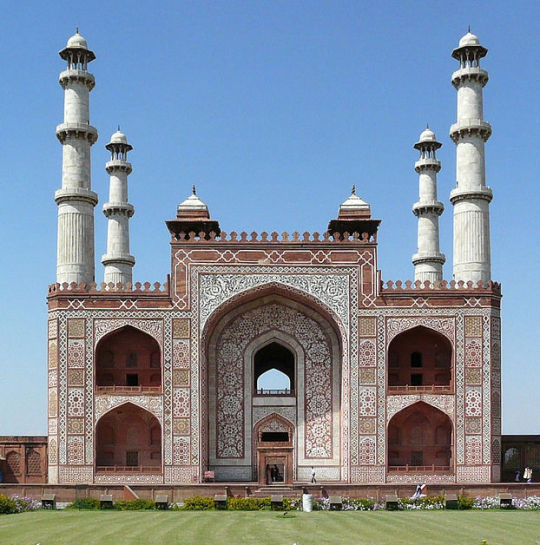
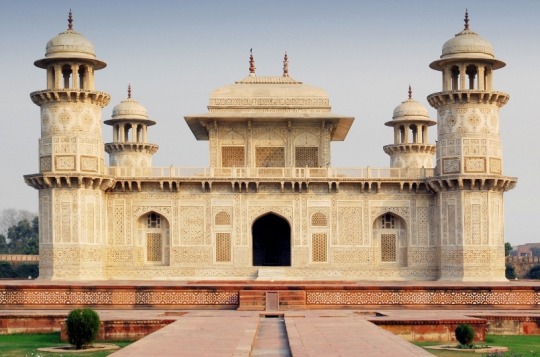
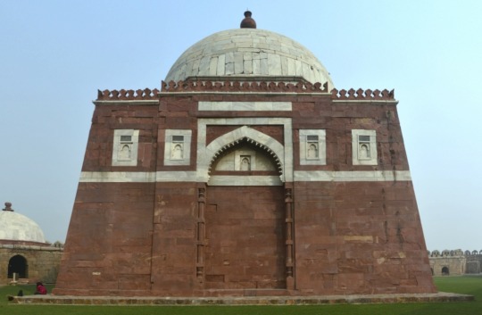
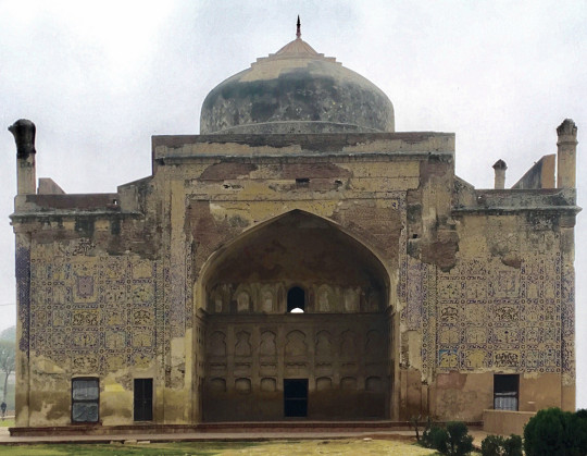
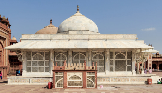
Here are some beautiful mausoleums in India. The extravagance of these buildings blows me away and I hope one day I will be able to see them. But I thought it would be interesting to post them as a series of beautiful objects.
There is a tenderness and repose – a dreamy voluptuousness, melancholy, and splendour peculiar to Eastern Scenery – more particularly when the moonlight is upon it – that, as the eye meets it, flow in upon the mind like successive waves of rich and delicious poetry. The luxuriant vegetation, the umbrageous foliage, and resplendent hues of, to the stranger, unknown and innumerable flowers; – the ghants and gondolas of the rivers; the temples, places, mosques and mausoleums, everywhere peering among the hills, or from the bosom of glens, upon the shore, all combine to give an impress, a character, a spirit to the scene, unseen elsewhere, peculiar to itself, its own. †
Taj Mahal
Humayun’s Tomb
Safdarjung’s Tomb
Bibi Ka Maqbara
Bahauddin Maqbara, Junagadh
Tomb of I’timād-ud-Daulah
Mausoleum of Akbar the Great
Tomb of I’timād-ud-Daulah
Mausoleum of Ghiyas-ud-din Tughlaq
Mausoleum of Qutbuddin Muhammad Khan
Chini ka Rauza
Salim Chishti Shrine
† Alexander’s East India and Colonial Magazine – Oriental Scenes and Scenery, 1836