Tag: Walter Hoyle
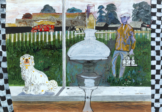
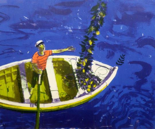
Walter Hoyle – May, 1963
The BBC Book of the Countryside came out in 1963 and was edited by Arthur Phillips. It featured illustrations from the Great Bardfield artists Walter Hoyle and Sheila Robinson. There are also illustrations from John Nash and Ralph Thompson. It is a book packed with beautiful illustrations that is so often overlooked due to the title.
A while ago I bought all six of the Walter Hoyle original ink illustrations from the book. I got them because they have illustrations made while Hoyle was in the Bardfield area and it’s important to see an artist while they are riding a creative peak.
Walter Hoyle – January, 1963
Walter Hoyle is in danger of being one of the forgotten Great Bardfield artists due to the lack of information on him. He was born in Rishton, Lancashire in July 1922. Hoyle’s artistic education started at the Beckenham School of Art in 1938,
I persuaded my local art school to accept me, and presented as evidence of my serious intent, a series of drawings much influenced by Walt Disney. †
From Beckenham, Hoyle gained a place as a student at the Royal College of Art from 1940-42 and again from 1947-48 after serving in the Second World War. During Hoyle’s time at the RCA one of his tutors was Edward Bawden, who encouraged him to develop watercolours and printmaking.
It was 1940, the phoney war was about to end and the college was evacuated from London to Ambleside in the Lake District, famous for poets rather than artists. It was here that I was first introduced to printmaking – lithography – by a friend called Thistlethwaite, a fellow student from Oswaldtwistle (although these names are true, I mention them only because I like the sound they make). He prepared a litho stone for me with a beautiful finely ground surface and instructed me how to draw in line and wash. †
In 1948, During the RCA Diploma show a visitor was so impressed by Hoyle’s work that he was offered seven months’ work in the Byzantine Institute in Istanbul. Hoyle accepted, the work he saw there made a strong impression. Italian art and architecture also influenced him at that time.
Early in 1951 when Bawden was commissioned by the Festival of Britain to produce a mural for the Lion and Unicorn Pavilion on the South Bank, it was Hoyle that he chose to assist him on account of his great talent. During that summer Bawden invited Hoyle on a holiday to Sicily.
Edward asked to see my watercolours. He looked very carefully and quizzed me about them, and in general was complimentary and encouraging. I felt I had passed some kind of examination. ♠
It was this holiday together that Hoyle would scribe into a limited edition booklet of 10 in 1990 and into a book in 1998 – “To Sicily with Edward Bawden” a limited edition of 350 copies with a forward by Olive Cook.
Geoffrey Ireland – Walter Hoyle at home in Great Bardfield c1955
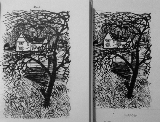
Walter Hoyle – March, 1963
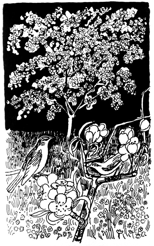
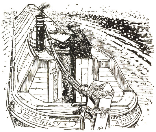
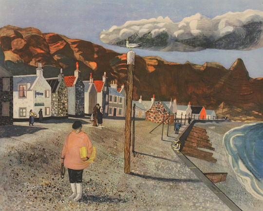
March I think is Hill Farm in Great Sampford, Essex.
The BBC Book of the Countryside features articles by different nature writers and journalists from the BBC from farming to wildlife. It comes from The Countryside radio show.
Selected from over five hundred scripts and sixty-seven hours of broadcasting, this anthology depicts life and activity in the British countryside as seen through the eyes of some of the contributors to the BBC’s monthly Countryside programme during the past eleven years.
C. Gordon Glover, whose narrative sets the scene for each chapter, lives in an Essex village and the changing face of the countryside from month to month is portrayed as he sees it, from his kitchen window — from the bridge over the village
Claude Gordon Glover was a BBC Radio Broadcaster (you can hear him present an edition of The Countryside here) and he lived in Arkesden, a few miles West of Saffron Walden. He was also for a time, the lover of Barbara Pym. His broadcasts consist of a Betjeman like prose over classical music and the song of birdsong likely to be heard that month. Below is a selection of October.
October: Lovely October of the half-way days, the wayward pause between the certainties of summer and winter – the one is well over, the other not yet begun. For the countryman everywhere this is the month of the great tidying up – the sweeping, the burning, the cleaning, the digging, the transference upon dry days of apples from tree to store. The suns of summer have done their work, the land has given forth and the harvest is home.
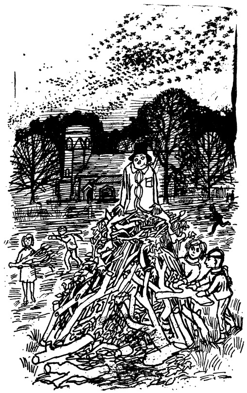
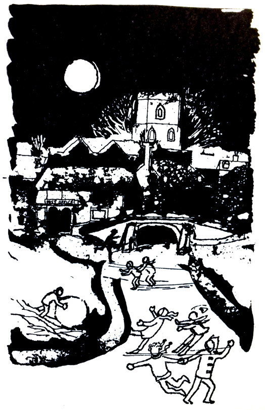
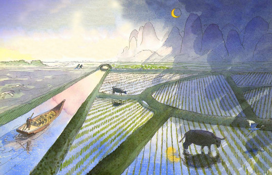
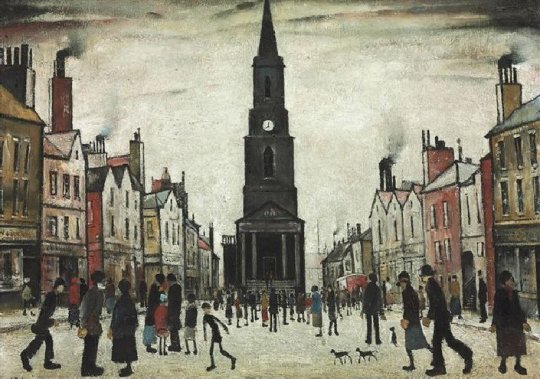
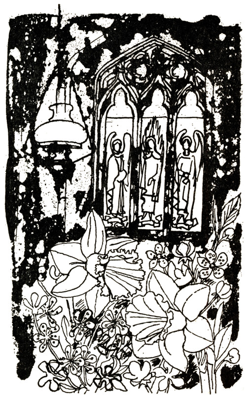
Walter Hoyle – November, 1963
Above is a picture for November by Hoyle and in the background is Bardfield Saling church. It is always good to prove that pictures are relevant to artists lives and the history of Great Bardfield. Curiously enough, the artist Celia Hart suggested that the guy might be a self portrait of Walter himself.
The photograph below was taken by John Piper in the late 40s or early 50s when he was working on the Shell Guides and just finished three of the Murray’s Guidebooks with John Betjeman.
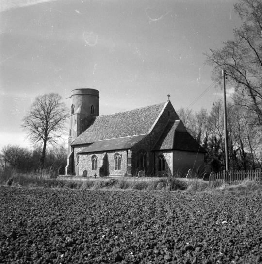
John Piper – Photograph of St. Peter & St. Paul’s church, Bardfield Saling, c1950
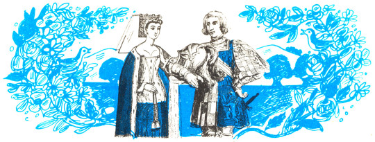
A poem for May:
A branch of May I have bought you
And at your door we shall stand
It is but a spout but it’s well spread about
By the words of our Lord’s hand.Fair Maids look out of your window so high
To view the May-Bush fair,
it was cut down so late last night
To take the fresh morning air.
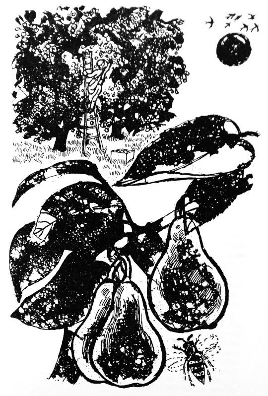
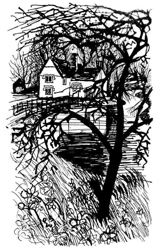
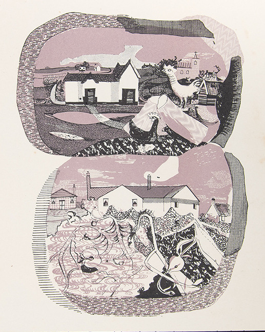
Walter Hoyle – September, 1963
In 1969 Walter Hoyle illustrated the ‘Women’s Institute book of Party Recipes’. This series of little illustrations are some of his best in my opinion.
They form a curious set of mixed media works that I believe to have been printed by Hoyle in lithograph then sent off to the book printers to be mass-printed, with the look of being a lithograph, but without it being so. Clearly the book was designed to be cheaply printed, for one it is spiral bound – but this is rather helpful in a cookery book. The other indicator of cheapness is that it has a very limited colour palette of orange, red and black. It was printed by Novello & Co Ltd, who mostly make sheet-music scores.
Below is an illustration from the cookery book of a man picking apples in an orchard and, above is almost the same drawing made four years later for the BBC Book of the Countryside by Walter Hoyle in 1963. As the WI book illustration have been drawn on to printing plate the image would have been reversed – so the ladder, man and fruit crate are a mirror image to the figures below. I know the picture from the Countryside book isn’t mirrored as it came from an ink drawing and I own those drawings.
† Printmaking Today, Volume 7, 1998. page 9-10.
‡ https://en.wikipedia.org/wiki/St_Mary_Abchurch
♠ To Sicily with Edward Bawden, Previous Parrot Press, 1998.
The Great Bardfield Exhibition by Gerald Marks, Realism, August – September, 1955
♣ http://www.fryartgallery.org/the-collection/search-viewer/691/artist/15/Walter-Hoyle–/22
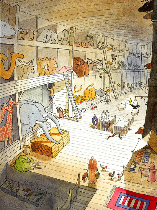
Warwick Hutton – Interior of Noah’s Ark, 1977
The work of Warwick Hutton is a bit of a rarity in the UK sadly. In Cambridge (where I live) he is known as a teacher as he was head of Fine Art at the Cambridge School of Art. Across the UK he is known as a painter and wood engraver and internationally he is remembered as an illustrator.
Hutton was born in England to an artistic family originally from New Zealand. His father was the glass engraver John Hutton (famous for the windows at Coventry) and his mother was Helen (Nell) nee Blair a talented painter. In 1939 the couple had twins, Macaillan (Cailey) John Hutton and Warwick (Wocky) Blair Hutton.
Warwick attended the Colchester School of Art where John O’Connor was the Principle and John Nash was teaching Botanical drawing. Richard Chopping was also teaching there. There Hutton met Elizabeth Mills and they were married in 1965.
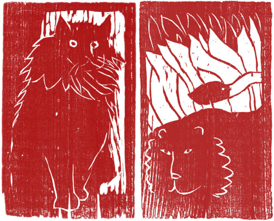
Warwick Hutton – Two illustrations from Cats Free and Familiar, 1975
Warwick was working as an illustrator while helping his father engrave and install the windows for Coventry Cathedral. He worked for small private presses and major publishers, from the The Keepsake Press (Throwaway Lines, Cats Free and Familiar, Rider And Horse.) to the Cambridge University Press and their limited edition Christmas Book series (Waterways of the Fens, A Printer’s Christmas Books).
One of Hutton’s illustrations appeared in John O’Connors book The Technique Of Wood Engraving. Three years later Warwick published his own book Making Woodcuts with Academy Editions Ltd.
The major successes for Warwick Hutton were to come with a series of retelling of Bible Stories (Noah and the Great Flood, Jonah and the Great Fish, Moses in the Bulrushes) and Grimm’s Tales (Beauty and the Beast, The Nose Tree, The Tinderbox, The Sleeping Beauty) all of these internationally published.

ウォリックハットン – ねむりひめ, 1979
My two favourites are the Adam and Eve story for it not being shy about nakedness in children’s books and Sleeping Beauty for the wonderful use of the rose thorns and the patterns used throughout the book.
Warwick Hutton – Illustration from The Sleeping Beauty, 1986
The most attention came for Hutton when he worked with Susan Cooper, the author best known for The Dark Is Rising series. Hutton illustrated three books for Cooper: The Selkie Girl, Tam Lin and the Silver Cow for her, many of these are still in American libraries.
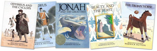
The later series of books by Hutton were re-telling of Greek Myths, Odysseus and the Cyclops, Persephone, Perseus, Theseus And The Minotaur the latter gaining much attention as mentioned in the New York Times Children’s Book Award review below:
The gifted British watercolorist turns to Greek myth and captures the bravery of young Theseus, the terrifying half-human Minotaur and the haunting beauty of ancient Crete. Here, as in all his other books, the ocean scenes have astonishing intensity and power. †
Hutton collaborated with other authors illustrating their books: Margaret & Raymond Chang on The Cricket Warrior: A Chinese Tale and James Sage on To Sleep.
Warwick Hutton – Illustration from The Cricket Warrior, 1994
Becoming Head of the Foundation course at the Cambridge School of Art Hutton was able to encourage the students to publish their works and set up and edited
Private View: The Journal from the Cambridge School of Art. The magazine republished works by famous artists as well as the students own work.
As a teacher at the Cambridge School of Art, Warwick provided the Council with a painting as part of the Original Works for Children in Cambridgeshire, part of the Pictures for Schools series. The Pictures for Schools project came out of, and alongside many other famous ‘utopian’ projects like Contemporary Lithographs (1937-38), AIA Everyman’s Prints (1940) and the School Prints series of lithographs where major artists would be paid to design a lithograph that would be printed in thousands and then sold to schools cheaply.
In the founding of the Pictures for Schools project Nan Youngman wanted to have paintings more than prints from artists. Early contributors were L. S. Lowry, Tirzah Garwood, Stephen Bone and Bernard Cheese. After some decades it was taken over by Walter Hoyle who was the head of Printmaking at the Cambridge School of Art. Together they encouraged their student’s to donate works to the collection to be hung in schools.
Hutton’s painting of ‘Adam and Eve’ followed with a book he published in 1987 under the same name by Hutton with Atheneum Books.

Warwick Hutton – Adam and Eve, 1986 (In My Collection)
Hutton died of cancer in 1994 in Cambridge, England. An audiobook of Jonah and the Great Fish is for sale in the USA as an audiobook and a video can be found here. Interior of Noah’s Ark can be purchased as a card from Orwell Press Art Publishing.
Private View: The Journal from the Cambridge School of Art.
Bibliography
Throwaway Lines
by Gavin Ewart, Illustrated by Warwick Hutton, 1964Waterways of the Fens
by Peter Eden, Illustrated by Warwick Hutton, 1972Making Woodcuts
by Warwick Hutton, 1974Practical Gemstone Craft
by Helen Hutton. Illustrated by Warwick Hutton. 1974.Cats Free and Familiar
by Robert Leach, Illustrated by Warwick Hutton. 1975Rider and Horse
by Martin Booth, Illustrated by Warwick Hutton. 1976Noah and the Great Flood
re-told and Illustrated by Warwick Hutton, 1977Mosaic Making Techniques
by Helen Hutton, 1977The Sleeping Beauty
re-told and Illustrated by Warwick Hutton, 1979The Nose Tree
re-told and Illustrated by Warwick Hutton, 1981Private View – Cambridge School of Art Magazine
Editor and co-editor, 1982-1989The Silver Cow: A Welsh Tale
by Susan Cooper. Illustrated by Warwick Hutton, 1983Flesh of His Flesh – Poems
by Florence Elon, Illustrated by Warwick Hutton, 1984Beauty and the Beast
re-told and Illustrated by Warwick Hutton, 1985Jonah and the Great Fish
re-told and Illustrated by Warwick Hutton, 1986Moses in the Bulrushes
re-told and Illustrated by Warwick Hutton, 1986The Selkie Girl
by Susan Cooper. Illustrated by Warwick Hutton, 1986Adam and Eve – The Bible Story
re-told and Illustrated by Warwick Hutton. 1987The Tinderbox
by Hans Christian Andersen and re-told and Illustrated by Warwick Hutton, 1988Theseus And The Minotaur
re-told and Illustrated by Warwick Hutton, 1989To Sleep
by James Sage. Illustrated by Warwick Hutton, 1990Tam Lin
by Susan Cooper, Illustrated by Warwick Hutton, 1991The Cricket Warrior – A Chinese Tale
retold by Margaret & Reymond Chang, Illustrated by Warwick HuttonPerseus
re-told and Illustrated by Warwick Hutton, 1993Persephone
re-told and Illustrated by Warwick Hutton, 1994Odysseus and the Cyclops
by Homer and re-told and Illustrated by Warwick Hutton, 1995.
† Published: New York Times. November 5, 1989
There are three villages in a remote area of north Essex which, for different reasons, attract attention: Thaxted for its magnificent church, Finchingfield as a near perfect example of a picturesque English village, and Great Bardfield, which in the immediate post-war period attracted artists as a place to live and work. The coming together in one area, of several artists happened by chance, rather than design. †
Hoyle moved first to Great Bardfield in 1952, living for a time in a farm cottage on the outskirts of Bardfield near Great Lodge Farm.
The farm was once part of a royal estate belonging to Anne of Cleves with large barns to hold hay to feed deer and other animals. In the 1950s some of the barns were pulled down but there is a brief visual record of the time the farm was working, rather than the wedding venue it has become today.
Walter Hoyle – Great Lodge Farm, 1955 (Fry Art Gallery)
Denise Hoyle – Great Lodge Farm, 1955 (Fry Art Gallery)
The view out of the front window of Walter and Denise’s home overlooked barns and the main farm house. Some of the sheds to the left of the house have gone now. Above Denise must have drawn the picture standing with her back to the barn, whereas Walter’s painting has a wider viewpoint and was done inside the house, with the oil lamp, staffordshire dog and the milkman. The workmen and people of the village made it in to many of the paintings Hoyle made. A lot of the machinery is painted in red too.
Walter Hoyle – Great Lodge Farm Cottage, 1952 (Fry Art Gallery)
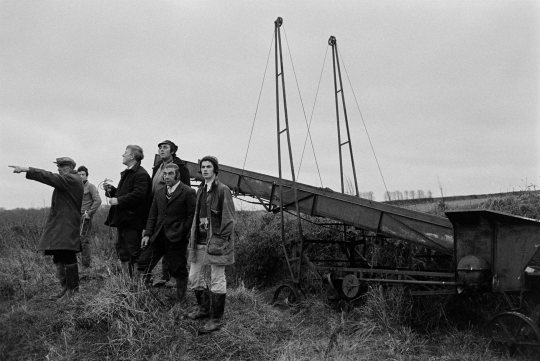
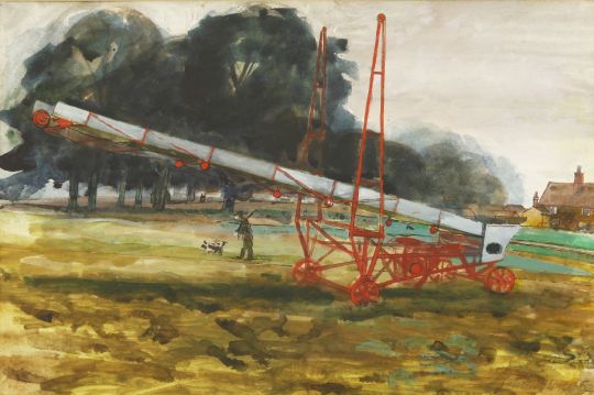
Above is a photograph by James Ravilious (son of Eric) and was taken in Devon, but I include it because the painting below has the same item in it. The painting by Hoyle depicts a grain elevator, designed to get grain or hay into the higher windows of a barn. Again it is painted in bright red, maybe because it was iron and was rusting, or it might have been a motif of his at the time.
The figure with the shotgun and dog may actually be a distant relative of mine on my mother’s side who worked on the farm in this period. Most of the men usually had a gun about them to shoot down deer, pheasants or most commonly, rabbits.
Walter Hoyle – Great Lodge Farm, 1952 (In My Collection)
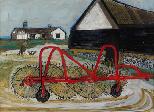
Walter Hoyle – Great Lodge Farm, 1953 (Fry Art Gallery)
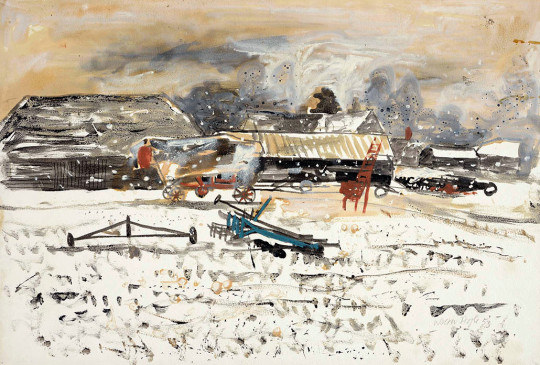
Walter Hoyle – Winter – Great Lodge Farm, 1953c
From what I can understand of the area, this painting above is also taken out of the Hoyles house window in the winter time.
Walter Hoyle – Great Lodge, 1952 (Fry Art Gallery)
† Printmaking Today – V6#2 – Great Bardfield Artists, 1997
As part of this series of posts looking at the illustrations of Great Bardfield artists in cookery books, here is Walter Hoyle’s contribution. In a previous post I have noted Hoyle’s biography.
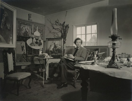
Geoffrey Ireland – Walter Hoyle, 1956
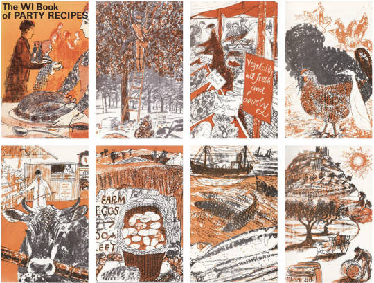
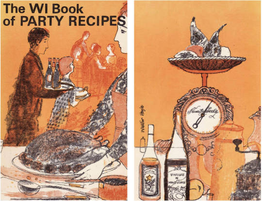
In 1969 Walter Hoyle illustrated the ‘Women’s Institute book of Party Recipes’. This series of little illustrations are some of his best in my opinion.
They form a curious set of mixed media works that I believe to have been printed by Hoyle in lithograph then sent off to the book printers to be mass-printed, with the look of being a lithograph, but without it being so. Clearly the book was designed to be cheaply printed, for one it is spiral bound – but this is rather helpful in a cookery book. The other indicator of cheapness is that it has a very limited colour palate of orange, red and black. It was printed by Novello & Co Ltd, who mostly make sheet-music scores.
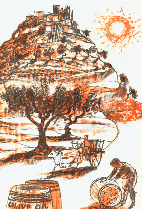
Walter Hoyle – Sauces, 1969
The illustrations are pencil and ink drawings with colour overlays in orange and red. I love the way that either the printer or Hoyle flood-fill the backgrounds of some of the drawings with pure colour. The method of printing used at this time was called ‘Simulated Lithography’, where any drawing could be put onto a printing plate and printed in one colour tone by using plastic films and scans of the original drawings. This process was easier than using lithographic stones and artists can line up the plastic films and work at a print to get the coloured edges correct.
Instead of drawing on lithographic stones or plates the artist drew on a transparent sheet of plastic grained like a lithographic plate. The advantages were that any opaque material, chalk, pencil, ink etc. may be used, because the sheets of plastic are not transferred but are used in the same way as a photographic positive would be. That is, placed in a printing frame against a lithographic machine plate and then exposed to light. By this means an offset printing plate capable of a hundred thousand run can be produced. Also machine plates can be duplicated from the plastic original without any deterioration in quality, for the artist can superimpose one sheet on another. It is possible that the use of plastic sheets came to be common with the scarcity of metal, being used for ammunition in wartime. †
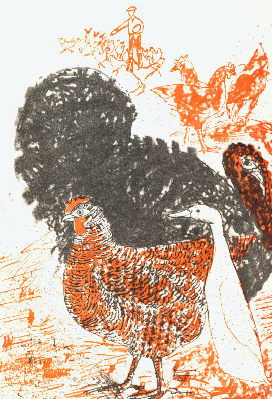
Walter Hoyle – Poultry, 1969
Below I have separated two layers into Colour and Black (K), the chicken, duck and turkey picture above. What I like about this print is the colour layer is a mixture of line drawing and flicked ink splats to give texture. The black layer has a fine line children and the outline of a white duck using the almost scrubbed brush black turkey design.
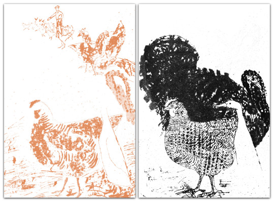
Left: The Colour. Right: The Black overlay.
Walter Hoyle – Front and Rear Covers, 1969.
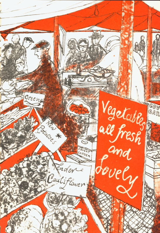
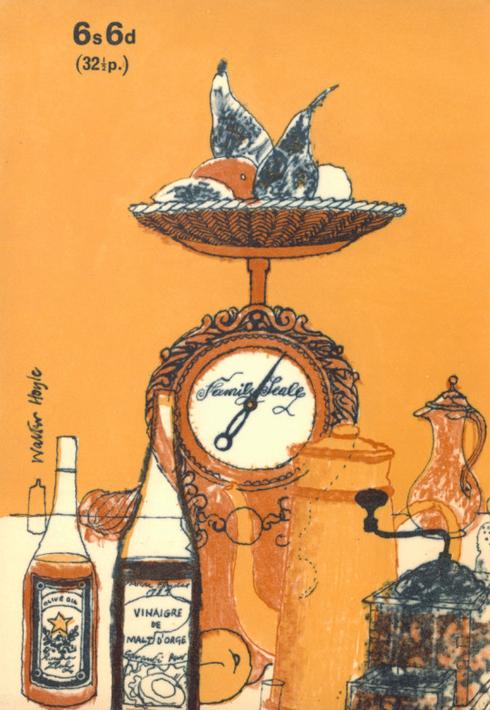
Below are a set of illustrations that in 1969 would have been more familiar than today’s shopping life. The picture of the antiquated scales is beautiful.
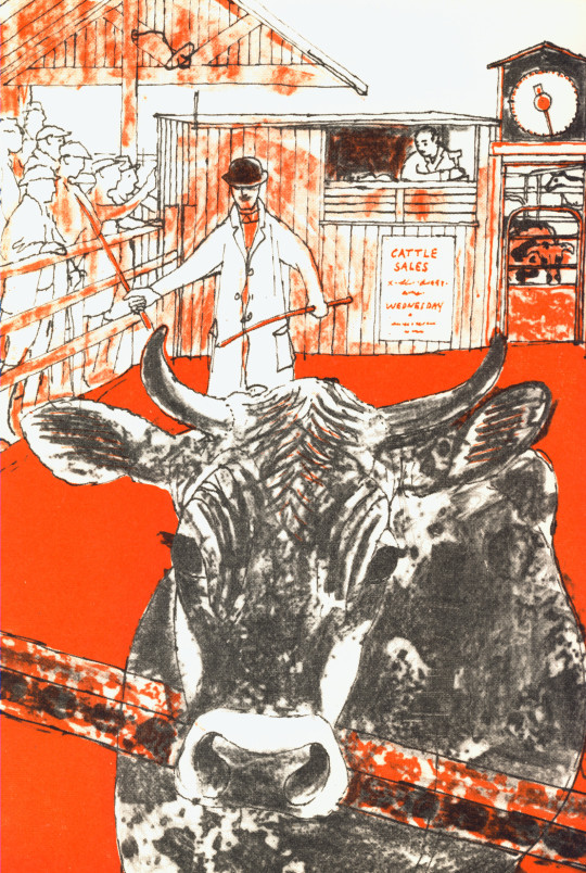
Walter Hoyle – Meat, 1969
Above is a drawing of the Cattle Market and although it could have been Braintree (closest to Great Bardfield) it is impossible to know. Below is Braintree Cattle Market by Walter Bayes in 1940 from the Recording Britain project, but this type of market was common all over Britain as many towns had their own cattle markets. I thought it would be nice to point out the scales and auctioneer’s hut next to the ring.
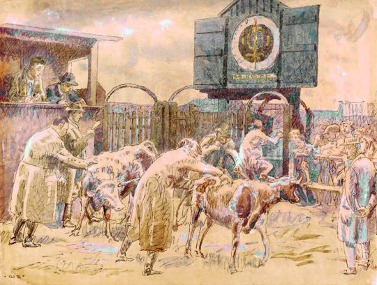
Walter Bayes – Braintree Cattle Market, 1940

Walter Hoyle – Sweets, 1969
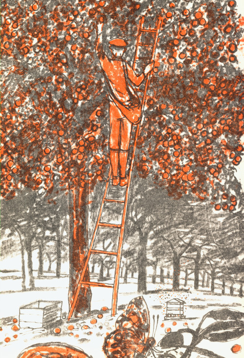
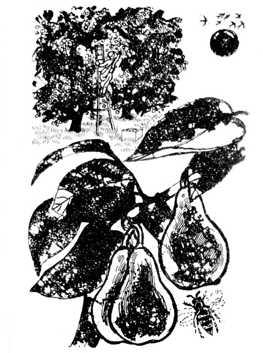
Above is an illustration from the cookery book of a man picking apples in an orchard and, below is almost the same drawing made four years later for the BBC book of the Countryside by Walter Hoyle in 1963. As the WI book illustration have been drawn on to printing plate the image would have been reversed – so the ladder, man and fruit crate are a mirror image to the figures below. I know the picture from the Countryside book isn’t mirrored as it came from an ink drawing and I own those drawings.
Walter Hoyle – September, 1963
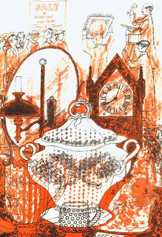
The rest of the illustrations I present below I can find nothing too remarkable to say other than Hoyle is cunning about the use of a soup tureen in an antique auction reminded me of the Cow for ‘Meat’ in an auction, rather than illustrating the food stuffs. There is a bit more imagination going on here.
Some of the scenes like Eggs and Sauces have a French and Italian flare, but it is likely because Hoyle and his French wife Denise spent many holidays there. The Sauces location looks like Civita di Bagnoregio but it’s very hard to know.
Walter Hoyle – Eggs, 1969
Walter Hoyle – Vegetable, 1969
Walter Hoyle – Soup, 1969
Walter Hoyle – Rear Cover, 1969
† Ruth Artmonsky – The School Prints – A Romantic Project – 2006, p98
Chloë Cheese – Tea and Cake (In My Collection)
This is a post about the Cambridgeshire County Council Pictures For Schools Collection. It was a brave project founded in 1947, in part as a reaction to the brutalities of the war, but also to brighten up classrooms and schools with modern works of art and improve the minds of young children.
I am apt to using the word utopian a lot, but personally I believe projects like these were important in rebuilding Britain after the war. Not just bringing art into the home, but taking it to the public spaces; from the windows in Coventry Cathedral to the Festival of Britain, there was a manufacturing ‘brave new world’ of Britain and they used the artists as part of the team, maybe from champions of design like Robin Darwin at the Royal College of Art and exhibitions like Britain Can Make It in 1946.
The driving force behind the Pictures for Schools project was painter and educator Nan Youngman, art adviser to Cambridgeshire’s Director of Education, Henry Morris. Youngman was a student of painting at the Slade from 1924-1927, winning a prize at the Slade in 1926. She painted still, but focused on education for most of her life.
The ideas motivating Pictures for Schools were very much of their time. During and after the Second World War, as the rebuilding of Britain was debated in both the public and political spheres, educators called for art education to be given a central position in the new school system. This received support from the Ministry of Education, as part of a project to promote British culture, improve the public’s standards of taste and create a new generation of citizens and educated consumers who were capable of exercising judgement in aesthetic matters and making informed choices and purchases.
The Pictures for Schools project came out of and alongside many other famous ‘utopian’ projects like the Contemporary Lithographs (1937-38), AIA Everyman’s Prints (1940) and the School Prints series of lithographs where major artists would be paid to design a lithograph that would be printed in thousands and then sold to schools cheaply.
Youngman was involved in the Everyman’s Prints series and it may have helped inspire the running of Pictures for Schools.
In the founding of the Pictures for Schools project, one of Youngman’s big successes was after she accompanied Morris to London in 1945 to buy a painting by L.S.Lowry from the Lefevre Gallery for 30gns for the Cambridge Schools Art Collection as part of Pictures for Schools. At the start of a recession in 2009 the Cambridge County Council sold it for £541,250 at Christie’s. The commission on that sale would have been around £125k.
L. S. Lowry – A Market Place, Berwick-upon-Tweed, 1935
The rest of the works were due to go up for sale with Christie’s too, some of the works I own still have catalogue assignment stickers from the auction house on the back, but with the economic climate the Cambridge Council pulled the collection from auction and in 2017 they would come up again for sale with another auction house.
Although Nan Youngman was the organiser and originator of Pictures for Schools, she had the support of long-running exhibition secretaries, who themselves had interesting backgrounds and careers.
Slade-trained painter and writer Sylvia Pollak was the first Organising Secretary. She had, like Youngman and many of their circle, links with the Artists’ International Association and the Women’s International Art Club.
She was succeeded by art historian, writer and lecturer Alison Kelly, who had a particular interest in furniture and pottery, from 1950-1957, when she resigned to spend more time lecturing… During the war, Kelly had been flown around the country working on camouflage schemes for possible bombing targets such as factories.
Katharine Baker, who had been treasurer for the Society for Education through Art, took over from 1958-1967. She had previously worked for the British Institute for Adult Education, which during the war organised good design exhibitions, put pictures in air raid shelters, armed services establishments and British Restaurants, and sent exhibitions to outlying districts. She received a New Year’s day MBE in 1948 for her work on the ‘Art for the People’ travelling exhibitions.
Finally, Joan Bartlett was Organising Secretary from 1967 until after the exhibitions’ close in 1969, when the exhibitions were held at the Royal Academy’s Diploma Galleries.
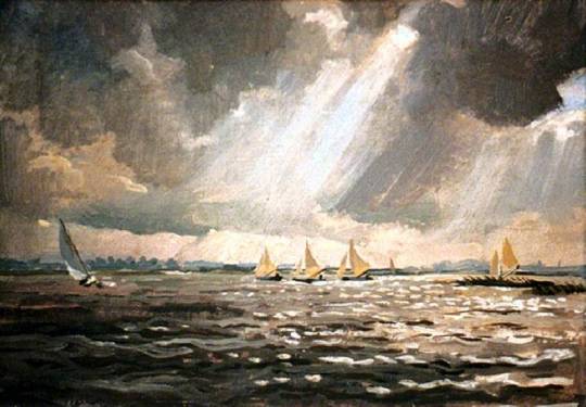
Stephen Bone – Yachts Racing at Loosdrecht, (In My Collection)
The Stephen Bone painting above was bought direct from the artist himself as on the back are various notes and bills on Bone’s headed paper.
Youngman donated some of her paintings and linocuts to the collection, other artists in the collection are like a who’s who of British Art. Gertrude Hermes, Richard Bawden, John Piper, Anthony Day, Patrick Hughes, Enid Marx, Michael Rothenstein, Malvina Cheek, Robert Tavener, Julia Ball, Peter Nuttall, Richard Beer, George Chapman, Alistair Grant, Edwin La Dell, Rosemary Ellis, Tirzah Garwood and Evelyn Dunbar are but a few.
Nick Lyons – Between You and Me, 1977 (In My Collection)
As the Pictures for Schools scheme ended in the 1960s, in Cambridge the project continued under the name ‘Original Works for Children in Cambridgeshire’.
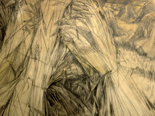
Malvina Cheek – Cornstooks at Furlongs, 1962 (In My Collection)
The Malvina Cheek drawing above came with some provenance.
I was staying at Furlongs when I drew the Corn Stooks . It was then a magical place, a shepherds cottage set in the shadow of the Downs. A gap in the wall leads up to the Downs. There was no electricity, no gas, only oil lamps and wood fires; a telephone the only concession to modern life.
In the fields alongside the cottage were pyramids of corn. The exciting shapes of the corn stooks attracted me. There was only time to draw, my daughter was very young, so I made studies hoping to develop them later. I also drew Dick Freeman, the farmer from whom Peggy leased her part of the cottage; he used an adjacent room where he rested after tending his sheep. There was always a pleasant speaking voice, a fine hooked nose and large hands like those in a Permeke drawing. Later I would use both the drawings of corn stooks and of Dick the farmer, I was commissioned to illustrate Gulliver’s Travels
Cheek also worked as part of the Recording Britain project.
Bernard Cheese – The Lemon Seller (In My Collection)
Walter Hoyle the Great Bardfield artist took over the scheme in the 1970s. Hoyle donated a few pictures and convinced other artists to donate works to the project too. Hoyle came to be involved as he was working at the Cambridge School of Art, now part of the Anglia Ruskin University. He would teach printmaking in the St Barnabas Press, a premises that the art school rented and he would encourage his pupils to donate a print to the collection. It may also explain how a fellow Bardfield artist, Bernard Cheese gets into the collection. Hoyle retired from teaching in 1985, moving from Cambridge to Hastings and Dieppe.
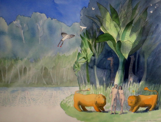
Warwick Hutton – Adam and Eve, 1986 (In My Collection)
We know the Original Works for Children in Cambridgeshire continued until 1985 when the project was run by the council and in the mid 1990s, the Council wound down the project citing the expenses of transporting the art around, hanging and administration costs and the works were stored in a shed outside Huntington Library and in a community centre in Papworth for the next 15 years.
The works by Walter Hoyle and Warwick Hutton in the collection were given with expenses for framing to the artists. Warwick Hutton’s painting of ‘Adam and Eve’ followed with a book he published in 1987 under the same name by Hutton with Atheneum Books.
Poul Webb – Petersfield (In My Collection)
Many of the works that Hoyle encouraged his students to make were prints, Poul Webb remembered making the print above in various colourways to me when I contacted him and he now works mostly as a painter with a totally different style. The picture below by Glyn Thomas is unlike his style now too, he works in drawings and etchings but Hoyle must have been an interesting man to work under as many of the artworks have a bit of Rothenstein or Bawden in them, I guess due to the Bardfield connections.
Glyn Thomas – Corn Exchange, Cambridge, 1965 (In My Collection)
It wasn’t just Bernard Cheese and Walter Hoyle that had works in the collection from Great Bardfield. Tizah Garwood had a painting in the collection of two donkeys. Chloe Cheese also had two prints in the collection.
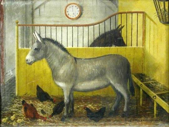
Tirzah Garwood – Nathaniel and Patsy
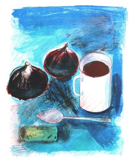
Chloë Cheese – Figs and Coffee, 1972 (In My Collection)
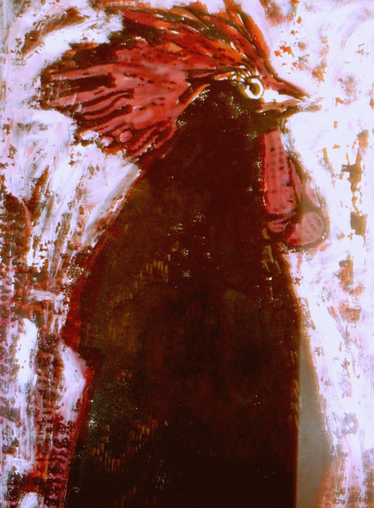
Norma Jameson – Black Cockerel (In My Collection)
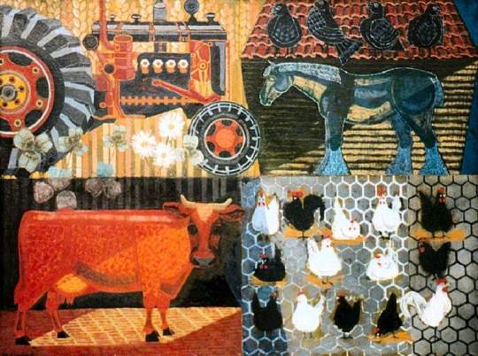
Marion Crawford – Agriculture (In My Collection)
Before television, the radio was the main media for the nation. The British Broadcasting Corporation was free from advertising and their early aims were to ‘educate, inform and entertain’. It was the education element that lead to leaflets being produced as a visual aid to the radio. The public could send a stamped-addressed envelope off and receive guide to the content in the radio show, from photographs of master paintings as part of a series of lectures on art to song sheets.
All of the artists from the Great Bardfield group would at one time or another work as commercial artists, many illustrating books. Here is a selection of works made for the BBC.
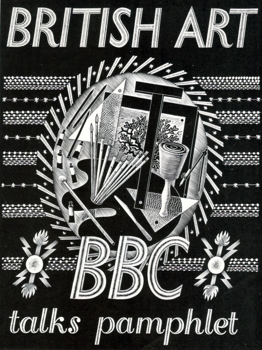
Eric Ravilious – BBC Talks Pamphlet, 1934
Published in 1934 this booklet was to follow six lectures on art, there are seven pages of text and 30 pages of black and white illustrations. The cover design is a wood engraving by Eric Ravilious showing a Bewick style wood-engraving, an artists pallet and oil paints and some beautiful graphic devices hand carved around the vignette. This booklet could be bought as a softback at seven pence or a hardback at one shilling.
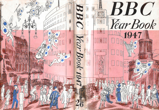
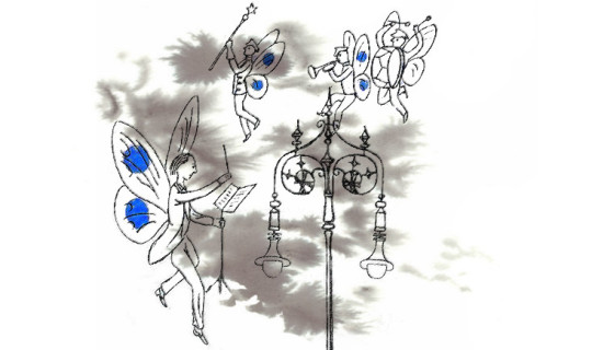
Edward Bawden – Dust Jacket for the BBC Year Book 1947
This cover by Edward Bawden shows Broadcasting House and All Souls Church with musical faeries flying around. The BBC Year book started as an annual review beginning 1928. In the mid 50′s it became the BBC Handbook and in the 80s merged into an Annual Report. The focus of the publication would range from statistics of people with Radio Licences, to essays on Opera, Art and even Foley House, the building that Broadcasting House replaced. But this gives me a wonderful excuse to share a picture of this magnificent building so you can compare it to Bawden’s drawing.
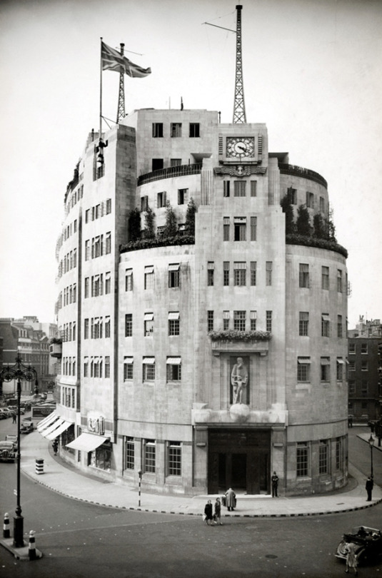
BBC Broadcasting House, London, 1932.
Many of the other works in the rest of this article are simple two colour illustrations made for various children’s educational radio programs. The way each of the artists went about solving this problem is interesting but mostly it is based on technique and time. Inside the covers is usually sheet music, lyrics and an illustration for most of the songs.
Many of Shelia Robinson’s illustrations are black and white pen drawings or her cardboard-prints, but rarely is there much colour and when there is it looks to be the printer flooding the image around her illustration with it. It’s a shame because her art prints are extraordinarily competent.
Bernard Cheese’s works have a more interesting use of colour and layering for those interested in printmaking and use of one colour with black, as is the work of Walter Hoyle.
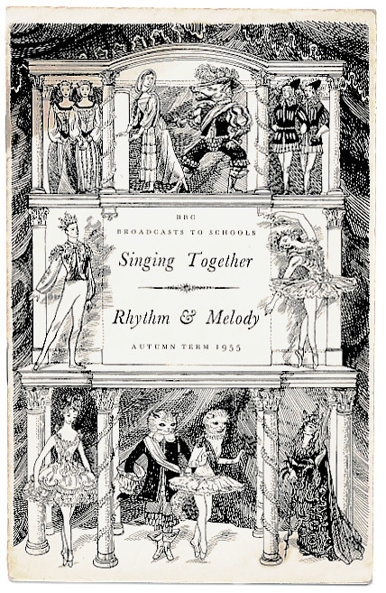
Sheila Robinson – Sing Together – Rhythm & Melody, 1955
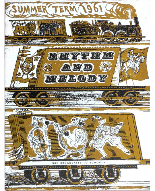
Walter Hoyle – Rhythm and Melody, 1961
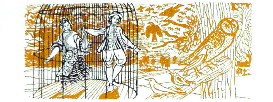
Walter Hoyle – Illustration from Rhythm and Melody, 1961
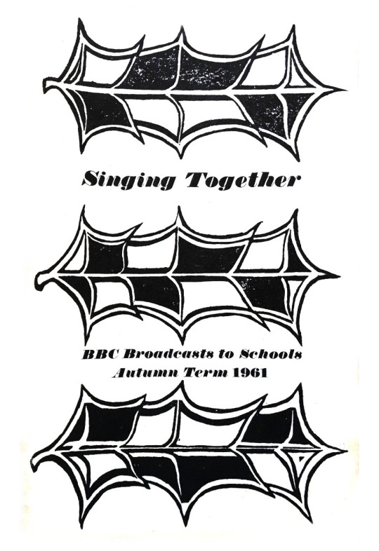
Sheila Robinson – Singing Together, 1961
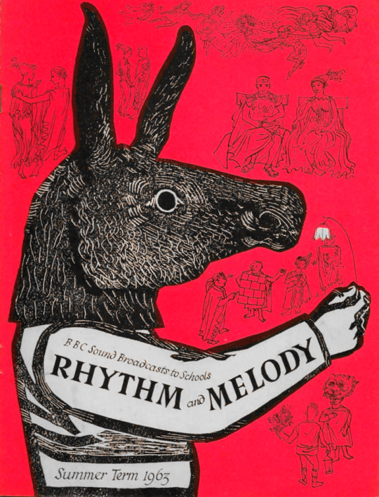
Sheila Robinson – Rhythm and Melody – Summer, 1963
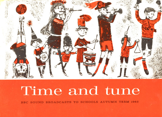
Bernard Cheese – Time and Tune, 1963
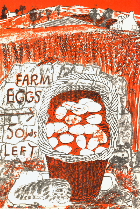
In a break from BBC radio pamphlets comes the BBC Book of the Countryside. A hardback book with a compilation of the BBC Countryside programs set out in a month by month calendar. For fans of Great Bardfield and East Anglian art, one gets work by both Walter Hoyle and Sheila Robinson, but also six illustrations by John Nash. The drawings from the book by Walter Hoyle I am delighted to own as part of my collection.
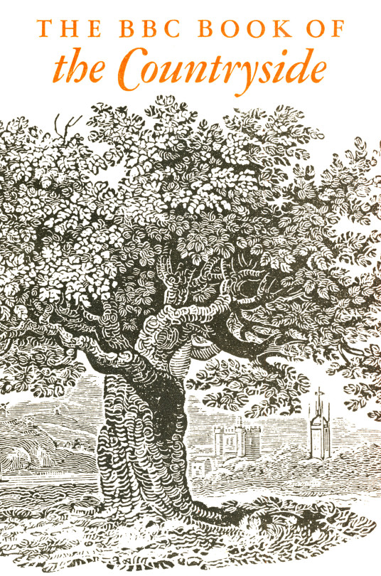
Cover to the BBC Book of the Countryside, 1963
Walter Hoyle – Page from the Book of the Countryside to the left and the drawing to the right, 1963.
Sheila Robinson – January, 1963, illustration from BBC Book of the Countryside
Walter Hoyle – April, 1963, illustration from BBC Book of the Countryside
Bernard Cheese – Singing Together, 1964
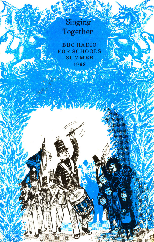
Bernard Cheese – Singing Together, 1968
Bernard Cheese – Illustration from Singing Together, 1968
To see more illustrations from the Bernard Cheese Singing Together 1968 book, click here as I dedicated a full post to them
This post covers a range of designs for the General Post Office by the artists of Great Bardfield, I think the post also shows the troubles of being a designer and how often artists were asked to submit designs and have them rejected.
We start with Sheila Robinson, who was the wife of Bernard Cheese and mother of artist Chloe Cheese. Like many of the Great Bardfield artists, Robinson was a print-maker but unlike most print-makers she used cardboard as a medium giving her prints a unique subtle quality. Her first commission for the Post Office would be to design one of two stamps for the 900th Anniversary of Westminster Abbey in 1966.
Miss Sheila Robinson, an art teacher at the Royal College of Art, designed the 3p stamp (No. 452). This was her first attempt at stamp designing and her full name appears as imprint on the stamps. The 3p stamps, printed by Harrison and Sons.
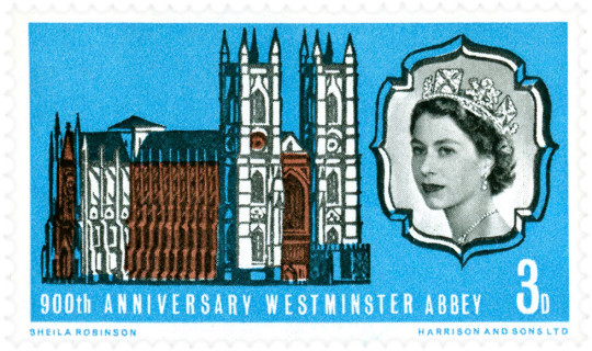
Sheila Robinson – 900th Anniversary of Westminster Abbey Stamp, 1966.
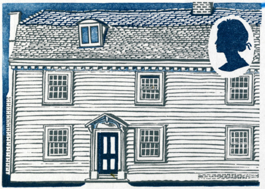
Her next commission would be four years later as part of the British Rural Architecture set of four stamps, Robinson designed two stamps, the other two being designed by David Gentleman. Released on 11th February 1970, they were in circulation for one year. The final designs were Welsh Stucco and Ulster Thatch.
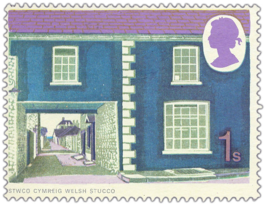
Sheila Robinson – Welsh Stucco Stamp, 1970
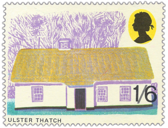
Sheila Robinson – Ulster Thatch, 1970
Above: Part of the information packet to the stamps
Below: are two other stamp designs and one prototype design.
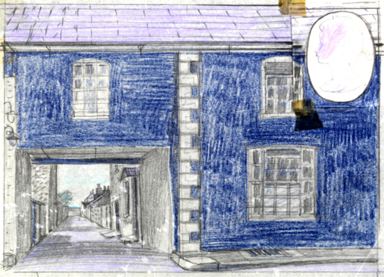
Sheila Robinson – Stamp Design Study – Welsh Stucco Stamp, 1970
Sheila Robinson – Unused Stamp Design Study, 1970
Sheila Robinson – Unused Stamp Design Study, 1970
Sheila Robinson – Abingdon (Linocut published by The Post Office), 1965
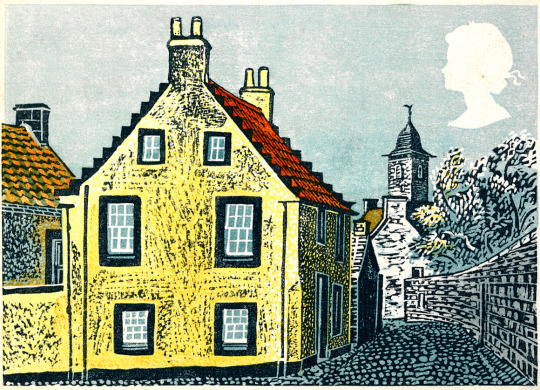
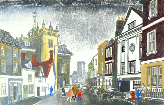
George Chapman had designed posters for Shell and the GPO. After he moved from Great Bardfield he moved to Wales, painting pictures in limited palates of colour, this is a grim looking image with the setting sun.
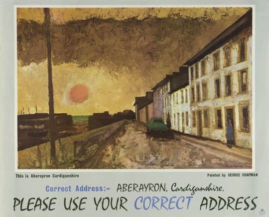
George Chapman – GPO Poster: This is Aberayron Cardiganshire, 1962
Denise Hoyle is the wife of Walter Hoyle and designed some simple posters for the Post Office savings bank, with the artwork being made from collages.
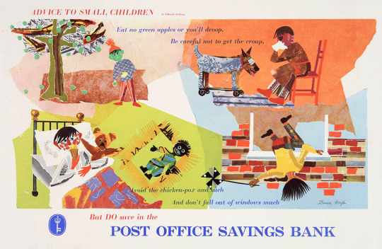
Denise Hoyle – Post Office Savings Bank,
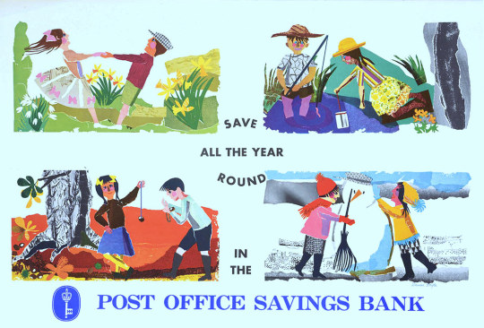
Denise Hoyle – Post Office Savings Bank
Walter Hoyle’s poster designs for the Savings Bank are also curiously off, depicting daily life but in an unfashionable way. Harlow looks wretched with a Golly in the corner and Morris Dancing is hardly popular. The Pennan, Aberdeenshire poster has a beautiful painting with it but feels very lonely.
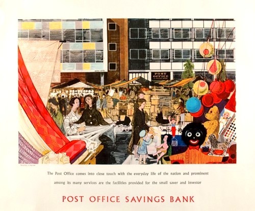
Walter Hoyle – Harlow, New Town, Post Office Savings Bank,
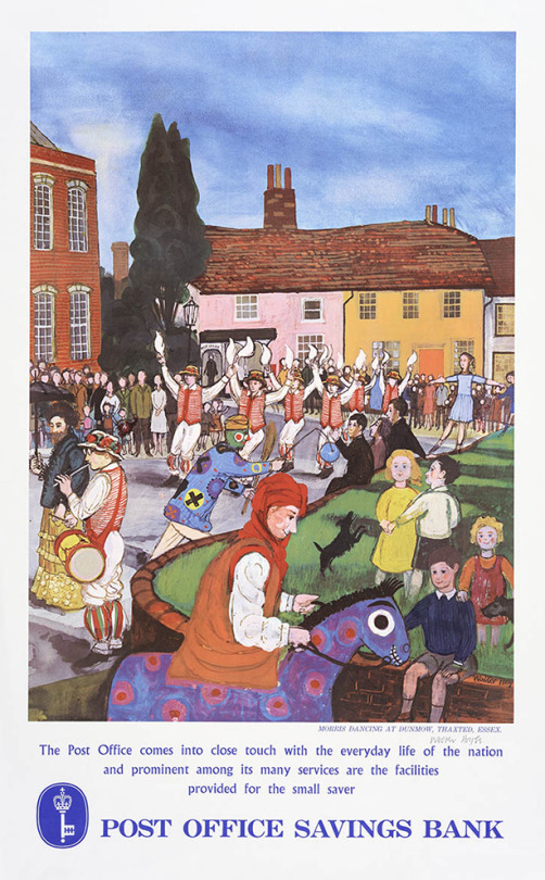
Walter Hoyle – Morris Dancers, Dunmow, Thaxted.
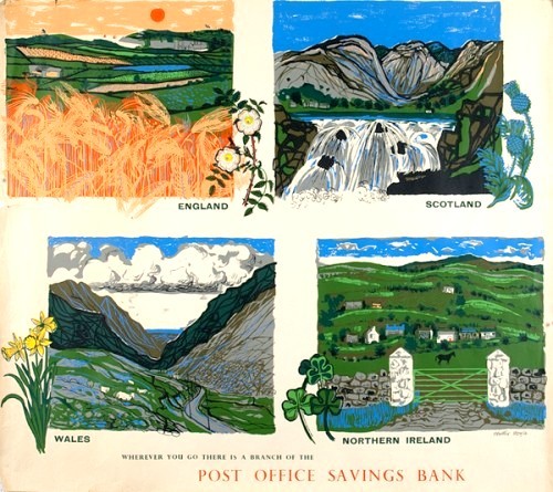
Walter Hoyle – Post Office Savings Bank – Four Nations.
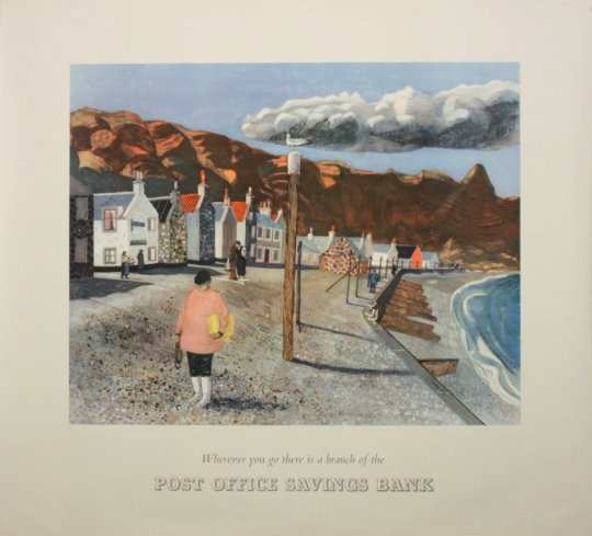
Walter Hoyle – Post Office Pennan, Aberdeenshire, GPO Poster, 1954
Walter Hoyle – Artwork for Post Office Pennan, Aberdeenshire, 1954
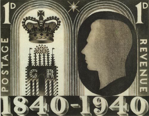
Eric Ravilious only work for the Post Office was a invitation to design a stamp to commemorate 100 years since the introduction of the Penny Black, the first adhesive stamp. Sadly this was not commissioned.
Eric Ravilious – Design for Stamp, 1940
Edward Bawden’s work for the GPO included work that was and wasn’t commissioned. The Post Office Tube Railway was used as a poster with Printed text blow on another sheet.
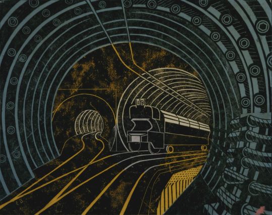
Edward Bawden – Post Office Tube Railway, 1935
The poster Bawden designed for London Transport to advertise Kew Gardens would be turned into stamps later along with other artists. The full image is on the poster but on the stamp they have cropped it.
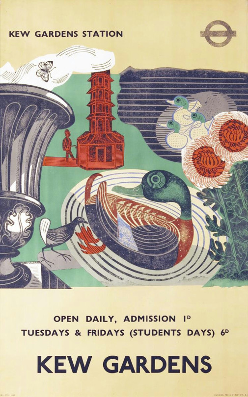
Edward Bawden – Kew Gardens Poster for London Underground, 1936
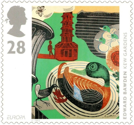
Edward Bawden – Kew Gardens Stamp, 1993
Below is a telegram design by Bawden that was not used by the GPO.
In the archives are lists showing that many well-known artists had not only been considered but had actually been invited to proffer designs. That so many of these invitees did not result in published telegrams may have been a combination of reluctance on the side of the artist and under-confidence or economy on the side of the Post Office.
A list, … included McKnight Kauffer, Graham Sutherland, Edward Bawden, Gwen Raverat and Fougasse. And a further list some two years later, in 1937, apparently emanating from Beddington, included Robin Darwin, Claude Flight, Blair Hughes-Stanton, Cedric Morris, John Nash and Clare Leighton. Many of these were subsequently formally invited to submit roughs. †
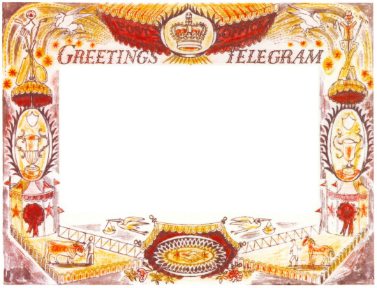
Edward Bawden – Telegram Design, 1935
† Ruth Artmonsky – Bringer of Good Tidings. Greetings Telegrams, 2009 – p22
Here are some of the Christmas cards from various Great Bardfield artists. I have always thought it important to send out something decorative and interesting at Christmas and the Bardfield artists were the same.
Eric Ravilious – Christmas Card
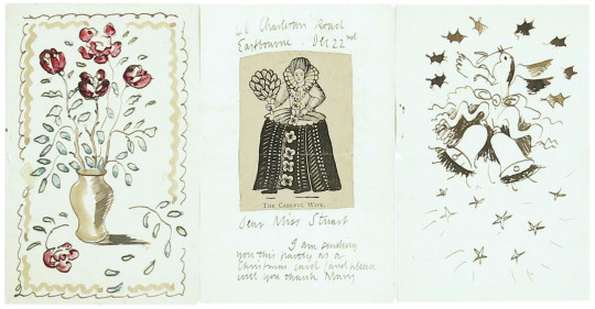
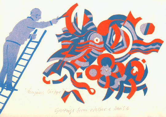
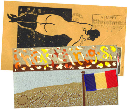
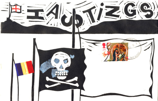
With some of the artists like Walter Hoyle the envelopes were just as important as the cards for decoration. Many of them were numbered as editioned prints. Signed from Walter and his wife Denise.
Walter Hoyle – Christmas Card Envelope, 1986
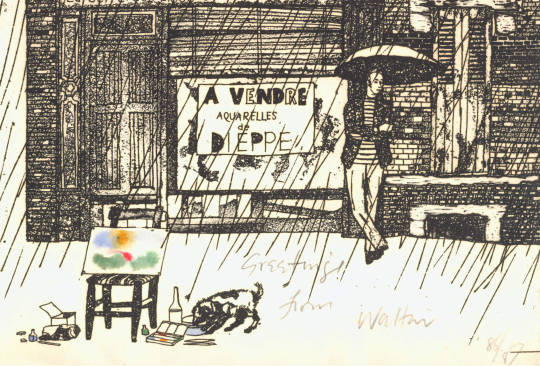
Walter Hoyle – Christmas Card, 1986
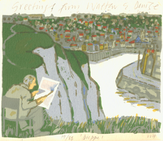
Walter Hoyle – Christmas Card and Envelope, 1983
Walter Hoyle – Christmas Card
Walter Hoyle – Christmas Card
Walter Hoyle – Christmas Envelope
Walter Hoyle – Christmas Card
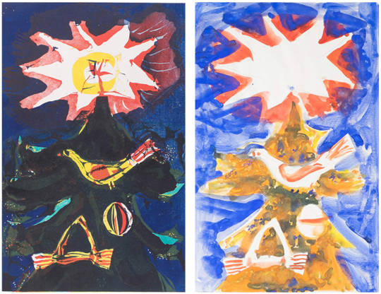
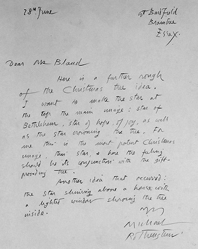
Michael Rothenstein – Christmas Card & Design for Faber and Faber, 1962
The note below is from Michael Rothenstein to David Bland of Faber and Faber. Faber were planning the Christmas card in June as the letter is dated 28th of that month. The picture above shows the finished design to the left and the prototype to the right.
Here is a further rough of the Christmas tree idea. I want to make the star at the top of the main image: star of Bethlehem, star of hope, of joy, as well as the star of morning, the tree, for me this is the most potent Christmas image….
Below are two Christmas cards from Kenneth Rowntree his wife Diana and family.
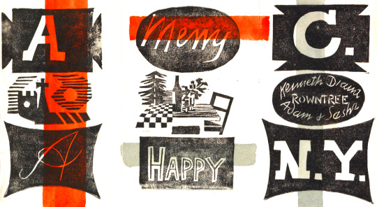
Kenneth Rowntree – Christmas Card
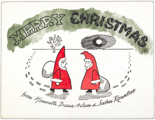
Kenneth Rowntree – Christmas Card
Below are some more images from other Great Bardfield artists.
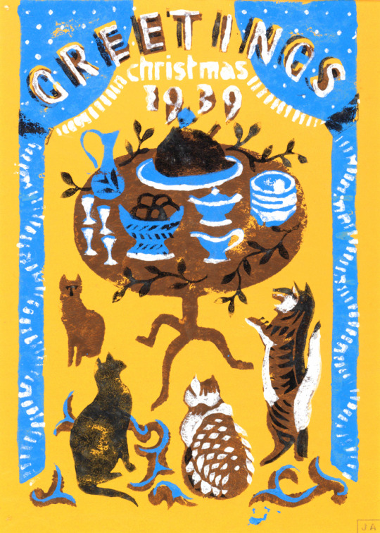
John Aldridge – Christmas Card
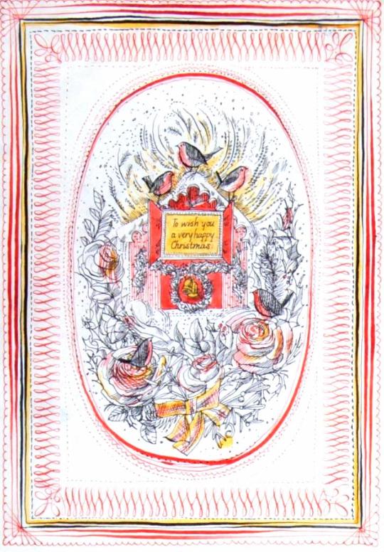
Sheila Robinson – Christmas Card Design
Michael Rothenstein – Christmas Card
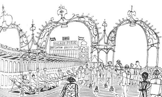
This post is not really connected in the typical way my articles are, but just points to a curious link between the Bardfield Artists being on Brighton Pier. I have also included a photograph by Edwin Smith – All of these artists are represented by the Fry Gallery in Saffron Walden.
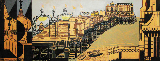
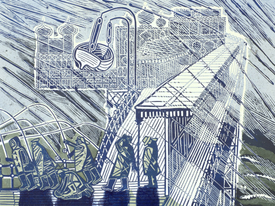
Edward Bawden – Brighton Pier (Proof), 1958
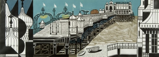
Edward Bawden – Brighton Pier, 1958
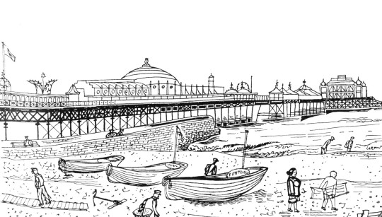
John Aldridge –
Palace Pier, Brighton, East Sussex, 1950
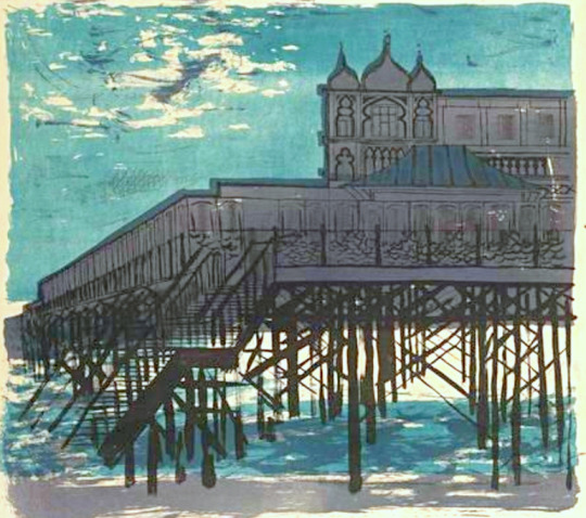
Walter Hoyle – Brighton Pier
Edward Bawden – Snowstorm in Brighton, 1956
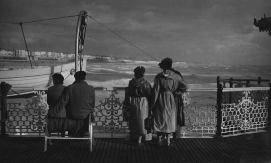
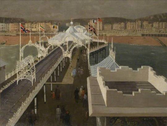
Edwin Smith – Palace Pier, Brighton, 1952
Edward Bawden – London Playground, Brighton
Edward Bawden – A Blow on the Pier.