The Etchings of Graham Sutherland

image

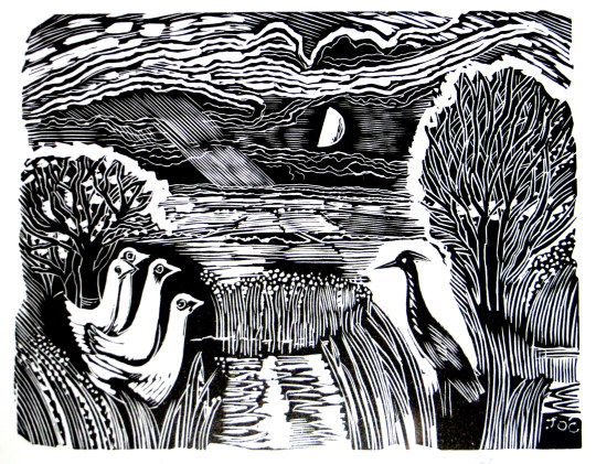
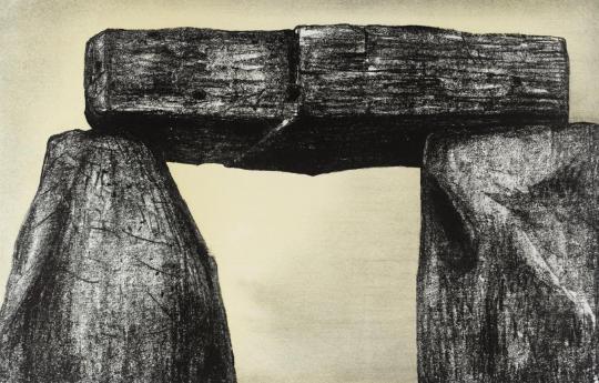
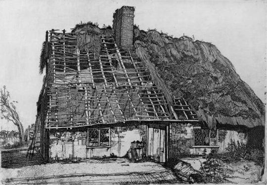
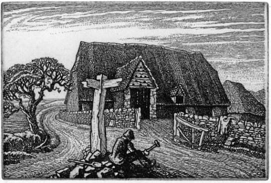
 Graham Sutherland – Number Fourty-Nine, 1924

Rather like my post on Graham Clarke, where I complained of his etchings and promoted his linocuts, in this post I would sooner promote and have a Sutherland etching than any of his other works.

I don’t know why I dislike so many of his paintings and to my opinion he only got worse with time. His work before WW2 seemed to have the sinister lust for mocking everything into destruction. It is almost as if he was calling for the war and then to use it as source material afterwards.

image

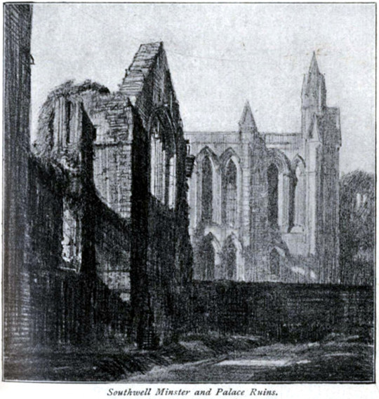
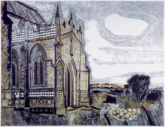
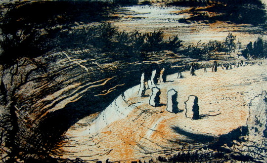
 Frederick Landseer Griggs – Southwell Minster, 1916

Sutherland was apprenticed as an engineer before studying engraving at Goldsmiths College in London. His tutor was F. L. Griggs, who had been working as an illustrator for the Highways and Byways series of books. These publications bought to light the modern ability to travel by bus, car or train around the country. Griggs pen drawings for these books, I would say, were the point when romantic nostalgia came back into fashion and his students would have been exposed to this.

‘He had a palm as delicate as gossamer,’ Sutherland remembered, it was his drawn illustrations to the thirteen volumes of the Highways and Byways guidebooks which had inspired both Piper and Sutherland as boys. When the older man offered both friendship and technical advice Sutherland was flattered to receive it. He and Paul Drury spent the Christmas of 1926 with Griggs learning about inking plates and printing them. Above all he helped to augment their growing enthusiasm for Palmer. 

image

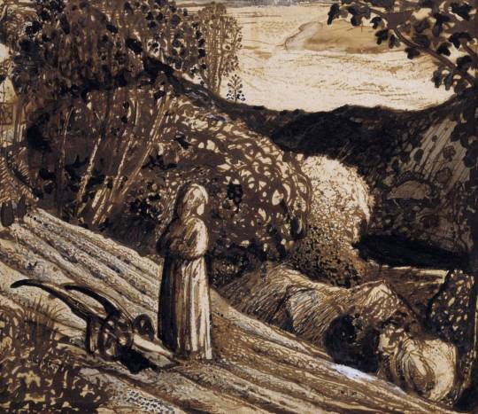
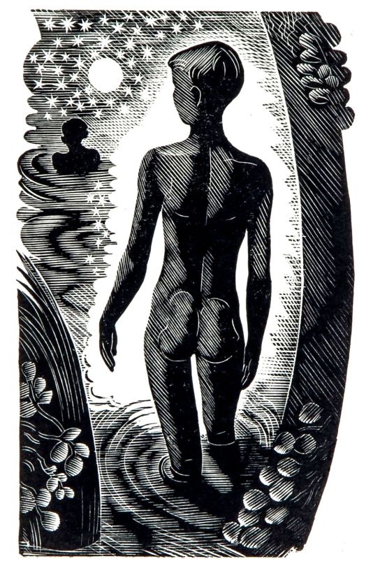
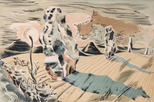
 Samuel Palmer – Landscape, Girl Standing, 1826

In autumn 1924 William Larkins showed his friends a Palmer print The Herdsman’s Cottage, which he had bought in Charing Cross Road. This tiny work came as a revelation to them all. Sutherland recalled: I remember I was amazed by its completeness, both emotional and technical. It was unheard of at the school to cover the plate almost completely with work and quite new to us that the complex variety and multiplicity of lines could form a tone of such luminosity. 

The landscapes were daring and drawn from unexpected viewpoints: The Girl in the Ploughed Field astonished me with its total disregard for conventional composition. The drawing is almost what we today call naïf. 

So, as noted, the biggest change in style for Sutherland at this time from the teaching of Griggs into the engraving style of Palmer works would be to etching the sky. The image Number Fourty-Nine above from 1924 has a clean sky where as the images below have engraving all over the etching-plate.

In the 1920s, when photographs were being used as illustrations, the question of art was in doubt; why should an artist depict a scene when the camera can do the job for them? So the result was that an artist can bend reality. From this came an ideal eden like view of the past and a retelling of rural life before the invention of machines. Later on the art world would rebel against the camera and surrealist, cubist and impressionist styles would be invented.

The 1920s was the start of a revival for Palmer, unpublished plates were being printed, the Medici Society published his other works for the public and books were being scribed.

Other artists worth noting are Robin Tanner or Paul Drury, both new converts to the church of Samuel Palmer’s work. These men walked the first steps in the world of the New Romantics, coming out of Goldsmiths College at that time.

image

 Paul Drury – September, 1928

image

 Robin Tanner – The Road Mender, 1928

All men at the same time made an impact on the artworld and they all shared themes, knowingly or not. Below are the etchings of Sutherland.

image

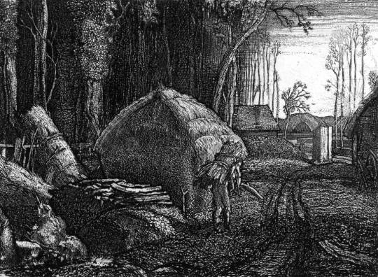
 Graham Sutherland – Wood Interior, 1929

image

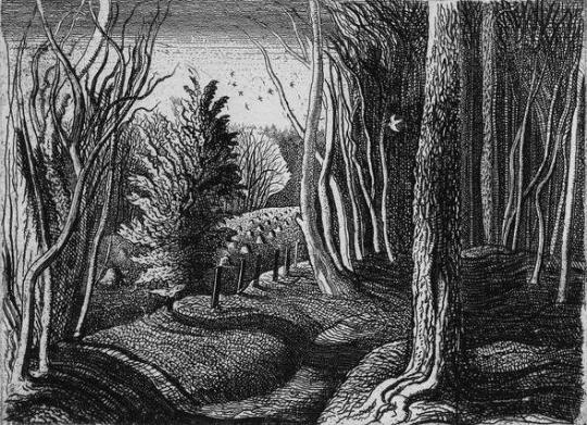
 Graham Sutherland – Cray Fields, 1925

image

 Graham Sutherland – Pecken Wood, 1925

I thought it worth including this study by Sutherland of a print. Looking more like a mono-print it has all the qualities of Palmer’s work as it is done in ink and oil paint. The final etching is below.

image

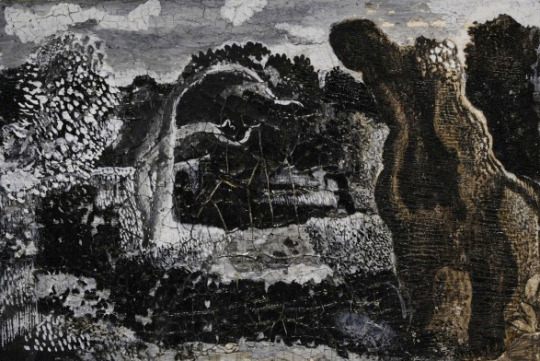
 Graham Sutherland – Sketch for Pastoral, 1930

image

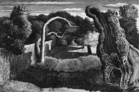
 Graham Sutherland – Pastoral, 1930

image

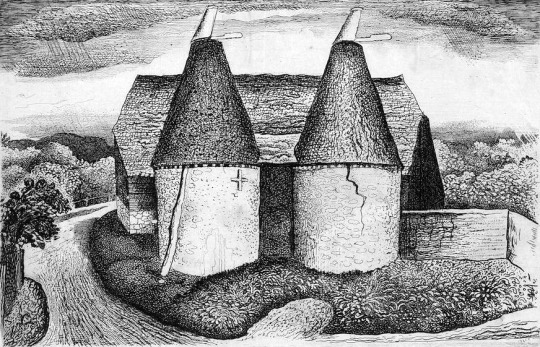
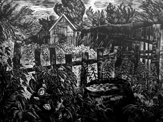
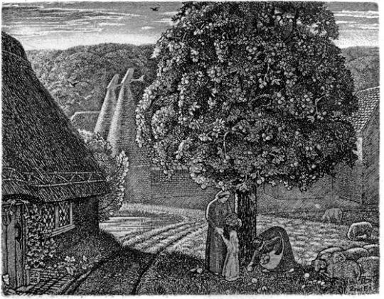
 Graham Sutherland – Oast House, 1932

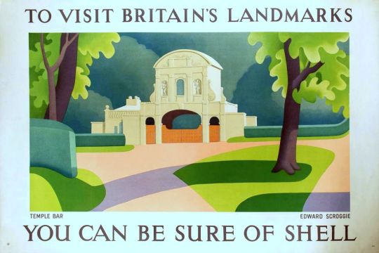
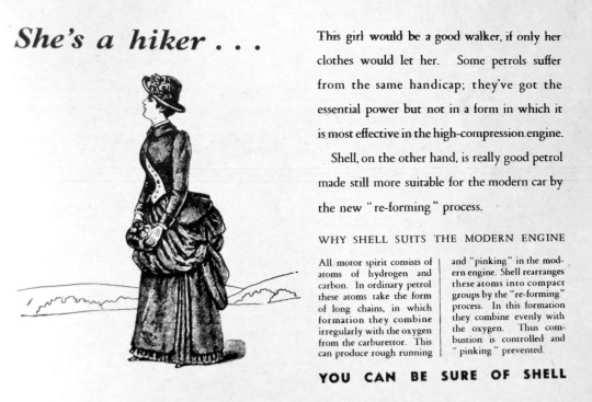
These words would get translated in various styles into Sutherland’s work but one of the most restrained and pleasing was this Shell Poster.

image

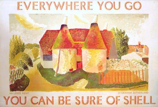
 Graham Sutherland – Shell Poster – Oust Houses, Near Leeds, Kent, 1932

† The Spirit of Place: Nine Neo-Romantic Artists and Their Times, 2001, p108
Stuart Sillars  – British Romantic Art and the Second World War, 1991, p42

Piper in Terrington St Clement

Here are two photographs by John Piper and two paintings, both in different styles. They focus on the such of St Clement’s, in Terrington St Clement. A large village in Norfolk, England. It is situated in the drained marshlands to the south of the Wash, 7 miles west of King’s Lynn, Norfolk, and 5 miles east of Sutton Bridge, Lincolnshire, on the old route of the A17 trunk road.

As well as showing the different artistic techniques for one subject, it also shows how Piper used his photographs as a visual reference when back in his studio (as I noted in the post ‘Lens and Pens’).

image

 John Piper – Terrington St Clement Church, 1975.

Five years apart between them both, the 1975 painting is a classic Piper picture and I am amazed it wasn’t editioned into a screen-print as the levels of detail in it are remarkable, the blocked out lighter panels of the windows and reversed light outline of the bell tower against the typical Piper sky.

image

 John Piper – Terrington St Clement Church, Norfolk.

image

 John Piper – Knowlton Church, Dorset, 1938

The picture below from 1980 is far more abstract and wild with colour. It is looking more like a study of a painting. The outlines and abstracted features of the building draughtsmanship are typically Piper. Although the colouring may not look like his works at that time, I would suggest they are a throwback to when Piper used collage in the 1930s. As with the Knowlton Church collage, blocks of colour are used with outlines. It makes an interesting marriage of new and old techniques.

image

 John Piper – Terrington St Clement Church, 1980

image

 John Piper – Terrington St Clement Church, Norfolk.

Below is a video I found on Youtube of a drone flight around the church, I wonder what Piper would have made of such a technology?

The Betrayal of Henry Moore

This post is about the 1967 gift of Henry Moore’s works to the Tate and how it never came to be. But more so, it’s about a public statement against that donation by 41 of his peers; people like Elisabeth Frink, Patrick Caulfield, Derek Boshier, Eduardo Paolozzi and Joe Tilson to name a few.

image

 Henry Moore – Three Fates, 1941

Having been a student at the Royal College of Art from 1921 to 1924, his first major breakthrough was as part of the Seven and Five Society. The society was set up in the 1920s, mostly for painters, but in the 30s they expanded and the new members bought a more abstract stance with them. The newer members where John Piper, Barbara Hepworth, Henry Moore and John Skeaping.

In the 40s Moore’s London Underground ‘shelter scenes’ presented his work with a human and sensitive side. From then on, a massive bulk of sculpture, drawings, paintings and books forged Moore as a great British artist.

Moore was looking how to cement his legacy as an artist. He was on, what anyone would have assumed was the peak of his forty year career.

image

 Henry Moore – Three Piece Reclining Figure No.2: Bridge Prop

On 27th February 1967, The Times’s front page hailed news that Henry Moore intended to donate many of his works to the Tate Gallery, London.

He had enjoyed a long association with the Tate, not least as trustee, and the idea of a gift was first mooted in 1964. In 1967 he made it conditional on an extension of the Tate’s galleries. †

image

 Flint stones in Henry Moore’s studio

The gift would have required the Tate to build a new wing to house the works. The cost to house the collection was rumoured to have been half a million British Pounds in 1967. In the weeks and months after the announcement, negotiations where held about how to raise the money, meanwhile, 41 artists wrote a letter to The Times to protest the new works, two of them, Moore’s own students.

The letter featured the phrase they all feared would happen if the works were housed: ‘publicly financed form of permanent enshrinement’ ‡.

‘Contemporary artists close to the Tape expressed their concern over so much space and funding going toward the celebration of one artist alone’ ♠.

Times 26 May 1967
HENRY MOORE’S GIFT
From Mr. Craigie Aitchison and others

Sir. – References have been made in the press and in public during the last few weeks concerning the offer made by Henry Moore to the Tate of between 20 and 30 major works. We understand that the Government will be giving £200,000, and that the Tate will be raising an equivalent sum specifically towards housing these works.

We must not lose sight of the fact that this £400,000, probably only a starting figure, is public money: and considering how public this whole matter should be there has been little precise information available. What can be deduced should be viewed with concern.

We may assume that at least half the gift will be large works. These alone properly displayed would require a space twice the size of the present sculpture hall. Even if the permanent display of these pieces is not envisaged the question of storage is equally crucial.

There are great priorities confronting public patronage of the arts. The Tate has only limited space into which to expand and in which to fulfil its role as the only permanent manifestation of a living culture. London has failed so far to provide itself with museum facilities commensurate with its importance as an art centre and it will not achieve its proper place as an organic part of our world by devoting itself so massively to the work of a single artist.

Whoever is picked out for this exceptional place will necessarily seem to represent the triumph of modern art in our society. The radical nature of art in the twentieth century is inconsistent with the notion of an heroic and monumental role for the artist and any attempt to predetermine greatness for an individual in a publicly financed form of permanent enshrinement is a move we as artists repudiate.

Yours faithfully,
CRAIGIE AITCHISON, DAVID ANNESLEY, GILLIAN AYRES, ANTHONY BENJAMIN, DEREK BOSHIER, ANTHONY CARO, PATRICK CAULFIELD, BERNARD COHEN, HAROLD COHEN, GARTH EVANS, SHEILA FELL, ELISABETH FRINK, PATRICK GEORGE, ANTHONY HILL, HOWARD HODGKIN, MALCOLM HUGHES, GWYTHER IRWIN, TESS JARAY, ALLAN JONES, MICHAEL KIDNER, PHILLIP KING, JOHN LATHAM, FRANCIS MORLAND, HENRY MUNDY, MYLES MURPHY, EDUARDO PAOLOZZI, JOHN PLUMB, TIM SCOTT, PETER SEDGLEY, PETER SNOW, PETER STARTUP, JOE TILSON, WILLIAM TUCKER, EUAN UGLOW, MARC VAUX, BRIAN WALL, GILLIAN WISE, ANTHONY WISHAW, BRIAN YOUNG. 

The works would end up going to Toronto with the art gallery there proposing to build a wing for the works and reassuring Moore with architect letters and funding plans on how they would present the collection. The galleries campaign to get the works was lead by Allan Ross, the former president of WM.Wrigley chewing gum. He stated he would donate $500,000 towards a gallery for Henry Moore in Toronto.

Ross wrote: ‘It occurred to me that we of Toronto, and Ontario, and Canada, should build a splendid classical structure to adequately house the collection you have in mind for Tate Gallery and which they for some years apparently cannot accommodate’

 The Henry Moore Gallery in Toronto. 

† Henry Moore by Chris Stephens, 2010. p14 9781854378767
‡ ‘Henry Moore’s Gift’, in Times 26 May 1967, in Henry Moore: Sculptural Process and Public Identity, Tate Research Publication, 2015.
♠ Sculpture and the Museum by Christopher R. Marshall, 2011. p79-80 9781409409106

A Double Take – Shell Adverts

image

In the 1930’s the adverts of Twinings, Guinness and Shell all followed a similar trend of comic verse and modern illustration.

Advertising needed to work differently in print, especially with the rise of weekly magazines, adverts were serialised, so every week they would have a different poem, illustration or tag line for the same product.

image

 John Patrick – Laurel & Hardy Chorlton-cum-Hardy Shell Petrol, 1937.

The adverts became less about the ‘quality and price’ of the products; but more abstract, advertising what the products do. With Shell it was to make you ‘go faster’, or give the perception of that.

image

The changes happened under Jack Beddington, who it could be argued changed the face of British Advertising by thinking of where his adverts would be seen. In magazines there would be more time to read the adverts, so there were poems or jokes. In petrol stations it was a bright poster with a line of text, something clean, quick to read and inspiring – for early petrol stations, that were mostly grubby sheds or small brick huts.

It was a trick Guinness would use to brighten up gloomy pubs. A decade later Lyons Corner-houses consulted Beddington on artists and lithography choices when doing prints to liven up their tea-rooms.

His adverts used modern art to make the company look modern by association. At this time museums charged admission, so the public didn’t visit them as much, so in these posters, it would have been the first time the public were exposed to modern art. The posters ’You can be sure of shell’ showcased beautiful British Locations by modern artists.

image

 Edward Scroggie – Temple Bar – ‘To Visit Britain’s Landmarks, You can be Sure of Shell’, 1937.

The magazine adverts were, on the whole, black and white with line drawings. The most famous are the series designed by Edward Bawden, but as I couldn’t find the illustrations below online, and the designers are less known, I thought it would be more interesting to showcase those rather than the adverts everyone knows already.

image

I photographed these adverts from old copies of Zoo Magazine: the National Nature Magazine – The Official Organ of the Zoological Society of London from 1937, ’38 and ’39.

image

 John Reynolds – ‘By Gad Sir!’ Reynolds was a book illustrator and cartoonist, best known for his illustrations of 1066 And All That (1930).

image

 Brian Robb – ‘Times Change.’ Robb worked for Punch in the 30′s, made posters for Shell and London Transport and became Head of Illustration at the Royal College, London. He was also a Camouflage Officer in the Western Desert in the Second World War. The advert above reads:

Times Change – So Does Shell
The threatening spectre of Mrs. Grundy and the cool efficiency of the policewoman are each as typical of their period. The working of the modern motor car is just as efficient and effortless. This is not due to any sudden discovery, but to many years of gradual improvement in motor engines, and to the continual change made by Shell to ensure that it will always give the highest performance. 

image
image

 Brian Robb – ‘Times Change’.

Times Change … So Does Shell
That’s Evolution – that is! Darwin might have said this about Shell, if he had been alive today. In the last thirty years motorcars have changed completely in appearance and engine design, but Shell has always adapted itself imperceptibly to the innumerate improvements that have been made. Today, as in 1907.

image
image

 Brian Robb – ‘Times Change’.

Times Change – so does Shell.
Shell has always been a contemporary spirit. It belongs to 1937 as much as it belonged to 1907. Between the years lies a big different made up of countless small improvements, each of which was made immediately it became desirable and possible. If, in the Autumn, you buy a 1938 car, you will find that Shell suits it perfectly; for Shell keeps in step with motor-car design.

image

She’s a hiker…
This girl would be a good walker, if only her clothes would let her. Some petrols suffer from the same handicap; they’ve got the essential power but not in a form in which it is most effective in the high-compression engine.
Shell, on the other hand, is really good petrol made still more suitable for the modern car by the new “re-forming” process.

image

John O’Connor

John O’Connor A.R.C.A. R.W.S, is today best known for his woodcuts, but during his lifetime he was also celebrated as a watercolourist. He was educated between the wars at the Royal College of Art in London under John Nash and Edward Bawden.

image

 John O’Connor – Self Portrait, The Ruth Borchard Collection

A quote about Ravilious mentions O’Connor: Through his work and his teaching he became a very real influence both in design and wood engraving. One of his
students was John O’Connor. As an engraver O’Connor is an illustrator and very sensitive draughtsman. In style he is influenced by the Ravilious manner, with an emphasis on pattern and book design techniques. He has made a valuable contribution to book design through his technical experiments which include colour. O’Connor has
also brought wood engraving and other media together in the same work. These are essentially book designing experiments rather than experiments in engravings as such.

John O’Connor was was born in Leicester in 1913. In 1930 he enrolled at Leicester College of Art before moving onto the Royal College of Art in 1933. His teachers at this time were Eric Ravilious, John Nash and Robert Austin. He graduated in 1937.

image

On a visit to Eric Ravilious’s home at Bank House, Castle Hedingham in Essex, O’Connor was captivated both by the directness of the wood-engraving technique, and by the simple domestic scene in which Ravilious engraved by a lamp in one corner of the room while his wife Tirzah played with their small son by the fire in another. It was due to Ravilious that O’Connor got his first commission of work aged 23, illustrating Here’s Flowers by Joan Rutter for the Golden Cockerel Press in 1937.

He taught at Birmingham and Bristol before serving in the Royal Air Force form 41-45. He arrived with the allied troops during the fall of Berlin, and sketched the ruined city. Back in England, but still in his flight lieutenant’s uniform, he met his future wife, Jeannie Tennant, who was a teacher, in Filey, North Yorkshire. They married in 1945, and spent their honeymoon cycling around the Yorkshire dales.

image

 John O’Connor – Kersey Church, Suffolk

On being demobbed he illustrated two books for the Golden Cockerel Press and taught in Hastings for two years before moving to Colchester to become the head of the School of Art in 1948. He was affectionately known as ‘Joc’ to his students, using his initials. His colleagues included Richard Chopping, who designed dust jackets for the James Bond novels, his own former teacher John Nash, and Edward Bawden, one of the finest
British printmakers.

image

 John O’Connor – Heron and Ducks

In 1950, O’Connor wrote and illustrated ’Canals, Barges and People’. The book had colour illustrations; wood-engravings by overprinting coloured linocuts. This was something of a revolution, as wood-engraving had till then been largely considered a black-and-white process.

The book also stood out as part of a Folk-art scene looking into the artistic past of Britain. Other writer/artists to be doing this would be Enid Marx, Barbara Jones and Noel Carrington. ’Canals, Barges and People’ was an immediate success, but only 1,000 copies were printed by Shenval Press and the colour made a reprint impractical and too expensive.

image

 John O’Connor – Orange Field. Clare College, University of Cambridge

He saw his favourite painting places in Suffolk – the ponds, willows, briars and honeysuckle – disappear beneath the bulldozer and combine harvester. In 1964 O’Connor retired from teaching full time at Colchester, to concentrate on painting and engraving. He wrote various ‘How to’ books and taught part time at St Martin’s School of Art. In 1975 he and his wife, Jeannie, went to live by Loch Ken in Kirkcudbrightshire, where his love of light and water inspired his many watercolours and oil paintings. He took up a post teaching at Glasgow School of Art from 1977 to 1984.

image

 John O’Connor – Chestwood Meadows, Lewisham Local History & Archives Centre

His engraving continued into yet another decade with the imaginative commission from Richard Ingrams for O’Connor to produce a monthly illustration for The Oldie magazine. These pieces – 36 of which were preserved in hard covers in People and Places – have all the sparkle and wit of the early work, and he only laid down his tools in 2001, a 65-year span which is surely unique.

John O’Connor’s last book of engravings, The Country Scene, a collection for the Whittington Press of his early and largely unknown work, was on the press when he died. As printing was about to begin, the instruction came from his hospital bed that colour was to be introduced wherever possible. Proofs were hurriedly made by his son, Mike, and taken to him, and delightedly approved days before his death.

image

 John O’Connor – Little Garden in the Evening, 1947

In the 1950s and 60s, O’Connor exhibited at the Zwemmer Gallery, in London, and had many exhibitions throughout Britain. His work was purchased by the Arts Council, the Tate Gallery, the British Museum and the Contemporary Art Society, as well as by several local education authorities; it can also be found in the Oslo Museum, the Zurich Museum and at New York central library. He was elected to the Royal Society of Painter-Etchers and Engravers in 1947, and, in 1974, to the Royal Watercolour Society. He was an honorary member of the Society of Wood Engravers. He retired to Stable Cottage, Danevale, Castle Douglas.

He died March 5 2004

Bibliography
1937 –  Here’s Flowers by Joan Rutter. Golden Cockerel Press
1945 – Together and Alone by Christopher Whitfield. Golden Cockerel Press
1946 – We Happy Few by Owen Rutter. Golden Cockerel Press
1950 – Canals, Barges and People by John O’Connor, reprinted 2014
1951 – An Essex Pie by T.M. Hope
1959 – A Pattern of People by John O’Connor
1967 – Landscape painting, reprinted 1977
1973 – Introducing relief printing
1971 – The Technique Of Wood Engraving
1979 – A View of Kilvert by John O’Connor. Foulis Archive Press
1989 – The Wood-engravings of John O’Connor
1990 – The Four Elements by Seamus Heaney. Whittington Press
1991 – Wood Engravings From La Vida Breve
1991 – Twins (Came with Matrix 11) by John O’Connor. Whittington Press.
1999 – People and Places by John O’Connor. Whittington Press.
2004 – The English Scene by John O’Connor. Whittington Press. 

Selected list of Exhibitions
1954 Zwemmer Media Arts, London
1955 Royal Academy of Arts, London
1973 The Minories, Colchester
1976 The Minories, Colchester
1977 Graphic Work Retrospective, Glasgow School of Art
1990 Royal Watercolour Society, Bankside, London

A History of British Wood Engraving by Albert Garrettv, 1978, 9780859360777 – p222
http://www.independent.co.uk/news/obituaries/john-oconnor-38138.html
https://www.theguardian.com/news/2004/mar/20/guardianobituaries.artsobituaries

Art of the Ancients

After buying the etching below and looking up the artist and location, it struck me how the uncovering and preservation of British ancient monuments in the twentieth century, together with the age of motoring bought artists to translate these places into art.

Chalk Men:

image

 John Grigsby – Cerne Giant

Cerne Abbas is a parish just about eight miles north from Dorchester, in Dorset, England, where, as in the etching above, a human figure has been cut into the chalk hillside. The figure, generally referred to as a giant, is the outline of an ithyphallic man carrying a club in his right hand. At about 55 metres high and 51 metres wide it dominates the valley below. Above the Giant is another landmark, the Iron Age earthwork known as the “Trendle” or “Frying Pan”. The carvings are formed by outlines cut into the turf about 2ft deep, and filled with crushed chalk. The construction of the Wilmington Giant is much the same.

image

 Eric Ravilious – Wilmington Giant, 1939.

“The Long Man of Wilmington and the very phallic Cerne Abbas Giant are of unknown age and controversy still rages over the date of the latter in particular”. 

The Ravilious painting is a watercolour using white resist makes the Giant Glow out from the paper’s natural colour, as do his cross-hatched, almost engraver brush-strokes of differing tones of colour.

Stonehenge:

image

 Gertrude Hermes – Stonehenge, 1959.

image

 Henry Moore – Stonehenge, 1973

Above two sculptors draw and engrave their perception of Stonehenge. Archaeologists believe Stonehenge was constructed from 3000 BC to 2000 BC. The surrounding circular earth bank and ditch, which constitute the earliest phase of the monument, have been dated to about 3100 BC. Unlike the chalk men, there have been writings of Stonehenge from most of recorded time. The earliest record of the chalk giants is from the 17th century.

Moore on Stonehenge: I began the Stonehenge series with etching in mind, but as I looked at, and drew, and thought about Stonehenge, I found that what interested me most was not its history, nor its original purpose – whether chronological or religious – or even its architectural arrangement, but its present-day appearance. I was above all excited by the monumental power and stoniness of the massive man-worked blocks and by the effect of time on them. Some 4000 years of weathering has produced an extraordinary variety of interesting textures.

Avebury:

image

 John Piper – Avebury, 1944

image

 Paul Nash – Landscape of the Megaliths, 1937

Above are both the avenue and the stone circle of Avebury painted in different styles by both Nash and Piper. John Piper’s image was for a book on Romantic British Poetry and he is making use of limited use of colours in the printing process of the book to make the dark-to-light drama washed with umbers. Nash’s lithograph is one of his less surreal of this working time period, unlike the image below where Nash project’s his own vision for modern monoliths. They maybe hay-bails or car grills but these are, to Nash, the monoliths of today.

image

 Paul Nash – Equivalents for the Megaliths, 1935.

With Nash it’s best to use his own words about why he came to paint ‘Equivalents for the Megaliths’

These groups (at Avebury) are impressive as forms opposed to their
surroundings both by virtue of their actual composition of lines and masses and planes, directions and volumes; and in the irrational sense, their suggestion of a super-reality. They are dramatic also, however, as symbols of their antiquity, as hallowed remnants of an almost unknown civilisation. 

In designing the picture, I wished to avoid the very powerful influence of the antiquarian suggestion, and to insist only upon the dramatic qualities of a composition of shapes equivalent to the prone or upright stones simply as upright or prone, or leaning masses, grouped together in a scene of open fields and hills. –  Paul Nash – Letter to Lance Sieveking. May 1937. 

The Cambridge Illustrated History of Prehistoric Art. p116 9780521454735
Paul Nash Places. 9781853320460
Henry Moore. Writings and Conversations. p299 978-0520231610