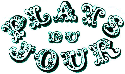
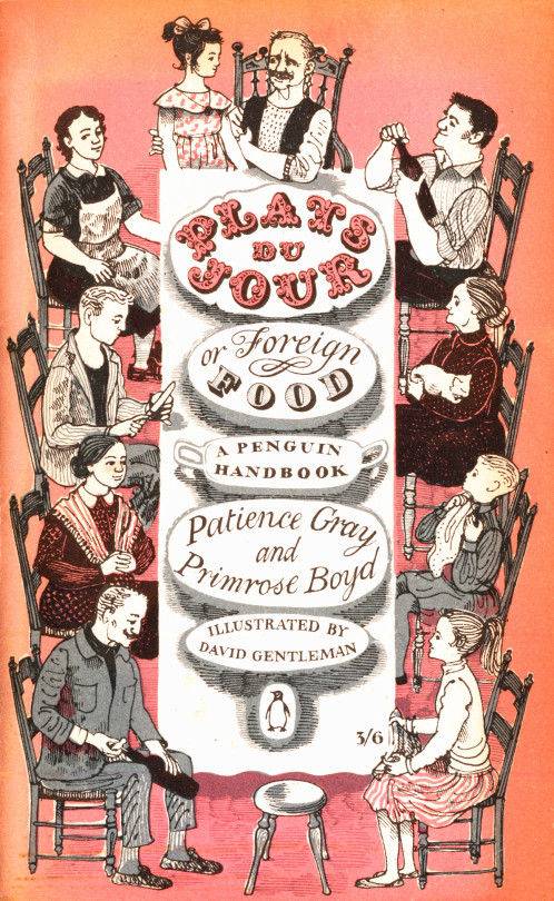
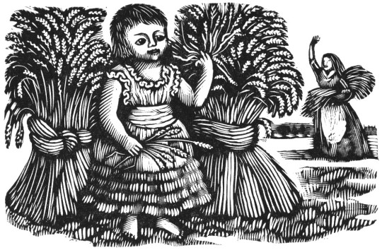
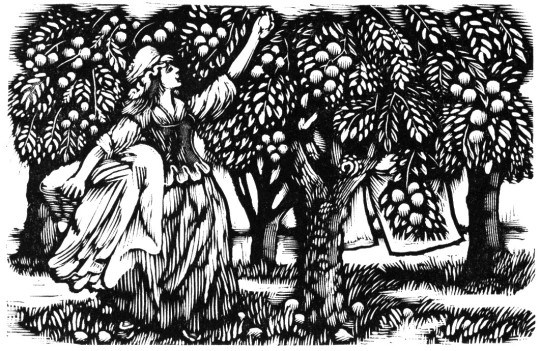
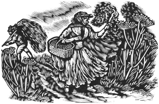
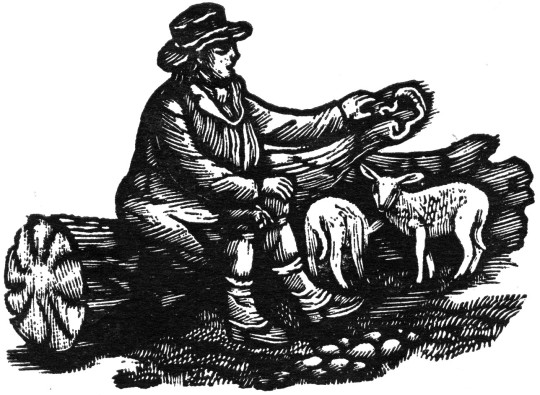
Plats du Jour by Patience Gray and Primrose Boyd is a book illustrated by a 27-year-old David Gentleman in 1957 used to be everywhere, I would see it in most charity shops and on book stalls, however now if you look online and try to find a copy it is about £30 and up. The Persephone Press reissued it it in 2006 with the original illustrations. However the art of the small illustrated cook book has been lost on a tide of celebrity endorsed cookery books, for a nice cookery book we can only look back or to a private press and hope to get books like Lovely Food – A Cookery Notebook by Ruth Lowinsky, Mediterranean Food by Elizabeth David or such like.
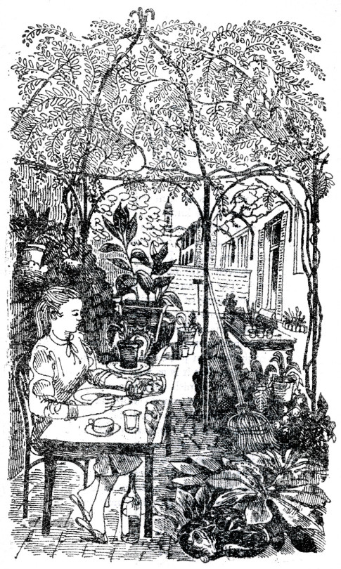
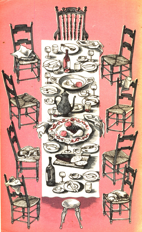
However I thought Plats Du Jour was worth looking at in close up for the beautiful covers, letter work and illustration inside. They are so beautiful it is almost aspirational. It sold 50,000 copies in its first year, far outstripping Elizabeth David who was the cookery writer of that age.
Although Gentleman has designed almost everything it could be imagined from Coins and Stamps to Underground Station Artwork and Anti War propaganda he is known most of either his wood-engravings or his lithographs but his drawings and watercolours need a modern retrospective.
I thought it would be interesting to list my 50 favourite books. I have no idea what it might say about me other than I read a lot and like escapist literature. It took a week to edit it down and I just picked the ones I could likely quote backwards. They are in no particular order other than most memorable.
1. We – Yevgeny Zamyatin 2. Maidens Trip – Emma Smith 3. A Crisis of Brilliance – David Haycock 4. Evolution in Modern Art – Frank Rutter 5. Alone in Berlin – Hans Fallada 6. Pictures from Persia – Cecil Keeling 7. The Pale Horse – Agatha Christie 8. And Then There Were None – Agatha Christie 9. Our Mutual Friend – Charles Dickens 10. The Riddle of the Sands – Erskine Childers. 11. Full Tilt – Dervla Murphy 12. Bicycle Diaries – David Byrne 13. The Painted Veil – Somerset Maugham 14. Lost Horizon – James Hilton 15. The Horse and His Boy – C S Lewis 16. Few Eggs and No Oranges – Vere Hodgson 17. The Happy Prince – Oscar Wilde 18. Dreaming of Babylon – Richard Brautigan 19. Empty World – John Christopher 20. The Tripods Trilogy – John Christopher 21. The Handmaid’s Tale – Margaret Atwood 22. Witches Abroad – Terry Pratchett 23. Wind in the Willows – Kenneth Grahame 24. His Dark Materials Trilogy – Philip Pullman 25. The Tempest – William Shakespeare 26. Vanity Fair – William Thakery 27. Mr Norris Changes Trains – Christopher Isherwood 28. On The Road – Jack Kerouac 29. The Wasteland – T.S. Eliot 30. Naked Lunch – William Burroughs 31. Fatherland – Robert Harris 32. On The Beach – Nevil Shute 33. The Doomed Oasis – Hammond Innes 34. The Story of the Amulet – E. Nesbit 35. The Day of the Triffids – John Wyndham 36. The Hound of the Baskervilles – A. Conan Doyle 37. The Temple – Stephen Spender 38. The House at Pooh Corner – A.A. Milne 39. The Hours – Michael Cunningham 40. Brideshead Revisited – Evelyn Waugh 41. The Lord of the Rings Trilogy – J.R.R. Tolkein 42. The Grapes of Wrath – John Steinbeck 43. The Wench is Dead – Colin Dexter 44. The Idiot – Fyodor Dostoyevsky 45. Summoned by Bells – John Betjeman 46. A Clergyman’s Daughter – George Orwell 47. The Pursuit of Love – Nancy Mitford 48. Unnatural Death – Dorothy L Sayers 49. Smiley’s People – John le Carre 50. Dead Souls – Nikolay Gogol
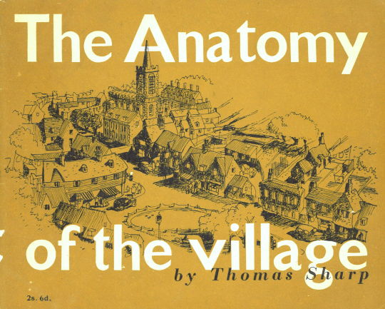
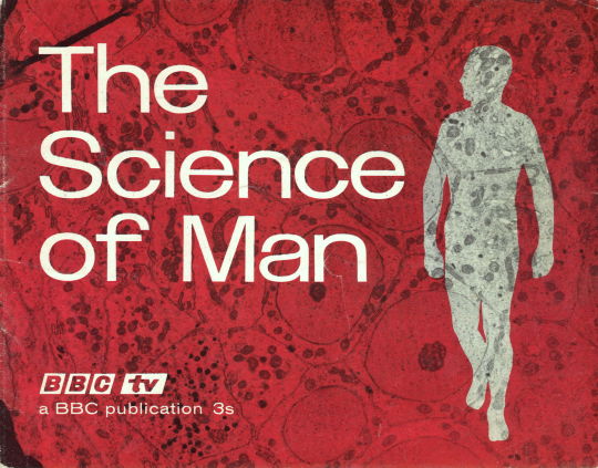
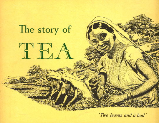
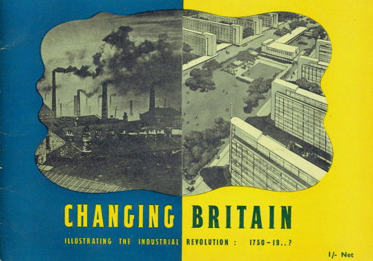
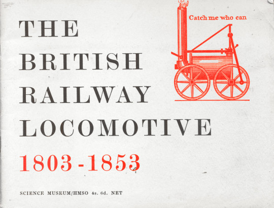
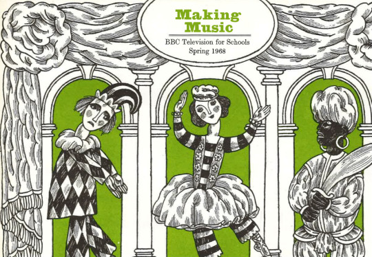
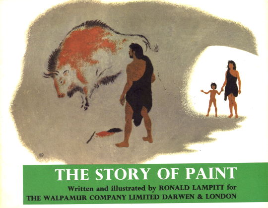
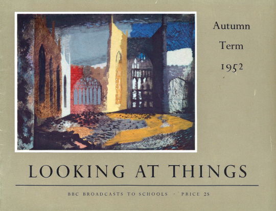
The Puffin picture book series was inspired from various continental and Russian children’s books; as Insel-Bücherei publications inspired the King Penguin series, the Puffin books also inspired others due to the handy size for displaying information. Here are some books that are the same size but are styled in a suspiciously similar way. Some of them are a series of BBC books, others are by tea companies and the V&A.
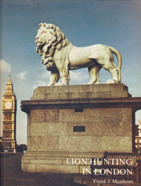
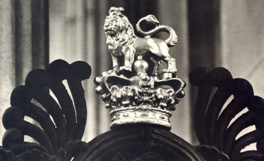
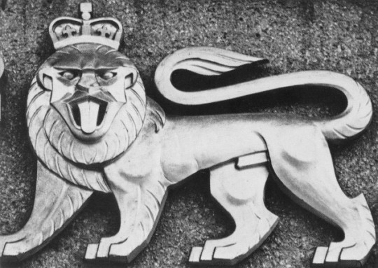
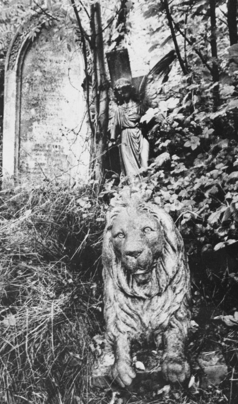
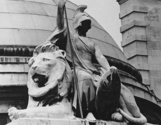
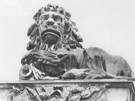
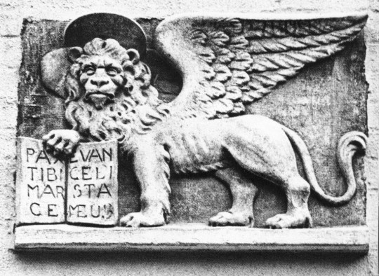
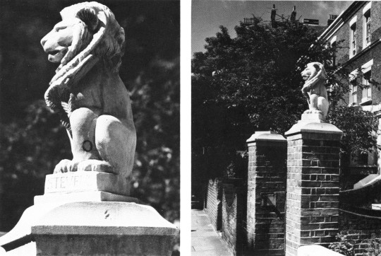
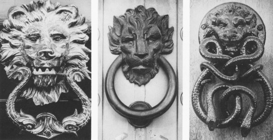
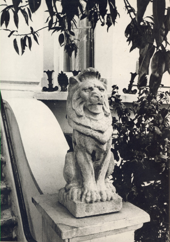
I own the book ‘Lion Hunting in London’ by Frank J. Manheim, 1975. A photographic survey of Lions in London, amazingly it hasn’t been reprinted when you think it would be perfect for tourists.
The Book Cover
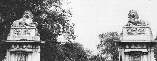
Apsley Gate at Hyde Park Corner
King’s College
Guarding a grave in Abney Park cemetery
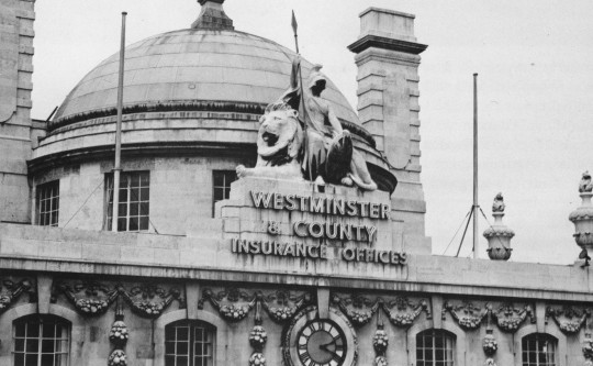
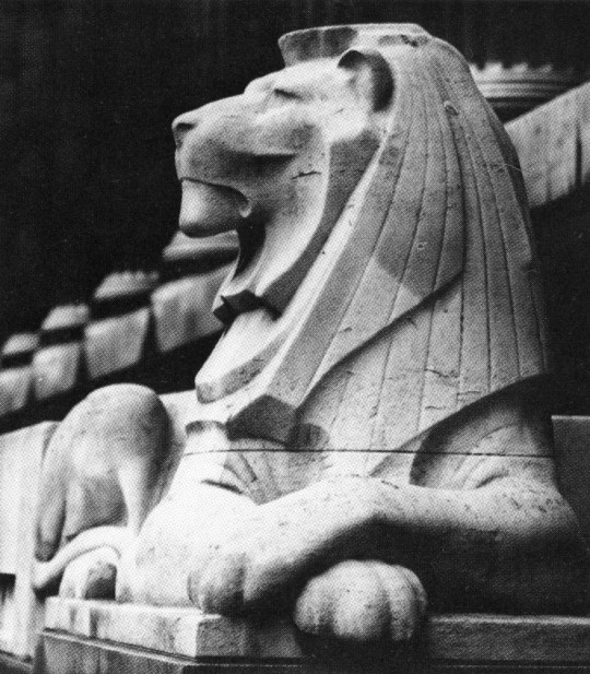
Detail of Westminster & County Insurance Office, Regent Street
Westminster & County Insurance Office, Regent Street
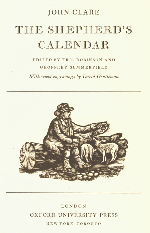
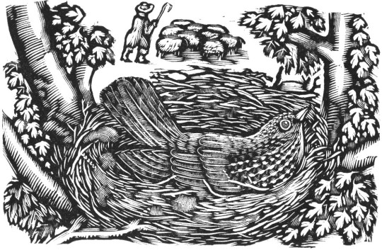
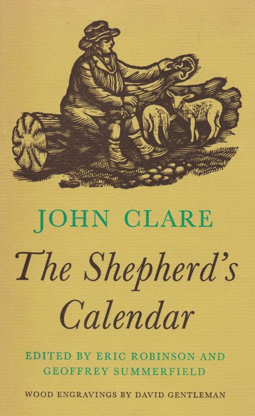
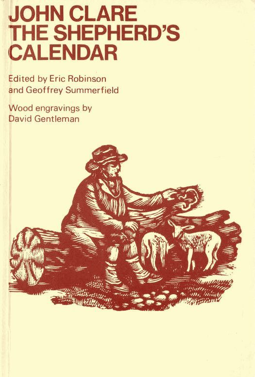
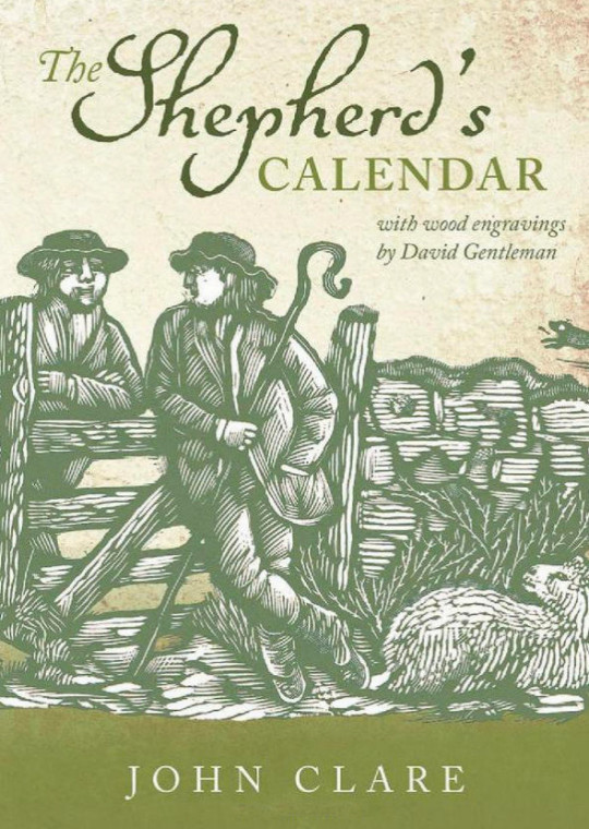
John Clare (1793 – 1864) was an English poet, the son of a farm labourer, who became known for his celebrations of the English countryside and sorrows at its disruption. His poetry underwent major re-evaluation in the late 20th century: he is now often seen as one of the major 19th-century poets.
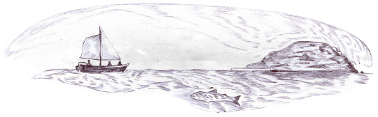
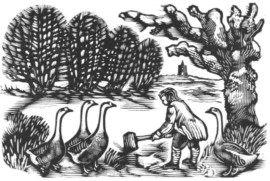
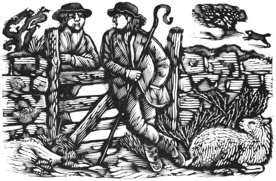
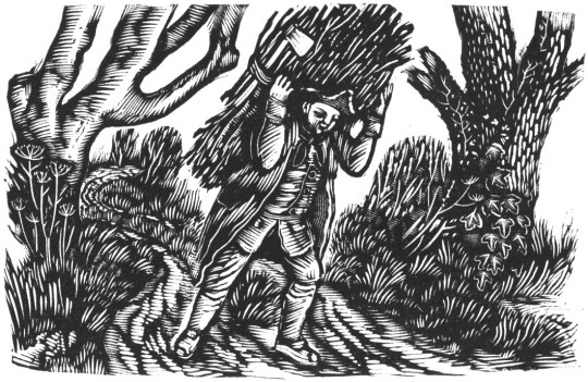
This book was published in 1964 with the monthly chapters headed by a wood-engraving by David Gentleman.
The poems of Clare have been republished many times over the years with Gentleman’s illustrations but it is interesting to look at the fashions in book-jacket design using the original illustrations.
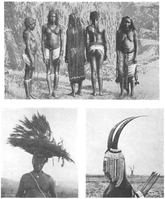
These pictures are all from a book by Hilaire Hiler ‘An Introduction To The Study Of Costume’, 1929.
The book illustrates fashion and costume through history. At just over 300 pages there are many wonderful illustrations, some of them I have pasted below.
Hilaire Harzberg Hiler was an American artist, psychologist, and color theoretician who worked in Europe and United States during the mid-20th century. At home and abroad, Hiler worked as a muralist, jazz musician, costume and set designer, teacher, and author.
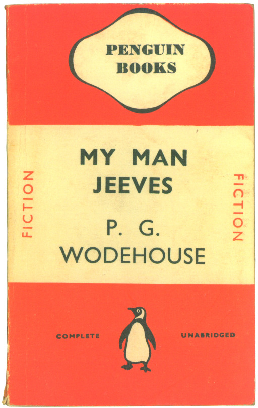
There are many examples where book design is uniform, most famously Penguin Book’s ‘Stripe’ design by Edward Young and perfected by Jan Tschichold in 1935. Bold and colourful they were enormously successful and cheap to make being paperback. The colours they used to coordinate the books also made selecting a book a quicker process due to your preference, Crime-Green. Fiction-Orange. Cerise-Travel. Blue-Biographies. Red-Drama.
There where many other sets imitating Penguin’s success, most of them short lived. Below is a range of book jackets that Edward Bawden and Eric Ravilious had been commissioned to do, but this time in hardback.
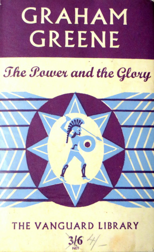
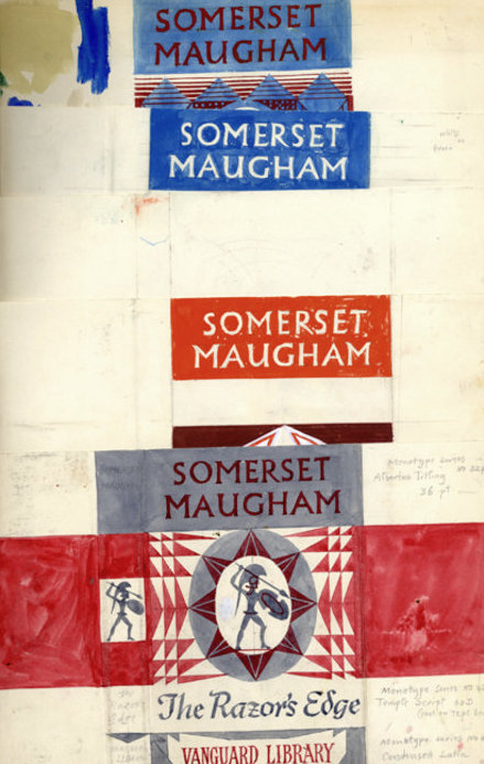
Edward Bawden & The Vanguard Library
The Vanguard Library (not to be confused with Vanguard Books, a US series from the 1930s) was a joint venture published by Chatto & Windus in association with William Heinemann Ltd. The joint venture was probably to combine the backlist of titles under copyright to both of these smaller publishers. The series was in print for only a few years in the early 1950s. The series consisted of back catalog titles, mostly modern fiction, a smattering of more and less serious fiction. †
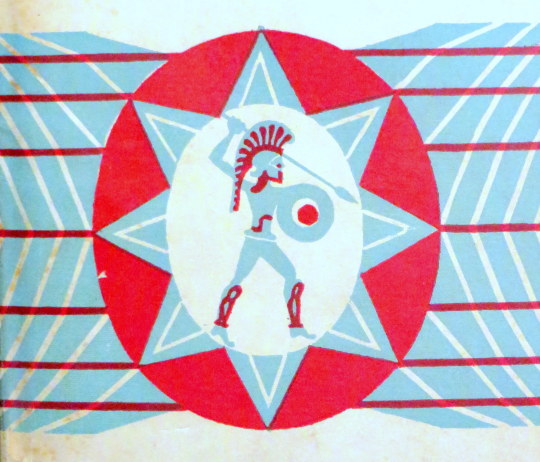
The dust jacket of the Vanguard Library books originally featured a standard design by Edward Bawden of a Trojan warrior on a geometric background.
A page from Bawden’s Sketchbooks showing the designs being worked upon.
Although the series would go on with various designs and dust jackets, it is estimated that only twelve books with Bawden’s covers where issued, all in 1952 with his Trojan design but with colour variations.
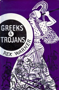
The inspiration for the Trojan design is likely to have come from another book illustration commission Bawden had completed the year before, illustrating Rex Warner’s ‘Greeks & Trojans’.
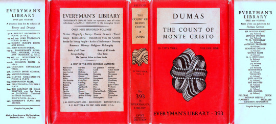
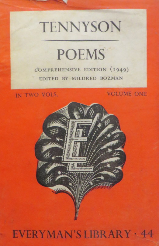
Ravilious & Everyman’s Library The series Eric Ravilious was commissioned to re-design was to run far longer than Bawden’s. J. M. Dent and Company began to publish the ‘Everyman’s Library’ series in 1906. It was conceived in 1905 by London publisher Joseph Malaby Dent, whose goal was to create a 1,000 volume library of world literature that was affordable for, and that appealed to, every kind of person, from students to the working classes to the cultural elite.
An Everyman’s Library book with Ravilious’s designs to the cover 1935-45
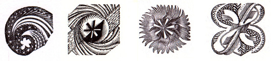
After running for thirty years and likely with the new release of Penguin paperback books, the series went under a redesign in 1935. Eric Ravilious was asked to redesign the covers, end-papers and make graphic devices for each subject that would also be colour coordinated with the dust jackets, like penguin books were. Both publishers where aiming for the same thing, cheap books for the people.
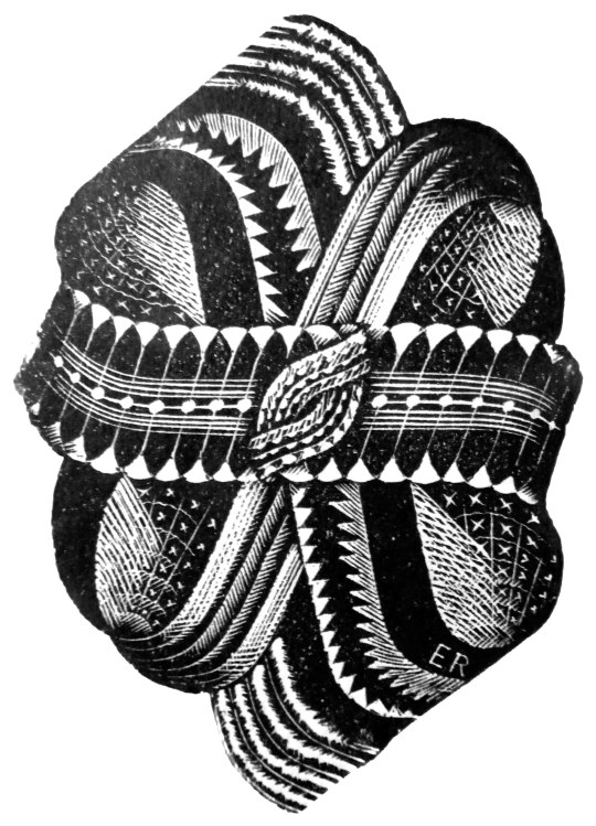
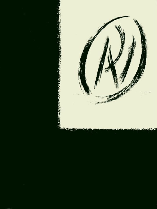
Above is the decorative knot used on the front covers of the books from 1935-1945. Signed ER in the corner. The carving on the top and bottom spikes seemed to lack some detail that would be expected from his normal standard. In two letters to his lover Helen Binyon, Ravilious writes about how the work is rushed and from all accounts takes three months from January to March:
3rd February 1935 …Dents have sent along a proof of the new book which is bad but not very bad, and I am hoping at the eleventh hour to do part of the job again. Unfortunately there is a hurry for it. ‡
21st March 1935
…Everyman is out at last, and seeing six new volumes this morning they looked alright – the one blue Chesterton even rather good. ‡
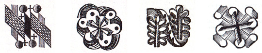
Below are a selection of some of the dust-jacket colours and devices used for the different subjects and featured on the title page of the book. Perplexingly the designs are not featured on the book spines:
Left to right is Oratory (Red), Reference (Pink), Romance (Orange), Poetry & Drama (Green).
Left to right: Science (Grey Blue), Young People (Bright Blue) Travel and Topography (Green), Essays & Bells-Lettres
Looking at the devices under magnification, there is every evidence that the engravings were made in a considerable hurry with engraved lines carrying on where they should have stopped and inadequate clearing of background details, none the less they represent a considerable imaginative achievement and are most effective. ‡
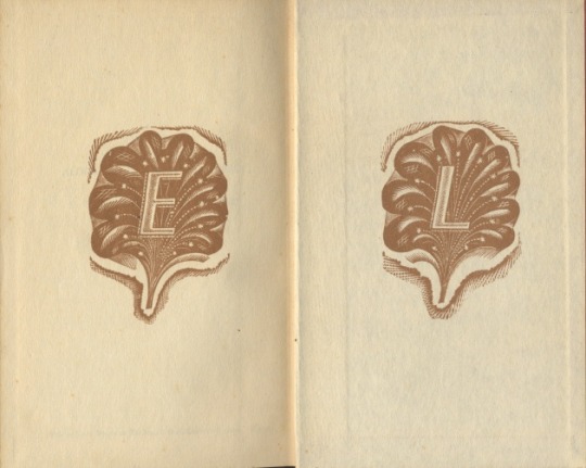
From 1945, the abstract knot was replaced on some volumes with a clam-shell like design overlaid with an ‘EL’, and from 1951 it was used on most jackets until the design was replaced in 1953.
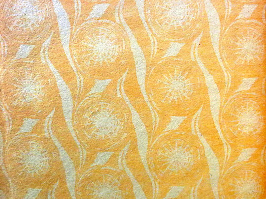
A section of the end paper, with a star like repeat design by Ravilious for the series, it was used from 1935-1953.
An alternative end-paper that was briefly used in 1935 but suspended for the star patterned paper above.
Below is an article by John Russell from The Listener magazine in November 1948. It’s mostly a promotional piece rather than a review, for the book ‘Paul Nash: Paintings, Drawings and Illustrations, 1948′.
The publication of the book was timed with a retrospective exhibition of Nash’s work at the Tate Gallery two years after his death in 1946 of heart failure, as a result of his long-term asthma.
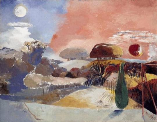
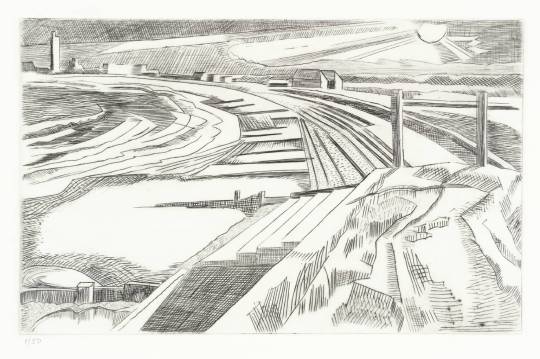
Paul Nash – Landscape of the Vernal Equinox, 1943.
The Vision of Paul Nash by John Russell In a moment of confidence (reproduced in June 1938 in that most fastidious of occasional periodicals, Signature) Paul Nash described how, as a very young man, he broke free from the thraldom of Rossetti. No violence was done; for he still trembled in sympathy with the luckless personages of that Italianate imagination, and was anxious to effect an unobtrusive retreat. ’I might have spared my caution’, he noted afterwards. ‘No one and no thing noticed either my presence or its departure. The lovers stayed locked in their anguished embrace, the chained monkey continued to pick the rose to pieces, the boar-hound of unsure anatomy still slept by the side of the lance and shield. On the window-sill the dove lay dead. Outside the door I passed the frenzied eavesdropper among the shadows’.
The man who could regard his own early attachments – and indeed the whole of life – with such ceremonious irony could not but appreciate the predicament of those who, in future years, will attempt to penetrate the imaginative world of Paul Nash himself. We who have grown up in this world, and marked each of its phases in turn, feel no such difficulty. The dis-peopled landscape of this painter’s art has long been accepted by us; and we know that for Paul Nash the conjunction of a toadstool and a tennis-ball was as significant as the encounter of Lancelot and Guinevere. (He told us so, moreover-remarking that ‘for me at least, the forms of natural objects and the features of landscape were sufficient without the intrusion of human beings, or even animals’.)
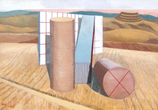
Paul Nash – Equivalents for the Megaliths, 1935.
To this conviction we owe the long series of painting in which he underprivileged members of the natural world were given the stature of heroic beings. It is in these works that the conventional order of landscape painting is reversed, and the fungus, the pebble and the diving-board are presented as triumphal features. In the last years of his life, when illness took from him all freedom of movement, he removed, in imagination, still further from the landscapes available to the casual eye. ‘What the body is denied’, he wrote at this time, ‘the mind must achieve’.
Many a friend and acquaintance of Paul Nash must recall how this painter, remarkable as ever for his anachronistic elegance of dress and diction, would expound in the sedate recesses of north Oxford the new visions on which he was working – the cluster of hellebores aslant the night sky, or the underground fortress of the mole. For those who knew, however slightly, this finest of men, it is natural to wish, and in wishing to assume, that the quality and intensity of his imagination have been perfectly reproduced in his work.
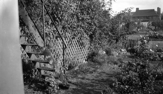
Paul Nash – Iron steps, 106 Banbury Road, Oxford (Nash’s Home).
The wish, if not the assumption, has animated, for example, the majestic memorial volume which Messrs. Lund Humphries have rescued from dereliction. Miss Eates, the general editor, has followed in outline the plans laid down by the artist himself; the publishers, less fortunate, have inherited a quantity of plates, and a quality of paper, that one would not normally associate with their imprint. In default of those last personal ornaments which Paul Nash would have known so well how to give, Miss Eates has called upon four distinguished enthusiasts to contribute essays upon various aspects of the artist’s activity. Mr. Read, Mr. Rothenstein, Miss Ramsden and Mr. Philip James discharge their duties in able and affectionate style; there is a good, though not a complete catalogue of known paintings by Paul Nash; and 132 plates, of which twenty are in colour.
Paul Nash’s pictures are peculiarly difficult to reproduce. The unvarnished surface of his oils inclines to look thin and dry when transposed into monochrome; and as for the key-cold delicacy of his watercolours, there can be few signatures which so constantly evade the reproducer’s craft.
Some periods come off well in this memorial volume – the exacerbated realism, for instance, of the paintings brought home from Flanders in 1918; the patient geometry of the late nineteen-twenties; and some of the pictures which it is possible to regard as his finest work- the series done at Dymchurch between 1922 and 1924, in a landscape where, as Nash later remarked, ‘natural and artificial forms have equal pictorial significance, even amounting to architectural beauty’. As against this, there are many reproductions which can only give, to those who do not known the originals, a derisory impression of the science and devotion which made Paul Nash not merely an original fantasticator, but also the best straightforward water-colourist of his generation.
Paul Nash – The Wall, Dymchurch, 1923.
Nash was that rarest of beings – an English water-colourist who got better and better; and he was never so good as when, during the last holiday of his life, he painted at Cleeve Hill, near Cheltenham, the series of sunset studies which, by their mastery of tone and variety of attack, can rank in the company of Girtin and Cotman. Of these paintings, unluckily, a grotesque amount is given, and one can hardly conceive that the artist would have sanctioned their appearance. One can only be grateful for the enthusiasm and the disregard for commercial obstacles which have gone to the making of this book, and its plates include many works which are rare, and some which have been destroyed; but it remains legitimate to hope that before long somebody will publish Paul Nash’s fragmentary memoirs, and a substantial collection of his admirable letters, for in these shines out the preservative irony which will help the best of his work to survive the hazards of reputation.
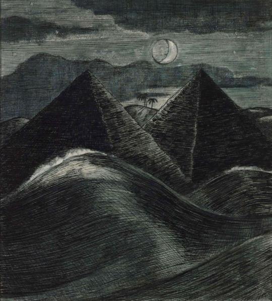
Paul Nash – The Pyramids in the Sea, 1912.
Here are fragments of text by Andrew Causey about Nash’s preparations on the book, that turned into a his memorial publication.
Paul Nash had been preparing for at least two years before his death in 1946 material for the book which Lund Humphries would publish in due course. He collected black-and-white prints from owners, some of them images he had not seen since before the First World War. And though he did not finish the project, he invested considerable time and energy in it, creating the skeleton of a book of which he may be considered part-author, and in which he could take much pride. ‡
The book signalled an advance on the conventional art book at that point: apart from the various authors’ texts, it contained supplementary information, including chronologies of Nash exhibitions and a list of Nash’s paintings and drawings in public collections in Britain and around the world. It was produced under difficult postwar conditions, marked especially by the shortage of paper of appropriate quality. ‡
The correspondence during the Second World War years surrounding Nash’s assembly of plates for what was to become the Lund Humphries book, shows how highly he valued his early drawings made around the family’s home at Iver Heath and how much his emotions were stirred by reliving his early life through his drawings. The paradox is that a book so personal to the artist and so full of references to his own life should not have been seen by Nash in its finished form. ‡
Paul Nash: Paintings, Drawings and Illustrations, 1948.
† The Listener, November 1948. The Vision of Paul Nash by John Russell
‡ Lund Humphries – Celebrating 75 Years of Art Book Publishing. 1939–2014. – Paul Nash by Andrew Causey
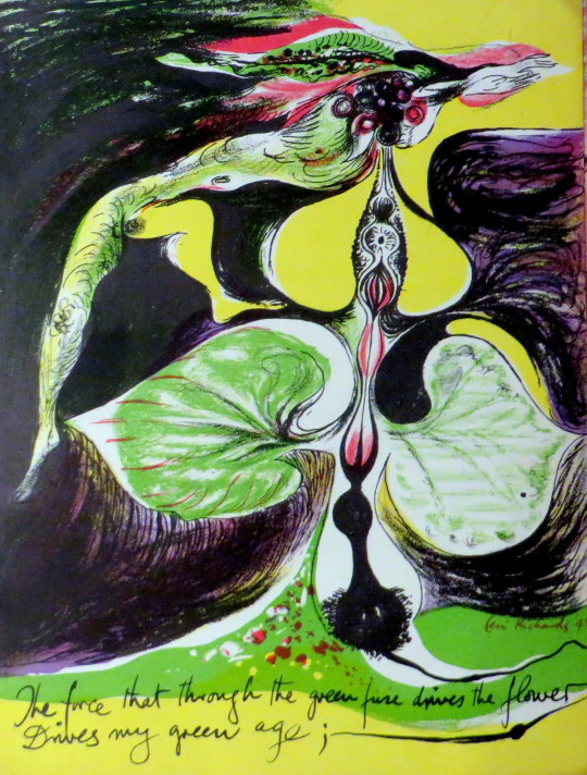
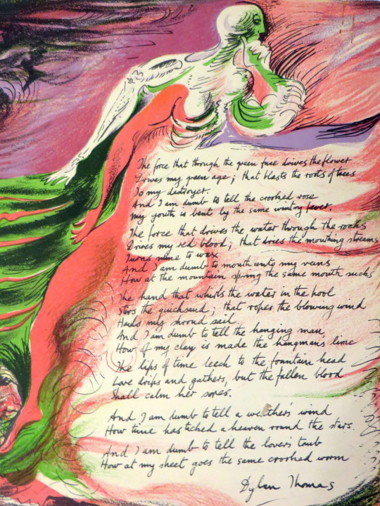
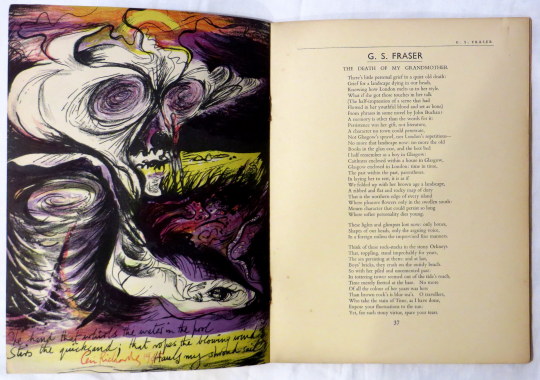
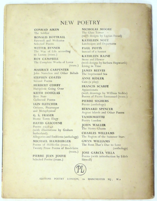
Poetry London: A Bi-Monthly of Modern Verse and Criticism. This publication was founded by Tambimuttu and the first issue was dated January/February 1939. The associated publishing imprint, Editions Poetry London, formed in 1943, produced some 70 books and pamphlets, including by Keith Douglas, G. S. Fraser, Henry Miller, Vladimir Nabokov and Kathleen Raine, before being discontinued in 1951.
This is one of those publications. I have a few in my collection but this is an excellent example as the cover is a lithograph by Henry Moore and inside there a further four lithographs by Ceri Richards, not to mention the authors inside.
Ceri Richards trained at the Royal College of Art from 1924. In 1929 he married Frances Clayton, a fellow artist.
His work gradually moved towards surrealism after exposure to the work of Picasso and Kandinsky. He was also a talented musician, and music is a theme for much of his artwork. From 1959 onwards, he made prints for theCurwen Press. One of the high points of his career was the Venice Biennale of 1962, where he was a prizewinner.
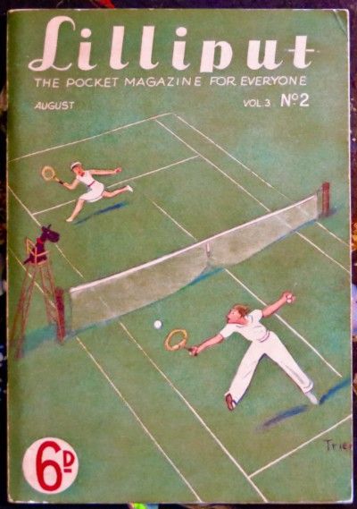
Lilliput Magazine was founded in 1937 by the Hungarian photographer Stefan Lorant. It was a quirky magazine featuring some of the best artists and photographers of that age.
Walter Trier cover for Lilliput.
Lorant was a photographer and film maker working in Vienna, Munich and Berlin before the second world war. He edited the Munich Illustrated News (Münchner Illustrierte Press) putting him against the emerging far right Nazi party in their homelands.
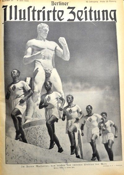
Opposed to Adolf Hitler, Lorant was imprisoned on the 13th March 1933 — right after Hitler came to power. The Nazis then took control of the Munich Illustrated News where famously they printed articles about favourable conditions in the Dachau camps for prisoners.
July 1933 — Cover of the now Nazi controlled ‘Berlin’ Illustrated Press with ideals of Nazi fitness and historical destiny.
Released after six months, Lorant made his way to England, where he wrote ‘I Was Hitler’s Prisoner’, a memoir. He then found work in Britain where he established and edited the Weekly Illustrated in 1934 until he then founded Lilliput Magazine.
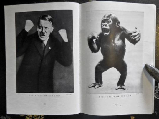
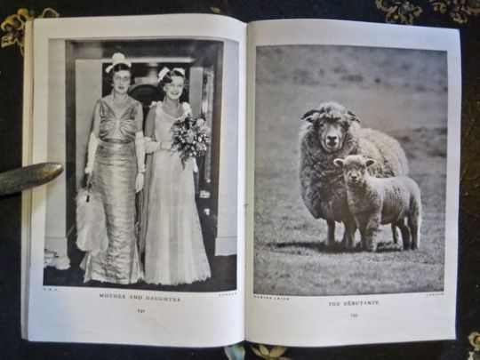
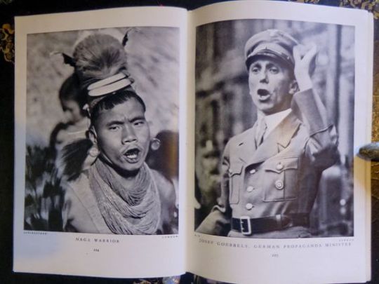
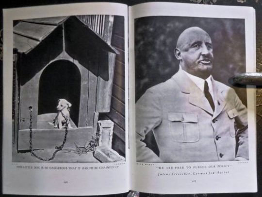
Below are some picture spreads from Lilliput magazine. Mostly contemporary pictures linked with a comic line. They really are fascinating to the spirit of the age, mixed with fun.
The Ruler of Germany — The Terror of the Zoo
Mother and Daughter — The Debutante
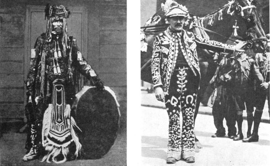
Naga Warrior — Josef Goebels, German Propaganda Minister
This little dog is so dangerous that it has to be changed up — “We are free to pursue our policy” Julius Streicher, German Jew-Baiter.
Some the best spreads of Lilliput’s history where made into a book called 101 Best Picture Comparisons From Lilliput or Chamberlain and the Beautiful Llama.
It was the art of using photos of narrative that was new and Lorant was one of the first people to use only photographs to tell a story without words.
In 1938 Lorant became the editor of Picture Post. While researching for an issue in America he decided to move from Britain to the United States in 1940, he became a naturalised US citizen in 1943. In 1993 Lorant was awarded the International Centre of Photography’s ‘Lifetime Achievement’ Award. He died in Rochester, Minnesota on November 14, 1997.