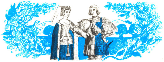
Cookery books are always important social documents, not just for tastes in eating but also for who will be doing the cooking. In the 1930s when more ladies of the house were doing the cooking and not the staff, cookbooks became more about budget, health and economy than the Victorian grandiose books for how to have your staff prepare a banquet. The bookends for the 1930s where the Great Depression and WW2, both had an effect in Britain and publishing. The Government would produce various cook books to promote health in a population with limited budget or ingredients to get the vitamins they needed. Publishing too had become cheaper and books more affordable. In these conditions the start of a suburban cookbook caught the publishers attention.
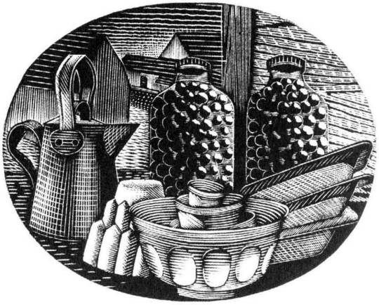
In this post are the books by Ambrose Heath showing various simple designs by Edward Bawden. The dust jacket and book-boards have a two-colour design in linocut and the internal pages are illustrated with black and white pen and ink studies.
I think part of the charm the books had Bawden illustrated was the playful and primitive look. Linocut is a medium that has had a bumpy road in the acceptance of art. Invented as a type of flooring in the 1860s, various artists used it for its printing quality and ease of carving, however detail couldn’t be applied to a linocut without many over-impressions, and the artists who did champion it in the 1920s made abstract works, like Sybil Andrews and many at the Grosvenor School of Modern Art. Books on how to make linocuts were popular such as Claude Flight’s own monograph, but many imitations came after and those books were aimed at the amateur artists or children.
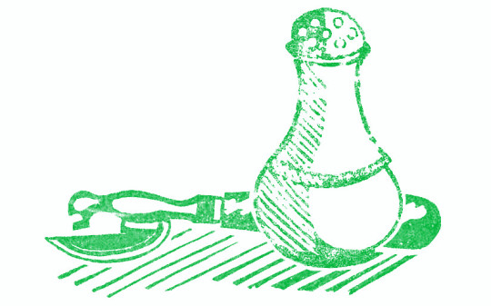
Edward Bawden’s works for linocut are the start of a lifelong pursuit of the medium. Unlike most people who try to start with linocut he saw the trick was to make the items oversized. Detail is for wood-engraving but with linocut it is better to be obvious. The soup-terrine or salt pot are large and simple but also beautiful compared to what cookery books looked like before. The standard type for a cookery book cover would have been a black and white photo of the author or a depressingly garish line drawing, embossed into wine-red cloth in gold, I am thinking of Mrs Beeton.
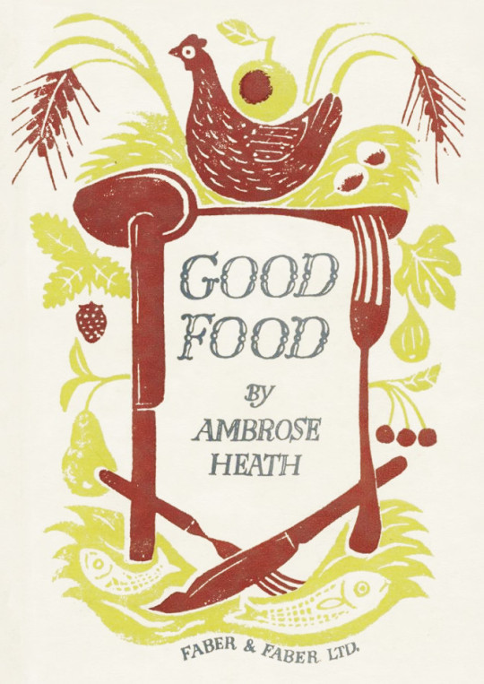
Edward Bawden – Front Cover for Good Food, 1932
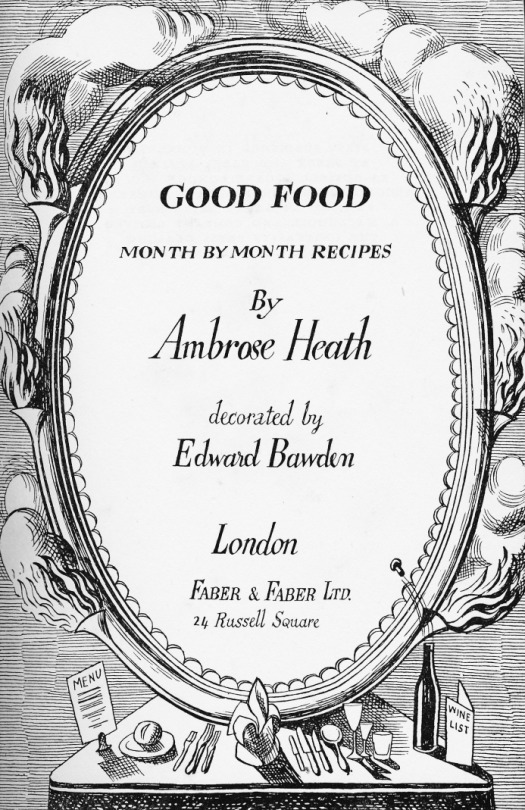
Edward Bawden – Title Page for Good Food, 1932
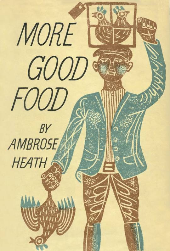
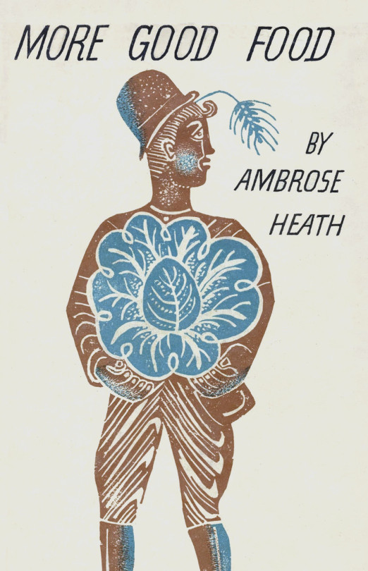
Edward Bawden – Front Cover for More Good Food, 1933
Edward Bawden – Rear Cover for More Good Food, 1933
What also is telling of an attention to quality in these books is that when Good Food and More Good Food were published, they are described as being ‘Decorated by Edward Bawden’ rather than illustrated, a subtle difference but I think it was the start of a change to how people illustrated cookery books.
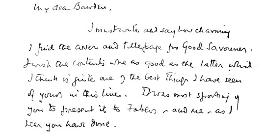
I rather thought that as with most cases the author would have little to do with the designs of the cover or even be able to approve them, but in this case there is a letter from Ambrose Heath to Bawden:
My dear Bawden,
I must write and say how charming I find the cover and title page for Good Savouries. I wish the contents were as good as the latter which I think is quite one of the best things I have seen of yours in this line. I was most sporting of you to present it to Faber, and me, as I hear you have done. †
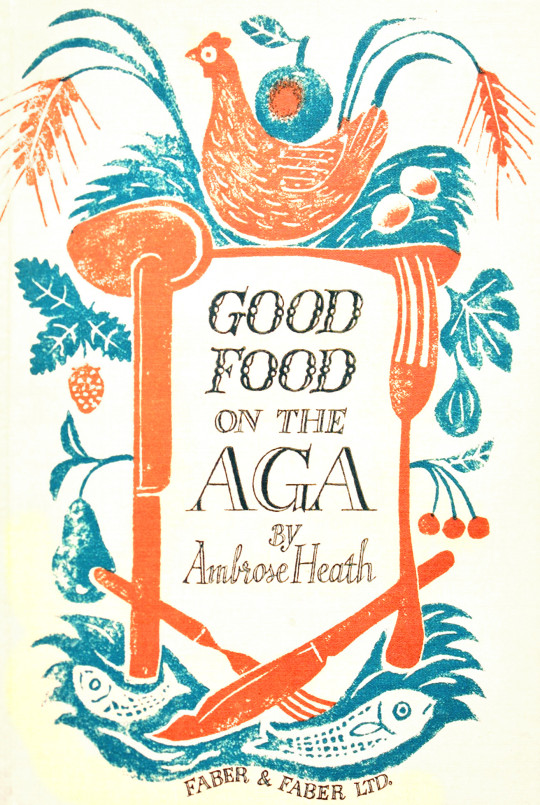
Edward Bawden – Front Cover for Good Food On The Aga, 1933
Ambrose Heath didn’t just write on the subject of AGA cookery; he was a passionate AGA cook himself. A 1933 AGA brochure stated: “For many
months now Mr Ambrose Heath has done his own cooking and tested his professional recipes on an AGA Cooker, and his enthusiasm is unbounded for the AGA cooker’s cooking efficiency. “He explains the various improvements made possible by AGA cooking and the difference in method due to the principle of AGA Heat Storage. He emphasises especially the enormously increased leisure which the AGA affords the Cook.” ‡
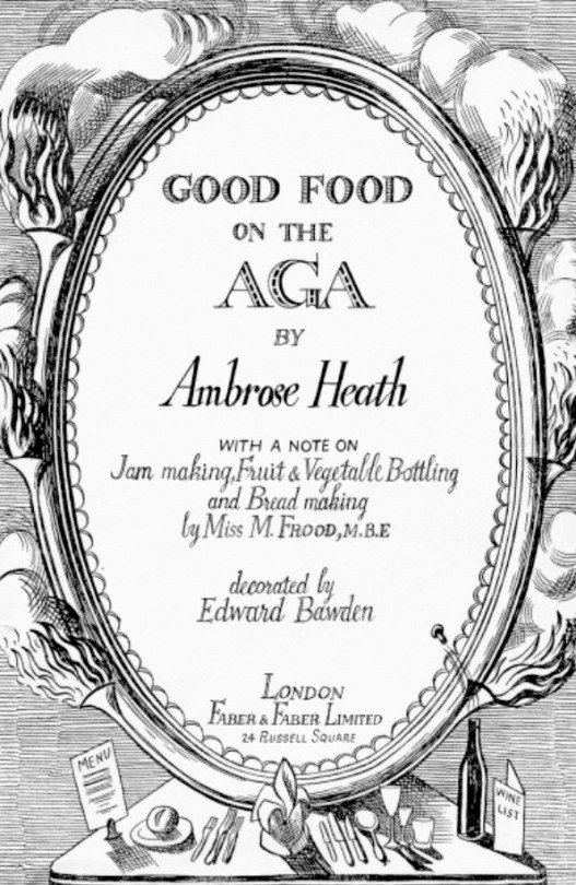
Edward Bawden – Title Page for Good Food On The Aga, 1933
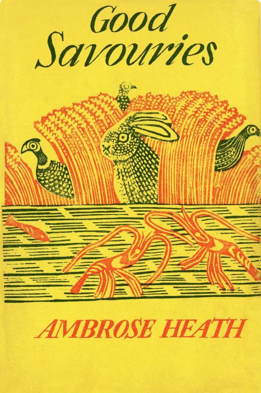
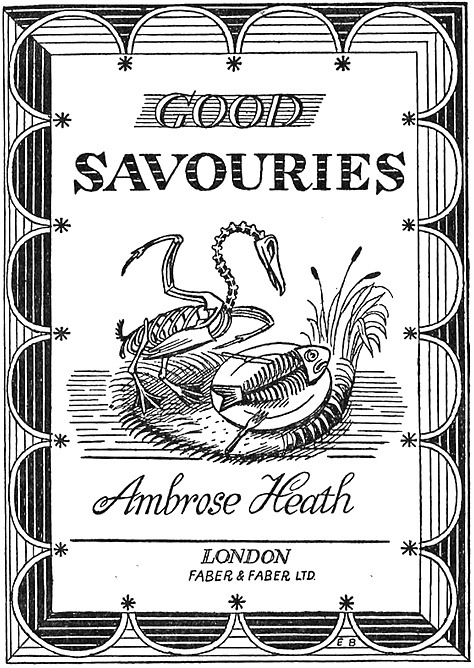
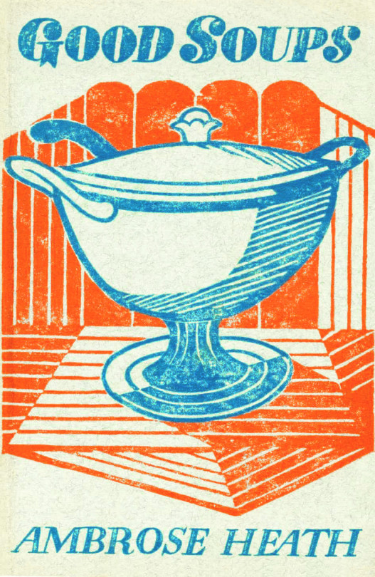
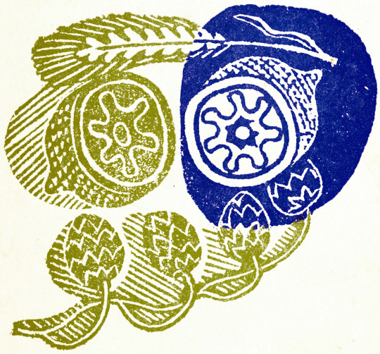
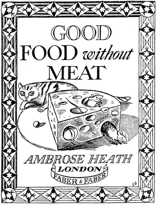
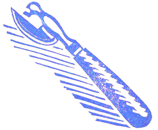
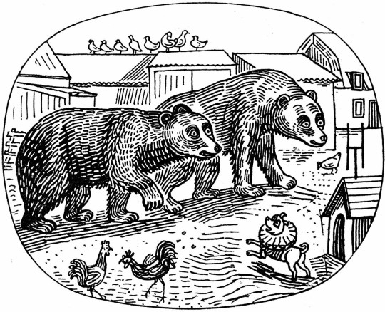
A steady job for Bawden during the thirties was decorating the Good Food guides by Ambrose Heath, published by Faber and Faber. There were ten of these with a dozen line-drawn illustrations inside, and a witty linocut cover, each with superbly inventive margins, different lettering styles and a central illustration – for example, Good Soups has a bird picking the peas from a pod and Good Savouries has a skeleton fowl contemplating a skeleton fish on a plate, elsewhere you might see flies on the crumbs or find mice in the cheese. ♠
Edward Bawden – Front Cover for Good Savouries, 1934
Edward Bawden – Title Page for Good Savouries, 1934
Edward Bawden – Rear Cover for Good Savouries, 1934
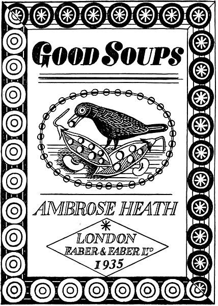
Edward Bawden – Front Cover for Good Soups, 1935
Good Soups is my favourite of all the books for the illustration of geometric patterns and inside the pen and ink drawings are often mistaken for linocut illustrations too.
Edward Bawden – Title Page for Good Soups, 1935
Edward Bawden – Rear Cover for Good Soups, 1935
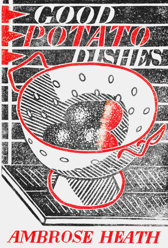
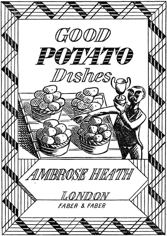
Edward Bawden – Front Cover for Good Potato Dishes, 1935
Edward Bawden – Title Page for Good Potato Dishes, 1935
Edward Bawden – Rear Cover for Good Potato Dishes, 1935
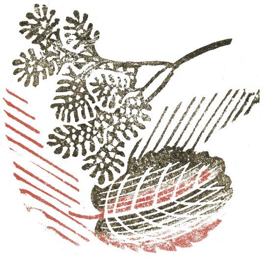
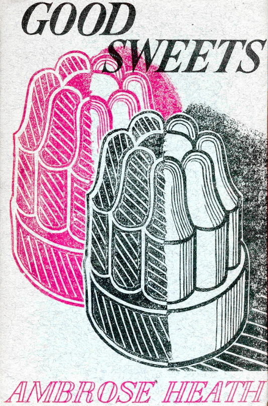
Edward Bawden – Front Cover for Good Sweets, 1937
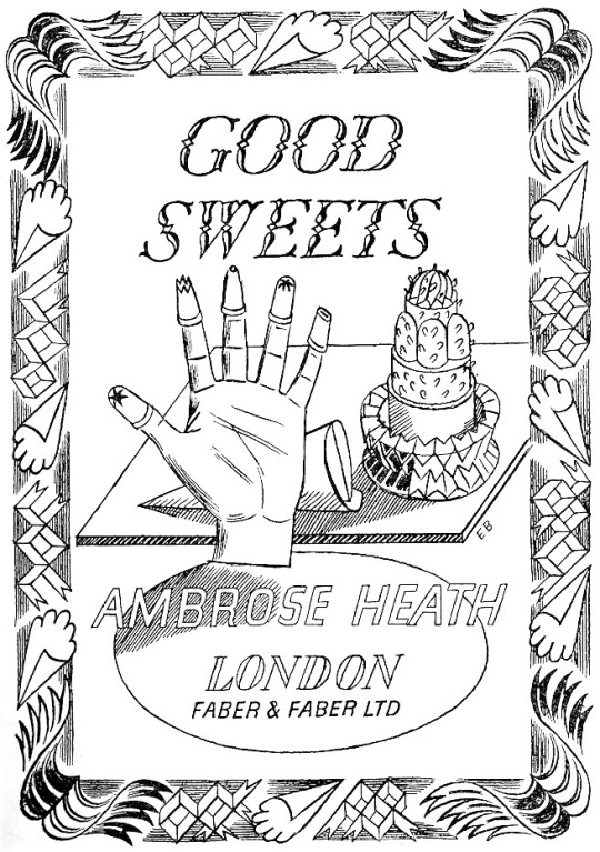
Edward Bawden – Title Page for Good Sweets, 1937
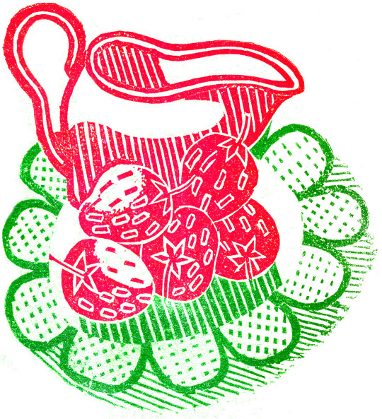
Edward Bawden – Rear Cover for Good Sweets, 1937
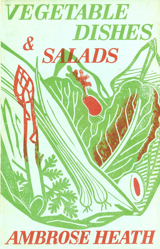
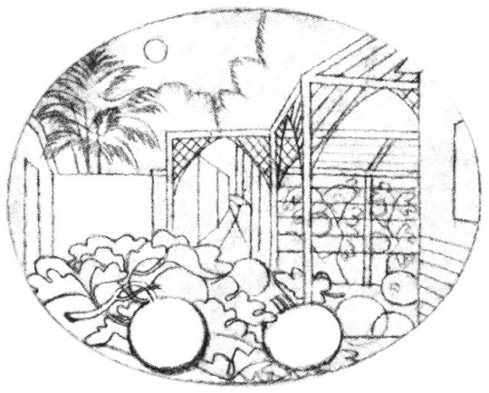
Edward Bawden – Front Cover for Vegetable Dishes & Salads, 1938
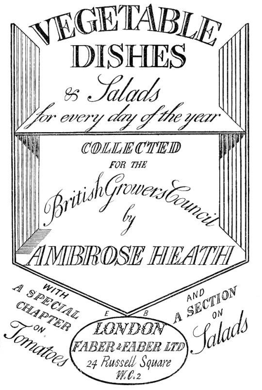
Edward Bawden – Title Page for Vegetable Dishes & Salads, 1938
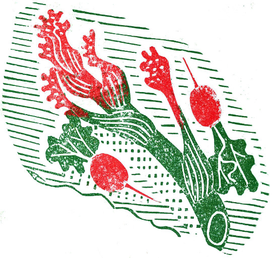
Edward Bawden – Rear Cover for Vegetable Dishes & Salads, 1938
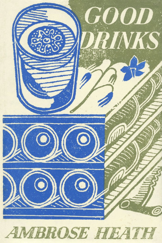
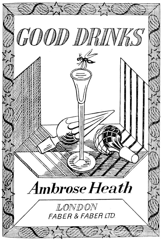
Edward Bawden – Front Cover for Good Drinks, 1939
Edward Bawden – Title Cover for Good Drinks, 1939
Edward Bawden – Rear Cover for Good Drinks, 1939
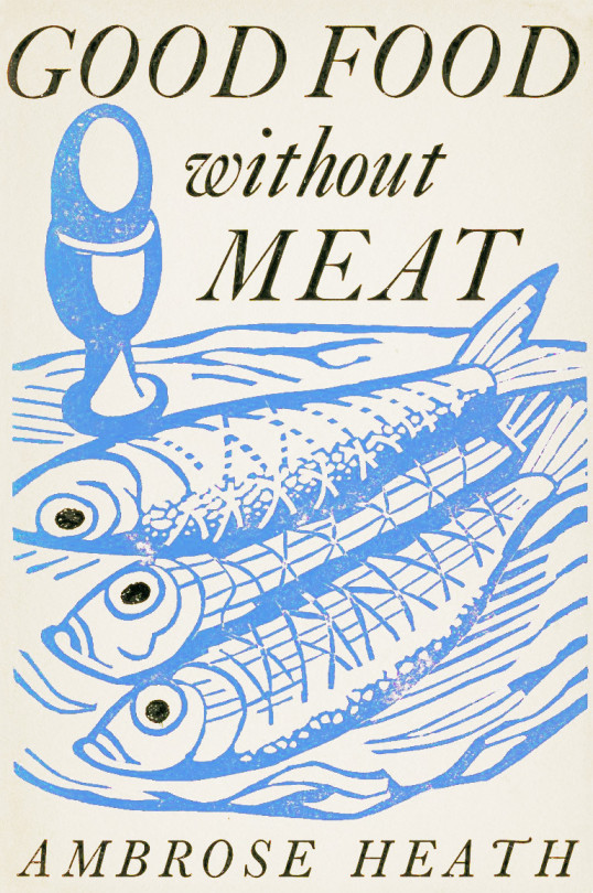
Edward Bawden – Front Cover for Good Food Without Meat, 1940
Edward Bawden – Title Page for Good Food Without Meat, 1940
Edward Bawden – Rear Cover for Good Food Without Meat, 1940
† Letter to Edward Bawden from Ambrose Heath, 31st May 1934. ‡ How The Aga Cooker Became An Icon, 2013, p32 ♠ Malcolm Yorke – Edward Bawden and His Circle, 2007, p74
This is the first part in a series of posts I have been working on about the cookery books made by artists of Great Bardfield. This first volume is on Eric Ravilious.
Eric William Ravilious (22 July 1903 – 2 September 1942) was an English painter, designer, book illustrator and wood-engraver. He grew up in East Sussex, and is particularly known for his watercolours of the South Downs and other English landscapes, which examine English landscape and vernacular art with an off-kilter, modernist sensibility and clarity. He served as a war artist, and died when the aircraft he was in was lost off Iceland. ◊
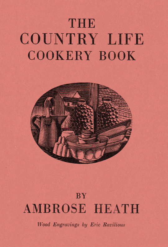
Dust Jacket for The Country Life Cookery Book by Ambrose Heath, 1937
The Country Life Cookery Book was published in 1937 and illustrated by Eric Ravilious. Country Life to some may just be the magazine, but at this point in history they were a major publisher about architecture, craft and a style of country life that would appeal to the new middle and upper classes of Britain. The publications normally contained lots of high quality photography.
In the same year as the Cookery Book was published were many other books, here are a few others for adults: Where To Catch Salmon And Trout, Elements Of Stabling, Morning Flight A Book Of Wildfowl, Gun For Company, Victorian Street Ballads. For children there were: Skilled Horsemanship, The Golden Knight and Other Stories, Peter & Co, Knight in Africa and Rajah the Elephant… as part of the ‘Junior Country Life Library’.
The books are countryside propaganda in the age of travel by train, omnibus, charabanc and car. They were promoting Britain in the way they wanted to see it. It is fair to say when people talk about the ‘Golden Nineteen-Thirties’ that Country Life had a great deal in the legend.
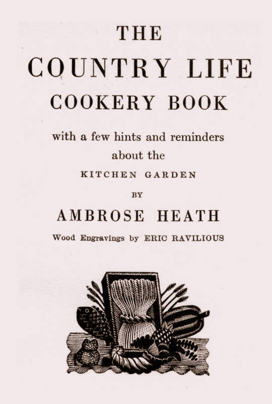
The Title-Page
Eric Ravilious – Title-page of the Country Life Cookery Book, 1937
We know Ravilious got the commission for the cookery book in July 1936 as he wrote in this letter to Helen Binyon:
This book is now begun and begins to be promising. †
The wood-engravings follow a seasonal theme, month by month rather than chapters on food or following the text – this calendar style is like the other Ambrose Heath books for Faber & Faber that Edward Bawden had illustrated for the previous five years. Only 12 blocks were cut by Ravilious for the in the book, so with the title page decoration, two of the months (January & December) used the same image. One can only assume this was how many images they thought they needed and so how many images they paid for.
Having the chapters as seasonal months would also hurry the project along from the illustration front – as in April of 1937, nine months later, Ravilious wrote to Binyon:
I don’t believe Heath has written his text yet. ‡
But not having the text as a guide would mean Ravilious could invent the illustrations from his mind and use past works. He worked on the illustrations from July 1936 – February 1937 while taking on other commissioned work and finishing a series of watercolours.
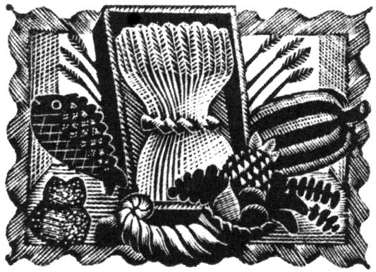
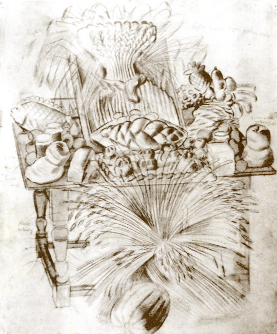
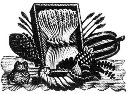
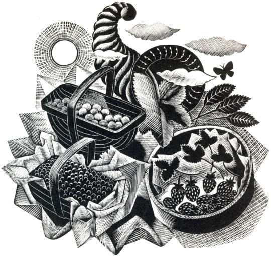
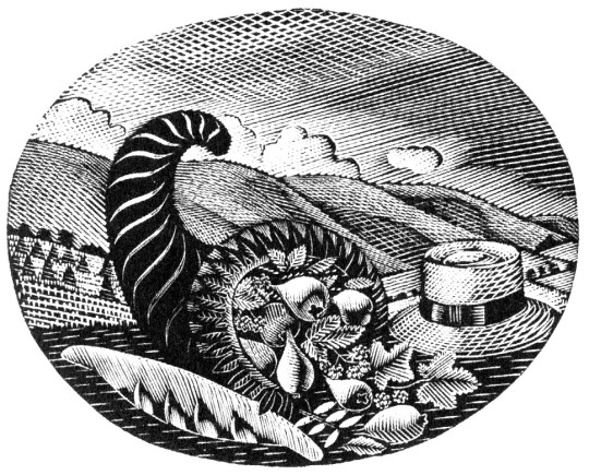
Below is the title page wood-engraving of a framed cornucopia, a wheat-sheaf and food produce. This illustration is a reject from another job.
Eric Ravilious – Title-page (Harvest Festival), Wood-engraving for the Cornhill Magazine, 1936
Ravilious was completing a commission for The Cornhill Magazine in the later part of 1936 and the project overlapped with the Cookery Book. So when one of the wood engravings was rejected by John Murray (editor of The Cornhill) he used it on the cookery book. I thought this engraving was a bit surreal and over the top until I discovered a drawing of it below.
Eric Ravilious – Harvest Festival and Loaves, 1936
I’ve been drawing the bread table in the church – dead and fancy loaves, barley and corn, apples and eggs – and I thought it too beautiful not to place on record. ♠
Having been rejected for one job Ravilious cut away the framed backdrop of the table and submitted the wood-engraving below for the Cookery Book project instead.
Eric Ravilious – Title-page (Harvest Festival), Wood-engraving for the Country Life Cookery Book, 1937
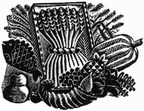
Below is another woodblock based on the same image made for The Writings of Gilbert White of Selborne in 1938. It’s a new version and not an edited restrike. Likely cut in 1937 as the job was commissioned in May of that year and the book published in 1938.
Eric Ravilious – (Harvest Festival), Wood-engraving for The Writings of Gilbert White of Selborne in 1938
January and December
Eric Ravilious – January & December, Wood-engraving for the Country Life Cookery Book, 1937
January & December is the block that is used twice in the cookery book.
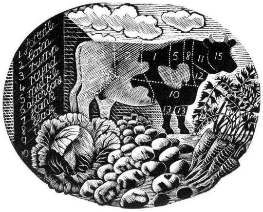
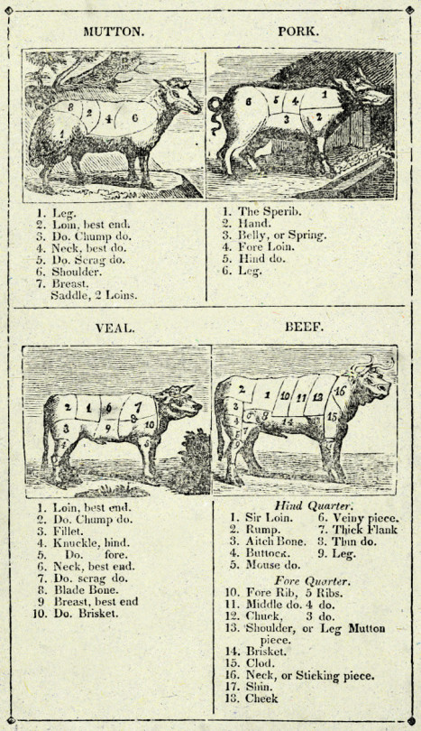
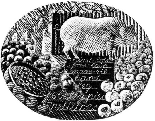
Ravilious would also find inspiration in the past. He owned a copy of The Frugal Housewife published by J Fairburn, 1838 and below is the meat guide on animals. I think this Ravilious woodcut is one of the defining moments in cookery illustration and helped re-popularise this old fashion key to animal flesh. The meat guide is now a typical image to see in cookery books to educate what meats can be gained from an animal. It is used three times in this book. He mentions the idea to use old cookery books below:
I’ve had what you would call a cleaver idea, and Mrs Beeton has been a help. †
Frontispiece – The Frugal Housewife, J. Fairburn, 1838
February
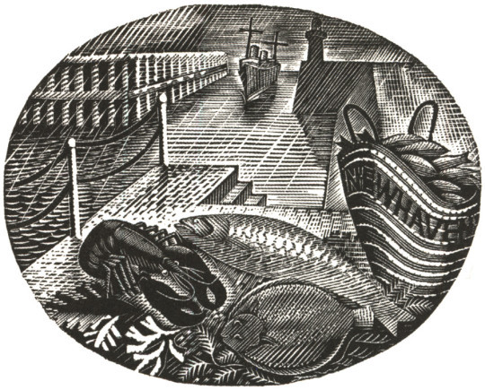
Eric Ravilious – February, Wood-engraving for the Country Life Cookery Book, 1937
In the August of 1935 Edward Bawden and Ravilious went on a painting trip to Newhaven and in the wood-engraving above, the basket of fish emblazoned with the name of the town.
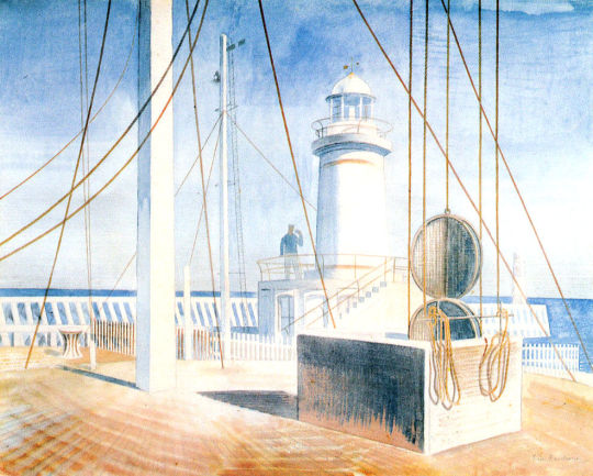
The idea for the wood engraving would also pop up again in another format, this time a print for Contemporary Lithographs, a company working with artists to make large runs of lithographic prints that would be cheap for the public to buy from the Zwemmer Gallery. Below is one of the watercolours from 1935 that could have been the inspiration for the commission. (The watercolour was also sold via Zwemmer Gallery).
Eric Ravilious – Newhaven Harbour, 1935
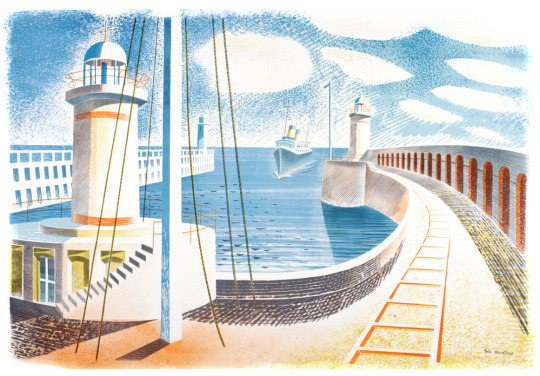
The print that Ravilious completed is very similar to the Cookery Book print as the jobs overlapped. The official title of the print is Newhaven Harbour but Eric referred to the print as ‘Homage to Seurat’. Helen Binyon wrote that the print has a:
scene of sensitive clarity and beautiful luminosity ♦
Eric Ravilious – Newhaven Harbour, Contemporary Lithographs Ltd, 1937
Eric Ravilious – February, Wood-engraving for the Country Life Cookery Book, 1937
March
Eric Ravilious – March, Wood-engraving for the Country Life Cookery Book, 1937
A pig surrounded by the fruit of choice, apples, and to the left of the wood-engraving a garden sieve with berries upon it. The watercolour below comes from the same year as the Cookery Book’s commission, but is now one of the lost paintings of Ravilious, it was also damaged when last seen having had the top left corner ripped and creased.
Trugs with Fruit is a lost watercolour by Eric Ravilious, damaged. In the corner it may have been framed and sold or just disregarded and thrown away, but it appears in the wood engraving in this commission for John G Murray, editor of the Cornhill Magazine. It was made for publicity for the Magazine but so far has only ever been seen on the compliment slips they had for a short time.
Eric Ravilious – Trugs with Fruit, 1936
April
Eric Ravilious – April, Wood-engraving for the Country Life Cookery Book, 1937
Rather like the Title Page, the wood engraving for April came at the same time as the Cornhill Magazine commission. Below is a watercolour, now presumed lost of trugs of fruit and the same trug appears in the wood engraving next to a glass of mint – these are red currents and mint, said to be the good sauces for Lamb.
Eric Ravilious – Trugs with Fruit, 1936
The wood-engraving below would have been copied from the painting and in the printing process it appears reversed, it comes with the same cornucopia from the title-page engraving.
Eric Ravilious – Autumn Fruits, 1936
And here you can see the wood-engraving in use on the Cornhill Magazine compliment slip.
Eric Ravilious – Cornhill Magazine Complement Slip with Autumn Fruits, 1936
May
The wood-engraving for May looks to be the most original of all of the illustrations, I can’t think of having seen any element in past work.
Eric Ravilious – May, Wood-engraving for the Country Life Cookery Book, 1937
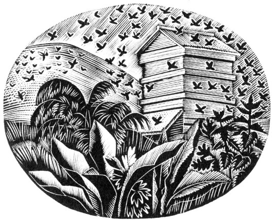
June
Eric Ravilious – June, Wood-engraving for the Country Life Cookery Book, 1937
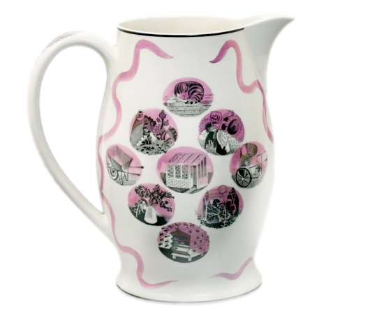
The June illustration features a bee-hive. A variation of the image would be used two years later on The Garden Implements Jug that was also designed by Ravilious for Wedgwood. The bottom most vignette.
Wedgwood Garden Implements Jug, 1939
July
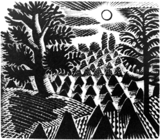
Eric Ravilious – July, Wood-engraving for the Country Life Cookery Book, 1937
The wood-engraving for July has roots in many places. The finished wood block has a hat, cornucopia of pears, a hat on the backdrop of hills and cornstooks. In an early drawing for the wood-block the hat is in the same place (reversed when printed) but many of the other elements have changed.
Eric Ravilious – Proposed July Block, Drawing made on tracing paper for woodblock, (reversed for printing), 1936
It is likely that the print Ravilious drew out was inspired by the Harvest theme of the month he was illustrating and he looked back on older work. Below the wood engraving from 1934 is one of many Curwen Press Stock Blocks. They are woodblocks and prints the press has paid artists to make so they can be used without the need to hire an illustrator for a job, so production times can be quicker and still have illustrated items.
The tree and setting of cornstooks reminded me of the drawing he made above and even the way the stooks flow uphill.
Eric Ravilious – July, Wood-engraving for the Country Life Cookery Book, 1937
Eric Ravilious – Curwen Press Stock Block 985, 1936
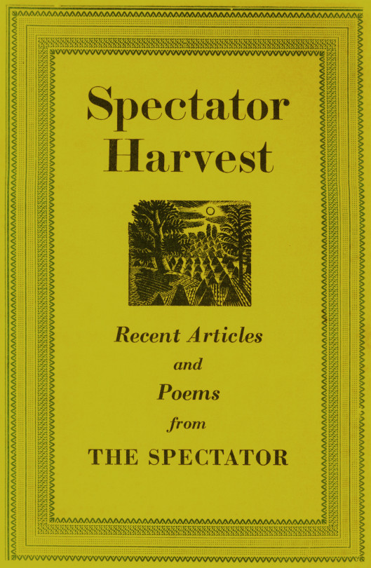
The booklet the block was used upon happened to be called Spectator Harvest, for the Spectator Magazine.
Spectator Harvest, 1952
It was also re-cut in mirror image for The Writings of Gilbert White of Selborne in 1938.
Eric Ravilious – Selborne Tailpiece Volume 2, 1938
But back to the cookery book – the cornucopia below (that appeared next to a hat and a baguette) has been seen before in this post – in the wood-engraving in use on the Cornhill Magazine compliment slip.
Eric Ravilious – July, Wood-engraving for the Country Life Cookery Book, 1937
One above the other, it isn’t hard to see a link.
Eric Ravilious – Autumn Fruits, 1936
August
Eric Ravilious – August, Wood-engraving for the Country Life Cookery Book, 1937
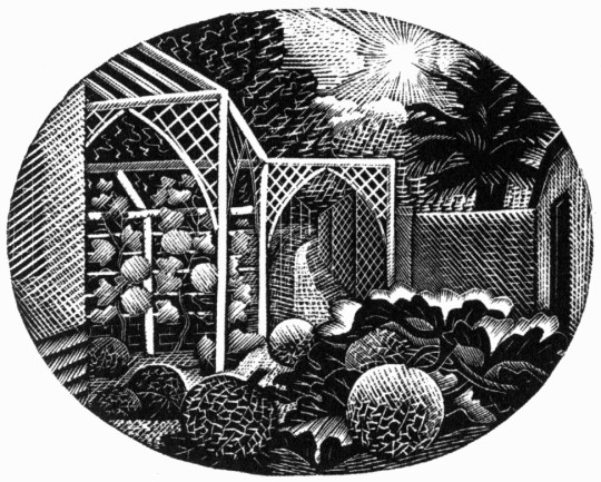
For the August vignette Ravilious chose to illustrate the garden of Brick House in Great Bardfield. Ravilious and his wife Tirzah had shared the house with Edward Bawden and his wife Charlotte from 1932 until 1935 when the Raviliouses moved to near-by Castle Hedingham.
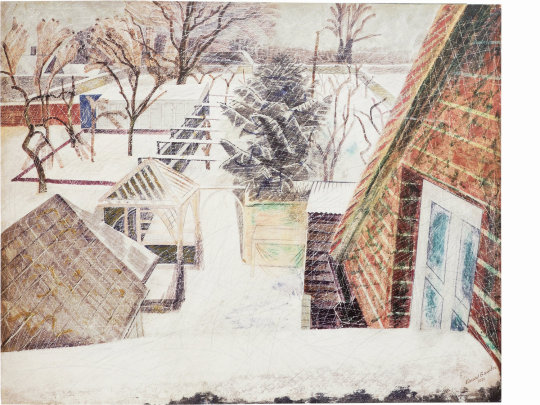
In 1936 Bawden painted the garden in the winter of the Cookery Book commission showing the wood gazebo that was up in 1932 as it was a wedding gift from Eric and Tirzah to Edward and Charlotte. The arches must have been added between then, around 1936.
Edward Bawden, February 2pm, 1936
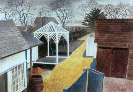
Eric Ravilious – The Garden Path, 1933
Eric Ravilious – August – Drawing made on tracing paper for woodblock, 1936 (reversed for printing)
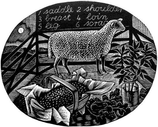
September
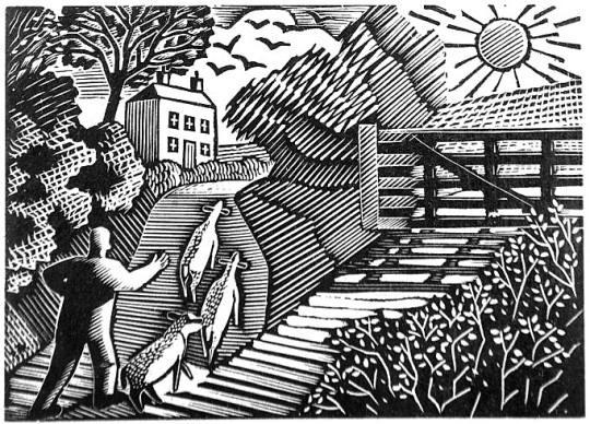
Eric Ravilious – September, Wood-engraving for the Country Life Cookery Book, 1937
The illustration for September shows the game shooting season and a brace of birds, maybe a goose to the left and pheasants to the right in front of a country lane. Below is the original trace drawing for the block, reversed for printing.
Eric Ravilious – September, Drawing made on tracing paper for woodblock, (reversed for printing), 1936
Followers of my blog would not be surprised to see that the illustration bears a similarity to another one, the wood-engraving for London Transport, this is confirmed in a letter to Helen Binyon again:
The jobs, cookery and Green Line advertisements – are all done and sent off and very glad am I that hard work is finished. ♣
Counter to the letter I can’t find another reference to them in print.
Eric Ravilious – The Shepard, 1936
The Shepard is one of the most lively engravings that Ravilious made for London Transport. The Sheep and their ears with the hillside up to the house are pleasing. The technicality of the halftone shading are some of his best. ♥
The Cookery Books version of the engraving is more detailed, I think because the printing was likely to be finer than the press adverts the London Transport one would be reproduced in.
Eric Ravilious – September, Wood-engraving for the Country Life Cookery Book, 1937
October
Eric Ravilious – October, Wood-engraving for the Country Life Cookery Book, 1937
October sees kitchen items, a jug, copper jelly mould stacked mixing bowls and baking trays with two jars of preserved items.
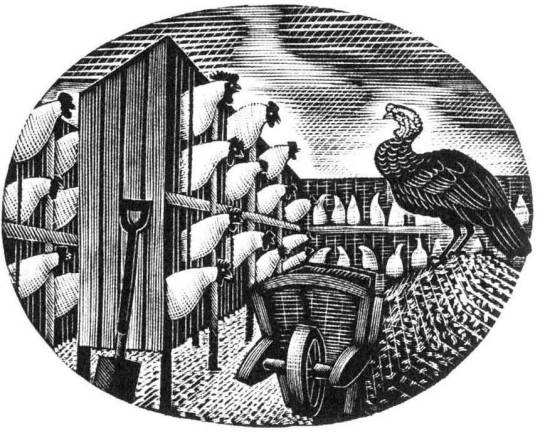
November
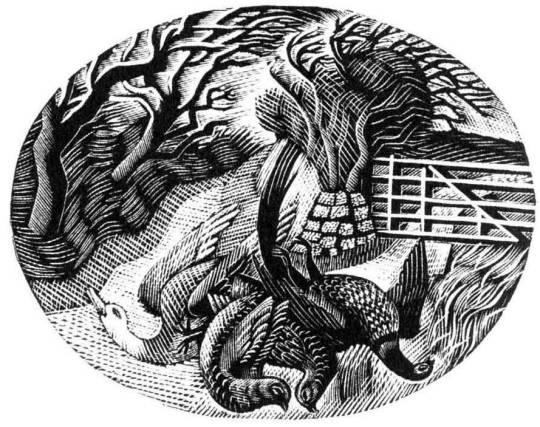
Eric Ravilious – November, Wood-engraving for the Country Life Cookery Book, 1937
The last work of a chicken farm and a turkey with wheelbarrow gives the Christmas feeling and may have been marked to have been the December illustration but January’s wood-engraving was also used as December.
† Eric Ravilious to Helen Binyon – 19th July, 1936 ‡ Eric Ravilious to Helen Binyon – 14th April, 1937 ♠ Eric Ravilious to Helen Binton – 6th October, 1936 ♣ Eric Ravilious to Helen Binyon – 17th August (1936) ♦ Helen Binyon – Eric Ravilious: Memoir of an Artist, 2016 ♥ Robjn Cantus – A Journey of London Transport with Eric Ravilious, 2018 ◊ Wikipedia – Eric Ravilious
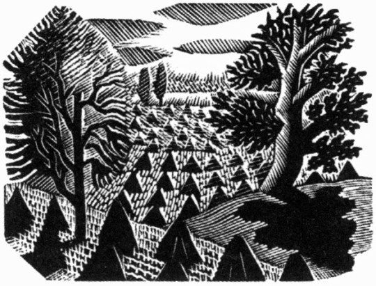
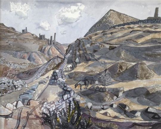
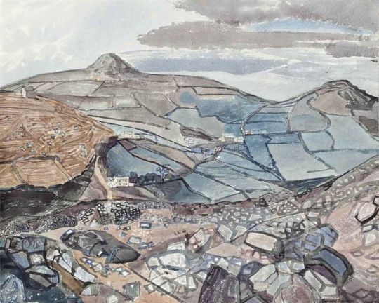
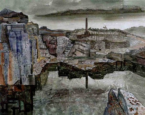
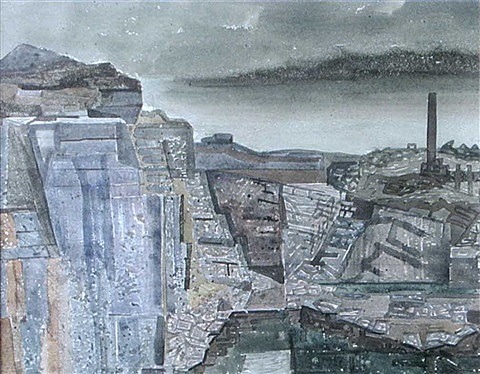
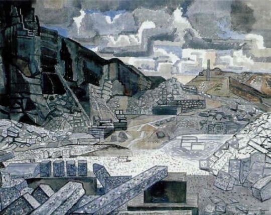
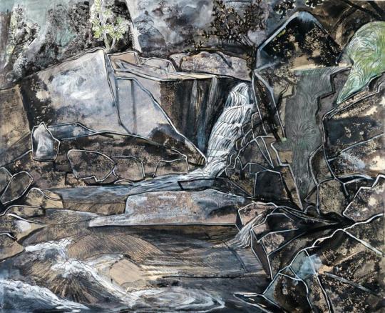
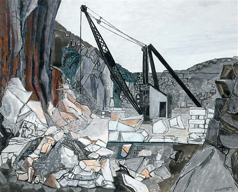
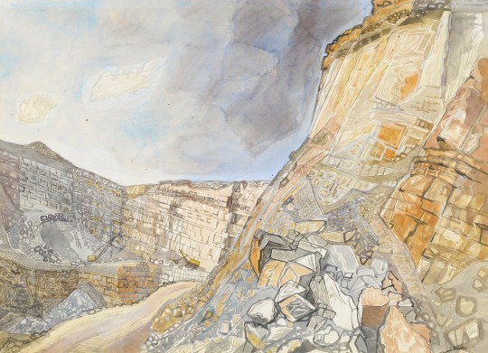
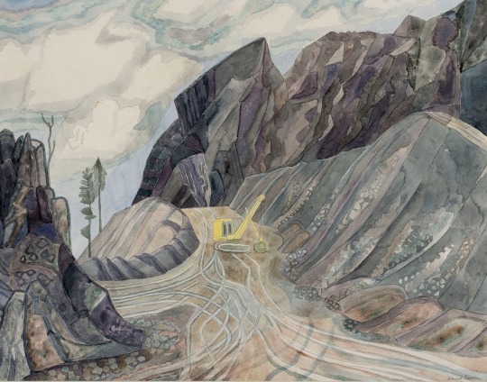
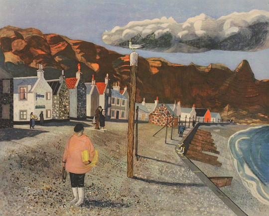
Edward Bawden frequently would take painting holidays in Cornwall. The landscape is hilly and pastoral unlike Bawden’s home in Essex made up of arable crop fields. A stony landscape of quarries, hill contours and spires made from tin mining ruins and churches set a challenge and some of the most curious paintings in his repertoire.
I think what I like so much about these paintings is the lack of abstraction that comes from the Cornish schools of art. Rocks are painted in details to the point they look like leaded stained-glass windows. The Quarry paintings from 1960 look as menacing as the effort to destroy the natural landscape they are in, each of the three I have depicted look like scenes from a nightmare. The only paintings that look typically Bawden are of Caerhays Castle.
Edward Bawden – Caradon, 1958
Edward Bawden – St. Neot, Cornwall, No. 2, 1958
Edward Bawden – Near Liskeard, 1958
Edward Bawden – View Toward Henwood, Minions, Cornwall, 1958
Edward Bawden – Gold Digging Quarry, Minion, Liskeard , 1958
Edward Bawden – Gold Digging Quarry, Minion, Liskeard (detail), 1958
Edward Bawden – Cheesewring Quarry no.4, Minions, NR Liskeard, 1958
Edward Bawden – The Engine House, Cornwall, 1960
Edward Bawden – The De Lank River, Cornwall, 1960
Edward Bawden – The De Lank Quarry No.2, 1960
Edward Bawden – Nant Mawr Quarry, Cornwall, 1971
Edward Bawden – Quarry at Pengwern II, Llanwrst, 1977
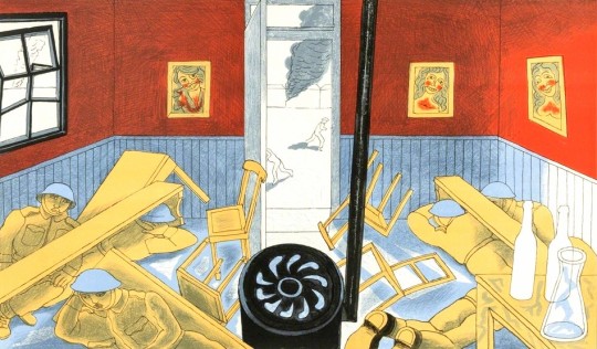
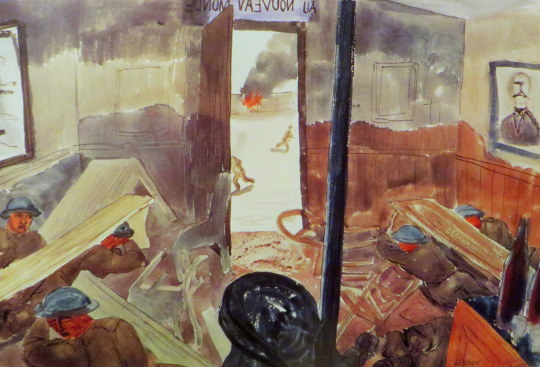
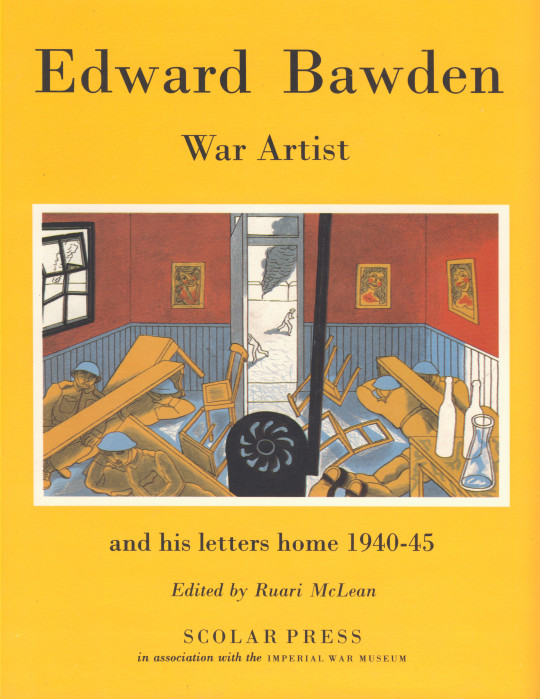
This post started looking at the difference between the Dunkirk painting and the print, but I thought it was also a good excuse to talk about the Edward Bawden ‘War Artist’ book. One of the cheaper Bawden books to buy it is full of Edward’s letters home with 38 of his war paintings.
Edward Bawden – Dunkirk, 1986
Above is the print of the Dunkirk bombings. Below is the original painting, but there is 40 years difference between the pair.
Painted by Edward Bawden during the shelling of Dunkirk in May 1940, the watercolour shows the interior of a bar and the soldiers hiding from shots under the tables. The bar ironically is called Au Nouveau Monde, ‘In The New World’. Paintings of Dunkirk fascinate me as it was such chaos it would have taken real nerve to paint at all.
Edward Bawden – Dunkirk, 1940
Bawden marched into Dunkirk with the retreating troops through lines of jeering French. The generals had already left by then, as Bawden noted: ‘Well, the rats go first”. Later he said: “By temperament I am a pacifist. War horrifies me, it horrified me then…. I hated the big bangs. No one knew what was happening , and I was just tossed about like a bad penny. Nobody wanted a war artist. Every day I got shoved off to a new unit.”
At Dunkirk he didn’t head for the beach and the rescue boats but to the docks where he holed up for two days making notes of chaotic smoke-filled scenes as thousands of troops tried to get away under constant strafing and shellfire. Eventually a boat came near enough to scramble aboard and he found it full of exhausted men ‘lying in heaps everywhere, some only half dressed.
Edward Bawden – War Artist prospectus, 1986
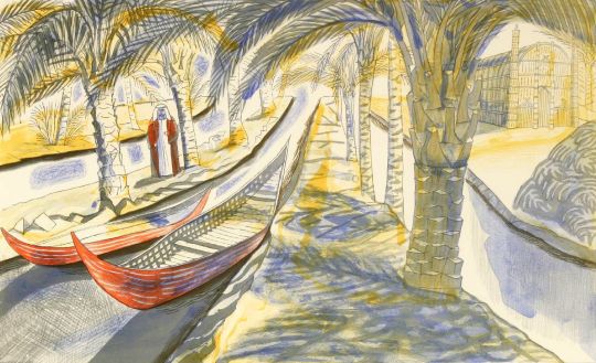
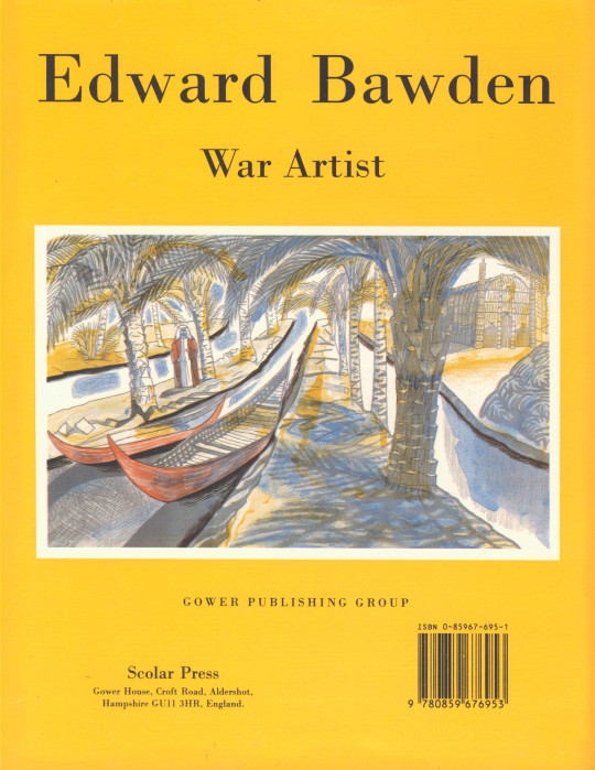
In 1989 Bawden released a series of his war letters, edited by Ruari Mclean. Edward Bawden War Artist and His Letters Home 1940-45. The book was due to come out in 1986 in a different format, a wide landscape book, signed and limited edition published by the Hurtwood Press. But the project stalled and ended up being rekindled and published in a landscape format in 1989.
Above is the original prospectus for the 1986 book that was never produced in this format. It would have looked much like a Fleece Press book.
To accompany the 1986 book would have been two new lithographs, but these were released without the book and then used as the front and back covers of the 1989 dust jacket. The Hurtwood Press published Among the Marsh Arabs, and Dunkirk in 1986.
Edward Bawden – Among the Marsh Arabs, 1986
Below are the front and back views of the 1989 book with the lithographs used as artworks.
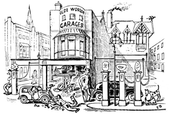
I rather love these adverts by Edward Bawden from the Architects Journal to promote Zinc from 1945-46. From the end of WW2 Britain needed to be rebuilt and Zinc Development Association wanted it to be done with Zinc! In the 1940s it was in direct competition with Aluminium and the asphalt roofing roll.
Bawden completed 12 adverts, one would guess each for a monthly copy of the Architects Journal and Architectural Review (where they were advertised). Bawden got the job from his life-long friend and patron Robert Harling, who was working for Everett’s Advertising Agency at the time. Harling was the fairy godmother to Bawden, providing him with work throughout his life and even penned a book on the artist, he wrote novels and worked as a typographer.
I think the typeface used in this adverts are delightful as well.
The full advert has some text under it, rather bleak and a little bulling I think. Each advert had something related but all about rebuilding Britain, post war.
Until the road system of England is one grand impenetrable traffic-jam, peacetime productions will mean more and more cars. And more and more cars will mean more and more garages. And heaven grant these garages will be neither in the shed-and-shanty nor in the Bypass-Tudor-cum Queen Anne manner, but decent, dignified and honestly contemporary. Their building will demand zinc. For zinc lasts long, resists atmospheric corrosion manfully and does its job economically. It has proved itself the best permanent material for roofs, gutters, weathering and down-pipes. And the wise architect will look into the many new ways and means of unit it.
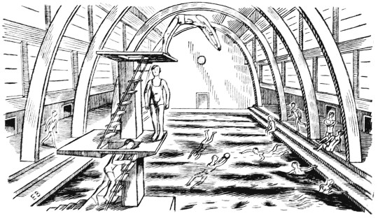
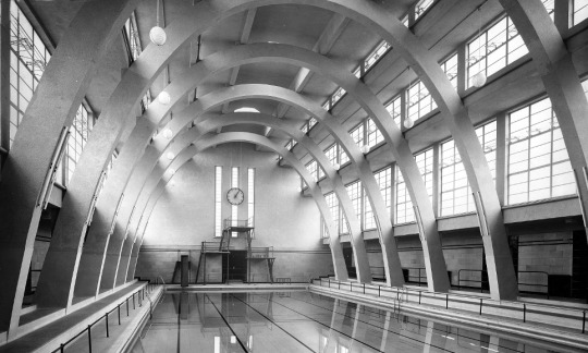
It can only ever be a guess but the swimming pool here is very similar to the Mounts Baths in Northampton, opened in October 1936 pictured below when they opened from Architectural Review.
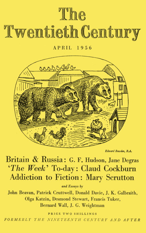
A short post showing the link between two Edward Bawden works. One is the illustration for the cover of The Twentieth Century, April 1956 and the other, a linocut print ‘Ives Farm’ that Bawden also produced in the same year. It isn’t a long post but little by little these observations all shall build up.
I had posted both works before but I just hadn’t noticed the cottage hiding in the corner.
Edward Bawden – Illustration for the cover of The Twentieth Century, April 1956
Edward Bawden – Ives Farm, 1956
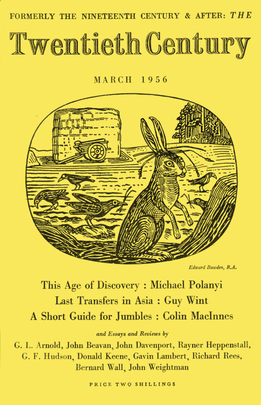
Edward Bawden – Cover of The Twentieth Century, April 1956
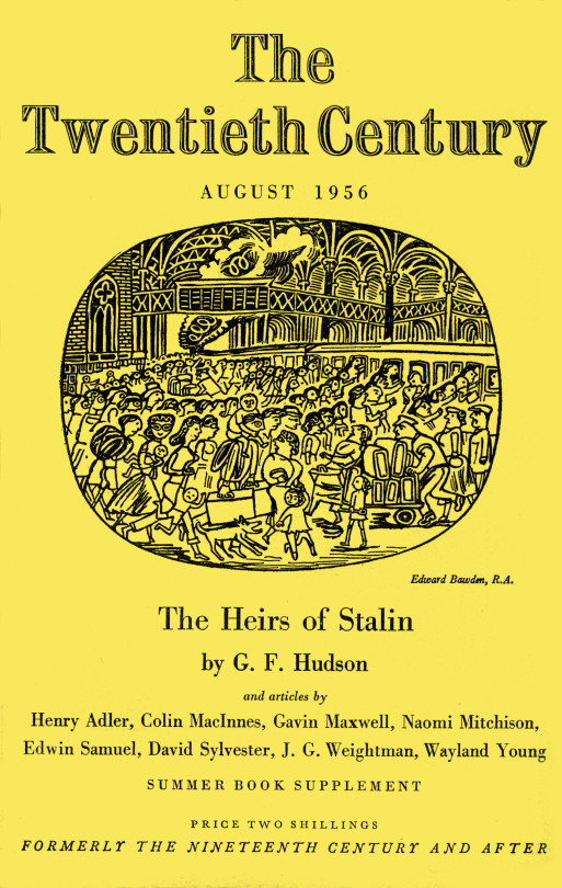
Edward Bawden – Cover illustration for The Twentieth Century, August, 1956
Edward Bawden was bought up in Braintree and after studying at the R.C.A. he moved to Great Bardfield. The nearest station was in Braintree and the terminus for the line was Liverpool Street Station, so as a student at the Royal College of Art or as a teacher there, he would have experienced the station countless times. While being interviewed for the BBC Monitor program Bawden is quoted below:
I don’t think I would have thought of Liverpool Street as a subject, as I am so familiar with it. Almost seems to me an extension of my own house. I think the ceiling is absolutely magnificent, it is one of the wonders of London. †
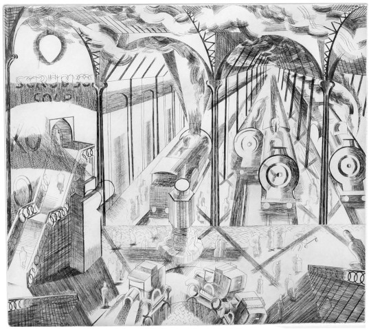
Bawden would use Liverpool Street Station in many various ways over his life, the first time is this etching done soon after he left the Royal College of Art.
Etchings for artists at this time were used like a romantic ideal of a photograph, very detailed and accurate, but edited. Few artists would use the medium like Bawden did at the time, a handful of exceptions of Christopher Nevinson and William Roberts exist. Bawden however didn’t edition many of the etchings and most of them were left to be forgotten and later reprinted in 1973. The value of Edward Bawden’s etchings is something that should be reviewed as a legacy to the medium.
Another amusing print is Mr. Edward Bawden’s engraving “Liverpool Street”, which is really humorous, not in subject, but in pattern. ‡
Edward Bawden – Liverpool Station, Etching, 1927-29
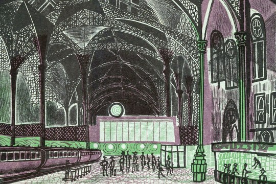
Below is a drawing used in the Sundour Diary and Notebook, a diary illustrated by Bawden in 1953 with scenes from all over Britain, a simple pen and ink drawing it captures the gothic windows and iron roof top that give the station a cathedral quality.
Edward Bawden – Liverpool Street Station, Drawing, 1953
Bawden, again working in pen and ink, illustrated the cover of the Twentieth Century magazine. He would work for the magazine for three years making covers most of the months with topical themes. This illustration looks like the rush on trains to start the holidays, at the front a father with a child on his shoulders, while carrying two suitcases and followed by a dog. In front of him a luggage trolley collides with a lady.
Edward Bawden – Cover illustration for The Twentieth Century, August, 1956
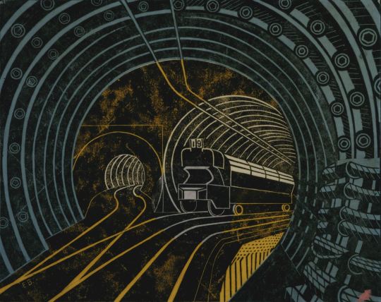
Bawden was commissioned to make two limited edition prints, one of Liverpool Street Station and one of Kings College, Cambridge, but nothing would come of that. It looks like Bawden trialled making the print in various ways, a lithograph and a linocut. The lithograph below looks almost like a pen doodle with the rooftop being a cobweb and the structure being lost in the detail. The figures on the the picture look like humans made of wire, it’s all very abstract for Bawden.
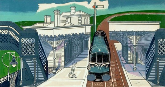
Edward Bawden – Liverpool Street Station, Artist’s Proof Lithograph, 1960
Edward Bawden – Liverpool Street Station, Linocut, 1960
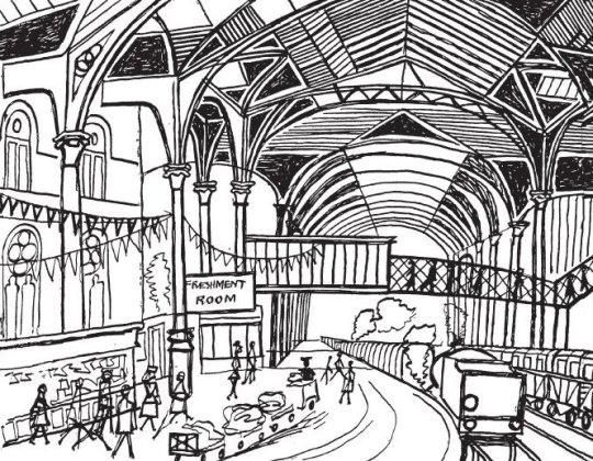
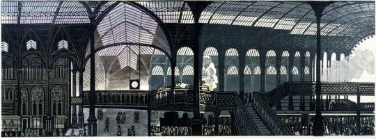
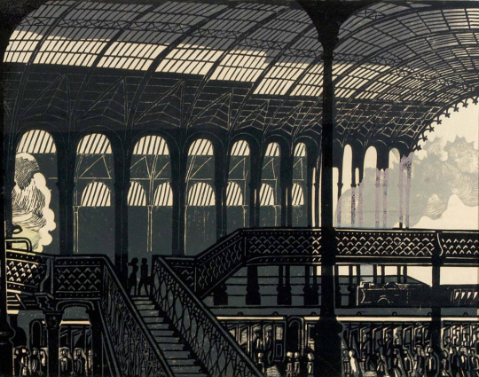
Above is the final print by Bawden after he settled on a linocut. Below is a study for the linocut as a drawing and with the perspectives bending away to the left. The main structure to the right looking like the final work. The final linocut being flatter and showing off the gothic windows.
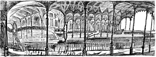
Edward Bawden – Liverpool Street Station, Drawing, 1960
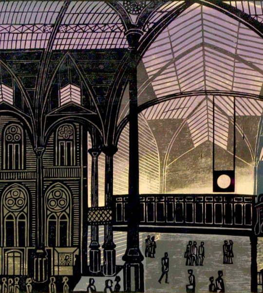
Below is a detail from the final print and a look at the repetitive detail and skill in the ironwork, rooftop and train carriages. It also shows off the over-printed steam to the right and the cut out steam to the left. And below that is another detail from the print showing the centre of the print having colour and light.
Edward Bawden – Liverpool Street Station, Linocut (Detail), 1960
Edward Bawden – Liverpool Street Station, Linocut (Detail), 1960
Even thought Bawden didn’t complete a print of Kings College, Cambridge, he did in the same year make a print of Braintree Station and this may have covered the commission. From one station to another, these are the main bench ends of Bawden’s world.
Edward Bawden – Braintree Station, Linocut, 1961
† BBC – Monitor, 10 November 1963 ‡ Apollo Magazine – 1928, p171
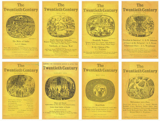
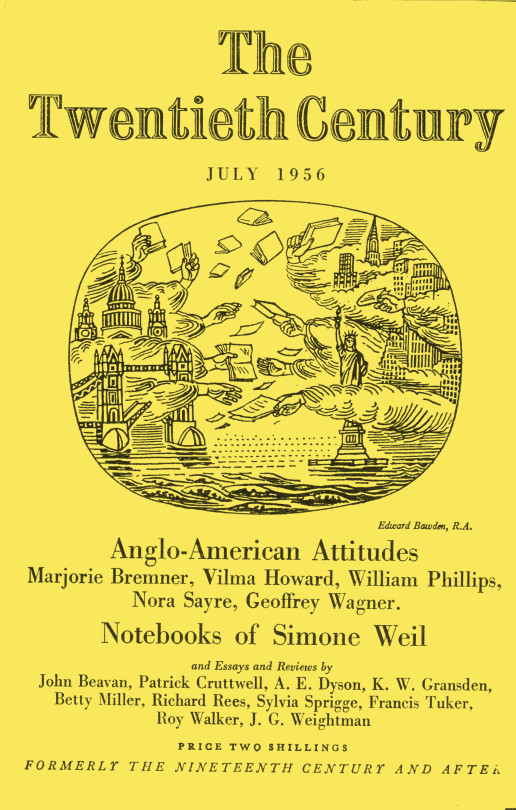
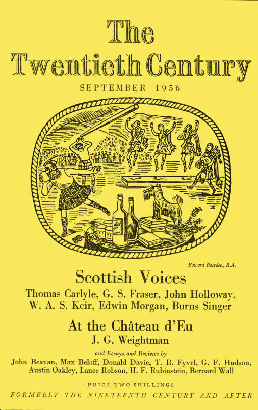
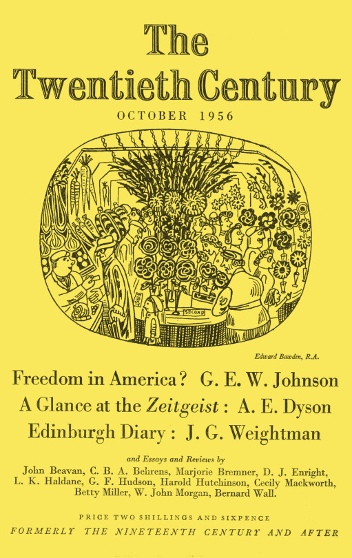
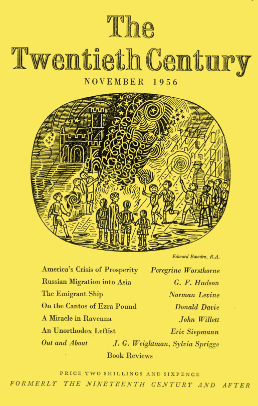
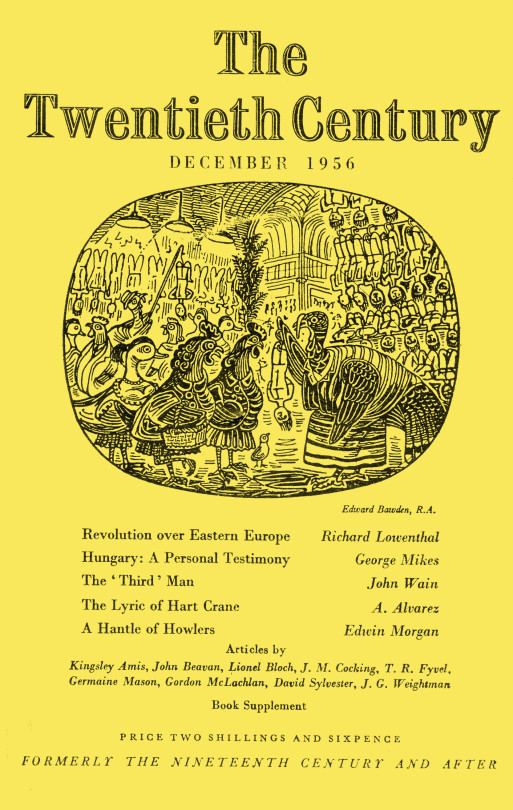
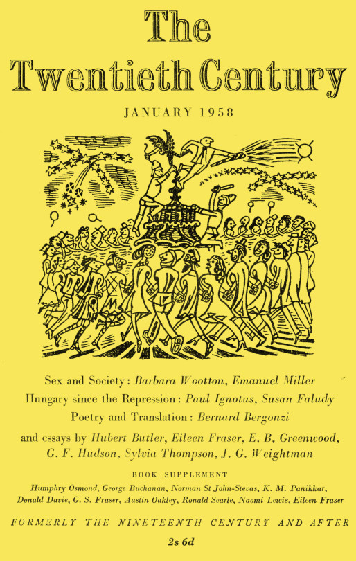
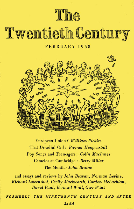
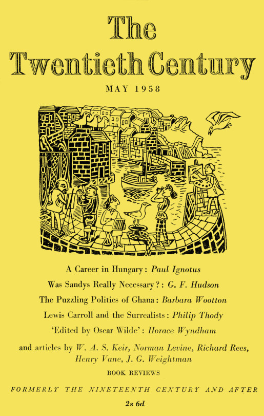
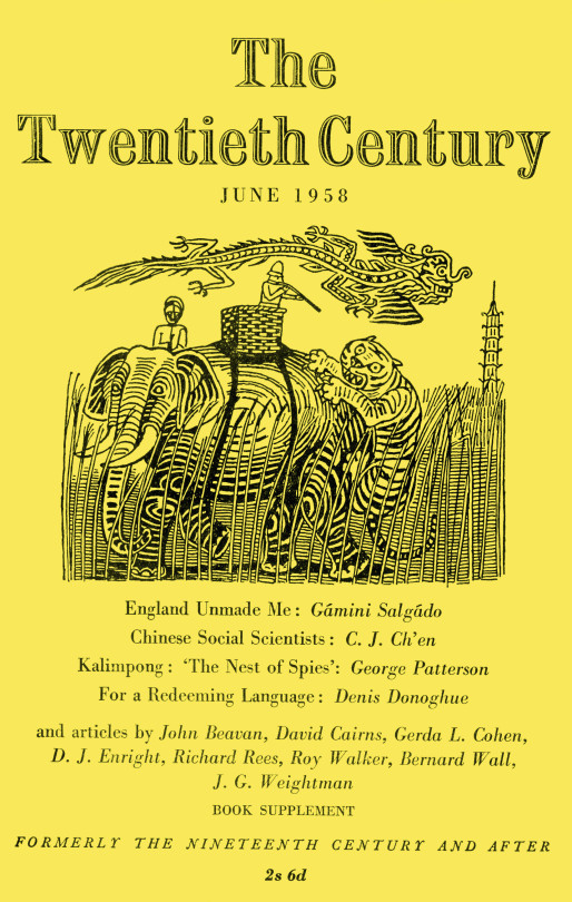
Here are all the covers of The Twentieth Century I own, yet there are many more, but I thought you would enjoy the illustrations, it shows Bawden looking at daily life and would be good for a diary.
It was in 1956 that Bawden was elected to the Royal Academy of Art. It must have happened in February as his credit his credit changed from ARA to RA.
Before television, the radio was the main media for the nation. The British Broadcasting Corporation was free from advertising and their early aims were to ‘educate, inform and entertain’. It was the education element that lead to leaflets being produced as a visual aid to the radio. The public could send a stamped-addressed envelope off and receive guide to the content in the radio show, from photographs of master paintings as part of a series of lectures on art to song sheets.
All of the artists from the Great Bardfield group would at one time or another work as commercial artists, many illustrating books. Here is a selection of works made for the BBC.
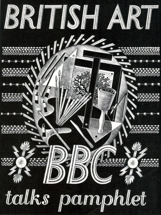
Eric Ravilious – BBC Talks Pamphlet, 1934
Published in 1934 this booklet was to follow six lectures on art, there are seven pages of text and 30 pages of black and white illustrations. The cover design is a wood engraving by Eric Ravilious showing a Bewick style wood-engraving, an artists pallet and oil paints and some beautiful graphic devices hand carved around the vignette. This booklet could be bought as a softback at seven pence or a hardback at one shilling.
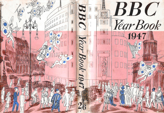
Edward Bawden – Dust Jacket for the BBC Year Book 1947
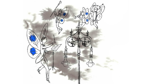
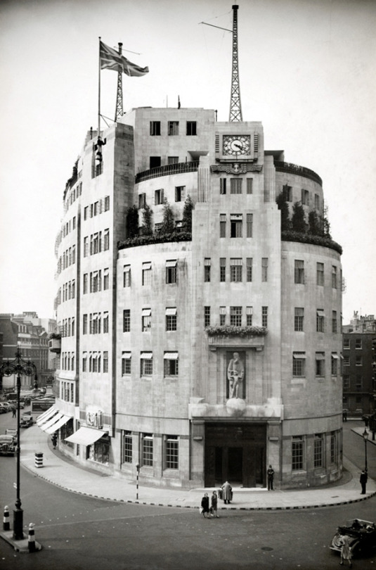
This cover by Edward Bawden shows Broadcasting House and All Souls Church with musical faeries flying around. The BBC Year book started as an annual review beginning 1928. In the mid 50′s it became the BBC Handbook and in the 80s merged into an Annual Report. The focus of the publication would range from statistics of people with Radio Licences, to essays on Opera, Art and even Foley House, the building that Broadcasting House replaced. But this gives me a wonderful excuse to share a picture of this magnificent building so you can compare it to Bawden’s drawing.
BBC Broadcasting House, London, 1932.
Many of the other works in the rest of this article are simple two colour illustrations made for various children’s educational radio programs. The way each of the artists went about solving this problem is interesting but mostly it is based on technique and time. Inside the covers is usually sheet music, lyrics and an illustration for most of the songs.
Many of Sheila Robinson’s illustrations are black and white pen drawings or her cardboard-prints, but rarely is there much colour and when there is it looks to be the printer flooding the image around her illustration with it. It’s a shame because her art prints are extraordinarily competent.
Bernard Cheese’s works have a more interesting use of colour and layering for those interested in printmaking and use of one colour with black, as is the work of Walter Hoyle.
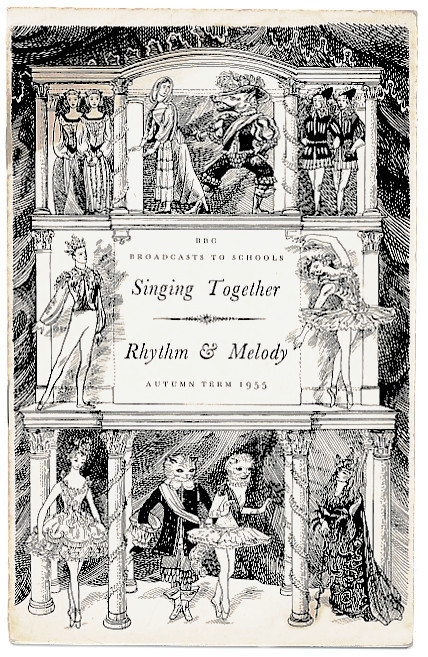
Sheila Robinson – Sing Together – Rhythm & Melody, 1955
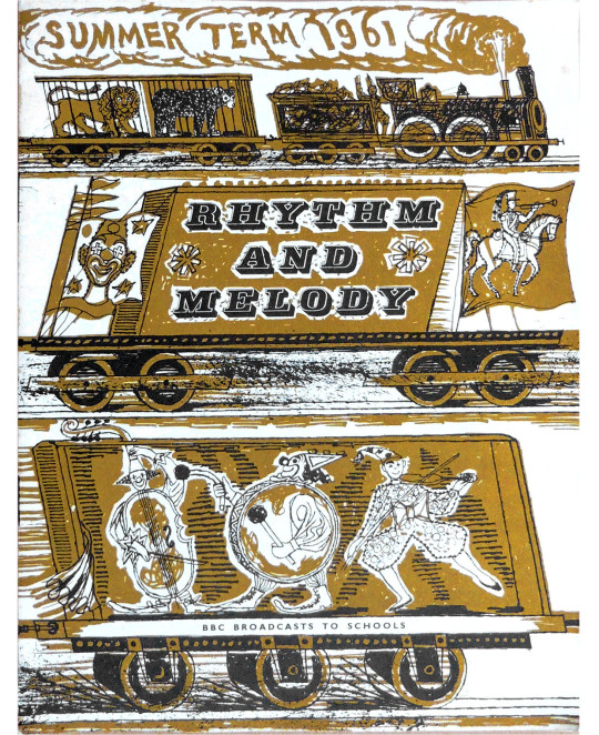
Walter Hoyle – Rhythm and Melody, 1961
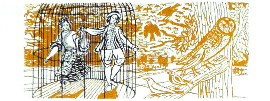
Walter Hoyle – Illustration from Rhythm and Melody, 1961
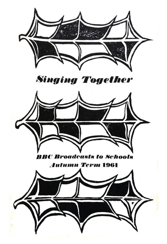
Sheila Robinson – Singing Together, 1961
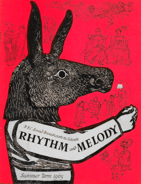
Sheila Robinson – Rhythm and Melody – Summer, 1963
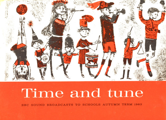
Bernard Cheese – Time and Tune, 1963
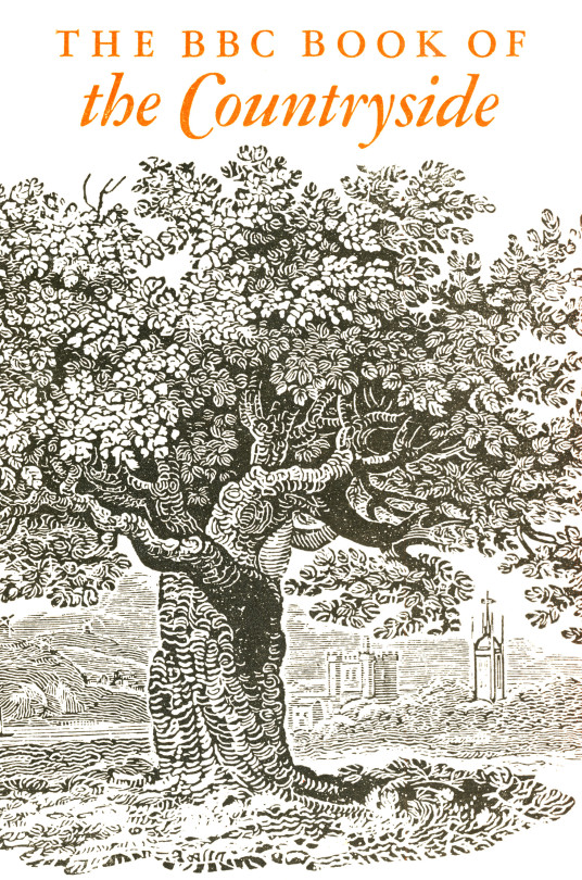
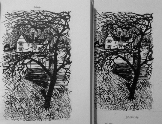
In a break from BBC radio pamphlets comes the BBC Book of the Countryside. A hardback book with a compilation of the BBC Countryside programs set out in a month by month calendar. For fans of Great Bardfield and East Anglian art, one gets work by both Walter Hoyle and Sheila Robinson, but also six illustrations by John Nash. The drawings from the book by Walter Hoyle I am delighted to own as part of my collection.
Cover to the BBC Book of the Countryside, 1963
Walter Hoyle – Page from the Book of the Countryside to the left and the drawing to the right, 1963.
Sheila Robinson – January, 1963, illustration from BBC Book of the Countryside
Walter Hoyle – April, 1963, illustration from BBC Book of the Countryside
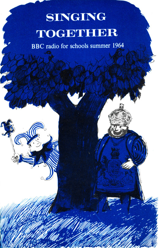
Bernard Cheese – Singing Together, 1964
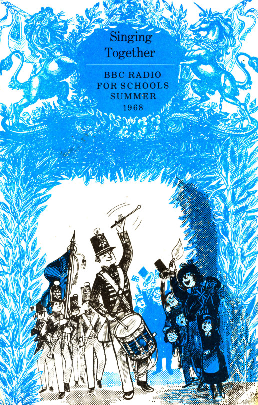
Bernard Cheese – Singing Together, 1968
Bernard Cheese – Illustration from Singing Together, 1968
To see more illustrations from the Bernard Cheese Singing Together 1968 book, click here as I dedicated a full post to them
This post covers a range of designs for the General Post Office by the artists of Great Bardfield, I think the post also shows the troubles of being a designer and how often artists were asked to submit designs and have them rejected.
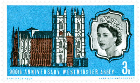
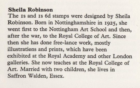
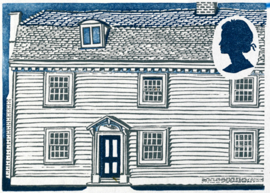
We start with Sheila Robinson, who was the wife of Bernard Cheese and mother of artist Chloe Cheese. Like many of the Great Bardfield artists, Robinson was a print-maker but unlike most print-makers she used cardboard as a medium giving her prints a unique subtle quality. Her first commission for the Post Office would be to design one of two stamps for the 900th Anniversary of Westminster Abbey in 1966.
Miss Sheila Robinson, an art teacher at the Royal College of Art, designed the 3p stamp (No. 452). This was her first attempt at stamp designing and her full name appears as imprint on the stamps. The 3p stamps, printed by Harrison and Sons.
Sheila Robinson – 900th Anniversary of Westminster Abbey Stamp, 1966.
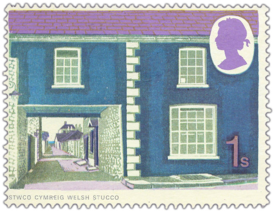
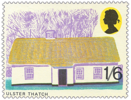
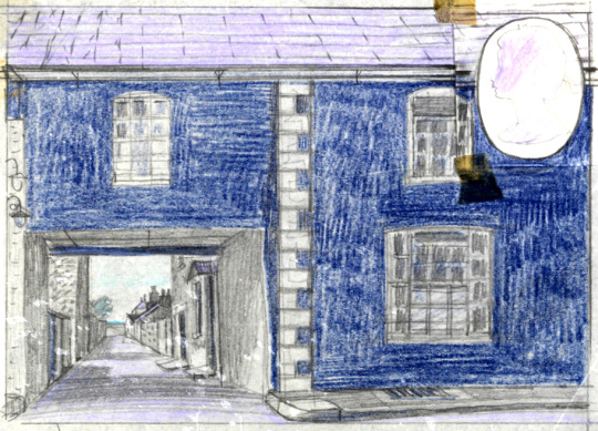
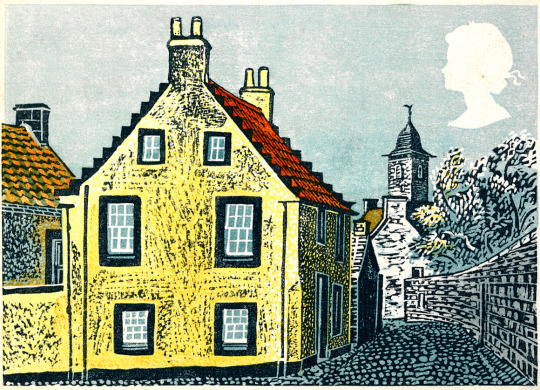
Her next commission would be four years later as part of the British Rural Architecture set of four stamps, Robinson designed two stamps, the other two being designed by David Gentleman. Released on 11th February 1970, they were in circulation for one year. The final designs were Welsh Stucco and Ulster Thatch.
Sheila Robinson – Welsh Stucco Stamp, 1970
Sheila Robinson – Ulster Thatch, 1970
Above: Part of the information packet to the stamps
Below: are two other stamp designs and one prototype design.
Sheila Robinson – Abingdon (Linocut published by The Post Office), 1965
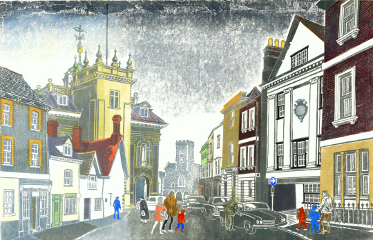
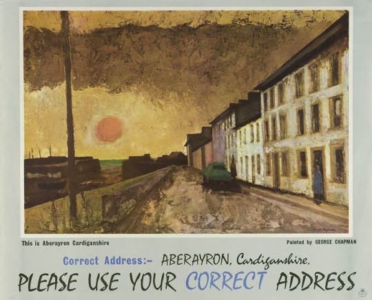
George Chapman had designed posters for Shell and the GPO. After he moved from Great Bardfield he moved to Wales, painting pictures in limited palates of colour, this is a grim looking image with the setting sun.
George Chapman – GPO Poster: This is Aberayron Cardiganshire, 1962
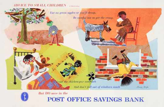
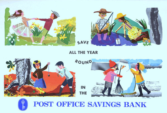
Denise Hoyle is the wife of Walter Hoyle and designed some simple posters for the Post Office savings bank, with the artwork being made from collages.
Denise Hoyle – Post Office Savings Bank,
Denise Hoyle – Post Office Savings Bank
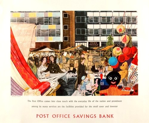
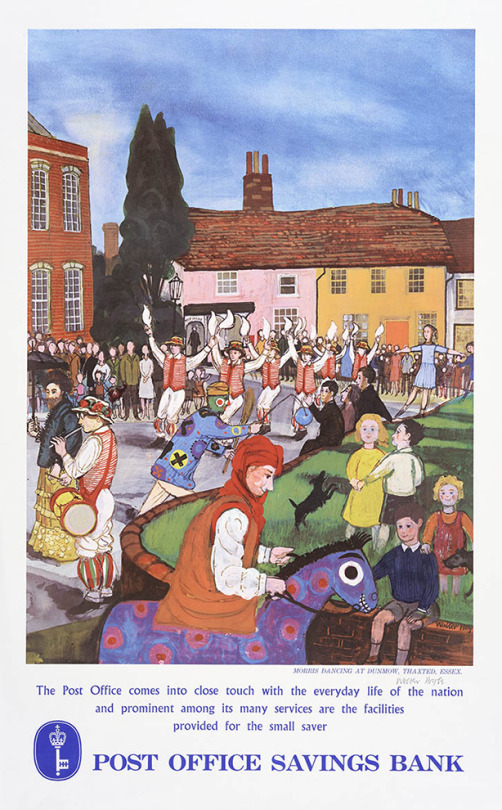
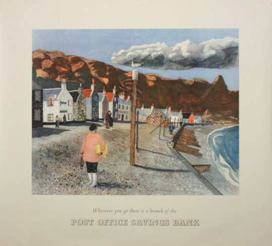
Walter Hoyle’s poster designs for the Savings Bank are also curiously off, depicting daily life but in an unfashionable way. Harlow looks wretched with a Golly in the corner and Morris Dancing is hardly popular. The Pennan, Aberdeenshire poster has a beautiful painting with it but feels very lonely.
Walter Hoyle – Harlow, New Town, Post Office Savings Bank,
Walter Hoyle – Morris Dancers, Dunmow, Thaxted.
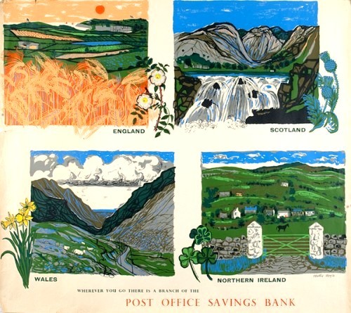
Walter Hoyle – Post Office Savings Bank – Four Nations.
Walter Hoyle – Post Office Pennan, Aberdeenshire, GPO Poster, 1954
Walter Hoyle – Artwork for Post Office Pennan, Aberdeenshire, 1954
Eric Ravilious only work for the Post Office was a invitation to design a stamp to commemorate 100 years since the introduction of the Penny Black, the first adhesive stamp. Sadly this was not commissioned.
Eric Ravilious – Design for Stamp, 1940
Edward Bawden’s work for the GPO included work that was and wasn’t commissioned. The Post Office Tube Railway was used as a poster with Printed text blow on another sheet.
Edward Bawden – Post Office Tube Railway, 1935
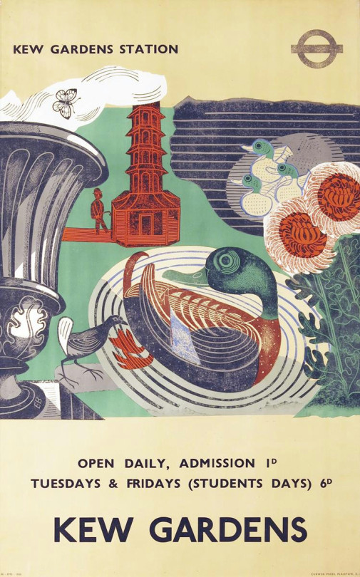
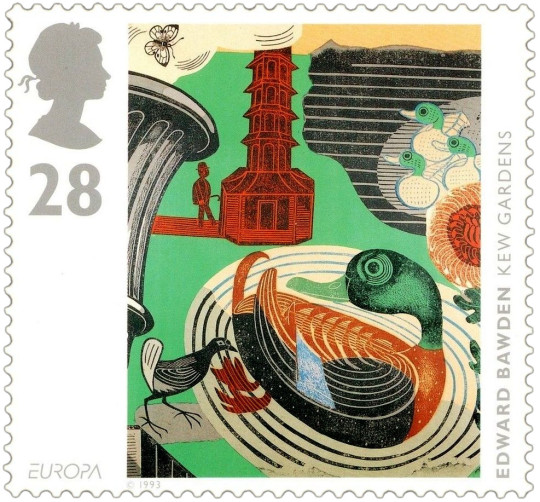
The poster Bawden designed for London Transport to advertise Kew Gardens would be turned into stamps later along with other artists. The full image is on the poster but on the stamp they have cropped it.
Edward Bawden – Kew Gardens Poster for London Underground, 1936
Edward Bawden – Kew Gardens Stamp, 1993
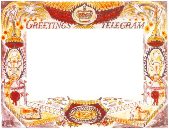
Below is a telegram design by Bawden that was not used by the GPO.
In the archives are lists showing that many well-known artists had not only been considered but had actually been invited to proffer designs. That so many of these invitees did not result in published telegrams may have been a combination of reluctance on the side of the artist and under-confidence or economy on the side of the Post Office.
A list, … included McKnight Kauffer, Graham Sutherland, Edward Bawden, Gwen Raverat and Fougasse. And a further list some two years later, in 1937, apparently emanating from Beddington, included Robin Darwin, Claude Flight, Blair Hughes-Stanton, Cedric Morris, John Nash and Clare Leighton. Many of these were subsequently formally invited to submit roughs. †
Edward Bawden – Telegram Design, 1935
† Ruth Artmonsky – Bringer of Good Tidings. Greetings Telegrams, 2009 – p22