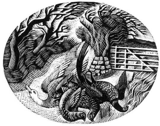
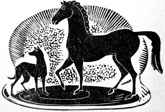
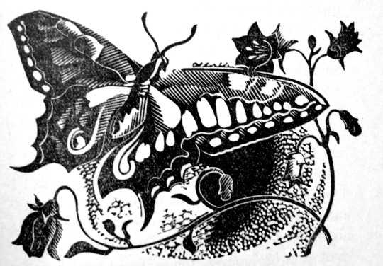
This is a simple post on beautiful illustrations inside The Escaped Cock by D. H. Lawrence, this was Lawrence’s preferred title for this tale but it has also been printed under the title The Man Who Died by some later, more prudish publishers.
In February 1930, the dying Lawrence was negotiating about an unlimited edition with the London publisher, Charles Lahr. Lahr asked for the title to be changed to The Man Who Died and Lawrence eventually agreed, insisting that the original title should be retained as a subtitle. This projected Lahr edition failed to appear, and the first English edition was eventually published by Martin Secker in September 1931 as The Man Who Died, a title never approved by the author. †
The first edition was illustrated with wood-engravings by John Farleigh. Farleigh was born in London. He was apprenticed to the Artists’ Illustrators Agency and later studied at the Central School of Arts and Crafts, London, learning engraving from Noel Rooke. He taught for many years at the Central School of Arts and Crafts. He was also a founder and long time Chairman of the Crafts Centre of Great Britain.
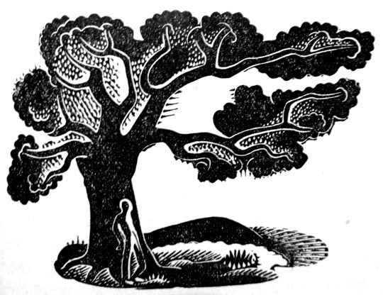
John Nash is more famous for his paintings of the First World War or his later-life landscapes, but as a young man he was a very fine wood-engraver. It seems by nature that wood-engraving at this time follows book illustration and as John’s brother Paul was championing a wave of woodblock revival at this time it is no surprise that in 1921 John became a member of the Society of Wood Engravers, a new society set up in 1920 by Eric Gill, Lucien Pissarro and Edward Gordon Craig. In coming years with more confidence with woodcut John Nash was able to illustrate whole books such a Poisonous Plants, 1927 that features 20 large botanical illustrations.
Many of his prints before 1924 where done to learn the craft and given as gifts but the Golden Cockerel Press asked him to illustrate a book in woodcut and he became professional and and a commercial artist. He would sell these woodcuts as limited editions too.
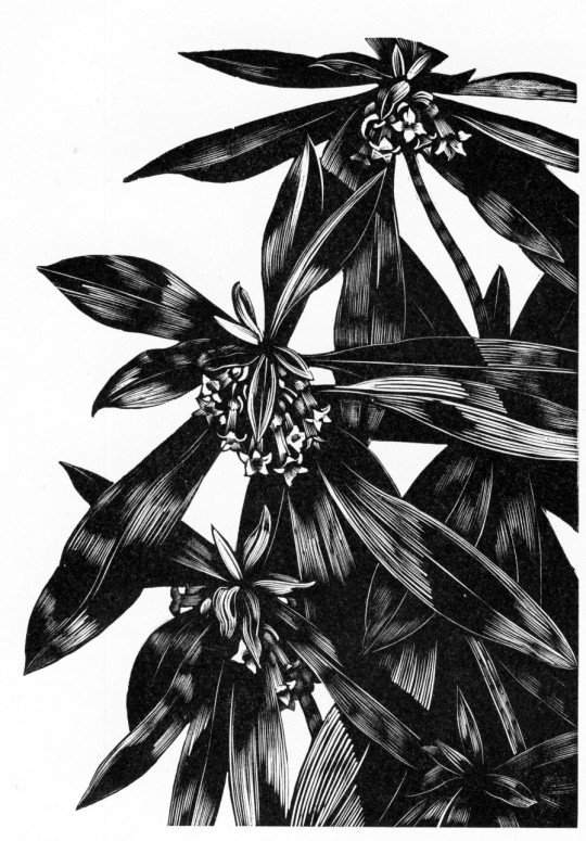
John Nash – Black Bryony (Dioscorea communis), 1927
His innocence and freshness of outlook has led him to emphasise the sharp-cut quality of engraving and this expresses the essence of living and the appreciation of forms. John Nash’s engraving of the human form, of flowers and of plants have a realism that is quite scientific in its observation and crispness of expression. †
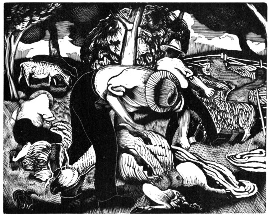
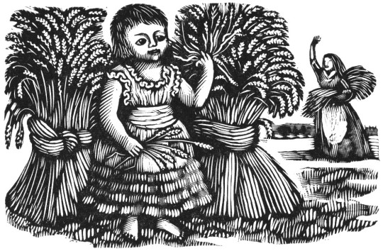
John Nash – Shearing Sheep, 1923
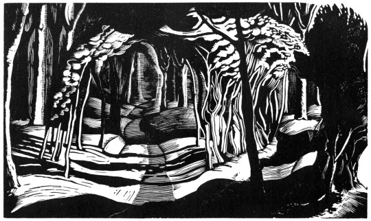
John Nash – Woodland Interior, 1929
John Nash – Spurge-Laurel (Daphne Laureola), 1927
John Nash – Frontispiece for Kathleen Woodward’s Jipping Street, 1928
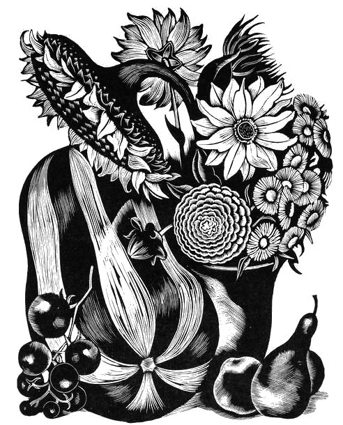
John Nash – Marrow and other Autumn Fruit and Flowers, 1935
‘Flowers and Faces’ by H.E. Bates, published by the Golden Cockerel Press
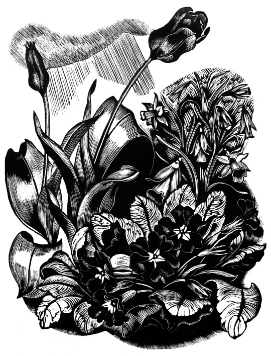
John Nash – Flowers and Faces, 1935
‘Flowers and Faces’ by H.E. Bates, published by the Golden Cockerel Press
† Albert Garrett – A History of British Wood Engraving, 1978
Below is an essay on Iain Macnab. Someone who is talked about for his and Claude Flight’s Grosvenor School. I didn’t really know a lot about Macnab but the text and illustrations are from The Artist, April 1937.
The old adage that “Those that can, do; those that can’t, teach” is one of those half-truths that are dangerous from their very speciousness. It is a good thing to dissect and expose them once in a while. So far as the fine arts are concerned, one need not look far for examples to prove the frequent falsity of this cruel and facile allegation.
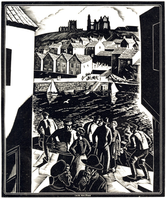
Iain Macnab – LNER Poster
Sickert is one conspicuous case; Tonks (whose recent loss we mourn) is another; and among the younger men one could hardly select a better subject than lain Macnab, who can both ‘do’ and ‘teach’ with talent and finish, and who is an artist teacher because he has the two-fold vocation.
The clarity of his exposition, the whole-hearted enthusiasm with which he descants on art, the breadth and catholicity of his views, mark him out a born teacher; while his own production as a painter and engraver is proof of his capacity as a practising artist.
Macnab is of Highland ancestry, and comes of an ancient and celebrated line of Scottish armourers, the Macnabs of Barachastalain. He has always found his hand respond easily to any new technique, and he is inclined to attribute this manual aptitude to the ingrained hereditary habit produced by an age-long tradition of fine engraved work on pistols and other arms. Also, there were artists on both sides of his family. His father was in the Hong Kong & Shanghai Bank, and Macnab was born on 21st October, 1890, at Iloilo, in the Philippine Islands, which were then under Spanish control. He lisped in Spanish as an infant but at the age of four he was brought home to Kilmalcolm, in Renfrewshire.
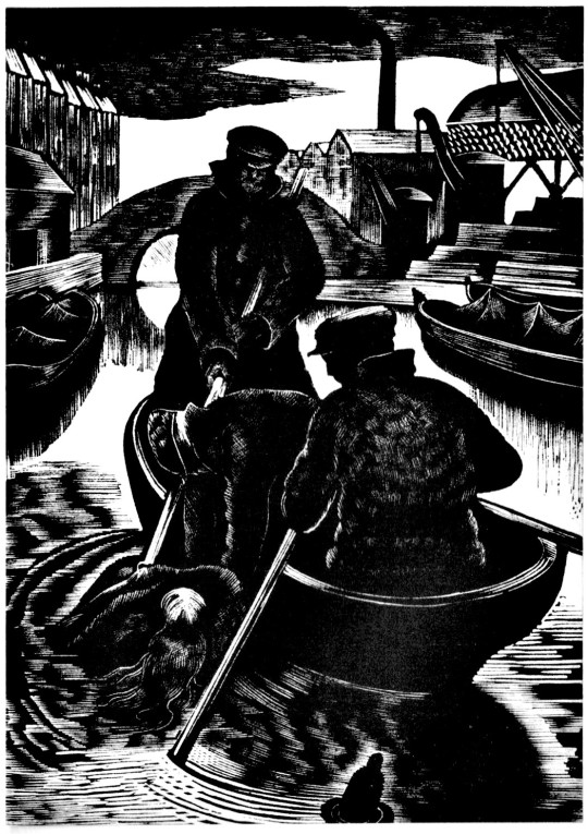
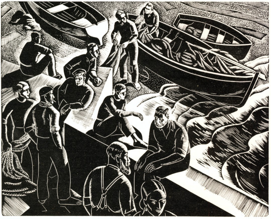
Iain Macnab – Fisherman at Portofino, 1937
During a holiday in Ireland at the age of seven a gypsy foretold that he would become an artist. He was educated at Merchiston and left school at eighteen. Already as a boy his interests were turned to sculpture, painting and cartooning, with the first perhaps pre-eminent, but the career chosen for him was that of chartered accountant, and he duly served his artiles thereto in Glasgow for five and a half years. He was due to sit for his final examination in October, 1914; with the prospect if he passed, of an excellent post in the Philippines, leading to the early reversion of a complete business.
But the outbreak of the war formed a pretext for abandoning accountancy, and Macnab enlisted at once as a private in the Highland Light Infantry. Being already trained in the school cadet corps, he found himself in France by the end of October, 1914 and is a Mons Star man. In April, 1915 he was granted a regular commission in the 2nd Argyll and Sutherland Highlanders. During the battle of Loos he was blown up by a shell. After some little time symptoms of grave internal injury became evident; and in July, 1916 he was invalided out of the service.
Iain Macnab – Spring Landscape, Tossa, 1936
His cure was by no means complete, however, and it was not until 1918 that he was well enough to take the art course he had promised himself.
In that year he became a student at Heatherley’s. He had already seen and studied many good paintings; he had an uncle who knew several of the Impressionists, and who used to talk art with him; and in general his mind was well stored with paintings lore. He started work with the determination to be a professional artist or nothing; the amateur status had no attraction for him. His rapid progress, his fertility in ideas, and his clear and ready exposition of them, led Henry Massey, the Principal of the School, to see in him a potentially valuable teacher. So strongly did Massey feel this that after only a year he offered Macnab the post of joint Principal of Heatherley’s.
With this offer Macnab closed, and as a teacher worked with enthusiasm at the School till temporarily put out of action again, in 1925, by a too-vigorous pull at the etching press. While convalescent in a nursing home he decided that the time had come when he needed, for the proper expression of his educational theories, a school under his sole personal control; so, once well again he found a big house in Warwick Square, Belgravia, and on 19th October, 1925 opened there the Grosvenor School of Modern Art.
Iain Macnab – Illustrations for Burns’s Tam o’Shanter, 1934
Macnab had thought out the broad principles on which he wished to run his school. His idea was not so much to train students to paint what they saw, in the crude sense, as to teach them to isolate from nature the elements that are truly pictorial, and then to develop their own personalities. His ambition was to make artists.
To be an artist, as distinguished from a mere competent draughtsman, he felt, it is necessary first to have a personality to express. It is indispensable to the production of a work of art that an emotional reaction shall take place. Of that reaction the drawing is only a vehicle. He stresses the cardinal importance of composition; the students are encouraged to approach every problem in terms of design from the beginning, and to build up their drawings gradually on logical principles.
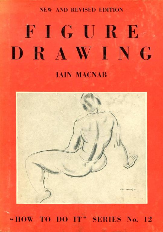
The preliminary visualisation of a subject in planes and its resolution by successive steps into a picture giving the illusion of three-dimensional form are clearly expounded in his recent book on ‘Figure Drawing.’ He is a firm believer in the virtues of wood-engraving as a discipline for all artists, since in this medium every mark must have its significance, and the whole thing must be thought out thoroughly in advance, for there is no scope for fumbling or retouching.
Iain Macnab – Figure Drawing, 1936
Macnab considers himself lucky to have attracted, from the first, a serious-minded type of student, took kindly to his inexorable rule of silence while at work in the studio. This rule shows his common sense, and is by no means the mark of the martinet. No one, indeed, could be less like the more starched kind of pedagogue than Macnab; and when the time comes for exposition and discussion he not only admits but encourages the criticisms of students.
He believes in the thorough ventilation of the subject, and strives to train his pupils to see the inwardness of widely-differing styles. Side by side with his teaching activities Macnab has pursued a versatile course as an artist. He began painting in 1918, and has developed, both in oils and water-colours, a distinctive style that, while it has nothing outré about it, is thoroughly in the modern trend of design.
In October, 1922 he decided that he would like to etch. He was told of five-year courses and suchlike, but this did not suit him, so he bought copper, tools, acid and a book on etching, and within three months had produced six prints which were good enough to secure his election as an Associate of the Royal Society of Painter-Etchers. For some years he exhibited etchings at the Academy, but in 1929 he decided that the copper was altogether too facile and deserted it for wood engraving.
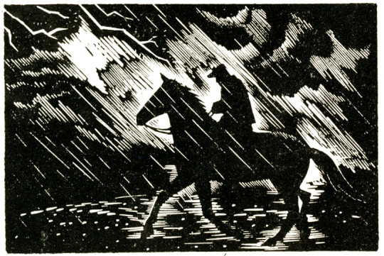
Iain Macnab – Illustration from Burns’s Tam o’Shanter, 1934
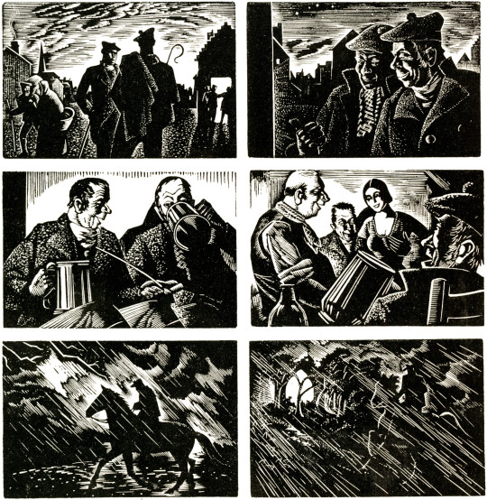
This medium he took up largely because of its recalcitrance, because of the stern discipline it imposes. In it he has done some of his finest work; and one might go a long way before finding wood-engravings to equal the ‘Tam of Shanter’ illustrations here Shown, with their beautiful distribution of blacks and whites and their admirable translation of the famous story into graphic terms.
Macnab is a member of the Royal Institute of Oil Painters, Honorary Treasurer of the National Society, and was made a full R.E. in 1935. He has held only one one-man Show, at the old Albany Gallery, Sackville Street. He exhibits each year at the Royal Scottish Academy, and frequently at the London Group, the Royal Institute of Oil Painters, the New English Art Club and the National Society. He has achieved much, and much more may be expected from him in the future.
This is the first part in a series of posts I have been working on about the cookery books made by artists of Great Bardfield. This first volume is on Eric Ravilious.
Eric William Ravilious (22 July 1903 – 2 September 1942) was an English painter, designer, book illustrator and wood-engraver. He grew up in East Sussex, and is particularly known for his watercolours of the South Downs and other English landscapes, which examine English landscape and vernacular art with an off-kilter, modernist sensibility and clarity. He served as a war artist, and died when the aircraft he was in was lost off Iceland. ◊
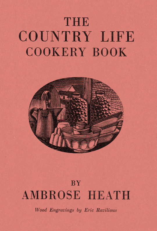
Dust Jacket for The Country Life Cookery Book by Ambrose Heath, 1937
The Country Life Cookery Book was published in 1937 and illustrated by Eric Ravilious. Country Life to some may just be the magazine, but at this point in history they were a major publisher about architecture, craft and a style of country life that would appeal to the new middle and upper classes of Britain. The publications normally contained lots of high quality photography.
In the same year as the Cookery Book was published were many other books, here are a few others for adults: Where To Catch Salmon And Trout, Elements Of Stabling, Morning Flight A Book Of Wildfowl, Gun For Company, Victorian Street Ballads. For children there were: Skilled Horsemanship, The Golden Knight and Other Stories, Peter & Co, Knight in Africa and Rajah the Elephant… as part of the ‘Junior Country Life Library’.
The books are countryside propaganda in the age of travel by train, omnibus, charabanc and car. They were promoting Britain in the way they wanted to see it. It is fair to say when people talk about the ‘Golden Nineteen-Thirties’ that Country Life had a great deal in the legend.
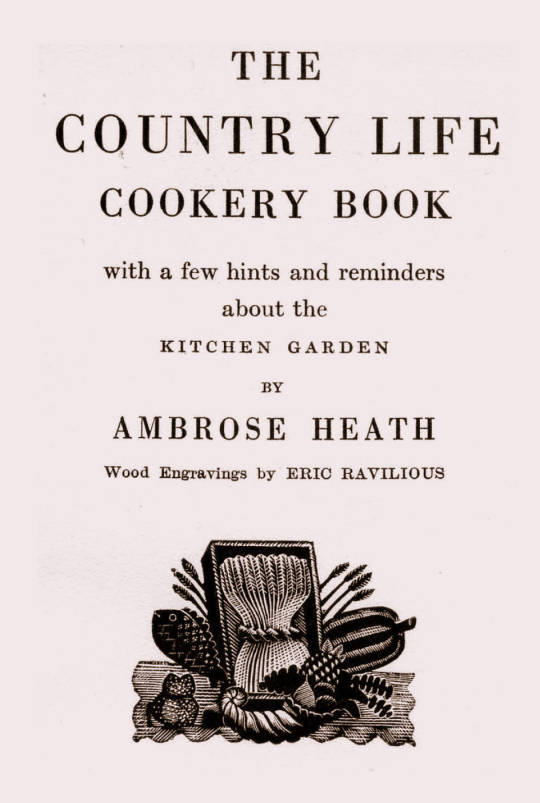
The Title-Page
Eric Ravilious – Title-page of the Country Life Cookery Book, 1937
We know Ravilious got the commission for the cookery book in July 1936 as he wrote in this letter to Helen Binyon:
This book is now begun and begins to be promising. †
The wood-engravings follow a seasonal theme, month by month rather than chapters on food or following the text – this calendar style is like the other Ambrose Heath books for Faber & Faber that Edward Bawden had illustrated for the previous five years. Only 12 blocks were cut by Ravilious for the in the book, so with the title page decoration, two of the months (January & December) used the same image. One can only assume this was how many images they thought they needed and so how many images they paid for.
Having the chapters as seasonal months would also hurry the project along from the illustration front – as in April of 1937, nine months later, Ravilious wrote to Binyon:
I don’t believe Heath has written his text yet. ‡
But not having the text as a guide would mean Ravilious could invent the illustrations from his mind and use past works. He worked on the illustrations from July 1936 – February 1937 while taking on other commissioned work and finishing a series of watercolours.
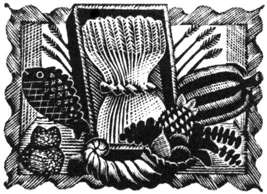
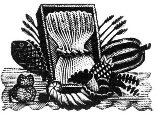
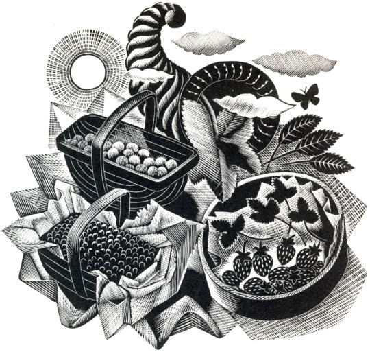
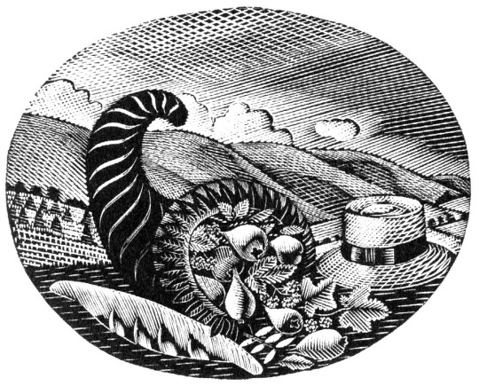
Below is the title page wood-engraving of a framed cornucopia, a wheat-sheaf and food produce. This illustration is a reject from another job.
Eric Ravilious – Title-page (Harvest Festival), Wood-engraving for the Cornhill Magazine, 1936
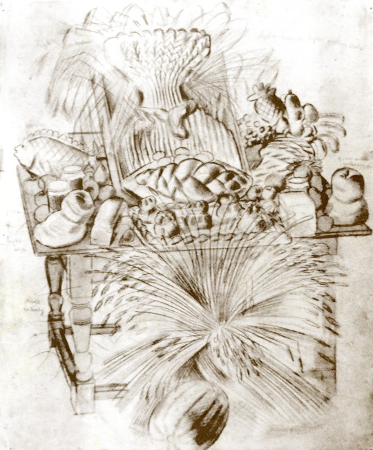
Ravilious was completing a commission for The Cornhill Magazine in the later part of 1936 and the project overlapped with the Cookery Book. So when one of the wood engravings was rejected by John Murray (editor of The Cornhill) he used it on the cookery book. I thought this engraving was a bit surreal and over the top until I discovered a drawing of it below.
Eric Ravilious – Harvest Festival and Loaves, 1936
I’ve been drawing the bread table in the church – dead and fancy loaves, barley and corn, apples and eggs – and I thought it too beautiful not to place on record. ♠
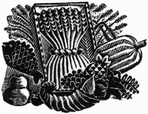
Having been rejected for one job Ravilious cut away the framed backdrop of the table and submitted the wood-engraving below for the Cookery Book project instead.
Eric Ravilious – Title-page (Harvest Festival), Wood-engraving for the Country Life Cookery Book, 1937
Below is another woodblock based on the same image made for The Writings of Gilbert White of Selborne in 1938. It’s a new version and not an edited restrike. Likely cut in 1937 as the job was commissioned in May of that year and the book published in 1938.
Eric Ravilious – (Harvest Festival), Wood-engraving for The Writings of Gilbert White of Selborne in 1938
January and December
Eric Ravilious – January & December, Wood-engraving for the Country Life Cookery Book, 1937
January & December is the block that is used twice in the cookery book.
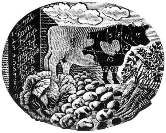
Ravilious would also find inspiration in the past. He owned a copy of The Frugal Housewife published by J Fairburn, 1838 and below is the meat guide on animals. I think this Ravilious woodcut is one of the defining moments in cookery illustration and helped re-popularise this old fashion key to animal flesh. The meat guide is now a typical image to see in cookery books to educate what meats can be gained from an animal. It is used three times in this book. He mentions the idea to use old cookery books below:
I’ve had what you would call a cleaver idea, and Mrs Beeton has been a help. †
Frontispiece – The Frugal Housewife, J. Fairburn, 1838
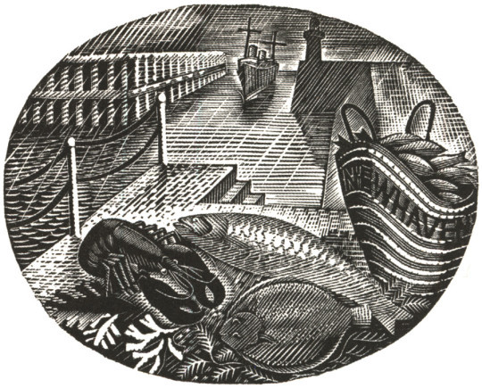
February
Eric Ravilious – February, Wood-engraving for the Country Life Cookery Book, 1937
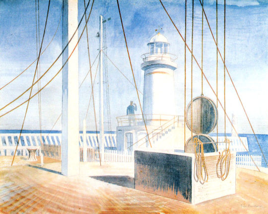
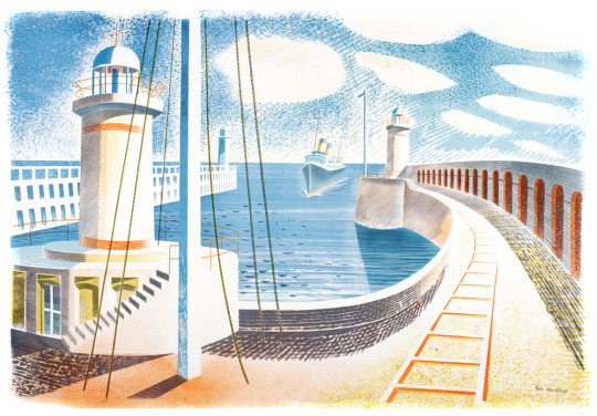
In the August of 1935 Edward Bawden and Ravilious went on a painting trip to Newhaven and in the wood-engraving above, the basket of fish emblazoned with the name of the town.
The idea for the wood engraving would also pop up again in another format, this time a print for Contemporary Lithographs, a company working with artists to make large runs of lithographic prints that would be cheap for the public to buy from the Zwemmer Gallery. Below is one of the watercolours from 1935 that could have been the inspiration for the commission. (The watercolour was also sold via Zwemmer Gallery).
Eric Ravilious – Newhaven Harbour, 1935
The print that Ravilious completed is very similar to the Cookery Book print as the jobs overlapped. The official title of the print is Newhaven Harbour but Eric referred to the print as ‘Homage to Seurat’. Helen Binyon wrote that the print has a:
scene of sensitive clarity and beautiful luminosity ♦
Eric Ravilious – Newhaven Harbour, Contemporary Lithographs Ltd, 1937
Eric Ravilious – February, Wood-engraving for the Country Life Cookery Book, 1937
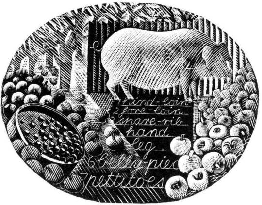
March
Eric Ravilious – March, Wood-engraving for the Country Life Cookery Book, 1937
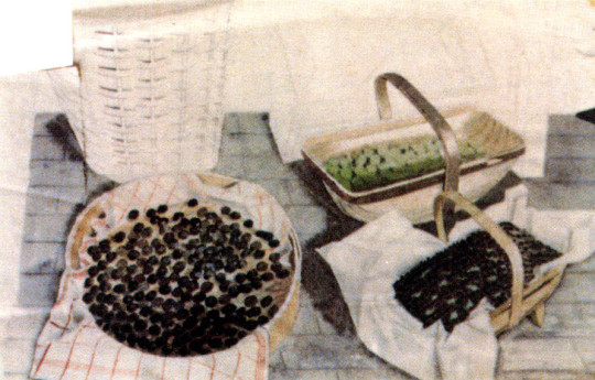
A pig surrounded by the fruit of choice, apples, and to the left of the wood-engraving a garden sieve with berries upon it. The watercolour below comes from the same year as the Cookery Book’s commission, but is now one of the lost paintings of Ravilious, it was also damaged when last seen having had the top left corner ripped and creased.
Trugs with Fruit is a lost watercolour by Eric Ravilious, damaged. In the corner it may have been framed and sold or just disregarded and thrown away, but it appears in the wood engraving in this commission for John G Murray, editor of the Cornhill Magazine. It was made for publicity for the Magazine but so far has only ever been seen on the compliment slips they had for a short time.
Eric Ravilious – Trugs with Fruit, 1936
April
Eric Ravilious – April, Wood-engraving for the Country Life Cookery Book, 1937
Rather like the Title Page, the wood engraving for April came at the same time as the Cornhill Magazine commission. Below is a watercolour, now presumed lost of trugs of fruit and the same trug appears in the wood engraving next to a glass of mint – these are red currents and mint, said to be the good sauces for Lamb.
Eric Ravilious – Trugs with Fruit, 1936
The wood-engraving below would have been copied from the painting and in the printing process it appears reversed, it comes with the same cornucopia from the title-page engraving.
Eric Ravilious – Autumn Fruits, 1936
And here you can see the wood-engraving in use on the Cornhill Magazine compliment slip.
Eric Ravilious – Cornhill Magazine Complement Slip with Autumn Fruits, 1936
May
The wood-engraving for May looks to be the most original of all of the illustrations, I can’t think of having seen any element in past work.
Eric Ravilious – May, Wood-engraving for the Country Life Cookery Book, 1937
June
Eric Ravilious – June, Wood-engraving for the Country Life Cookery Book, 1937
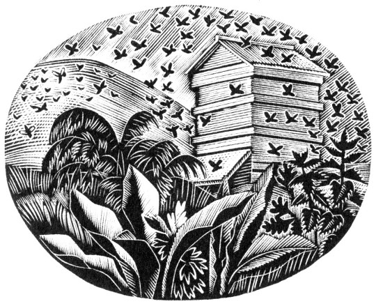
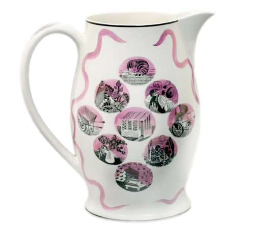
The June illustration features a bee-hive. A variation of the image would be used two years later on The Garden Implements Jug that was also designed by Ravilious for Wedgwood. The bottom most vignette.
Wedgwood Garden Implements Jug, 1939
July
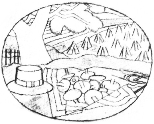
Eric Ravilious – July, Wood-engraving for the Country Life Cookery Book, 1937
The wood-engraving for July has roots in many places. The finished wood block has a hat, cornucopia of pears, a hat on the backdrop of hills and cornstooks. In an early drawing for the wood-block the hat is in the same place (reversed when printed) but many of the other elements have changed.
Eric Ravilious – Proposed July Block, Drawing made on tracing paper for woodblock, (reversed for printing), 1936
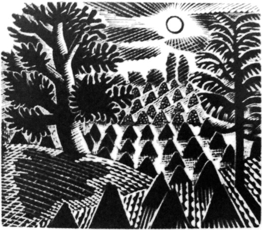
It is likely that the print Ravilious drew out was inspired by the Harvest theme of the month he was illustrating and he looked back on older work. Below the wood engraving from 1934 is one of many Curwen Press Stock Blocks. They are woodblocks and prints the press has paid artists to make so they can be used without the need to hire an illustrator for a job, so production times can be quicker and still have illustrated items.
The tree and setting of cornstooks reminded me of the drawing he made above and even the way the stooks flow uphill.
Eric Ravilious – July, Wood-engraving for the Country Life Cookery Book, 1937
Eric Ravilious – Curwen Press Stock Block 985, 1936
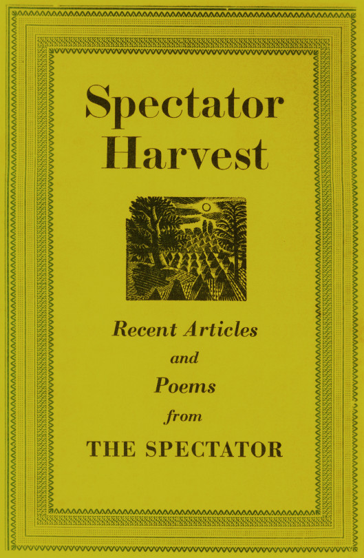
The booklet the block was used upon happened to be called Spectator Harvest, for the Spectator Magazine.
Spectator Harvest, 1952
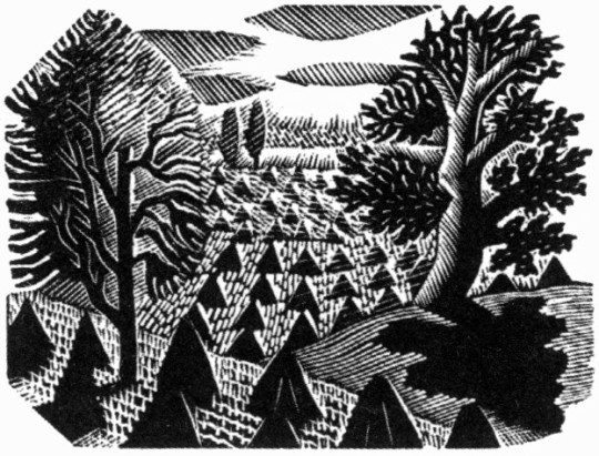
It was also re-cut in mirror image for The Writings of Gilbert White of Selborne in 1938.
Eric Ravilious – Selborne Tailpiece Volume 2, 1938
But back to the cookery book – the cornucopia below (that appeared next to a hat and a baguette) has been seen before in this post – in the wood-engraving in use on the Cornhill Magazine compliment slip.
Eric Ravilious – July, Wood-engraving for the Country Life Cookery Book, 1937
One above the other, it isn’t hard to see a link.
Eric Ravilious – Autumn Fruits, 1936
August
Eric Ravilious – August, Wood-engraving for the Country Life Cookery Book, 1937
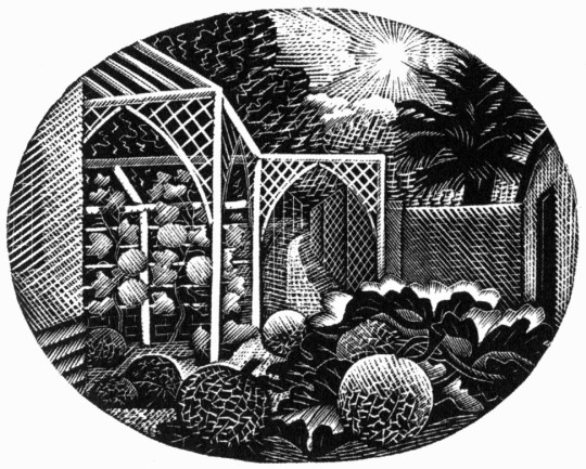
For the August vignette Ravilious chose to illustrate the garden of Brick House in Great Bardfield. Ravilious and his wife Tirzah had shared the house with Edward Bawden and his wife Charlotte from 1932 until 1935 when the Raviliouses moved to near-by Castle Hedingham.
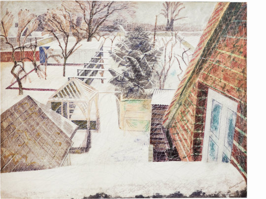
In 1936 Bawden painted the garden in the winter of the Cookery Book commission showing the wood gazebo that was up in 1932 as it was a wedding gift from Eric and Tirzah to Edward and Charlotte. The arches must have been added between then, around 1936.
Edward Bawden, February 2pm, 1936
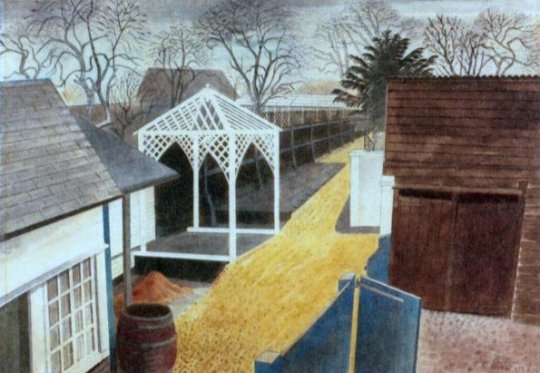
Eric Ravilious – The Garden Path, 1933
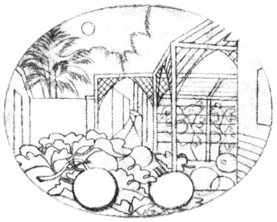
Eric Ravilious – August – Drawing made on tracing paper for woodblock, 1936 (reversed for printing)
September
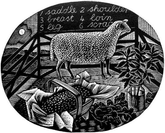
Eric Ravilious – September, Wood-engraving for the Country Life Cookery Book, 1937
The illustration for September shows the game shooting season and a brace of birds, maybe a goose to the left and pheasants to the right in front of a country lane. Below is the original trace drawing for the block, reversed for printing.
Eric Ravilious – September, Drawing made on tracing paper for woodblock, (reversed for printing), 1936
Followers of my blog would not be surprised to see that the illustration bears a similarity to another one, the wood-engraving for London Transport, this is confirmed in a letter to Helen Binyon again:
The jobs, cookery and Green Line advertisements – are all done and sent off and very glad am I that hard work is finished. ♣
Counter to the letter I can’t find another reference to them in print.
Eric Ravilious – The Shepard, 1936
The Shepard is one of the most lively engravings that Ravilious made for London Transport. The Sheep and their ears with the hillside up to the house are pleasing. The technicality of the halftone shading are some of his best. ♥
The Cookery Books version of the engraving is more detailed, I think because the printing was likely to be finer than the press adverts the London Transport one would be reproduced in.
Eric Ravilious – September, Wood-engraving for the Country Life Cookery Book, 1937
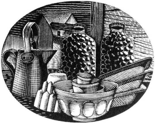
October
Eric Ravilious – October, Wood-engraving for the Country Life Cookery Book, 1937
October sees kitchen items, a jug, copper jelly mould stacked mixing bowls and baking trays with two jars of preserved items.
November
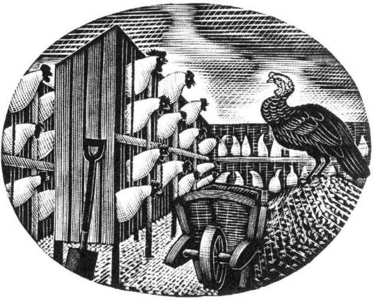
Eric Ravilious – November, Wood-engraving for the Country Life Cookery Book, 1937
The last work of a chicken farm and a turkey with wheelbarrow gives the Christmas feeling and may have been marked to have been the December illustration but January’s wood-engraving was also used as December.
† Eric Ravilious to Helen Binyon – 19th July, 1936 ‡ Eric Ravilious to Helen Binyon – 14th April, 1937 ♠ Eric Ravilious to Helen Binton – 6th October, 1936 ♣ Eric Ravilious to Helen Binyon – 17th August (1936) ♦ Helen Binyon – Eric Ravilious: Memoir of an Artist, 2016 ♥ Robjn Cantus – A Journey of London Transport with Eric Ravilious, 2018 ◊ Wikipedia – Eric Ravilious
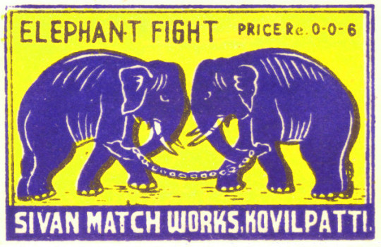
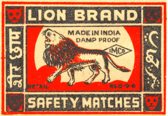
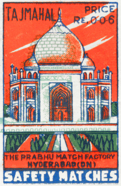
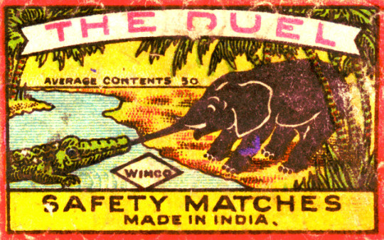
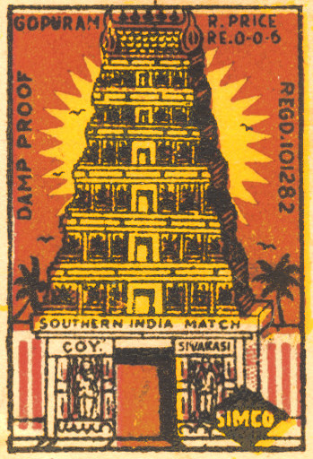
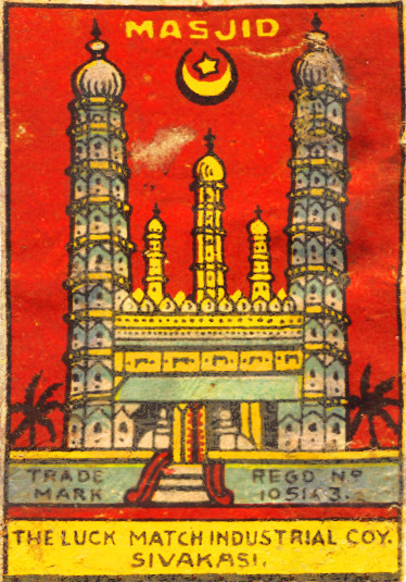
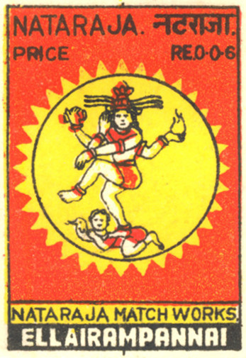
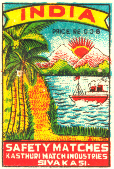
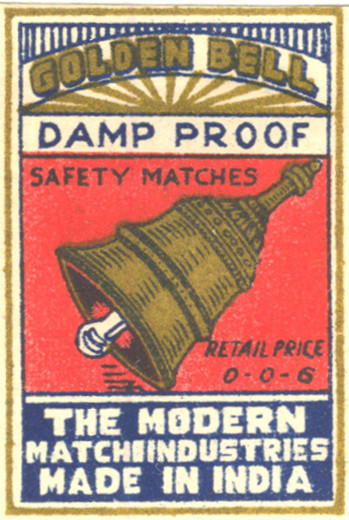
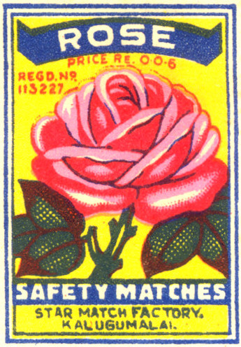
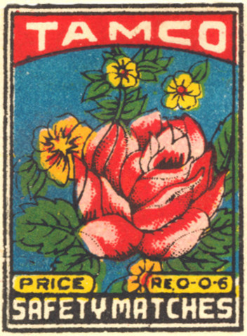
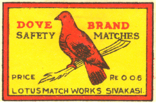
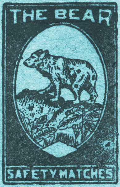
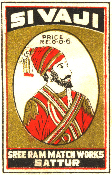
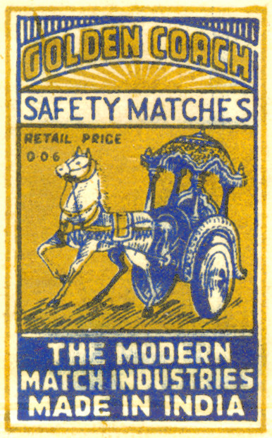
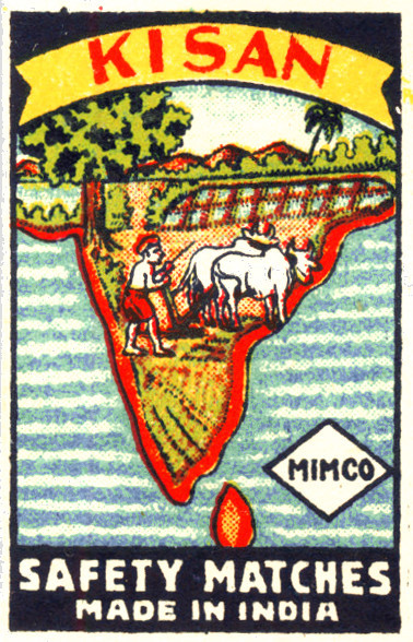
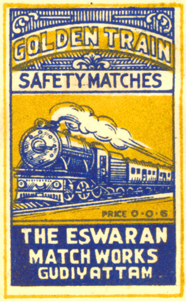
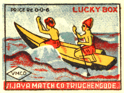
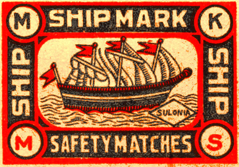
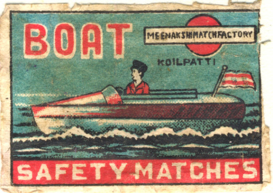
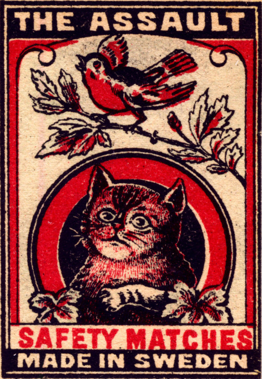
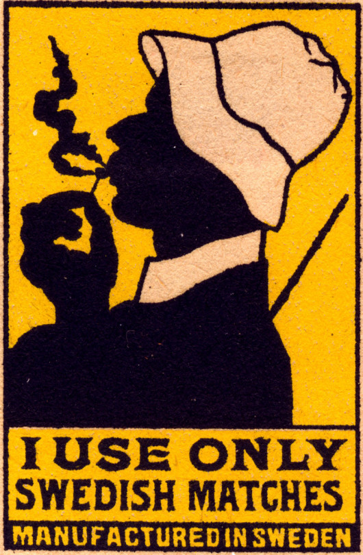
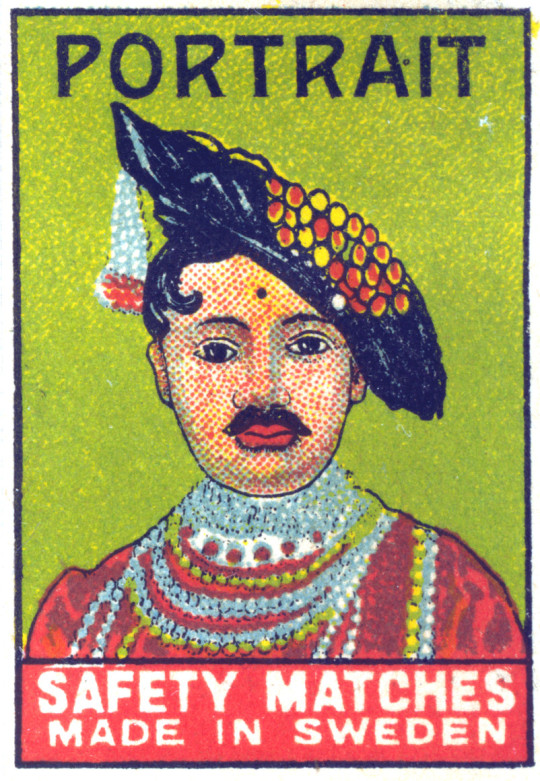
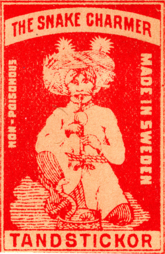
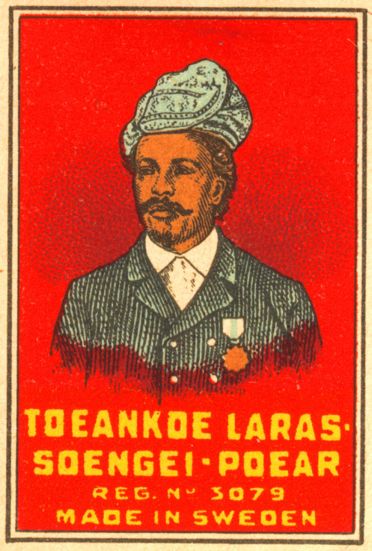
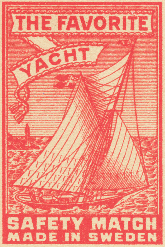
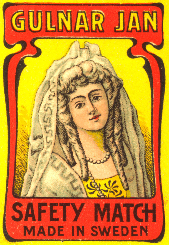
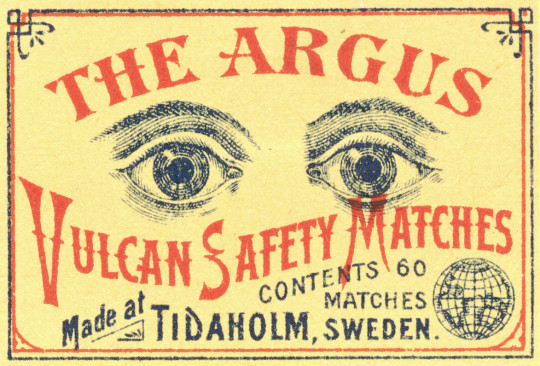
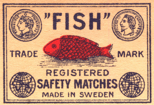
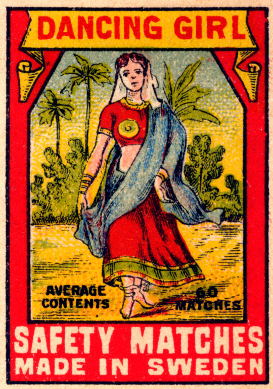
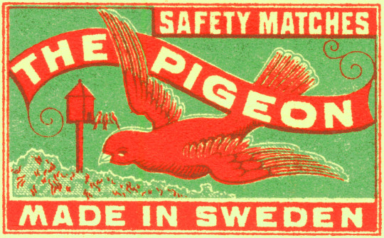
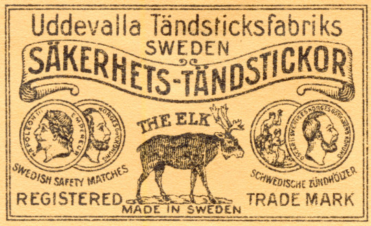
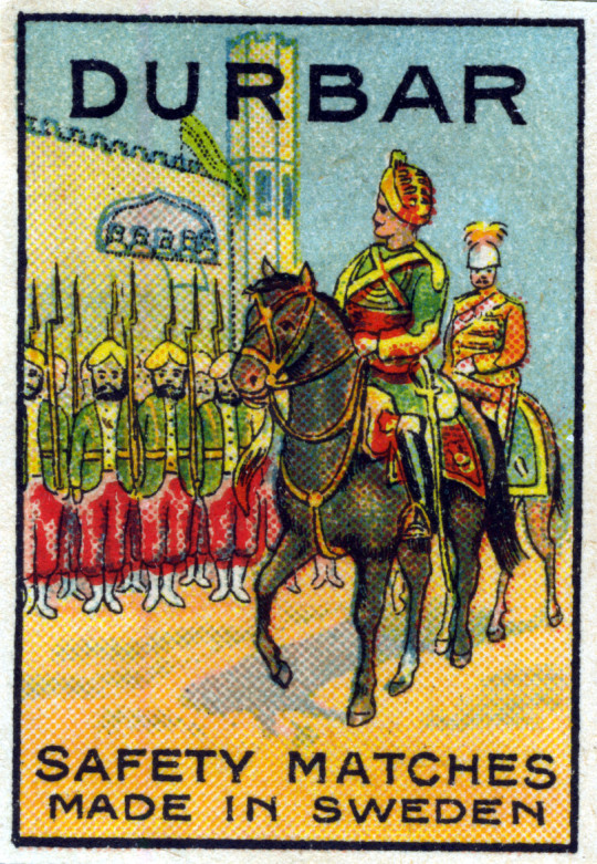
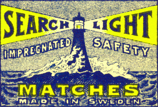
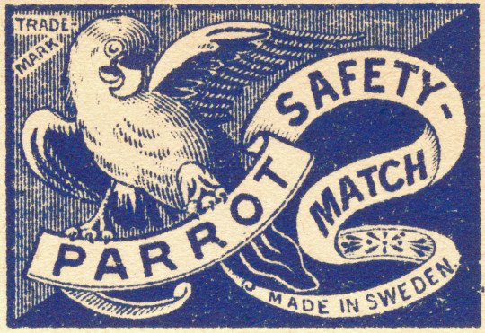
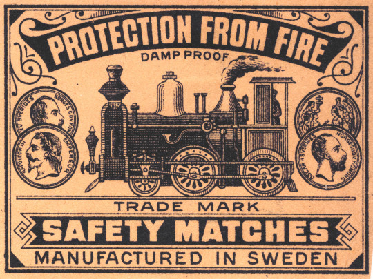
Once having studied graphic design I find the history of printing and advertising fascinating. There are all sorts of ephemera that I collect, old business cards, shop receipts, tins, and matchboxes. The woodcuts and early lithographic designs are artworks to their own.
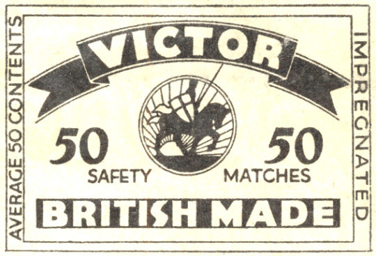
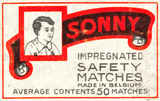
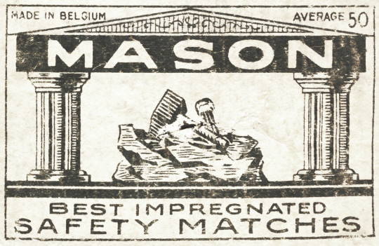
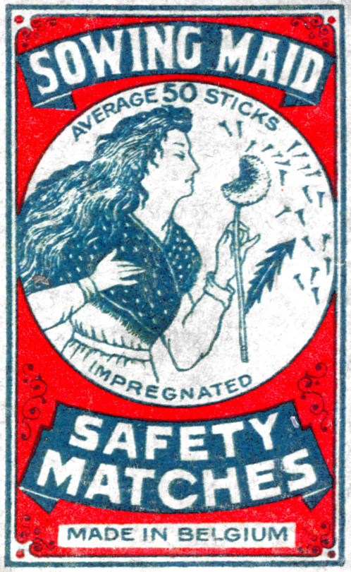
Matchbox designs, being on small cheap items, vulnerable to the customer’s whim, often reflected almost uncannily the attitudes of their age, long before these attitudes could be recognised or analysed. †
Matchbox labels first appeared in 1829 and every conceivable idea was used to illustrate them. By the middle of the nineteenth century the collection of these often colourful and decorative little pieces of design had become a European craze. The early labels were printed by letterpress with woodcut designs, but soon chromolithography was also being used. †
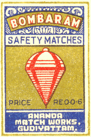
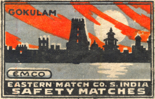
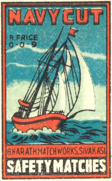
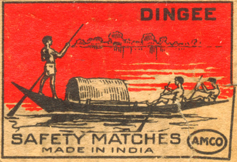
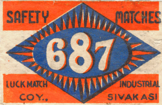
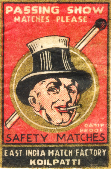
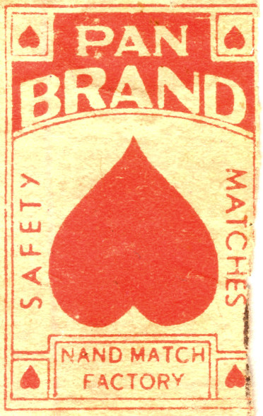
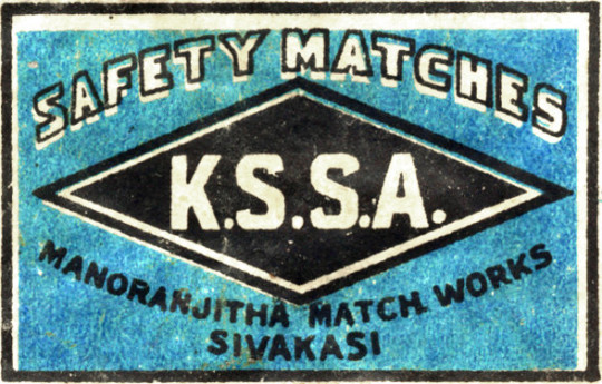
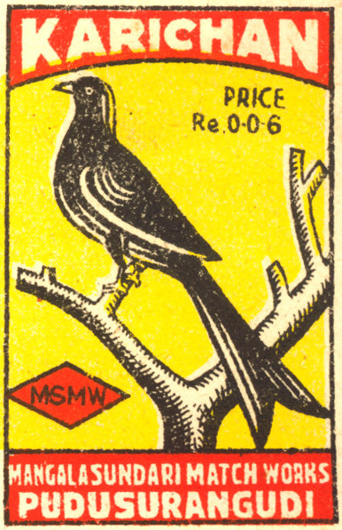
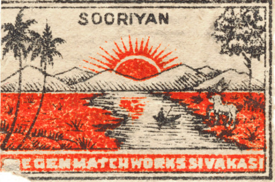
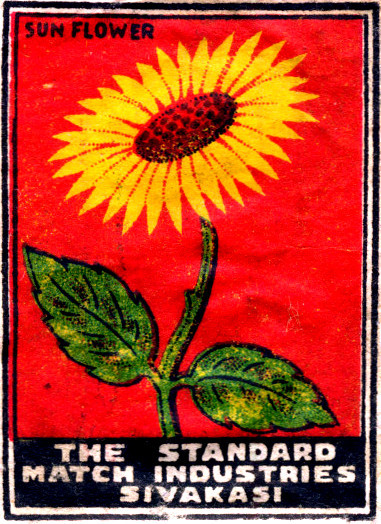
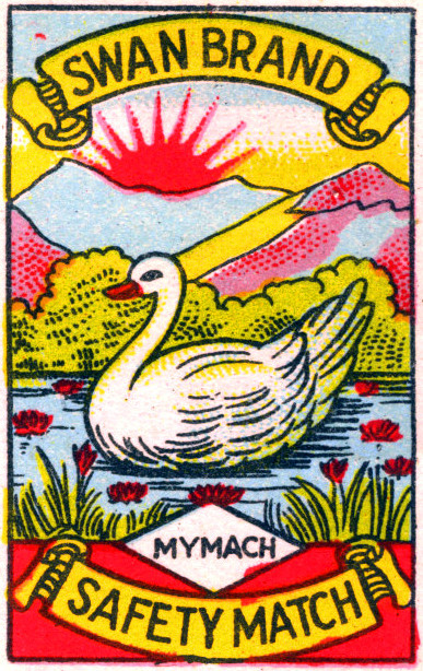
These box labels are mostly from the English and Indian collections, but there are hundreds of other examples.
While looking into Eric Ravilious’s work for London Transport I noticed how many times a greenhouse would appear in Ravilious’s work.
Eric Ravilious – Kynoch Press Block 112, 1932
There are two curious observations in this post. One is the wood-engraving above, and the one below are the same location; the walled-off greenhouse with decoration on the end of the roof above the glass panes. It is also like the wood-engraving Tea in the Garden, but not quite.
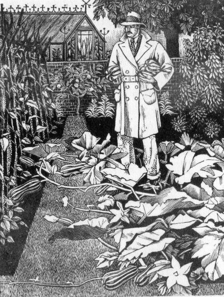
Tirzah, (Ravilious’s wife), was a wonderful wood-engraver and artist in her own right. Below is a man about town in a driving Macintosh laden with marrows, the perfect suburban man.
Tirzah Garwood – The Husband, 1929
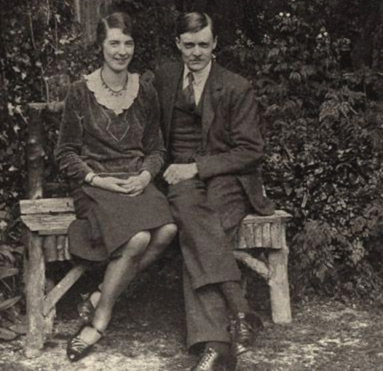
Below are two pictures, one, a wood-engraving featured in last week’s post on London Transport, but also a photograph of Tirzah and Eric together at the time of their engagement.
I include it because it’s the second of my observations in this post – the bench they are sitting on is so remarkably similar to the bench in Tea in the Garden that I would say this is the same bench and the inspiration. The back may have curves on the woodcut but I would suggest this is just to make the design more harmonic.
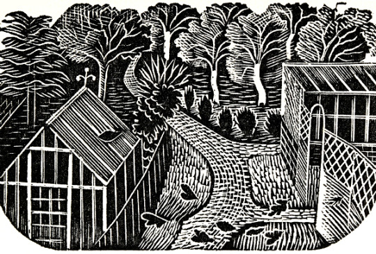
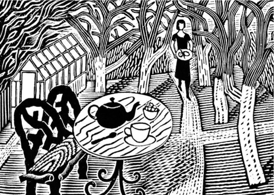
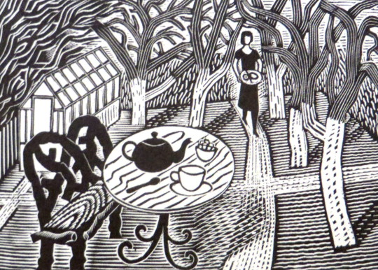
Eric Ravilious – Tea in the Garden, 1936
Tirzah Garwood and Eric Ravilious at the time of their engagement, 1930
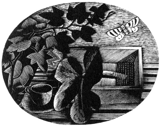
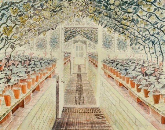
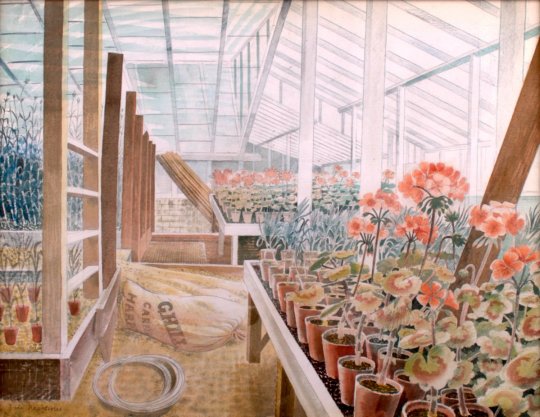
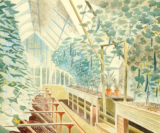
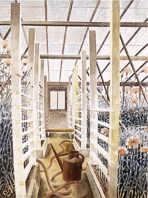
Below are a series of beautiful watercolours of greenhouses by Eric Ravilious included because they are so beautiful. It is very hard to walk into any greenhouse and not think of these paintings. They are the skill of perspective but also that skill found in craftsmen, the ability to paint, carve or make a series of objects, in the case of a carpenter it would be stair rods, in Ravilious’s case it is each plant pot and working with the the backdrop of shadow.
Eric Ravilious – The Greenhouse – Cyclamen and Tomatoes, 1935.
Eric Ravilious – Geraniums And Carnations In Greenhouse, 1935
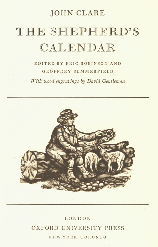
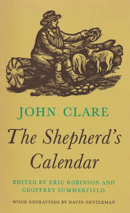
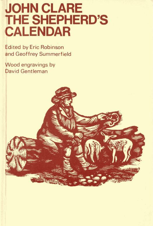
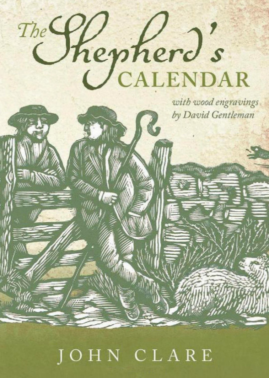
John Clare (1793 – 1864) was an English poet, the son of a farm labourer, who became known for his celebrations of the English countryside and sorrows at its disruption. His poetry underwent major re-evaluation in the late 20th century: he is now often seen as one of the major 19th-century poets.
This book was published in 1964 with the monthly chapters headed by a wood-engraving by David Gentleman.
The poems of Clare have been republished many times over the years with Gentleman’s illustrations but it is interesting to look at the fashions in book-jacket design using the original illustrations.
The journey of any work of art can be interesting in how it is used, forgotten and then reused. As I write this I think it’s endemic of Ravilious’s life that there can be no area or topic on him that hasn’t been probed or turned into a book, but onward I go with my quest for originality.
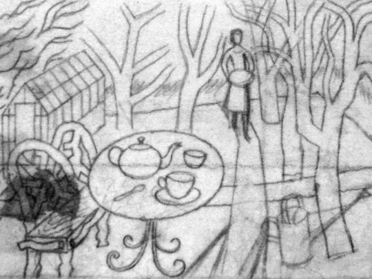
Eric Ravilious – Sketch for Tea in the Garden, 1936
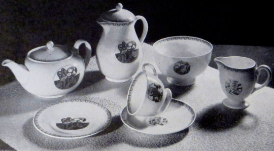
In 1936 Eric Ravilious made a wood engraving for London Transport. Tea in the Garden was made to be used in newspaper advertisements for the Green Line bus service, a decorative vignette to go with commuter information. It is a rather abstract design but it was the start of the commuter lifestyle as London was building a new wave of suburbia and you can imagine the print being used with slogans like “home in time for tea” or “enjoy the garden, 20 mins from the city by bus”
Eric Ravilious – Finished print of Tea in the Garden, 1936
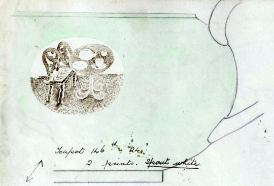
Soon after Ravilious reused the design for a commission with Wedgwood, he was so busy during this point that many designs where recycled from wood engravings to watercolours or china. Below you can see a sketch drawing for a teapot design using the woodblock above. Carving out the legs of the bench and inverting the colours of the table so when printed the transfer will be black and an enamel colour wash painted over.
Eric Ravilious – Sketched idea for Teapot design, 1938
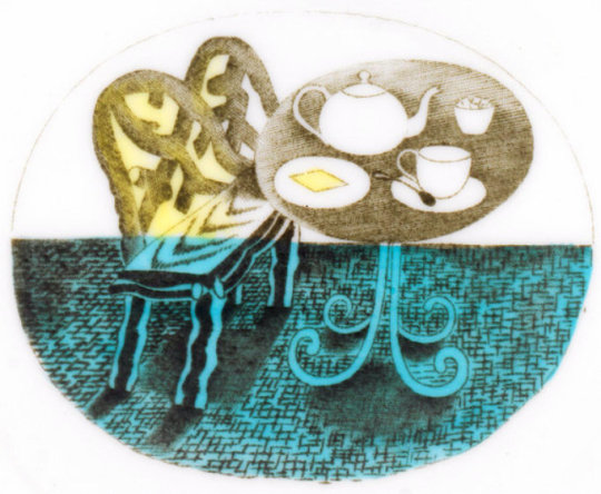
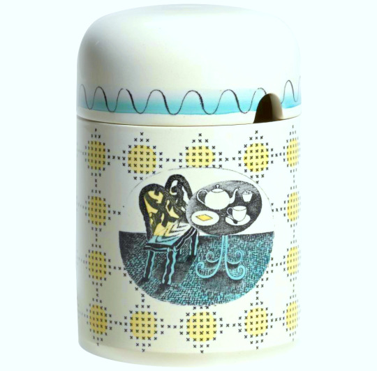
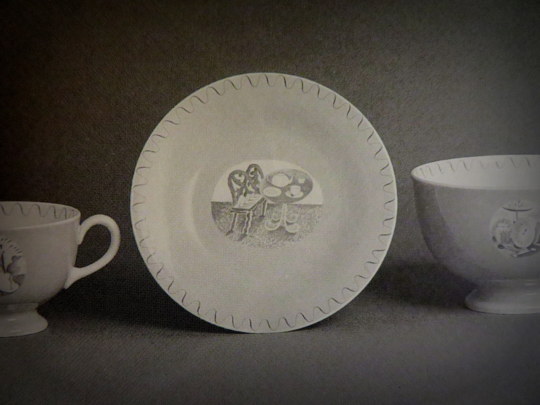
The finished design below, with the colouring in yellow, blue and green. The design has been made simpler and the shading is able to be more subtle as it will be printed on a metal plate, so there is more detail in the halftone lines. It was first used on a preserve jar for Wedgwood.
The preserve jar was introduced six months in advance of the rest of the pattern. The design was advertised in 1939 as being available also in breakfast and coffee sets; the war prevented production of these. At first unnamed, later called ‘Teaset’, the design was finally named ‘Afternoon Tea’.
Here the tea-set is advertised in ‘The Studio Year Book of Decorative Art 1943-1948′ (the gap in printing is noted in the introduction due to WW2, lack of paper and designers being commissioned to do essential war work, this year book covers a wide range of time).
The Bone china tea ware decorated with motifs illustrating Afternoon Tea, printed in sepia and hand-coloured green. Designed by Eric Ravilious A.R.C.A. for Josiah Wedgwood and Sons. †
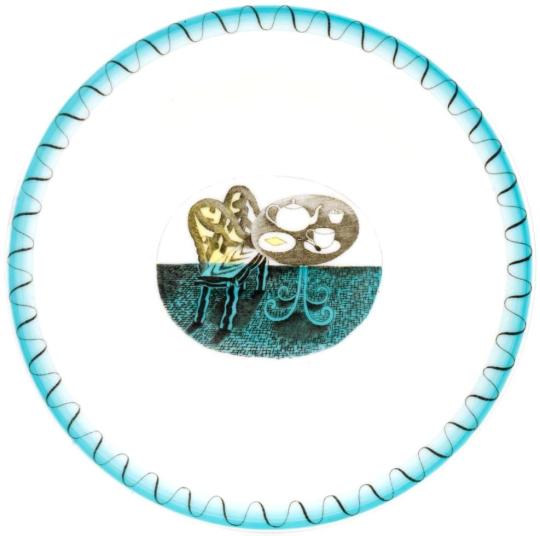
Here is a tea-plate from the set with the simple wave decoration on the perimeter of the plate and washed in blue enamel paint.
In this prototype photograph from 1938 the design is painted around with a pink glaze to the edge of the design and the Ravilious vignette and border uncoloured but printed in a brown sepia with the pink flooding over the whole plate. These are the rarest of all the designs as they were not put into production and the designs were modified to use less colour glaze after the war.
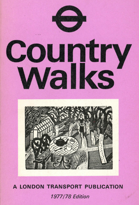
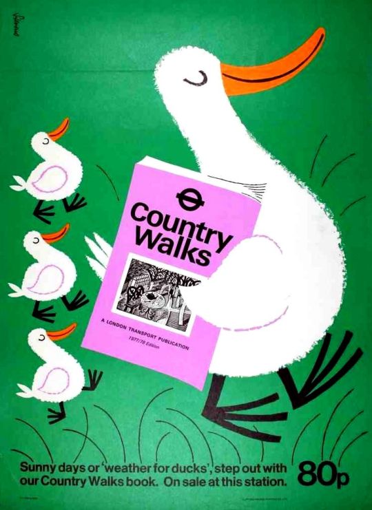
Twenty five years later the original woodblock design would be resurrected and used in a reduced size for advertising and on the covers of Country Walks booklets.
Country Walks with the Ravilious Engraving on the cover, 1978
A rather fun and unusual poster for the Country Walks books by Harry Stevens, 1978.
Ravilious Engravings by Ravilious Jeremy Greenwood, Wood Lea Press, 2008. Country Walks, London Transport, 1978. Ravilious and Wedgwood: The Complete Wedgwood Designs of Eric Ravilious, 1995. † The Studio Year Book of Decorative Art 1943-1948
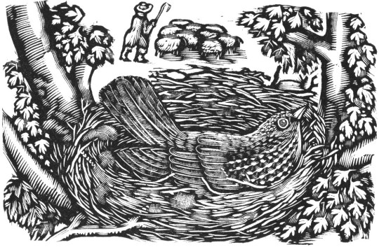
In a past post I wrote about the Cambridge Book of Poetry for Children, edited by Kenneth Grahame with 54 wood-engravings by Raverat. All of them black and white. This is a post about her colour wood engravings from The Bird Talisman.
Gwen Raverat, the granddaughter of Charles Darwin, was an English wood engraver and author. Born and raised in Cambridge, England, she studied art at the Slade School of Fine Art in 1908 and studied under Frederick Brown and Henry Tonks. She was inspired by Thomas Bewick’s wood engravings but the Slade at that time gave no opportunities to study wood engraving. When she left the Slade she went to Paris to the Sorbonne where she met and married Jacques Pierre Raverat, a fellow student and draughtsman.
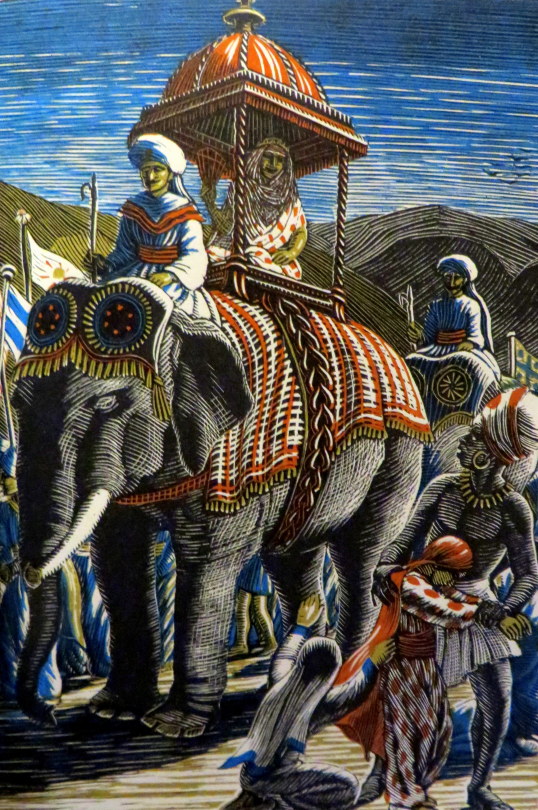
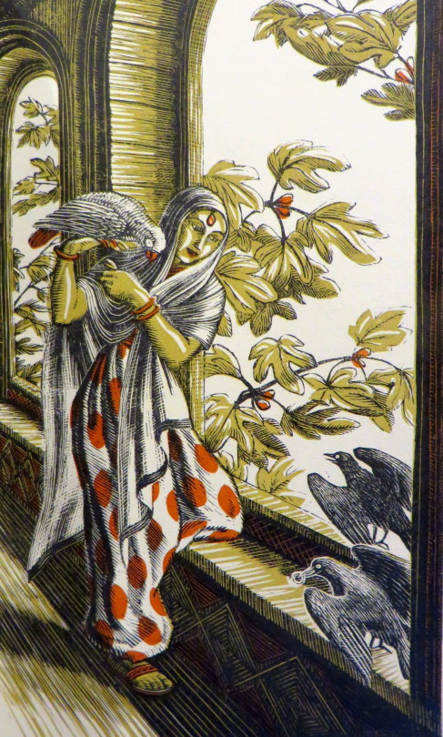
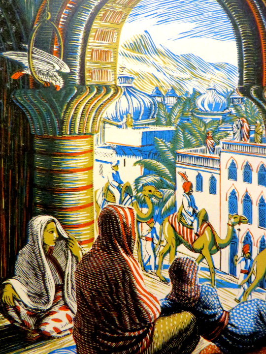
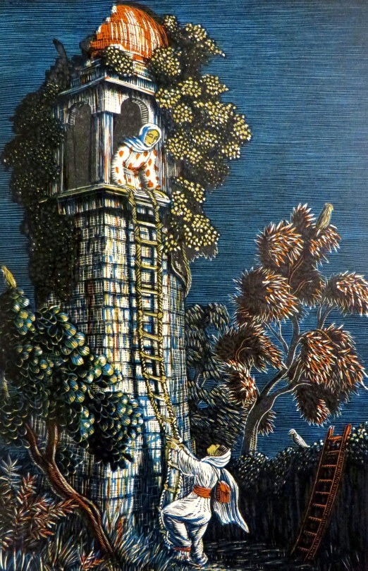
These images come from The Bird Talisman is a story written by Raverat’s great uncle, Henry Allen Wedgwood, a London barrister. He originally published it with illustrations by the himself in The Family Tutor in 1852 and then later in book form in 1887.
Gwen took it upon herself to re-illustrate the book with her wood engravings.
She overcame her feeling of “sacrilege in tampering with a sacred work” and tried to illustrate it herself for Faber and Faber. It did not worry her that she had never visited India, where the story is set, for neither had her great uncle; and neither of them made any effort to be accurately Indian.
Her interest in colour printing, which had first appeared in the frontispiece to Four Tales from Hans Andersen, is here developed with rich effect in eight full-page colour plates. †
She held off agreeing to a contract until she had experimented one of these and settled how to do the various cuts. She decided in each to undertake the main block herself, but to hand over to a blockmaker those that would carry the colour. When de la Mare arranged for these to be done in Vienna, Gwen objected, owing to the German occupation of Austria, and asked to estimate the cost of Austrian blocks, postage and insurance against the of using either English or French blockmakers as she was willing to pay the difference. †
In the end she used an English blockmaker she knew and trusted outlining for him the colour on the second block. She herself cut the plentiful smaller black-and-white engravings, in a variety of shapes and sizes, which help make this the most sumptuously decorated of all her books.It was contracted in February 1939 and due to be delivered in May of that year, but took longer, owing to the painstaking work involved. †
At one point the imminence of war cast doubt over the book’s production. “It’s now so nearly finished that I do hope it will get actually printed and bound, war or no war,” she wrote to Richard de la Mare in late August 1939, “that is I should hope this, if I could think about anything but war.” More positively, she wrote: “I hope you will like the colour plates; they are, at any rate, just what I intended them to be.” She threw further encouragement his way, reminding him that in the last war people had bought a lot of books, “especially if they were absolutely non-topical – quite away from war subjects, which this is. And there’s always Christmas for children even in war. However,” she ended, unable to stem her own despair, “nothing really matters much does it?” †
The book did, however, get published, though work on it was slow for by the time they started printing half the men at the Press had been called up. (This may have limited the number produced in 1939 and helps explain why a second edition was produced in 1945, soon after the return to peace.) †
† Gwen Raverat: Friends, Family and Affections by Frances Spalding, p357, 2001.
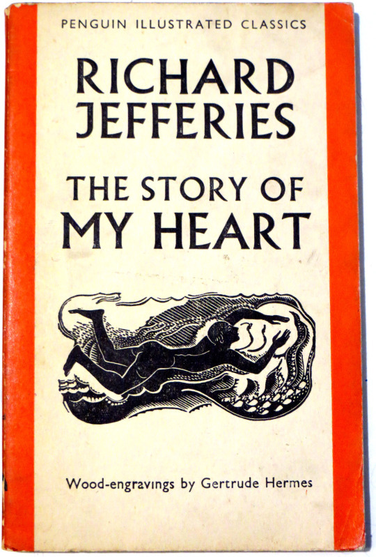
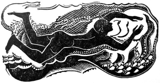
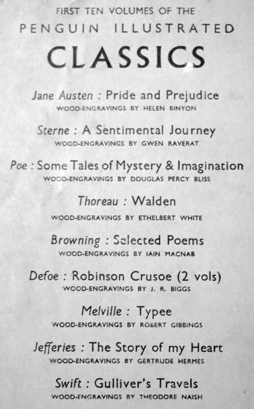
The Penguin Illustrated Classics were a series of books published by Penguin to showcase wood-engraving. Only ten were issued, all in May 1938. Robert Gibbings was the Series Editor and he also illustrated a book too.
Here is the book illustrated by Gertrude Hermes. Normally her woodcuts are fantastically expensive but as it’s a paperback book, this edition can be found easily and cheaply. A year later Hermes would illustrate another book for Penguin, (the eleventh classic) ‘The Complete Angler’ by Izaak Walton.
Gertrude Hermes was born on 18 August 1901 in Bickley, Kent. Her parents, were from Altena, near Dortmund, Germany. In about 1921 she attended the Beckenham School of Art, and in 1922 enrolled at Leon Underwood’s Brook Green School of Painting and Sculpture, where other students included Eileen Agar, Raymond Coxon, Henry Moore and Blair Hughes-Stanton, whom she married in 1926, though they separated in 1931, and were divorced in 1933.
Hermes exhibited regularly at the Royal Academy from 1934, and showed at the Venice International Exhibition in 1939. In 1937 Hermes produced a commission for the British Pavilion at the Paris World Fair. She worked in Canada from 1940 to 1945. She taught wood engraving and linocutting at Central School of Art in London from the late forties to early fifties. She also took a drawing class to London Zoo. She taught wood and lino block printing at the Royal Academy Schools, from 1966. She was elected associate to the Royal Academy in 1963, a full member in 1971 and was appointed an OBE in 1981.